37 Free Bootstrap Contact Form Templates 2026
We are always on the lookout for new snippets, but in the case of Bootstrap contact forms, we needed to create our own.
Even though we tested 100s, and some were pretty solid, we still decided to take matters into our own hands.
With this, we promise you the most reliable, fresh, and up-to-date templates that WORK FOR ANY blog or website.
A contact form is a must for every website, but you now don’t need to create it yourself.
We covered a wide range of styles with over 35 different designs.
What’s best, our free contact forms are also easy to edit and configure. (Read: simple customization.)
Make the necessary contact section happen quickly.
Best Free Bootstrap Contact Forms
Contact Form 1 by Colorlib
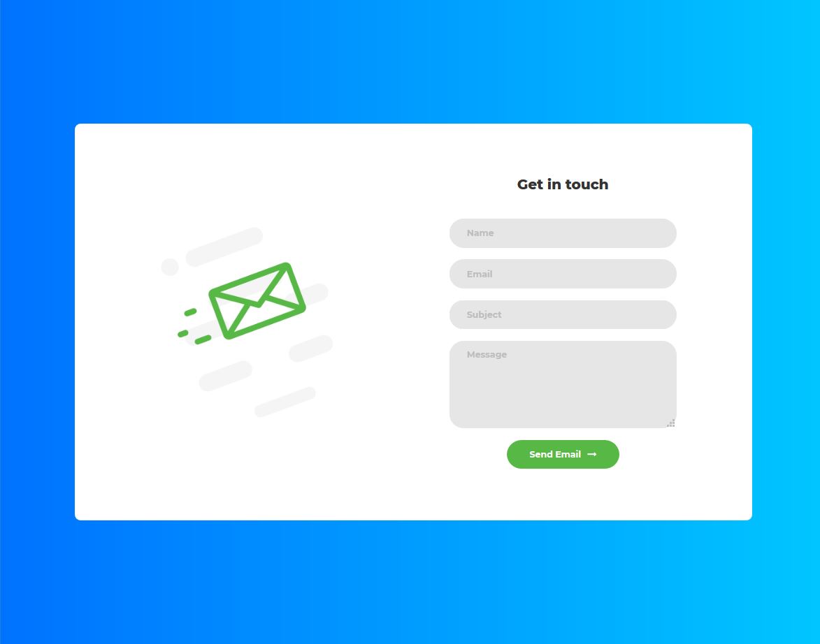
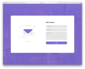
Contact Form 1 developed by Colorlib, is a cool contact form designed with Bootstrap. This contact form looks COOL because of the excellent choice of colors.
The form title is ‘Get in touch’, a meaningful and suitable title for this form. On the left side of the form, a beautiful message icon has been added to enhance the look and feel of this template.
This form template provides four text fields for name, email address, subject, and message. Users can stretch the message field to enter a larger message.
More info / Download DemoContact Form 2 by Colorlib
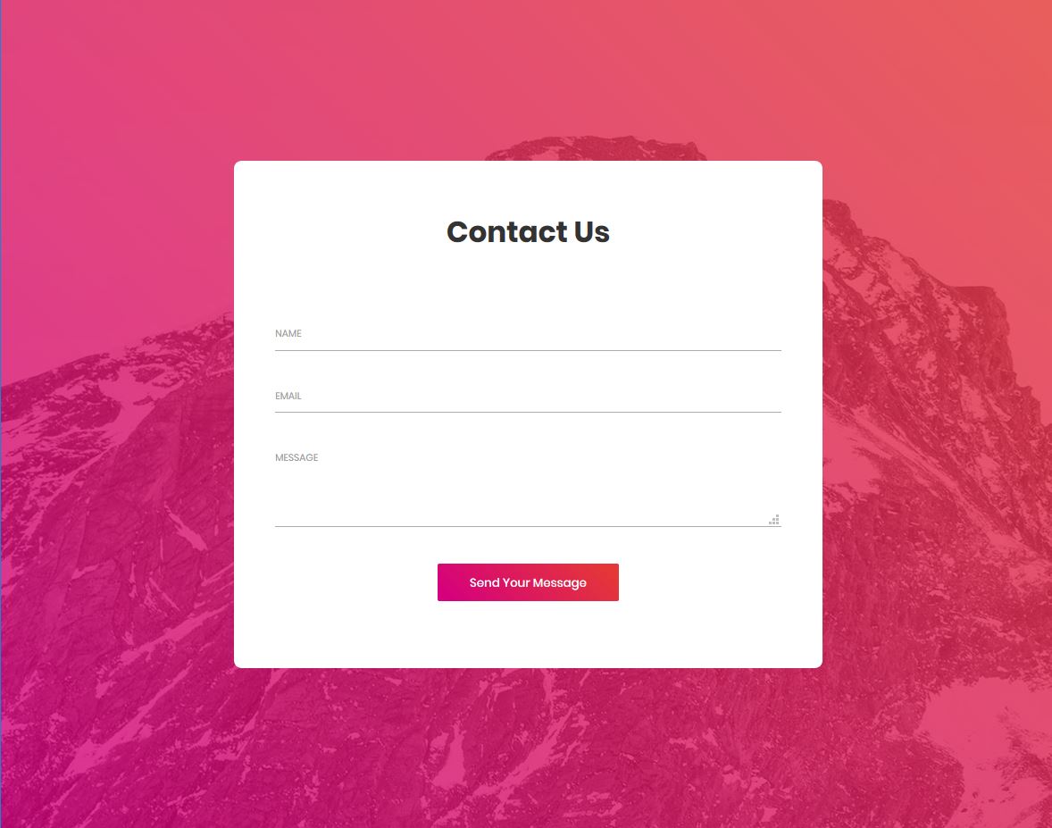
Contact Form 2 made by Colorlib is a beautiful, free contact form template designed using Bootstrap.
The form title is ‘Contact Us’. Although this title is appropriate enough, you may change this text to some other text. For example, you can replace this text with ‘Keep in touch‘ or other suitable text.
This form has only three text fields: name, email address, and message. You may also add more fields from the code. For instance, you may add a subject field to enter the message’s subject.
The user has to enter VALID text values. If they enter invalid texts, error messages are shown when the user hovers the mouse over the text fields.
More info / Download DemoContact Form 3 by Colorlib
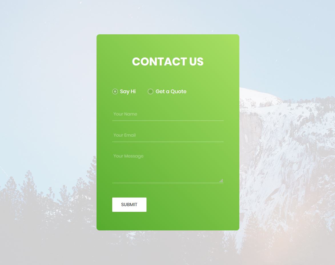
This contact form by Colorlib has TWO options. For each option, a different contact form appears. One option is just saying ‘hi’, while the other contact form is for getting a quote.
This template provides you with two forms for two purposes. It will become very convenient and useful for the user.
On clicking the budget field, a few sample budgets appear from which the user can select a budget. On clicking the ‘Needed Services’ field, a drop-down list appears with a list of services.
More info / Download DemoContact Form 4 by Colorlib
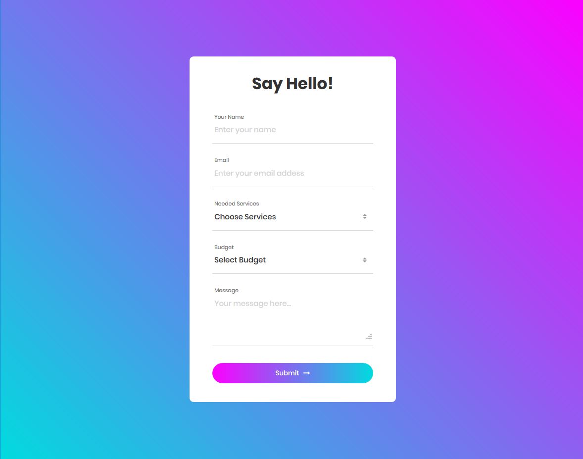
Contact Form 4 by Colorlib is an awesome, free contact form template that can be added to any website.
If you need a contact form to reach out to potential customers, this form template is a good choice. Using this form, your potential clients can inquire about your services.
The user needs to choose a service that they want to know about. They can select a service from the drop-down list with the caption ‘Needed Services’ in this form template.
From the budget field, the user can select their budget. When you know about your potential client’s budget and which service they’re interested in, it becomes easier for you to communicate with your potential customers.
More info / Download DemoContact Form 5 by Colorlib
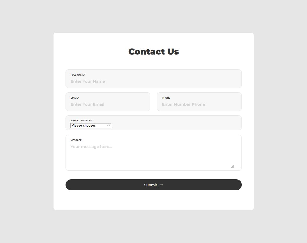
Contact Form 5 built by Colorlib, is an excellent, free Bootstrap contact form.
The text fields have placeholder texts that describe them. The form title is bold with the text ‘Contact Us.’ The submit button is very wide—it’s as wide as the message field.
When you click on the ‘Needed services’ field, a drop-down list appears. It’s a list of services. Your potential customers can choose from this list. If you provide different services, you may change this list in the code.
More info / Download DemoContact Form 6 by Colorlib
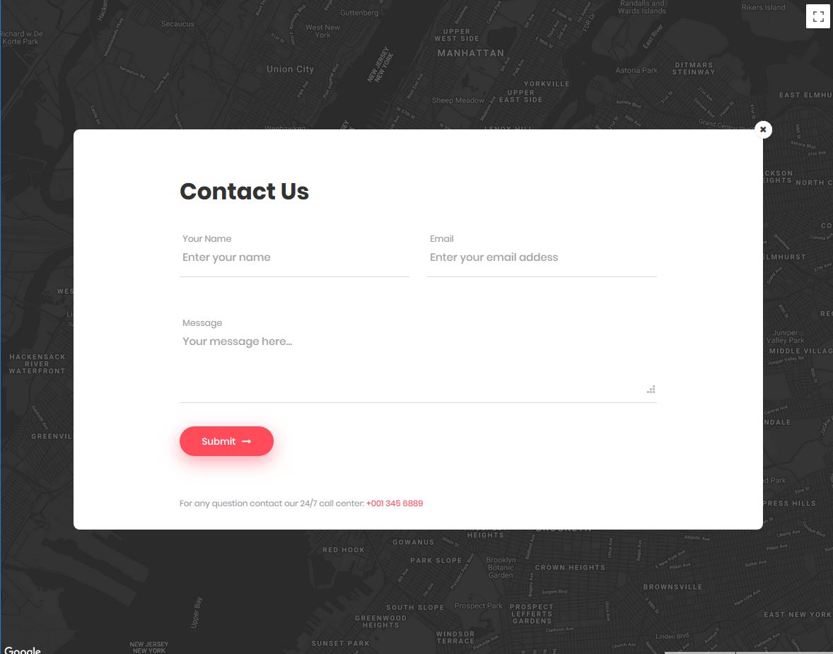
This is one of the best Bootstrap contact forms developed by Colorlib. This template shows a map and an icon of a message over it.
When you click on the message icon, the contact form appears. It has three text fields. In these input fields, the user can enter their name, email address, and the message they want to send. Below the message field, there’s a beautiful submit button.
The submit button has an exciting hover EFFECT.
If you click on the submit button without entering any values in the text fields, error messages appear red.
The user must enter the email address in the correct format. An error message will be shown if your user enters an invalid email address.
More info / Download DemoContact Form 7 by Colorlib
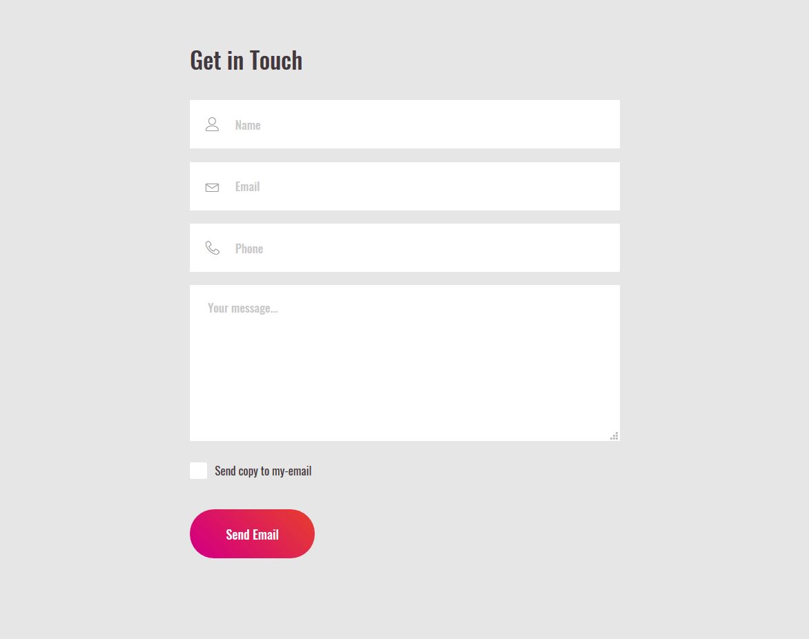
Contact Form 7 is a very standard contact form developed by Colorlib. It has a very familiar design. Using this contact form on your website will make your site look more professional.
The form title is ‘Get in Touch.’ This form has four text fields. The user can enter their name, email address, phone number, and a message through this form.
In the text fields, there are proper placeholder texts and icons. These icons and the placeholder texts have made the form more USER-FRIENDLY.
There is a checkbox below the message field with ‘Send copy to my email’. If the user wants a copy of the entered details, they can send it to their email address.
More info / Download DemoContact Form 8 by Colorlib
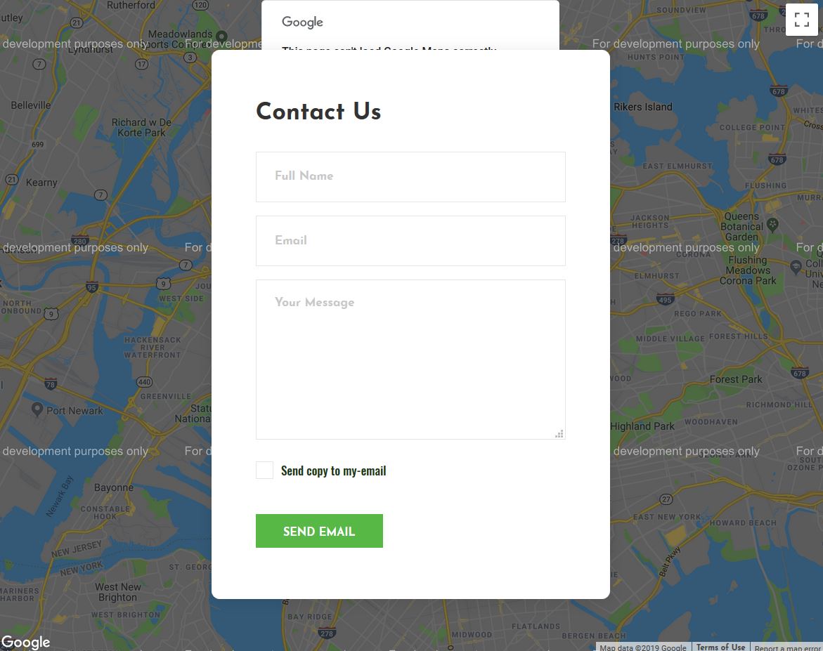
Contact Form 8 is an excellent, free Bootstrap contact form template made by Colorlib with a map as a background.
This form has interesting effects. When you click on the text fields, you can see cool visual effects. The overall quality of this form is very high.
There are appropriate placeholder texts so the users can understand what to enter in a particular field. For example, the message field’s placeholder text is ‘Your message.’
By seeing this text, the user can quickly understand that they must enter a message in this field.
The button with the caption ‘SEND EMAIL’ looks great. Its background is light green, and the text is white. When you hover your mouse over the button, the background changes to dark green.
More info / Download DemoContact Form 9 by Colorlib

This is another awesome contact form template developed by Colorlib. This is an accessible template. So you don’t have to spend money to use it on your website.
And it’s also customizable, meaning you can make changes in this template according to your requirements and preferences.
When you click on the text boxes, you can see an interesting VISUAL EFFECT. Not entering any values in them will show error messages in red. An error message is shown if you enter an email address with an incorrect email format in the email form.
Alternatively, there’s a phone number at the bottom, but you must change it to your contact number.
More info / Download DemoContact Form 10 by Colorlib
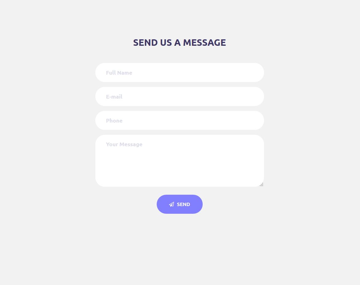
This beautiful, free Bootstrap contact form made by Colorlib is a high-quality contact form template. Round text boxes, round buttons, and a GREAT color combination used in this template have completed the form beautifully.
There’s a small icon placed in the ‘send’ button. Because of this icon, the button looks very interesting. There’s also a hover effect.
When you click on the text boxes, they grow slightly in width. The user can enlarge the message field by dragging the bottom-right corner.
If the user’s message doesn’t fit in the text box, they can make it larger.
Form validation has been implemented. So if the user leaves the required fields empty or enters invalid values and clicks the ‘send button, error messages will appear.
More info / Download DemoContact Form 11 by Colorlib
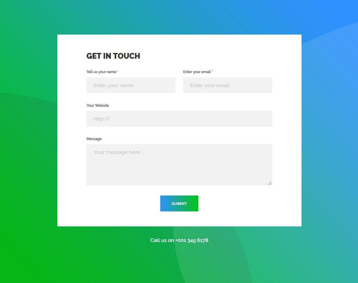
This is a simple yet powerful Bootstrap contact form template. The background is amazing, enhancing the beauty of your website. This form has two mandatory text fields and two optional ones.
The mandatory fields are marked with a star. The website and the message fields are optional. So, no error messages will be shown if the user doesn’t enter their website URL or provide text in this form.
However, the user must enter their name and email address in the appropriate fields.
This beautiful contact form will be a QUICK WAY for your customers to contact you.
More info / Download DemoContact Form 12 by Colorlib
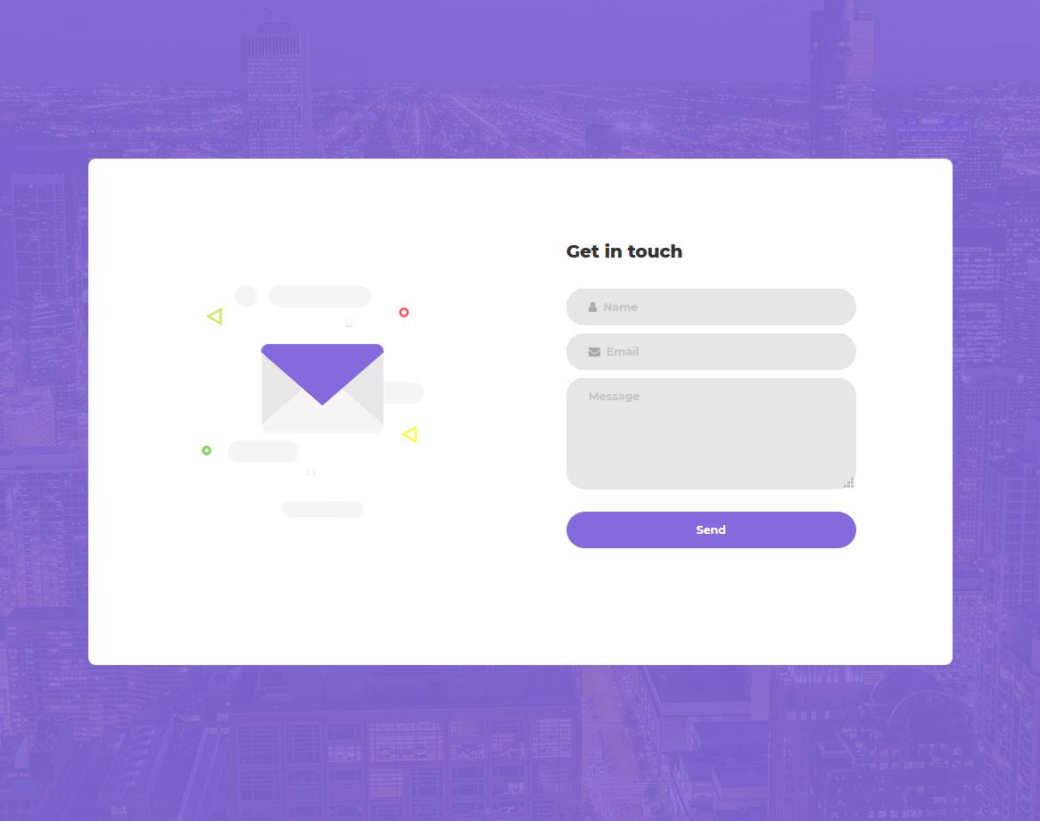
Contact Form 12 is one of the most fantastic templates developed by Colorlib. This form looks VERY COOL and has great visual effects. There’s a message icon on the left side of the form.
It will move slightly when you hover your mouse over this message icon.
You can see another great visual effect when clicking on the text boxes.
Behind the form, there’s a picture of buildings. This has enhanced the aesthetic appeal of this contact form. The color combination used in this template is great.
This form has three text fields: name, email, and message. The corners of the text boxes and the button are round.
More info / Download DemoContact Form 13 by Colorlib
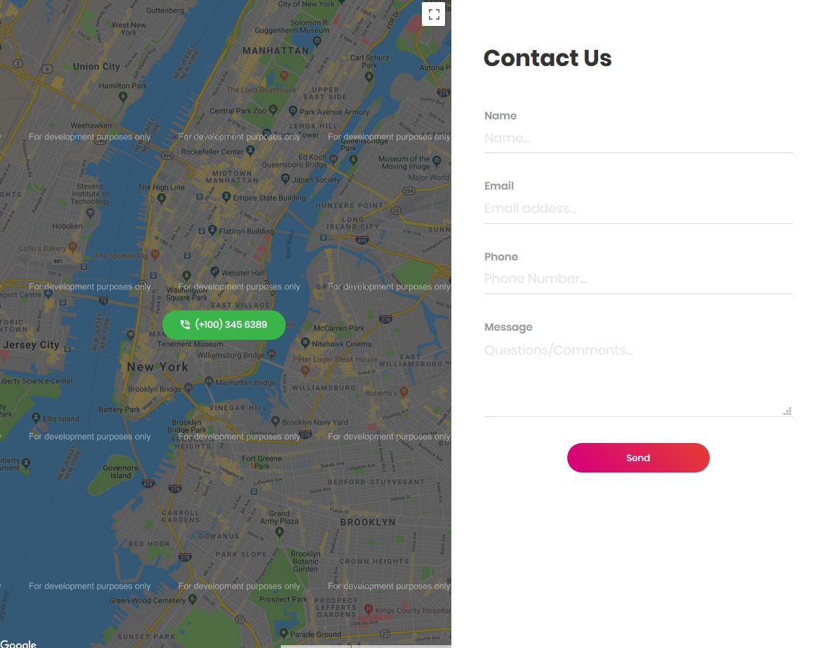
Contact Form 13, made by Colorlib, looks unique. On the left side, there’s a map, and the form is on the right. A phone number is visible in the map section.
The contact form includes all necessary input fields. If you need additional fields, you can add them at any time by modifying the template’s code.
Like the other contact forms developed by Colorlib, this form is also FREE and FULLY customizable, meaning you don’t have to spend any money integrating it into your website, and you can make necessary changes to it.
Although this form looks very standard, you may need to make slight adjustments to its design to ensure it matches your website’s design.
More info / Download DemoContact Form 14 by Colorlib
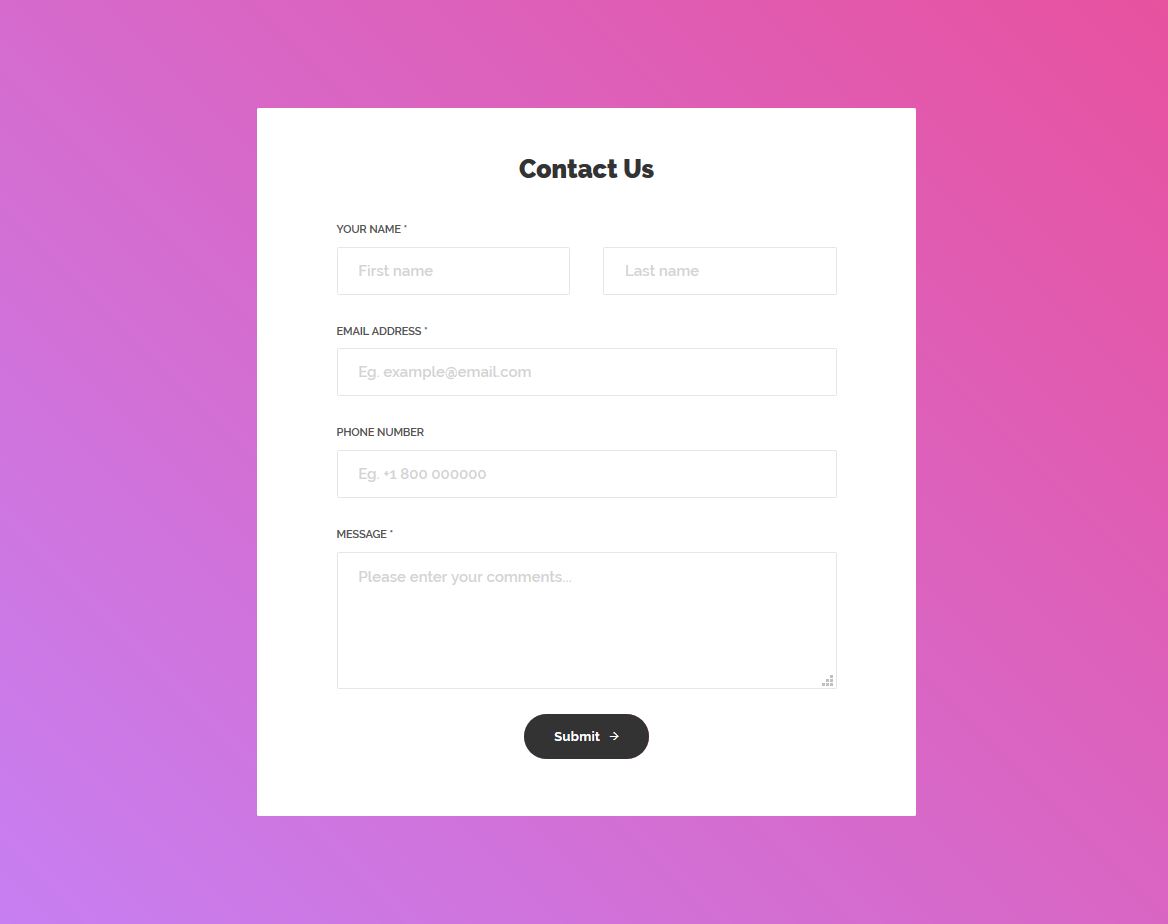
This contact form is one of the best contact forms made by Colorlib. There’s an excellent background behind this form. Like the other templates in this blog post, this is also a free, fully customizable contact form template exceptionally designed with Bootstrap.
This contact form requires the user to enter a value in the name, email, and message fields. The others are optional.
The user cannot message through this contact form, leaving the mandatory fields empty.
Although this form looks excellent, you always have the option to enhance the design. You can make NECESSARY changes to create this form that matches your website’s design.
More info / Download DemoContact Form 15 by Colorlib
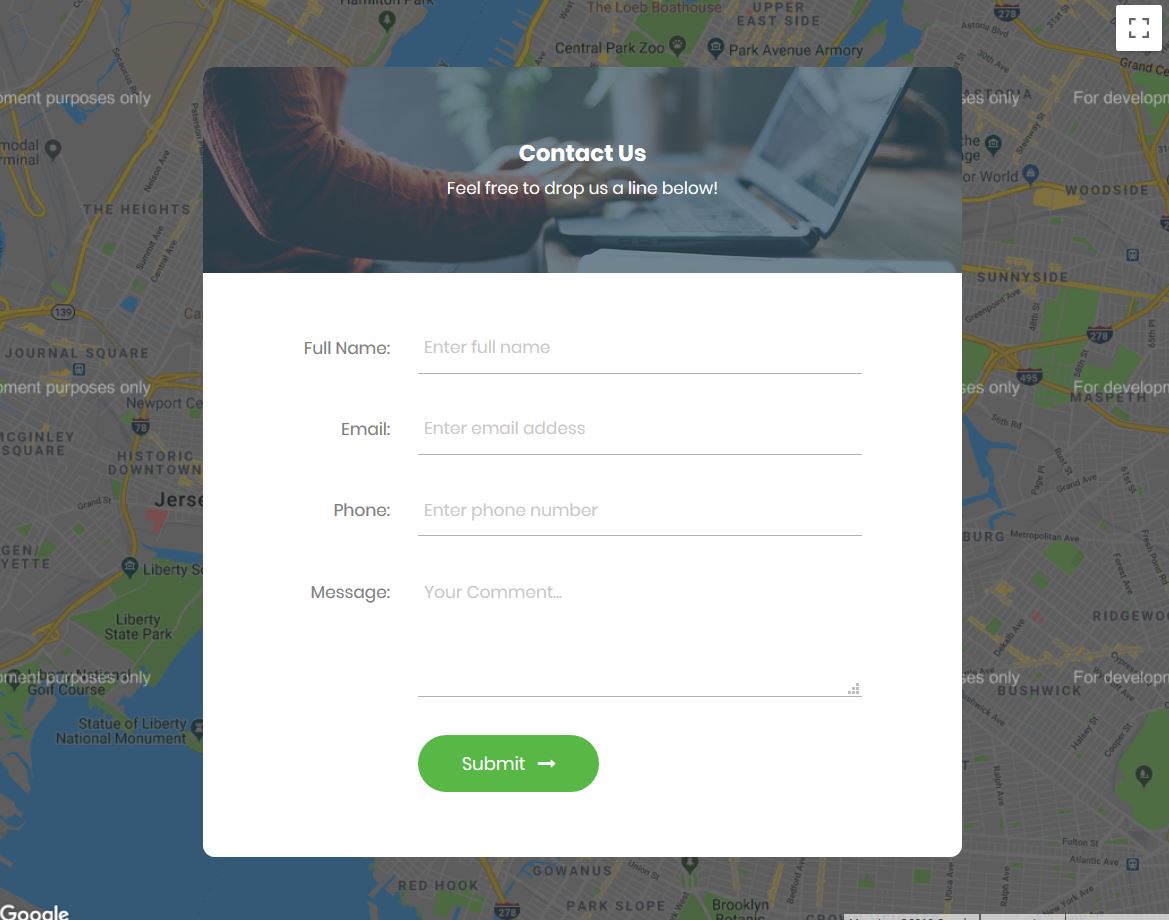
Contact Form 15 by Colorlib is a FANTASTIC free contact form template designed with Bootstrap that can be integrated into any website. Behind the form, you can see a map.
The text fields appear modern due to their single-line design, rather than traditional rectangular text boxes. Each text field has a proper placeholder text, grey.
When clicking on the text fields, the placeholder texts disappear, and the lines of the text fields become green, enhancing the user experience.
On top of the form, you can see a nice picture of a man working with a laptop. If you think this image is inappropriate for your website, you can REPLACE this image with a different one.
More info / Download DemoContact Form 16 by Colorlib
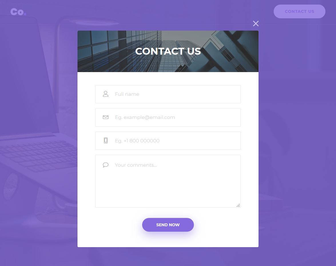
Contact Form 16 is also one of the most awesome templates developed by Colorlib. It does not just look cool, it’s also simple, beautiful, and powerful.
You can consider using this form if you’re looking for a great, free Bootstrap contact form for your website. This form is cool enough and can be integrated EASILY like any other contact form mentioned in this blog post.
If you know the basics of web development, you can add this form to your site in just a few minutes.
Behind the form, there’s a great picture. Another image is on top of the form, which enhances the look of this form template.
And you can see SPECIAL effects on clicking the text fields.
More info / Download DemoContact Form 17 by Colorlib
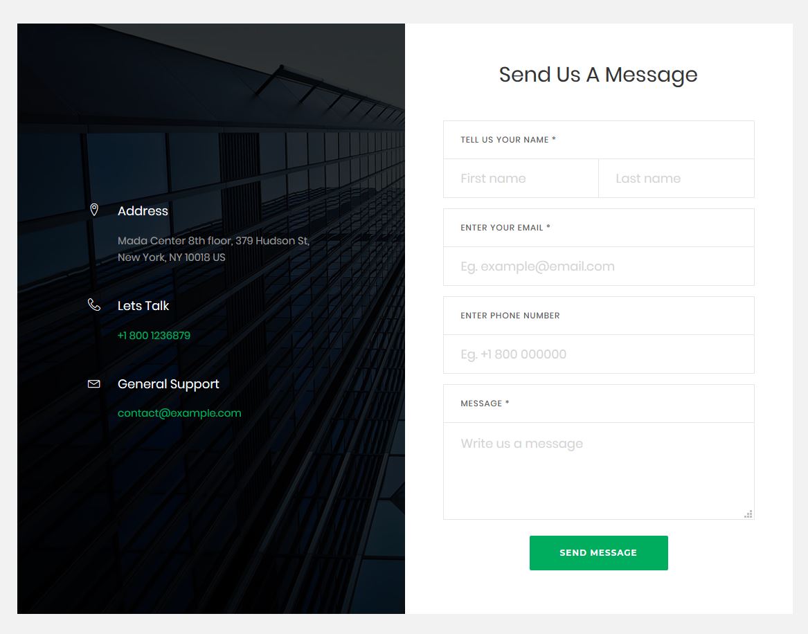
Contact Form 17 is a beautiful, free, and fully customizable Bootstrap contact form template designed by Colorlib. On the left side of the form, there’s a nice picture with contact information such as an address, phone number, and email address.
So, if the user wants, they can also contact you by phone and email. They also have the option to physically visit your company office at the address provided in this section.
This form stands out because its text fields deviate from the standard text fields found in other contact forms and web forms.
For each text field, there’s a CAPTION above the field. Each caption is placed inside a rectangle with thin, grey lines.
More info / Download DemoContact Form V01
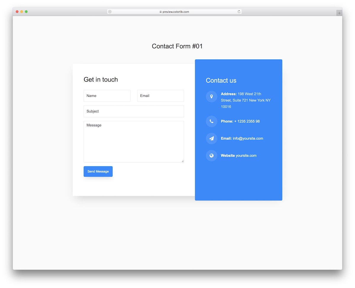
Contact Form V01 is a modern, free widget that you can easily insert on your website. It allows your users to contact you conveniently without having to pick up their phone.
Contact Form V01 also rocks a cool split design with the form on one side and additional company details on the other.
You can also add a link to the home page if they want to continue browsing your content and not leave JUST YET.
More info / Download DemoContact Form V02
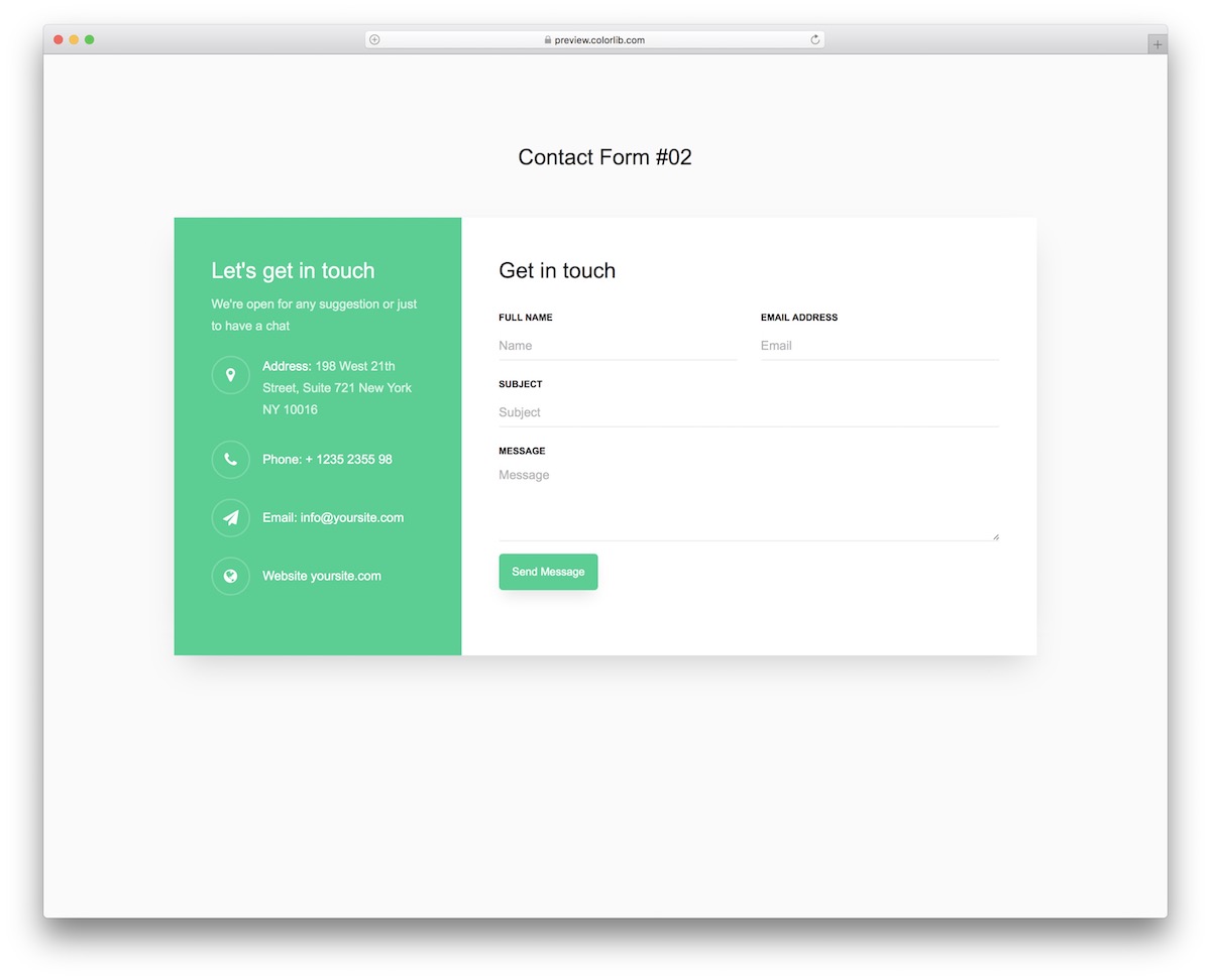
A contact section is mandatory regardless of the type of website you run. Contact Form V02 is here to sort things out with a clean design that allows you to add extra detail.
Since it’s a Bootstrap contact form, the fluid design also ensures great adaptability to smaller screens.
By the way, the widget ALSO supports autocomplete and validation.
More info / Download DemoContact Form V03
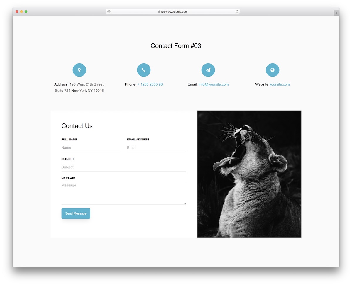
Contact Form V03 is a great free alternative to create a full-blown contact page on your website.
Not only do you get a functional form, but there is also an IMAGE section and EXTRA company details, like address, phone, and email.
As for the form, it’s pretty basic with four fields and a button with a hover effect.
More info / Download DemoContact Form V04
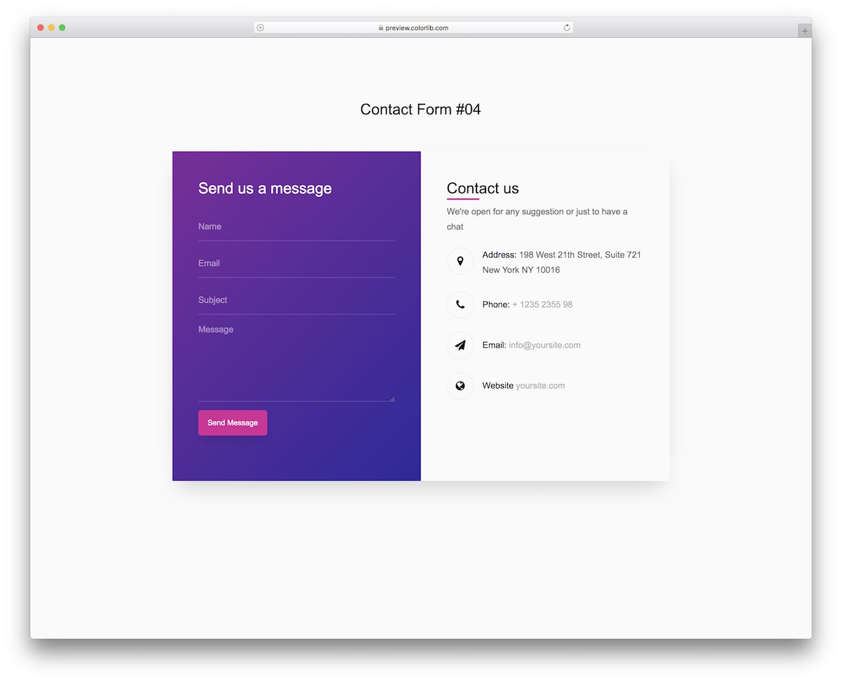
There are multiple ways of spicing up the contact area – the GRADIENT effect being one of them. If you are into this, Contact Form V04 is our free template based on the Bootstrap Framework that does the trick.
Like many of our other contact forms on this list, this one also has an extra section for adding address, phone, and email and even linking back to the home page.
More info / Download DemoContact Form V05
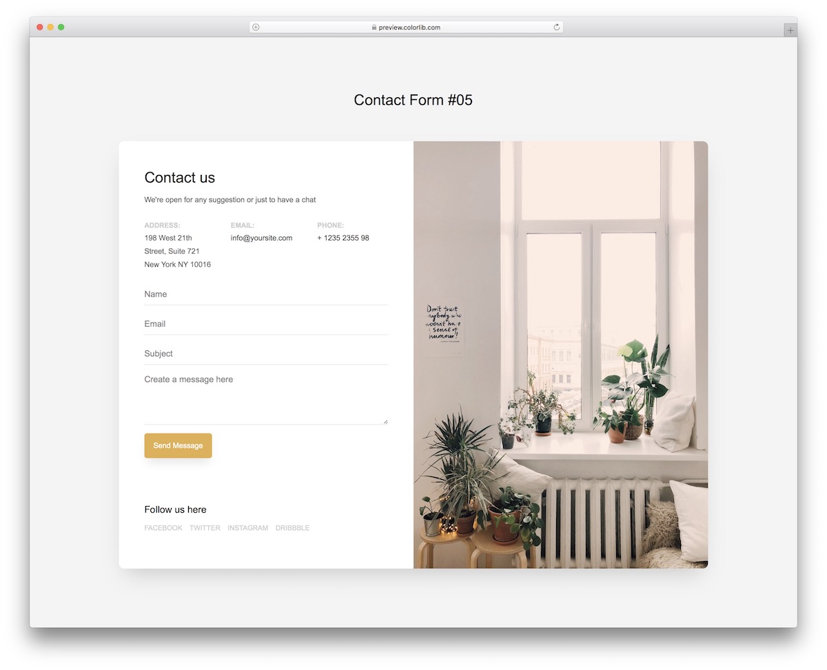
If youare highly active on social media and achieve great results, you should include links to those platforms throughout your website.
INCLUDING the contact page/form.
Contact Form V05 is a great example, offering many additional features beyond just social media links.
You can even check the live demo on different devices first before proceeding.
More info / Download DemoContact Form V06
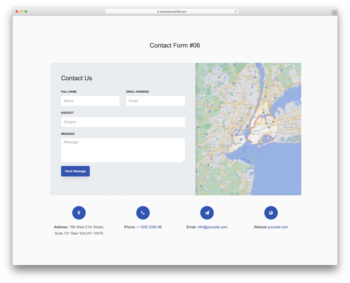
Many people appreciate the idea of displaying their company location on a map, so users don’t have to look it up manually.
Contact Form V06 boasts an excellent split layout, featuring a form and Google Maps integration for added convenience.
You also don’t need to manage form autocomplete and validation, as Contact Form V06 integrates both by default.
More info / Download DemoContact Form V07
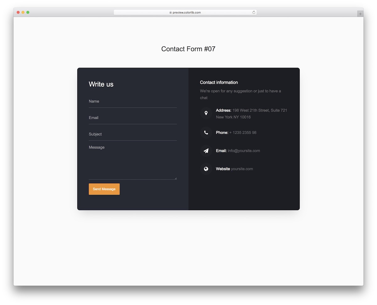
I am sure many of you were looking for this alternative—the free Bootstrap contact form with a DARK design.
You are welcome to use Contact Form V07 as is, or you can modify it.
For instance, you may be interested in changing the color of the “send message” button, even fonts.
More info / Download DemoContact Form V08
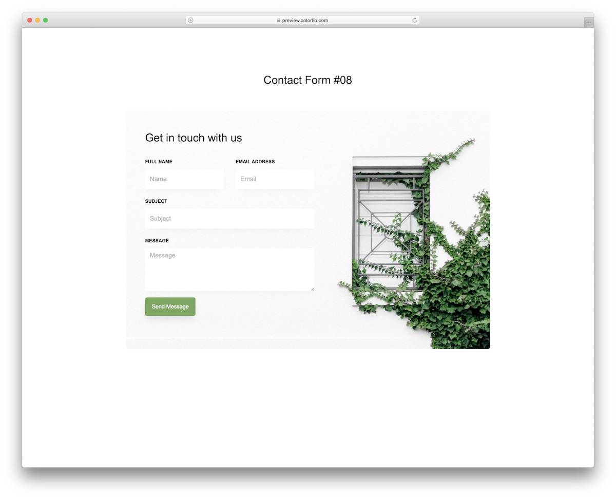
Adding an image background can make your website contact widget pop more. But instead of making it happen FROM SCRATCH, you can now use Contact Form V08.
This free Bootstrap contact form is pretty straightforward but adds a nice touch with the background image.
Remember that you can always improve things, making the snippet follow your branding regulations.
More info / Download DemoContact Form V09
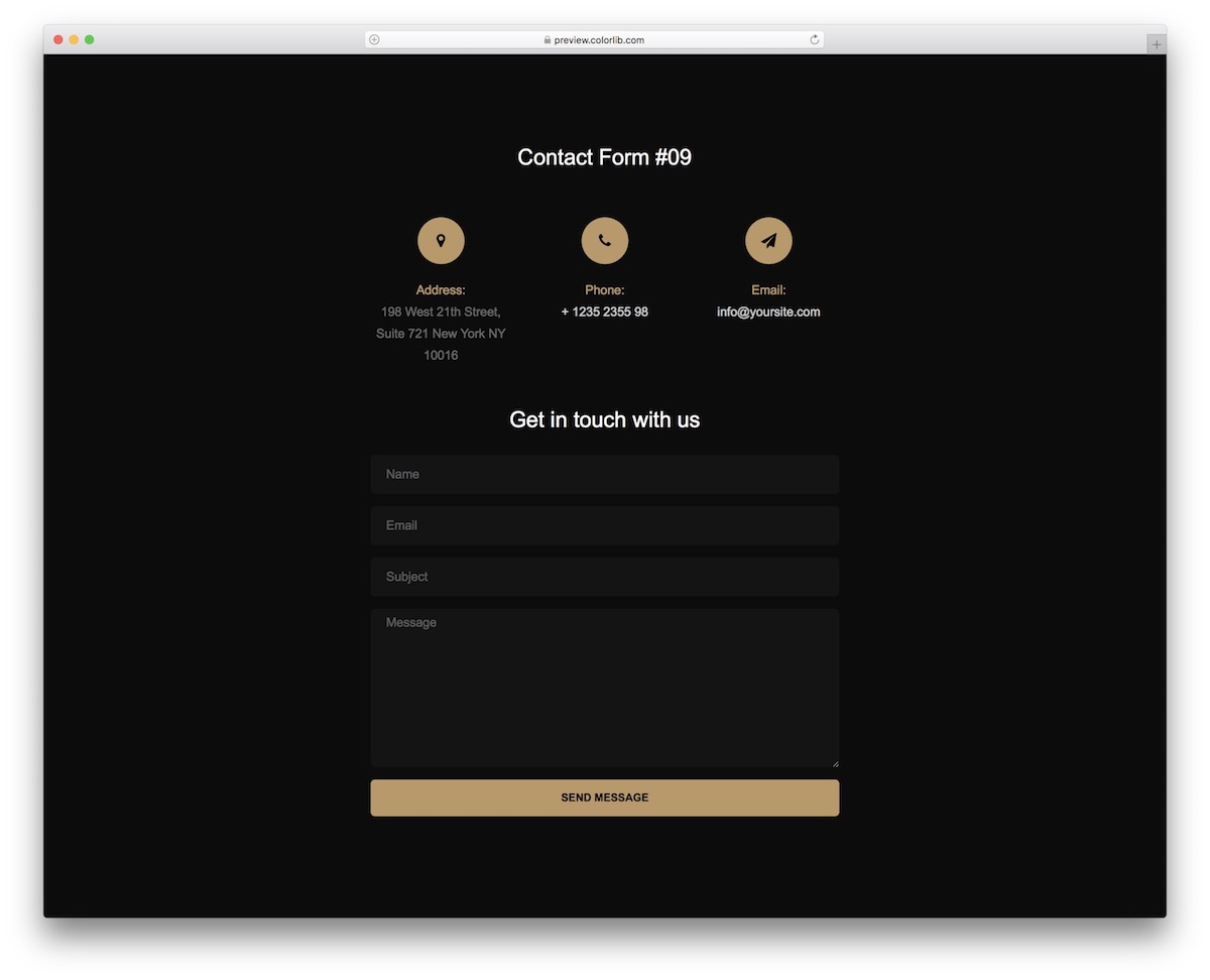
I will say only one thing: Let this free contact form template do all the talking instead of me. Dark background, gold details, gray and white text—WOW.
A tool that will let everyone enjoy filling out the missing information when needing to get in touch with you.
The widget is also perfectly harmonious with mobile devices and features autocomplete and validation.
What else do you need?
More info / Download DemoContact Form V10
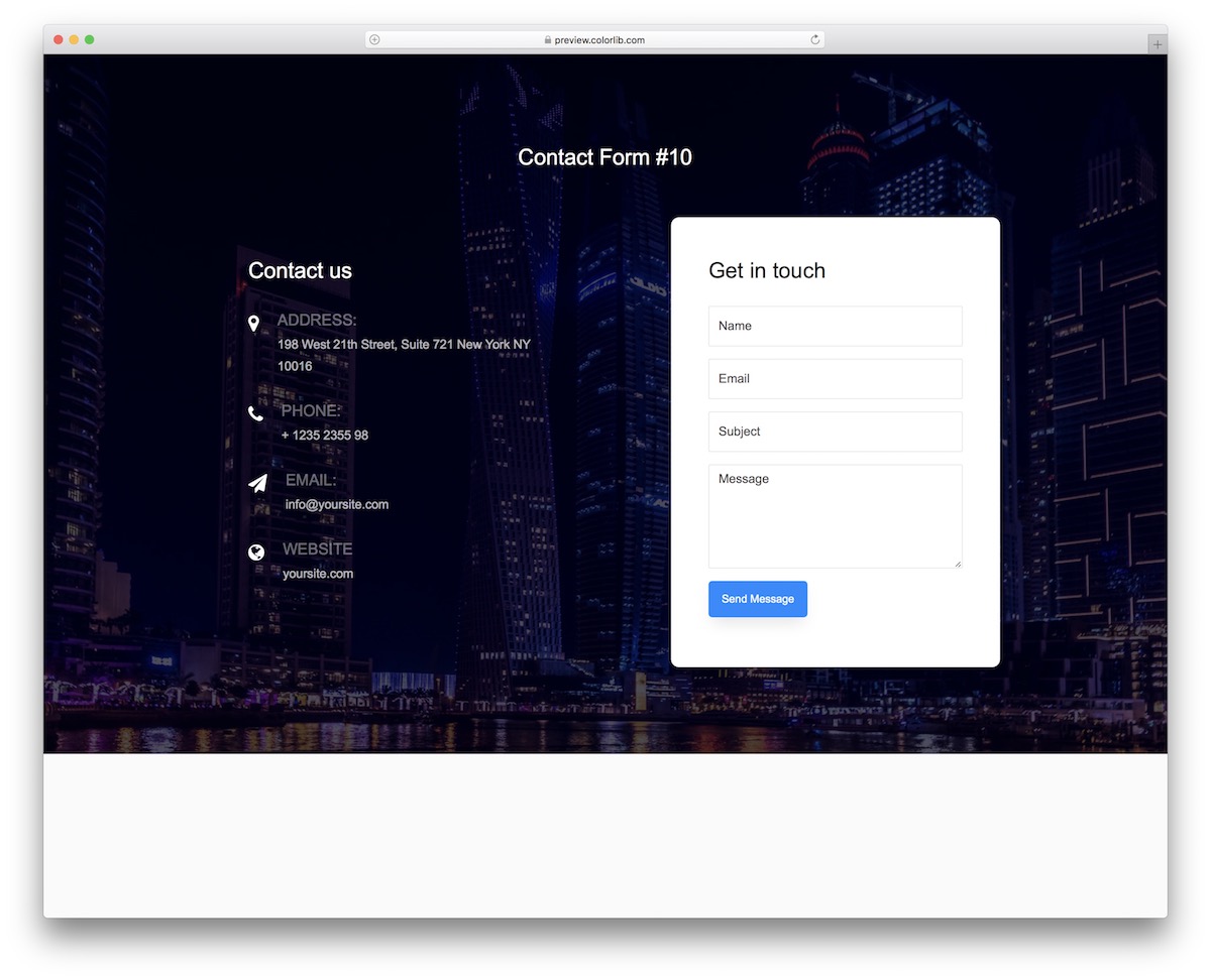
Full-screen image background, transparent design, and solid color contact form – that’s what’s up with Contact Form V10.
While the additional details and form are side by side on the desktop, they move one on top of the other on mobile.
If your website visitor only needs your telephone number or address, this template ALLOWS you to include those.
More info / Download DemoContact Form V11
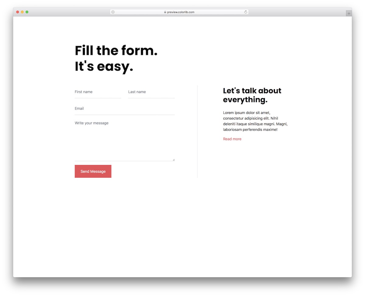
Contact Form V11 is one of the most minimalist contact form templates ever released. What’s cool about that is that it works with different website themes and styles.
Other than changing the color of the “send message” button, you can use it exactly as it is in the box.
But you can keep it entirely AS-IS, too.
More info / Download DemoContact Form V12

Do you need more minimalist Bootstrap contact form templates? Here we go.
Contact Form V12 is another superb tool that delivers a full-blown outcome in little to no time.
Contact Form V12 is user-friendly, thanks to the organized and well-structured code. Even a beginner in web development can quickly improve it.
More info / Download DemoContact Form V13

With the gradient background, Contact Form V13 stands out from the masses. We always bring you as many variations as possible with all the free widgets and snippets we release.
The SAME applies to contact forms.
Contact Form V13 is ideal for businesses and agencies, offering extra contact details and a section to share a few compelling words.
More info / Download DemoContact Form V14
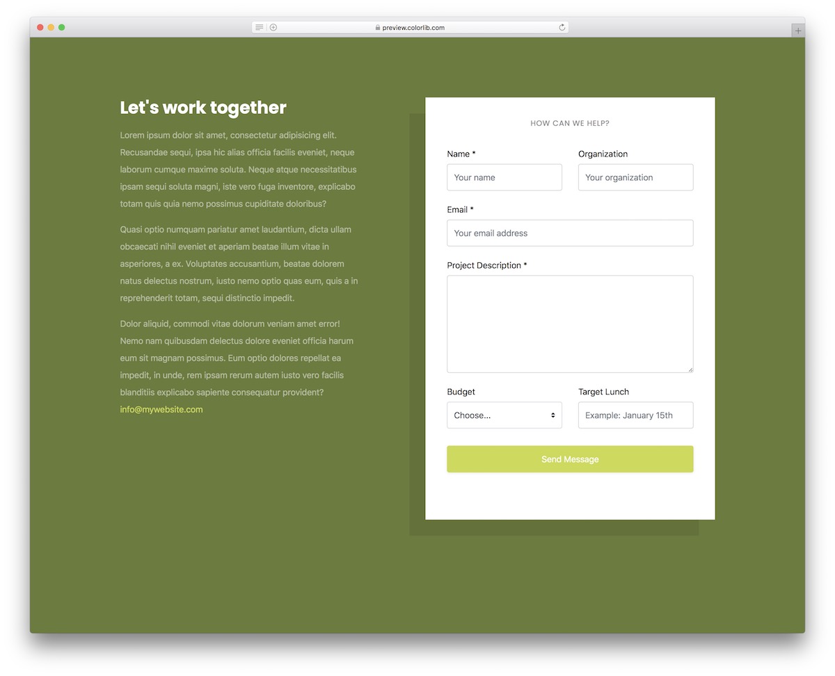
We have Contact Form V14, perfect for businesses and agencies by default. It works ideally for a marketing agency, but you can also use it for other purposes.
For instance, if you run a news site and offer advertisements, this free contact form can also be useful.
You can use the section on the left to further convince the potential client to work with you.
More info / Download DemoContact Form V15
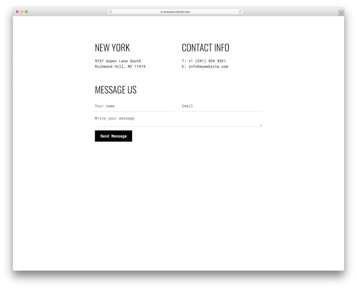
Contact Form V15 is modern and minimal, both at the same time. Due to its clean and bold style, you can keep your contact section bold yet straightforward.
Why even use too many distractions?
But that’s something that depends on business to business.
To maintain the simplicity of your website, use Contact Form V15 and avoid building the contact page from scratch.
More info / Download DemoContact Form V16
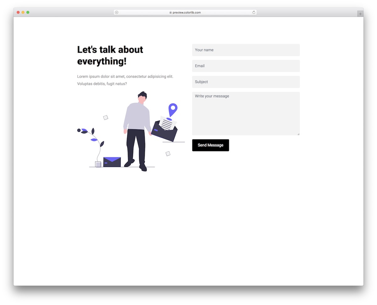
Contact Form V16 is an ENGAGING contact form for agencies, businesses, and freelancers. But, even if you run a blog, you can include this catchy free Bootstrap template.
The message has three fields: name, email, subject, and text area.
Contact Form V16 also supports form validation and autocomplete, making it even more practical.
More info / Download DemoContact Form V17
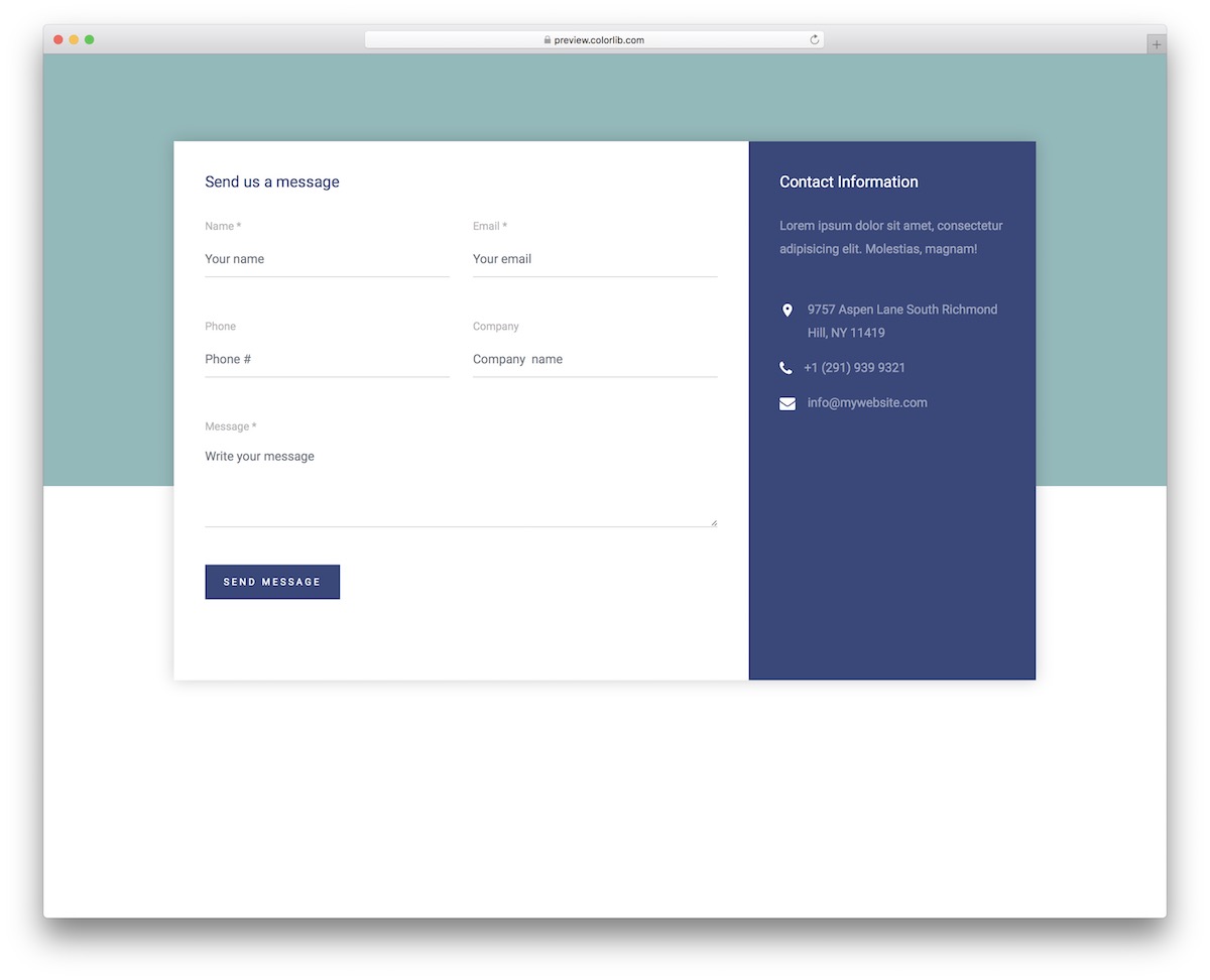
While you probably already have COMPANY DETAILS and contact info in the footer area, you can also add it beside the contact form.
To achieve a great result swiftly, you opt for Contact Form V17.
Name, email, phone, company, and text area are the five predefined fields you can use as-is or improve further. Also, go for it if you want to beautify it with a different colorway.
More info / Download DemoContact Form V18
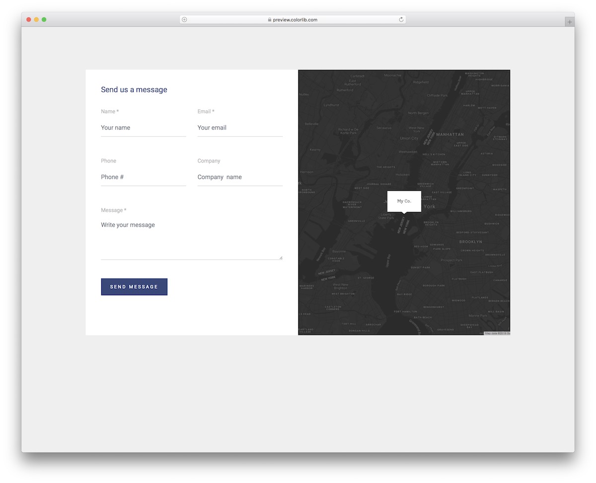
Contact Form V18 is another take to a free Bootstrap contact form template with Google Maps. With the TWO-IN-ONE design, this widget lets you quickly sort out a contact section on your website.
It’s a great alternative as you can use it on a separate page or even include it on your one-page website.
More info / Download DemoContact Form V19
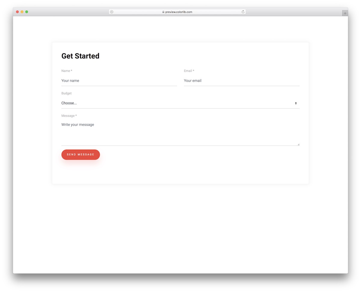
If you want your site visitors and potential customers/clients to provide a little extra information, a contact form with a dropdown may be very handy.
Contact Form V19 is the free tool you can now employ regardless of your branding regulations. It works great out of the box thanks to the extremely minimal look.
Another cool feature is the button click effect – go ahead and see it for yourself.
More info / Download DemoContact Form V20
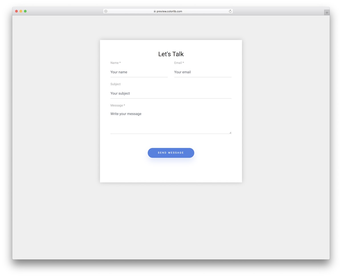
With a contact form, you only need four fields to get straight to the point. Contact Form V20 features fields for name, email, and subject plus the text area.
The layout is also perfectly harmonious with smartphones, tablets, and desktops, ensuring a fantastic user experience.
More info / Download Demo


Comments (0)