18 Best Simple Websites (Examples) 2026
Are you a minimalist searching for the best simple websites for inspiration?
It was quite challenging to curate a list of the most outstanding, given the numerous beautiful pages.
But here we are; if you like simple web design, this is the collection you need to check.
From eCommerce and personal websites to online portfolios and business sites, you’ll find them all and then some.
You’ll also learn which platform/builder each page uses, but we know many of you prefer WordPress.
For this reason, we also created a list of the best simple WordPress themes that are easy to use and help create a beautiful and clean website.
Best Simple Websites For Inspiration
1. Lars Tornoe
Built with: Squarespace
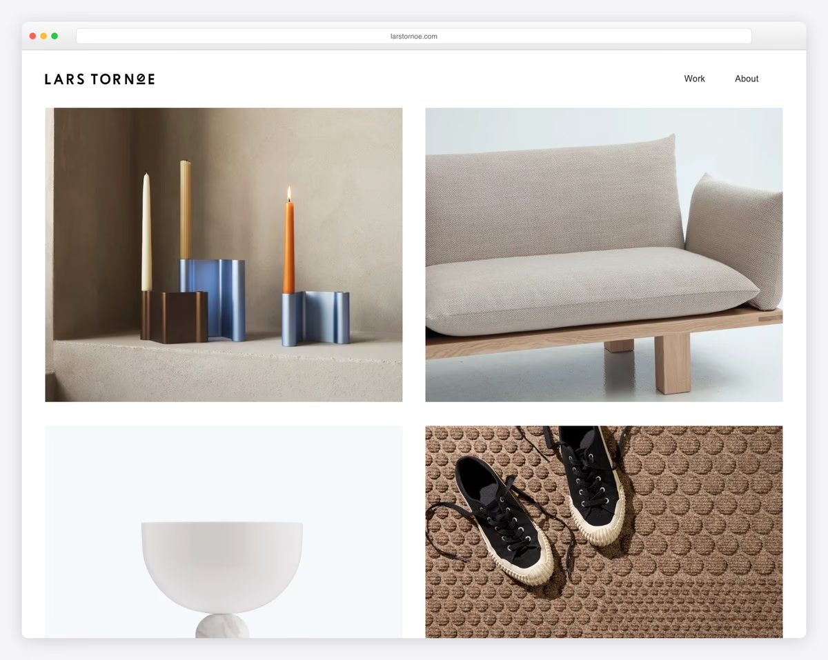
Lars Tornoe’s website has a framed layout, with a vanilla header and no footer on the home page. The two-column grid features large images with a hover effect that take you to individual project pages when you click them.
What stands out: Don’t use a footer to create a cleaner website look. However, if you decide to use one, here are some of the best footer examples for inspiration.
Also, don’t miss our Squarespace website examples for more creative ideas.
2. Bedow
Built with: Gatsby
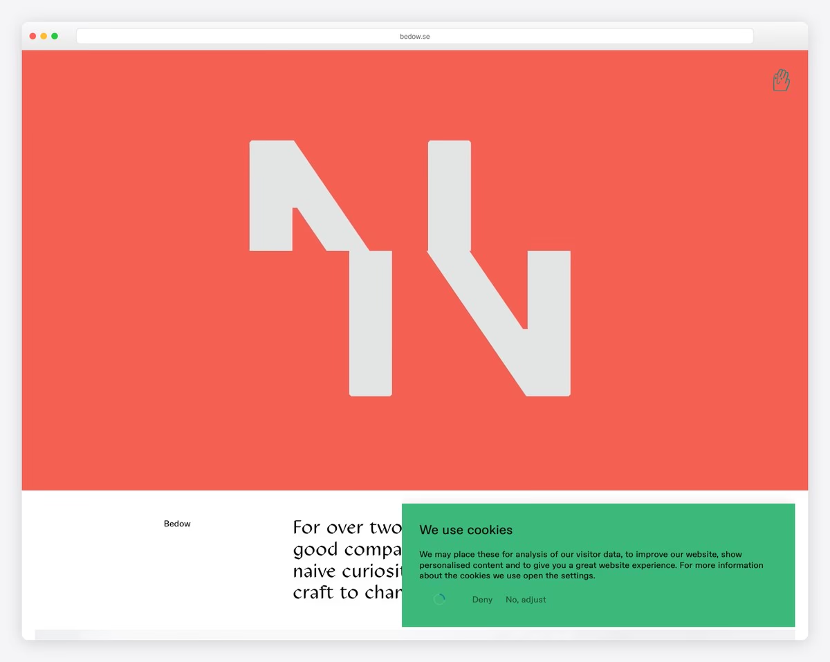
Bedow is a simple page example. The hero section features a highly engaging video that keeps everyone’s attention.
The header features only a sticky, waving hand that opens a full-screen menu overlay upon click. However, the website uses a minimalist footer with links, contact details, and a newsletter subscription widget.
What stands out: Add an engaging video above the fold to trigger visitors’ interest.
3. ETQ
Built with: Shopify
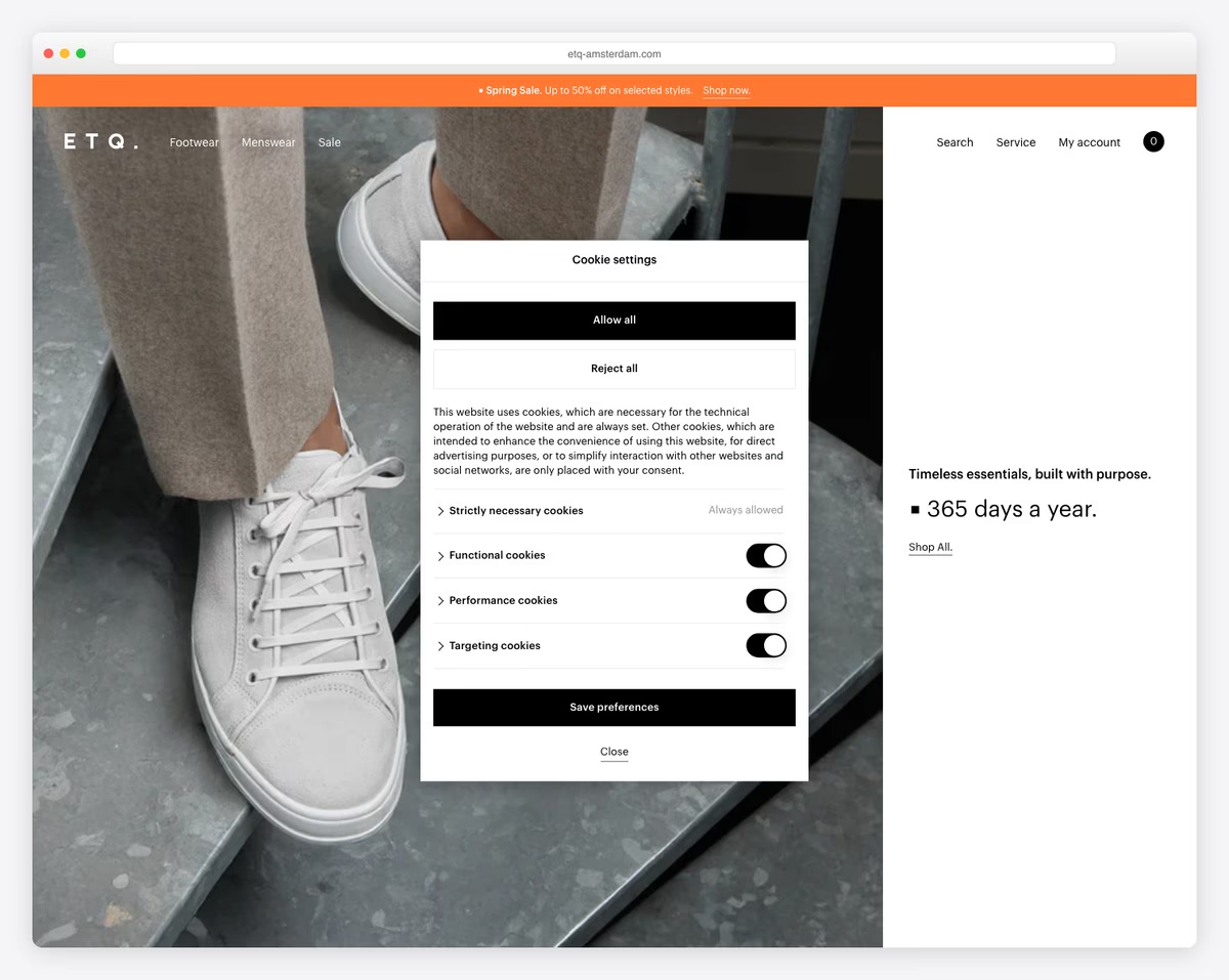
ETQ is a simple, minimalist eCommerce website example featuring a full-screen hero section that combines 2/3 images and 1/3 text, along with a call to action (CTA).
The header (with mega menu) disappears on scroll and reappears when you scroll back to the top.
Moreover, the footer is seamlessly integrated into the main design, featuring a white background to maintain a clean look.
What stands out: For smoother scrolling, consider using a disappearing/reappearing header.
4. Co & Co
Built with: Craft CMS
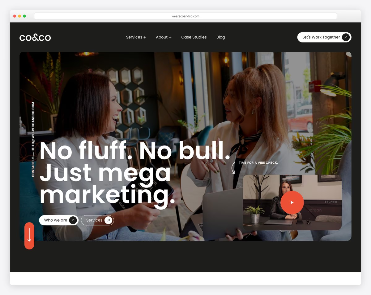
Co & Co welcomes you to their world with a full-screen video background, text, and contact information in a vertical right sidebar.
We also like the choice of background color for sections, which changes between black and white. The font choice and white space make the page much more readable.
Plus, using the testimonial slider with client avatars, names and positions is very impactful.
What stands out: Integrated testimonials into your responsive web design for social proof.
5. Monograph
Built with: Webflow
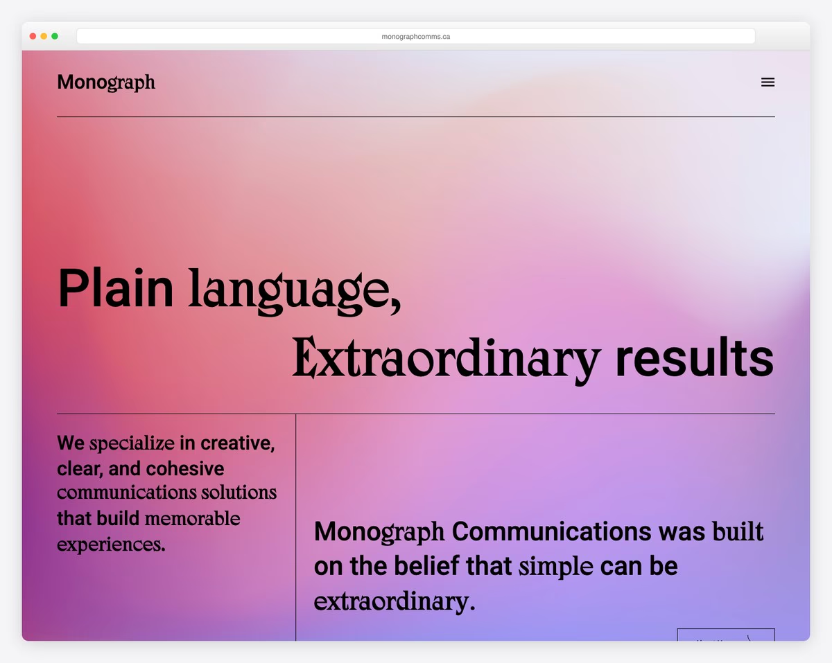
Monograph is a simple website with a gradient background that enhances the user experience.
What’s unique about Monograph is that the website is text-heavy, with no images used. For this reason, they use larger fonts, white space, and line breaks to break up the layout into multiple sections.
What stands out: Don’t feel like using visual content on your website? No problem, go ahead and do a text-only one!
Would you like to explore more Webflow websites? We have a dedicated collection for them.
6. Netil Radio
Built with: Gatsby
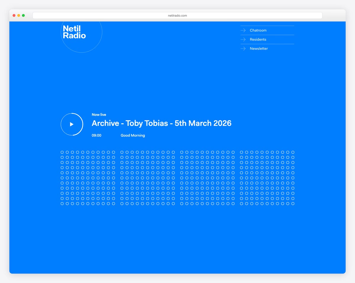
Netil Radio maintains a clean, simple look, using the hero section to promote the next show. The next section features residents; the third is a footer with logo, text and social media icons.
What’s cool is that when you press the play button, all the dots activate and become solid.
What stands out: Even if you plan to create a plain website, you can still add life to it with animation or another creative element.
7. Field
Built with: Craft CMS
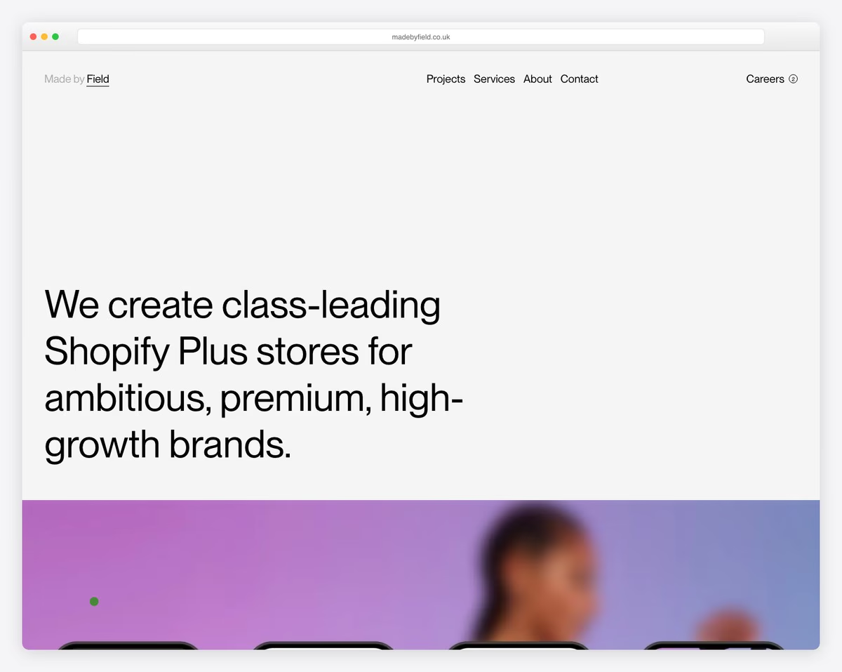
Field has a pleasant content-loading scrolling experience with text, images and enough white space to make everything pop up more.
We appreciate that the header, footer, and base of this simple website share the same background, which contributes to the design’s overall cleanliness. However, the hamburger menu icon in the header opens a full-screen overlay with a dark background.
What stands out: One way to simplify the website layout is to maintain the same background color across all sections (including the header and footer).
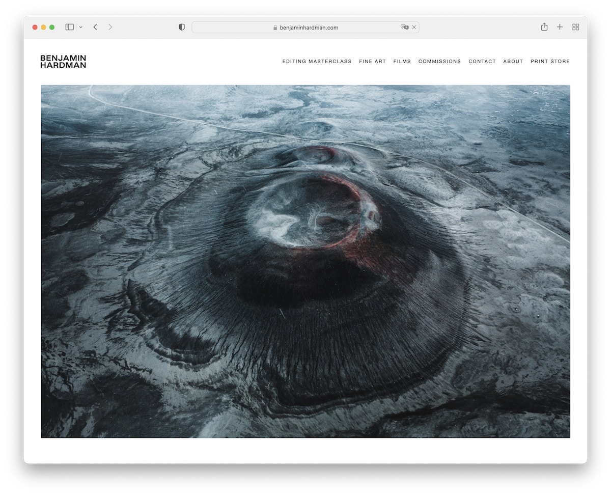
8. Benjamin Hardman
Built with: Squarespace
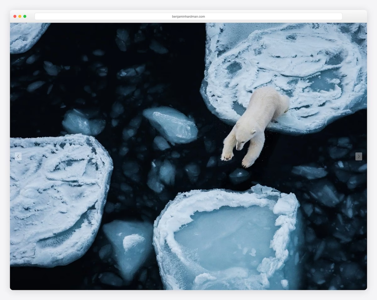
Benjamin Hardman brings out the best in his beautiful photography work with a thoughtful lighting design and a slider.
He only uses a header with a drop-down menu for a more refined search. And, of course, to achieve a truly minimalist appearance.
What stands out: A light, simple design is ideal for highlighting your photographs.
You may also want to check additional photography websites to see gorgeous designs.
9. Scott Snyder
Built with: Squarespace
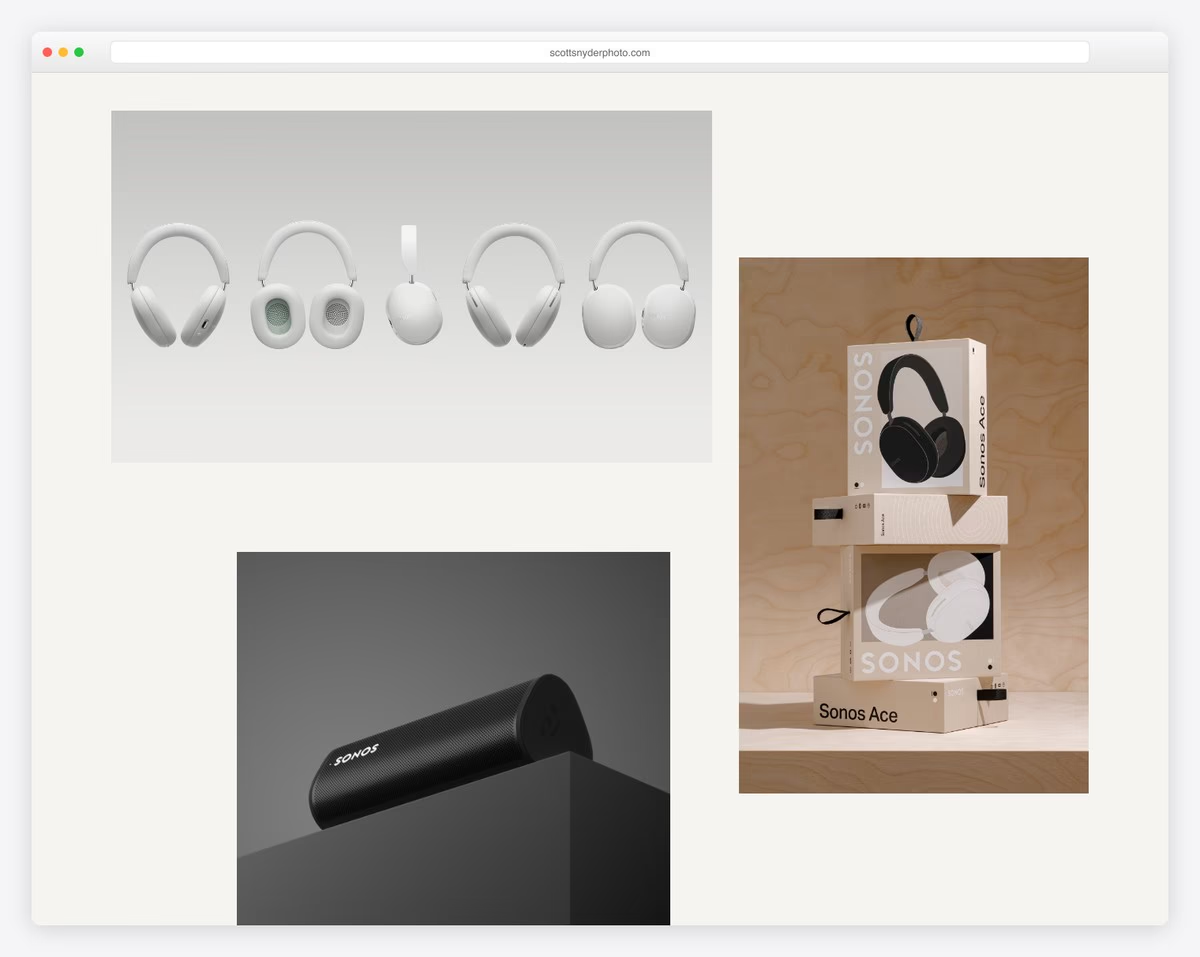
Scott Snyder uses a unique portfolio grid layout that features both static and animated images. Every portfolio item opens the project on an individual page with additional images and text.
Scott also showcases some of the clients he’s most excited about, along with two testimonials and a CTA that directs you to the contact form.
The footer consists of a clickable logo for the home page and copyright text – that’s it.
What stands out: Mix static and animated elements to make your online portfolio website more engaging.
10. Wendy Ju
Built with: Wix
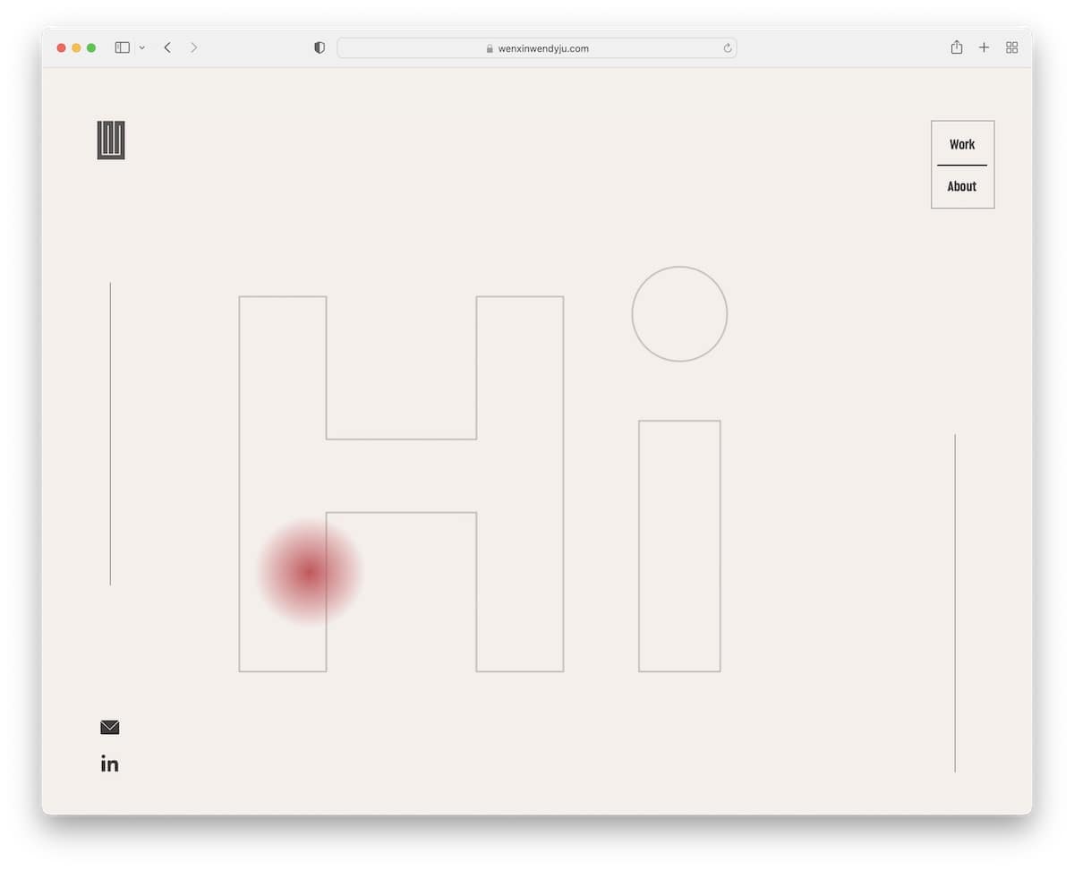
Wendy Ju’s page combines simplicity nicely with a cool text animation above the fold. The home page features an eight-item grid portfolio with moving and static elements, as well as hover effects.
This two-page website features a modern layout with a sticky sidebar containing LinkedIn and email icons.
We can almost say that the website doesn’t have a header or footer, but has a floating corner navigation with only two links.
What stands out: You can use various ways to welcome visitors to your personal website, such as an animated “hello”.
But here are some more websites built on the Wix platform if you’d like to see what else is possible with this builder.
11. Soilboy
Built with: Squarespace
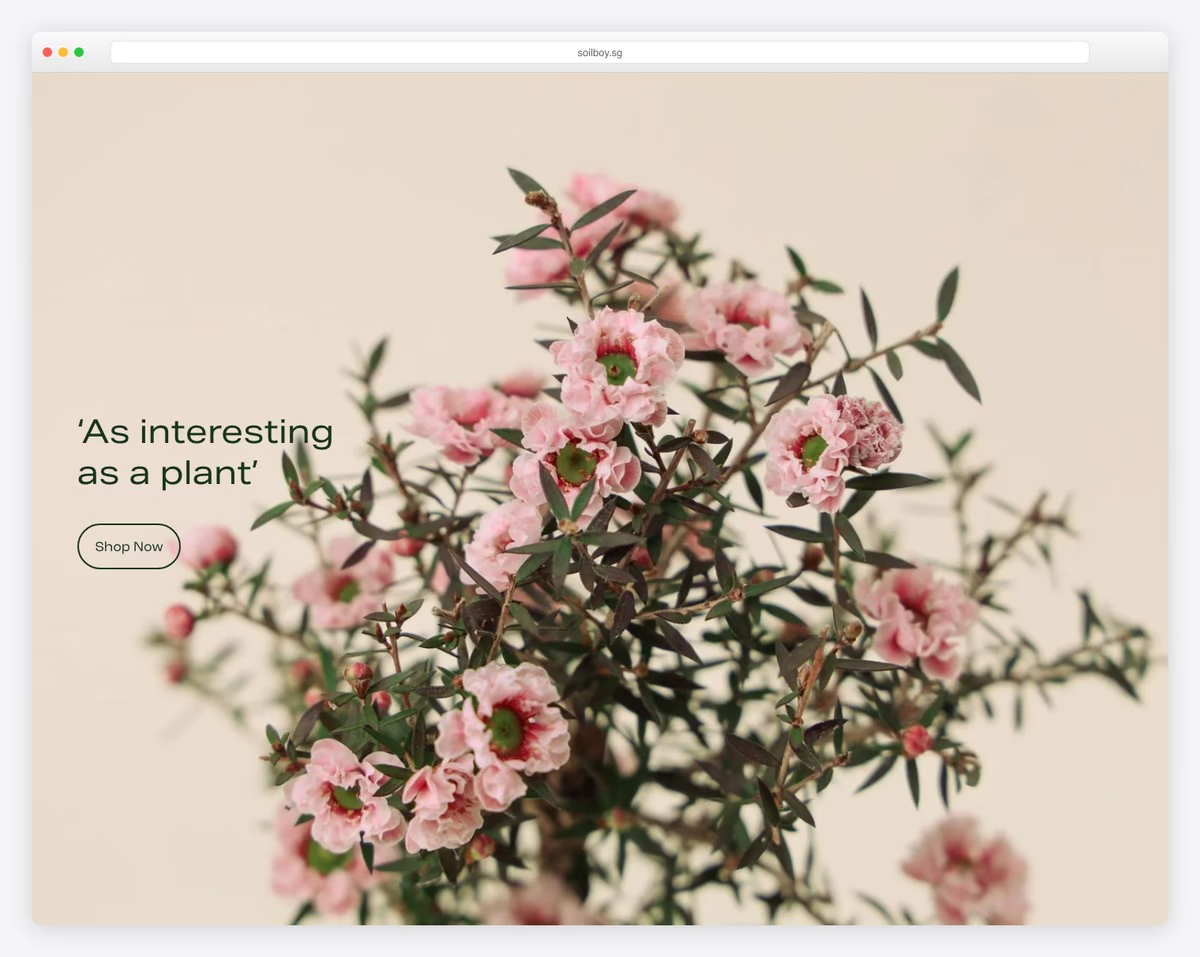
If you’re building a website about selling plants and creating content around plant care, you must check Soilboy.
The choice of background image and the accompanying images work well together, creating a soothing atmosphere.
Soilboy’s basic header disappears when you start scrolling, so your focus is on content and items (but it reappears on the back scroll).
Also, the Instagram feed is one of the cleanest we’ve ever seen!
What stands out: Do you want to add more content to your page? Integrate an IG feed.
12. Steve Benjamins
Built with: Squarespace
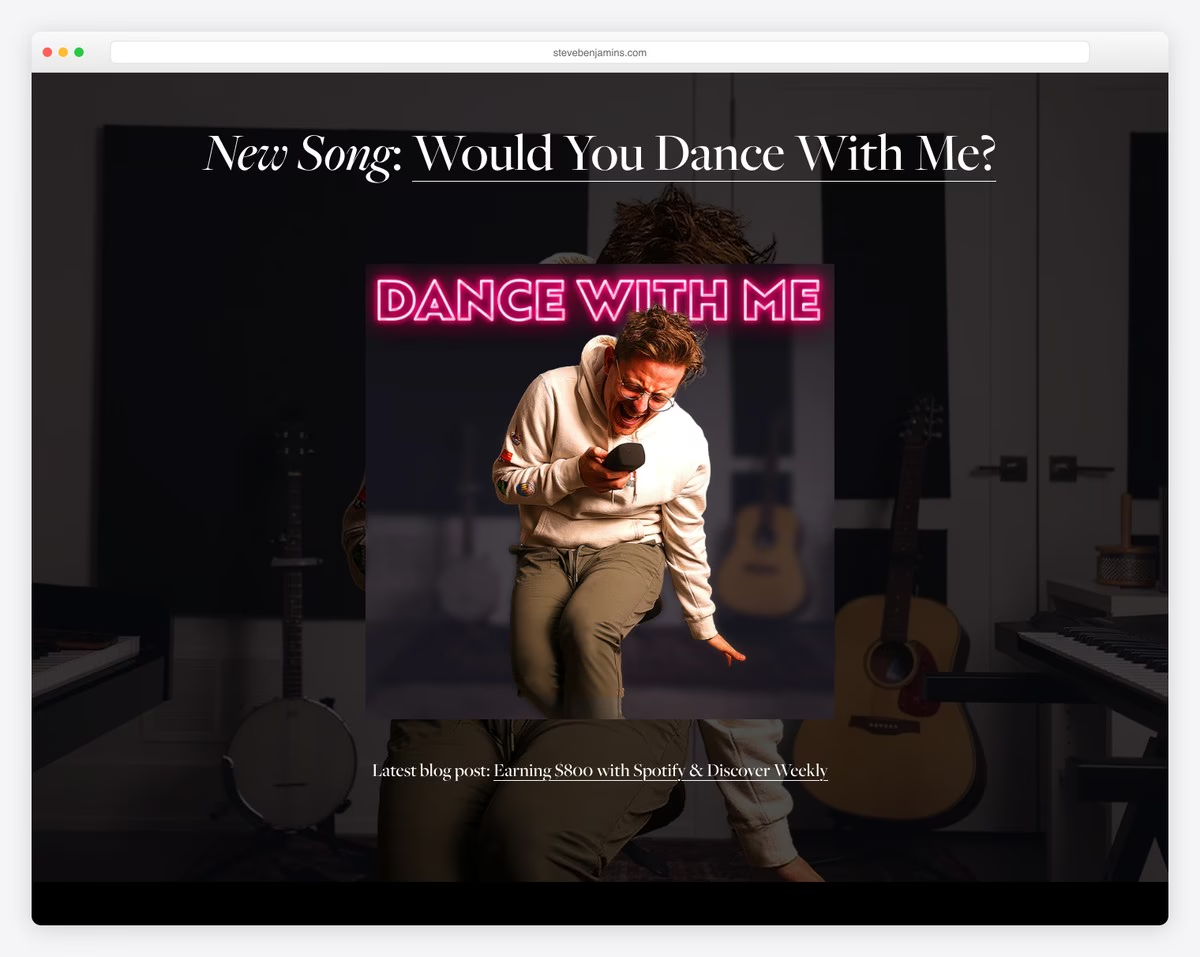
Steve Benjamins run a simple page with dark-ish vibes that has 100% transparent header with menu links and a CTA button to iTunes.
The site’s homepage promotes his new song and opens to a new page with a video, lyrics, and more.
Lastly, Steve uses the footer to promote his vinyl, newsletter subscription form, and social media icons.
What stands out: Use a CTA button in the header, so everyone interested can take immediate action.
13. Ginventory
Built with: Webflow
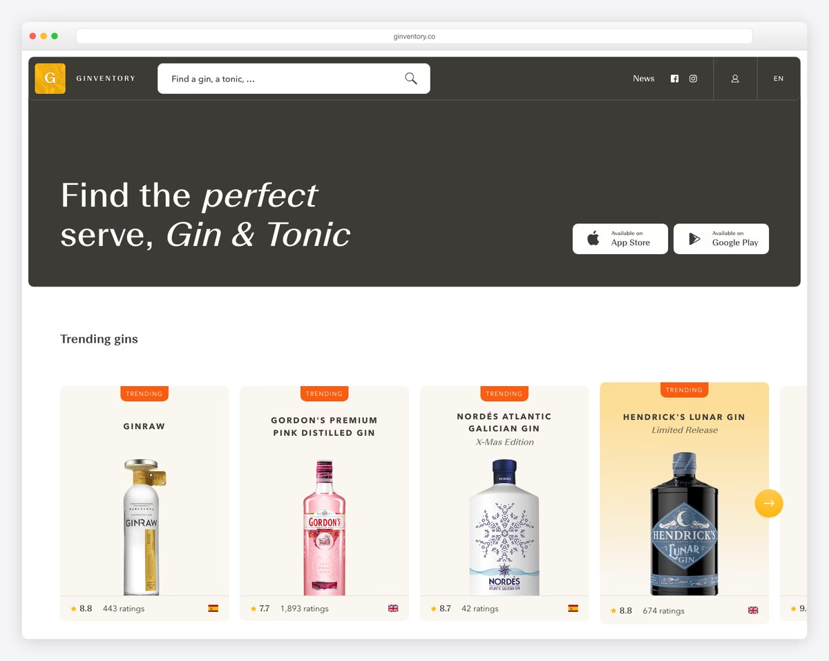
Ginventory is a modern landing page example with a clean design. Its header features social icons, and its footer features them again, along with a contact button.
The rounded corners closely resemble a mobile app experience. Thanks to the iPhone screenshots, you can easily understand what the app offers and how it looks.
To increase downloads, the CTA buttons above the fold and at the bottom (and between content) are essential.
What stands out: Ensure CTA buttons are visible and clickable to drive more potential users to the download page.
14. O’Neil Langan
Built with: Squarespace
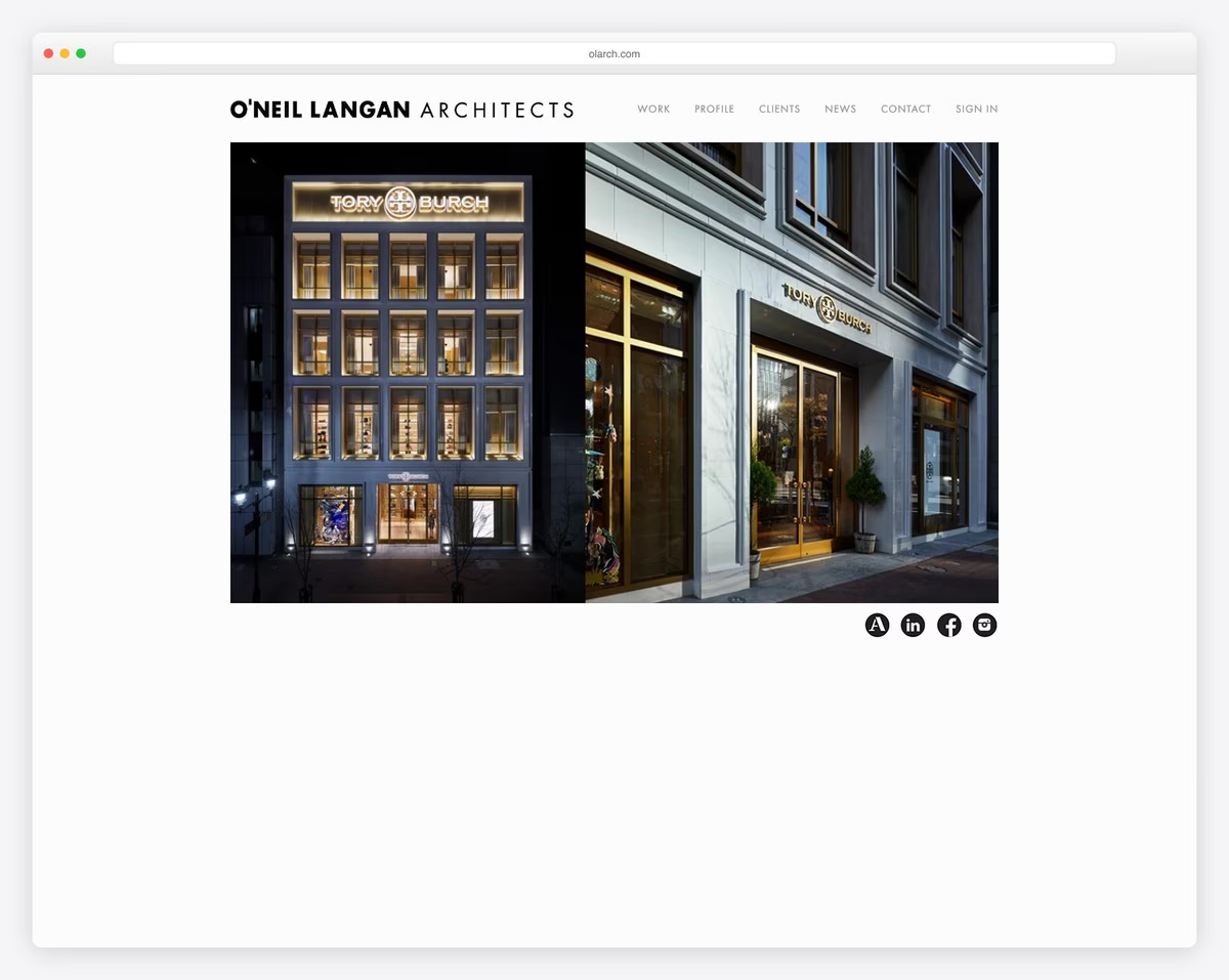
Like Benjamin’s simple website, O’Neil Langan’s home page features an uncluttered header and a slider.
No page on this site has a footer, which elevates simplicity.
Besides the business details and contacts, O’Neil Langan also has Google Maps with a location marker.
What stands out: Integrate Google Maps to showcase your business’s location.
15. Casa Mami
Built with: Squarespace
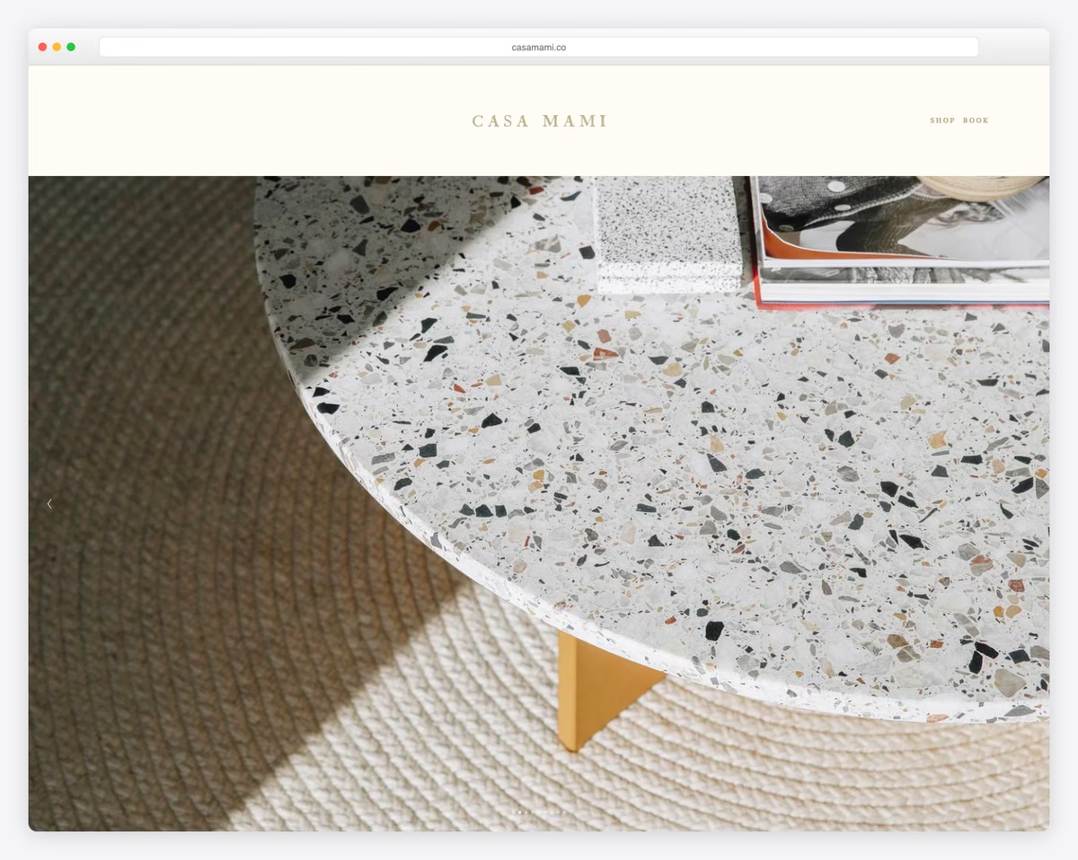
Casa Mami features a large, image-only slider that showcases the beautiful location, making you feel as if you’re there.
This page features extensive white space, a parallax image effect, and a CTA button for bookings (which redirects to Airbnb).
Casa Mami’s website has tiny text, which makes the images stand out more. The renovation page features before-and-after sliders that show the process.
What stands out: Use before/after sliders if you work on redesigns, renovation, body transformations, etc.
16. Oishii
Built with: Shopify
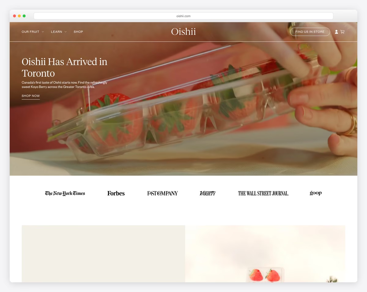
While Oishii’s website has additional elements, its overall design remains simple and clean.
The first is a top-bar notification (which you can close), and the second is a transparent header that floats on scroll.
Moreover, you’ll find a full-width IG feed just above the footer that opens as a lightbox gallery. The footer includes links and a subscription form.
What stands out: Use a top bar notification for special announcements.
17. Meiwen See
Built with: Squarespace
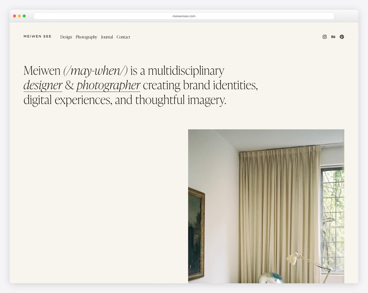
Meiwen See’s portfolio is a masterclass in simple, elegant web design. The large serif typography introduces her as a multidisciplinary designer and photographer, while an understated color palette of cream and black keeps the focus entirely on her work.
The navigation is minimal — just four items — and the hero section pairs the text introduction with a carefully chosen interior photograph, setting a sophisticated tone from the start.
What stands out: Pairing oversized serif typography with a muted color palette creates an effortlessly elegant portfolio.
18. The Sorry Girls
Built with: Squarespace
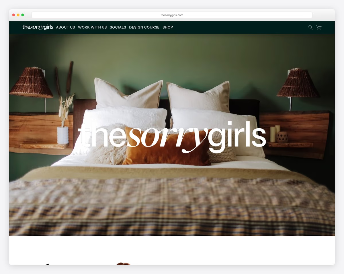
The Sorry Girls keep things beautifully simple with a full-bleed hero image and their logo overlaid in a modern, mixed-weight serif font. The earthy, warm tones of the bedroom scene immediately establish their design-focused lifestyle brand.
Navigation is clean and straightforward with links to their content, collaborations, design course, and shop. The site proves that a single impactful image can be more effective than a cluttered hero section.
What stands out: A single full-bleed lifestyle image with an overlaid logo can create a striking, brand-defining first impression.
Related Posts


what about org.org and net.net? they are much simpler
Thank you for your suggestion. I wouldn’t call them as simple website examples since they are basically a blank pages with minimal HTML and no CSS styling. In my opinion, a real website should have a real functionality, even the most basic one but still more than just a placeholder page.