27 Best Example Websites Built With Wix 2026
Do you want to check out some of the greatest websites built on the Wix platform?
With Wix, anyone can create and design a website to their liking without using any code. It is a cloud-based platform that helps to build websites using a simple drag-and-drop builder.
You can pick a predefined template, adjust it as you like, add images, text, and video, and have a website of your own.
How cool does that sound?
Fun fact: 73 million people in 180 countries have done this before you. From dog walkers to landscape artists, lawyers to event planners, people from every profession have used Wix to build their websites. (Find more by viewing these extensive Wix statistics.)
What do you get with Wix?
Domain, secure hosting, drag and drop builder, scaling to mobiles, galleries, a vast image collection, SEO, 24/7 support, and more.
You can also look for additional features in the 500+ apps that help you include social media, add a countdown to an event, or integrate bookings or contact forms to your website.
I’ve surfed the internet and hand-picked excellent Wix site examples for you to take a closer look at.
These will give you a fair idea of the possibilities with Wix and perhaps a few cues you can pick up to build your website.
This post covers:
- Best Example Websites Built With Wix
- Objective
- Ception
- Puffin Packaging
- Studio Bonny
- Zion Adventure Photog
- Copper & Brass
- Hair Comes The Bride
- Seasons In Colour
- Ok Drugs
- Bridge Investment Group
- Sticky Lemon
- Cottons Restaurant
- Bella & Bloom
- Pien
- TerraLiving
- The Bruin Group
- Black Sheep Bikes
- Kesslers
- Weddings By Shannon
- Fabi Acupuncture
- Frankie
- Elles Bailey
- Blink 182
- S Kaba Consulting
- Wendy Ju
- OrangeYouGlad
- MonetaGo
- Reasons To Use Wix For Your Website
- How To Make A Website With Wix
- FAQ: Wix Website Examples
Best Example Websites Built on Wix Platform
1. Objective
Built with: Wix

The Objective website stands out with its minimalist design, offering a clean and modern user experience.
It features a simple navigation bar with a shopping cart and social media icons for easy access.
Eye-catching animated thumbnails add a dynamic touch, while the innovative, vertically written “Objective” floating button serves both as a unique brand statement and a practical back-to-top function.
The website’s footer also includes a handy subscription form, enhancing user engagement and communication.
Note: Whenever you are unsure about creating the ideal website design, opt for minimalism. It simply works!
Why we chose it: Objective is an ideal Wix website example for its blend of minimalist design, user-friendly features and innovative elements.
2. Ception
Built with: Wix
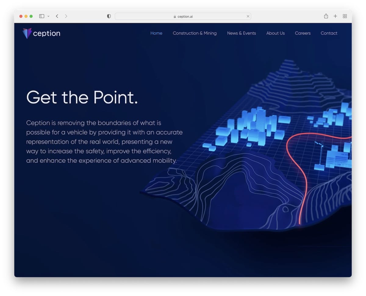
The Ception website has a sleek, professional look and intuitive functionality.
It features a sticky navigation bar that ensures easy access to all sections at any scroll point.
Parallax image effects add depth and a modern flair to the user experience.
The site’s footer includes business and contact details along with a practical contact form, making it simple for visitors to connect with and engage with the business.
Note: Make a contact form always available by placing it in the footer.
Why we chose it: Ception rocks a professional design, engaging visuals, and user-friendly navigation and contact features.
You also don’t want to miss these epic business websites for more inspiration.
3. Puffin Packaging
Built with: Wix
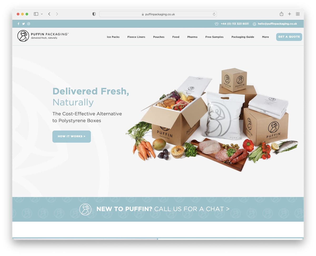
The Puffin Packaging website excels with its engaging and user-friendly layout. It features a floating top bar that displays essential contact details and social media icons.
The main menu (which also floats) includes a prominent Call-To-Action (CTA) button, enhancing user interaction.
The site captivates with cool scrolling effects and dynamic carousels, showcasing content effectively.
A dark, contrasting footer offers quick links and business details, creating a visually appealing and informative end to the user journey.
Note: Add a top bar to include email, telephone number, etc.
Why we chose it: Puffin Packaging has an engaging design, floating navigation elements and dynamic visuals.
4. Studio Bonny
Built with: Wix
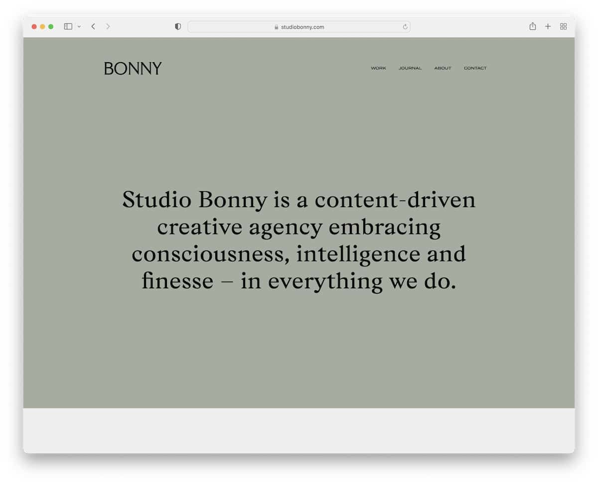
Studio Bonny’s website captures the attention with its strikingly bold, text-only above-the-fold section, paired with a transparent header for a sleek, modern look.
It captivates users with smooth scrolling animations that enhance the browsing experience.
This small business site features animated thumbnails that add a lively, interactive element to the display of work.
Embracing minimalism, the footer is exceptionally clean. It consists solely of copyright information and an Instagram icon, emphasizing a clutter-free, visually focused design ethos.
Note: Don’t be afraid to make a solid statement with a text-only above-the-fold section. (Sometimes, you can achieve even better results than with visuals!)
Why we chose it: Studio Bonny exemplifies a top Wix website with its bold, minimalist design, engaging animations, and clean, focused user interface.
5. Zion Adventure Photog
Built with: Wix
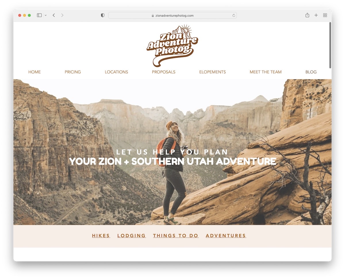
Zion Adventure Photog’s website uniquely engages visitors with a popup notification for a free gift/subscription, immediately capturing interest.
It employs a stunning parallax effect, adding depth and movement to the visual experience. A top bar notification offers timely information or promotions, enhancing user engagement.
The site effectively uses carousels for an interactive content presentation alongside a testimonials slider that adds credibility.
Its two-column footer features quick links for easy navigation and a dedicated area for the free gift/subscription, balancing utility with marketing.
Note: Incorporating parallax effect sections is a great way to enhance your website’s user experience.
Why we chose it: Zion Adventure Photog showcases engaging popups, dynamic parallax effects, and a well-organized footer that blends functionality with marketing.
6. Copper & Brass
Built with: Wix
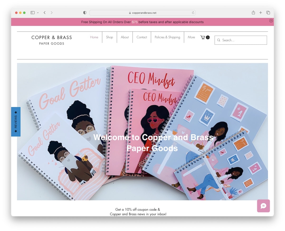
Copper & Brass’s website immediately draws visitors in with a discount popup, offering an enticing start to the browsing experience.
It features a floating header and top bar for constant, easy navigation access. The site’s search functionality displays live results, enhancing user interaction and efficiency.
A sticky contact and rewards widget remain accessible as users scroll, encouraging engagement.
This eCommerce website rounds off with a minimalist footer, emphasizing a clean, user-friendly design while maintaining essential information and links.
Note: Keep the menu bar always accessible by sticking it to the top of the screen for a boost in UX.
Why we chose it: Copper & Brass has an engaging discount popup, user-friendly navigation elements, live search results, and a seamless blend of functionality with a minimalist design.
7. Hair Comes The Bride
Built with: Wix
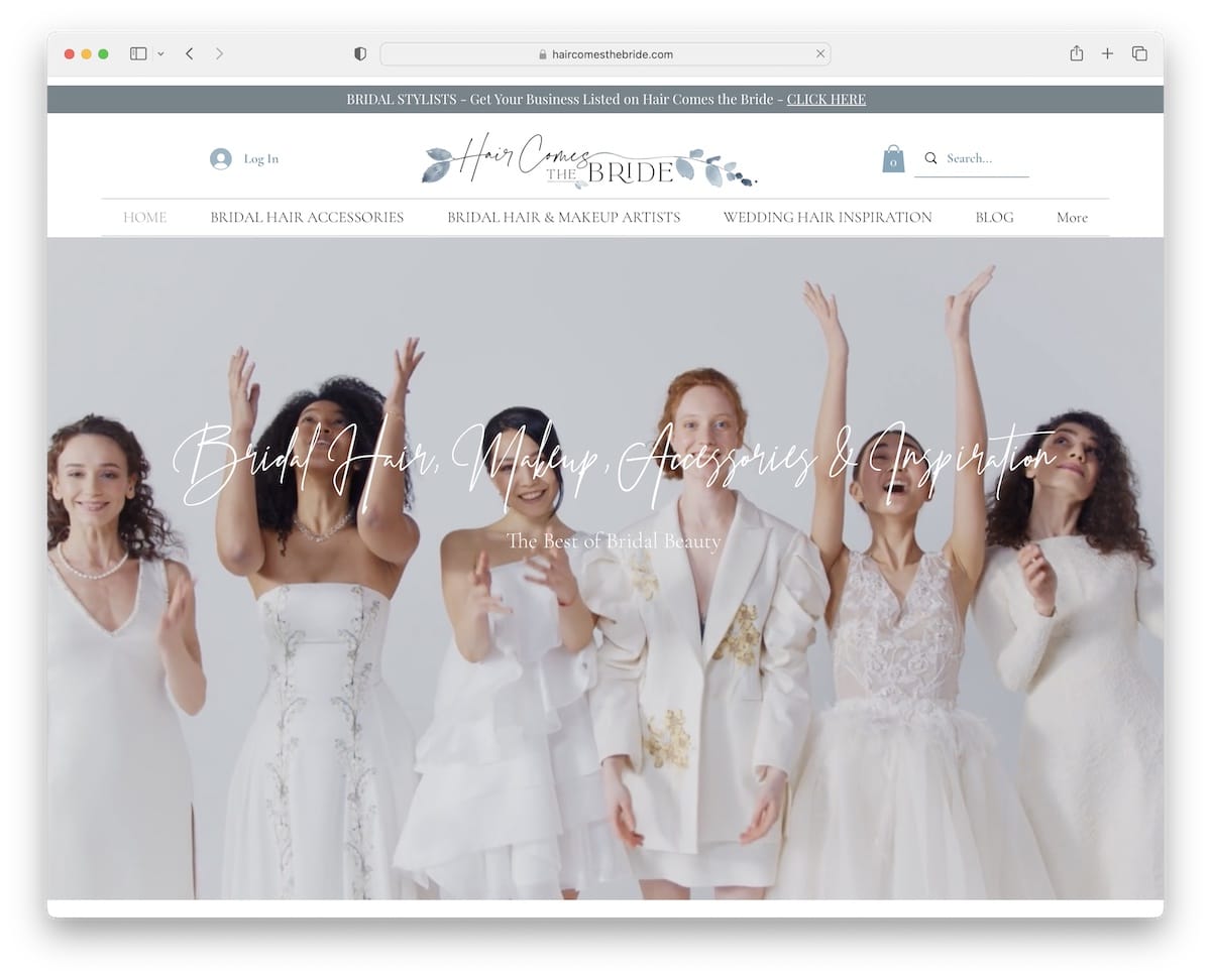
Hair Comes The Bride’s wedding website charms visitors right away with a catchy video banner above the fold.
The header is efficiently designed with a log-in icon, a search bar, and a drop-down menu for effortless navigation.
As users scroll, content loads smoothly, maintaining engagement and interest.
The site also employs a subtle parallax effect, adding a layer of depth and sophistication to the browsing experience, enriching the overall look and user interaction.
Note: Incorporating a video banner or background is a great solution to creating a striking first impression.
Why we chose it: Hair Comes The Bride features an engaging video banner, intuitive menu, and dynamic content loading to up the overall user experience.
8. Seasons In Colour
Built with: Wix

The Seasons In Colour website is notable for its elegant simplicity, focusing on home decor ideas.
It features a minimalist header and footer, ensuring a clean and uncluttered user interface.
A prominent banner effectively promotes the latest home decor trends and ideas, capturing visitor interest.
Moreover, on the blog page, a secondary menu provides easy navigation through various topics. Additionally, including social media icons in the navigation bar facilitates easy connectivity.
Note: Using the same background color for the header, base and footer can create a unified structure, pleasant to the eye.
Why we chose it: Seasons In Colour combines a minimalist design, an engaging large banner for home decor promotion, and user-friendly navigation features.
9. Ok Drugs
Built with: Wix

The Ok Drugs website grabs the curiosity with its sleek and modern design.
Its header and footer are styled for maximum impact yet simple, with the footer featuring a darker theme for better visibility and distinction.
A noticeably placed contact form on the homepage makes it easy for visitors to reach out, enhancing user engagement.
The navbar is efficiently designed with log-in and cart icons for an easy shopping experience.
This Wix site combines aesthetics with practicality, catering to a user-friendly browsing experience.
Note: Integrate a shopping cart icon in the navigation bar so it’s more accessible.
Why we chose it: Ok Drugs showcases a well-designed Wix website with its sleek layout, standout footer, convenient contact form (on the home page), and practical navigation icons.
10. Bridge Investment Group
Built with: Wix
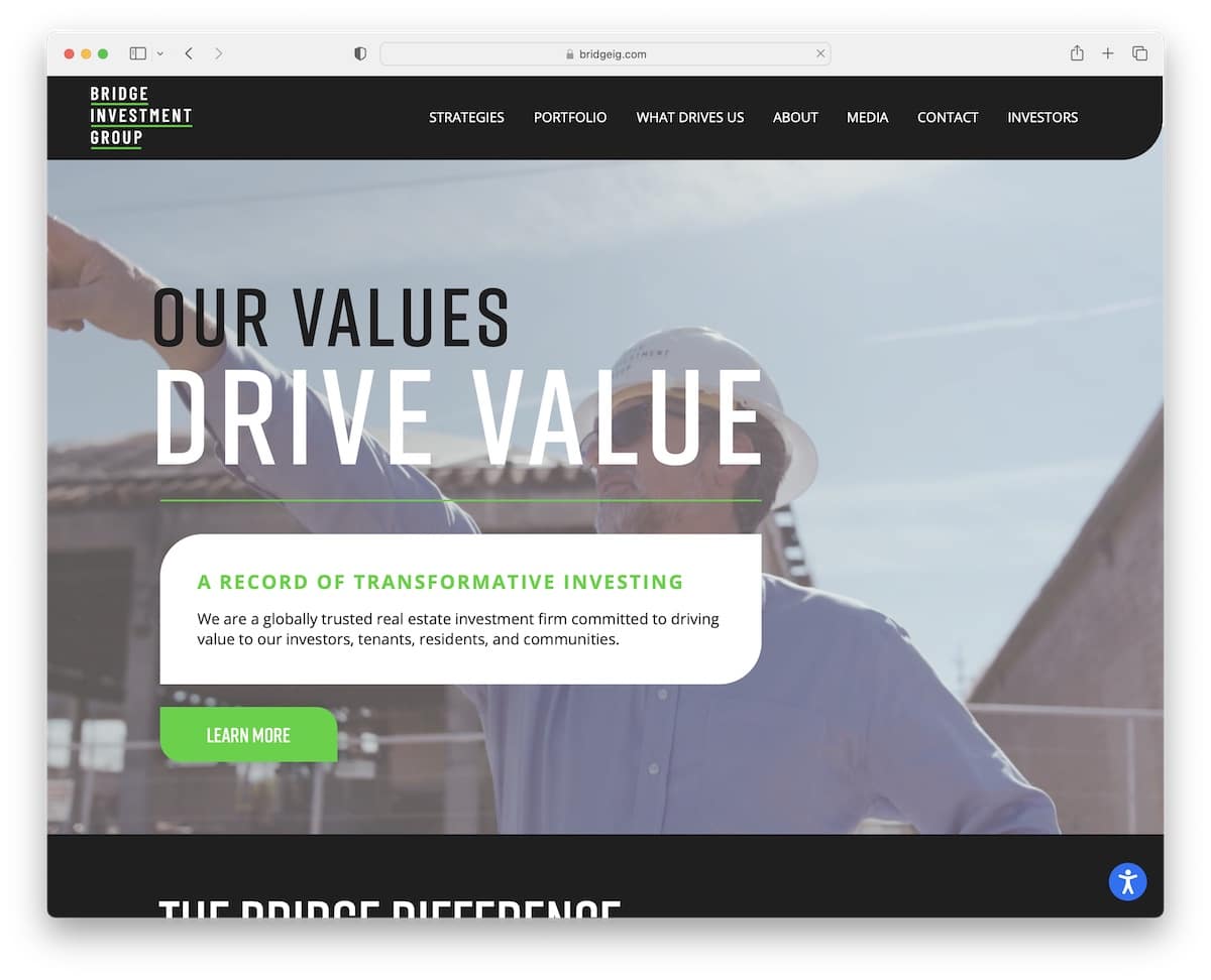
The Bridge Investment Group website features an immersive video background, setting a dynamic tone.
Its innovative header cleverly disappears and reappears based on scrolling direction, enhancing usability and screen space.
A standout feature is the slider, which has a split-screen design. It showcases visual content on one side and informative text with a CTA button on the other, efficiently balancing visuals and information.
An accessibility configurator is included, ensuring the site is user-friendly for all visitors.
Note: Do you want to make your Wix website accessible to more people? Then integrate an accessibility configurator so everyone can adjust your site’s appearance accordingly.
Why we chose it: Bridge Investment Group’s website sets itself apart with its dynamic video background, smart scrolling header, innovative split-screen slider, and accessibility configurator.
11. Sticky Lemon
Built with: Wix
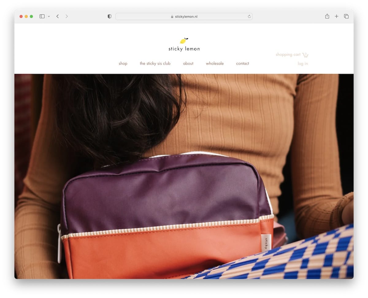
The Sticky Lemon website contains a large slider that immediately fetches attention with its bold visuals.
Its simple layout is user-friendly, ensuring easy navigation. Unique hover effects reveal secondary images, adding an interactive layer to browsing.
An embedded video that auto-plays on the site provides an engaging multimedia experience.
Also, integrating an Instagram feed with popup posts seamlessly connects social media content, enriching the user’s journey and offering a dynamic glimpse into the Sticky Lemon world.
Note: Mix video and image content by making your Wix website more engaging and interactive.
Why we chose it: Sticky Lemon represents a compelling Wix website with its large slider, simple yet interactive layout, auto-play video, and integrated Instagram feed.
12. Cottons Restaurant
Built with: Wix

Cottons Restaurant’s website delights with its vibrant and colorful design, perfectly capturing its lively atmosphere.
A prominent “Find a Table” button in the navbar makes reservations straightforward and accessible.
The use of parallax sections adds depth and a dynamic visual experience. Unique multi-color background sections provide a creative twist, enhancing this restaurant website‘s aesthetic appeal.
Google Maps integration effectively displays the restaurant’s location, and a convenient back-to-top button ensures easy navigation back to the top.
Note: Use colors and other vibrant inclusions in your website to speak your brand’s voice.
Why we chose it: Cottons Restaurant amazes with its colorful design, easy reservation access, engaging parallax sections, and practical Google Maps integration.
13. Bella & Bloom
Built with: Wix
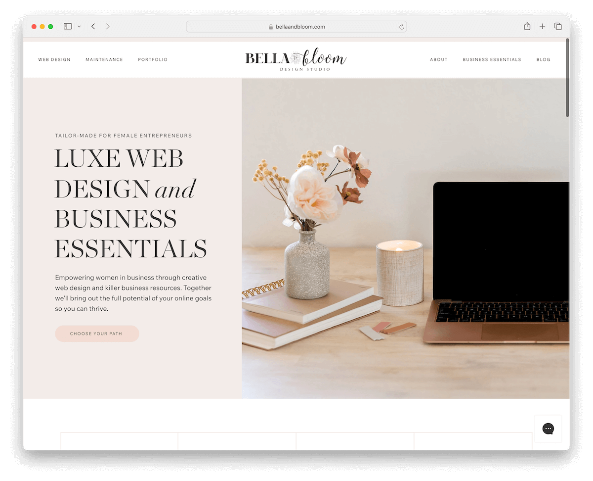
Bella & Bloom’s website radiates a clean and feminine charm, appealing to its target audience.
It features a floating header for seamless navigation, enhancing the user experience. A sticky live chat widget is strategically positioned, offering instant assistance and engagement.
The inclusion of a testimonial slider lends credibility and a personal touch.
Furthermore, beautiful parallax backgrounds add depth to the design. At the same time, an Instagram feed, placed below a practical three-column footer, integrates social content, further enriching the site’s interactive and stylish appeal.
Note: Express your personality through the website’s tone and design.
Why we chose it: Bella & Bloom’s website intrigues us with its clean, feminine design, convenient features like a sticky chat widget, and engaging elements such as a testimonial slider and IG feed.
You may also be interested in these fantastic artist portfolio websites.
14. Pien
Built with: Wix

Pien’s website breaks the mold without a traditional header and footer, opting for a sleek one-page layout.
It features an original framed header showcasing some portfolio work, immediately drawing attention to the site’s creative essence.
A lightbox gallery allows for an immersive view of images, while a vertical slider adds a distinctive touch to content presentation.
The site is rounded off with a simple yet effective contact form, which ensures easy communication while maintaining its minimalist and innovative aesthetic.
Note: A one-page website layout can be a very effective way of promoting an online business without overwhelming potential clients.
Why we chose it: Pien’s website is exceptional for its unconventional one-page layout, immersive lightbox gallery, and unique vertical slider, showcasing creative and efficient web design.
15. TerraLiving
Built with: Wix

TerraLiving’s website strikes an elegant balance with its bold floating header and minimalist design, offering a clean, sophisticated UX.
The sticky chat widget in the bottom right corner adds a layer of interactivity and accessibility for visitors.
Moreover, its boxed layout provides a structured, neat visual appeal.
Carousel reviews on the site lend credibility and a personal touch. At the same time, the embedded Instagram feed seamlessly integrates social content, enriching the site with a dynamic, up-to-date view of the brand’s presence.
Note: Add more content to your website while showing how sociable you are by integrating social media, like Instagram.
Why we chose it: TerraLiving’s website is notable for its bold floating header, minimalist aesthetic, interactive chat widget, and engaging features like carousel reviews and embedded Instagram.
16. The Bruin Group
Built with: Wix
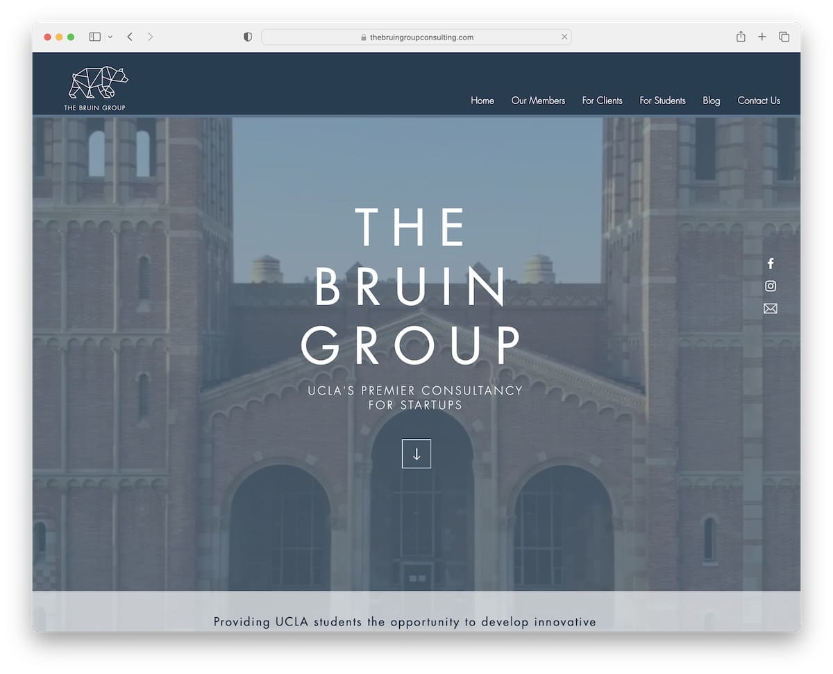
The Bruin Group’s website spices things up with a captivating video background setting an engaging tone.
It includes intuitive scroll-down and back-to-top buttons, facilitating easy navigation through the content.
The site’s masonry image grid presents content in an aesthetically pleasing, organized fashion, adding to the visual appeal.
Additionally, a newsletter subscription widget is strategically placed in the footer, encouraging visitors to stay connected and updated.
Note: Boost your website’s liveliness by incorporating a video background.
Why we chose it: The Bruin Group’s website fascinates with its engaging video background, user-friendly navigation buttons, stylish masonry image grid, and convenient newsletter subscription feature.
17. Black Sheep Bikes
Built with: Wix
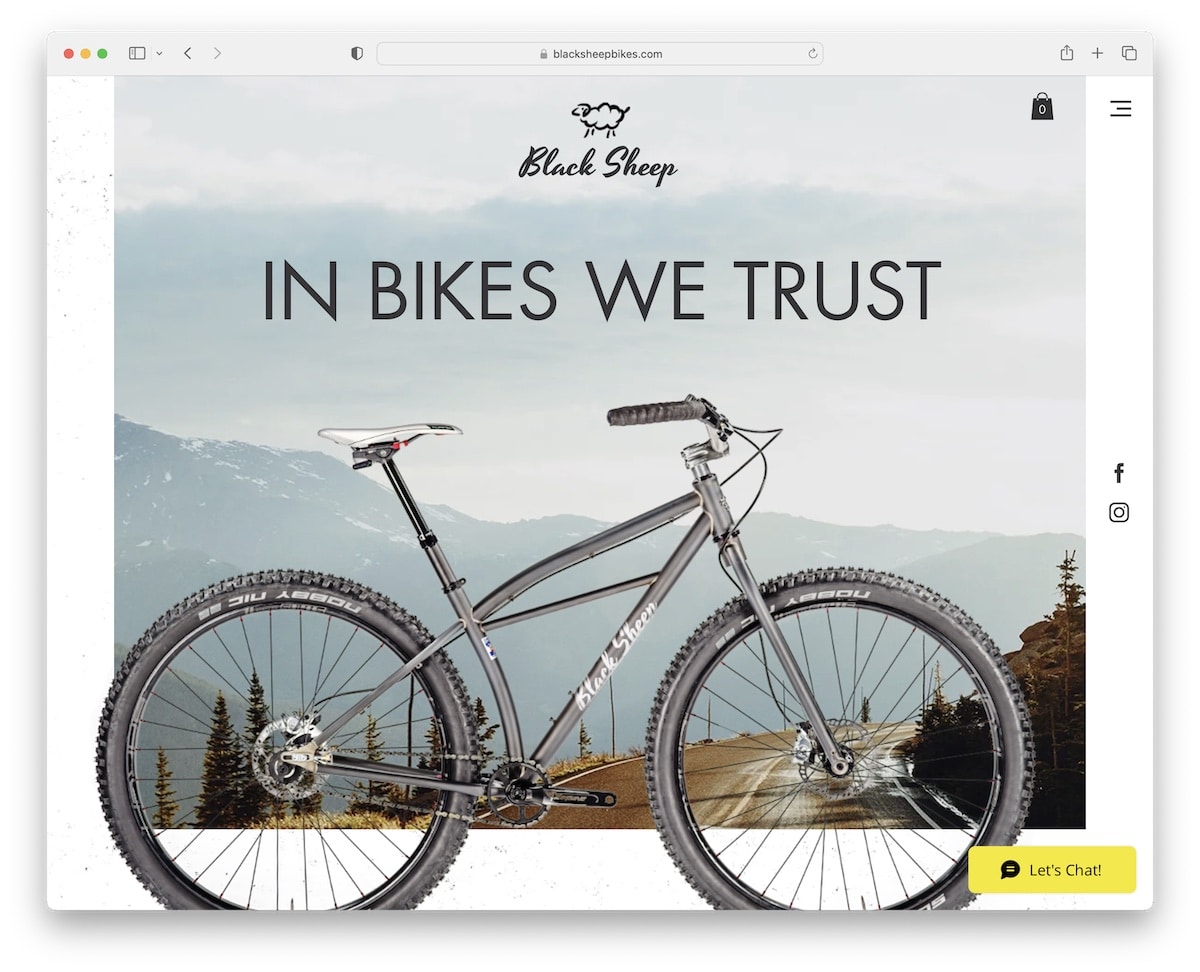
Black Sheep Bikes’ website provides a modern, immersive navigation experience with its full-screen hamburger menu overlay.
It features striking parallax images that add depth and motion to the visual layout. A lightbox gallery showcases their products in detail, enhancing the user’s engagement.
Floating social media icons for Facebook and Instagram on the right side of the screen ensure constant, easy access to their social platforms.
Including an Instagram feed and a user-friendly contact form further enriches the site’s functionality and appeal.
Note: Create a clean and minimal header with a hamburger menu icon.
Why we chose it: Black Sheep Bikes brings a full-screen menu, engaging parallax images, and convenient social media integration.
18. Kesslers
Built with: Wix
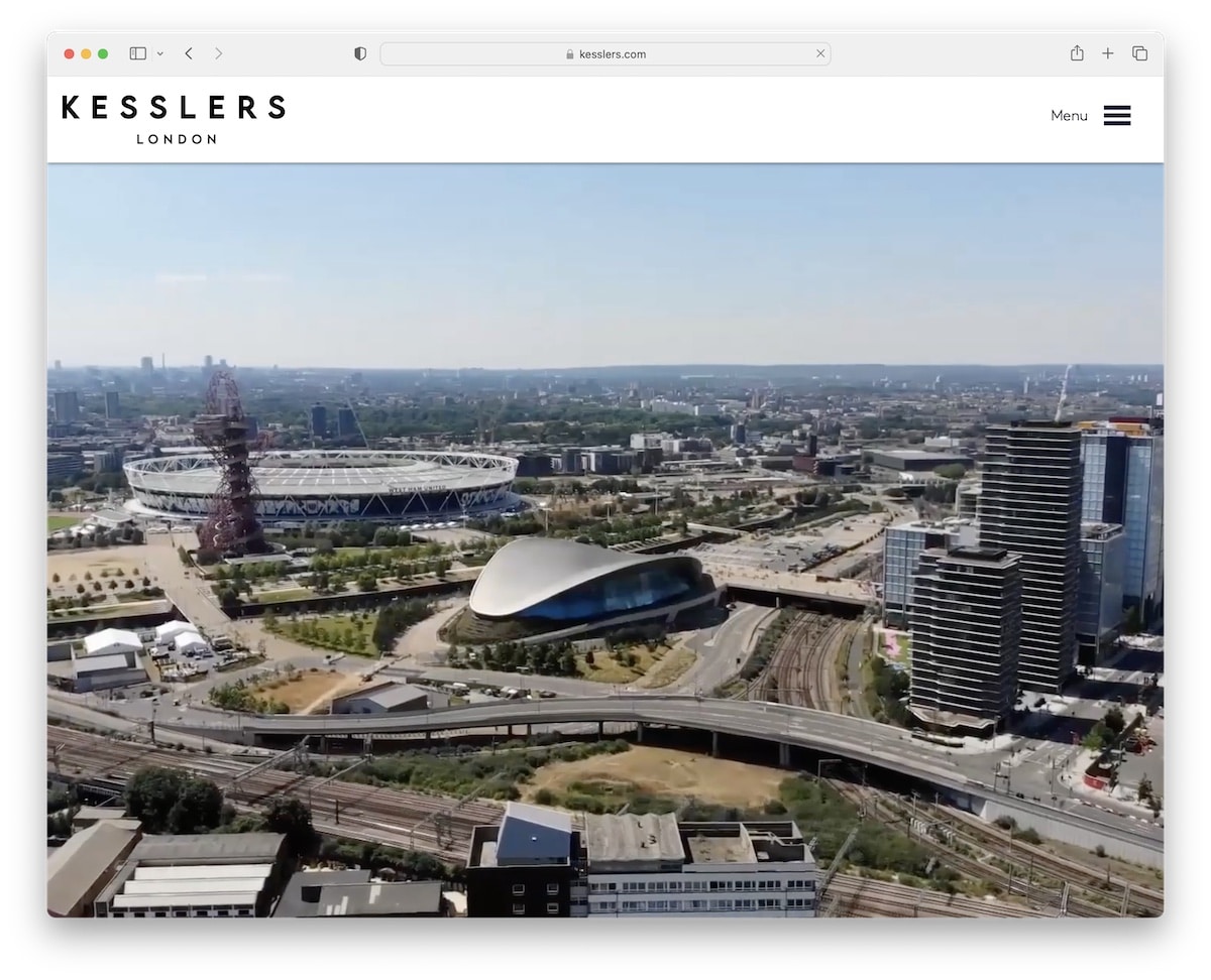
Kesslers’ website, a neat Wix example, opens with an impressive full-width video banner above the fold, free of text or CTAs, for a visually striking entrance.
The navigation is streamlined through a hamburger menu, enhancing the minimalist aesthetic. Engaging scrolling animations add dynamism to the browsing experience.
The site employs a captivating parallax effect, bringing a sense of depth. Its design alternates between contrasting dark and light background sections, creating an intriguing and elegant user interface.
Note: Create a distraction-free first impression with a video banner, free from text, links and CTAs.
Why we chose it: Kesslers’ website has a striking full-width video banner, a minimalist hamburger menu, and engaging scrolling animations with contrasting backgrounds.
19. Weddings By Shannon
Built with: Wix
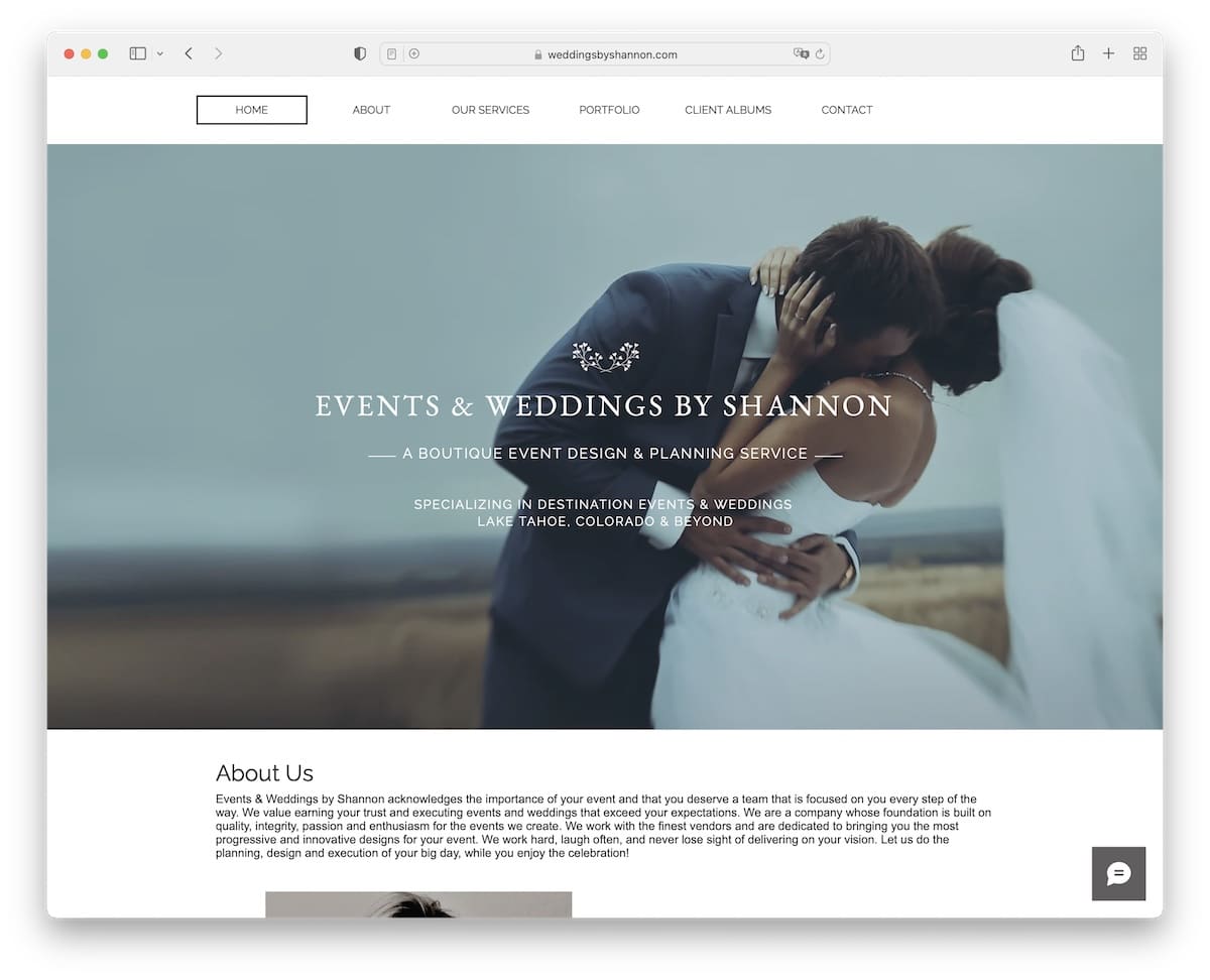
Weddings By Shannon’s website promotes a clean and elegant design, perfect for showcasing wedding photography.
Large, high-quality photographs dominate the layout, instantly engaging visitors. The lightbox portfolio gallery allows users to view images in full detail, adding to the immersive experience.
Its semi-one-page layout ensures a seamless scroll through different sections. Moreover, the site’s full-width structure maximizes screen space, providing a modern and spacious feel that elegantly highlights the portfolio’s visual storytelling.
Note: As a photographer, include large, high-quality images and a lightbox feature for a better viewing experience.
Why we chose it: Weddings By Shannon’s website excels with its clean design, stunning large photography, an immersive lightbox gallery, and a user-friendly semi-one-page layout.
20. Fabi Acupuncture
Built with: Wix
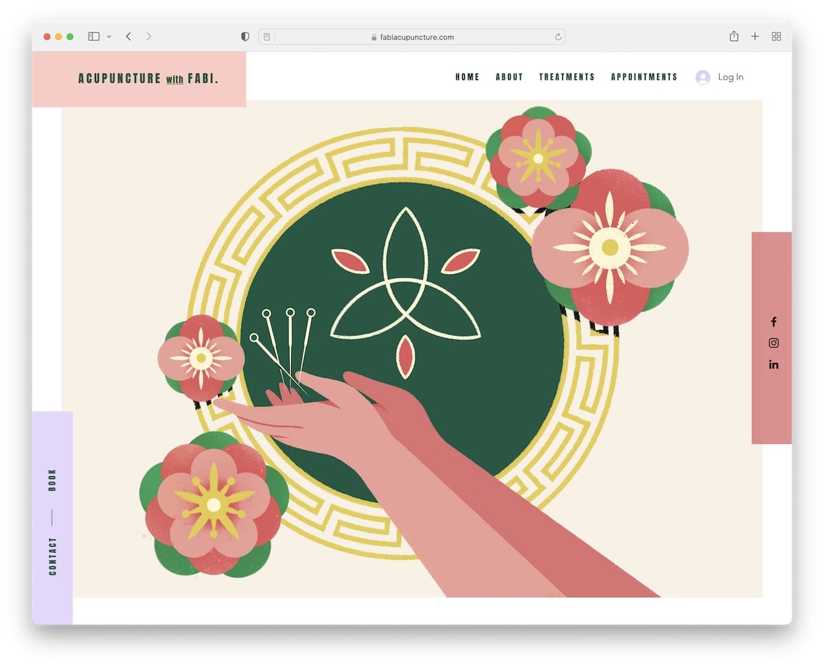
Fabi Acupuncture’s vibrant website exudes energy and warmth, inviting visitors with its colorful and lively appearance.
Key features include floating social media icons for easy sharing and engagement, and a convenient contact/booking and navigation bar for effortless user interaction.
The site integrates Google Maps, making location finding a breeze. A subscription form is strategically placed for ongoing client engagement, while social and email login options simplify the user experience.
Note: If you have a members’ area, make it easy to log in or register using social media profiles.
We chose it: Fabi Acupuncture’s website captures attention with its vibrant design, user-friendly features like floating social icons and Google Maps integration, and convenient social and email login options.
21. Frankie Ratford
Built with: Wix
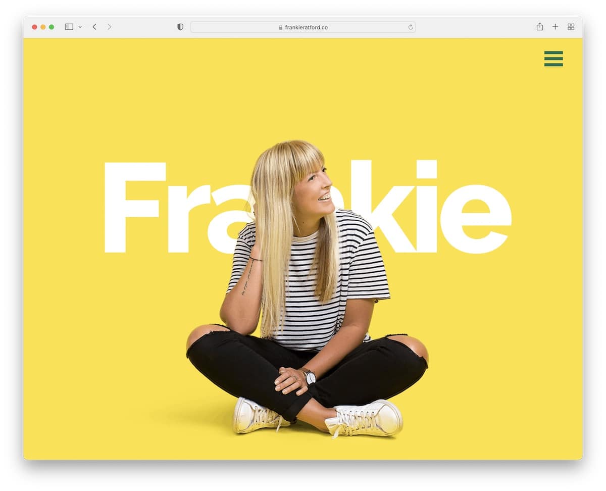
Frankie Ratford’s website is enlivened by cool parallax effects and a vibrant color scheme that captures attention and reflects a creative spirit.
It has a hamburger menu smoothly slides in from the right, contributing to the header’s simplicity.
Content is cleverly revealed as users scroll, creating an engaging and interactive experience.
The website concludes with a basic yet effective footer, featuring copyright information, a nod to its creation with Wix, and an Instagram icon for easy social connection.
Note: You can use the parallax effect for images and text; don’t feel limited.
Why we chose it: Frankie Ratford’s website wows with engaging parallax effects, vibrant colors, and interactive scroll-reveal content, showcasing creative and effective Wix design.
22. Elles Bailey
Built with: Wix
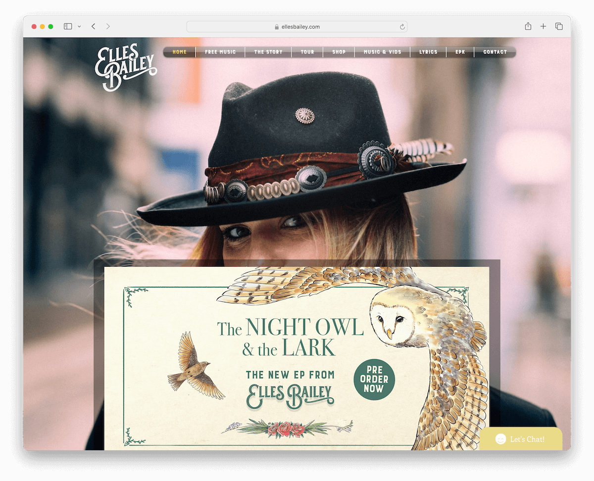
Elles Bailey’s musician website captures the essence of her music with a stunning parallax background, adding depth and movement.
An embedded video and playlist offer visitors an immediate taste of her artistry. The site thoughtfully lists tour dates, keeping fans informed and engaged with RSVP and ticked buttons.
Social icons are conveniently placed, encouraging visitors to connect on various platforms. A newsletter subscription option lets fans stay updated, while a chat widget provides interaction, making the website a hub for her musical journey and fan engagement.
Note: Let your fans enjoy your must on your website with embedded videos and playlists.
Why we chose it: Elles Bailey’s website makes a statement with its immersive parallax background, embedded music video, comprehensive tour date listing, and interactive features like social icons and a chat widget.
23. Blink 182
Built with: Wix
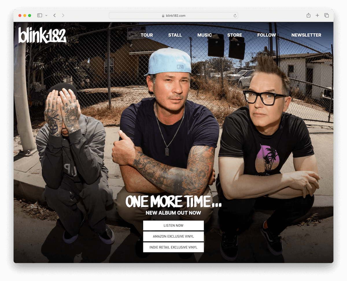
The Blink 182 website embodies a straightforward and effective design, perfect for fans and newcomers alike.
It features a clean and basic menu, ensuring ease of navigation. Dominating the fold is a captivating band image, instantly engaging visitors.
The homepage thoughtfully presents a comprehensive list of tour dates, making it convenient for fans to follow the band’s schedule.
The footer is streamlined, containing only essential links.
While social media and music are on separate pages, integrating some on the home page could enhance user experience by providing direct access to these key aspects.
Note: Bring the entire tour date with links to RSVP and tickets to the home page (or at least make it very easy to access).
Why we chose it: The Blink 182 website has a clear, user-friendly design, prominent band imagery, comprehensive tour information, effectively catering to fans’ needs.
24. S Kaba Consulting
Built with: Wix
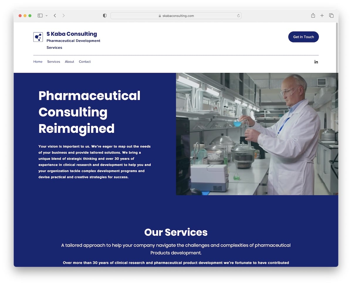
S Kaba Consulting’s website exudes professionalism with its one-page structure, offering a seamless and coherent user experience.
The above-the-fold section features a modern split-screen design: engaging text on the left introduces the company, while an informative video on the right visually articulates their services.
This layout efficiently utilizes screen space, providing immediate insight into the firm’s expertise.
A strategically placed contact form at the bottom of the page invites easy engagement, rounding off the site with a practical, business-oriented approach.
Note: Make your website speak professionalism through the right choice of colors, text and visuals.
Why we chose it: S Kaba Consulting’s website is an example of professional and efficient design, with its (almost) one-page structure, split-screen layout above the fold, and a convenient contact form.
25. Wendy Ju
Built with: Wix
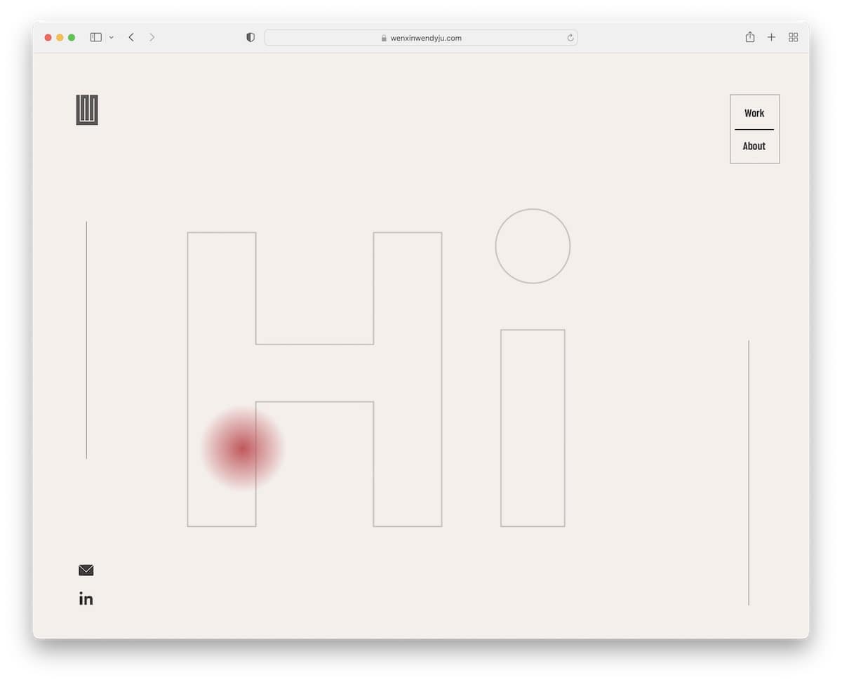
Wendy Ju’s website wins you over with its unique typewriter effect, which adds a dynamic touch to the textual content.
The site features a custom cursor, enhancing the interactive user experience. Video thumbnails provide an engaging preview of her work.
The essential header smartly hides and reappears based on scrolling, optimizing screen space and user focus.
Additionally, the website thoughtfully includes a separate page for her PDF resume, which is easy to download and print-friendly.
Note: If you want a text-heavy section above the fold, enhance it with a typewriter effect.
Why we chose it: Wendy Ju’s website impresses with its unique typewriter effect, custom cursor, smart header design, and practical features like video thumbnails and a downloadable PDF resume.
26. OrangeYouGlad
Built with: Wix
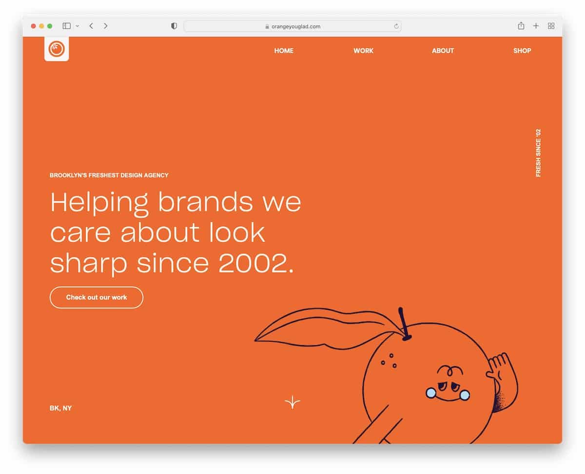
OrangeYouGlad’s website instantly grabs interest with its catchy animations and a bold, impactful orange background above the fold, embodying the brand’s vibrant personality.
The site offers an awesome scrolling experience, smoothly guiding visitors through its content.
A standout feature is the large, full-screen contact section, which includes a prominent CTA button and interactive letters that react on hover, making the interaction both fun and engaging.
This design effectively blends visual appeal with user interactivity, creating a memorable online presence.
Note: Hover effect can add a sweet WOW effect, improving your site’s UX.
Why we chose it: OrangeYouGlad’s website stands out with its vibrant animations, bold color scheme, seamless scrolling, and an interactive, full-screen contact section with engaging hover effects.
27. MonetaGo
Built with: Wix
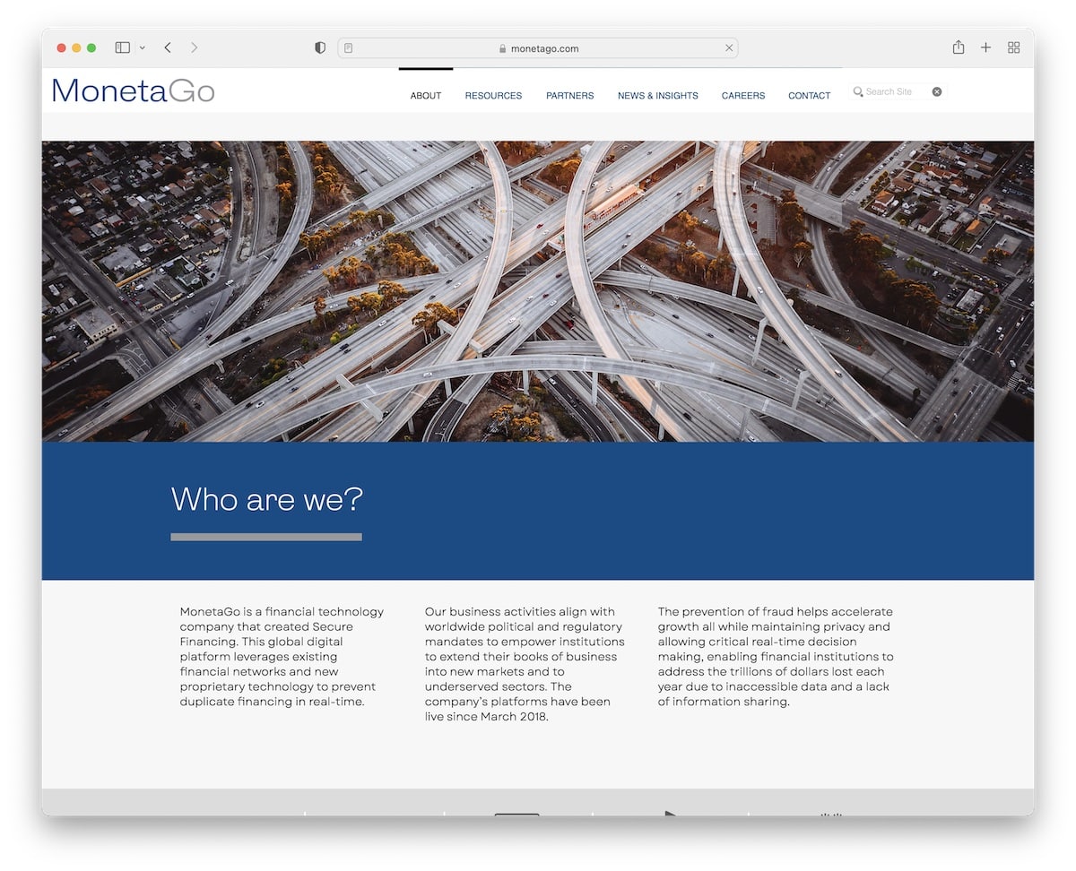
MonetaGo’s website includes a clean and intuitive navbar featuring social icons and a prominent CTA button, facilitating easy navigation and engagement.
An embedded promotional video effectively introduces their services, creating an immediate, impactful connection with visitors.
The site smartly utilizes carousels for a sleek and dynamic presentation of various content, enhancing user experience.
Additionally, accordions concisely present necessary information while saving screen space, ensuring the site remains uncluttered yet informative, perfectly balancing professionalism with functionality.
Note: Accordions are a great feature that keeps a clean and minimal design intact but still ensures the content is readily available.
Why we chose it: MonetaGo’s website showcases a clean design with a functional navbar, engaging promotional video, dynamic carousels, and space-efficient accordions.
Related Posts


Comments (0)