16 Best Notary Websites (Examples) 2026
Do you want to see the best notary websites and great examples of professional web design?
You came to the right place!
Surprisingly, after reviewing dozens of websites, we found that many notary pages use a very basic look.
This tells us you can easily stand out with a modern and creative website.
Use a business website builder to create a top-notch site without coding and design skills. Showcase your services, case studies, the team of notaries, blog and even a compelling about page.
But first, check out these great examples to gain inspiration before you start.
Best Notary Websites You’ll Love
1. Legitify
Built with: Squarespace
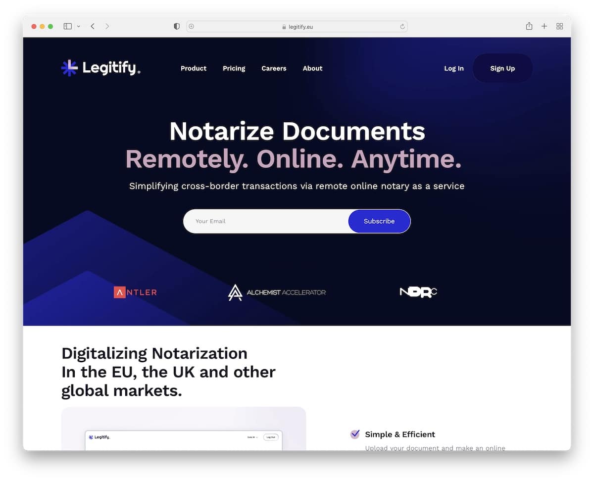
Legitify welcomes potential users with a clean header, text, and a newsletter subscription form. The page is smooth and simple, making the content and information pop.
The client testimonial slider is big and bold, so no one can miss it. The “Featured in” section gives Legitify another layer of professionalism and dependability.
What stands out: Add testimonials of larger businesses’ CEOs, letting everyone know your high-quality services.
2. Notarize
Built with: Webflow
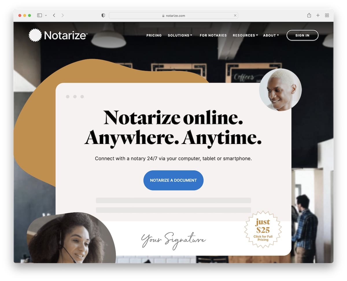
Notarize is a trendy notary website example with a great scrolling experience. The page uses a simple sticky header with a drop-down menu and a sign-in button.
The above-the-fold section also has a CTA button, so every visitor can start using Notarize’s services immediately.
There’s also an accordion element that reveals three reasons why use Notarize.
What stands out: In the hero section, include a CTA button so potential users can choose your service without scrolling.
Here are some more excellent Webflow websites that we recommend checking.
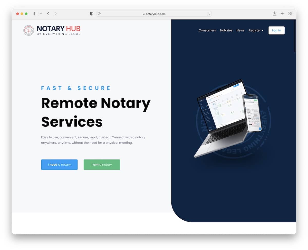
3. Notary Hub
Built with: Squarespace

Notary Hub has a catchy split-screen hero section with text and CTAs on the left and an image on the right.
Below the fold is a promotional video for everyone who doesn’t have time to read. Still, this notary website has multiple sections that reveal all the ins and outs of the service, including testimonials and FAQs.
What stands out: Use a promotional video to attract more attention to your product(s) or service(s).
4. Bronx Mobile Notary Service
Built with: Divi Theme
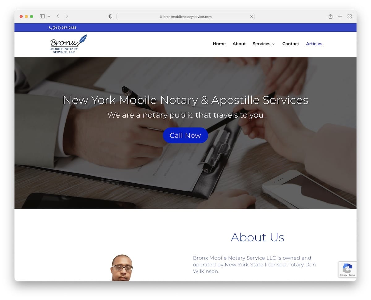
Bronx Mobile Notary Service is a simple website with a light design and embedded Google Reviews widget.
It’s a landing page-style home page with a floating navbar that takes you to sections without scrolling. However, you’ll also find internal pages for services and blogs.
What stands out: Keep visitors informed about everything you do just by visiting your home page (even add a contact element!).
Need more inspiration? Head over to our list of the best websites using the Divi theme.
5. VP Notaries
Built with: Genesis
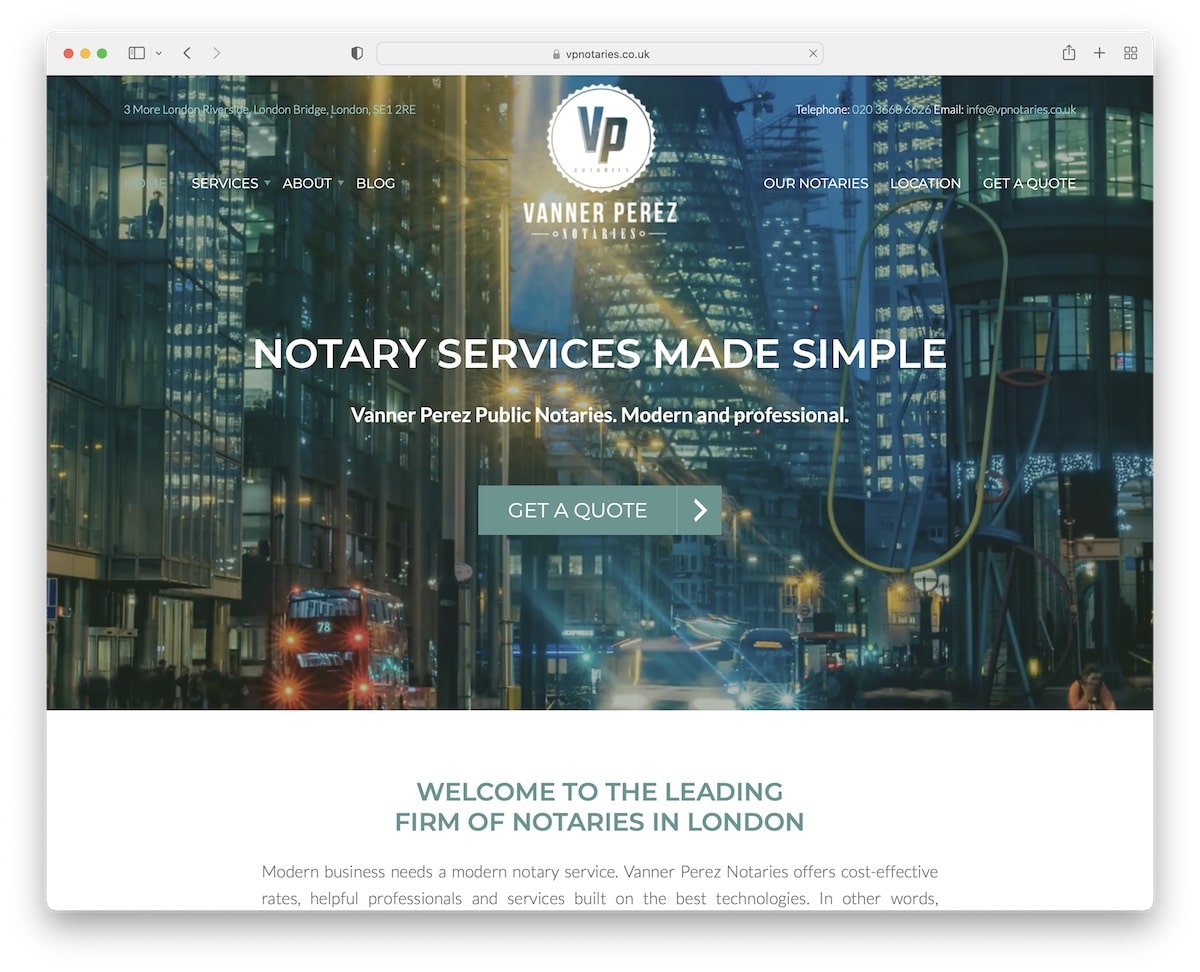
VP Notaries is a modern website with a video background for the hero section, a transparent header and a call-to-action (CTA) button.
The rest of the page is very simple and clean, having multiple sections to distribute the necessary content and information elegantly. They also integrated two types of testimonials, including Google Reviews.
What stands out: Build customer trust by adding testimonials and reviews for social proof.
6. Peter H. Baker
Built with: Duda
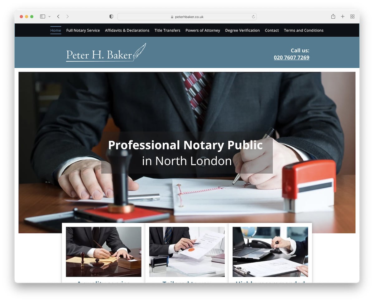
Peter H. Baker is a notary website with a sticky top bar and header, allowing visitors to check all the pages without scrolling back to the top.
Peter uses a contact form on the home page and Google Maps with the exact location of his office. The footer provides additional business information, a menu and a link to Yell reviews.
What stands out: Encourage clients to review your services with an on-page form or direct them to a 3rd-party platform.
7. Jesus Benavides Lima
Built with: Webflow
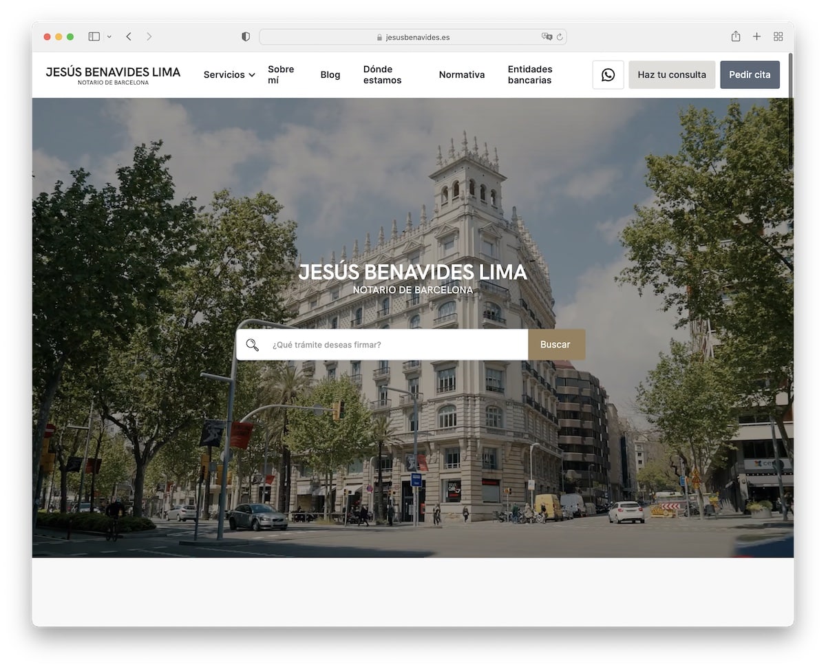
Jesus Benavides Lima’s video background gives a glimpse at the office, keeping engagement at an all-time high. This notary website uses a search bar for quick finds instead of a CTA button, which is very untraditional.
The floating header features a mega menu with WhatsApp and consultation buttons.
What stands out: Make content easily findable with a visible search bar.
8. eNotaryLog
Built with: Avada Theme
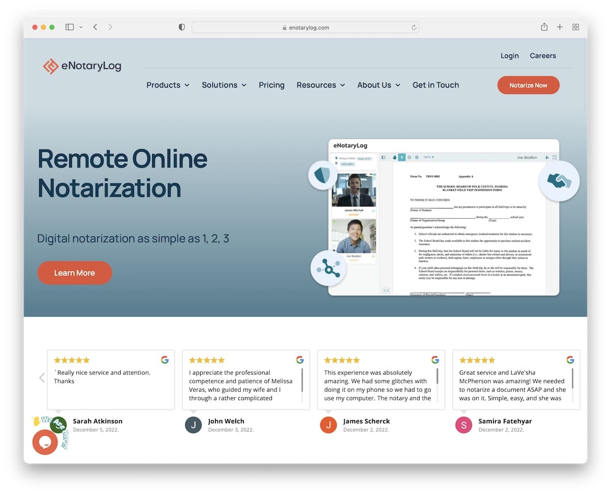
eNotaryLog has various moving elements that spice up the experience and make browsing much more engaging.
The drop-down menu appears and disappears depending on the up/down scroll, so you always have access to the necessary information while browsing the site, which remains smooth.
The two sections with client logos and certifications raise eNotaryLog’s potential, just like the positive Google Reviews.
What stands out: Add client logos and certificates to make you appear more trustworthy.
Here are some more Avada theme examples that show you how powerful it is.
9. DocuSign
Built with: Drupal
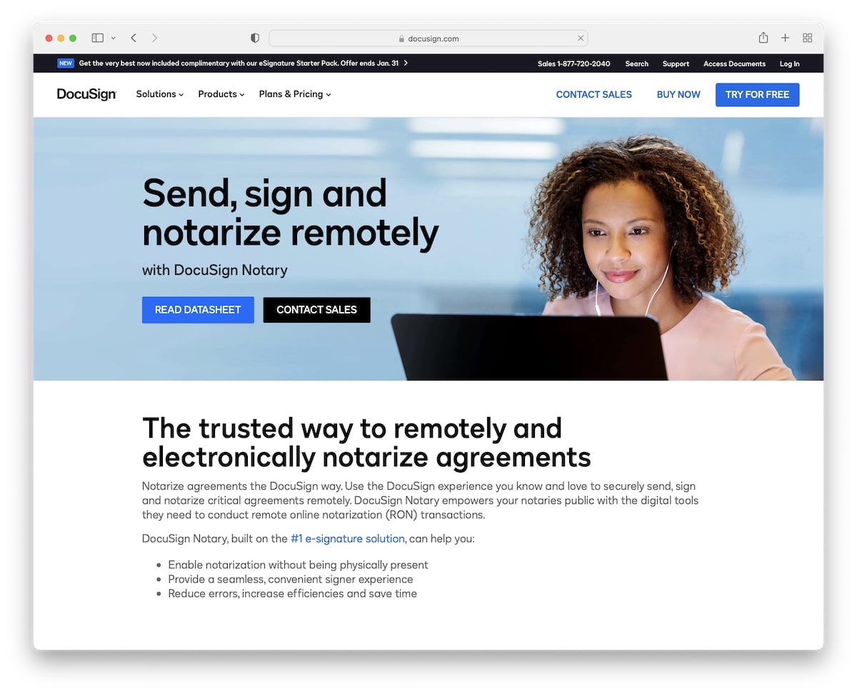
DocuSign’s clean and light responsive web design creates a pleasant atmosphere. The narrow banner promotes CTAs, while the other part of the hero section provides more information about the service.
The embedded video is a great way to show potential users how DocuSign works. Still, further explanation of features, resources, and FAQs equips users with everything they need before proceeding.
What stands out: Keep your page informative, with all the details and information easily accessible.
10. Online Notary US
Built with: Squarespace
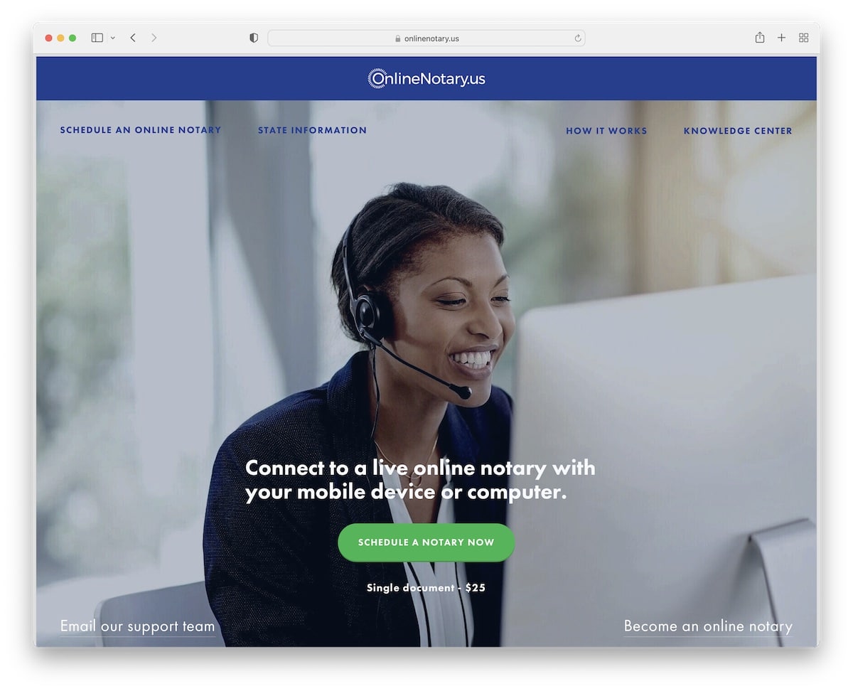
Online Notary US’s parallax image background sparks visitors’ interest. We like that instead of only using a CTA button, they also include the cost, so you don’t need to waste time finding the pricing.
While this notary website is pretty text-heavy, the parallax background sections make it more dynamic.
Lastly, Online Notary US doesn’t have a footer, but we could say that the contact form IS the footer.
What stands out: If you plan on adding a lot of text, use a parallax effect or animation to kill the monotony.
11. Notarity
Built with: Elementor
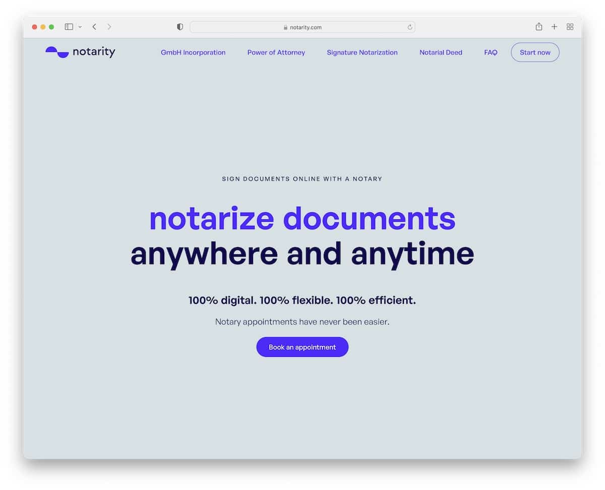
Notarity is a more minimalist notary page example we stumbled across, which is refreshing.
Instead of images or videos above the fold, Notarity only uses a solid color background with text and a CTA button.
The simplicity spreads throughout the website with great attention to detail to maintain the branding and eliminate distraction.
What stands out: A minimalist web design is always a smart choice to make.
12. SignNow Notary
Built with: Laravel
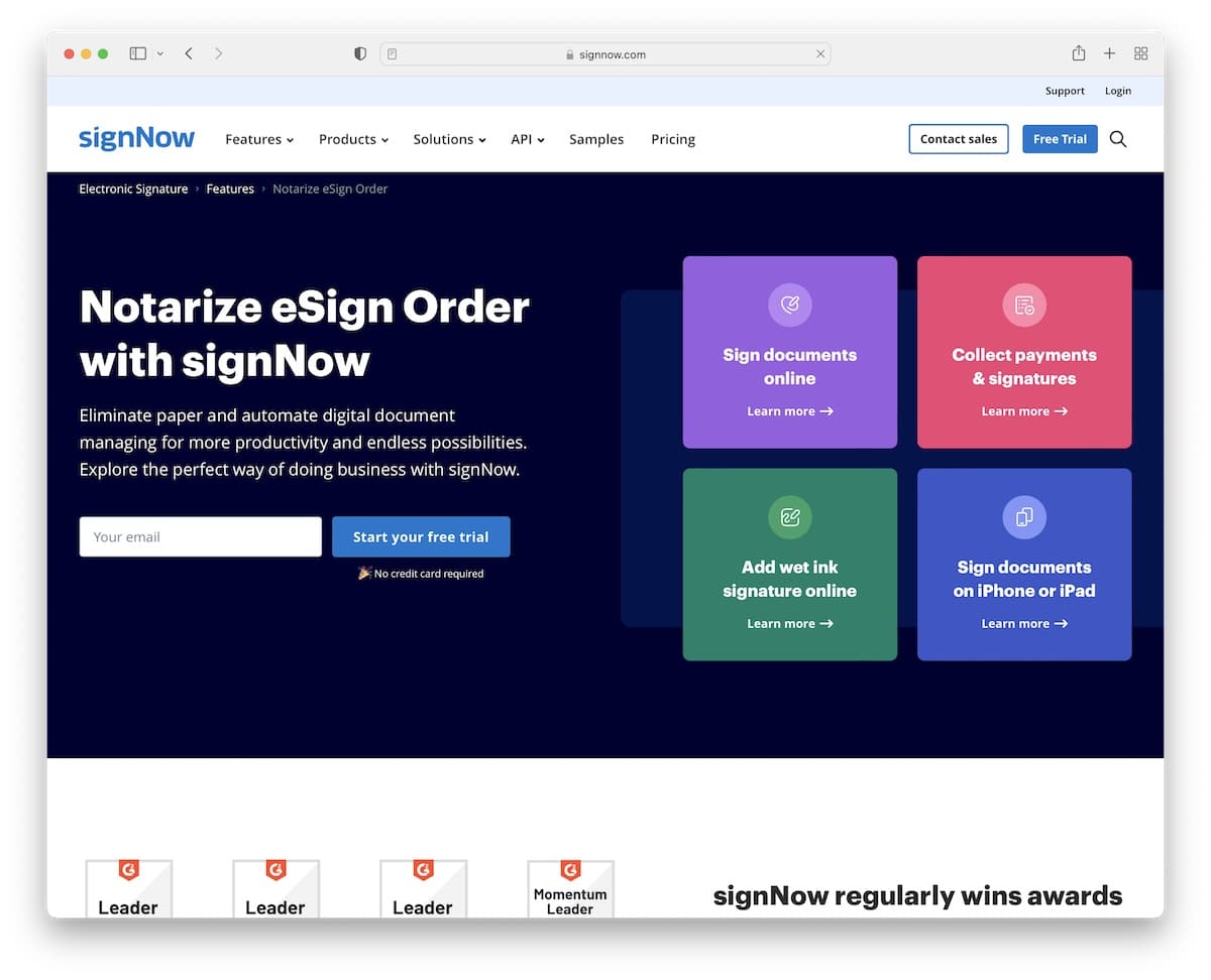
SignNow Notary encourages everyone to start a free trial with a simple email opt-in form above the fold.
The page features a floating header with a mega menu so that you can learn more about the features, products, pricing, and more, fast.
And using “contact” and “free trial” buttons in the navbar is clever for instant access.
What stands out: Capture more leads with a free trial email opt-in form above the fold.
13. Mobile Notary Zone
Built with: Elementor
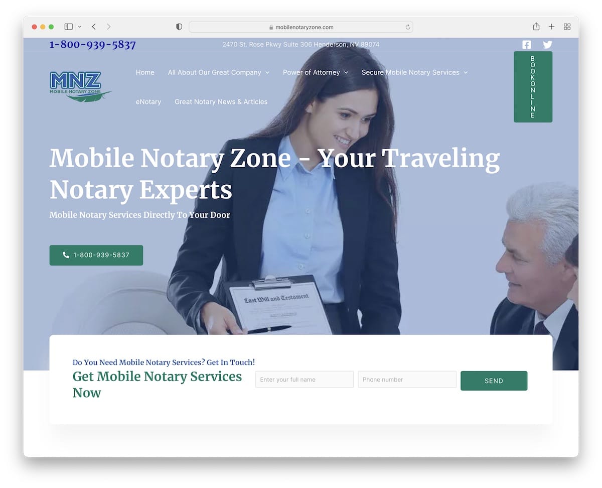
Mobile Notary Zone has a modern classic (if that makes sense) website example with a rich header and hero section.
They use a drop-down menu to take you to different services and information and a CTA button for online bookings so that everyone can take immediate action.
What’s really interesting is that the home page has an extensive list of benefits and FAQs before the footer.
What stands out: Use a FAQ section to answer the most common questions.
You may also want to read our Elementor review and check the best Elementor WordPress themes for an immediate start.
14. Bergen Pro Notary
Built with: Squarespace
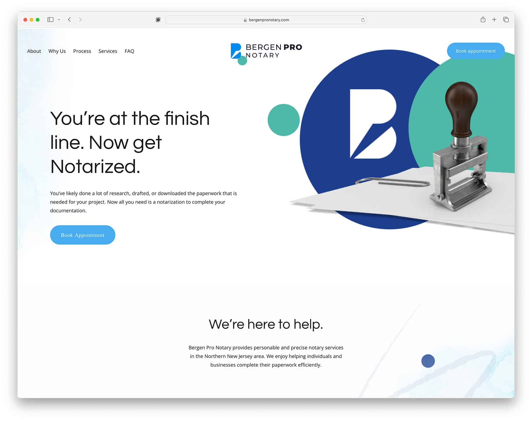
Bergen Pro Notary website is the perfection of minimalism. It uses exceptional whitespace and a matching color scheme for the branding and website elements. The website itself is made using a popular website builder called Squarespace. It is a DIY website builder you can use to create a similar or even better website yourself.
It also has social proof front and center, using Google Business Reviews. We recommend that every small business owner have that.
While we like this website a lot, it could be improved by having a team page with all the employees and their bios. That would add extra credibility, especially in a sensitive business like a notary.
Note: A booking page with exact pricing and availability goes a long way in a business where everything is around appointment scheduling and meetings. That’s something you can learn from the Bergen Pro Notary website.
What stands out: A masonry grid layout organizes content attractively while maximizing screen real estate.
15. A La Mode Notary
Built with: Squarespace
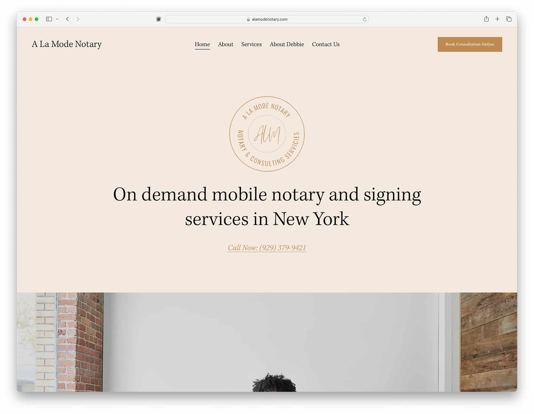
A La Mode Notary website offers New York online notary and signing services. The website features a simple one-page setup, which is great for usability but disastrous for SEO, so if you want to create a similar website, you need to decide which is more important to you.
All the appointments are scheduled and managed via Calendly, which adds to usability thanks to its simplicity. A La Mode Notary has some social proof via certificates, but we would like to see Trustpilot or Google reviews because they show more about the notary services people have received.
What stands out: A minimal color schema can help build trust in your brand, so make sure to choose it wisely.
16. Snapdocs
Built with: Custom
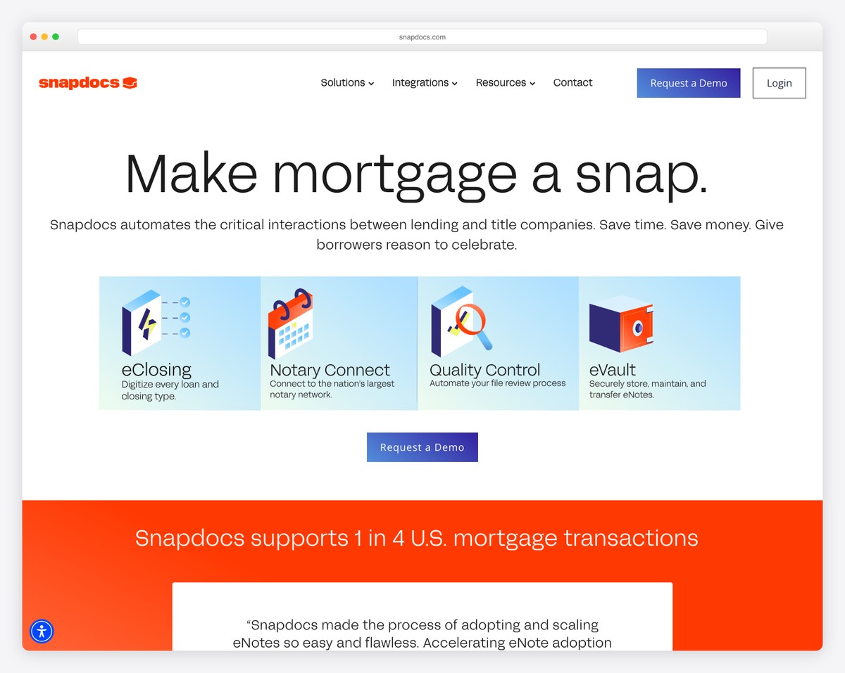
Snapdocs is the leading digital closing platform that connects lenders, title companies, and notary signing agents. Their website presents a polished enterprise SaaS look with a hero that immediately communicates the value: automating and digitizing the real estate closing process from start to finish.
The clean navigation (Solutions, Products, Resources, About) is designed for multiple audiences — lenders looking to modernize closings and signing agents looking for assignments. Trust indicators and client logos build credibility for a platform handling sensitive financial transactions.
What stands out: For notary tech platforms, building trust through clean design and enterprise-grade aesthetics is essential — users are entrusting you with legally binding documents and signatures.
Related Posts


Comments (0)