19 Best Wedding Websites (Examples) 2026
Are you ready to check out multiple examples of great wedding websites?
It’s been tough picking only nineteen because so many have excellent designs.
You can review them all, from wedding planners and photographers to couples sites, to gain inspiration for your web project.
One trend that many wedding pages follow is a light design with white space, which contributes to a better user experience.
You can choose a wedding website builder or a WordPress wedding theme for your page.
Let’s go!
Best Wedding Websites And Examples
1. Weddings By Lisa Nicole
Built with: Squarespace
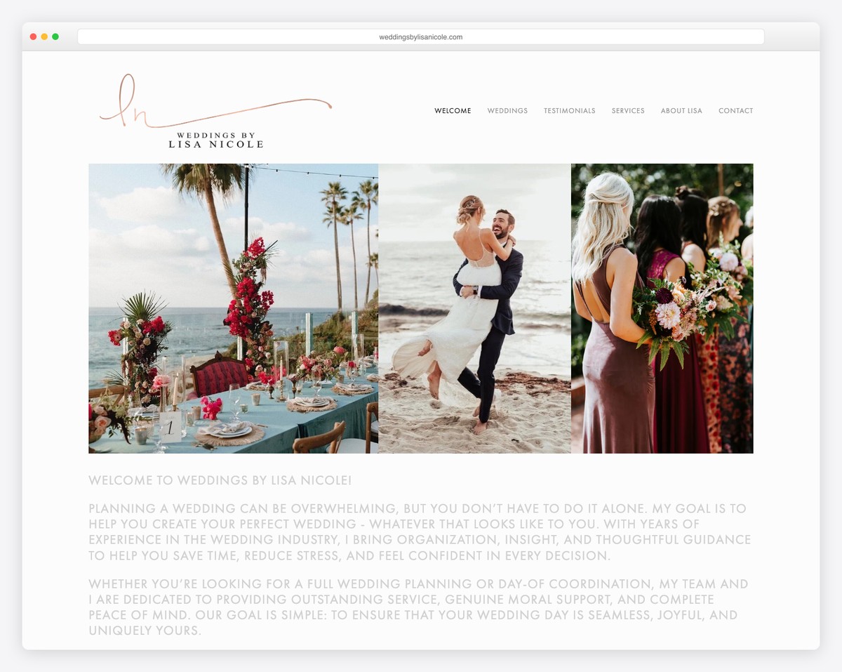
Weddings By Lisa Nicole is a stunning and minimalist website with text sandwiched between two clean sliders (that don’t feel like sliders).
The website also has only the header area with navigation and no footer, which is very untraditional.
Moreover, the internal pages have more gorgeous content, testimonials, services, and a contact form, to name a few.
What stands out: Keep your wedding website clean and simple, emphasizing content and services (and testimonials.)
We also have more Squarespace website examples that you’ll find inspirational.
2. Sarah & Stephen
Built with: Wix
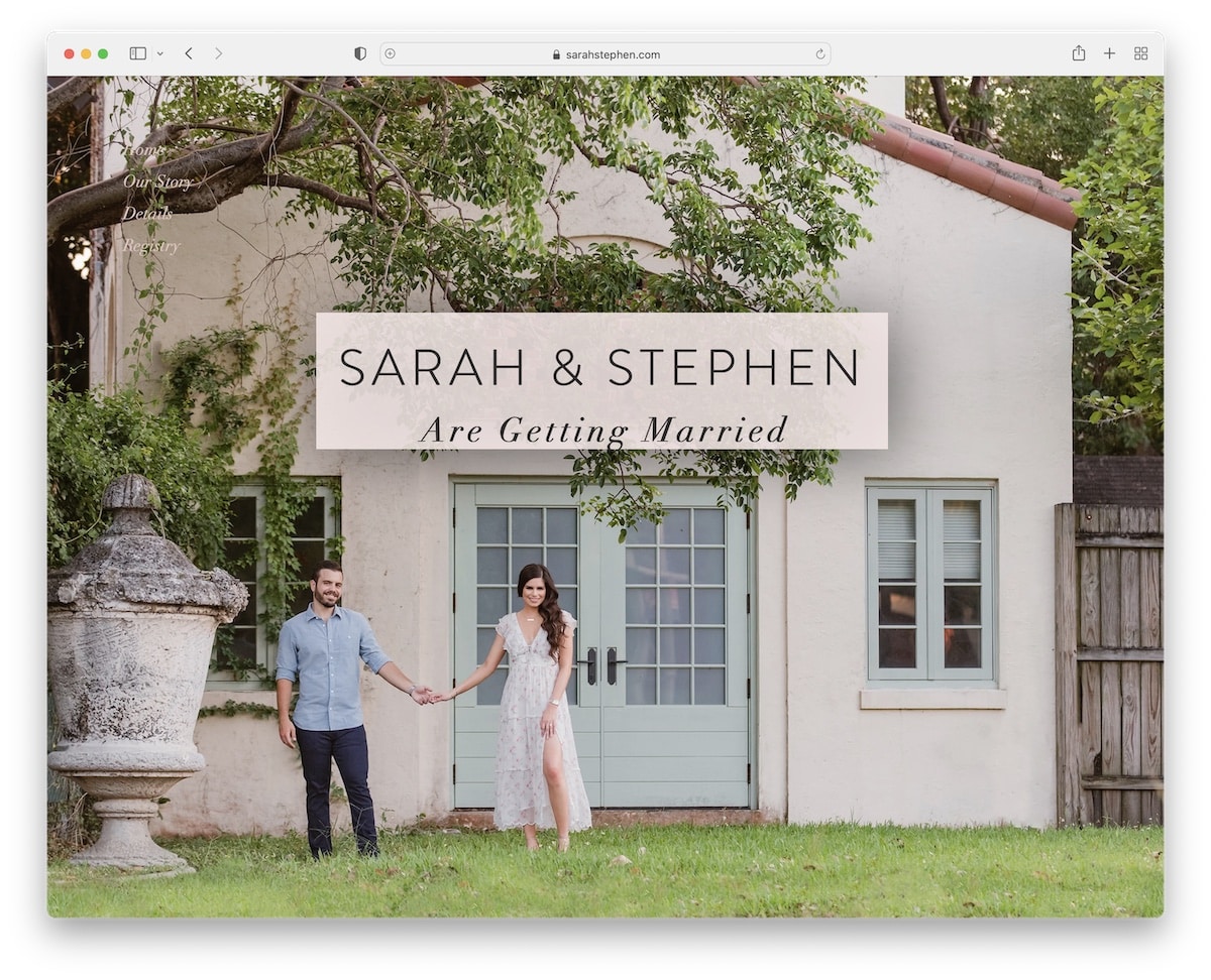
Sarah & Stephen is a great example of a one-page website with a large hero section with text and a transparent vertical navigation that floats.
One of the coolest features of Sarah & Stephen is the quiz that everyone can take – to see how well they know Sarah & Stephen.
There’s also a slider, a video background element and links to presents.
What stands out: Make your website a lot more engaging by adding a quiz.
Don’t miss all these other great websites built on Wix platform.
3. Alison Bryan
Built with: Squarespace
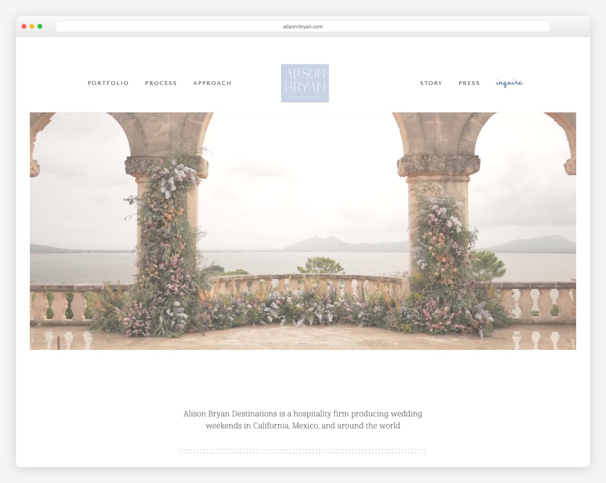
Alison Bryan’s website presents images, services, and testimonials that potential clients can browse.
The floating header features left and right links with a centered logo that transforms into a cool animation when you start scrolling.
Also, Alison Bryan shows all the press mentions on the individual page, which everyone would be proud of.
This excellent website is built based on one of these wedding website templates for Squarespace.
What stands out: Create a separate page just for the press mentions if you have many.
4. Jess & Chris
Built with: Webflow
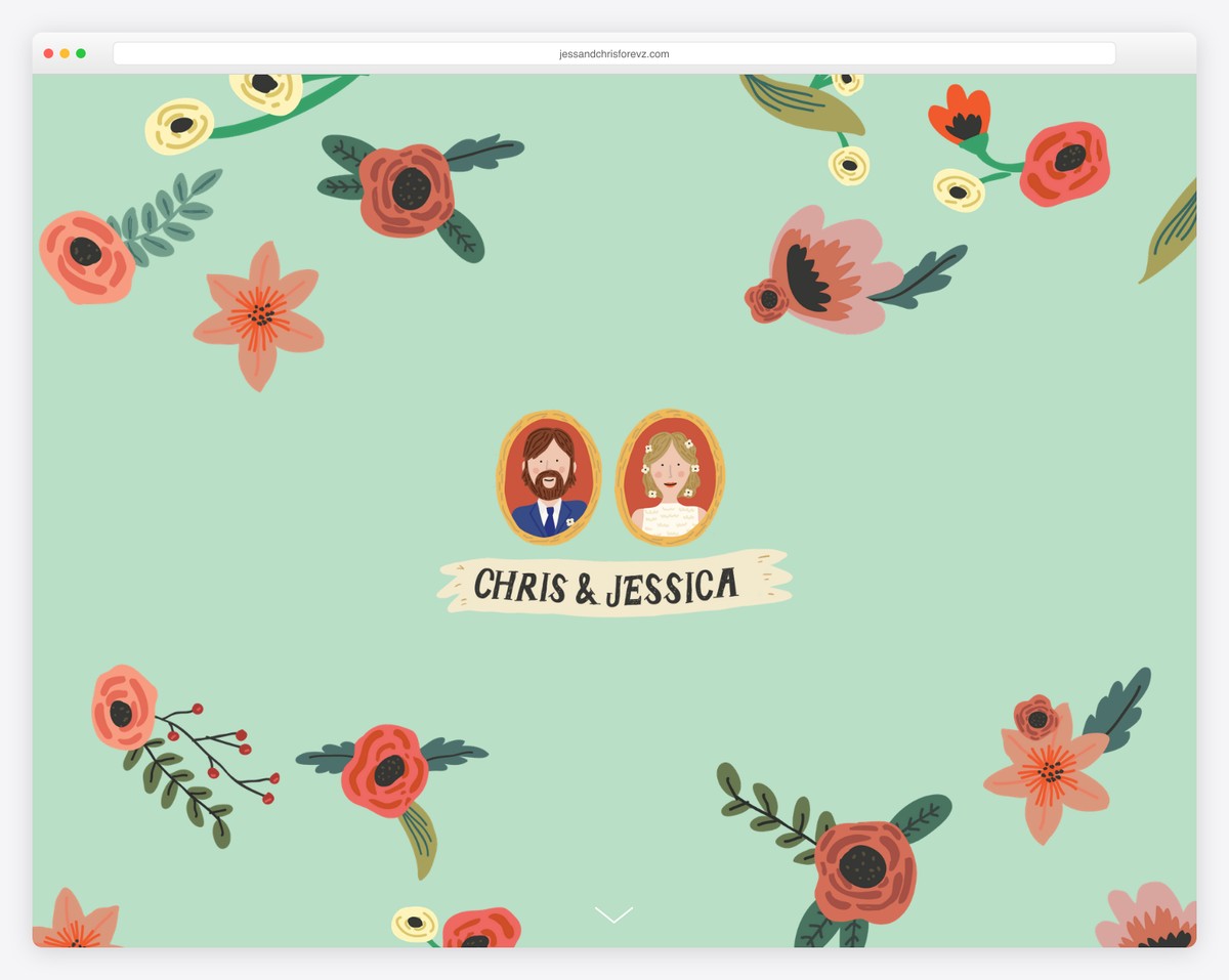
Jess & Chris took a very cute and cartoonish approach for their hero section instead of being on the more serious side with a real image of them.
The header only appears when you start scrolling, which keeps the hero area spotless.
The floating navigation is handy because the page is pretty long. It allows you to jump from section to section more comfortably.
What stands out: Use a sticky menu to guide your visitors through your single-page layout without requiring them to scroll.
Need more design ideas? Check out these amazing Webflow websites!
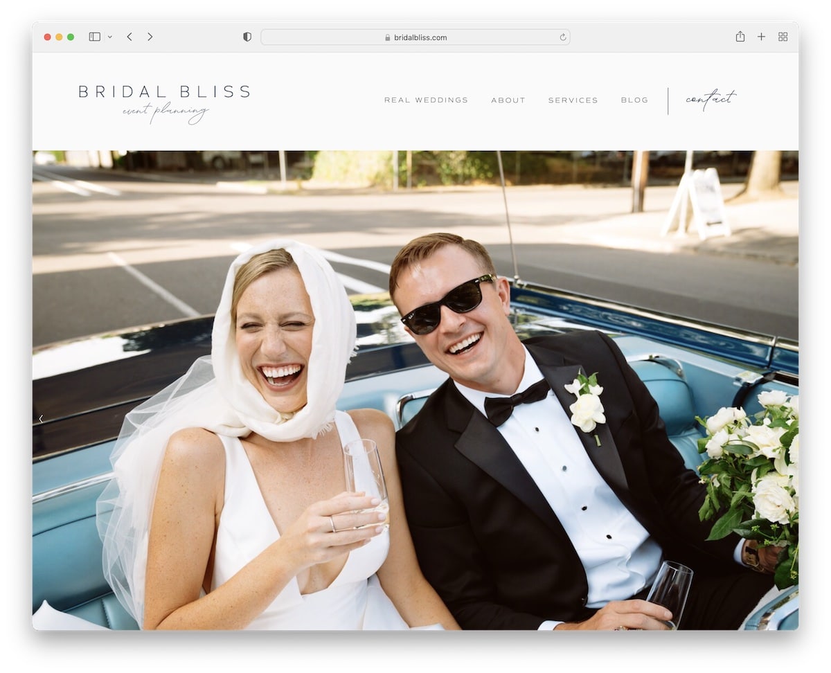
5. Bridal Bliss
Built with: Squarespace
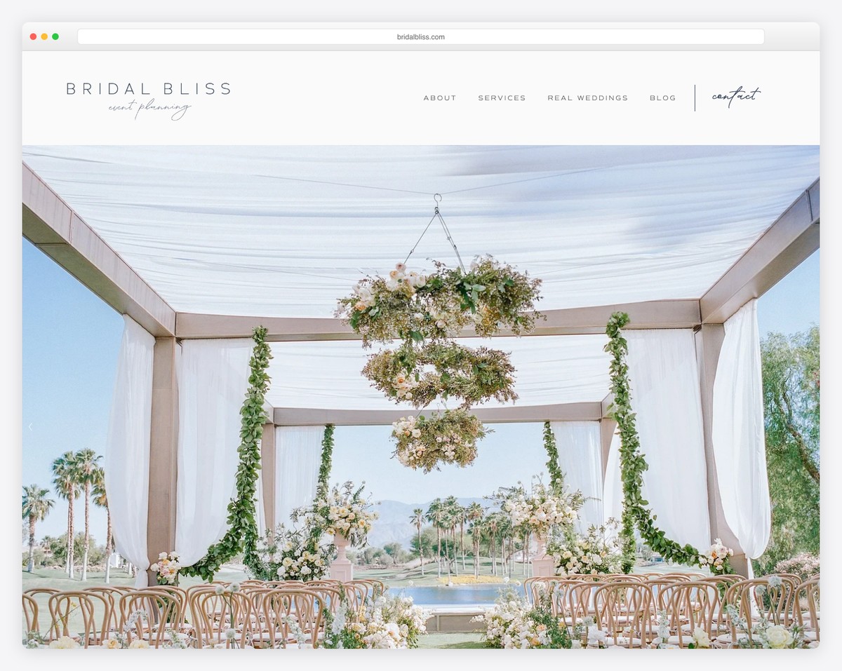
After Bridal Bliss’s wedding website loads, you see a minimalist header and a massive slideshow.
One of the better features of this page is the section with logos from various authorities to build social proof.
And the parallax background to promote their contact page grabs the attention.
What stands out: Use authorities’ logos on your website as a reference to show your popularity.
6. Engaged & Inspired
Built with: Squarespace
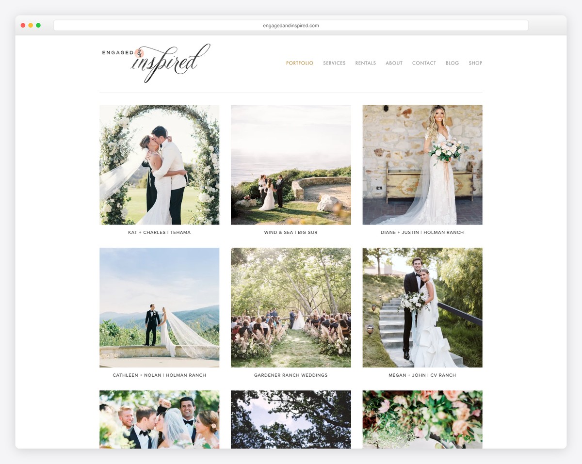
Engaged & Inspired’s home page has a grid featuring twelve of their past wedding events. Each grid element is clickable, giving the event’s page with more information and many images.
This wedding website uses a white background for the header, base, and footer. The only thing that separates the header and footer from the main part of the site is a thin line.
What stands out: Create a portfolio of your wedding events, so potential clients can see what to expect from your amazing services.
7. Kristen Noelle
Built with: Gatsby
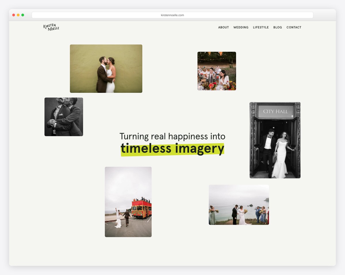
When browsing her page, Kristen Noelle ensures that her wedding images do most of the talking. Where there is text, she uses enough white space to make it more readable.
One great section that grabbed our attention is testimonials, which opens each client’s feedback in a popup with text and an image.
What stands out: Introduce client testimonials to build trust in your services.
We also have a collection of great wedding photography websites to get more ideas.
8. Mango Studios
Built with: Pronto Theme
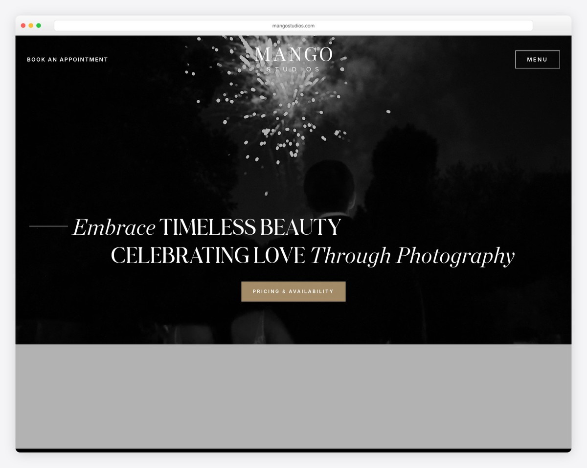
Mango Studios features a large hero image with a logo and a call-to-action (CTA) button. There’s no header, only a top bar with a link to the availability calendar and a clickable phone number.
Like Jess & Chris’s website, the header/menu sticks to the top of the screen once you pass the hero area.
This wedding website is light with various types of content (including an Instagram feed) for enjoyable browsing.
What stands out: If you prefer speaking to clients via phone, ensure your number is clickable and always visible.
9. The Arroyos
Built with: Pronto Theme
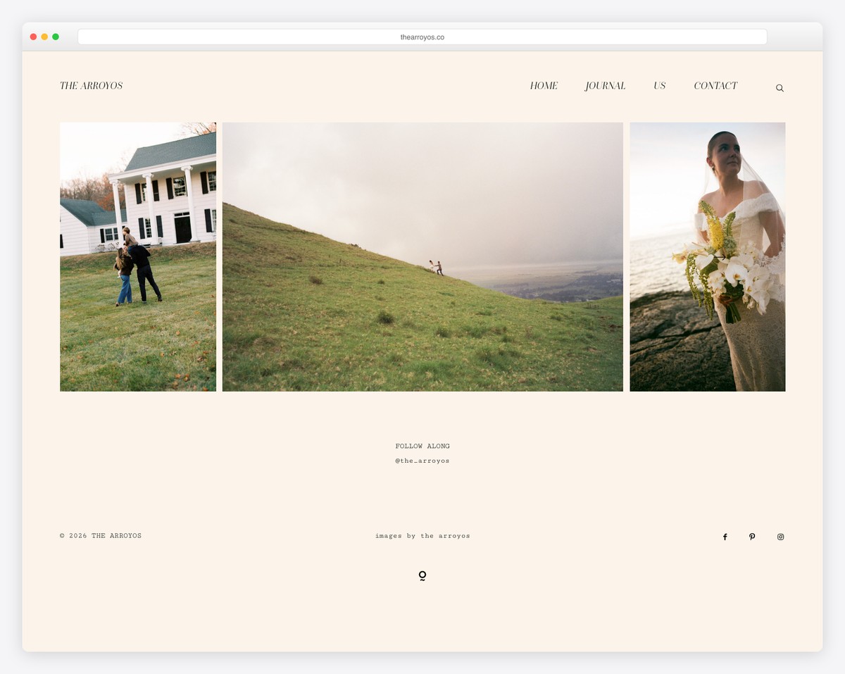
The Arroyos showcases some of the best images with a lightbox portfolio that you can play and pause.
The home page also has an embedded video, a simplistic footer and a compelling “about us” section.
What stands out: Place your amazing works first and all the rest second. Let your projects promote your business and services.
10. Piper & Muse
Built with: Squarespace
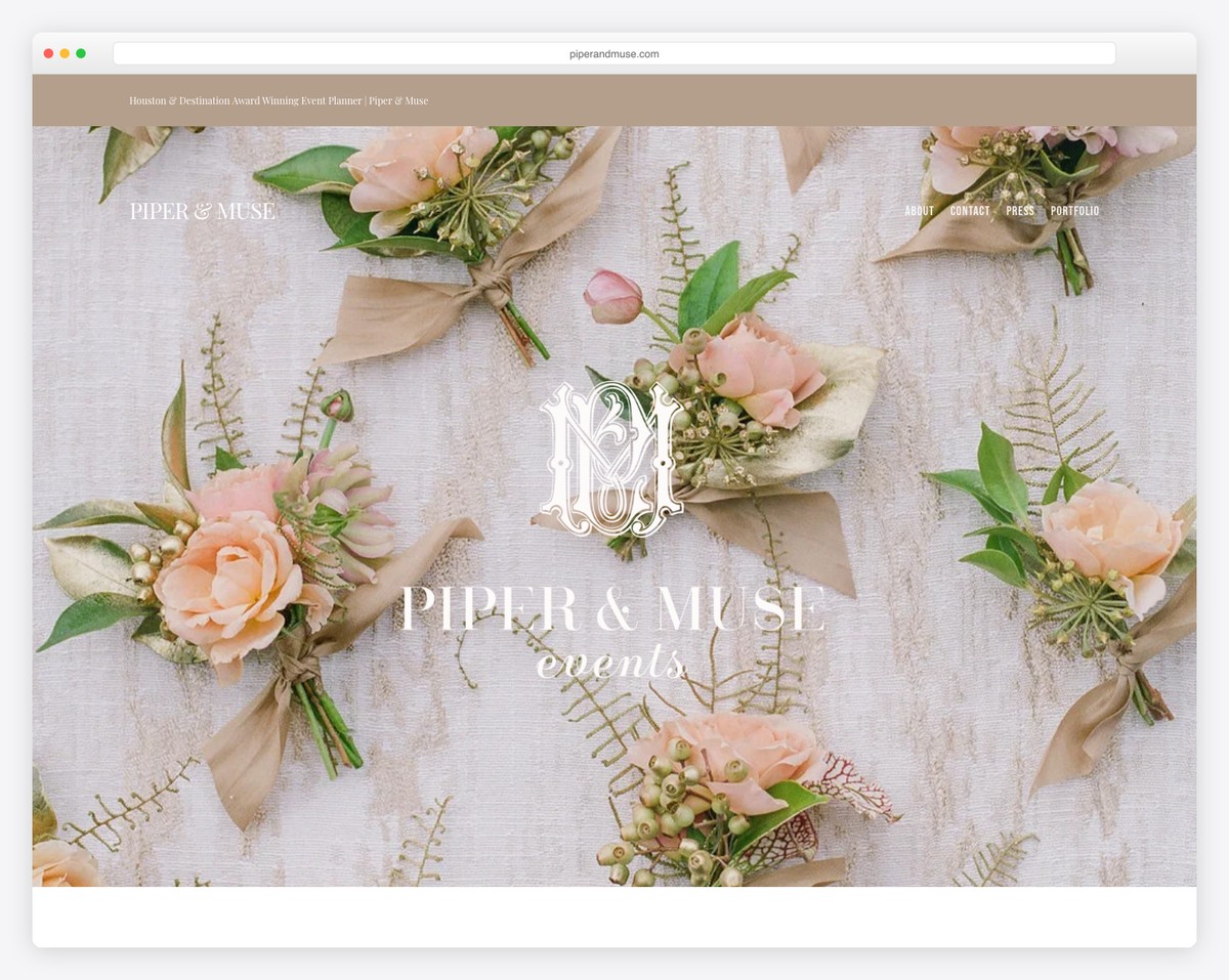
What’s special about Piper & Muse are the multiple parallax background sections that make browsing a pleasant experience.
The white background, text, icons, images and CTAs keep the visitor engaged and ready to take action.
What stands out: Add depth to your wedding website with the catchy parallax effect.
Here are more Squarespace wedding website examples made by first-time website owners.
11. Jenna Brisson
Built with: Showit
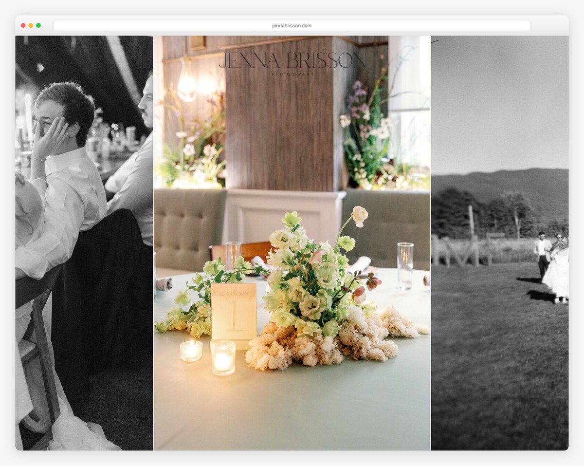
Jenna Brisson’s page starts with a cool slider, logo overlay, and a bottom header/menu section.
The next section is the introduction/about me part, followed by the latest blog posts and an awesome client testimonial slider.
Moreover, the footer section is enriched with a cool IG feed, social icons, navigation and a back-to-top button.
What stands out: Instead of using a header at the top of the screen, use it at the bottom and let the content be the first thing your visitors see.
12. Ryan Flynn
Built with: Squarespace
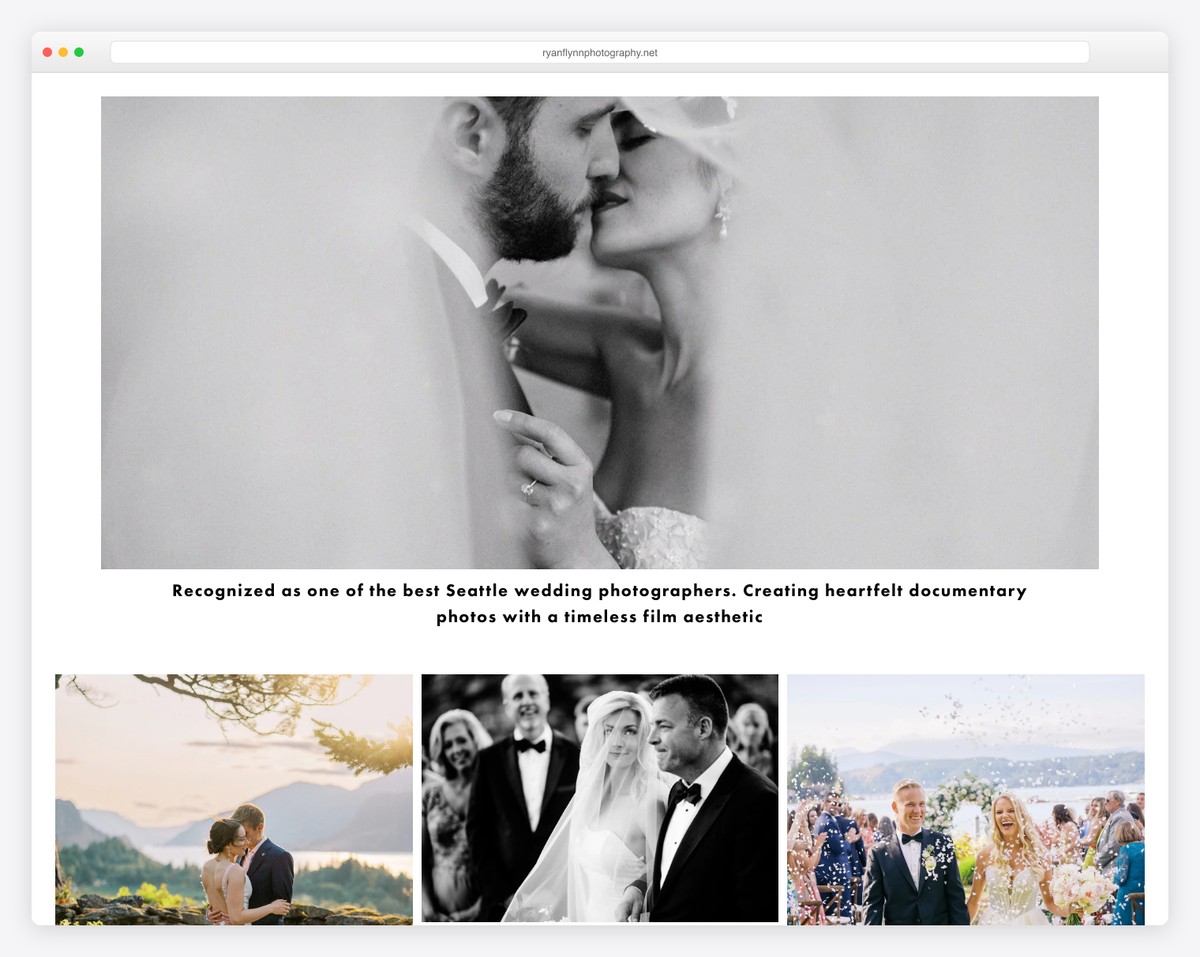
Ryan Flynn’s full-width slider is all you want to check thrice because it’s a collage of terrific imagery without text and CTAs. Also, the header (with a drop-down menu) is minimal, on a white background, so it doesn’t cause any distraction.
Below the slideshow is a grid of images with links to various categories, where you can check more of his work.
What stands out: For a better viewing experience, keep the slider clean with images only and skip adding text and buttons.
13. Weddings By Shannon
Built with: Wix
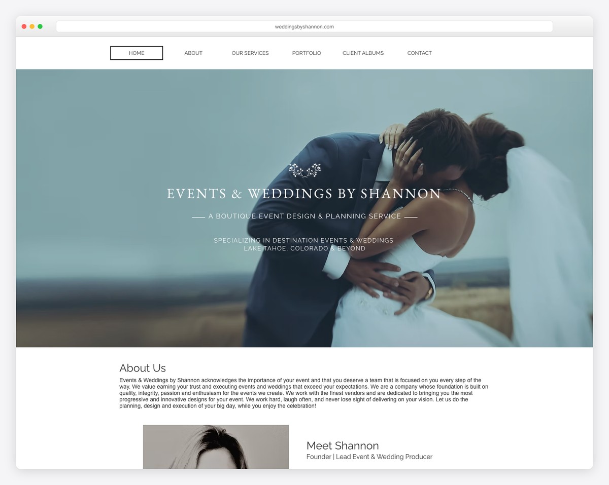
Weddings By Shannon’s heavy image-focused home page creates a pleasant atmosphere and provides all the reasons to consider her services.
The portfolio features the lightbox effect, which opens the image in a popup and turns the rest of the website white for a more intimate experience.
This wedding website features a live chat, but other content details are also available.
What stands out: A live chat function can be a great addition to your website for turning more visitors into clients.
14. KC Events
Built with: Wix
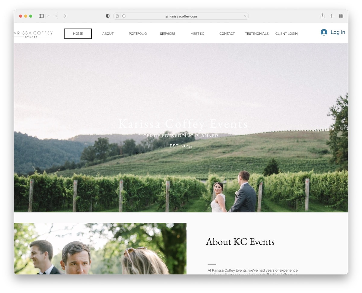
KC Events is a one-page wedding website with a menu that takes you to different sections without scrolling. And there’s a back-to-top button at the bottom, so you don’t have to scroll to the top.
KC Events includes multiple certificates of various awards, which are great indicators of the quality of work.
What stands out: Let certificates and badges vouch for your high-quality services/products.
15. Blush + Bowties
Built with: Squarespace
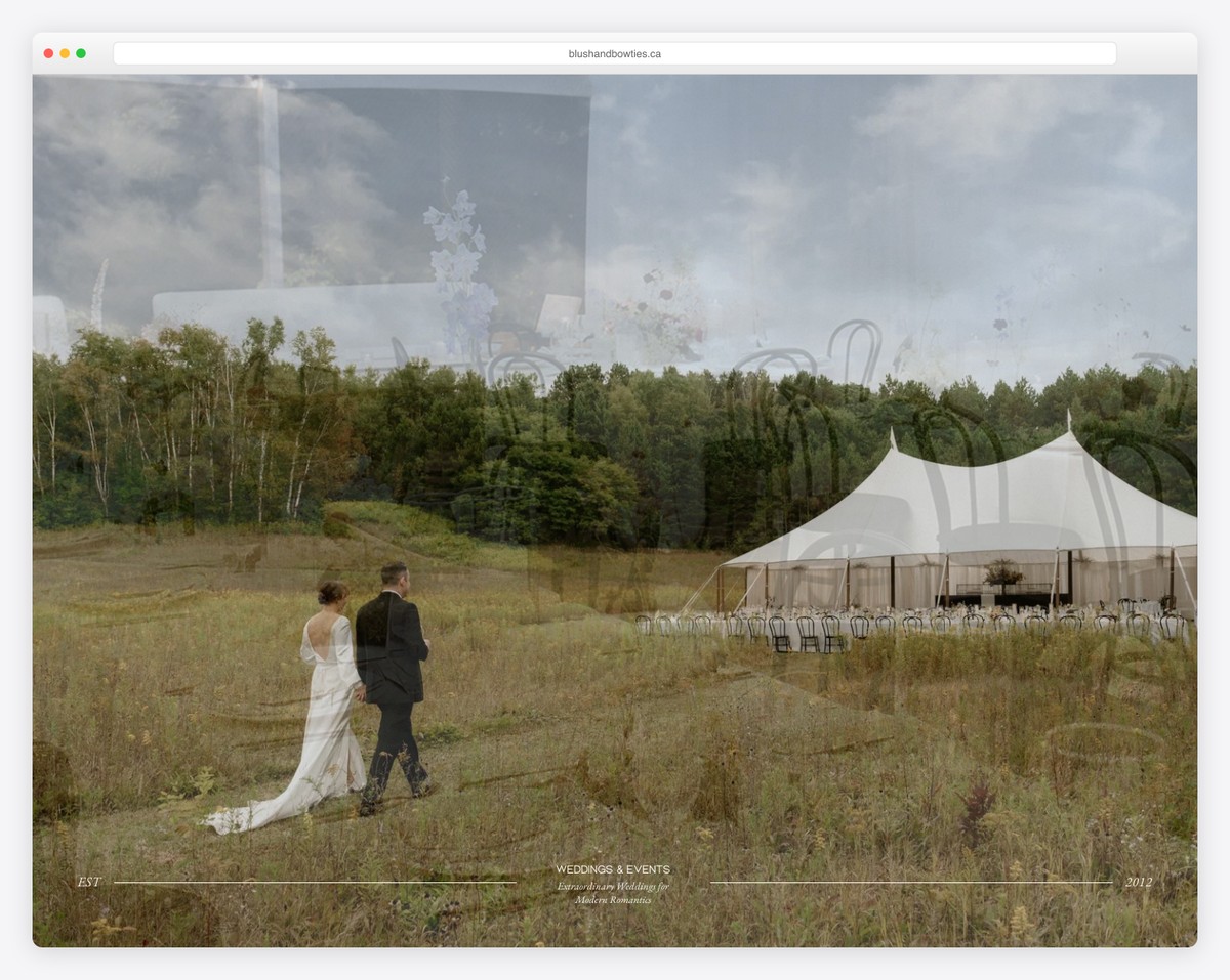
Blush + Bowties gives a luxurious feel with its large parallax background sections and little text.
The header is the most minimalist of all the wedding websites we collected for this list. It only has a logo on the left and a hamburger menu icon on the right, so all the focus is on the image. But the footer isn’t far off, keeping a similar yet not as fine look.
What stands out: If you want your hero section to be the most shining, make the header feel nonexistent and boost UX.
16. A Day To Cherish
Built with: Squarespace
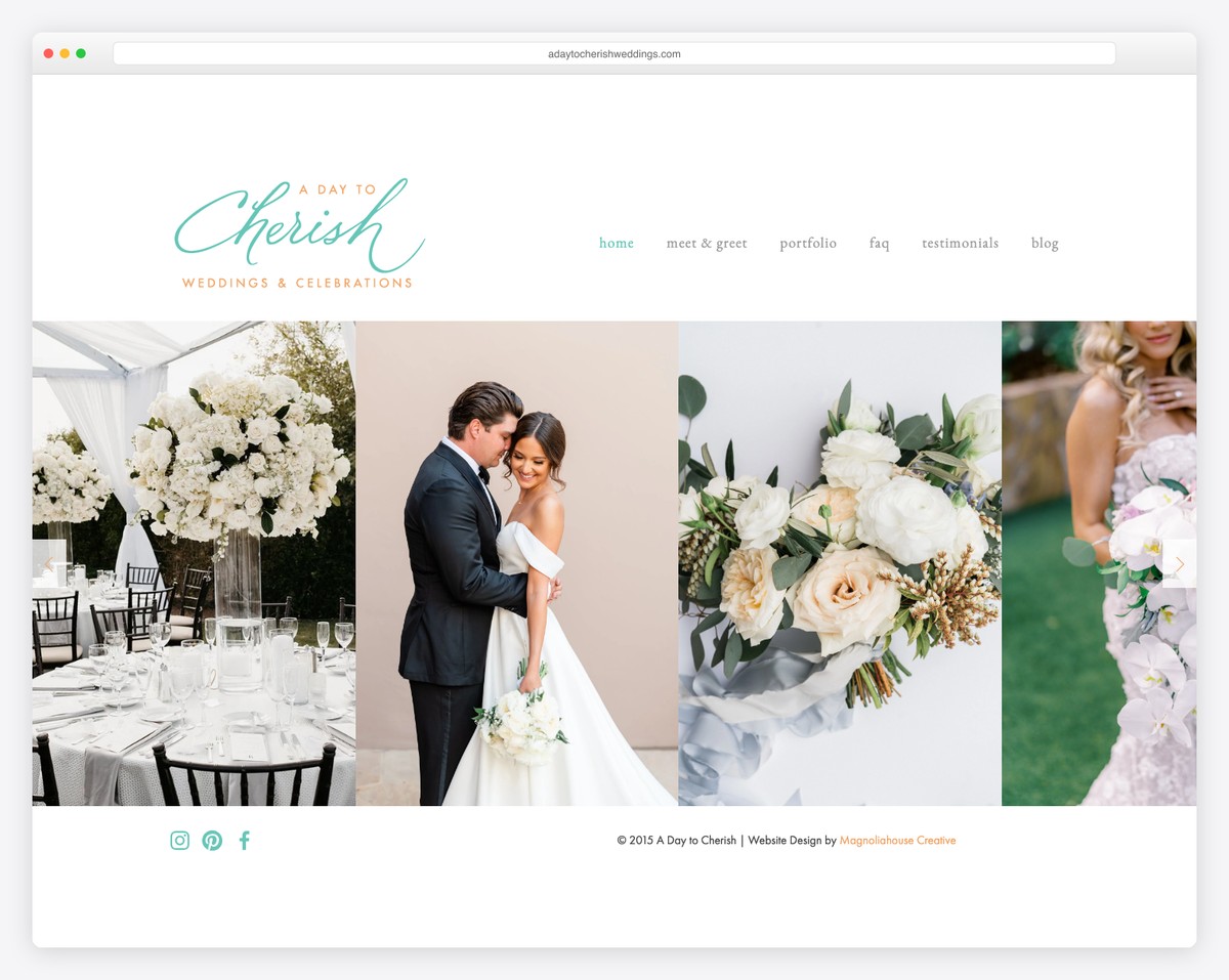
Do you want to create a simple wedding website but don’t know how to approach its design? A Day To Cherish is the perfect example of doing it correctly.
The home page features a header and a footer that sandwich a slideshow – and that’s it.
A drop-down menu also takes you to other page sections with an awesome portfolio that details each event’s image presentation in detail.
What stands out: If you’re unsure about what web design approach to take, have one thing in mind: Keep it simple.
17. Flawless Weddings & Events
Built with: GoDaddy Website Builder
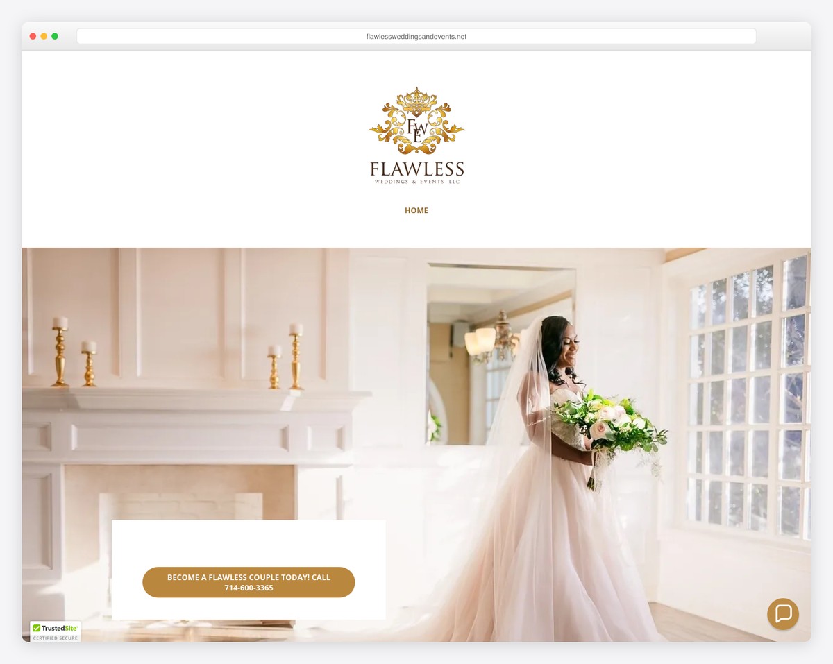
Flawless Weddings & Events is a single-page style wedding website without navigation, which isn’t something we’re used to seeing too often.
The page is divided into multiple sections to present the team, the work, the services, etc.
What’s very interesting about Flawless Weddings & Events is the blog section towards the end of the website.
What stands out: Remember that a blog can be a great marketing strategy for building and growing your business to the next level.
18. Junebug Weddings
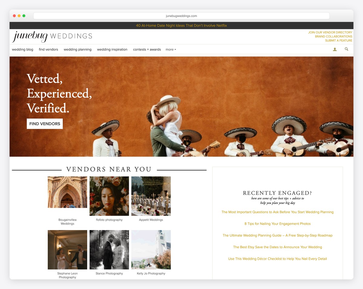
Junebug Weddings is a comprehensive wedding vendor directory and inspiration platform featuring a vetted, searchable database of photographers, planners, and venues. The site combines stunning real-wedding editorials with a practical vendor marketplace that helps couples find their perfect team.
The design balances aspirational wedding photography with functional search and filtering tools. Featured real weddings showcase diverse styles and locations, while the vendor directory includes detailed profiles, portfolios, and direct contact options. The annual “Best of the Best” awards add an editorial authority layer.
What stands out: Combining curated editorial content (real wedding features) with a functional vendor directory creates a dual-purpose platform where inspiration naturally leads to vendor discovery — keeping couples on the site longer.
19. Style Me Pretty
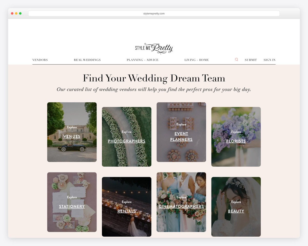
Style Me Pretty is a long-running wedding inspiration and planning hub that combines gorgeous real-wedding features with a vendor marketplace. The site is browsable by season, style, color, and location — making it easy to find exactly the aesthetic you’re envisioning for your own celebration.
The editorial design features a soft, romantic color palette with elegant typography that perfectly matches the wedding industry aesthetic. The gallery-style layout showcases professional photography at large scale, while planning tools and vendor directories add practical value beyond pure inspiration.
What stands out: Offering multiple browse pathways (by color, season, style, location) lets visitors explore wedding inspiration from any starting point — meeting couples wherever they are in their planning journey.
Related Posts


Comments (0)