
19 Best Informational Websites (Examples 2026)
Are you searching the web for a collection of the best informational websites to enjoy beautiful web design?
We collected twenty of the best examples from various industries that you can examine in great detail with us and gain new creative ideas.
Moreover, we have also added one- and multi-page websites to demonstrate what’s possible.
Get excited to create yours and stand out with a unique online presence!
Keep in mind that you can create your informational site easily and quickly with any of these best and most popular WordPress themes.
However, if you prefer an all-in-one solution, we recommend using website builder software.
Best Informational Websites For Inspiration
1. Wix Encyclopedia
Built with: Wix
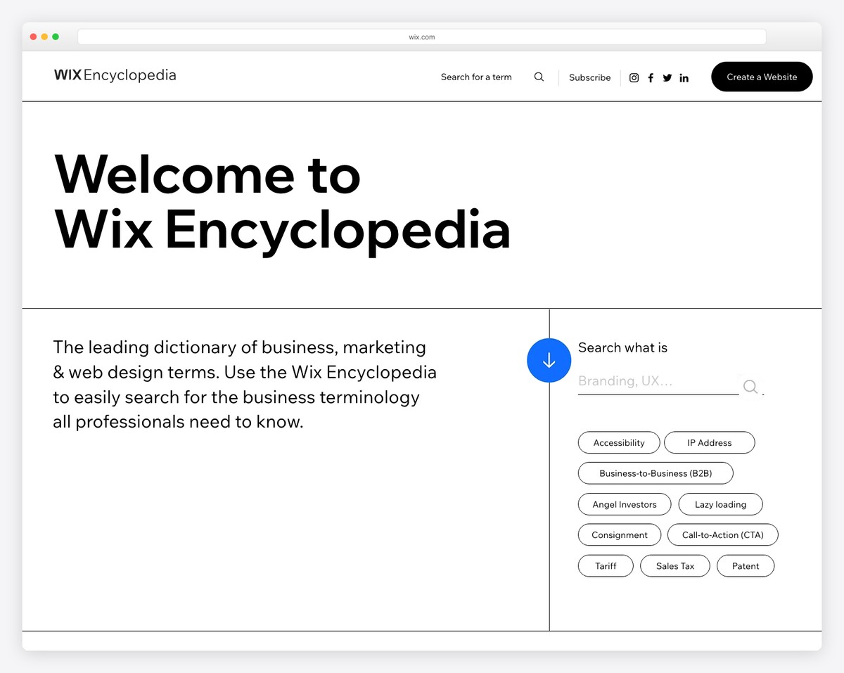
Wix Encyclopedia is an informational website featuring a clean and simple design, highlighted by a large title text. The practical search bar is easily accessible, with some of the most frequently searched terms just a click away.
We also appreciate that they offer a full alphabet, allowing you to search for terms by letter.
Moreover, Wix Encyclopedia uses a popup bar at the bottom of the screen to take immediate action in building a website.
What stands out: Offer readers multiple ways to find topics that interest them.
Here are some more websites built on the Wix platform.
2. Experience Map
Built with: Webflow
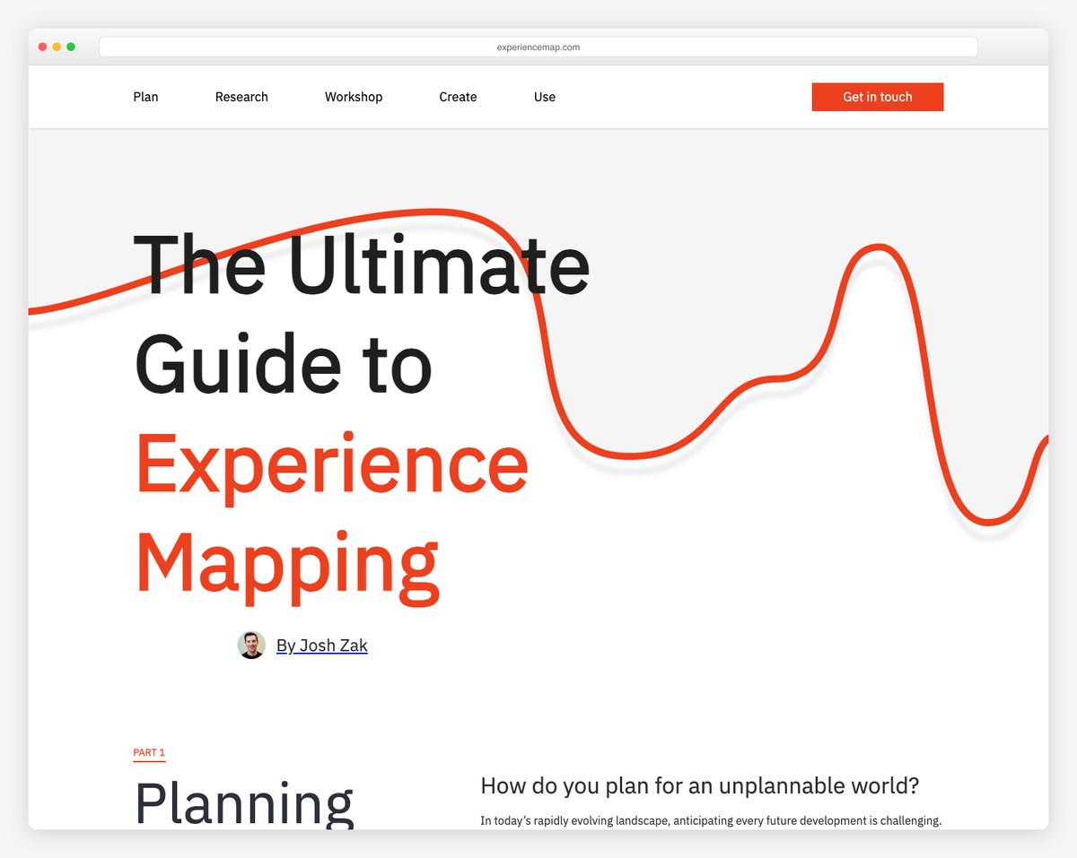
Experience Map is a long informational website with a light and clean design that starts with a title text instead of a hero image, slider or video.
Because of the heaps of content and information and its single-page structure, the sticky navigation comes in handy (for jumping from section to section).
Moreover, Experience Map also includes a CTA in the menu section, but another one is located at the bottom, just before the minimalist footer.
What stands out: Use bold text in the hero section (and (optional) graphics) – no need for visual content.
3. Photofocus
Built with: Elementor
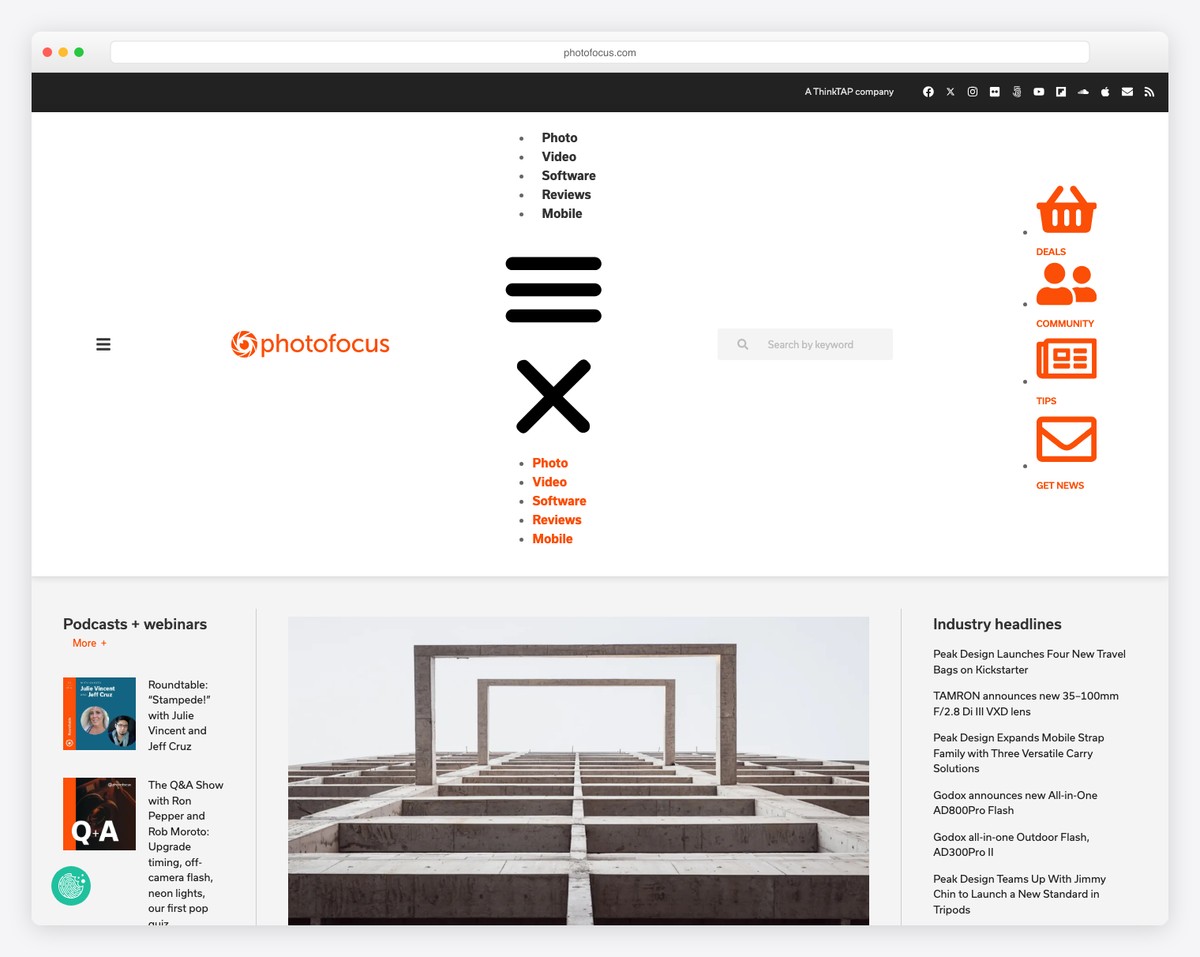
Photofocus keeps the layout clean with a simple header with a hamburger menu icon, logo and a search bar.
The navigation opens as a full-screen overlay, where you’ll also find a search bar and social media icons.
This information website has a layout of an online magazine with a sidebar, a sticky newsletter subscription widget and a back-to-top button.
What stands out: Add a back-to-top button, so readers don’t need to scroll all the way to the top (especially handy if you don’t use a sticky header/menu).
Read our Elementor review to see why it’s the best page builder for WordPress.
4. The Information
Built with: Ruby On Rails
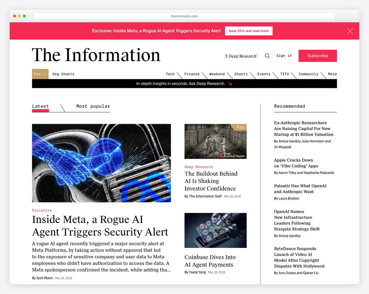
The Information is a website with members-only and public content. They use an email opt-in above the fold to direct you to the main content and another in the footer. But a popup will remind you to become a subscriber, too.
The page has a top bar, a header, a hamburger menu and a sticky bottom notification bar with a call-to-action (CTA) button.
What stands out: Use a form above the fold if you want to increase your opt-in rates.
5. Info Tech
Built with: Ruby On Rails
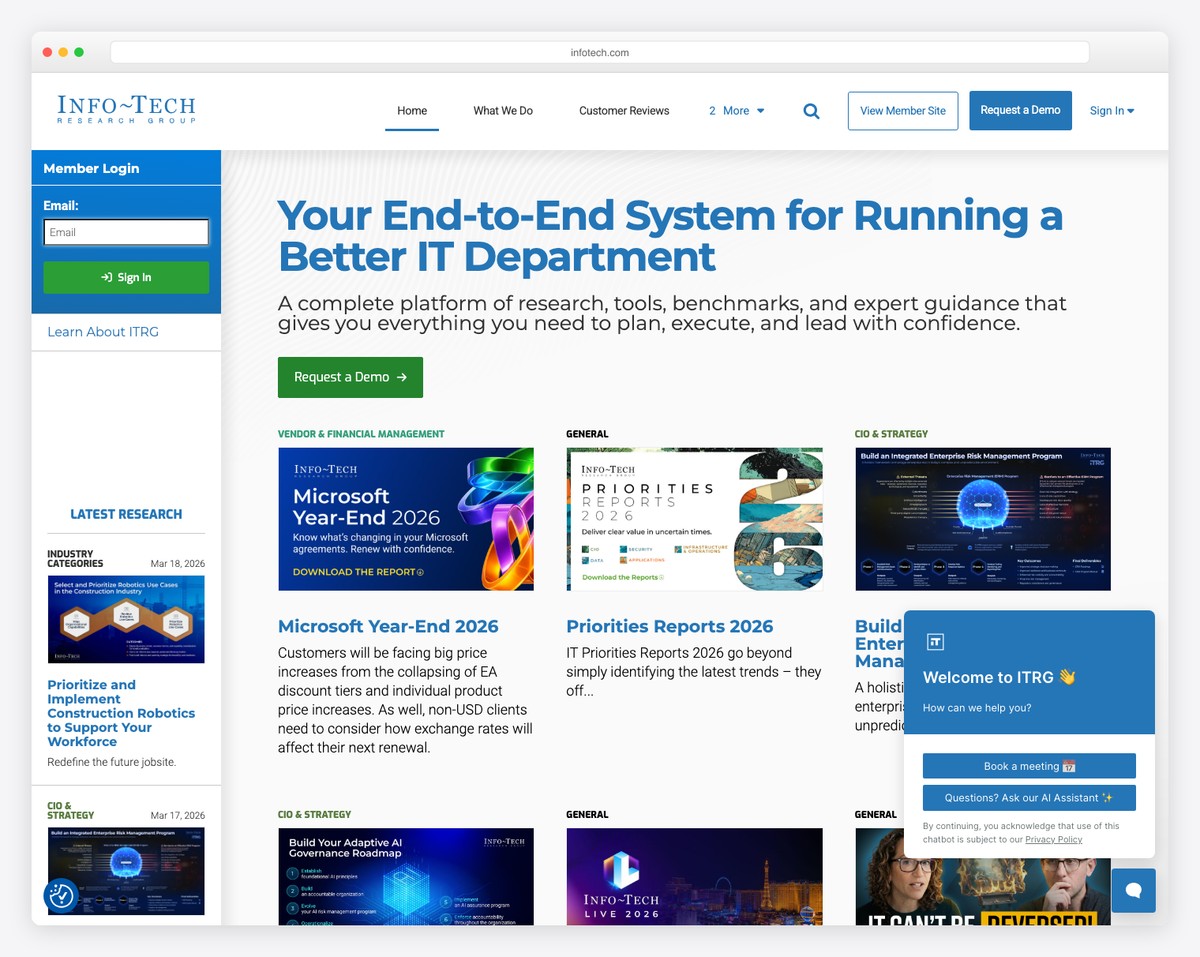
Info Tech has a modern, professional, and clean design with images loading on scroll. While there’s a lot of content going on, white space makes it readable on desktop and mobile.
The CTA button in the hero promotes a trial that opens a new page with a form.
Moreover, they utilize a more advanced subscription form at the bottom of the home page, featuring a drop-down that allows users to select a topic relevant to them.
What stands out: Allow potential newsletter subscribers to sign up for particular topics they’re interested in.
6. The Rocks
Built with: Kentico
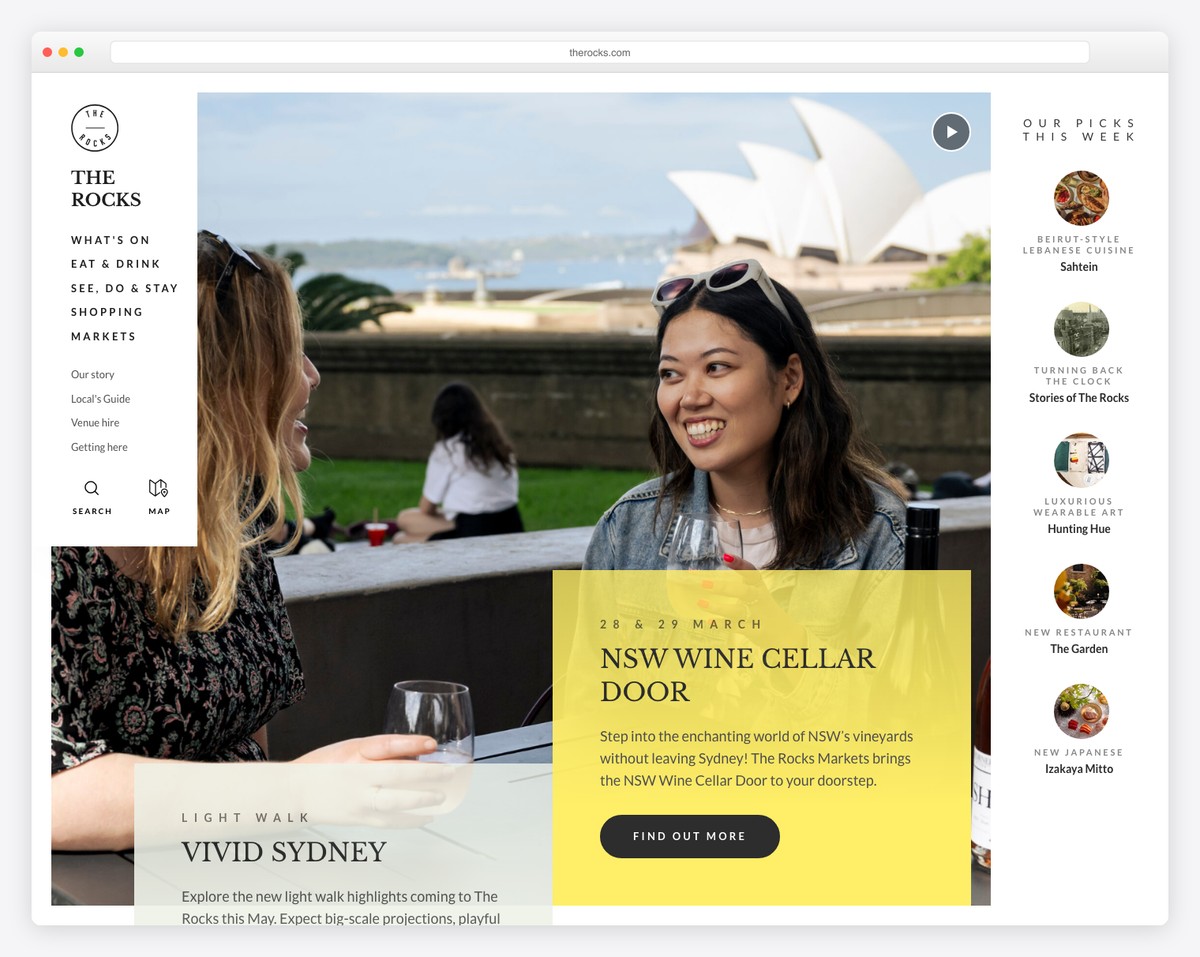
The Rocks is an informative website featuring a creative and responsive web design. It features a semi-sidebar header/menu that collapses when you start scrolling and remains in the top left corner.
The subscription form also floats in the bottom right corner but disappears once you scroll all the way to the bottom. Why? Because there’s a subscription widget in the footer.
What’s also cool are the “best picks of the week” section in the right sidebar above the fold.
What stands out: Enhance your browsing experience with a collapsible header/menu.
7. Polygon
Built with: Chorus
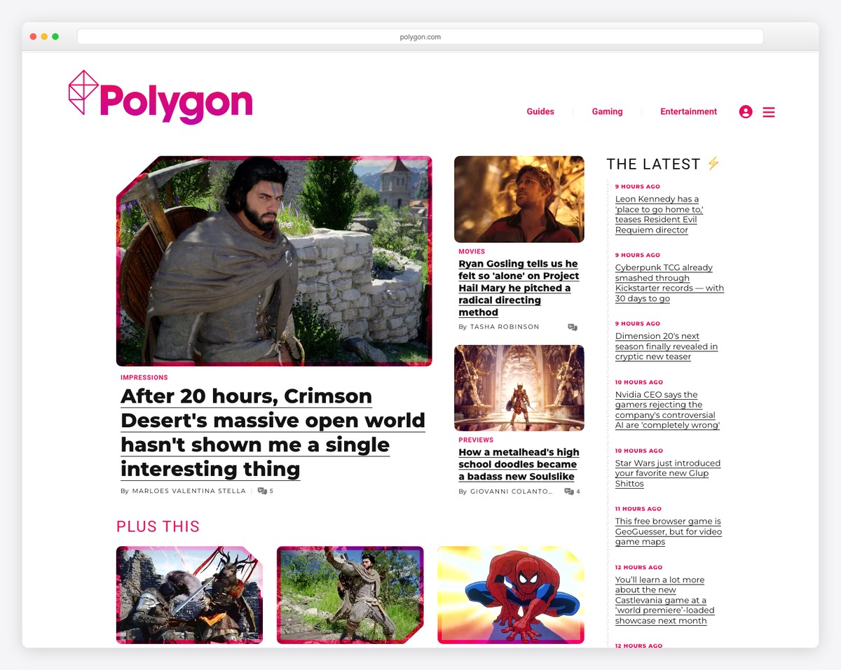
Polygon is a magazine-style website with a wealth of content to explore on the homepage. But you can also use the drop-down navigation or the search bar to find something specific.
Moreover, as soon as you start to scroll, a large newsletter subscription form appears at the bottom of the screen and remains visible. What also floats are the sidebar banner ads, so they grab more eyeballs.
What stands out: Use a drop-down menu to offer readers the ability to find something more specific more easily and quickly.
8. The Verge
Built with: Chorus
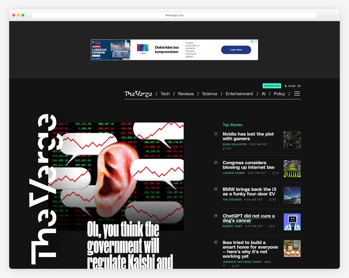
The Verge’s specialty is its dark design, which instantly makes it stand out from the rest. Similar to Polygon, The Verge also features sticky elements that make particular content (and ads) stand out more.
The navigation consists of two parts, a basic menu and a hamburger menu that appears on the right side of the screen. It utilizes a drop-down menu and displays login, sign-up links, and social media icons.
What stands out: Light design is still the most popular, so you can easily go against the grain with a dark one.
9. Cookie And Kate
Built with: Magazine Pro Theme
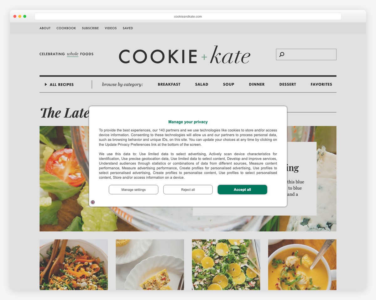
Cookie And Kate is a food and recipe blog with a minimalist look. The layout features a top bar, then a logo and only then a multi-level drop-down menu with a search bar.
What’s unique about Cookie And Kate is the use of pretty long blog post excerpts that usually consist of multiple images.
There’s also a sizeable sticky sidebar banner ad and another floating banner bar at the bottom of the screen.
What stands out: Give your readers a reason to click the post(s) by creating more extended excerpts.
10. HubSpot Blog
Built with: HubSpot CMS
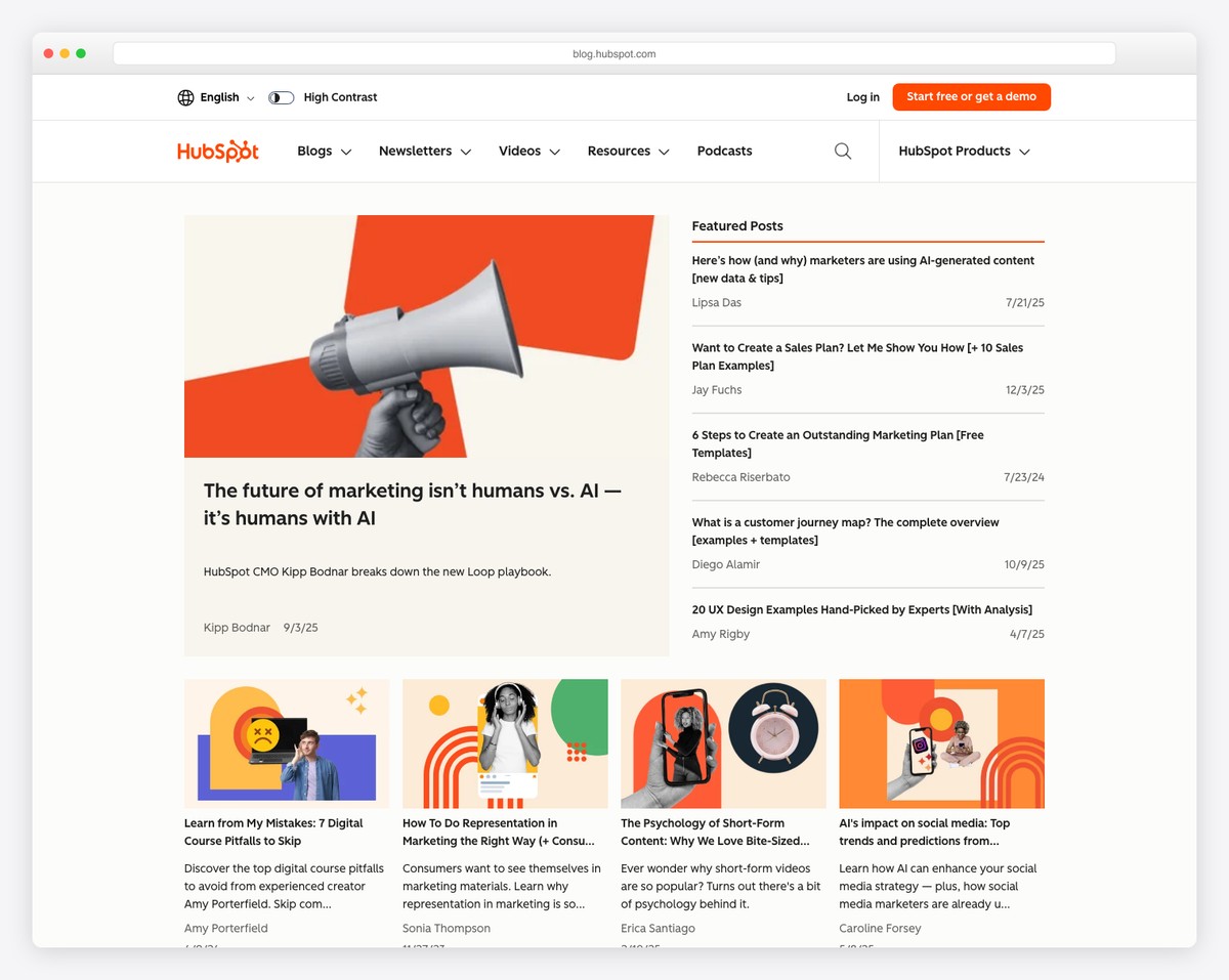
The HubSpot Blog feels more like an online magazine, with plenty of content and information, but its sectioned structure allows you to find the right information much faster.
Moreover, the sticky header has a mega menu and search bar, making everything easily accessible.
HubSpot Blog’s email subscription form allows users to pick the blog emails he or she wants to receive, which is handy.
What stands out: Instead of sending all emails to all subscribers, allow subscribers to pick the topics they are interested in.
11. He Spoke Style
Built with: Shopkeeper Theme
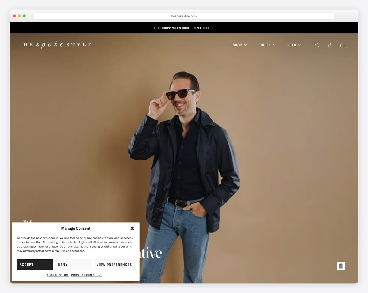
He Spoke Style’s first thing is a top bar notification that you can close by pressing the “x.” Next is a logo and a navigation bar with all the necessary links (but only the navbar sticks to the top of the screen.)
The home page focuses primarily on images, accompanied by titles and, sometimes, one-sentence excerpts.
The footer is minimalist, with additional business links.
What stands out: A top bar is a great place to share any notification you’d like to make more visible.
12. Help Scout
Built with: Gatsby
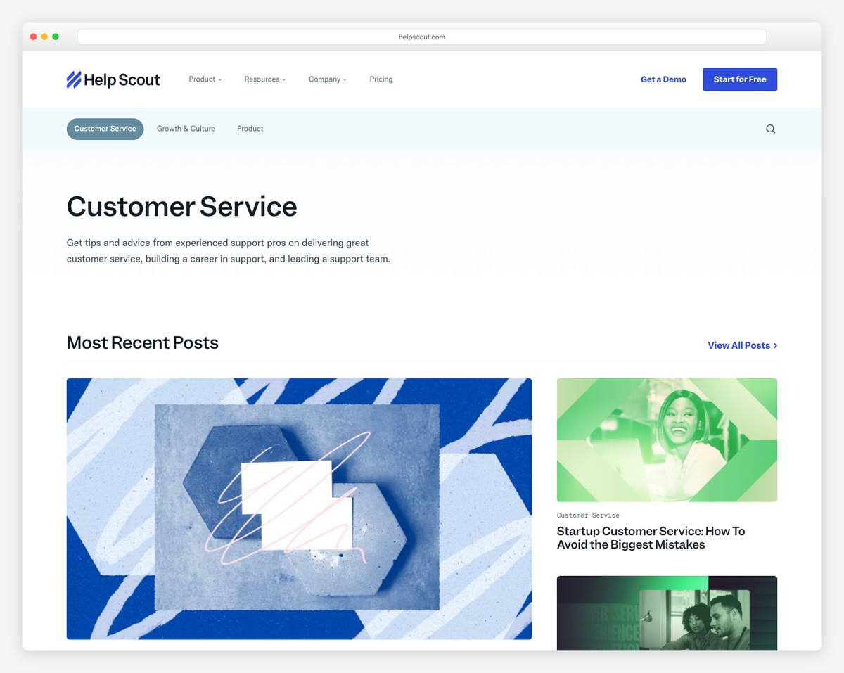
Help Scout is an excellent information blog with a light and clean design, giving you instant access to the most recent posts, editor’s picks, customer service, and more. But before the content is title and text with quick links.
The website also features a floating header with a mega menu, where you can find additional useful information, products, resources, and more.
What stands out: Instead of immediately starting your website with images or content, share a few words about the website first.
13. Regeneration
Built with: Webflow
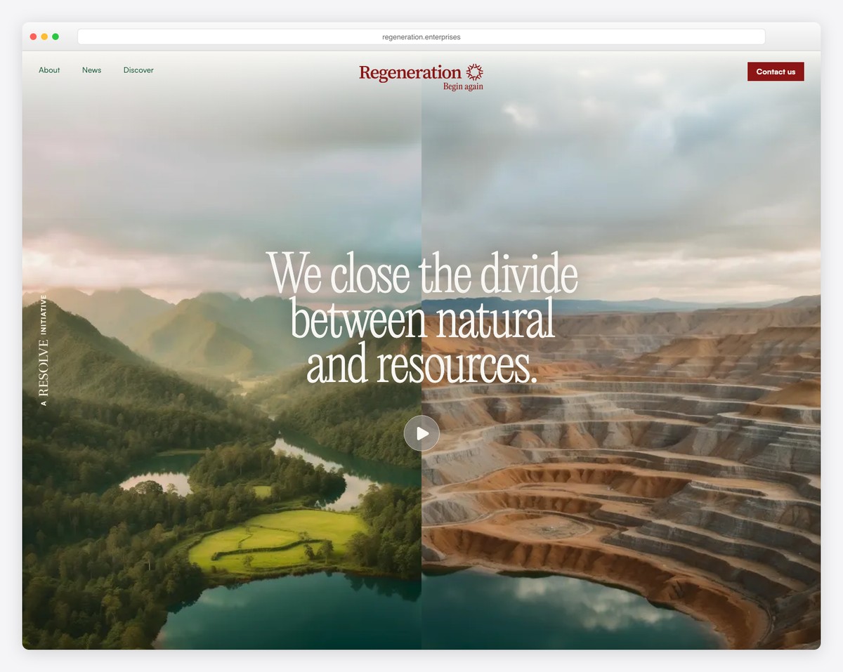
Regeneration creates a fantastic experience browsing through its informational content, featuring an epic one-page website layout that animates content as you scroll.
They use larger texts and plenty of white space, making reading more pleasant. Regeneration also has a back-to-top button, so you don’t need to scroll all the way back.
Additionally, they utilize a CTA in the sticky header, ensuring it’s always accessible.
What stands out: Use sticky header to have a CTA button always visible.
We also published an extensive list of the best Webflow websites with more great examples.
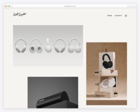
14. Steve Jobs Archive
Built with: Next.js
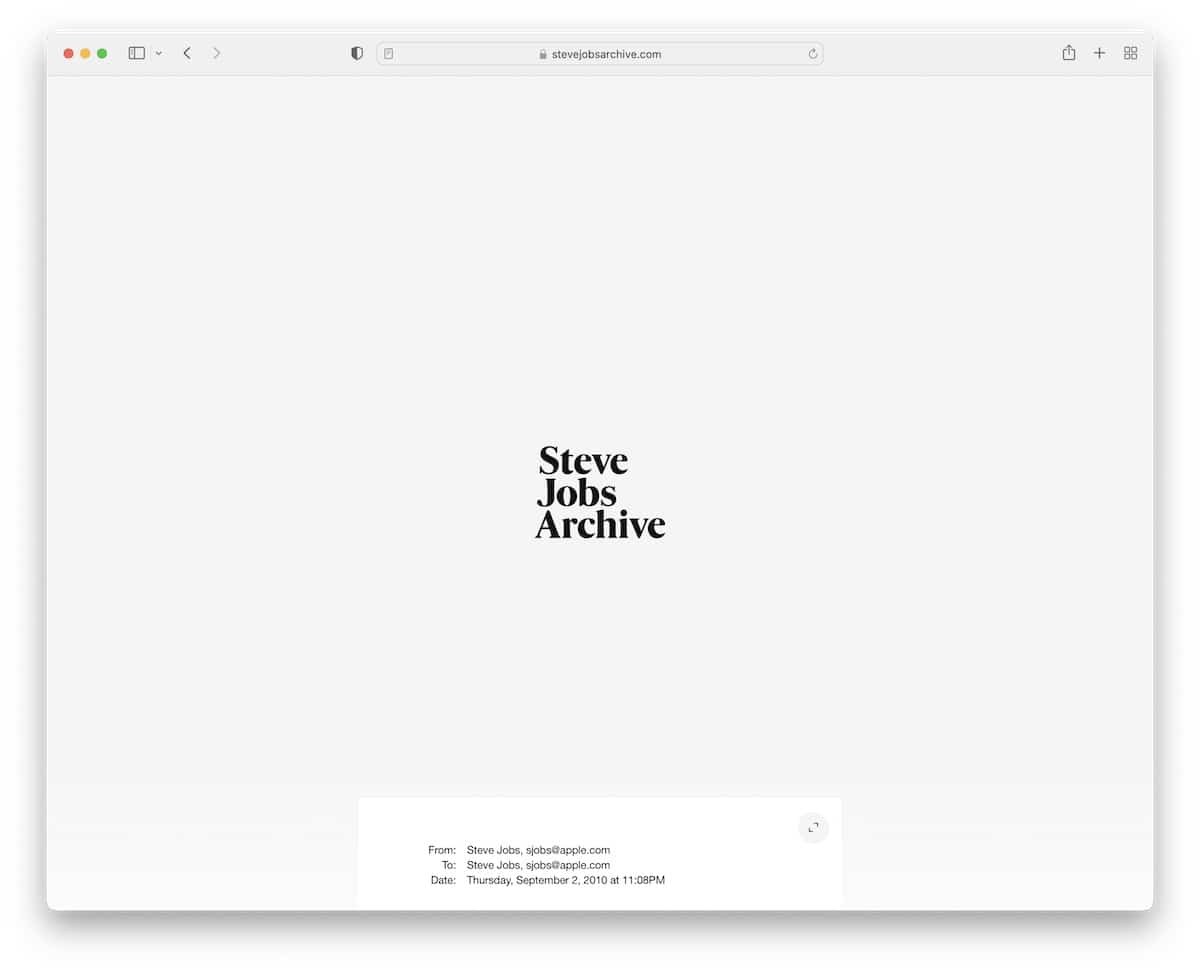
The Steve Jobs Archive is a minimalist, timeline-style website featuring a basic header and footer. The timeline elements have a hover effect that highlights the one you view and starts playing a thumbnail video.
Additionally, the option to resize Steve’s email makes it more readable while keeping the site neater in its original size.
What stands out: Use a hover effect to highlight the object and dim the rest of the page.
15. 3rd Wave Coffee Collection
Built with: Next.js
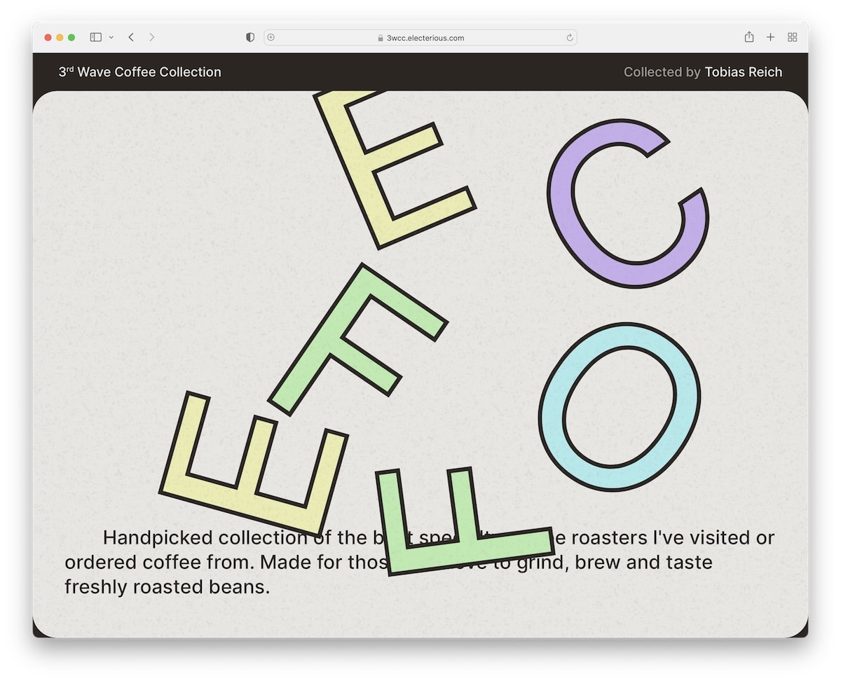
3rd Wave Coffee Collection is a creative and clean information website with a custom cursor that’s so large you can’t miss it.
You’ll find a large hero section featuring a cool “coffee” graphic and two sentences that describe the pageis content.
The rest of the page consists of a small grid featuring favorites and a long list that displays all the roasters.
What stands out: Don’t know how to make your website more unique? Use a custom cursor.
16. Open Subscription Platforms
Built with: Hugo
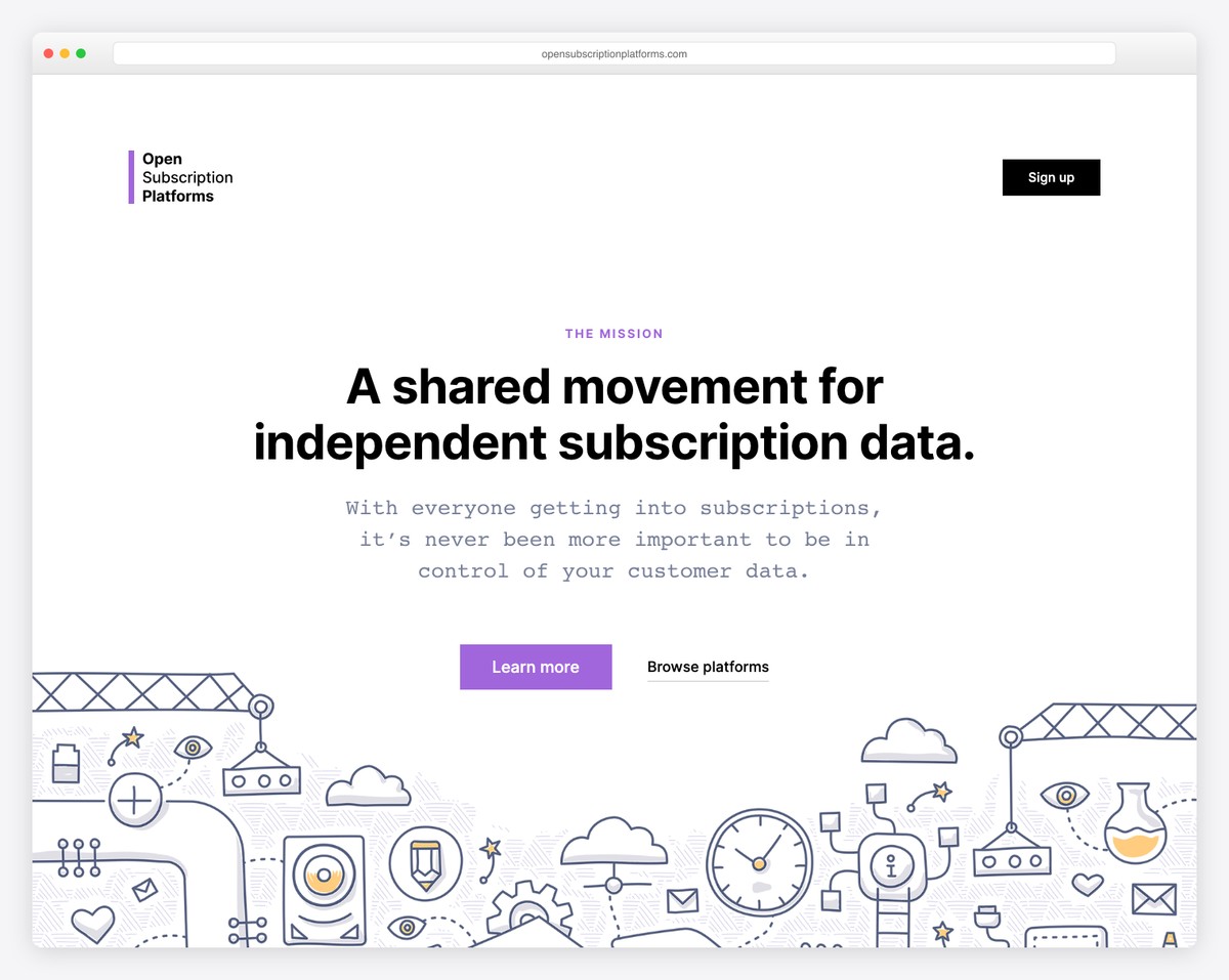
Like Experience Map, Open Subscription Platforms also uses text on a solid background above the fold to make their mission visible to everyone.
The header (with a CTA button) and footer are simple, maintaining the same background color to avoid visual distraction. Lastly, the subscription form is pretty large, which increases the opt-in rates.
What stands out: Make your newsletter subscription form large and visible so that more users can join.
17. SocialSizes
Built with: Gatsby
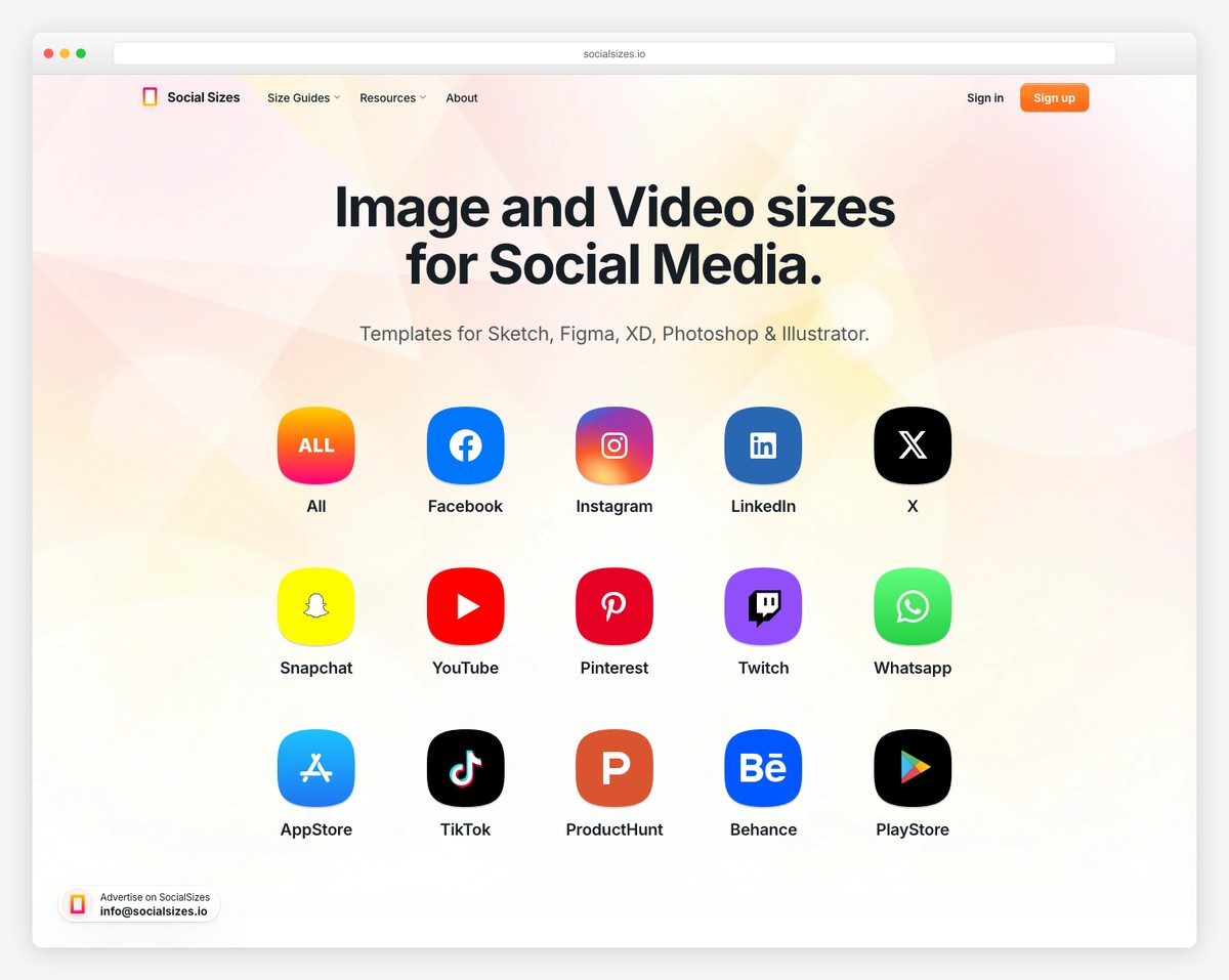
SocialSizes features clickable social media icons that direct you to the relevant content.
But even when you start scrolling, the sticky bottom “navigation” always gives you access to other content. Alternatively, you can press the back-to-top button to return to the header, which features three links and a newsletter subscription form. Meanwhile, the footer consists of menu links, social media and email.
What stands out: Give users quick access to the necessary content/information with clickable icons (so they don’t need to scroll for it).
18. TinySeed
Built with: Squarespace
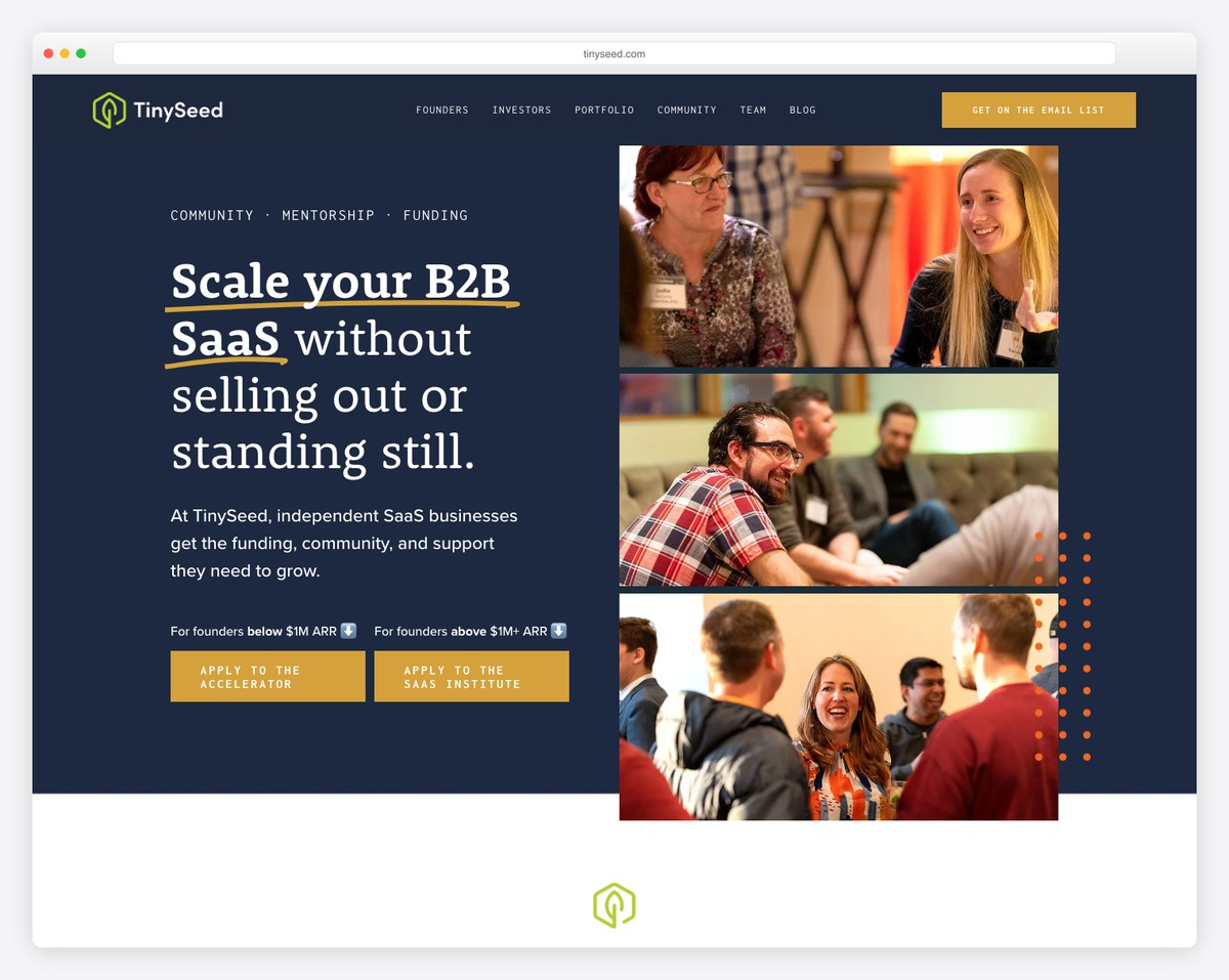
TinySeed’s website immediately communicates its mission — helping independent SaaS founders scale without selling out. The bold serif headline on a dark navy background grabs attention, while a vertical stack of community photos adds a human touch.
The dual CTA approach (for founders below and above $1M ARR) smartly segments visitors, and the overall design balances professionalism with the approachability of a bootstrapper community.
What stands out: Segmenting CTAs by audience type (e.g., revenue stage) helps visitors self-select the right path quickly.
19. Supernatural Kitchen
Built with: Squarespace
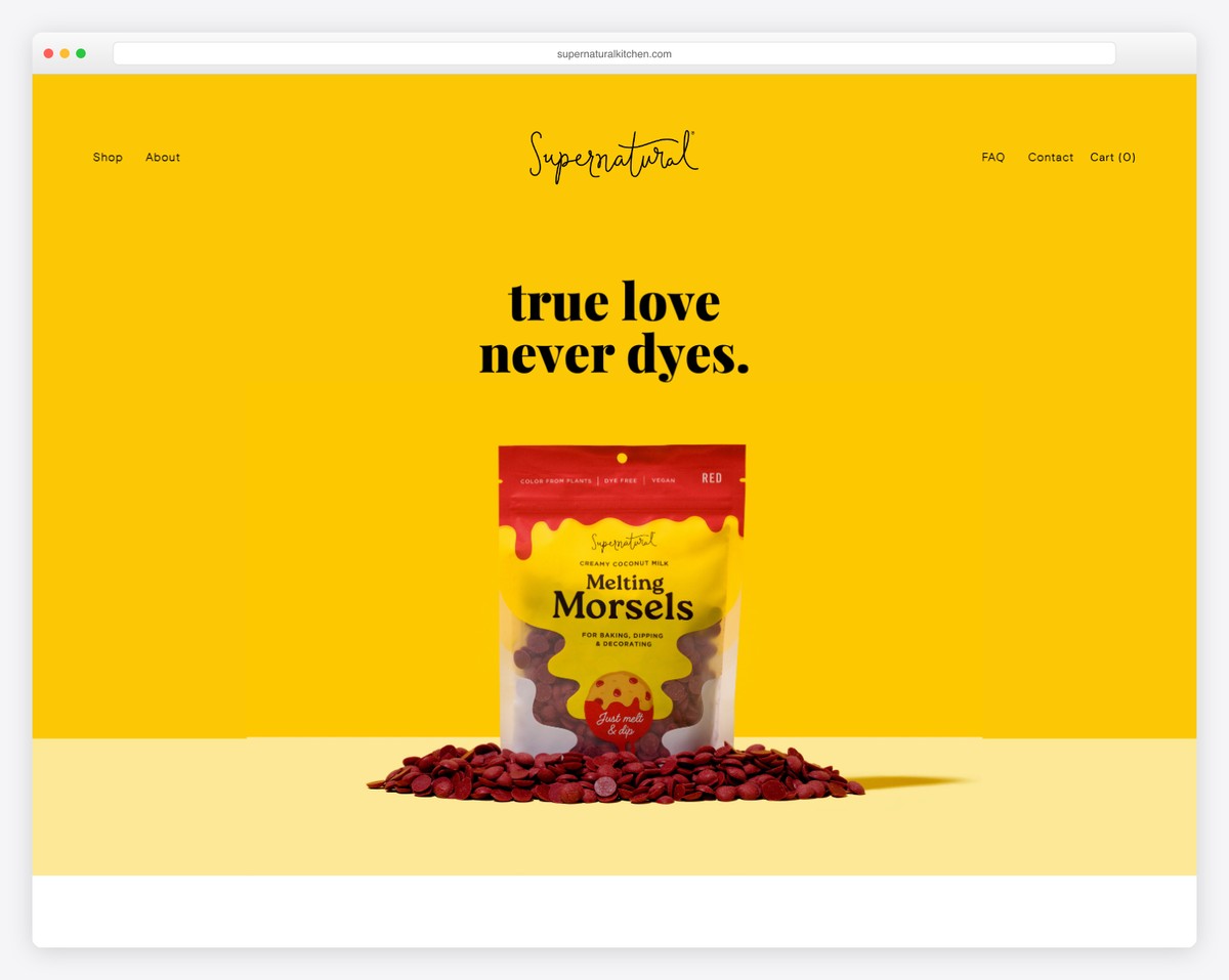
Supernatural Kitchen’s website is a vibrant, eye-catching example of how to present a product-focused informational site. The bold yellow background and playful tagline “true love never dyes” immediately communicate the brand’s personality and mission — plant-based, dye-free food products.
The minimal navigation with just four links keeps things clean, and the centered product shot with spilled morsels adds a dynamic, appetizing feel to the page.
What stands out: A bold, monochromatic background color can make a product hero image pop and create instant brand recognition.
Related Posts

Comments (0)