25 Best Shopify Websites (Examples) 2026
Do you want to examine the best Shopify websites because you’re in the process of building an epic eCommerce website?
We’ve reviewed 100s of online shops, which allowed us to create this collection of the absolute best for your viewing pleasure.
Not just that, but you’ll also learn new stuff, gain new ideas and even find what you thought would be cool but ends up not being how you pictured it when investigating these pages built on Shopify.
Finally, the big question: “How to build a website similar to these?”
We recommend using any of these simple Shopify themes because you’ll save yourself plenty of time.
Best Shopify Websites You Can Learn From
1. ETQ
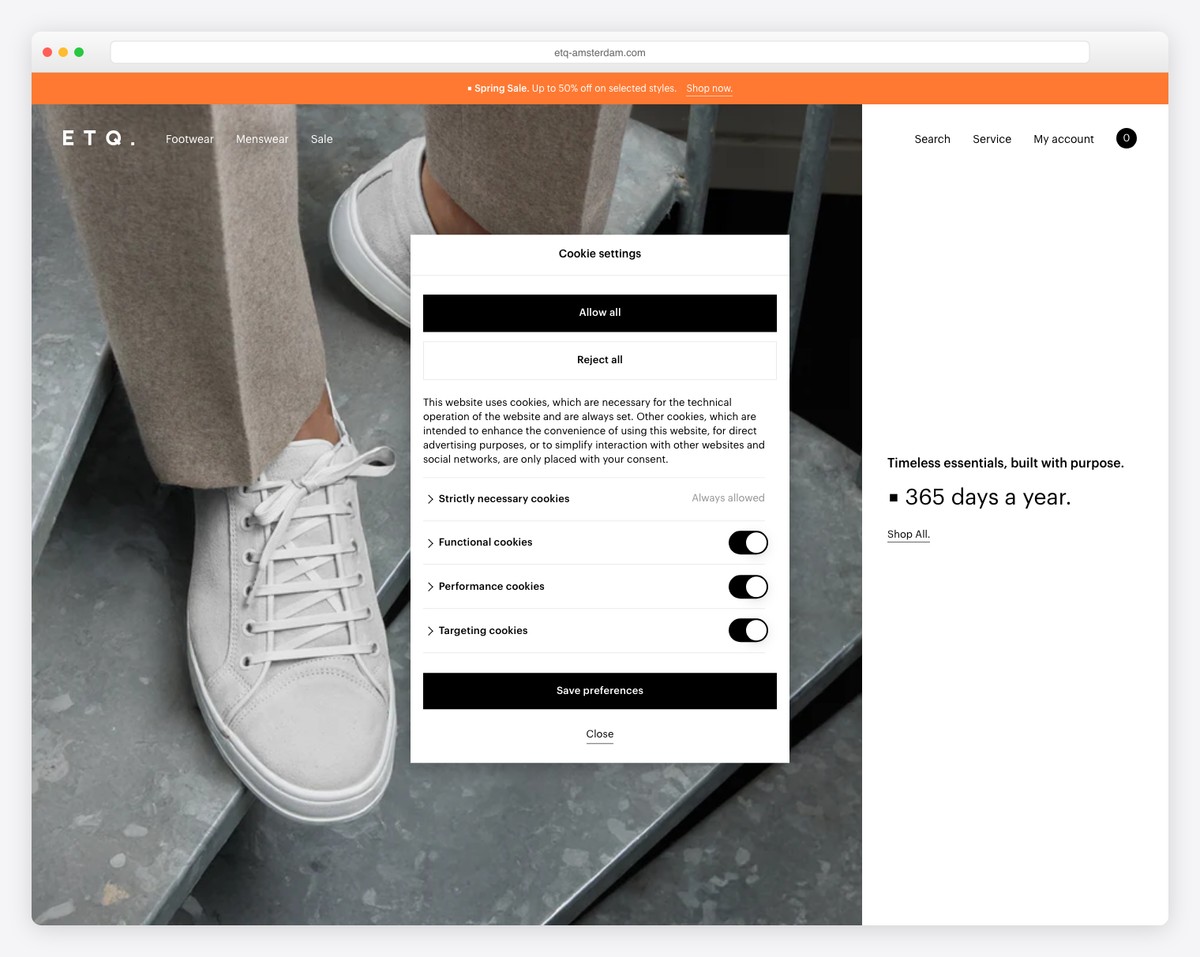
ETQ is a minimalist shoe website with a full-screen hero section with a split design, with an image on one side and text and link on the other.
To improve user experience, it has a header that disappears when scrolling and reappears when you scroll back to the top. Moreover, the footer has multiple columns with additional business information, social media links, and navigation.
You also get hit with a popup promoting a discount in exchange for your email.
What stands out: Use a newsletter subscription form to grow your email list and build your business.
Estimated Revenue: 1.6M USD
2. Oishii
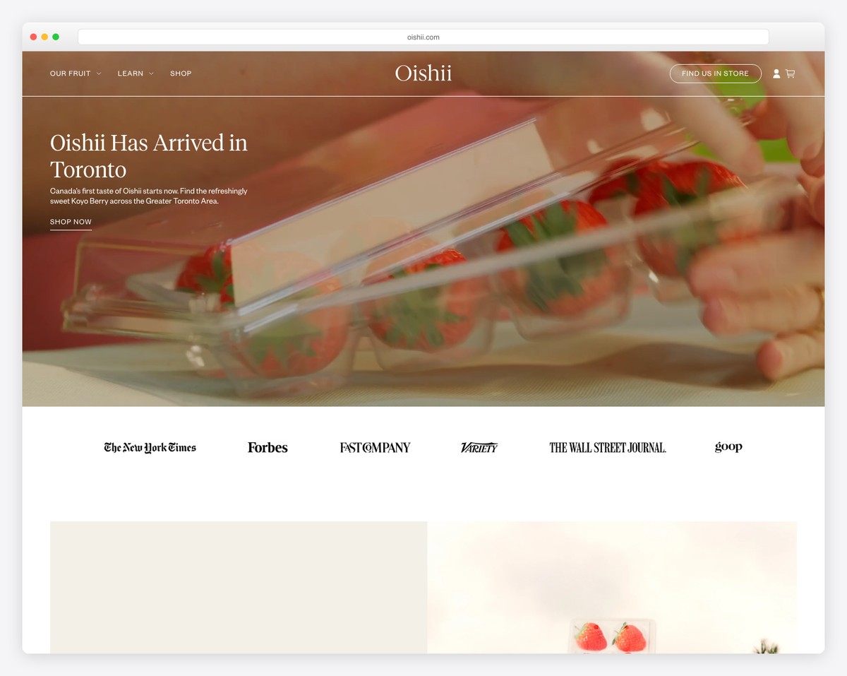
Oishii is a Shopify website example with an image banner with text and a link above the fold. Moreover, the transparent header sticks to the top of the screen to keep the navigation always available.
Oishii also has a top bar notification, which you can close by pressing “x.” Before the information-rich footer is a full-width Instagram feed that opens posts in a lightbox slider.
What stands out: You can easily add more content to your eCommerce website with an IG feed (which will also help you grow your profile).
Revenue: Unknnow but it has secured over 150M in funding.
3. LivSo
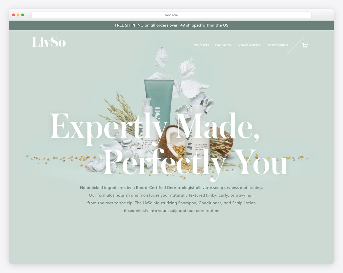
LivSo has a clean, responsive web design that emphasizes its products beautifully. Extra white space enhances readability, while the transparent floating navbar gets you to other pages without needing to scroll back to the top.
LivSo also has a sticky top bar notification to inform customers about their free shipping. We also like the “in the press” section that features a logo slider with links to full articles.
What stands out: Using less content and more white space can significantly improve your Shopify site’s UX.
Revenue: 5M USD
4. Sophie Ratner
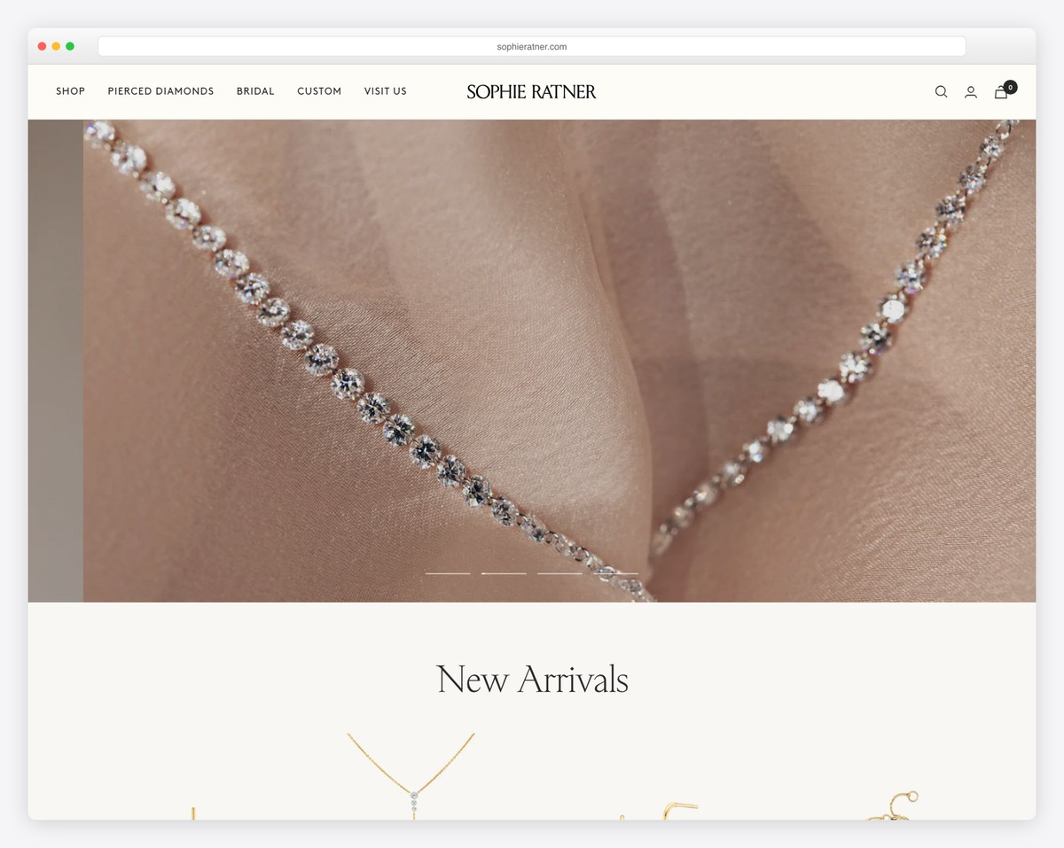
Sophie Ratner has a massive slideshow featuring their “in use” products with titles and links.
You’ll notice a sticky accessibility button that allows users to customize their website experience. There’s also a sticky country selector in the bottom right corner.
Furthermore, the navigation has a mega menu with links and images to find categories and products much easier.
What stands out: Let everyone enjoy your online store fully with accessibility adjustments.
Revenue: 5M USD
5. Tattly
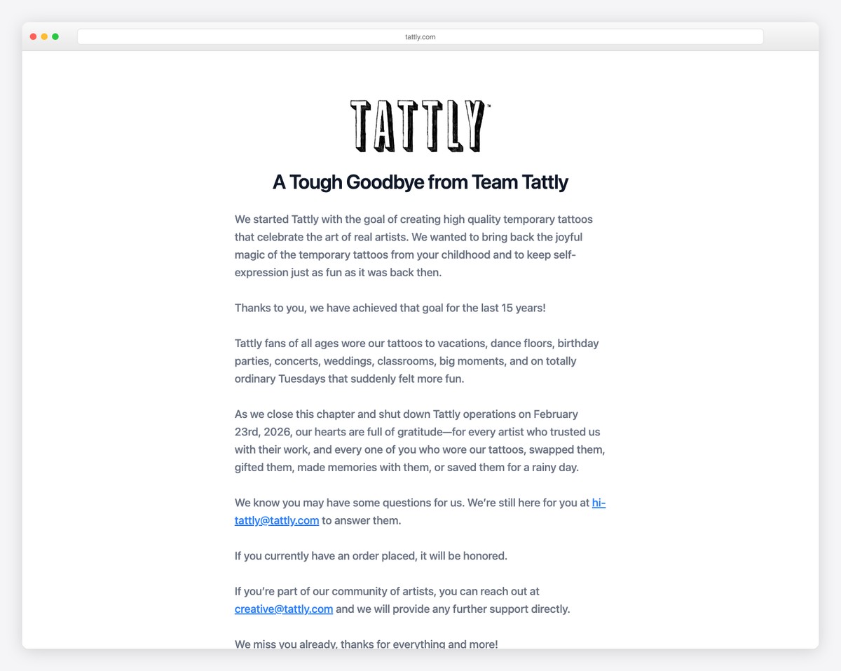
Tattly starts with a top bar notification with a contrasting background to make it stand out more. Next is a minimalist header with a mega menu and a bold grid with links to categories.
This Shopify website has a simple layout with creative details to enhance the online shopping experience.
What stands out: Mixing minimalism with creativity contributes significantly to a better viewing experience. (Make it fun!)
6. Nalen Ayurveda
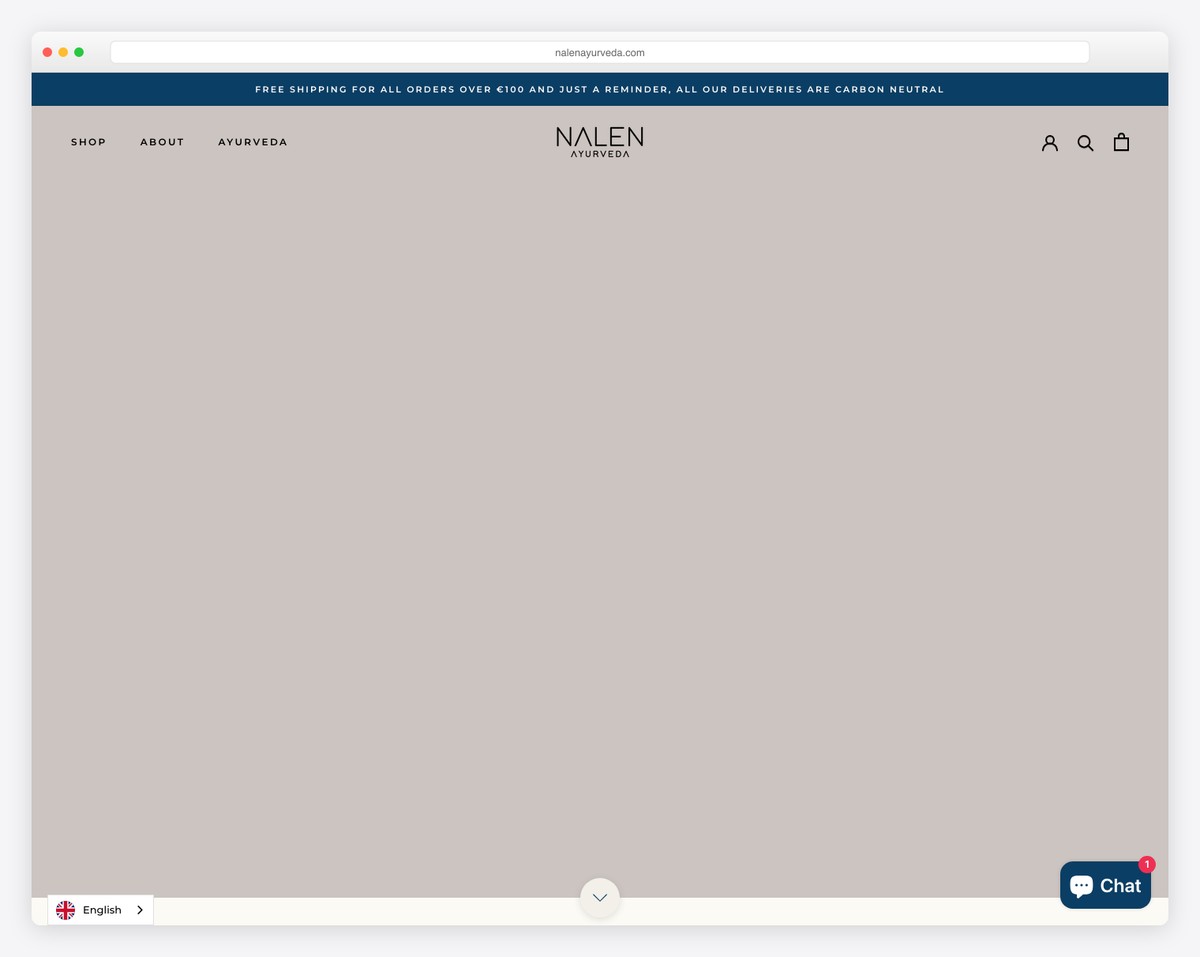
Nalen Ayurveda’s soothing web design gets you involved in its products. It starts with a large slideshow that emphasizes the product more than the actual sales element (the text and CTA aren’t too distracting).
The live chat button floats in the bottom right corner, so you don’t need to search for contact details.
What’s cool is the slider that features images with hotspots that showcase the product with a name, price and a CTA button (all within the slideshow).
What stands out: Use a slider to promote your products through beautiful imagery but keep the sales part simplistic.
7. Feastables
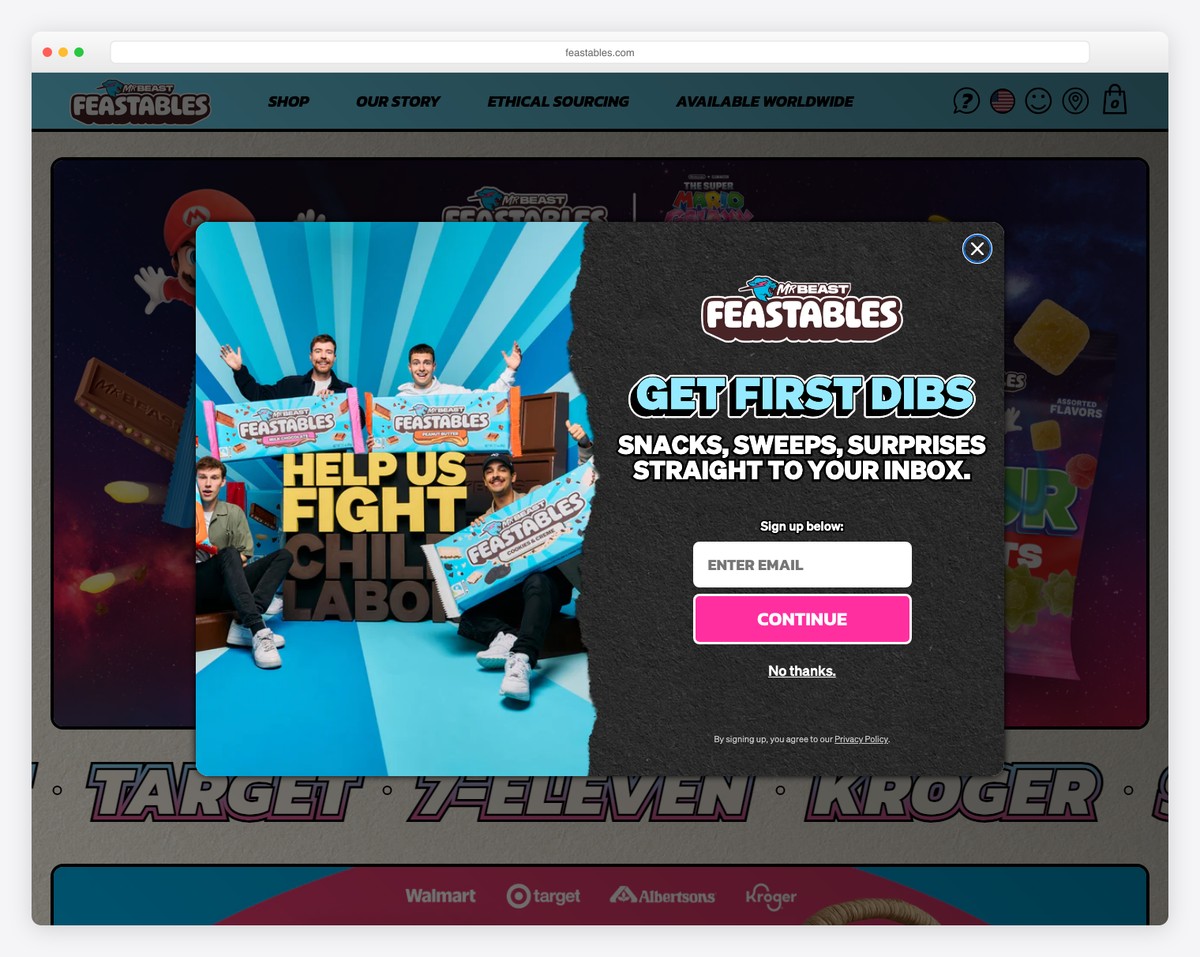
Feastables isn’t your ordinary Shopify website because of its vibrant, cool and catchy design that goes completely against the grain.
It features many animated elements, CTA buttons that feel like you’d be pressing an actual button, and a floating top bar and header.
There’s also a unique review section and a slider with images featuring fans with Feastables products.
What stands out: Involve your customers by sharing their feedback and modeling your products, which you can collect using a unique IG hashtag.
8. Kylie Cosmetics
Kylie Cosmetics’s Shopify website has a three-part header section with a top bar, navigation with a search bar and country selector and a notification bar (that you can close). On top of that, all three stick to the top of the screen.
Similarly, the footer also takes a pretty large chunk of web real estate, where you can find social media icons, additional links, and more.
What stands out: A multi-part header can work great, but stick to simplicity and not overstuff it.
9. Oatly
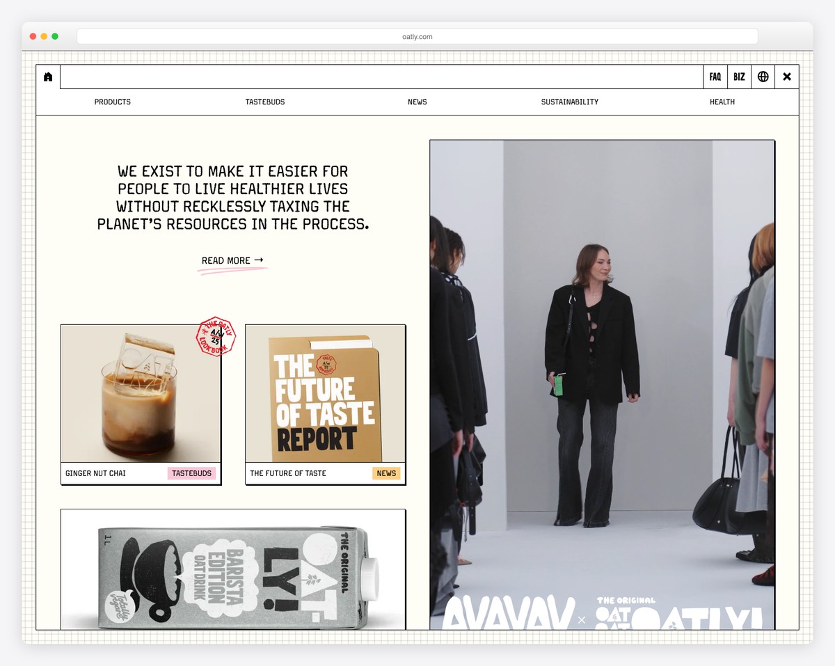
We could say that Oatly comes very close to the Feastables website because of its uniqueness.
Instead of scrolling vertically, you scroll this Shopify website horizontally. And even though the design feels very crowded, checking content is fun because it almost feels like a “can you find it?” game.
However, Oatly still has a sticky hamburger icon in the top left corner that opens a full-screen menu overlay that will take you to the necessary content and info.
What stands out: Dare to do something differently? Make a home page that scrolls horizontally instead of vertically.
10. Deliveroo Packaging
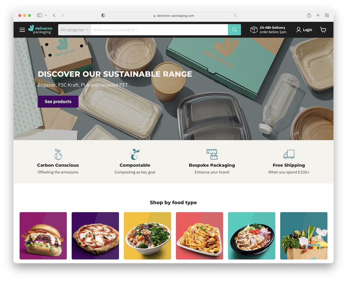
While business websites usually have a small search bar or just an icon, Deliveroo Packaging makes a good part of its floating header a search bar with an option to search by category. Very convenient.
But they also use a mega menu and an option to shop by food type to make finding the right stuff easier and faster.
What stands out: Ensure everyone gets to the right stuff easily with great navigation and a search bar.
11. Huel
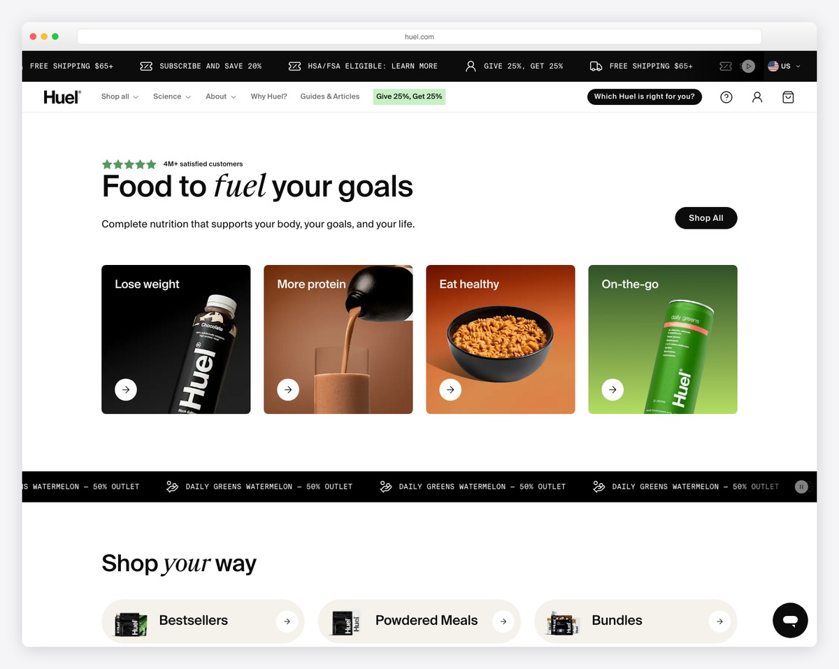
Huel ensures you first pick the right location, so it adjusts the website to your country. The page has a top bar with multiple notifications and a simple header that opens a mega menu for finding categories and products quickly.
There’s also a special section below the hero banner dedicated to various authority logos, which are press mentions.
The banner features a title, text, a CTA button and a Trustpilot badge.
What stands out: Are you using a 3rd-party rating system? Showcase the overall score on your home page (if it’s high).
12. Gymshark
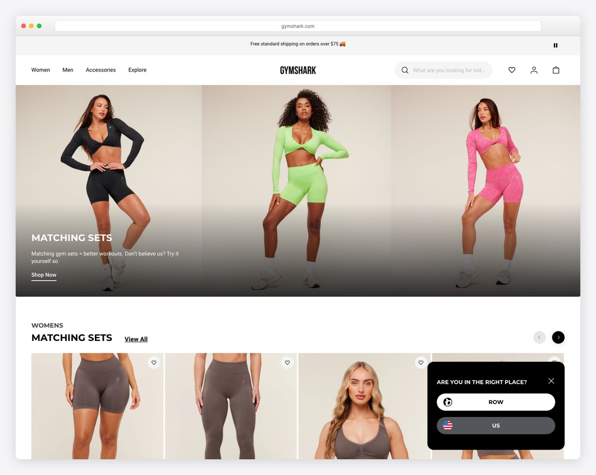
Gymshark’s home page is pretty strongly product promotion oriented but still with great UX in mind to ensure visitors stay on the site and not leave early.
This Shopify website has a live chat widget with FAQs, but there’s also an option to send a direct message.
The navigation bar only includes three main categories that open a mega menu with multiple links. But there are more links in the footer with social media icons and payment gateway badges.
What stands out: Using a mega menu, you can keep the navigation bar much simpler.
13. Bremont
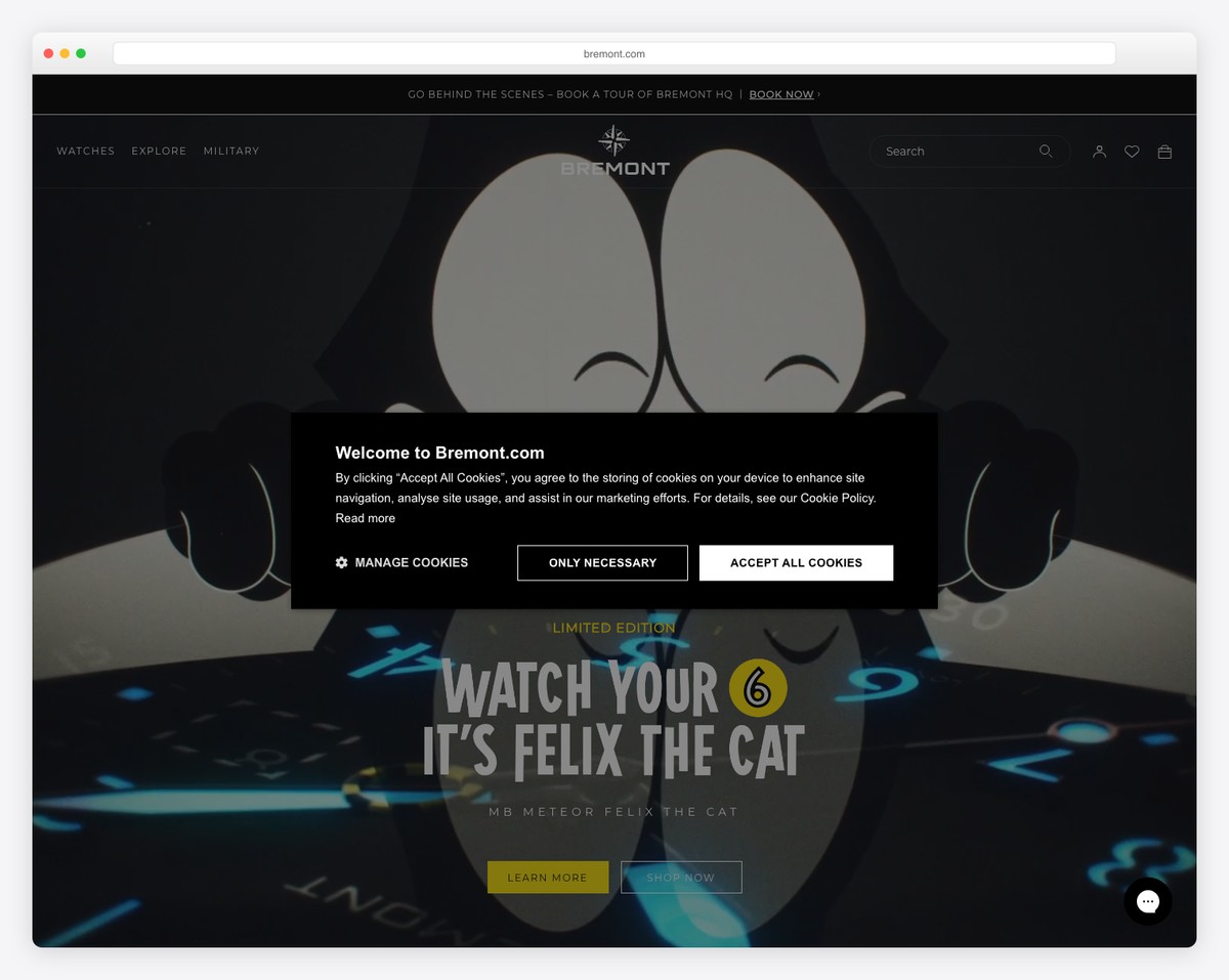
Bremont has multiple sections, displaying images, videos, a product carousel, and article links.
One section also promotes a newsletter subscription form with information on what type of emails you can expect.
The header disappears/reappears depending on the scrolling movement to improve UX. Moreover, you’ll also find a currency/location switcher for personalizing the shopping experience.
What stands out: If you have customers worldwide, use at least a currency switcher (if you don’t feel like translating the entire website yet).
14. Lazy Oaf
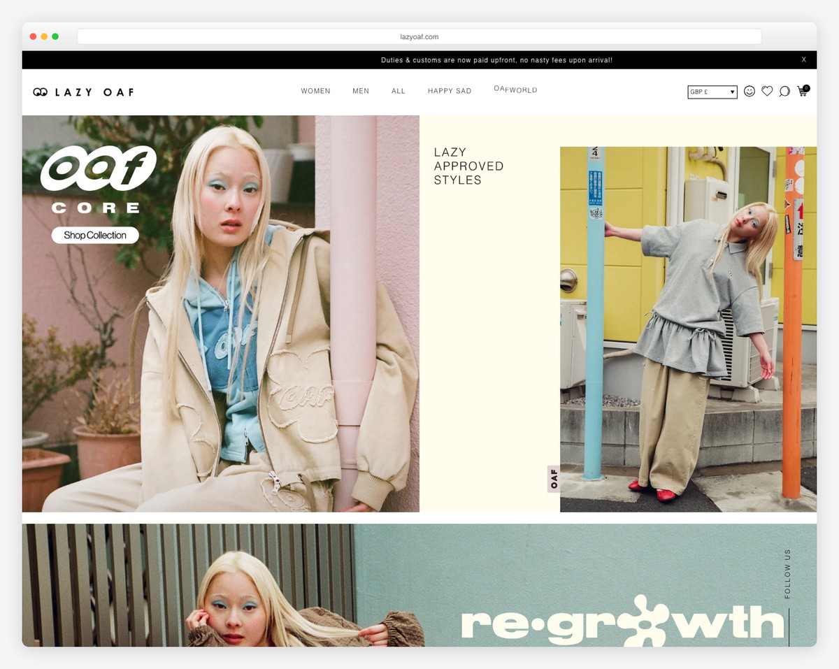
Lazy Oaf has a top bar notification that promotes their app, a sticky sidebar button that pushes a discount for email and a live chat widget in the bottom left corner to help users with quick answers.
This Shopify website is also really clever regarding small details that make shopping a lot more pleasurable.
They also have a disappearing/reappearing header and an Instagram feed that opens posts as a lightbox slideshow.
What stands out: Use a top bar notification to promote a sale, a special drop, an application, etc.
15. Skinnydip
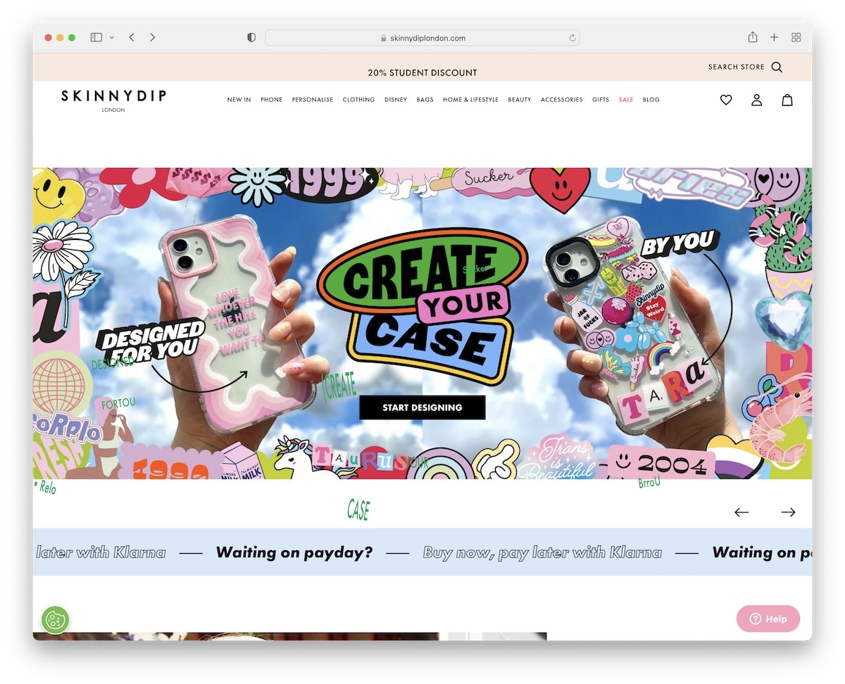
Skinnydip wants to grab your attention with a discount popup, which you can pass or fill out. This form’s handy because it allows you to pick your device, so you only get content related to it, making emails more useful.
And then there’s a reminder at the top of the screen about the discount that floats, just like the secondary notification and the header.
Skinnydip builds trust with a customer feedback slider and an Instagram shop featuring the actual customers, not just Skinnydip’s models.
What stands out: Allow subscribers to pick the “topic” they’re most interested in when giving you their email for more personalized newsletters.
16. Finisterre
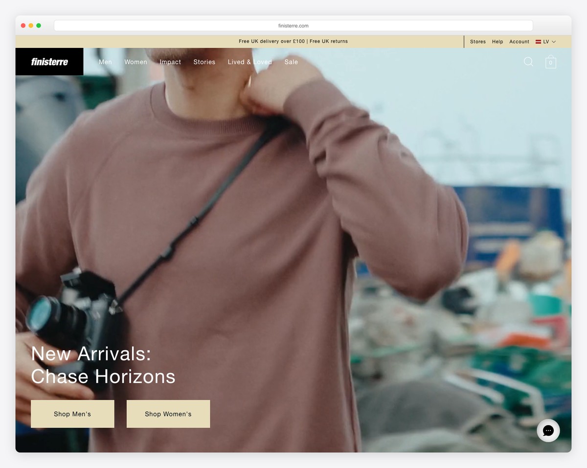
Instead of an image or a slider above the fold, Finisterre uses a very engaging video with text overlay and three CTA buttons.
Finisterre ensures that finding items is a piece of cake with the mega menu and the search bar. Remember, the header disappears when you start scrolling and reappears on a back scroll.
Finisterre is a good example of how to mix products, content and IG feed to easily get immersed in what you see, thanks to the minimalist feel and extra white space.
What stands out: Use a promotional, a product showcase video for a new drop or any other video above the fold.
17. Nicce
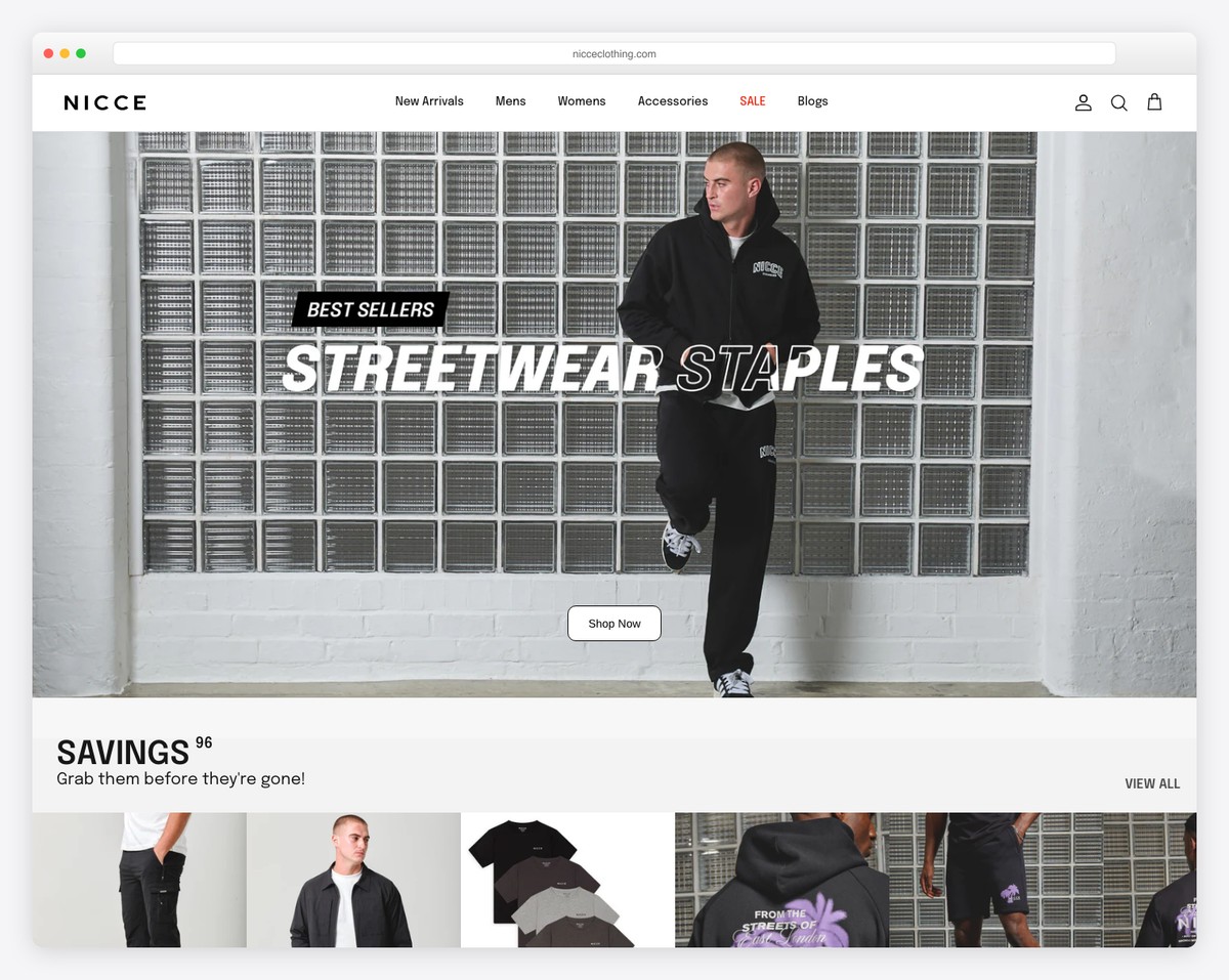
Nicce lets you glimpse some of their products and offerings via the large slider above the fold. This Shopify website has trending items right below the slideshow, followed by other sections that reveal more of the good stuff.
They also use a pretty advanced subscription form popup and a four-column footer with many additional links, store locations and social media.
What stands out: You can create more personalized newsletters by requesting more user information.
18. Staples
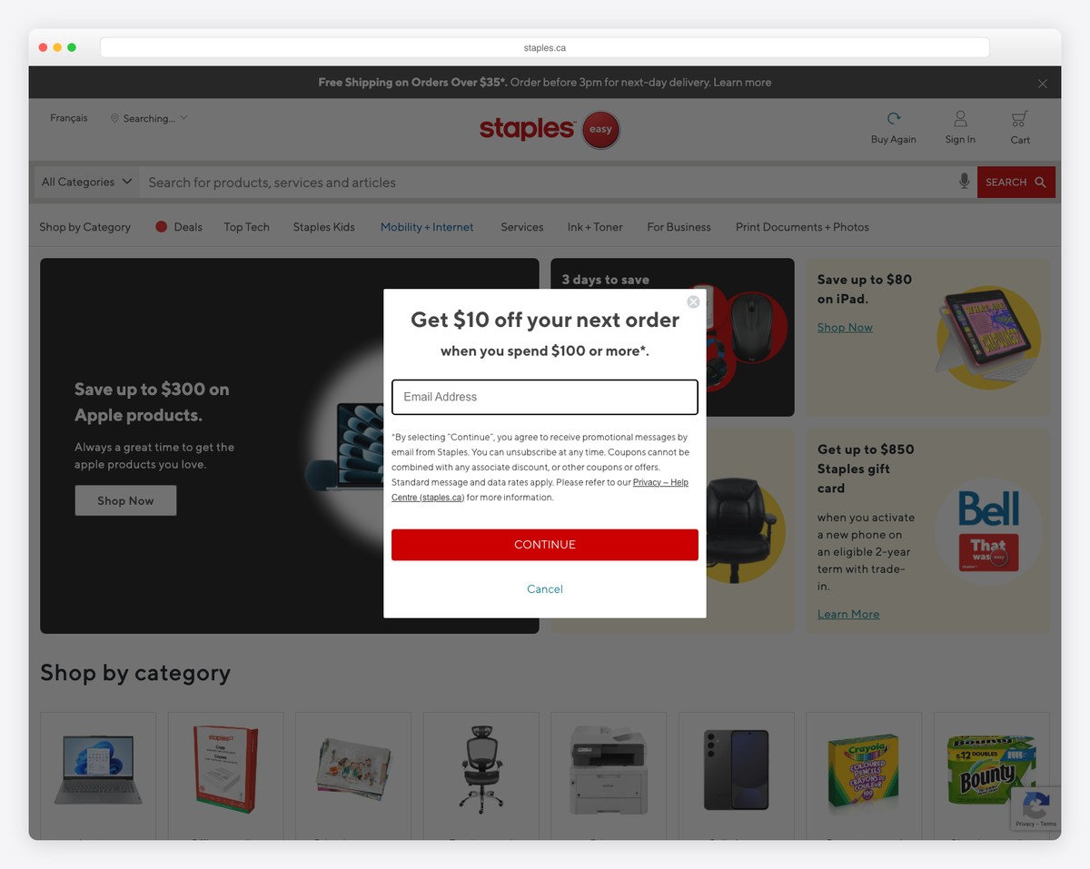
Staples is a general Shopify website with a cleaner design to ensure all the content pops up more. They use a mega menu navigation and a large search bar to find items easier.
And to prevent scrolling back to top, you’ll find a back-to-top button in the bottom right corner (improves UX).
Moreover, the store location function in the header area allows you to search for stores to find a nearby one, its opening hours and business details.
What stands out: Use a store locator if you have multiple locations so that a customer can find the ideal location.
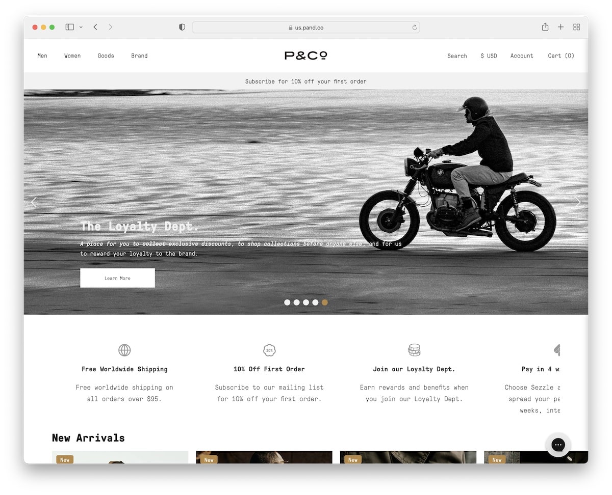
19. P&Co
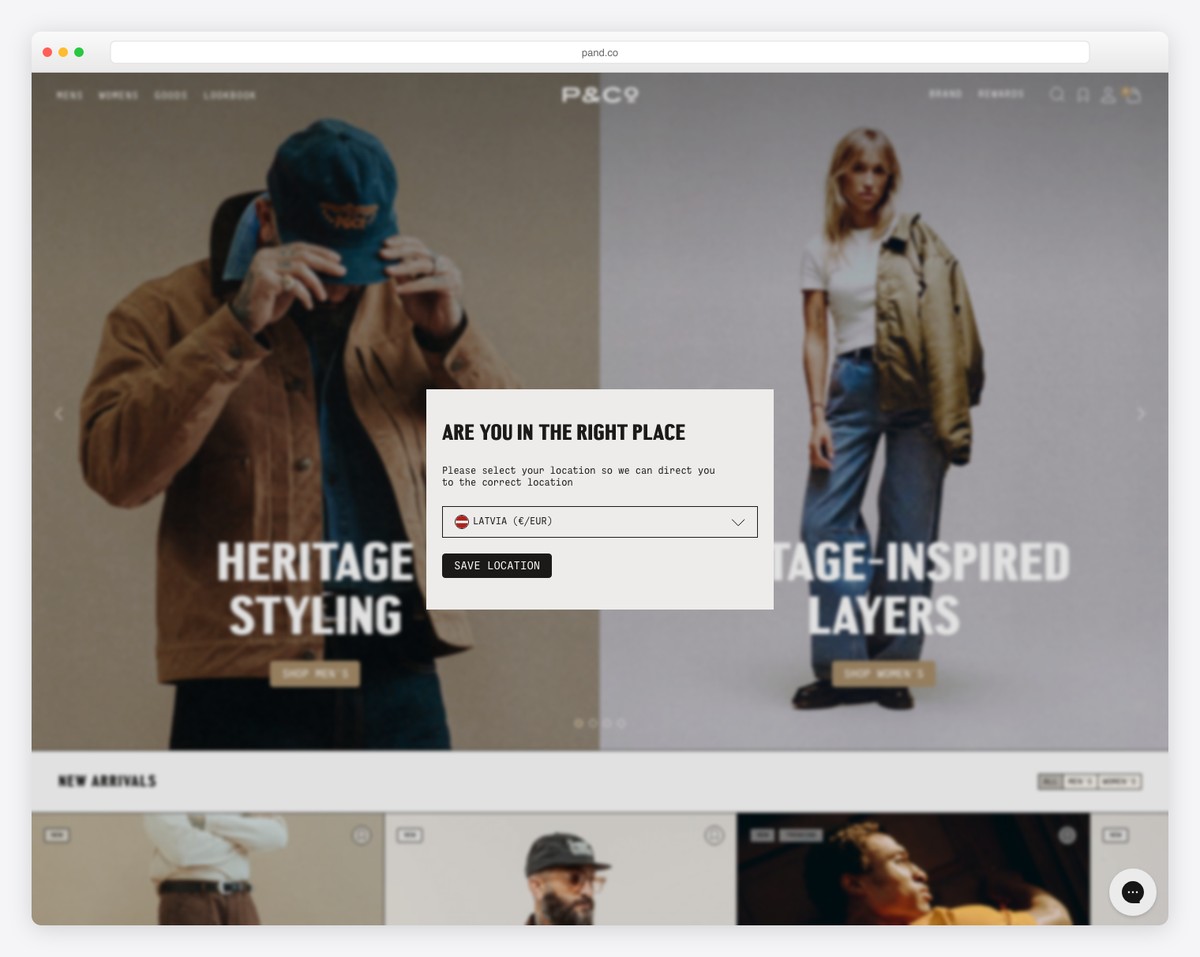
P&Co uses a narrower slider, so there’s space left to include an additional informational slider above the fold.
The header and the notification bar float on top of the screen, while the footer equips you with a subscription form, shopping details and links to other page sections and social media.
What’s also handy are the two different product carousels for new arrivals and featured products, so you can quickly swipe through them.
What stands out: Save website space with a product carousel(s).
20. Proper
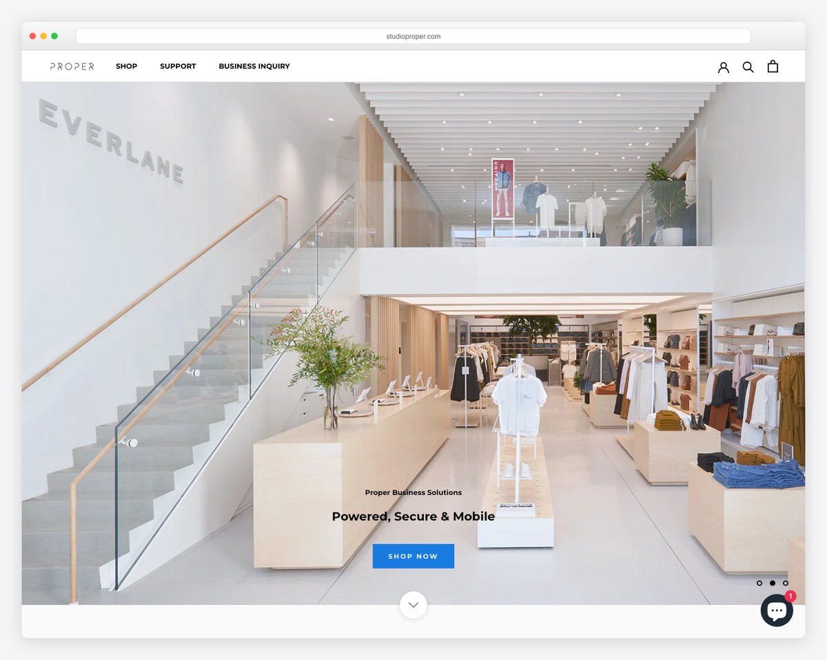
Proper is another online store that welcomes visitors with a massive slider (with smaller text and CTAs).
The navigation bar is basic at first glance but opens a mega menu that guides you through the entire website.
Proper’s overall layout is simplistic, so the focus on products and content isn’t distracted by fancy special effects.
They also use an Instagram feed grid and a customer review slider to build social proof.
What stands out: Your products will shine more with a minimal and simple website look.
21. Simba
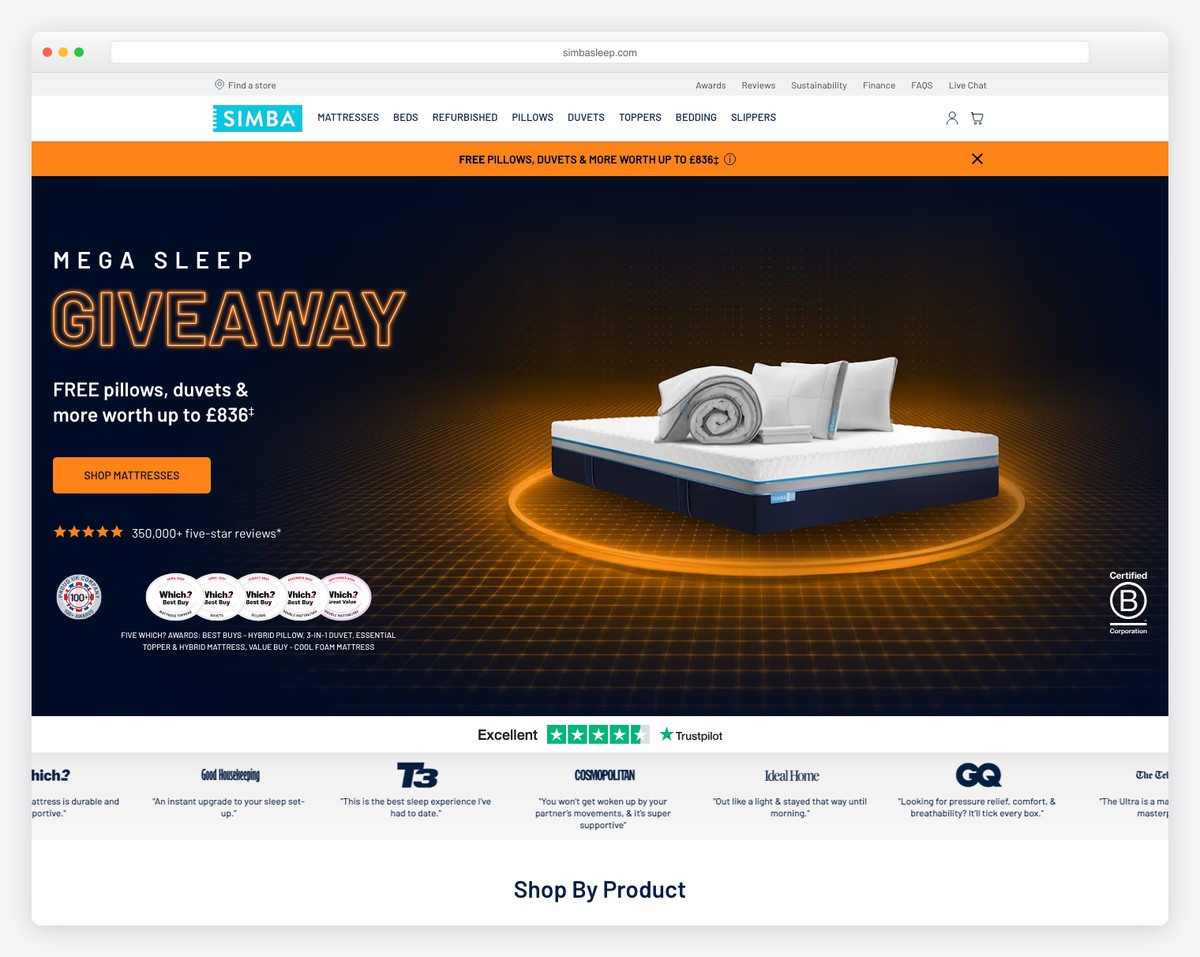
Simba has all kinds of helpful information on its Shopify website besides its products to educate potential customers and show they are real professionals at it.
The header has a clean navigation bar with a mega menu and a notification bar below it (which you can close).
On the other hand, the footer takes up a lot more space with multiple columns, links, social icons, a country selector, etc.
What’s also helpful are the two CTA buttons above the fold, of which one opens a promotional lightbox video.
What stands out: Use trust badges, star reviews and testimonials to build company trust.
22. Pop Chart
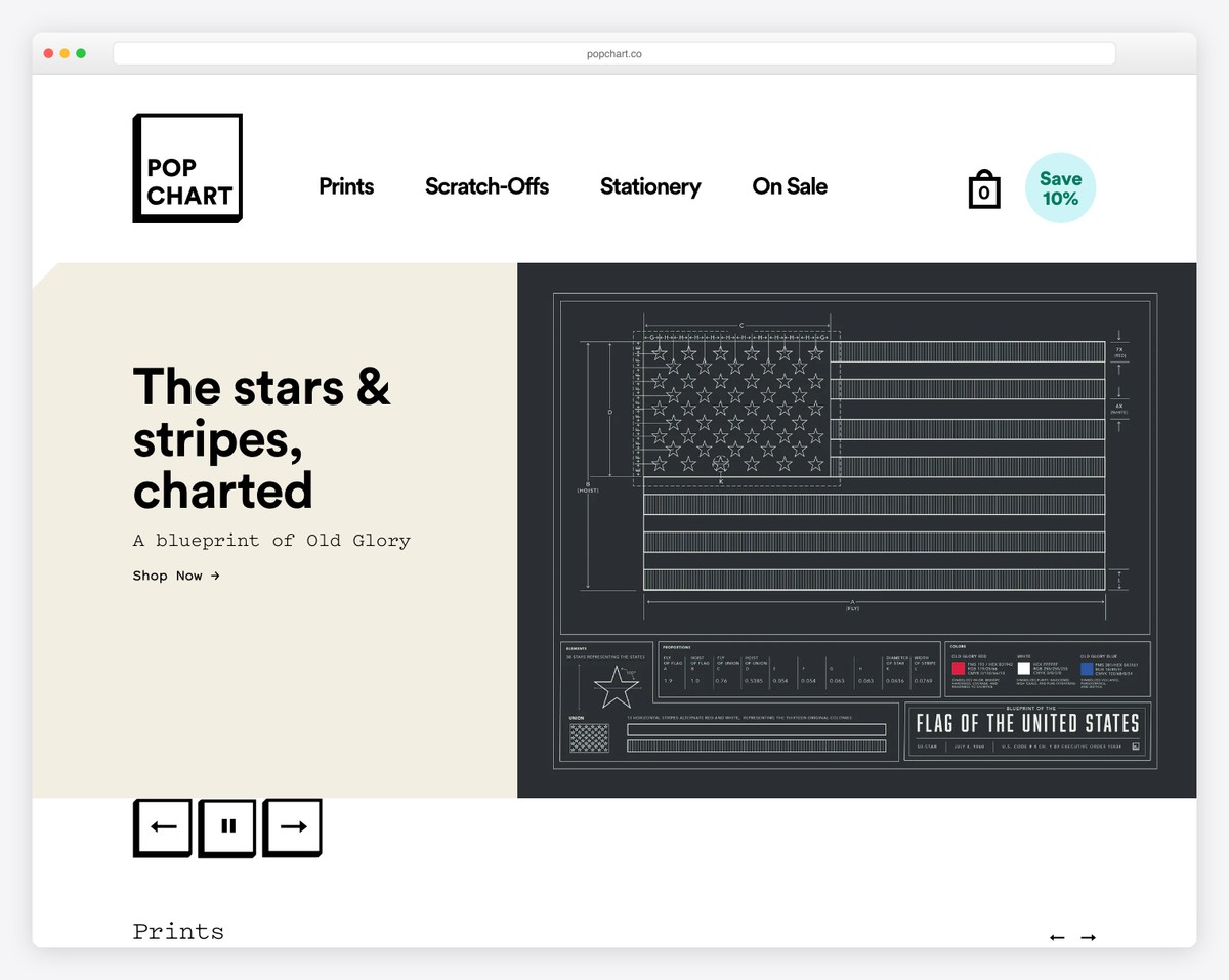
Pop Chart tries to collect your email first thing with a catchy popup telling you about their un-spammy emails.
Moreover, they use multiple product carousels with cool hover effects to make content viewing more engaging.
Another valuable part of the Pop Chart is the PR mentions, which include some big authority names.
We really like Pop Chart’s attention to detail that’s neatly scattered throughout their clean website.
What stands out: Even if you plan to create a minimalist web design, you can still add creative elements/details to make it a more joyful experience.
23. Haus
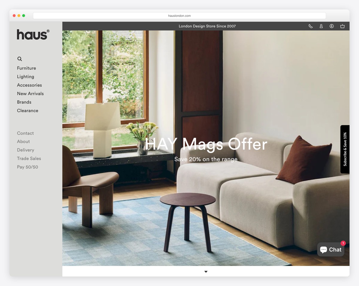
We couldn’t find many Shopify websites with high-quality sticky sidebar header/menu. But we found Haus!
Besides the sidebar navigation, Haus also has a top bar notification, additional links, a currency switcher, and a multi-column footer.
What stands out: Try something different by creating a sidebar header/menu.
24. Madsen Cycles
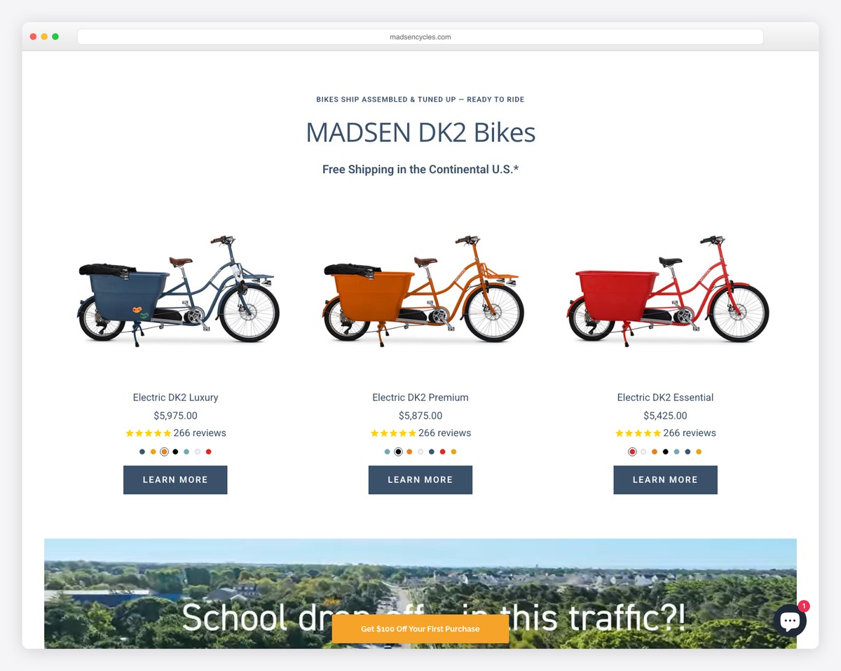
Madsen Cycles greets you with a slider, a notification bar for free shipping and a clean navbar.
On the left side, a sticky button for a discount will appear (if you close the popup), constantly reminding you. In the bottom right corner, the live chat function is another floating element.
Madsen Cycles also has one of the best product presentations on the home page. They display all their products in all the available colors but without any text, keeping it minimalist but cool.
Madsen Cycles also has a popular blog on its website. It happens to be built using Shopify. Here are more Shopify blog examples just like this one.
What stands out: Add a sticky button to remind the visitor of a special deal/sale/discount, even for a straight-up newsletter subscription.
25. Ridge
Built with: Shopify
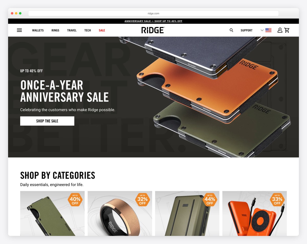
Ridge (formerly Ridge Wallet) sells premium minimalist wallets, key cases, and everyday carry essentials through a polished Shopify storefront. The site opens with a bold hero featuring their signature slim wallet against a dark backdrop, immediately communicating the brand’s sleek, no-nonsense aesthetic.
The product pages use lifestyle photography alongside clean product shots, with detailed specs and comparison tools that help customers choose the right material and configuration. The checkout flow is streamlined and fast — essential for a brand built on the promise of eliminating unnecessary bulk.
What stands out: Using dark, moody product photography against minimalist backgrounds reinforces the brand promise of “minimal design” — the visual language matches the product philosophy perfectly.
Related Posts


Comments (0)