18 Best Minimalist Website Examples 2026
These are the best minimalist website examples to check if you like clean and simple web design.
Don’t we all?
These pages are easy to skim and don’t distract you from leaving early. Even though some use animations, they work very well with the minimalistic look.
Whether you need inspiration for building a personal, business, or eCommerce website, here are some examples that will do you well.
Not yet decided which platform to choose? Opt for WordPress and pick the best minimalist WordPress theme!
It’s so effortless to build your dream website.
Best Clean & Minimalist Website Examples
1. Lars Tornoe
Built with: Squarespace
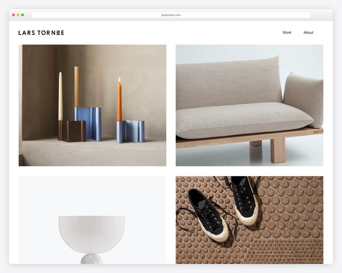
Lars Tornoe’s home page is a neat two-column grid portfolio with hover effects. Also, each portfolio item is clickable and links to the project page, which includes additional images and text.
The header only has a logo on the left and two links on the right, but Lars Tornoe doesn’t use a footer. The footer with links to other works only appears on individual pages.
What stands out: Ditch the footer and make your website look more minimalist.
You’ll also enjoy studying these best Squarespace website examples. But if you need something more specific, view our portfolio website collection.
2. Monograph
Built with: Webflow
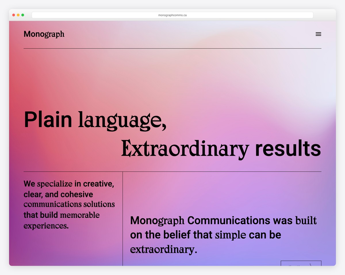
Monograph is a text-heavy minimalist website example with a catchy gradient background. The header uses a hamburger menu icon that slides in the navigation from the left.
Moreover, the sticky left sidebar features only one sentence and a newsletter subscription form. The two-part footer consists of a large Monograph sign and menu links.
What stands out: Use larger fonts and more white space to create a website without images.
We also have a full collection of Webflow websites if you want to view more alternative designs.
3. Bedow
Built with: Gatsby
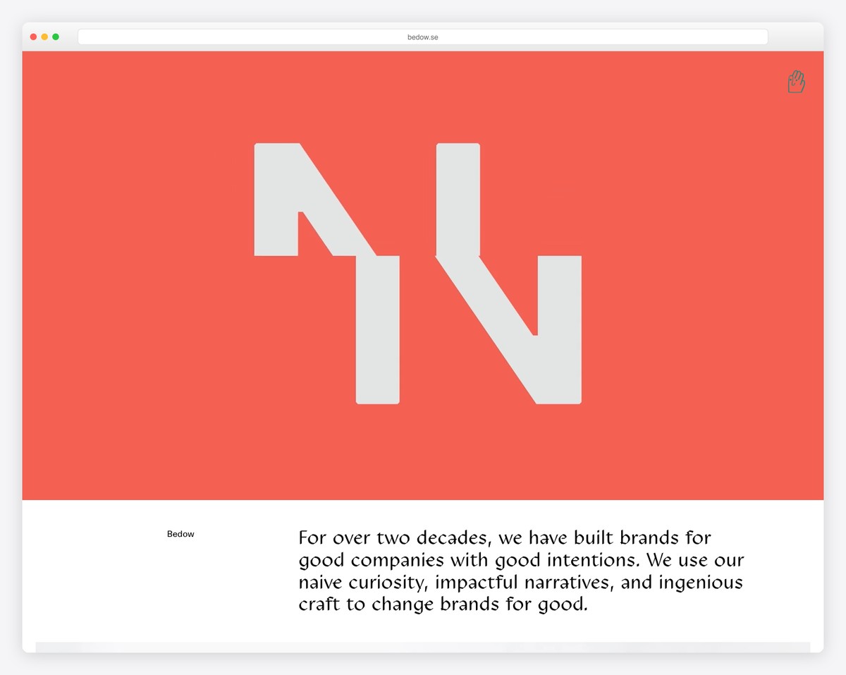
Bedow is a beautiful example of minimalist, creative, responsive web design that’s also very catchy. But the latter goes to the clickable hero video and links to their works.
What’s cool about Bedow is that they don’t use the traditional hamburger menu icon but a waving hand that opens an overlayed navigation.
What stands out: Use a video above the fold to increase users’ interest.
4. ETQ
Built with: Shopify
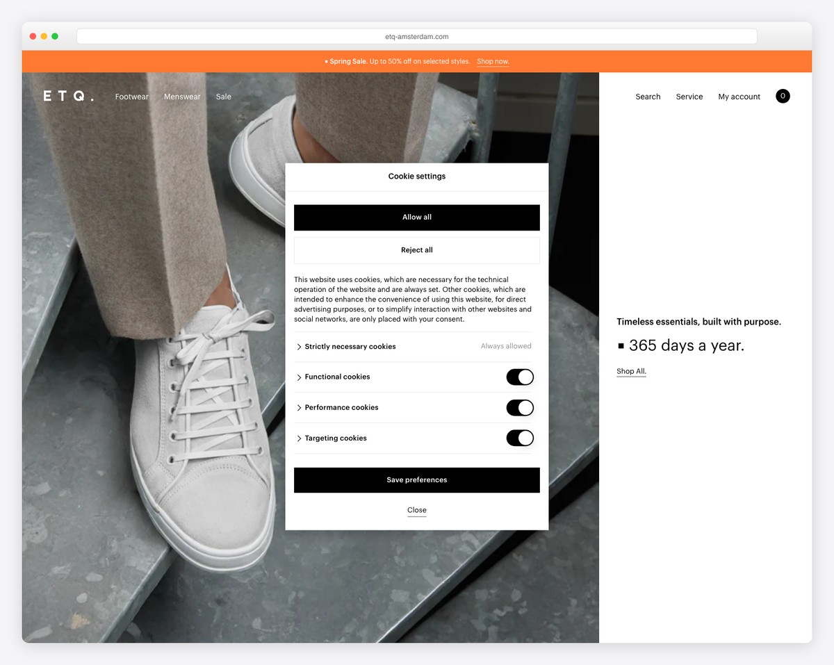
ETQ is a clean website with a full-screen, above-the-fold section split into 2/3 image and 1/3 solid-color background with text and a link.
They use a transparent header that fades in and out with scrolling.
While the footer is widget-rich, it still maintains a minimalist flow, with the same light color as the website’s base.
What stands out: Create a cleaner look with a fully transparent header/menu.
You may also be interested in investigating these great shoe website designs.
5. Netil Radio
Built with: Gatsby
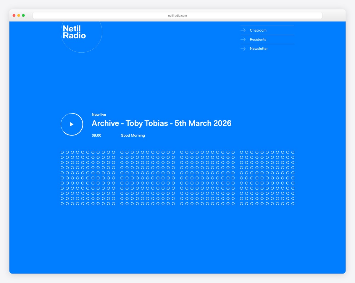
Netil Radio might have a vivid blue background, but the overall design is clean and simple. The hero section features a play button with text announcing the upcoming show. And when you press the play button, all those outlined dots turn solid.
Netil Radio is also a one-page website, with all the content only a few scrolls apart.
What stands out: A minimalistic web design and a single-page layout work well together.
6. Field
Built with: Craft CMS
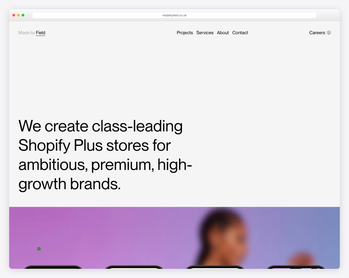
Field has a full-screen image for the home page “preloader” with a menu and an option to skip and go to the website.
The header disappears on the scroll and reappears as soon as you scroll back to the top. Just like the header, the footer also uses the same background as the website’s base to achieve a neat look.
What stands out: Maintain a consistent background color across your entire website, including the header and footer, to achieve a more minimalist appearance.
7. Scott Snyder
Built with: Squarespace
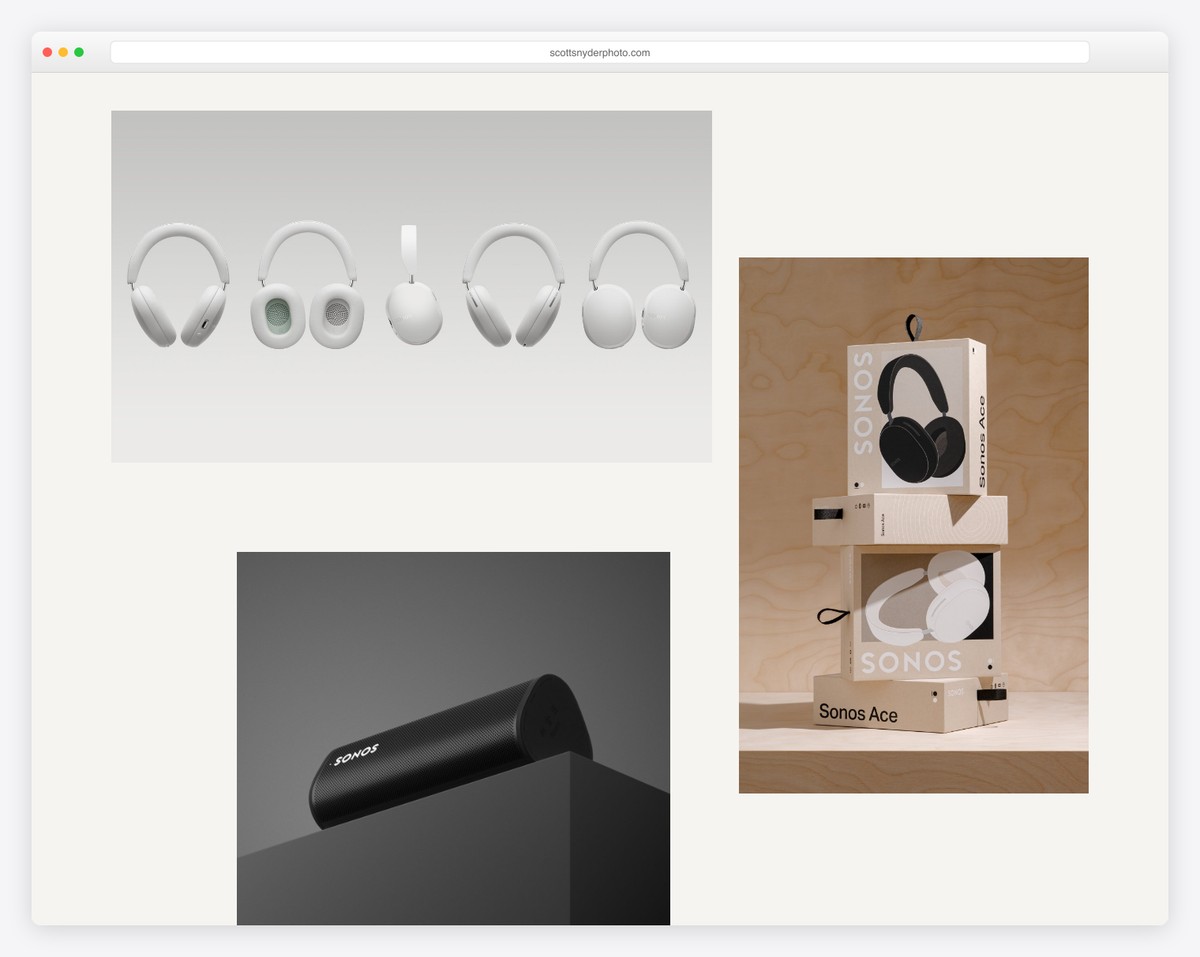
Scott Snyder has randomly scattered portfolio elements on the home page, each linking to the project page, like Lars Tornoe. And some thumbnails are animated to spice up the experience.
Scott also added a section for clients he works with and testimonials to build social proof.
What stands out: Use testimonials and reviews on your website to build trust.
Scott Snyder’s website is built on a minimal Squarespace template you can use to establish your online presence.
8. Wendy Ju
Built with: Wix
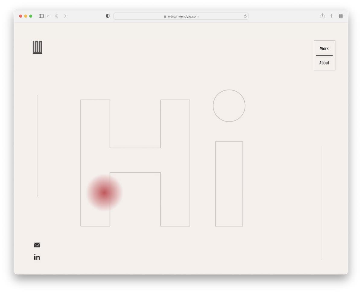
Wendy Ju made her minimalist website more engaging with the simple but catchy hero text animation. The page has sticky sidebars: social and email links on the left, and basic navigation on the right.
Furthermore, the eight-part portfolio section has static and animated thumbnails that link to individual project pages with in-depth presentations.
What stands out: Add animated text in the hero section, even if it’s saying “hello” in different languages.
Plus, don’t miss these websites built on the Wix platform that’ll fill you with even more creative ideas.
9. Casa Mami
Built with: Squarespace
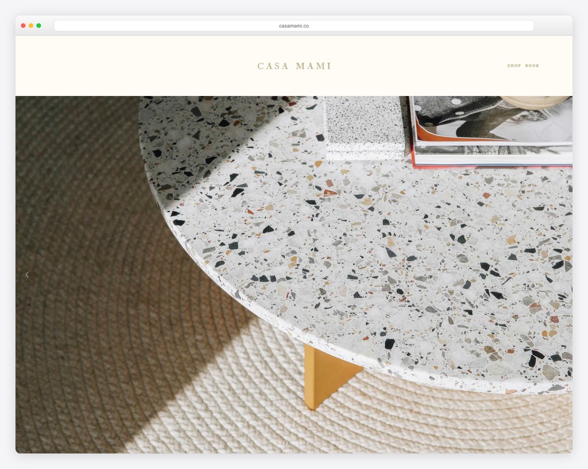
Casa Mami uses a large image slider that creates a warm welcome to the world of simplicity. Also, there’s no text or links/CTAs on the slides, and the slides aren’t clickable. The slideshow is there for pure enjoyment.
This minimalist website example also has a parallax image with a CTA button that turns solid on hover.
What stands out: Add more depth to your beautiful website with a parallax background.
10. Anthony Wiktor
Built with: Gatsby
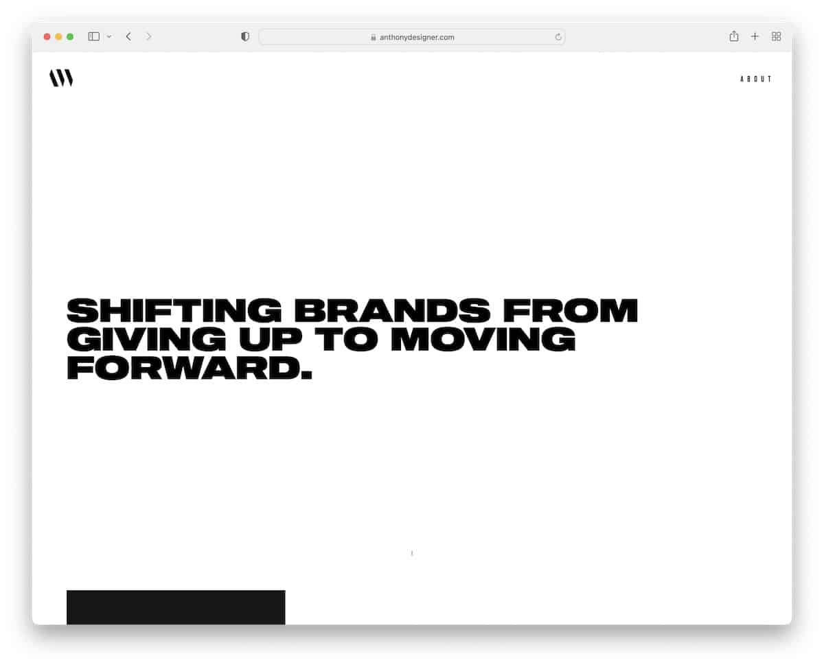
The awesome thing about Anthony Wiktor’s personal site is that it’s light at the beginning but turns dark as soon as you start to scroll.
What we also like about this minimalist website is the portfolio area with a hover effect that changes the thumbnail, but also “dims” the whole website with different shades.
What stands out: You can use dark and light web design, or mix the two.
11. Andrew McCarthy
Built with: GitHub Pages
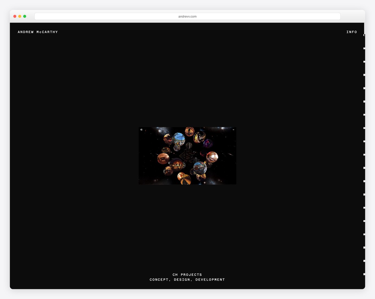
Andrew McCarthy’s minimalist website is very tricky. Why? It features an infinite-scroll loop with changing overlaid objects that may take a while to notice; it’s all the same.
Clever.
For this reason, it’s even handier that the menu reappears on a back scroll because it could take quite some time to get back to the top otherwise.
What stands out: Do you want to go against the grain? Do it the Andrew McCarthy way!
12. OrangeYouGlad
Built with: Wix
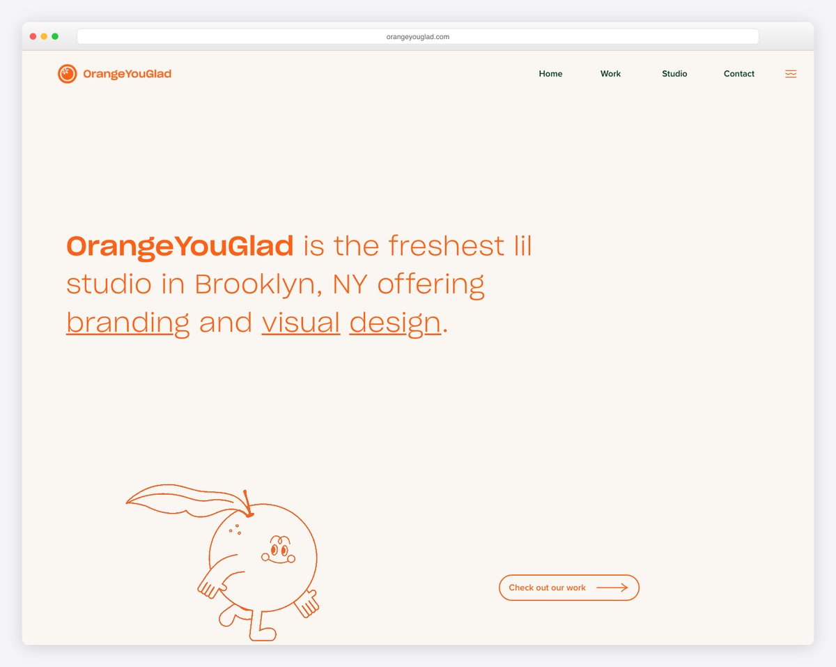
Even though OrangeYouGlad leans towards minimalist web design, it still features many cool, catchy, creative, and animated details to make the website more engaging.
But our favorite part is once you hover over the “drop us a line” button and the “howdy” sign starts shaking, word after word.
What stands out: Your minimalist page look doesn’t have to be too serious. Add animations and special effects to enhance it and boost the cool factor.
13. Scope Copenhagen
Built with: Elementor
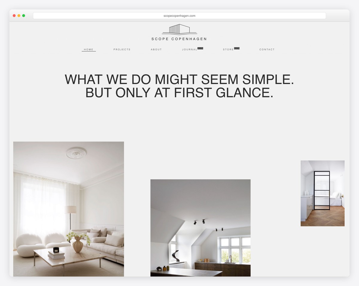
The Danish style is simple and minimal, exactly what Scope Copenhagen’s website resembles.
Below the header is a simple but powerful message that continues with beautiful images of their works and links to their projects, about page, and more. But you can also access all the information via the floating navbar.
The footer features four columns, displaying menu, social media, and project links, plus a dark and light mode switcher.
What stands out: Integrate a day/night mode switcher, so visitors can choose how they want to experience your site.
If you like WordPress and want to use a page builder, read our extensive Elementor review first.
14. Maciej Bączkowski
Built with: Kirby
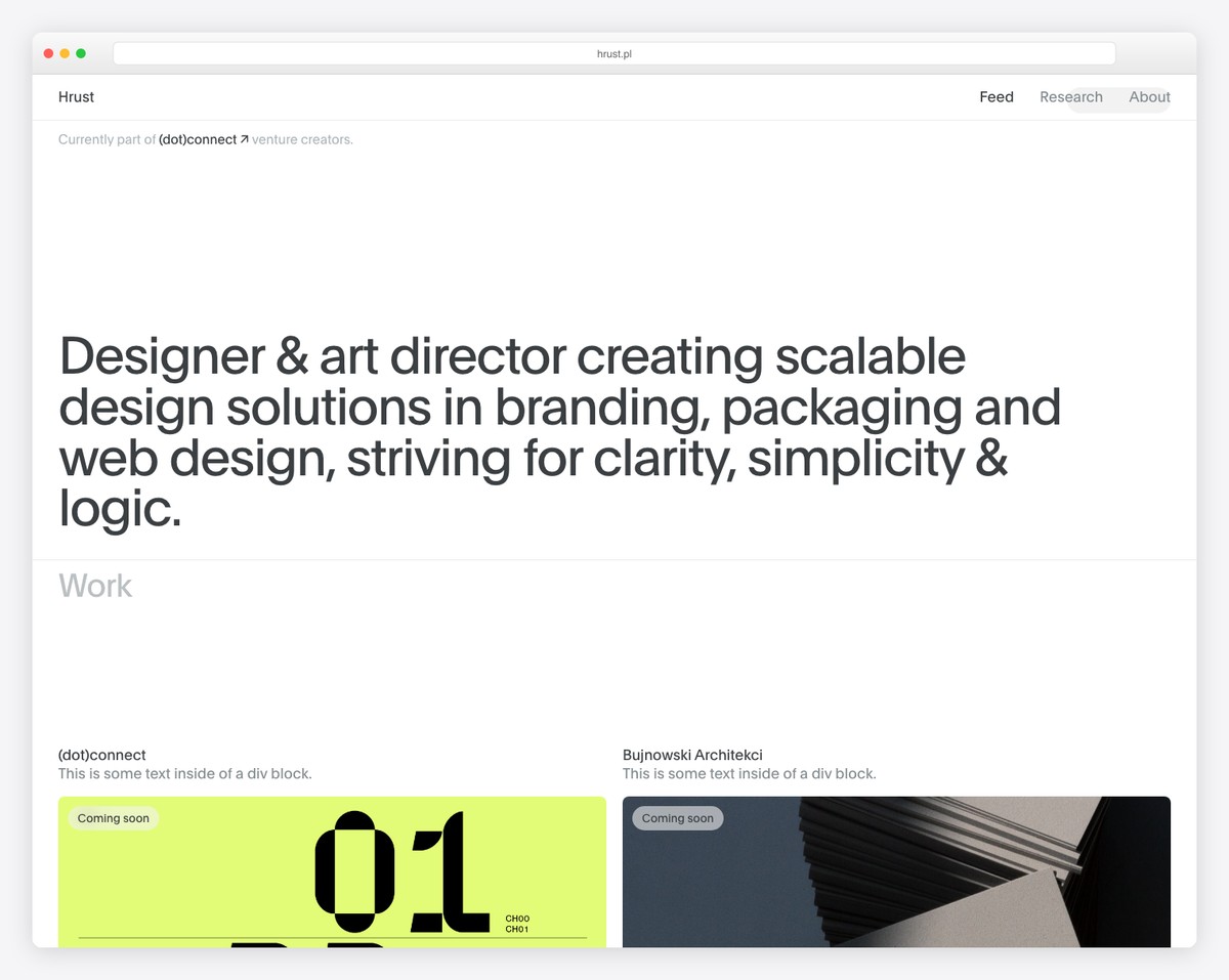
Maciej Bączkowski’s page is another proof that the text-only hero area works. This minimalist website example features a portfolio on the home page with extra spacing between elements and on-scroll content loading.
The header floats, but it features just links without a background to keep the distraction at a minimum.
Another notable mention is the footer reveal function, which isn’t common.
What stands out: The footer reveal effect is an excellent detail to an overall minimalist layout.
15. Shanley Cox
Built with: Squarespace
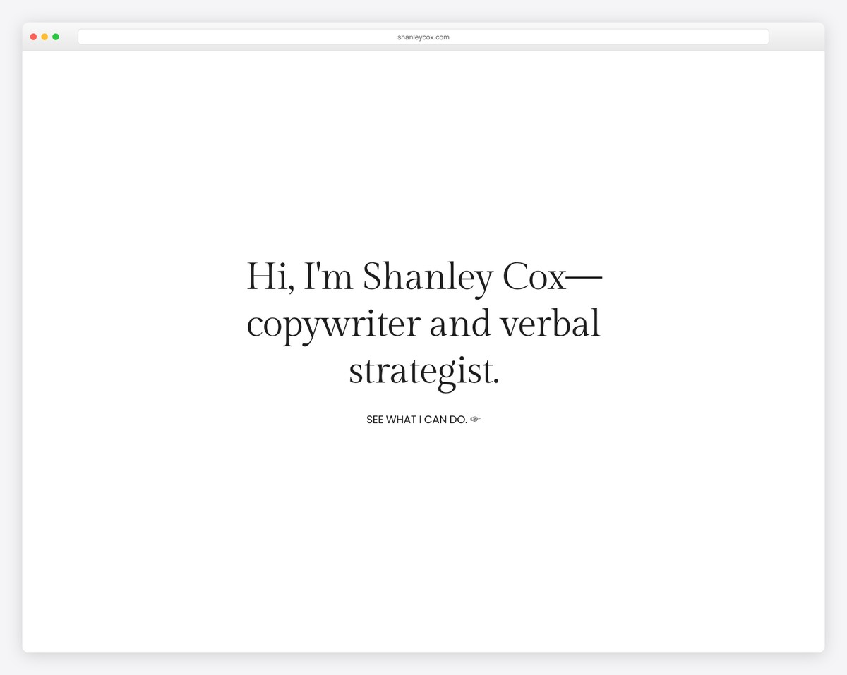
Shanley Cox is a professional copywriter with decades of experience delivering the best possible content for emails, websites, product descriptions, and more. Her minimal website boosts her credibility because it looks professional and well-structured.
She emphasizes her social presence, and that’s where most of her leads are coming from. She is not just an exceptionally talented writer but also a photographer, and she combines both to boost her brand on social media. This is a great example of how a website doesn’t tell the whole story, which is how it should be for extra engagement.
What stands out: The use of images and white spaces greatly improves credibility.
16. Matt D’Avella
Built with: Squarespace
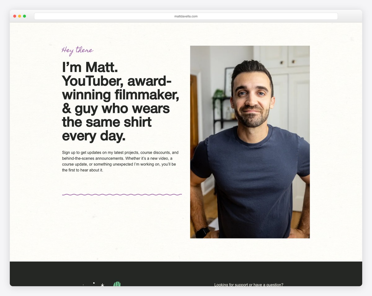
Matt D’Avella is a popular YouTuber and award-winning filmmaker with 4 million subscribers across social networks. He is well known for his storytelling, which has made him so successful on YouTube.
He uses his minimal Squarespace website to get email subscribers, provide a sales page, and log in to his YouTube course. This is one of the simplest websites out there, but given his popularity, I bet his online video course is making him money.
What stands out: A simple website can generate an incredible cash flow if you can drive potential customers to it.
17. Jake Knapp
Built with: Squarespace
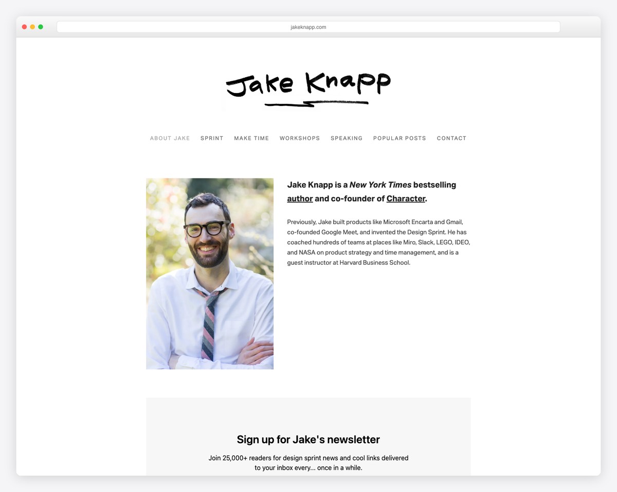
Jake Knapp’s website is a textbook example of minimalist design — a white background, a hand-drawn logo, and a centered photo with a brief bio. No distractions, no visual noise. The site immediately communicates who he is: a New York Times bestselling author and co-founder of Character.
The navigation is well-structured with links to his books (Sprint, Make Time), workshops, speaking engagements, and blog. A newsletter signup section below completes the page without any clutter.
What stands out: A hand-drawn logo on a clean white background can convey personality while maintaining a minimalist aesthetic.
18. Studio Neat
Built with: Squarespace
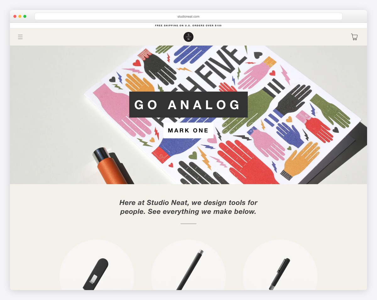
Studio Neat takes the minimalist approach to e-commerce with their warm, product-focused design. The “Go Analog” tagline and a single hero product image against a neutral background set the tone for a brand built around thoughtful, analog tools.
The entire homepage communicates the brand philosophy in one scroll — product imagery, a brief mission statement, and a clean grid of their product line. No sidebars, no popups, no clutter.
What stands out: Limiting the homepage to one product hero with a bold tagline can make a minimalist e-commerce site feel intentional and focused.




Comments (0)