20 Best Shoe Website Design Ideas 2026
Before creating your footwear page, do you want to check the best shoe website design examples?
Welcome to our collection of fantastic eCommerce website examples from brand sites to general online shoe stores.
All these websites feature a responsive layout with excellent navigation, providing a seamless online shopping experience on both desktop and mobile devices.
But do you know what’s best?
You can easily and quickly create a similar page either using one of the best eCommerce website builders or a shoe WordPress theme. (No coding and design skills necessary!)
Let’s go.
Best Shoe Website Design Ideas For Inspiration
1. Vivobarefoot
Built with: Magento/Adobe Commerce
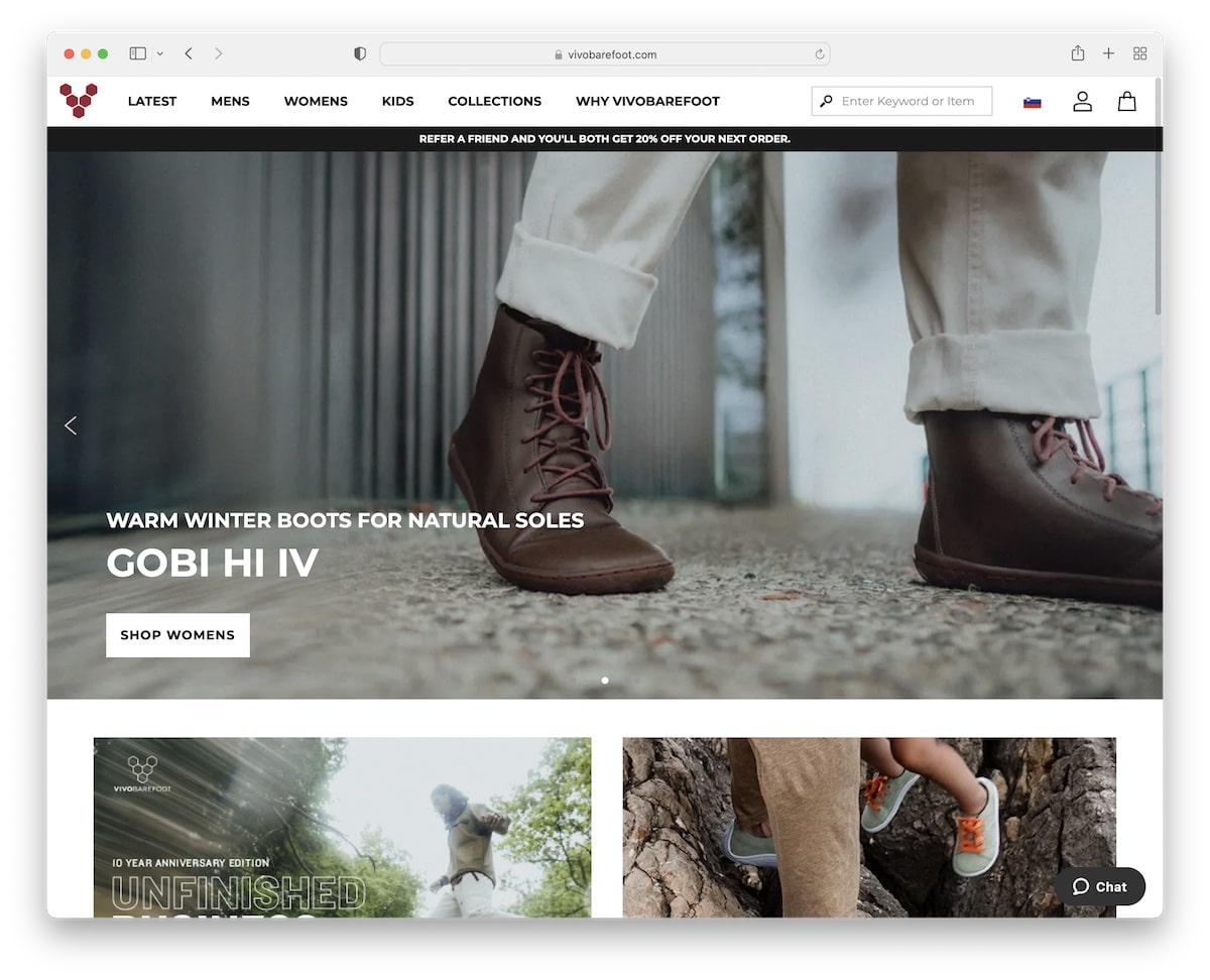
Vivobarefoot has a sticky header with a mega menu, search bar, currency/language switcher, profile and cart icons and a notification bar.
It also features a slider with call-to-action (CTA) buttons, a newsletter subscription form and a handy carousel that shows their shoes in use (with links to individual categories).
What stands out: Vivobarefoot has a strong online presence with great storytelling that contributed to sales.
You also don’t want to miss our dedicated list of the best Magento websites.
2. Coddi
Built with: Shopify
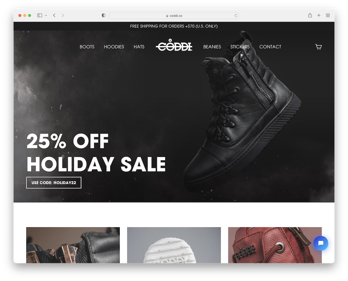
Coddi has a large hero image with a transparent header for a smoother appearance. There’s also a top bar notification for free shipping and a live chat widget in the bottom right corner.
What’s interesting is that Coddi doesn’t use a footer. The last thing on this clean website is a newsletter subscription form.
What stands out: Integrate a live chat function and utilize it to assist users, thereby increasing sales.
3. Xero Shoes
Built with: Elementor
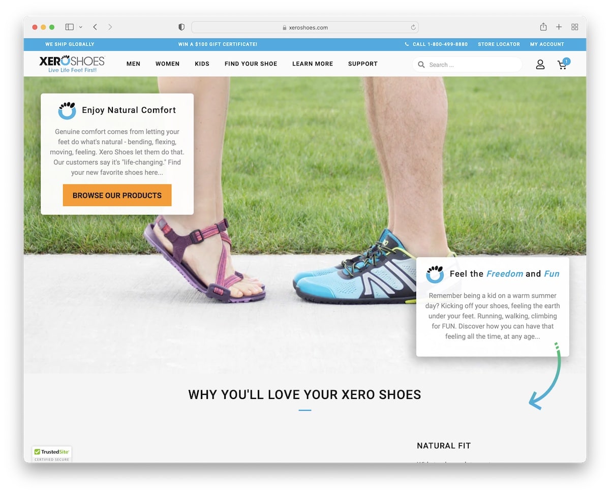
Xero Shoes website starts with a popup that asks you to select your region. Like Vivobarefoot, Xero Shoes also features a floating header, providing you with constant access to the menu, search bar, and more.
We really like the use of a down-pointing arrow in the hero section, making you want to scroll to see what it’s pointing at.
What stands out: Use a popup country selection if you have stores in different locations.
Check out our extensive Elementor review if you’d like to build your shoe site with WordPress.
4. Converse
Built with: Salesforce Commerce
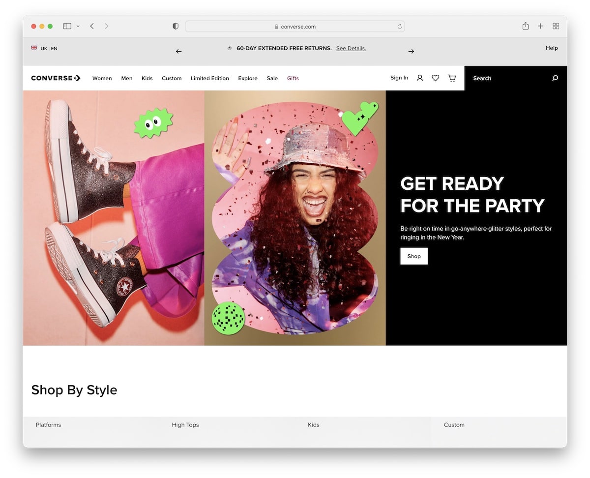
Converse kicks things off with a language selector, which opens the local website for a better user experience.
This shoe website has a clean design with large images, hover effects, and CTA buttons. A cool shoe animation added a touch of spice.
Moreover, the footer features four columns with multiple widgets, such as a newsletter and social media links.
What stands out: Use a language selector to offer a localized experience.
5. UGG
Built with: Salesforce Commerce
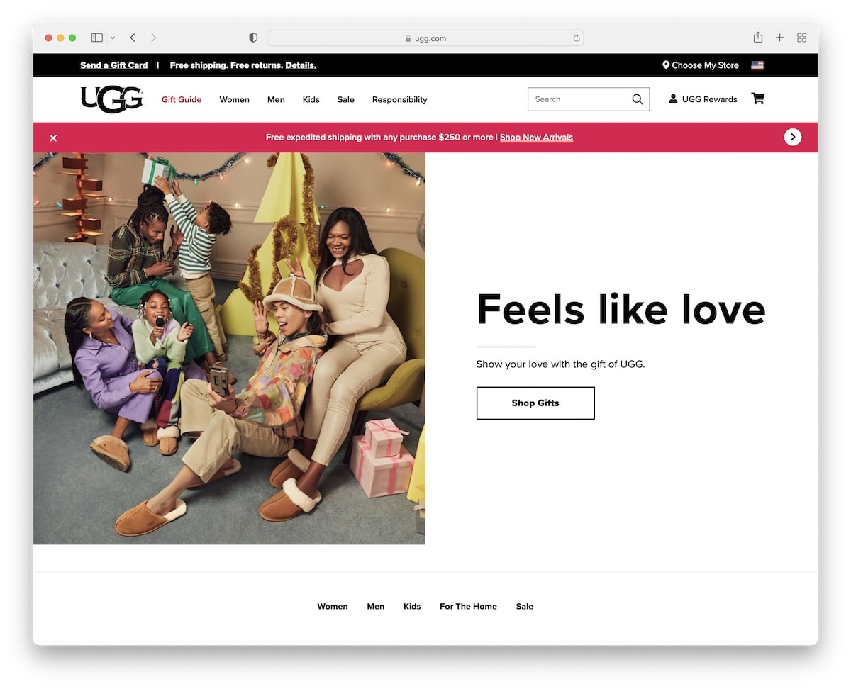
UGG features a catchy split-screen hero design, with an image on the left and text and a CTA on the right.
The page has a top bar, a navigation bar and a sliding notification bar (that you can close), but only the menu is floating.
The minimalist design creates a pleasant shopping experience and product viewing experience with minimal distractions.
What stands out: Use a notification bar to display free shipping, special deals, sales, and other relevant information.
6. Etnies
Built with: Shopify
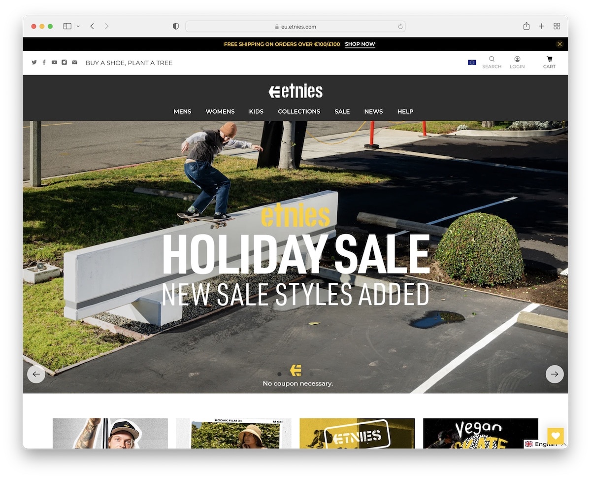
Etnies aims to capture more leads with a promotional popup that can be closed by pressing the “x” button.
This footwear site has a large slider to advertise deals, new product drops, and more. The sticky notification bar and navigation are always present to keep you strolling through the website more easily.
Finally, Etnies also includes an embedded video that features their latest project.
What stands out: If you have a team that produces videos for you, be sure to include them on your page.
7. Shoe Warehouse
Built with: BigCommerce
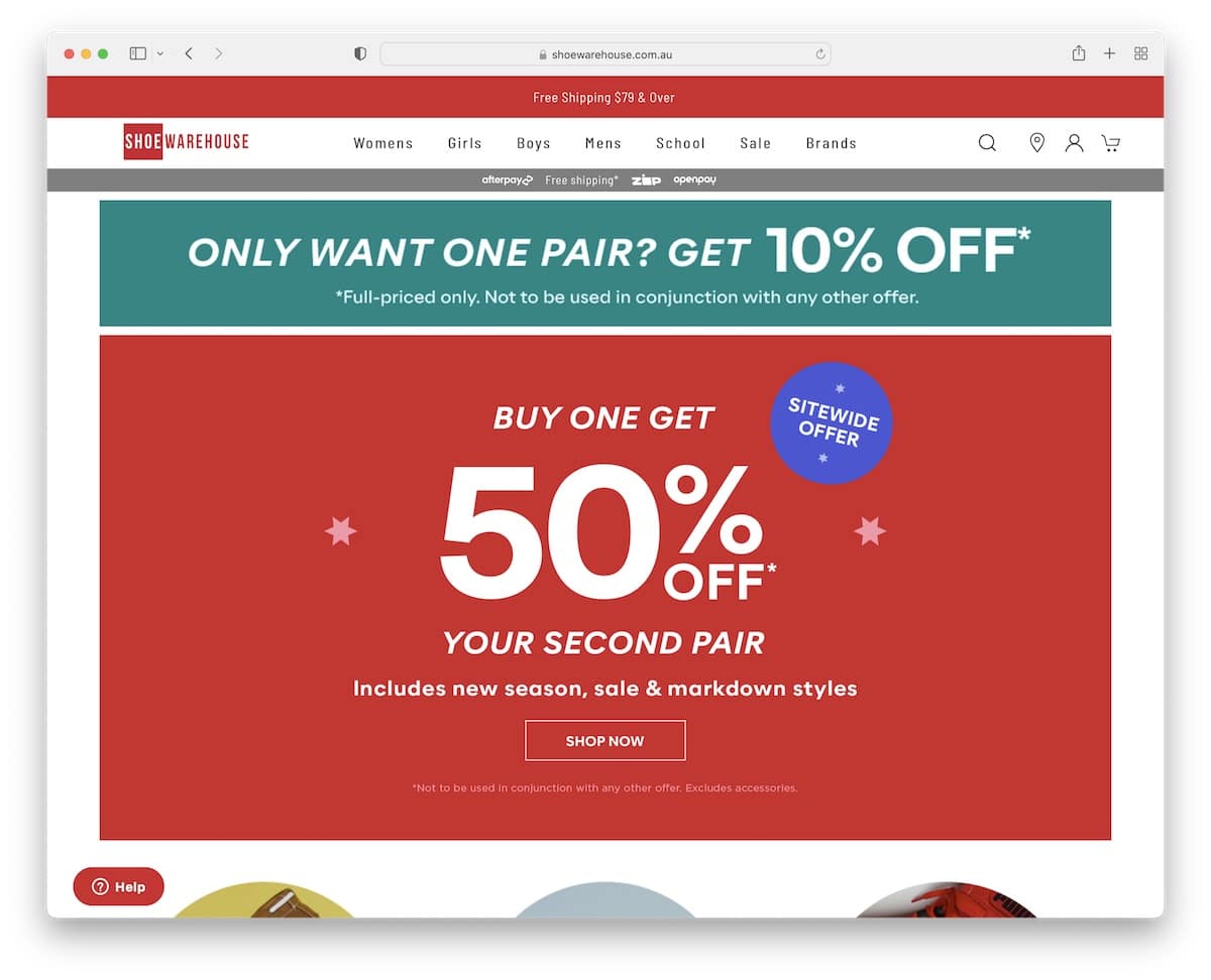
Shoe Warehouse is a more traditional online shoe store that carries multiple brands. The page has a large banner with text and a CTA promoting a seasonal deal (but they use it for other offers throughout the year, too).
Shoe Warehouse also features circular thumbnails highlighting the most popular categories and a grid section showcasing their top brands.
What stands out: Bring awareness to your special deals, new product drops or anything else you have going on with a large banner above the fold.
Do you need more ideas? Then take a peek at these ultimate BigCommerce websites.
8. Fortress
Built with: Shopify
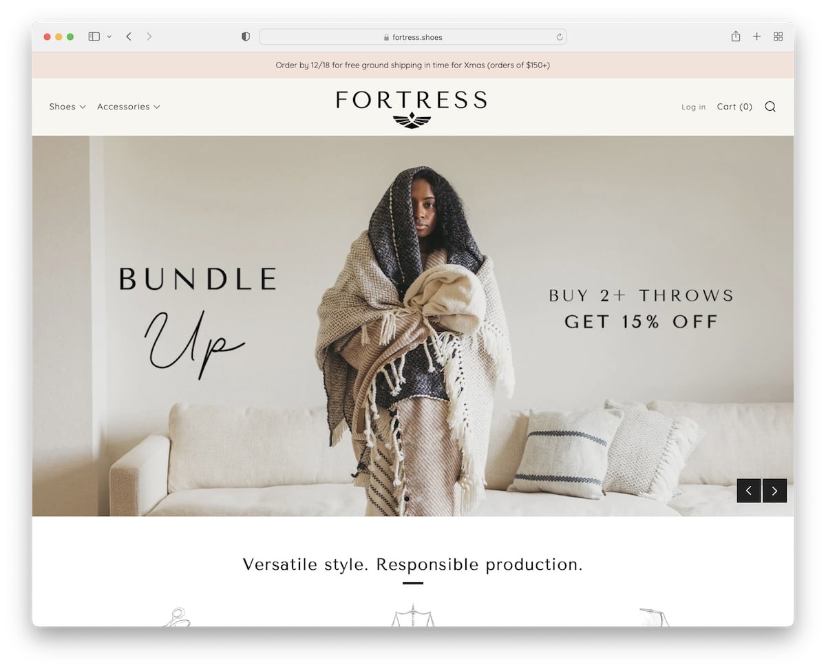
Fortress is a beautiful, modern shoe website with an elegant browsing experience. Although its slider doesn’t include CTA buttons, each slide is still clickable.
The header is very minimalistic. It has a mega menu and a search icon that opens a popup with the search bar and main menu.
We really like the shoemaker introduction section, which gives an instant impression of quality.
What stands out: Don’t be afraid to show the team behind the brand.
9. Nine West
Built with: Shopify
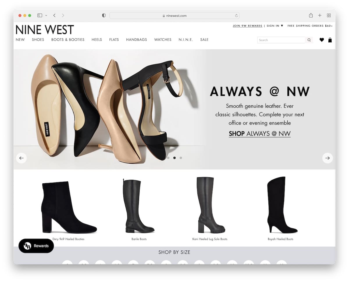
Nine West collects emails with a large popup that offers an instant discount in exchange for an email.
The page uses a pretty large notification bar that’s impossible to miss. While there are multiple sections, with and without animations, browsing is pleasant and unintrusive.
One handy feature is “Shop by size,” which allows you to find all shoes available in a specific size with a single click.
What stands out: Make the notification bar (for a special deal) large enough to be easily spottable (but not too large).
10. Velasca
Built with: Shopify
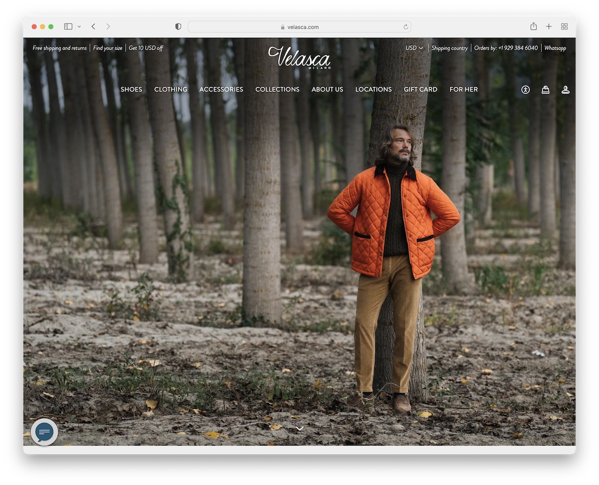
Velasca’s responsive web design is elegant. It’s a minimalist shoe website with a full-screen background image above the fold—without text or CTA. The header is 100% transparent to create a more pleasant first impression.
Velasca also does a great job integrating an Instagram feed featuring their latest posts.
What stands out: Keep things elegant and stylish with a full-screen image (only) for the hero section.
11. Shoepassion
Built with: Shopify
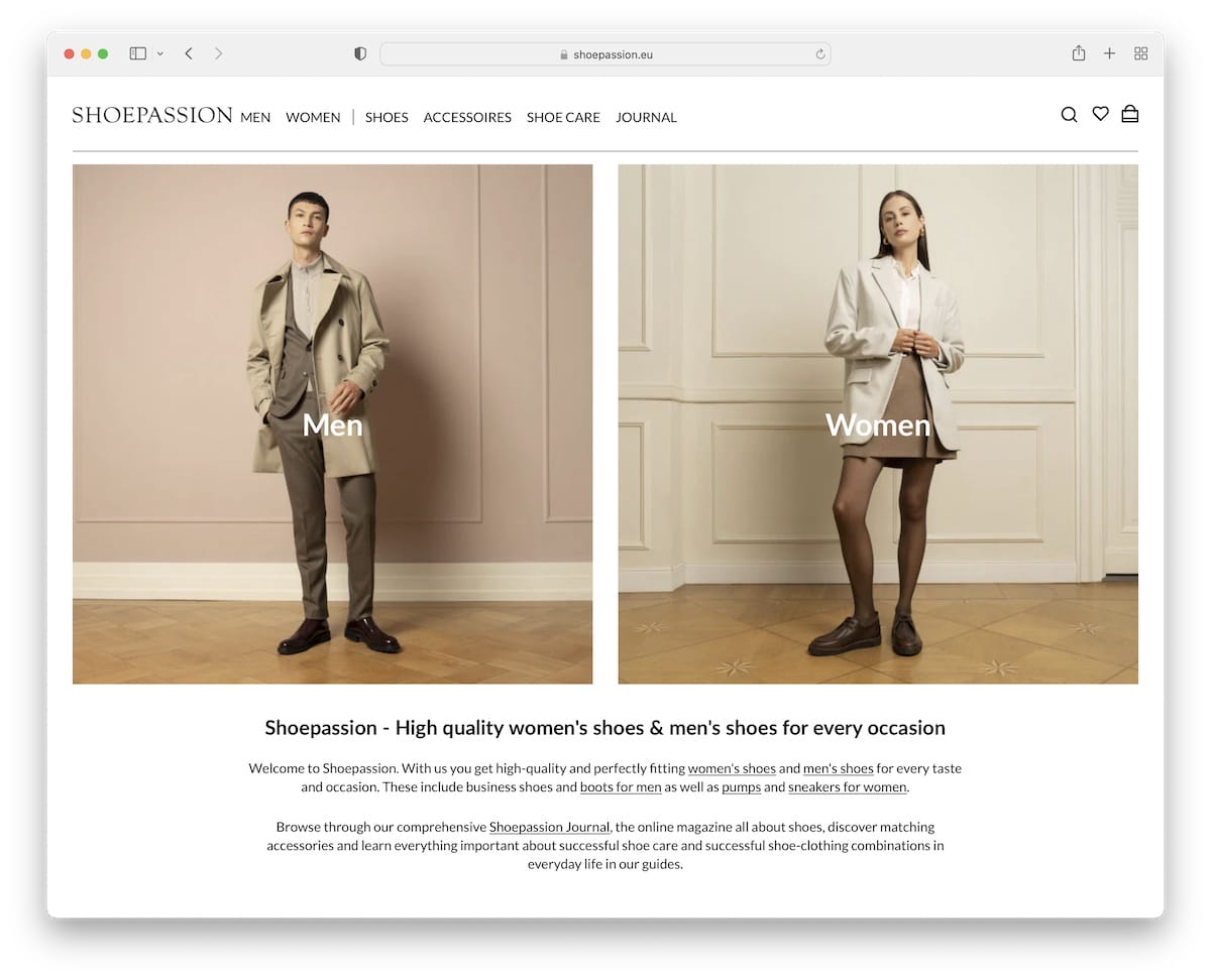
Shoepassion’s home page is very simple, with a clean header, two banners for male and female shoes side by side and accordions with more information.
The footer features multiple columns with additional links, newsletter subscription, social icons and a currency switcher.
What stands out: Allow male and female customers to find the right section through self-explanatory banners.
12. Nubikk
Built with: Shopware
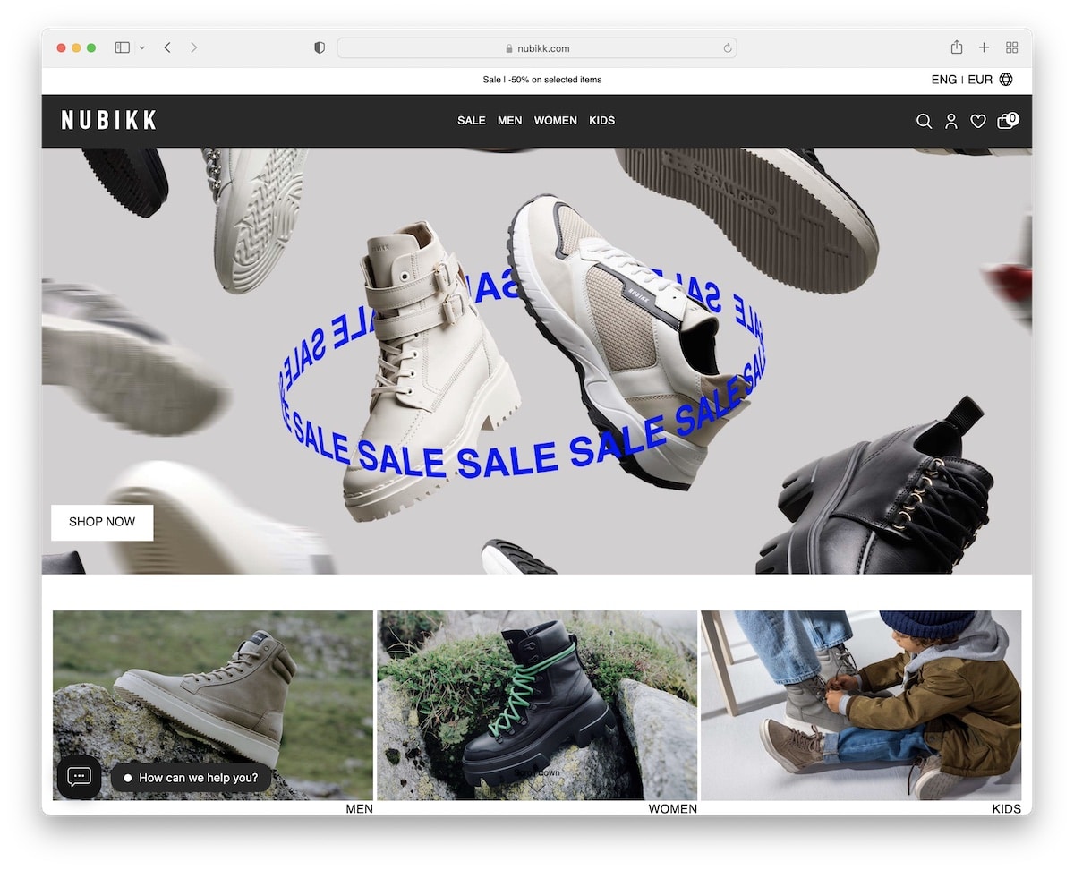
Nubikk has a trendy design. Above the fold, a large banner is displayed, and below it are three images that direct the user to sections for men’s, women’s, and children’s footwear.
The sliding top bar notification also has language and currency switchers for more pleasant online shopping.
But Nubikk has another notification banner about delivery, shipping and free returns that separates the site’s top and bottom half.
What stands out: Inform potential customers about free shipping and fast delivery.
13. Rudy’s
Built with: Shopify
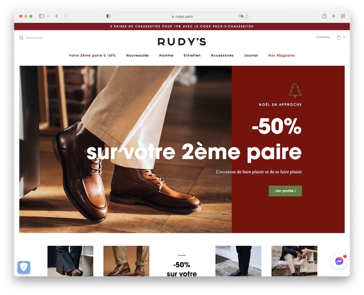
Rudy’s shoe website maintains a clean and simple design, with the sliding top bar text being the only moving element. (Okay, there’s one more thing – the larger images start zooming in on hover.)
The floating header is minimalist, but its handy mega menu is very practical.
Rudy’s also has a Facebook Messenger button for a quick chat.
What stands out: Facebook Messenger (which we all use) is a great way for users to contact you.
14. Volta
Built with: Sage Starter Theme
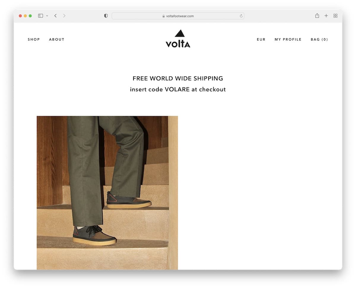
One of Volta’s key characteristics is that they don’t make it feel like they’re trying to sell you anything. They’re keeping everything very low-key.
The header is also one of the cleanest, just like the rest of the website. Additionally, the footer almost doesn’t resemble a traditional footer.
Furthermore, the big, bold, sticky bottom screen newsletter subscription banner is hard to miss.
What stands out: When you aim for a minimalist look, apply it to content use, the header, and the footer.
15. Hanon
Built with: Shopify
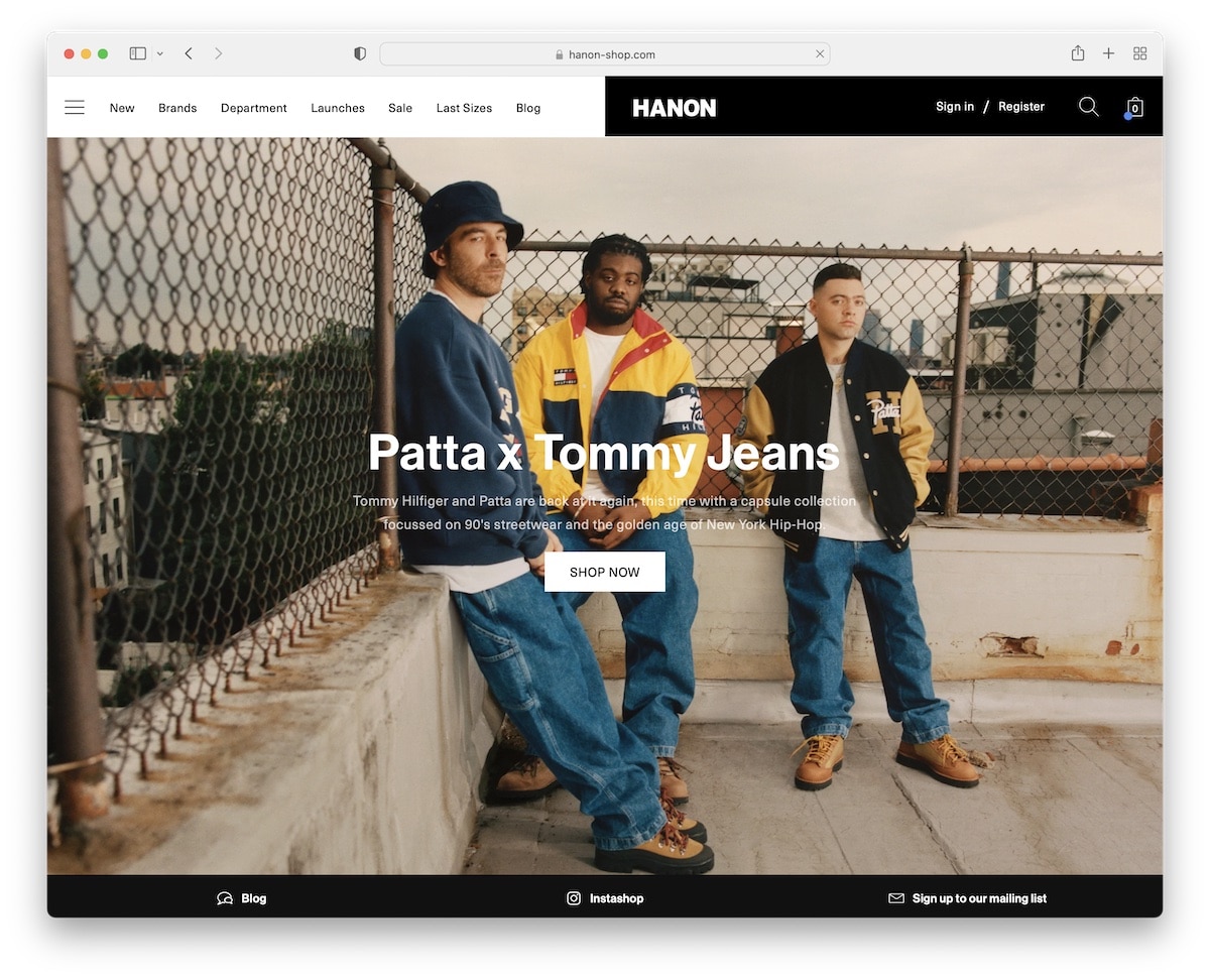
Hanon is an awesome sneaker, shoe and clothing website with one of the best headers we’ve ever seen. The half-white, half-black layout looks rad, and it sticks.
Hanon then uses a large hero image to promote new product drops with text and a CTA.
They also have another floating element/bar at the bottom of the screen promoting their blog, IG shop and subscription form.
What stands out: Try adding another sticky bar at the bottom of the screen (but make it as minimalist as possible).
16. Undefeated
Built with: Shopify
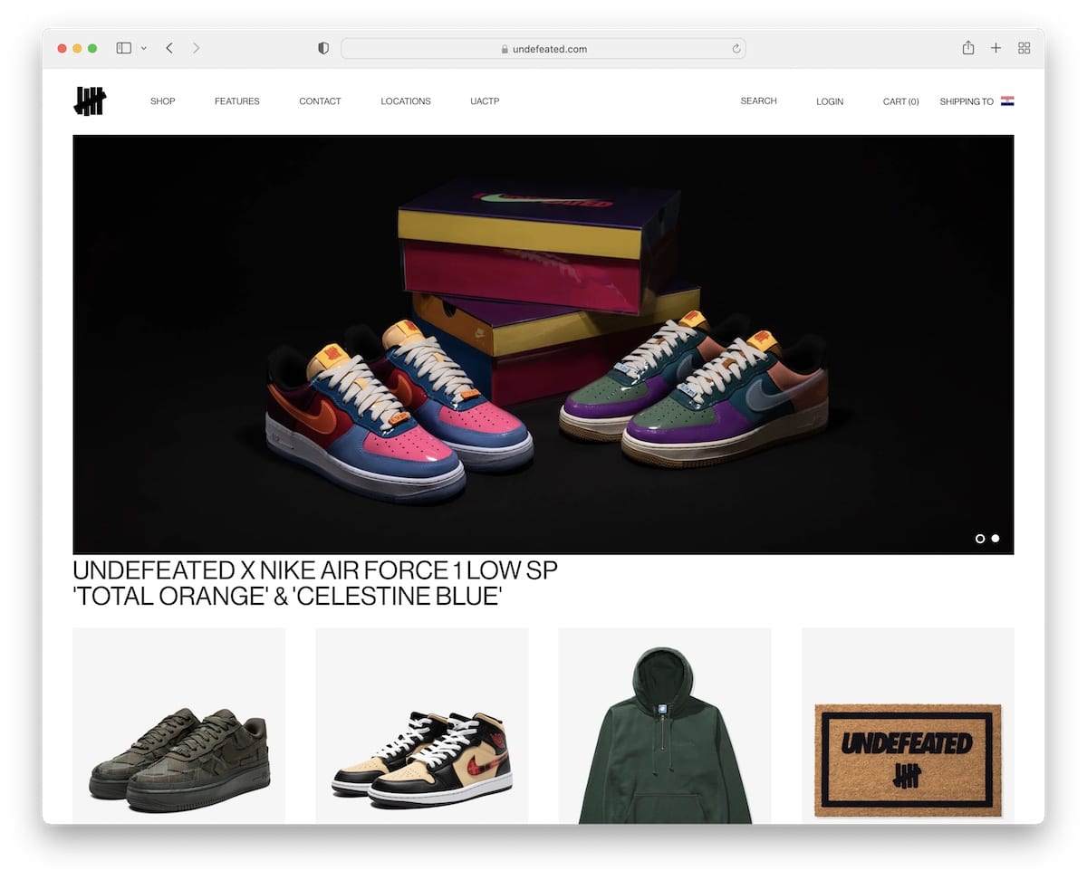
Undefeated has one of the simplest homepages we’ve come across. It features a clean header, a slider, four banners showcasing four products, and a similarly clean footer.
Additionally, Undefeated opted for a boxed layout, which is only visible on larger screens.
What stands out: Keep your home page uncomplicated, yet include the necessary links to help visitors find what they need quickly.
17. Wethenew
Built with: Shopify
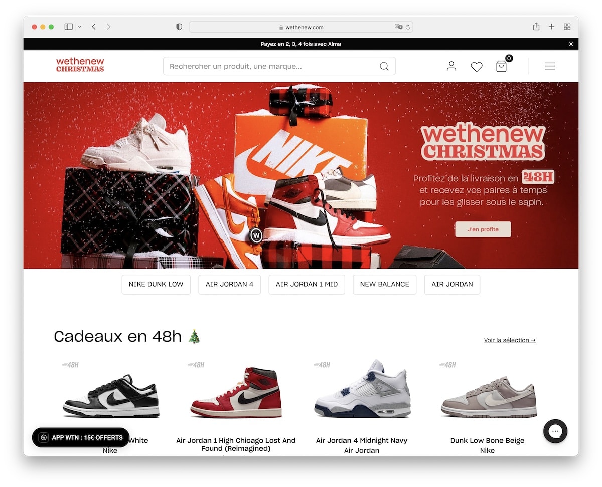
Wethenew offers many sneakers to flip through, with three carousels on the home page. Luckily, they use enough white space to keep the experience pleasant.
The header has a hamburger menu icon and a large search bar. But the footer is widget-rich, including Trustpilot reviews, newsletter subscription, social icons and multiple links.
What stands out: Keep the header cleaner with a hamburger menu icon.
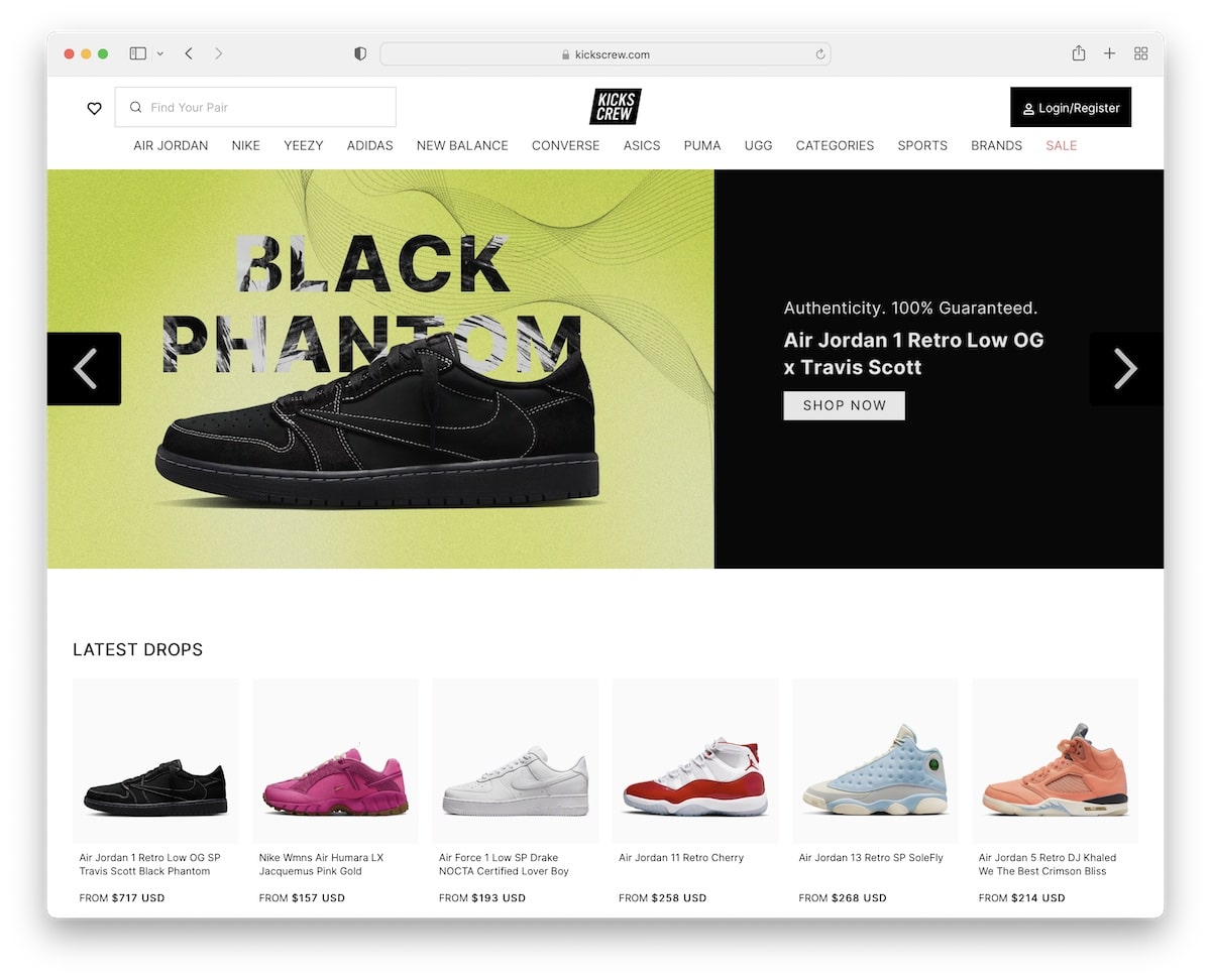
18. Kikscrew
Built with: Shopify
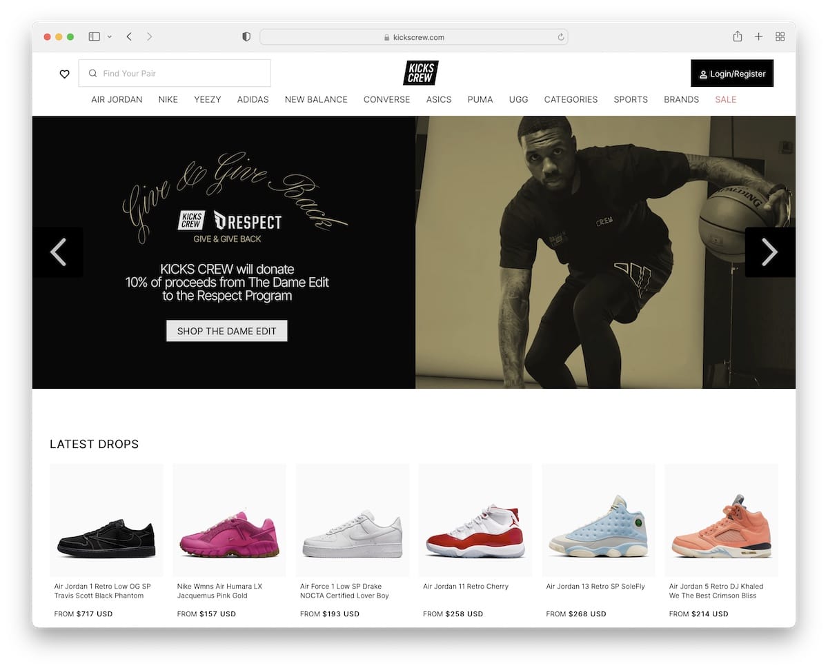
Even though Kikscrew is a shoe website with A LOT of items on the home page, they keep the design light for a great scrolling and viewing encounter.
This allows the visitor to quickly browse the latest drops and sale items without needing to conduct additional searches.
Of course, the floating header is always available to find something more specific through drop-down navigation or a search bar.
What stands out: Ensure enough white space if you add many products on a single page.
19. Sneaker Politics
Built with: Shopify
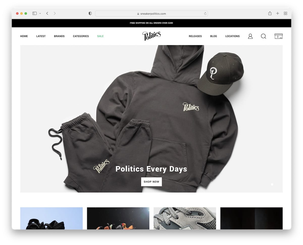
Sneaker Politics home page isn’t as content and products-heavy as some other shoe websites, but it still features a large slider, a carousel of their latest drops and featured blogs, to name a few.
The top bar has a free shipping notification, and the header has simple navigation with profile, search and cart icons.
You’ll also notice a small (sticky) “Politics VIP club” in the bottom left corner that opens a newsletter subscription form on click.
What stands out: Let users access their profiles easily via the clickable icon in the header.
20. Greats
Built with: Shopify
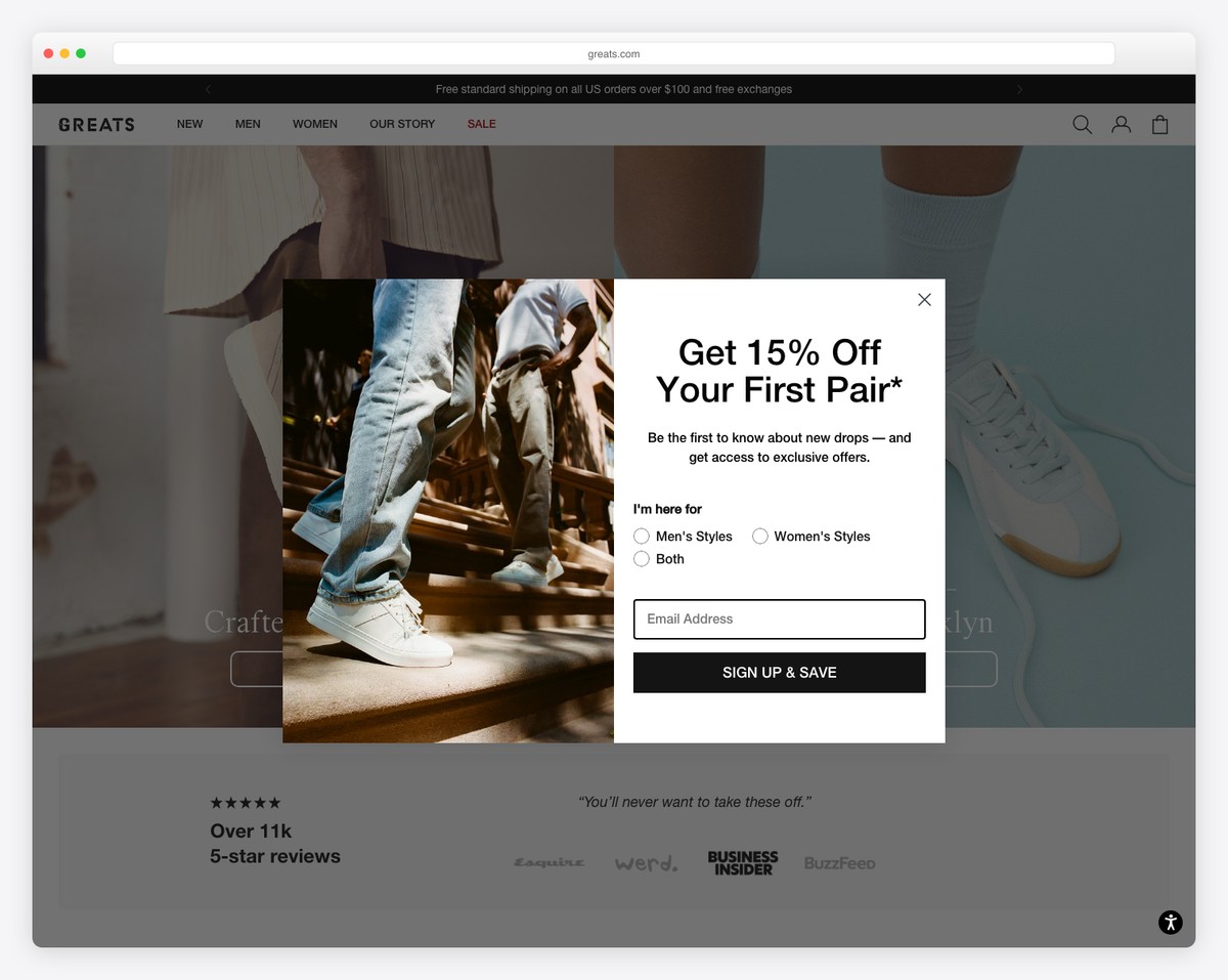
Greats’ Brooklyn-born sneaker brand leads with lifestyle photography and a “Crafted in Brooklyn” positioning. The split-hero layout pairs street-style imagery with clean product shots, while press mentions from Esquire, Wired, and Business Insider build instant credibility.
The Shopify-powered site keeps navigation focused (New, Men, Women, Our Story, Sale) with a persistent top bar promoting free shipping on orders over $100. The email signup popup with style preference selection (Men’s/Women’s/Both) enables personalized marketing from the first interaction.
What stands out: Including press logos (Esquire, Business Insider) near the hero section adds social proof that resonates strongly with fashion-conscious shoe shoppers.
Related Posts


Comments (0)