
23 Best Magento Websites (Examples) 2026
This is our take on the best Magento websites that are perfect for gaining new ideas when building any type of eCommerce website.
Fun fact: Adobe recently acquired Magento, now called Adobe Commerce.
You’ll immediately notice that some of the biggest brands in the world use Magento to run their online businesses.
It’s a powerful platform with endless options and possibilities. Plus, it easily handles the largest volumes of traffic for your convenience.
You’re ready for anything and everything from minimalist online shops to the most advanced ones.
Best Magento Websites & Examples
1. Fred Perry
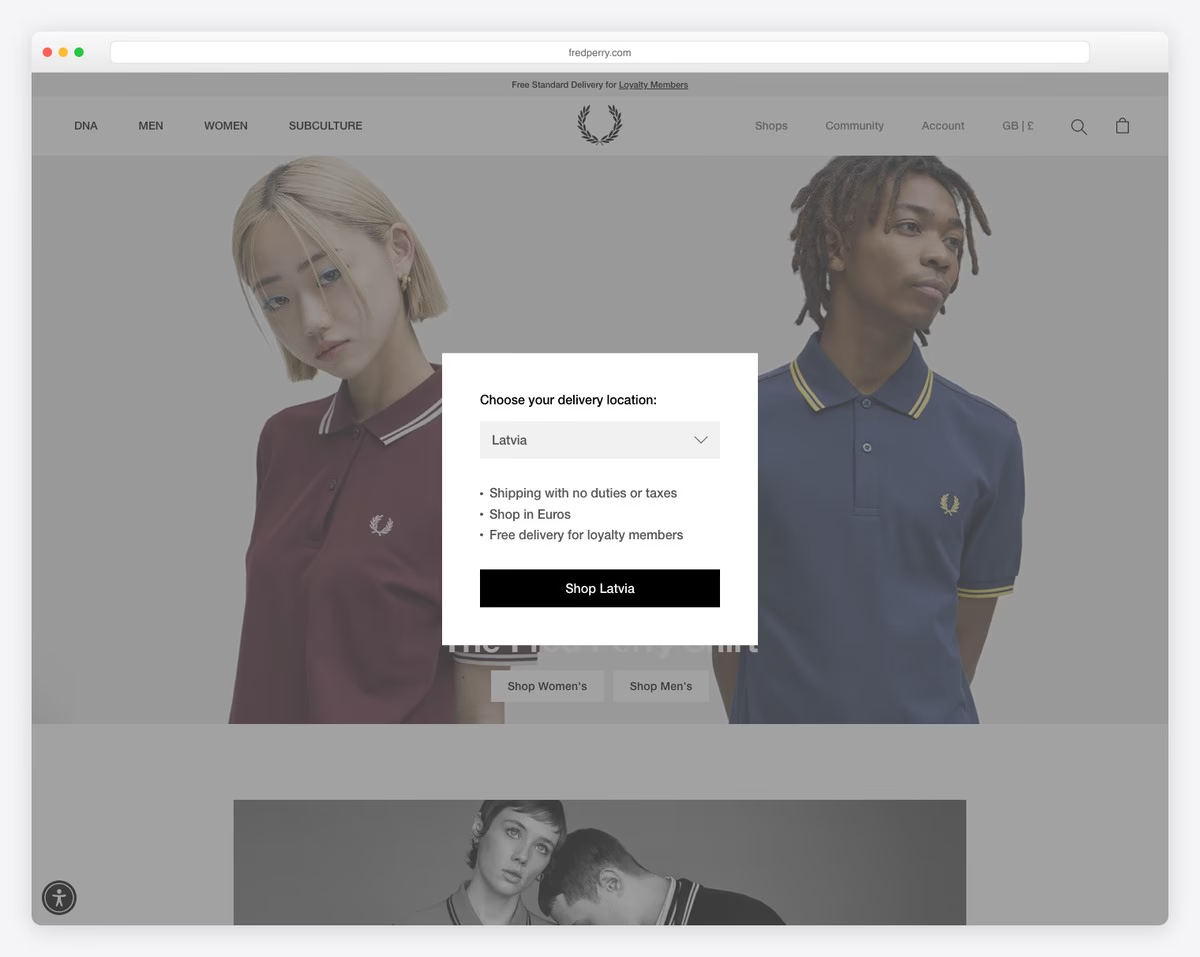
Fred Perry’s seemingly long home page doesn’t feel boring when you start scrolling.
The mixture of images, text and white space is nicely balanced to give you a pleasant experience. Also, the sticky newsletter subscription notification at the bottom of the screen is clever.
And the website also has a floating header that only appears when you start scrolling back to the top.
What stands out: A nice balance of content and white space ensures great UX.
You may also want to check these online store builders if you’re unsure about Magento yet.
2. Omega Watches
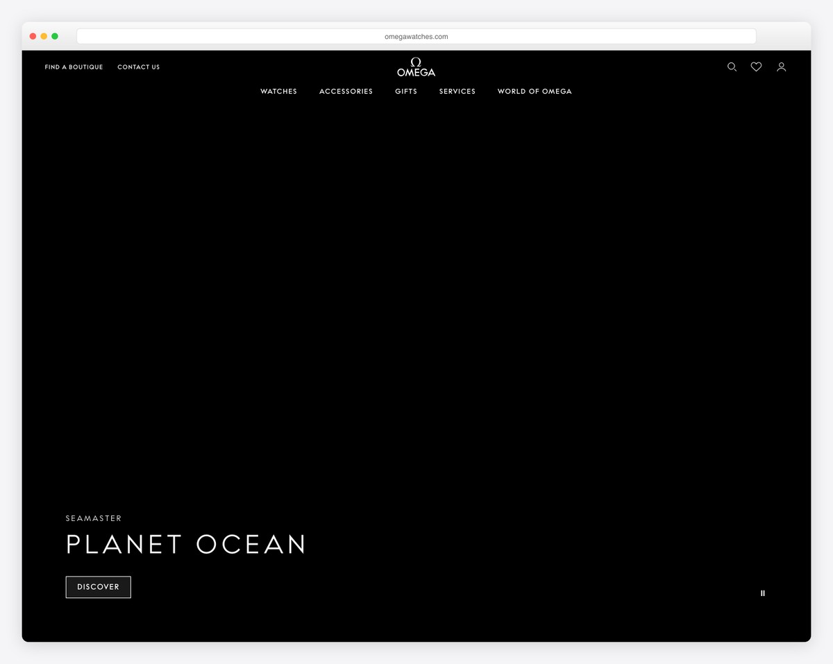
Omega Watches is a Magento website with an awesome split-style slider you can pause and play. They use one side of the slider for an image and the other for text and a call-to-action (CTA).
Omega Watches has a minimalist mega menu that helps you find the desired item or category more comfortably.
And the scrolling content animations are a must-see.
What stands out: If you’d like to add animations to your eCommerce website, do them with style (like Omega Watches).
3. Helly Hansen
Helly Hansen’s front page is pretty basic, with a large hero image and CTA buttons to the shop section. You will also find a sticky header area with a mega menu and a newsletter subscription section just before the footer area.
Speaking of the footer, it’s a five-column one and pretty info-dense but not distracting.
What stands out: Use your website’s footer to add all the additional information about customer service, payments, social media, etc.
4. Vivobarefoot
Vivobarefoot welcomes you to their shoe world with a full-width slideshow with texts and CTAs.
They also opted for a sticky header with a mega menu, search bar and notification bar.
What we like is the black-background footer which gives the overall website experience a more dynamic feel.
What stands out: Let your potential customers have access to your products at any time with a sticky mega menu.
5. Barbour
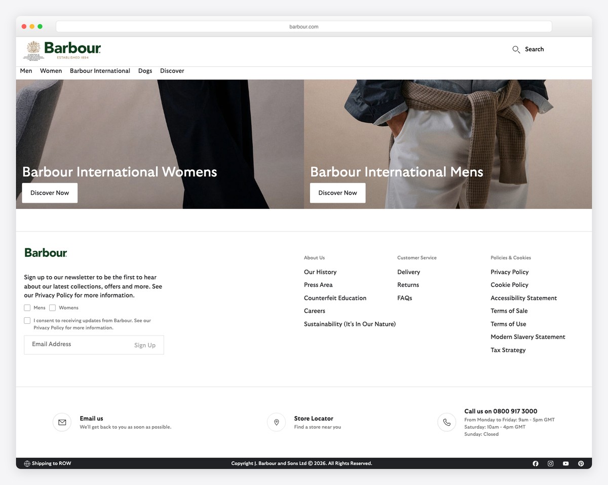
Barbour’s multi-section home page gives you an instant experience of the brand. They normally structure the home page according to the season or any special drops and collaborations they have.
Barbour also has a mega menu with images and links, but it’s not a floating one. You’ll also find multiple carousels for categories, top picks and client images/shop the look.
What stands out: Use carousels and sliders strategically if you want to showcase many items, content, categories, and more.
6. Sigma
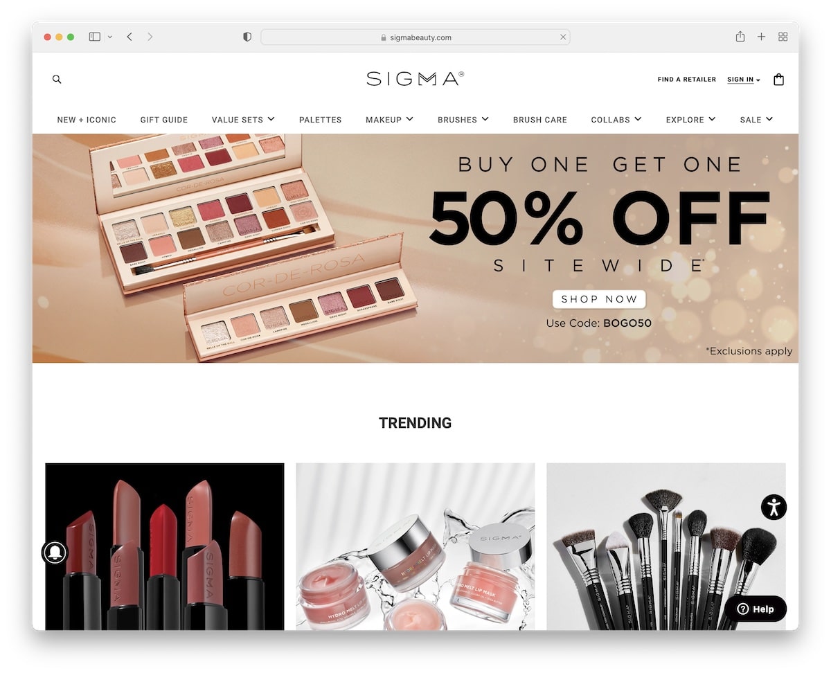
Many would say that Sigma’s front page is way too “stuffed” with products, images, texts and other content.
But it’s for this same reason that we’re adding it to the list. The use of larger fonts, white space and black and white backgrounds make it happen, keeping the user undistracted.
Plus, the minimalist sticky drop-down menu is always available for finding desired categories and items faster.
What stands out: Use Sigma as a great Magento eCommerce website example of how to put A LOT of stuff on the home page – with taste.
7. Nespresso
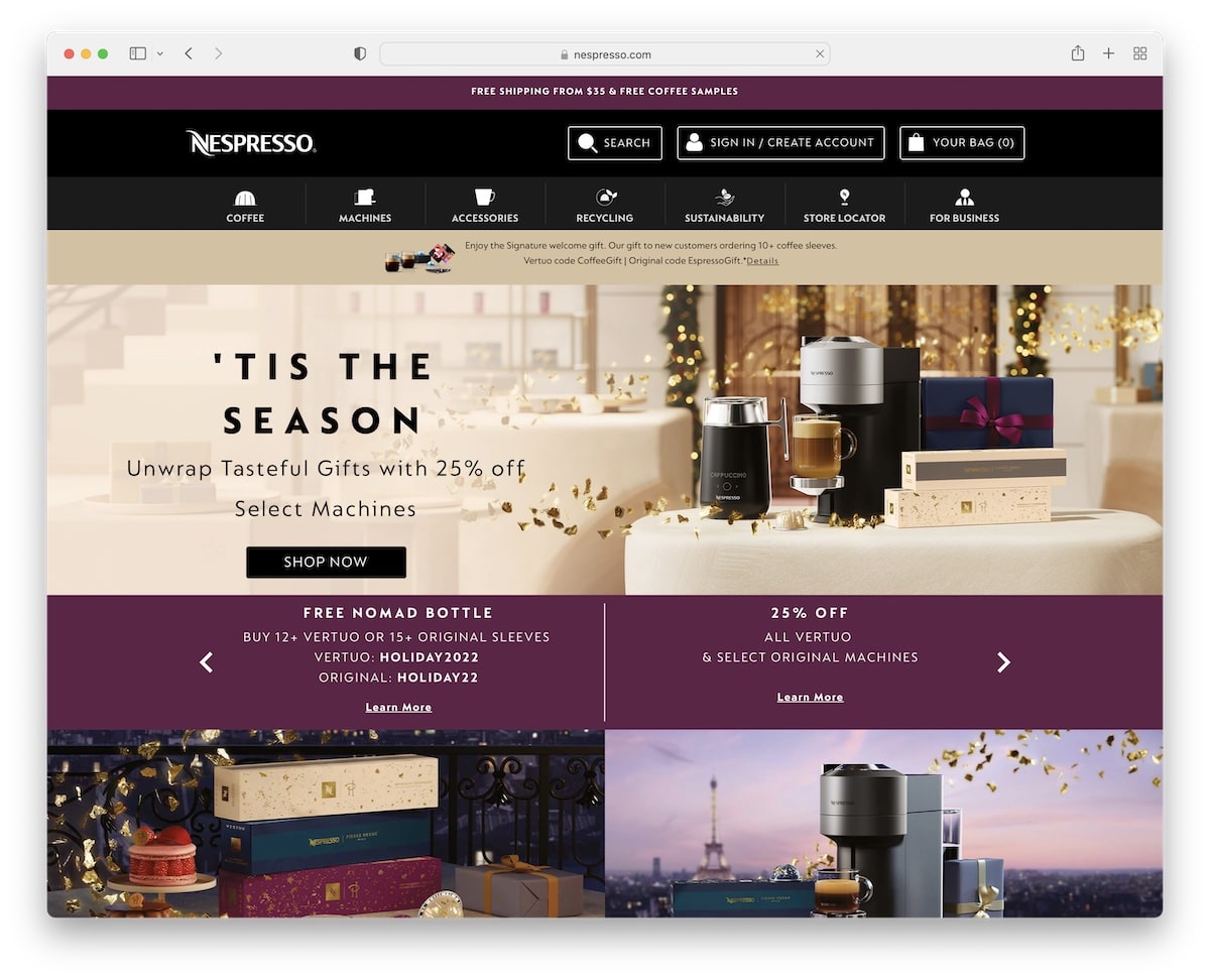
Nespresso has a content-rich, beautifully sectioned home page for the visitor to get a taste of everything.
They have a cool text slider below the hero image with special codes and deals to immediately grab your attention.
Interestingly their sticky “header” only features the logo, the search bar, the account button and the shopping bag.
What stands out: Do you regularly have multiple deals and coupons going on? Showcase them with a text slider.
8. Shinola
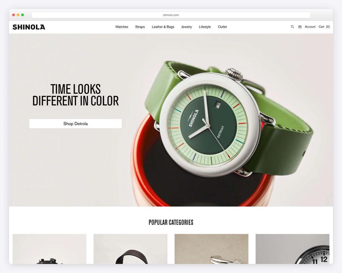
Part of Shinola’s home page features a masonry grid that they use for displaying categories with beautiful images.
They also use a carousel slider for their best sellers and a very original section with only one testimonial/review.
Moreover, the mega menu is enhanced with multiple images and links, and the search bar features live results.
What stands out: An image-heavy home page with a beautiful masonry grid can work well for brands.
9. Christian Louboutin
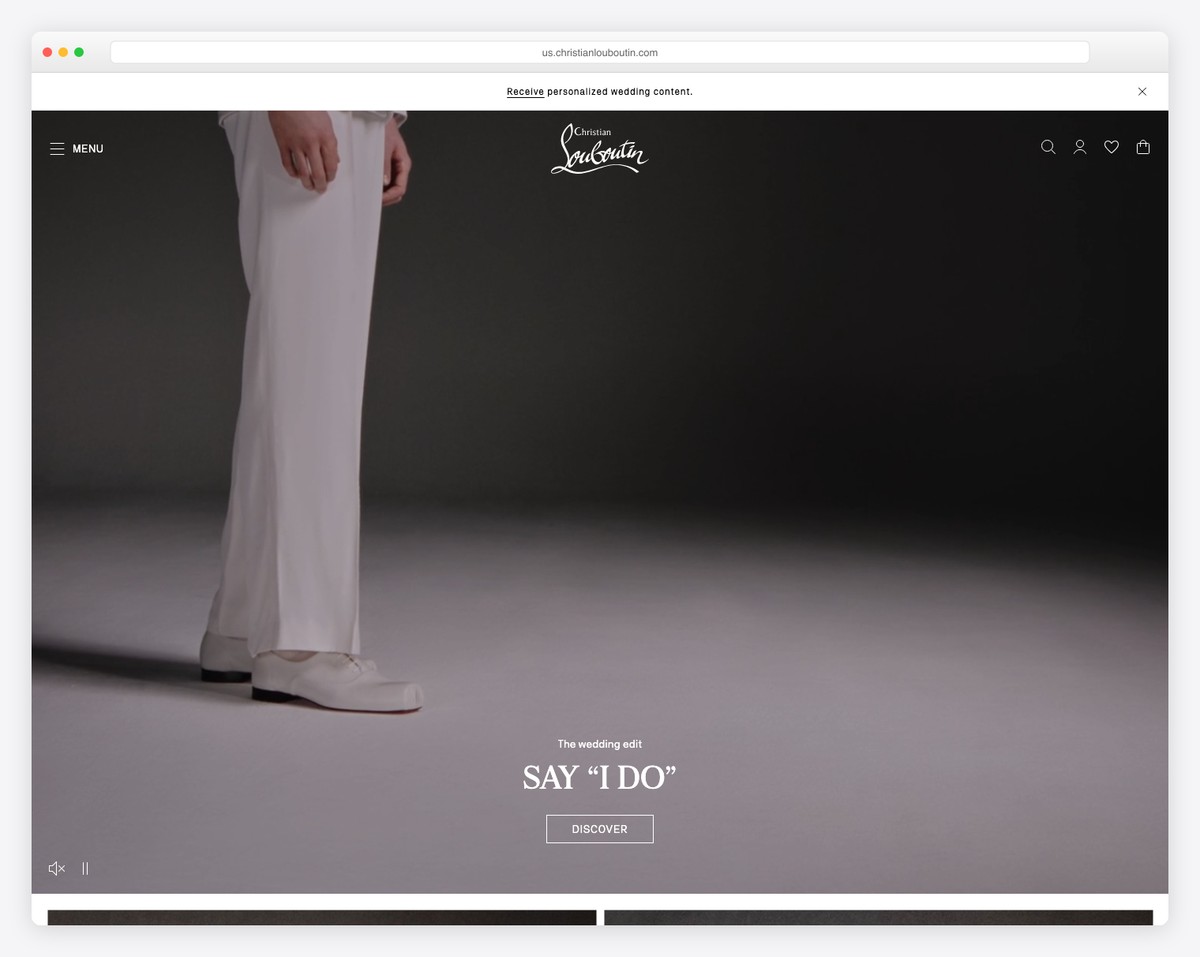
Christian Louboutin’s auto-played video in the hero area is very engaging and offers you to mute/unmute it.
This Magento website is very minimalist with a simple content loading animation on scroll.
And what instantly differentiates the website from the rest is its accessibility options with multiple visual functions.
What stands out: You can make your website accessible-ready with a cool widget, like Christian Louboutin.
10. Vortex
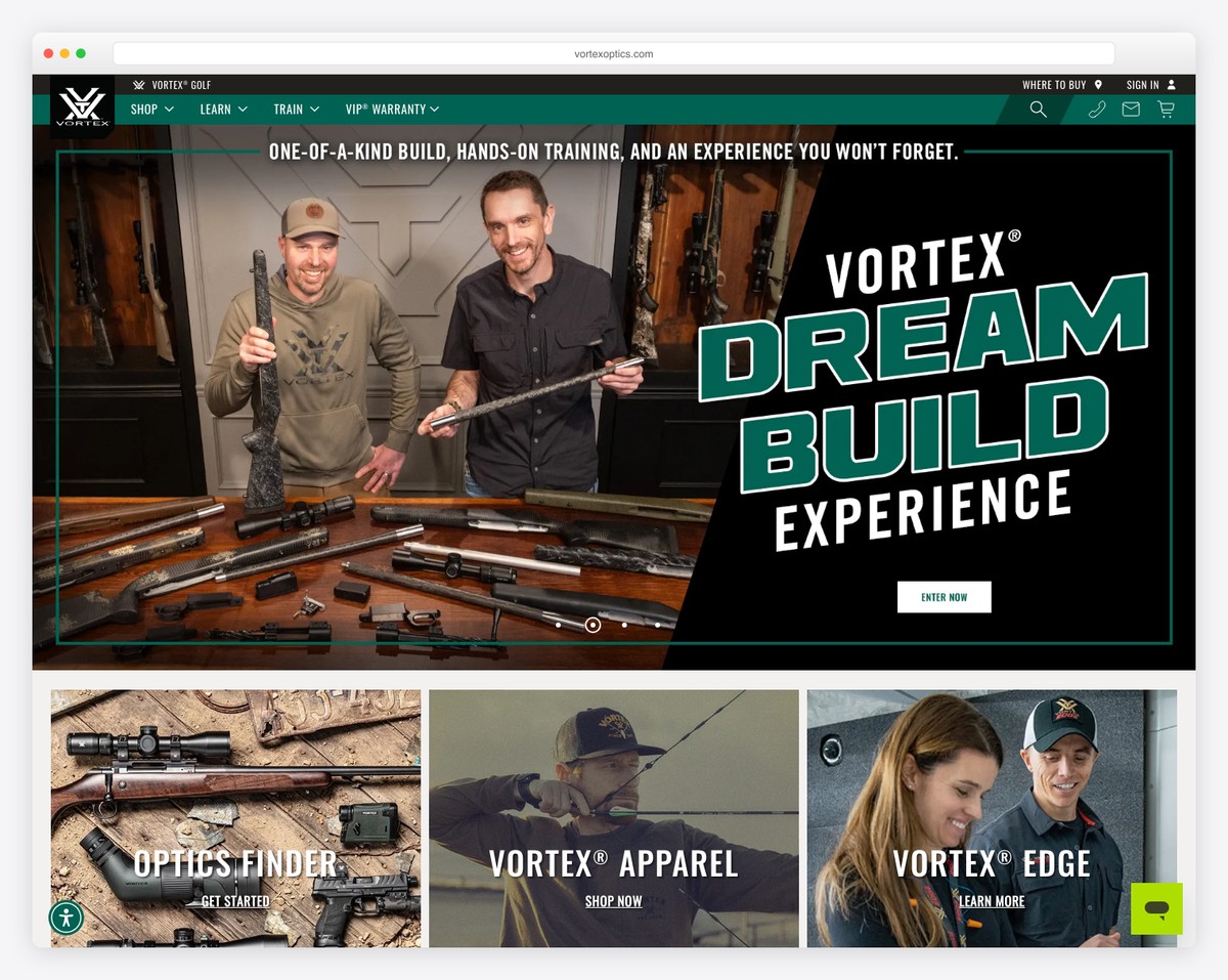
Vortex features a responsive web design that gives mobile and desktop users an equally awesome experience.
The page features a slider and a mega menu that appears only after you click the desired category.
They also have a dedicated section for a newsletter subscription form, social media links and a hashtag.
What stands out: If you would like to popularize your unique hashtag, ensure you don’t forget to include it on your website.
11. Cox & Cox
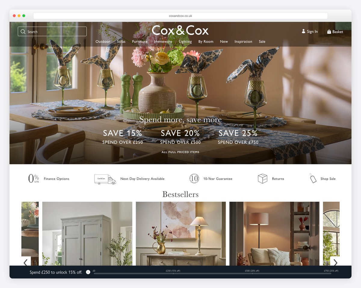
Cox & Cox equips you with special deals, features categories, popular products and more with a grid-style home page.
Their header is minimalist, with a large search bar that also recognizes the person’s voice. And the footer section has a gray background to make it stand out from the already “distracting” (in a good way) home page.
What stands out: If you want to emphasize your products, then a grid of professional images with links is a great solution.
12. Munchkin
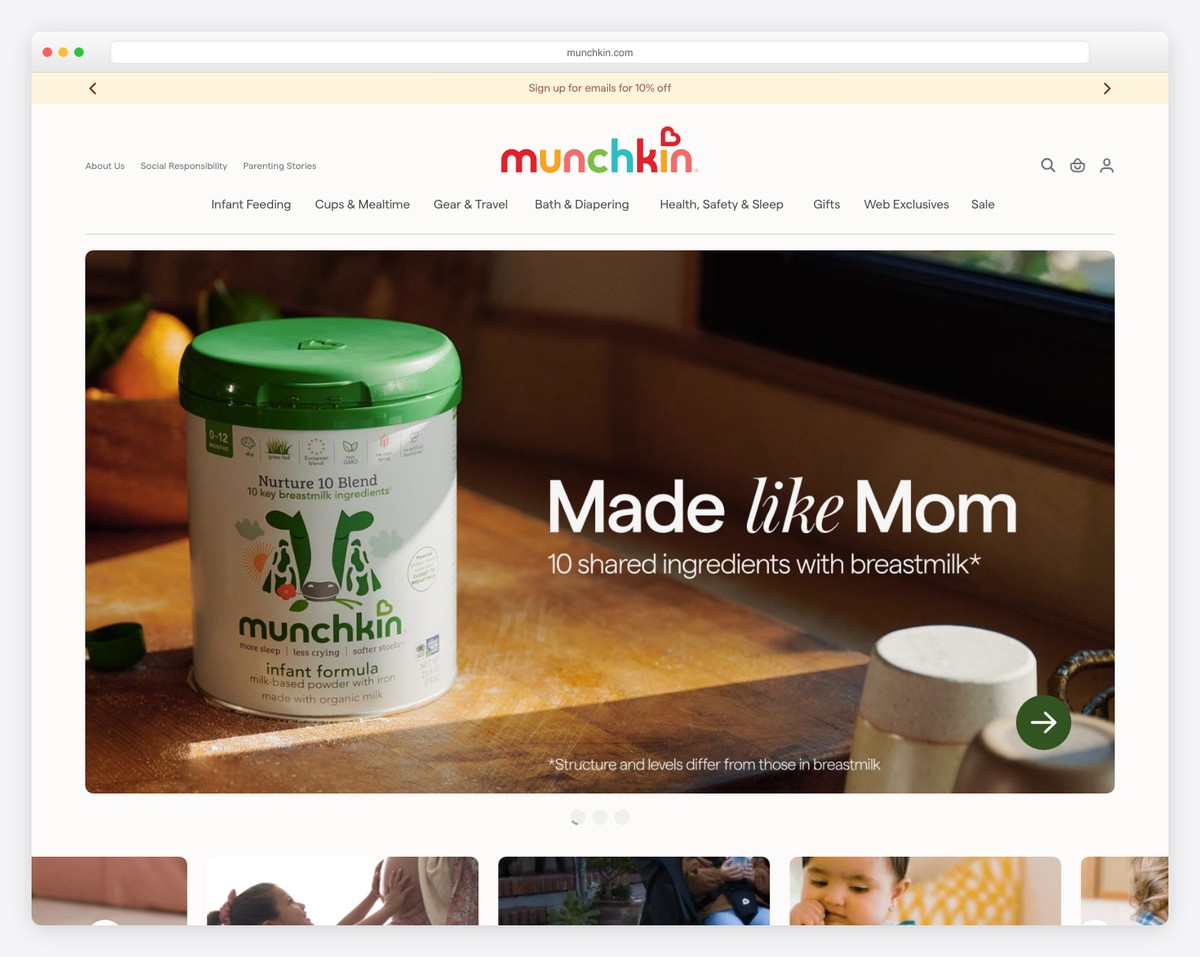
Munchkin’s website is clean but, at the same time, vibrant, perfect for loving parents. They feature a valuable testimonial slider that’s from various authorities.
One more practical element is the sticky bar that promotes an article, but you can close it by pressing “x.”
What stands out: If other big brands talk about you, make it visible on your website and show potential customers how popular you are.
13. Sig Sauer
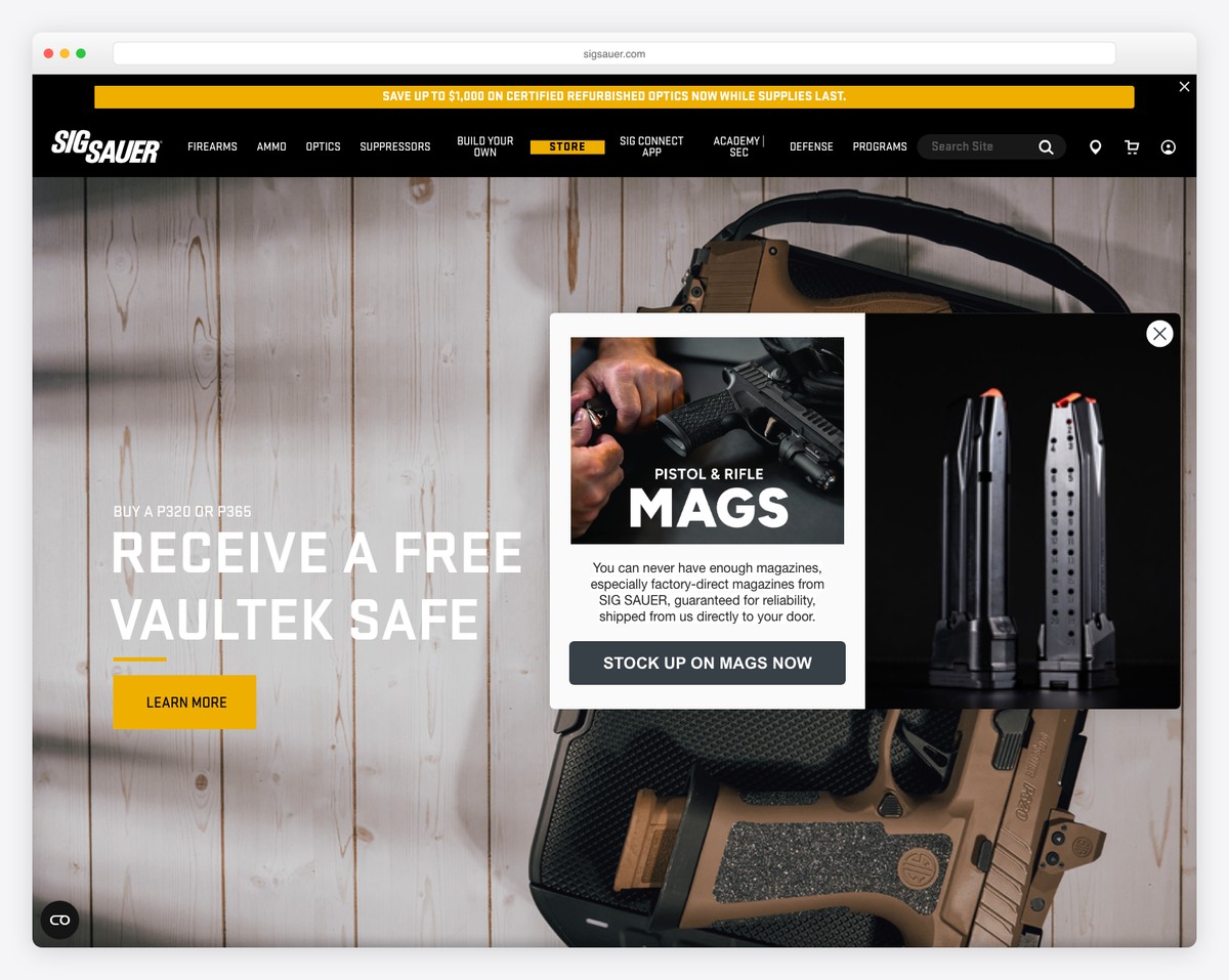
Sig Sauer contains a large hero image with text and a CTA button. Their header section is small and transparent, not getting in the way.
But the top bar captures your eye, which is exactly what a notification bar should do.
Besides the featured items, some additional company information and a pretty extensive footer area, Sig Sauer keeps things very simple.
What stands out: Keep your hero section cleaner with a transparent header/navigation bar.
14. Lladro
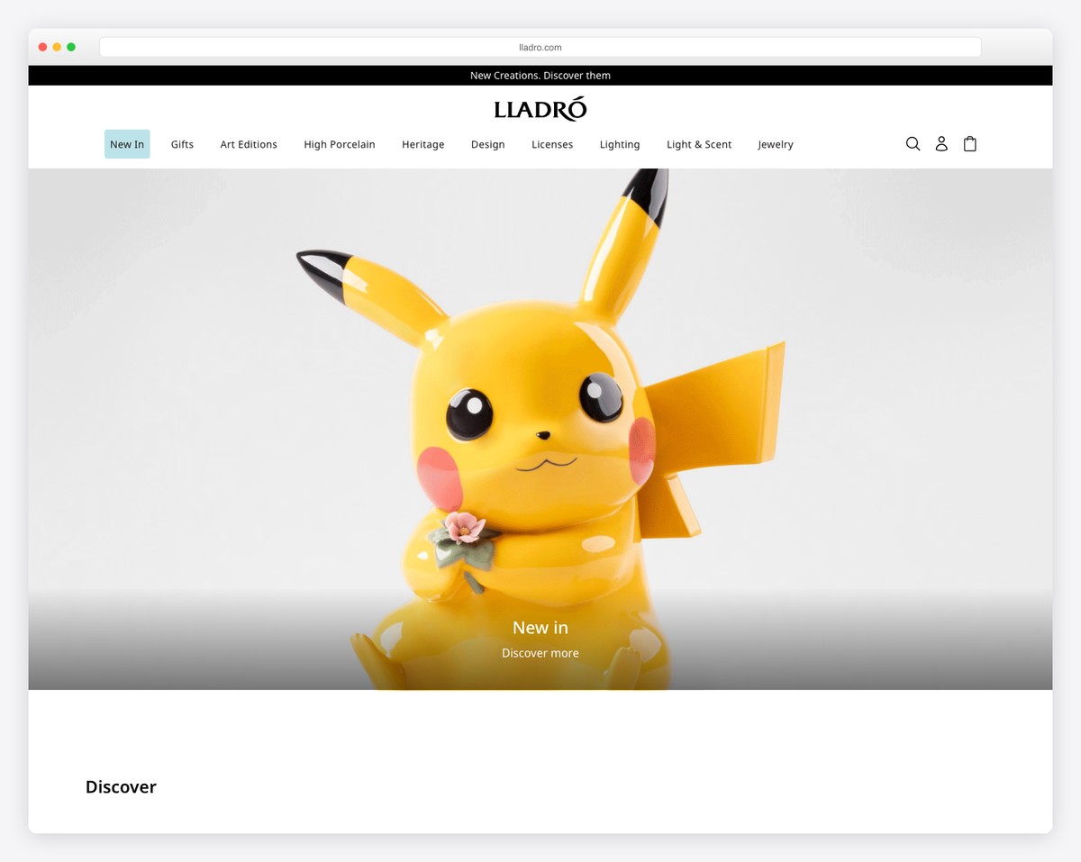
Lladro has an awesome mega menu, with most images pretty large (and clickable). What’s pretty intriguing is the top notification bar that doesn’t reveal much but makes you want to click.
Lladro also features some catchy animations and includes special sections for various collections, first an image that leads you to the category and second some of the items from the collection.
What stands out: Limited collections deserve special sections, which you can copy and improve on from Lladro.
15. Tom Dixon
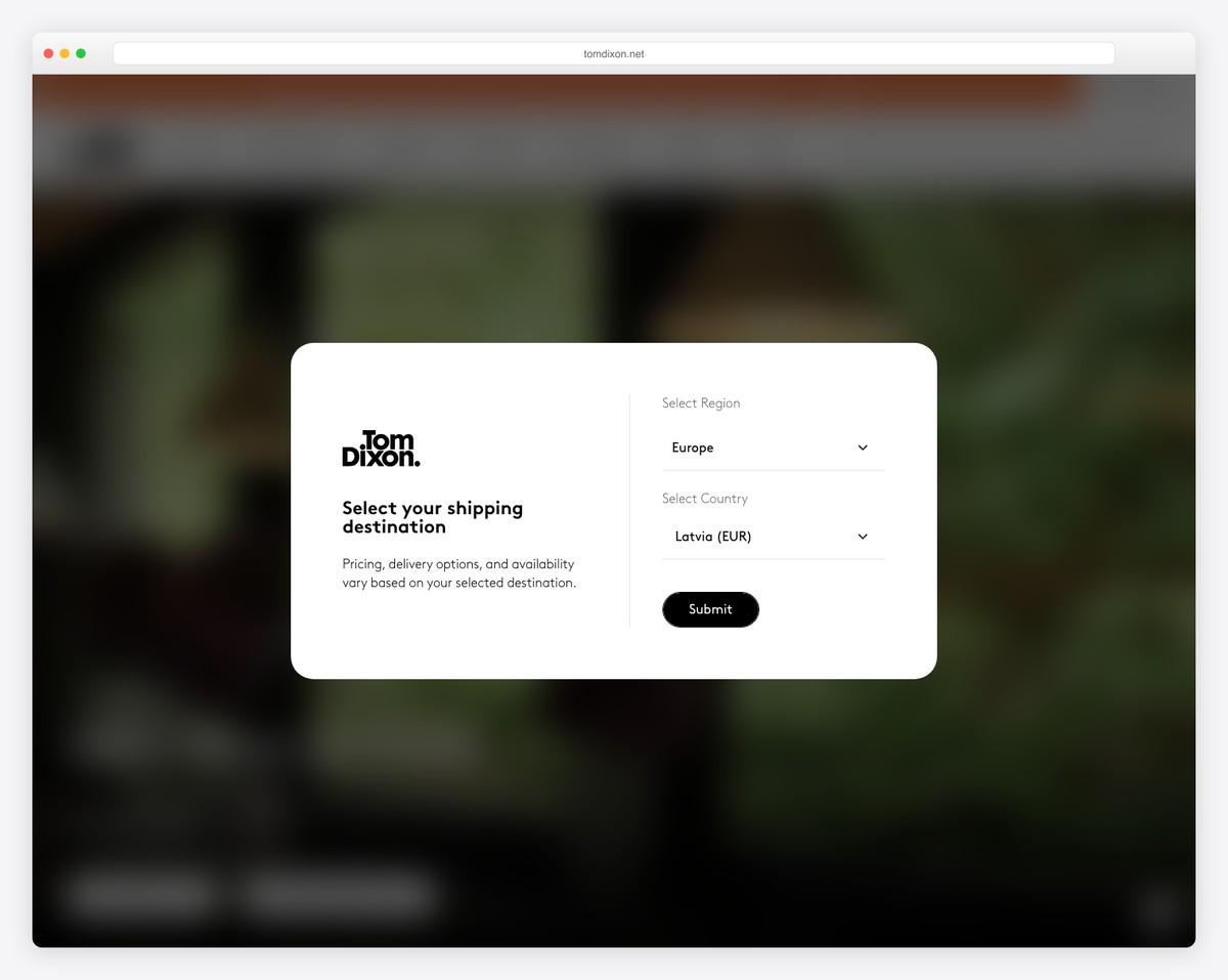
The top bar, header and full-screen slider are the first things Tom Dixon treats you to. And this is enough to get the visitor’s excitement going.
Tom Dixon keeps the navigation bar very minimalist with four clickable categories that unlock the mega menu on hover.
Last but not least, the shoppable Instagram section allows you to visualize Tom Dixon’s products in their natural habitat.
What stands out: A shoppable Instagram feed is great for showcasing customers who use your products but at the same time guiding the visitor to the product page.
16. Bulk
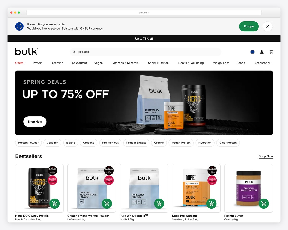
Bulk’s header smoothly collapses on scroll but reappears when you scroll back to the top.
This gives the user a more pleasant browsing experience but gives him/her a chance to visit other sections and products without going all the way to the top again. (No time wasting.)
The “Stay in touch” section is also large, which increases the chance of scoring a new lead.
What stands out: Always focus on the best user experience, and a great browsing experience is one of the contributing factors.
17. Catbird
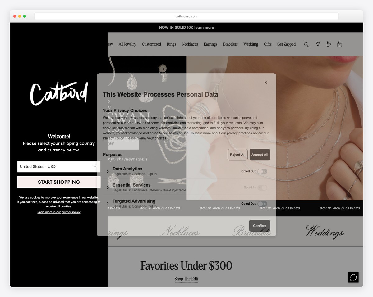
Catbird’s top notification bar (with multiple notifications) and header area are floating to keep you guided through the page regardless of how much scrolling you do.
We particularly like the “How you wear it” section, which shows some of Catbird’s customers modeling the products. But at the same time, you’ll see links to product pages for quick shopping.
Plus, Catbird is also one of the rare websites with the accessibility mode.
What stands out: Instead of opting only for the floating header, make the notification bar sticky, too.
18. Byredo
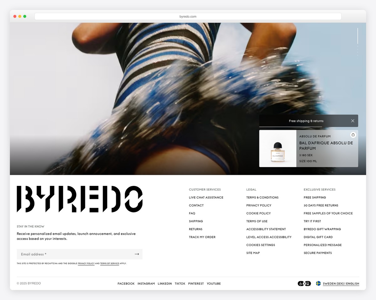
Byredo’s front page is a big grid of beautiful images with text, pricing and an option to click on them. Some elements guide you to the category and some directly to the product page.
But you also have the floating minimalist header (with a mega menu) always present if you want to visit something that’s not on the home page.
What stands out: A full-screen grid-style home page allows you to showcase products without being too salesy.
19. Vionic
Vionic features a boxed Magento website design that’s clean and simple for everyone to enjoy.
The top notification bar collapses on the scroll but not the header. The navigation only features four elements that reveal sub-sections on hover.
What stands out: Promote the benefits of your product(s) with a slider that showcases what’s hot (check Vionic’s “three-zone comfort” slider.)
20. Vitamix
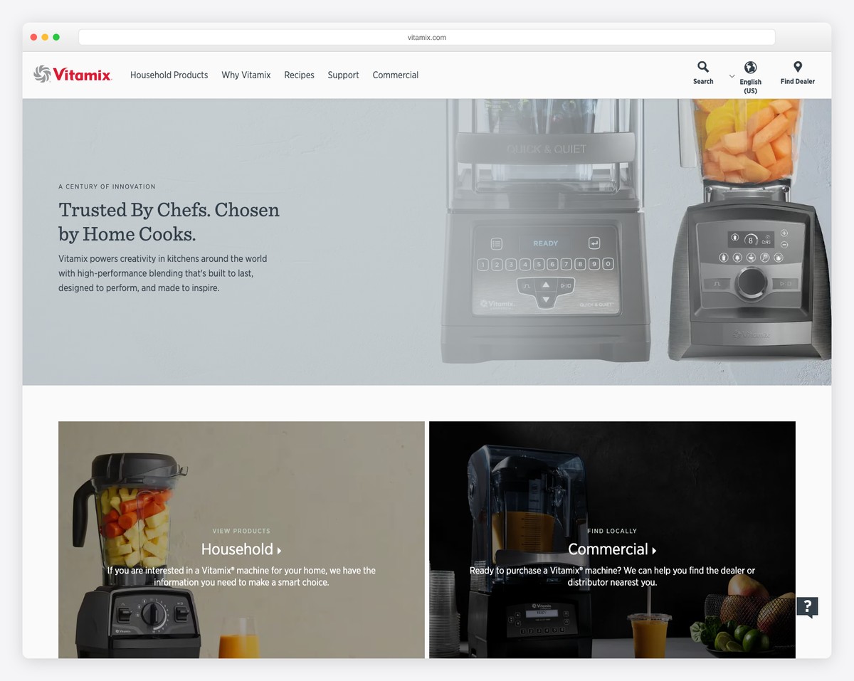
Vitamix has a very basic Magento website, which makes it a perfect inclusion to the list. We wanted to show this awesome eCommerce website builder‘s versatility – you can build any type of online store with it, clean and simple or creative and modern.
What stands out: If you’re unsure about your business’ web design – keep it simple!
21. Coca-Cola Store
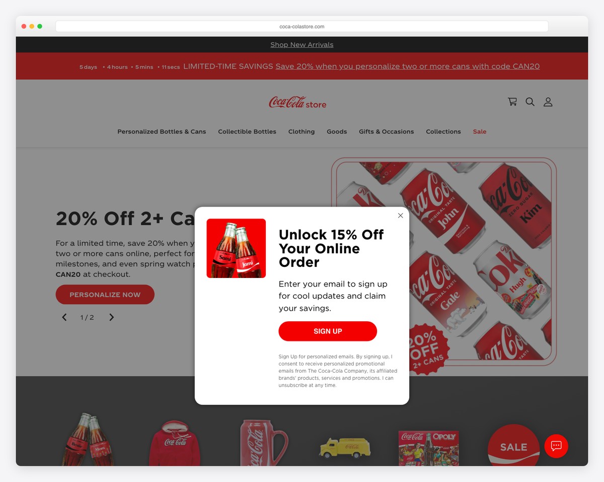
Coca-Cola Store features bold elements to capture the visitor’s interest with main and secondary navigation (a multi-level drop-down), a notification bar and a countdown timer for special deals, sales, etc.
They also keep all the CTA buttons red, which go very well with their branding, always reminding you of Coca-Cola.
What stands out: Make your website elements resemble your branding.
If you’d also like to check some Magento alternatives, we recommend cheap eCommerce website builders that’ll get you started immediately.
22. Land Rover Shop
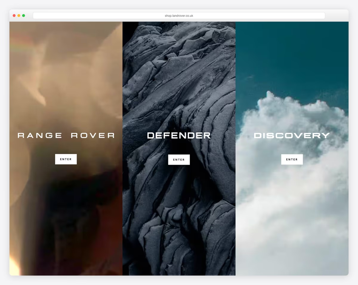
The official Land Rover accessories and merchandise store runs on Magento 2 (Adobe Commerce) with the modern Hyvä theme. The design features large hero imagery organized by vehicle collections — Range Rover, Defender, and Discovery — with prominent CTAs for each collection.
Advanced search powered by Klevu and international commerce via Global-e demonstrate enterprise-level Magento capabilities. The premium brand presentation with high-quality vehicle photography and organized collection navigation matches the luxury automotive brand’s standards.
What stands out: Organizing accessories by vehicle model creates a focused shopping experience — Land Rover owners immediately find parts for their specific vehicle rather than browsing a generic catalog.
23. Citizen Watch UK
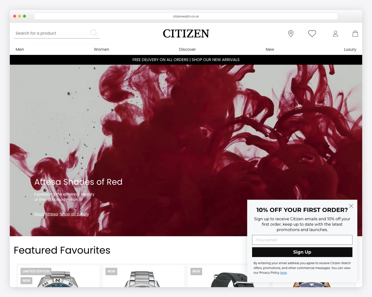
Citizen Watch UK runs their ecommerce store on Magento 2 with the Hyvä theme, selling their Eco-Drive, Super Titanium, and licensed collections including Disney, Marvel, and Star Wars collaborations. The clean product grid with comprehensive filtering makes browsing the extensive catalog intuitive.
Built on the Hyvä theme with Tailwind CSS, the site delivers fast page loads that match the premium brand experience. Klevu-powered search and Klaviyo marketing integration demonstrate how Magento handles enterprise ecommerce needs while maintaining a polished customer-facing design.
What stands out: Licensed collections (Disney, Marvel, Star Wars) displayed as curated landing pages transform a traditional watch store into a gift destination — each collection tells a story that resonates with fans beyond just watch enthusiasts.
Related Posts


Comments (0)