21 Best Shopify Blog Examples In 2026
Do you want to check some of the best Shopify blog examples because you’re interested in expanding your online store?
While we don’t necessarily recommend starting a blog with Shopify, we do recommend adding one to your eCommerce website.
Not only can you use it to announce new product drops and promote special deals, but you can also grow your business through SEO-optimized articles (tips, tricks, advice, etc.) and enjoy more organic traffic.
Show the world that you’re an expert in your field.
Shopify has all the tools necessary to start a blog – and here are twenty top-notch examples to inspire you.
Inspiring Shopify Blog Examples
1. Flourist Recipes
Built with: Shopify
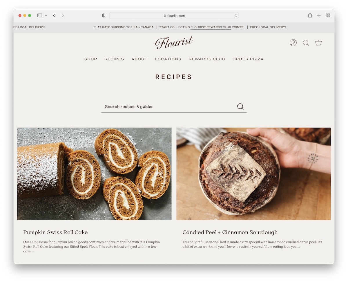
Flourist Recipes is a great example of a Shopify blog with a two-column grid layout. It has a sliding text notification in the top bar and a header with a navigation bar (that has a multi-column drop-down).
Below the header is a basic search bar for finding specific information. The footer also contains many additional quick links, social media icons, and a newsletter subscription widget.
Note: Display more blog posts on the “home page” with a multi-column grid layout.
You may also be interested in our collection of the best recipe blogs.
What stands out: Scroll-triggered animations guide the eye through each section without overwhelming the visitor.
2. Urban Beardsman
Built with: Shopify
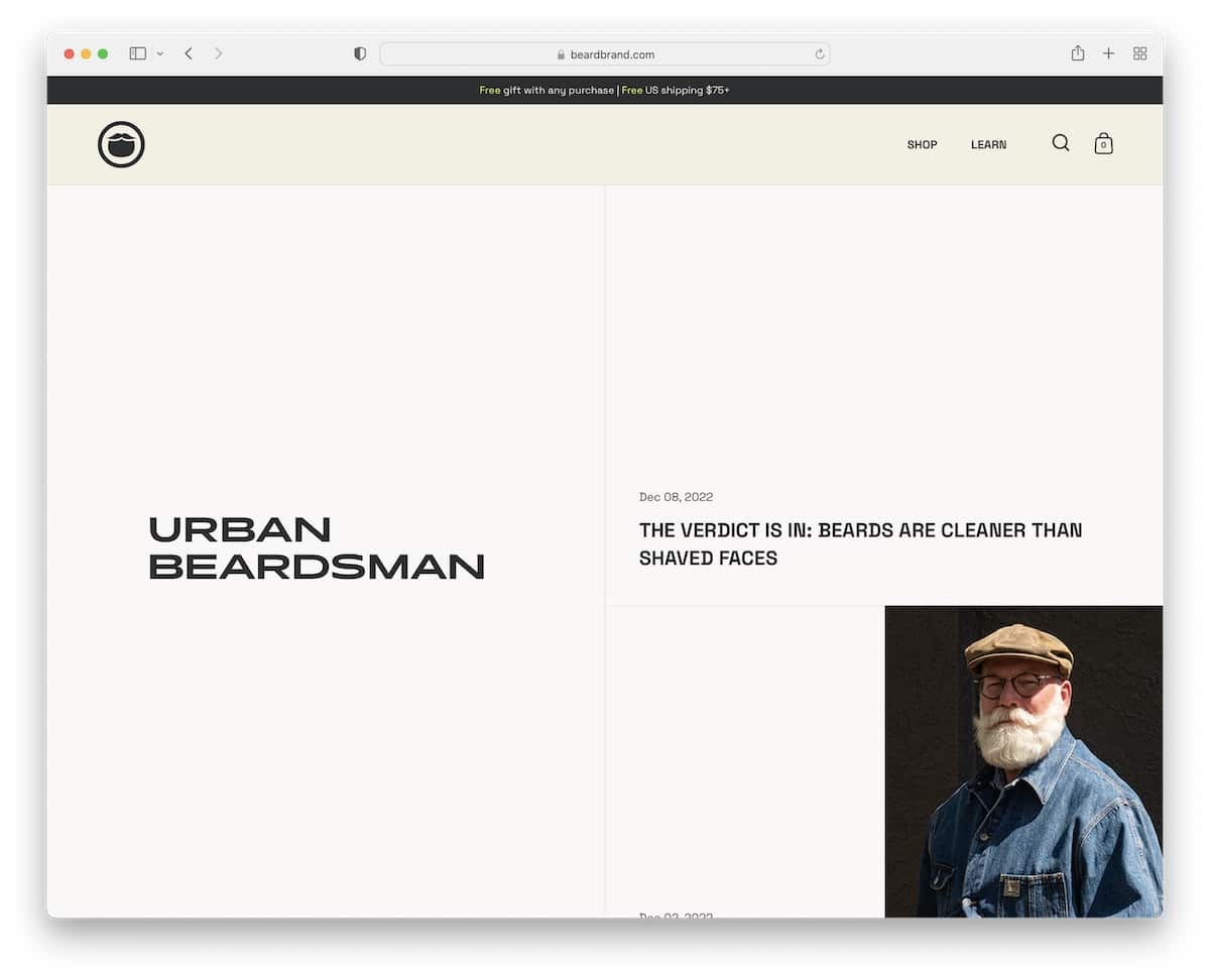
Urban Beardsman has a very interesting split-screen design, with the left part static and the right scrollable. However, the “scrollable” section also has a split design, with one section featuring date and title on a solid background and the other featuring a featured image.
This blog’s header hides when you scroll down but reveals itself when you return to the top. We also like the black background, which makes the extra information and links stand out more.
Note: Create a better user experience with a disappearing/reappearing header to make scrolling more pleasing.
What stands out: A hero slider showcases multiple offerings at a glance, giving visitors quick access to key content.
3. Girlboss
Built with: Shopify
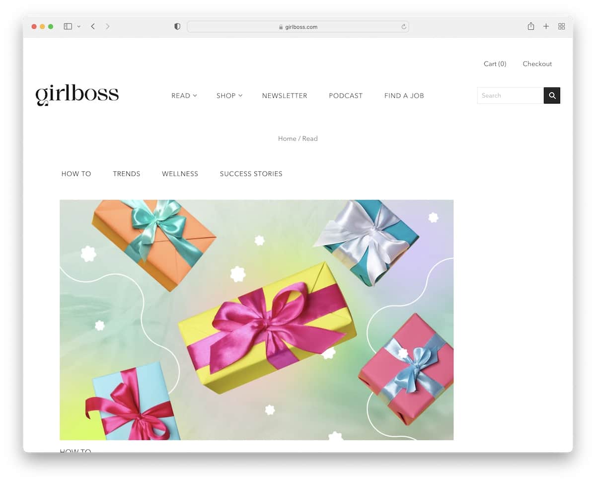
Girlboss has a minimalist blog layout with a light header and a dark footer to make it more dynamic. Below the header and breadcrumbs are tags to access the articles you’re into quickly. But you can always type in something more specific in the search bar.
In between all the post grids is also a newsletter subscription section with a vibrant design to capture everyone’s attention.
Note: Integrate a newsletter subscription widget to build your list and grow your business through email marketing.
What stands out: The dark color scheme gives the site a sleek, modern feel that makes imagery pop.
4. Finisterre
Built with: Shopify
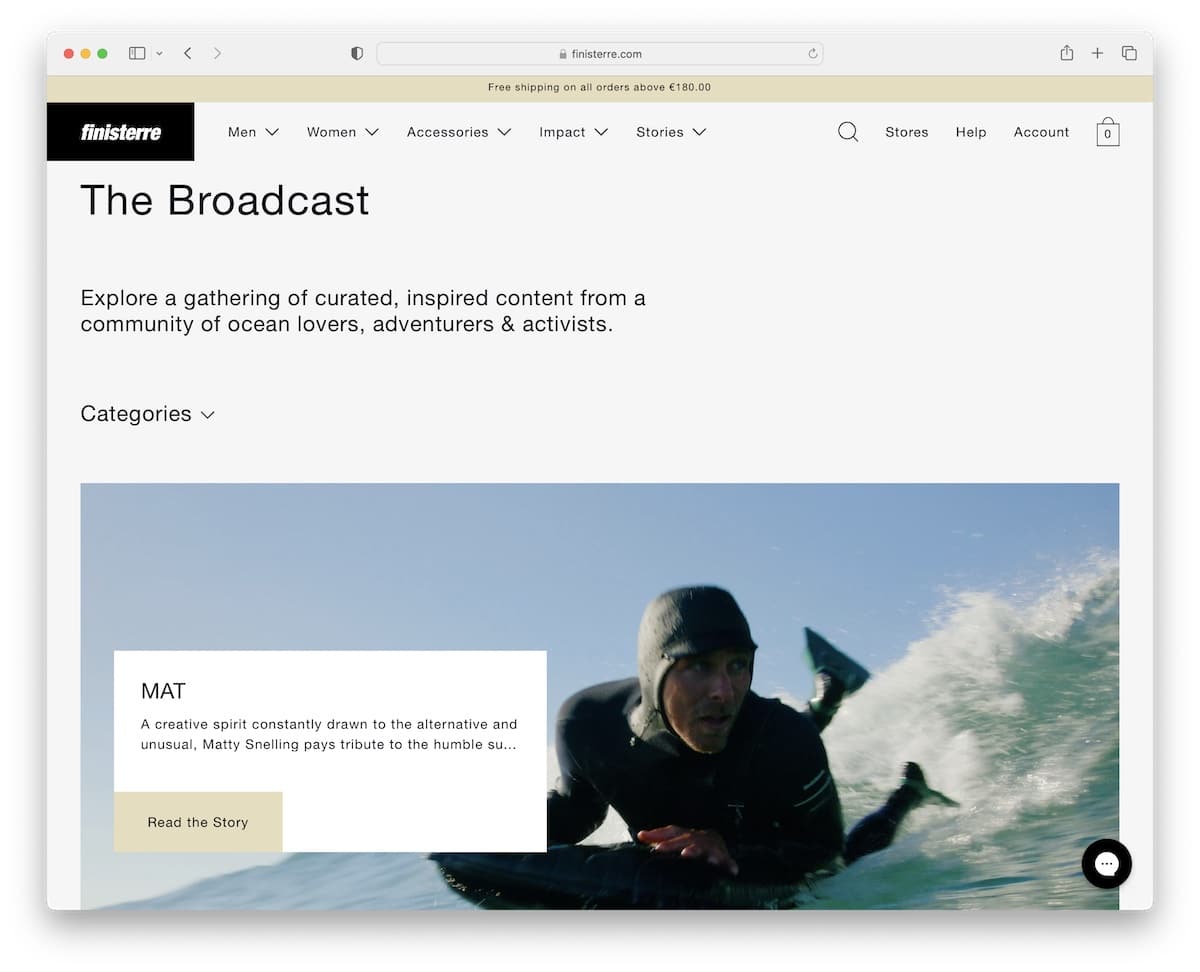
Finisterre has a content-rich blog home page with a clean look that makes skimming through it a piece of cake. The hero section also has a category drop-down, allowing you to pick only the topics you want to read.
Individual posts have a full-width layout, ensuring excellent visual and text content distribution.
Finisterre also has a newsletter subscription popup with checkboxes to decide what type of emails you want to receive.
Note: Checkboxes allow your users to pick the topics and categories they’re interested in.
What stands out: The image carousel keeps the above-the-fold area dynamic without requiring visitors to scroll.
5. Laird Superfood
Built with: Shopify
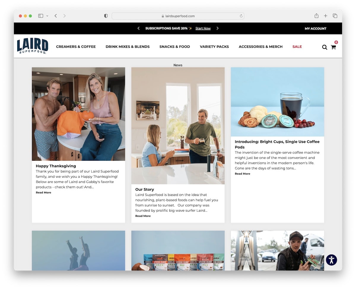
Laird Superfood’s Shopify blog has a boxed structure with a three-column grid to showcase many articles that are only a few clicks apart. Each grid element has a thumbnail, a title, an excerpt, and a “read more” button.
The post itself has a more traditional form, with a right sidebar that contains links to recent posts, all news, and a giant list of tags.
Another advantage of Laird Superfood is the accessibility configurator, which allows anyone to adjust the blog’s look as they want.
Note: Allow readers to configure the blog’s look with accessibility adjustments.
What stands out: Seamless e-commerce integration lets visitors go from browsing to buying without leaving the site.
6. Mani Life
Built with: Shopify
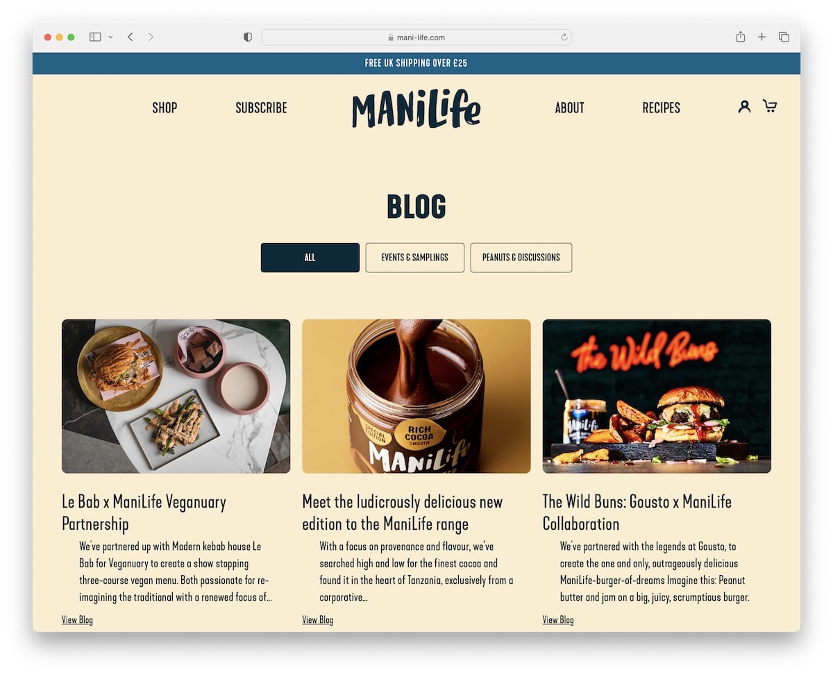
Mani Life’s blog starts with three tabs for choosing to view “all” articles, “events and samplings,” or “peanuts and discussions.”
The look is more mobile-like because of the thumbnails with rounded edges. Mani Life also uses a disappearing and reappearing header that depends on the scrolling movement.
But we find one of the more clever features is the “related products” below each post, contributing to more conversions.
Note: Remember that your blog can help your business generate more sales.
What stands out: Subtle entrance animations add polish without slowing down the browsing experience.
7. Etnies
Built with: Shopify
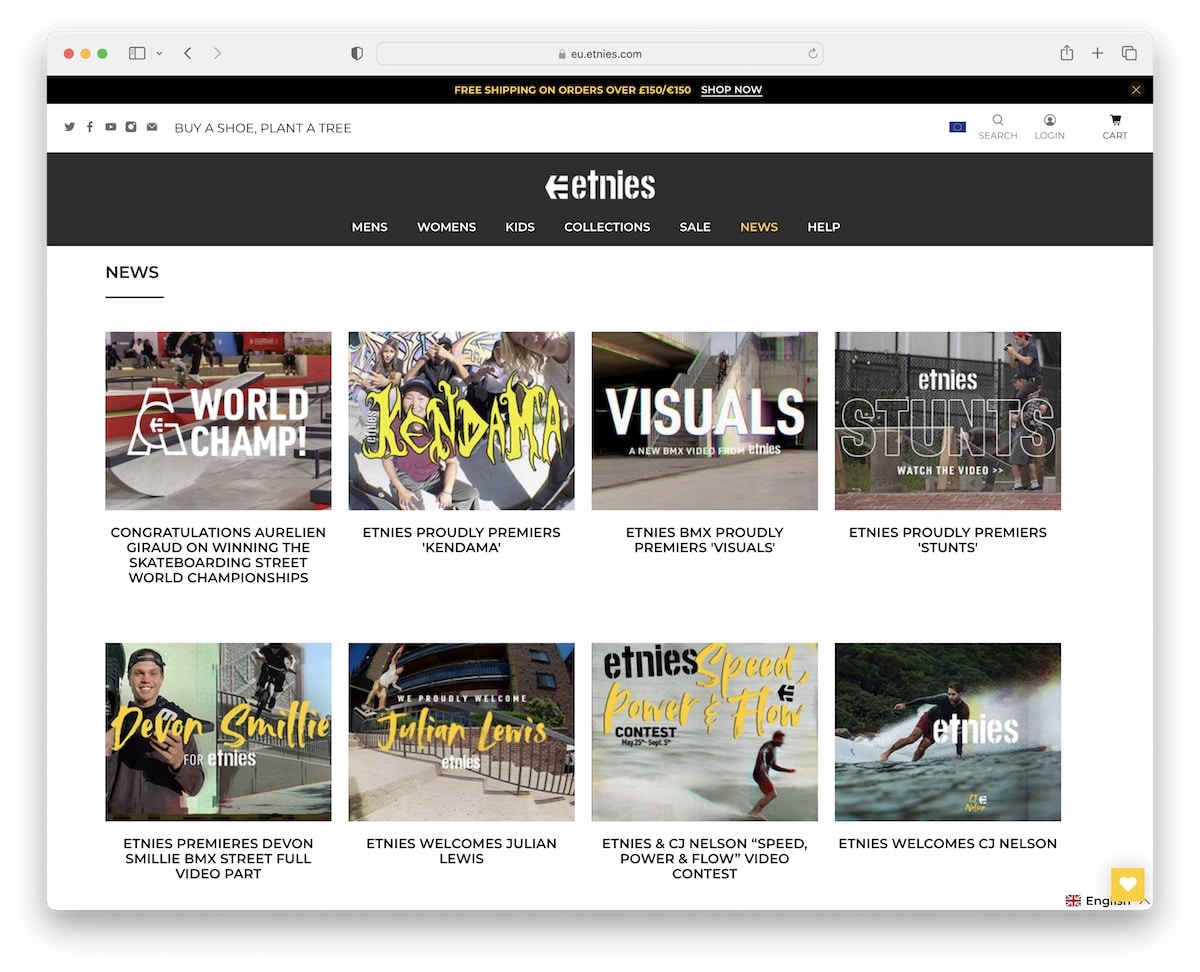
Etnies’s blog has a sticky header with a mega menu to ensure the ultimate navigability experience. Plus, the search bar displays recommendations (“did you mean?”) to ensure finding the right stuff is pain-free.
Moreover, blog posts usually have both image and video content besides text to spice things up. Also, you’ll find a “previous/next” link in the top right corner to jump from post to post more conveniently.
Note: Mega menu navigation allows you to create a custom drop-down template with links, images, etc.
What stands out: Built-in booking functionality turns the website into a 24/7 appointment scheduler.
8. Shoepassion
Built with: Shopify
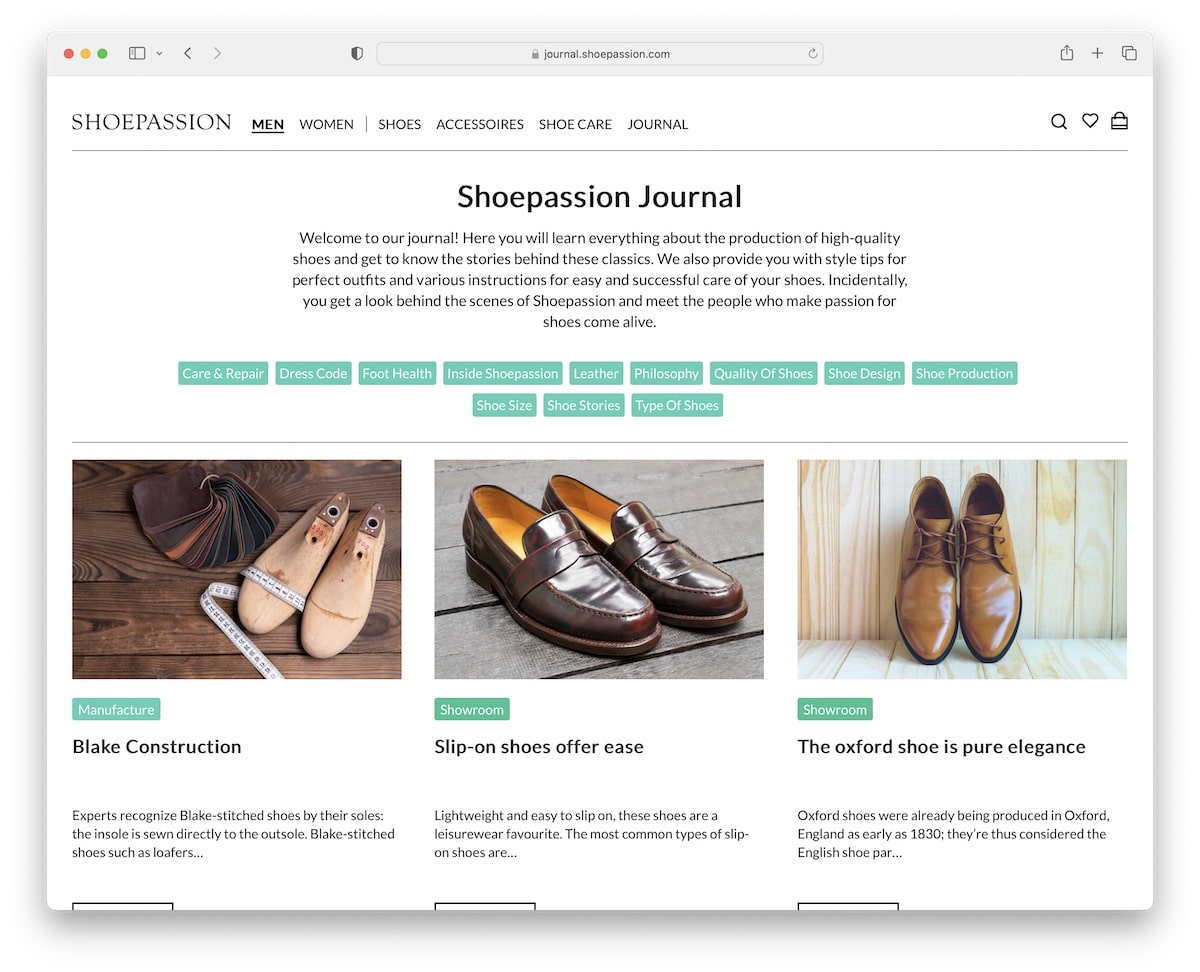
Shoepassion’s journal/blog is elegant, with a simple structure that nicely completes the job. Above the fold are a title and a short description of what to expect from the content published on the journal page.
Additionally, Shoepassion also displays multiple buttons for various categories/topics to find the necessary content much more quickly.
Note: Use blog categorization so that readers can search and find the right article(s) faster.
What stands out: A masonry grid layout organizes content attractively while maximizing screen real estate.
9. Nalen
Built with: Shopify

Nalen displays the latest article in the hero section, followed by a grid of articles that load while you scroll.
This Shopify blog example has three sticky elements; the header, the language switcher and the chat widget. While that sounds much, they don’t crowd the screen.
Just like the blog’s home page, individual articles also have a product carousel at the bottom, so everyone has a reason to stay on the page and continue checking different items.
Note: Give your latest or most-read article extra shine by highlighting it in the hero section.
What stands out: The clean layout and intuitive navigation create a professional user experience that builds trust.
10. Bremont
Built with: Shopify
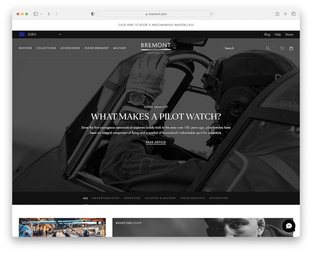
Bremont is a modern Shopify blog example with a load more button that informs you about the number of loaded articles and total articles. It almost feels like a progress bar.
Below the latest article, above the fold, is a banner with links to various categories for quick access. But even if you don’t stop and continue scrolling, the banner floats at the top of the screen, so you don’t have to return to reach it.
Note: Instead of traditional pagination, you can also use a load/show more button to keep enjoying the posts on the same page.
What stands out: A dark background paired with bold accent colors creates striking visual contrast.
11. Pretty Presets
Built with: Shopify
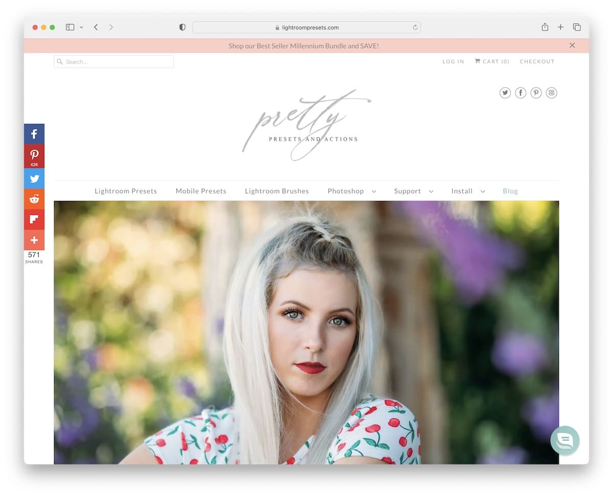
Pretty Presets is an elegant Shopify blog with two columns and a sidebar with links to different categories and a newsletter subscription form.
On the left side of the screen are floating social media icons for sharing the content and helping spread the word.
One cool feature of posts is the before and after slider (which is also a great sales element).
Note: Use a before/after slider to showcase the improvements, whether it’s image transformation, body transformation, house transformation, etc.
What stands out: Integrated appointment booking removes friction between browsing and converting.
12. Press
Built with: Shopify
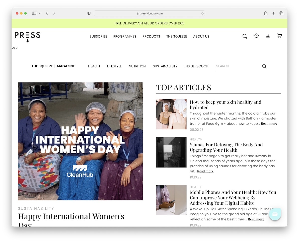
Press’ GIF is a great attention-grabber to trigger the readers’ interest (so they don’t leave too quickly).
However, many more animated elements throughout the layout create a very engaging atmosphere.
Furthermore, both the notification bar and the header stick to the top of the screen, so scrolling back to the top is unnecessary.
Note: A top bar notification with a contrasting background is a smart way of getting more eyeballs on whatever you’d like to inform the visitor about.
What stands out: A prominent search function helps visitors find exactly what they need without scrolling through pages.
13. The Maudern
Built with: Shopify
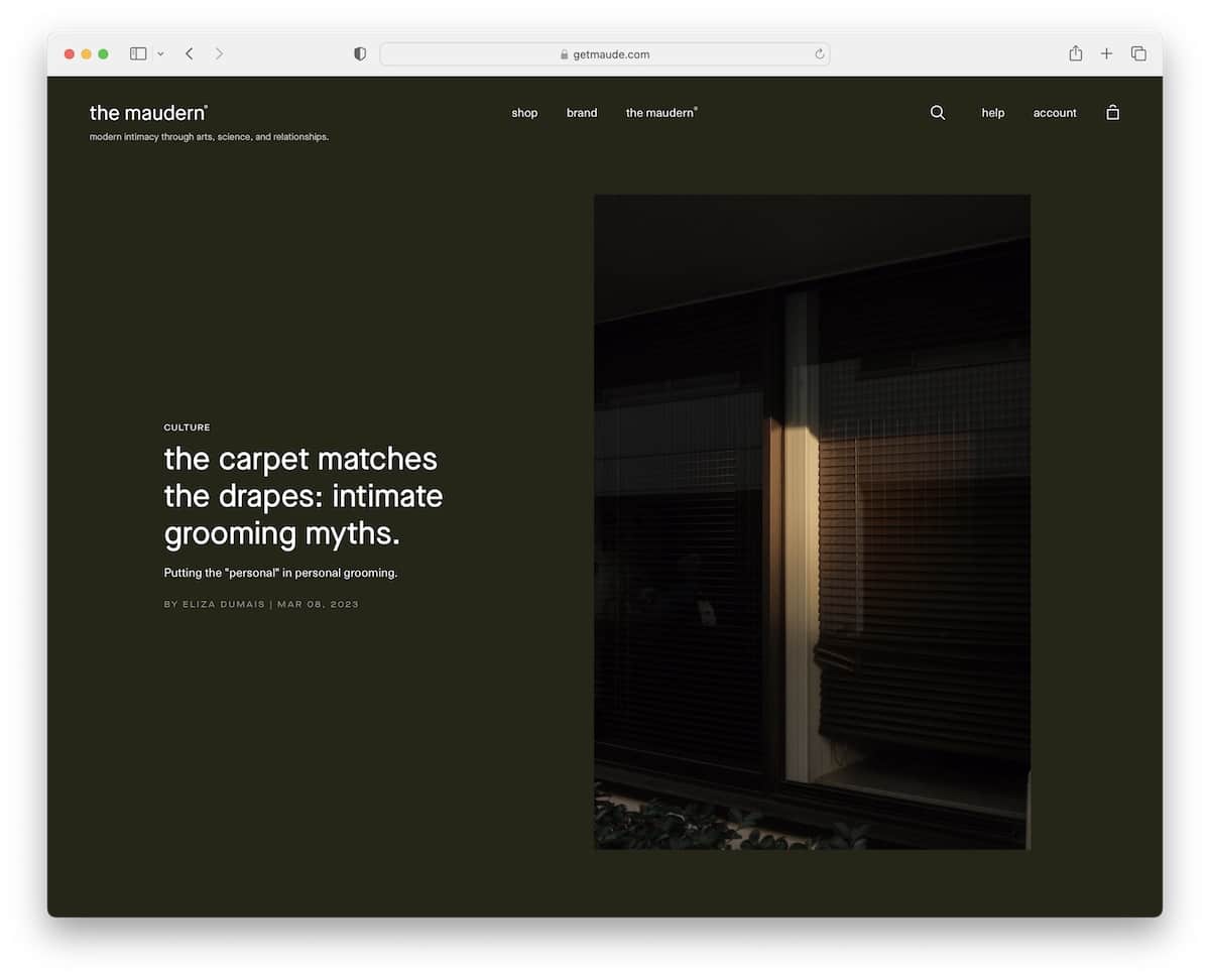
What immediately triggers curiosity is The Maudern’s dark green design, that’s calming but at the same time keeps you focused on text and visuals.
The floating header is very minimalist, with hamburger menu, search and shopping cart icons.
The search bar displays recommended results when you start typing your query to ease the finding process. And the hamburger navigating slides from the left with a drop-down to ensure getting to the right location is effortless.
Note: Create a more elegant look with a hamburger menu icon instead of displaying links in the navbar.
What stands out: Parallax scrolling adds visual depth and encourages visitors to keep exploring.
14. Great Jones
Built with: Shopify
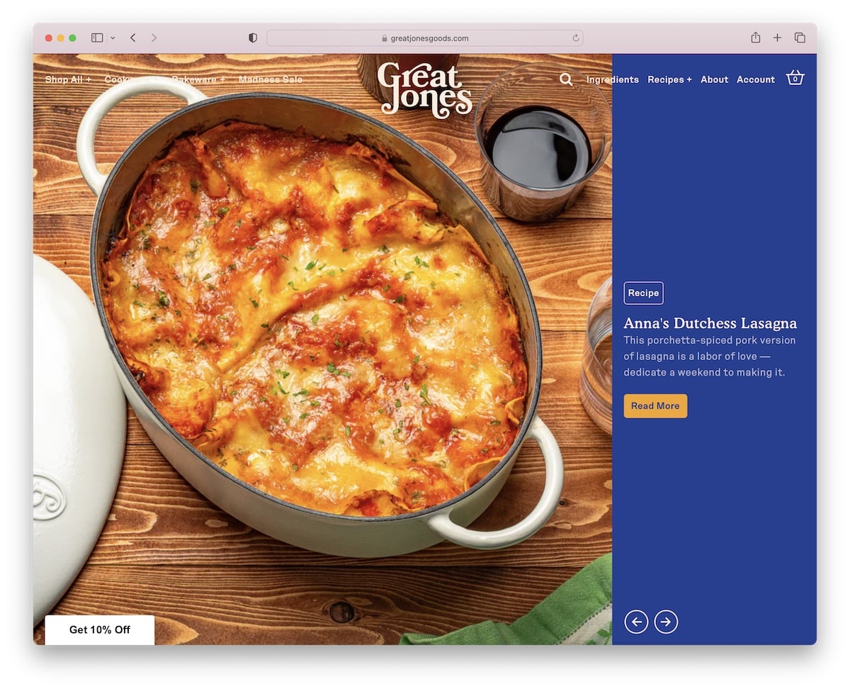
What Great Jones does differently is using a massive slider above the fold and a sliding text notification bar with changing background colors.
Great Jones has a catchy website color scheme with a great choice of typography and extra white space to ensure better readability.
Note: Create a (large) slideshow to bring the must-read articles to the center of attention.
What stands out: Product listings with clear pricing and add-to-cart buttons simplify the purchase flow.
15. Partake Foods
Built with: Shopify
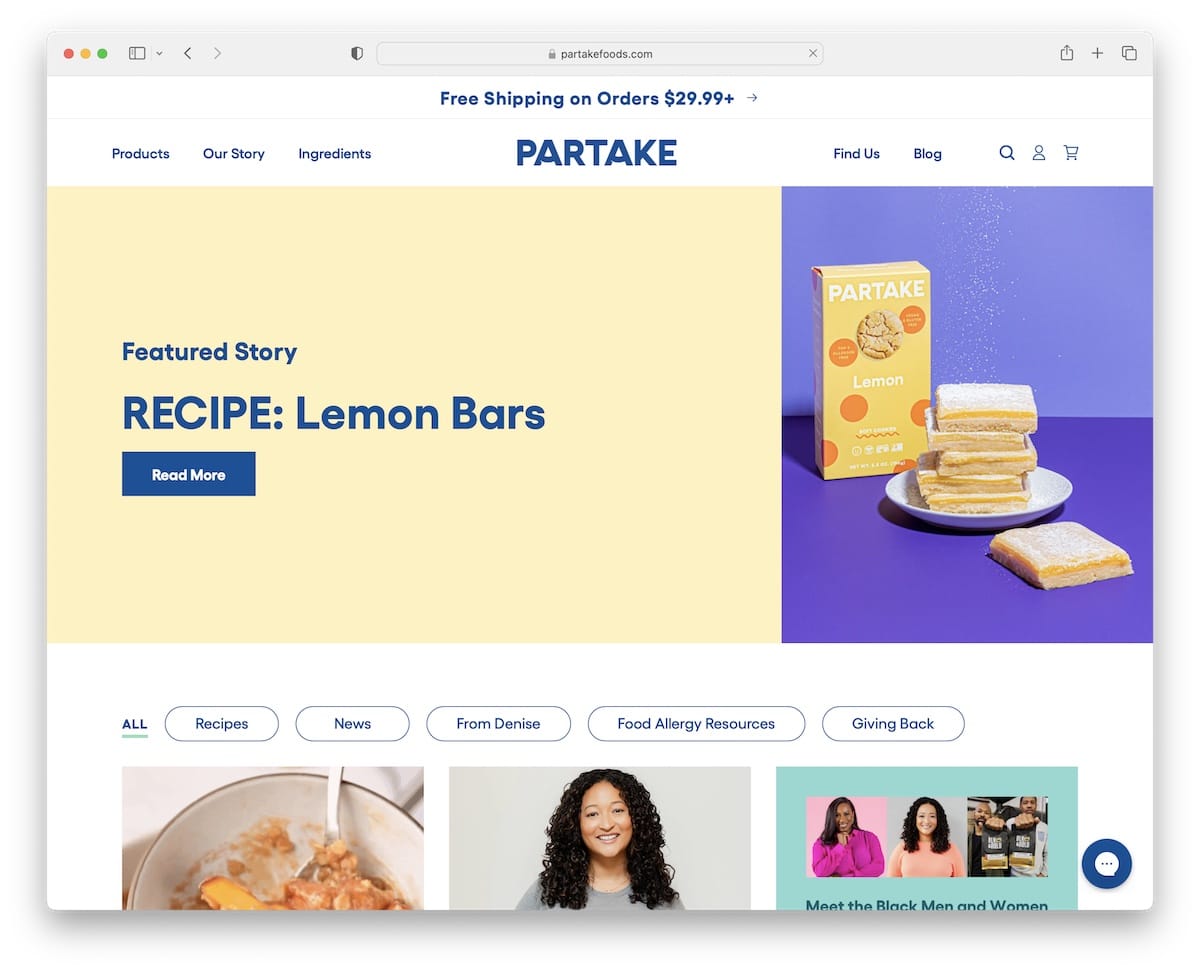
Even though Partake Foods’ post-grid layout is EXTREMELY long, it doesn’t feel boring. Why? Because of the static and animated thumbnails that are very appealing to the eye.
Instead of scrolling endlessly, you can also navigate through different categories by clicking on the buttons below the hero banner.
Our friendly advice: Add a back-to-top button or a sticky header if you create a (very) long page to improve UX.
Note: Mixing animations in the mainly static responsive web design can create a more exciting overall vibe.
What stands out: A well-structured homepage guides visitors through key information without overwhelming them.
16. BioLite
Built with: Shopify
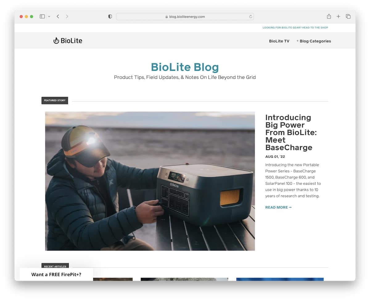
BioLite is a superb Shopify blog example with cleanness in mind to ensure content comes more front and centered.
Both blog’s home and post pages don’t have sidebars for the distraction-free experience that we all are after.
What’s more, the hero area displays a featured story with a large thumbnail, title, date, excerpt and read more link.
(But BioLite is another blog where a floating navbar or a back-to-top button would be practical.)
Note: A no-sidebar blog can contribute to a more satisfying UX.
What stands out: The minimalist design keeps the focus on what matters most — the content itself.
17. The Seea
Built with: Shopify
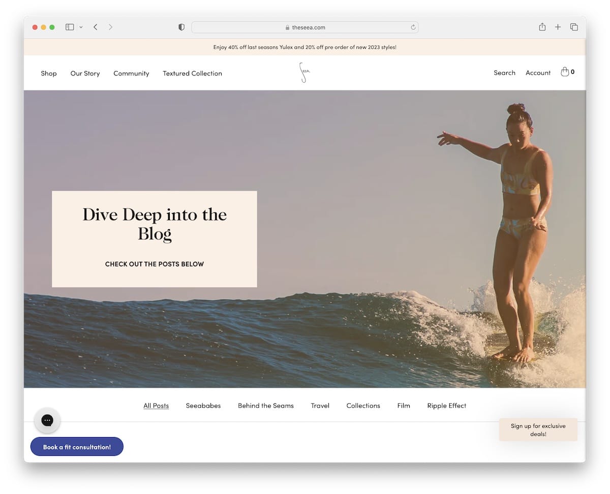
The Seea has a catchy layout with outlined grid elements, a simple detail that differentiates this Shopify blog from the rest.
Four floating elements ensure all the necessary is always at your fingertips. The header, the chat box, the booking and the subscription, you can access them all anytime, anywhere.
Furthermore, each blog post has a progress bar and a minute note (so you know how long it’ll take to read it).
Note: Include a progress bar, so the reader knows exactly how “deep” in the content he/she is.
What stands out: Strong visual hierarchy ensures the most important content catches the eye first.
18. Consider The Wldflwrs
Built with: Shopify
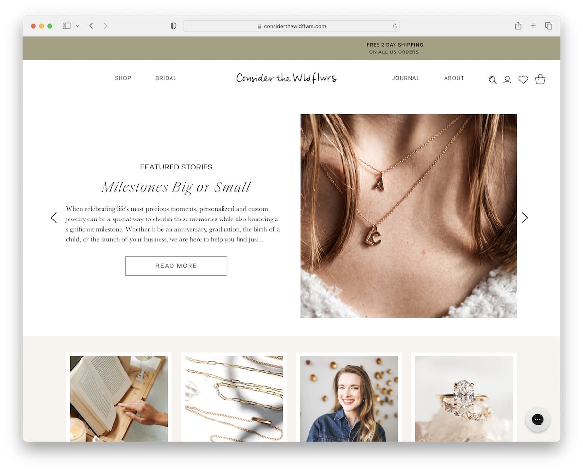
Consider The Wldflwrs is another gorgeous Shopify blog example with a slider displaying featured stories. Each slide features a title, an excerpt, a call-to-action (CTA) button and an image.
The blog has a single-column layout with images loading while you scroll.
Consider The Wldflwrs has one of the longest blog homes we’ve encountered. But that’s OK because it uses the sticky header (with a mega menu) that doesn’t require scrolling to go back to the top.
Note: Create a more fetching ambiance by loading some or all content on scroll.
What stands out: The background video creates an immersive first impression that immediately sets the mood.
19. Kirrin Finch
Built with: Shopify
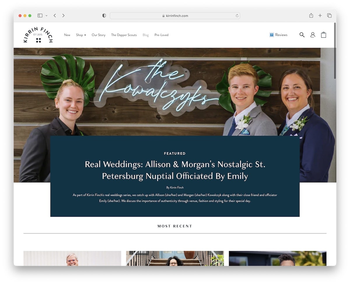
Kirrin Finch’s blog’s above-the-fold section showcases a featured article followed by a grid of the most recent ones. Each grid thumbnail has a hover effect for interactivity (read to make it more clickable).
One of the more interesting elements of this Shopify blog example is the floating “how would you rate your experience” icon in the bottom right corner. This helps Kirrin Finch gain first-hand feedback, which helps them improve and optimize the website’s overall experience, performance, etc.
Note: Asking your blog/website visitors to share their opinion (anonymously) can reward you greatly.
What stands out: A portfolio-first layout lets the work speak for itself with minimal distraction.
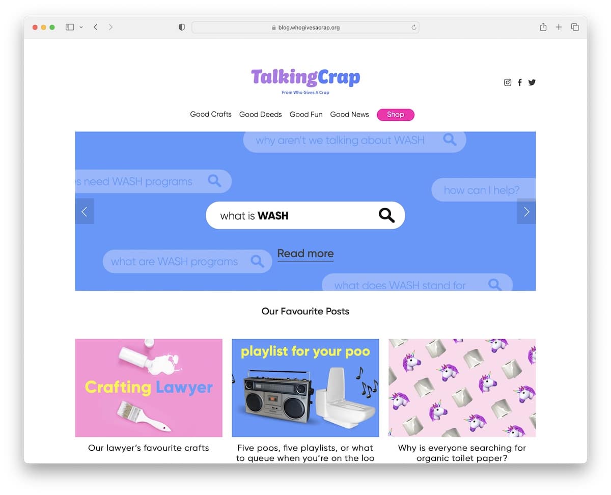
20. Talking Crap
Built with: Shopify

Talking Crap is a blog section of the Who Gives A Crap website where the name alone is probably the biggest attention-grabber.
It features a slideshow and a two-part header, the logo and social media icons and the navigation bar (but only the former sticks). At the bottom is an Instagram feed that opens posts in a new tab.
Individual posts have a right sidebar with banners, featured posts, and sticky left and right buttons to move through the articles more elegantly.
Note: An IG feed adds more content to your blog but also helps you grow your profile.
What stands out: Intuitive navigation makes the site easy to explore even for first-time visitors.
21. Chubbies
Built with: Shopify
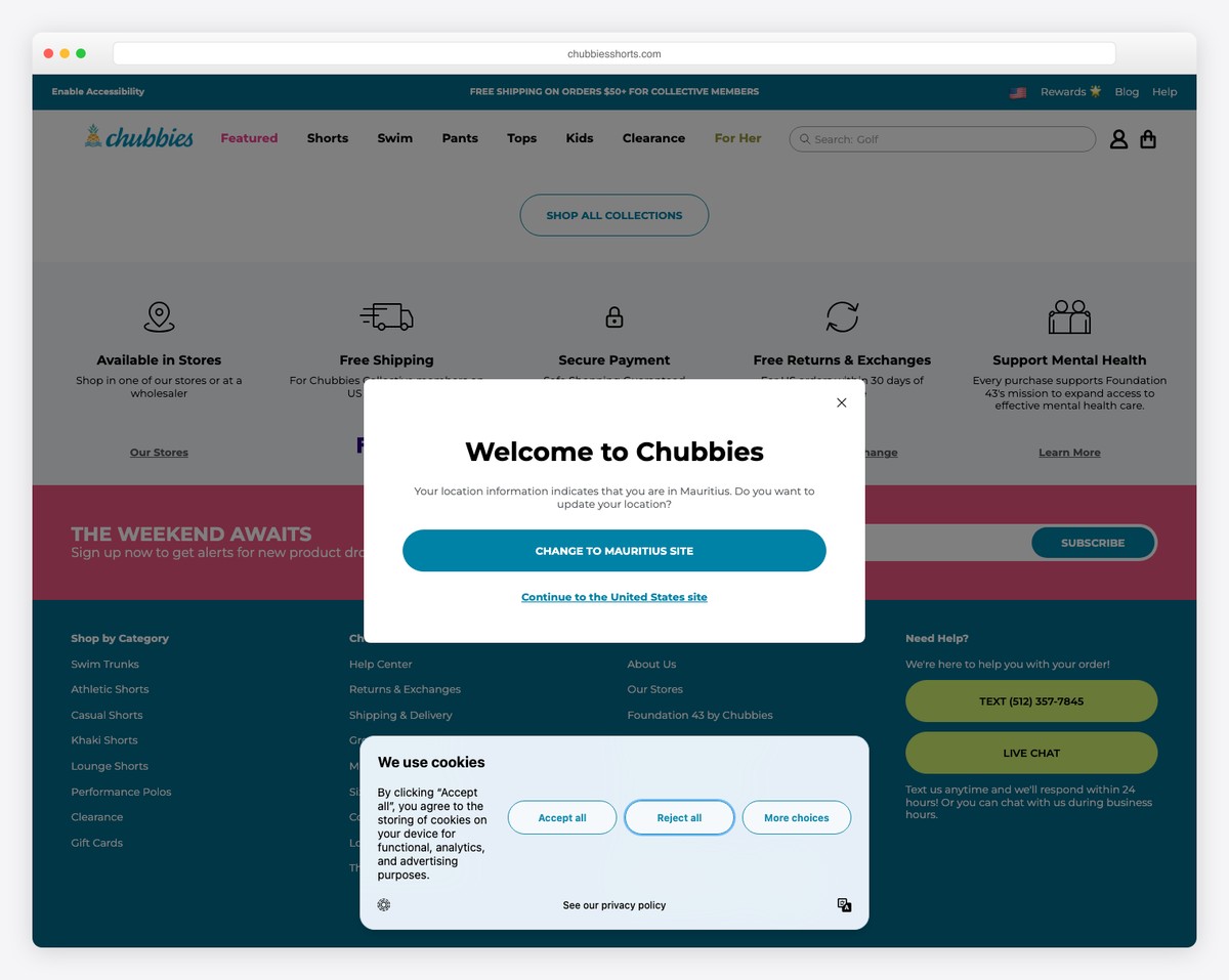
Chubbies runs a lifestyle-focused blog alongside their Shopify store, covering weekend culture, styling tips, and product drops with their signature irreverent brand voice. The blog feels less like corporate content marketing and more like a friend sharing their weekend plans.
The blog layout integrates seamlessly with the main store navigation, making it easy for readers to jump from an outfit inspiration post directly to purchasing the featured products. The playful tone and bright photography match the brand’s fun, casual identity throughout every post.
What stands out: Maintaining a consistent, distinctive brand voice across blog content turns a standard Shopify blog into a genuine content destination — readers come for the personality, stay for the products.
Related Posts


Comments (0)