
31 Best Colors For Websites (In 2026)
Are you wondering what are some of the best colors for websites?
While your content, products, and services are key, it’s also important that you create a great atmosphere for a pleasant user experience. Colors are crucial in ensuring that your visitors enjoy your website more.
Colors evoke our emotions and may make us feel good or bad, even though we might not know it.
The right palette can keep your visitors on your website longer, contributing to your page’s overall performance.
Friendly tip: If you aren’t a designer, it’s always better to stick to simplicity and not use too many different colors. But below is more on how to pick the right shade combos.
Now, let’s take a peek at some of the best website color schemes.
This post covers:
- Why Is A Website Color Palette Important?
- What Are The Best Website Color Schemes?
- How To Choose The Right Website Color Scheme?
Best Impactful Website Color Schemes To Try
1. Mitchell Adam (Yellow, Black & White)
Built with: Elementor

This color scheme is great for achieving a strong and memorable first impression. Yellow gives it a vibrant, catchy feel (it grabs the attention!); black creates boldness, and white makes different sections and elements pop more.
While the combination of shades is pretty intense, “white space” ensures a pleasing atmosphere and experience.
You may also want to skim through our Elementor websites list, where you can find plenty of more interesting palettes.
Colors used: White (#FFFFF), black (#0f111d), yellow (#f7d569), orange (#f7c25a)
What stands out: A vibrant color palette creates energy and personality that sticks in visitors’ minds.
2. Photofocus (White, Light Gray & Tomato)
Built with: Elementor
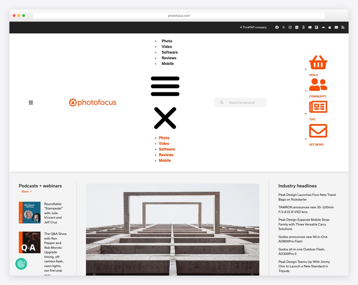
Mixing white and light gray creates a very professional outcome, which can work really well for blogs and online magazines. It also makes the text more readable.
However, the touch of “tomato” for call-to-action (CTA) buttons and some section backgrounds adds a nice touch to make the website appear more engaging.
Photofocus also uses other background colors to make different parts of the site pop more, including the footer.
Colors used: White (#FFFFF), black (#222222), orange (#e95d2a), grey (#f4f4f6).
What stands out: High-quality photography does the heavy lifting, making the content feel premium.
3. Notarity (Steel-blue & Blue-violet)
Built with: Elementor

While running a notary business seems very serious, you don’t need to be so strict about your website.
Notarity creates a nice blend of steel-blue and blue-violet colors, which create an attention-grabbing effect, especially when combined with black typography. Moreover, the rest of the website is predominantly light, with elements and icons in the cool blue-violet shade.
You shouldn’t skip these awesome notary websites if you’re in the same industry.
Colors used: #d8e1e6, #f5f5f6, #d3d7dd, #3a2d97, #adadc2, #000000
What stands out: Integrated appointment booking removes friction between browsing and converting.
4. Scope Copenhagen (Light gray & black)
Built with: Elementor
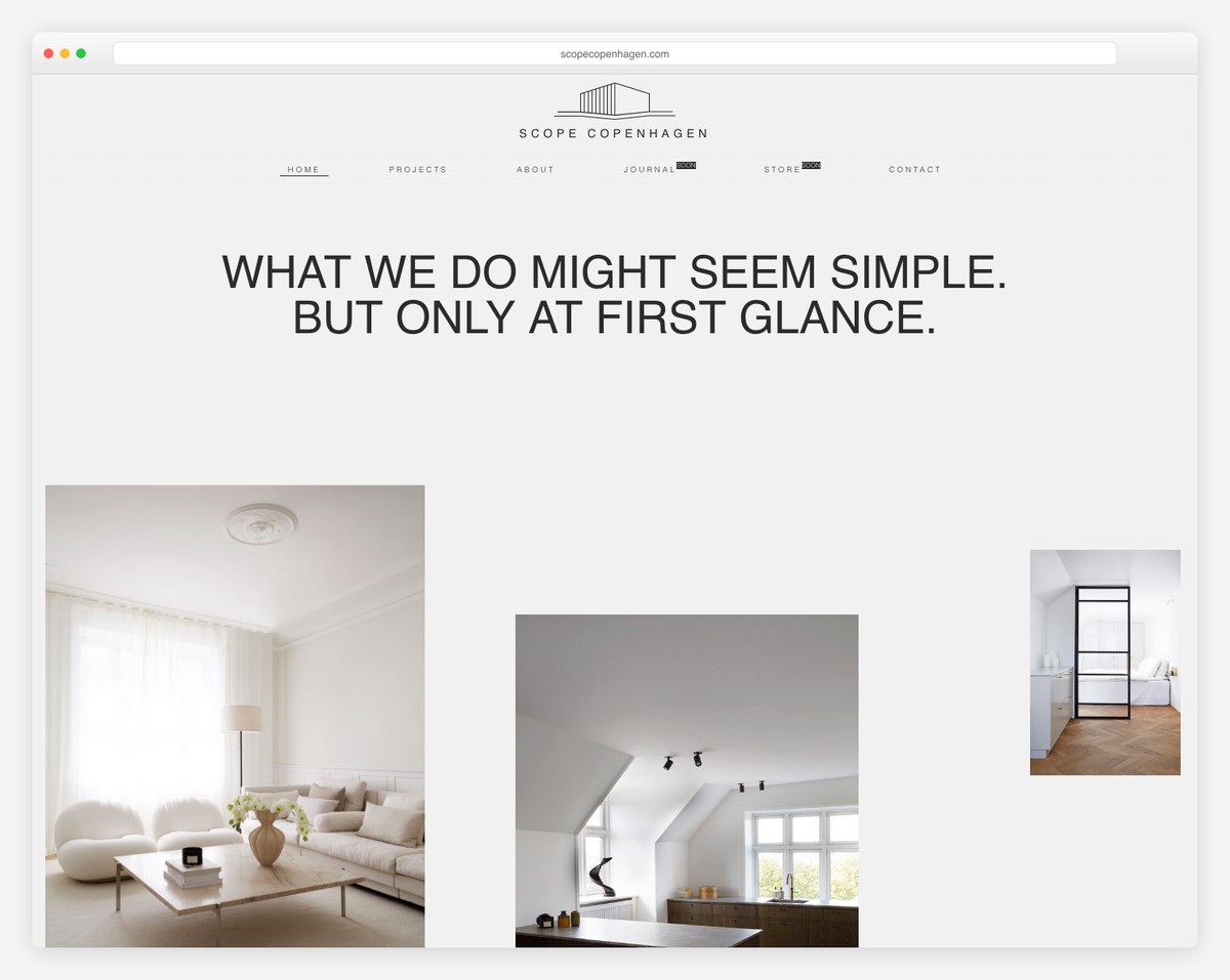
Even though minimalism works well in web design, that doesn’t mean you need to use a white background.
Go against the grain with a light gray one that differs from the rest and makes the black typography stand out without hurting the eyes too much. (This can happen with too much (actual) white space when the user has screen brightness on full whack.)
Don’t forget to check our complete collection of the best minimalist website examples.
Colors used: #f2f2f2, #d3d2d1, #a7a4a1, #5d5248, #c4bfba, #000000
What stands out: The minimalist design keeps the focus on what matters most — the content itself.
5. Practipago (Purple, turquoise & white)
Built with: Elementor

Practipago is a master at mixing vivid colors in a scheme that’s very pleasing to the eye. From purple and turquoise to white (and gray, and pink, and more) – it’s all done strategically to achieve professionalism but with a creative tweak. Additionally, this business website uses the gradient effect to add oomph.
Colors used: f2f3fb, #6040d1, #d7d5dc, #bab0c1, #655baa, #000000
What stands out: The color palette used throughout the page demonstrates the principles being discussed.
6. YouEngage (Blue & white)
Built with: Elementor

YouEngage’s blue and white color scheme above the fold and contrasting CTA let you know it’s a software startup website. It speaks expertness while achieving great focus on the content, with other shades for sections and icons. Another surprising choice of color is teal, which breaks the main scheme pleasantly.
Colors used: #f6f7f8, #3681f7, #adb2b6, f9d97c
What stands out: The color palette used throughout the page demonstrates the principles being discussed.
7. ebulletins (White, yellow & teal blue)
Built with: Elementor

ebulletins uses a fantastic color scheme for its website, using white and teal blue with yellow details for branding. It’s a captivating blend of shades that creates an enjoyable user experience. Plus, using hover effects that change elements’ colors is a lovely feature.
Colors used: f9fafa, #255876, #d5d8d9, #f2b143
What stands out: The color palette used throughout the page demonstrates the principles being discussed.
8. Ulah (Red, black & gray)
Built with: Elementor

While red and black create a very impactful presence, grey and white space makes Ulah’s page feel lightweight and pleasant to scroll (especially due to the cool animations). Everything is in balance, which creates intriguing results.
Colors used: #f65215 (Orange), #eae9ea, #0d0a09, #8a8b8c
What stands out: A dark background paired with bold accent colors creates striking visual contrast.
9. Beginner Bank (Black & white)
Built with: Webflow

A dark/black background instantly gives the website a more premium feel. White typography and a light footer ensure the necessary contrast that always works in perfect harmony.
It’s a color scheme that will give you an edge.
We also have even more beautiful Webflow websites with superb color schemes.
Colors used: #dfdfdf, #0c0c0c, #646363
What stands out: The color palette used throughout the page demonstrates the principles being discussed.
10. Launchpad (Purples, pinks, blues & darks)
Built with: Webflow

Launchpad is a mix of many hues of the same colors, calling for a unique, immersive, slightly futuristic outcome (yes, animations contribute immensely).
It’s a modern and sleek color combination that draws users’ attention to the content and eventually leads them to click the CTA button(s).
Colors used: #38065f, #941874, #711de0, #ffffff
What stands out: The color palette used throughout the page demonstrates the principles being discussed.
11. Feastables (Black, blue, pink, yellow, etc.)
Built with: Shopify
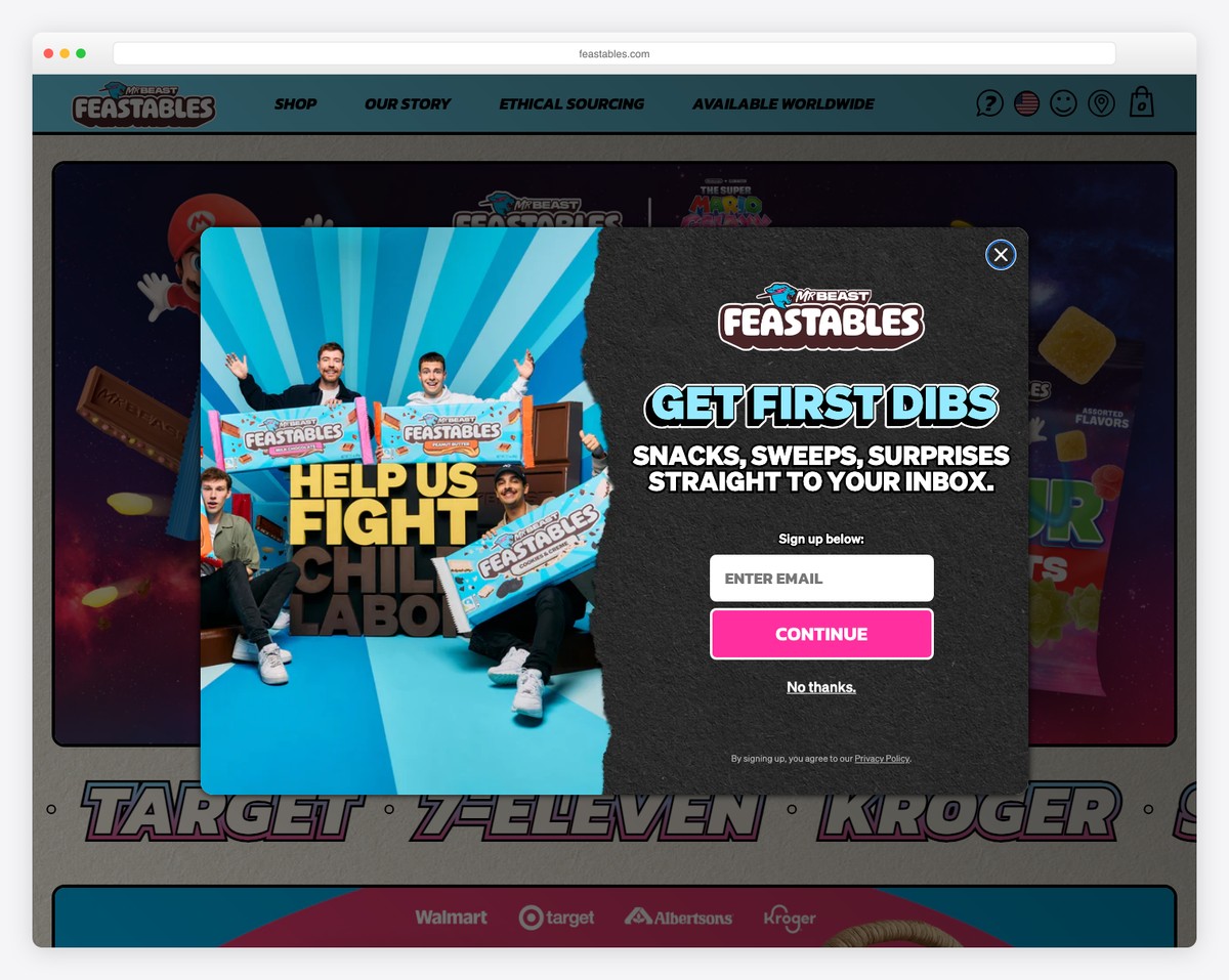
Okay, we’re adding Feastables because they are unique, vibrant, and engaging. Of course, the choice of colors greatly contributes to the original page experience that few are as daring to create.
Even though the extreme variety of shades isn’t recommended, you’re always free to do what feels good. Feastables is an excellent example of a “wicked” color scheme.
Finally, check these eCommerce websites for more inspirational color combinations.
Colors used: #c7bcd3, #23456c, #6e2a7e, #5e80c4
What stands out: Social media integration brings real-time content from other channels directly into the website experience.
12. Arlen McCluskey (Gradient & white)
Built with: Webflow
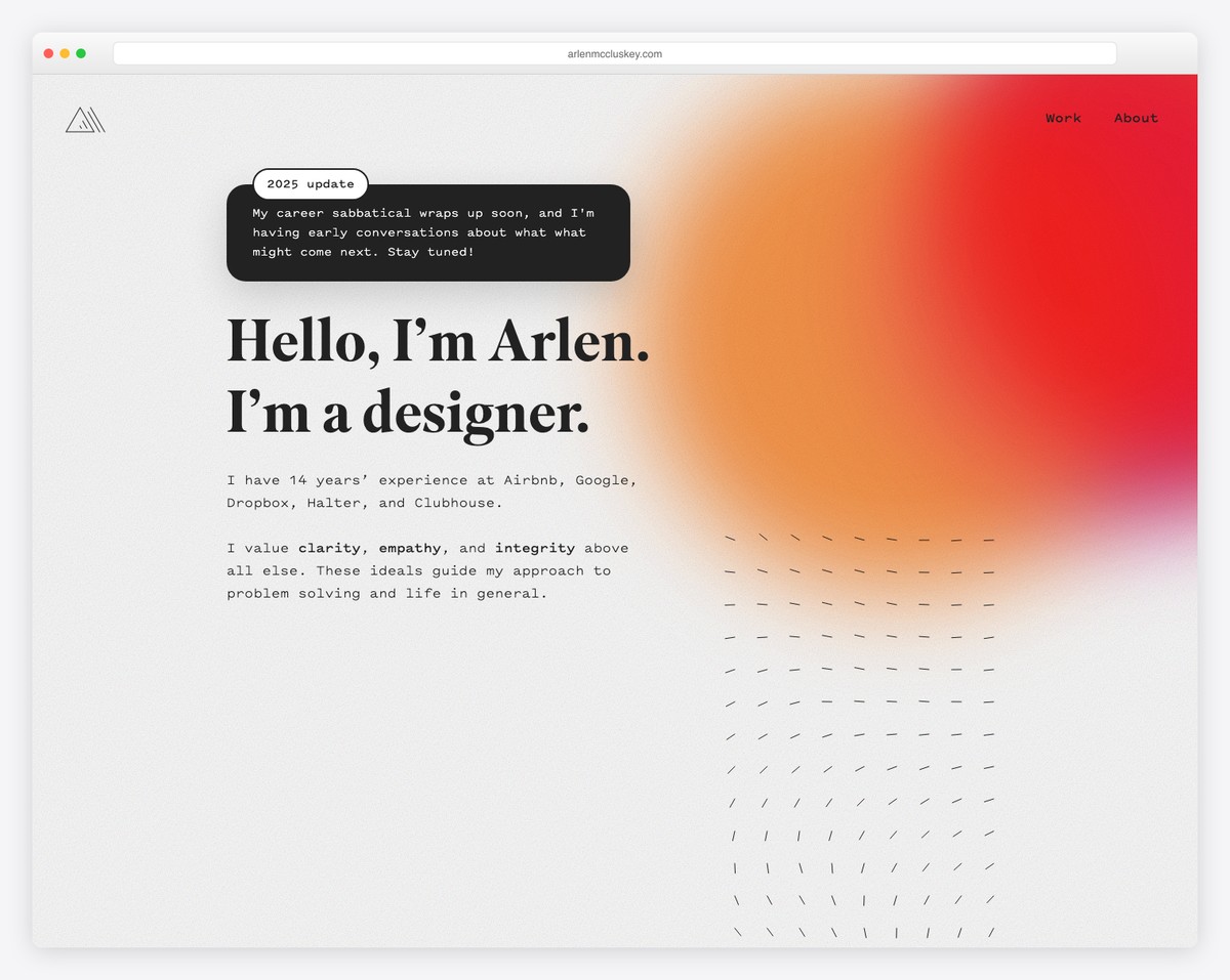
A white background for the page’s base, including a gradient effect, which Arlen McCluskey uses in the above-the-fold section and for the footer, can completely change the look. Gradient allows you to use more color tones to create your personal website more eye-catching and memorable.
Colors used: #ece5eb, #f03737, #eb7b5c, #bb8dc1
What stands out: The color palette used throughout the page demonstrates the principles being discussed.
13. Mindy Nguyen (Beige & black)
Built with: Squarespace

Using beige as the base background color in combination with black typography creates a soothing and satisfying atmosphere. Mindy Nguyen uses it to her advantage, ensuring a likable involvement in her portfolio items.
Finally, all these Squarespace website examples will give you more ideas about creating the perfect palette for your page.
Colors used: #faf6f0, #1d1d1d
What stands out: A prominent search function helps visitors find exactly what they need without scrolling through pages.
14. KeyNest (Beige, green & white)
Built with: Squarespace
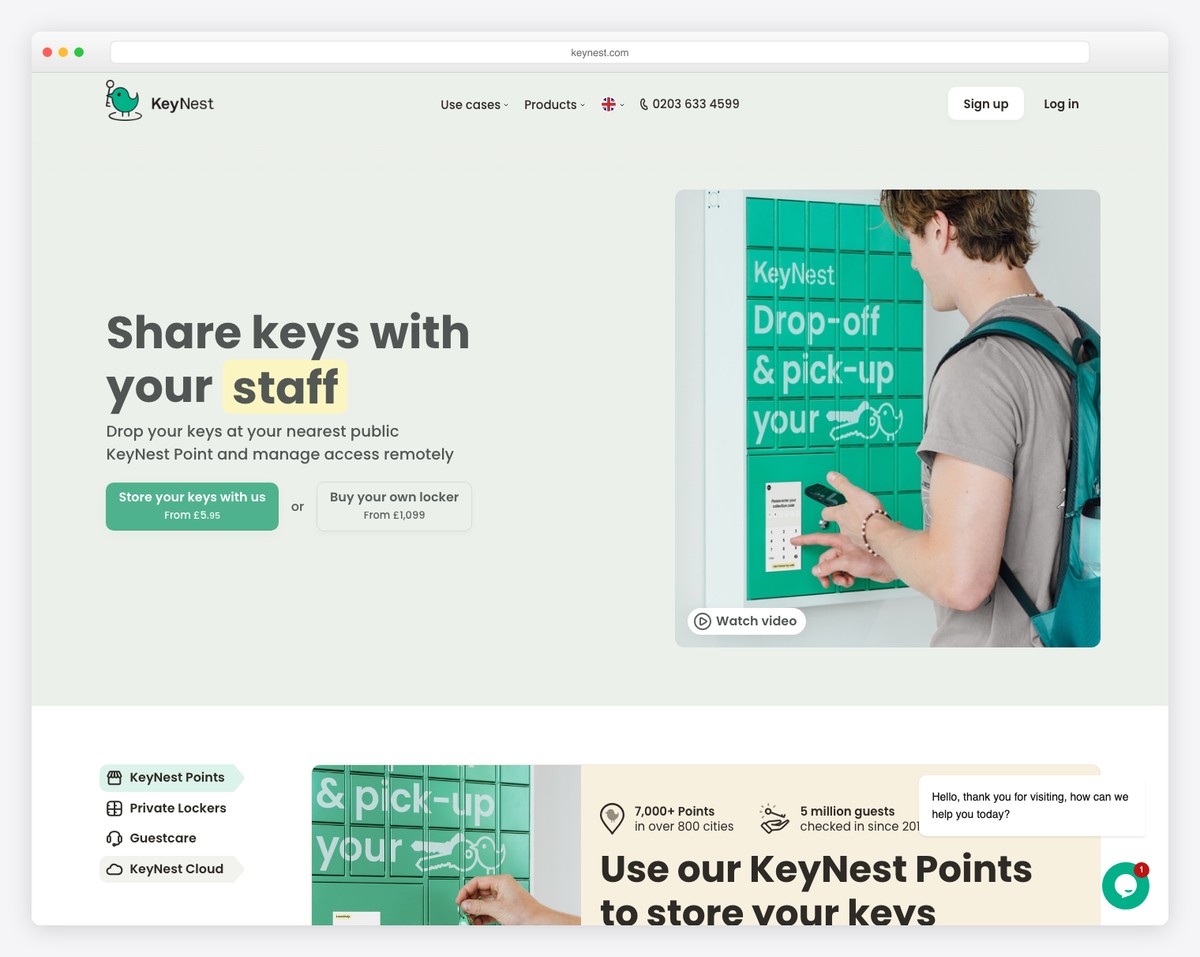
From smooth green to smooth beige, KeyNest ensures their business website looks professional but not too serious. Then, there are solid green CTA buttons and white background sections, making the entire page follow KeyNest’s branding to the very last detail.
Colors used: #ebf0ea, #515654, #4fb28f
What stands out: The color palette used throughout the page demonstrates the principles being discussed.
15. JP Teaches Photo (Pastel pink & red)
Built with: Squarespace

The pastel pink background color gives JP Teaches Photo’s website a soft feel but also makes black typography more readable. The red CTA buttons work well with the background, giving them the extra shine they deserve.
Colors used: #f7efee, #030303, #db423d
What stands out: The grid-based gallery makes it easy to scan a large collection at a glance.
16. Melyssa Griffin (Light pink, tan, yellow & pastel red)
Built with: Showit

The mentioned aren’t the only colors Melyssa Griffin uses on her website, but they are some of the first ones you see. It’s a pretty unique palette, especially with the tan one in the middle, creating depth and warmth to enhance the personal side of the website.
This is an excellent example if you want to see a colorful website and gain new ideas.
Colors used: #e2d1ca, #FEBBAC, #d0bca8, #f9ede5
What stands out: Subtle entrance animations add polish without slowing down the browsing experience.
17. Charlie Marie (Purple, lavender & teal)
Built with: Webflow

While the purple and lavender colors create a harmonious ambiance, the teal call-to-action buttons appear front and center, making them more clickable. This is a great strategy to make CTAs more noticeable.
Colors used: #8c5b97, #60b0ba, #ffffff, #eeeef5
What stands out: The image carousel keeps the above-the-fold area dynamic without requiring visitors to scroll.
18. Lemon Tree Editorial (Yellow & green)
Built with: Squarespace
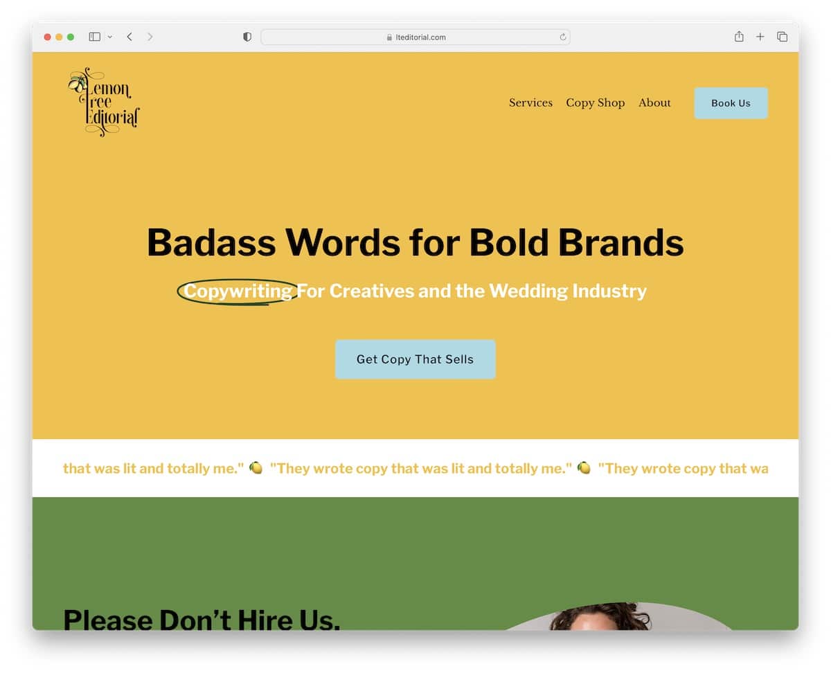
Not only does yellow attract interest and make a web design look more refreshing, but it also goes very well with this website’s name, Lemon Tree Editorial.
On the other hand, green is almost the complete opposite, calming the visitors (and also goes well with the name). Everything in balance, they say.
Colors used: #567f38, #f3bc36, #000000
What stands out: The color palette used throughout the page demonstrates the principles being discussed.
19. Katie Lemon (Pink, sandy brown & black)
Built with: Squarespace

Katie Lemon expresses her personality with light, feminine tones. She also uses solid-color backgrounds and creative alternatives for section interchanging to improve and revitalize the vibe of her website.
Katie also uses different background colors (black, brown, and gray) for CTA buttons, which doesn’t happen very often but works great in her case.
Colors used: #f4f0ed, #3c3736, #eaaa64, #f9d5d5
What stands out: The color palette used throughout the page demonstrates the principles being discussed.
20. Alejandro Castro (Vivid green & pink)
Built with: Squarespace
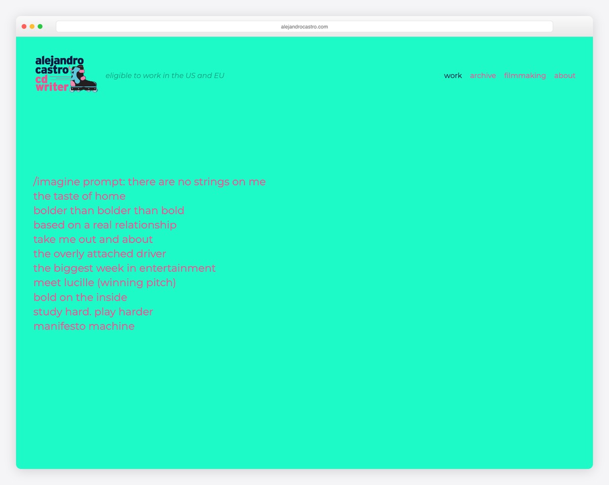
This website color scheme example takes things to extremes with its vivid (almost fluorescent) green and pink. The two work together incredibly well and strike the visitor with the unexpected. But as soon as you hover over the text, a background image appears to calm down your eyes.
If you’re all about creating a strong impact on users, try something VIVID.
Colors used: #1efac7, #ff4d91
What stands out: Built-in booking functionality turns the website into a 24/7 appointment scheduler.
21. Scarlet (Dark red, light gray & white)
Built with: Craft CMS
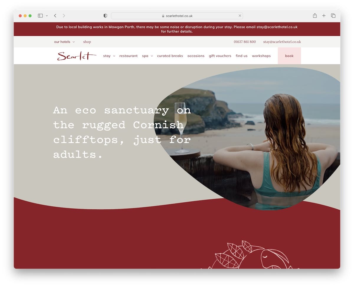
The Scarlet hotel website‘s color palette is luxurious and elegant. Dark red, light gray, and white invite you to immerse yourself in the location and services through its superb (but clean) online presence.
All three colors complement each other smartly, with hints of pink, green and dark “salmon.”
Colors used: #911825, #f4f4f2, #ffffff
What stands out: A hero slider showcases multiple offerings at a glance, giving visitors quick access to key content.
22. CitrusAd (Grayish, lime & white)
Built with: Elementor

If you use detailing strategically, you can elevate your website’s user experience tremendously. In the CitrusAd case, that would be lime green, which goes well with grayish and white sections. While the latter two are dull, the lime green makes the page more exciting to scroll.
Colors used: #67f81d, #62cb2c, #262b25
What stands out: Product listings with clear pricing and add-to-cart buttons simplify the purchase flow.
23. S Kaba Consulting (White & blue)
Built with: Wix
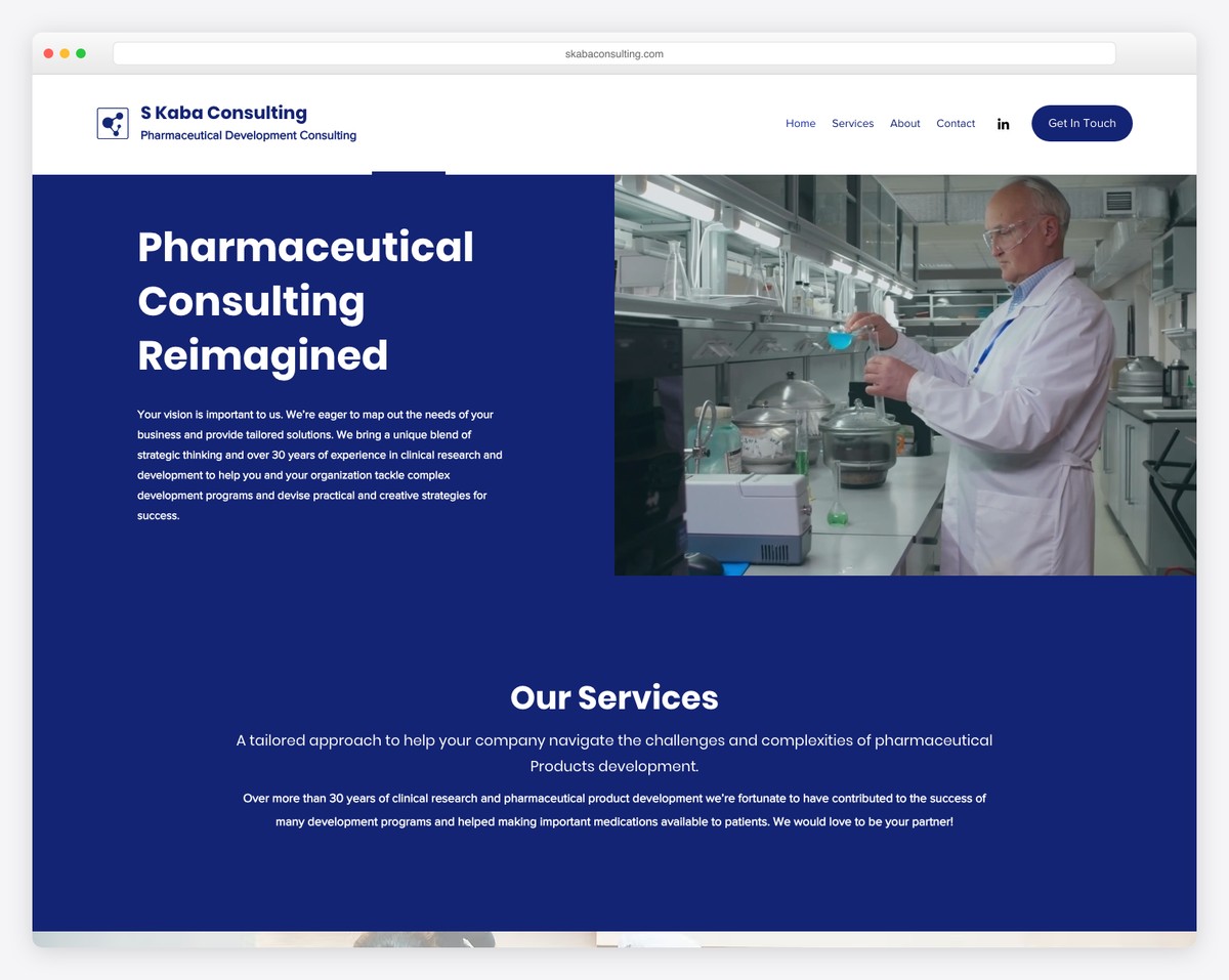
White and blue are heavily associated with the medical industry, and S Kaba Consulting knows that very well.
They keep the design simple, using only two shades (except for the footer, which is light gray). Even the text is white on a blue background, and vice versa.
Colors used: #18246f, #ffffff
What stands out: Full-screen video on the homepage draws visitors in before they even start scrolling.
24. Clarity Recruiting (Peach, orange & white)
Built with: Underscores
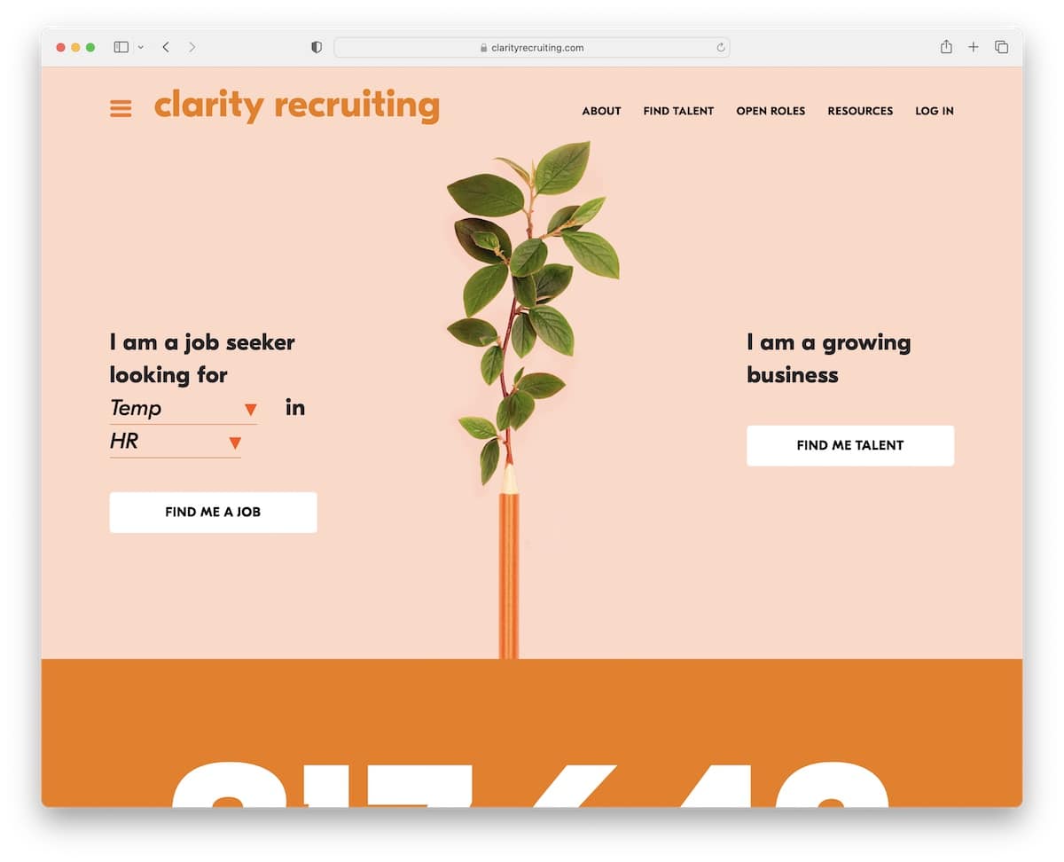
With peach and orange colors on the one hand and white on the other, Clarity Recruiting creates a cheery mood that places all its content front and center. Your branding should speak through all your channels, including your website, and a bright and soothing color scheme can make a big difference.
Colors used: #ef7a00, #ffd9c6, #212529
What stands out: Seamless e-commerce integration lets visitors go from browsing to buying without leaving the site.
25. Freshminds (Deep pink, light gray & dark teal)
Built with: Ruby On Rails

Freshminds knows how to create a vibrant website with deep pink, light gray and dark teal. The color scheme gives the page a professional look yet still has a fun touch that makes it very appealing. Professional websites don’t have to be boring.
Colors used: #00393c, #e40178, #f3f3f3, #073238
What stands out: The dark color scheme gives the site a sleek, modern feel that makes imagery stand out.
26. iET SA (Orange, white & blue)
Built with: Craft CMS

Orange, the shade of encouragement and self-confidence, can strongly influence your visitors. Moreover, white will make any text pop more, while blue gives a relaxed and calm sensation. iET SA uses the right color palette for a satisfying website experience.
Colors used: #ff6f29, #ffffff
What stands out: The color palette used throughout the page demonstrates the principles being discussed.
27. Andrew Huang (Teal, deep pink & yellow)
Built with: Squarespace

This is a color scheme you don’t see too often and is also why Andrew Huang’s musician website grabs so much attention.
Instead of starting with yellow to grab the attention, the website begins with teal to open up and start the communication. It’s followed by deep pink that resembles kindness and love and then strikes you with yellow.
It’s a notable progression that, at the same time, expresses Andrew’s personality.
Colors used: #429b99, #cf3a60, #daffa6
What stands out: Layered parallax effects create a sense of movement that makes scrolling feel dynamic.
28. Sierra Hull (Black & gold)
Built with: Squarespace
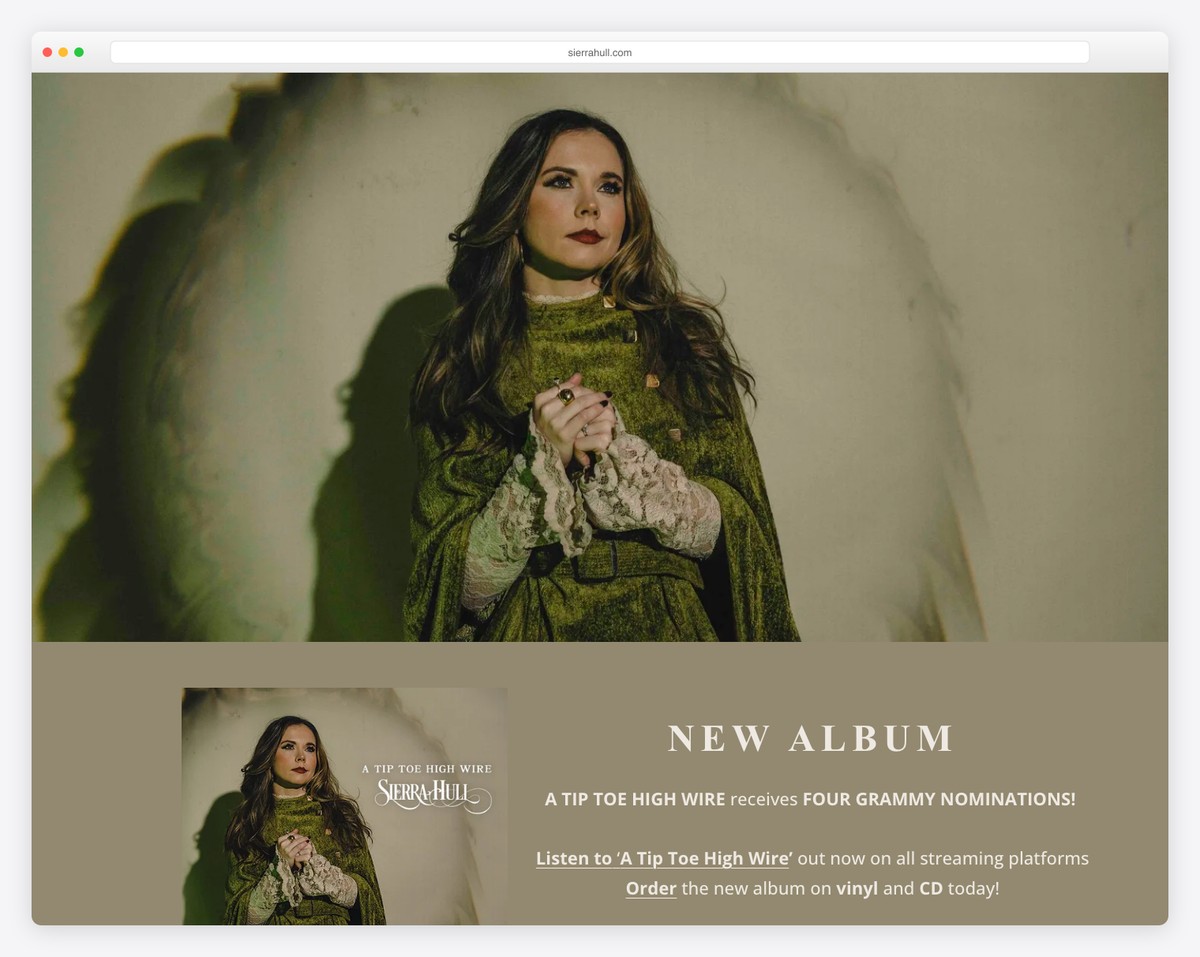
Black and gold give the website a luxurious and stylish touch, which can achieve the same strong impression as using a vivid palette. However, Sierra also uses an almond tone for her tour dates to make details and CTAs appear more front and center.
Any time there’s dark/black involved in web design, the page instantly appears more premium.
Colors used: #a78444, #0d0d0d, #f2eade
What stands out: Parallax scrolling adds visual depth and encourages visitors to keep exploring.
29. Jones Bar-B-Q (Burnt orange, light tan & white)
Built with: Squarespace
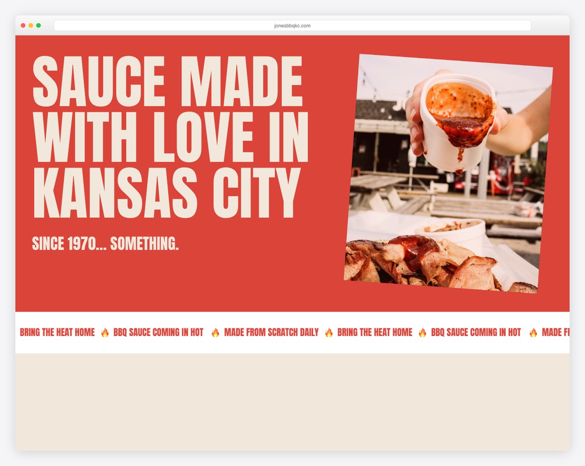
The burnt orange colorway goes so well with a BBQ sauce brand. In Jones Bar-B-Q’s case, the orange tone resembles the sauce, making it look even tastier—yes, the website.
On the other hand, natural shades, like tan and white, ensure that the online presence is more dynamic and elements stand out more.
Colors used: #f1e7da, #db4439, #76251e
What stands out: A masonry grid layout organizes content attractively while maximizing screen real estate.
30. Kettle & Fire (Red, pink & white)
Built with: Shopify
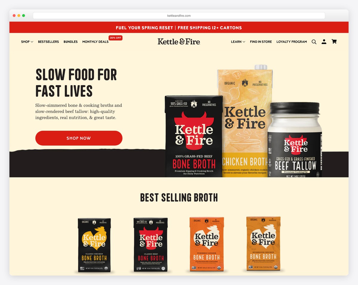
Kettle & Fire’s sparkling combination of red, pink, and white (plus other calming tones) ensures every visitor is treated smoothly. The atmosphere is somewhat peaceful yet “intense” in terms of customer focus.
The palette also works harmoniously with every product packaging design, ensuring an easier and more enjoyable online shopping experience.
Colors used: #ffca6a, #fdb6b7, #fff9ee, #2b1a1a
What stands out: Scroll-triggered animations guide the eye through each section without overwhelming the visitor.
31. Koysor Abdul (Dark olive, light green & burnt orange)
Built with: Webflow

Besides viewing Koysor Abdul’s online portfolio website to enjoy his work, he also applies his experience to his website.
Using dark olive green with plenty of white space promotes simplicity, elegance and earthiness. He then uses lighter green for the portfolio elements’ backgrounds, giving them the necessary shine without distraction.
Then, the burnt orange warmly welcomes you to contact him.
Colors used: #f6f2e5, #113023, #4deaa7
What stands out: The background video creates an immersive first impression that immediately sets the mood.
Why Is A Website Color Palette Important?
One of the simplest answers would be because we are visual creatures.
However, studies also show that people make decisions based on the product’s color and the website’s color scheme, too.
That’s when color psychology comes into play – understanding how different colors and color combinations impact users.
When everything clicks, your website will be much more engaging and attention-grabbing, resulting in longer time spent on your page—which is a big plus.
Why? Because it can mean a lower bounce rate, and that’s good for SEO.
What Are The Best Website Color Schemes?
1. Monochromatic Colors For Websites
One of the easiest ways of approaching website color scheme creation is by using monochromatic colors.
What’s that?
A monochromatic color palette contains all the variations of a single color, such as light red, dark red, pastel red, crimson, or “salmon.”
It’s a safe approach because you only play with different shades of the same hue that work in harmony and do not contradict each other.
What stands out: The color palette used throughout the page demonstrates the principles being discussed.
2. Complementary Colors For Websites
If you’re unsure about which complementary colors to choose for your site’s palette, it’s best to use the color wheel to simplify your life. This way, it’s also (almost) impossible to make the wrong picks.
The general rule is picking colors on the color wheel’s opposite side.
For instance, you’d pick yellow and violet, orange and blue, red and green, etc. This creates a pleasant contrast, making your website more dynamic.
Our recommendation: Choose any color you want as the base and then use a complementary color (the one on the other side of the color wheel) for details. You can also add whites and blacks if you wish.
What stands out: The color palette used throughout the page demonstrates the principles being discussed.
3. Analogous Colors For Websites
While complementary colors sit against one another on the color wheel, analogous colors are the ones next to each other.
After choosing the dominant color, you can pick the one on the left and the right, and you immediately have three shades to work with.
If choosing yellow, you can also pick yellow-orange and yellow-green. Or in the case of red, the two analogous colors are red-orange and red-violet.
What stands out: Accessible contrast ratios are shown alongside aesthetic choices — form meets function.
4. Triadic & Tetradic Colors For Websites
This is a more advanced approach when choosing the best colors for your website but not undoable.
Triadic colors: Pick a shade on a color wheel and draw a triangle. The three colors on the triangle’s corner are triadic colors.
Tetradic colors: The same initial point as before, just draw a square, with each corner a color that falls into the tetradic color category.
What stands out: Side-by-side color comparisons make it easy to evaluate different schemes.
5. Split-Complementary Colors For Websites
While complementary colors sit on the opposite side of a color wheel, split complementary shades sit on the left and right of the tint on the other side.
In plain English, you’d pick blue and orange for a complementary palette, but you’d choose blue, red-orange, and yellow-orange for the split-complementary scheme.
What stands out: The color palette used throughout the page demonstrates the principles being discussed.
How To Choose The Right Website Color Scheme?
You only need to follow a few general rules when creating the ideal color scheme for your website.
No biggie.
But if you already have a product and branding set, stick to that because branding consistency across multiple channels is a MUST. You should not deviate from it.
Let’s get back to the “rules:”
- Choose any of the above five color combinations because they are tested and proven.
- Let the color(s) you choose enhance your business message. If you have an environment-friendly business, focus on natural tones (greens, browns), and if you run a luxury watch store, use bold and opulent colors (blacks, golds).
- Keep it simple. Two to three shades are more than enough. Sure, you can use more, but there’s no need to overcomplicate it unless you know exactly what you want.
- Think of your branding. Make the colors you choose remind people of your brand. You’ll likely think of the color red when someone mentions Coca-Cola.
- Get familiar with color psychology basics. For example, green represents harmony, blue represents reliability, purple represents royalty, black represents luxury, and white represents purity.
That’s it!
You now have all the necessities to create the ultimate color scheme for your website. Create a strong and lasting impression on your visitor!
Related Posts


Wow. Great list.
I was looking for color schemes and inspirations for my personal website. This list contains some amazing designs. I appreciate the time you spend curating this list. Thank you
Nice, I got great idea of color scheme for website
Thanks.
I like the thinking here. My site uses a full set of colors where I look to orange and a blue to demonstrate a college alliance while staying true to his club colors gold and black. Thoughts?
The emphasis on simplicity and consistency in branding is spot on. It’s frustrating when websites overwhelm visitors with too many colors or are inconsistent with their brand identity