22 Best Hotel Websites (Examples) 2026
Your hotel’s website is the first impression most guests will ever have of your property. Before they step through the lobby doors, they’re scrolling through your pages, checking out rooms, amenities, and the overall vibe. A well-designed hotel website doesn’t just look good — it drives bookings and builds trust with travelers who have dozens of options to choose from.
Whether you run a boutique inn, a luxury resort, or a budget-friendly chain, your website needs to showcase what makes your property special. High-quality photography, intuitive navigation, seamless booking integration, and mobile-friendly design are all non-negotiable in today’s hospitality market.
We’ve gathered 22 outstanding hotel website examples to inspire your next redesign or new build. Each one demonstrates a different approach to layout, branding, and user experience — so you can find the ideas that fit your property best.
1. The Berkeley
Built with: Optimizely
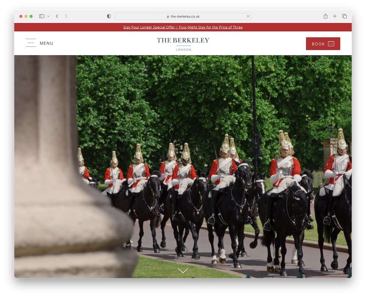
Like Aman, Berkeley also uses a video above the fold, with no text and no CTA. It’s beautiful.
They use a top bar notification for a special offer and a clean header with a hamburger icon and a booking CTA button.
This hotel website example also has accessibility options that appear as a sticky icon in the bottom left corner. Lastly, the scrolling animation really makes this page much more pleasurable.
Note: Introduce the accessibility configurator so your visitors can modify their website-viewing experience.
What stands out: The background video creates an immersive first impression that immediately sets the mood.
2. Blue Lagoon
Built with: Contentful
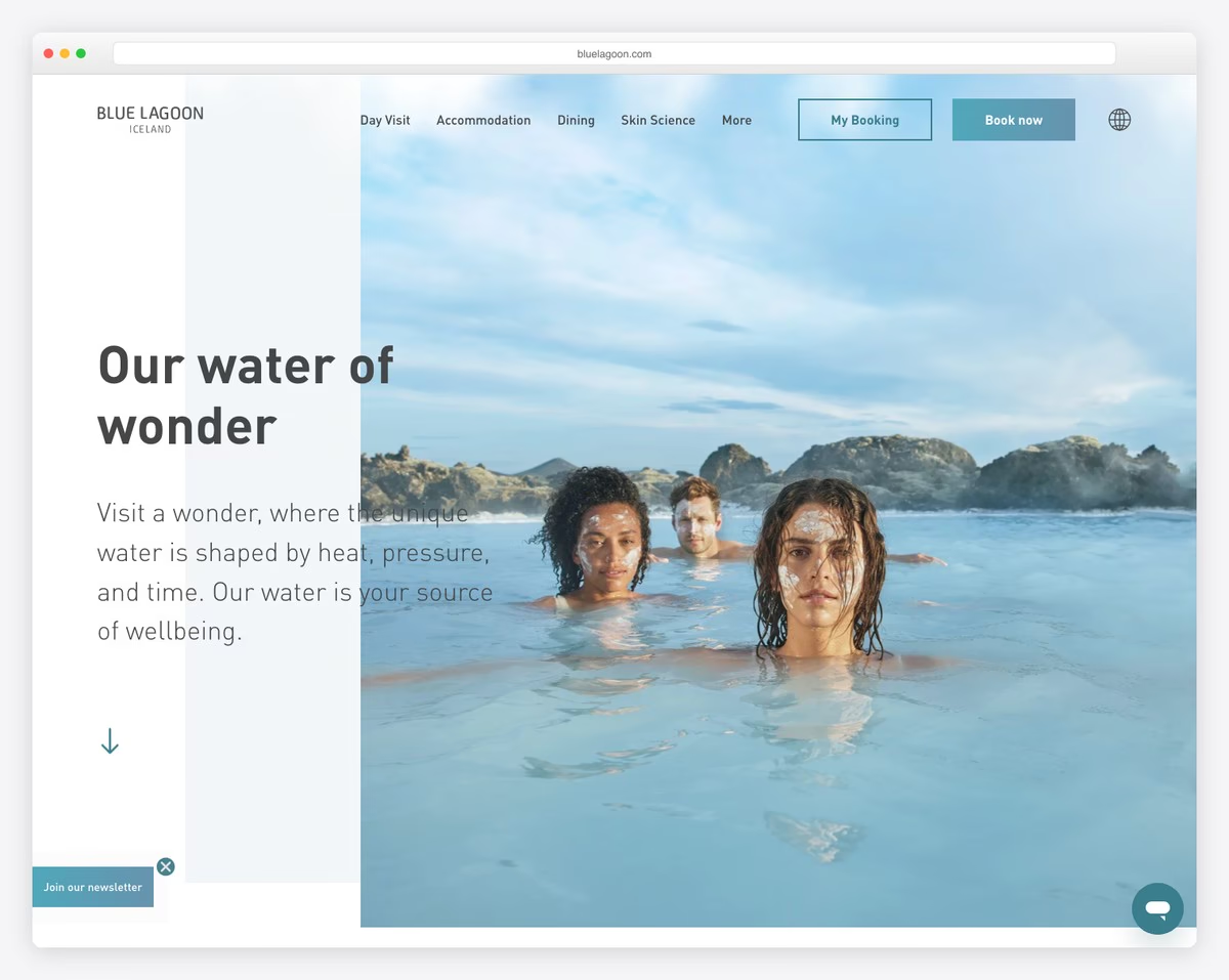
Blue Lagoon’s design is modern and minimal, with lots of white space to ensure excellent readability.
It has two CTA buttons in the navigation bar and a footer with multiple quick links, business/contact details and a newsletter subscription form.
The “live” chatbot is also available for improved customer service.
Note: Add CTA buttons in the header section and enhance click-through rates.
What stands out: The minimalist design keeps the focus on what matters most — the content itself.
3. Gaia Retreat
Built with: Elementor
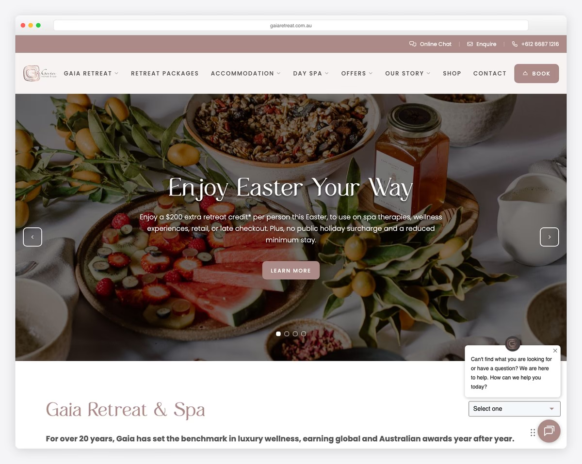
Gaia Retreat is another superb example of a retreat and spa website with a full-screen video above the fold. The video also has the option to turn the volume on or off.
The floating header with a black background stands out nicely. It always gives you access to other pages, a clickable telephone number, and a bookings button.
Some of the menu links have a unique hover effect function that we haven’t seen before and might give you new ideas for your website.
Note: A sticky or floating header/menu can improve your hotel site’s user experience (no more scrolling back to the top!).
What stands out: Parallax scrolling adds visual depth and encourages visitors to keep exploring.
4. Scarlet
Built with: Craft CMS
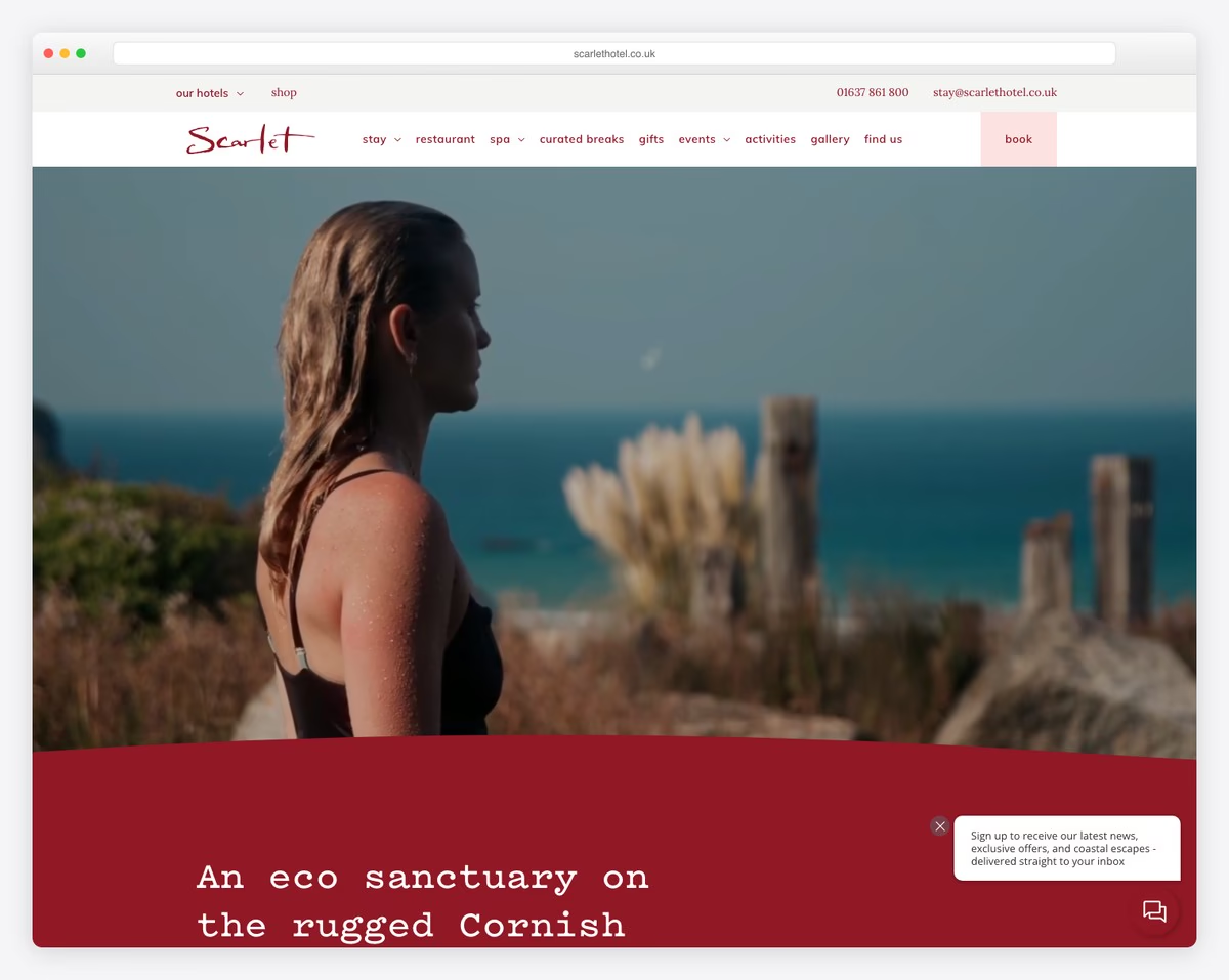
Scarlet has a one-of-a-kind hero section with text, video and a unique background to spice things up.
Although the website leans towards minimalism, it’s still engaging with its incredible attention to detail.
The floating navigation has a mega menu and a booking link, so everything necessary is always easily accessible.
Scarlet also uses a top bar with a few additional quick links and contact details (clickable number and email).
Note: Make your contact details clickable.
What stands out: Full-screen video on the homepage draws visitors in before they even start scrolling.
5. Ultima Collection
Built with: Concrete
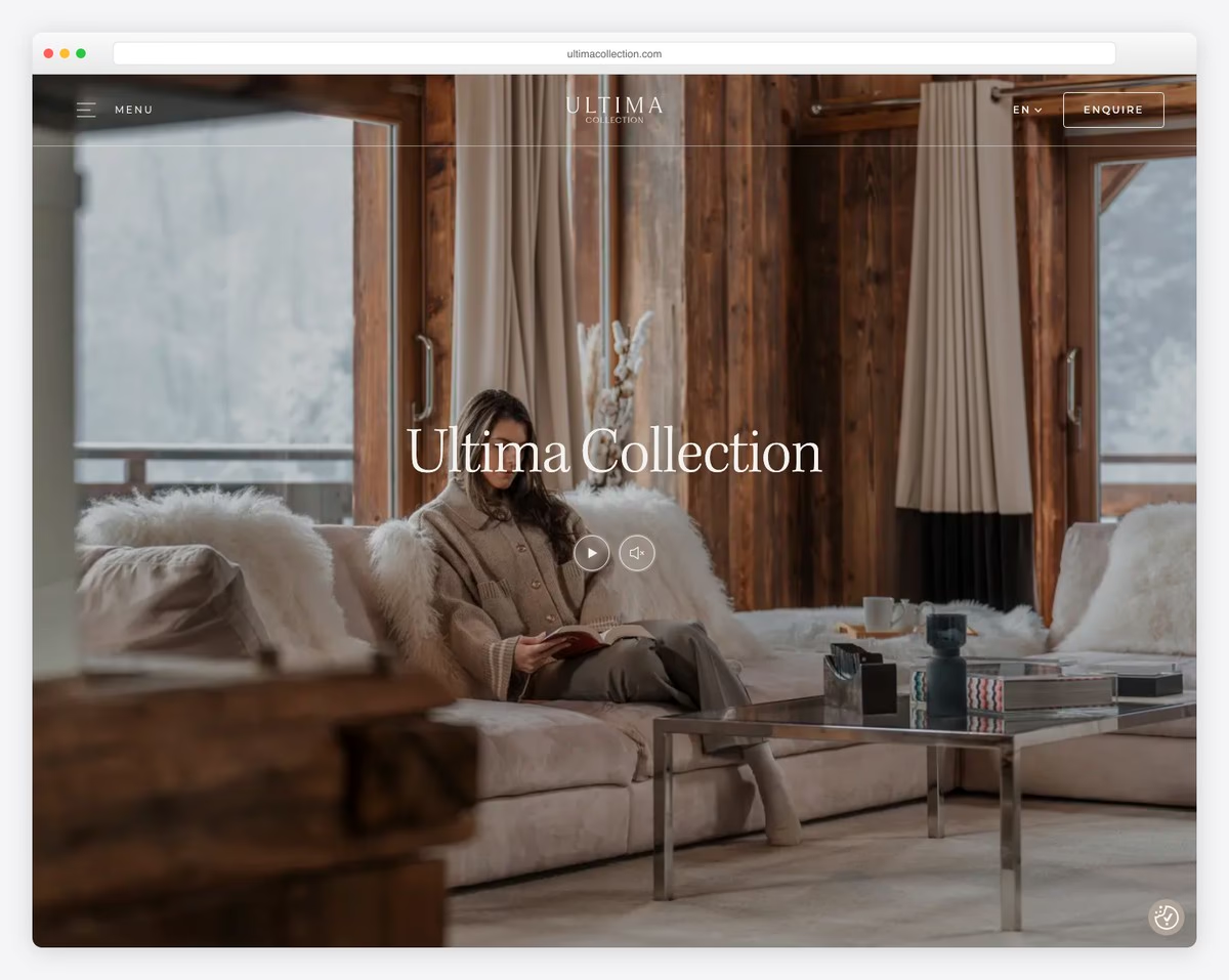
Ultima Collection knows how to create a strong first impression with its bold hotel website that we loved reviewing.
It has a full-screen video background with a transparent (turns solid on scroll) header to ensure a better viewing experience. The header is simple with a hamburger icon, language switcher and booking inquiry button.
One more cool detail of this excellent page is the footer reveal, which you don’t often see.
Note: Translate your website and build a language switcher into the header.
What stands out: A hero slider showcases multiple offerings at a glance, giving visitors quick access to key content.
6. Silo Ridge
Built with: Craft CMS
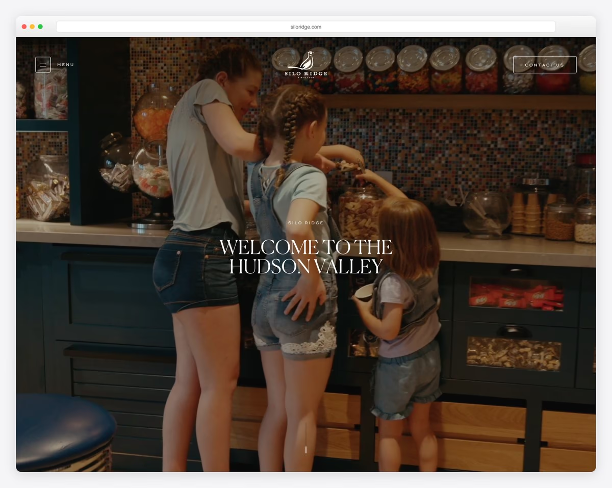
What we’ve learned by studying all these great hotel websites is that using videos above the fold is very common. And Silo Ridge is another excellent example, with a full-screen hero video that makes the page much more engaging.
Moreover, the scrolling animations also add another layer of life to the website to make it more likable. Plus, the touch of simplicity makes the overall appearance real eye candy.
Note: Use scrolling animations and effects to make the website livelier.
What stands out: The dark color scheme gives the site a sleek, modern feel that makes imagery pop.
7. Campbell Gray Hotels
Built with: Divi
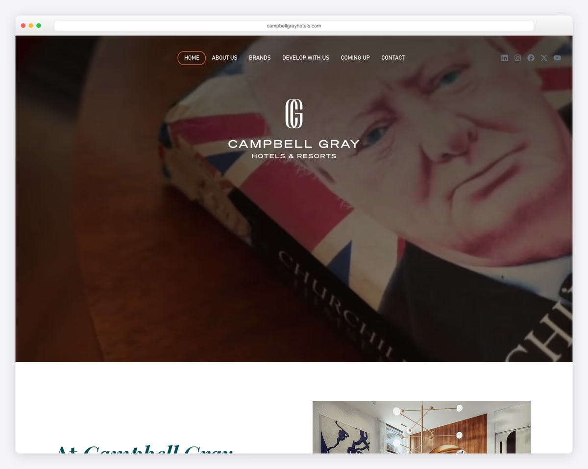
While Campbell Gray Hotels might not use a hero video like many others, you can watch a promotional video below the fold.
What’s interesting is that the website doesn’t have a header and a footer. In other words, it’s a simple website with a single-page layout that you can use to quickly glimpse at their locations.
Note: Create a one-page website where all the information and detail are only a few scrolls apart.
Hey, we’re sure you’ll have a blast checking all these websites using the Divi theme.
What stands out: The image carousel keeps the above-the-fold area dynamic without requiring visitors to scroll.
8. Sabi Sabi
Built with: Concrete
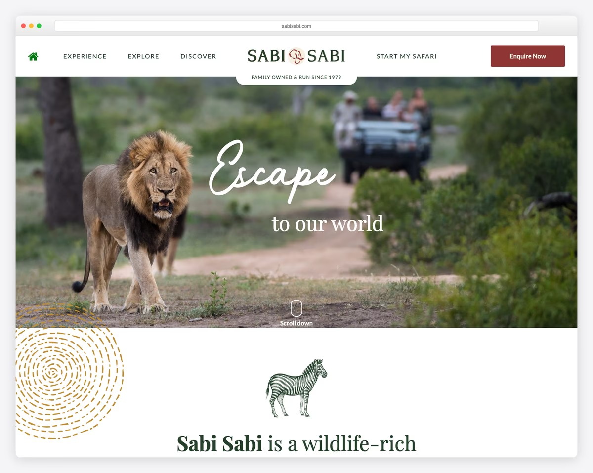
Sabi Sabi’s full-width layout, large image, plenty of white space, compelling text and cool graphics call for an enjoyable moment.
The header has a distinct mega menu functionality and a CTA button for inquiries. Another special function is the disappearing and reappearing of the header, depending on whether you scroll down or up. Handy.
Finally, the footer features multiple columns with contacts, links, social icons, a subscription form, and more.
Note: Build a mega menu to create a better site navigation experience.
What stands out: A masonry grid layout organizes content attractively while maximizing screen real estate.
9. Hotell Nordevik i Skärhamn på Tjörn
Built with: Divi
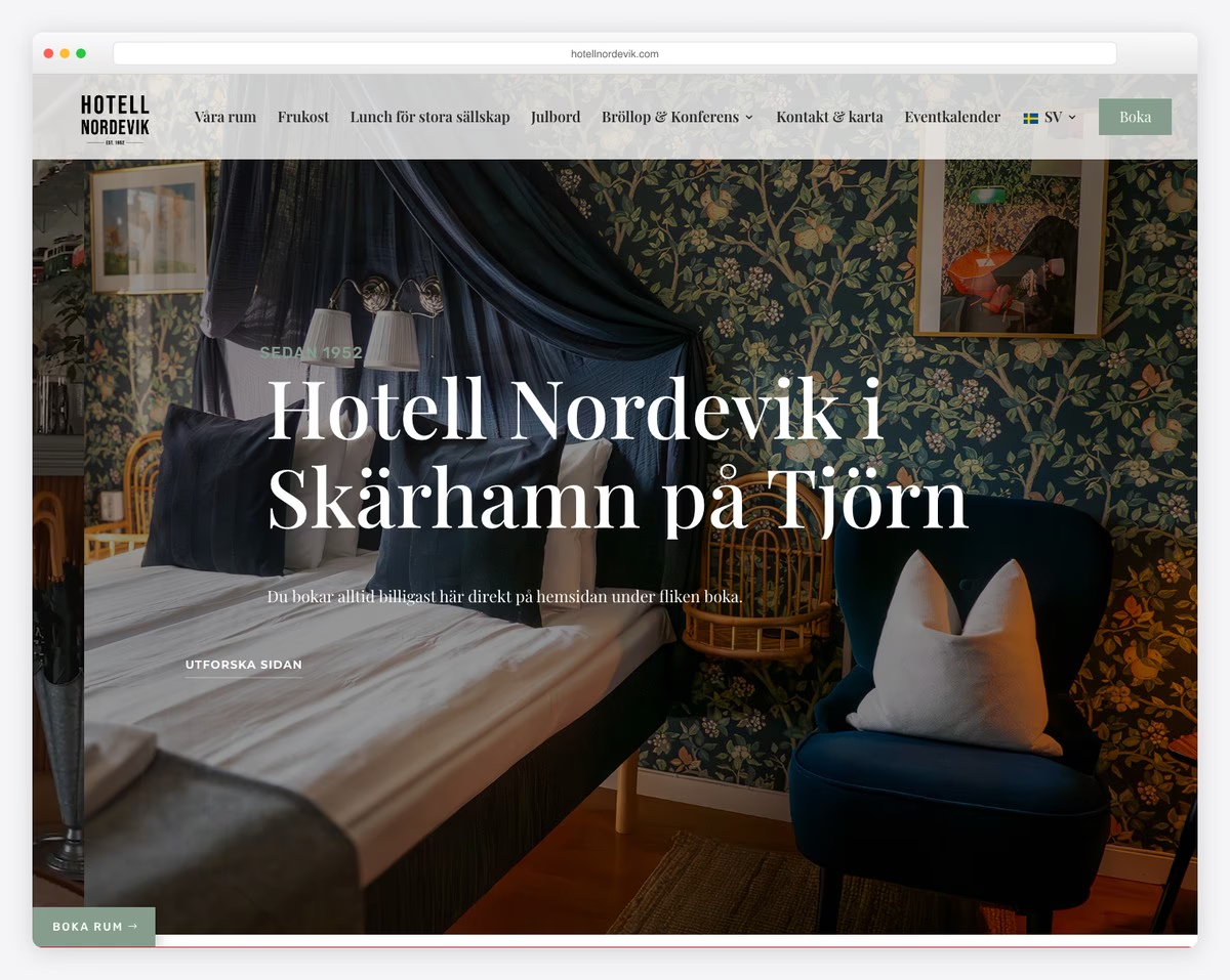
This hotel website example was built with Swedish minimalism in mind but with enough creative details to enliven it.
The home page has a booking form, so you can quickly check availability. The accordions are a nice feature that keeps the initial look cleaner but still delivers the necessary information.
Hotell Nordevik i Skärhamn på Tjörn has a floating navigation bar and a back-to-top button to minimize scrolling.
Note: Integrate online bookings into your website, so potential customers don’t have to visit a 3rd-party platform to make a reservation.
What stands out: A dark background paired with bold accent colors creates striking visual contrast.
10. DDD Hotel
Built with: Nuxt
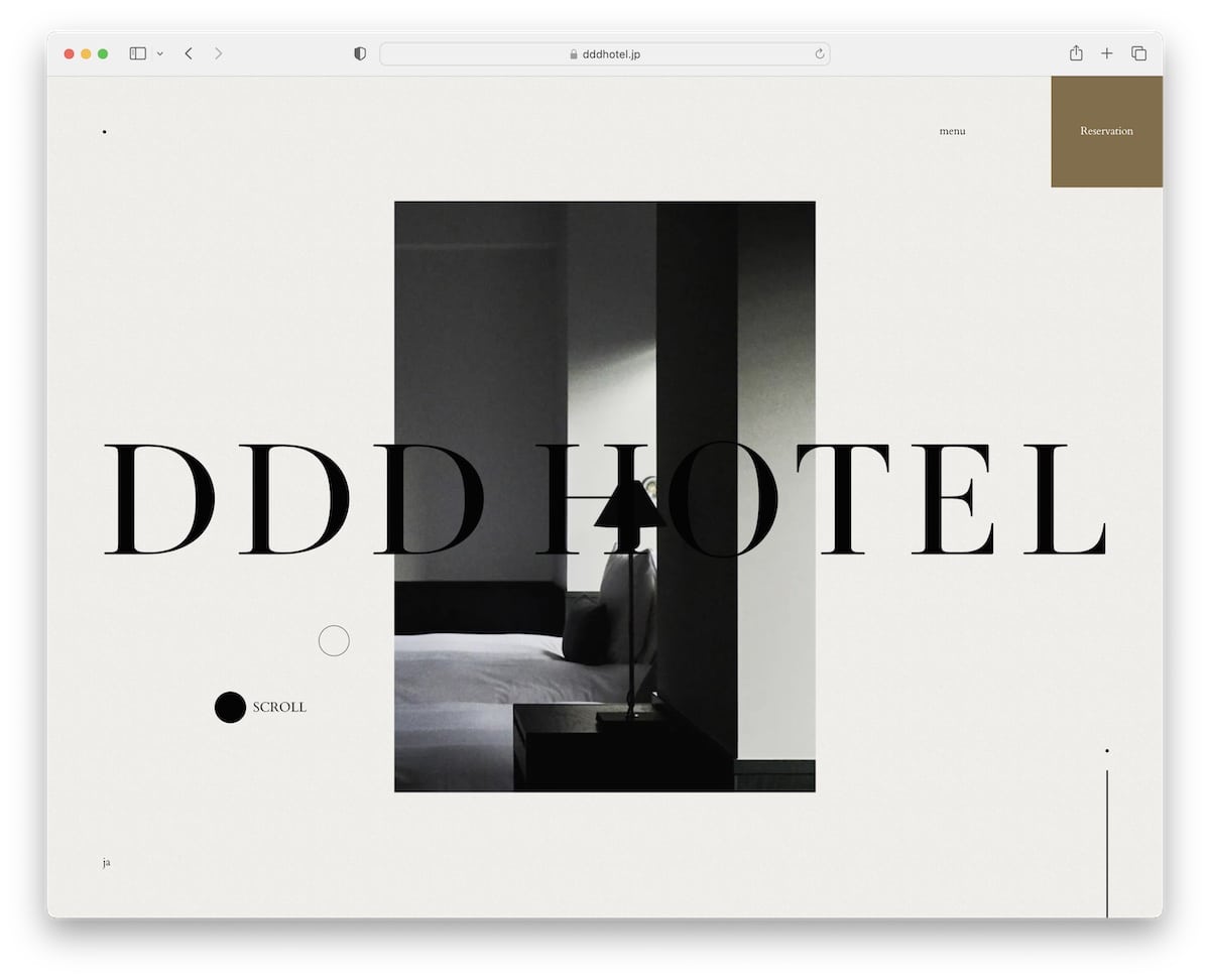
DDD Hotel is a unique and minimalist website with a novel overlayed menu function and a custom cursor element.
Everything about this hotel website is incomparable to anything other we added to this collection.
The parallax effect and the animated text are pleasant details that make the experience more dynamic.
Note: If you want to do something different, you can gain many creative ideas by checking out DDD Hotel.
11. Constance Hotels & Resorts
Built with: Umbraco
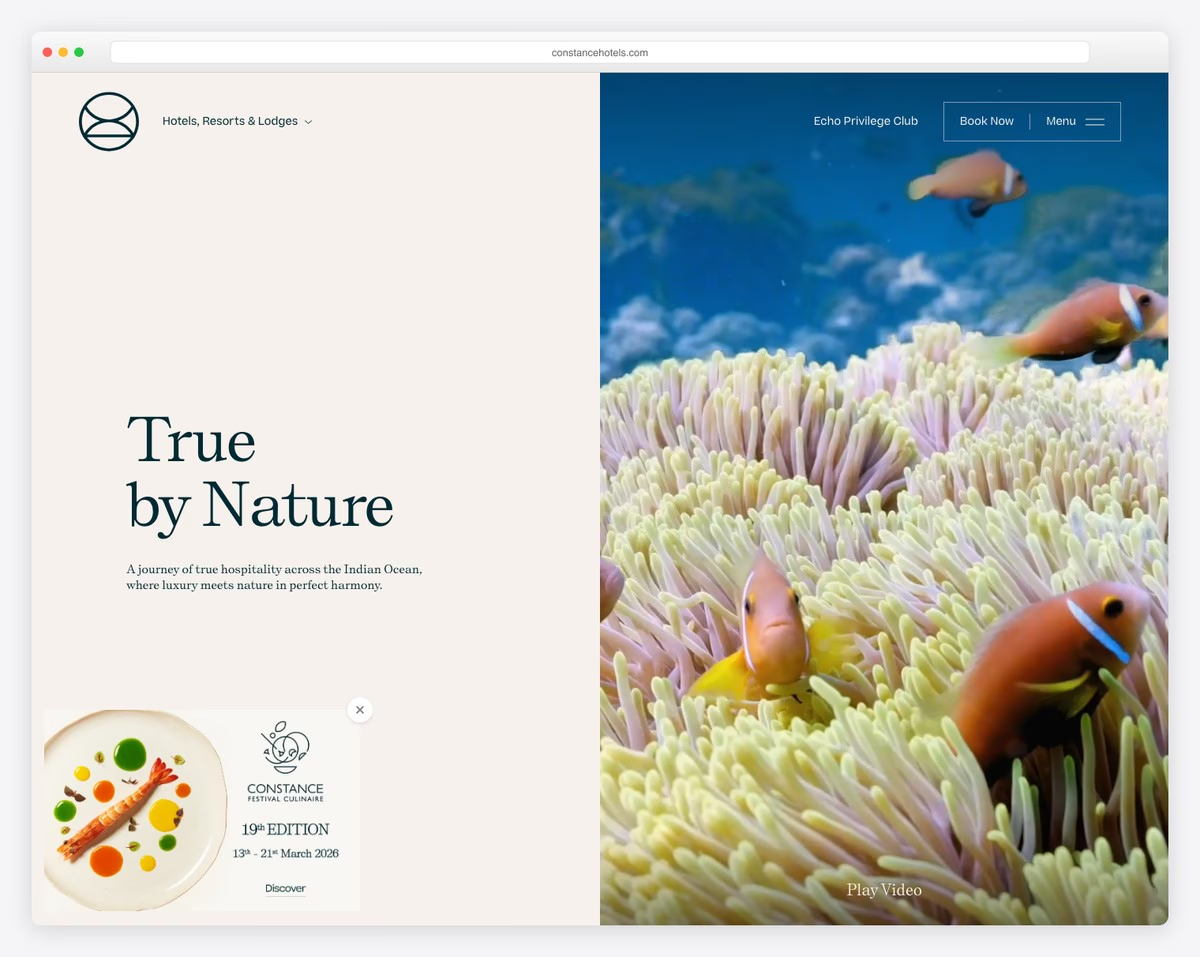
Constance Hotels & Resorts has a hero video with text and a CTA button that promotes their exclusive offers.
The categorized hotels and resorts below the fold are handy for picking/finding the perfect location easier.
This hotel website has a top bar and a navigation bar where you can find all the quick links, a language selector and a booking button.
Note: If you have multiple locations, organize them with categories/tags in a handy slider/carousel.
What stands out: Layered parallax effects create a sense of movement that makes scrolling feel dynamic.
12. The Corner Hotel
Built with: Laravel
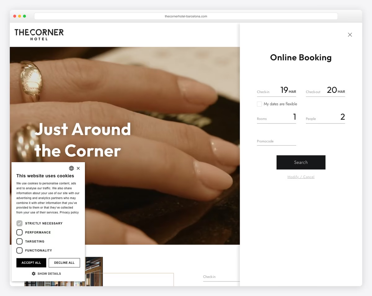
The Corner Hotel’s clean and modern page design takes you on a journey, starting with the hero video that’s very gripping.
Right below the video is a search form, but you can also access the bookings via the CTA button in the header. Speaking of the header, it reveals a hamburger menu with a drop-down, plus it has a drop-down language selector.
The page has a back-to-top button, so the tedious back scrolling is unnecessary.
Note: If you don’t use a sticky header, a back-to-top button is a smart function to improve UX.
What stands out: Built-in booking functionality turns the website into a 24/7 appointment scheduler.
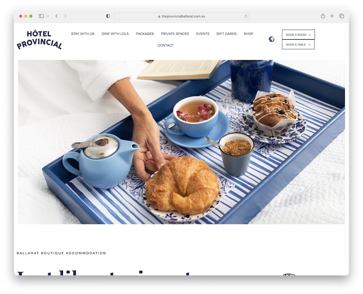
13. Hotel Provincial
Built with: Elementor
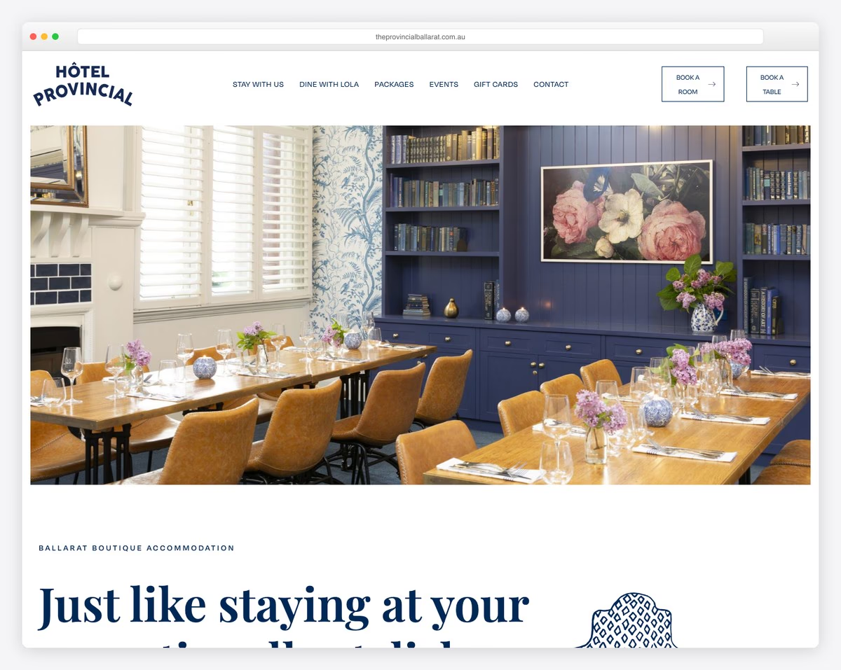
Instead of a video, Hotel Provincial website has a clean slideshow without text or CTAs. The page has a minimalist feel with random sections full of helpful information and visual content.
The header has a cool language picker and two CTA buttons for booking a room or a table. Moreover, the footer is clean, with business details, opening hours, quick links, CTAs and a subscription form.
Note: Use a slider to create a stunning presentation of your location (try skipping text and CTAs for a more appealing look).
What stands out: The grid-based gallery makes it easy to scan a large collection at a glance.
14. Aman
Built with: Drupal
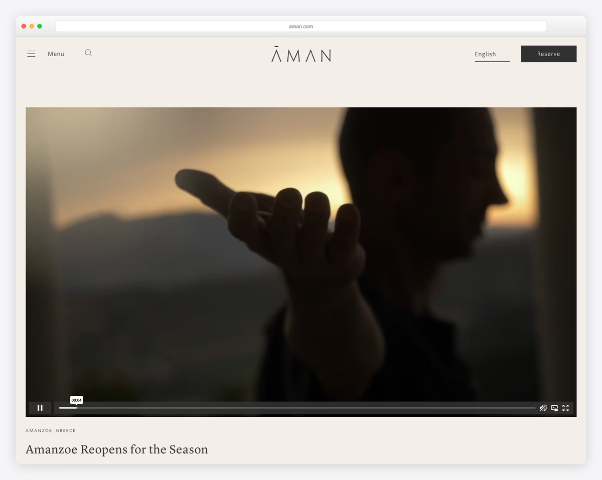
Aman is an elegant and modern hotel website with a hero video that’s so gripping that you just want to watch it to the end. What’s also interesting is that they didn’t add any text or a call-to-action (CTA) button – it’s for pure enjoyment.
The floating header is always available with a hamburger menu, a search bar, a language switcher and a booking button.
Another handy thing is the sticky bottom screen online booking bar to check availability quickly.
What stands out: Create a promotional video and embed it into your website for enjoyment. Don’t be too salesy.
15. Kempinski
Built with: Next.js
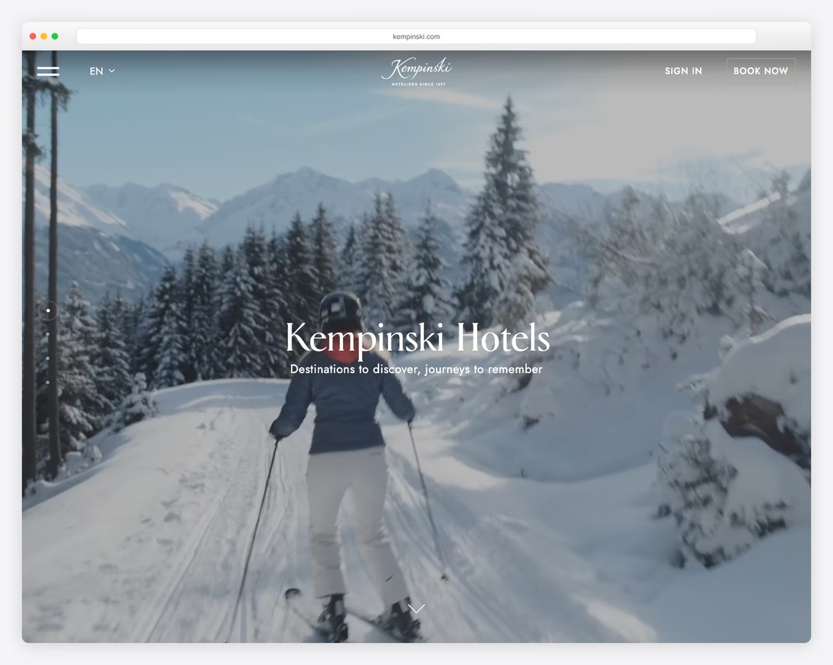
Kempinski is another fantastic hotel site example with a full-screen background video above the fold.
While they use overlayed text, it’s minimal and unintrusive. Plus, the transparent header ensures your viewing experience isn’t distracted.
Meanwhile, the hamburger icon opens full-screen navigation with quick links and a “footer.”
Note: A hamburger menu icon helps eliminate the links if you want to create a neater navigation bar.
What stands out: Integrated appointment booking removes friction between browsing and converting.
16. Maistra
Built with: Hugo CMS
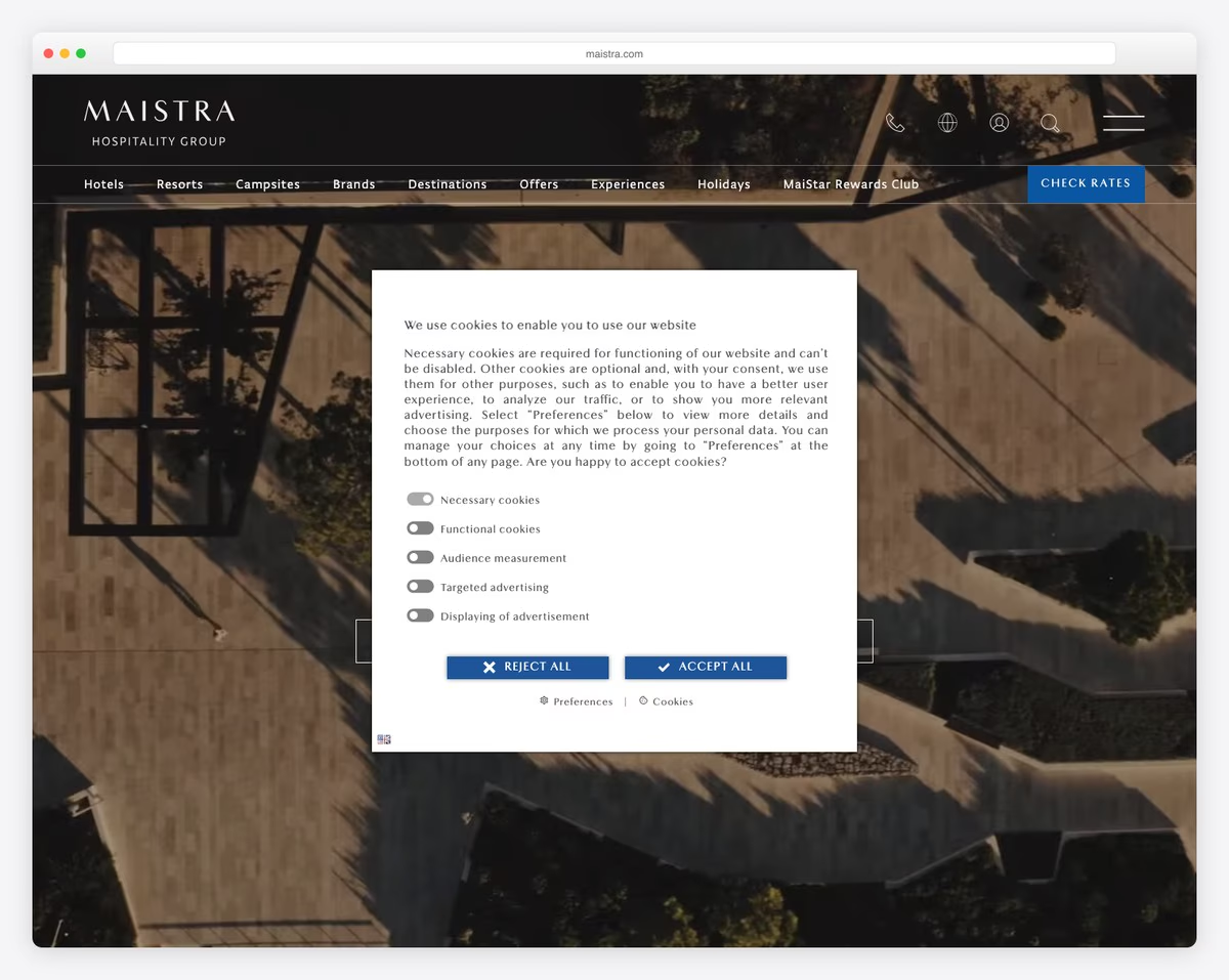
Maistra has a very actionable above-the-fold section with contrasting CTA buttons for checking rates/online bookings.
This responsive web design has an elegant, clean, professional appearance with on-scroll content loading. An approach like this is handy if the (home) page is lengthy, like Maistra’s. And a floating header is a MUST.
Maistra thicks all the boxes.
Note: Use contrasting CTA background colors to get more eyeballs on them.
What stands out: Scroll-triggered animations guide the eye through each section without overwhelming the visitor.
17. Alleys Hotel
Built with: Drupal
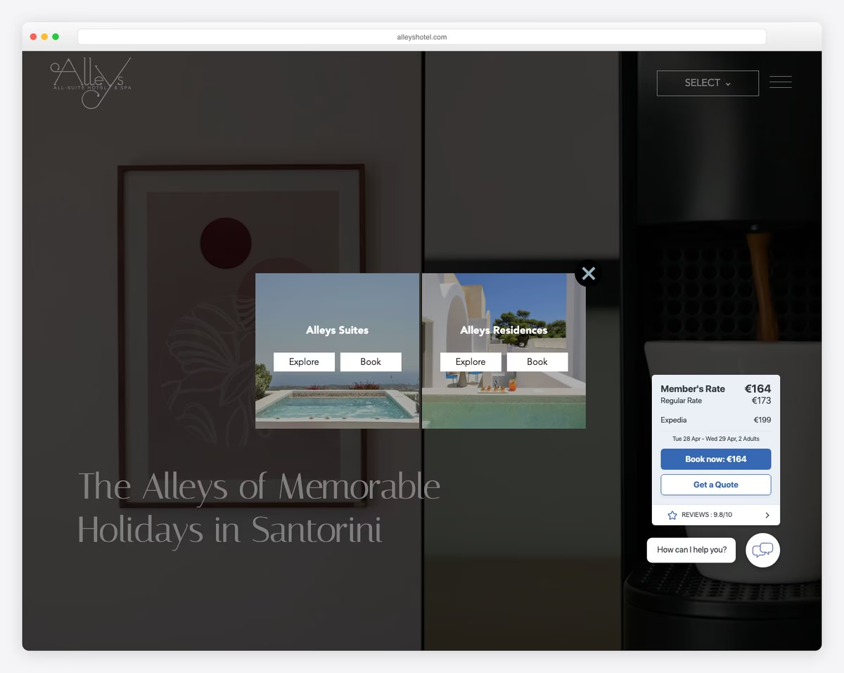
Alleys Hotel keeps you focused with the captivating full-screen video background upon landing on the page.
The hamburger menu icon showcases full-screen navigation (it also features Facebook and Instagram icons), but you can also go straight to the bookings. Remember, the header disappears and reappears depending on the scrolling motion.
The background changes colors, some images zoom in and the slider showcases the place through nice-looking images – together, creating a very engaging experience.
Note: Make the header/menu disappear (for a cleaner look) and reappear (for better UX) depending on scrolling down or up.
What stands out: High-quality photography does the heavy lifting, making the content feel premium.
18. One & Only
Built with: SiteCore
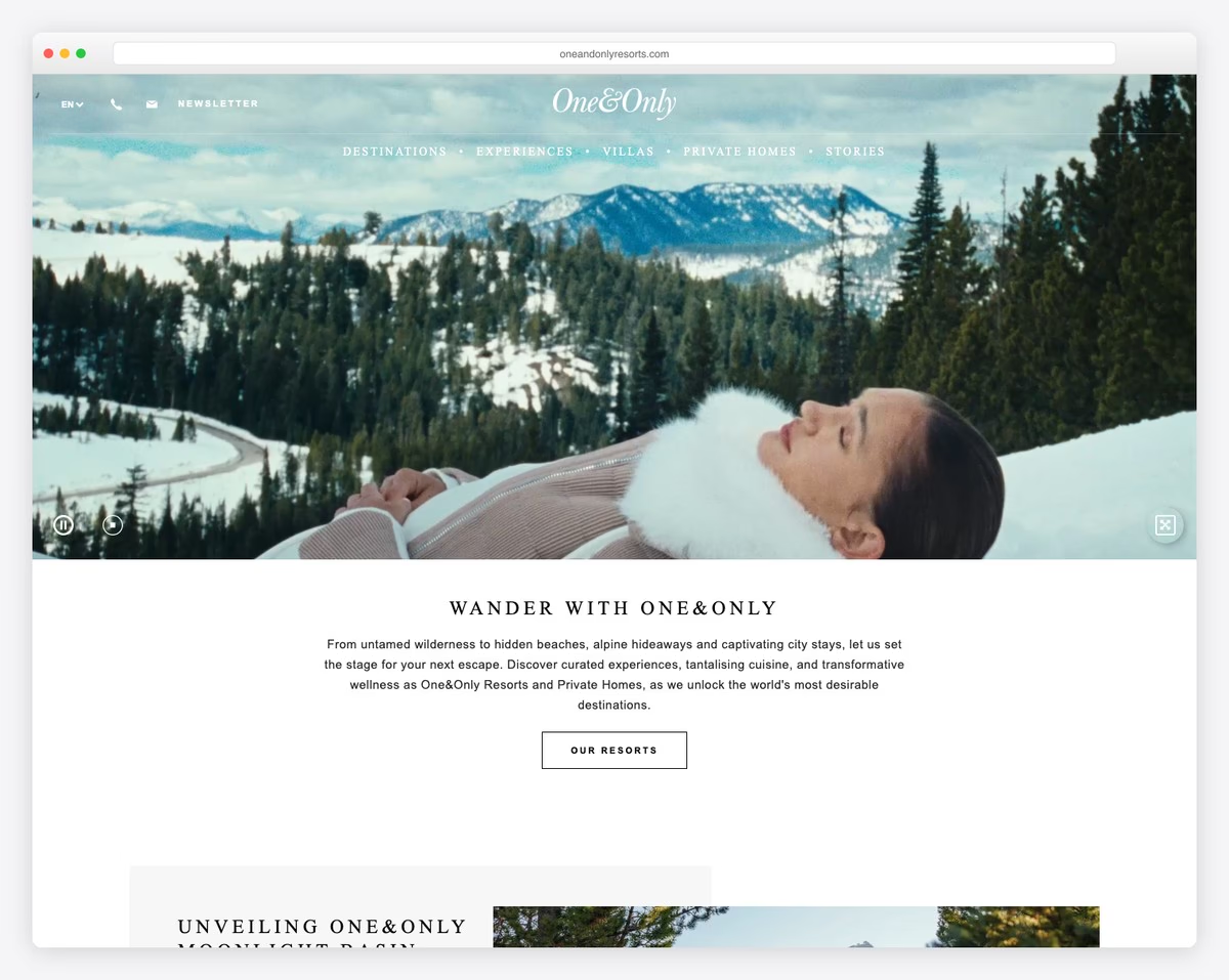
The unique function of One & Only is the hero video, which plays automatically but transforms into a slider when it ends. You can also click it, and the slideshow will appear immediately.
The header has two parts, one for contacts and languages and the other for menu links.
Also, One & Only is one of the rare hotel websites (like Ultima Collection) with a catchy footer reveal function.
Note: Get the most out of the hero area by mixing a video and a slider, like One & Only.
What stands out: Intuitive navigation makes the site easy to explore even for first-time visitors.
19. Nobis
Built with: Craft CMS
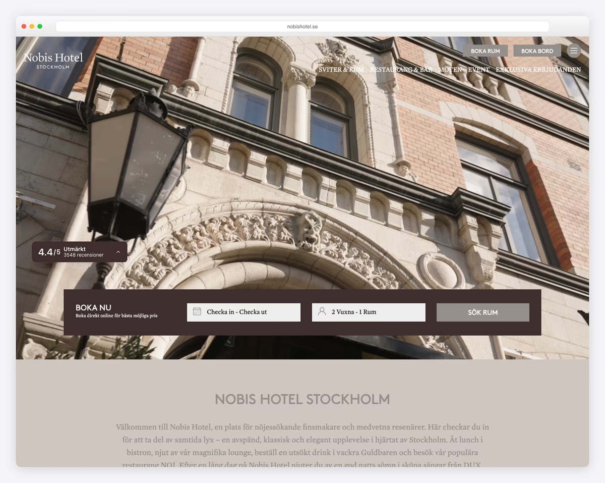
A few seconds after you land on the Nobis, a popup window hits you with a special promotion, which you can participate in by clicking the CTA button.
Nobis is a hotel website with a simple layout. It allows users to quickly find all the necessary information or make an online booking.
However, if you have any questions, the live chat widget (in the bottom right corner) will do the trick.
Note: Use an entry, delayed or exit popup window for subscription forms, special deals, bookings, etc.
What stands out: The clean layout and intuitive navigation create a professional user experience that builds trust.
20. The Hoxton
Built with: WordPress
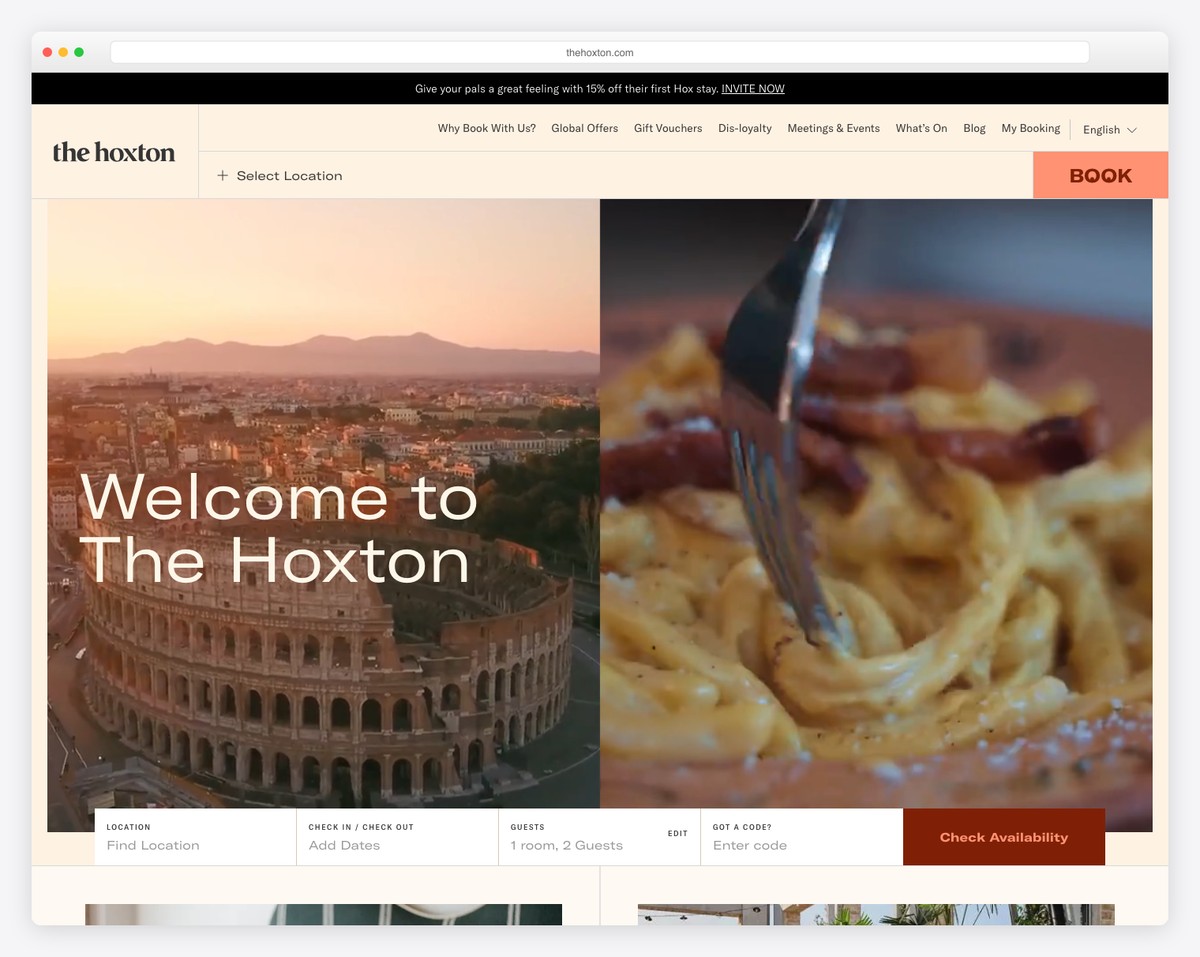
The Hoxton’s website captures the boutique hotel chain’s “open house” philosophy with warm, lifestyle-driven photography. The hero showcases their properties’ distinctive character — design-forward rooms, buzzing lobbies, and neighborhood-centric experiences across London, Paris, Amsterdam, and beyond.
Built on WordPress VIP, the navigation elegantly separates Hotels, Working, Eating & Drinking, and Happenings, reflecting that The Hoxton is as much about its restaurants and coworking spaces as its rooms. The warm color palette and editorial typography give it a magazine-like quality.
What stands out: Positioning a hotel as a neighborhood destination (not just a place to sleep) through editorial content and lifestyle photography attracts both travelers and locals.
21. citizenM
Built with: Custom
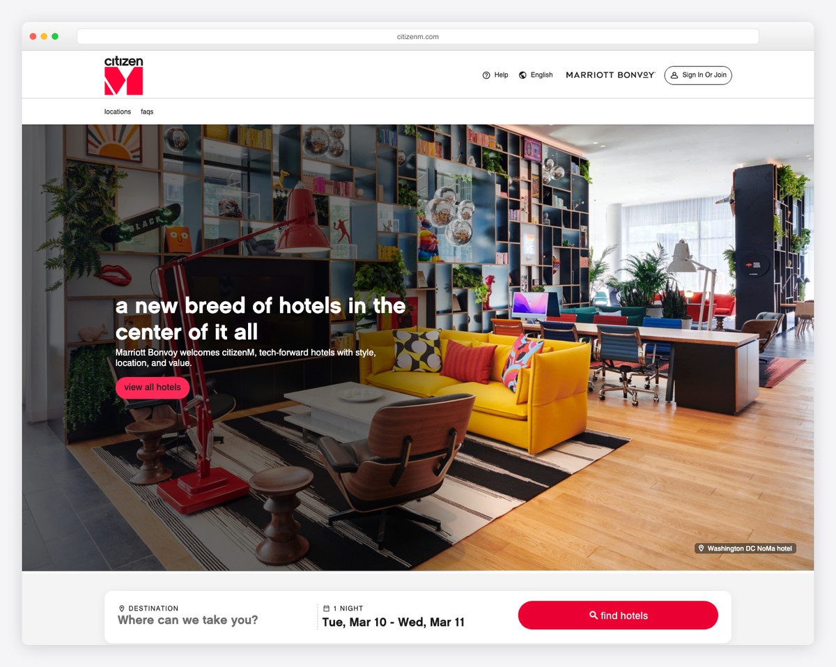
citizenM’s website is as design-forward as their hotels — a vibrant hero image of their colorful lobby interiors immediately communicates their “affordable luxury” positioning. The bold “For the people” tagline and lowercase branding create an approachable, modern identity.
The booking widget is integrated directly into the header with destination search, dates, and guest count, minimizing friction for direct bookings. The playful yet polished design — bright colors, bold typography, and art-filled photography — perfectly represents their tech-savvy, design-conscious guest persona.
What stands out: Embedding the booking widget in the header (not buried in a separate page) dramatically reduces the steps between landing and booking for hotel websites.
22. Ace Hotel
Built with: WordPress
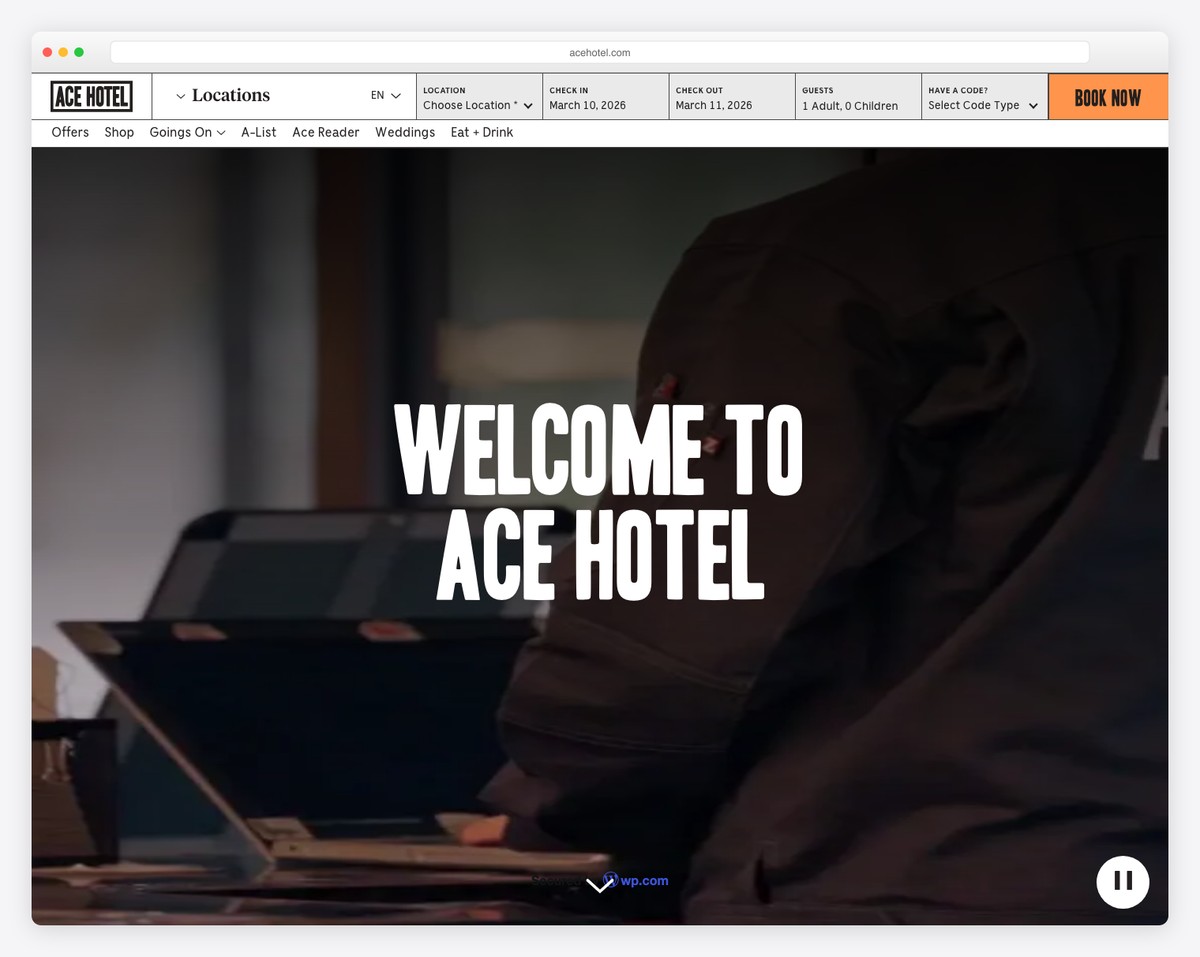
Ace Hotel’s website opens with a cinematic full-screen video and the iconic “Welcome to Ace Hotel” in their signature blocky, stencil-style typography. The orange “Book Now” button and integrated booking bar (location, dates, guests) make reservations immediately accessible.
The navigation is uniquely lifestyle-oriented — alongside standard hotel sections, you’ll find “Ace Reader” (their editorial blog), “Goings On” (local events), and “Eat & Drink” — reinforcing Ace’s identity as a cultural hub. The design is distinctly editorial, treating each property as a creative destination.
What stands out: A full-screen video hero paired with an immediately visible booking widget combines emotional storytelling with conversion functionality — the best of both worlds for hotel sites.
Related Posts


Comments (0)