21 Companies Using WordPress In 2026
Are you trying to find some fantastic examples of companies using WordPress?
Today, we’re not just talking about what WordPress can do; we’re showing you how it’s done in the real world.
Welcome to our special feature, where we showcase a variety of companies, big and small, that have harnessed the magic of WordPress for their websites.
From innovative startups to established industry leaders, these examples will inspire, educate, and maybe even surprise you.
Remember, you can build any website with WordPress because of its flexibility, adaptability and extendability.
Whether you’re a beginner entrepreneur, a seasoned business owner, or someone who loves staying updated on the latest digital trends, enjoy these company website examples and take notes.
Turn your online vision into a stunning reality!
This post covers:
- 20+ Companies Using WordPress
- How To Make A Company Website With WordPress
- WordPress Company Website FAQs
20+ Companies Using WordPress
Catch a glimpse of digital excellence with our curated list of the best company websites powered by WordPress.
These shining examples embody innovation, creativity, and the incredible versatility of this platform.
1. TechCrunch
Built with: WordPress
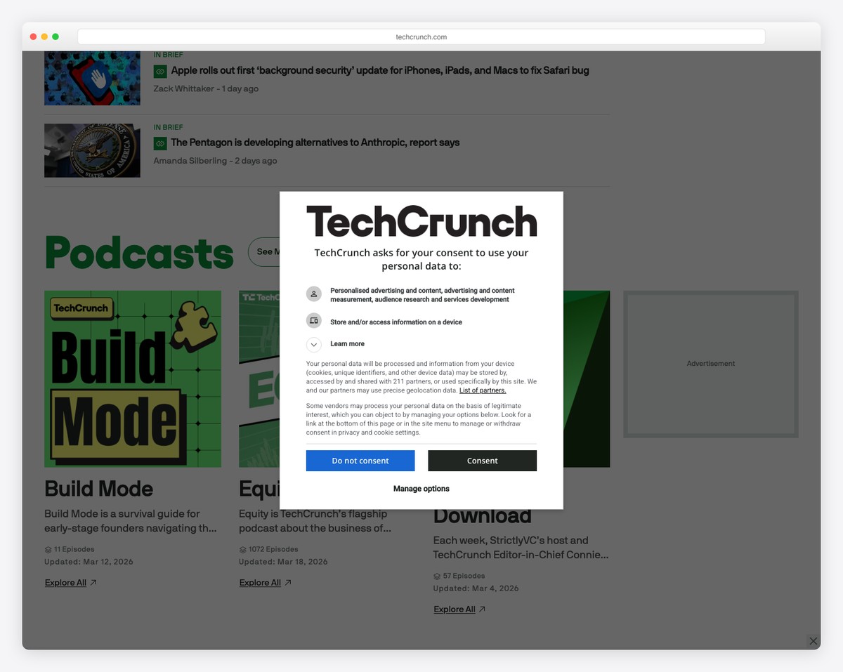
TechCrunch, a premier player in the tech news arena, showcases the versatility of WordPress as its chosen platform. Its blend of high functionality and aesthetic appeal sets the TechCrunch website apart.
Utilizing WordPress, the site presents a clean, user-friendly interface that effortlessly handles content, from breaking news to in-depth analyses.
The responsive design ensures an optimal viewing experience across devices, which is crucial for its tech-savvy audience.
TechCrunch also leverages WordPress’s extensive customization capabilities, integrating various multimedia elements and interactive features that enhance user engagement. This makes TechCrunch not just a news portal but a dynamic digital experience.
What stands out: The layout is easy to use, making navigation and content discovery easy for users. It also facilitates simple sharing and engagement with content on various social platforms.
What stands out: TechCrunch exemplifies the best of WordPress through its cutting-edge, responsive design and adept handling of high-traffic and dynamic content.
2. Meta Newsroom
Built with: WordPress
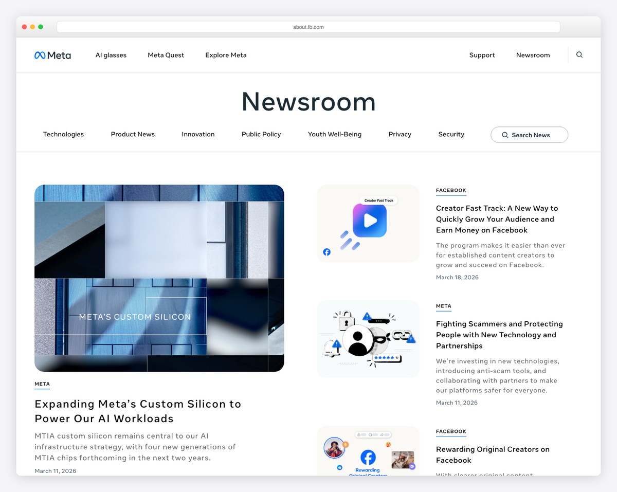
The Meta Newsroom website is a stellar example of corporate communication done right. It’s a platform where Meta (formerly Facebook) articulates its narrative, showcasing transparency and engaging storytelling.
What makes this site special is its sleek, modern design, which aligns seamlessly with Meta’s futuristic brand identity. The website presents complex information, such as press releases and policy updates, in an accessible, visually appealing format.
The header, base and footer all rock a white background to keep everything sleeker. And using a sticky navigation with a mega menu ensures easy navigation.
This site demonstrates WordPress’s capability to create a sophisticated, informative, and user-centric corporate news portal.
What stands out: Meta’s modern, clean design is visually appealing and reflects its forward-thinking brand identity. It also uses a rich footer with plenty of links for quick actions.
What stands out: Meta Newsroom is a prime example of how WordPress can be leveraged to create a sophisticated, multimedia-rich, and user-friendly corporate communication platform.
3. Hypebeast
Built with: WordPress
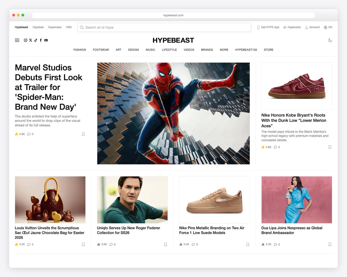
Hypebeast, as a trendsetting digital platform in fashion and lifestyle, brilliantly utilizes WordPress to its full potential.
The website stands out for its simplistic design that mirrors its content’s contemporary, stylish essence.
What’s special about Hypebeast is its dynamic presentation of news, editorials, and creative collaborations that engage a fashion-forward audience.
The site seamlessly integrates high-quality images and videos, enhancing the visual storytelling experience.
It takes the user experience to the next level with a two-part navigation, dark/light mode and language/region switcher.
What stands out: Hypebeast features main navigation links at the top, with a hamburger menu icon on the left for a more refined search. Users can also view it in dark mode, which is beneficial for late-night surfing.
What stands out: Hypebeast fuses stylish design and dynamic content management, showcasing WordPress’s capability to cater to trendy, visually-driven audiences.
4. Caesarstone
Built with: WordPress

What makes Caesarstone unique is its immersive visual experience, presenting high-quality images and detailed galleries highlighting its products’ beauty and variety.
But what we dig the most is the full-screen video slider that welcomes you to their world of fancy countertops.
The website’s design mirrors Caesarstone’s offerings’ sophistication and premium quality.
User-friendly navigation allows easy access to product information, design inspirations, and resources for customers and partners.
What’s cool about Caesarstone’s mobile navigation is that it’s located at the bottom of the screen – and it sticks.
What stands out: To grab your visitors’ attention, create a full-screen video slider above the fold for a more immersive experience.
What stands out: Caesarstone is full of goodies, from the massive video slider to the bottom-screen floating navigation on smaller screens.
5. Tonal
Built with: WordPress
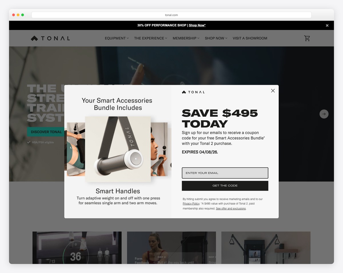
Tonal’s site immediately captivates visitors with a video background above the fold, showcasing Tonal’s innovative fitness technology in action.
This dynamic visual element sets the tone for the user’s experience. The transparent header, which blends seamlessly with the content, and a minimalist hamburger menu ensure uncluttered and intuitive navigation.
Further enhancing the user experience, the website features a widget-rich footer that offers easy access to essential information and resources.
Combined with a neat, responsive design, these elements pleasantly embody Tonal’s trendy brand identity.
What stands out: Like Tonal, use a video background presentation (ideally above the fold) to demonstrate your product in use.
What stands out: Tonal’s video demonstration, transparent header and practical footer made us add it to the list of companies using WordPress.
6. Spotify – For The Record
Built with: WordPress
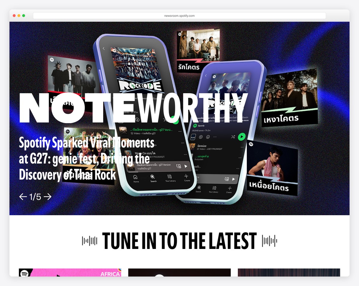
Spotify’s “For The Record” website is a striking example of digital storytelling meeting clever design. Its full-screen mega menu immediately draws visitors in, offering a fetching navigation with easy-to-access categories.
The website is enriched with subtle animations and hover effects that bring its content to life.
Using a dark footer adds a pop of contrast, highlighting key information and links without overwhelming the main content.
These design choices and a clean, modern appearance perfectly encapsulate Spotify’s brand ethos.
What stands out: To express your company’s liveliness, integrate animations, hover effects, and other cool elements into your website’s design.
What stands out: Spotify’s “For The Record” blends a full-screen mega menu, engaging animations, and striking design for added hype.
7. Etsy Journal
Built with: WordPress
The Etsy Journal website is attractive for its user-centric design and functionality tailored to its creative audience.
A prominent feature is the large search bar in the header, making it effortless for visitors to explore its artisanal content and stories.
The site employs popular menu links for easy access to trending topics and a simple hamburger menu for a clean, uncluttered navigation experience.
Boxed layouts bring structure and focus to content, while a back-to-top button and subscription form enhance user convenience.
These thoughtful design elements and a vibrant and inviting aesthetic reflect Etsy’s commitment to community and creativity.
What stands out: Make your WordPress website even more searchable with a large search bar with live recommendations.
What stands out: Etsy Journal skillfully blends extensive search functionality, user-friendly navigation, and visually appealing layouts to cater to its creative and diverse audience.
8. Wired
Built with: WordPress
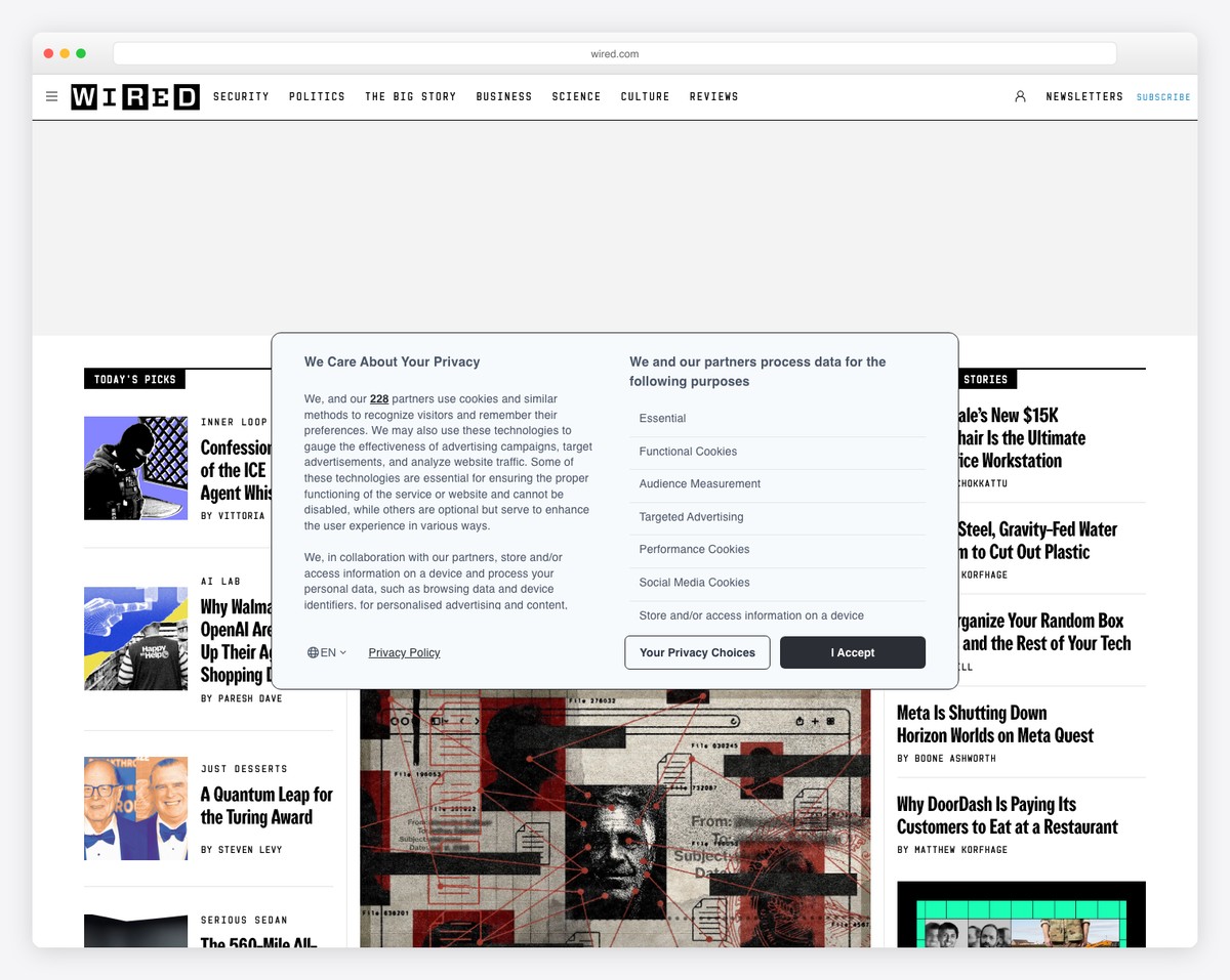
Wired’s website is a benchmark in digital publishing for distributing large volumes of content distraction-free.
A striking feature is the full-screen hamburger menu, offering a modern, tidy navigation experience. The site boasts a dedicated search page with advanced sorting options, allowing users to filter results by relevance or newest, enhancing content discoverability.
Key elements like sign in and subscribe buttons are strategically placed in the navigation bar for easy access, emphasizing user engagement and retention.
Also, sticky ad elements on the page ensure more visibility and higher click-through rates.
Wired is a great example of a sophisticated, interactive, and highly useful digital news platform.
What stands out: Keep your navigation/header section cleaner with a hamburger menu. This also allows you to display only the most essential links/categories.
What stands out: Wired masterfully utilizes WordPress for a feature-rich online presence, perfectly aligning with its status as a leader in digital reporting.
9. Unconquered
Built with: WordPress
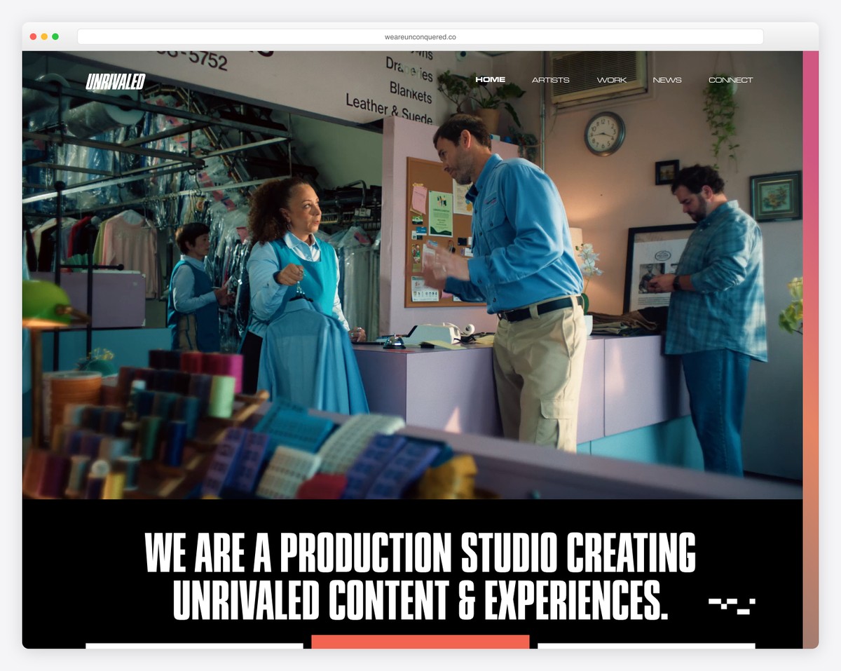
The Unconquered website offers a captivating digital showcase of its branding prowess.
Its grand feature is the full-screen video slider on the homepage, where each slide is visually striking and clickable, leading users directly to detailed case studies. This interactive approach brilliantly highlights their portfolio.
In the top left corner, an “index” button reveals a comprehensive menu, encompassing contact details, social media links, and a compact version of the video slider, ensuring vital information is always at the user’s fingertips.
Unconquered is an excellent example if you want something different to present your company portfolio. Make it uniquely yours, thanks to WordPress’s flexibility.
What stands out: Leave all the bloat out and create a massive video slider home page, displaying your portfolio like a champ.
What stands out: Unconquered’s website is an outstanding example of creative and interactive WordPress design, effectively showcasing its portfolio through a full-screen video slider and an innovative index menu.
10. Ted Blog
Built with: WordPress
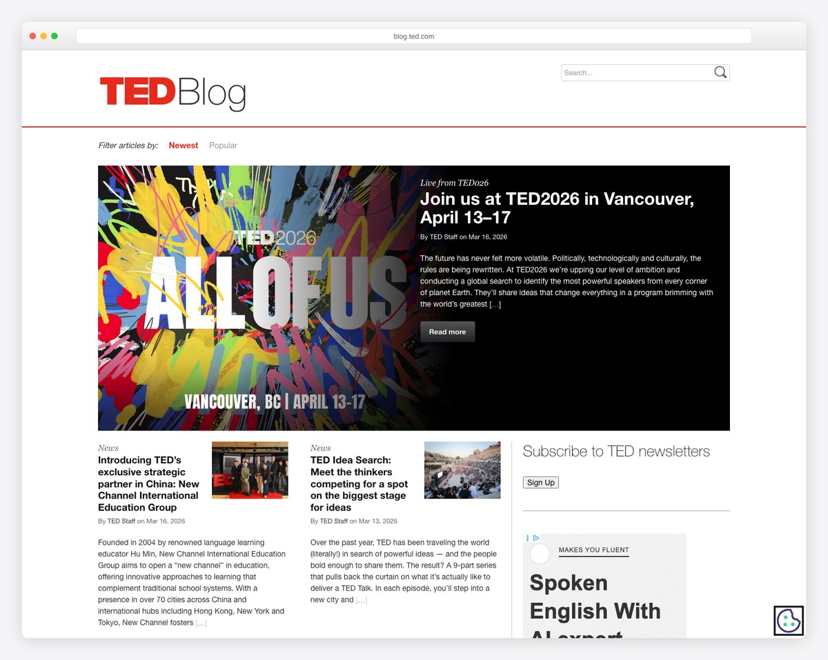
The TED Blog website exemplifies simplicity and functionality in its design.
Its basic header includes two intuitive filters for sorting articles by newest and most popular, alongside a search bar, making content discovery straightforward for visitors.
The site features a prominently placed featured section highlighting key content, drawing immediate attention.
A right sidebar offers additional options for social connection, a sign-up button and an advertisement.
At the bottom, another email sign-up footer widget encourages user engagement and subscription.
This clean, user-friendly layout, combined with TED’s trademark thought-provoking content, demonstrates WordPress’s ability to create an efficient, content-focused, and easily navigable blog platform.
What stands out: Create a featured area above the fold, which you can use to highlight the latest, most read or any other content you want to put an extra shine on.
What stands out: TED Blog effectively uses WordPress to create a streamlined, content-centric site, making it a prime example of balancing simplicity and user engagement in web design.
11. Yelp Blog
Built with: WordPress
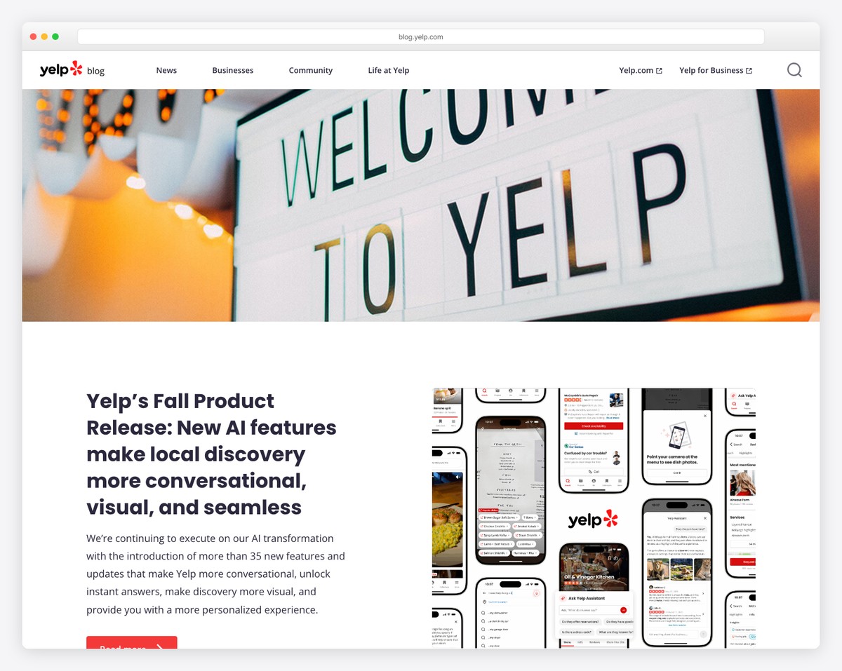
The Yelp Blog excels in delivering a foolproof and content-rich experience. It features a simple navigation bar on larger screens that transitions to a hamburger menu on smaller devices, ensuring ease of use regardless of screen size.
A specially curated section for recommended topics guides visitors to areas of interest.
Moreover, the blog is organized into multiple sections, each dedicated to the latest content in different categories, such as business, community, and life at Yelp, allowing for easy exploration of diverse topics.
Additionally, the multi-column footer area is thoughtfully designed, offering quick access to essential information and resources.
What stands out: Instead of displaying your latest article on your blog’s home page, create a more organized layout by displaying the latest content in different categories.
What stands out: The Yelp Blog is a superb example of WordPress’s adaptability, showcasing a seamless blend of navigation, diverse content categorization, and responsive design.
12. cPanel Blog
Built with: WordPress
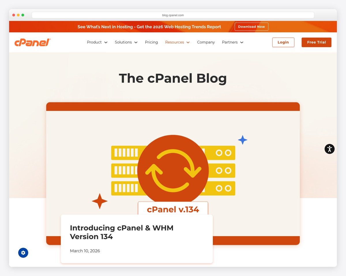
The cPanel Blog has a structured and informative design, catering to its tech-savvy audience. It employs a boxed layout that neatly frames content, emphasizing clarity and focus.
The homepage displays the latest articles, ensuring immediate access to new insights and updates.
Unique to its design is the two-part header navigation: the top section provides links to business-related pages, while the bottom part offers easy access to blog categories alongside a search bar, both separated by a central logo banner. This clear segregation aids in seamless navigation.
The multi-widget footer further enhances functionality, offering additional resources and links. These elements collectively make the cPanel Blog a fantastic example of an organized and professional tech blog.
What stands out: Even if you run a business blog, don’t forget to include links to your products and services, like cPanel does by splitting its header navigation into two sections.
What stands out: The cPanel Blog demonstrates the use of WordPress for a tech-oriented audience, combining a structured boxed layout, dual-part navigation, and comprehensive content display.
13. Vogue
Built with: WordPress
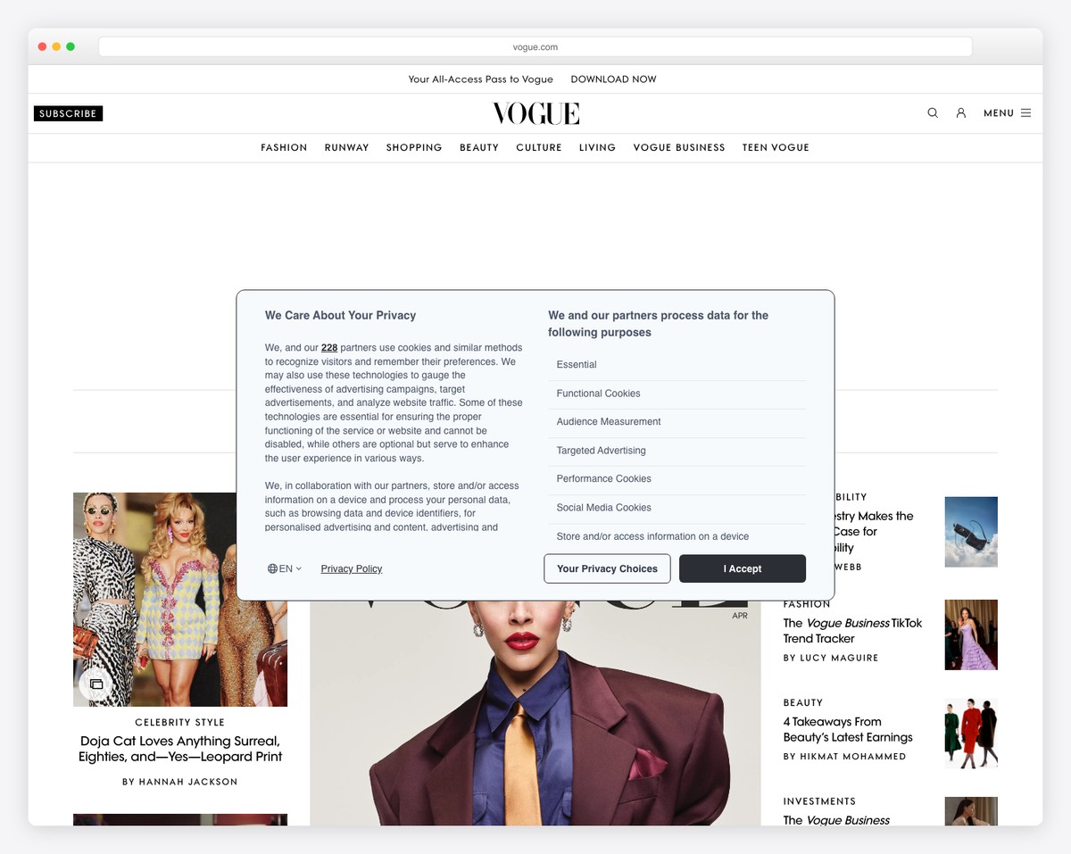
Vogue’s website epitomizes elegance and sophistication with its minimalist layout, reflecting the essence of its fashion-forward content.
The floating header provides smooth navigation while maintaining a crisp look. A notable aspect is the strategic placement of multiple ads, including sticky ones, integrated without disrupting the user experience. (But they could use fewer ads.)
Video thumbnails add a dynamic visual element to the grids. And the contrasting footer background separates it from the content, enhancing stylish appeal.
Like Wired, Vogue also adopts a separate search page, offering a more focused search experience.
These design choices demonstrate WordPress’s variability in creating a chic, modern, and highly effective online magazine.
What stands out: Whenever you’re in doubt about the company website layout, stick to simplicity. Why? Because it works!
What stands out: Vogue’s website elegantly balances a minimalist design with functional features like floating headers and strategic ad placements for a seamless user experience.
14. The New York Times Company
Built with: WordPress
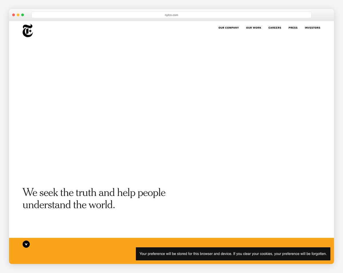
The New York Times Company website’s most striking feature is the massive white above-the-fold section, which makes a bold statement and transforms into a vertical slider upon scrolling, guiding readers through content.
The transparent header, quick menu links, and hamburger menu offer a clean and intuitive navigation experience.
This design choice stresses the site’s commitment to unobstructed content delivery.
Additionally, the clean footer provides essential links without overwhelming the user, and a prominent subscription link encourages the reader to become a member.
What stands out: Instead of using a fancy video or a full-screen slider above the fold, keep it clean with a white background featuring only a sentence that’s ballsier than any of the cool effects.
What stands out: The New York Times Company website blends a bold, interactive design with straightforward navigation and content-focused features for added engagement.
15. Mozilla Blog
Built with: WordPress
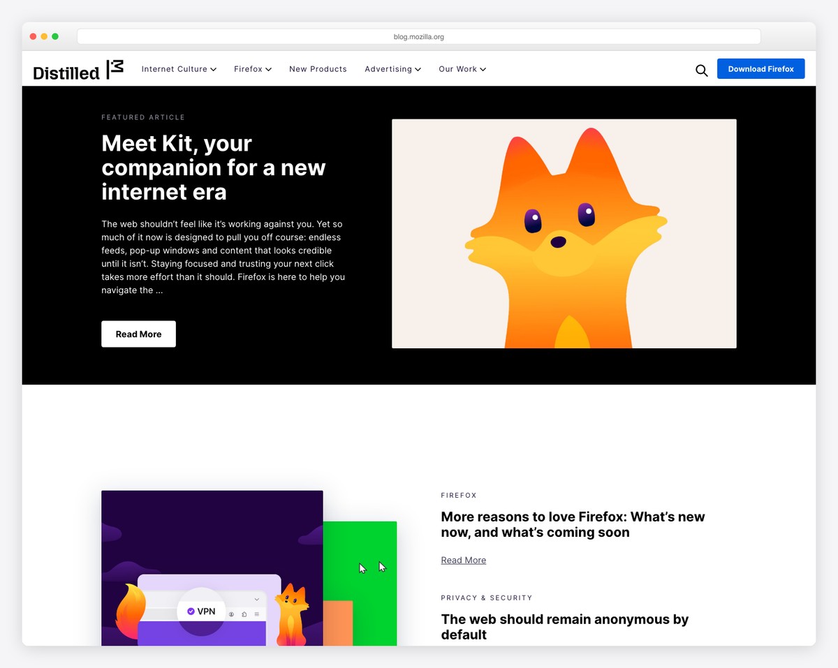
The Mozilla Blog emphasizes openness and accessibility. A feature worth mentioning is the prominent call-to-action (CTA) button in the navigation bar, strategically placed to engage visitors and guide them toward downloading Firefox.
The blog employs a basic drop-down menu, ensuring direct and hassle-free navigation.
Its simplistic grid layout presents content in an organized, easily digestible format, aligning with Mozilla’s commitment to clarity.
Additionally, including a newsletter subscription form above the footer effectively captures visitor interest, fostering ongoing engagement.
What stands out: Do you want to increase downloads? Add a CTA button in the floating navigation section so it’s always available.
What stands out: The Mozilla Blog showcases a clean, accessible, and user-focused design, effectively incorporating key engagement tools like CTA buttons and subscription forms.
16. Airstream
Built with: WordPress
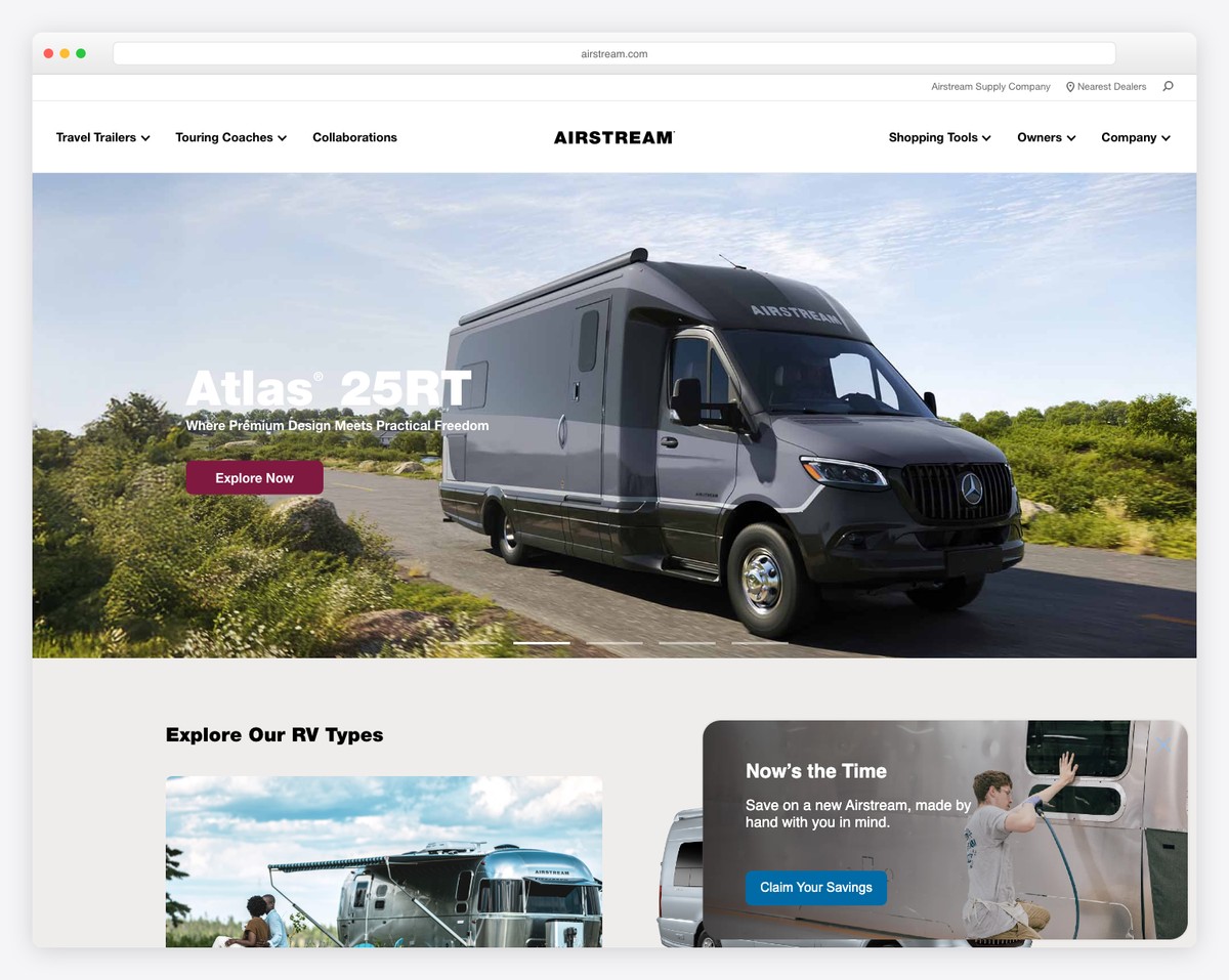
The Airstream website features a harmonious blend of oomph and performance, perfectly embodying the spirit of adventure and quality of its products.
The site features a full-width slider on the homepage, complete with engaging text and prominent CTA buttons, drawing visitors into the world of Airstream.
An advanced mega menu offers detailed navigation options, while a top bar provides quick access to essential information.
A floating banner smartly invites users to claim special offers, enhancing user engagement.
The two search bars, one in the top bar and another above the footer, along with social media icons, ensure comprehensive user interaction.
Additionally, showcasing the latest blog posts keeps the content fresh and relevant.
These elements create a seamless and informative user experience, showcasing WordPress’s pliability in building brand-centric, feature-rich websites.
What stands out: When integrating a slider into your company website, use captivating copy and CTA buttons so visitors can take immediate action.
What stands out: Airstream’s website has an engaging, feature-rich online presence, with a full-width slider, advanced navigation, and strategic user interaction elements.
17. Hodge Bank
Built with: WordPress
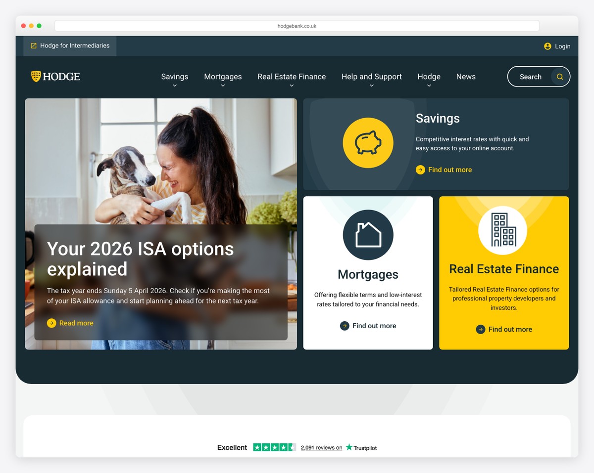
The Hodge Bank website displays a meticulous approach to online banking presence, prioritizing accessibility and user trust.
Its three-part header is a key feature, with a top bar for quick access, a middle section offering detailed information and login/register links, and a bottom part directing users to various business offerings. This layered approach effectively organizes information without overwhelming the user.
A floating feedback button on the right side of the screen invites real-time user engagement, enhancing the customer experience.
The homepage includes a dynamic slider with key services and promotions. Notably, integrating a clickable Trustpilot score and reviews transparently showcases customer satisfaction, building trust and credibility.
Collectively, these elements create a user-focused, trustworthy, and easily navigable banking website.
What stands out: Integrating 3rd-party rating and review services into your company websites can build trust and credibility.
What stands out: Hodge Bank’s website is a stellar example of an organized, user-friendly, and trust-building online banking platform with innovative features like a multi-part header and real-time feedback options.
18. Creative Commons
Built with: WordPress
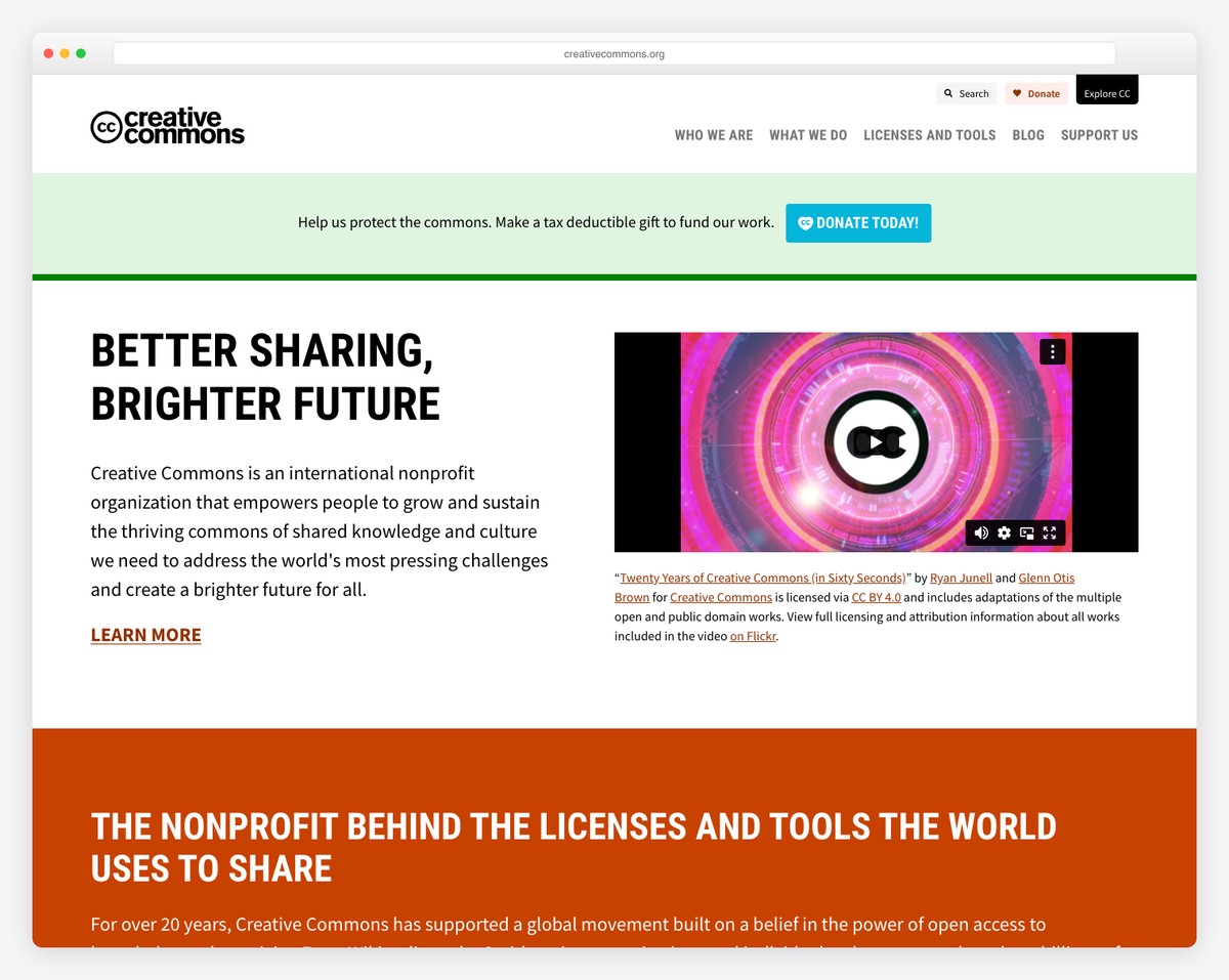
The Creative Commons website is a beacon of clarity and functionality in the digital landscape. Its simple navigation makes it effortless for users to explore its vast resources and initiatives.
The embedded promotional video on the homepage effectively communicates the mission and impact of Creative Commons.
The site includes a portfolio section showcasing some companies using their licenses, which serve as powerful testimonials to their global reach and relevance.
The latest news section keeps visitors updated on recent developments and initiatives. Plus, the dynamic footer is an interaction hub, offering quick links, business details, donation buttons, social media icons, and a newsletter subscription form.
This comprehensive approach makes the Creative Commons website a model of effective communication and user engagement.
What stands out: Use a promotional video to showcase what you do, as we are getting more prone to watching than reading.
What stands out: Creative Commons’ website is a great example of how WordPress can work for clear, effective communication and community engagement
19. Brooklyn Brewery
Built with: WordPress
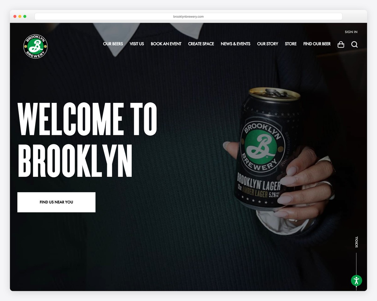
The Brooklyn Brewery website captures the essence of its iconic brand through a dynamic and user-focused design.
It features a large slider on the homepage, complete with bold text and clear call-to-action (CTA) buttons, immediately drawing visitors into the world of craft beer.
Accessibility adjustments are a thoughtful inclusion, ensuring a wide range of users can comfortably navigate the site.
Engaging scrolling animations add visual interest, reflecting the brand’s creative spirit.
And a cart button in the navigation bar caters to the convenience of customers.
Brooklyn Brewery is a great example of what’s possible with WordPress, from a top-notch online brand display to articles and an online shop. Yup, a lot!
What stands out: Do you want more people to be able to use and browse your website? Then integrate an accessibility adjustment configurator.
What stands out: Brooklyn Brewery’s website is a fine display of WordPress’s capabilities in creating a vibrant online presence with features like large sliders, accessibility options, and interactive animations.
20. Reader’s Digest
Built with: WordPress
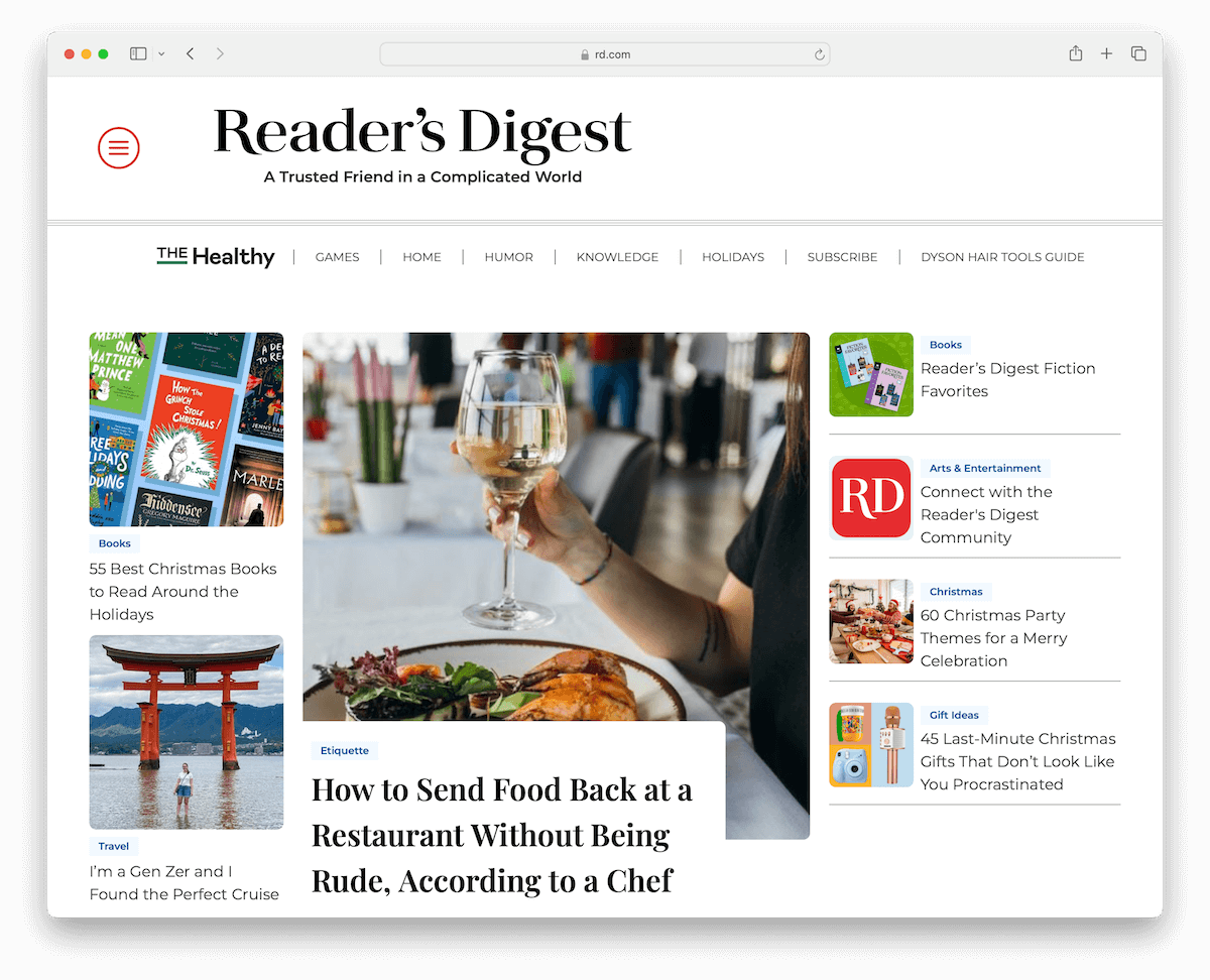
The Reader’s Digest website blends traditional content presentation with modern web design.
It employs a dual-menu system: a hamburger menu for comprehensive navigation and a main category menu for quick access to key areas.
The website’s white space enhances readability, making it comfortable for users to engage with various articles. And animated thumbnails add a dynamic touch, drawing attention to stories.
Furthermore, a sticky magazine subscription banner remains visible, subtly encouraging user commitment.
Also, the homepage is thoughtfully segmented into multiple categories, each highlighting essential articles, allowing for easy exploration of diverse topics.
What stands out: Create a clearly visible floating banner on the left/right side of the screen to drive more attention to subscriptions, downloads, special deals, etc.
What stands out: Reader’s Digest’s website is an example of an engaging, reader-friendly digital magazine, with its efficient dual-menu navigation, clean layout, and dynamic content presentation.
21. The Line Hotels
Built with: WordPress
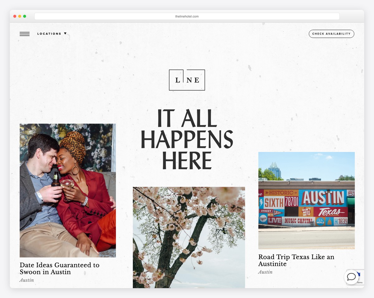
The Line Hotels website is a paragon of modern hospitality web design, encapsulating the essence of its unique locations.
One handy feature is the location selector in the transparent header, which allows visitors to effortlessly choose their desired hotel destination.
This, along with a hamburger menu and an availability button, provides a seamless navigation experience.
A beautiful grid layout defines the site’s aesthetic, incorporating modern design elements with striking images and videos that evoke the hotel’s ambiance.
Live chat functionality ensures instant visitor engagement. Additionally, content loading on scroll keeps the user experience dynamic and continuous.
What stands out: Offer your existing and new customers instant support by integrating a live chat into your website.
What stands out: The Line Hotels’ website illustrates WordPress’s ability to create a luxurious and enticing online experience with its elegant design, dynamic content loading, and user-focused features.
How To Make A Company Website With WordPress
- Define your website goals: Start by outlining what you want your website to achieve. Are you looking to sell products, provide information, or showcase your portfolio? This will guide your design and content choices.
- Choose a WordPress hosting provider: Select a hosting provider that offers WordPress installation. Many options, like Bluehost, SiteGround, or Godaddy, are reliable and WordPress-friendly. (Feel free to refer to our extensive guide on how to choose WordPress hosting.)
- Install WordPress: Once you’ve chosen a hosting provider, follow their instructions to install WordPress. Most providers offer a one-click installation process, which makes it quite straightforward.
- Select a WordPress theme: Choose a WordPress business theme that aligns with your company’s brand and goals. There are thousands of free and premium themes available. Consider responsiveness, customization options, and ease of use.
- Customize your website: Customize your theme with your company’s logo, colors, and content. Use the WordPress Customizer to tweak the layout, add widgets, and modify various design elements.
- Add content and pages: Create essential pages such as Home, About Us, Services/Products, Blog, and Contact. Add quality content that represents your company well and is valuable to your audience.
- Install essential plugins: Plugins enhance your site’s functionality. Consider plugins for SEO (like Yoast SEO), security (like Wordfence), and performance optimization (like W3 Total Cache).
But don’t miss our extensive guide on how to make a WordPress website.
WordPress Company Website FAQs
How secure is a WordPress website for a business?
WordPress is entirely secure when properly maintained. Regular updates, strong passwords, secure hosting, and plugins can significantly enhance your site’s security.
Can a WordPress website handle high traffic?
Yes, WordPress can handle high traffic volumes. The key to managing high traffic effectively is choosing a robust hosting service, implementing caching solutions, and optimizing images and content.
Is WordPress suitable for eCommerce websites?
Absolutely. WordPress, with plugins like WooCommerce, offers a powerful and flexible platform for creating fully-functional eCommerce websites.
How customizable are WordPress websites for businesses?
WordPress offers extensive customization options. From themes and plugins to custom code, you can tailor almost every aspect of your site to meet specific business needs.
Does WordPress require coding knowledge to manage a company website?
Not necessarily. WordPress is user-friendly, and most tasks can be done without coding. However, basic HTML/CSS knowledge can be helpful for more advanced customizations.



Comments (0)