70+ Color Psychology Statistics & Facts (2026 Data)
Last updated: March 2026
Color shapes how people feel, buy, and interact with websites — often in under 90 seconds. These 70+ color psychology statistics reveal exactly how much impact color has on branding, conversions, web design, and accessibility.
Key Color Psychology Statistics (2026)
- 85% of consumers cite color as the primary reason they buy a product (Colorcom)
- 62-90% of snap judgments about products are based on color alone (CCICOLOR)
- Blue is the world’s favorite color — chosen by 57% of men and 35% of women (Hallock)
- Color increases brand recognition by 80% (University of Loyola)
- Red CTA buttons outperform green by 21% (HubSpot)
- 300 million people worldwide have color vision deficiency (Color Blind Awareness)
- Only 29% of websites meet WCAG AA color contrast requirements (WebAIM)
How Color Affects Purchasing Decisions
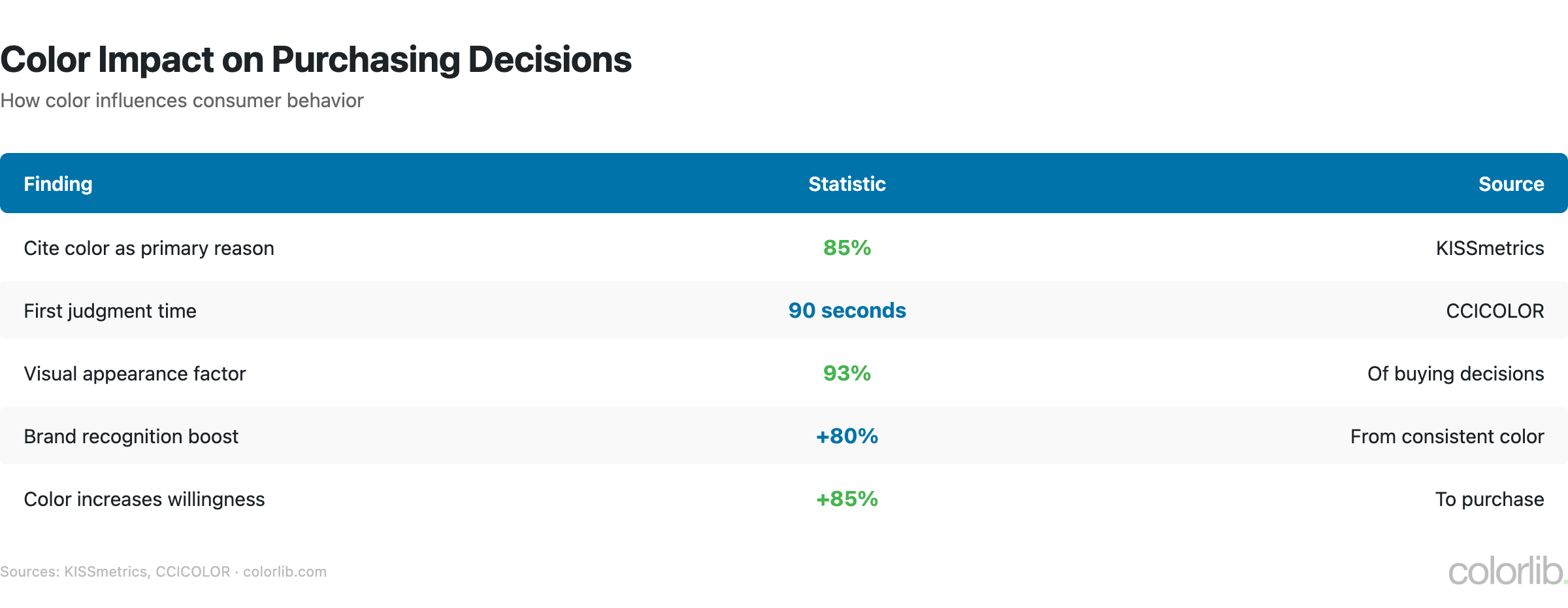
People decide fast — and color drives most of that decision.
| Statistic | Number | Source |
|---|---|---|
| Consumers who cite color as primary purchase reason | 85% | Colorcom |
| Snap judgments based on color alone | 62-90% | CCICOLOR Institute |
| Time to form product opinion | 90 seconds | CCICOLOR Institute |
| Consumers focused on visual appearance when purchasing | 93% | Seoul Intl Color Expo |
| Shoppers who left a store due to poor aesthetics | 52% | Kissmetrics |
| Product return reduction with accurate color display | 39% | Shopify UX |
| Color ads read more often than black & white | 42% | Xerox |
| Color improves willingness to read | 80% | Xerox |
| Color improves learning and comprehension | 55-78% | Xerox |
| Ads in color more recognizable than B&W | 26% | University of Winnipeg |
Color Preference Statistics
Which colors do people actually prefer? The data is remarkably consistent across studies.
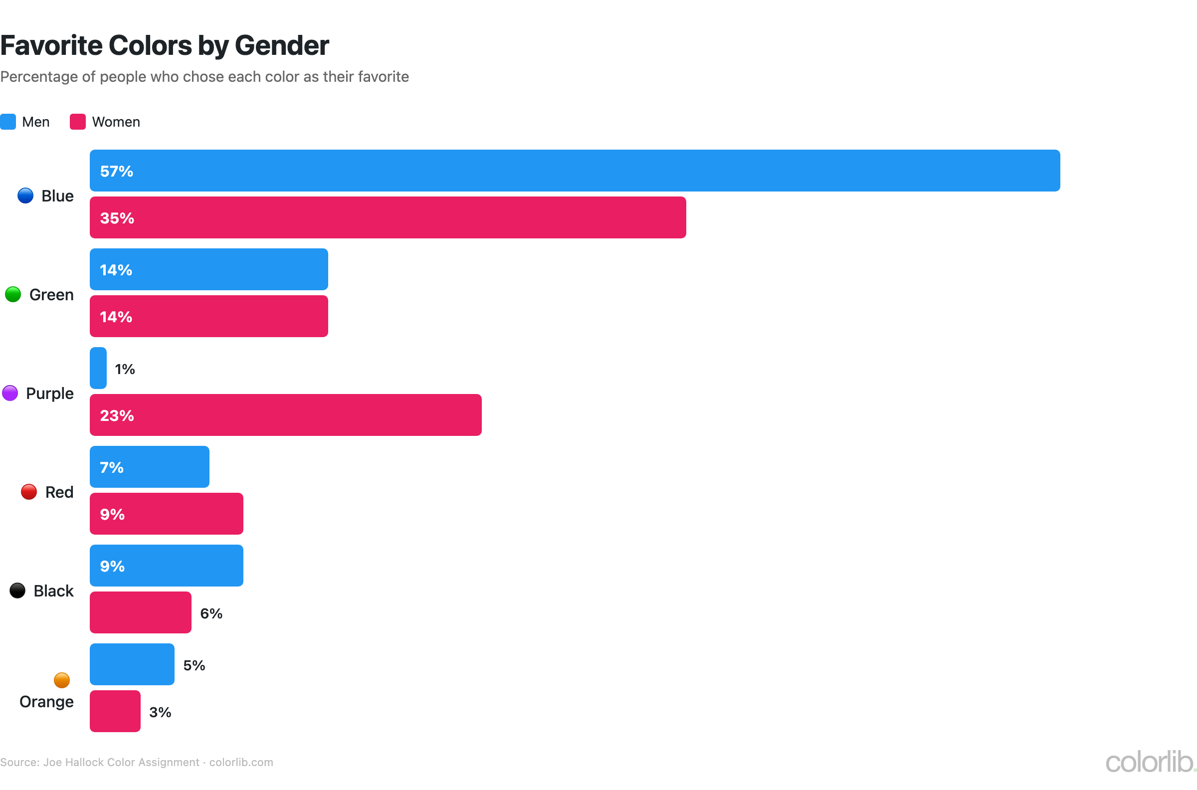
Favorite colors by gender
| Color | Men | Women |
|---|---|---|
| 🔵 Blue | 57% | 35% |
| 🟢 Green | 14% | 14% |
| 🟣 Purple | 1% | 23% |
| 🔴 Red | 7% | 9% |
| ⚫ Black | 9% | 6% |
| 🟠 Orange | 5% | 3% |
- Blue is the global favorite across all demographics — chosen by 57% of men and 35% of women
- Purple shows the biggest gender gap: 23% of women vs only 1% of men
- Orange is the most disliked color — cited as least favorite by 33% of women and 22% of men
- Children prefer bright, warm colors (red, yellow), shifting to cooler tones (blue, green) in adulthood
- Dark mode adoption has hit 82% among users who have the option (Android Authority)
Color in Branding & Marketing
The colors a brand chooses directly shape how customers perceive it.
Most popular brand colors
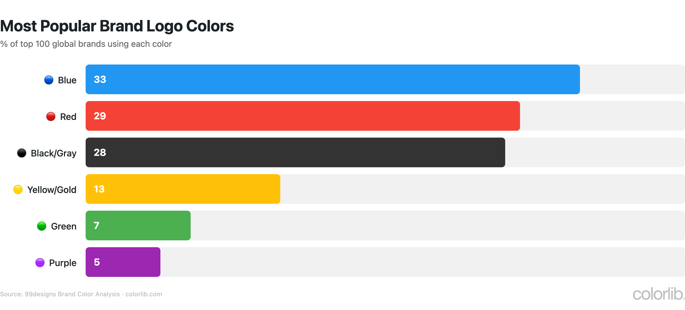
| Color | % of Top 100 Brands | Industry Association |
|---|---|---|
| 🔵 Blue | 33% | Finance, tech, healthcare |
| 🔴 Red | 29% | Food, retail, entertainment |
| ⚫ Black/Gray | 28% | Luxury, fashion, automotive |
| 🟡 Yellow/Gold | 13% | Energy, optimism, fast food |
| 🟢 Green | 7% | Health, organic, environment |
| 🟣 Purple | 5% | Luxury, creativity, wellness |
- 95% of the top 100 brands use only one or two colors in their logos (99designs)
- Consistent brand color usage across all platforms increases revenue by up to 23% (Forbes/Lucidpress)
- Color increases brand recognition by up to 80% (University of Loyola)
- 76% of marketers believe color is important for brand recognition (Venngage)
- Black logos are perceived as 50% more luxurious than logos in other colors (Reboot)
- 75%+ of major banks use blue in their branding (Canva)
- Fast food brands predominantly use red + yellow — red stimulates appetite, yellow grabs attention
Color and Conversion Rates
Small color changes can drive significant conversion differences. Here’s what the A/B test data shows.
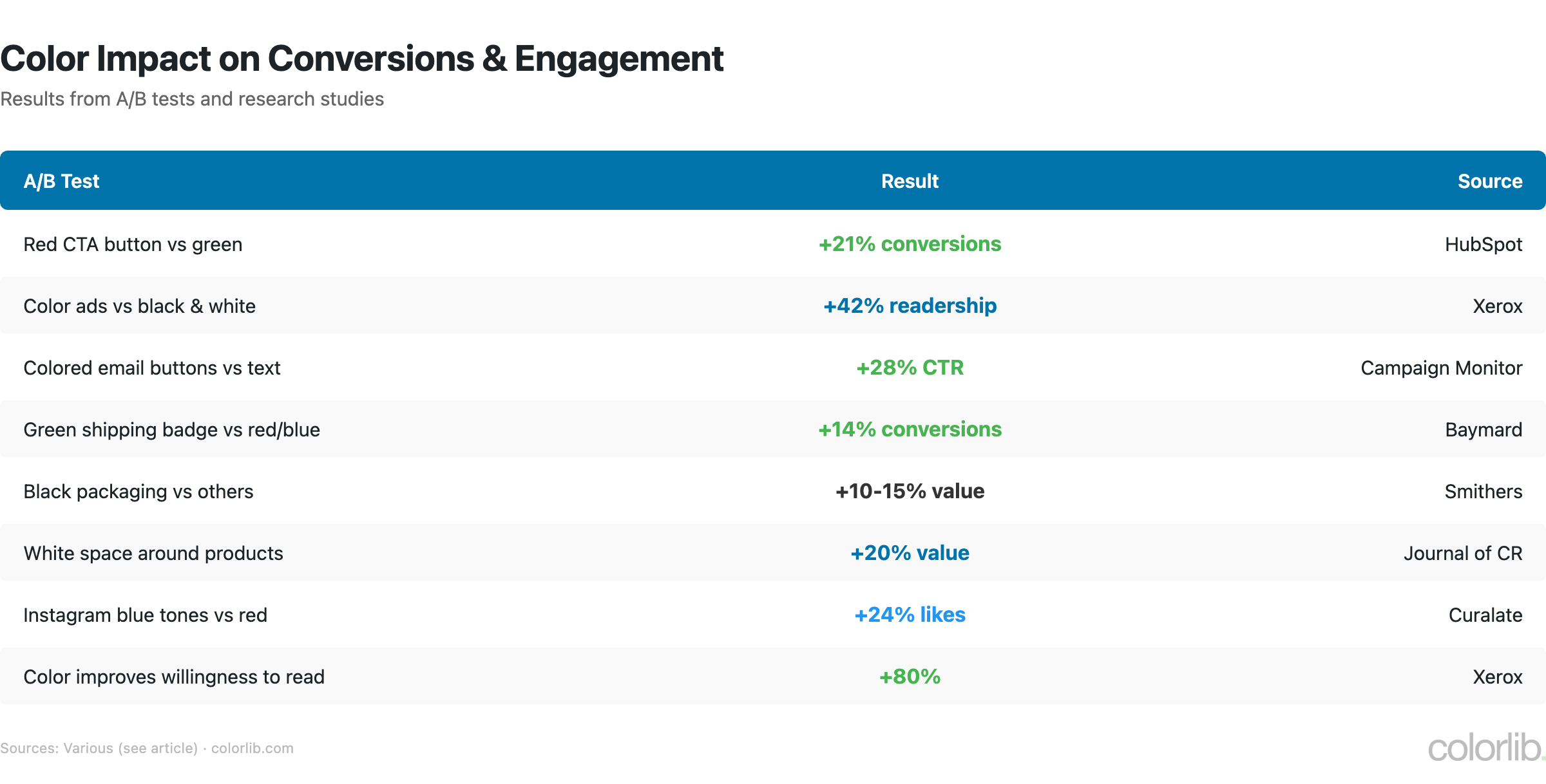
| Test | Result | Source |
|---|---|---|
| Red CTA button vs green | +21% conversions for red | HubSpot |
| Colored email buttons vs plain text links | +28% CTR | Campaign Monitor |
| Green “free shipping” badge vs red/blue | +14% conversions | Baymard Institute |
| Black packaging vs other colors | 10-15% higher perceived value | Smithers |
| White space around products | +20% perceived value | Journal of Consumer Research |
| Instagram posts with blue tones vs red | +24% more likes | Curalate |
Key insight: There’s no universally “best” color for CTAs. Performance depends on contrast with the page, brand context, and audience. The real lesson is that color choices should be tested, not assumed.
Color in Web Design
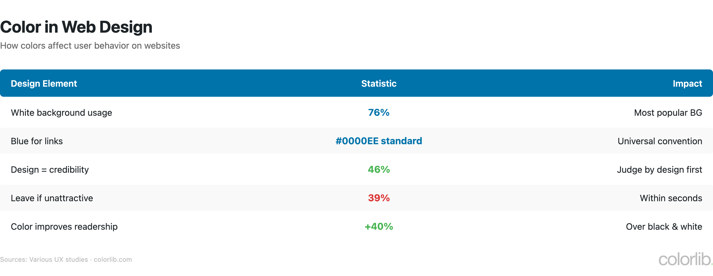
As a web design company, we see color decisions shape user experience every day. Here’s what the data says.
- White is the most common website background — used by 76% of websites (W3Techs)
- Google tested 41 shades of blue for link color to maximize clicks — the winning shade generated $200 million in additional ad revenue (The Guardian)
- 46% of consumers say website design (including color) is the #1 criterion for judging a company’s credibility (Stanford)
- 39% of people stop engaging with a website if the color layout is unattractive (Adobe)
- High-contrast color combinations improve readability by up to 40% (W3C WCAG)
- Dark mode adoption has reached 82% among users with the option, driven by OLED screens (Android Authority)
- Blue is the most preferred website color among consumers; yellow and orange are the least preferred
For more on how color is used across the web, see our Website Color Statistics deep dive.
Color Psychology Research
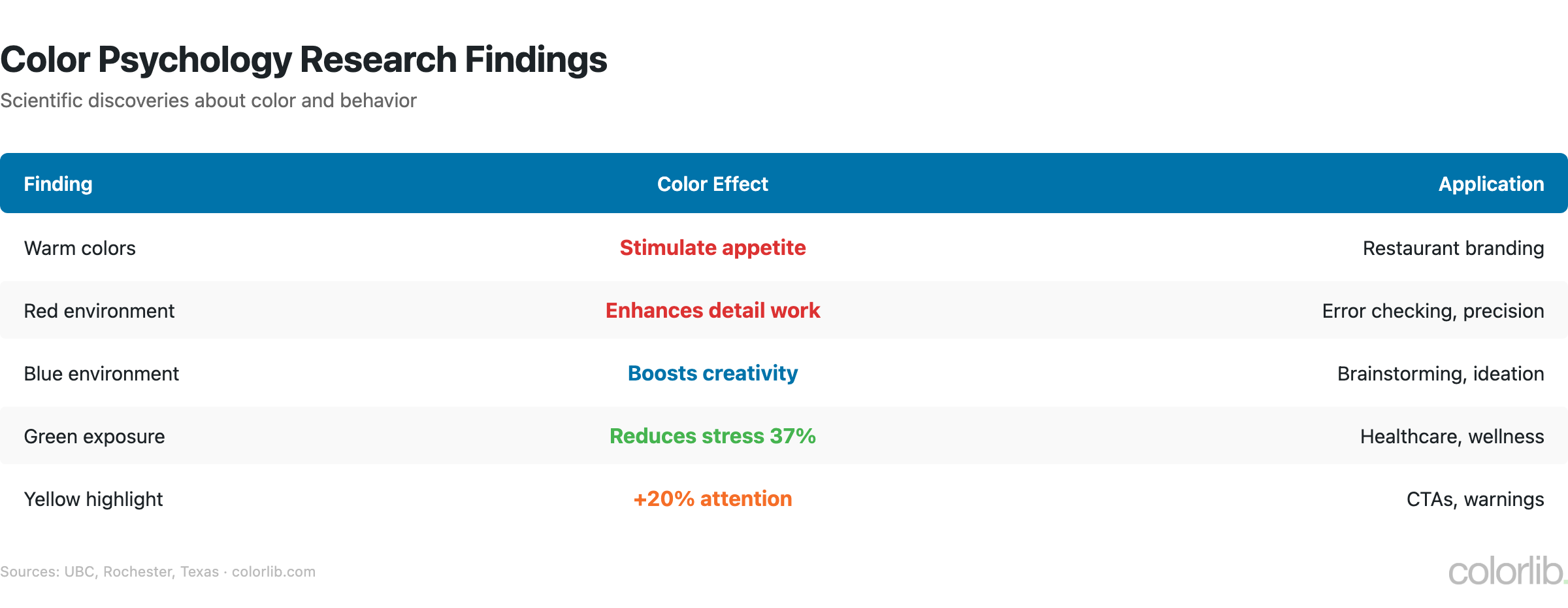
What does the science actually say about how color affects the brain?
| Finding | Detail | Source |
|---|---|---|
| Warm colors increase heart rate | Red, orange, yellow stimulate appetite and urgency | Verywell Mind |
| Red boosts detail-oriented tasks | Blue enhances creative performance | University of British Columbia / Science |
| Color improves memory | 55-78% better recall vs black & white | Farley & Grant, Journal of Applied Psychology |
| Green boosts creativity | Brief exposure to green before a creative task improves output | Personality & Social Psychology Bulletin |
| Pink reduces aggression | “Baker-Miller Pink” reduced violent incidents in prisons | Schauss, A.G. (1979) |
| Blue light improves alertness | Blue-lit environments enhance cognitive performance | Harvard Health |
| Isolation effect (Von Restorff) | Items standing out by color are more likely to be remembered | Laws of UX |
| Store return visits | People are 15% more likely to return to a blue-themed store vs orange | Journal of Business Research |
Color Accessibility Statistics
Color choices are also an accessibility issue. A significant portion of your audience may not see colors the way you intend.
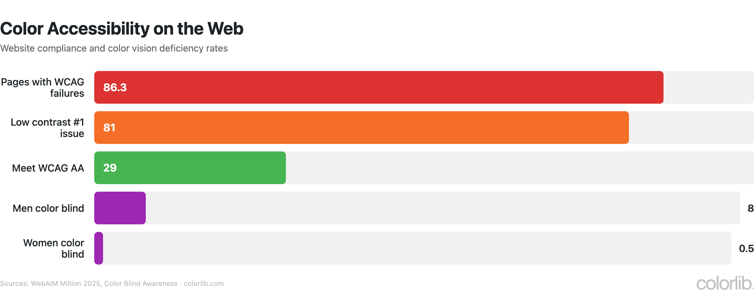
⚠ Accessibility alert: 86.3% of home pages have WCAG 2 color contrast failures. Low contrast text is the #1 accessibility issue on the web.
| Statistic | Number | Source |
|---|---|---|
| People with color vision deficiency worldwide | 300 million | Color Blind Awareness |
| Men with red-green color blindness | 8% (1 in 12) | National Eye Institute |
| Women with color blindness | 0.5% (1 in 200) | Color Blind Awareness |
| Most common type (deuteranomaly) | 5% of all males | AAO |
| Websites meeting WCAG AA color contrast | Only 29% | WebAIM Million 2025 |
| Home pages with detectable WCAG failures | 86.3% | WebAIM Million 2025 |
| Pages where low contrast text is the #1 issue | 81% | WebAIM Million 2025 |
Design takeaway: Never rely on color alone to convey information. Use labels, patterns, or icons alongside color. Test your palette with a color blindness simulator.
Color Meanings Across Cultures
The same color can mean opposite things in different cultures. If your audience is global, this matters.
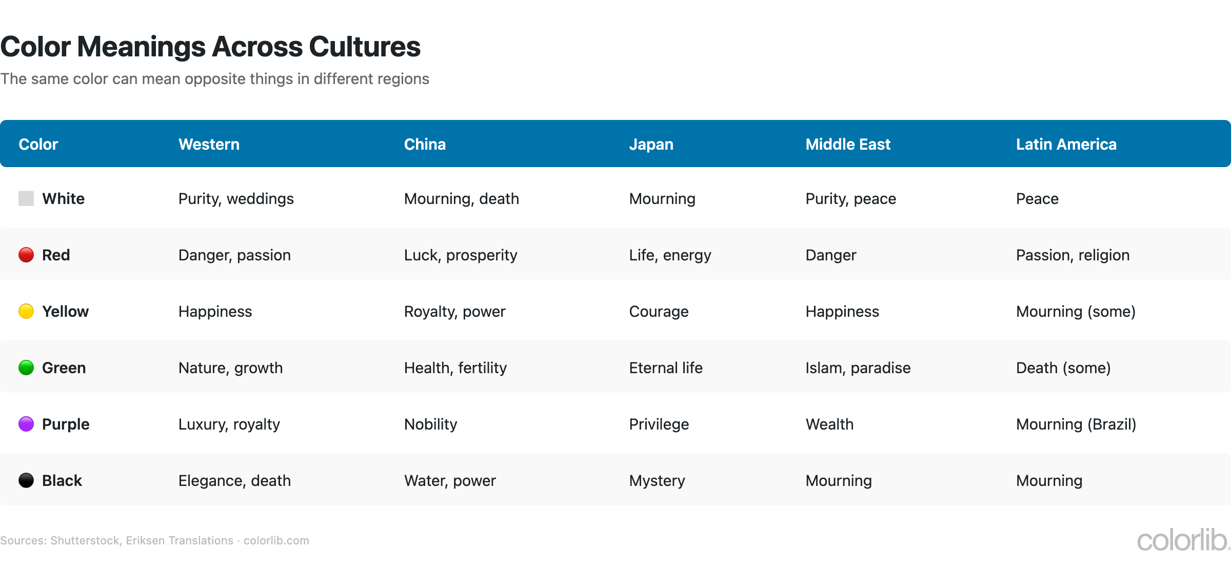
| Color | Western | China | Japan | Middle East | Latin America |
|---|---|---|---|---|---|
| White | Purity, weddings | Mourning, death | Mourning | Purity, peace | Peace |
| Red | Danger, passion | Luck, prosperity | Life, energy | Danger, caution | Passion, religion |
| Yellow | Happiness | Royalty, power | Courage | Happiness | Mourning (some) |
| Green | Nature, growth | Health, fertility | Eternal life | Islam, paradise | Death (some) |
| Purple | Luxury, royalty | Nobility | Privilege | Wealth | Mourning (Brazil) |
| Black | Elegance, death | Water, power | Mystery | Mourning, evil | Mourning |
- In South Korea, writing someone’s name in red ink implies they are dead — a strong cultural taboo
- Orange is the national color of the Netherlands, associated with the royal House of Orange
- Green appears prominently on flags of many Muslim-majority countries due to its religious significance in Islam
Color in E-Commerce
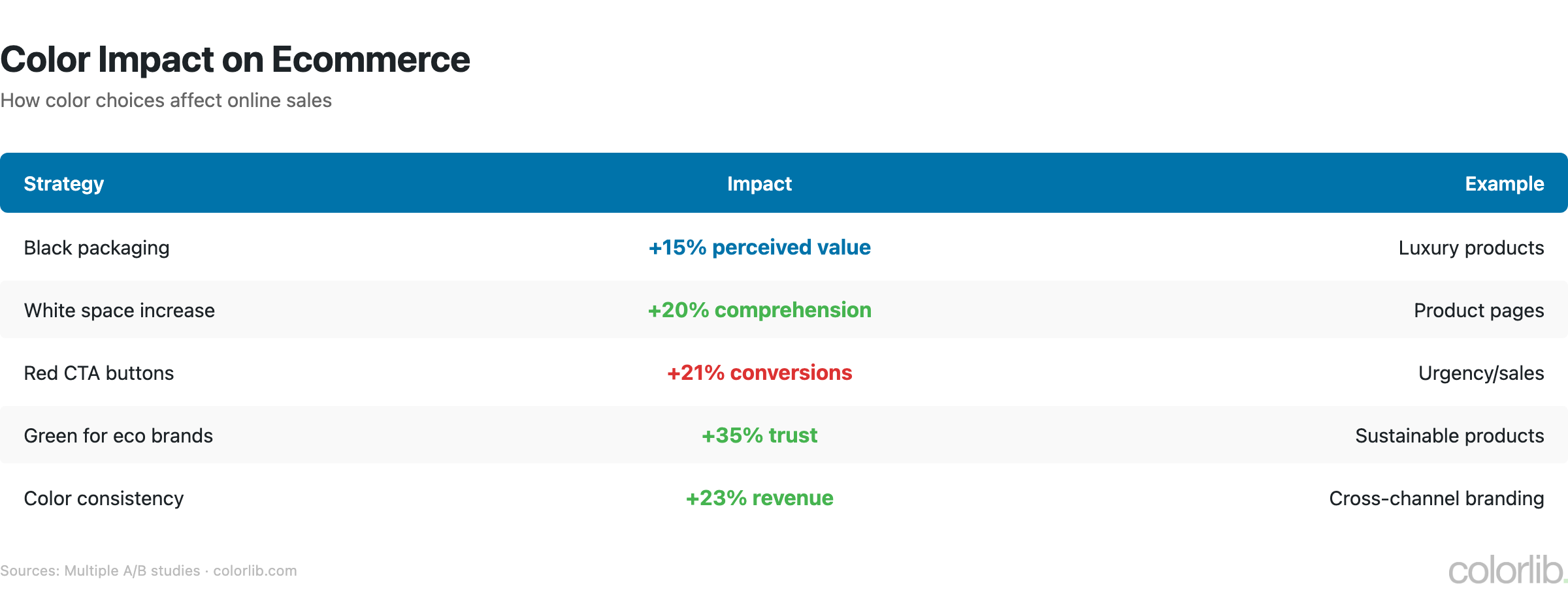
- 93% of consumers place the greatest importance on visual factors when buying; color is #1 over texture (6%) and sound (1%) (Seoul Intl Color Expo)
- Products in black packaging can command prices 10-15% higher than identical products in other colors (Smithers)
- White space around products increases perceived value by 20% (Journal of Consumer Research)
- Amazon’s orange “Add to Cart” button was chosen after extensive A/B testing for maximum urgency and visibility (GoodUI)
- Showing accurate product colors reduces returns by 39% (Shopify)
Color Trends for 2025-2026
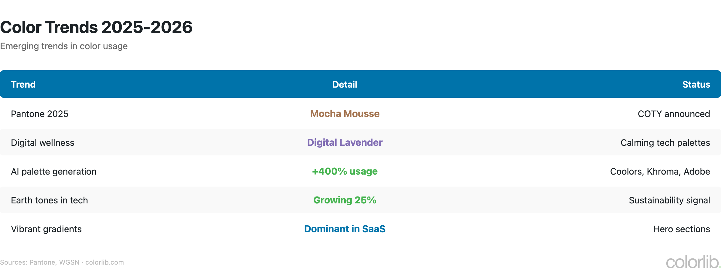
- Pantone Color of the Year 2025: Mocha Mousse (PANTONE 17-1230) — a warm brown evoking comfort and indulgence (Pantone)
- Digital Lavender continues as a top trending color in tech interfaces (WGSN)
- Earth tones and natural palettes dominate 2025-2026, driven by sustainability and biophilic design (Shutterstock)
- AI color palette tools (Coolors, Khroma) saw 400%+ growth in usage from 2024 to 2025 (Coolors)
- Dark mode-first design is now specified in 30% of new web design projects, up from 8% in 2021 (Awwwards)
Key Takeaways
- Color drives purchasing. 85% of consumers cite it as their primary reason to buy. If your website color palette doesn’t match your audience’s expectations, you’re leaving money on the table.
- Blue is the safest choice. It’s the global favorite, dominates finance and tech branding, and gets the most clicks on links. When in doubt, lean blue.
- Test, don’t assume. Red vs green CTA results vary by context. A/B test your specific audience.
- Accessibility is non-negotiable. 300 million people have color vision deficiency. 81% of websites fail basic contrast checks. Design for everyone.
- Culture changes everything. White means purity in the West and mourning in China. If you serve a global audience, audit your palette.
- Consistency pays. Using the same brand colors everywhere increases revenue by up to 23%.
Sources
- Colorcom — Why Color Matters
- Joe Hallock — Color Assignment
- 99designs — Brand Color Analysis
- Xerox — The Power of Color
- HubSpot — Button Color A/B Test
- WebAIM — The WebAIM Million 2025
- Colour Blind Awareness
- Stanford Persuasive Technology Lab
- Shutterstock — Color Symbolism Around the World
- University of British Columbia — Blue or Red? (Science, 2009)
- Pantone — Color of the Year 2025
- Reboot — Logo Color & Brand Perception
Frequently Asked Questions
What is the most popular color in the world?
Blue is consistently the most popular color worldwide, preferred by 57% of men and 35% of women across cultures and age groups.
Does color really affect purchasing decisions?
Yes. Research shows 85% of consumers cite color as the primary reason they buy a product, and 62-90% of snap judgments are based on color alone. People form product opinions in just 90 seconds.
What color increases sales the most?
There’s no single “best” color. Red CTA buttons outperformed green by 21% in HubSpot’s A/B test, but results vary by context. The key is contrast with your page design and testing with your specific audience.
What percentage of people are color blind?
Approximately 8% of men (1 in 12) and 0.5% of women (1 in 200) have some form of color vision deficiency. That’s roughly 300 million people worldwide.
What is the best color for a website background?
White is used by 76% of websites and provides the best readability. However, dark mode (dark gray/black backgrounds) has hit 82% adoption among users who have the option, making it essential to support both.
What color makes people trust a brand?
Blue is most strongly associated with trust and security. Over 75% of major banks and financial institutions use blue in their branding. It’s also the most popular color for tech companies.
For more insights into web design and color, explore our Website Color Statistics, Best Colors for Websites, and Most Colorful WordPress Themes.
Related Posts


Comments (0)