22 Best Squarespace Photography Website Examples (In 2026)
Welcome to our comprehensive list of the most outstanding Squarespace photography website examples.
We included a range of web designs, from simple and minimal to more creative, so there’s something for everyone.
And the best part is that you can easily create a similar one with Squarespace.
However, you can also choose an alternative WordPress photography theme or start with a free photography website builder.
But first, let’s enjoy these stunning photography sites together.
Greatest Squarespace Photography Examples
1. Peter McKinnon
Built with: Squarespace
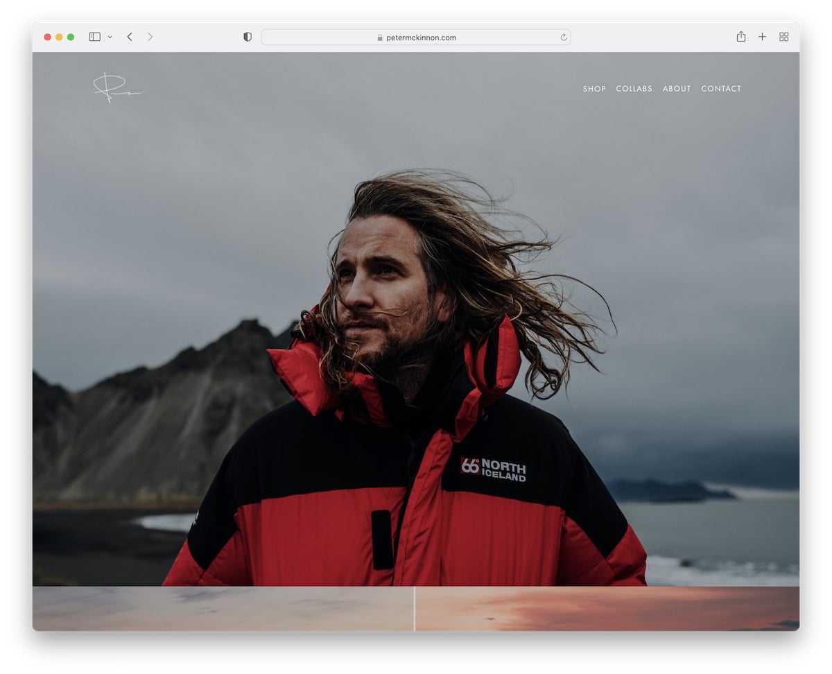
Peter McKinnon has a beautiful full-screen photography website with large images, some of which use a parallax effect.
The header (with a drop-down menu) and footer are clean and basic, with the necessary links and social icons.
What stands out: Create a bold, strong first impression with a full-screen responsive web design.
2. Olga Miljko
Built with: Squarespace
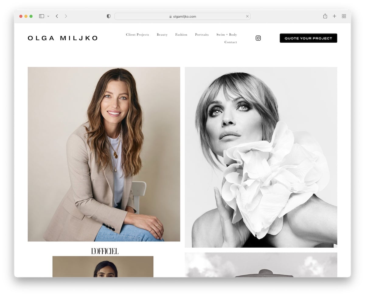
Olga Miljko runs a minimalist website, so all her photo works and projects stand out more. The header vanishes once you start scrolling but reappears when you return to the top.
Moreover, the long, two-column grid home page loads images as users scroll, making the experience more engaging.
It’s also practical to use a call-to-action (CTA) button in the header so anyone interested can access the quote form more quickly. (Also, the contact page contains Google Maps, showcasing Olga’s business location.)
What stands out: Creating a disappearing/reappearing header creates a pleasant scrolling atmosphere and improves user experience.
3. Shanley Cox
Built with: Squarespace
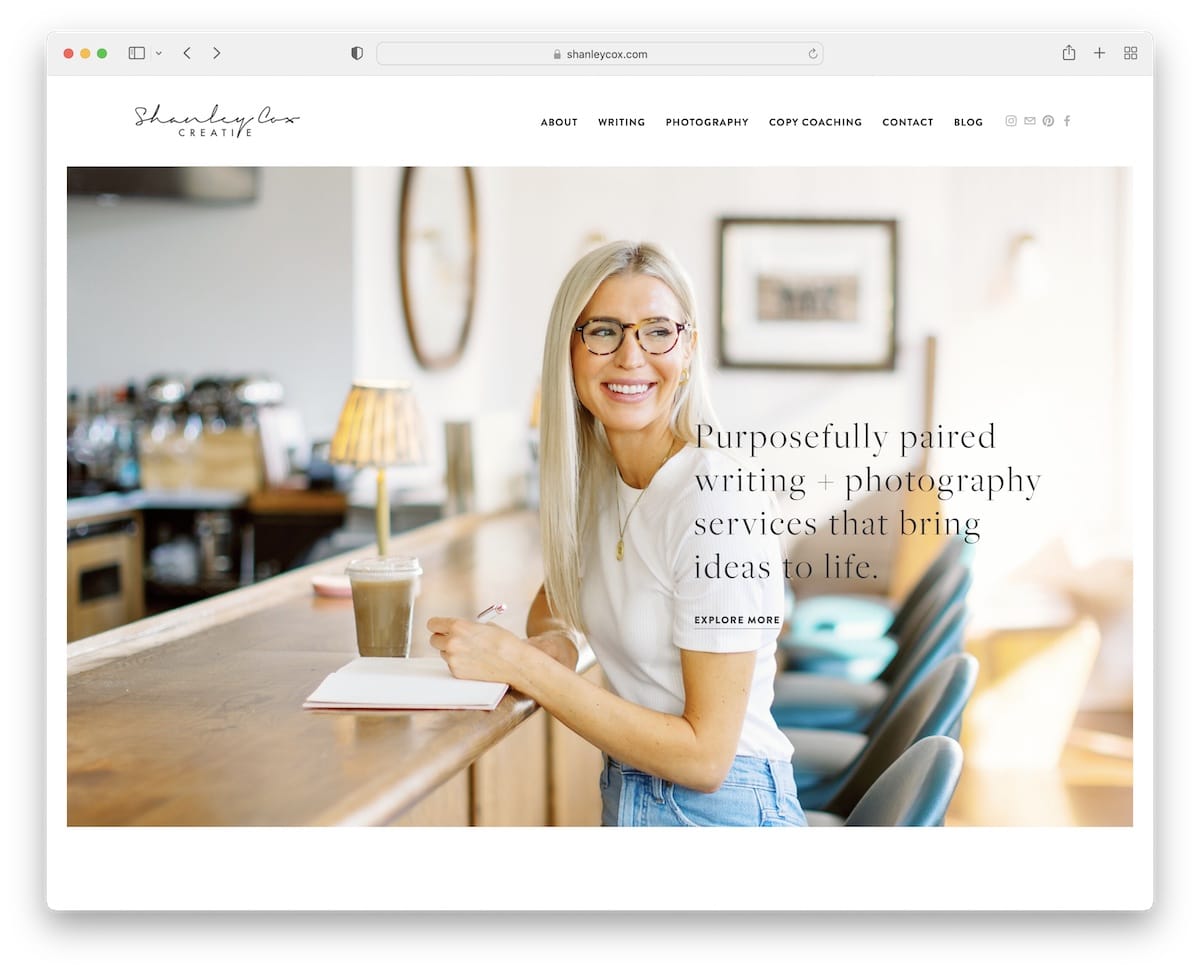
You get that personal feel immediately after you land on Shanley Cox’s Squarespace photography site. It has a clean, creative look, with ample white space to improve readability.
Shanley also features a testimonials slider on the home page for social proof. You’ll see an Instagram feed before the footer; posts open in a new tab.
What stands out: Build trust in your outstanding services by integrating client testimonials.
Peek at these simple websites if you don’t want to complicate things with web design, yet still achieve a superb online presence.
4. Weddings By Lisa Nicole
Built with: Squarespace
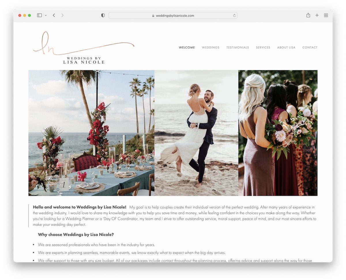
Weddings By Lisa Nicole’s page has an elegant vibe. It includes image sliders that showcase some of the best work through compelling visuals.
This Squarespace photography example has only a header and no footer (it only says, “powered by Squarespace”).
Moreover, you’ll find a dedicated testimonials page with in-depth reviews.
What stands out: If you don’t feel like using a footer, don’t. However, we recommend doing this only if you have a basic website with few pages.
You will also enjoy these curated wedding photography websites.
5. Mike Kelley
Built with: Squarespace
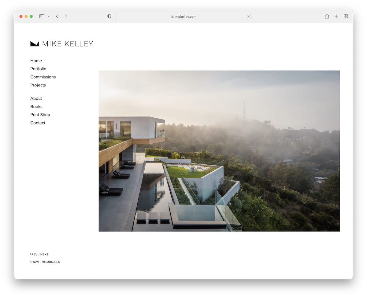
Mike Kelley’s standout feature is the sticky sidebar header/menu. It’s always present, so you don’t need to scroll to the top to access navigation links.
Moreover, the base and sidebar header share the same white background, giving this photography site a neater look. Plus, there’s no footer for an even tidier appearance.
What stands out: Moving the header section to the (left) sidebar can easily differentiate your online presence from the rest.
6. Scott Snyder
Built with: Squarespace
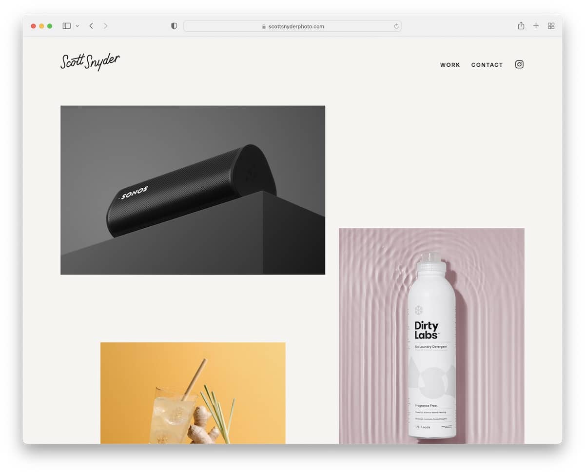
Scott Snyder triggers curiosity with a unique grid layout. Some thumbnails are animated, and some are static. Clicking on a thumbnail opens a complete project page with more written and visual information.
This Squarespace website example maintains the same background color throughout the entire page, including the header and footer. Also, you don’t need to scroll back to the top to access menu links because the header reappears when you start scrolling back.
What stands out: Mix static and animated thumbnails to increase engagement.
7. Liller Photo
Built with: Squarespace
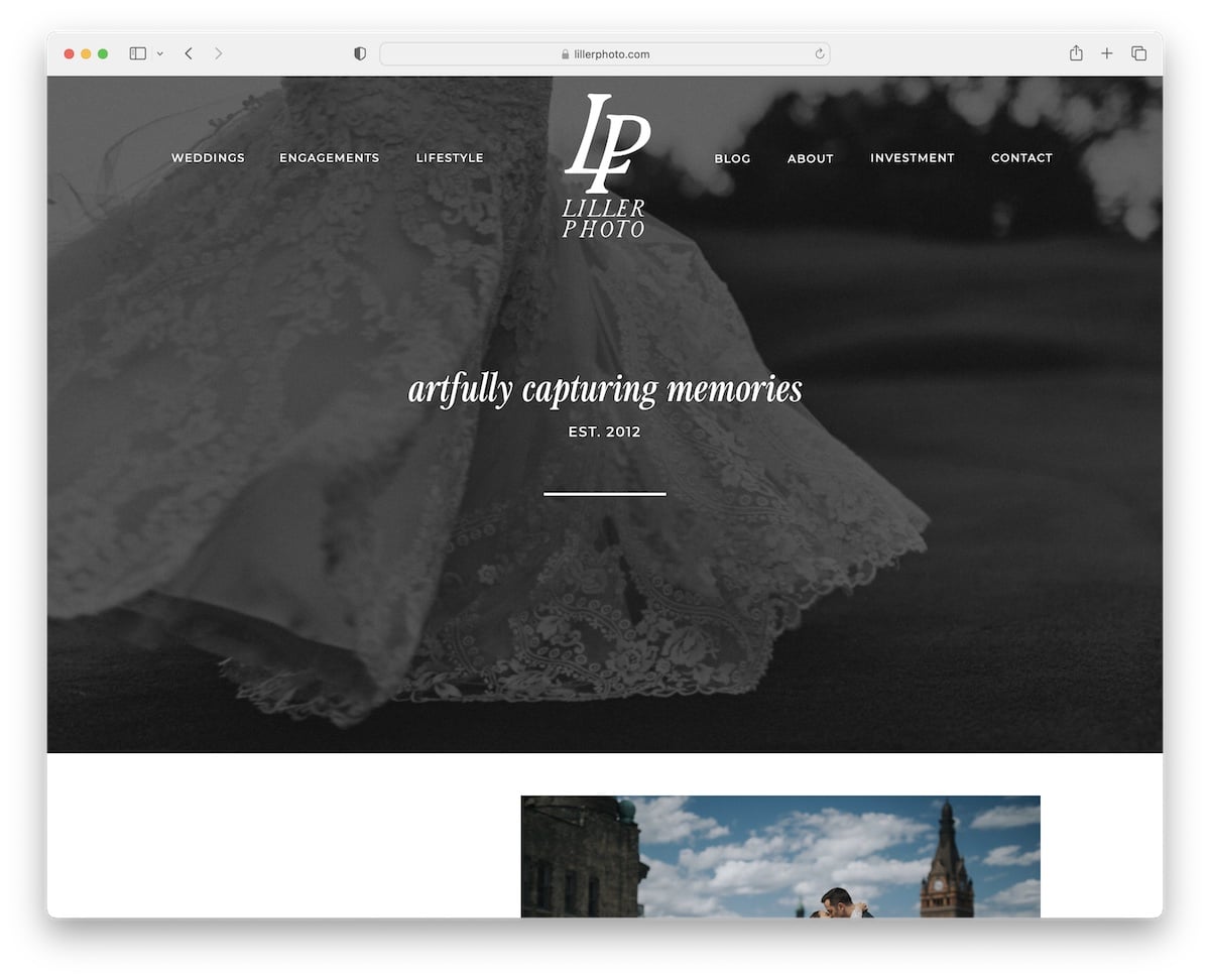
Liller Photo’s site has a distinct layout with compelling sections that engage you with the content.
The header transitions from complete transparency to “fogginess” when it stays at the top of the screen, creating a strong visual effect. But the footer has a black background, so the additional information and links pop more.
There’s also a back-to-top button (you almost don’t need it) and a testimonial slider with images of brides and grooms.
What stands out: A back-to-top button is especially handy if you don’t use a floating header – it’ll lift your site’s UX.
8. Jessica Chou
Built with: Squarespace
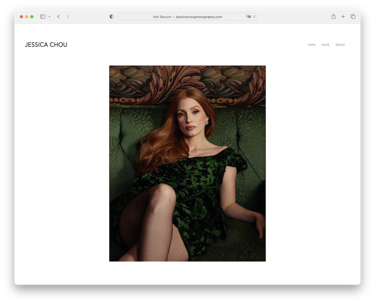
Jessica Chou is an excellent example of a (extreme) minimalist Squarespace photography site. While there is very little text content and the navigation bar is very plain, Jessica added a lot of images to do all the talking.
The home page is long, but loading content on scroll keeps you engaged and helps you forget about time. The only downside is that there’s no footer and back-to-top button, so scrolling back can be annoying.
What stands out: You’re a photographer, so let your photographs do the talking (you don’t necessarily need a ton of text, and Jessica Chou’s website is a terrific illustration of that).
9. Alex Tran
Built with: Squarespace
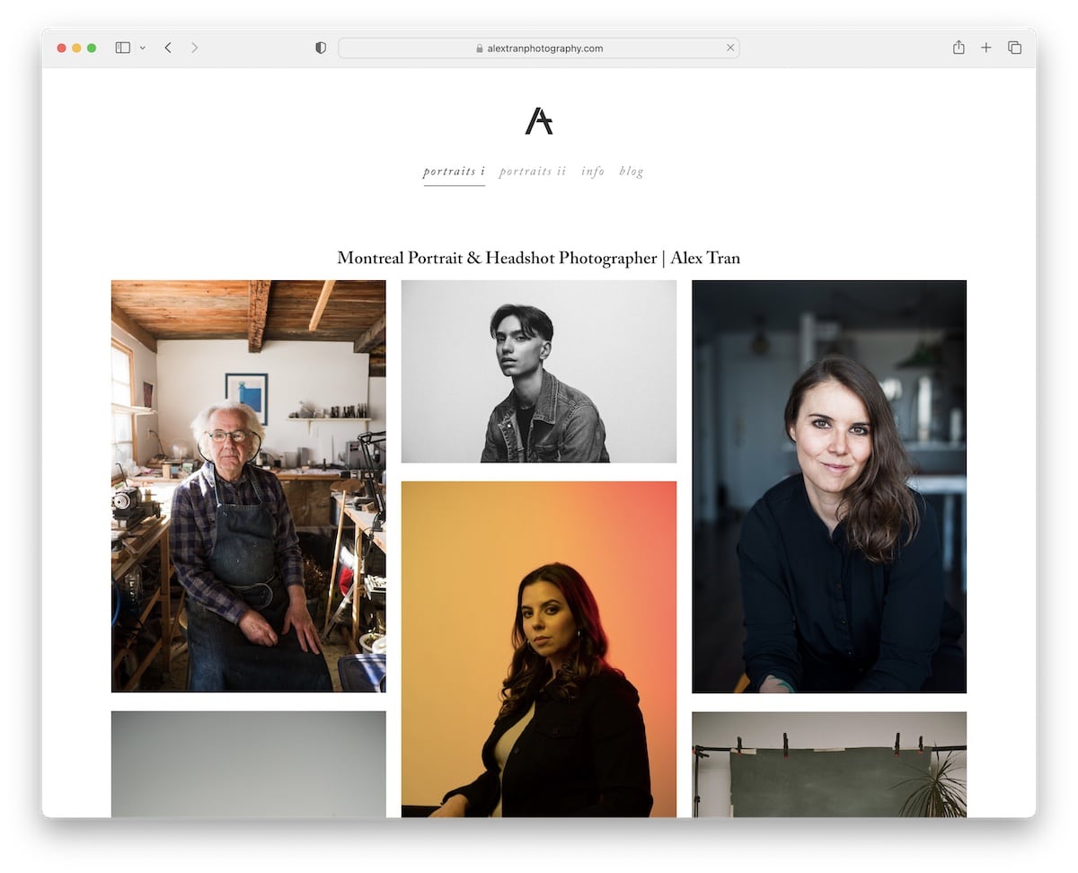
One of the more interesting aspects of Alex Tran’s site is that he displays a bio in the footer on some pages.
In addition to the portfolio pages and an info/about me page, Alex Tran also has a blog where he discusses various photo-first topics.
What stands out: One way to improve your Squarespace photography website is to start a blog. (Just update it regularly.)
10. Mathieu Stern
Built with: Squarespace
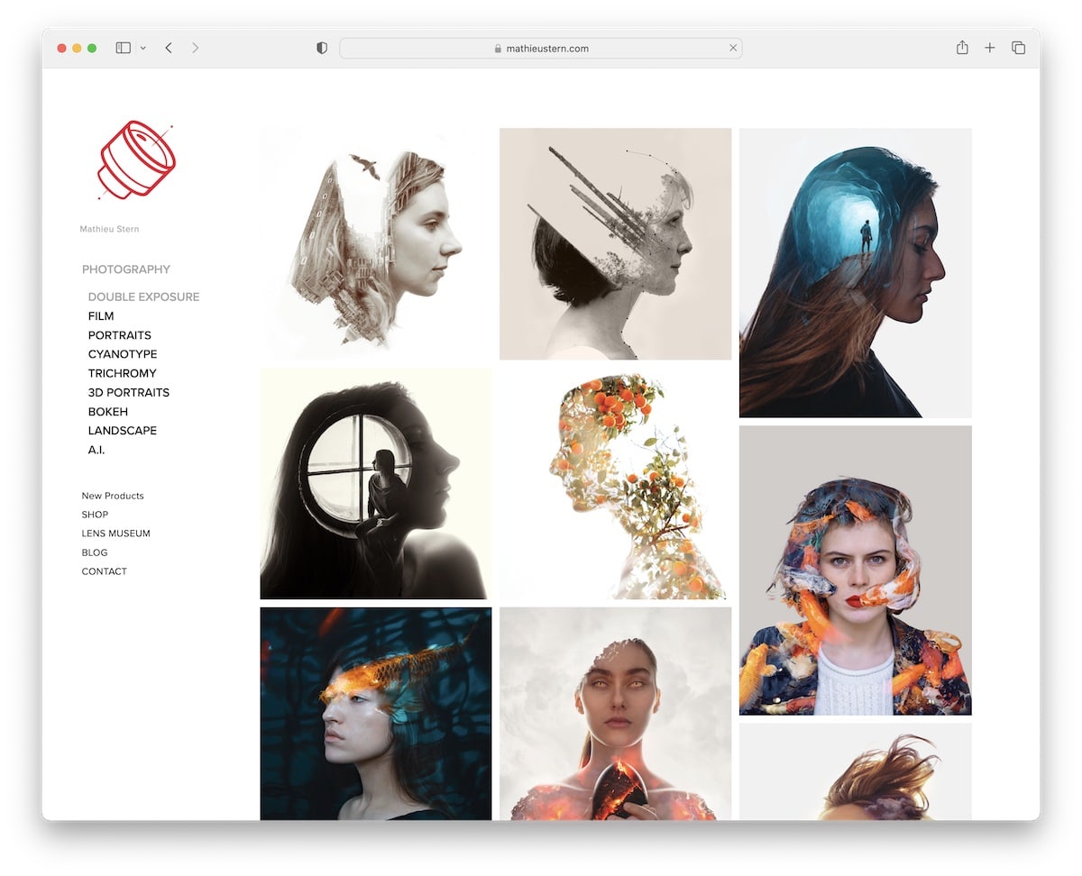
Mathieu Stern is another excellent example of a clean website with floating sidebar navigation and a drop-down menu. This allows you to browse the site quickly, with links on the left and content on the right.
Mathieu’s page also lacks a footer, further simplifying his online presence.
When on any of the portfolio categories, and after you click the thumbnail, a larger image opens on a new page, but you can then slide through the rest without needing to return. (You can also click “show thumbnails” in the bottom left corner to see the whole album.)
What stands out: Convert your online portfolio to a slideshow so viewers can view your work at higher resolution.
11. Will Bremridge
Built with: Squarespace
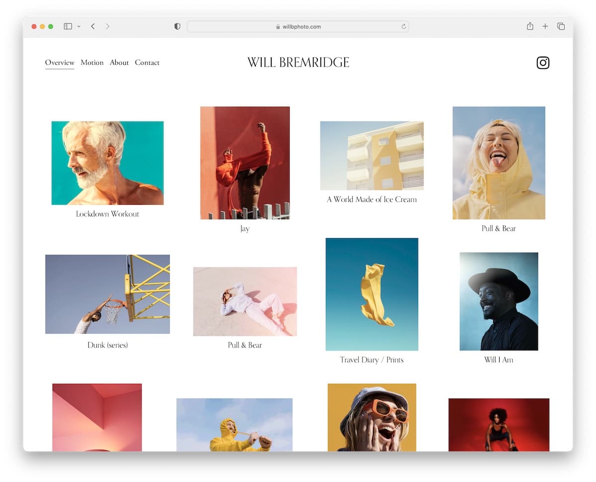
Using animations and GIFs on your photography website can add more life and make the experience more engaging. And Will Bremridge definitely knows that.
His online portfolio keeps it simple, focusing the extra shine on the projects.
The header has only the essential links and an Instagram icon, and the footer contact details – that’s it. The base is either extensive visual content or a short biography.
What stands out: Simplifying your online presence means removing distractions so the focus is on your work.
12. Brandon Woelfel
Built with: Squarespace
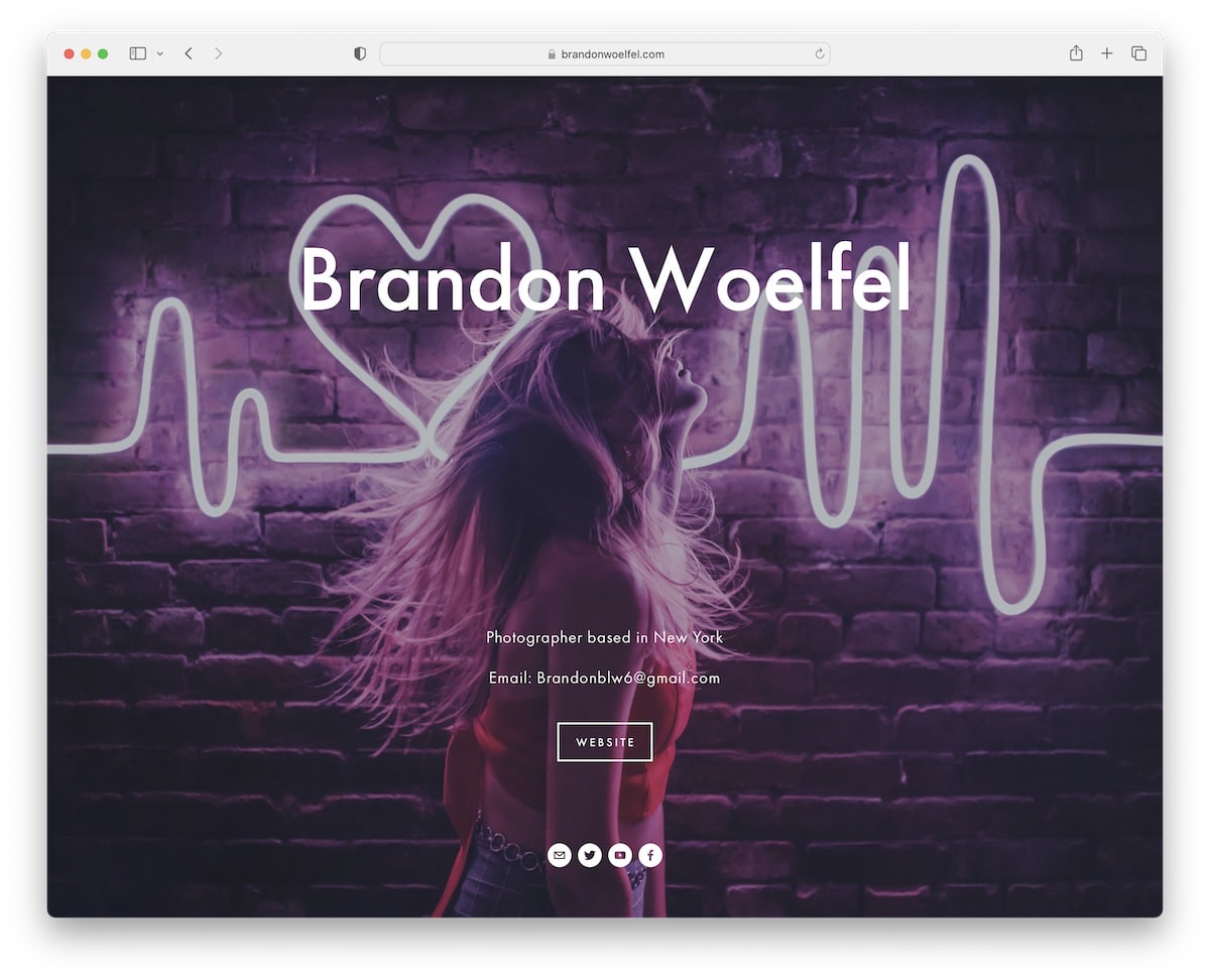
We couldn’t find many Squarespace photography examples with a separate home page, but Brandon Woelfel’s is worth examining (and three more below).
The front page has brief info, an “enter the website” button and email and social icons at the bottom. Then there’s the internal part with a massive header, a tiny footer and a lightbox gallery/portfolio function.
What stands out: A lightbox is great for viewing larger content without leaving the current page.
13. Levon Biss
Built with: Squarespace
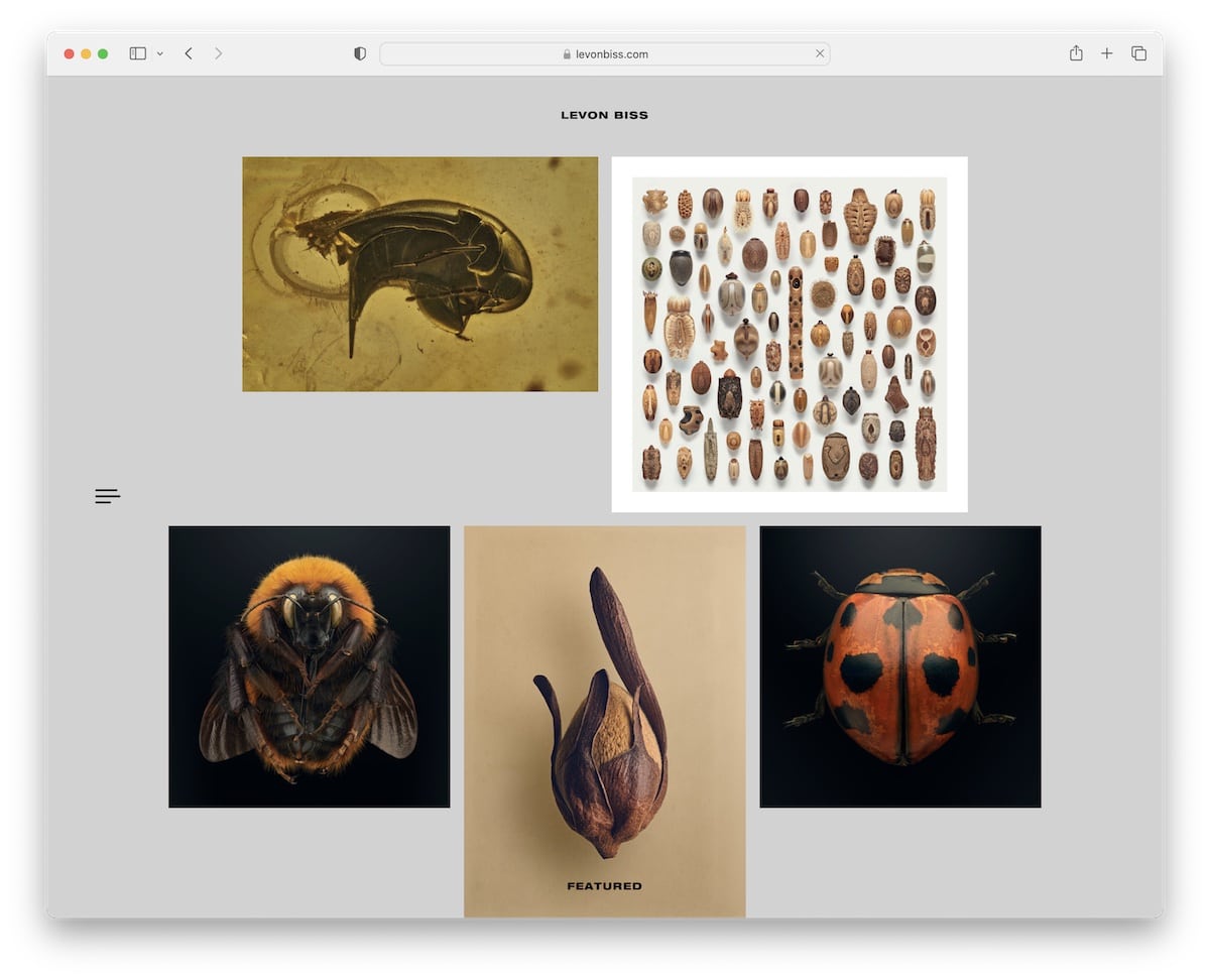
We’ve seen many minimalist sites, but Levon Biss is taking it to the next level. The “header,” the “footer” and the sidebar hamburger menu icon are all on a transparent background and stick to the screen.
The latter reveals full-screen navigation to visit other pages, while viewing the portfolio also has a slider function with a thumbnail icon in the bottom right corner to see all the work from the specific category on a single page.
What stands out: Create a much cleaner navigation bar with a simple hamburger menu icon.
14. Jonathan Gregson
Built with: Squarespace
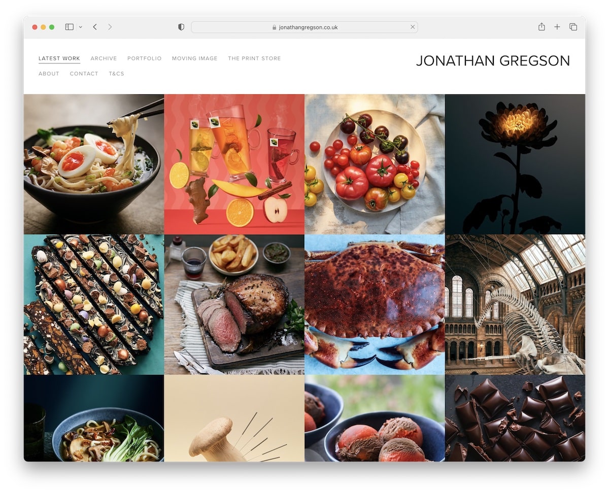
Jonathan Gregson’s portfolio grid layout is multi-column without spacing but with a hover effect that displays the project title.
This Squarespace photography example doesn’t have a footer, but the floating header always has the menu links at your disposal, making navigation through the page much more comfortable.
What stands out: Create a clean grid of images but use the hover effect to show more info, with a link to the project page.
15. Deanie Chen
Built with: Squarespace
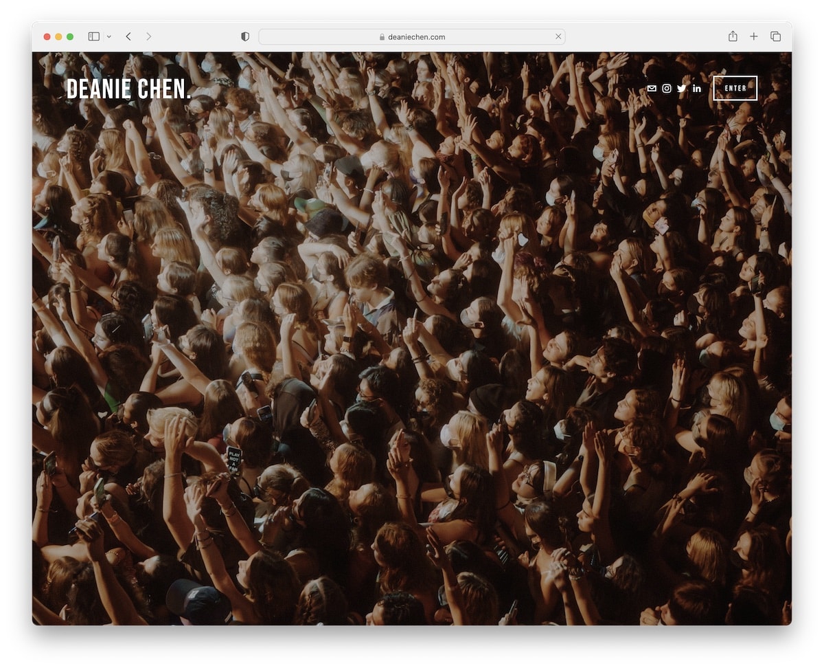
Deanie Chen’s full-screen slider would have easily grabbed attention if Brandon had only used an image background on the home page.
After you enter this photography page, you get hit with a LONG masonry grid of images with the practical lightbox.
The navigation includes links to various categories, so everyone can find what they’re interested in more quickly. On the other hand, the footer only has social media icons.
What stands out: Capture your visitors’ interest with a full-screen image slider.
16. Danilo & Sharon
Built with: Squarespace
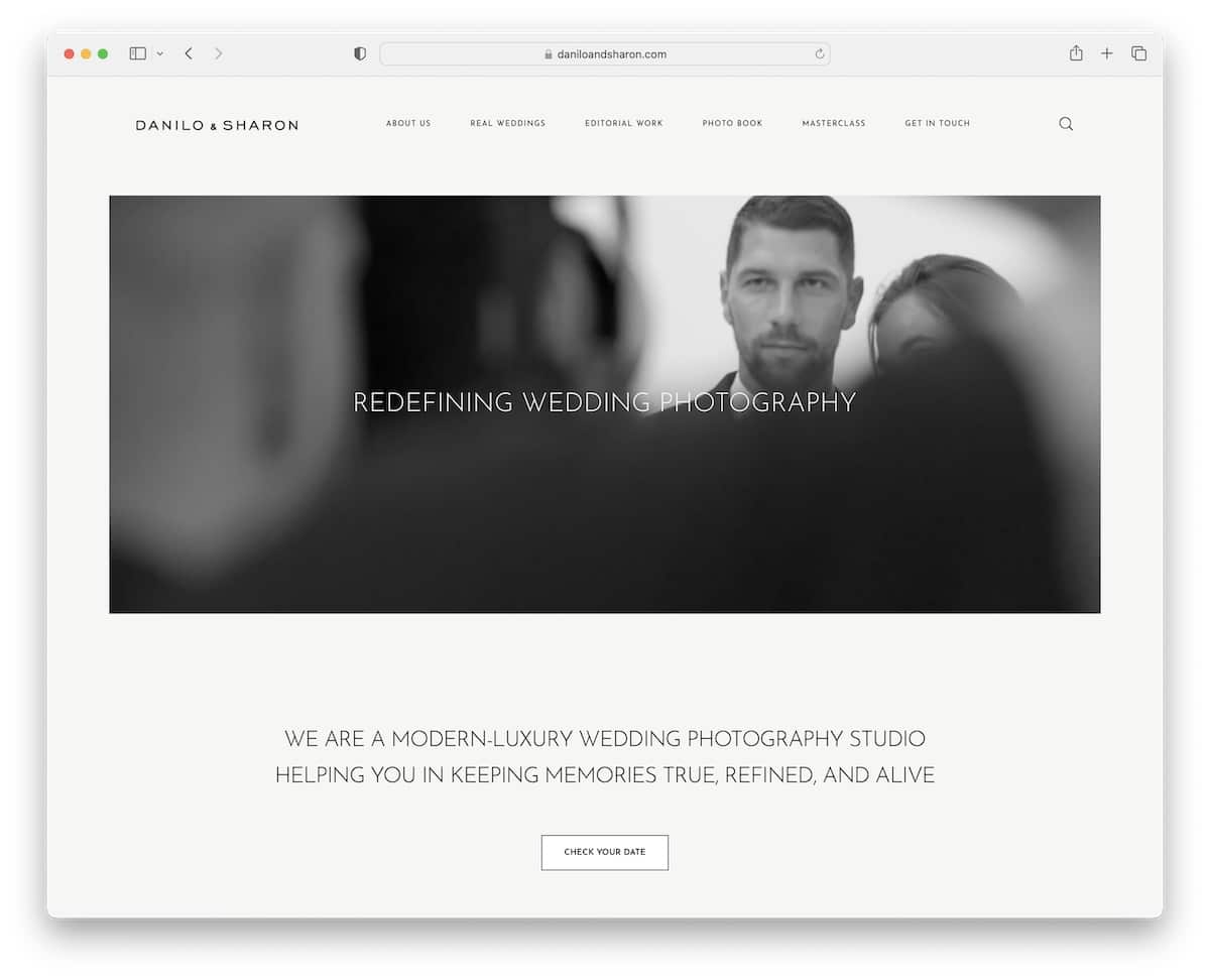
Danilo & Sharon’s website specializes in the hero video, making this online photography portfolio very attractive.
While the structure is minimalist, the page still has catchy elements to keep you focused (like loading content on a scroll).
Plus, you’ll find an Instagram feed and a “book an appointment” button at the bottom, before the simple footer.
What stands out: An IG feed can be a great addition to your Squarespace photography website for additional content (and to grow your profile).
17. Sean McCoy
Built with: Squarespace
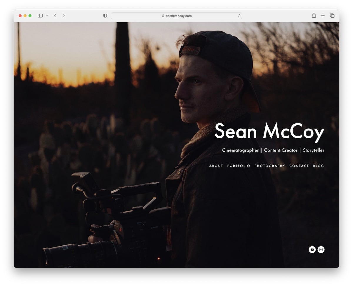
Sean McCoy creates a more personal vibe with a full-screen image of himself on the home page, where you can find all the links and social media.
What’s notable about this page is the top-bar notification, which Sean uses to promote bookings. Furthermore, portfolio thumbnails include a Pinterest button, making sharing them easy.
What stands out: Use a top bar if you have something important to share or announce.
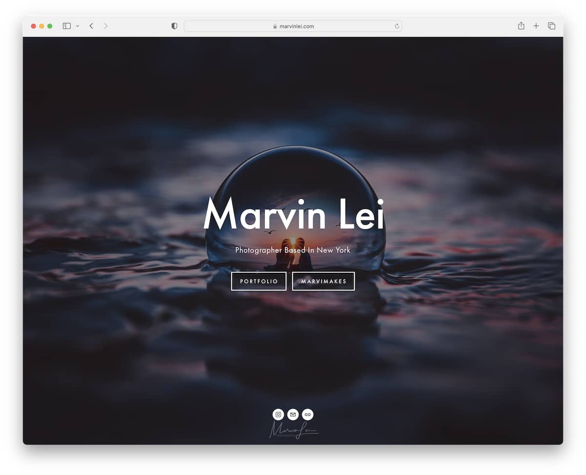
18. Marvin Lei
Built with: Squarespace
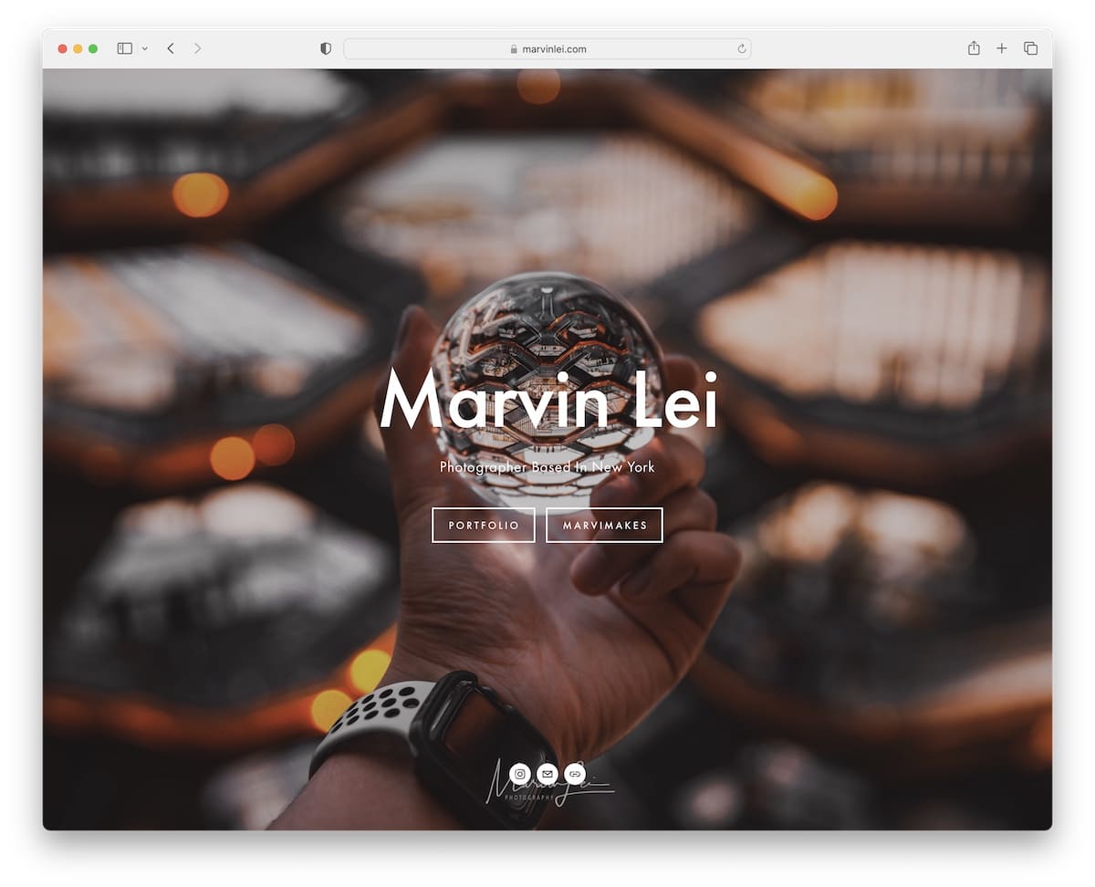
Like Deanie, Marvin Lei also uses a full-screen background slideshow to create a strong impression on visitors.
You can then use the navbar to browse the different photography styles Marvin’s into, check gear, etc. Additionally, using a lightbox helps you flip through the higher-resolution images distraction-free.
What stands out: Create a simple menu to help visitors navigate your website quickly and easily.
19. UNRTD
Built with: Squarespace
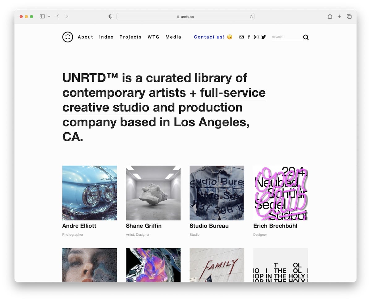
UNRTD opens its website with a brief explanation of what it’s about. A subscription pop-up will also open early to collect leads for “inbox promotions.”
Another fun element that few people use on their sites is emojis, and UNRTD has an upside-down smiling one in the header to grab your attention.
What stands out: Build your email list through a newsletter subscription pop-up and grow your business through email marketing.
20. The Hearnes
Built with: Squarespace
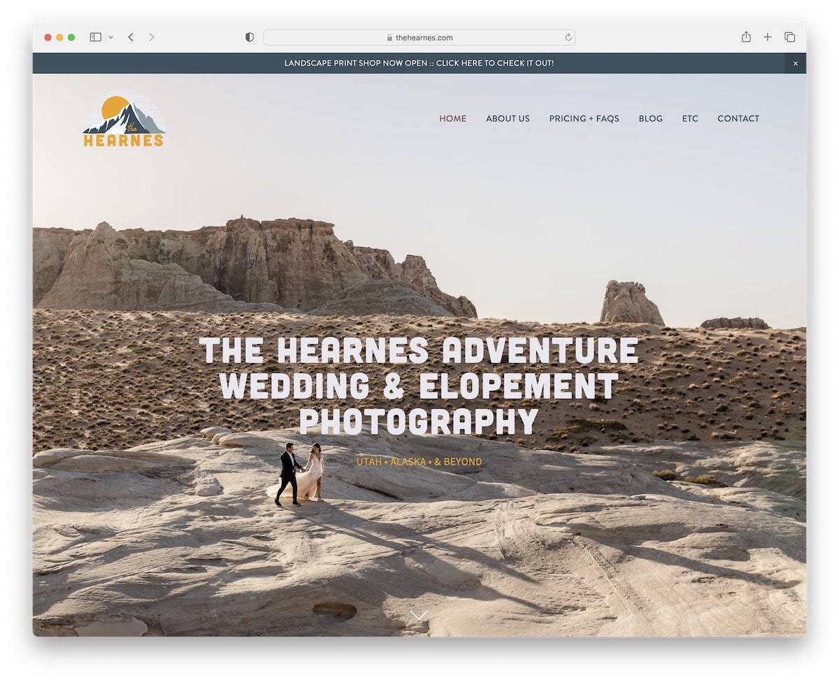
The Hearnes is a superb Squarespace photography example with a full-screen hero image with a parallax effect. It has a top-bar notification and a 100% transparent header, so the background doesn’t get in the way.
The page has a clean foundation, naturally blending text and images for optimal content exposure.
Atypical uses a footer search bar instead of a header search bar. Moreover, the special “packages” page is highly transparent about pricing and FAQs, so potential clients know precisely what they get.
What stands out: Be as transparent as possible when promoting your services (and don’t forget to add pricing).
21. Tayler Smith
Built with: Squarespace
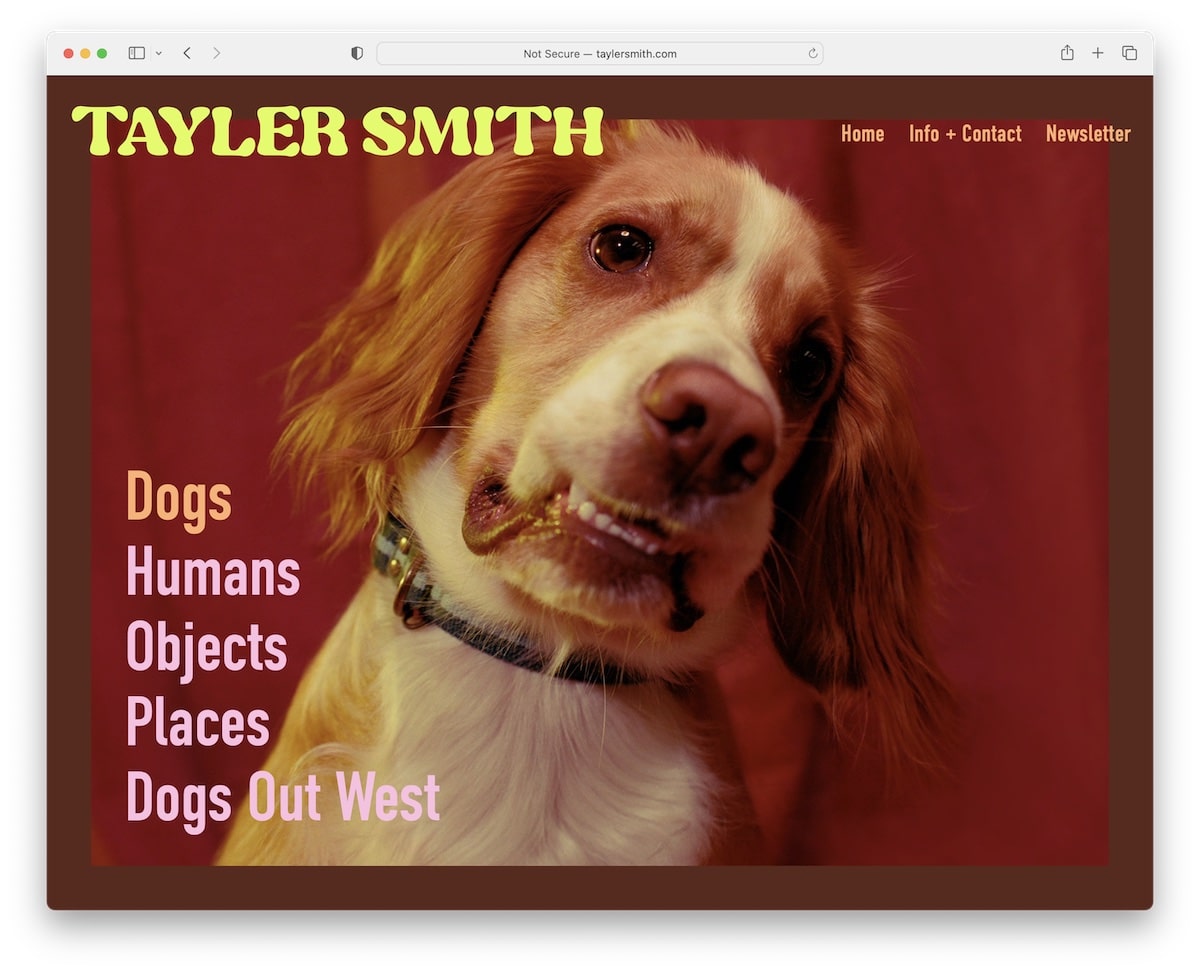
Tayler Smith has one of the more engaging hover effects we’ve seen when collecting the best Squarespace photography examples. Once you hover over the text, the entire image changes, which will definitely make you go, “Oh, that’s brilliant.”
One more thing: When you view the portfolio of, let’s say, humans, instead of getting to a footer after scrolling all the way to the bottom, the home page reappears. And that’s something we haven’t seen before.
What stands out: Although your website may appear simple at first glance, it can still include unique elements that make it more interactive. See Tayler Smith’s!
22. Andrew Kearns
Built with: Squarespace
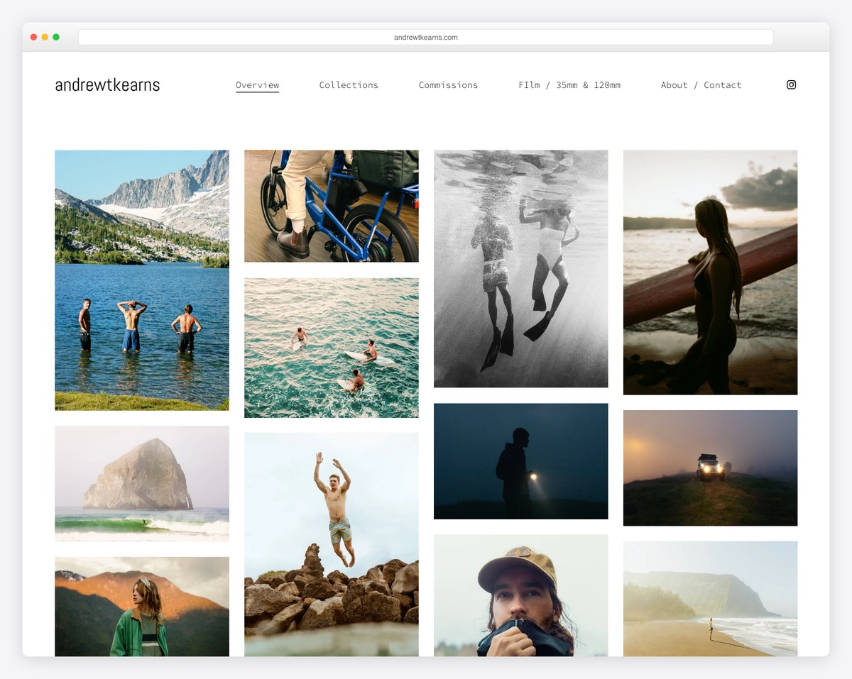
Andrew Kearns’ adventure photography portfolio is a visual rush — a masonry grid of surfing, mountain, underwater, and portrait shots fills the screen immediately. With work spanning coastal California, alpine peaks, and desert roads, his imagery captures the spirit of outdoor exploration.
The Squarespace layout keeps navigation minimal — Overview, Collections, Commissions, Film / 35mm & 120mm, and About / Contact — letting the photography command all attention. The clean white background and edge-to-edge grid make this a textbook example of how to showcase adventure photography.
What stands out: A masonry photo grid without text overlays is the purest way to present adventure photography — it lets the work sell itself to potential clients and agencies.
Related Posts


Comments (0)