
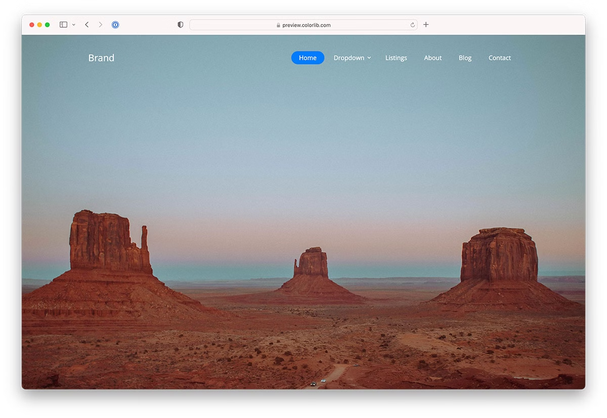
24 Website Menu Design Examples & Free Templates 2026
Good website menu design starts with two decisions: where the menu lives, and what it does on a phone.
A horizontal top bar suits most business sites. A sidebar works for blogs and portfolios. A full-screen overlay puts the navigation center stage, and a mega menu handles stores and publishers with deep categories. Each Colorlib template below is labelled with its pattern, the kind of site it suits and how it behaves on mobile.
The list now has 24 entries: 20 Colorlib Website Menu templates, three menu patterns from our 2026 snippets (a mobile drawer, a full-screen overlay and a collapsible icon rail) and a uiCookies pack of eight menu designs. The Colorlib menus are free downloads with live demos, built as dependency-free HTML, CSS and vanilla JavaScript, so they work on their own or inside Bootstrap 4, 5 and 6 projects.
Top picks come first, one per pattern, followed by bonus variations of the same layouts. For more, browse our website menu category.
Our Top Website Menu Design Picks
uiCookies Menu Templates (8 templates)
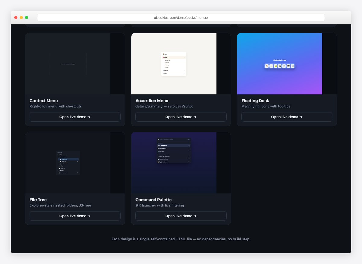
Eight navigation patterns that go past the standard navbar: an account dropdown, an admin sidebar, a mobile bottom bar, a right-click context menu, an accordion menu, a floating dock, a file tree and a command palette.
Several of them work with no JavaScript at all, and the rest use a few lines of vanilla JS rather than a plugin. Free download from our own uiCookies library, each design in its own self-contained file.
Website Menu V03
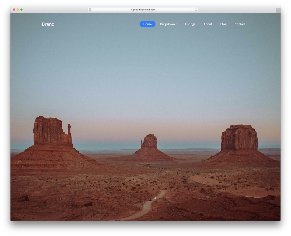
Website Menu V03 follows the transparent top bar pattern: a clean, minimal navigation that sits on top of your hero section instead of pushing it down.
Pattern: transparent top bar with a multi-level drop-down. Suits: landing pages and portfolios that open with a large photo or video. On mobile: a hamburger icon opens a panel that slides in from the right.
This solution works great if you add an image or even a video as a background above the fold.
It will not distract from the content, yet still offer great navigability.
Moreover, Website Menu V03 is a static menu template with a cool blue button that appears when clicked. It also includes a multi-level drop-down menu that works well for users with many pages and categories. It’s responsive, too.
Website Menu V05
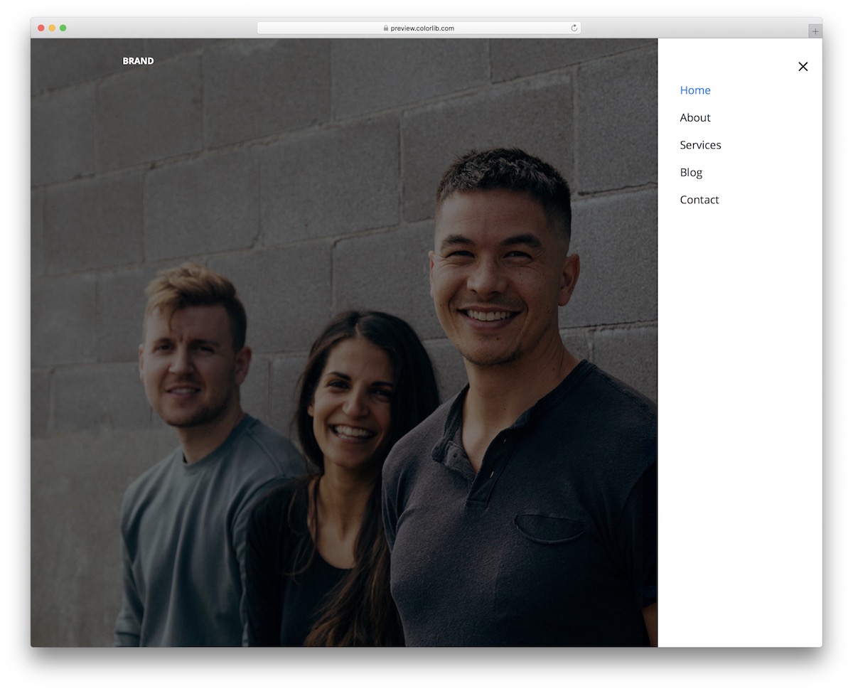
Hiding the whole navigation behind one icon is the most minimal menu design there is, and Website Menu V05 does exactly that.
Pattern: icon-triggered vertical sidebar, opening from the right. Suits: minimal portfolios and sites with a handful of pages. On mobile: the same as on desktop, so nothing needs reworking.
While there’s not much at first glance, the menu icon reveals a sidebar hamburger menu on click. Website Menu V05 maintains the same style on both small and large screens, adapting perfectly to mobile devices.
We also ensured that the code structure is both user- and beginner-friendly.
HURRAY.
Everyone can now easily embed this free menu template into their web app.
But first, peek at the live demo preview and go from there.
Website Menu V07
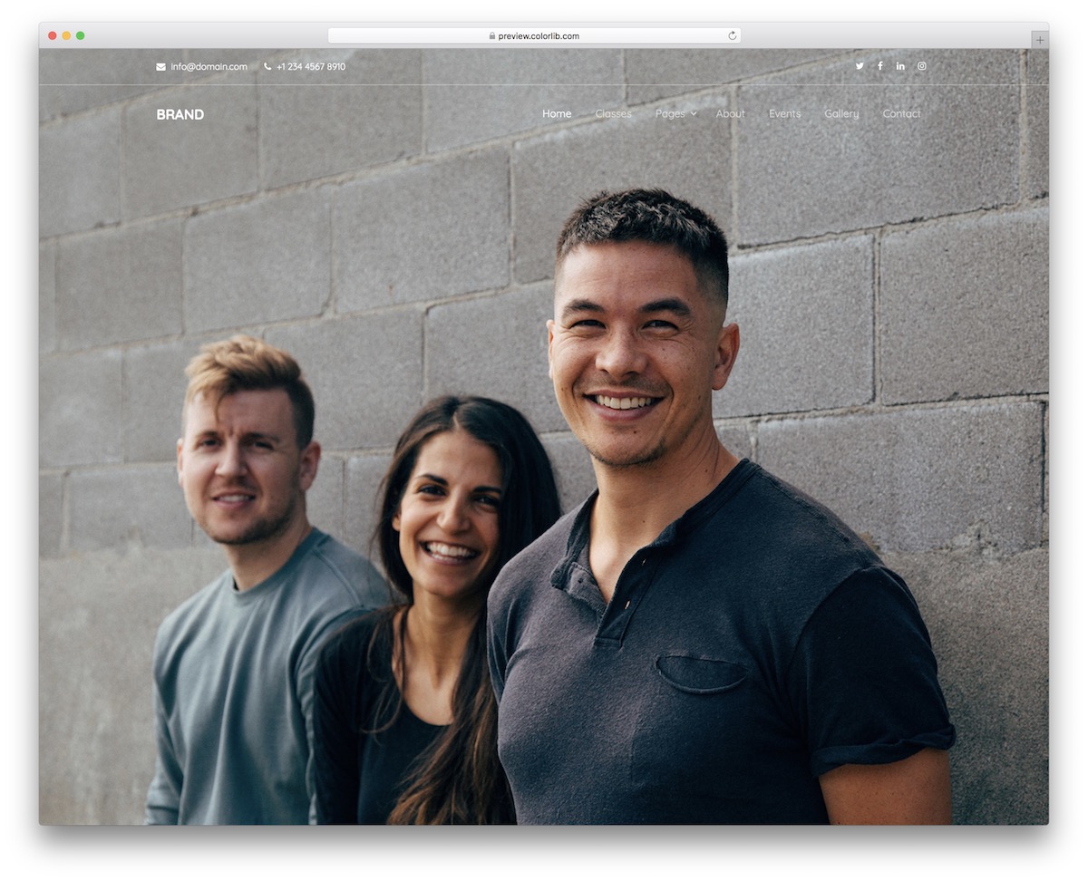
Website Menu V07 is a transparent header with a slim top bar above the main navigation, so the image behind it does the talking instead of a solid block of color.
Pattern: transparent navbar plus top bar, with a multi-level drop-down. Suits: hotels, travel and agency sites with a big hero photo. On mobile: the links move into a panel that slides in from the right.
Your cup of tea?
That’s GREAT.
Website Menu V07 is ready to employ it out-of-the-box or even style it further.
There’s also a top bar for additional contact info and social media icons along with the main navbar.
Website Menu V12
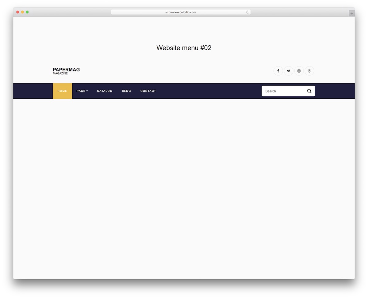
Website Menu V12 is a free navigation template that mixes simplicity with boldness. The top section only features logo and social icons and a light/transparent background.
Pattern: stacked header, a branding row above a solid navigation bar, with a drop-down and search. Suits: magazines, blogs and content-heavy sites. On mobile: the links collapse into one toggle menu.
On the other hand, the navigation bar is a solid color with a highlighted section of a different color—very dynamic, if you will.
Two additional notable features of Website Menu V12 are the integrated drop-down menu and search form. If the user does not directly find what they are looking for in the menu, they can always type it in the search.
Website Menu V12 also performs flawlessly on mobile devices, but the design changes slightly. It is now more user-friendly.
Website Menu V14
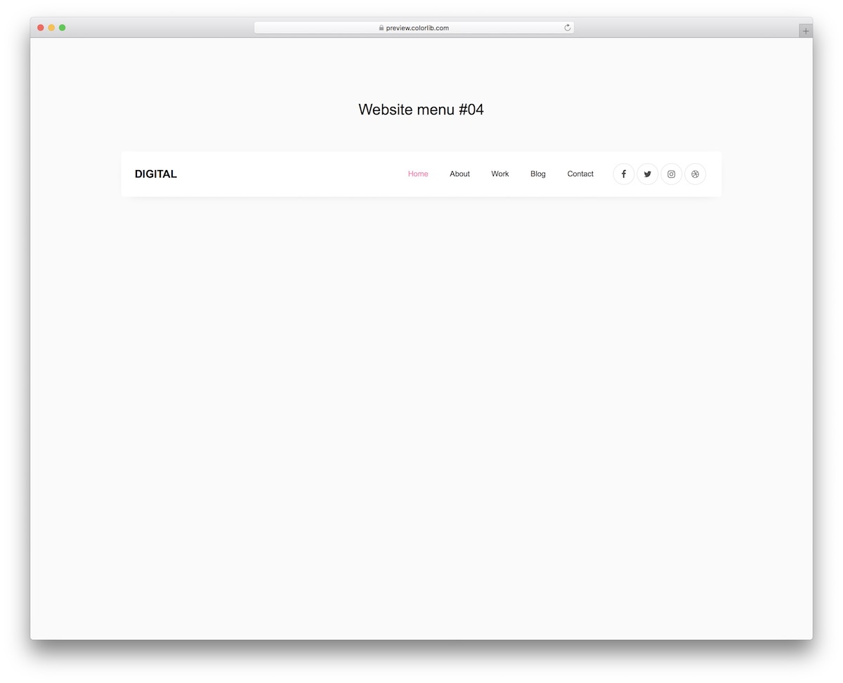
Website Menu V14 is somewhat basic with a boxy design that makes it stand out. There’s always a way to stick to simplicity but with a TOUCH of creativity.
Pattern: boxed, right-aligned navbar with social icons. Suits: small business and personal sites. On mobile: turns dark, and the links collapse behind a hamburger toggle.
Keep in mind that once you start investigating Website Menu V14 further, you will notice the design changes on mobile or vice versa: it will be light on desktop and dark on mobile.
That’s not it.
While the logo and social icons are still mobile, the navigation appears like a hamburger menu. The pink-ish detail makes it even more appealing.
Still, if you’d like to make any edits, go ahead.
Website Menu V18
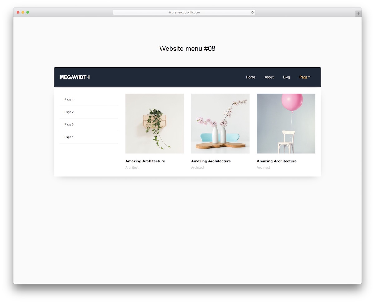
Website Menu V18 is the mega menu pattern: a plain bar until you open the item with the chevron, and then a large panel that mixes links and images drops down.
Pattern: mega menu. Suits: online stores, publishers and any site with deep categories. On mobile: the menu collapses behind a toggle and keeps the text links only.
Website Menu V18 is perfect for anyone interested in adding more material to the menu than just text. This free website menu template also supports image content.
Note: as images and text may distract the user too much on mobile, we only added the text part of Website Menu V18.
But just like any other template in this collection, you can first test it on different devices by visiting the item’s live preview.
Website Menu V19
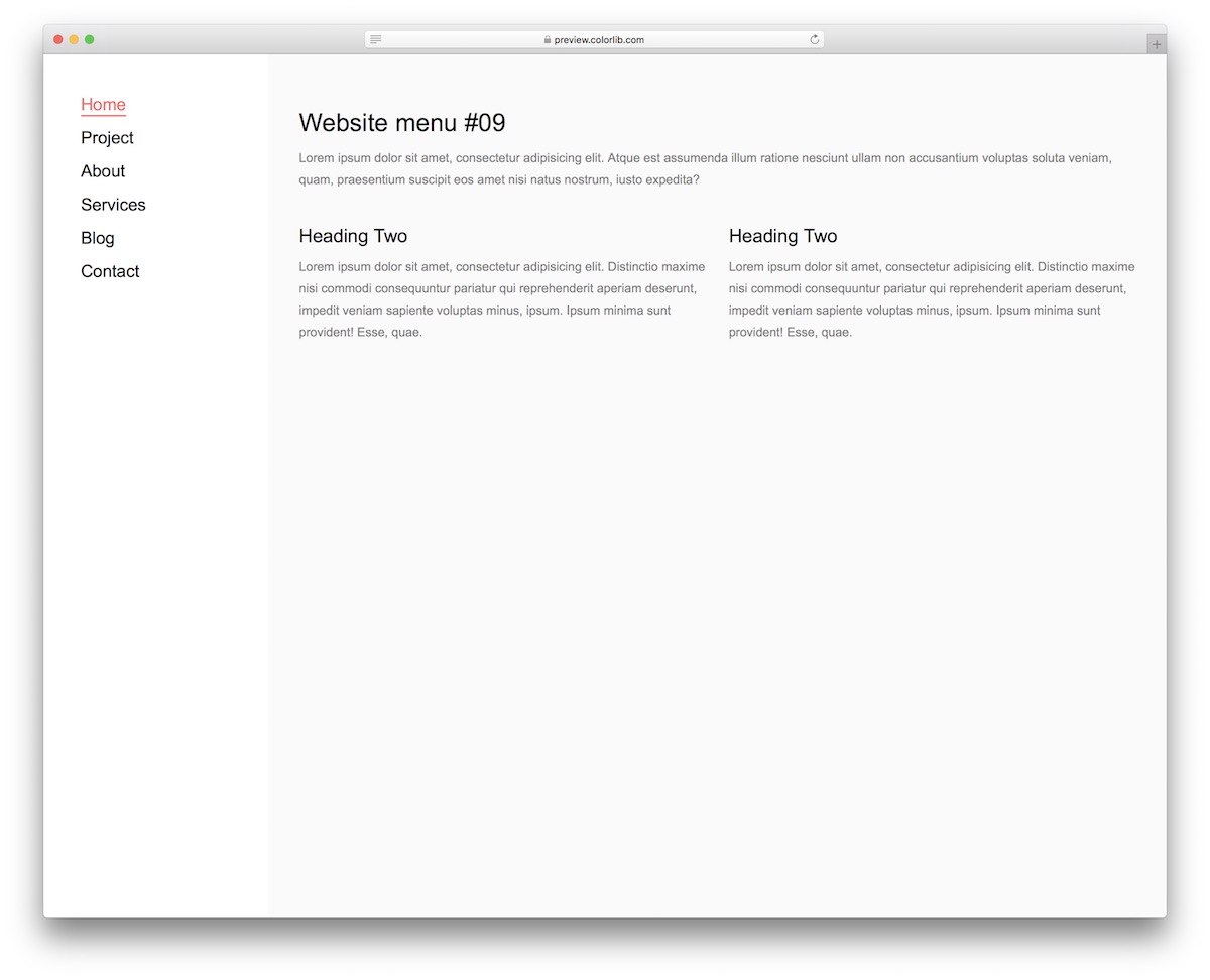
Website Menu V19 moves the navigation out of the header and into a vertical sidebar on the left of the page.
Pattern: left sidebar with an active-page highlight. Suits: blogs, portfolios and personal sites. On mobile: the sidebar becomes an off-canvas menu behind a burger icon.
It features a light design with a highlight effect that adds color and underlines to the text. It’s a clever way of showing what page of your website your user is on.
Your content may be so compelling they are completely immersed in it, forgetting what’s happening around them.
Website Menu V19 is also perfectly compatible with smartphones and tablets. However, viewing it on smaller devices transforms into an off-canvas menu for PRACTICALITY purposes.
Website Menu V20
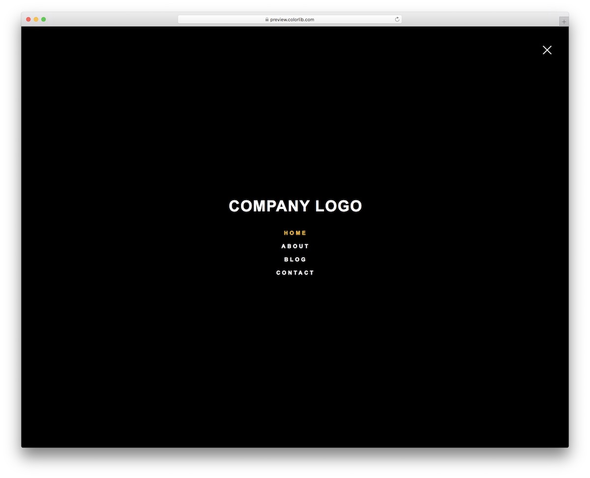
Website Menu V20, my favorite of the top picks, is a full-screen overlay menu, the boldest menu design in this collection.
Pattern: full-screen overlay. Suits: creative studios, portfolios and one-page sites with few links. On mobile: the same overlay, opened and closed by a few lines of vanilla JavaScript.
It only sports a menu icon, but it displays the entire menu overlaying the content you view. No other navigation in this collection places the menu as boldly as this one.
The Website Menu V20 maintains the same style, whether viewed on a mobile device or desktop. Additionally, it appears dark in the default configuration, but you can adjust this if necessary.
Bonus Free Website Menu Templates
Besides our top choices, here are some more free menu alternatives. Keep in mind, in some instances – these are just slight variations of the above.
Website Menu V01
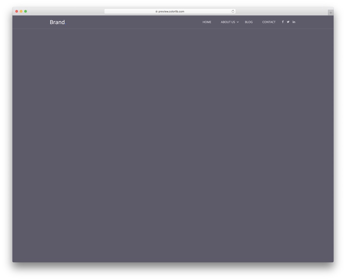
Website Menu V01 is a sticky top bar: transparent at first, solid once the visitor scrolls, and always within reach. It also features a logo section, social media buttons and a drop-down in two layers.
Pattern: sticky top bar that turns from transparent to solid. Suits: long pages where visitors need the menu at any scroll depth. On mobile: a hamburger opens a panel that slides in from the right.
Does it fit mobile?
OF COURSE, it does!
But that’s something you can pre-test yourself.
Website Menu V02
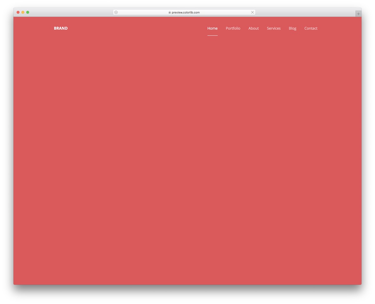
Website Menu V02 is the classic horizontal link bar with nothing extra. It works well if you don’t have many pages or categories.
Pattern: minimal single-row bar. Suits: small sites, landing pages and documentation. On mobile: a hamburger menu.
It also ensures that it retains a similar minimalist style on mobile. But it slides in from the right side as a hamburger menu.
Website Menu V04
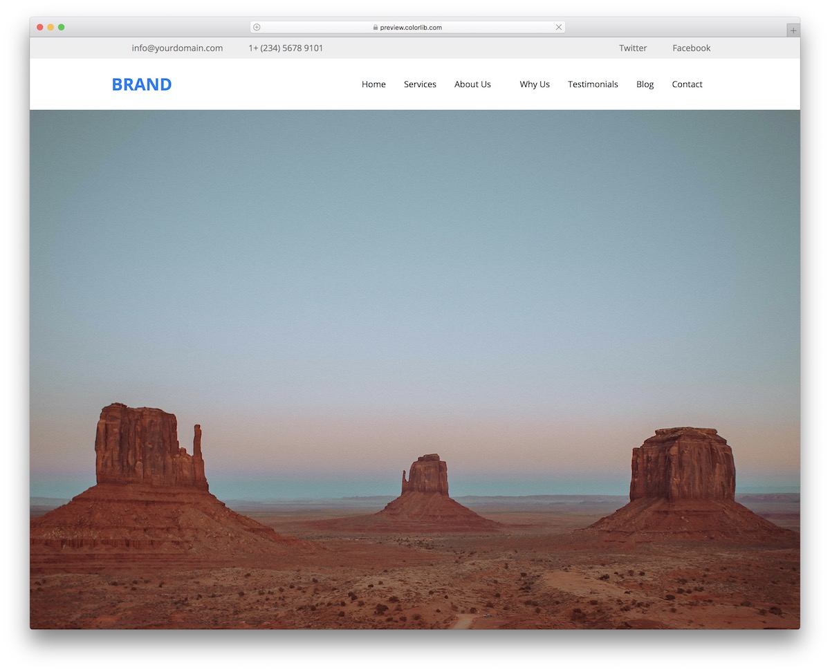
Website Menu V04 is a full header with sticky navigation: the main bar stays pinned to the top of the screen while the visitor scrolls.
Pattern: top bar plus sticky main navigation. Suits: business and service sites that show contact details in the header. On mobile: a hamburger opens a panel that slides in from the right.
Always accessible.
Besides the main menu area, there’s also a top bar. You can use this section to add additional contact details, such as email and telephone numbers. Website Menu V04 also has a space for social icons.
Website Menu V06
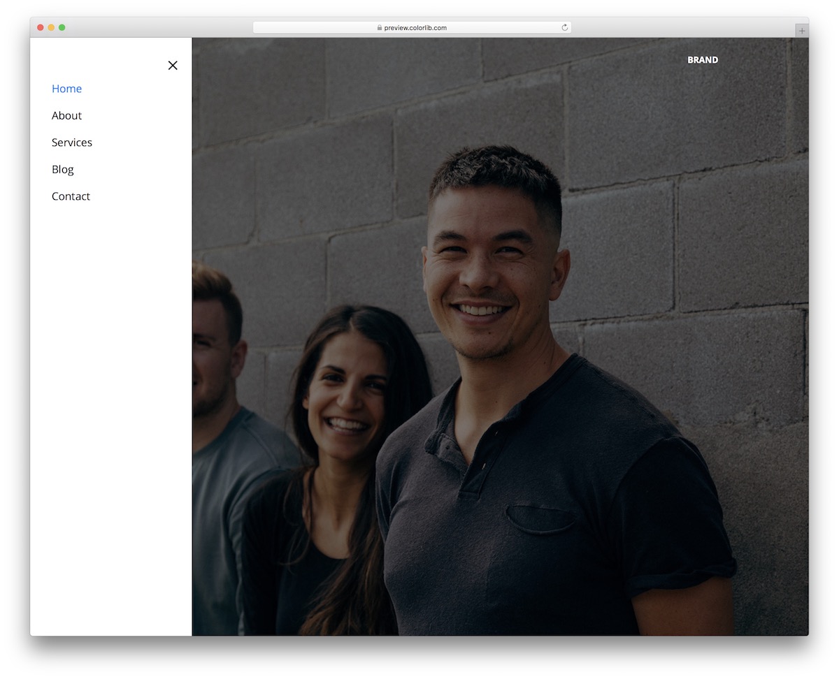
Website Menu V06 is the mirror image of V05 above: the same icon-triggered sidebar, opening from the left instead of the right.
Pattern: icon-triggered vertical sidebar, opening from the left. Suits: minimal sites and portfolios. On mobile: the same as on desktop.
If the right version is a NO-GO for you, this is the alternative that you can grab with a single click.
Just as simple as it sounds.
Website Menu V08
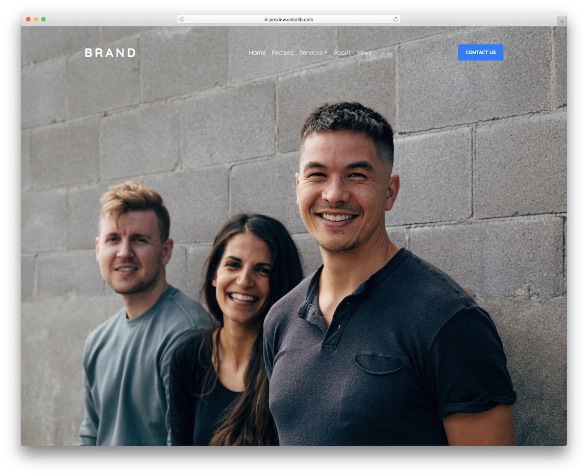
Website Menu V08 is the transparent bar with a call-to-action: logo on the far left, links in the center and a button on the right.
Pattern: transparent bar with a CTA button. Suits: SaaS, agency and lead-generation pages. On mobile: the links collapse behind a toggle, and the drop-down supports keyboard navigation.
Website Menu V08 is another excellent snippet that will get you started without requiring a complete overhaul. This one features very little, aside from text, a drop-down, and a CTA button.
But for some, this is MORE THAN ENOUGH.
Website Menu V09
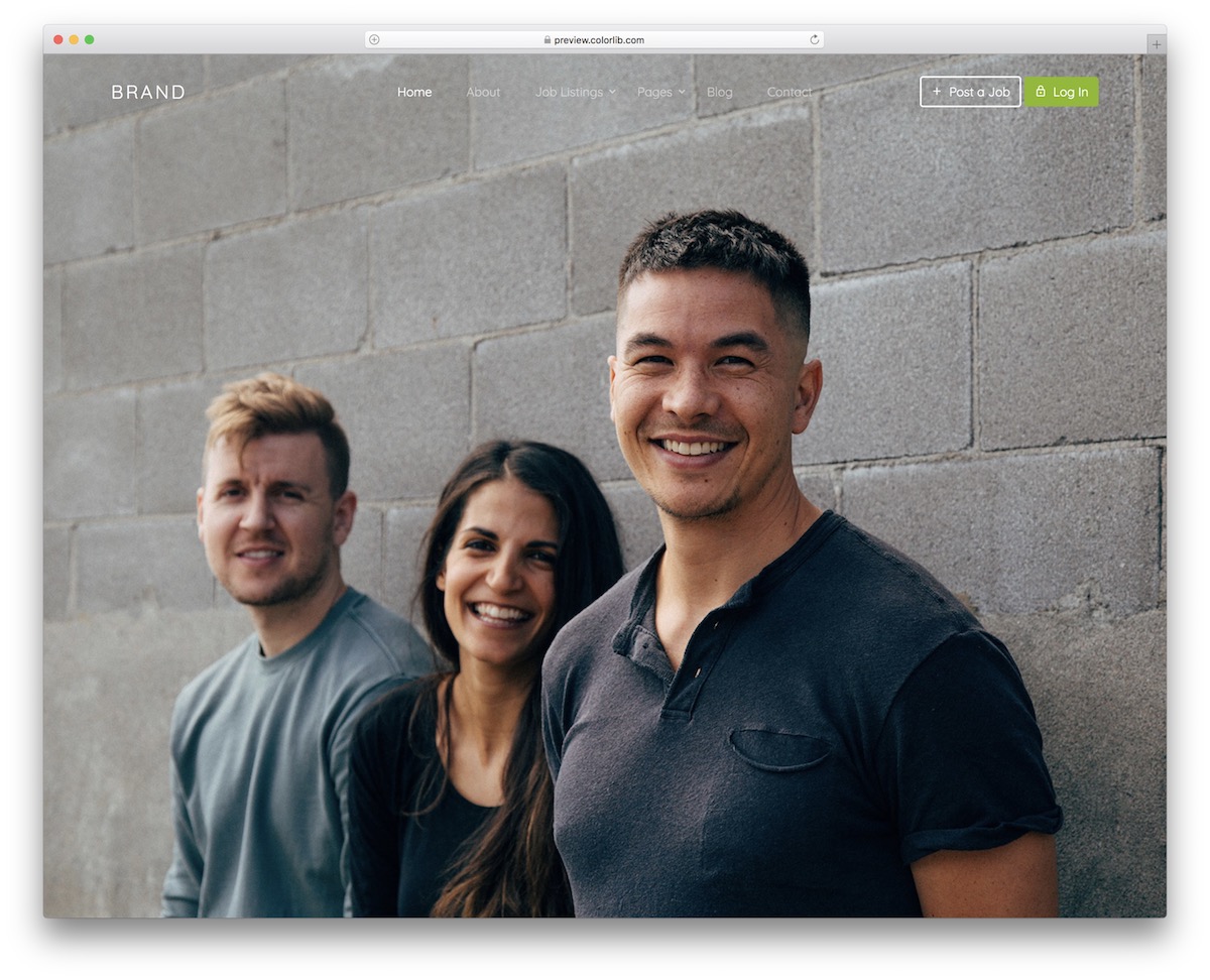
Website Menu V09 shows how a menu can carry the site’s main actions: next to the drop-down links sit two call-to-action buttons, set up for job boards by default.
Pattern: navbar with drop-downs and two action buttons. Suits: job boards, marketplaces and membership sites with log-in and posting actions. On mobile: a hamburger opens a panel that slides in from the right.
But for all the daring ones out there, feel free to modify Website Menu V09 to your liking.
Website Menu V10
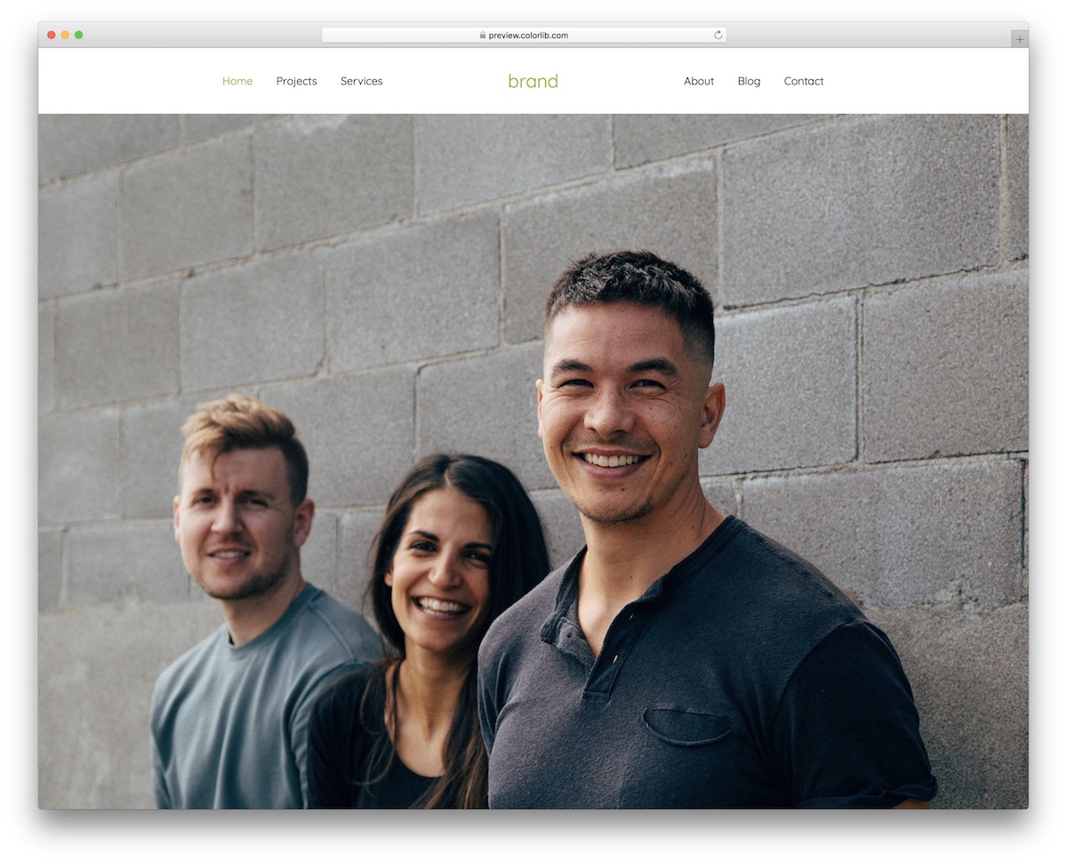
Website Menu V10 features a solid navigation bar with a centered logo and three menu items on each side. However, the design changes completely on mobile, sliding in from the right (hamburger menu).
Pattern: solid bar with a centered logo and split links. Suits: restaurants, fashion and lifestyle brands where the logo matters most. On mobile: the split layout gives way to a slide-in panel.
Website Menu V11
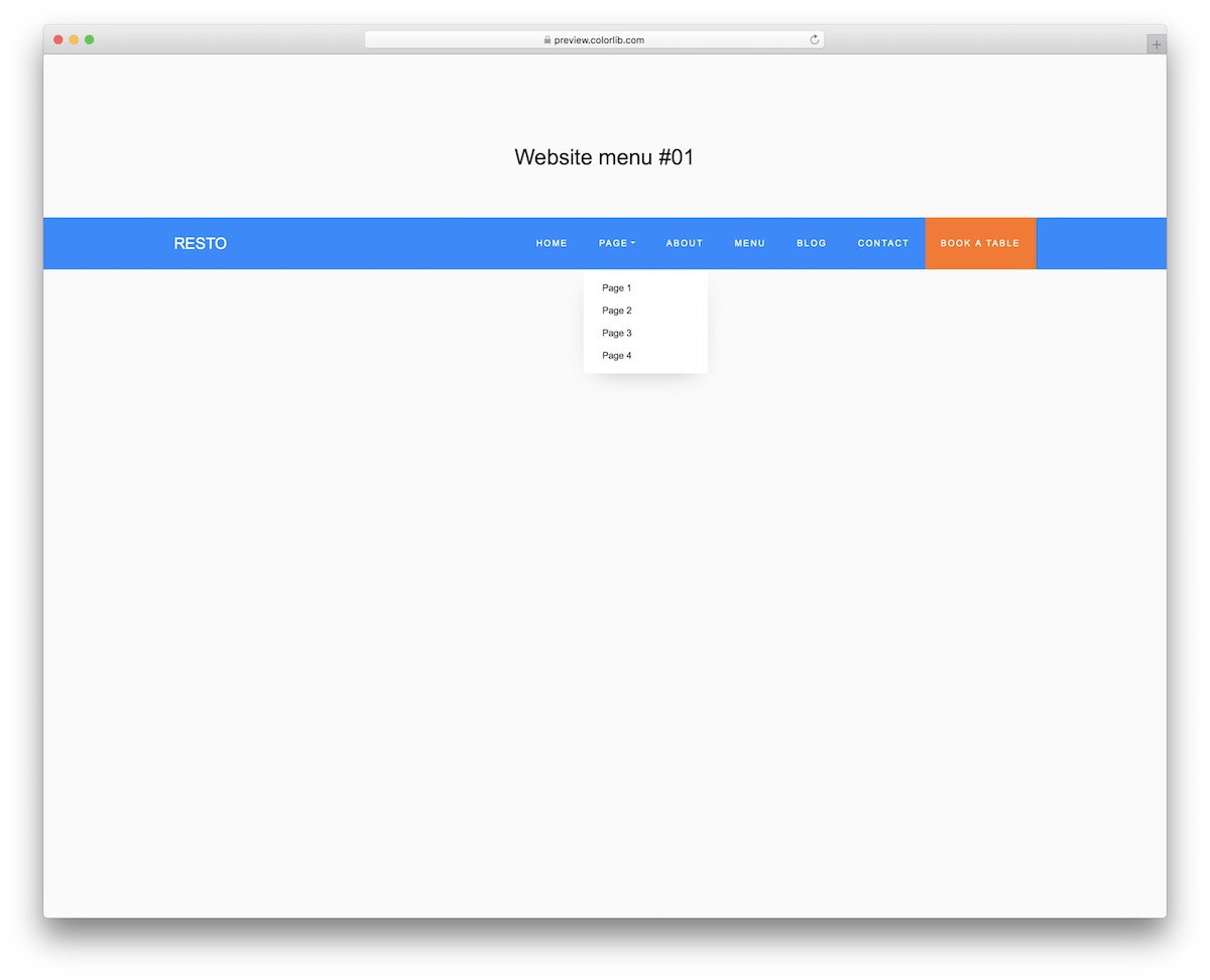
Website Menu V11 is a horizontal navbar with a drop-down and a booking-style call-to-action button, set up for a restaurant by default. With a few text changes it fits any business that takes reservations or appointments.
Pattern: navbar with a drop-down and a CTA button. Suits: restaurants, salons and clinics. On mobile: the links collapse behind a toggle and the colors switch to black and orange.
BUT.
You can also play with different color combinations or stick to the blue/orange scheme.
Website Menu V13
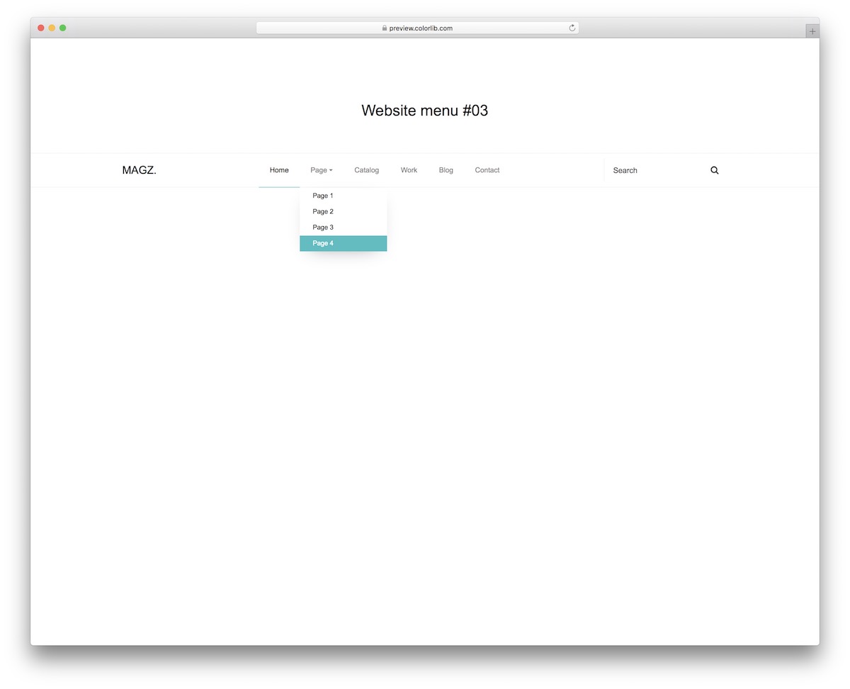
Website Menu V13 is a minimal navbar that still makes room for search, a useful pattern when visitors arrive looking for something specific.
Pattern: minimal navbar with a drop-down and search. Suits: business sites, blogs and knowledge bases. On mobile: the links collapse behind a toggle.
This free website menu template easily works for business websites, blogs and other projects you work on.
The light design changes to DARK on mobile, so you know. You also get a search bar and a drop-down.
Website Menu V15
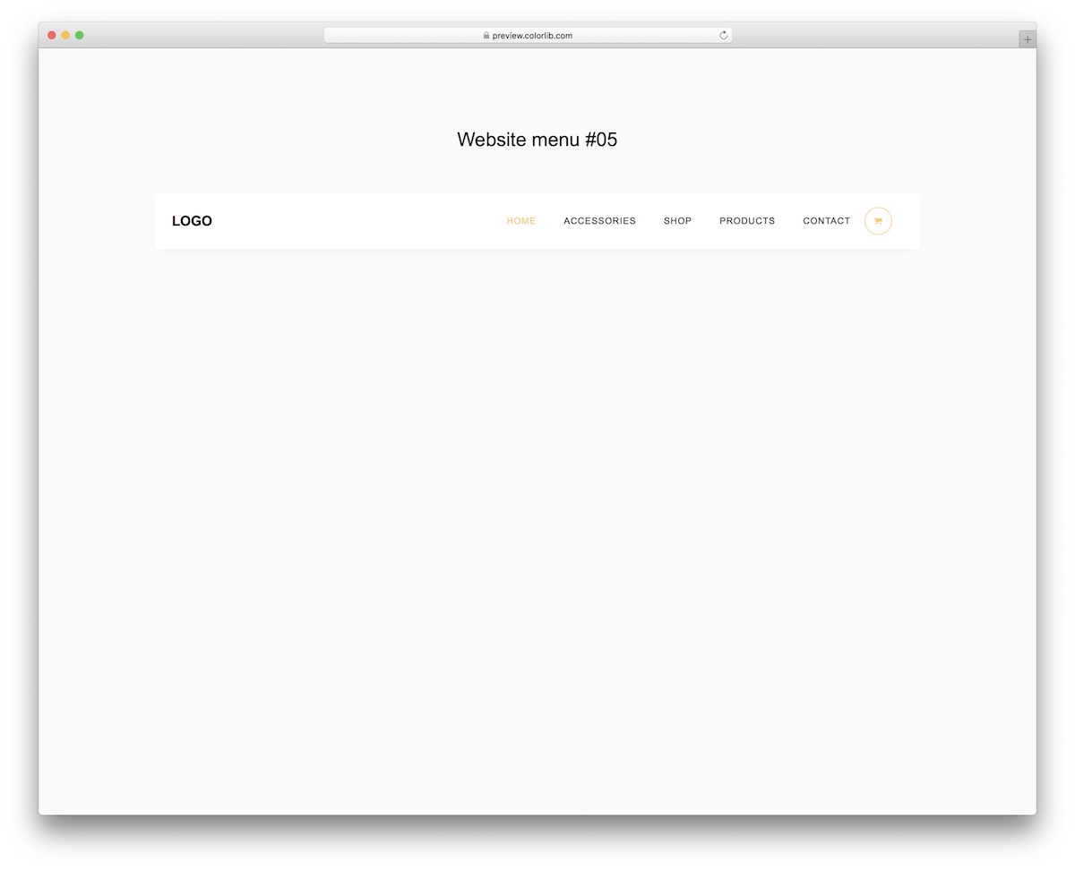
Website Menu V15 is the storefront pattern: a navbar built around shopping, with the cart right in the menu.
Pattern: e-commerce navbar with a cart drop-down. Suits: online stores. On mobile: the links collapse behind a toggle.
The main specialty of the free template is the cart icon, which features a drop-down on hover for various actions.
Website Menu V16
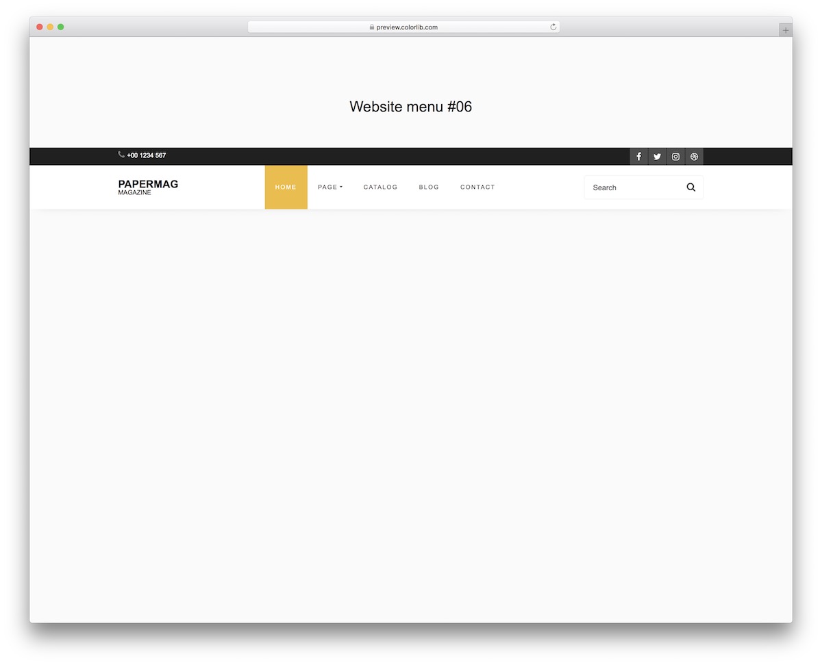
Website Menu V16 is the full-header pattern: a dark top bar for contact details and social buttons above a light main menu with a drop-down and a search form.
Pattern: two-row header, top bar plus main menu. Suits: corporate, news and service sites with a lot to show. On mobile: the links collapse behind a toggle, and the drop-down supports keyboard navigation.
Even though there’s quite some stuff going on, Website Menu V16 does it with STYLE.
Website Menu V17
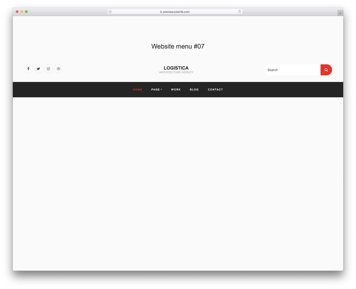
Website Menu V17 is a centered masthead: social icons on the left, the logo in the middle, search on the right, and a dark navigation bar with a drop-down underneath.
Pattern: centered-logo masthead above a navigation bar. Suits: magazines, blogs and fashion brands. On mobile: the layout changes slightly and the links collapse behind a toggle.
Website Menu V17 has a nice and dynamic feel, whether viewed on a desktop computer or a smartphone. It has all the necessary JAZZ, so you won’t have to code it from scratch.
More 2026 menu snippets from Colorlib
Menu patterns from our 2026 snippets: a mobile drawer with nested sections, a full-screen overlay menu and a collapsible icon rail.
Offcanvas V01: Left navigation drawer for a mobile site with nested sections
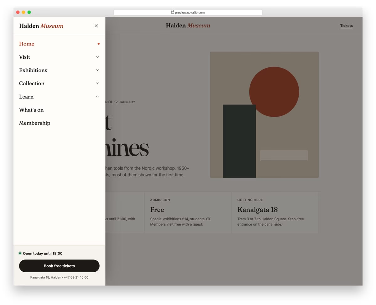
A slide-in menu from the left for a museum website, opened from a Menu button in the header. Top-level sections expand into sub-links with native details and summary elements, and only one section stays open at a time. The footer of the drawer holds today's opening hours and a ticket button.
Best for: mobile navigation for content-heavy sites such as museums, universities and councils. Plain HTML and CSS with a few lines of vanilla JavaScript, a 257 KB download, and it works on its own or inside a Bootstrap 4, 5 or 6 project.
Offcanvas V08: Full-screen overlay menu with large typography and a staggered link reveal
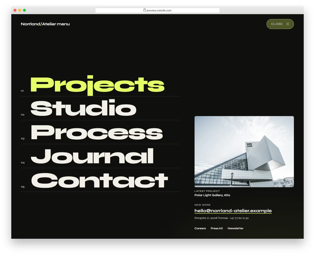
A full-screen menu for an architecture studio that opens with a circular wipe from the Menu button. Five oversized numbered links slide up one after another, followed by a featured project, contact details and small links. It closes with the Close button, Esc, a click on its empty background or by choosing a link.
Best for: portfolio, agency and studio websites with a short main menu. Plain HTML and CSS with a few lines of vanilla JavaScript, a 381 KB download, and it works on its own or inside a Bootstrap 4, 5 or 6 project.
Offcanvas V10: Collapsible icon rail that expands into a labelled dashboard sidebar
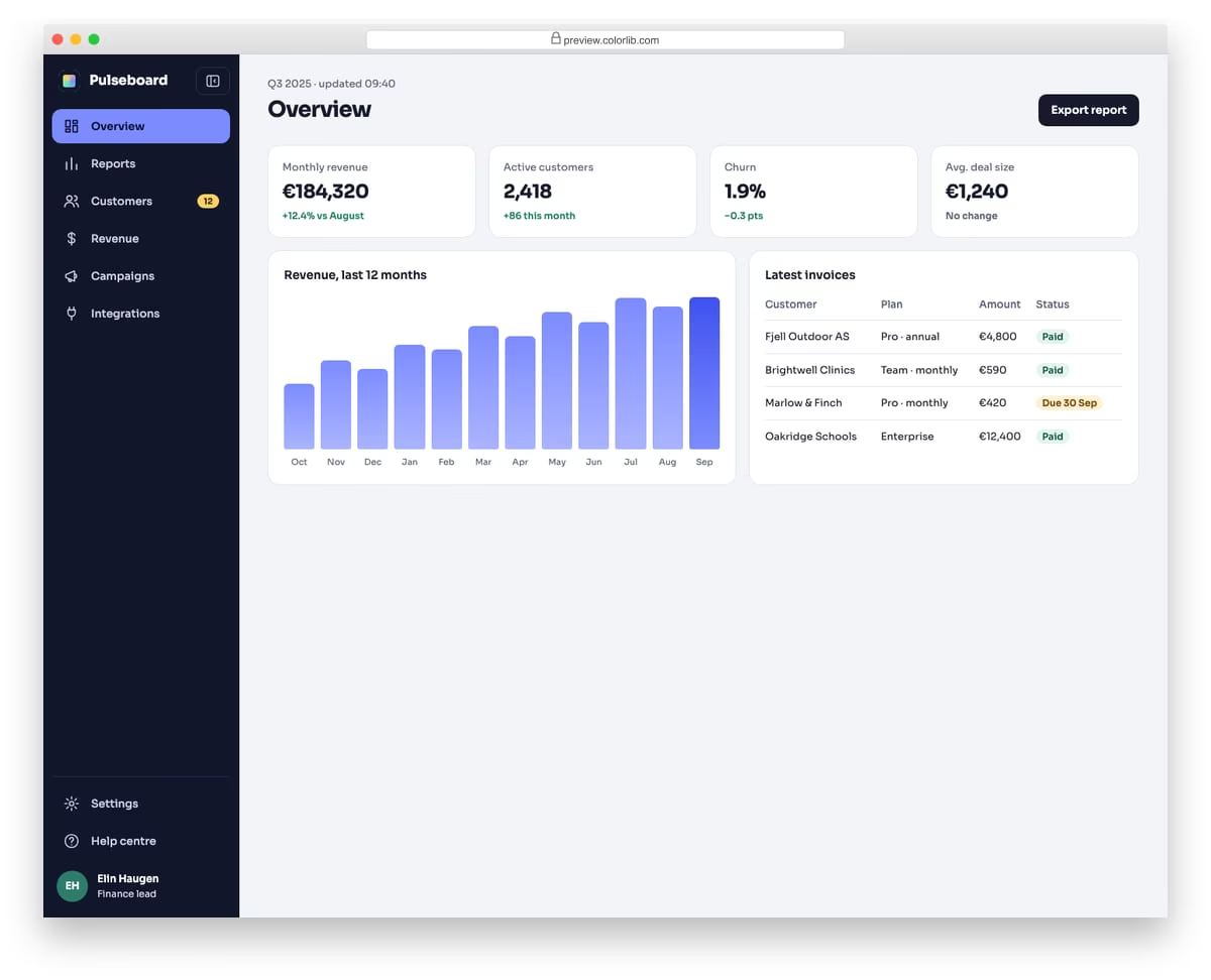
A dark icon rail for an analytics dashboard that expands into a full sidebar with labels, a badge and the signed-in user. When collapsed, each icon shows its label as a tooltip on hover and keyboard focus, and the label stays available to screen readers. The chosen state is saved in localStorage, guarded with try/catch, and on phones the expanded sidebar floats over the page instead of squeezing it.
Best for: admin dashboards, analytics tools and web apps with many sections. Plain HTML and CSS with a few lines of vanilla JavaScript, a 156 KB download, and it works on its own or inside a Bootstrap 4, 5 or 6 project.
How to choose a website menu design
Count your links first. A handful of pages fits a single bar like V02 or an overlay like V20. Deep categories need a mega menu (V18) or a stacked header with search (V12, V16), and a web app with many sections suits a collapsible icon rail such as Offcanvas V10.
Design the phone version, not just the desktop one. Each Colorlib template above notes what it does on mobile. Long menus stay usable in a drawer with nested sections, like Offcanvas V01, where only one section is open at a time.
Show visitors where they are. An active-page highlight, as in V19, tells people which page they are on without any extra text.
Support keyboard and screen reader users. Drop-downs should open from the keyboard (V08 and V16 support keyboard navigation), overlays should close with Esc (Offcanvas V08 does), and icon-only menus need text labels: Offcanvas V10 keeps each label available to screen readers.
Keep transparent menus readable. V03 and V07 sit on top of a hero photo, so test link contrast against the brightest part of your image, or use a bar that turns solid on scroll like V01.
Frequently asked questions
Do these menu templates need Bootstrap or jQuery?
No. The Colorlib menus carry their own CSS and a few lines of vanilla JavaScript for the toggles and drop-downs. They work without a framework, and inside a Bootstrap 4, 5 or 6 project they keep their look.
Which templates include a drop-down menu?
V01, V03 and V07 have multi-level drop-downs, and V08, V09, V11, V12, V13, V16 and V17 have a drop-down in the main bar. V15 adds a cart drop-down and V18 a mega menu. For a simple website with a drop-down menu, V01 and V11 are good starting points.
Can I use them in commercial projects?
Yes. The Colorlib menus are free under CC BY 3.0: use them in personal and commercial projects and keep the credit link. The uiCookies pack has its own licence, shown on its download page.
How do I customize a menu template?
Swap the logo and links in the HTML, then change colors and fonts in the CSS. V11, for example, ships in blue and orange; replace those values with your brand colors. Check the result at phone width, since several templates change colors or layout on mobile.
Final thoughts
Start with V01 for a sticky bar, V18 for a store or publisher with deep categories, or Offcanvas V01 for a content-heavy mobile menu. For Bootstrap-specific bars and menus, see our Bootstrap navbar examples and Bootstrap dropdowns.

Related Posts
Hi,
Thank you for the templates. How do I use them with a wordpress site? I’m especially interested in Circular Navigation.
Thanks and have a great day!
yours sincerely,
Nikhil Bhavsar