
35 Bootstrap Hamburger Menu Examples (Free) 2026
This list of Bootstrap hamburger menu examples now has 35 entries: 15 Colorlib menus that fold behind a hamburger or menu button, 19 creative menu designs from CodePen and a uiCookies pack of eight mobile navigation patterns.
The Colorlib menus are free downloads with live demos. They are dependency-free HTML, CSS and vanilla JavaScript: the hamburger opens without jQuery or Bootstrap’s JavaScript, and each menu works on its own or inside a Bootstrap 4, 5 or 6 project. The CodePen designs are ideas to adapt; two of them still use jQuery, and each carries its author’s licence.
You will find slide-in panels from the right (V05) and the left (V06), full-screen overlays (V20, Offcanvas V08), full navbars that switch to a hamburger on phones (V01 to V04) and a drawer with nested sections for long menus (Offcanvas V01). For other layouts, browse our website menus and website menu templates, or a complete Bootstrap website template.
Best Bootstrap Hamburger Menu Examples
uiCookies Menu Templates (8 templates)

If you are looking at hamburger menus you are really solving mobile navigation, and this set takes two runs at it: a bottom navigation bar for thumb reach, and an accordion menu for deep hierarchies. Six more cover an account dropdown, an admin sidebar, a context menu, a floating dock, a file tree and a command palette.
Several need no JavaScript, and none of them depend on Bootstrap’s collapse plugin. From our own uiCookies library, free for commercial projects.
Bootstrap Website Menu V05
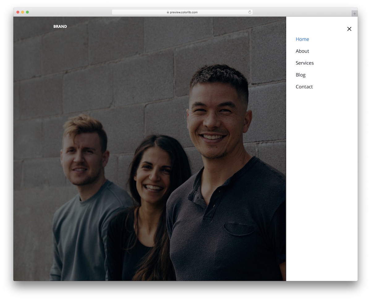
Website Menu V05 is our own take on hamburger menus, built with plain HTML, CSS and a few lines of vanilla JavaScript instead of Bootstrap’s JS. It is a trendy solution with an icon in the top right corner, sliding in from the right to navigate.
The amazing performance remains intact, thanks to the fluid layout, whether viewed on desktop or mobile.
Another cool feature is the hover effect that turns the section you want to click on BLUE. Remember, if necessary, you can also brand it and apply refining touches, or opt for the out-of-the-box version.
Website Menu V06
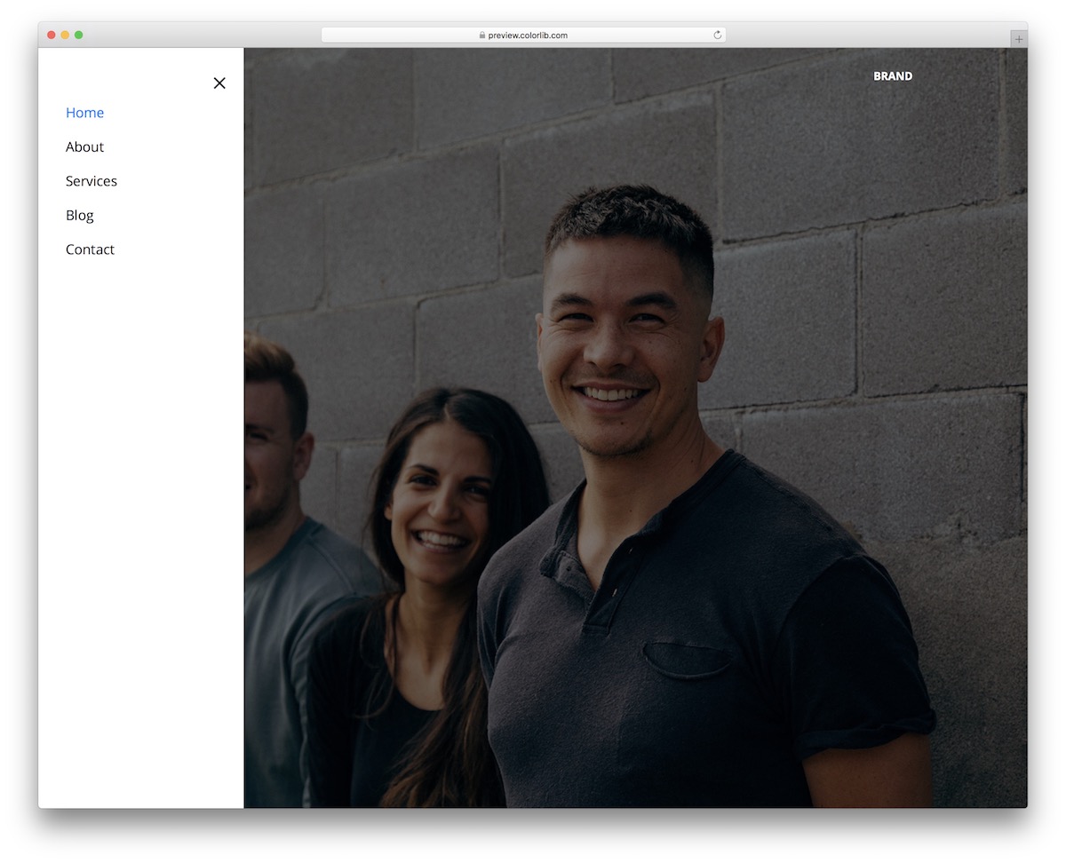
Website Menu V06 is nearly identical to the hamburger menu above, except it’s mirrored on the left side. It drops into any Bootstrap 4, 5 or 6 project or runs on its own.
It has the same icon, same slide-in menu and hover effect. Instead of using a right-side navigation, you can opt for a left-side version.
Moreover, the snippet’s code is user-friendly and well-organized, allowing you to quickly get the most out of it. Meaning, even if you plan to MAKE adjustments, they will take you little time to complete.
Bootstrap Website Menu V20
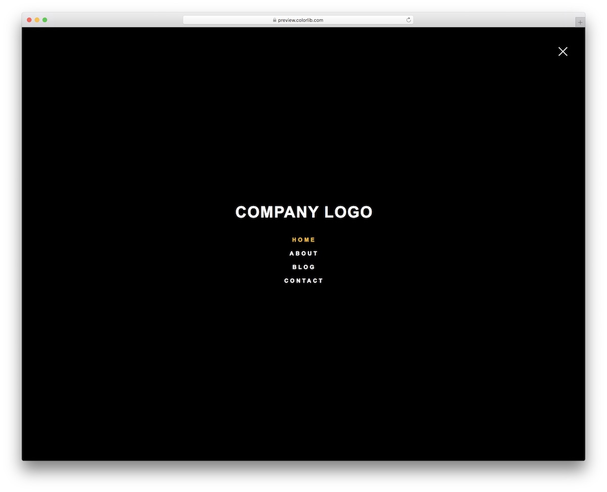
If you are looking for a full-screen menu overlay template, Website Menu V20 is your best bet. Its dark design by default makes it extra special.
Another cool feature of the free snippet is the neat animation that activates when you open or close the menu.
Also, the overlay keeps the same format on mobile, tablet and desktop, and the open/close toggle is a few lines of vanilla JavaScript. Prefer a classic bar? See our Bootstrap navbar examples.
More Off-Canvas Hamburger Menus from Colorlib
These navbars show a full menu on desktop and switch to a hamburger icon with a slide-in panel on smaller screens, which is what most sites need from a hamburger menu.
Website Menu V01
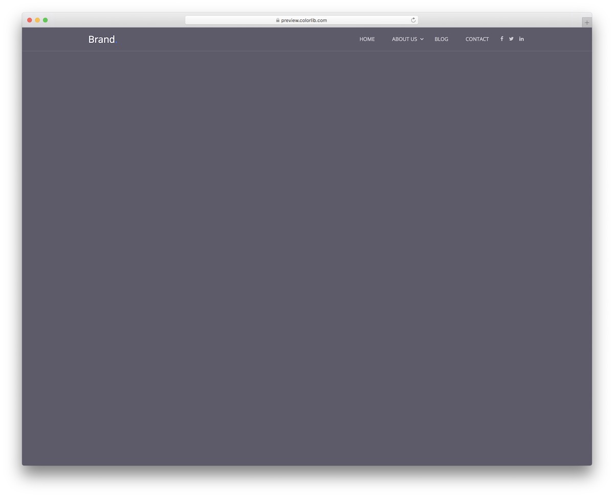
Website Menu V01 is a sticky navigation bar that starts transparent and turns solid when the visitor scrolls, with a multi-level drop-down, social media icons and a logo on desktop.
On smaller screens the links move behind a hamburger icon that opens a panel sliding in from the right. The sticky header and the panel run on a few lines of vanilla JavaScript, and the download is 226 KB.
Website Menu V02
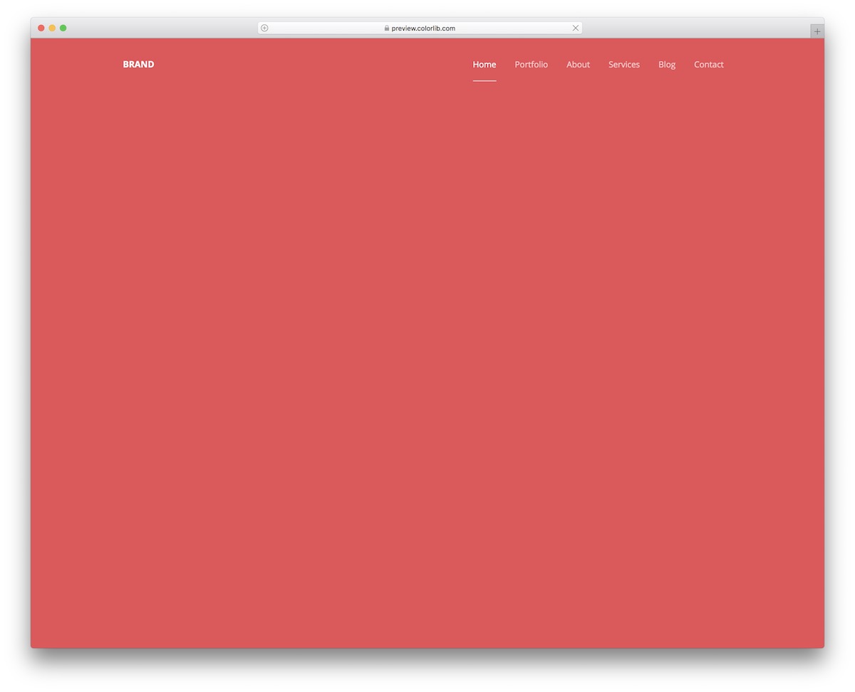
Website Menu V02 is the simplest bar in the family: a handful of links with a hover effect that lightens the text and adds an underline.
It keeps the same minimal style on mobile, where it turns into a hamburger menu that slides in from the right. No jQuery, no Bootstrap files.
Website Menu V03
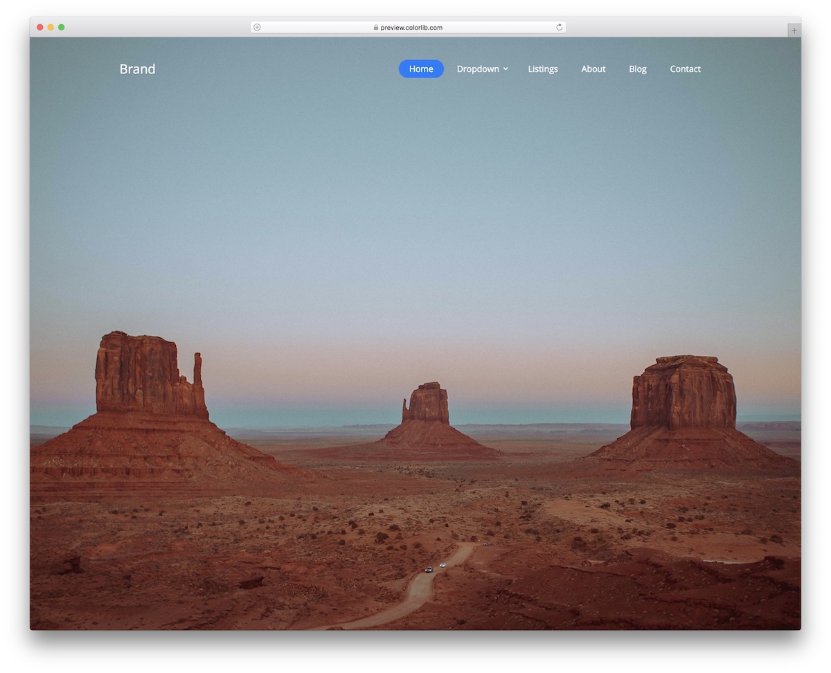
Website Menu V03 is a modern, transparent navbar with a button hover effect and a multi-level drop-down, made to sit on top of a hero image or video.
On phones, a hamburger icon reveals the whole menu in a slide-in panel from the right. It looks the same on its own or inside a Bootstrap 4, 5 or 6 project.
Website Menu V04
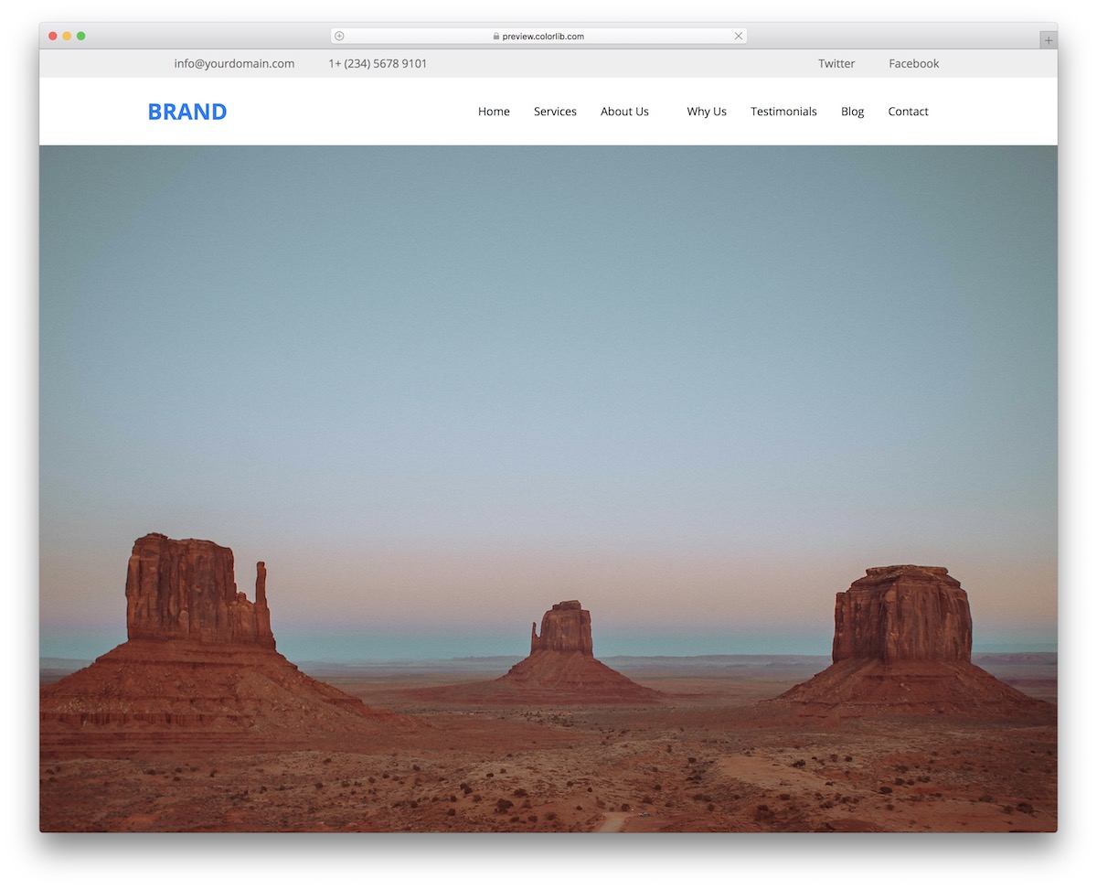
Website Menu V04 pairs a top bar for contact details and social icons with a sticky main navigation that stays within reach while visitors scroll.
Below desktop widths, the navigation folds into a hamburger icon and a panel that slides in from the right. The download is 694 KB, down from 2.0 MB.
Website Menu V07
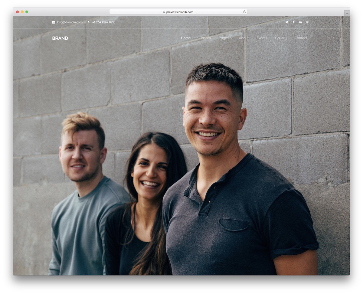
Website Menu V07 is a transparent header with a top bar for email, phone and social icons, plus a multi-level drop-down in the main menu.
On mobile, the menu becomes a hamburger icon with a slide-in panel from the right, so a full-width background image stays uncluttered on small screens too.
Website Menu V09
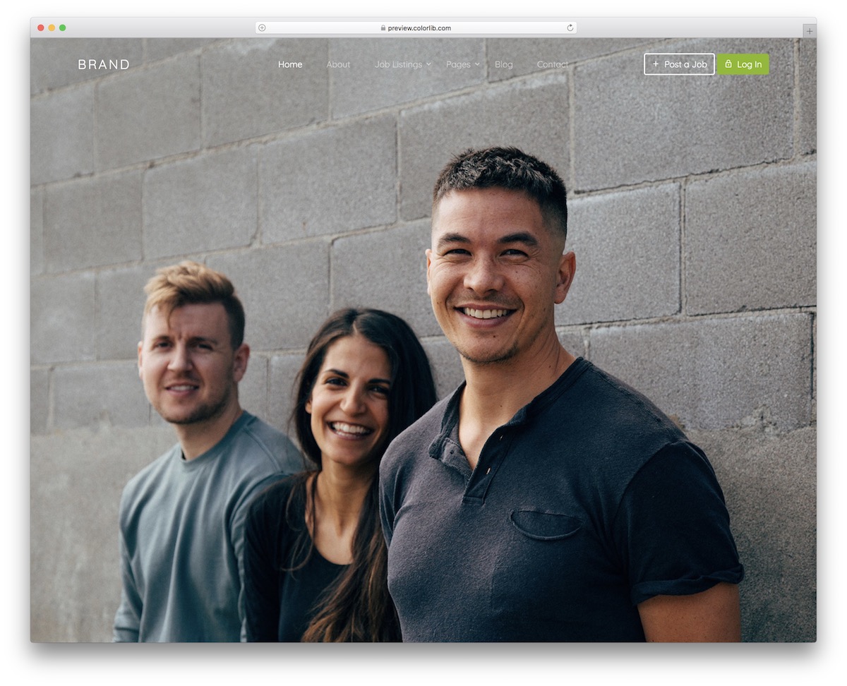
Website Menu V09 is a navbar with drop-downs, a logo on the left and two call-to-action buttons on the right, set up for a job board with “Post a job” and “Log In”.
On smaller screens the links move into a hamburger-triggered panel that slides in from the right, handled by a few lines of vanilla JavaScript.
Website Menu V10
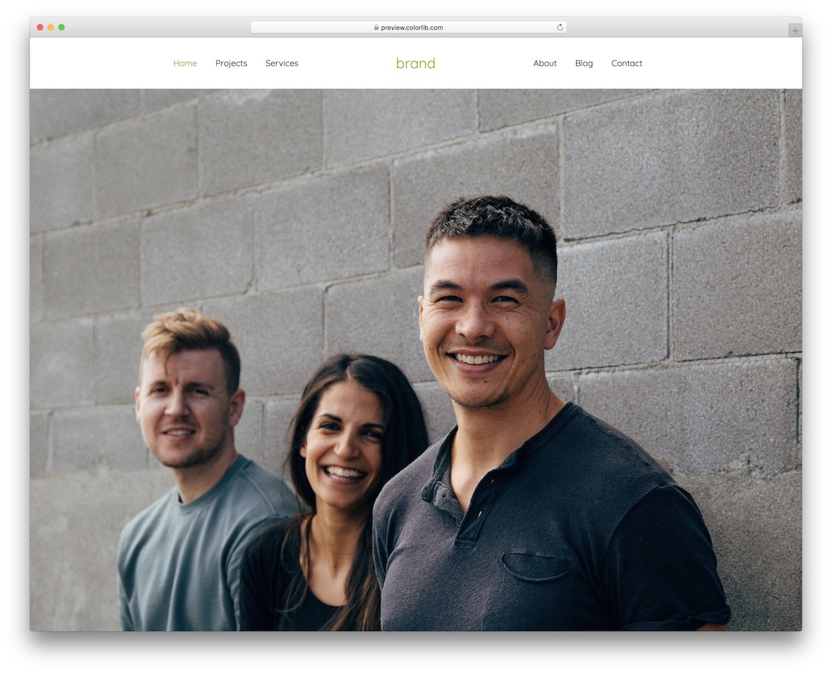
Website Menu V10 is a solid navigation bar with a centered logo and three menu items on each side.
The design changes completely on mobile: the split menu is replaced by a hamburger icon and a panel that slides in from the right. It works with or without Bootstrap on the page.
Website Menu V19
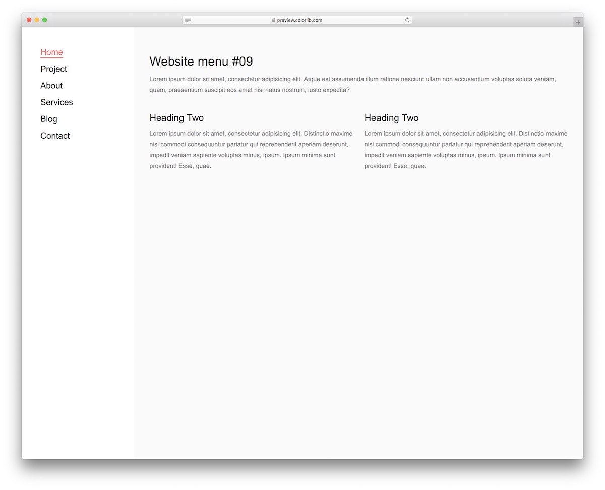
Website Menu V19 is a left sidebar menu with a highlight effect that adds color and an underline to the current page.
On smaller screens the sidebar turns into an off-canvas menu that arrives from the left when the visitor taps the burger icon. The download is 250 KB.
Creative Hamburger Menu Designs
HTML5/CSS3 Horizontal Menu
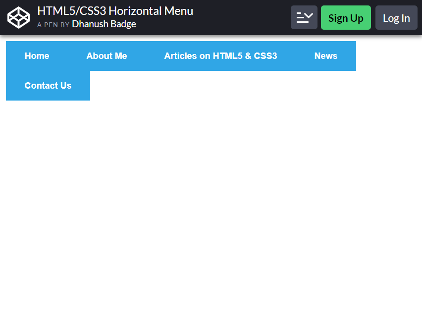
Well, this bootstrap hamburger menu is not a ‘hamburger,’ but it has the same functions. What more, you can add menus inside the icon.
Example, you can see that inside the icon, there is ‘Articles n HTML5 & CSS3’. Once you click it, several categories will appear. Visitors will find it easier to navigate through the website. They don’t have to find what they need anywhere on the page.
This is perfect for any website. It can be mobile-friendly too! You can add up to five menus, then add categories under it as you like. Dhanush Badge made this purely using HTML5 CSS3.
Javascript or programming is NOT essential for this to function.
Hamburger Menu – HTML, CSS & jQuery
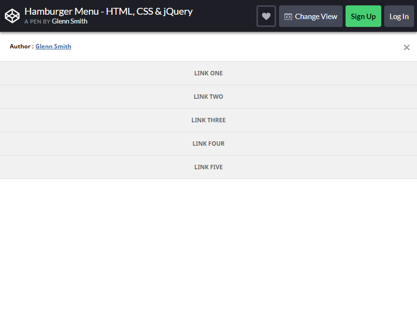
Glenn Smith created this icon using HTML, CSS, and jQuery. Although simple, it functions perfectly and smoothly.
Sometimes, it is easier for website audiences to use simpler icons that allow them to easily find what they are looking for.
This menu is at the bottom right side of the screen. You can add up to five categories. The categories will appear just by clicking the list. The background color is white, making it easier for the audience to read the titles.
The only thing about this menu is it covers the content beneath it. If you want to CHANGE the function, simply remove the z-index in the menu icon and panel.
Menu “Hamburger” Icon Animations
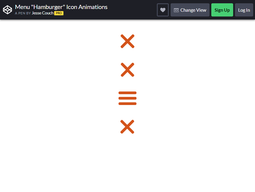
Hugo Darby Brown designed this Bootstrap hamburger menu. If you want to play through the icon, you can visit this page Brown shared in his account – https://www.designcouch.com/. He adds a different flavor to this menu compared to others.
Instead of putting all the categories under the menu, he decided to add the categories beside it. You can add buttons with pictures.
From Brown’s website, he added four categories: bio, work, resume, and blog. You can do just the same by using this hamburger icon he made. It has an X button if you want to close the menu.
Gooey Menu
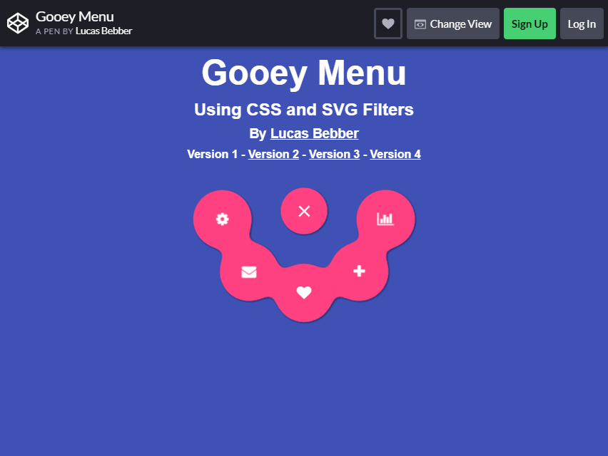
Lucas Bebber used CSS and SVG Filter to make this menu. It has three different versions. For all the folks out there that are looking for unique bootstrap hamburger menu, this may be the one for you.
Depending on your taste, you can choose any version for your website.
For Version 1, as you click the circle menu button, upper curve line will appear with five several category buttons. To close the menu, click the X. For Version 2, six categories will appear around it as you click the button.
What about Version 3? Four separated circle buttons will appear on the right as you click the menu. Lastly, there is Version 4, which features four categories as you click the menu.
It is slightly similar to Version 3; the only difference is that the buttons are too close together.
Pure CSS Fullscreen Navigation Menu
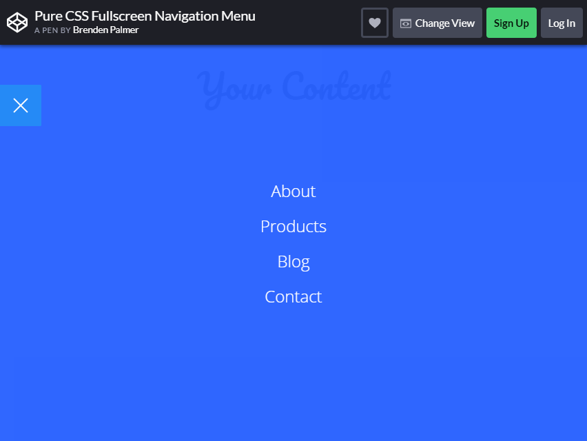
Brenden Palmer designed this menu on May 17, 2015. From its name ‘fullscreen navigation menu,’ the categories WILL CONSUME the entire page.
It’s not a big problem if all the critical functions of the blog are arranged inside the groups. You can add up to four categories, or as many as you like. Just copy the same principle he used in creating this one.
If you want to close the menu, click the X button at the bottom left of the page.
Pull Menu – Menu Interaction Concept
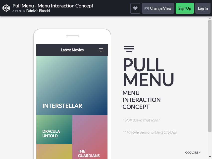
Were you searching for a better Bootstrap hamburger icon for a mobile-friendly website? This pull menu has a great concept. You only have to pull down the figure to jump between the pages.
Fabrizio Bianchi created this menu interaction concept. Aside from the unique way this icon is used, the color is pretty impressive.
You can add up to four categories or more. As you pull the menu a little, the next category will appear, and as you pull a little more, it will transition to the following categories.
Pull menu is a good substitute for a sliding list. The process is the same for refreshing options. The difference is that it does not refresh the page but jumps to the next page. It is also colorful and too fun to use.
Morphing Hamburger Menu with CSS
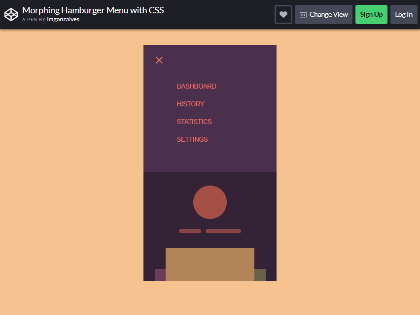
This one is also a mobile-friendly Bootstrap Hamburger Menu created by Imgonzalves. What you will like in this menu is that it will not cover the entire page when you click it.
The content will remain and go down under the categories.
You can add up to four categories or more. There is also an X button if you want to close the menu. What is unique about this? It CREATES A MORE straightforward navigation for your audience coming to your site.
You may have seen many web pages where it is too hard to find the option you want to click, but thank you for this. You will have a better idea to include in your blog.
iOS Style Sliding Menu
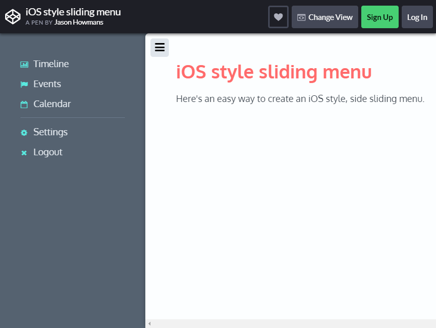
This menu, created by Jason Howans, is one of the most popular and often used by website creators. The style is purposely for users, but the designer of this icon thought of another way to make it available to other kinds of operating systems.
This menu can be added to your website too!
What makes this menu special? The navigation is just SIMPLE.
You only have to click one button, and all the categories are there. You can add several groups under the menu. The colors used here are also enticing for the visitors.
SVG Gooey Hover Menu Concept
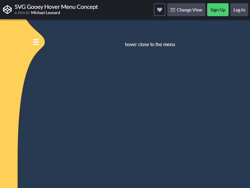
You will love the concept of this menu. Just hover your mouse to the icon and all the categories will appear.
You will SAVE yourself from clicking different icons to get where you want to go. Michael Leonard created the codes for this menu.
This menu has six items. To make the categories disappear, hover your mouse away from the list. The navigation is easy, and visitors will enjoy playing with it.
CSS Menu Icon Animation: Know Your Menu
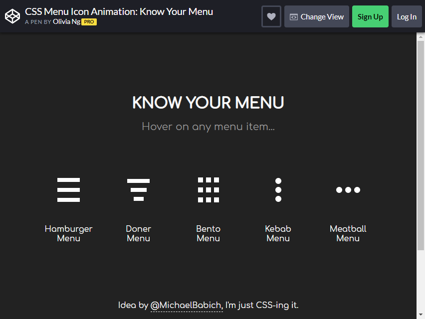
This menu offers a variety of items for you to choose from. In addition to the Bootstrap Hamburger Menu, there is the Doner Menu, Bento Menu, Kebab Menu, and Meatball Menu.
Although it has a different design, the principle is the same as the original one. If you want to add unique style to your website, this might be for you.
The Menu Icon Animation was designed and created by Olivia Ng.
Responsive Overlay Menu Navigation
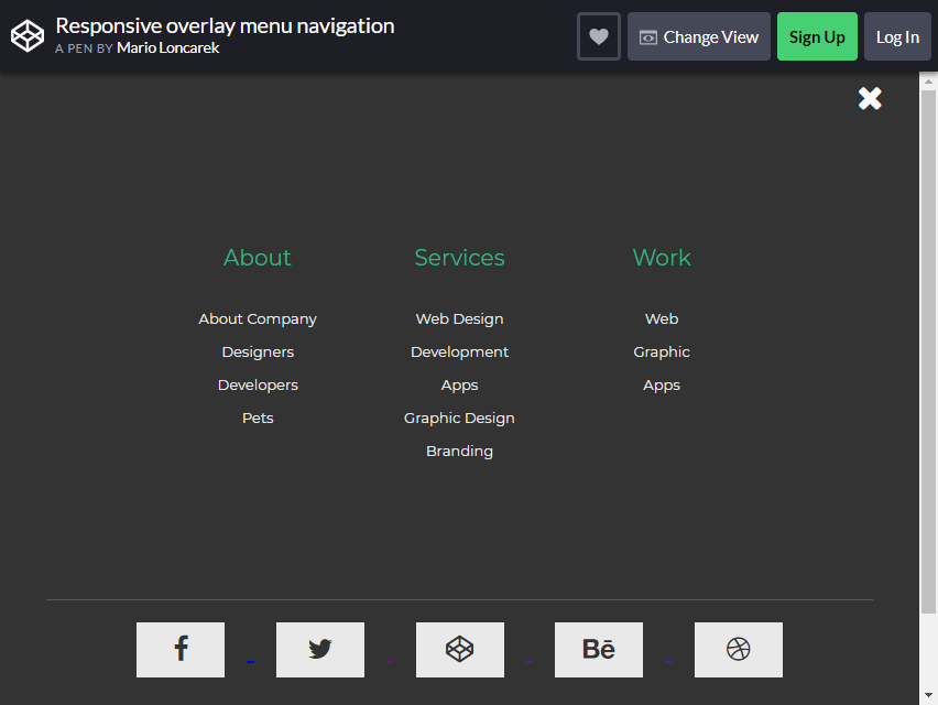
Mario Loncarek created this Bootstrap Hamburger overlay menu style. In just one click, you’ll see all the categories – even the categories under these main categories.
This kind of menu is organized yet straightforward. All the necessary items are compiled into a single button. It is an advantage for visitors who are looking for a specific thing.
In Loncarek’s style, you will see that he created three menus—About, Services, and Work—which make it easier for a user to narrow down the categories they are looking for.
He created this icon using CSS, HTML, and jQuery. Its neutral color makes it easier to read.
CSS3/JavaScript Pure Dropdown Menu
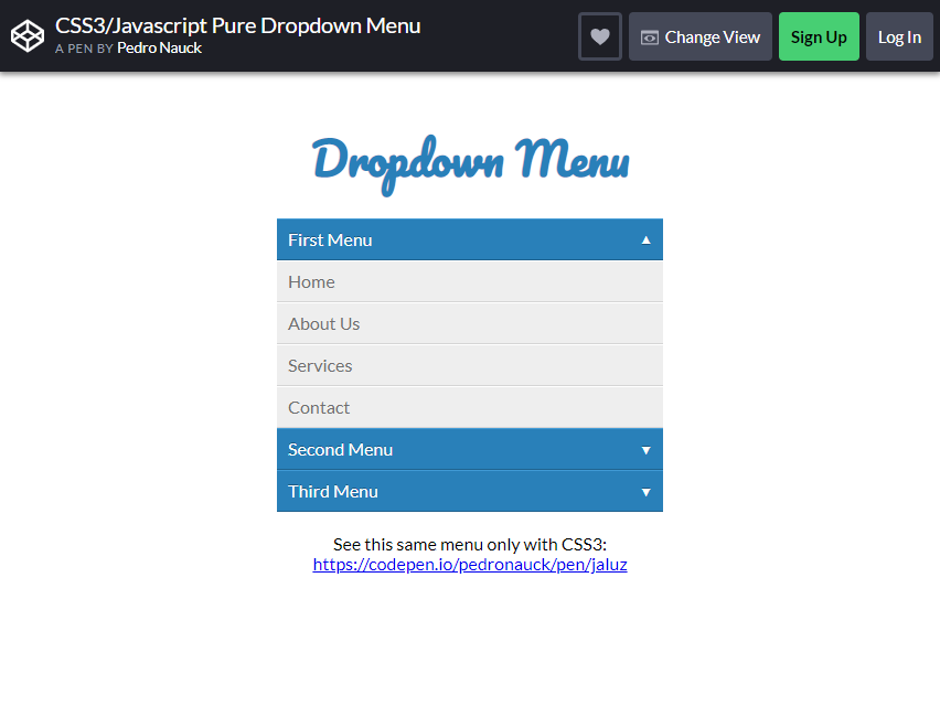
Pedro Nauck created this Dropdown Menu. You can make several menus. As you can see from the picture, the creator created three lists. In every menu, various categories showed on the screen.
Navigating using this menu is VERY natural. It doesn’t require your entire page to display the menu and categories. You can click the dropdown arrow again to hide the content.
This is not only mobile-friendly but also desktop-friendly. It has a beautiful font too! You can copy the font, but you can change little details depending on your taste.
Touch Device Jelly Menu Concept
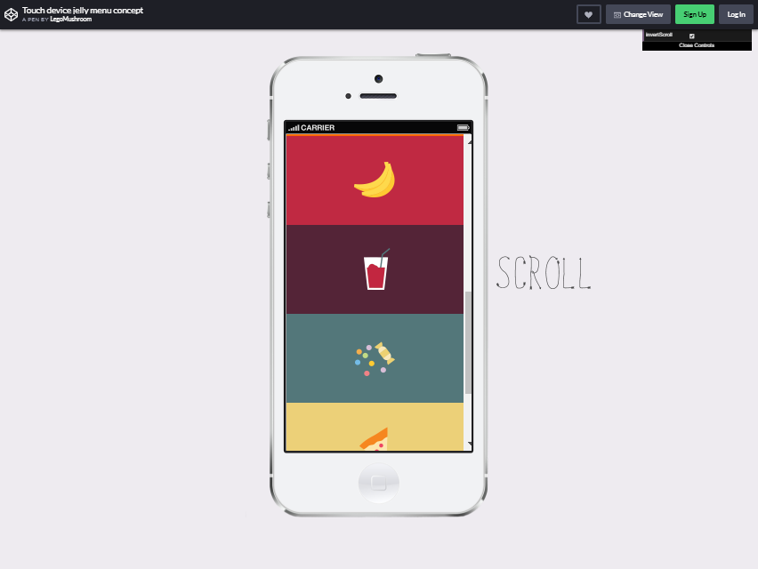
Oleg Solomka created this super cute and fantastic menu concept, Lego Mushroom. Instead of using a typical icon, he uses cute ones to give color to the idea he had in mind.
It depends on whether you look for the simpler or unique one.
Oleg Solomka even explained how he created the menu button. That is only a concept. You can use this concept on your website, too.
Menu Toggle Button with Flat Menu
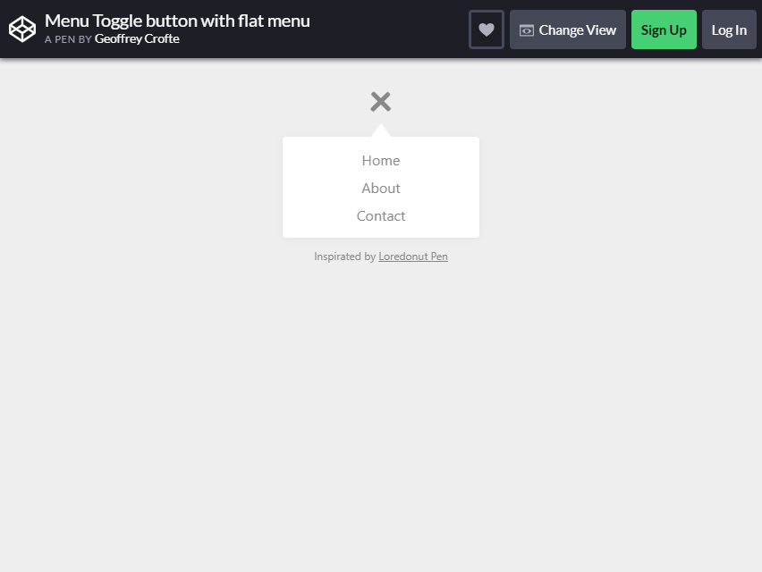
Geoffrey Crofte designed this menu style, which utilizes CSS transitions and vanilla JavaScript. As you can see from the picture, it is simple.
However, if you look beyond the picture, it will provide users with a better navigation experience. Click the Bootstrap hamburger menu button, and categories will appear. You can click the X icon to remove the categories.
This is mobile-friendly design but can also available for navigation through a desktop.
The menu’s NEUTRAL color makes it fit any theme of your blog or websites. It does not cover other site contents, which is a + for your audience or blog visitor.
Hamburger Icon with Morphing Menu
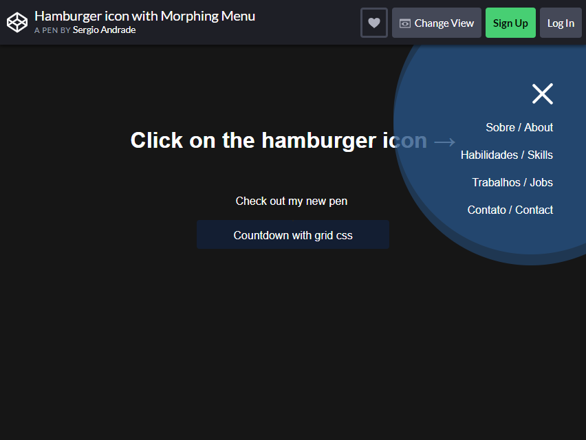
The concept with this menu is almost the same with others. However, it has something unique in this menu style.
Although the navigation method remains the same with toggle style, its appearance on the screen differs. Unlike others, this morphing menu is on one side of the website.
Its shape is also ideal for showing a few categories. To hide it, just click the X button.
For a beginner, this one is NOT difficult to follow. Just copy the codes Sergio Andrande shared. Edit it out a little, and then you are ready to go.
Page Tilt Effect
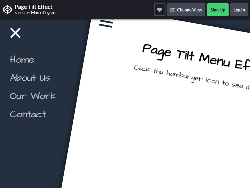
Do you want to add another flavor to your website? Thankfully, we have something to share with you. This Page Tilt Menu is different and may entice more visitors to your website.
Marco Furago is the one who created this hamburger menu style.
From your page, click the Bootstrap hamburger menu icon to tilt the page. The categories from your menu will then show up—it’s just as simple as that. You can add four or several categories under your menu button.
As you can see from the image, it has an excellent visual effect, and the font style is perfect. The color also adds to the website’s beauty.
Responsive and Mega Menu
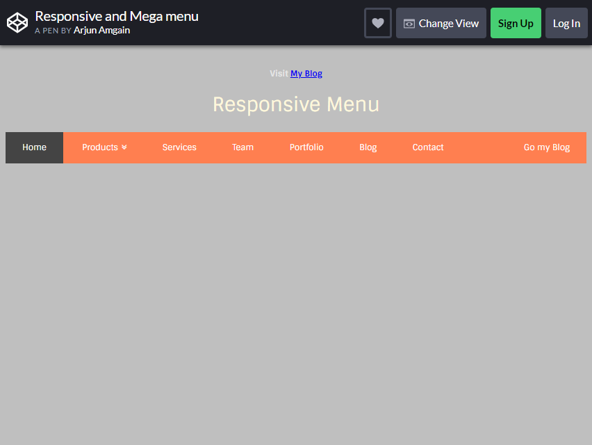
This menu does not feature a hamburger icon, but it still offers several toggle-down lists to help you get exactly what you want. Some website visitors prefer this one a lot. On the page, the menus are transparent and too easy to navigate.
They will only narrow down the item they are searching for by choosing a related menu. Then the category would be found easily.
Full Page Intro and Navigation
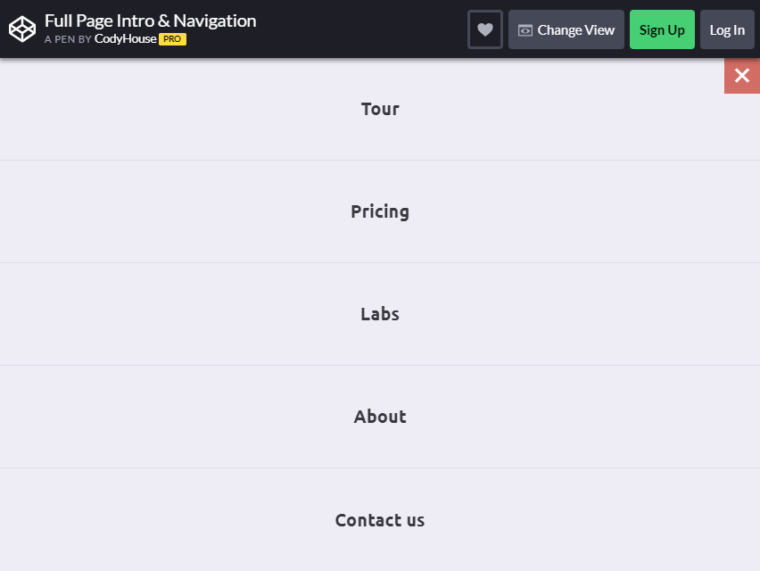
If you are looking for a full-page menu, this would be an excellent option. The category will appear on the screen as you navigate the hamburger icon.
It is not a bother anyway; a user can find the category they are looking for simply by clicking the icon. To close the menu, click the X, and you will return to the original page.
Aside from the SIMPLE menu design, it can be navigated easily.
Good navigation and simple design can work together. It will enhance the functionality of your website, allowing it to function the way you want it to.
Sara Soueidan’s Circulus
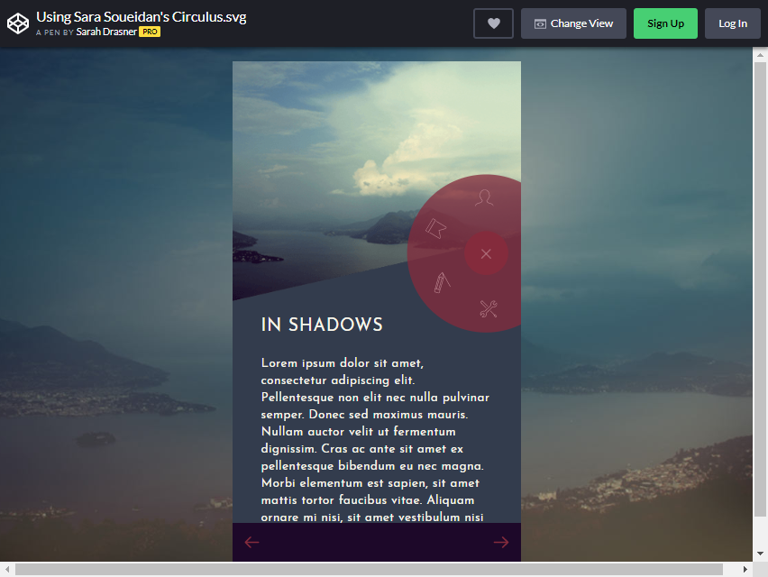
This bootstrap hamburger menu is not ordinary. It is used for mobiles, to begin with. But if you are creating other hamburger menus, this can inspire you to include one on your website. Look at the picture.
You will see a hamburger icon on the right side. As you click the image, other symbols will appear around it. That is where you will find a variety of categories.
Just click the X button to close the menu.
Having PICTURES on your menu icon is enticing to the viewers. It will give them instant ideas on what is included in every category. Sara Soueidan did an excellent job on this!
More 2026 mobile menu snippets from Colorlib
Menu buttons that open real panels, from our 2026 snippets: a mobile navigation drawer, a full-screen overlay menu and two hero headers with working mobile menus.
Offcanvas V01: Left navigation drawer for a mobile site with nested sections
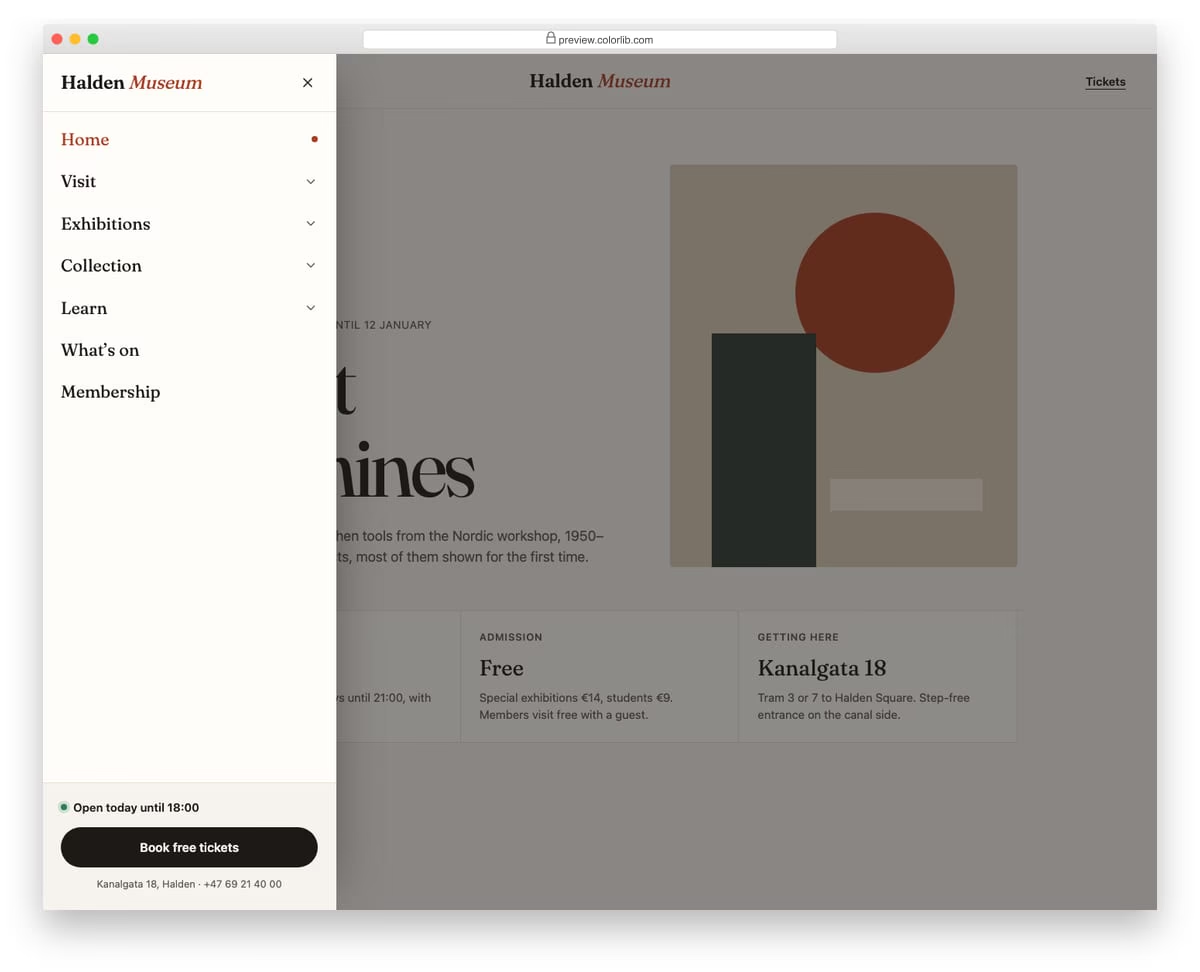
A slide-in menu from the left for a museum website, opened from a Menu button in the header. Top-level sections expand into sub-links with native details and summary elements, and only one section stays open at a time. The footer of the drawer holds today's opening hours and a ticket button.
Best for: mobile navigation for content-heavy sites such as museums, universities and councils. Plain HTML and CSS with a few lines of vanilla JavaScript, a 257 KB download, and it works on its own or inside a Bootstrap 4, 5 or 6 project.
Offcanvas V08: Full-screen overlay menu with large typography and a staggered link reveal
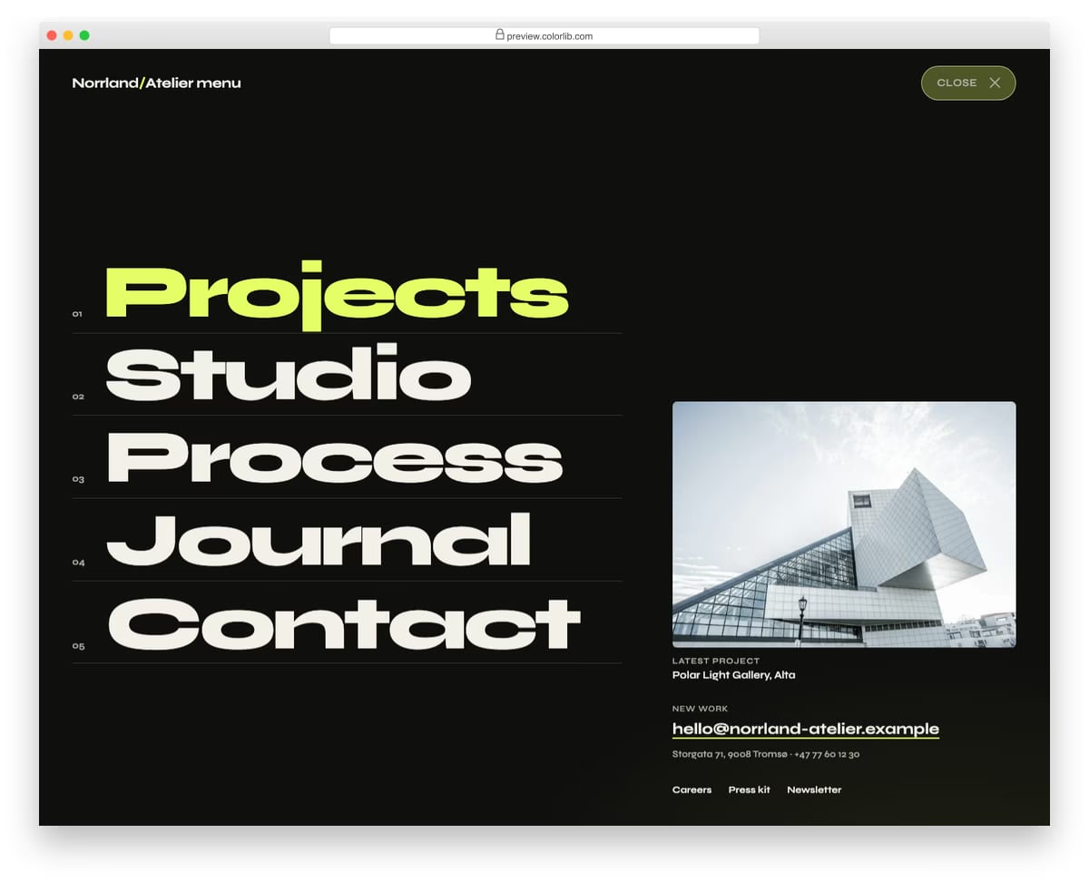
A full-screen menu for an architecture studio that opens with a circular wipe from the Menu button. Five oversized numbered links slide up one after another, followed by a featured project, contact details and small links. It closes with the Close button, Esc, a click on its empty background or by choosing a link.
Best for: portfolio, agency and studio websites with a short main menu. Plain HTML and CSS with a few lines of vanilla JavaScript, a 381 KB download, and it works on its own or inside a Bootstrap 4, 5 or 6 project.
Hero V02: Centred hero on an animated gradient mesh with a logo cloud
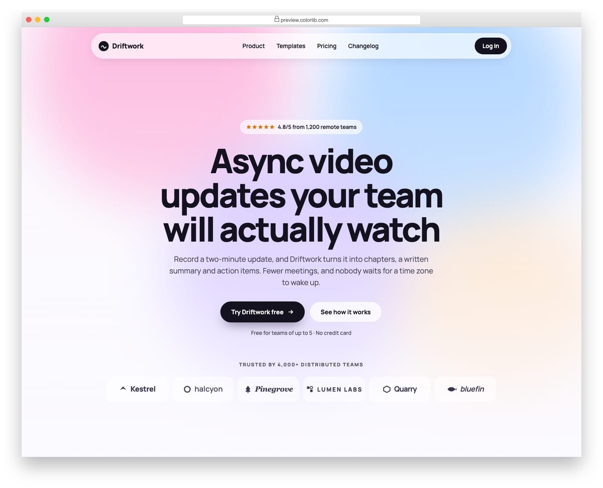
A centred landing-page hero for a remote-work video product, set on a soft gradient mesh made of four blurred shapes that drift slowly. It has a rating pill, a balanced multi-line headline, two calls to action and a logo cloud of six invented company wordmarks drawn with inline SVG. The glass top bar turns into a round menu button on phones, and the mesh stops moving when reduced motion is requested.
Best for: product launches, startup homepages and waitlist pages. Plain HTML and CSS with a few lines of vanilla JavaScript, a 204 KB download, and it works on its own or inside a Bootstrap 4, 5 or 6 project.
Hero V08: Restaurant hero on a full-bleed food photo with opening hours
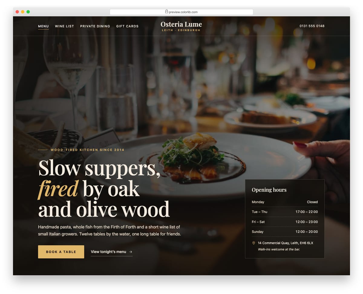
A full-screen restaurant hero with a dining-room photo under a layered dark overlay, a centred serif wordmark and navigation split around it. The headline, a short introduction and a gold Book a table button sit bottom left, and a translucent card lists opening hours, the address and a walk-in note. On phones the photo stays at the top, the overlay deepens and the hours card stacks under the copy.
Best for: restaurants, cafes, bars and hospitality venues. Plain HTML and CSS with a few lines of vanilla JavaScript, a 298 KB download, and it works on its own or inside a Bootstrap 4, 5 or 6 project.
What makes a good hamburger menu
Use a real, labelled button. The toggle should be a <button> with a text label such as “Menu” (visible or visually hidden) and an aria-expanded state, so screen readers announce what it does. Offcanvas V01 and V08 both open from a labelled Menu button.
Let people close it easily. A close button, Esc and a click outside the panel should all work, and focus should return to the button afterwards. Offcanvas V08 closes with its Close button, Esc, a click on its empty background or by choosing a link, and Offcanvas V01 returns focus to the Menu button.
Hide the menu only when you have to. On a desktop, visible links are quicker to use. V01 to V04 show the full menu on large screens and switch to the hamburger on phones, while V05, V06 and V20 hide it on every screen size, which suits portfolios with a few pages.
Structure long menus. A drawer with dozens of flat links is hard to scan. Offcanvas V01 groups sub-links into expandable sections and keeps only one open at a time.
Respect reduced motion. Animated icons and sliding panels should calm down for visitors who ask for less motion. Offcanvas V01 switches off its slide animation, and Hero V02 stops its moving background, when reduced motion is requested.
Frequently asked questions
Do these hamburger menus need Bootstrap or jQuery?
The Colorlib menus need neither: the toggle is a few lines of vanilla JavaScript, and they keep their look inside Bootstrap 4, 5 or 6. Two CodePen designs (Glenn Smith’s and Mario Loncarek’s) use jQuery, so check each pen before you copy it.
How do I add a hamburger icon to a Bootstrap 5 navbar?
Bootstrap’s own navbar uses a .navbar-toggler button with data-bs-toggle="collapse" and a .navbar-toggler-icon span inside, and it needs Bootstrap’s JavaScript bundle. If you would rather not load it, use one of the Colorlib menus above, which open with their own small script.
Can I use them in commercial projects?
Yes for the Colorlib menus: they are free under CC BY 3.0, so you can use them in personal and commercial projects as long as you keep the credit link. The uiCookies pack and the CodePen designs carry their own licences, so check each source before you ship.
How do I change the screen width where the hamburger appears?
Find the media query in the CSS that hides the desktop links and shows the toggle, and change its width. Test on a phone and a tablet, because a menu that fits at 1024px may wrap at 800px.
Final thoughts
Start with Website Menu V01 for a navbar that becomes a hamburger on phones, V05 for an icon-only slide-in menu, or Offcanvas V01 for a long menu with sections. For more slide-in panels, see our Bootstrap offcanvas examples.

Related Posts


Comments (0)