22 Free Bootstrap Progress Bar Examples (2026)
By Aigars Silkalns · Last updated May 13, 2026 · 15-min read
File uploads, multi-step forms, quiz progress, dashboard storage indicators, course completion meters — Bootstrap’s progress bar component shows up everywhere a user needs to know how much of something is done. This collection gathers 22 free Bootstrap 5–compatible progress bar examples covering both the linear and circular intents: the canonical striped-animated bar, contextual color variants, multi-segment stacked progress (new in Bootstrap 5.3), file-upload XHR patterns, SVG circular rings, conic-gradient circular indicators, multi-step form wizards, vertical timeline processes, and indeterminate loaders. Every screenshot is a working Bootstrap 5.3 implementation; each example links to its original inspiration on CodePen, GitHub, or the Bootstrap docs for those who want to fork or compare. If you’re picking the right progress indicator for an upload flow, building a circular ring without a library, or just hunting for a polished progress style, start here.
What is a Bootstrap progress bar?
A Bootstrap progress bar is a visual indicator of how much of a task has been completed — file uploads, form-wizard steps, quiz progress, loading states. Bootstrap ships progress bars as flexible, accessible components that scale from a single percentage indicator to multi-segment stacked bars representing parallel processes.
When to use a progress bar:
- File uploads or downloads with measurable progress
- Multi-step forms (“Step 2 of 5”)
- Course or onboarding completion
- Quiz or survey progress
- Storage usage indicators
- Long-running background tasks (data sync, report generation)
Bootstrap 5 vs Bootstrap 4 progress bars: Bootstrap 5 simplified the markup slightly and added native ARIA attributes (role="progressbar", aria-valuenow, aria-valuemin, aria-valuemax). The animated stripes (progress-bar-animated) now use a CSS-only animation rather than the Bootstrap 4 jQuery-based approach. Color variants follow Bootstrap’s standard contextual classes (success, info, warning, danger). Bootstrap 5.3 added the .progress-stacked wrapper for native multi-segment bars.
Progress bar vs spinner vs skeleton: Progress bars show measurable progress (you know what % is done). Spinners show indeterminate activity (something’s happening, time unknown). Skeleton loaders show content shape while data loads (the page renders structure before data arrives). Choosing the right one significantly improves perceived performance — see the comparison table further down for when to reach for each.
Browser support: All modern browsers (Chrome, Safari, Firefox, Edge) since 2021. Animations work everywhere Bootstrap 5 is supported. Circular progress bars (custom CSS / SVG) work everywhere SVG is supported. The newer CSS @property animated counter (item #13) requires Chrome 85+, Safari 16.4+, Firefox 128+.
How to use Bootstrap progress bars (basic markup)
<!-- Basic progress bar (60% complete) -->
<div class="progress" role="progressbar" aria-label="Basic example"
     aria-valuenow="60" aria-valuemin="0" aria-valuemax="100">
  <div class="progress-bar" style="width: 60%">60%</div>
</div>

<!-- Striped + animated -->
<div class="progress" role="progressbar"
     aria-valuenow="75" aria-valuemin="0" aria-valuemax="100">
  <div class="progress-bar progress-bar-striped progress-bar-animated bg-success"
       style="width: 75%">75%</div>
</div>

<!-- Multi-segment stacked (Bootstrap 5.3+) -->
<div class="progress-stacked">
  <div class="progress" role="progressbar" aria-valuenow="20" style="width: 20%">
    <div class="progress-bar bg-success">Done</div>
  </div>
  <div class="progress" role="progressbar" aria-valuenow="30" style="width: 30%">
    <div class="progress-bar bg-warning">In review</div>
  </div>
</div>
Required JS: None — progress bars are CSS-only by default. JavaScript is only needed for dynamic value updates.
Common gotcha: The width style on .progress-bar sets the actual visual progress. The aria-valuenow attribute is for screen readers only — they don’t sync automatically. Update both when changing progress programmatically.
Best free Bootstrap progress bar examples
We grouped the 22 picks by use case rather than ranking them — every example below is a viable production starting point. Each screenshot shows our Bootstrap 5.3 implementation of the pattern, inspired by the original designer credited beneath. The “Original demo” link goes to the source pen or repository for those who want to fork, compare implementations, or see the author’s specific code style.
Showcase — visually distinctive progress designs
1. Neon Glassmorphism Progress
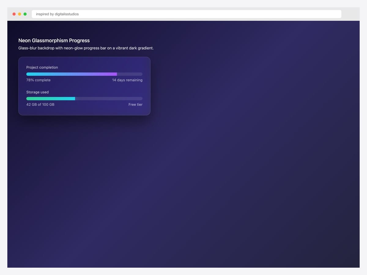
Frosted-glass backdrop with a vibrant neon-violet progress fill glowing on a dark productivity-tool background — the kind of polish you see in Linear, Raycast, or Vercel dashboards. Best fit for premium SaaS UIs where motion and depth signal product quality. Built with backdrop-filter: blur() on a translucent card, a gradient-filled .progress-bar, and a box-shadow glow that pulses via CSS keyframes. Browser support for backdrop-filter is universal in modern Chrome/Safari/Firefox (no Safari prefix needed since 2024). Provide a solid-color fallback for older browsers via @supports not (backdrop-filter: blur()).
Inspired by: digitalisstudios · License: MIT
Source & details Original demo
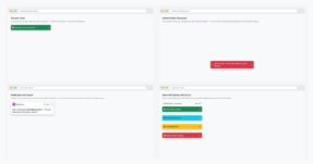
2. Gradient Score Meter
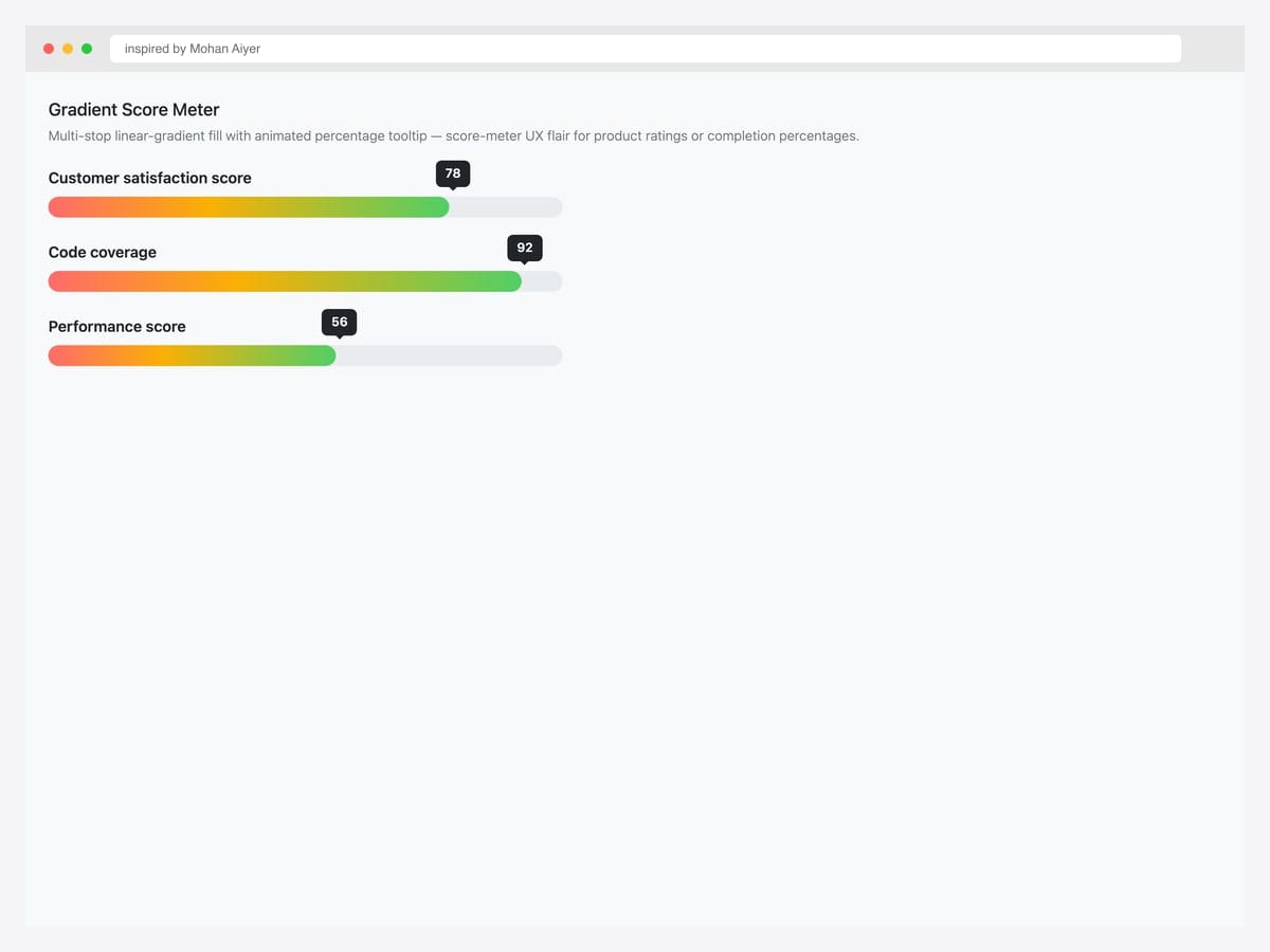
Multi-stop linear-gradient progress fill with an animated percentage tooltip that floats above the bar — a score-meter flair for product ratings, quiz results, and completion percentages. Best fit for gamified onboarding, learning platforms, and product-rating UIs where the score itself is the key information. Pure CSS gradient on the .progress-bar via background-image: linear-gradient(90deg, ...); the tooltip is an absolute-positioned element pinned to left: var(--percent) via CSS custom property. Update one CSS variable to move both the fill and the tooltip in lockstep.
Inspired by: mohan-aiyer · License: CodePen default (attribution required)
Source & details Original demo
3. Skill Bars Resume Style
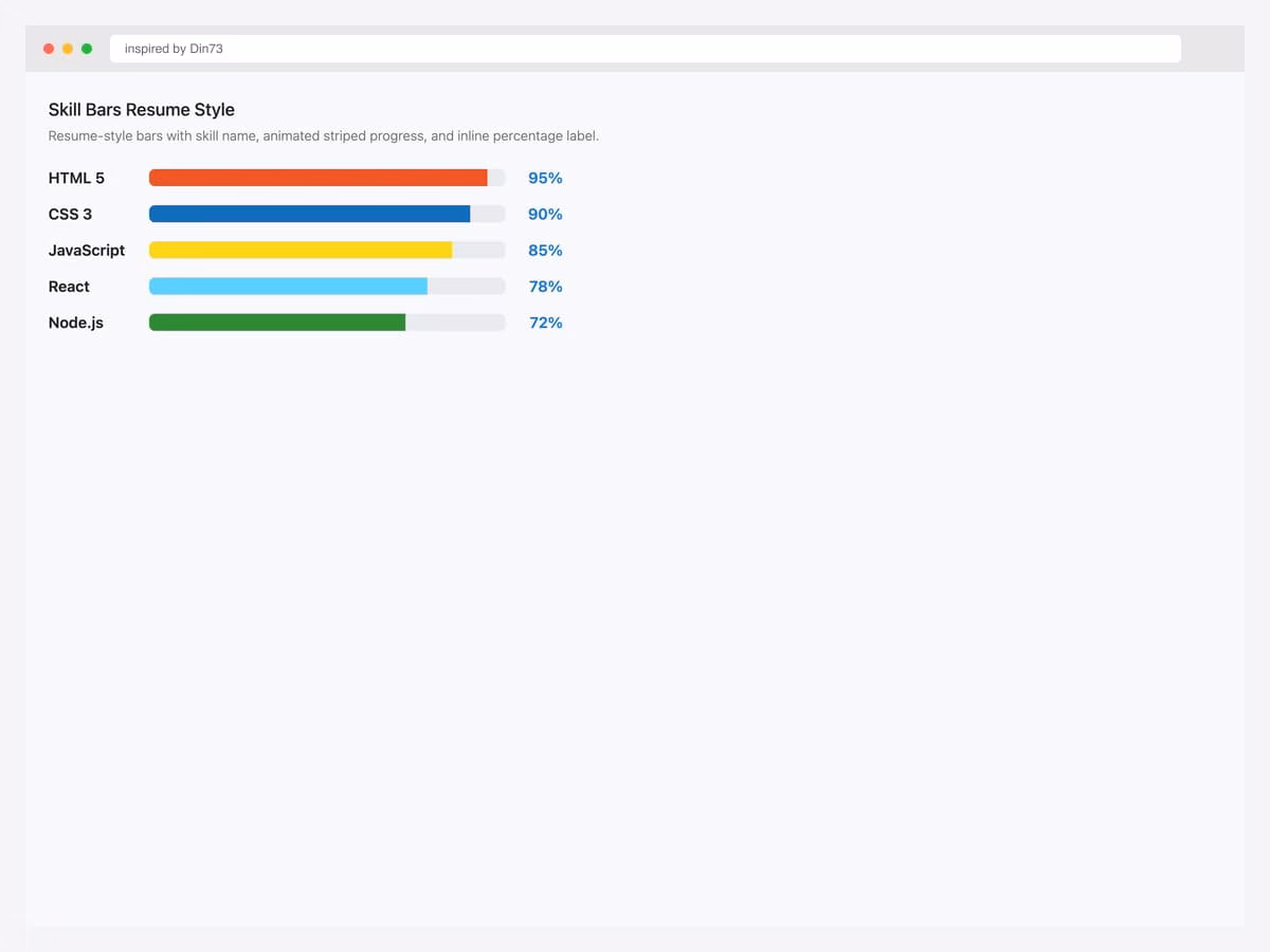
Resume-style stacked skill bars — HTML at 95%, CSS at 85%, JavaScript at 75% — each with striped animation and inline percentage labels. Best fit for portfolio sites, resumes, and profile pages where the user wants to communicate skill depth at a glance. Pure Bootstrap 5.3 .progress-bar-striped.progress-bar-animated on stacked .progress containers with custom labels. Use a fade-in or width-from-0 transition on scroll for visual interest. The label uses position: absolute outside the bar to stay readable regardless of fill color.
Inspired by: Din73 · License: CodePen default (attribution required)
Source & details Original demo
4. Neon Glow Bar
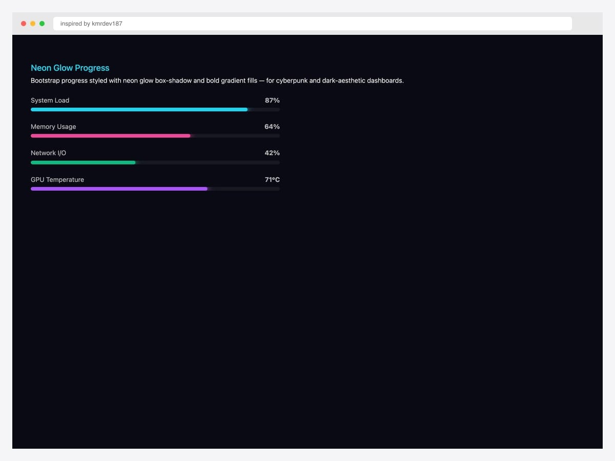
Native HTML <progress> element styled with a neon glow box-shadow and gradient fill on a dark background. Best fit for landing pages, hero sections, and any context where the bar itself is a design element rather than a utility. Pure CSS — the native progress element is styled via ::-webkit-progress-bar and ::-webkit-progress-value pseudo-elements plus a Firefox fallback. Animate the value with JavaScript (progressEl.value = pct) or use a CSS-only width animation if the value is static. Pair with a glassmorphism card (#1) for full visual coherence.
Inspired by: kmrdev187 · License: CodePen default (attribution required)
Source & details Original demo
Linear progress bars — Bootstrap native variants
5. Default Progress Bar
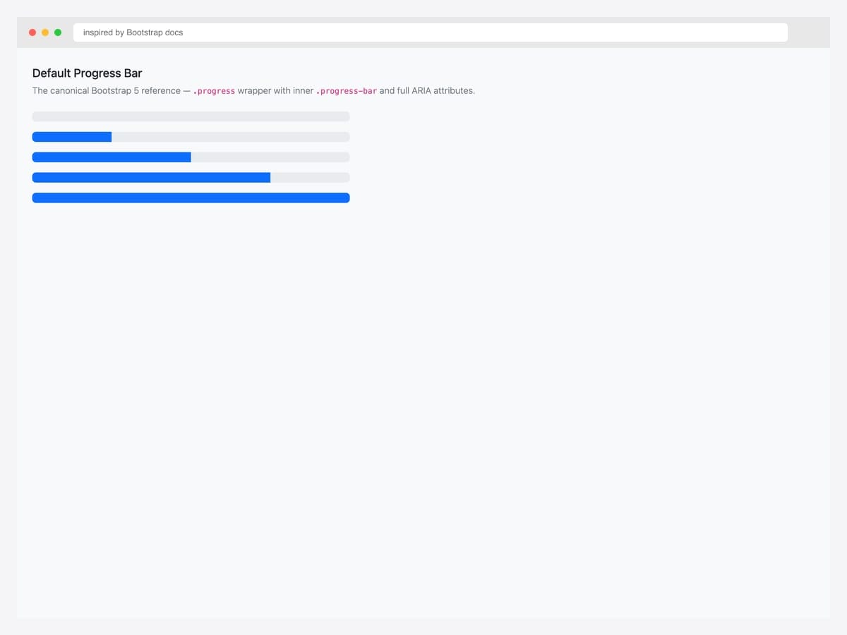
The canonical Bootstrap 5 progress bar — .progress wrapper with role=”progressbar” and aria-value attributes, plus an inner .progress-bar at 75% width. Best fit as the baseline for every project: this is the markup every other progress pattern in this collection extends. Pure Bootstrap 5.3 with full ARIA attributes (aria-valuenow, aria-valuemin="0", aria-valuemax="100"). The inner bar’s width style is what sets the visual fill — update both width and aria-valuenow when changing progress programmatically (they don’t sync automatically).
Inspired by: Bootstrap (twbs) · License: MIT
Source & details Original demo
6. Striped + Animated
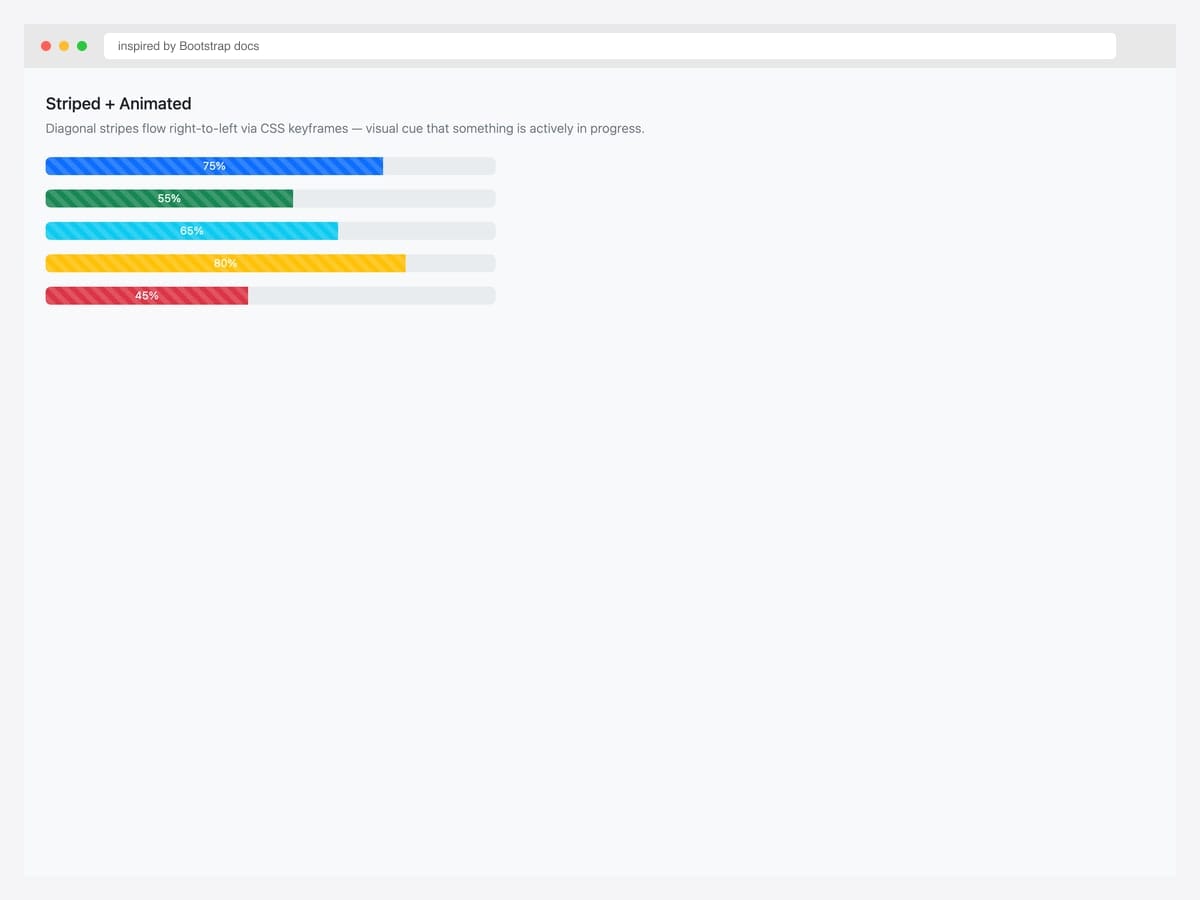
Striped animated progress bar — diagonal stripes flowing right-to-left via CSS keyframes inside a standard Bootstrap 5 .progress wrapper. Best fit for active-state indicators: file uploads, background syncs, long-running tasks where the animation signals “still working.” Pure Bootstrap 5.3 — add .progress-bar-striped for the diagonal pattern and .progress-bar-animated for the rightward motion. The animation is a CSS-only @keyframes progress-bar-stripes rule. Respect prefers-reduced-motion: reduce by hiding the animation for users with vestibular sensitivities.
Inspired by: Bootstrap (twbs) · License: MIT
Source & details Original demo
7. Contextual Color Variants
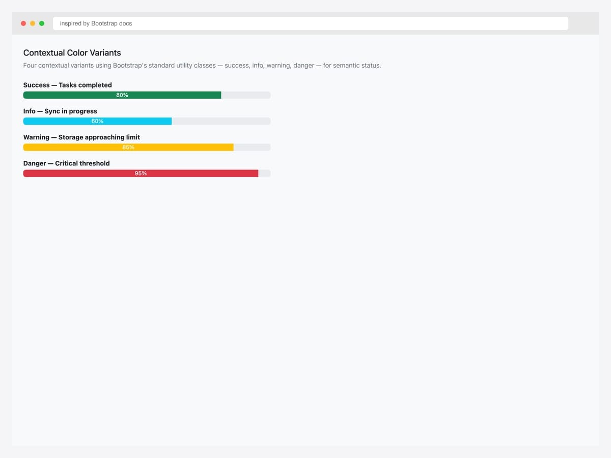
Four contextual color variants stacked vertically — .bg-success green, .bg-info cyan, .bg-warning yellow, .bg-danger red — for semantic status communication on dashboards and status pages. Best fit for multi-task dashboards, batch-process status indicators, and storage-usage breakdowns where color carries meaning. Pure Bootstrap 5 contextual classes. The colors map to Bootstrap’s CSS variables (--bs-success, --bs-warning, etc.) so they re-tint correctly under data-bs-theme="dark". Pair color with a text label for accessibility — never rely on color alone.
Inspired by: Bootstrap (twbs) · License: MIT
Source & details Original demo
8. Height Variations
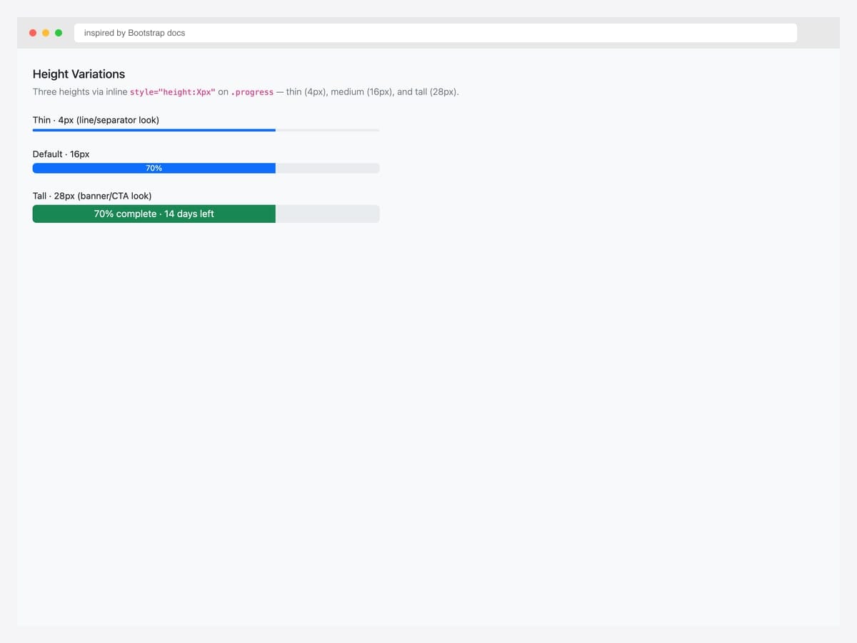
Three height variations — thin (4px), medium (16px), and tall (28px) — demonstrating size customization via inline style="height: Xpx" on the .progress wrapper. Best fit as a reference for sizing decisions: thin (4px) for reading-progress indicators, medium (16px) as the Bootstrap default, tall (28px) for hero-section progress with inline labels. Pure Bootstrap 5. Set height on the parent .progress element only — Bootstrap’s CSS auto-fills the inner bar to match. For a sticky-top reading-progress indicator, combine the 4px height with position: fixed; top: 0; z-index: 1030.
Inspired by: Bootstrap (twbs) · License: MIT
Source & details Original demo
9. With Inline Label
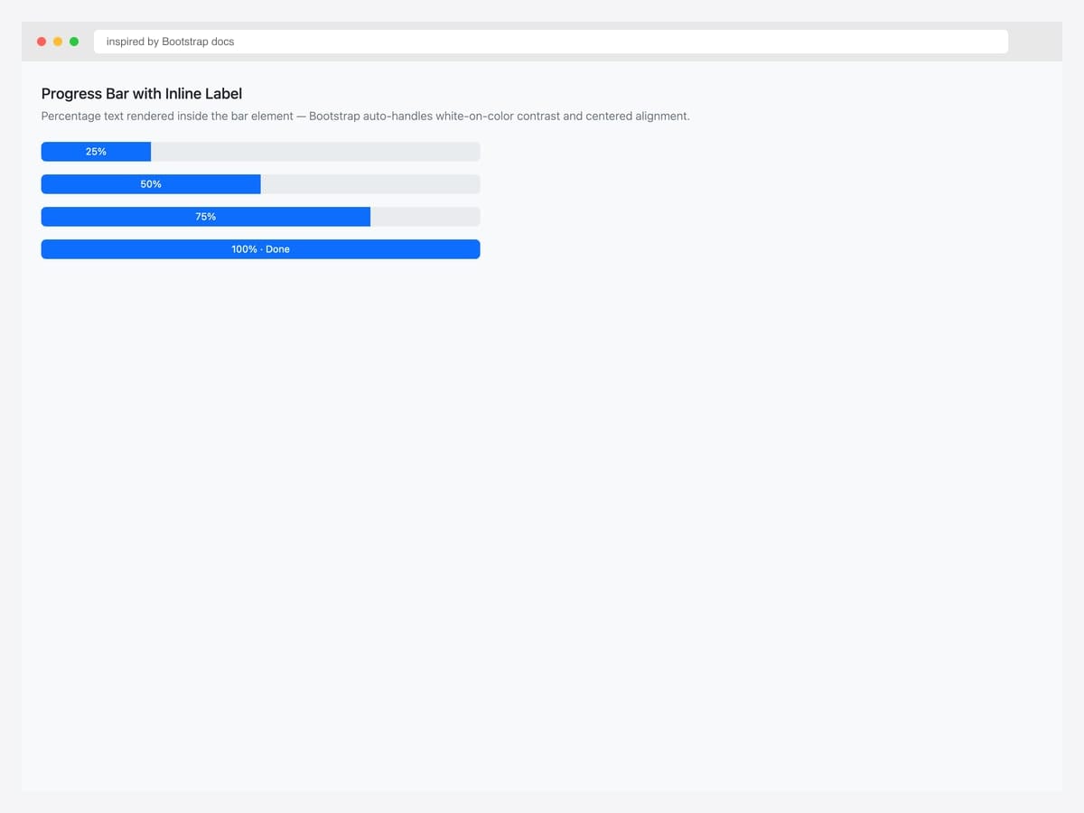
Progress bar with inline percentage label — 75% rendered inside the .progress-bar element in white text centered on the blue fill. Best fit when the percentage is the key information and the bar is wide enough to fit readable text (≥120px). Pure Bootstrap 5 — drop the percentage as text content inside the .progress-bar div. For low percentages (under ~15%) the label would clip outside the bar — switch to an external label or hide the label below a threshold. Update both the text and the width style when changing values dynamically.
Inspired by: Bootstrap (twbs) · License: MIT
Source & details Original demo
Circular progress (SVG & CSS)
10. SVG Circle with Percentage
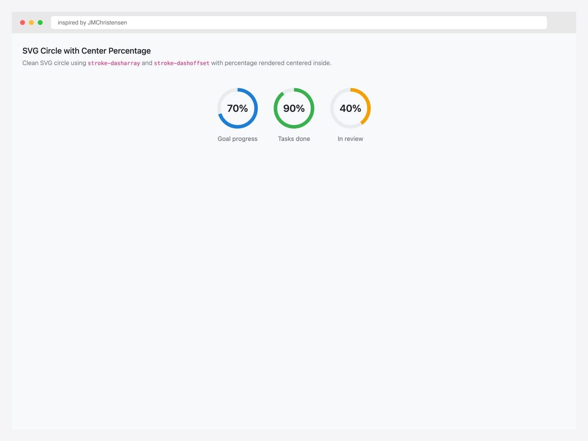
Clean SVG circular progress — a single stroke-dasharray ring with the percentage rendered as centered text inside the circle. Best fit for dashboard widgets, profile completion indicators, and any context where the circular shape carries metaphorical weight (completion, fullness). Pure SVG with no JavaScript — stroke-dasharray="65, 100" sets the visible portion of the ring’s circumference. The path uses a relative d attribute that’s easy to copy and re-color. Pair with Bootstrap color tokens via stroke="var(--bs-primary)" for theme consistency.
Inspired by: JMChristensen · License: CodePen default (attribution required)
Source & details Original demo
11. Conic-Gradient Circular
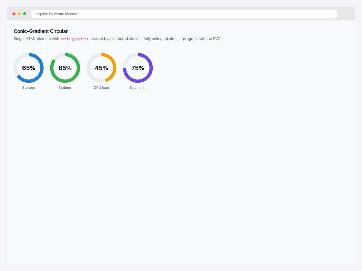
Single HTML element circular progress — conic-gradient fill masked by a radial-gradient cutout creating a fully animated circular indicator with no SVG required. Best fit when you want a lightweight circular progress without the SVG markup, especially for dashboards rendering hundreds of progress dots. Pure CSS — background: conic-gradient(var(--bs-primary) calc(var(--p) * 1%), #eee 0) with a ::before pseudo-element overlaying the center. Update the --p custom property to animate. Browser support is universal in modern browsers (Chrome 88+, Safari 15+, Firefox 89+).
Inspired by: alvaromontoro · License: CodePen default (attribution required)
Source & details Original demo
12. Multi-Color Gradient Ring
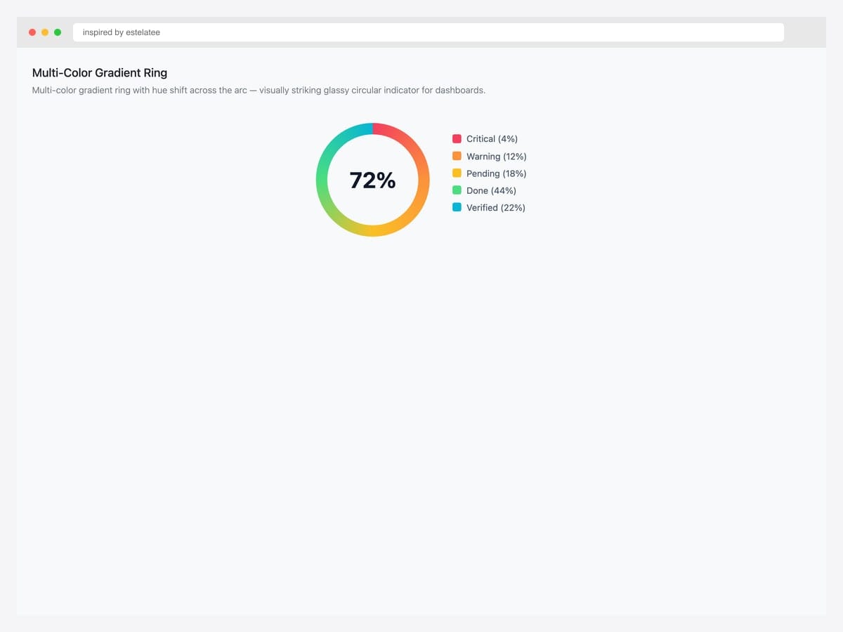
Multi-color gradient ring — circular progress with hue shifting smoothly across the arc creating a striking glassy gradient indicator. Best fit for premium dashboards, fitness apps, and visualization-heavy interfaces (Strava, Apple Activity rings). Built with a CSS conic-gradient using multiple color stops to create the rainbow effect, masked by a radial cutout for the ring shape. The animated version uses @keyframes on the gradient angle to rotate the hue. Pair with a soft drop-shadow on the ring for additional depth.
Inspired by: estelatee · License: CodePen default (attribution required)
Source & details Original demo
13. @property Animated Counter
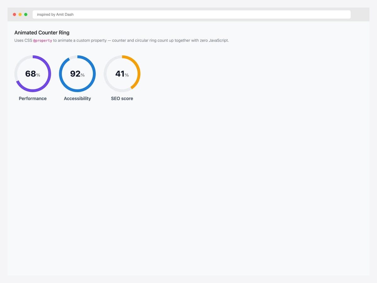
CSS @property animated circular progress — the ring fill and numeric counter count up together driven entirely by CSS without JavaScript. Best fit for landing-page hero stats, scroll-triggered metric reveals, and any context where motion-as-feedback signals “this number matters.” Uses the modern CSS @property rule to declare a typed custom property (<integer>) that CSS can animate — the trick is that browsers can only smoothly transition typed properties, not raw var() values. Browser support requires Chrome 85+, Safari 16.4+, Firefox 128+ (May 2024). Provide a JavaScript fallback for older browsers if needed.
Inspired by: Amit-Dash · License: CodePen default (attribution required)
Source & details Original demo
Stepped & wizard progress
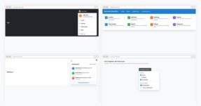
14. Multi-Step Form Wizard
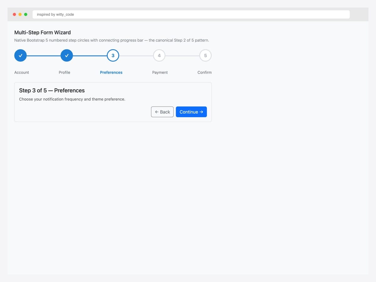
Multi-step form wizard — five numbered circular step indicators connected by a horizontal progress bar showing current position. Best fit for checkout flows, onboarding wizards, and any multi-step form where users need to see how much remains. Native Bootstrap 5 markup with custom step-circle CSS (border-radius: 50% on circles, ::before connecting line for the track). The active circle uses Bootstrap’s primary blue; completed steps get a checkmark icon. Wire the setStep(n) function from the brief to advance the indicator as users complete each step.
Inspired by: witty_code · License: CodePen default (attribution required)
Source & details Original demo
15. Dots + Lines Step Indicator
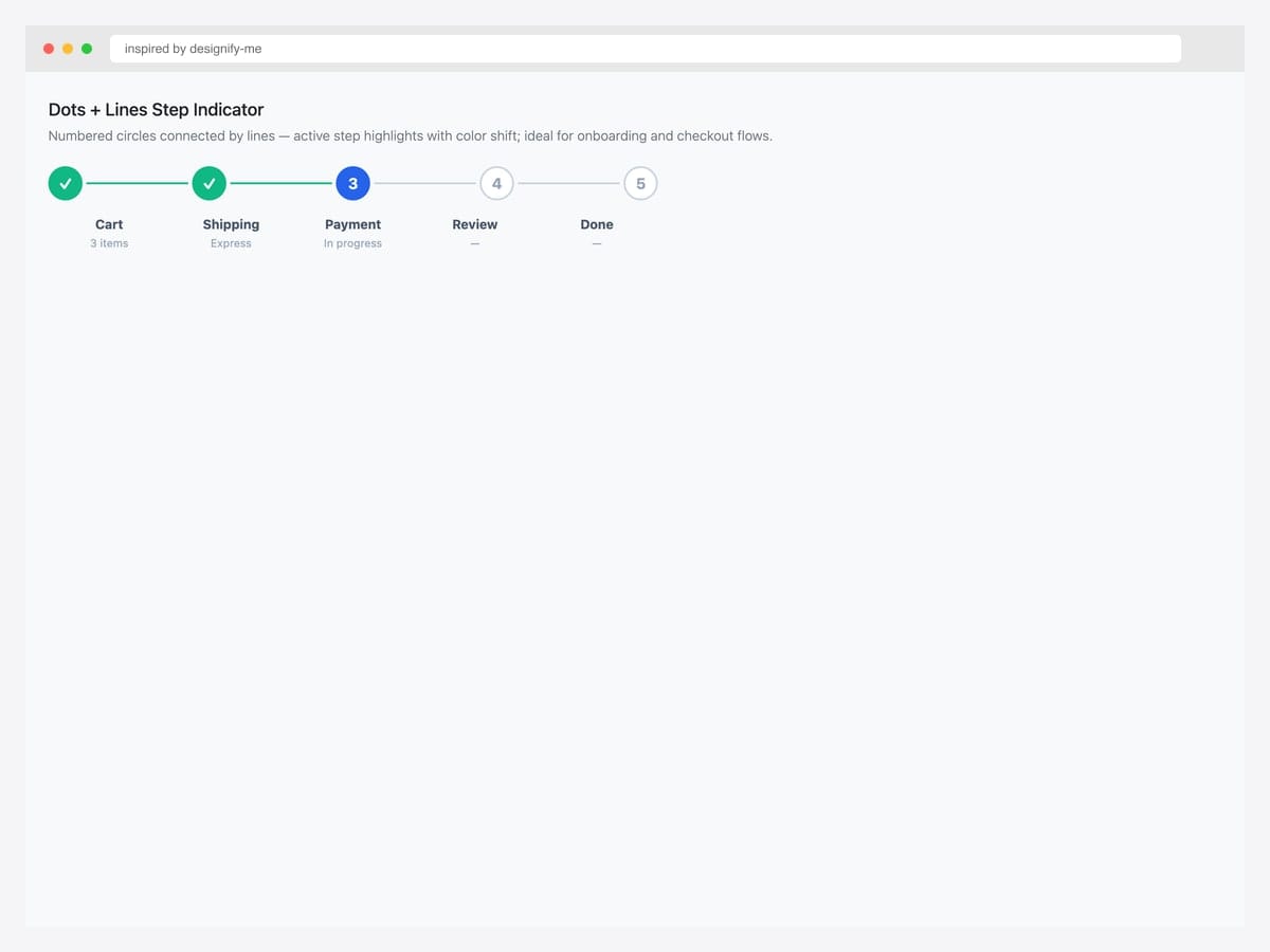
Dots-and-lines step indicator — numbered circles connected by lines with active-step highlighting via color shift on click. Best fit for tabbed multi-step content (settings panels, profile-setup flows) where users can jump between steps freely. Pure CSS for the dots and connecting lines using flexbox with justify-content: space-between and a horizontal line via ::before on the container. The active state toggles via a JavaScript click handler that updates an aria-current="step" attribute for screen reader support.
Inspired by: designify-me · License: CodePen default (attribution required)
Source & details Original demo
16. Vertical Timeline Process
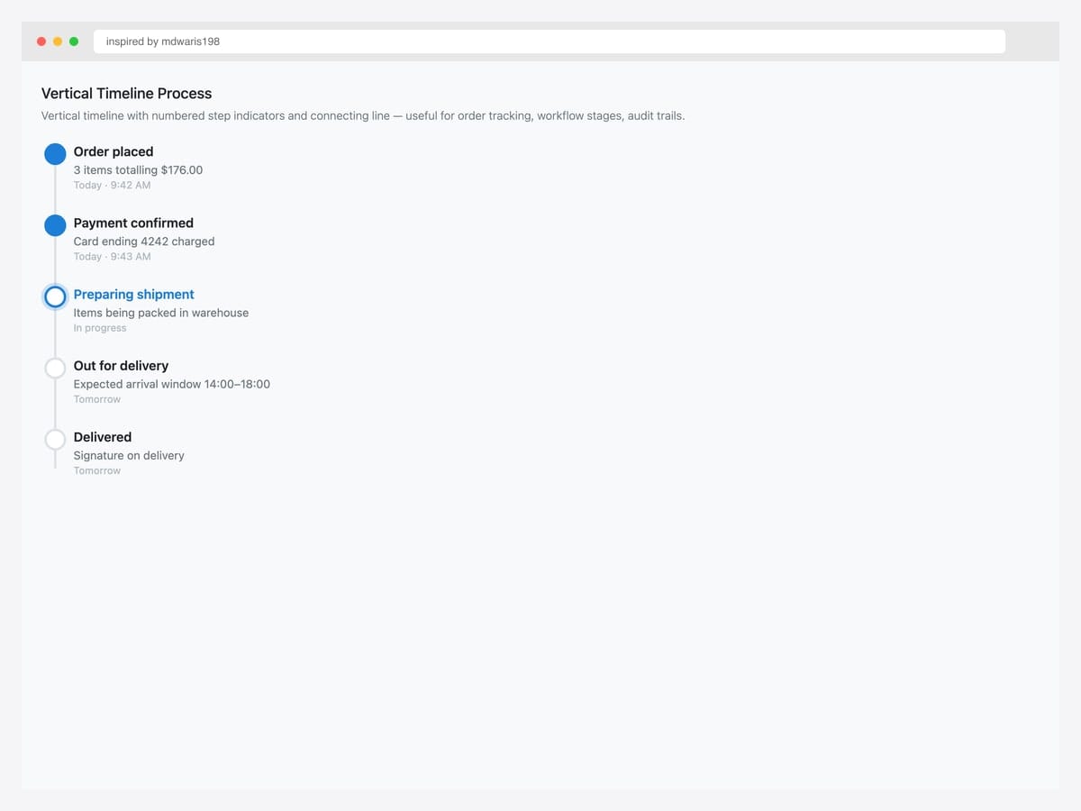
Vertical timeline progress — alternating left/right step boxes with cyan numbered indicators and fade-in animations on scroll. Best fit for company timelines, process explanations, and how-it-works sections where each step deserves its own block of content. Bootstrap 5 grid (row, col-md-6) with custom timeline CSS for the central connecting line and numbered circle markers. The fade-in uses Intersection Observer or AOS.js triggered on scroll. Alternates left/right via :nth-child(even) for visual rhythm.
Inspired by: mdwaris198 · License: MIT (Bootsnipp default)
Source & details Original demo
17. Animated Step Transitions
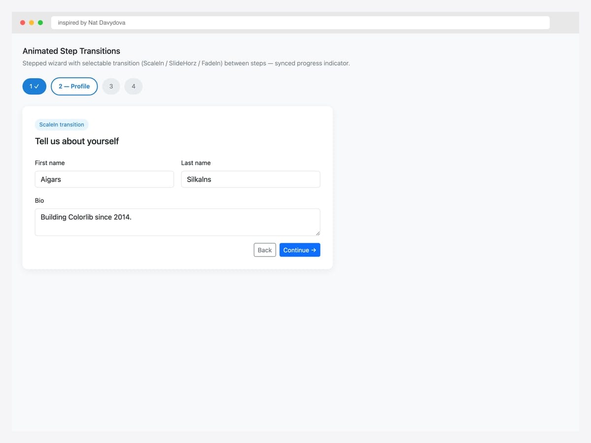
Stepped wizard with selectable transitions — ScaleIn, SlideHorz, or FadeIn between steps, synced with a progress indicator above. Best fit for product configurators, customization wizards, and any multi-step UI where motion polish elevates the experience. Built on Bootstrap 5 with Animate.css or custom CSS keyframes for the transitions. The active transition is stored in localStorage so user preference persists. Each step’s opacity and transform animate via CSS, triggered by adding/removing an .active class on the step container.
Inspired by: nat-davydova · License: CodePen default (attribution required)
Source & details Original demo
Specialty patterns — upload, stacked, indeterminate
18. File Upload Progress
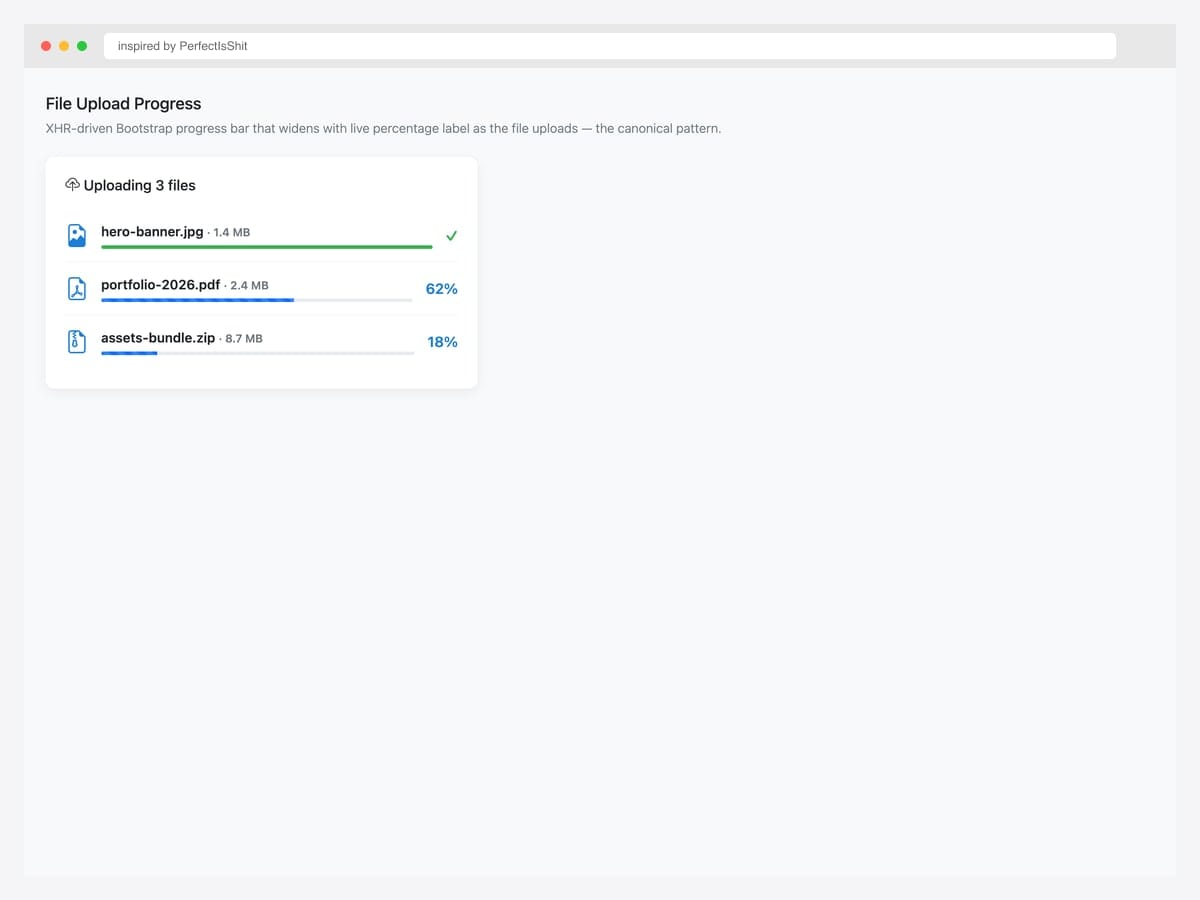
XHR-driven Bootstrap progress bar that widens with a live percentage label as the file uploads to the server — the canonical practical pattern. Best fit for any file-upload flow: avatar uploads, document attachments, media imports. Pure Bootstrap 5 markup with vanilla JavaScript XHR upload.addEventListener('progress', ...) handler. The loaded and total properties of the progress event give exact byte counts; divide for the percentage. On completion, swap the striped-animated bar for a static green success state. See the “File-upload progress” advanced pattern below for the full XHR + Bootstrap implementation.
Inspired by: PerfectIsShit · License: CodePen default (attribution required)
Source & details Original demo
19. Multi-Segment Stacked
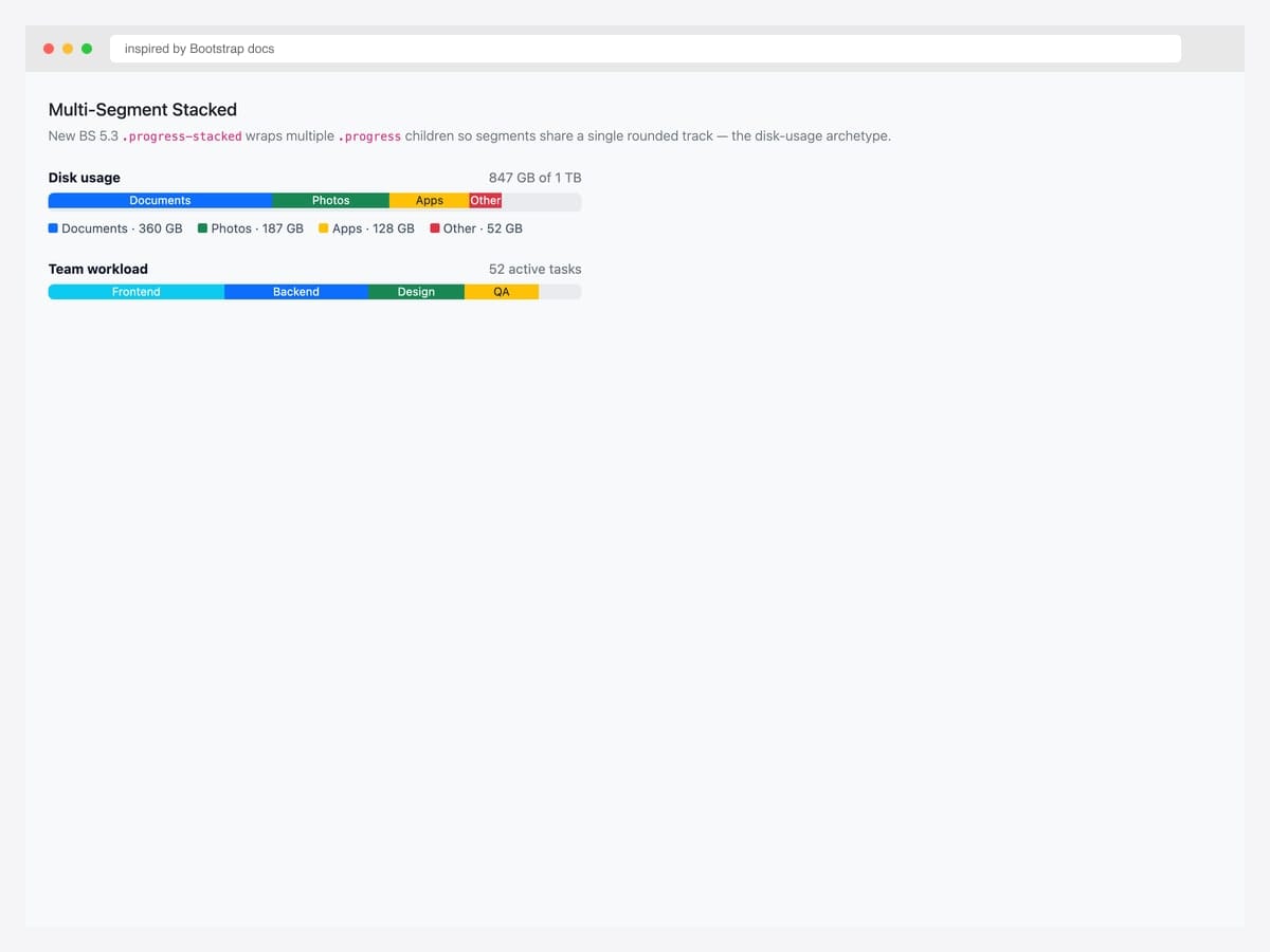
Multi-segment stacked progress — Bootstrap 5.3’s new .progress-stacked wraps multiple .progress children so segments share a single rounded track. Best fit for disk-usage breakdowns (used / free / cache), budget allocations (spent / pending / remaining), and any quantity split across parallel categories. Native Bootstrap 5.3 — no custom CSS needed. Each segment is a separate .progress with its own width and color variant (.bg-success, .bg-warning, .bg-danger). The wrapper handles the unified rounded-corner treatment so segments visually connect.
Inspired by: Bootstrap (twbs) · License: MIT
Source & details Original demo
20. Reverse Countdown Timer
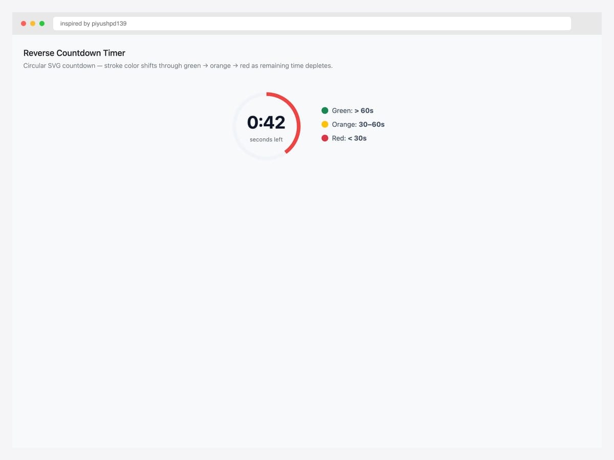
Reverse countdown timer — circular SVG with the stroke color transitioning green to orange to red as remaining time depletes. Best fit for quiz timers, time-limited offers, OTP-code expiration, and any countdown context where the color itself signals urgency. Uses SVG stroke-dasharray animated via JavaScript on a setInterval tick. Three CSS classes (.normal, .warning, .danger) trigger at the 50% and 25% remaining thresholds via JavaScript class toggle. Pair with a centered text element showing remaining seconds for precise feedback.
Inspired by: piyushpd139 · License: CodePen default (attribution required)
Source & details Original demo
21. Indeterminate Loader
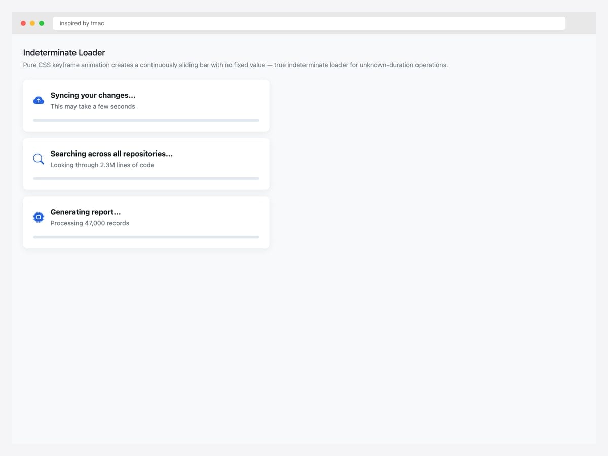
Pure-CSS keyframe sliding bar with no fixed value — animates continuously as a true indeterminate progress indicator. Best fit when progress can’t be measured (server-side processing, awaiting external API response). Pure CSS — a ::before pseudo-element with animation: indeterminate 1.5s infinite linear slides from 0% to 100% inside the .progress container. No JavaScript required. This is the progress-bar equivalent of a spinner: use when you can’t calculate progress, prefer a real progress bar (#18) whenever you can compute it.
Inspired by: tmac · License: CodePen default (attribution required)
Source & details Original demo
22. Poll Comparison Bars
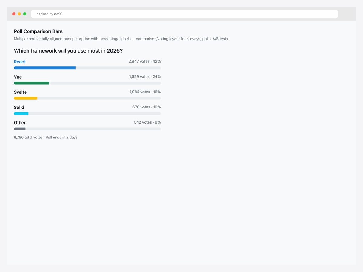
Three horizontally aligned progress bars per poll (25%, 55%, 20%) with text labels and tally counts — the comparison voting layout. Best fit for polls, survey-result pages, and any context comparing multiple values within a fixed total. Pure Bootstrap 5 markup with each option in a flex row: label on the left, bar in the middle, tally on the right. Color-code the leading option with .bg-primary and others with .bg-secondary for visual hierarchy. Update widths after submission via a single re-render — no animation needed for static result display.
Inspired by: ee92 · License: CodePen default (attribution required)
Source & details Original demo
Advanced Bootstrap progress bar patterns
Three patterns the listicle items above hint at but rarely demo as full working code. Each solves a specific production problem.
Pattern 1 — Dynamic file-upload progress with XHR. The most common practical use of progress bars. The browser’s XHR progress event gives loaded and total byte counts you can divide for the percentage. Update both width and aria-valuenow on every tick:
<input type="file" id="fileInput">
<div class="progress mt-2" role="progressbar"
     aria-valuemin="0" aria-valuemax="100" hidden>
  <div class="progress-bar progress-bar-striped progress-bar-animated"
       id="uploadBar" style="width: 0%"></div>
</div>
document.getElementById('fileInput').addEventListener('change', (e) => {
const file = e.target.files[0];
if (!file) return;
const progressEl = document.querySelector('.progress');
const barEl = document.getElementById('uploadBar');
progressEl.hidden = false;
const xhr = new XMLHttpRequest();
xhr.upload.addEventListener('progress', (evt) => {
if (evt.lengthComputable) {
const pct = Math.round((evt.loaded / evt.total) * 100);
barEl.style.width = pct + '%';
progressEl.setAttribute('aria-valuenow', pct);
barEl.textContent = pct + '%';
}
});
xhr.addEventListener('load', () => {
barEl.classList.remove('progress-bar-animated', 'progress-bar-striped');
barEl.classList.add('bg-success');
barEl.textContent = 'Uploaded';
});
const fd = new FormData();
fd.append('file', file);
xhr.open('POST', '/upload');
xhr.send(fd);
});Pattern 2 — Step-based form wizard progress. Multi-step forms need progress indication. Map each step to a percentage and update on transition. The percentage formula ((step - 1) / (total - 1)) * 100 ensures step 1 shows 0% and the final step shows 100%:
<div class="progress" role="progressbar"
     aria-valuemin="0" aria-valuemax="100" aria-valuenow="0">
  <div class="progress-bar bg-info" id="wizardProgress" style="width: 0%"></div>
</div>
<div class="d-flex justify-content-between mt-1 small">
  <span>Account</span>
  <span>Profile</span>
  <span>Preferences</span>
  <span>Confirm</span>
</div>
const TOTAL_STEPS = 4;
function setStep(currentStep) {
const pct = ((currentStep - 1) / (TOTAL_STEPS - 1)) * 100;
const bar = document.getElementById('wizardProgress');
bar.style.width = pct + '%';
bar.parentElement.setAttribute('aria-valuenow', pct);
}Pattern 3 — Circular progress bar (custom CSS, BS-compatible). Bootstrap doesn’t ship a circular progress bar natively, but an SVG-based approach pairs cleanly with Bootstrap’s color tokens. The stroke-dasharray trick uses the path length (100 for the magic circle math below) to set the visible portion of the ring:
<div class="progress-circle" style="--progress: 65; --color: var(--bs-primary);">
  <svg viewBox="0 0 36 36" class="circular-chart">
    <path class="bg" d="M18 2.0845 a 15.9155 15.9155 0 0 1 0 31.831 a 15.9155 15.9155 0 0 1 0 -31.831"/>
    <path class="fg" stroke-dasharray="65, 100"
          d="M18 2.0845 a 15.9155 15.9155 0 0 1 0 31.831 a 15.9155 15.9155 0 0 1 0 -31.831"/>
    <text x="18" y="20.5" class="percentage">65%</text>
  </svg>
</div>
.progress-circle .circular-chart { width: 120px; }
.progress-circle .bg { fill: none; stroke: var(--bs-gray-200); stroke-width: 3; }
.progress-circle .fg {
fill: none;
stroke: var(--color, var(--bs-primary));
stroke-width: 3;
stroke-linecap: round;
animation: progress-fill 1s ease-out forwards;
}
.progress-circle .percentage { font-size: .5em; text-anchor: middle; }
@keyframes progress-fill { from { stroke-dasharray: 0 100; } }Progress bar vs spinner vs skeleton — when to use which
| Progress bar | Spinner | Skeleton loader | |
|---|---|---|---|
| What it shows | Measurable progress (0–100%) | Indeterminate activity | Content shape while data loads |
| User knows when it ends | Yes (via percentage) | No | Sort of (loads “when ready”) |
| Best for | File uploads, multi-step processes, quizzes | API calls, background tasks | Initial page or list rendering |
| Layout | Inline horizontal or circular | Small circular icon | Mimics final UI structure |
| Implementation | Bootstrap .progress | Bootstrap .spinner-border / .spinner-grow | Custom CSS (often animated gray boxes) |
| Perceived performance | High (visible progress) | Low (you wait) | High (visible structure) |
When to choose what: Measurable task → progress bar. Quick API call (<2s) → spinner. Initial page or list render → skeleton. For longer indeterminate tasks (3–10s) where you genuinely can’t compute progress, use an indeterminate progress bar (#21) rather than a spinner — it visually commits more screen space, which signals “this might take a moment.”
Frequently asked questions
How do I animate a Bootstrap progress bar?
Add the progress-bar-striped and progress-bar-animated classes to the inner .progress-bar element: <div class="progress-bar progress-bar-striped progress-bar-animated" style="width: 60%"></div>. The striped pattern is created via CSS gradient, and the animation moves the stripes via the progress-bar-stripes keyframe. No JavaScript required. Respect prefers-reduced-motion: reduce by hiding the animation for users with vestibular sensitivities.
How do I update a Bootstrap progress bar dynamically with JavaScript?
Update the width style on the inner .progress-bar element and the aria-valuenow attribute on the parent .progress: const bar = document.querySelector('.progress-bar'); bar.style.width = '75%'; bar.parentElement.setAttribute('aria-valuenow', 75);. Always update both — width is for visual rendering, aria-valuenow is for screen readers.
How do I create a circular progress bar in Bootstrap?
Bootstrap doesn’t ship a native circular progress bar, but you can build one with SVG using two overlapping circular paths and a stroke-dasharray value that maps to your percentage. Pair this with Bootstrap’s color tokens (var(--bs-primary)) for consistency. See Pattern 3 in the advanced patterns above for the full code. For a JavaScript-free animated version, use the CSS @property approach demonstrated in item #13.
How do I make a Bootstrap progress bar taller or shorter?
Set the height style on the parent .progress element: <div class="progress" style="height: 24px;">. Bootstrap’s default height is 1rem (16px). Avoid setting height on the inner .progress-bar directly — it inherits from the parent. For thin progress bars (reading-progress indicators), use heights as small as 2–4px combined with position: fixed; top: 0 for a sticky reading-progress effect.
What’s the difference between a progress bar and a spinner?
A progress bar shows measurable progress (e.g., file upload at 65%) — the user knows how much remains. A spinner shows indeterminate activity (something is happening, duration unknown). Use a progress bar when you can calculate progress; use a spinner for short tasks (under 2 seconds) where progress reporting would be more confusing than helpful. For longer indeterminate tasks, use an indeterminate progress bar (#21) instead of a spinner.
How do I show multiple values on a single Bootstrap progress bar?
Use the .progress-stacked wrapper (Bootstrap 5.3+) with multiple .progress elements inside, each with its own width. This creates a multi-segment stacked bar — useful for showing parallel processes, multi-status work queues, storage breakdowns, or budget allocations. Each segment can have its own color variant (bg-success, bg-warning, etc.). See item #19 in this collection for the canonical example.
Are these Bootstrap progress bar examples free for commercial use?
Yes — every example in this collection uses an MIT, Apache 2.0, or CodePen-default license, which permits commercial use including in client projects and SaaS products. Our Bootstrap 5.3 implementations are released under MIT; the original inspirations are linked for those who want to verify each source pen’s specific license terms.
Final thoughts
Bootstrap’s progress bar component is one of the most flexible primitives in the framework — it scales from a 4px reading-progress indicator pinned to the top of a blog post all the way up to a multi-segment storage breakdown in a dashboard widget. The picks worth committing to memory: the official striped+animated reference (#6) as your default for active states, the file-upload XHR pattern (#18) for any upload flow, the multi-step wizard (#14) for any onboarding or checkout, Bootstrap 5.3’s stacked progress (#19) for parallel-process indicators, and the SVG circular progress (#10) when you need the circular shape without pulling in a library.
If you’re building a multi-step form, pair these progress patterns with our Bootstrap form templates. For the file-upload flow specifically, see our Bootstrap file upload templates. For Bootstrap 5 status-feedback siblings, see our Bootstrap toast notifications and Bootstrap alerts.
Related collections: Bootstrap form templates · Bootstrap file uploads · Bootstrap toast notifications · Bootstrap alerts · Bootstrap contact form templates · Bootstrap buttons · Bootstrap cards · Free booking form templates · HTML5 login form templates · Bootstrap snippet library
Related Posts


Comments (0)