

25 Free Bootstrap Buttons: Hover, Icon & Social Styles 2026
These free Bootstrap buttons give you ready-made styles for calls to action, social logins, drop-downs, toggles, checkboxes and file uploads, in solid, outline, rounded, angled, gradient and dark variations.
The list has 25 items. The 20 Colorlib button sets are dependency-free HTML and CSS, with a few lines of vanilla JavaScript only where a set includes drop-downs, and the downloads shrank from over 600 KB to around 100–250 KB. Each works on its own or inside a Bootstrap 4, 5 or 6 project. Alongside them are the uiCookies button pack and four 2026 snippets whose buttons change state: add to bag, favorite, like and app store buttons.
Every Colorlib set is a free download with a live demo. Tips for picking button styles and answers to common questions follow the list.
Best Bootstrap Buttons Templates
uiCookies Button Sets (8 sets, 30+ styles)

Eight sets rather than eight buttons, adding up to more than thirty styles: gradient, pressable 3D, ghost, icon, loading-state, neon, neobrutalist and social sign-in buttons.
The loading-state set is the one worth a look — it covers the spinner and disabled states most button collections skip, which is exactly the part you end up writing yourself. From our own uiCookies library, pure CSS, free for commercial use.
Bootstrap Buttons V01
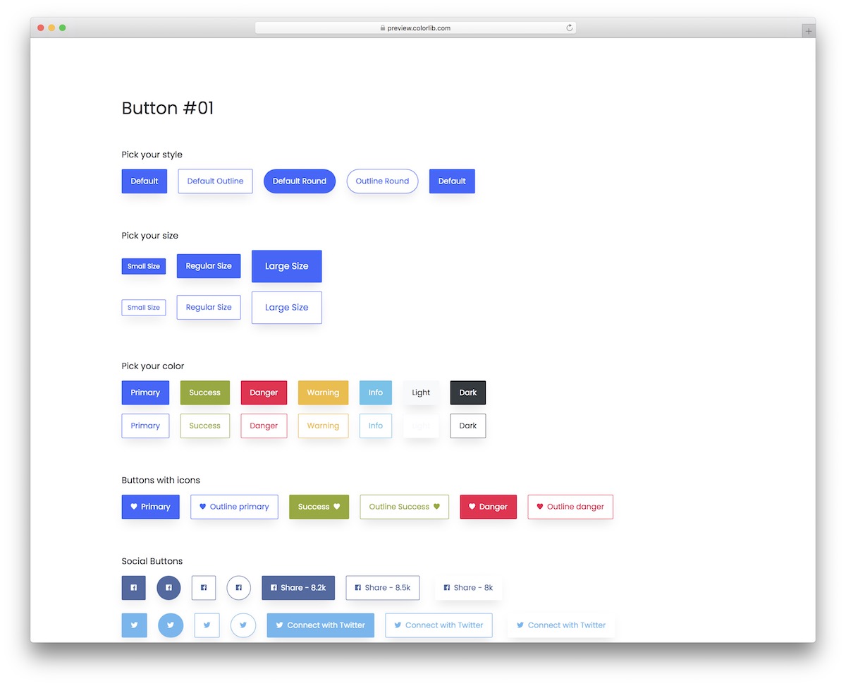
A collection of multiple different buttons that work for any website or application. This is a modern set of small snippets that you can now integrate without starting from scratch.
They come in many different styles, sizes, colors, and other features that will help you.
You also get this with a hover effect and a minimalistic outline look. In short, there’s something for everyone.
Bootstrap Buttons V02
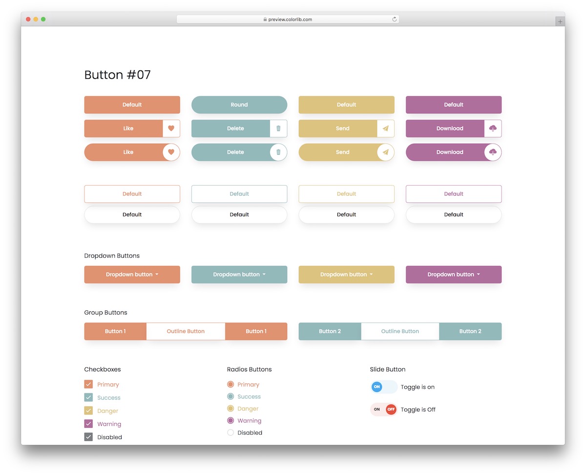
This creative collection of buttons is perfect for everyone who digs a more soothing look. You can easily find the right ones with various color choices that meet your specific branding requirements.
If you want to make any changes, you can do so.
You also get toggles, social icons/buttons, checkboxes, call-to-actions, and standard buttons. Of course, all these buttons work flawlessly on desktop and mobile.
Bootstrap Buttons V03
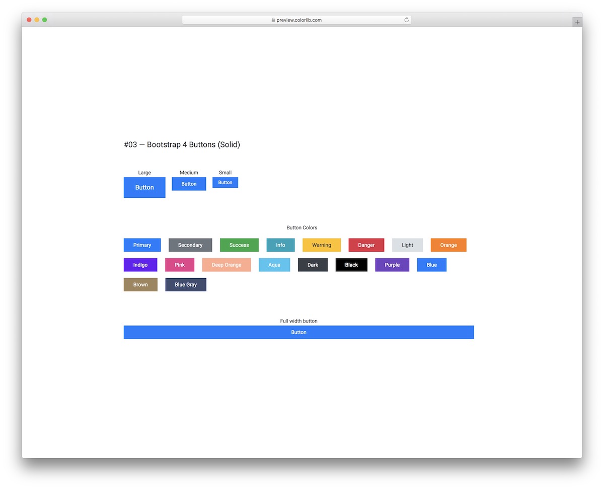
This template has solid Bootstrap-style buttons and outline alternatives. You can even mix and match the two at your own discretion. It is pure CSS and needs no JavaScript at all.
They come in three different sizes, offering over fifteen color variations and even a full-width version.
If you need a quick solution for your application, look no further and opt for any of these.
Bootstrap Buttons V04
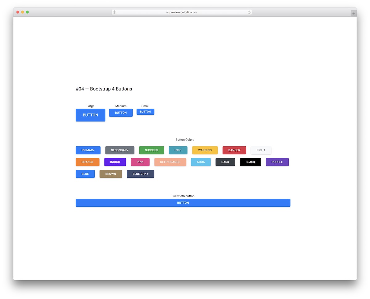
These Bootstrap buttons are similar to the solid ones from the template above, just with rounded edges. If you don’t like the sharpness, you can soften the effect by using these responsive buttons.
You can also select from several sizes and color choices, allowing for an almost instant embed into your project.
Bootstrap Buttons V05

There is always a way to go against the norm, even when it comes to buttons.
For instance, you can opt for this cool collection of angled Bootstrap buttons with solid form.
Like all our other alternatives, they come in various dimensions (including full width) and different colors, as shown in the screenshot above.
Bootstrap Buttons V06
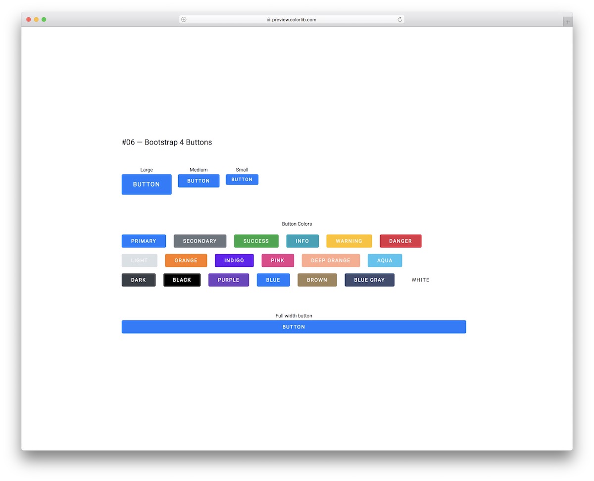
Bootstrap Buttons V06 is a collection of bold and simple buttons with rounded edges at first glance but they are more than that.
Each button comes with a cool hover effect that changes it into white and makes it pop by slightly enlarging it and adding a shadow around it.
Feel free to test them out before downloading.
Bootstrap Buttons V07

Rounded elements on websites and applications have become increasingly popular with the popularity of mobile traffic.
To integrate rounded buttons into your project, you don’t need to make them yourself; rather, download the Bootstrap Buttons V07 bundle.
Along with the modern design, they also respond on hover and work smoothly on different screen sizes.
Bootstrap Buttons V08
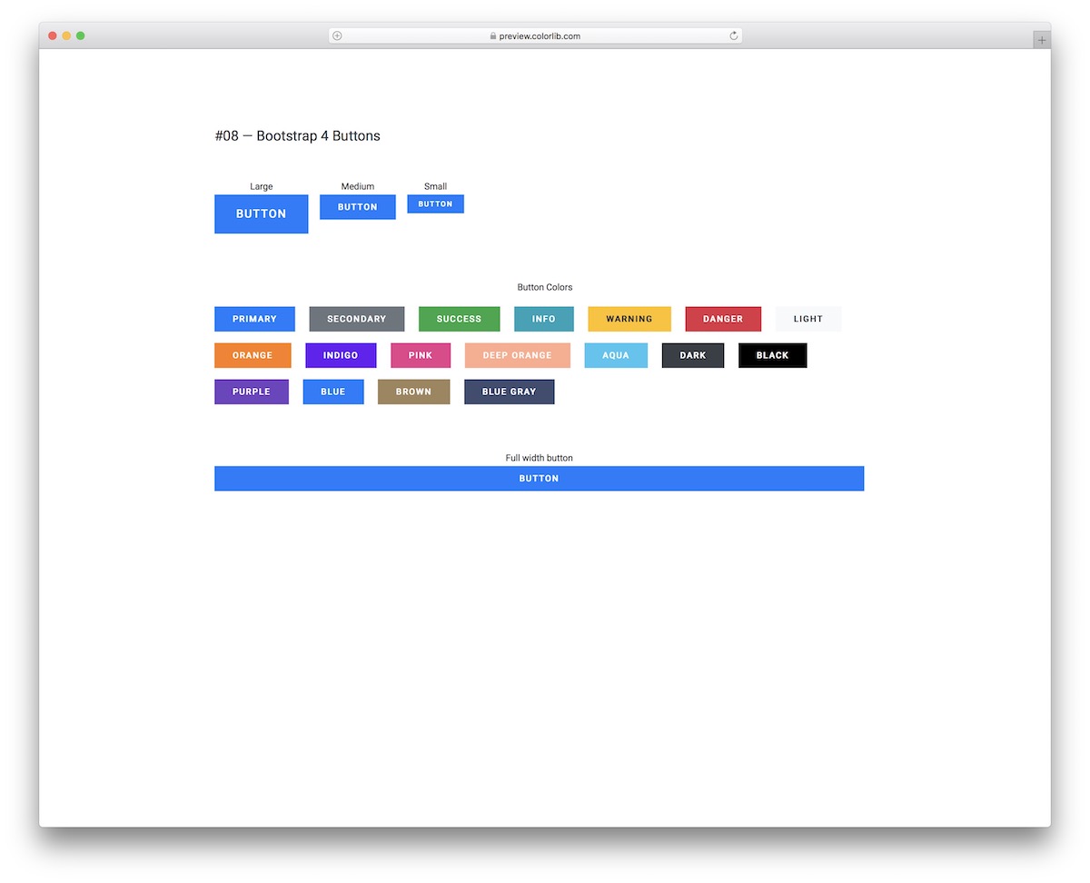
For those who prefer buttons with sharp edges and keep things relatively basic, Bootstrap Buttons V08 is the best option.
Different colors, sizes, and an exclusive full-width option are available for integration.
They are pure CSS with no JavaScript at all, so they look right on mobile and desktop, with or without Bootstrap on the page.
Bootstrap Buttons V09
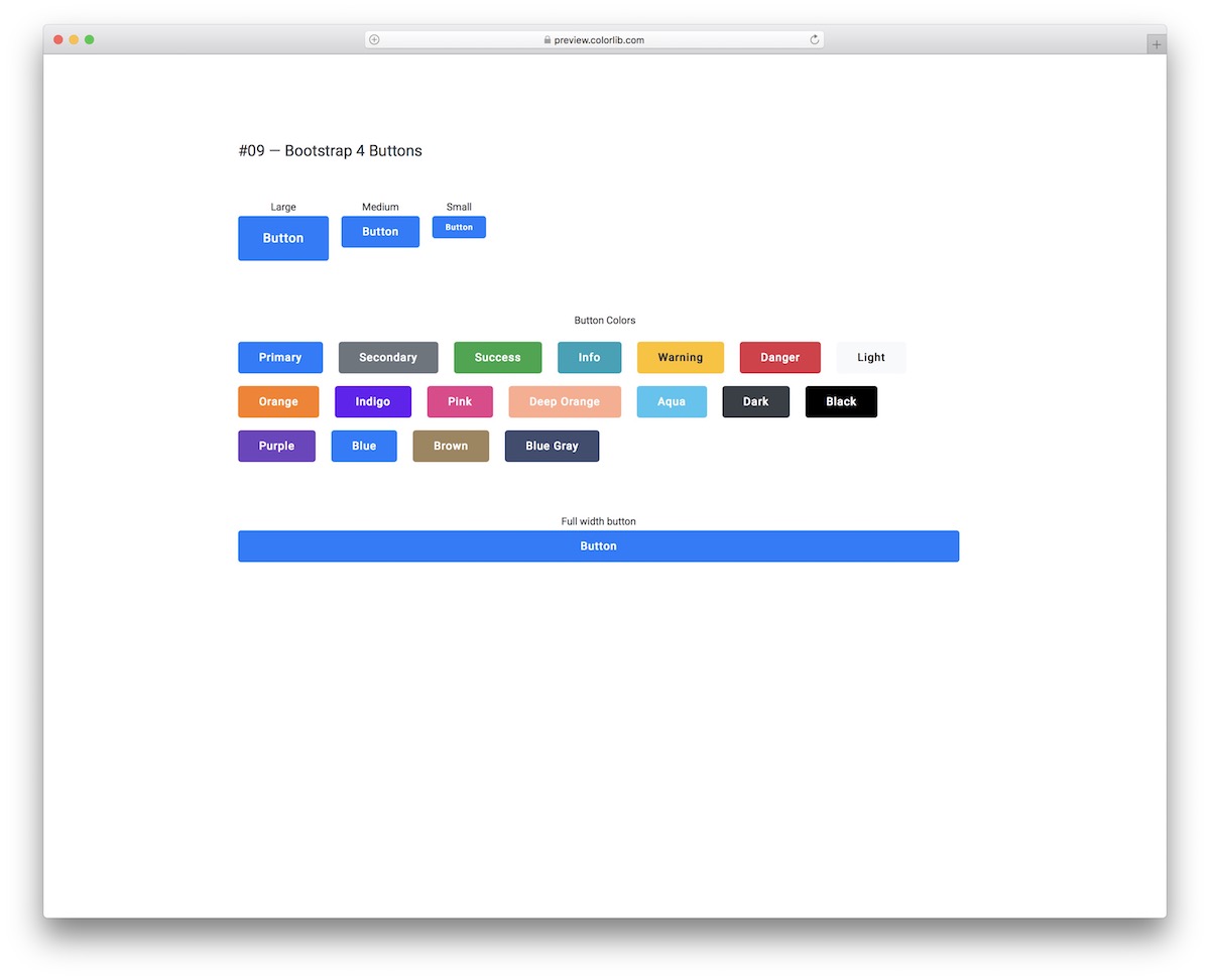
Regarding buttons, they can be plain and simple or have special effects. Regardless of your style, this list covers them all and then some.
You can integrate these into your app if you like a nice hover effect on a button that appears as an outline.
You can save a lot of time with the diverse color options and sizes.
Bootstrap Buttons V10
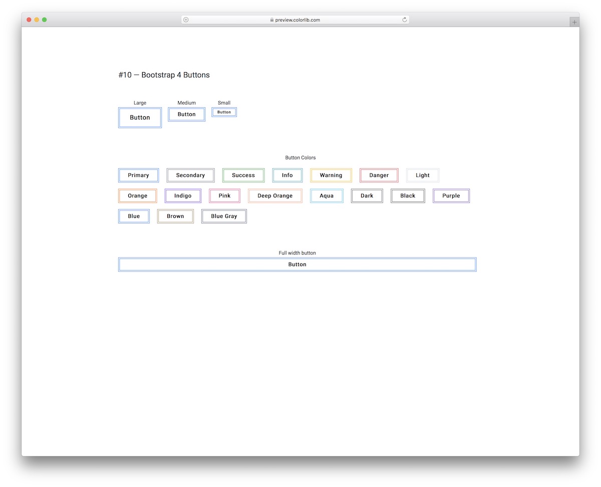
Bootstrap Buttons V10 are clean, minimal and creative.
They feature a double-lined outline by default, but the two lines change into a bold outline once you hover over them with your mouse cursor.
You can always go with something that is not too traditional, and that’s when you select Bootstrap Buttons V10.
Bootstrap Buttons V11
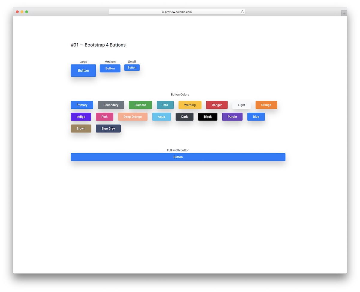
Rounded edges, shade, and hover effect are the core characteristics of Bootstrap Buttons V11.
These flexible and easy-to-use alternatives are great for everyone with a light (or white) app or website design. Let’s face it, if it’s a dark shade, it will almost not make sense.
Keep in mind that the hover effect causes the shade to disappear and darkens the color of the button.
Bootstrap Buttons V12
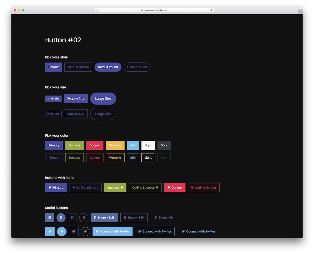
If you run a website or an application with a dark design and want your buttons and CTAs to stand out, Bootstrap Buttons V12 is your best bet.
This comprehensive collection of button styles, sizes, colors, links, disabled options, and more.
You also get radio buttons, checkboxes, drop-downs, and a list of specialties. The drop-downs work without Bootstrap’s JavaScript, keyboard navigation included.
Bootstrap Buttons V13

Bootstrap Buttons V13 is a collection of buttons with various styles that you can now utilize to your advantage.
These are great for dark app and website themes, but you can also use them with other formats.
Every button also comes in two styles: solid color and outlined. Additionally, many users apply the hover effect, which can be used by default.
Bootstrap Buttons V14
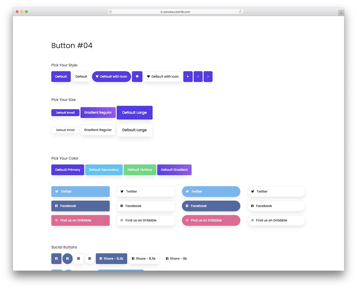
Bootstrap Buttons V14 is a collection of solutions that covers them all from gradient, solid color and white buttons.
You can also get them in different sizes and for various purposes, such as social media, drop-down menus, and checkboxes.
This bundle does not miss multiple icon buttons, call-to-actions, and text-style buttons/links. Its drop-down menus run on a few lines of vanilla JavaScript instead of Bootstrap’s.
Bootstrap Buttons V15

These fancy buttons are everything you need if you want something that doesn’t look too classic but is still not too out of this world.
The buttons come in many styles and formats, including a shadow and a hover effect (the latter does not apply to all of them).
You can use them for call-to-actions, social media, checkboxes, toggles, etc.
Bootstrap Buttons V16
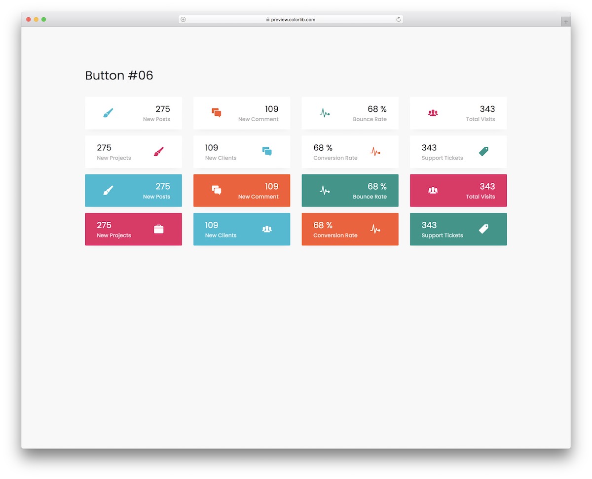
Bootstrap Buttons V16 is a snippet collection that features more than just text in a button.
These buttons also include an icon and a number that are advantageous for many projects. They come in two distinct styles: a light background and a solid background.
Besides, the latter spice things up with a hover effect.
Bootstrap Buttons V17
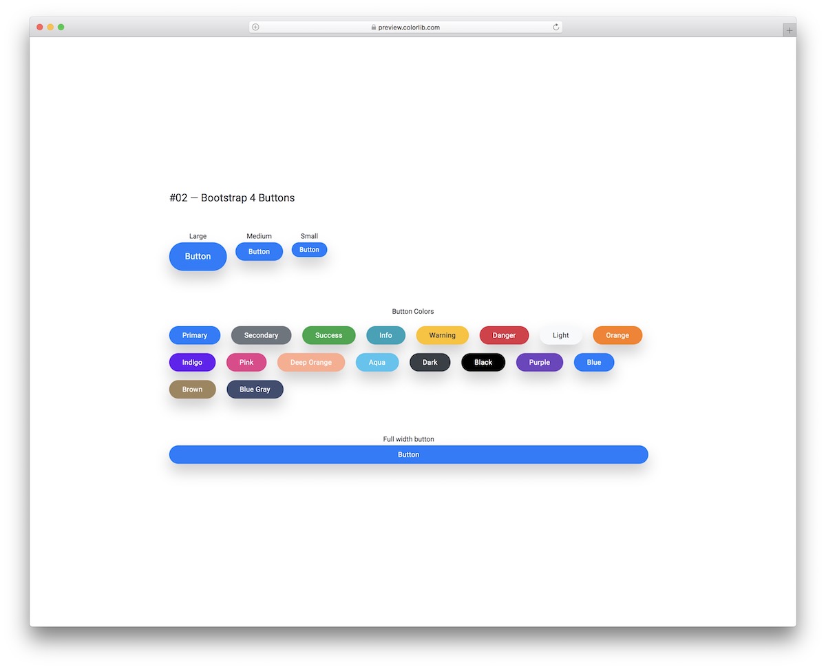
Buttons can have no effect, hover, click, or both. If you opt for the “both” format, you should head straight to the live demo preview to view Bootstrap Buttons V17.
The hover effect makes the shadow around the button disappear, while the click effect makes it feel “pressed down.” A great option that can make a significant difference for your project.
Bootstrap Buttons V18
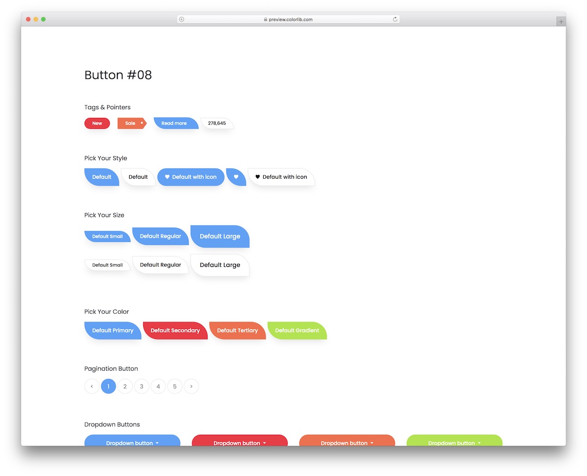
This particular set includes buttons, icons, pointers, pagination, checkboxes, and radio buttons.
There’s more.
This bundle is special from assorted color options to various dimensions, even hover and click effects. You will also notice the non-traditional, rounded shape of the buttons, which will pop beautifully on your application.
Bootstrap Buttons V19
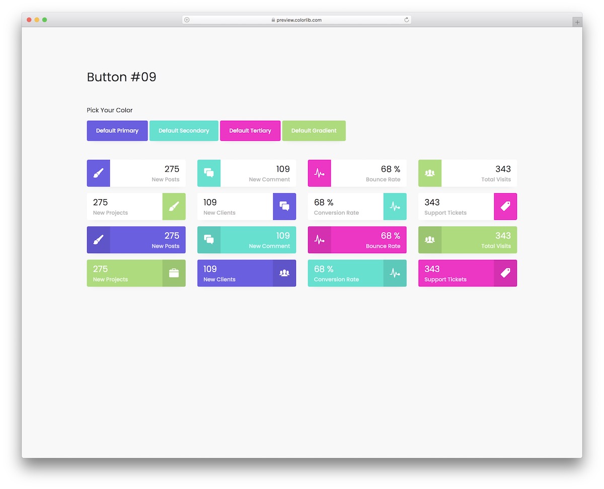
A button can feature text, icons, and a number, accompanied by a dynamic color choice that is visually appealing.
These vibrant buttons are pure CSS (a 102 KB download, down from 624 KB), so they stay flexible and look the same on different screen sizes.
They are also very straightforward and QUICK to integrate due to the beginner-friendly code structure.
Bootstrap Buttons V20

A button with animation on hover can easily trigger someone’s attention and boost the likelihood of clicking.
Bootstrap Buttons V20 is a collection of buttons of different styles and colors.
They come with a solid color or with an outline and feature text, icon or both. You also get multiple social media buttons to choose from, so you don’t need to create them manually. The animations are pure CSS, with no JavaScript at all.
More 2026 button patterns from Colorlib
Buttons with real states from our 2026 snippets: add-to-bag with an added state, favourite and like toggles with aria-pressed, and app store buttons.
Card V02: Shop product cards with add to bag
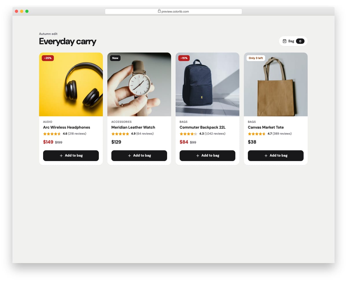
Product cards for an online shop with a square photo, sale or stock flag, star rating, sale price with the original price struck through, and an add-to-bag button. Clicking the button switches it to an added state, updates the bag counter and announces the change in a live region. Clicking again removes the item.
Best for: online shops, product grids and category pages. Plain HTML and CSS with a few lines of vanilla JavaScript, a 431 KB download, and it works on its own or inside a Bootstrap 4, 5 or 6 project.
Card V14: Real estate listing cards
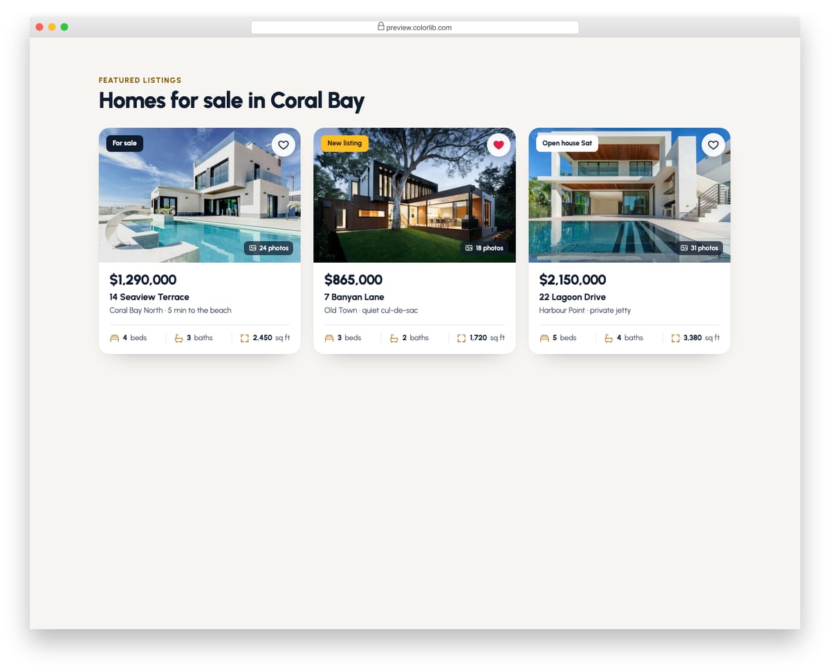
Property cards with a photo, status badge, photo count and a heart button to save the home. Below are the price, address, area and a row of beds, baths and floor-area icons. The favourite button uses aria-pressed and a short pop animation.
Best for: real estate, rentals and property marketplaces. Plain HTML and CSS with a few lines of vanilla JavaScript, a 502 KB download, and it works on its own or inside a Bootstrap 4, 5 or 6 project.
Card V20: Social post cards
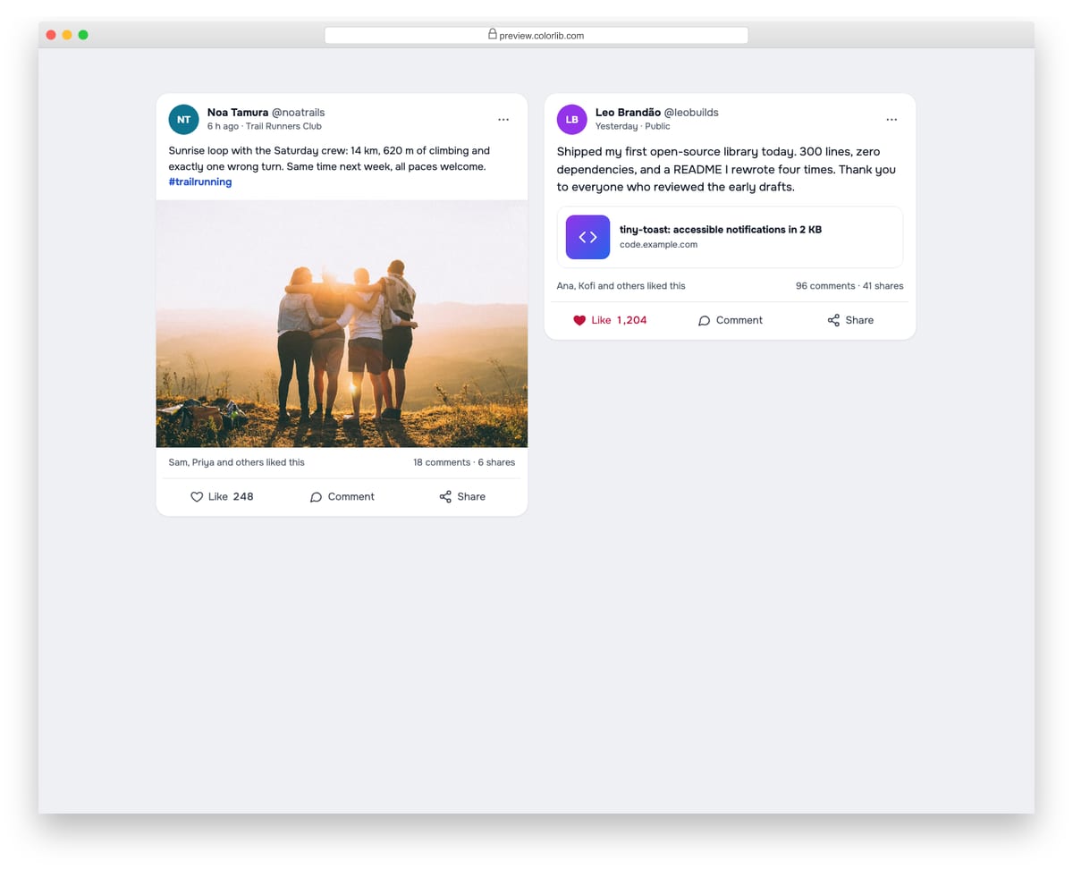
Social feed posts with an avatar, name, handle, time, text, a photo or link preview, and engagement counts. Like toggles with aria-pressed and adjusts the count, Comment opens a reply field, and Share uses the share sheet on touch devices or copies the link.
Best for: community sites, social apps and team feeds. Plain HTML and CSS with a few lines of vanilla JavaScript, a 362 KB download, and it works on its own or inside a Bootstrap 4, 5 or 6 project.
Hero V04: App download hero with CSS phone mocks and store buttons
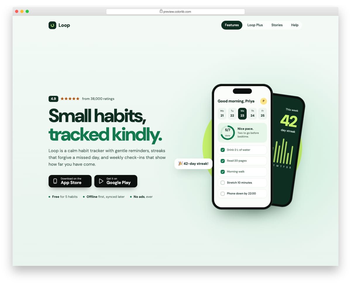
A mobile-app landing hero for a habit tracker, with a rating line, a two-tone headline, short copy, two generic store download buttons and three quick facts. The right side shows two phones built entirely in HTML and CSS: today's habit list with a conic-gradient progress ring, and a tilted stats screen behind it. On phones the layout centres, the store buttons go full width and a single phone mock remains.
Best for: mobile app launches and app marketing pages. Plain HTML and CSS with a few lines of vanilla JavaScript, a 376 KB download, and it works on its own or inside a Bootstrap 4, 5 or 6 project.
How to choose Bootstrap button styles
Use the right element. Use a button element for actions and a link for navigation, even when they look identical. It decides what Enter and Space do and what screen readers announce.
Treat hover as a bonus. Phones have no hover, so judge each set by how clickable it looks at rest, then by its hover effect. Keep a visible focus outline too, because keyboard users rely on it and style sets often remove it.
Check contrast on every color. White text on yellow, light blue or light green often fails the 4.5:1 WCAG contrast ratio for normal text. Outline and ghost buttons need a border that stands out from the background as well (3:1 for interface components).
Give toggles and actions real states. A toggle should say whether it is on: Card V14 and Card V20 use aria-pressed for their favorite and like buttons, and Card V02’s add-to-bag button switches to an added state and announces it in a live region. The uiCookies loading-state set covers spinner and disabled states.
Keep tap targets large enough. Aim for about 44 by 44 pixels on touch screens; WCAG 2.2 sets 24 by 24 pixels as the minimum. Icon-only buttons also need an accessible name, such as an aria-label.
Frequently asked questions
Do these buttons need Bootstrap or jQuery?
No. Most Colorlib sets are pure CSS with no JavaScript at all, and the seven sets with drop-down menus (V01, V02, V12 to V15 and V18) add a few lines of vanilla JavaScript, keyboard navigation included. They look the same on their own or inside a Bootstrap 4, 5 or 6 project.
How do I add an icon to a Bootstrap button?
Put an inline SVG next to the label inside the button and give the icon aria-hidden=”true”, so screen readers read only the text. For an icon-only button, add an aria-label. In a Bootstrap 5 project, the d-inline-flex, align-items-center and gap-2 utilities on the .btn keep icon and text aligned. Bootstrap Buttons V16, V19 and V20 include icon buttons you can copy.
How do I change the button colors?
In the Colorlib sets, colors live in css/style.css and the class names are namespaced, so editing them won’t affect Bootstrap’s own .btn classes. In Bootstrap 5.3 itself, you can restyle a button with CSS variables such as –bs-btn-bg and –bs-btn-hover-bg instead of overriding each state.
Can I use them in commercial projects?
Yes. Colorlib snippets are free under CC BY 3.0 for personal and commercial projects, as long as you keep the credit link. The uiCookies pack comes with its own license, so check its page first.
Start with Bootstrap Buttons V03 for plain solid and outline buttons, V16 for icon buttons and V20 for social buttons. To see buttons in context, browse our Bootstrap dropdowns and pricing tables.

Related Posts

Comments (0)