
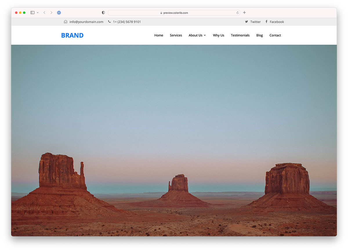
26 Free Bootstrap Header Templates & Examples 2026
This list of free Bootstrap header templates now has 26 entries: eight Colorlib Website Menu headers, six headers from our 2026 hero, breadcrumb and cart snippets, a uiCookies pack of ten header designs and eleven examples from CodePen developers.
The Colorlib headers are free downloads with live demos. They are dependency-free HTML, CSS and vanilla JavaScript, so they work on their own or inside Bootstrap 4, 5 and 6 projects without jQuery. The CodePen examples come from other developers and carry their own licences.
Choose by what the header has to hold: V04 and V16 add a top bar for contact details, V17 centers the logo above the menu, V08 and V11 end with a call-to-action button, and Shopping Cart V03 adds a mini cart. Need a whole site rather than a header? Browse our Bootstrap 5 templates.
Best Free Bootstrap Header Templates
uiCookies Header Templates (10 templates)
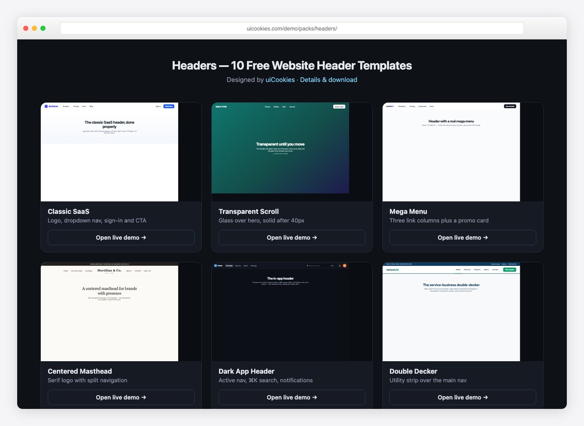
Ten headers covering the patterns most sites need: a classic SaaS bar, a transparent header that turns solid on scroll, a mega menu, a centered masthead, a dark in-app bar, a two-row service header, a hamburger drawer, a floating glass pill, a storefront header and a neobrutalist one.
Each is a single HTML file with the CSS inline, and the scroll and drawer behaviour is a few lines of vanilla JavaScript rather than a plugin. From our own uiCookies library, free for commercial projects.
Website Menu V03
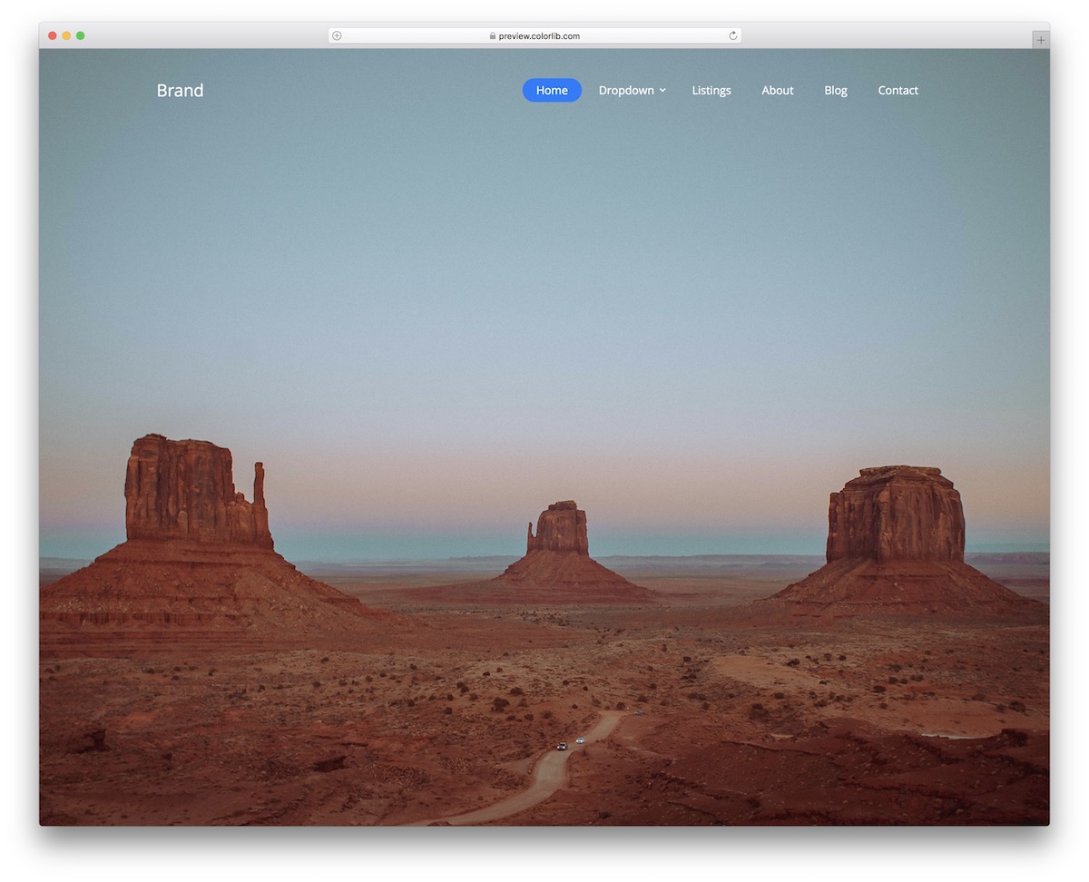
Here are a few of our website menu/header templates that you can use—of course, free of charge.
Website Menu V03 is a modern, minimal and transparent solution that caters to any website you establish.
Due to the default design, you don’t need to make any changes—just use it as is.
Of course, if you’d like to TWEAK typography and color choice, you can do that, too. There’s also a multi-level drop-down menu, so you don’t need to create it yourself.
Website Menu V04
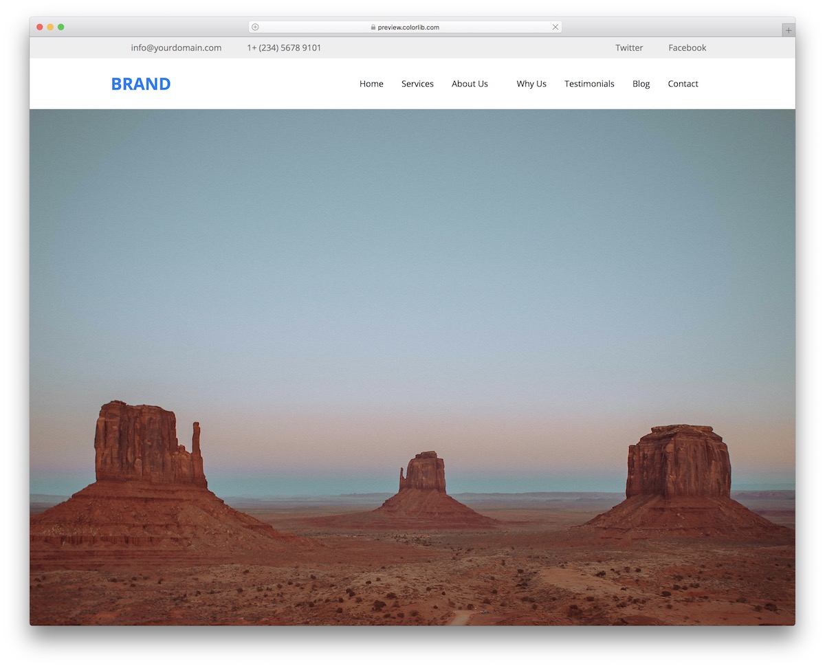
If you’d like to make your header stand out, Website Menu V04 is a superb free snippet to use. The design integrates a top bar, the main navigation section, and the logo.
The latter allows you to display additional contact details and link your website to social media.
It is a flexible layout that adapts to different screen sizes, and the sticky header and mobile menu run on a few lines of vanilla JavaScript. Go ahead, test it yourself first and make some noise later.
Website Menu V08
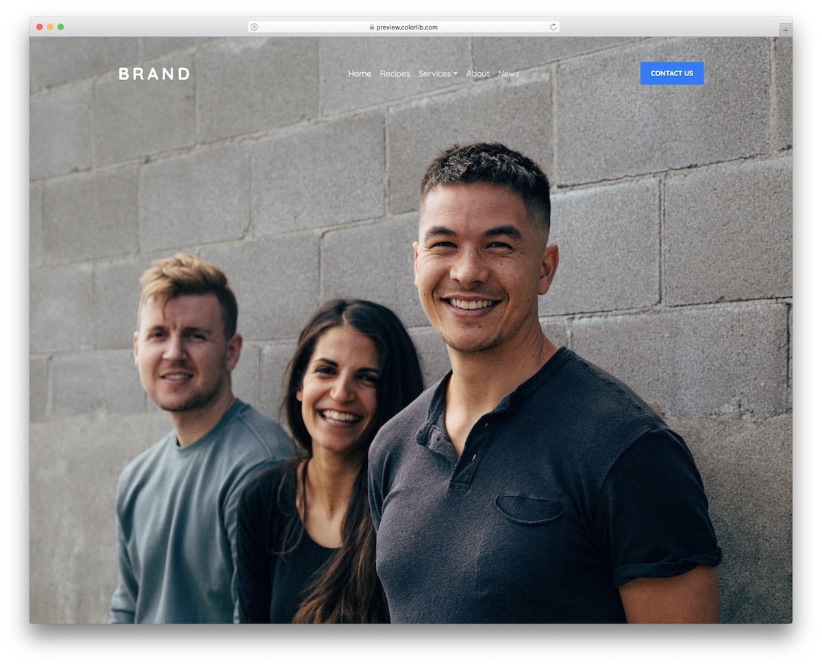
For all of you who dig cleanness and minimalism, Website Menu V08 is the header that does the trick, with a drop-down that works without Bootstrap’s JavaScript. Although I have already featured a similar format above, this one is slightly different, as it also includes a call-to-action button.
You can use its default settings for contact or go entirely against the grain and apply it for something else.
Moreover, add your logo, alter the navigation items, and save time and energy. Why do things from the ground up today if you don’t have to?
Website Menu V10
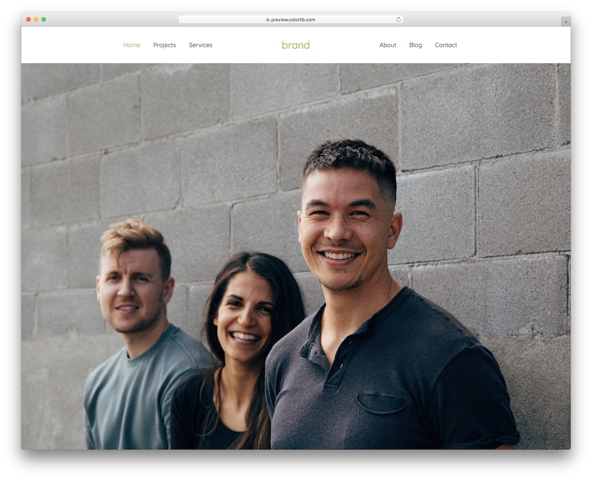
Website Menu V10 is a solid header written in plain HTML and CSS that attaches to the top of the website. Agencies, businesses, freelancers, it doesn’t matter, Website Menu V10 is great for all sorts of pages.
You are welcome to integrate it as is—you can even stick to the green color—or you can modify the user-friendly code.
This header features simple navigation without a drop-down or a mega menu.
Website Menu V11
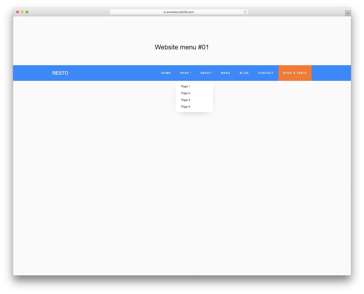
Website Menu V11 is a straightforward header that needs no jQuery or Bootstrap files, which will help you save time and energy. There’s no need to start from scratch, and the whole design is relatively basic, with a drop-down menu and a call-to-action (CTA) button.
You can rock the blue/orange/white color scheme or brand the snippet with your CUSTOM color selection.
You can achieve a lot, so don’t hold back and utilize your full potential.
Website Menu V14
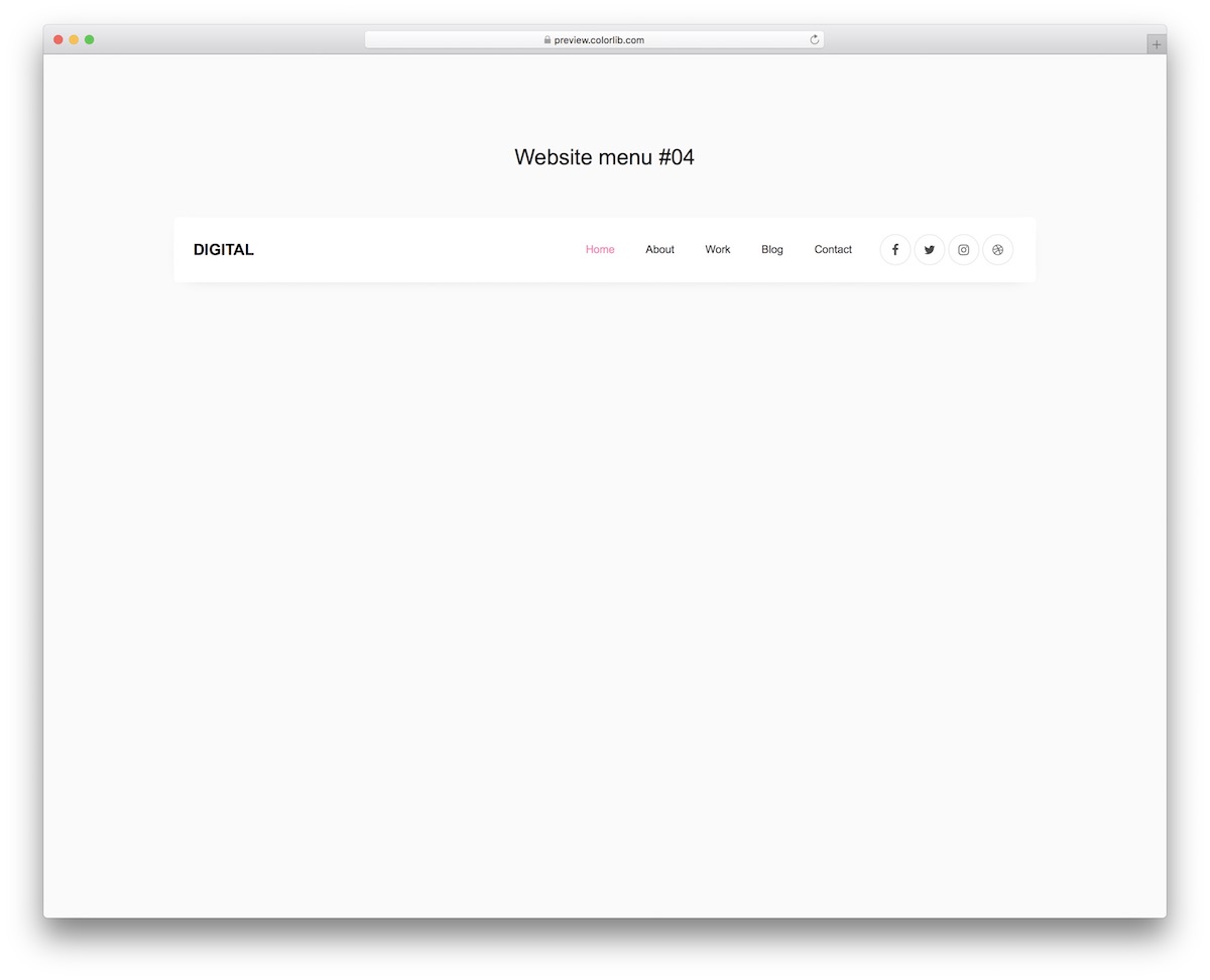
Website Menu V14 features a clean, boxy design. If you prefer simple headers, don’t hesitate to grab this design now.
It costs you nothing yet it can do wonders for your web application.
Remember, while it’s white on the desktop, it turns dark on mobile.
How cool is that?
Website Menu V14 features a logo area on the left and navigation and social media icons on the right. It also sports a hover effect, which only SPICES THINGS up.
Website Menu V16
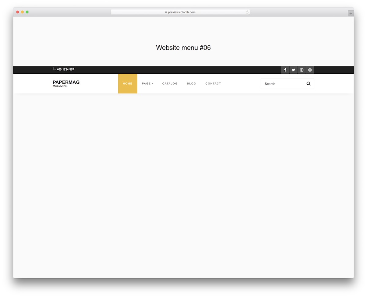
Website Menu V16 is another excellent header example if you want to add a top bar, and it looks the same dropped into a Bootstrap 4, 5 or 6 project. It will benefit everyone with its nice and dynamic look, whether you use it out of the box or alter it further.
Hover effect animation, social media buttons, and a search bar are also integrated into the design by default.
Your website’s EXCELLENT navigation will be intact across different screen sizes on mobile, tablet and desktop.
Website Menu V17
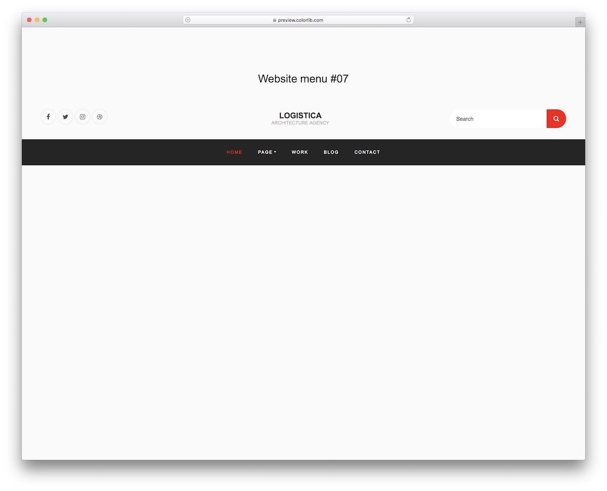
If you want to differentiate your website from others with a distinct header that still maintains a tidy appearance, Website Menu V17 is the way to go.
The tool features a logo area in the middle, social icons on the left and a search form on the right. Below is the navigation bar with a drop-down menu and a dark background.
The format changes slightly on mobile, where the links fold behind a toggle that opens without Bootstrap’s JavaScript.
Bootstrap header by Roger Pence

This is an amazing header example made by Roger Pence. It has been designed with Bootstrap and looks very standard. This template features a search box, navigation menu, and additional elements.
This header example allows you to place your brand name in the center of the webpage, although you can adjust its position using the code.
This is a FULLY customizable template. So you can make changes according to your needs and preferences.
A simple text is placed in the middle, but you can also place your company logo in this area if you want.
Bootstrap logo left header by Leon Rainbow
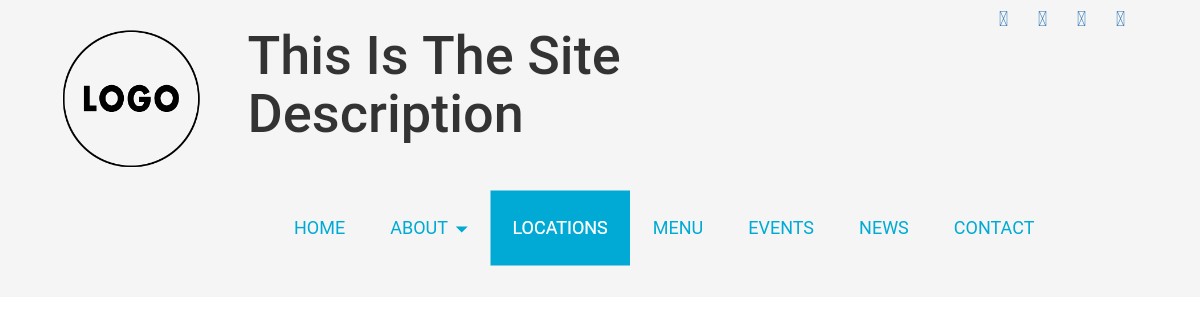
This is an AWESOME, free, fully customizable Bootstrap header example mode by Leon Rainbow, a CodePen user. As you can see from the screenshot of this template, a sample logo is placed on the left side of the webpage.
If you use this template on your website, you must replace the sample logo with your own company logo.
On the right side of the sample logo, there’s a space for a site description. You can display a short description of your site in that area. Just below the site description, a navigation bar is located.
Enhance your site’s user experience with a NEAT header.
Bootstrap header by Giovanni Rampini
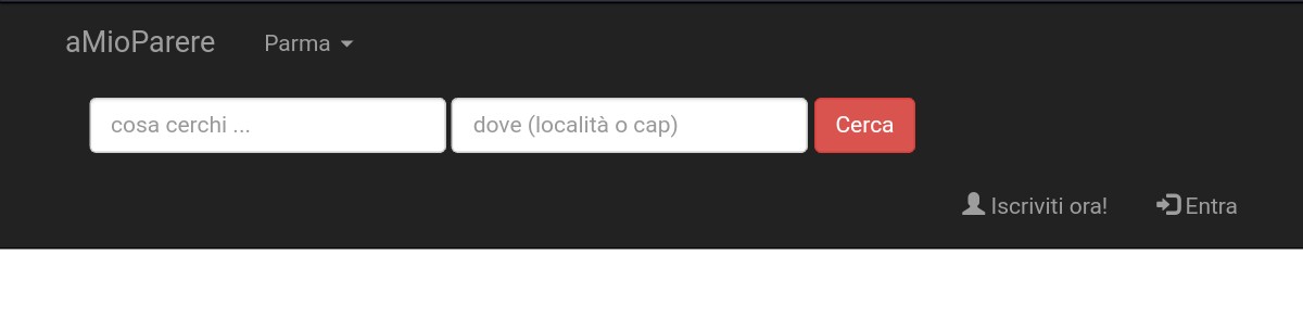
This is a beautiful template developed by Giovanni Rampini. It contains USEFUL website elements such as a search bar. A sample business name is placed on the left side of the webpage.
You can reposition it on the right side or in the middle. As the template is fully customizable, you can easily change the position of any webpage element.
The header is in a black background. This header template is free like the other templates mentioned in this post.
Bootstrap header with carousel by Ronalds Vilcins
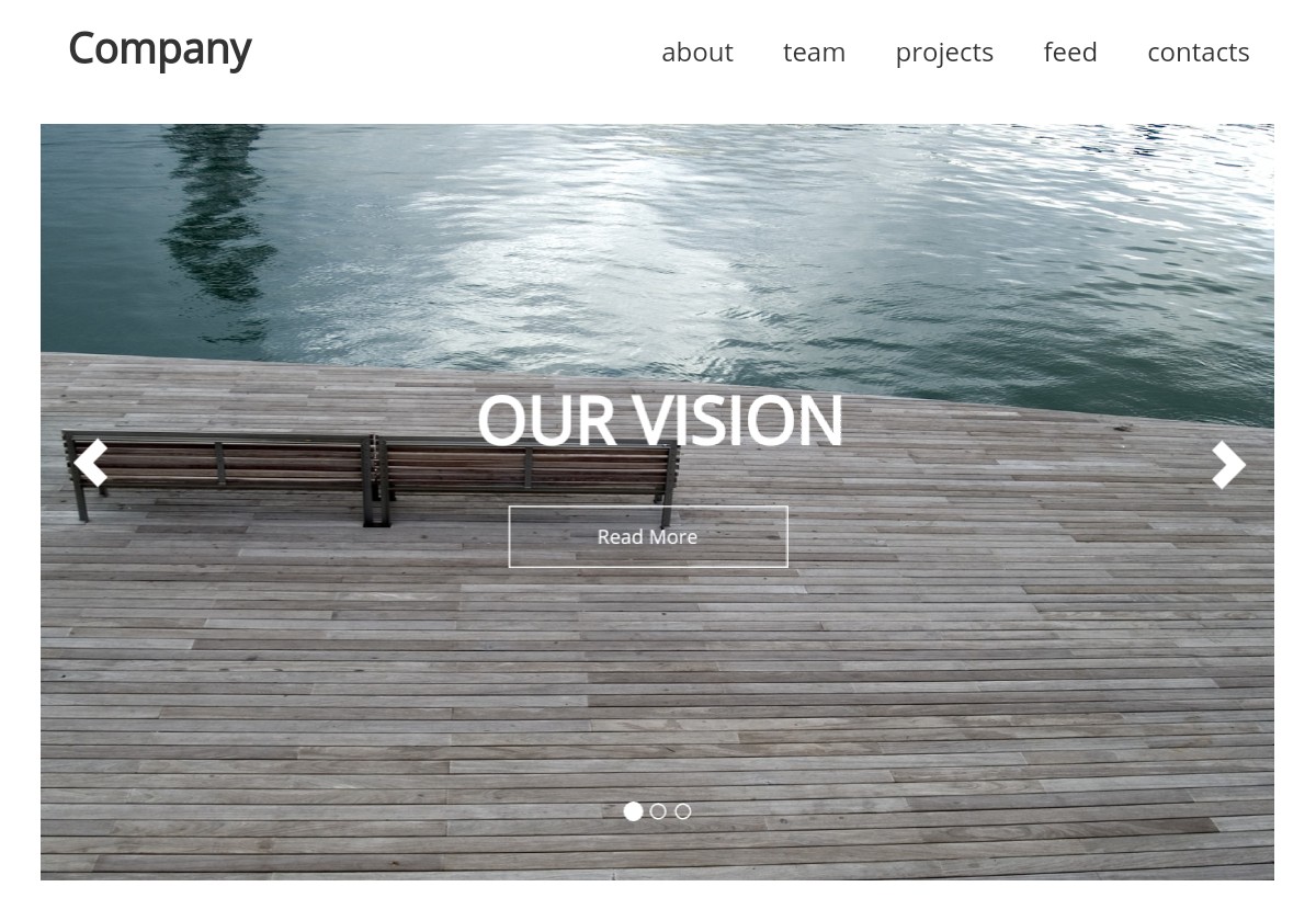
This Bootstrap header template is a high-quality, classic example with a navigation bar and a carousel. You can show your company name or logo in place of the text ‘Company’.
There are five menus in the navigation bar, including ‘About’, ‘Team’, and others. You can significantly enhance the design of this header template by incorporating Bootstrap code or modifying the CSS code.
Although you can improve the design, keep it simple as it is very effective.
Bootstrap header with fade effect by Nikola Kostov
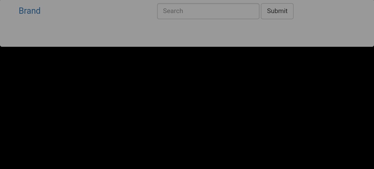
This Bootstrap header example by Nikola Kostov is an EXTREMELY simple header template. As the name of this example suggests, this template has a fade effect.
By default, the header is not visible.
When you scroll down, it becomes visible. The more you scroll down the webpage, the brighter the header becomes. So when you scroll up, the header fades.
This beautiful fade effect makes the header very interesting.
On the left side of the webpage, you can see a sample brand text that you need to replace with your brand name. There’s also a search box on the right side of the brand name.
Header example by Ivan Sakoman

This is a nice, free, header example made by Ivan Sakoman, a CodePen user. This template features navigation menus on the right side of the webpage and a menu labeled ‘Home’.
You can PLACE your business name or your company logo in this area.
As this is just an example of a header, the texts that you can see in this template are just sample texts. You have to replace them with your own texts. Feel free to make any changes you want.
For example, you can change the colors to match your website’s design.
Custom Bootstrap header by Anton Kastritskiy
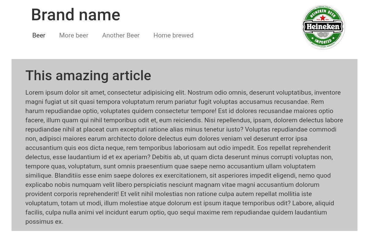
This custom Bootstrap header is an amazing, free template made by a CodePen user named ‘Anton Kastritskiy’. You DON’T HAVE to spend any money to integrate it into your website.
It’s also fully customizable, so you can modify it according to your preferences. On the top-left side of the webpage, a sample text for the brand name is shown. Replace this sample text with your brand name.
The sample text for the brand name is simple with a white background. There are navigation menus below the brand name.
Bootstrap header nav by Jason Melgoza

This is an awesome, free Bootstrap header example made by Jason Melgoza, a CodePen user. As you can see from the screenshot, a sample brand name is placed at the top left of the webpage. On the right is a navigation section.
The header text color is white, while the background color is black.
Fancy dark design? HERE YOU GO.
Click the ‘Demo’ button below to examine this example closely. Then click the ‘Download’ button to download this template.
Website header example by Abe Lincoln

This is a stunning, free Bootstrap website header example developed by Abe Lincoln. It includes a sample logo, navigation bar, social icons, and additional elements.
If you think this header template will look good on your site, you can use it. All the texts and icons used in this template are for illustrative purposes only.
Creating this header is straightforward if you are familiar with the basics of HTML, CSS, and Bootstrap. But why spend so much time creating one when you can get awesome header templates for free?
You can INTEGRATE this header example into your site in just a few minutes.
Responsive header by Arif Manzoor

This is a high-quality, free, fully customizable Bootstrap header template created by CodePen user Arif Manzoor.
The header’s background is light grey, and a sample logo is on the left. On the right side, there are navigation menus and drop-down lists.
The header looks very simple. You can download this one if you’re looking for a minimal header.
Bootstrap header by Narinder

Social icons are visible on the top-left side of this header. Just below the social icons are navigation menus and a website domain name.
This header example looks pretty unique. If you’re looking for a unique header template, you can use this one. This header not only looks unique but is also striking.
The header looks very interesting as the navigation menus are in black background and the background color of the website domain name is green.
More 2026 header snippets from Colorlib
Headers from our 2026 hero sections and pages: a SaaS header over a product hero, an editorial agency header, a conference header, a developer-platform header, a page header with a breadcrumb and a shop header with a mini cart.
Hero V01: SaaS split hero with a CSS-built product dashboard
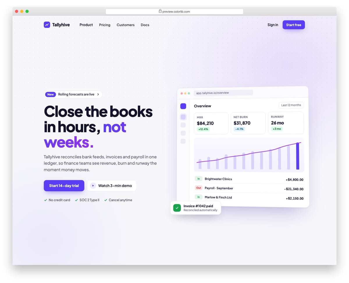
A split landing-page hero for a finance software product, with an announcement pill, headline, supporting copy, two calls to action and a short trust list on the left. The right side is a product dashboard drawn entirely in HTML and CSS, with KPI tiles, a bar and line chart and recent transactions, so there is no screenshot to replace. A top bar with logo, links and sign-in collapses into a menu button on phones.
Best for: SaaS, fintech and B2B product landing pages. Plain HTML and CSS with a few lines of vanilla JavaScript, a 250 KB download, and it works on its own or inside a Bootstrap 4, 5 or 6 project.
Hero V03: Editorial agency hero with oversized serif typography
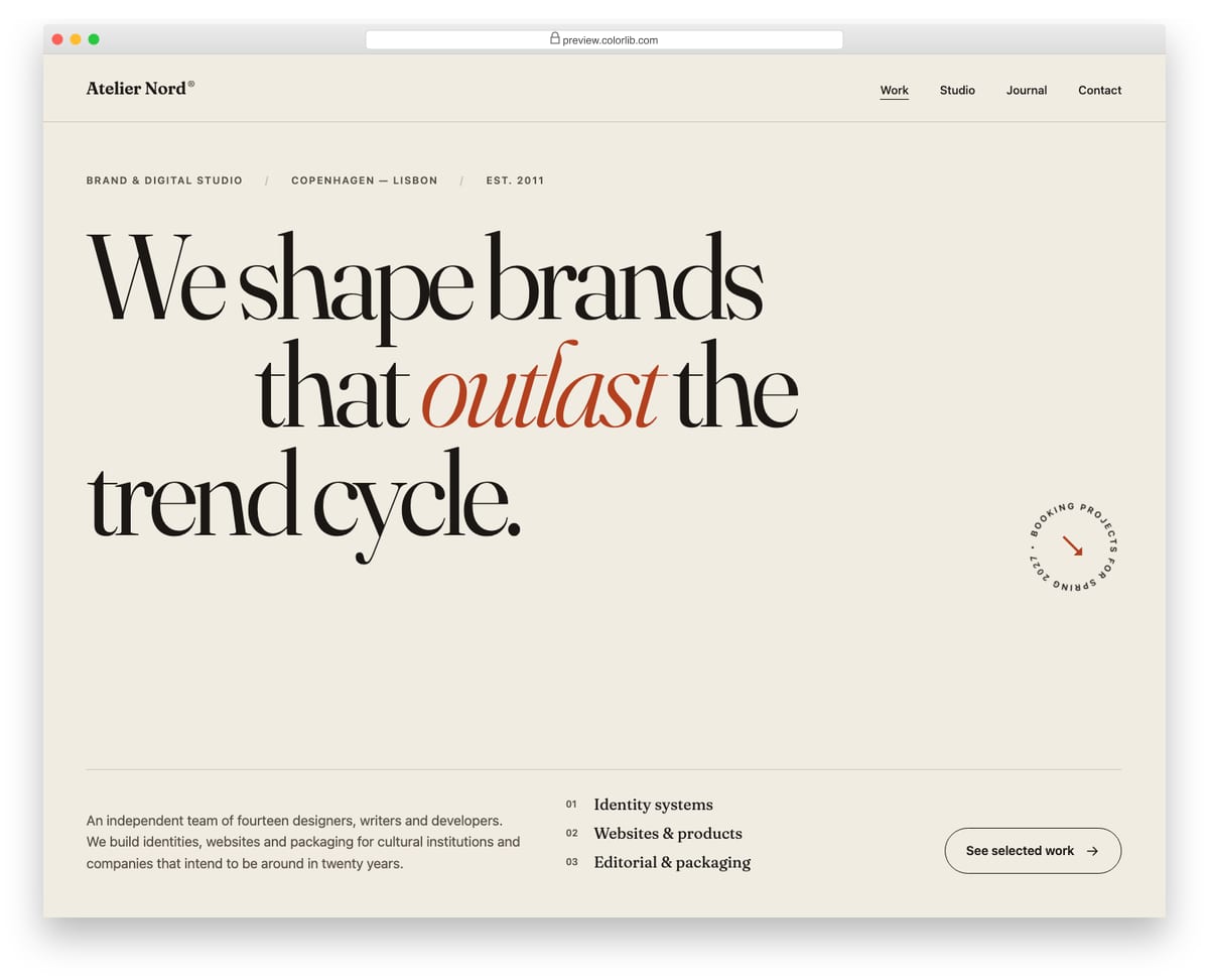
A minimal, type-led hero for a design studio, built around a very large serif headline with an indented middle line and an italic accent word. A thin rule separates the headline from a footer row with a slowly rotating circular availability badge, a short studio introduction, a numbered service list and a link to the work. It needs no JavaScript: the four navigation links stay visible at every width and simply move under the logo on phones.
Best for: design agencies, studios and creative portfolios. Plain HTML and CSS, no JavaScript, a 280 KB download, and it works on its own or inside a Bootstrap 4, 5 or 6 project.
Hero V07: Conference hero with date, venue and a live countdown
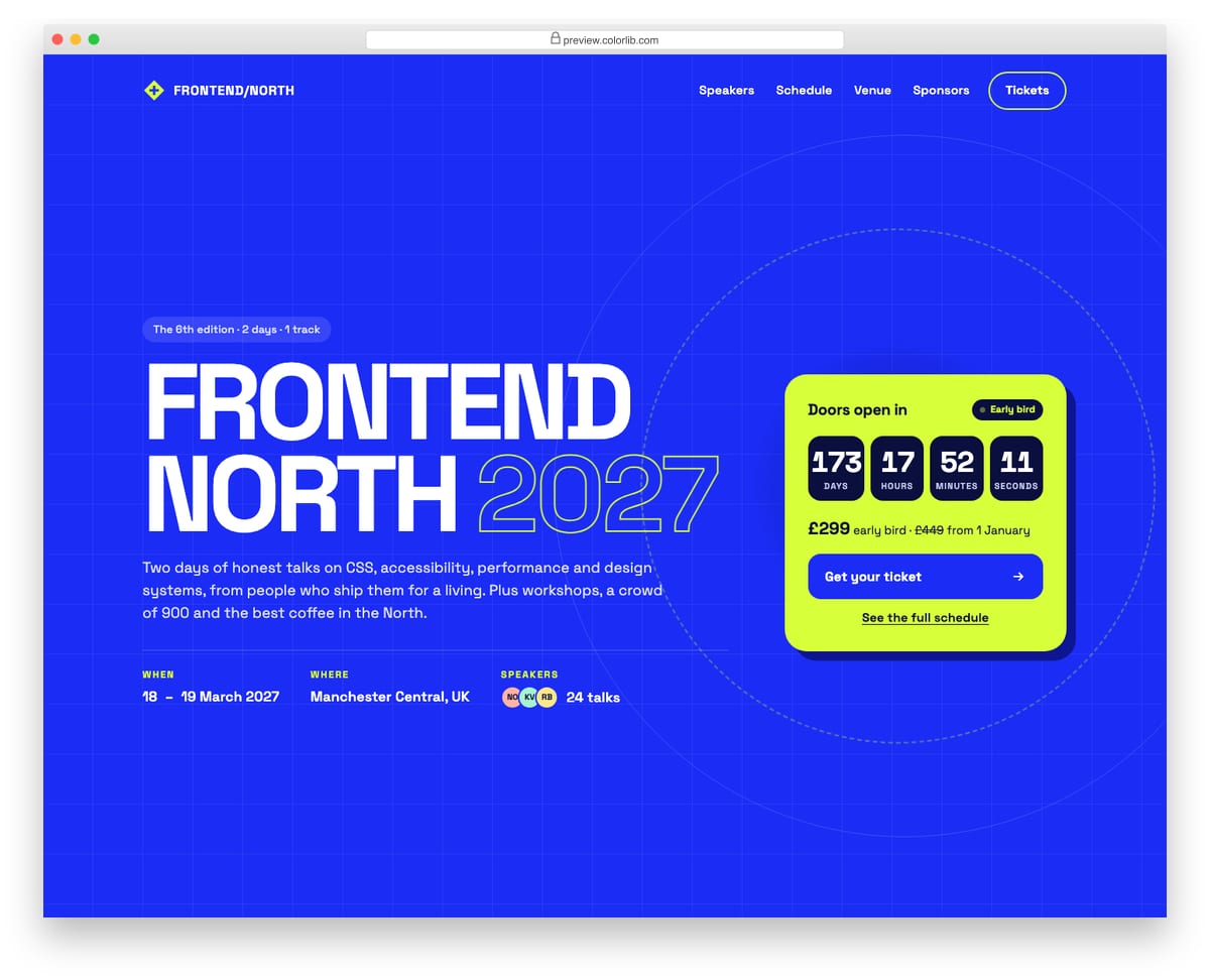
A bold event hero for a two-day front-end conference, with an oversized uppercase title, an outlined year, the dates, venue and speaker count in a description list. A lime ticket card counts down the days, hours, minutes and seconds to the opening and holds the ticket price and call to action. The countdown uses a role="timer" region with a readable label and switches to a doors-open message when the date passes.
Best for: conferences, meetups, festivals and product launch events. Plain HTML and CSS with a few lines of vanilla JavaScript, a 171 KB download, and it works on its own or inside a Bootstrap 4, 5 or 6 project.
Hero V10: Dark developer-platform hero with a stats row on a grid background
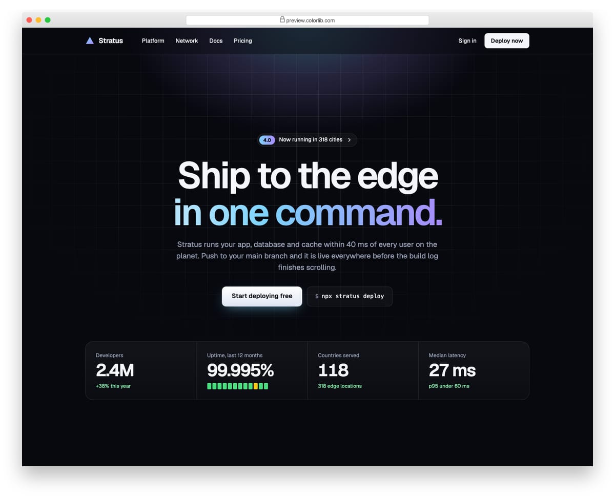
A dark, centred hero for a cloud hosting platform, set on a faint line grid that fades out with a radial mask under a slowly breathing glow. It has an announcement link, a two-line headline with a gradient second line, a primary button beside the install command, and a four-column stats band for developers, uptime, countries and latency. The stats are a description list and fold into a two-by-two grid on smaller screens.
Best for: developer tools, infrastructure and API product homepages. Plain HTML and CSS with a few lines of vanilla JavaScript, a 188 KB download, and it works on its own or inside a Bootstrap 4, 5 or 6 project.
Breadcrumb V05: Page header with the breadcrumb above the title on a photo
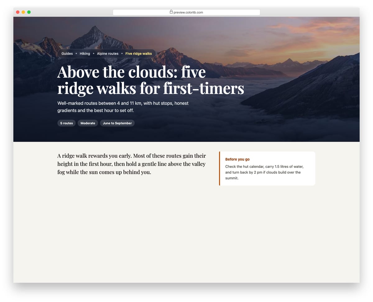
A full-width page header for a travel guide, with a frosted glass breadcrumb pill sitting above a large serif title and a short summary. A layered gradient keeps the white text readable over the photo, and the current page is picked out in warm yellow. The header is followed by the opening of the article.
Best for: blog, travel and landing page headers. Plain HTML and CSS, no JavaScript, a 249 KB download, and it works on its own or inside a Bootstrap 4, 5 or 6 project.
Shopping Cart V03: Mini cart dropdown from a header cart button with a badge count
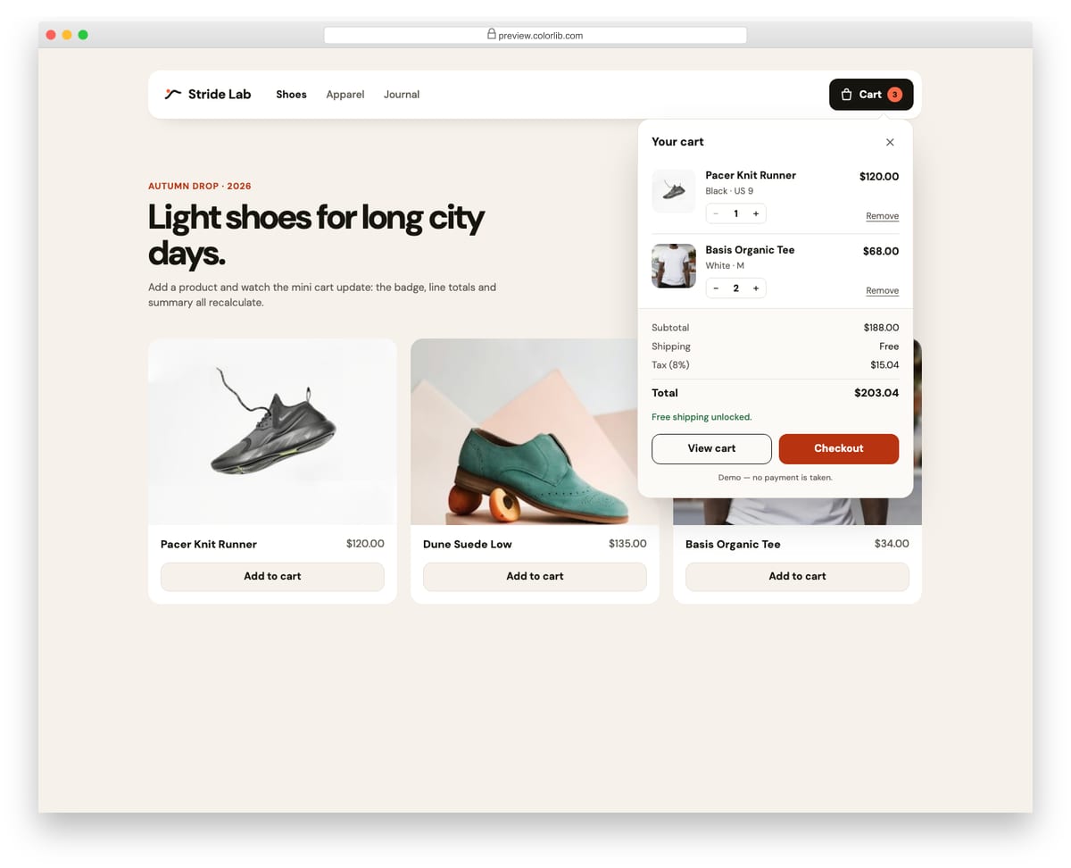
A store header with a cart button that opens a mini cart panel using the disclosure pattern. The panel lists line items with small quantity steppers, shows subtotal, shipping, tax and total, and offers View cart and Checkout buttons. Add to cart buttons on the demo product grid add new lines or raise quantities, and the badge count bumps as it changes.
Best for: store headers and quick cart previews. Plain HTML and CSS with a few lines of vanilla JavaScript, a 322 KB download, and it works on its own or inside a Bootstrap 4, 5 or 6 project.
How to choose a Bootstrap header
List what the header has to carry. A logo and links fit one row, as in V10. Contact details, search and a cart each add weight: V04 and V16 use a separate top bar, and V17 stacks a masthead above the menu. Every extra row pushes your content further down on a phone.
Decide whether it should stick. A sticky header like V04 keeps the navigation in reach on long pages. Keep the pinned part to one slim row so it doesn’t cover content on small screens. Nikola Kostov’s example takes another route and fades the header in as you scroll.
Test transparent headers against your photo. V03 and Hero V08 place navigation over an image. Check link contrast against the brightest area, or add a dark overlay as Hero V08 does.
Check the mobile menu and keyboard access. The drop-downs in V08, V11, V16 and V17 work without Bootstrap’s JavaScript and support keyboard navigation. Open each demo at phone width too: V14 turns dark and V17 folds its links behind a toggle.
Check the Bootstrap version behind CodePen examples. Markup changed between Bootstrap 4 and 5 (data-toggle became data-bs-toggle, ml-* became ms-*), so see which version a pen loads before you copy its markup into your project.
Frequently asked questions
Do these header templates work with Bootstrap 5?
The Colorlib headers do, and with Bootstrap 4 and 6 as well: they carry their own CSS and a few lines of vanilla JavaScript, so they look the same with or without Bootstrap and need no jQuery. The CodePen examples depend on the Bootstrap version their author loaded, so check the pen settings.
What is the difference between a header and a navbar?
The navbar is the menu itself. The header is the whole top area around it: the logo, the navigation and anything else you place there, such as a top bar, a search form or a cart. For navigation bars on their own, see our Bootstrap navbar examples.
Can I use them in commercial projects?
Yes for the Colorlib headers: they are free under CC BY 3.0, so you can use them in personal and commercial projects as long as you keep the credit link. The uiCookies pack and the CodePen examples carry their own licences, so check each source before you ship.
How do I customize a header template?
Replace the logo, links and button text in the HTML, then set your colors and fonts in the CSS. V10 ships in green and V11 in blue and orange; swap those values for your brand colors and check the result at phone width.
Final thoughts
Start with Website Menu V04 for a business header with contact details, V17 for a magazine-style masthead, or Hero V01 if you want the header and hero section together. For the section below the header, see our Bootstrap jumbotron examples.

Related Posts


your Bootstrap Header tamplate and social icons tamplate its very usefull for my website thank you for giving such important material