24 Free Bootstrap Toast Notification Examples (2026)
By Aigars Silkalns · Last updated May 13, 2026 · 17-min read
Save confirmations, undo buttons after deletion, sync errors with retry options, offline mode indicators, file upload progress — Bootstrap’s toast component is the foundation behind nearly every modern web app’s transient notification chrome. This collection gathers 24 free Bootstrap 5–compatible toast notification examples covering the patterns developers actually ship: success/error/warning/info variants, Gmail-style undo, retry on network errors, animated stacks, countdown progress bars, file upload feedback, mobile snackbars, persistent offline indicators, and Bootstrap 5.3’s native dark-mode treatment. Every screenshot is a working BS 5.3 implementation; each example links to its original inspiration on CodePen, GitHub, or the Bootstrap docs for those who want to fork or compare. If you’re rebuilding form feedback, designing a notification system, or hunting for a specific toast pattern, start here.
What is a Bootstrap toast?
A Bootstrap toast is a lightweight, dismissible notification that appears briefly in a corner of the screen to inform users about an event — a successful save, an undo opportunity, a connection error. Toasts are non-blocking (the user can keep working while they’re visible) and typically auto-hide after a few seconds. Bootstrap 5 ships toasts as a native component with positioning, animation, and stack-management built in.
When to use a toast:
- Confirming an action just completed (“Item added to cart”)
- Surfacing a non-critical error (“Couldn’t sync — retrying in 10s”)
- Offering a reversible action (“Email deleted — Undo”)
- Live-status updates that don’t need user input
Bootstrap 5 vs Bootstrap 4 toasts: Bootstrap 4 introduced the Toast component in 4.2 (October 2018), but it required manual positioning and offered no stacking helper. Bootstrap 5 added the .toast-container class for declarative positioning, improved the JS API (bootstrap.Toast), and refined the default styling. The auto-hide behavior is now opt-in via data-bs-autohide="false" — defaulting to auto-hide.
Browser support: All modern browsers. Bootstrap 5 toasts rely on CSS transforms and animations that work in IE 11 with polyfills, though Bootstrap 5 officially dropped IE support. All 24 examples below were tested in Chrome 124, Safari 17, and Firefox 125 on May 2026.
How to use Bootstrap toasts (basic markup)
<!-- 1. Toast container (place once, anywhere — positioning is via class) -->
<div class="toast-container position-fixed bottom-0 end-0 p-3">
  <!-- 2. The toast itself -->
  <div id="liveToast" class="toast" role="alert" aria-live="assertive" aria-atomic="true">
    <div class="toast-header">
      <strong class="me-auto">Notification</strong>
      <small class="text-muted">just now</small>
      <button type="button" class="btn-close" data-bs-dismiss="toast" aria-label="Close"></button>
    </div>
    <div class="toast-body">Your changes have been saved.</div>
  </div>
</div>

<!-- 3. Trigger -->
<button type="button" class="btn btn-primary" id="showToastBtn">Show toast</button>

<script>
  const toastEl = document.getElementById('liveToast');
  const toast = new bootstrap.Toast(toastEl);
  document.getElementById('showToastBtn').addEventListener('click', () => toast.show());
</script>
Common gotcha: Toasts are hidden by default — you cannot make them visible by removing a class. You must call .show() via the JavaScript API, or use the data-attribute trigger.
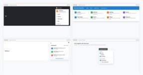
Best free Bootstrap toast examples
We grouped the 24 picks by use case rather than ranking them — every example below is a viable production starting point. Each screenshot shows our Bootstrap 5.3 implementation of the pattern, inspired by the original designer credited beneath. The “Original demo” link goes to the source pen or repository for those who want to fork, compare implementations, or see the author’s specific code style.
Showcase — visually distinctive toasts
1. Bootstrap 5 Live Toast
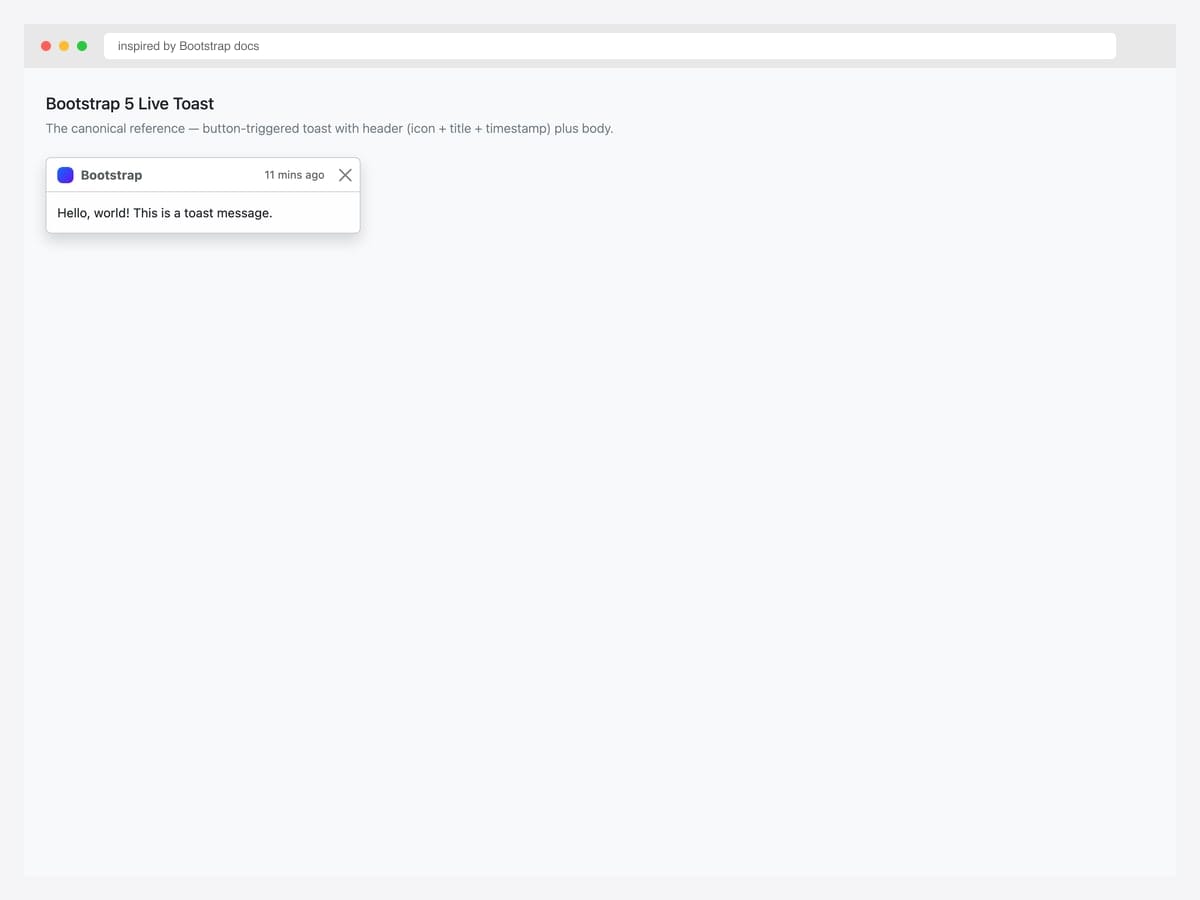
The canonical Bootstrap 5 toast — button-triggered, header with brand icon, title, timestamp, and dismiss button, plus a body message. Best fit as the baseline for any project: this is the markup every other toast pattern in this collection builds on. Pure Bootstrap 5.3 with the JavaScript bundle for the toast controller. Initialize via new bootstrap.Toast(el) or bootstrap.Toast.getOrCreateInstance(el).show(). Include role="alert" aria-live="assertive" aria-atomic="true" on the toast element so screen readers announce the entire message immediately on appearance.
Inspired by: Bootstrap (twbs) · License: MIT
Source & details Original demo
2. Translucent Toast
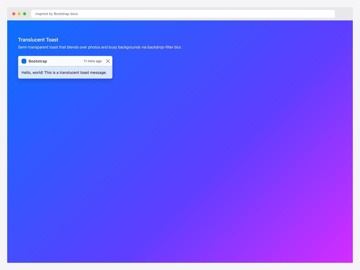
The translucent toast variant uses Bootstrap’s default backdrop-filter: blur styling to blend over hero images, video backgrounds, and busy gradients without losing legibility. Best fit for marketing landing pages, photo galleries, and any UI where the toast appears over rich visual content. Pure Bootstrap 5.3 — no custom CSS beyond the default toast classes. The blur effect requires modern browser support; degrades gracefully to a solid background in older browsers. Pair with text-body-secondary for the timestamp so it stays readable against any backdrop tint.
Inspired by: Bootstrap (twbs) · License: MIT
Source & details Original demo
3. Stripe-Style Animated Checkmark
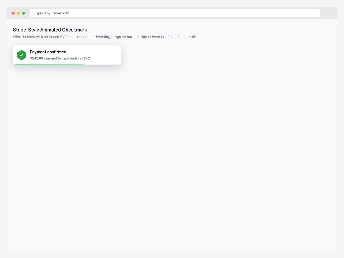
Stripe-style success toast with a circular checkmark icon, two-line message (header + sub), and a depleting progress bar at the bottom — the exact aesthetic Stripe, Linear, and Vercel use for payment confirmations and deploy success. Best fit for payment flows, deploy notifications, and any “operation completed cleanly” moment. Custom HTML + CSS on top of Bootstrap; uses inline SVG for the checkmark rather than a font icon for crisp rendering at all sizes. The progress bar width animation pairs with data-bs-delay via a CSS transition synced to the toast’s auto-hide timer.
Inspired by: nttoan1202 · License: CodePen default (attribution required)
Source & details Original demo
4. Glassmorphism Toast
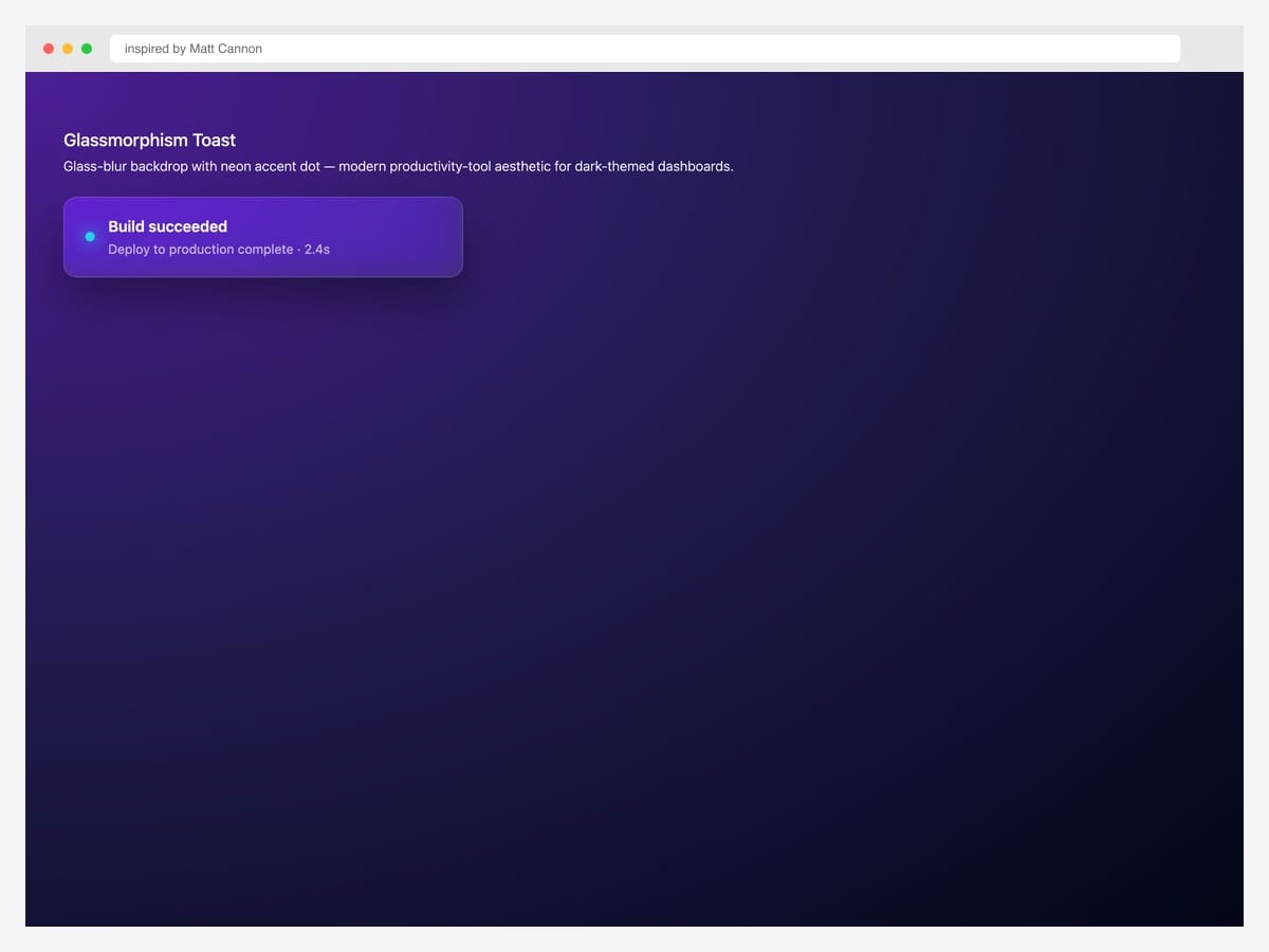
Glassmorphism toast with backdrop-blur, neon accent dot, and high-contrast white text — the modern productivity-tool aesthetic (Linear, Arc, Raycast) for dark-themed dashboards. Best fit for dev tools, gaming UIs, and any product whose visual language already lives in the dark-theme / vibrant-accent register. Pure CSS layered on top of Bootstrap’s toast structure; uses backdrop-filter: blur(20px) saturate(180%) for the glass effect and a neon glow via box-shadow on the accent dot. Backdrop-filter is unsupported in older Firefox; degrades to a solid semi-transparent background.
Inspired by: Matt Cannon · License: CodePen default (attribution required)
Source & details Original demo
Status variants — success, error, warning, info, loading
5. Success Toast
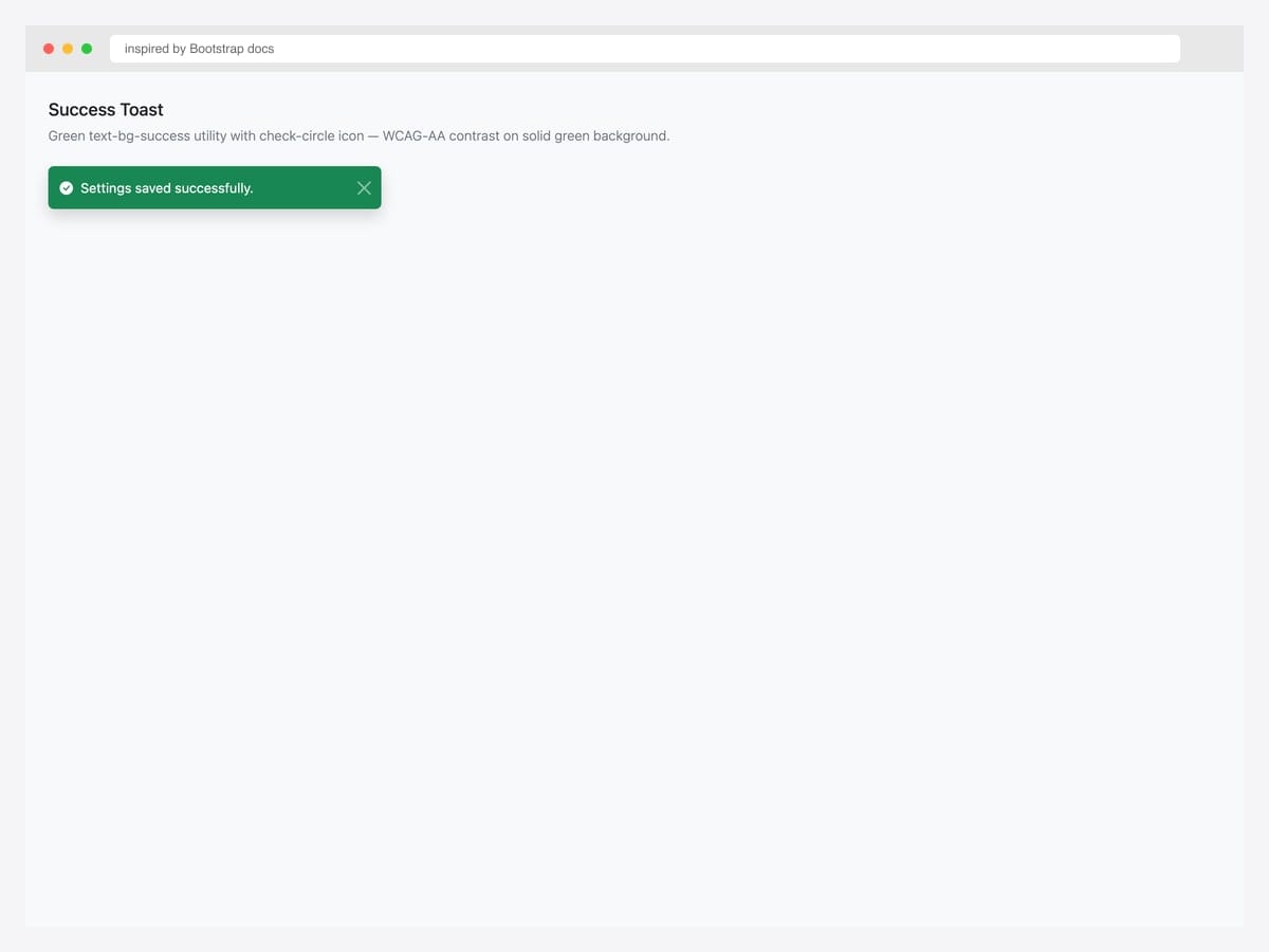
The canonical success toast — green text-bg-success background, check-circle icon, and assertive ARIA live region. Best fit for “Settings saved”, “Profile updated”, “Payment successful”, and any positive confirmation that doesn’t require user response. Pure Bootstrap 5 with one utility class (text-bg-success) for the green background plus matching white text and close button. The aria-live="assertive" announces the success immediately — appropriate for confirmation feedback. For status-only updates that shouldn’t interrupt the user, switch to role="status" with aria-live="polite" instead.
Inspired by: Bootstrap (twbs) · License: MIT
Source & details Original demo
6. Error / Danger Toast
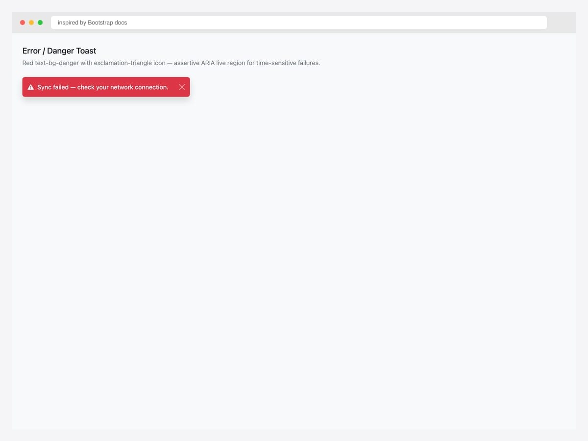
Error toast — red text-bg-danger background, exclamation-triangle icon, assertive ARIA live region for time-sensitive failures. Best fit for sync failures, payment declines, validation errors, and any “something just went wrong” moment that needs immediate user awareness. Pure Bootstrap 5 utility classes — no custom CSS. Use role="alert" + aria-live="assertive" so screen readers announce the failure immediately. For error toasts that include a Retry button, increase data-bs-delay to 8000-10000ms so users have time to read the message and decide to act.
Inspired by: Bootstrap (twbs) · License: MIT
Source & details Original demo
7. Warning Toast
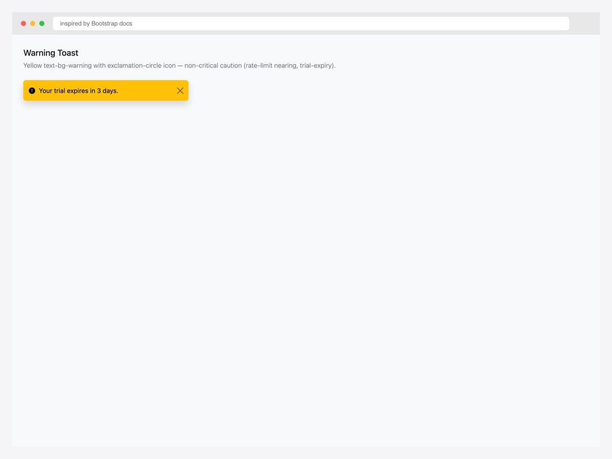
Warning toast — yellow text-bg-warning background with exclamation-circle icon. Best fit for non-critical caution states: trial expiry approaching, rate-limit nearing, unsaved changes, storage capacity 80%+. Pure Bootstrap 5; uses role="alert" with aria-live="polite" (vs assertive for danger) because the user can finish their current task before responding. Yellow-on-yellow contrast is the trickiest of all eight variants — Bootstrap uses dark text on the warning background automatically, but verify the close button icon is dark via .btn-close (default) not .btn-close-white.
Inspired by: Bootstrap (twbs) · License: MIT
Source & details Original demo
8. Info Toast
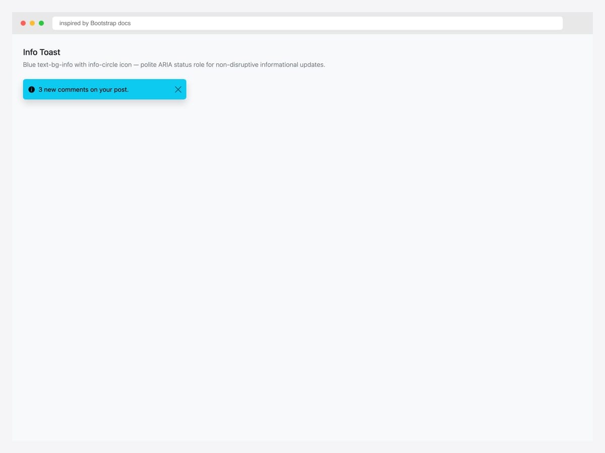
Info toast — blue text-bg-info background, info-circle icon, polite ARIA status role for non-disruptive informational updates. Best fit for “3 new comments”, “system maintenance scheduled”, “tip of the day” — anything the user benefits from knowing but doesn’t need to act on. Pure Bootstrap 5; the role="status" + aria-live="polite" combo is critical here so screen readers don’t interrupt the user’s current task. Info toasts work best with shorter content (under 12 words) — anything longer drifts into territory better served by a banner alert or notification panel.
Inspired by: Bootstrap (twbs) · License: MIT
Source & details Original demo
9. Loading Toast with Spinner
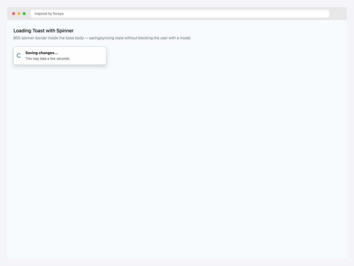
Loading toast with a spinner-border inside the body — the right pattern for async operations (file uploads, batch saves, data syncs) that complete in 2-30 seconds. Best fit for any “this will take a moment” feedback that doesn’t warrant a full-page loading state or modal. Pure Bootstrap 5 — the spinner is the standard .spinner-border.spinner-border-sm with role="status" on the spinner element for screen-reader compatibility. When the async operation completes, swap the toast content with the success variant (toast #5) and keep the same toast element — the transition feels seamless and saves the user a re-read.
Inspired by: floraya · License: CodePen default (attribution required)
Source & details Original demo
Interactive patterns — undo, retry, countdown, upload, avatar
10. Undo Pattern (Gmail-style)
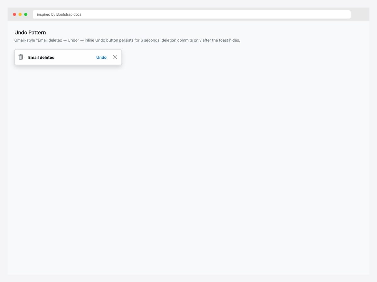
Gmail-style “Email deleted — Undo” pattern. The toast persists for 6 seconds with an inline Undo link; the underlying deletion only commits if the user doesn’t click Undo. Best fit for destructive actions where users might change their mind: email/file deletion, item removal from cart, archive operations. Pure Bootstrap 5 toast markup; the Undo behavior requires a small JavaScript handler that tracks a setTimeout reference and clears it on Undo click. Set data-bs-delay="6000" (default 5000) so users have time to register the action and locate the Undo affordance.
Inspired by: Bootstrap (twbs) · License: MIT
Source & details Original demo
11. Retry Pattern (Network Error)
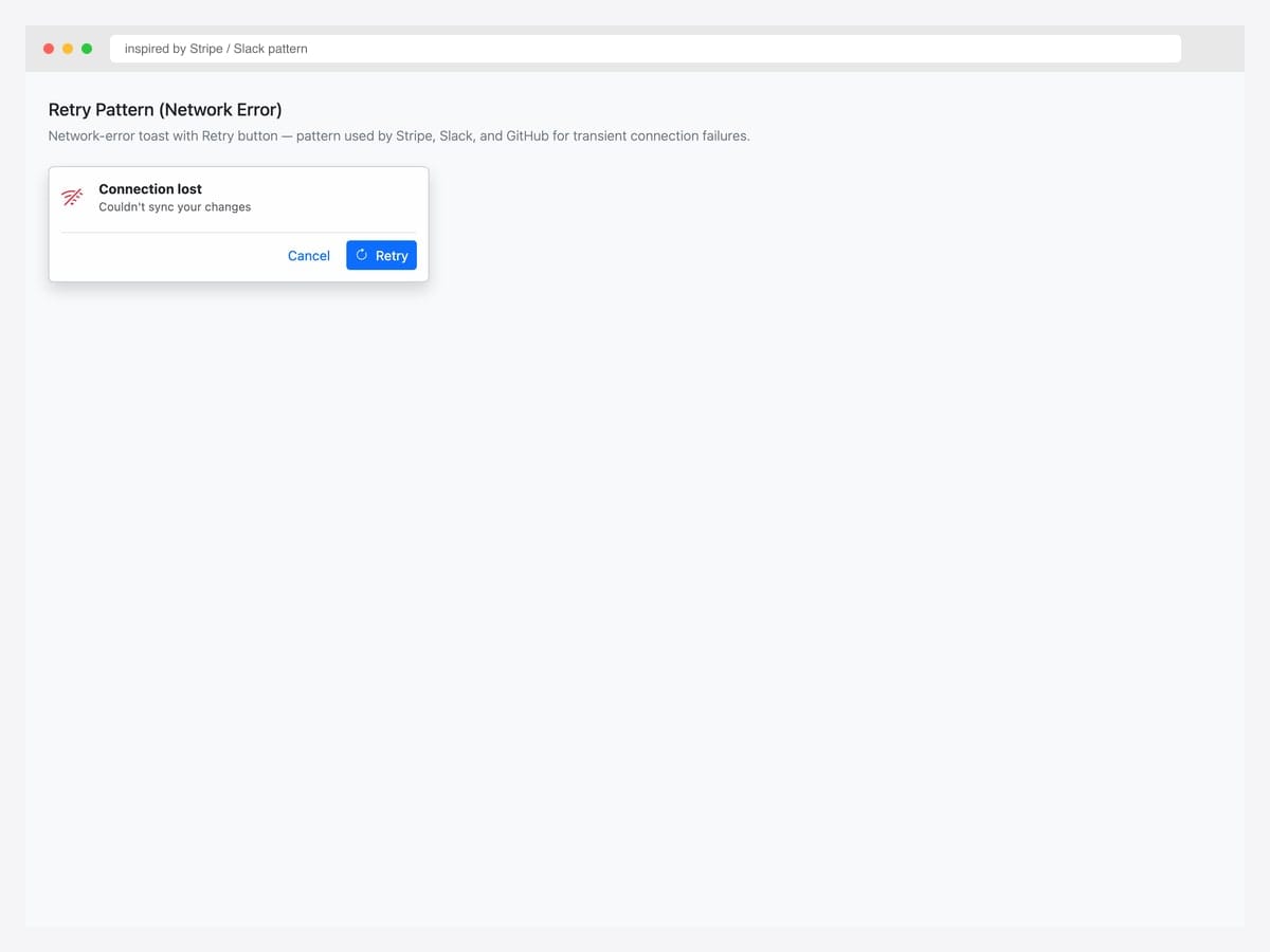
Network-error toast with Retry button — pattern used by Stripe, Slack, and GitHub for transient connection failures. Best fit for AJAX errors, websocket disconnections, and any user-initiated operation that failed due to network rather than logic. Pure Bootstrap 5 with custom button group via border-top divider. The Retry button should re-attempt the original operation with exponential backoff (1s, 2s, 4s, 8s) before giving up — don’t let users hammer a flaky endpoint by clicking Retry repeatedly. Cancel dismisses the toast without retrying.
Inspired by: pattern · License: MIT (Bootstrap)
Source & details Original demo
12. Toast with Countdown Progress Bar
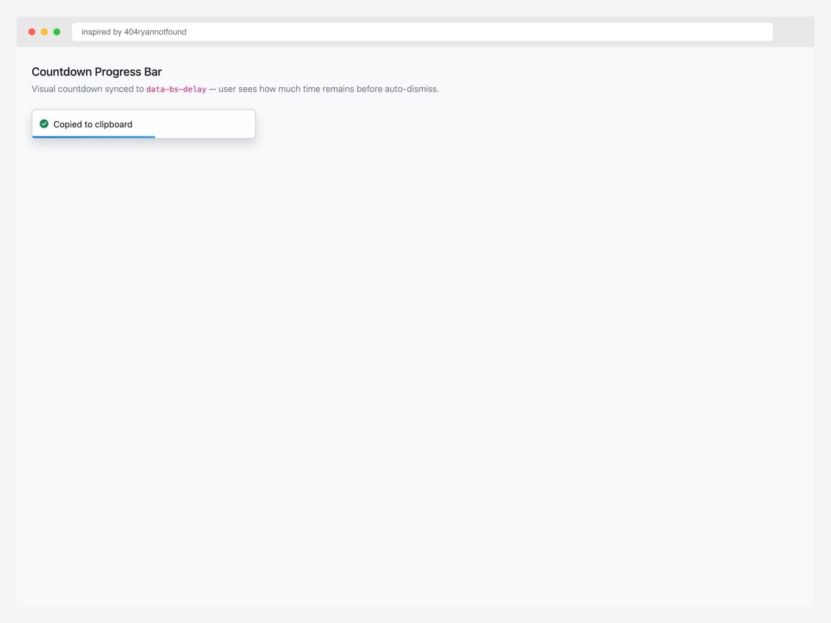
Toast with countdown progress bar — visual cue showing how much time remains before auto-dismiss. Best fit for “Copied to clipboard”, “Settings saved”, and other transient confirmations where the user benefits from knowing the toast is about to disappear rather than being surprised when it does. Pure CSS — the progress bar uses a ::after pseudo-element with a CSS transition on width synced to the toast’s data-bs-delay. For interactive operations (toast contains a button), pause the progress on hover so users have time to act.
Inspired by: 404ryannotfound · License: CodePen default (attribution required)
Source & details Original demo
13. File Upload Progress Toast
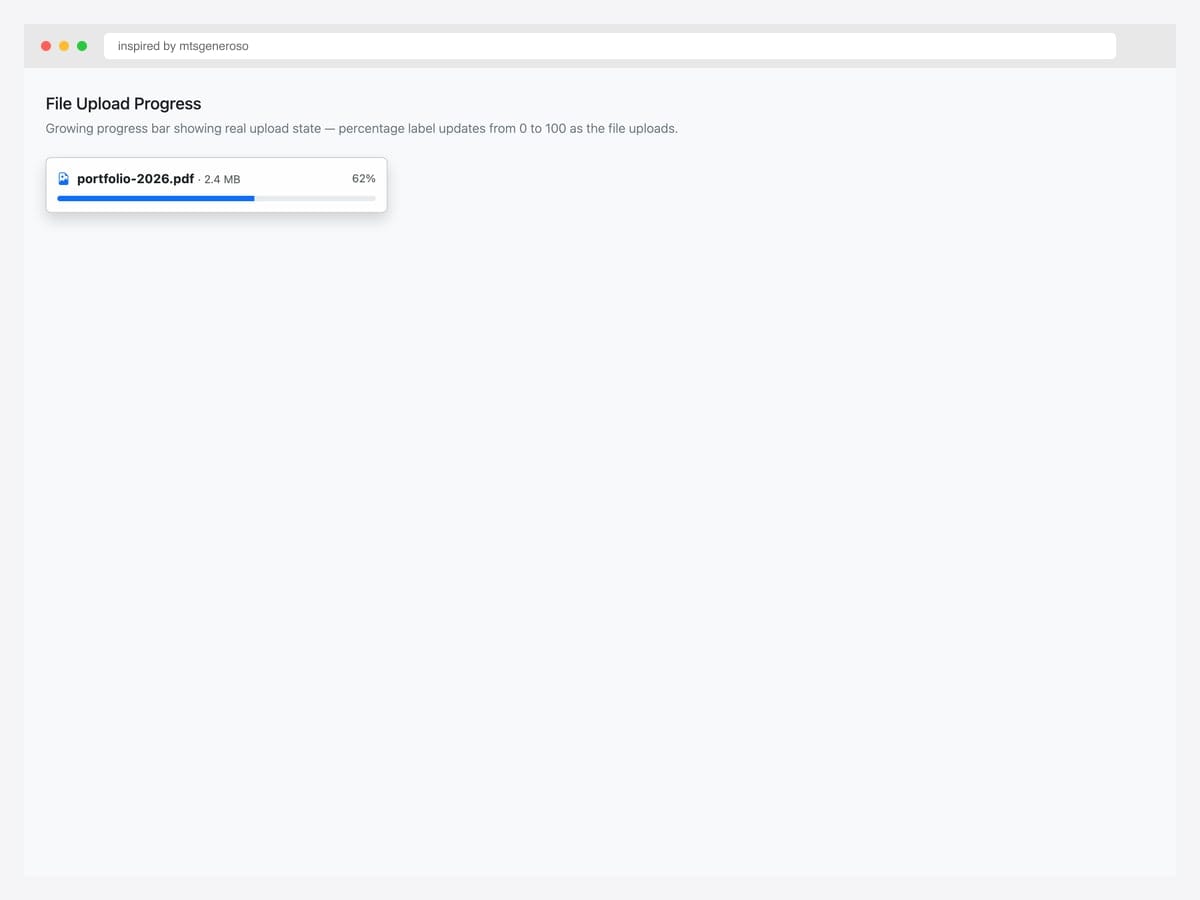
File upload toast with a real Bootstrap progress bar showing upload percentage. Best fit for file uploads, batch processing, and any long-running operation where the user benefits from progress feedback. Pure Bootstrap 5 — uses the standard .progress + .progress-bar components with aria-valuenow, aria-valuemin, and aria-valuemax for screen-reader announcements. Update the progress bar width via JavaScript as upload progresses. For multi-file uploads, render one toast per file in a .toast-container so users can see all in-flight uploads at once.
Inspired by: mtsgeneroso · License: CodePen default (attribution required)
Source & details Original demo
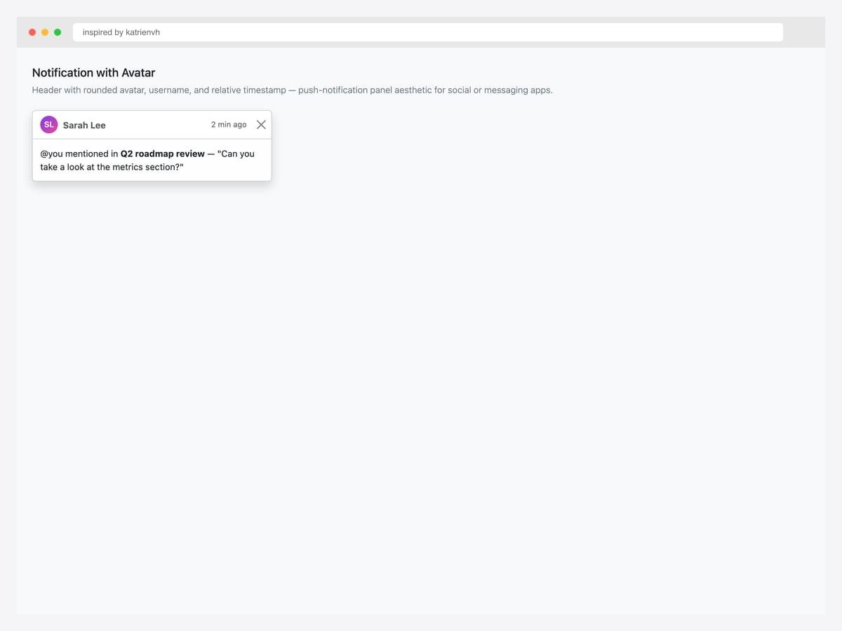
14. Notification with Avatar
Notification with circular avatar header — push-notification panel aesthetic for social apps, messaging tools, and any product where notifications come from specific people. Best fit for @-mention alerts, DM previews, collaboration tools (Slack, Linear, Notion). Pure Bootstrap 5 toast markup with a custom .rounded-circle avatar (here using a CSS gradient + initials; swap for an <img> tag for real user photos). Always include the username and relative timestamp (“2 min ago”) in the header — screen readers announce the entire header before reading the message body.
Inspired by: katrienvh · License: CodePen default (attribution required)
Source & details Original demo
Position demos — top, bottom, center placements
15. Top-Right Toast
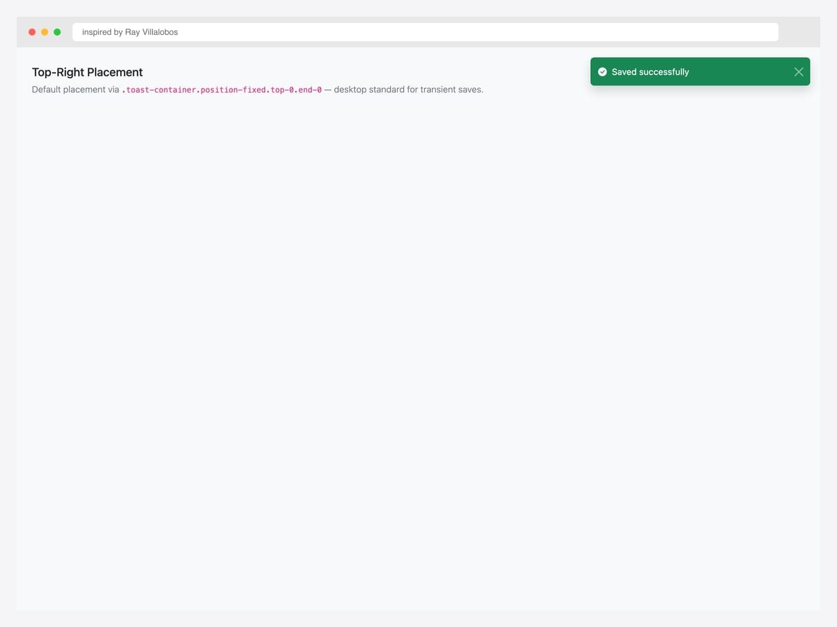
Top-right placement via .toast-container.position-fixed.top-0.end-0.p-3 — the de-facto standard for SaaS dashboards (Stripe, Linear, GitHub). Best fit for transient saves and confirmations where the user’s attention is on their work, not the chrome. Pure Bootstrap 5 utility classes — the container’s position-fixed keeps the toast in place during scroll. p-3 on the container creates the standard 1rem gap from the viewport edge. For sites with a fixed top header (navbar), increase the top padding via style="top: 60px" or use a CSS variable so the toast doesn’t appear behind the header.
Inspired by: Ray Villalobos · License: CodePen default (attribution required)
Source & details Original demo
16. Top-Center Toast
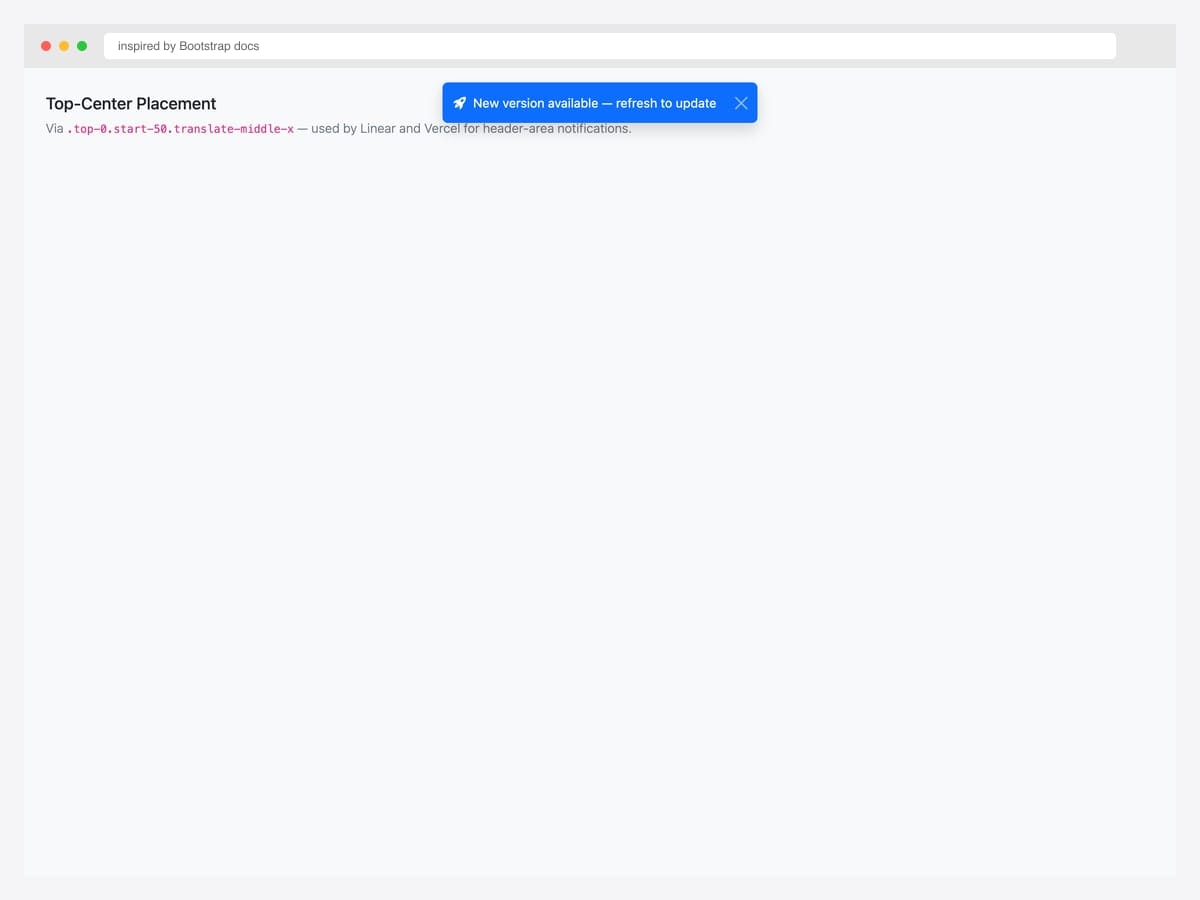
Top-center placement via .top-0.start-50.translate-middle-x — used by Linear, Vercel, and Notion for header-area notifications. Best fit for app-wide announcements (“New version available — refresh to update”), broadcast messages, and updates that affect the entire user session rather than a specific page section. Pure Bootstrap 5 — the translate-middle-x utility centers the toast on the horizontal axis without affecting vertical position. The data-bs-theme="dark" works seamlessly on top-center toasts for dark-mode sites; the toast doesn’t compete with sidebar or hero imagery in this position.
Inspired by: Bootstrap (twbs) · License: MIT
Source & details Original demo
17. Bottom-Right Toast
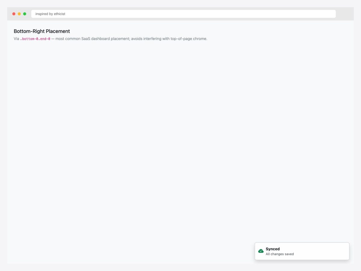
Bottom-right placement via .bottom-0.end-0.p-3 — most common placement for production SaaS dashboards because it avoids interfering with top-of-page chrome (navbar, breadcrumbs) and keeps notifications near the user’s last action. Best fit for sync confirmations, save toasts, and silent status updates (“Last synced 2 min ago”). Pure Bootstrap 5 utility classes. The bottom-right placement plays especially well with chatbot or support widget integrations — both typically sit in the bottom-right, so toasts naturally float just above the widget without overlapping.
Inspired by: ethicist · License: CodePen default (attribution required)
Source & details Original demo
18. Bottom-Center Snackbar
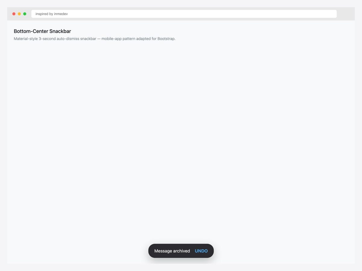
Bottom-center snackbar — Material Design-style pill-shaped notification with auto-dismiss after 3 seconds and an optional Undo action. Best fit for mobile-app interfaces, ecommerce checkouts, and any UI where Material Design conventions are familiar. Custom HTML + CSS (not the default Bootstrap toast markup) — uses border-radius: 24px for the pill shape and dark background with white text and a contrasting Undo link. For consistency with the rest of your app, wrap the snackbar logic in a helper function (showSnackbar(message, actionLabel, onAction)) so the call site stays clean.
Inspired by: inmedev · License: MIT (Bootsnipp default)
Source & details Original demo
19. Middle-Center Toast
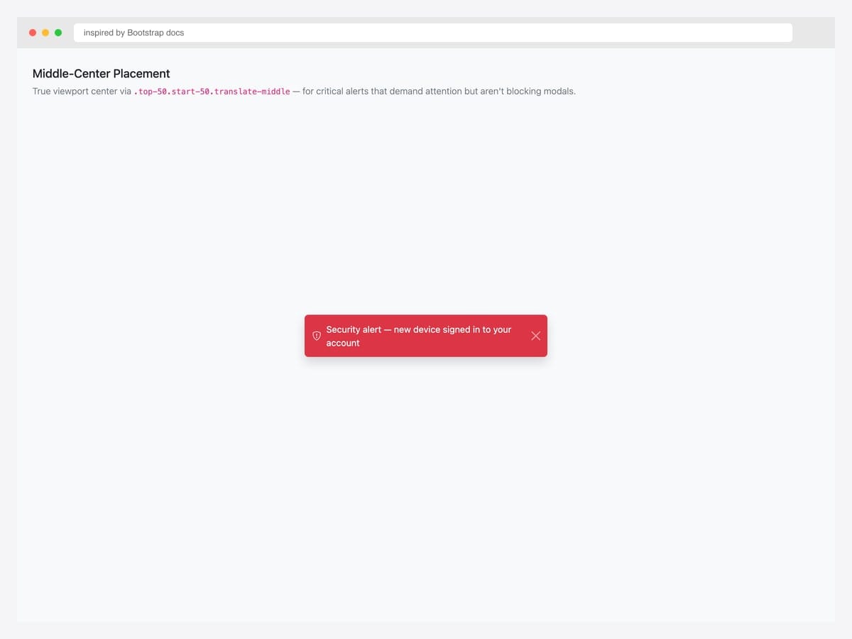
Middle-center placement via .top-50.start-50.translate-middle — true viewport center for critical alerts that demand attention but aren’t full-blocking modals. Best fit for security alerts (“New device signed in”), account warnings (“Subscription expired”), and any notification that requires user awareness without blocking the underlying UI. Pure Bootstrap 5 utility classes. The translate-middle shifts the element by 50% of its own width and height — works regardless of the toast’s actual dimensions. Use sparingly: center-positioned toasts feel modal-adjacent, so reserve them for genuinely important alerts.
Inspired by: Bootstrap (twbs) · License: MIT
Source & details Original demo
Stack & queue patterns
20. Stacking Multiple Toasts
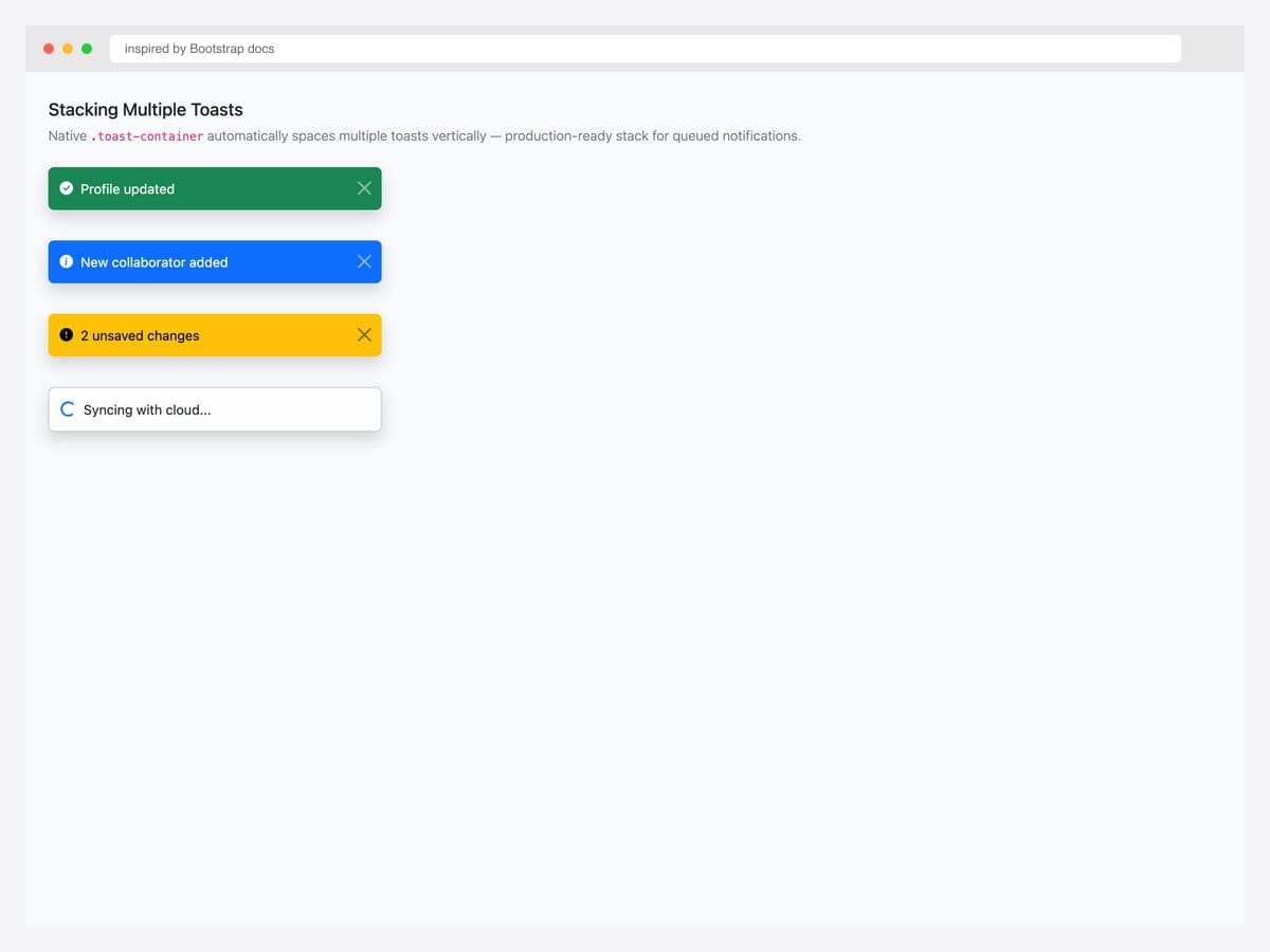
Stacking multiple toasts via a single .toast-container with d-flex.flex-column.gap-2. Best fit for dashboards where multiple events fire near-simultaneously: build status updates, real-time notifications, batch operation feedback. Pure Bootstrap 5 — the container handles the vertical spacing automatically; just append new toasts as children. The order matters: newest toast appends at the bottom of the stack (or top, depending on your flex-direction). For high-frequency notifications, implement a queue (see Pattern 1 in Advanced patterns) so toasts don’t flood the screen.
Inspired by: Bootstrap (twbs) · License: MIT
Source & details Original demo
21. Animated Stack with Smooth Transitions
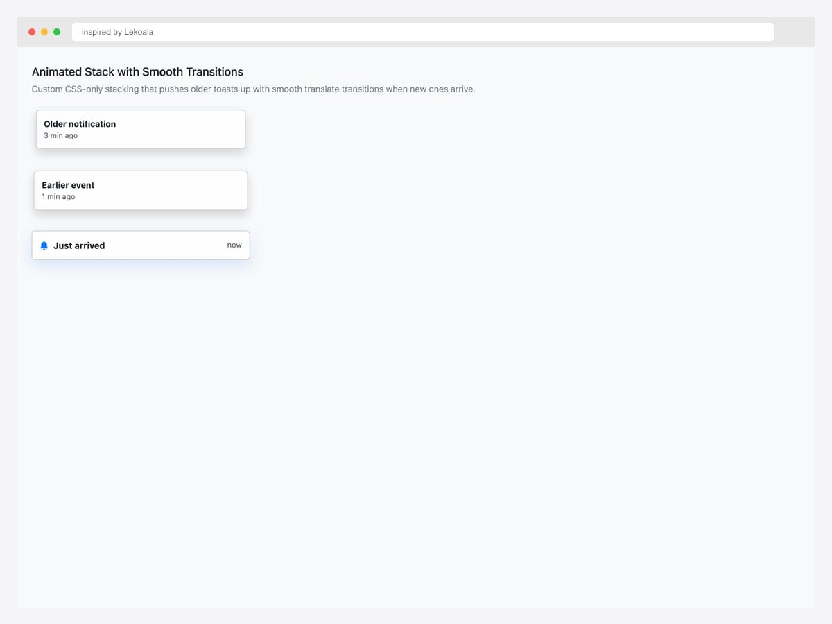
Animated stack with smooth transitions — newer toasts arrive with full opacity while older toasts compress slightly via transform: scale(0.96) and reduced opacity. Best fit for notification-heavy products where the stack itself communicates “newer = more important” without requiring users to read timestamps. Custom CSS layered on top of Bootstrap’s .toast-container. Animate each toast’s transform via CSS transition: transform 0.2s ease, opacity 0.2s ease. For accessibility, ensure the animation respects prefers-reduced-motion: reduce via a media query that disables the transform.
Inspired by: Lekoala · License: CodePen default (attribution required)
Source & details Original demo
22. Stack with Dismiss-All Control
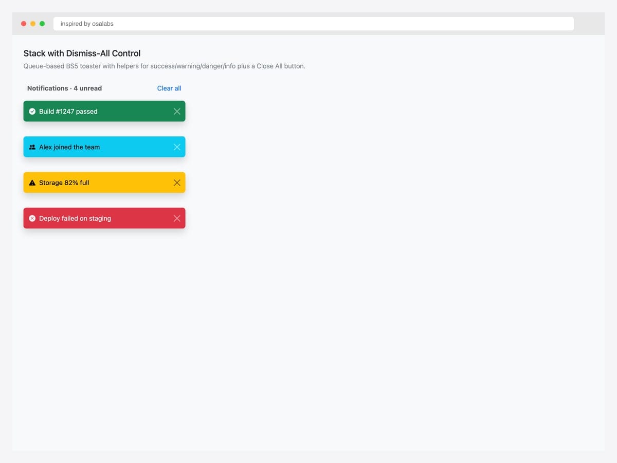
Notification panel header (“Notifications · 4 unread”) with a “Clear all” button plus a stack of contextual status toasts. Best fit for product UIs that surface multiple notifications at once — Slack notification trays, GitHub activity feeds, project management dashboards. The “Clear all” button calls bootstrap.Toast.getInstance(el).hide() on every toast in the container. Pure Bootstrap 5 markup. For real-world use, persist the cleared state to localStorage or backend so dismissed notifications don’t reappear on page refresh. Pair with a notification bell icon in the navbar for the trigger.
Inspired by: osalabs · License: MIT
Source & details Original demo
23. Persistent Status (Offline Mode)
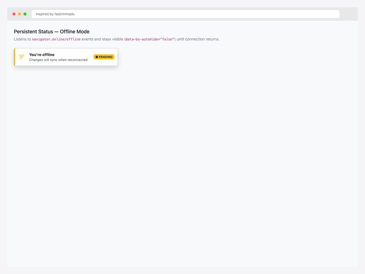
Persistent status toast with data-bs-autohide="false" — stays visible indefinitely until the user clicks the close button or your code calls .hide(). Best fit for status indicators that should reflect ongoing state: offline mode, connection lost, sync in progress, maintenance window active. Pure Bootstrap 5 markup. Wire to navigator.onLine events: window.addEventListener('offline', () => toast.show()) and window.addEventListener('online', () => toast.hide()). The colored left border (border-left: 4px solid) is a subtle visual cue that this isn’t a transient toast — it represents persistent state.
Inspired by: fadzrinmadu · License: CodePen default (attribution required)
Source & details Original demo
24. Bootstrap 5.3 Dark-Mode Toast
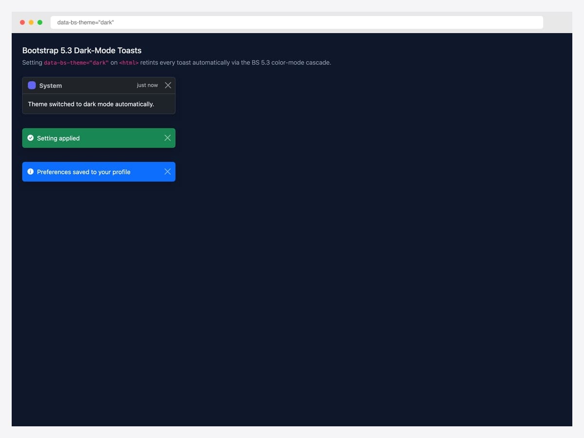
Bootstrap 5.3 introduced native dark-mode support via data-bs-theme="dark" — every .toast automatically re-tints through the color-mode CSS variable cascade with zero per-component overrides. Best fit for any product that supports system color-scheme preferences or offers a manual dark-mode toggle. Pure Bootstrap 5.3 — the cascade is built into the framework. Apply data-bs-theme="dark" at the <html> level for global dark mode, or scope it to a specific section by setting it on a wrapper div. Both contextual color variants (success/danger/warning/info) and the neutral toast variant automatically adjust their backgrounds and text colors.
Inspired by: Bootstrap (twbs) · License: MIT
Source & details Original demo
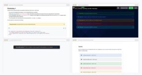
Advanced Bootstrap toast patterns
Three patterns the listicle items above hint at but rarely demo in isolation. Each one solves a specific production problem.
Pattern 1 — Programmatic toast queueing. When multiple events fire near-simultaneously (network sync errors during a save), you don’t want 5 toasts on top of each other. Build a queue that respects display delay:
const toastQueue = [];
let isShowing = false;

function enqueueToast({ title, body, variant = 'primary', delay = 4000 }) {
  toastQueue.push({ title, body, variant, delay });
  processQueue();
}

function processQueue() {
  if (isShowing || toastQueue.length === 0) return;
  isShowing = true;
  const { title, body, variant, delay } = toastQueue.shift();
  const el = renderToast({ title, body, variant });
  document.querySelector('.toast-container').appendChild(el);
  const toast = new bootstrap.Toast(el, { delay });
  el.addEventListener('hidden.bs.toast', () => {
    el.remove();
    isShowing = false;
    processQueue();
  });
  toast.show();
}
Pattern 2 — Toast with action button (undo pattern). The Gmail-style “Message deleted — Undo” pattern. The toast persists for 5–8 seconds, the user can click Undo, and the underlying action only commits after the toast hides:
let undoTimer;
function deleteEmail(id) {
  document.getElementById(`email-${id}`).style.display = 'none';
  undoTimer = setTimeout(() => commitDelete(id), 6000);
  const toast = new bootstrap.Toast(document.getElementById('undoToast'));
  toast.show();
  document.getElementById('undoBtn').onclick = () => {
    clearTimeout(undoTimer);
    document.getElementById(`email-${id}`).style.display = '';
    toast.hide();
  };
}
Pattern 3 — Persistent status toast. Some toasts are status indicators that shouldn’t auto-hide — “Offline mode active” until connection returns. Set data-bs-autohide="false" and control visibility programmatically based on app state:
<div class="toast" id="offlineToast" data-bs-autohide="false" role="status" aria-live="polite">
  <div class="toast-body">
    <span class="badge bg-warning">●</span> Offline — changes will sync when reconnected.
  </div>
</div>
<script>
  const toast = new bootstrap.Toast(document.getElementById('offlineToast'));
  window.addEventListener('offline', () => toast.show());
  window.addEventListener('online', () => toast.hide());
</script>
Toast vs Alert vs Modal — when to use which
| Toast | Alert | Modal | |
|---|---|---|---|
| Visibility | Briefly visible (auto-hide) | Inline, persistent until dismissed | Blocks page until dismissed |
| Page interaction | Non-blocking | Non-blocking | Blocking (overlay) |
| Position | Floating (corners) | Inline within page flow | Centered overlay |
| Best for | Transient feedback (saved, undo, error) | Persistent contextual messages | User action required |
| Default behavior | Hidden, opt-in via JS | Always visible | Hidden, opt-in via trigger |
| ARIA role | alert or status | alert | dialog |
When to choose what: If the user can ignore the message and keep working → toast. If the message is context-bound to a specific page section → alert. If user must respond before continuing → modal.
Frequently asked questions
What’s the difference between a Bootstrap toast and a Bootstrap alert?
Toasts are floating, dismissible notifications that appear briefly in a corner of the screen and auto-hide — best for transient feedback like “saved” or “undo deleted”. Alerts are inline, persistent messages within the page flow — best for contextual warnings, errors, or instructions tied to a specific section. Use toasts for events; use alerts for states.
How do I position a Bootstrap toast in the bottom right corner?
Wrap your toast in a .toast-container with positioning utility classes: <div class="toast-container position-fixed bottom-0 end-0 p-3">. Bootstrap 5’s utility classes (top-0, top-50, start-0, end-0, bottom-0) cover all eight common positions. Use translate-middle for true center positioning.
How do I show a Bootstrap toast with JavaScript?
Create a Toast instance and call .show(): const toast = new bootstrap.Toast(document.getElementById('myToast')); toast.show();. You can also use the helper bootstrap.Toast.getOrCreateInstance(element).show() to avoid duplicate instances if you trigger the toast from multiple places.
Can I prevent a Bootstrap toast from auto-hiding?
Yes — set data-bs-autohide="false" on the toast element. The toast will stay visible until the user clicks the close button or you call .hide() programmatically. This is useful for status indicators like “offline mode active” that should persist until the underlying state changes.
How do I stack multiple Bootstrap toasts?
Wrap them all in a single .toast-container element. Bootstrap 5 will stack them vertically with proper spacing automatically. To prevent toasts from overlapping when fired in rapid succession, implement a queue: collect toast requests, show them one at a time, and only show the next after the previous one hides (see the “queue pattern” in this article).
Are Bootstrap toasts accessible to screen readers?
Yes, when implemented correctly. Use role="alert" and aria-live="assertive" for important notifications (errors, urgent actions), or role="status" and aria-live="polite" for non-critical updates. Always include aria-atomic="true" so screen readers announce the entire toast, not just changed parts. Skipping these attributes is the most common toast accessibility mistake.
Are these Bootstrap toast examples free for commercial use?
Yes — every example in this collection uses an MIT, Apache 2.0, or MDB-free license, which permits commercial use including in client projects and SaaS products. Our Bootstrap 5.3 implementations are released under MIT; the original inspirations are linked for those who want to verify the source pen’s license terms.
Final thoughts
Bootstrap’s toast component fills the “non-blocking transient feedback” slot under almost every modern web app’s chrome. The patterns above show the spectrum: from the canonical docs reference to Stripe-style payment confirmations, from kebab notification badges to file upload progress bars, from undo affordances to persistent offline indicators. The picks worth committing to memory: the canonical live toast (#1) as your baseline, the Gmail undo pattern (#10) for any destructive operation, the persistent offline indicator (#23) for any app that goes offline, and Bootstrap 5.3’s native dark-mode cascade (#24) for any product that supports theme switching.
If you’re building form-validation feedback that lives in the page rather than floating in a corner, see our Bootstrap alert examples. For action-required dialogs that block the page until the user responds, see our Bootstrap modal templates.
Related collections: Bootstrap alert examples · Bootstrap modal templates · Bootstrap dropdown menu examples · Bootstrap form templates · Bootstrap snippet library
Related Posts
Comments (0)