26 Free Bootstrap Dropdown Menu Examples (2026)
By Aigars Silkalns · Last updated May 13, 2026 · 16-min read
User profile menus, action kebabs, mega menus, filter dropdowns, language switchers, notification bells — Bootstrap’s .dropdown component sits behind nearly every modern web app’s chrome. This collection gathers 26 free Bootstrap 5–compatible dropdown menu examples covering the patterns developers actually ship: nav-bar dropdowns with rich items, account menus with avatars, mega menus with multi-column grids, filter dropdowns with form controls, split buttons, directional variants, and Bootstrap 5.3’s native dark-mode treatment. Every screenshot is a working BS 5.3 implementation; each example links to its original inspiration on CodePen, Bootsnipp, or GitHub for those who want to fork or compare. If you’re rebuilding a navbar, designing a settings menu, or hunting for a specific dropdown pattern, start here.
What is a Bootstrap dropdown?
A Bootstrap dropdown is a toggleable menu that displays a list of links or actions when its trigger element is clicked. Dropdowns are the foundation of nearly every web app’s navigation, settings menu, action menu (⋮), and user account menu. Bootstrap 5 ships dropdowns with Popper.js-based positioning, ARIA-compliant keyboard navigation, and built-in support for nested elements like dividers, headers, and forms.
When to use a dropdown:
- Nav-bar links with sub-pages (“Products › Categories”)
- Action menus on table rows or cards (
⋮ More) - User account menus with profile, settings, logout
- Filter or sort selectors that don’t fit in a flat row
- Split buttons (primary action + secondary options)
Bootstrap 5 vs Bootstrap 4 dropdowns: Bootstrap 5 replaced jQuery with vanilla JavaScript across all components, and dropdowns received API changes: data-toggle became data-bs-toggle, the global bootstrap.Dropdown namespace replaced jQuery plugins, and the auto-close behavior gained finer control via data-bs-auto-close="inside" | "outside" | "true" | "false". The HTML structure is otherwise compatible — most Bootstrap 4 dropdowns work in 5 with attribute renames.
Browser support: All modern browsers. Popper.js handles positioning edge cases automatically (flipping menus when they’d overflow the viewport). Hover-triggered dropdowns require custom CSS — Bootstrap defaults to click-trigger for accessibility (hover excludes keyboard and touch users). All 26 examples below were tested in Chrome 124, Safari 17, and Firefox 125 on May 2026.
How to use Bootstrap dropdowns (basic markup)
<!-- Standard dropdown -->
<div class="dropdown">
  <button class="btn btn-secondary dropdown-toggle" type="button" data-bs-toggle="dropdown" aria-expanded="false">
    Dropdown button
  </button>
  <ul class="dropdown-menu">
    <li><a class="dropdown-item" href="#">Action</a></li>
    <li><a class="dropdown-item" href="#">Another action</a></li>
    <li><hr class="dropdown-divider"></li>
    <li><a class="dropdown-item" href="#">Something else</a></li>
  </ul>
</div>

<!-- Split button dropdown -->
<div class="btn-group">
  <button type="button" class="btn btn-primary">Save</button>
  <button type="button" class="btn btn-primary dropdown-toggle dropdown-toggle-split" data-bs-toggle="dropdown" aria-expanded="false">
    <span class="visually-hidden">Toggle Dropdown</span>
  </button>
  <ul class="dropdown-menu">
    <li><a class="dropdown-item" href="#">Save as draft</a></li>
    <li><a class="dropdown-item" href="#">Save and publish</a></li>
  </ul>
</div>
Required JS: Bootstrap bundle (includes Popper.js, which dropdowns depend on for positioning).
Common gotcha: The trigger element must have data-bs-toggle="dropdown" AND aria-expanded="false" AND be inside the same .dropdown (or .btn-group) wrapper as the .dropdown-menu. Omit any of these and the dropdown won’t open.
Best free Bootstrap dropdown examples
We grouped the 26 picks by use case rather than ranking them — every example below is a viable production starting point. Each screenshot shows our Bootstrap 5.3 implementation of the pattern, inspired by the original designer credited beneath. The “Original demo” link goes to the source pen or repository for those who want to fork, compare implementations, or see the author’s specific code style.
Showcase — visually distinctive dropdowns
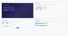
1. Bootstrap 5.3 Multi-Level + Mega Menu
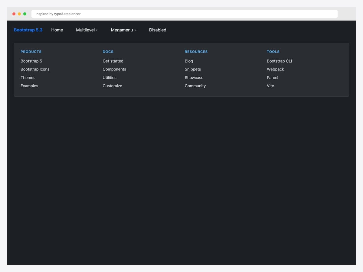
Inspired by typo3-freelancer’s CodePen showcase, this dark-theme navbar combines a multi-level menu with a four-column mega panel — categorized link lists across Products, Docs, Resources, and Tools. Best fit for documentation sites, agency portfolios, and product marketing pages where the nav needs to surface dozens of pages without overwhelming. Built on Bootstrap 5.3 with custom CSS for the mega-menu grid and column headers; no JavaScript required for the layout (only for click/hover toggle). The mega menu spans the full container width via position-static on the parent <li> — drop that class and the menu narrows to the toggle’s width.
Inspired by: typo3-freelancer · License: CodePen default (attribution required)
Source & details Original demo
2. Mega Dropdown Menu Navbar BS 5.3.8
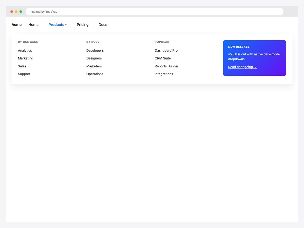
Inspired by YepeYey’s Bootstrap 5.3.8 pen, this lighter mega dropdown pairs categorized link columns (By Use Case, By Role, Popular) with a gradient promo card in the fourth column — the layout most SaaS marketing sites use to mix navigation with featured-product promotion. Best fit for B2B SaaS, agency sites, and any product navbar that needs to balance utility links with conversion-focused CTAs. Pure Bootstrap 5.3 utility classes (row, col-md-3, shadow) — no custom components. The promo card uses inline gradient backgrounds; verify your brand colors hold their visual hierarchy alongside the contextual link columns before deploying.
Inspired by: YepeYey · License: CodePen default (attribution required)
Source & details Original demo
3. Searchable Dropdown BS 5.3
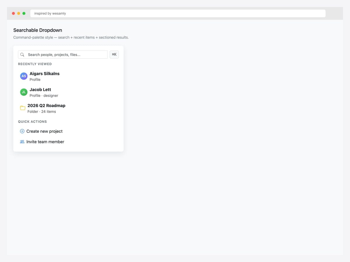
Inspired by wesamly’s BS 5.3 searchable dropdown, this command-palette style combines a search input with sectioned content — recent items with avatars, quick actions with icons, and a ⌘K keyboard hint. Best fit for productivity apps, admin dashboards, and any product where users navigate by typing rather than scrolling through menus (Linear, Notion, GitHub Copilot). Pure Bootstrap 5.3 with Bootstrap Icons; the search filtering itself requires a small JavaScript handler — start with document.querySelector('input').addEventListener('input', filterFn). Don’t over-design the search loading state — for menus under 50 items synchronous filtering is fast enough; reach for async only at scale.
Inspired by: wesamly · License: CodePen default (attribution required)
Source & details Original demo
4. Bootstrap 5.3 Dark-Mode Dropdowns
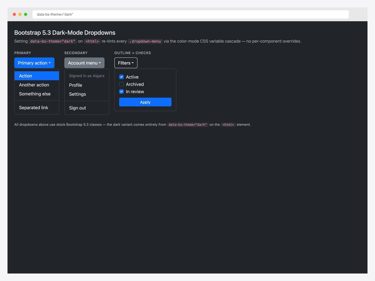
Bootstrap 5.3 introduced native dark-mode support via the data-bs-theme="dark" attribute on <html> — every .dropdown-menu re-tints automatically through the dark color-mode CSS variable cascade with zero per-component overrides. This self-hosted demo applies the attribute to a stock Bootstrap 5.3 page and renders three dropdowns (primary action with separator, account menu with header, filter form with checkboxes) in their dark-mode form. Best fit for any product that supports system color-scheme preferences or offers a manual dark-mode toggle. Customize the dark variants via [data-bs-theme="dark"] scoped CSS variables rather than overriding the base classes.
Inspired by: Bootstrap (twbs) demo · License: MIT
Source & details Original demo
Navigation dropdowns
5. Bootstrap 5 Navbar Examples
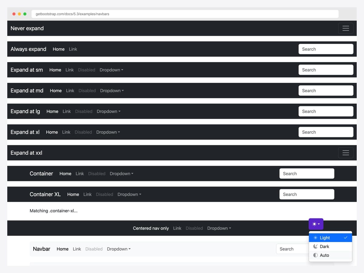
The official Bootstrap 5 navbar examples gallery — every responsive variant in one demo: Never expand, Always expand, Expand at sm/md/lg/xl/xxl, Container, Container XL, Centered nav, plus the theme picker dropdown with Light / Dark / Auto options. Best fit for the baseline: any project where you want the navbar dropdowns to look exactly like the official docs so users recognize the pattern instantly. Pure Bootstrap 5.3 with no dependencies beyond the framework itself. The theme-picker dropdown at the bottom right shows the BS 5.3 color-mode toggle in action — drop the same JavaScript into your project to flip between light, dark, and auto modes.
Inspired by: Bootstrap (twbs) · License: MIT
Source & details Original demo
6. Hover Navbar Dropdown
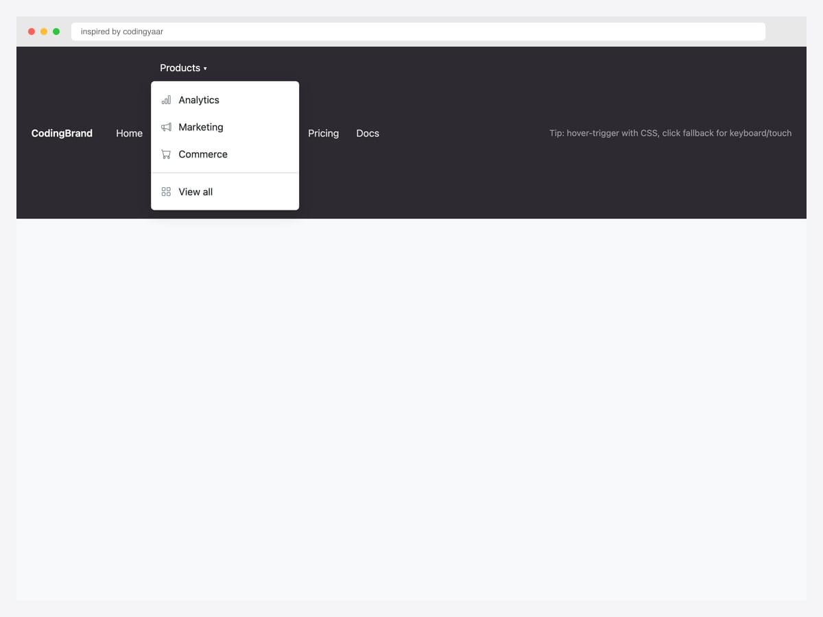
Inspired by codingyaar’s hover-navbar pen, this pattern adds CSS-driven hover-trigger on top of Bootstrap’s default click behavior — keyboard and touch users still get the click fallback. Best fit for marketing sites and landing pages where instant hover-reveal feels expected; not appropriate for in-app navigation where accessibility audit will flag missing keyboard equivalents. Pure CSS via @media (hover: hover) and (min-width: 992px) guard — desktop hover-capable browsers get the enhancement, touch devices keep the click. The dropdown uses Bootstrap Icons for inline labels; the hover behavior layers over standard .dropdown markup without modifying the underlying classes.
Inspired by: codingyaar · License: CodePen default (attribution required)
Source & details Original demo
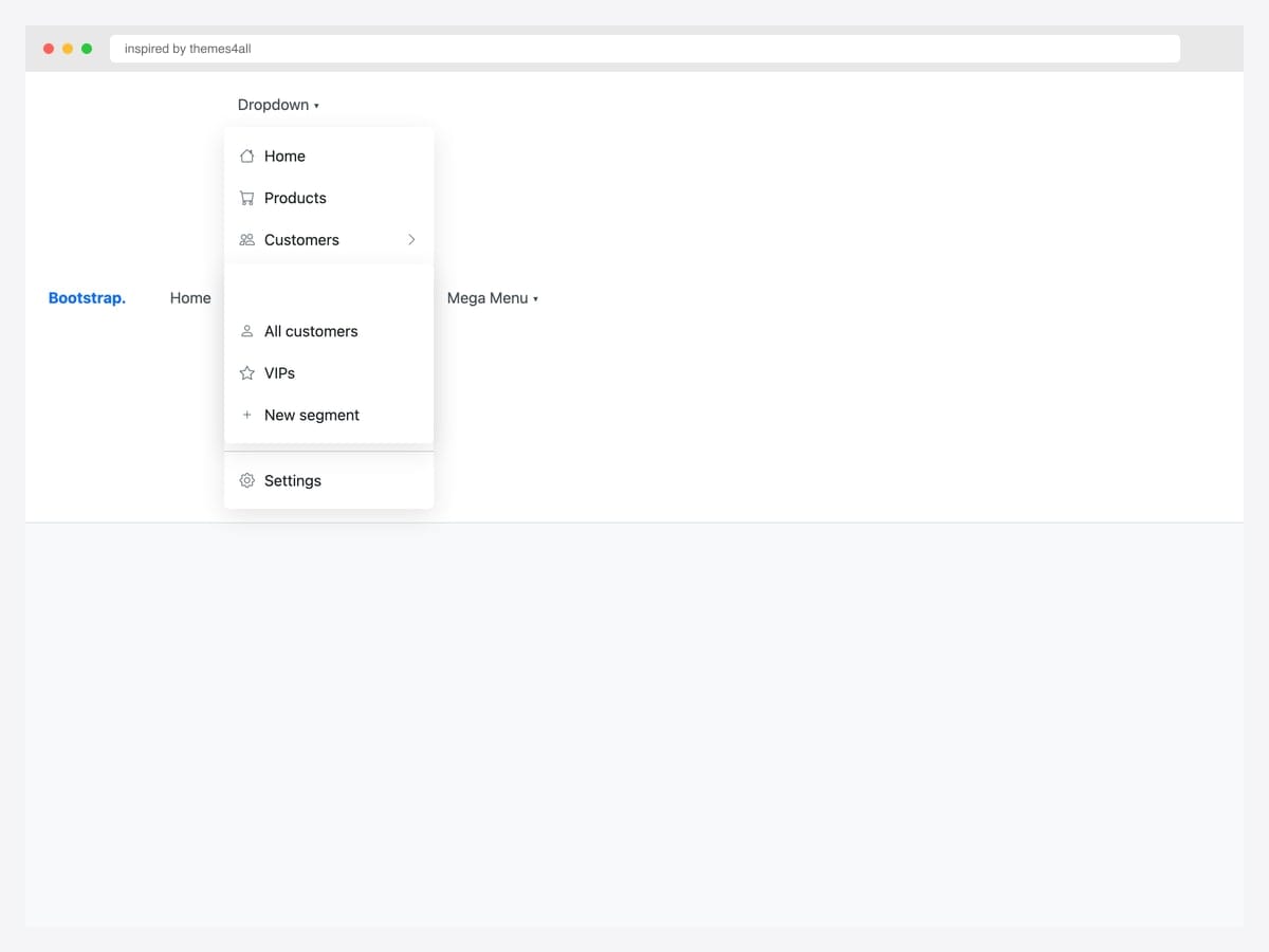
7. Navbar with Nested Dropdowns
Inspired by themes4all’s nested-dropdown pattern, this layout shows a navbar dropdown with an icon for every item plus a flyout submenu that opens to the right on hover. Best fit for content-heavy products with deep category hierarchies — ecommerce sites, news portals, and B2B catalogs where flat menus would lose users. Pure CSS for the submenu positioning (position: relative; left: 100%); Bootstrap handles the parent dropdown’s open/close state. Flyout submenus break on narrow viewports — pair this pattern with .dropdown-toggle-split or accordion-style collapsible menus for mobile, and gate the flyout behind a @media (min-width: 992px) guard.
Inspired by: themes4all · License: CodePen default (attribution required)
Source & details Original demo
8. Nested Dropdown on Hover
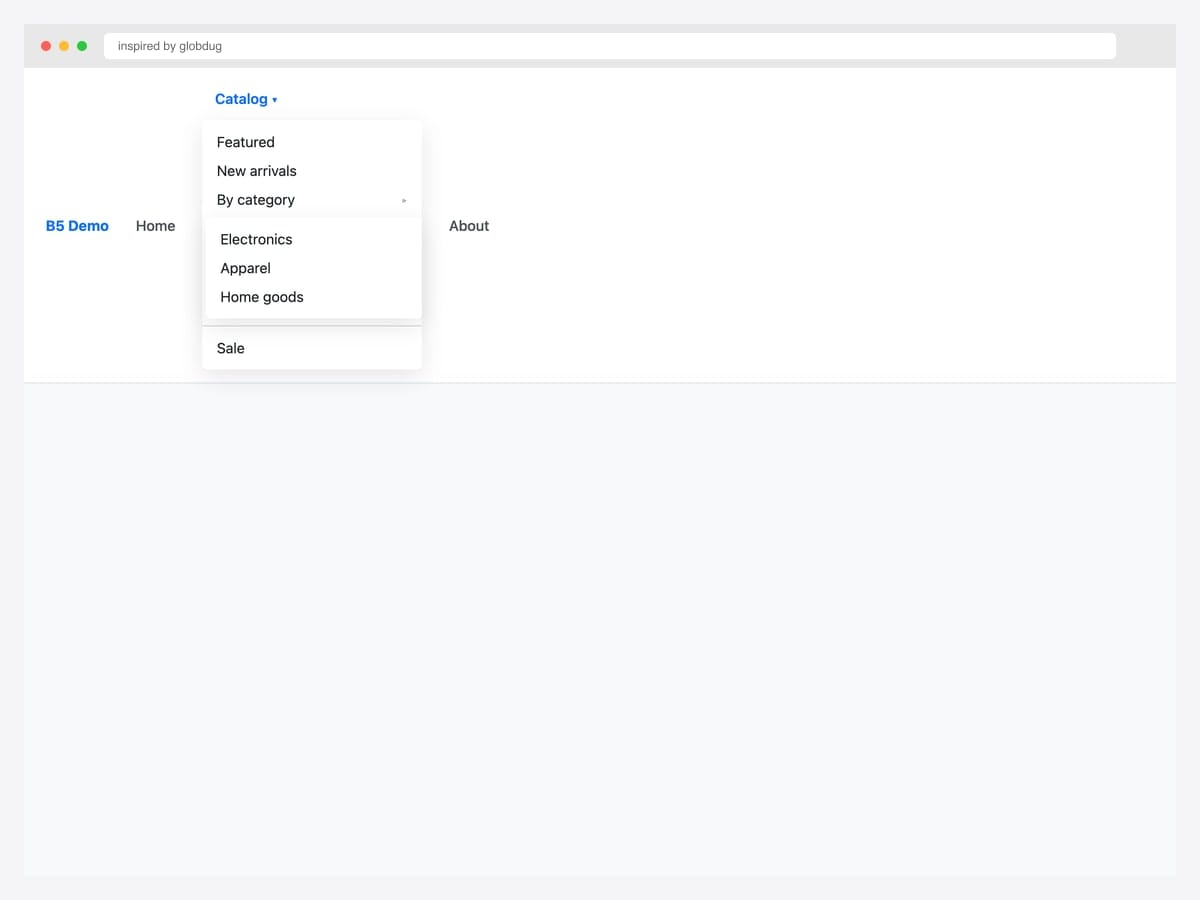
Inspired by globdug’s nested-on-hover pen, this navbar dropdown shows parent items with arrow indicators (▸) signaling “has submenu” — a visual cue most flyout patterns omit. Best fit for documentation sites and admin tools where users need to predict whether clicking will navigate or expand. Pure CSS — the chevron indicator is a ::after pseudo-element; the submenu’s right-flyout uses left: 100% on the nested .dropdown-menu. Submenus expand outside their parent boundary, so anchor the navbar above any overflow: hidden ancestor to avoid clipping — and verify the menu doesn’t extend off the viewport on smaller laptops (1280×800).
Inspired by: globdug · License: CodePen default (attribution required)
Source & details Original demo
9. Multilevel Responsive Mobile
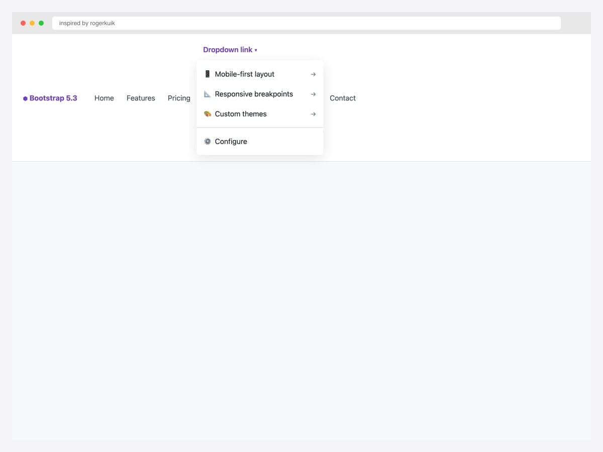
Inspired by rogerkuik’s responsive multilevel pen, this dropdown collapses inline on mobile (accordion-style) and flies out on desktop — solving the “deep menu hierarchy on small screens” problem without resorting to a separate mobile-only navigation pattern. Best fit for ecommerce, B2B SaaS, and any product whose desktop navigation needs three or more levels but where mobile users would drown in nested submenus. Vanilla JavaScript with Bootstrap 5.3 classes; the responsive collapse is driven by @media (max-width: 991px) queries that override the flyout positioning. Test the mobile collapse direction (down vs. up) against your viewport breakpoints — wrong defaults can cause menu items to overflow off-screen.
Inspired by: rogerkuik · License: CodePen default (attribution required)
Source & details Original demo
Account & profile menus
10. User Profile Navbar Dropdown
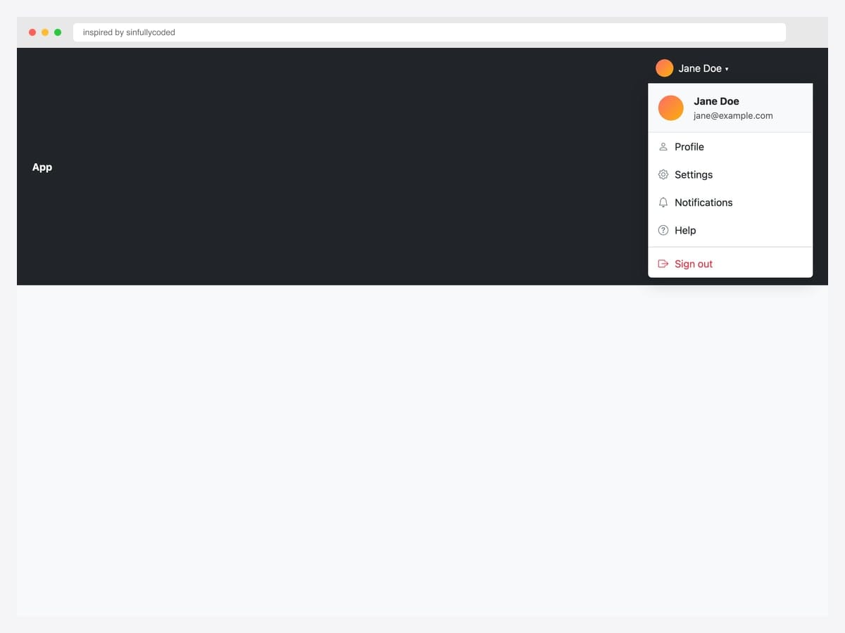
Inspired by sinfullycoded’s user-profile dropdown, this Gmail-style menu attaches to a dark navbar with an avatar trigger and reveals a profile header (avatar, name, email) above a divided action list. Best fit for any logged-in app — SaaS dashboards, admin panels, social products. Pure Bootstrap 5 with Bootstrap Icons; the header background uses .bg-light to separate it from the action items. Use role="menu" on the .dropdown-menu if your app needs strict ARIA semantics; otherwise Bootstrap’s default role="menu" implicit on <ul> children of .dropdown-menu is sufficient for most a11y audits.
Inspired by: sinfullycoded · License: CodePen default (attribution required)
Source & details Original demo
11. Avatar Profile Dropdown
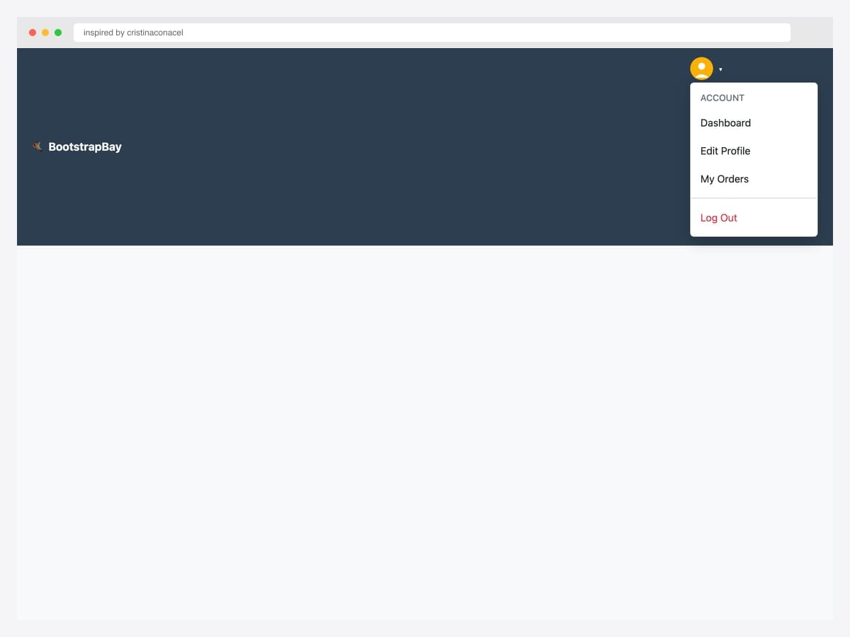
Inspired by cristinaconacel’s BootstrapBay avatar dropdown, this pattern shows a compact avatar trigger in a dark navbar with Account header, Dashboard / Edit Profile / My Orders items, and a danger-styled Log Out separator. Best fit for the classic SaaS chrome where the avatar IS the trigger (no name shown until expanded), maximizing horizontal space in the navbar. Bootstrap 4-era markup that ports to Bootstrap 5 with the data-toggle → data-bs-toggle swap. Avatar dropdowns rely on contrast — verify the avatar background contrasts with both the navbar (dark here) AND any browser autofill yellow tint (Chrome) that can wash out the trigger.
Inspired by: cristinaconacel · License: CodePen default (attribution required)
Source & details Original demo
12. Dropdown Menu UI
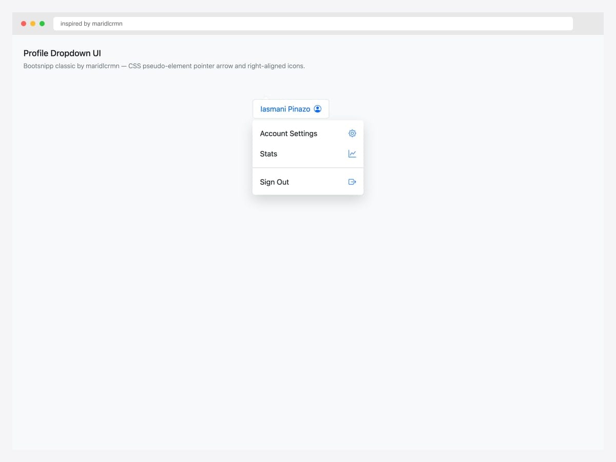
Inspired by maridlcrmn’s Bootsnipp classic (415 favs / 274K views), this dropdown adds a CSS pseudo-element pointer arrow above the menu and right-aligns icons next to each action — visual touches that make the dropdown feel like a polished popover rather than a generic menu. Best fit for product UIs where small visual refinements signal premium quality (Stripe Dashboard, Linear, Notion’s settings panels). Pure CSS — the arrow uses a ::before pseudo-element with border-triangle technique. The pointer arrow works at any trigger position; if you align the dropdown’s right edge to a trigger’s right edge, shift the arrow’s left value to match.
Inspired by: maridlcrmn · License: MIT (Bootsnipp default)
Source & details Original demo
13. Profile Dropdown Inspirations
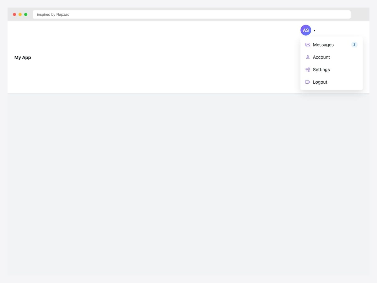
Inspired by Rapzac’s profile dropdown, this animated avatar menu shows initials in a purple gradient circle plus action items with right-aligned badges (e.g., “3” unread messages). Best fit for messaging apps, support tools, and any product where pending actions need visual emphasis next to navigation. Pure Bootstrap 5 with custom CSS for the badge pill and animation timing. The badge pill is a separate <span> with absolute positioning — for accessibility, also include the count in the screen-reader-only text on the action label so users with NVDA/JAWS hear “Messages, 3 unread” rather than just “Messages”.
Inspired by: Rapzac · License: CodePen default (attribution required)
Source & details Original demo
Action menus & contextual dropdowns
14. Three-Dots Kebab Dropdown
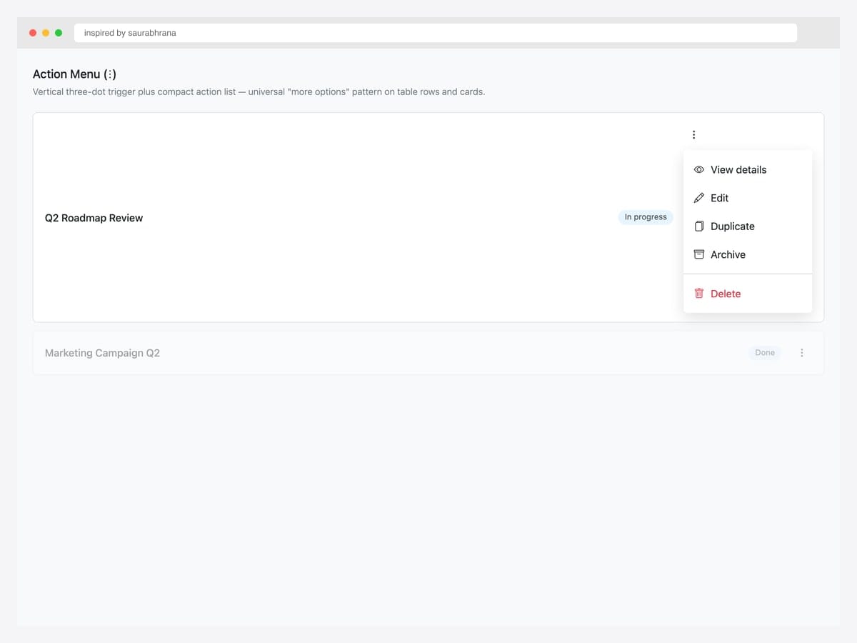
Inspired by saurabhrana’s three-dots pen, this kebab (⋮) action menu sits at the right edge of a task row and reveals five actions: View, Edit, Duplicate, Archive, plus a danger-styled Delete. Best fit for table rows, card grids, and any list interface where each row needs its own action menu without crowding the row with five buttons. Pure Bootstrap 5 utility classes (btn, dropdown-menu, dropdown-item); the kebab icon is Bootstrap Icons’ bi-three-dots-vertical. Critical: ensure the menu opens within the viewport bounds — for table rows near the bottom of the page, Bootstrap auto-flips the menu upward via Popper.js without any extra config.
Inspired by: saurabhrana · License: CodePen default (attribution required)
Source & details Original demo
15. Notifications Bell + Badge
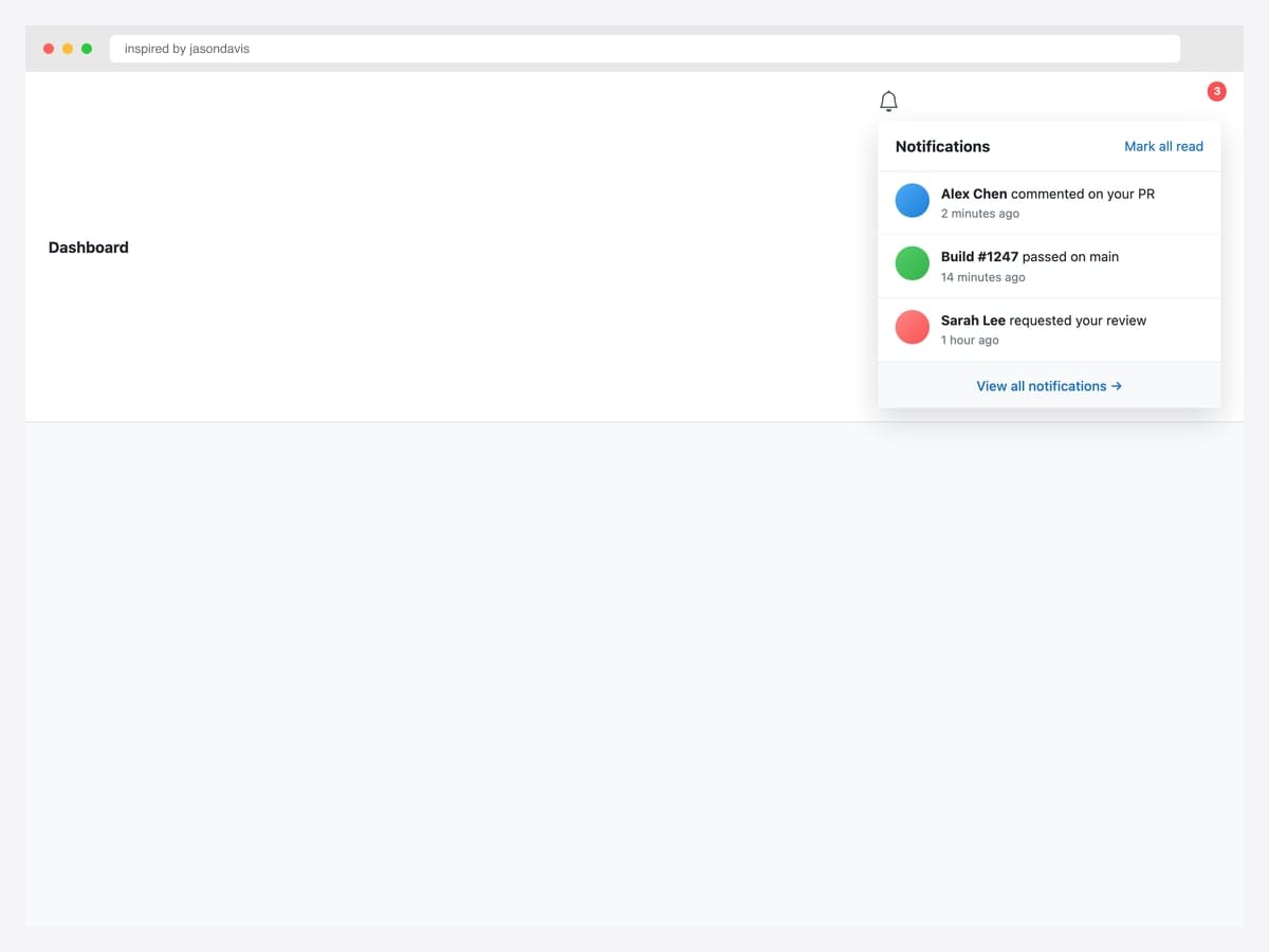
Inspired by jasondavis’s classic notification pen, this bell-icon dropdown shows a red count badge (3), a scrollable list of recent activity items with avatars and timestamps, plus a “View all” footer link. Best fit for any logged-in product with async events — comments, PR reviews, build status, mentions. Bootstrap 5 markup with custom CSS for the badge positioning and avatar circles. Reset the count badge after the user opens the menu (not on individual item clicks) — most products handle this via a single API call on show.bs.dropdown rather than tracking per-item read state, which avoids race conditions when notifications arrive while the dropdown is open.
Inspired by: jasondavis · License: CodePen default (attribution required)
Source & details Original demo
16. Cart Dropdown
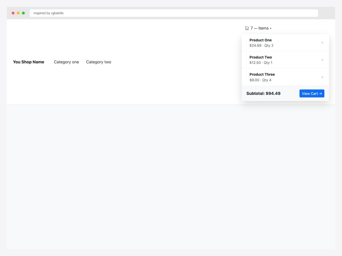
Inspired by rgbskills’s Bootsnipp cart dropdown, this e-commerce navbar pattern shows a mini-cart with product thumbnails, names, prices, quantity, per-item remove buttons (✕), and a Subtotal + View Cart footer. Best fit for ecommerce sites where users add items frequently and need to verify cart contents without leaving the current page. Bootstrap 3.3-era markup that works in 5 unchanged because it’s CSS-only. Hydrate the cart count and contents from localStorage or your cart API on every page load — for users with disabled JavaScript, the cart trigger still navigates to the full cart page when clicked (the dropdown gracefully degrades).
Inspired by: rgbskills · License: MIT (Bootsnipp default)
Source & details Original demo
17. Language Switcher with Flags
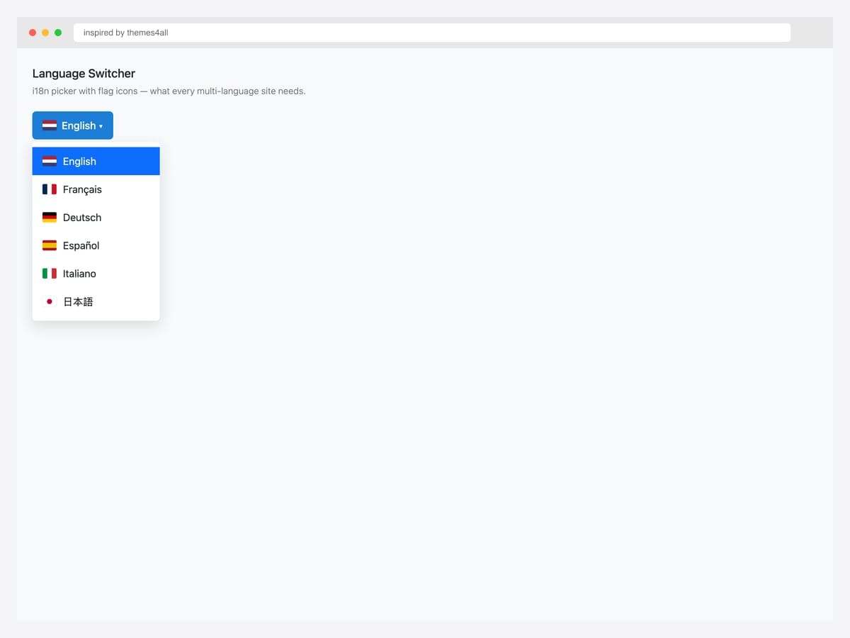
Inspired by themes4all’s flag-icon dropdown, this language switcher shows the currently selected language with a flag in the trigger button, then lists all available languages with their flags in the menu. Best fit for any multi-language site where users need to switch UI language and want visual confirmation of the choice (flags help non-Latin-script speakers). Custom CSS flag rendering — no flag-icon library dependency, just pure CSS gradients for the six flags shown. For RTL languages (Arabic, Hebrew), pair the language switch with a dir="rtl" attribute swap on <html> after selection; otherwise the language changes but the layout direction doesn’t.
Inspired by: themes4all · License: CodePen default (attribution required)
Source & details Original demo
Mega menus
18. BS5 Mega Menu Icon + Title + Description
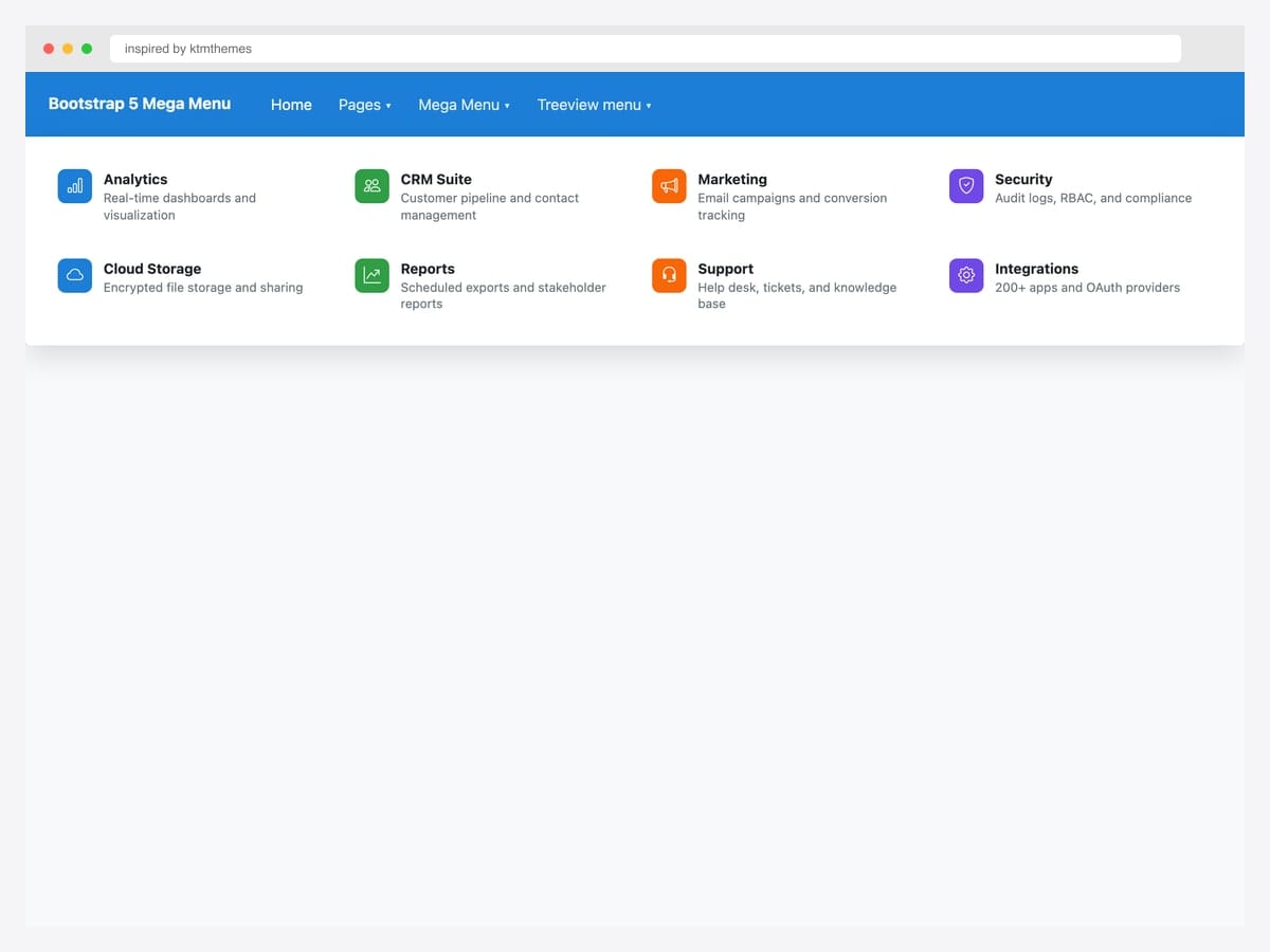
Inspired by ktmthemes’s BS5 mega menu, this layout shows eight rich items in two rows — colored icon tiles, bold titles, one-line descriptions. Best fit for B2B SaaS product navigation where users need to discover features (Analytics, CRM Suite, Marketing, etc.) rather than just navigate to known pages. Pure Bootstrap 5.3 with Bootstrap Icons; each tile uses row.g-3 for grid spacing and contextually colored icon backgrounds (bg-primary, bg-success, etc.). The description text is the differentiating element — keep it to one line (about 8-10 words) so the grid stays scannable. Longer descriptions push items below the fold and defeat the “scan everything at once” advantage of mega menus.
Inspired by: ktmthemes · License: CodePen default (attribution required)
Source & details Original demo
19. MDB Mega Menu — Mixed Media
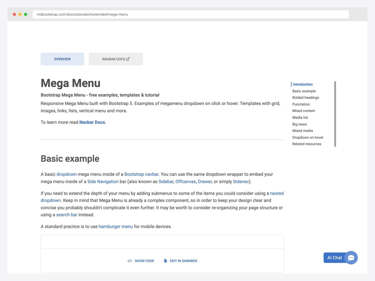
Bootstrap 5 mega menu documentation from MDBootstrap — their Bootstrap-Mega-Menu repo (MIT) ships responsive multi-column dropdowns with templates for grid layouts, image-rich menus, vertical menus, and dropdown-on-hover variants. Best fit for teams that want a battle-tested mega-menu component without writing the responsive collapse logic from scratch. Built on Bootstrap 5 with the kit’s alert SCSS partial that can be adopted standalone without pulling in the whole MDB UI Kit. The free tier covers all mega-menu variants — only the “Pro” templates require a paid license. Confirm via the GitHub repo’s LICENSE file rather than the rendered docs page, which doesn’t display license info prominently.
Inspired by: MDBootstrap · License: MIT (MDB Free)
Source & details Original demo
20. Responsive BS5 Mega Menu Icon Tiles
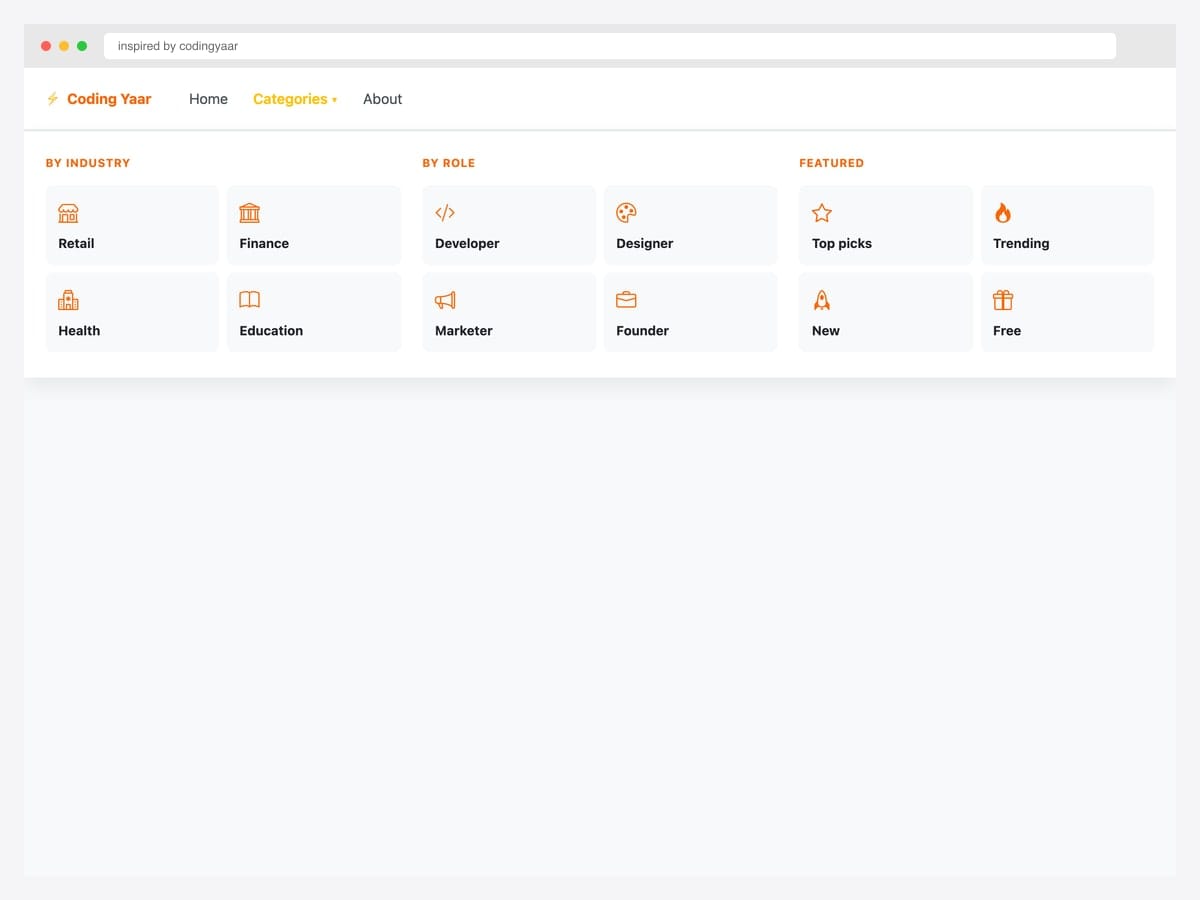
Inspired by codingyaar’s BS5 mega menu, this layout uses icon tiles in a 2-column grid per category (By Industry, By Role, Featured) — gracefully collapsing into an accordion on mobile. Best fit for ecommerce and content sites with cleanly grouped category structures (4-8 main categories, 3-8 sub-categories each). Pure Bootstrap 5 utility classes — no custom components. The tile-grid layout uses CSS Grid (grid-template-columns: 1fr 1fr) rather than Bootstrap’s flex grid, because two-column tiles inside three-column sections create alignment headaches with col-md-6. Override with CSS Grid and the layout stays predictable across viewport sizes.
Inspired by: codingyaar · License: CodePen default (attribution required)
Source & details Original demo
21. BS5 Mega Menu Multi-Column
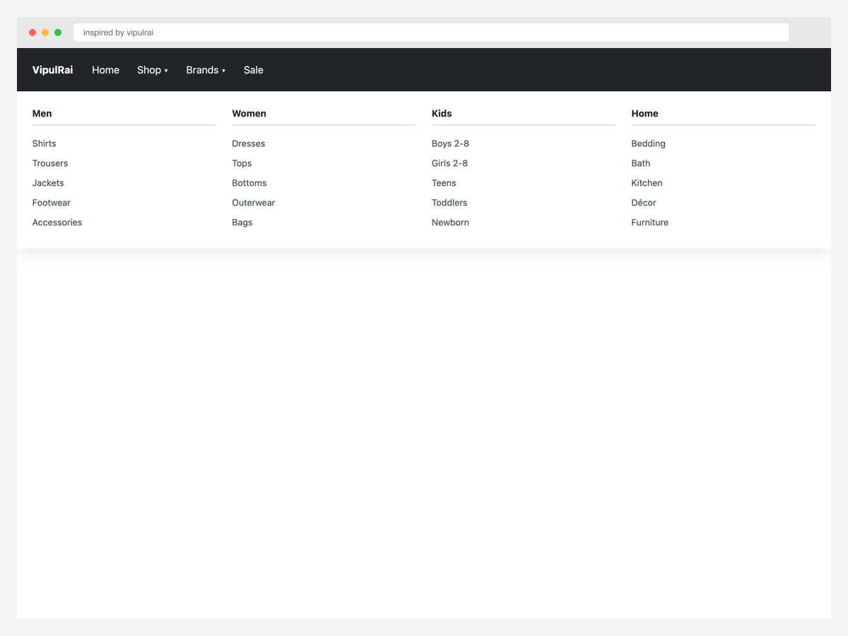
Inspired by vipulrai’s mega menu, this multi-column layout shows four product category sections (Men, Women, Kids, Home) — each with five sub-category links and a colored top border that matches the category. Best fit for apparel ecommerce, marketplaces, and any catalog site where the top-level navigation needs to mirror the URL hierarchy users will browse. Pure Bootstrap 5 utility classes — col-md-3 for the column layout, custom CSS for the top borders and hover states. The pattern works equally well horizontally (4 cols × 5 rows = 20 items) and vertically (4 rows × 5 cols) — pick the orientation that matches your category count and your audience’s reading direction.
Inspired by: vipulrai · License: CodePen default (attribution required)
Source & details Original demo
Form-field dropdowns
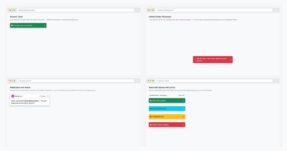
22. Dropdown with Checkboxes / Switches
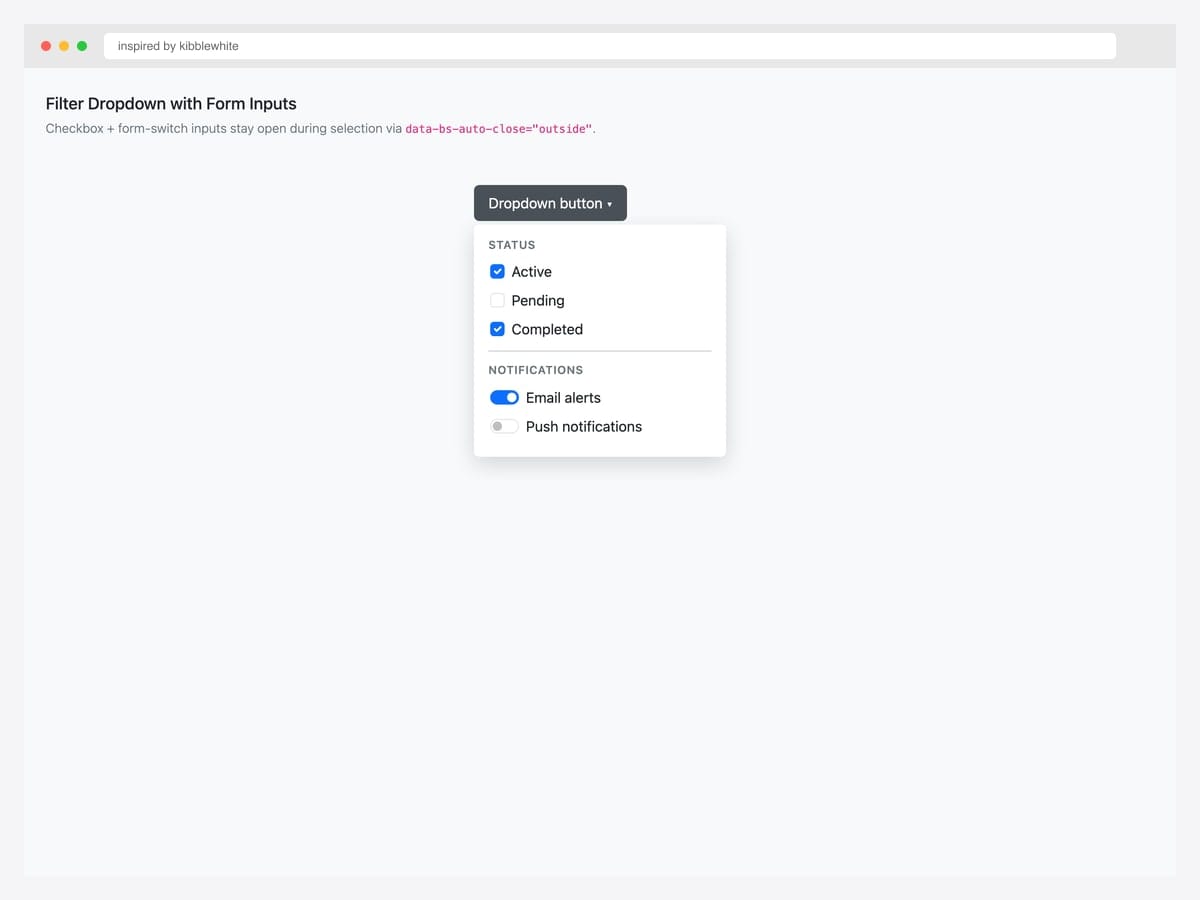
Inspired by kibblewhite’s filter-dropdown pen, this menu combines checkboxes (Status: Active / Pending / Completed) with form switches (Notifications: Email / Push) inside a single dropdown — staying open during selection via data-bs-auto-close="outside". Best fit for data-heavy interfaces — admin tables, analytics dashboards, search-result filtering. Pure Bootstrap 5 form classes (.form-check, .form-switch); the auto-close behavior is the critical differentiator. Group related filters with section labels (Status / Notifications) so users can scan logical chunks rather than a flat list of unrelated toggles. Apply filters on a “Apply” button click rather than per-toggle for performance.
Inspired by: kibblewhite · License: CodePen default (attribution required)
Source & details Original demo
23. Dropdown autoClose Behaviors
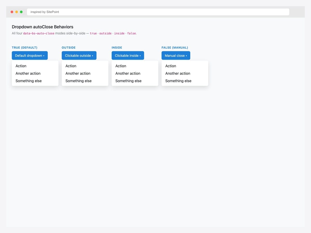
Inspired by SitePoint’s dropdown autoClose demo, this comparison shows all four data-bs-auto-close behaviors side-by-side: true (default — close on any click), outside (close only on outside click), inside (close only on inside click), and false (never auto-close; manual .hide() required). Best fit as a teaching reference for developers learning Bootstrap 5’s dropdown behavior options. Pure Bootstrap 5 — each variant just changes one data attribute on the trigger. Pick outside for filter dropdowns with multiple toggles, inside for menus with destructive actions that need user reflection, and false for tour/onboarding overlays where dismissal is controlled programmatically.
Inspired by: SitePoint · License: CodePen default (attribution required)
Source & details Original demo
24. Search Form Inside Dropdown
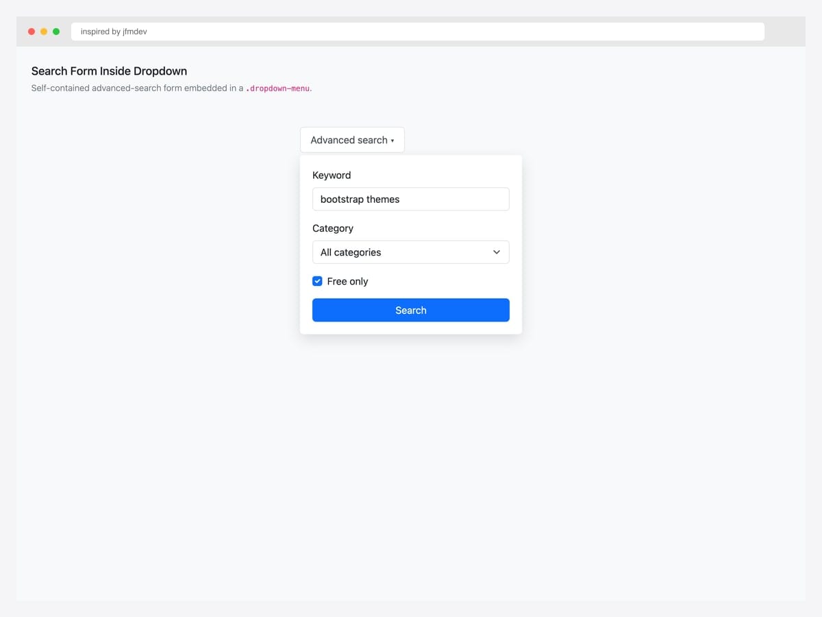
Inspired by jfmdev’s form-in-dropdown pen, this dropdown contains an advanced search form — keyword input, category select, “free only” checkbox, plus a primary submit button. Best fit for site-wide search interfaces where the dropdown holds form controls rather than navigation links. Pure Bootstrap 5 form classes; the dropdown stays open during input via data-bs-auto-close="outside". Forms inside dropdowns are tricky for screen readers — explicitly include aria-label on the dropdown trigger (“Open advanced search form”) so users with screen readers understand the dropdown expands a form rather than a list of links.
Inspired by: jfmdev · License: CodePen default (attribution required)
Source & details Original demo
Split buttons & directional variants
25. Split Button Dropdown Group
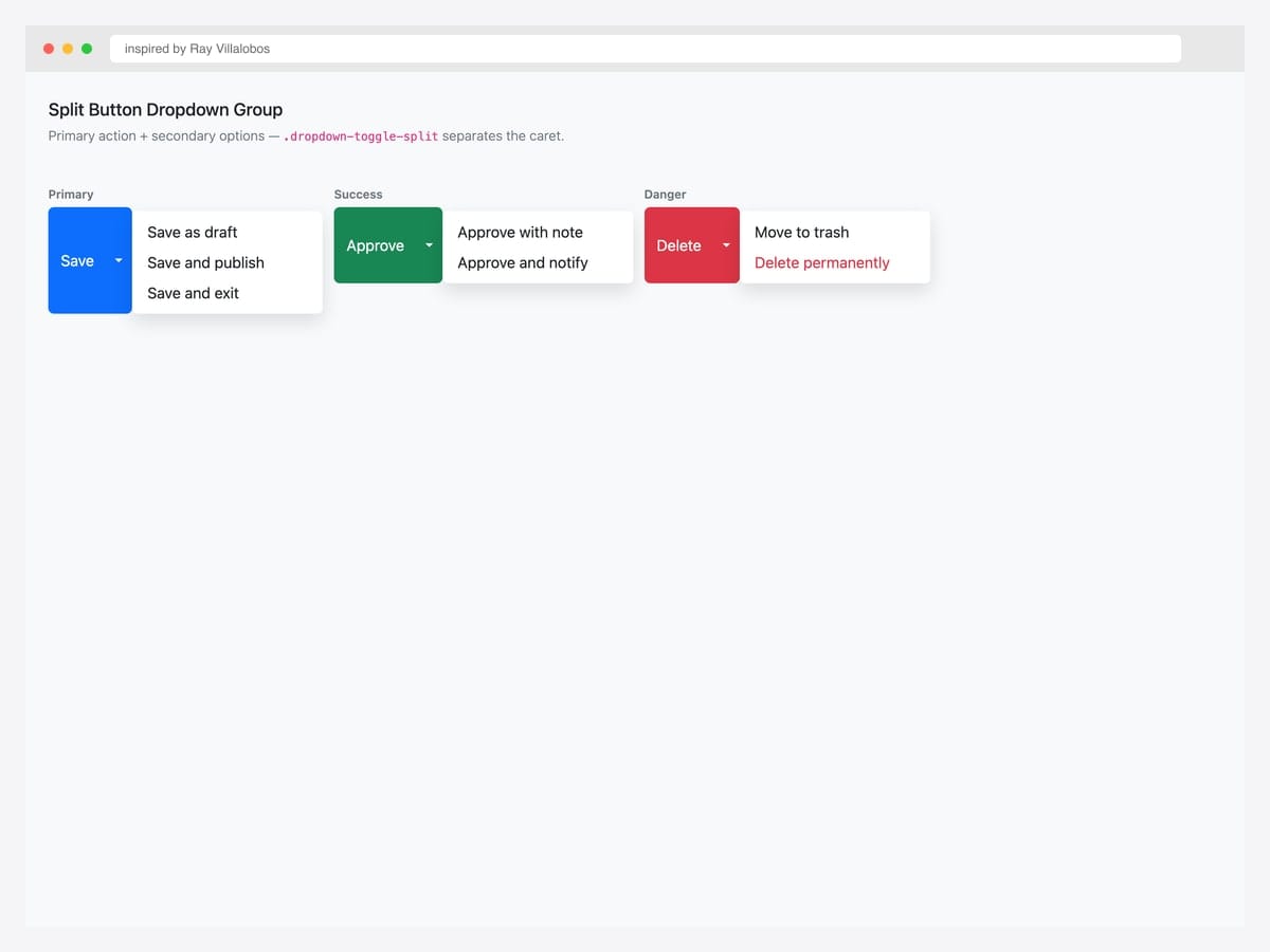
Inspired by Ray Villalobos’s LinkedIn Learning split-button pen, this group shows three Bootstrap 5 variants — Primary (Save / Save as draft / Save and publish), Success (Approve / with note / and notify), and Danger (Delete / Move to trash / Delete permanently). Best fit for forms with a primary action plus secondary variations — save dialogs, publish flows, destructive actions with safety options. Pure Bootstrap 5 — .btn-group wrapper, two buttons (main action + .dropdown-toggle-split caret). Include a screen-reader-only label on the split toggle (<span class="visually-hidden">Toggle</span>) so the toggle button has an accessible name even though it’s visually just a caret.
Inspired by: Ray Villalobos · License: CodePen default (attribution required)
Source & details Original demo
26. Dropdown Options (dropup / dropstart / dropend)
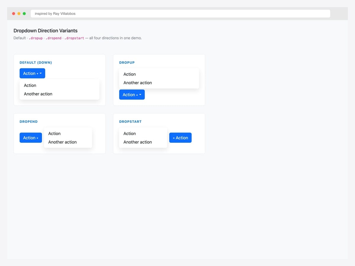
Inspired by Ray Villalobos’s BS5 dropdown options pen, this 2×2 grid shows all four directional variants in one demo — Default (down), Dropup, Dropend, and Dropstart. Best fit as a reference when you need to pick a direction based on the trigger’s position relative to the viewport edge. Pure Bootstrap 5 — each direction is just a different class on the wrapper (.dropdown, .dropup, .dropend, .dropstart). For dynamic position decisions, Bootstrap uses Popper.js automatically — set data-bs-display="dynamic" on the trigger and Popper will flip the menu when it would overflow the viewport. No manual direction logic required.
Inspired by: Ray Villalobos · License: CodePen default (attribution required)
Source & details Original demo
Advanced Bootstrap dropdown patterns
Three patterns the listicle items above hint at but rarely demo in isolation. Each one solves a specific production problem.
Pattern 1 — Hover-triggered dropdown with keyboard fallback. Bootstrap defaults to click for good reasons (keyboard accessibility, touch-friendly). But marketing/landing-page contexts often want hover-trigger nav menus. This pattern adds hover on top of click — keyboard and touch users still get the click behavior:
@media (hover: hover) and (min-width: 992px) {
  .dropdown.dropdown-hover:hover > .dropdown-menu {
    display: block;
  }
  .dropdown.dropdown-hover > .dropdown-toggle:active {
    pointer-events: none;
  }
}
Critical: gate this with @media (hover: hover) so touch devices keep click behavior. Otherwise mobile users tap the link and immediately follow it without seeing the dropdown.
Pattern 2 — Mega-menu dropdown. When a single dropdown needs 30+ items, the flat .dropdown-menu becomes unusable. Mega-menus widen the menu to multi-column grids:
<li class="nav-item dropdown position-static">
  <a class="nav-link dropdown-toggle" data-bs-toggle="dropdown" href="#">Products</a>
  <div class="dropdown-menu w-100 p-4" style="max-width: 1140px;">
    <div class="row">
      <div class="col-md-3">
        <h6 class="dropdown-header">By Category</h6>
        <a class="dropdown-item" href="#">Electronics</a>
        <a class="dropdown-item" href="#">Apparel</a>
      </div>
      <div class="col-md-3">...</div>
    </div>
  </div>
</li>
Key trick: position-static on the parent <li> lets the dropdown span the full container width. Otherwise the dropdown is anchored to the link.
Pattern 3 — Dropdown with embedded form. Filter dropdowns often need form controls (date range, price slider, checkboxes). Bootstrap 5 supports this via data-bs-auto-close="outside" — clicking inside the menu doesn’t close it; only clicking outside does:
<div class="dropdown">
  <button class="btn btn-outline-secondary dropdown-toggle" data-bs-toggle="dropdown" data-bs-auto-close="outside">
    Filters
  </button>
  <form class="dropdown-menu p-3" style="min-width: 320px;">
    <div class="form-check"><input class="form-check-input" type="checkbox"> In stock only</div>
    <button type="submit" class="btn btn-primary w-100">Apply</button>
  </form>
</div>
Dropdown vs Select vs Autocomplete — when to use which
| Dropdown (menu) | Select (<select>) | Autocomplete / Combobox | |
|---|---|---|---|
| Element | Custom (button + ul) | Native HTML <select> | Custom (input + suggestions) |
| Triggers actions | Yes (links/buttons) | No (selects a value) | No (selects a value, often filtered) |
| Searchable | No (without custom JS) | No (native only) | Yes — primary use case |
| Mobile UX | Custom — needs careful design | Native mobile picker | Custom — needs careful design |
| Use case | Nav menus, action menus | Form fields with finite options | Form fields with many options |
| Server submission | No | Yes (form input) | Yes (form input) |
When to choose what: Nav-bar menu → dropdown. Form field with under 20 options → select. Form field with 20+ options or freeform input → autocomplete. Looking for the form-input version? See our Bootstrap multiselect examples.
Frequently asked questions
What’s the difference between a Bootstrap dropdown and a select element?
A Bootstrap dropdown is a toggleable menu of actions (links, buttons) typically used in navigation or action menus. A <select> element is a native HTML form control that picks a single value from a list. Use a dropdown when items perform actions or navigate. Use a select when the user is choosing a value to submit with a form.
How do I open a Bootstrap dropdown on hover instead of click?
Bootstrap’s default click-trigger is accessibility-friendly (keyboard, touch). To add hover-trigger on desktop, use CSS gated by @media (hover: hover): .dropdown-hover:hover > .dropdown-menu { display: block; }. Always keep the click behavior as the fallback for keyboard and touch users. See the “hover dropdown” advanced pattern in this article for the full code.
How do I make a Bootstrap dropdown stay open when clicking inside it?
Set data-bs-auto-close="outside" on the trigger element. This makes the dropdown close only when you click outside of it — clicks inside the menu are ignored. Useful for filter panels with checkboxes, date pickers, or any dropdown containing form controls. The other valid values are "true" (default — close on any click), "inside" (close only on inside clicks), and "false" (never auto-close).
How do I position a Bootstrap dropdown to open upwards?
Use the dropup class on the wrapper instead of dropdown: <div class="dropup">. Bootstrap also offers dropstart and dropend for left/right-opening menus. For dynamic positioning that flips when near viewport edges, Bootstrap uses Popper.js automatically — no extra config needed.
How do I create a Bootstrap mega menu?
A mega menu is a full-width dropdown that uses a grid layout. Add position-static to the parent <li> so the dropdown can span the container width, then use .row and .col-md-* inside the .dropdown-menu. See the “mega-menu” advanced pattern in this article for working markup.
How do I create a split button dropdown?
Use the .btn-group wrapper with two buttons — the main action button and a .dropdown-toggle-split button. Add dropdown-toggle dropdown-toggle-split classes to the second button and data-bs-toggle="dropdown" for the menu trigger. Include <span class="visually-hidden">Toggle Dropdown</span> for screen readers.
Are Bootstrap dropdowns accessible?
Yes, when implemented with the documented markup. Bootstrap dropdowns include aria-expanded state management, keyboard navigation (arrow keys, Escape to close), focus management, and ARIA roles. The trigger element must include aria-expanded="false" initially. For custom triggers (non-button elements), add role="button" and tabindex="0" for keyboard access.
Are these Bootstrap dropdown examples free for commercial use?
Yes — every example in this collection uses an MIT, Apache 2.0, or MDB-free license, which permits commercial use including in client projects and SaaS products. Our Bootstrap 5.3 implementations are released under MIT; the original inspirations are linked for those who want to verify the source pen’s license terms.
Final thoughts
Bootstrap’s dropdown component is the foundation under almost every web app’s navigation chrome. The patterns above show the spectrum: from the canonical eight contextual variants in the docs to mega-menus with rich content tiles, from kebab action menus to user profile dropdowns with avatar headers. The picks worth committing to memory: the canonical Bootstrap docs reference (#5) as your baseline, the Gmail-style user profile pattern (#10) for any logged-in app, the mega menu with rich items (#18) for product navigation, and Bootstrap 5.3’s native dark-mode cascade (#4) for any product that supports theme switching.
If you’re building a form with many options and looking for the input version, see our Bootstrap multiselect templates. For navbars that need to integrate dropdowns alongside other elements, our Bootstrap navbar examples is the next stop.
Related collections: Bootstrap navbar examples · Bootstrap multiselect templates · Bootstrap form templates · Bootstrap buttons · Free website menu templates · Bootstrap snippet library
Related Posts
Comments (0)