
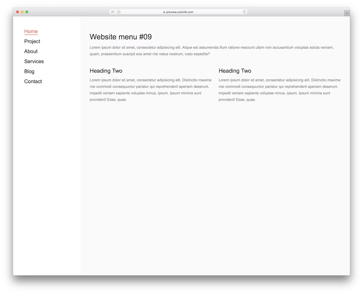
26 Free Bootstrap Navbar Examples & Templates 2026
This list of free Bootstrap navbar examples now has 26 entries: the 20 Colorlib Website Menu snippets (V01 to V20), five navigation bars from our 2026 hero, cart and drawer snippets, and a uiCookies pack of eight menu patterns.
Every Colorlib navbar here is a free download with a live demo. They are dependency-free HTML, CSS and a few lines of vanilla JavaScript, so they work on their own or inside a Bootstrap 4, 5 or 6 project and look the same either way. The drop-downs and mobile toggles need neither jQuery nor Bootstrap’s JavaScript.
Pick by pattern: V01 and V07 are transparent bars for photo heroes, V04 and V16 add a top bar for contact details, V12, V13 and V17 build in a search form, V18 is a mega menu, V19 a left sidebar and V20 a full-screen overlay. Each entry has a short description plus Demo and Download buttons. For menu plugins rather than templates, see our navigation bar roundup.
Best Free Bootstrap Navbar and Menu Templates
uiCookies Menu Templates (8 templates)
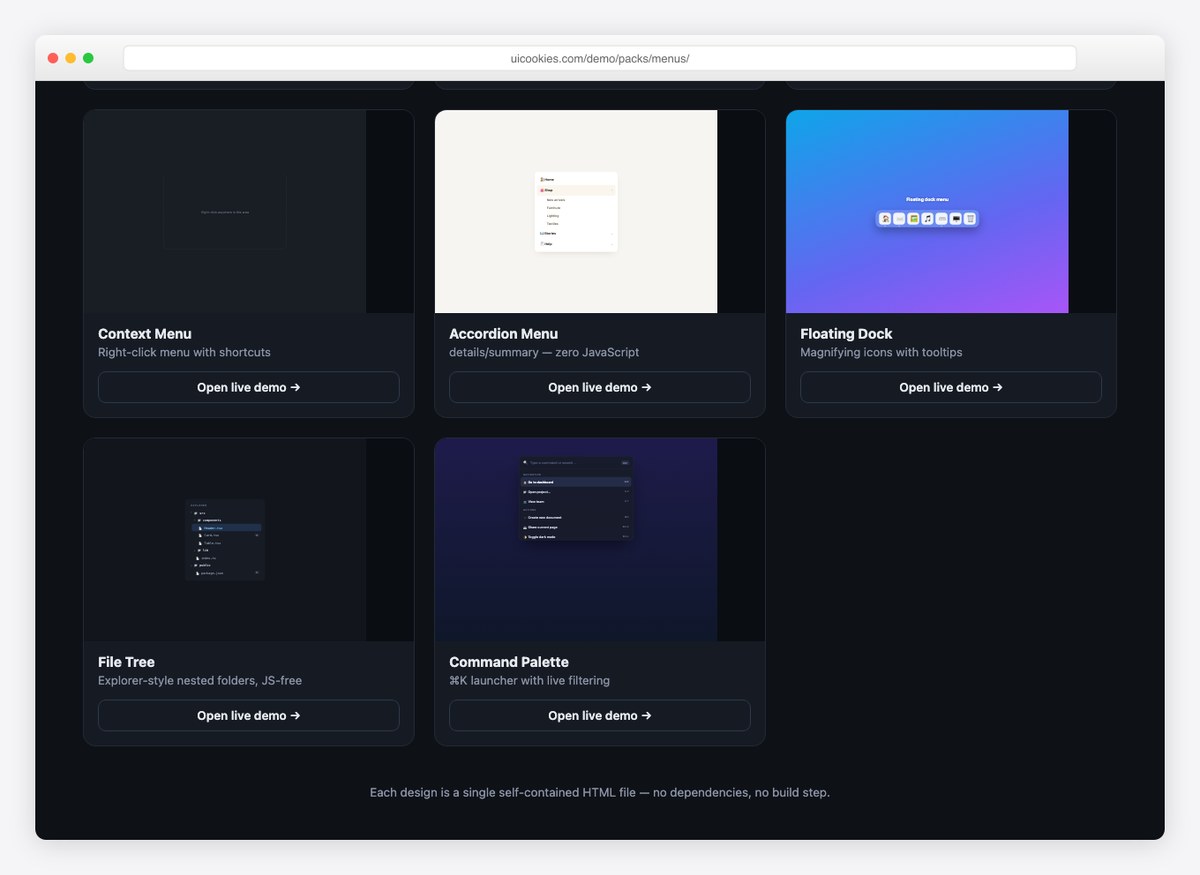
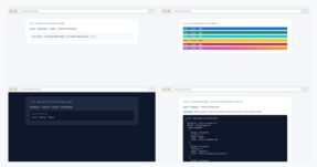
Eight navigation patterns that go past the standard navbar: an account dropdown, an admin sidebar, a mobile bottom bar, a right-click context menu, an accordion menu, a floating dock, a file tree and a command palette.
Several work with no JavaScript at all, and the rest use a few lines of vanilla JS rather than a plugin. From our own uiCookies library, each design in its own self-contained file.
Website Menu V01
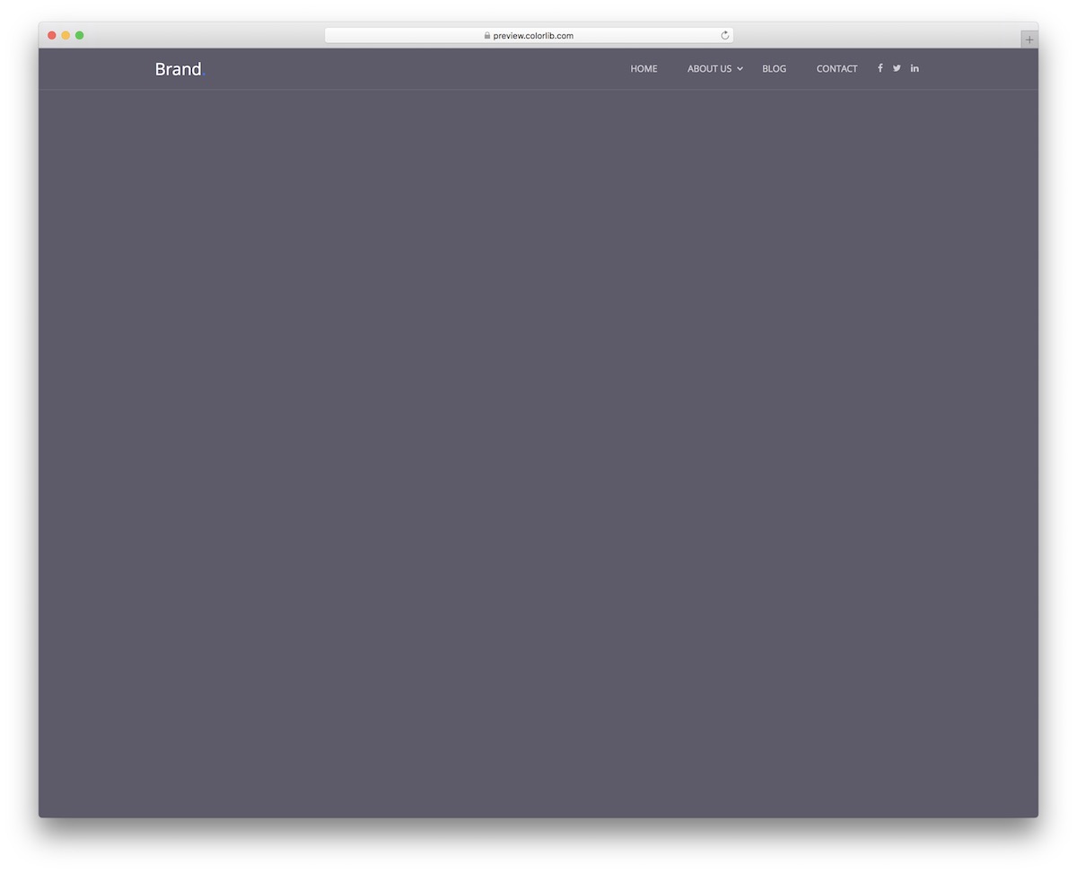
Website Menu V01 is a minimal navigation bar that you can embed into your website to save time. It features a TRANSPARENT design but turns solid when scrolled.
Why? It’s a sticky navbar, and the solid background helps it pop more when scrolling. Additional features are a multi-level drop-down menu and social media icons. The sticky header and the mobile menu run on a few lines of vanilla JavaScript, and the whole download is 226 KB.
Website Menu V02
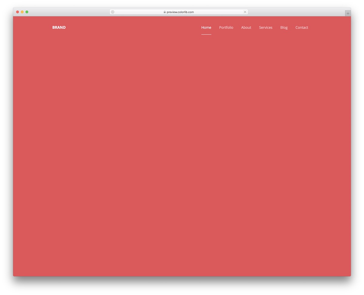
Website Menu V02 is one of the simplest navigation bars in this list: plain HTML and CSS, plus a small vanilla JavaScript mobile menu.
It aims to cater to all kinds of website designs by default, without requiring many configurations regarding the looks.
In other words, you are welcome to use it as-is, since it works incredibly well. The COOL feature is the hover effect that lightens the text and adds an underline.
Website Menu V03
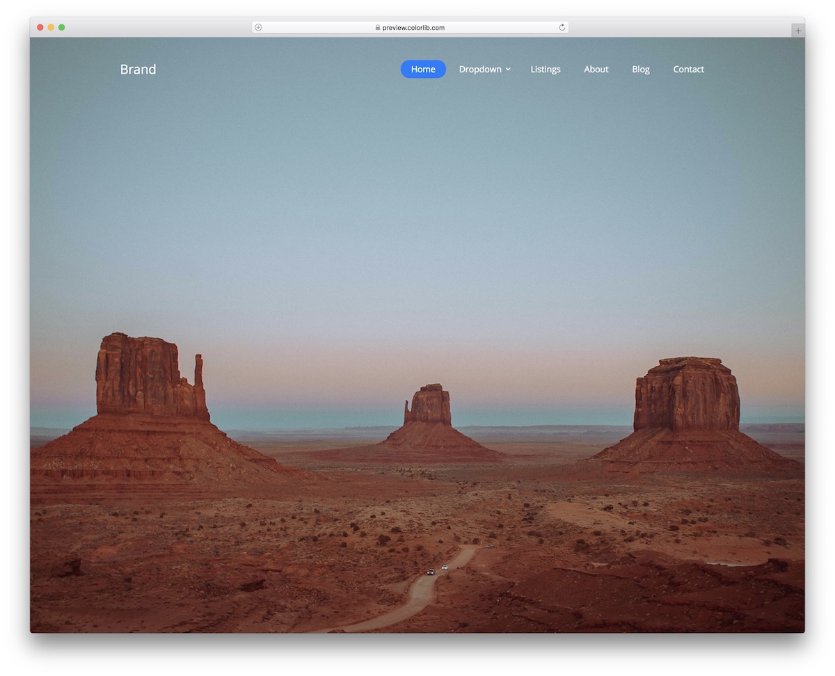
Website Menu V03 is modern, transparent, with a nice button hover effect. There’s also a drop-down section to make the navbar even more practical if you have a lot of content to display, and it looks the same with or without Bootstrap on the page.
The design WORKS GREAT on mobile, too, but it changes, sliding in from the right as a hamburger menu.
Website Menu V04
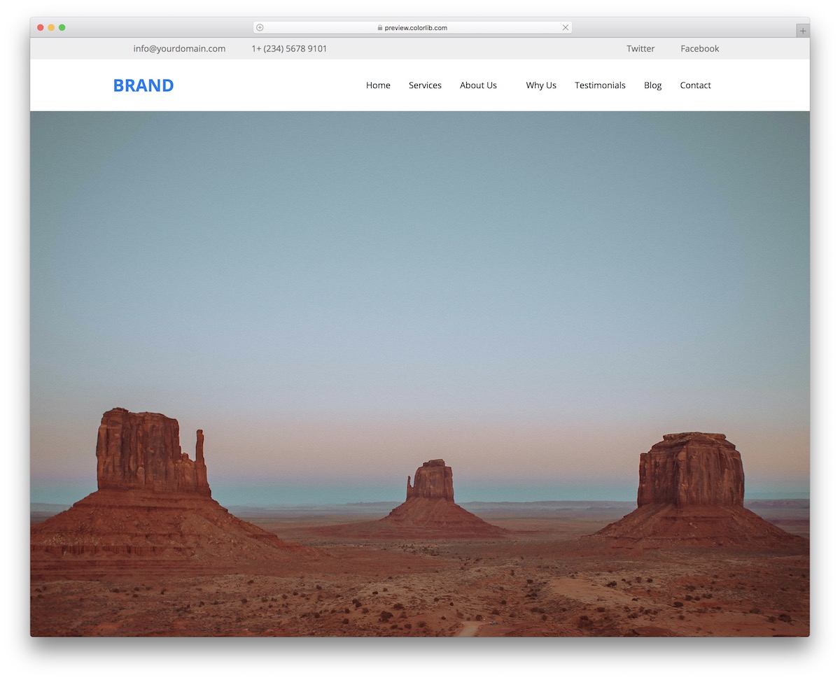
If you want to create a full-blown header area on your website, grab Website Menu V04. This is a fantastic shortcut, as you no longer need to start from scratch.
There’s also a TOP BAR for additional contact details, social media buttons, and the main navigation bar.
Website Menu V05
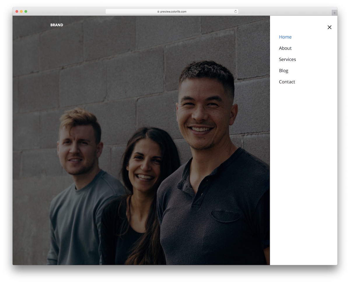
Website Menu V05 does not feature an entire navbar. Instead, it features only an icon that reveals a sidebar hamburger menu from the right.
All items have a hover effect that changes the text to blue. The style is identical on desktop and mobile, and the slide-in panel opens with a few lines of vanilla JavaScript rather than jQuery.
Website Menu V06
Poor site navigation is the WORST. It decreases your site performance and makes users want to leave early.
Make sure that doesn’t happen to you.
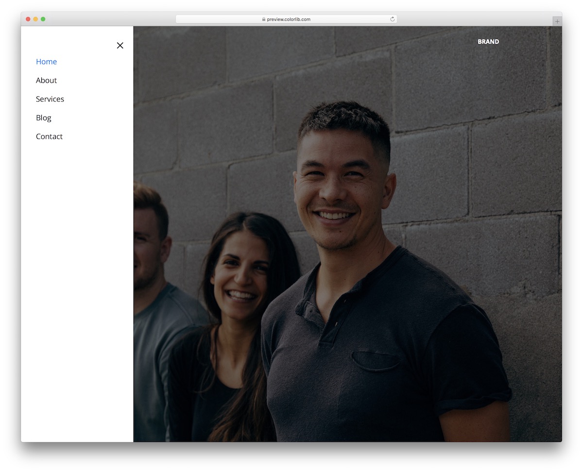
It won’t if you use any of our easy-to-use navigation bars, such as Website Menu V06, which drop into any Bootstrap 4, 5 or 6 project or run on their own.
This one comes pretty specific, as it aims to everyone who likes to keep it minimal with a slide-in menu from the left.
Website Menu V07
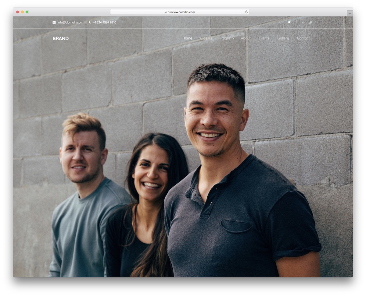
When you rock an image background above the fold, ensure your navbar does not ruin it. Thanks to Website Menu V07, that’s not something to worry about.
It is an excellent alternative with a transparent background that you can freely embed.
Along with the drop-down menu, there’s a top bar section, which can feature email, telephone number, and social media icons, just like the DEFAULT configuration.
Website Menu V08
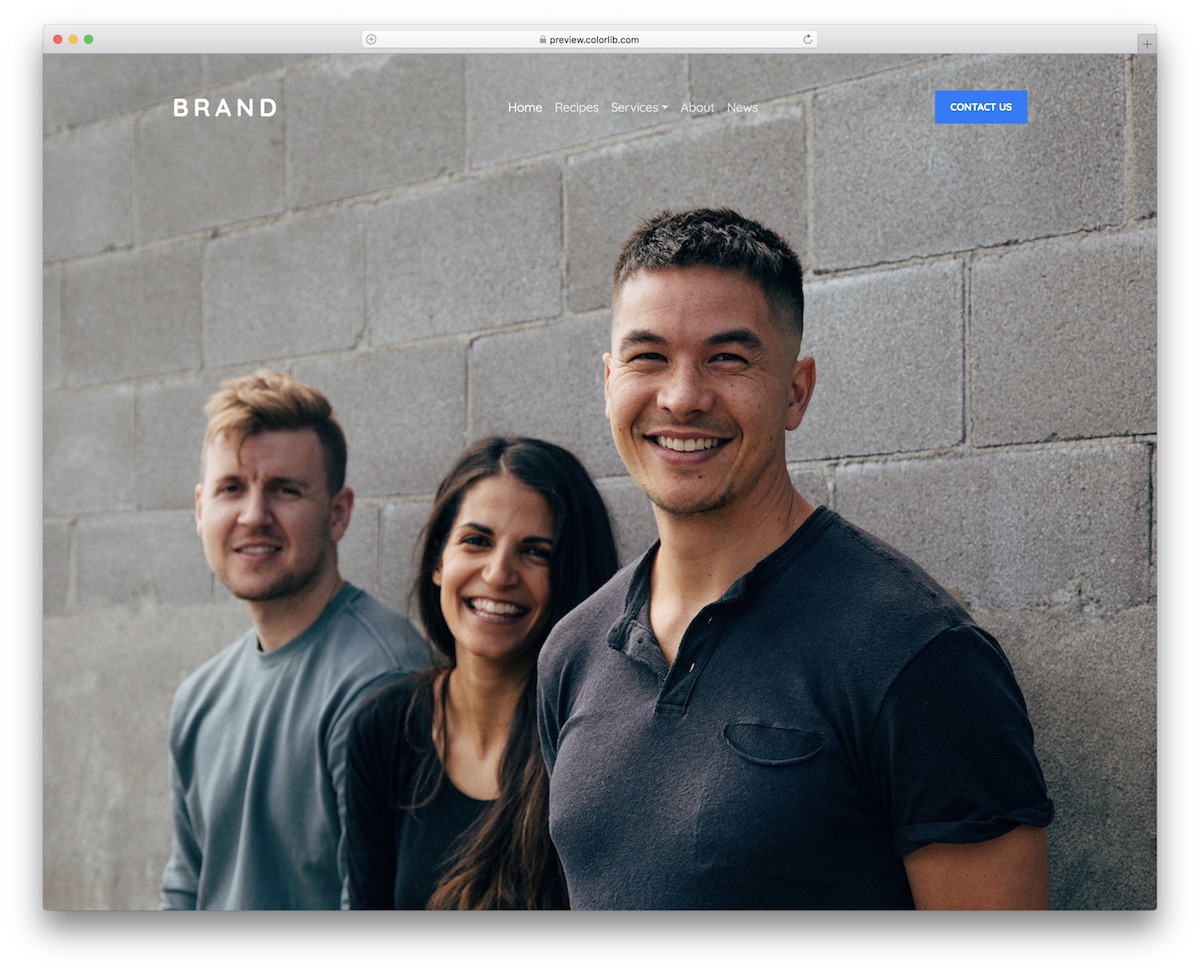
Website Menu V08 is similar to the website menu above, with a call-to-action button but without the top bar. Its drop-down and mobile toggle work without Bootstrap’s JavaScript, keyboard navigation included.
Simplicity is very on point, as it will NOT DISTRACT from other content you plan to present above the fold.
The design is transparent with a logo section on the far left, a centered menu, and a CTA on the right. You can use the latter to lead your visitors to the contact section, but that’s not the only way.
Website Menu V09
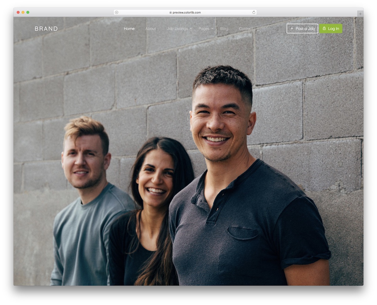
Website Menu V09 is perfect for a job board or an employment/freelancer marketplace. It features predefined “Post a job” and “Log In” buttons, as well as other sections tailored to its purpose.
But there’s always a BUT.
That’s right; it does not necessarily mean that you use Website Menu V09 exactly as-is.
You are WELCOME to alter it and even go entirely against the grain.
Website Menu V10
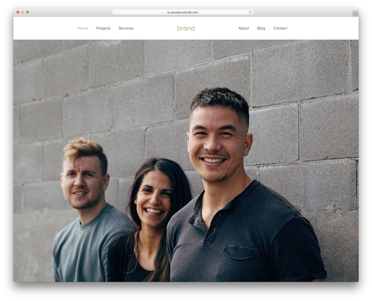
Since users have different preferences, we have created numerous Bootstrap-ready navbar examples that you can utilize. Website Menu V10 is a great solution for those interested in a solid background menu template.
But you know what’s BEST? You can even test a few free snippets from this list before deciding on the winner.
Why not? They come with no hidden fees, the code is newbie-friendly, and the layout is responsive.
Website Menu V11
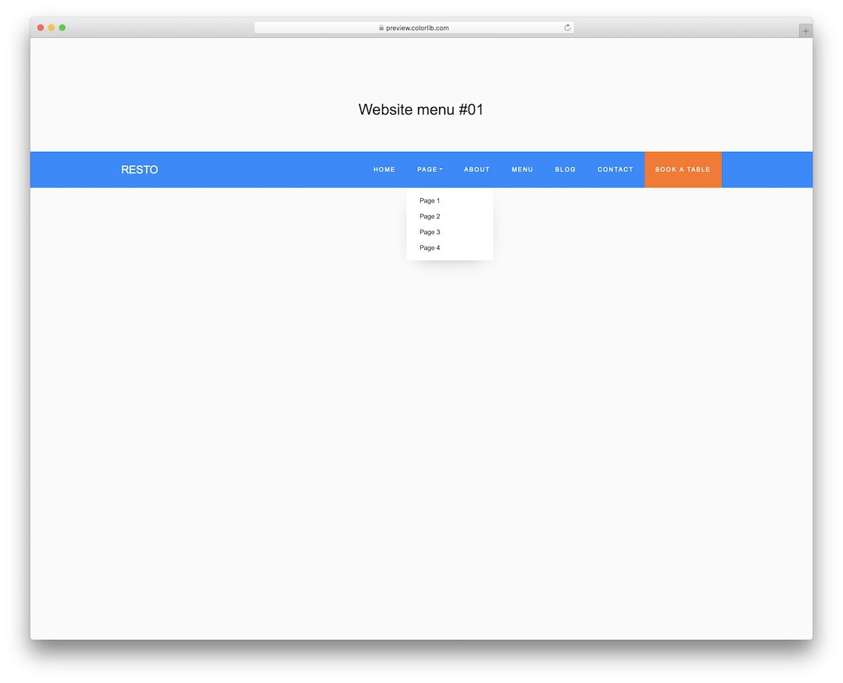
Website Menu V11 is a standard website menu with a few specialties. First, it includes a drop-down, so you don’t need to think about creating it.
And second, it also has a CTA button – in the default example – for book a table.
The current color scheme features blue and orange, but you can QUICKLY IMPROVE it with your branding directions.
Website Menu V12
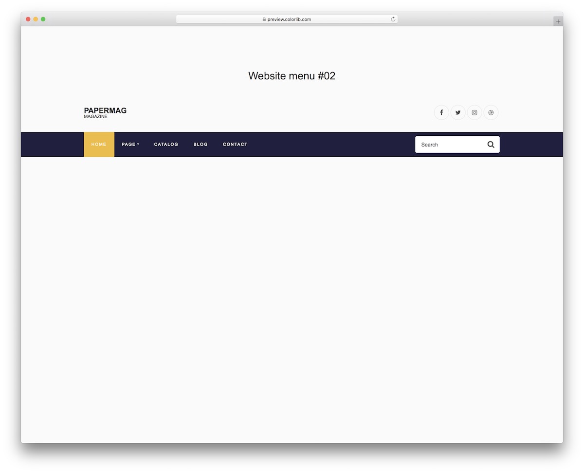
Many websites feature a search bar in the menu section, and you can make it happen.
Website Menu V12 is a full-blown navigation bar with many features, like hover effect, drop-down and social media icons. The drop-down works without Bootstrap’s JavaScript.
And that could be your entire header section.
The performance is solid on mobile, too; however, the entire menu is one organized drop-down.
Website Menu V13
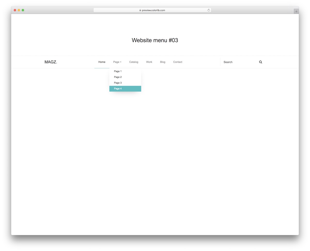
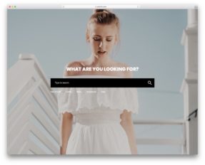
Cleanness at its finest—that’s what you can expect from Website Menu V13. But you can already see that in the screenshot.
However, it’s EVEN BETTER when viewing and experiencing the live demo preview.
That’s exactly how your page’s menu can look. Still, you can go one step further, perform configurations and make it your own. The beneficial search bar is also available.
Website Menu V14
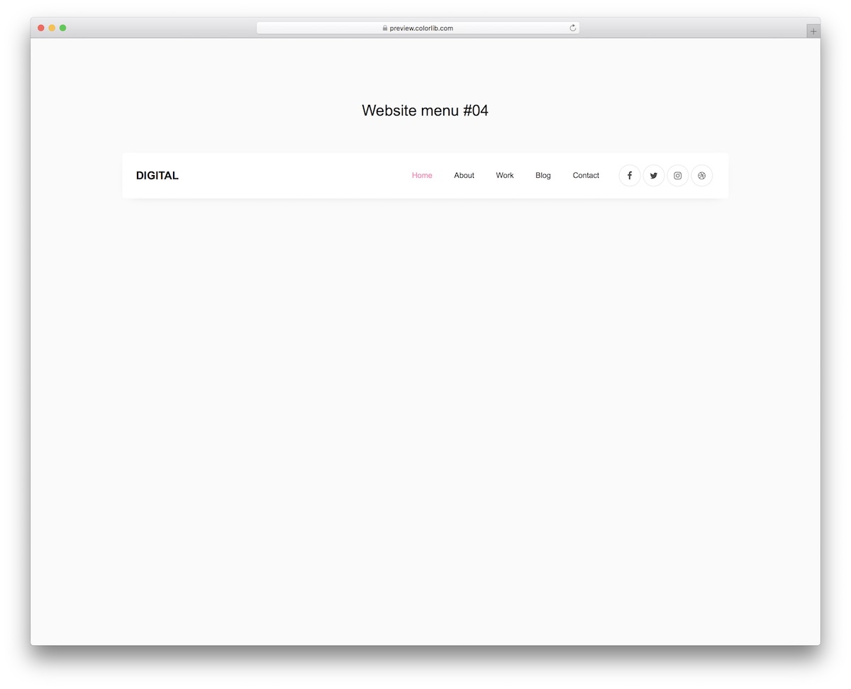
Website Menu V14 has a BOXED LAYOUT light on desktop but turns dark on mobile. Moreover, it applies a hover effect to both the text and the social media icons.
Although it uses pink, you can quickly switch to a different color selection.
For a simple menu that still stands out from the masses, you go with Website Menu V14.
Website Menu V15
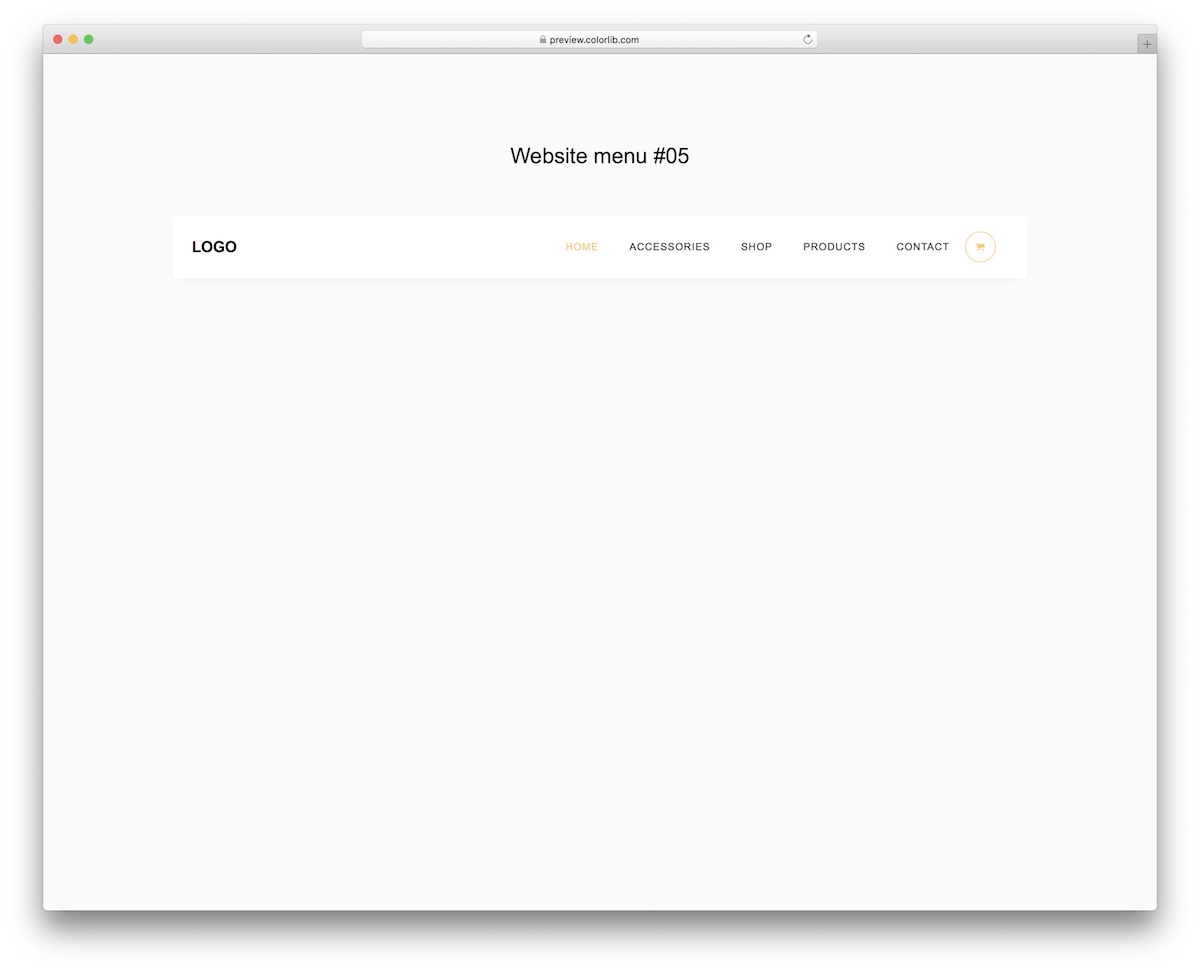
Website Menu V15 features a similar design to its predecessor, with a focus on eCommerce websites and online stores. It even comes with a cart icon that opens a drop-down menu when hovered over.
Your website navigability will never be the same again.
It will improve AS SOON AS you implement Website Menu V15, but you need to work on it to activate it.
Still, even if you are a beginner in the web development space, you will win the game.
Website Menu V16
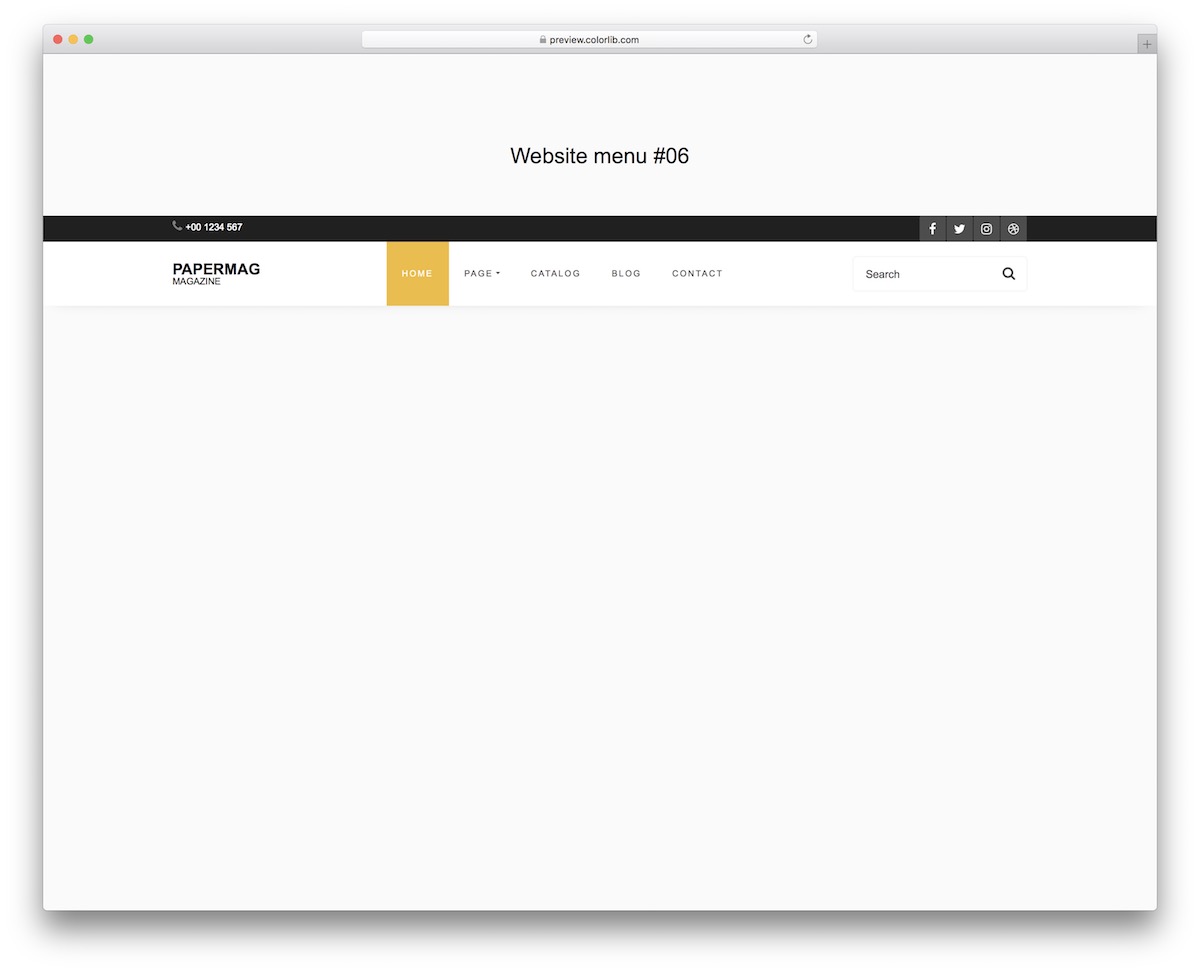
Website Menu V16 is a more dynamic navigation, with the main part light and the dark top bar. Additionally, the tool adds a yellow tone, which enhances its appearance even further.
Moreover, the free snippet comes with an INTEGRATED search bar and social media icons. Additionally, there is a drop-down option for selecting additional sections and categories.
Website Menu V17
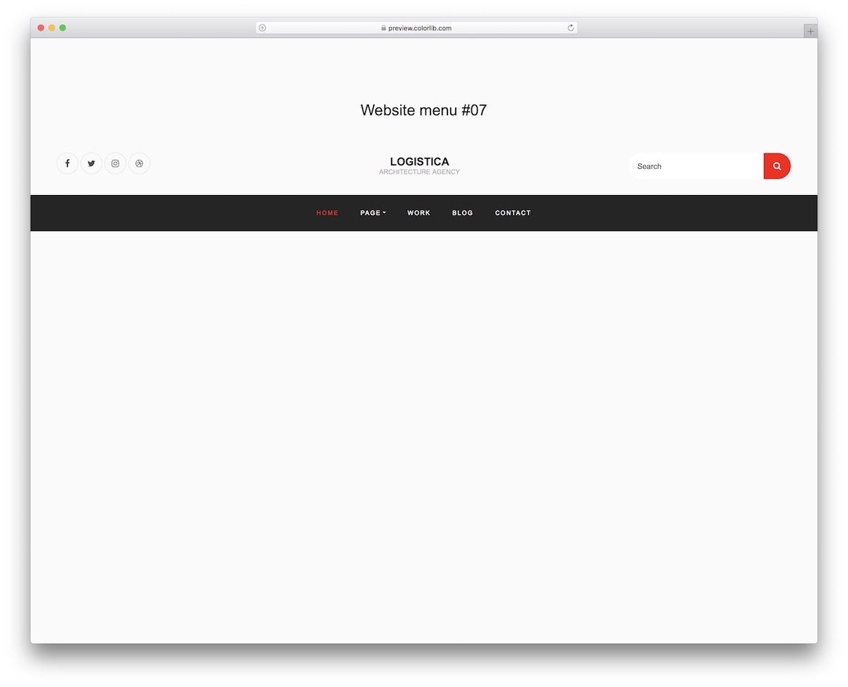
Social icons, a search bar, and a drop-down are neatly packed into one menu that needs no jQuery or Bootstrap files. Website Menu V17 is a remarkable alternative, keeping up with the latest trends and regulations of the modern web.
Why do things yourself when we have so many awesome solutions that will save you plenty of time?
Thanks to Website Menu V17 and other variations, you can create user-friendly site navigability to increase UX.
Website Menu V18
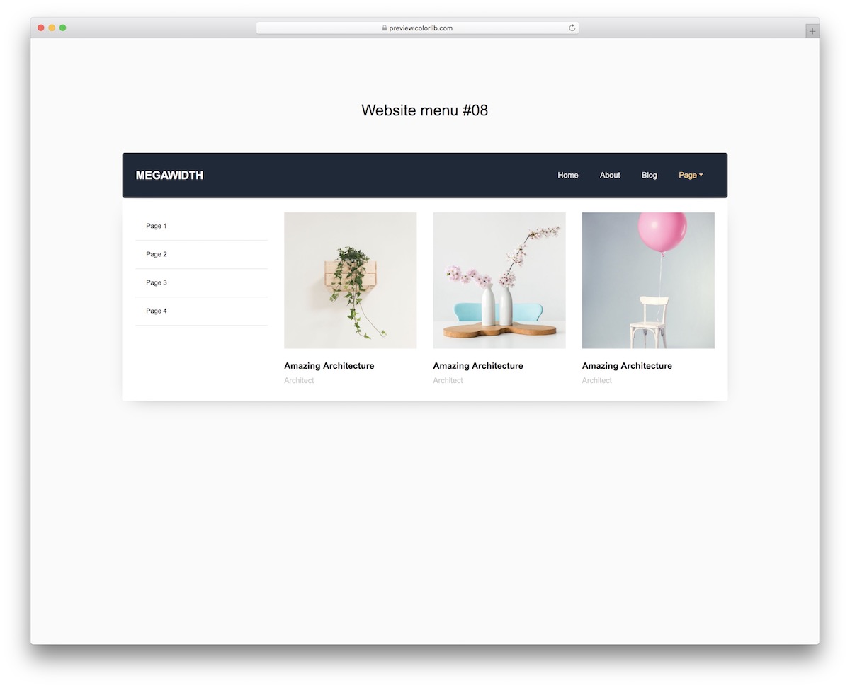
If you want to feature both text and image content in the navigation bar, Website Menu V18 can help.
It’s a great take on the mega menu, written in plain HTML and CSS with a little vanilla JavaScript for the drop-downs.
The template is 100% mobile-friendly but does not feature the image section on mobile.
Website Menu V19
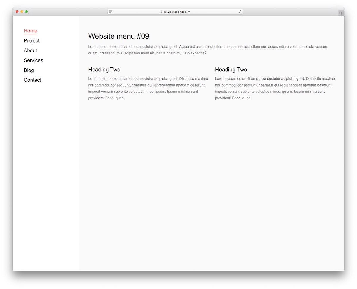
Whether you choose a top or a sidebar menu does not matter—it’s more of a personal preference.
One is not better, but you can still test both and see which fits your audience best.
ABT – always be testing.
Website Menu V19 is a left sidebar menu with a TERRIFIC performance on mobile. On smaller screens, it features an off-canvas menu arriving from the left.
Website Menu V20
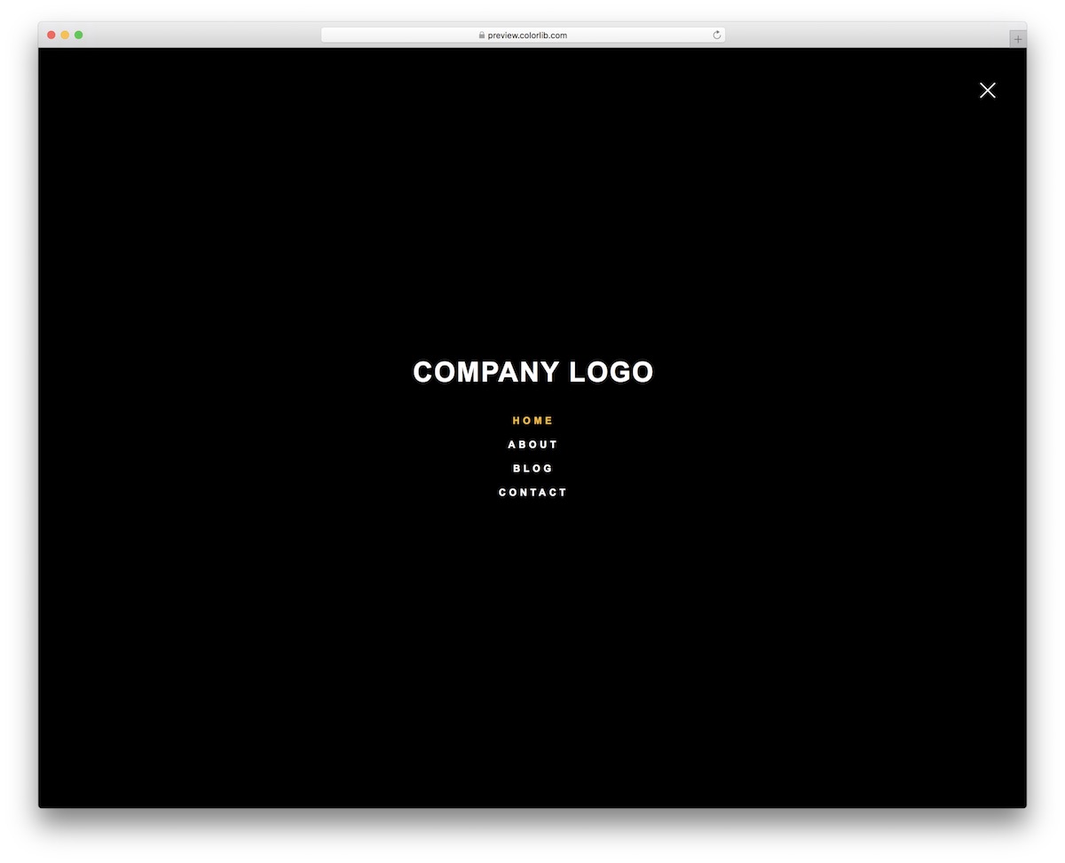
I forgot to mention that you can also choose an overlay menu in addition to the top and sidebar navigation. Website Menu V20 is our only version of a convenient full-screen menu.
If you’d like to go slightly AGAINST THE GRAIN, you now know which option to choose.
The same menu overlay appears on both mobile and desktop devices, ensuring an excellent experience remains intact.
More 2026 navigation snippets from Colorlib
Navigation bars that ship with our 2026 hero sections and drawers: a frosted pill nav, a restaurant nav split around a centred logo, a shop header with a cart, a mobile drawer and a full-screen menu.
Hero V02: Centred hero on an animated gradient mesh with a logo cloud
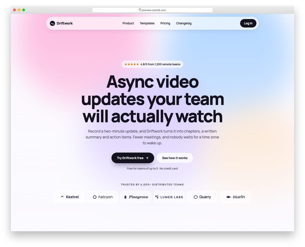
A centred landing-page hero for a remote-work video product, set on a soft gradient mesh made of four blurred shapes that drift slowly. It has a rating pill, a balanced multi-line headline, two calls to action and a logo cloud of six invented company wordmarks drawn with inline SVG. The glass top bar turns into a round menu button on phones, and the mesh stops moving when reduced motion is requested.
Best for: product launches, startup homepages and waitlist pages. Plain HTML and CSS with a few lines of vanilla JavaScript, a 204 KB download, and it works on its own or inside a Bootstrap 4, 5 or 6 project.
Hero V08: Restaurant hero on a full-bleed food photo with opening hours
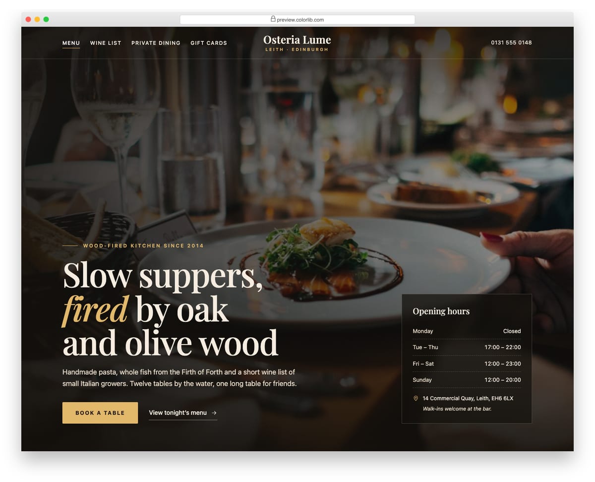
A full-screen restaurant hero with a dining-room photo under a layered dark overlay, a centred serif wordmark and navigation split around it. The headline, a short introduction and a gold Book a table button sit bottom left, and a translucent card lists opening hours, the address and a walk-in note. On phones the photo stays at the top, the overlay deepens and the hours card stacks under the copy.
Best for: restaurants, cafes, bars and hospitality venues. Plain HTML and CSS with a few lines of vanilla JavaScript, a 298 KB download, and it works on its own or inside a Bootstrap 4, 5 or 6 project.
Shopping Cart V03: Mini cart dropdown from a header cart button with a badge count
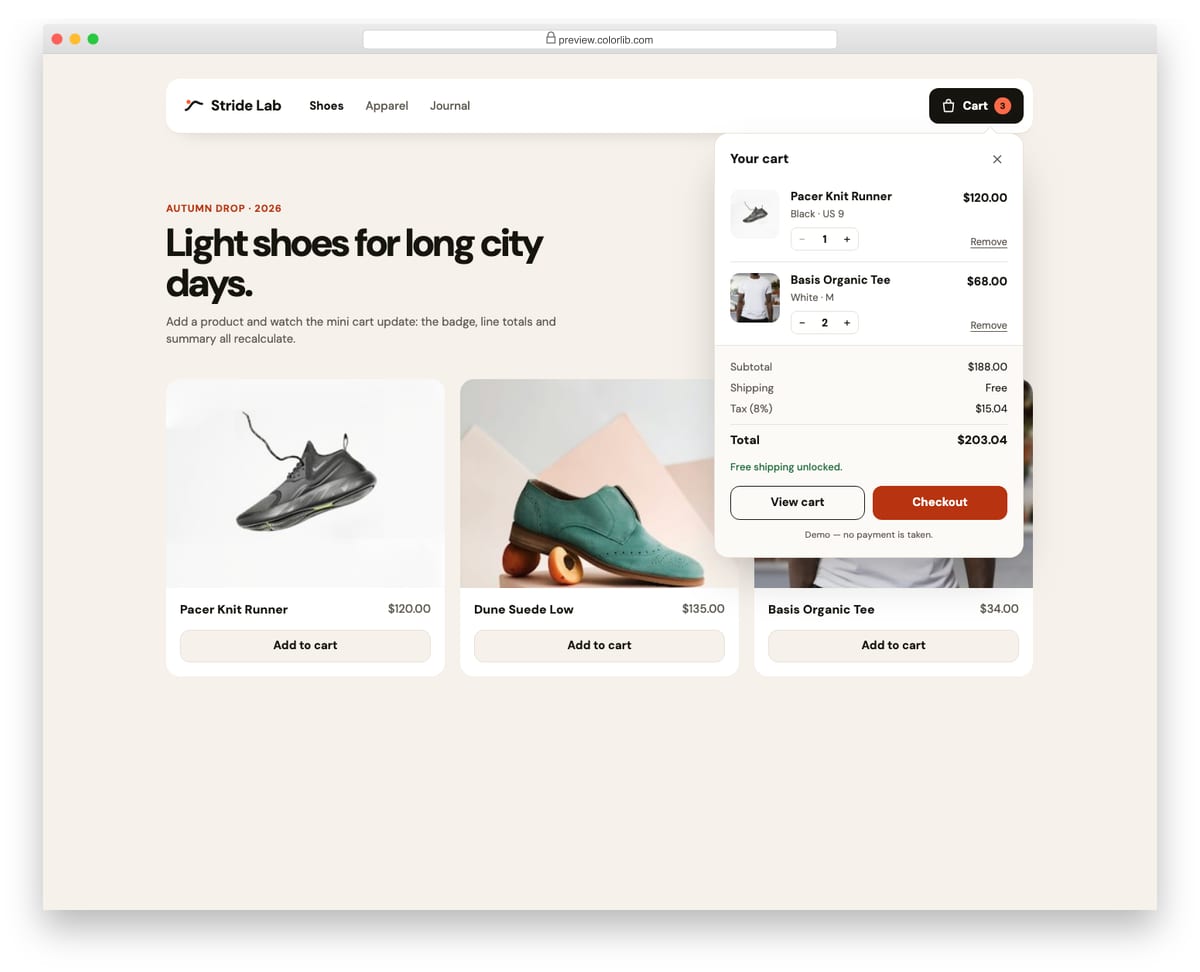
A store header with a cart button that opens a mini cart panel using the disclosure pattern. The panel lists line items with small quantity steppers, shows subtotal, shipping, tax and total, and offers View cart and Checkout buttons. Add to cart buttons on the demo product grid add new lines or raise quantities, and the badge count bumps as it changes.
Best for: store headers and quick cart previews. Plain HTML and CSS with a few lines of vanilla JavaScript, a 322 KB download, and it works on its own or inside a Bootstrap 4, 5 or 6 project.
Offcanvas V01: Left navigation drawer for a mobile site with nested sections
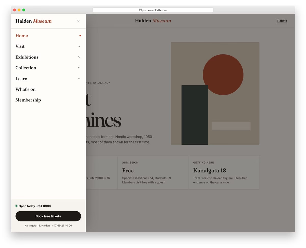
A slide-in menu from the left for a museum website, opened from a Menu button in the header. Top-level sections expand into sub-links with native details and summary elements, and only one section stays open at a time. The footer of the drawer holds today's opening hours and a ticket button.
Best for: mobile navigation for content-heavy sites such as museums, universities and councils. Plain HTML and CSS with a few lines of vanilla JavaScript, a 257 KB download, and it works on its own or inside a Bootstrap 4, 5 or 6 project.
Offcanvas V08: Full-screen overlay menu with large typography and a staggered link reveal
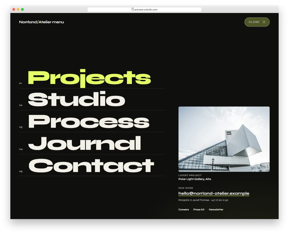
A full-screen menu for an architecture studio that opens with a circular wipe from the Menu button. Five oversized numbered links slide up one after another, followed by a featured project, contact details and small links. It closes with the Close button, Esc, a click on its empty background or by choosing a link.
Best for: portfolio, agency and studio websites with a short main menu. Plain HTML and CSS with a few lines of vanilla JavaScript, a 381 KB download, and it works on its own or inside a Bootstrap 4, 5 or 6 project.
How to choose a Bootstrap navbar
Size the pattern to the menu. Five or six links fit a plain bar such as V02 or V10. Deeper sites need drop-downs (V11, V12) or a mega menu (V18), and a portfolio with a short menu can use a full-screen overlay like V20 or Offcanvas V08.
Check the phone version first. Open each demo at phone width before you choose: V03 slides in from the right, V19 becomes an off-canvas menu from the left, V14 switches to a dark style, and Hero V02’s glass bar turns into a round menu button.
Make drop-downs work from the keyboard. Hover-only menus lock out keyboard and touch users. The drop-downs in V08, V11 to V13 and V15 to V18 open without Bootstrap’s JavaScript and support keyboard navigation, and the Offcanvas V08 overlay closes with Esc.
Keep transparent bars readable. White links over a photo can vanish against bright areas. Test contrast over the lightest part of your hero image, or use a bar that turns solid on scroll, like V01.
Keep sticky bars slim. A sticky header (V01, V04, V07) keeps the menu in reach on long pages, but a tall one eats into a small screen. Pin one row, not the whole header.
Frequently asked questions
Do these navbars need Bootstrap or jQuery?
No. The Colorlib navbars carry their own CSS and a few lines of vanilla JavaScript for the toggles, sticky header and drop-downs. They work on a page with no framework, and inside a Bootstrap 4, 5 or 6 project they keep their look without jQuery or Bootstrap’s JavaScript.
What is the difference between a navbar and a header?
The navbar is the row of links and its mobile toggle. The header is the whole top area around it, which can also hold a top bar with contact details, a search form or a cart. V04 and V16 are complete headers with a top bar above the navbar.
Can I use them in commercial projects?
Yes. The Colorlib navbars are free under CC BY 3.0: use them in personal and commercial projects and keep the credit link. The uiCookies menu pack has its own licence, shown on its download page.
How do I customize a navbar template?
Replace the logo and links in the HTML, then change colors, fonts and spacing in the CSS file. To change the screen width where the links give way to the mobile toggle, edit the breakpoint in the media query that switches between the two.
Final thoughts
Start with Website Menu V01 for a sticky bar that turns solid on scroll, V08 for a centered menu with a call-to-action button, or V18 if you need a mega menu. For the parts inside and beside the bar, see our Bootstrap dropdown examples and Bootstrap offcanvas menus.

Related Posts
hello, Are all free templates commercially available?
I need an exact license.
All our free templates are free to use for private and commercial use.