25 Free Bootstrap Offcanvas Examples (2026)
By Aigars Silkalns · Last updated May 13, 2026 · 17-min read
Mobile navigation drawers, e-commerce cart panels, filter sidebars, notification trays, admin sidebars that flip to drawers on mobile — Bootstrap’s offcanvas component (introduced in BS 5.0 and absent from Bootstrap 4) is the foundation behind every modern web app’s slide-in chrome. This collection gathers 25 free Bootstrap 5–compatible offcanvas examples covering the patterns developers actually ship: mobile menus with multi-level navigation, cart drawers with line items, faceted filter panels, notification panels, admin sidebars with avatars, settings drawers with toggle switches, and Bootstrap 5.3’s native dark-mode treatment. Every screenshot is a working BS 5.3 implementation; each example links to its original inspiration on CodePen, GitHub, or the Bootstrap docs for those who want to fork or compare. If you’re migrating from Bootstrap 4 custom drawers, rebuilding a mobile menu, or hunting for a specific offcanvas pattern, start here.
What is a Bootstrap offcanvas?
A Bootstrap offcanvas is a hidden sidebar that slides into view when triggered — used for mobile navigation drawers, ecommerce cart panels, filter sidebars, and notification trays. Bootstrap 5 introduced offcanvas as a native component (it was not available in Bootstrap 4), making slide-in UI patterns possible without custom JavaScript.
When to use offcanvas:
- Mobile navigation menus that need more space than a hamburger dropdown allows
- Shopping cart drawers in ecommerce flows
- Filter and faceted-search panels on catalog pages
- Secondary navigation in admin dashboards
Bootstrap 5 offcanvas vs Bootstrap 4: Bootstrap 4 had no offcanvas component, so developers built custom solutions using position: fixed, transform, and jQuery. Bootstrap 5 ships the component natively at bootstrap.Offcanvas with built-in placement options (start, end, top, bottom), backdrop behavior, body-scroll lock, and ARIA-compliant focus management. Migrations from Bootstrap 4 to 5 should replace custom slide-out menus with the native component.
Browser support: All modern browsers (Chrome, Safari, Firefox, Edge) since 2021. All 25 examples below were tested in Chrome 124, Safari 17, and Firefox 125 on May 2026.
How to use Bootstrap offcanvas (basic markup)
<!-- Trigger -->
<button class="btn btn-primary"
        data-bs-toggle="offcanvas"
        data-bs-target="#mobileMenu"
        aria-controls="mobileMenu">
  Open menu
</button>

<!-- Offcanvas -->
<div class="offcanvas offcanvas-start" tabindex="-1" id="mobileMenu" aria-labelledby="mobileMenuLabel">
  <div class="offcanvas-header">
    <h5 class="offcanvas-title" id="mobileMenuLabel">Menu</h5>
    <button type="button" class="btn-close" data-bs-dismiss="offcanvas" aria-label="Close"></button>
  </div>
  <div class="offcanvas-body">
    <!-- nav links go here -->
  </div>
</div>
Placement modifiers: Swap offcanvas-start for offcanvas-end, offcanvas-top, or offcanvas-bottom.
Common gotcha: Without tabindex="-1", focus management breaks for keyboard users. Don’t omit it.
Best free Bootstrap offcanvas examples
We grouped the 25 picks by use case rather than ranking them — every example below is a viable production starting point. Each screenshot shows our Bootstrap 5.3 implementation of the pattern, inspired by the original designer credited beneath. The “Original demo” link goes to the source pen or repository for those who want to fork, compare implementations, or see the author’s specific code style.
Showcase — visually distinctive offcanvas designs
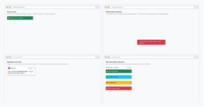
1. Bootstrap 5 Live Offcanvas Demo
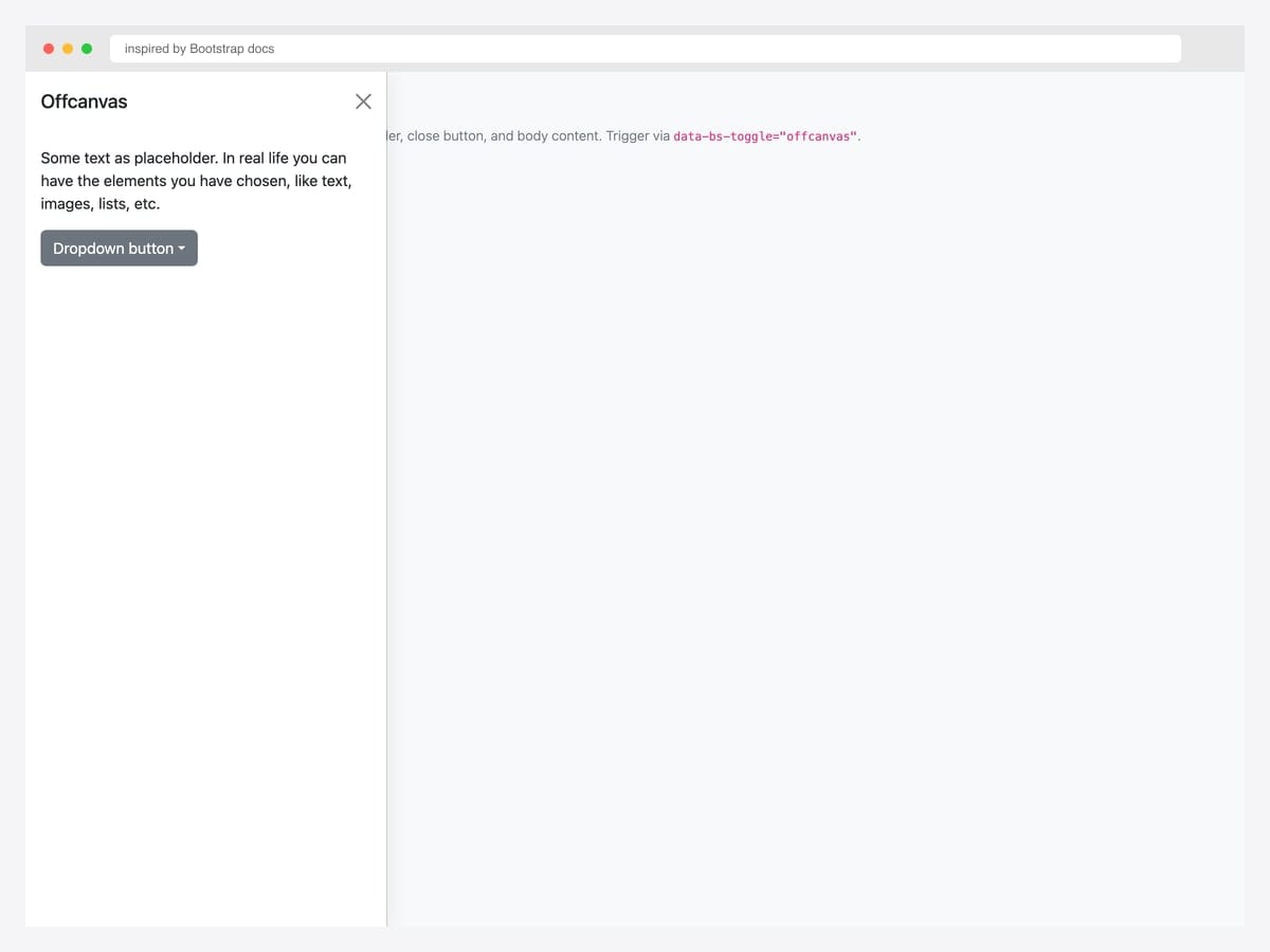
The canonical Bootstrap 5 offcanvas — left-sliding drawer with header (title + close button), body content, and a nested dropdown placeholder. Best fit as the baseline for any project: this is the markup every other offcanvas pattern in this collection builds on. Pure Bootstrap 5.3 with the JavaScript bundle for the offcanvas controller. Initialize via new bootstrap.Offcanvas(el) or use the data-attribute trigger (data-bs-toggle="offcanvas" + data-bs-target="#id"). Include tabindex="-1" on the offcanvas element so keyboard focus management works correctly.
Inspired by: Bootstrap (twbs) · License: MIT
Source & details Original demo
2. Mega Menu Offcanvas
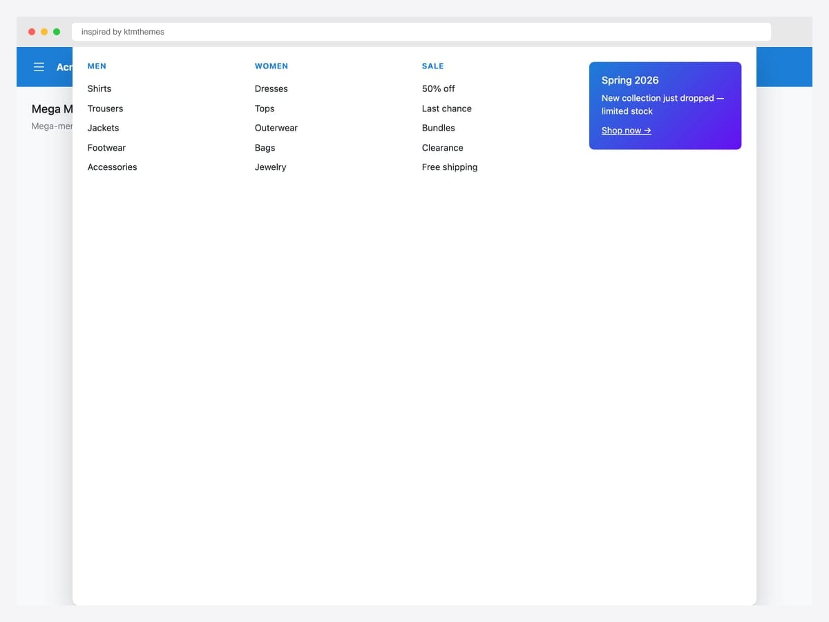
Mega-menu dropdowns inside an offcanvas drawer — multi-column layout (Men, Women, Sale) plus a promo card in the fourth column, the layout most e-commerce sites use for primary navigation. Best fit for retail, marketplaces, and any catalog site whose top-level taxonomy has many sub-categories. Pure Bootstrap 5.3 utility classes (row, col-md-3) inside .offcanvas-top for a full-width slide-down panel. The promo card is a gradient background with white text — swap for a category hero image in production. Position the offcanvas below a fixed navbar via top: 60px custom inline style.
Inspired by: ktmthemes · License: CodePen default (attribution required)
Source & details Original demo
3. Chat Layout with Persistent Drawer
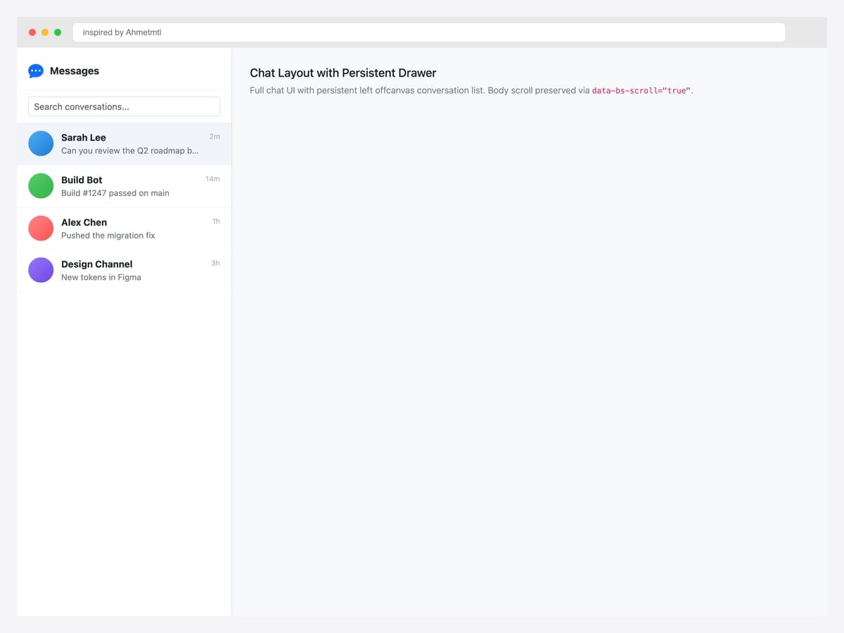
Full chat UI with a persistent left offcanvas conversation list — Messages header, search input, and four conversation rows showing avatars, names, message previews, and timestamps. Best fit for messaging apps, support tools, and any product where the conversation list is a permanent fixture rather than a temporary drawer. Pure Bootstrap 5 markup with a custom data-bs-scroll="true" attribute so the main content area scrolls independently. The active conversation row uses .active with a light blue background for clear selection state.
Inspired by: Ahmetmtl · License: CodePen default (attribution required)
Source & details Original demo
4. Push Effect Offcanvas
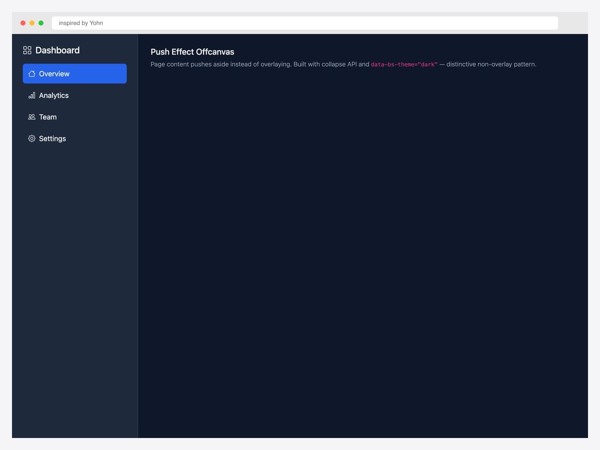
Push effect offcanvas — page content shifts right rather than being overlaid by a backdrop, mimicking the Material Design “permanent drawer” pattern. Best fit for productivity tools (Linear, Notion, Slack) where the sidebar IS the navigation rather than a temporary overlay. Custom CSS layered on top of Bootstrap’s collapse API; uses data-bs-theme="dark" for the dark sidebar variant. The push effect requires the main content area to be a flex sibling of the offcanvas — wrap both in display: flex and the offcanvas’s width pushes the content rather than overlapping it.
Inspired by: Yohn · License: CodePen default (attribution required)
Source & details Original demo
Mobile navigation drawers
5. Mobile Drawer Navigation
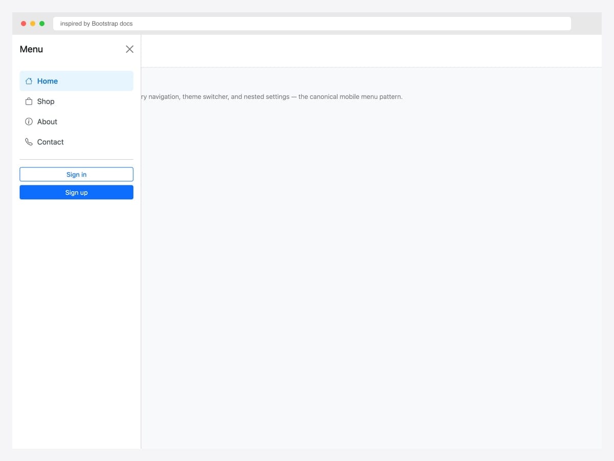
Mobile drawer navigation triggered by a hamburger button — primary nav links with Bootstrap Icons, a theme switcher, and Sign in / Sign up CTAs in the footer. Best fit for content sites, marketing pages, and any site whose mobile menu needs more space than a dropdown allows. Pure Bootstrap 5 markup with .offcanvas-start for left placement. The active nav item uses a light blue background (#e7f5ff) — adjust to match your brand. Pair with a fixed-top navbar via position: fixed; top: 0 on the navbar so the hamburger stays accessible during scroll.
Inspired by: Bootstrap (twbs) · License: MIT
Source & details Original demo
6. Multi-Level Slide Stack
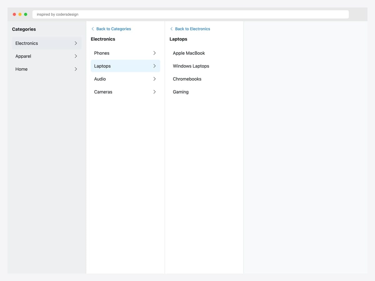
Multi-level slide-stack — three side-by-side panels showing Categories → Electronics → Laptops drill-down navigation with a Back link in each child. Best fit for e-commerce sites with deep category hierarchies (Amazon, eBay, IKEA style). Each panel is a separate offcanvas instance triggered from the previous panel’s links. JavaScript handler listens for show.bs.offcanvas on the child panel to prevent the parent from auto-closing. Add aria-expanded on the active row so screen readers track the drill-down state.
Inspired by: codersdesign · License: CodePen default (attribution required)
Source & details Original demo
7. Nested Accordion Drawer
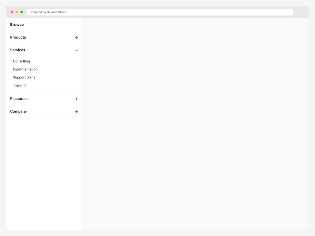
Nested accordion drawer — Browse menu with Products, Services (open showing four items), Resources, and Company sections that expand inline using native <details>/<summary>. Best fit for deep hierarchies that fit within scroll height — documentation sites, B2B SaaS, and any product where the user needs the full taxonomy in one view. Pure HTML; no JavaScript required. The <details> element handles open/close natively with keyboard support out of the box. Custom CSS overrides the default disclosure triangle with a Bootstrap-friendly + / − chevron.
Inspired by: devanand-ale · License: CodePen default (attribution required)
Source & details Original demo
8. Right-Side End Drawer
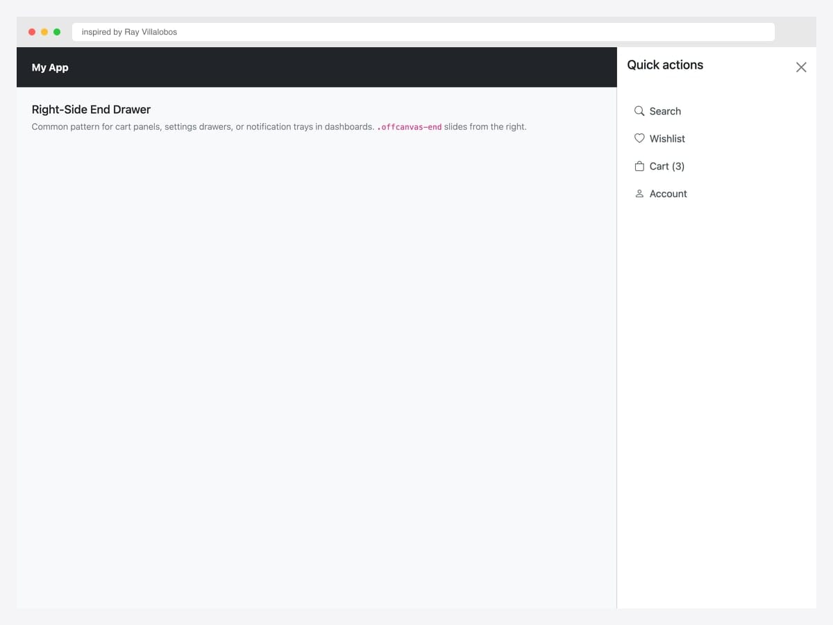
Right-side end drawer with quick actions — Search, Wishlist, Cart, Account — triggered from a dark navbar’s right-side hamburger. Best fit for SaaS dashboards where the user account chrome belongs on the right (Stripe, Shopify, GitHub style). Pure Bootstrap 5 with .offcanvas-end for right placement. The drawer’s nav links use the standard Bootstrap .nav-link class with Bootstrap Icons. For RTL languages, swap .offcanvas-end for .offcanvas-start — Bootstrap respects RTL automatically when dir="rtl" is set on <html>.
Inspired by: Ray Villalobos · License: CodePen default (attribution required)
Source & details Original demo
9. Top Search Overlay
Top search overlay — full-width input plus five suggestion chips slides down from the viewport top via .offcanvas-top. Best fit for search-heavy sites (e-commerce, documentation, marketplaces) where Cmd+K or click-on-search-icon expands a focused search experience. Pure Bootstrap 5 with the .offcanvas-top placement. The chip suggestions use .form-control-lg for the input plus custom pill styles. For instant search, wire the input’s input event to your search-suggestions API (Algolia, Typesense) and update the chips dynamically.
Inspired by: Bootstrap (twbs) · License: MIT
Source & details Original demo
10. Bottom Action Sheet
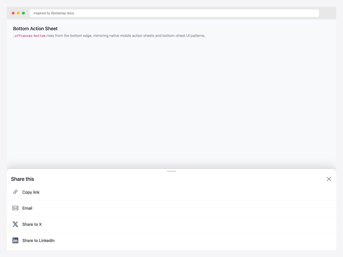
Bottom action sheet — share menu with Copy link, Email, X, LinkedIn options rises from the bottom edge via .offcanvas-bottom, mirroring native mobile share sheets. Best fit for mobile-first apps and any product where share or quick-action menus follow Material Design / iOS conventions. Pure Bootstrap 5 with a custom drag handle (the small pill at top center) for visual cue. Each action row uses border-bottom for separation. On native mobile, integrate with the Web Share API (navigator.share()) for system-level share, falling back to the offcanvas if unsupported.
Inspired by: Bootstrap (twbs) · License: MIT
Source & details Original demo
E-commerce cart & filter drawers
11. Cart Drawer with Line Items
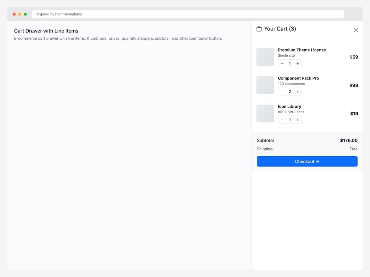
Cart drawer with three line items — Premium Theme License, Component Pack Pro, Icon Library — each with thumbnail, name, qty stepper, and remove control, plus a $176 subtotal and Checkout footer button. Best fit for e-commerce sites where users add items frequently and need to verify cart contents without leaving the current page. Pure Bootstrap 5 markup with .offcanvas-end for right placement. Wire the qty steppers to your cart-update API and re-render the subtotal on each change. Persist cart state via localStorage or your backend so dismissed drawers reopen with the correct items.
Inspired by: hamrotemplates · License: CodePen default (attribution required)
Source & details Original demo
12. Filter Panel with Checkboxes
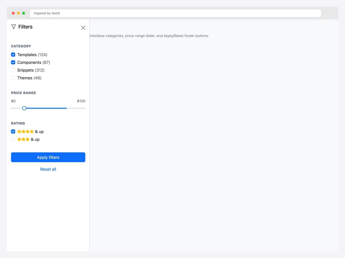
Filter panel with checkboxes — Category, Price Range slider, Rating filter sections with Apply and Reset buttons. Best fit for e-commerce catalogs, search-result pages, and any list interface that needs faceted filtering. Pure Bootstrap 5 form classes (.form-check, .form-range coming in 5.3+) with data-bs-scroll="true" so the filter panel can grow taller than the viewport without locking the page. For SPA implementations, debounce the Apply button or apply filters live as users toggle checkboxes for better UX.
Inspired by: inspired-by-iworb · License: CodePen default (attribution required)
Source & details Original demo
13. Mini-Cart Preview
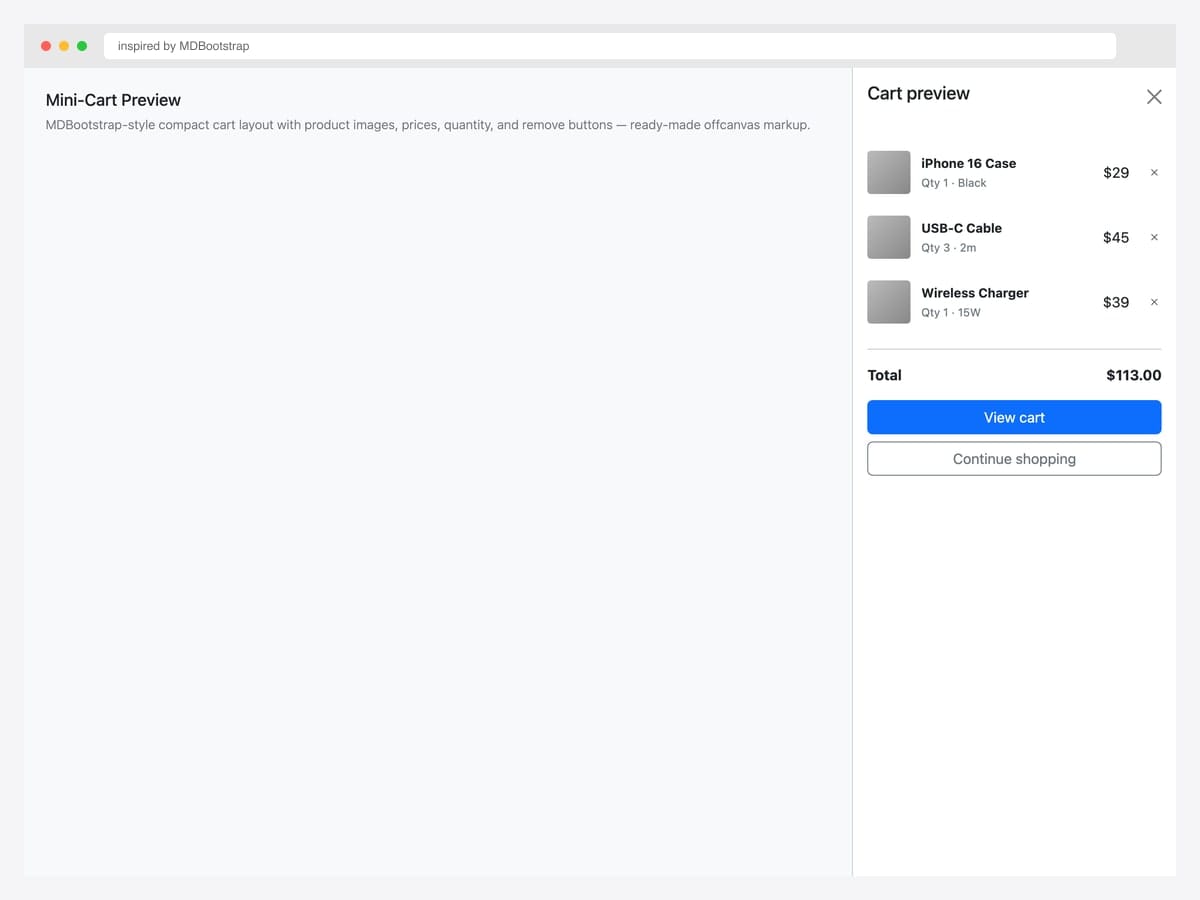
Mini-cart preview with three product line items — iPhone Case, USB-C Cable, Wireless Charger — each with quantity, color/spec subtitle, price, and remove button, plus a $113 total and View cart / Continue shopping buttons. Best fit for compact cart previews triggered after “Add to cart” actions, where users want immediate confirmation without going to the full cart page. Pure Bootstrap 5 markup, MDBootstrap-inspired design. The “Continue shopping” button dismisses the offcanvas; “View cart” navigates to the cart page — clear two-path decision for the user.
Inspired by: MDBootstrap · License: MIT
Source & details Original demo
14. Faceted Search with Range
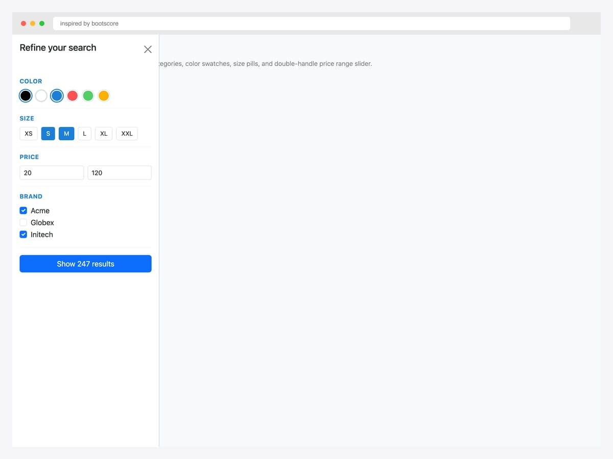
Faceted search with color swatches, size pills, price range inputs, and brand checkboxes — the production e-commerce filter pattern with explicit Show 247 results button. Best fit for fashion, apparel, and any catalog with rich attribute filtering. Pure Bootstrap 5 markup with custom swatch and pill styles. Color swatches use border-radius: 50% with active state via box-shadow ring (avoids the harsh black border most implementations use). Size pills toggle between selected/unselected via active class. Update result count as filters change for tight user feedback.
Inspired by: bootscore · License: MIT
Source & details Original demo
15. Wishlist Drawer
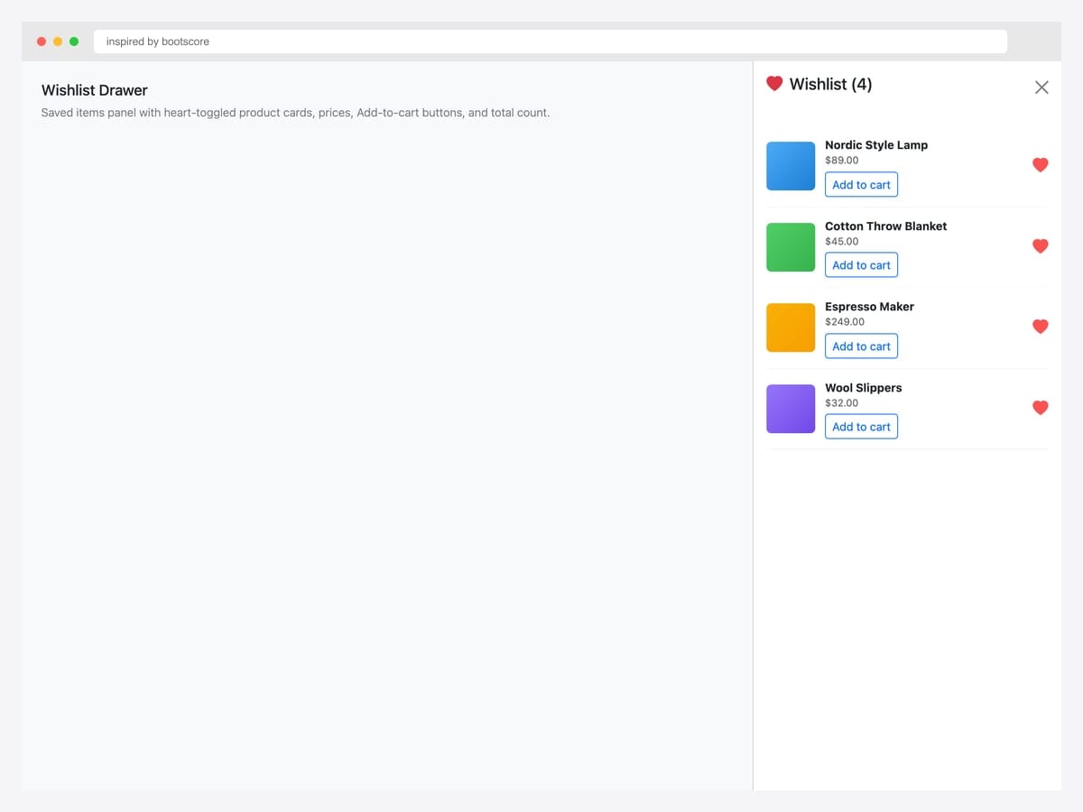
Wishlist drawer with four saved items — heart-toggled product cards showing name, price, and Add-to-cart button for each. Best fit for e-commerce with save-for-later functionality, especially products with longer consideration cycles (furniture, electronics, fashion). Pure Bootstrap 5 markup with custom item layout. Each item’s heart icon uses .text-danger for the saved state; clicking it removes the item from wishlist. For logged-out users, persist via localStorage and sync to account on sign-in.
Inspired by: inspired-by-bootscore · License: MIT
Source & details Original demo
Admin & dashboard panels
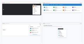
16. Admin Sidebar with Avatar
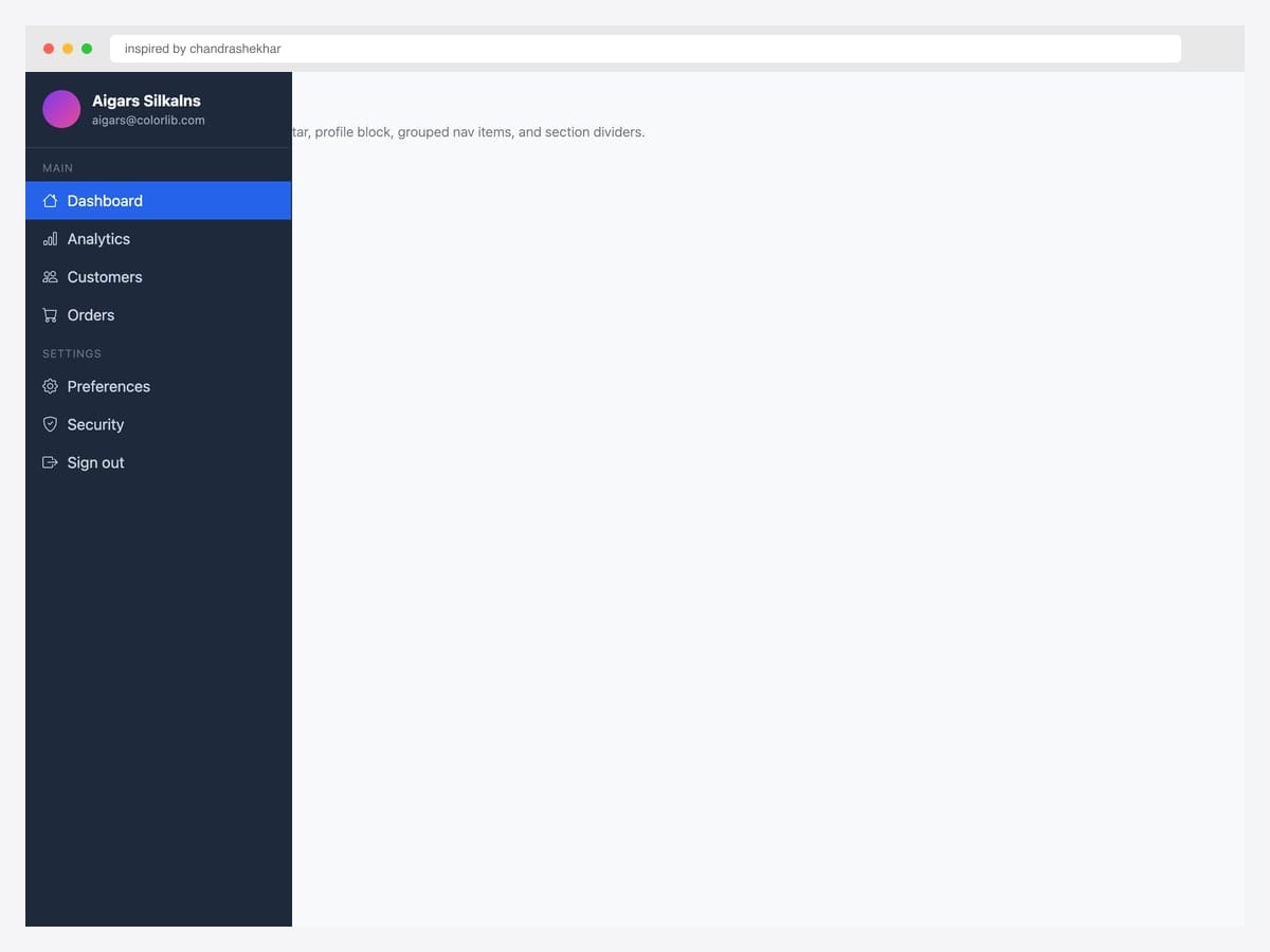
Admin sidebar with avatar — dark drawer with user profile block (avatar, name, email), grouped nav items under Main and Settings section headers, and an active-state highlight on Dashboard. Best fit for admin dashboards, SaaS control panels, and any logged-in product where the sidebar is the navigation backbone. Custom dark theme (#1e293b) layered on Bootstrap’s offcanvas — the active item uses Bootstrap’s primary blue. Section dividers use small uppercase labels for grouping. Pair with a top navbar for breadcrumbs / search / user menu on the right.
Inspired by: chandrashekhar · License: CodePen default (attribution required)
Source & details Original demo
17. Notifications Panel
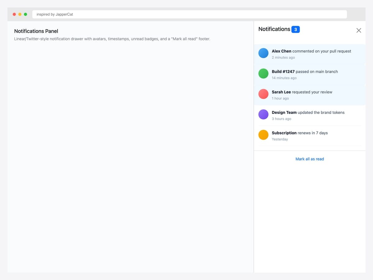
Notifications panel with five recent items — avatars, message previews, timestamps, and an unread highlight for the most recent three. Linear/Twitter-style notification drawer with a Mark all read footer link. Best fit for any logged-in product with async events (comments, PR reviews, build status, mentions). Pure Bootstrap 5 with custom unread-row styling (light blue background) for visual differentiation. Reset the unread count badge on the trigger when the drawer opens (not on individual item clicks) — most products handle this via a single API call to avoid race conditions.
Inspired by: JapperCat · License: CodePen default (attribution required)
Source & details Original demo
18. Settings Drawer with Toggles
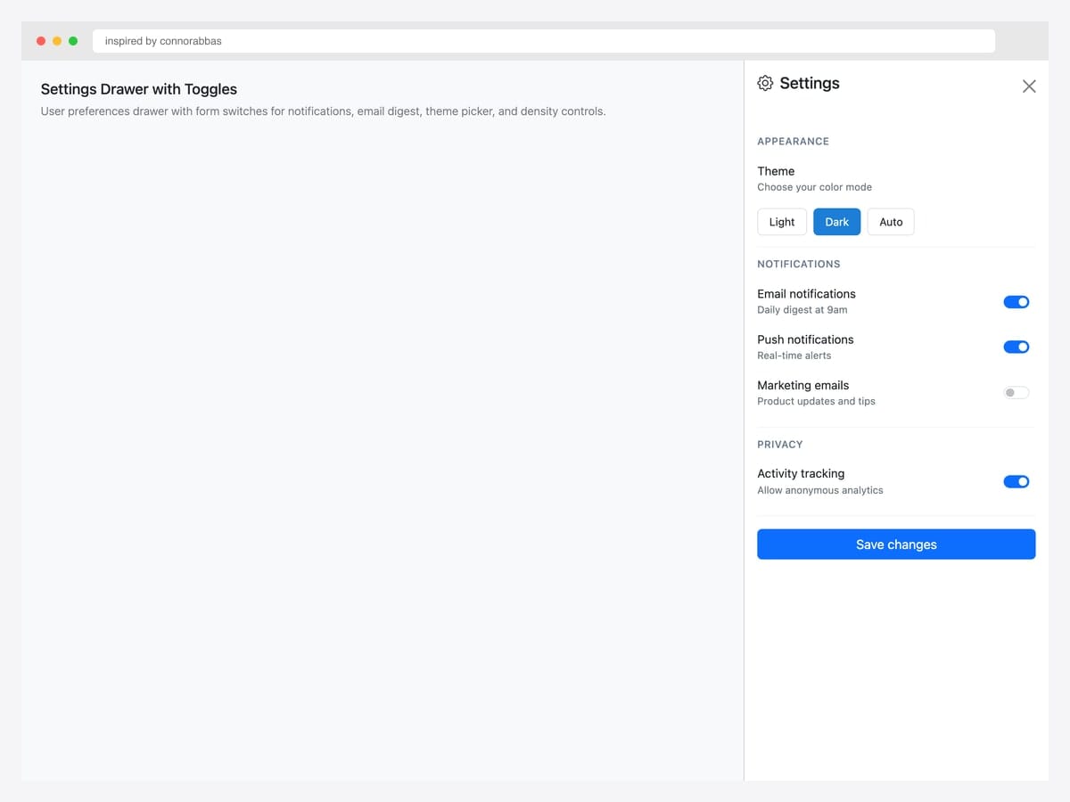
Settings drawer with toggle switches — Appearance theme picker (Light/Dark/Auto), Notifications switches (Email, Push, Marketing), Privacy controls, and a Save changes button. Best fit for any product with user preferences that don’t warrant a dedicated settings page. Pure Bootstrap 5 form classes (.form-check.form-switch) with custom section dividers. The theme picker uses pill buttons rather than radios for a more tactile feel. Each toggle has both a label and a description — the description explains what the toggle actually does, reducing support tickets.
Inspired by: connorabbas · License: CodePen default (attribution required)
Source & details Original demo
19. Responsive Sidebar offcanvas-lg
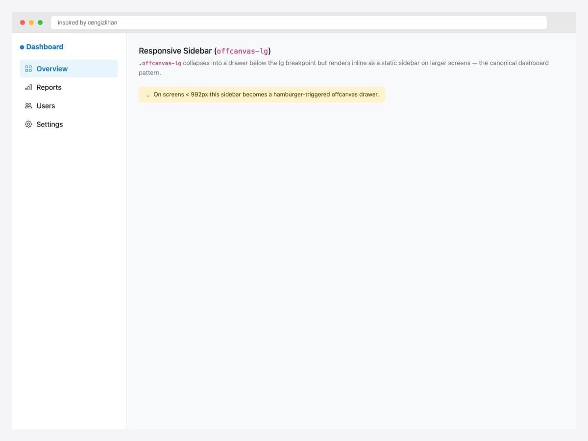
Responsive sidebar via .offcanvas-lg — collapses into a drawer below the lg breakpoint (992px) but renders inline as a static sidebar on larger screens. Best fit for admin dashboards, documentation sites, and any layout where desktop users want a permanent sidebar while mobile users get a hamburger-triggered drawer. Pure Bootstrap 5.3 — the responsive class does the work automatically. No JavaScript media queries required. Pair with display: flex on the body for the desktop layout so the sidebar and main content render side-by-side without overlap.
Inspired by: cengizilhan · License: CodePen default (attribution required)
Source & details Original demo
20. Dark Admin Drawer
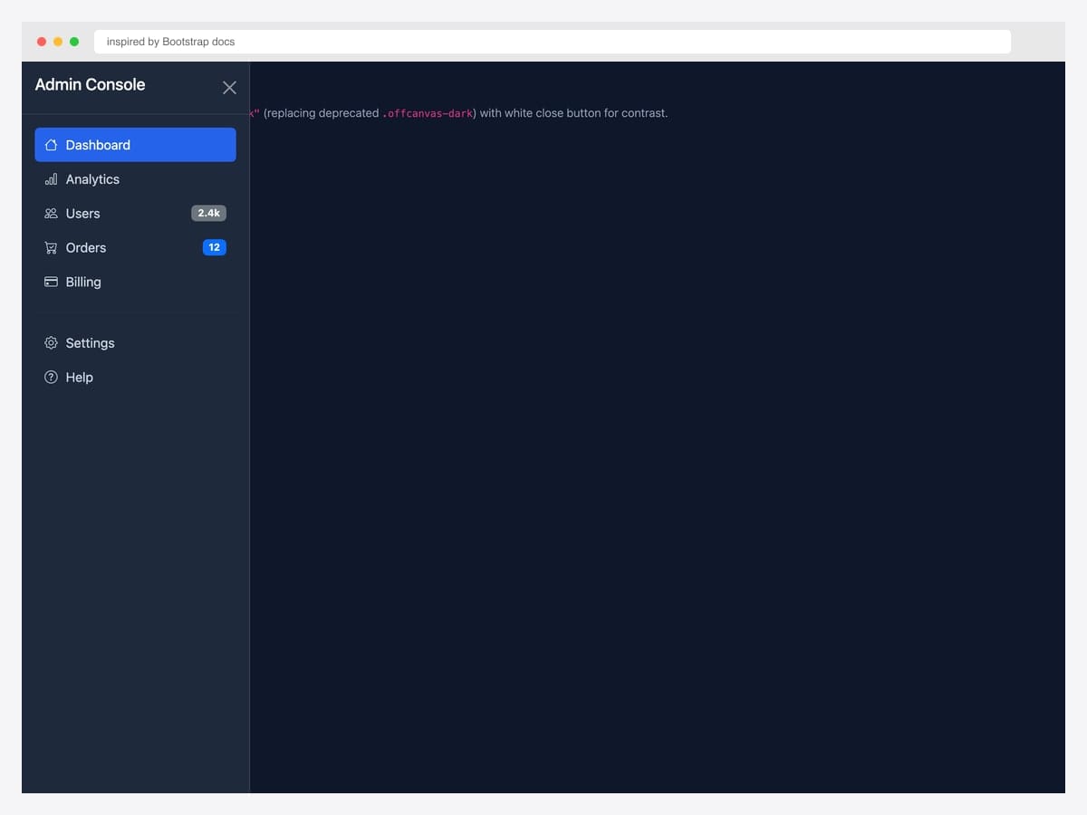
Dark admin drawer with data-bs-theme="dark" — Admin Console with Dashboard (active), Analytics, Users (2.4k badge), Orders (12 badge), Billing, plus Settings and Help. Best fit for products that ship a dark-mode option or admin tools that default to dark themes. Pure Bootstrap 5.3 — the dark theme cascade re-tints every element automatically (background, text, borders, badges). Custom CSS for the navbar hover/active states. Pair the dark drawer with a dark navbar via data-bs-theme="dark" on the body or specific containers.
Inspired by: Bootstrap (twbs) · License: MIT
Source & details Original demo
Simple drop-in patterns
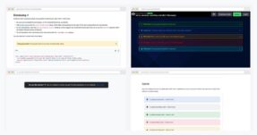
21. Basic Live Reference
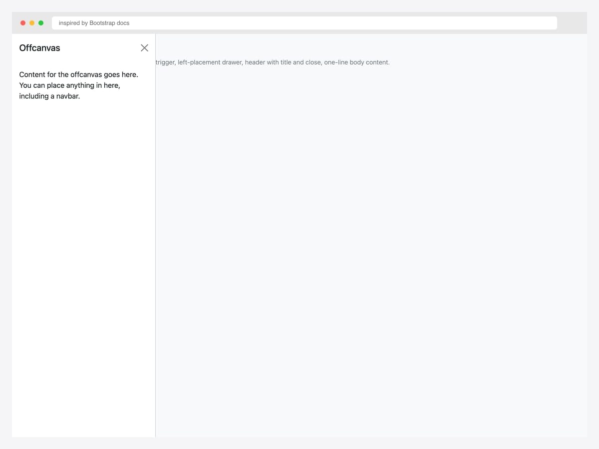
The smallest viable offcanvas — single button trigger, left-placement drawer with title and one-line body content. Best fit as a starting point: copy this markup, change the placement and content, ship it. Pure Bootstrap 5; no custom CSS or extended JavaScript. Initialize via the data-attribute API (data-bs-toggle="offcanvas" + data-bs-target="#id") — no JavaScript required for basic open/close. For programmatic control (open from a different page section, close after form submit), use the JavaScript API: bootstrap.Offcanvas.getOrCreateInstance(el).toggle().
Inspired by: Bootstrap (twbs) · License: MIT
Source & details Original demo
22. Static Backdrop
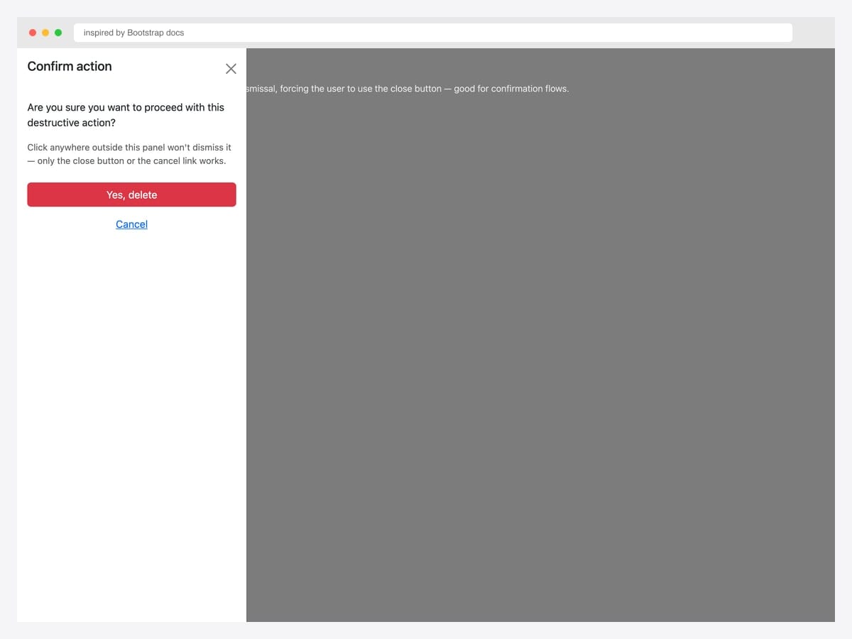
Static backdrop offcanvas — data-bs-backdrop="static" blocks click-outside dismissal, forcing the user to use the close button (or your provided Cancel link). Best fit for confirmation flows, destructive-action prompts, and any drawer where accidental dismissal would cause data loss. Pure Bootstrap 5 with one extra data attribute. The backdrop is still visible but doesn’t respond to clicks. Pair with a clear Cancel action inside the drawer so users always have a non-button escape route.
Inspired by: Bootstrap (twbs) · License: MIT
Source & details Original demo
23. Body Scroll Preserved
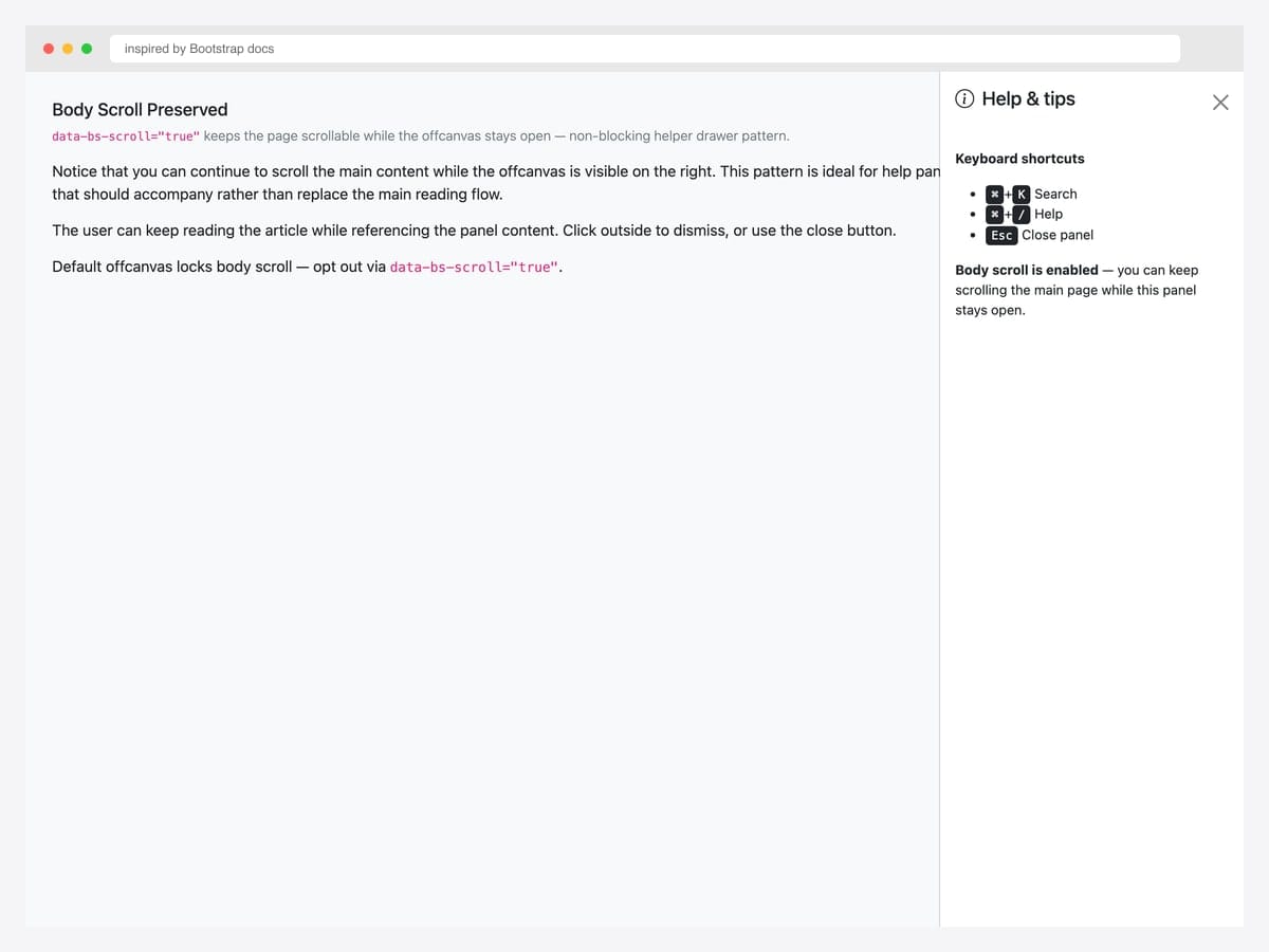
Body scroll preserved via data-bs-scroll="true" — the page remains scrollable while the offcanvas stays open. Best fit for help panels, table of contents, and any drawer that should accompany rather than replace the main reading flow. Pure Bootstrap 5; the data attribute opts out of the default scroll-lock behavior. Pair with data-bs-backdrop="false" for fully non-blocking interaction (see #24). For long content inside the offcanvas, the offcanvas itself scrolls independently — no extra config needed.
Inspired by: Bootstrap (twbs) · License: MIT
Source & details Original demo
24. Backdrop Disabled (non-blocking)
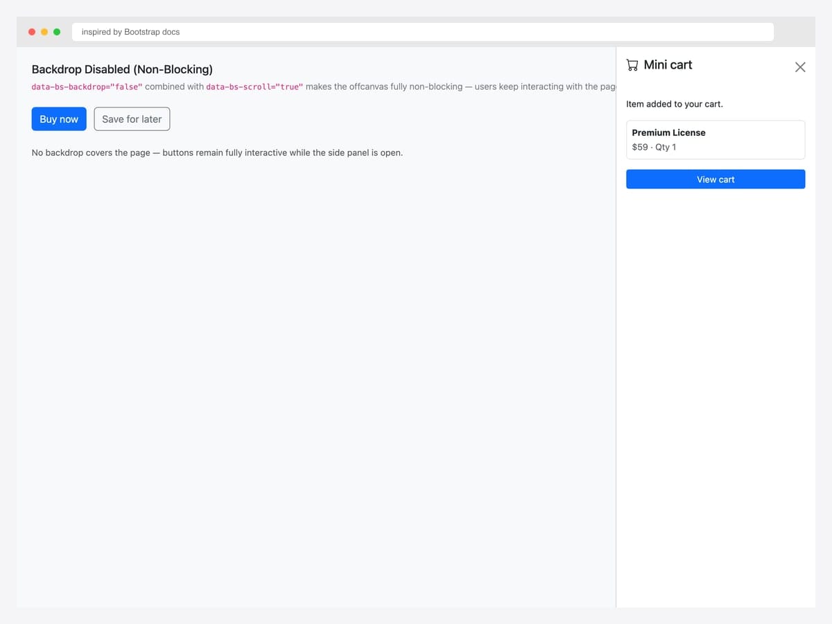
Backdrop disabled (data-bs-backdrop="false") combined with data-bs-scroll="true" makes the offcanvas fully non-blocking — no overlay covers the page, all buttons remain interactive. Best fit for mini-cart previews after “Add to cart”, help tips that point at specific UI elements, and any drawer that should accompany the user’s primary task rather than interrupt it. Pure Bootstrap 5 with two data attributes. The drawer feels more like a side panel than a modal — users naturally dismiss it by clicking elsewhere or pressing the close button without feeling blocked.
Inspired by: Bootstrap (twbs) · License: MIT
Source & details Original demo
25. Animated Transitions
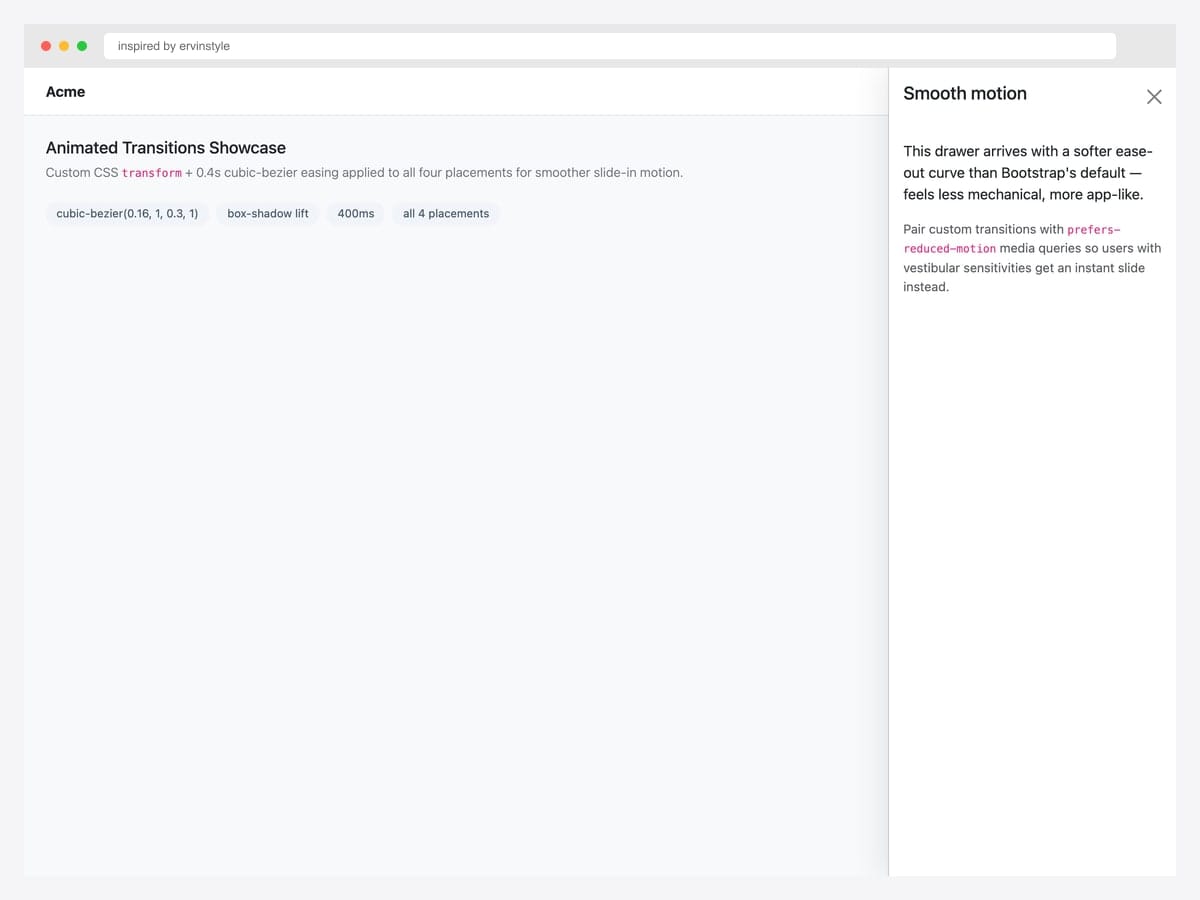
Custom CSS transform + 0.4s cubic-bezier easing applied to all four placements for smoother slide-in motion than Bootstrap’s default 0.3s ease. Best fit for premium product UIs (Linear, Vercel, Stripe) where motion polish signals quality. Pure CSS layered on top of Bootstrap’s offcanvas — override the .offcanvas transition rule with your own easing curve. Respect prefers-reduced-motion: reduce by adding a media query that disables custom transitions for accessibility — vestibular sensitivities can be triggered by sliding motion.
Inspired by: ervinstyle · License: CodePen default (attribution required)
Source & details Original demo
Advanced Bootstrap offcanvas patterns
Three patterns the listicle items above hint at but rarely demo in isolation. Each solves a specific production problem.
Pattern 1 — Multi-level slide-stack. When the menu has deep hierarchy (ecommerce categories, multi-tenant admin), don’t squash everything into one panel. Stack offcanvas panels that slide further as the user drills down. Each level is a separate offcanvas instance triggered from the previous one’s links:
const parent = bootstrap.Offcanvas.getInstance(document.getElementById('parent'));
document.getElementById('child').addEventListener('show.bs.offcanvas', () => {
  document.getElementById('parent').classList.add('offcanvas-stacked');
});
Pattern 2 — Offcanvas with body scroll preserved. Default offcanvas locks page scroll while open. For long content (cart with many items, filter panel on catalog), preserve body scroll so users can reference the underlying page:
<div class="offcanvas offcanvas-end"
     data-bs-scroll="true"
     data-bs-backdrop="false"
     tabindex="-1"
     id="filterPanel">
  <!-- ... -->
</div>
Pattern 3 — Offcanvas → modal escalation. Pattern for cart drawers: offcanvas for the summary, modal for full checkout. Hide the offcanvas programmatically when the modal opens, then re-show on modal close:
const cartOC = bootstrap.Offcanvas.getInstance(document.getElementById('cartDrawer'));
const checkoutModal = bootstrap.Modal.getOrCreateInstance(document.getElementById('checkoutModal'));

document.getElementById('startCheckoutBtn').addEventListener('click', () => {
  cartOC.hide();
  checkoutModal.show();
});

document.getElementById('checkoutModal').addEventListener('hide.bs.modal', () => {
  cartOC.show();
});
Offcanvas vs Modal vs Sidebar — when to use which
| Offcanvas | Modal | Sidebar (layout) | |
|---|---|---|---|
| Component type | BS5 native component | BS4/BS5 native component | Layout pattern (custom CSS) |
| Default state | Hidden until triggered | Hidden until triggered | Always visible |
| Position | Slides from edge (start/end/top/bottom) | Centered overlay | Fixed left/right column |
| Blocks page interaction | Yes (default) — configurable | Yes — always | No |
| Best for | Mobile menus, filters, cart drawers | Confirmations, forms, focused tasks | Persistent navigation, admin UIs |
| Mobile-friendly | Yes — primary use case | Yes — but cramped on small screens | Usually collapses into hamburger |
When to choose what: Reach for modal when you need user attention focused on a single short task. Reach for offcanvas when you need supplementary navigation or filtering that maintains the page context underneath. Reach for sidebar layout when navigation is the primary spatial structure (admin dashboards, docs sites).
Frequently asked questions
Is Bootstrap offcanvas available in Bootstrap 4?
No — offcanvas is a Bootstrap 5 native component, introduced in version 5.0 (October 2021). Bootstrap 4 has no equivalent built-in component. Developers using Bootstrap 4 typically built custom slide-out menus with position: fixed, transform: translateX(), and jQuery. If you’re migrating from Bootstrap 4 to 5, replacing those custom solutions with the native offcanvas component is recommended.
How do I open a Bootstrap offcanvas with JavaScript?
Use the JavaScript API: const oc = new bootstrap.Offcanvas(document.getElementById('myOffcanvas')), then call oc.show(). You can also use bootstrap.Offcanvas.getOrCreateInstance(element).toggle() to toggle visibility. The data-attribute API (data-bs-toggle="offcanvas") works for most cases and requires no JavaScript.
Can I have multiple offcanvas panels open at once?
By default, no — Bootstrap closes any open offcanvas when a new one opens. You can override this by listening to the show.bs.offcanvas event and preventing the default close behavior on the parent panel. This is useful for multi-level navigation drawers. See the “Multi-level slide-stack” advanced pattern above for the full code.
How do I make the offcanvas slide from the right instead of the left?
Use the offcanvas-end modifier class instead of offcanvas-start. Bootstrap 5 also supports offcanvas-top (slides down from the top) and offcanvas-bottom (slides up from the bottom). The default direction is offcanvas-start, which respects RTL layouts automatically.
Is Bootstrap offcanvas accessible (WCAG compliant)?
Yes — when implemented with the documented markup, Bootstrap offcanvas includes ARIA labels, focus trapping while open, focus return on close, and keyboard Escape-to-close. You must include tabindex="-1" on the offcanvas element and aria-labelledby pointing to the offcanvas title for screen readers to announce it correctly.
Why does my page still scroll when the offcanvas is open?
Bootstrap 5 locks body scroll by default when an offcanvas opens. If your page is still scrolling, check whether you’ve set data-bs-scroll="true" on the offcanvas element — that attribute explicitly enables body scroll. Also check that no parent element has overflow: hidden that would interfere with Bootstrap’s scroll-lock logic.
Are these Bootstrap offcanvas examples free for commercial use?
Yes — every example in this collection uses an MIT, Apache 2.0, or MDB-free license, which permits commercial use including in client projects and SaaS products. Our Bootstrap 5.3 implementations are released under MIT; the original inspirations are linked for those who want to verify the source pen’s license terms.
Final thoughts
Bootstrap 5’s offcanvas component fills the gap that Bootstrap 4 left for slide-in panels. The patterns above show the spectrum: from canonical docs references to feature-rich cart drawers, from chat layouts to faceted search panels. The picks worth committing to memory: the official live demo (#1) as your baseline, the cart drawer with line items (#11) for any e-commerce flow, the admin sidebar with avatar (#16) for logged-in dashboards, the responsive offcanvas-lg pattern (#19) for dashboards that need a permanent desktop sidebar, and Bootstrap 5.3’s dark-mode cascade (#20) for any product that supports theme switching.
If you’re building a complete admin UI, pair offcanvas with our Bootstrap sidebar templates for the permanent-sidebar half. For mobile menus and hamburger triggers, see our Bootstrap navbar examples.
Related collections: Bootstrap navbar examples · Bootstrap sidebar templates · Bootstrap modal templates · Bootstrap dropdown menus · Free website menu templates · Bootstrap snippet library
Related Posts
Comments (0)