22 Best Musician Websites (Examples) 2026
We carefully curated a collection of the best musician websites (and some bands) to inspire you with creative ideas.
A great page allows you to embed videos and playlists, showcase tour dates, promote the latest tunes and albums, and sell merchandise.
You’ll also experience a range of web designs, from dark to light and some colorful ones, as we wanted to ensure there’s something for everyone.
However, the best part is that you can easily create a similar musician site without any coding or design experience.
We recommend choosing a WordPress theme for musicians, but you can also pick a powerful musician website builder.
Best Musician Websites You’ll Love
1. Sharam
Built with: Squarespace

Sharam is also a dark-ish musician website with a basic header and footer, a hero area promoting the latest tunes and call-to-action (CTA) buttons that link to social media.
All the content is beautifully overlaid over the background image, creating a pleasant atmosphere.
What stands out: Use the above-the-fold area to promote your latest releases, albums, and more.
We also curated a list of the most fantastic Squarespace website examples.
2. Steve Benjamins
Built with: Squarespace

Steve Benjamins ‘ website is an example of a musician’s website featuring a single-sectioned front page that promotes his new song.
The header is transparent and clean, featuring a CTA button that links to his Spotify account.
Furthermore, the footer has three columns; one for the vinyl, one for the newsletter subscription form (with reCAPTCHA) and one for social media icons.
What stands out: Adding a CTA button in the header section can increase click-throughs (downloads, sales, etc.).
3. Claire Soulier
Built with: Webflow

The number one thing that makes Claire Soulier’s page pop is the auto-played video above the fold.
This musician’s website loads content on scroll for a more enjoyable scrolling experience. It also has a sticky sidebar hamburger menu icon that opens an overlayed navigation. (The header with social media buttons also floats.)
While this Webflow website‘s core has a dark design, the footer, with a light background, keeps it more dynamic.
What stands out: Embed your music video(s) into your website to make it more engaging.
4. Jay Hardway
Built with: Laravel

What’s unique about Jay Hardway is that some parts of the website are public and some are only accessible to members. This is a great way to grow the community, which will help you grow your musical career.
The home page features a four-column grid with tags, enabling you to filter the content and view only the items that interest you.
Moreover, this musician’s website also has a floating header with a login/sign up CTA button.
What stands out: A sticky header can enhance your page’s user experience.
5. Carl Cox
Built with: Salient Theme

Carl Cox is a simple, bold and dark website with a full-screen hero background image, logo and text (which is a quote from Carl).
The header is minimalist and transparent, with the necessary menu links, search bar and social media icons. This page also features a back-to-top button to facilitate easy navigation.
What stands out: Create a strong impact on all your visitors with a dark web design.
Be sure to check out these awesome Salient theme examples for more website design ideas.
6. Charlotte De Witte
Built with: Craft CMS

Charlotte De Witte is a one-page website with a full-screen home layout with a catchy text-revealing effect.
It features a large hero image of the artist, followed by all the necessary contact details and a footer full of additional social media links and tour dates.
What stands out: Use a single-page layout, so fans can quickly find all the necessary information.
7. Peggy Gou
Built with: Craft CMS

Peggy Gou is one of the more unique musician websites we’ve encountered when curating this collection.
Instead of the header, the menu is located at the bottom of the screen and is sticky. Peggy Gou offers you to play a tune by pressing the “+” sign in the bottom left corner.
Lastly, the home page animation makes this site way more catchier.
What stands out: Introduce an audio player to your website, allowing everyone to enjoy your music while browsing your content.
8. Elles Bailey
Built with: Wix

The beautiful parallax background image sets Elles Bailey’s site apart from the rest. It has a boxed layout with an embedded playlist and video, tour dates and a subscription form.
Another interesting feature is the live chat widget in the bottom right corner, which isn’t something you often see on a musician’s website.
What stands out: Parallax effect is a great engagement booster that adds depth to your site.
You may also want to check all these websites built on the Wix platform.
9. Charley Crockett
Built with: Elementor

Charley Crockett only has a hero section on the front page, with a full-screen image background, a transparent header (that floats), and social media icons at the bottom.
Although it features a modern and responsive web design, this is still a fairly basic website that excels in promoting tunes and tour dates.
What stands out: A full-screen image background can be extremely effective in increasing visitor engagement.
We recommend reading our Elementor review if you plan to build a WordPress website.
10. Andrew Huang
Built with: Squarespace

Andrew Huang’s musician website immediately grabs your attention with its vibrant colors. The hero section has social media links to connect with Andrew immediately.
Moreover, the header floats at the top of the screen, ensuring that all menu links are always available. Andrew’s website also features a simple video grid and a newsletter subscription form, located just before the footer.
What stands out: Let your personality speak through your website’s branding.
What’s cool about this website? You can create an exact one using a Squarespace website template for musicians.
11. Lauren Conklin
Built with: Wix

Lauren Conklin’s website begins with a full-width image featuring her name overlaid, followed by three embedded Shopify playlists that allow you to listen to her music directly from her website.
Additionally, this musician’s website has a beautiful video gallery/library with optional share buttons.
Similar to Peggy Gou, Lauren’s page also features a header/menu at the bottom of the screen (floating).
What stands out: Dare to move the traditional top header to the bottom of the screen.
12. Jonathan Jackson
Built with: Squarespace

Jonathan Jackson’s front page is a full-screen image background with text, a CTA to enter the website and social media icons at the bottom.
This musician’s website opens in a new tab, where you can find a wealth of additional information, including videos and more.
The header and footer are both basic, which complement the overall clean website design well.
What stands out: Use an impactful home page layout with text, a CTA to enter the site and social buttons.
13. Justin Ward
Built with: Wix

Justin Ward is a neat musician website with a hero image (without an overlayed text or CTA), a header (with menu) and a footer (with social media).
This simple website features a straightforward structure that allows you to access all the useful information with just a few clicks.
What stands out: If you’re unsure how to design and structure your online presence, keep it simple. It always works!
14. Sierra Hull
Built with: Squarespace

Sierra Hull has a semi-one-page website with a floating navigation bar that guides you from section to section (and other pages) without the need to scroll.
Below the hero area is a section promoting her latest album, along with a list of tour dates featuring CTAs for tickets and RSVPs.
Sierra Hull also has a newsletter subscription form sandwiched between an Instagram feed slider and a Spotify playlist.
What stands out: Integrate an IG feed to add more content to your website and to grow your profile.
15. Garry Tallent
Built with: Webflow

Garry Tallent features a visually appealing above-the-fold area with a background image and a transparent header.
This musician’s website features a single-page structure, with all the details conveniently located just a few scrolls away. (Too bad the header isn’t sticky; it’d make jumping from section to section much more comfortable.)
While many use an IG feed, Garry uses a Twitter grid feed (powered by the Juicer tool).
What stands out: One-page website can improve UX (especially with a sticky menu).
16. Behemoth
Built with: Squarespace

Behemoth is a band website example with a video embedded above the fold over a background image. The header is transparent for a more distraction-free experience. Also, the navigation bar has social media icons and a CTA button to join the mailing list.
What stands out: Let your fans view your latest video immediately by placing it above the fold.
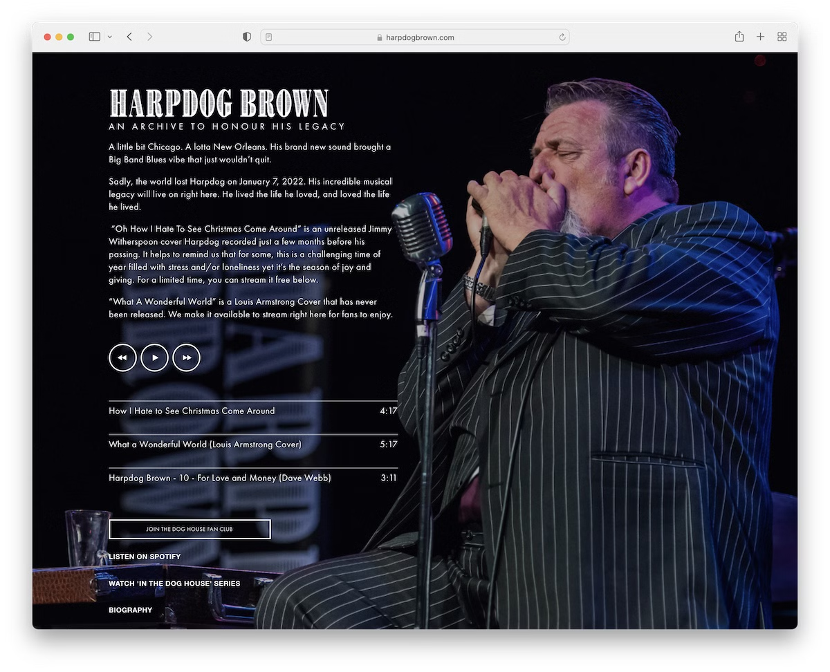
17. Harpdog Brown
Built with: Squarespace

What we really like about Harpdog Brown’s website is the front page with a full-screen background slider, audio player, links to social media and other pages.
While the home page lacks a header or footer, the rest of the website features them. The navigation bar features a drop-down menu to facilitate easier access to specific information.
What stands out: Use a background slider to enhance the viewing experience and add visual interest.
18. Paul Lay
Built with: Squarespace

Paul Lay’s home page has two CTA buttons (with a hover effect) to enter the French or English websites. However, you can also directly connect with Paul via the social media icons in the bottom right corner.
The page has a header (with a drop-down menu), a footer (with a newsletter subscription) and additional sidebar navigation.
What stands out: Let your visitors pick the desired website language via your home page.
19. Blink 182
Built with: Wix

Blink 182 is a musician website with a full-screen hero section with CTA buttons and a simple navbar.
Below the fold is their latest official music video, followed by a list of upcoming tour dates. The footer is tiny and contains additional user and business links.
What stands out: Make your tour dates instantly accessible by adding them to your home page.
20. Cameron Carpenter
Built with: Squarespace

Cameron Carpenter’s website is minimalistic and simple. The above-the-fold section only has a hero image without any text or CTA and a plain navigation bar.
Below the fold are numerous PR mentions from various authorities that serve as social proof.
What stands out: Instead of fan reviews and testimonials, you can also include PR mentions and references on your musician website.
21. Janie Bay
Built with: Carrd

We’re adding Janie Bay’s website to this list because it demonstrates that minimalism is effective. Additionally, anyone can build a website like this with the Carrd builder in just a short time.
Basic details, a simple header with navigation, social media, and email icons in the footer – that’s it!
What stands out: A minimalist website can create a great user experience and is often easier to build.
Here are some more Carrd websites that show how an easy website builder can help you create great sites.
22. Bonobo
Built with: WordPress

Bonobo’s website is a visual feast — the full-screen hero features a breathtaking underwater photograph with vibrant sunset colors bleeding through ocean waves, perfectly reflecting the atmospheric, nature-inspired electronic music he’s known for.
The “Lazarus — Album Out Now” announcement sits centrally with the album artwork, surrounded by multiple CTAs for streaming, buying, and tour dates. The header provides quick access to social platforms (Spotify, Apple Music, TikTok, Facebook, Instagram, Twitter, YouTube) and a Subscribe button.
What stands out: Using atmospheric nature photography that reflects the mood of your music creates a cohesive brand experience across visual and audio.
Related Posts


Comments (0)