29 Best Spa & Day Spa Website Examples 2026
A spa website should feel like the experience it’s selling: calm, elegant, and effortlessly inviting. Visitors should feel their shoulders drop the moment the page loads.
We’ve curated 29 spa and day spa websites that achieve this — from boutique treatment rooms to luxury wellness resorts. Each entry includes the platform and what makes the design work.
Platform breakdown: Squarespace (9), Wix (6), Shopify (4).
The best spa websites share three traits: soothing color palettes, seamless service booking, and high-quality imagery that communicates tranquility before the first appointment. Use these as a blueprint for your own.
Best Spa & Day Spa Website Examples
1. Spa Belles
Built with: Squarespace
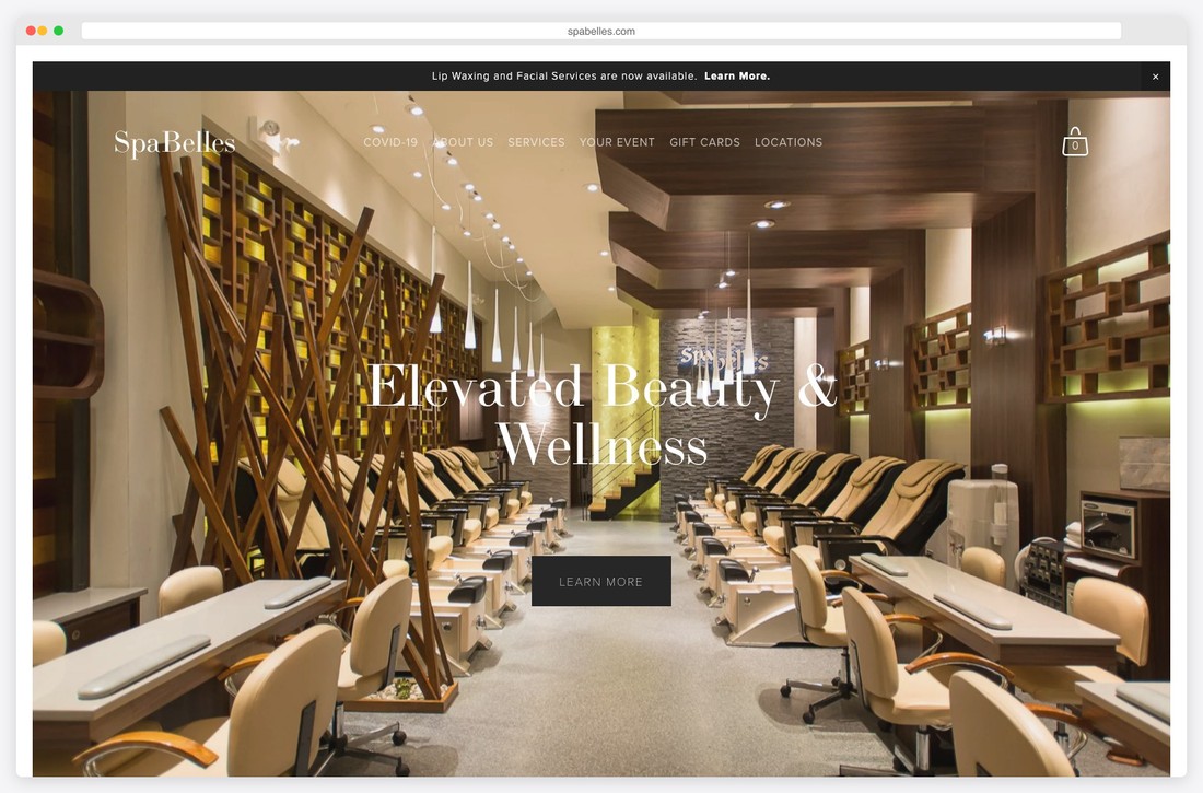
Full-service day spa offering manicures, pedicures, facials, waxing, body massage, microdermabrasion, and eyelash extensions across multiple NYC locations..
Clean, classic design with high-resolution photography, timeless serif fonts, and an announcement bar highlighting new services alongside integrated online booking.
What stands out: Seamless online booking removes friction and converts browsers into paying clients.
2. PRESS Modern Massage
Built with: Squarespace
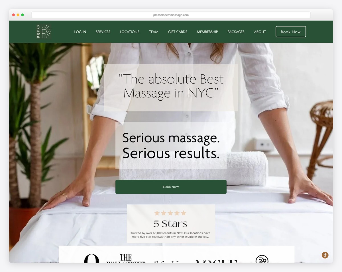
Award-winning clinical massage studio established in 2008 with five NYC locations offering therapeutic full-body massage, pregnancy massage, and elevated premium treatments..
Modern minimalist aesthetic with bold wellness branding, a membership-focused announcement bar, clean typography, and Boulevard booking system integration.
What stands out: Seamless online booking removes friction and converts browsers into paying clients.
3. Float Luxury Spa
Built with: Squarespace
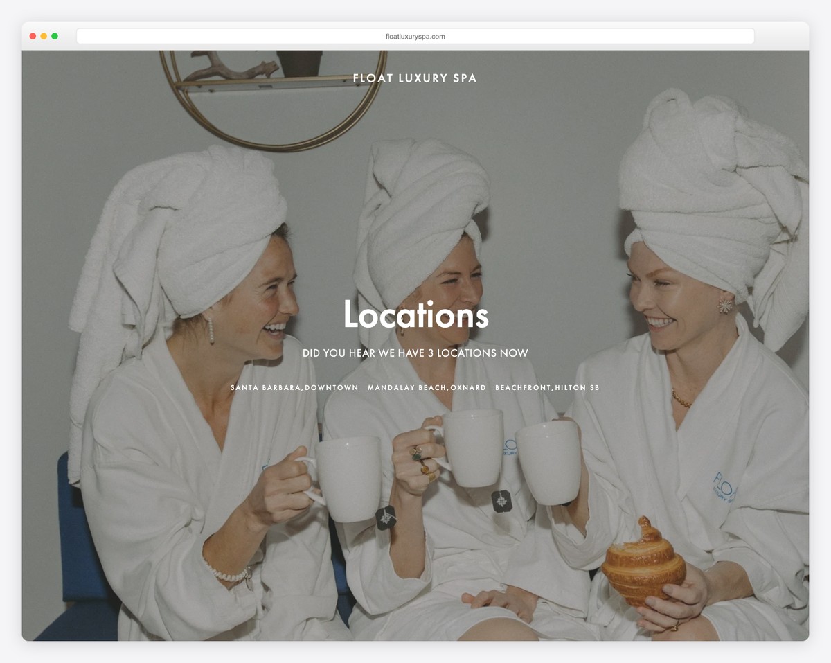
High-end day spa specializing in luxurious facials and body treatments designed to promote deep relaxation and rejuvenation..
Elegant dark color palette conveying luxury and calm, with generous white space, high-quality imagery, and prominent booking calls to action.
What stands out: Seamless online booking removes friction and converts browsers into paying clients.
4. The Wellness Spot
Built with: Squarespace
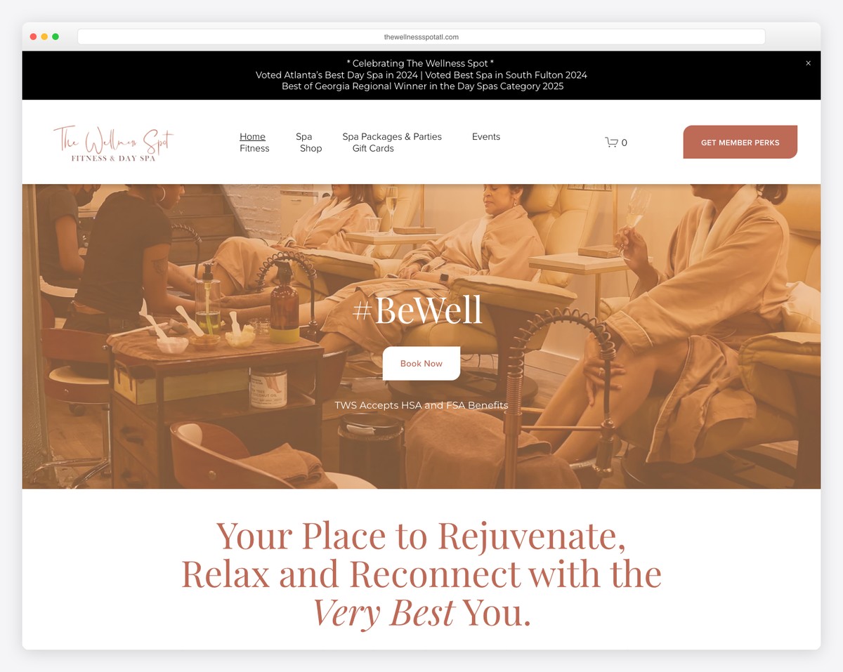
Upscale fitness and day spa offering massage therapy, facials, manicures, pedicures, waxing, infrared sauna, and private event hosting..
Warm, inviting design with a wellness-focused color scheme, integrated fitness class scheduling, and Squarespace commerce functionality for spa packages.
What stands out: Event and catering capabilities open additional revenue streams and attract higher-value clients.
5. Vitality Float Spa
Built with: Squarespace
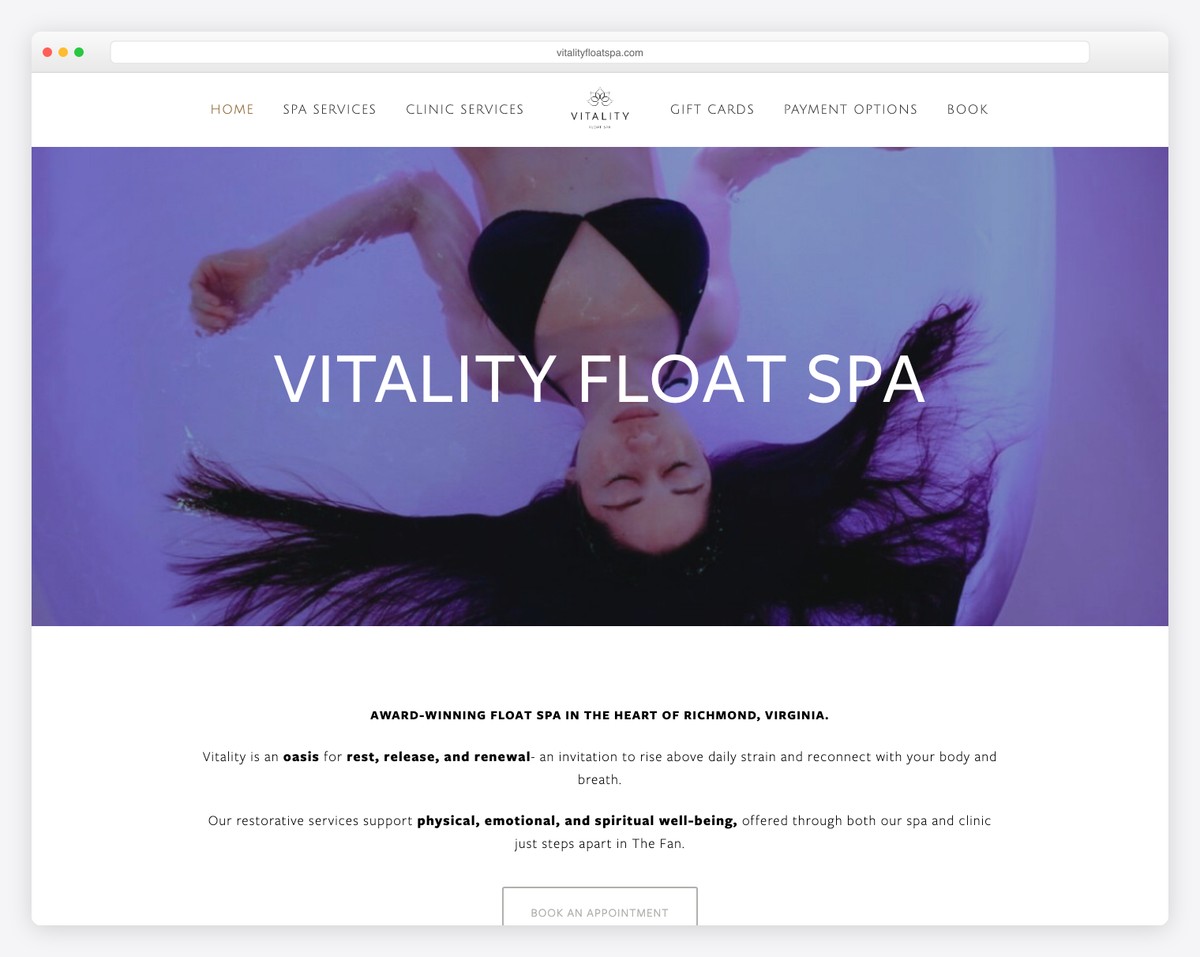
Premier float spa offering sensory deprivation float therapy, customized massage with cupping and CBD, facials, reflexology, and community wellness events..
Earthy, calming design with a focus on service education, prominent scheduling integration, and detailed therapist profiles that build client trust.
What stands out: Emphasizing custom, personalized services positions the business as premium and client-focused.
6. Blooming Moon Spa
Built with: Squarespace
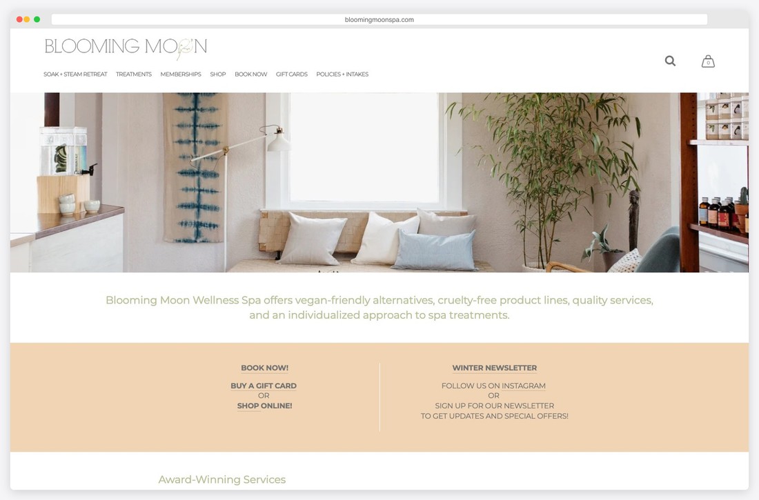
Boutique day spa operated by a licensed esthetician emphasizing mind-body wellness through customized facials, body treatments, and holistic skin care services..
Serene, nature-inspired aesthetic with soft earth tones, handcrafted branding, and a personal storytelling approach that connects visitors to the spa’s philosophy.
What stands out: Emphasizing custom, personalized services positions the business as premium and client-focused.
Looking for more website inspiration? Check out our collections of small business websites, service websites, and clean website designs.
7. Skinterest Skincare Boutique
Built with: Squarespace

Modern day spa specializing in unique facial treatments, professional massage, acupuncture, waxing, advanced healing treatments, and wellbeing workshops..
Polished boutique-style layout with warm neutrals, clear service categorization, integrated booking, and a welcoming event space section for workshops.
What stands out: Seamless online booking removes friction and converts browsers into paying clients.
8. Hazel Salon & Spa
Built with: Squarespace
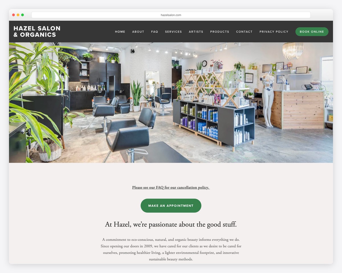
Organic beauty day spa operating since 2009 offering sugaring hair removal, customized facials, body treatments, and the Hyaluron Pen lip service..
Clean, nature-forward design with an earthy green and neutral palette, staff profiles, and a strong commitment to organic and sustainable beauty practices.
What stands out: Detailed team profiles help clients connect with their stylist or artist before the first visit.
9. Brick Canvas
Built with: Wix
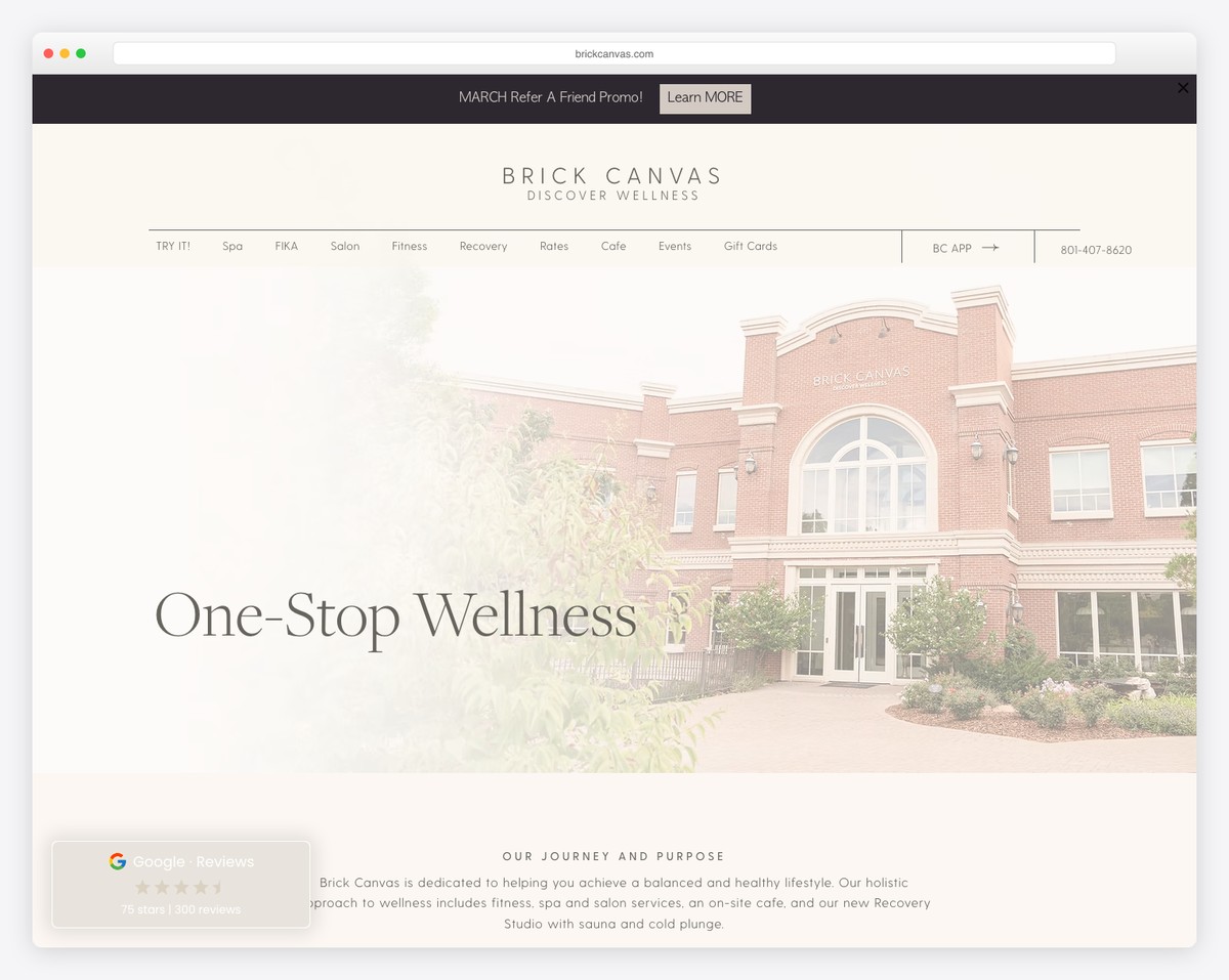
Full-service wellness center offering massages, facials, HydraFacials, hot pilates, reformer pilates, sauna, cold plunge, red light therapy, and an on-site cafe..
Bold, energetic design with vibrant imagery spanning fitness and spa categories, integrated class scheduling, mobile app promotion, and a lifestyle brand approach to wellness.
What stands out: The calming, spa-like design experience starts the relaxation journey before clients even arrive.
10. Dream Day Spa
Built with: Wix
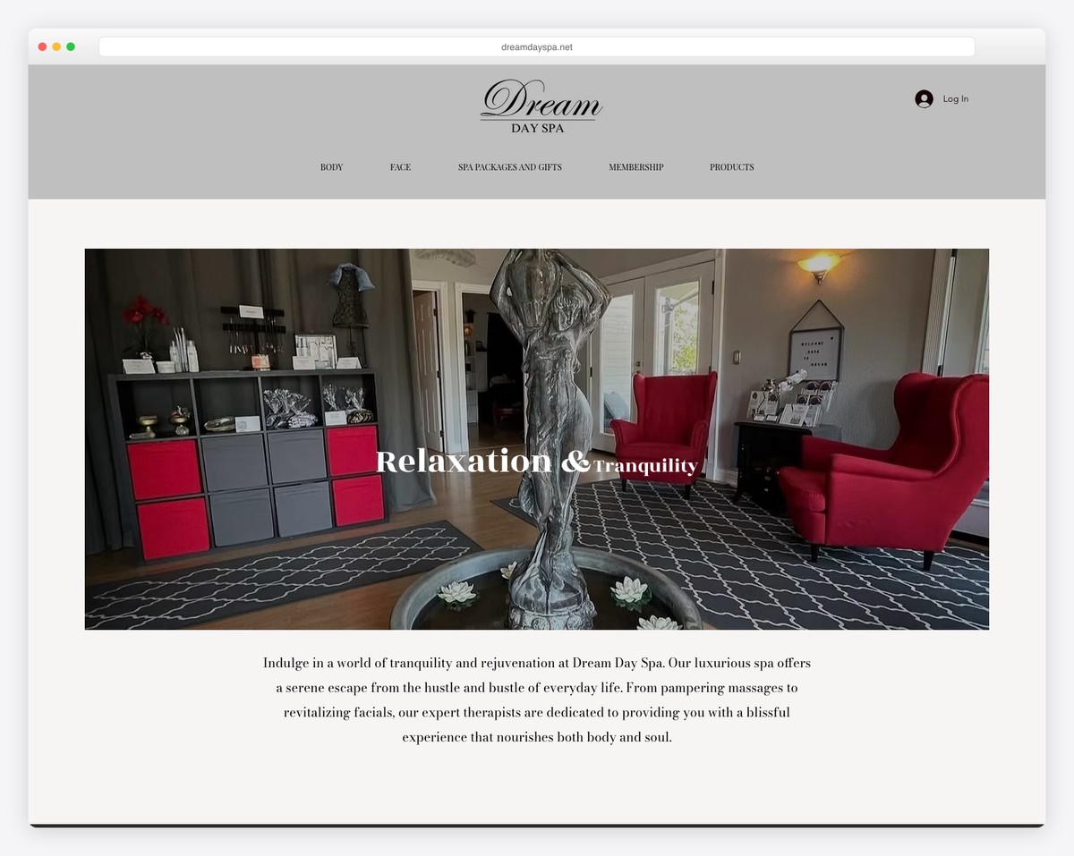
Day spa offering a range of relaxing massages, facials, and rejuvenating body treatments in a tranquil setting..
Clean and calming Wix layout with responsive mobile design, smooth CSS animations, a professional navigation system, and a soothing color scheme throughout.
What stands out: The calming, spa-like design experience starts the relaxation journey before clients even arrive.
11. Exhale ChiroSpa
Built with: Wix
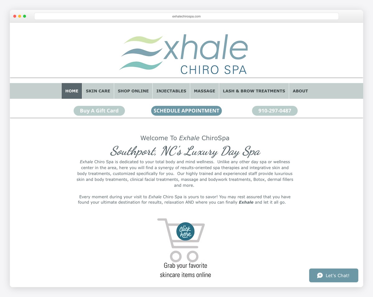
Premier destination spa combining chiropractic care with facials, anti-aging treatments, massage therapy, injectables, and chemical peels..
Modern wellness-focused design blending medical and spa aesthetics, with Wix booking integration, clear service menus, and a professional yet approachable visual identity.
What stands out: Seamless online booking removes friction and converts browsers into paying clients.
12. California Skin Care & Day Spa
Built with: Wix
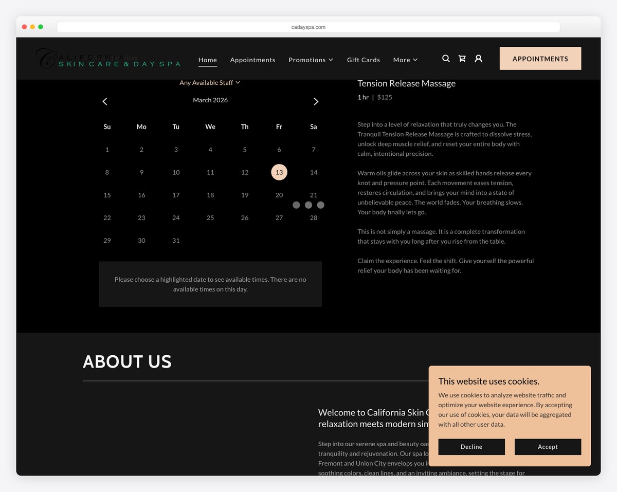
Established day spa with over 35 years of experience offering advanced skin therapy, cosmetology treatments, massage specialties, and customized facial therapy..
Straightforward, informative design emphasizing the spa’s decades of expertise, with a warm color palette, clear treatment descriptions, and an experience-focused approach.
What stands out: Emphasizing custom, personalized services positions the business as premium and client-focused.
13. The Cutting Edge Salon & Day Spa
Built with: Wix
Full-service salon and day spa operating since 1996 with skilled stylists, technicians, and therapists offering comprehensive hair, nail, skin, and body services..
Welcoming, community-oriented design with a classic beauty aesthetic, team introductions, and an emphasis on the spa’s long-standing local reputation.
What stands out: Detailed team profiles help clients connect with their stylist or artist before the first visit.
14. Glasskin
Built with: Shopify
Active skincare studio offering tiered facial treatments from 25 to 90 minutes, Biologique Recherche specialty facials, and a curated retail skincare line..
Sleek, modern e-commerce design built on Shopify with a dewy aesthetic, membership program promotion, Mangomint booking integration, and a clean product shop layout.
What stands out: Seamless online booking removes friction and converts browsers into paying clients.
15. Bloom Wellness Spa
Built with: Shopify
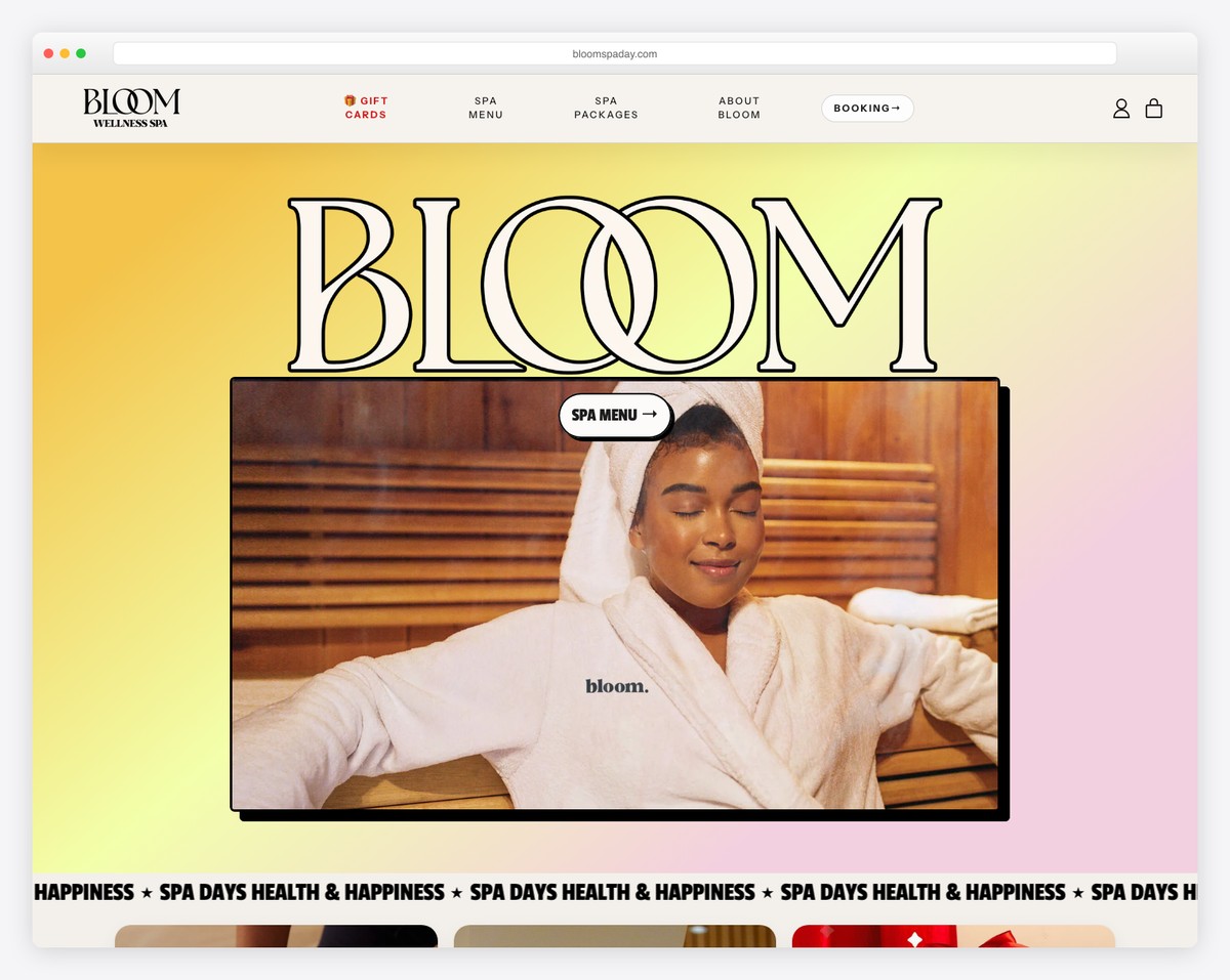
Day spa destination offering massage, sauna, float therapy, and seasonal spa day packages for singles and couples in a serene wellness setting..
Fresh, welcoming Shopify storefront with seasonal package promotions, an announcement bar for specials, and a smooth booking experience integrated into the shopping flow.
What stands out: Seamless online booking removes friction and converts browsers into paying clients.
16. Body Beautiful Day Spa
Built with: Shopify
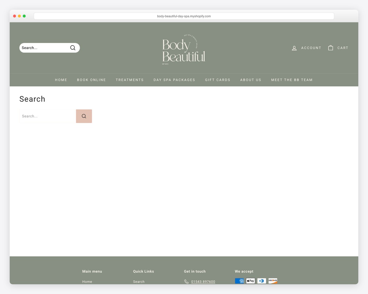
Boutique day spa housed in a stunning three-storey listed building overlooking Minster Pool, offering facials, massage, microdermabrasion, Elemis Biotec treatments, and nail services..
Elegant Shopify layout with a heritage British aesthetic, treatment package displays, online booking for all services, and product retail integration.
What stands out: Seamless online booking removes friction and converts browsers into paying clients.
17. Visage Salon & Day Spa
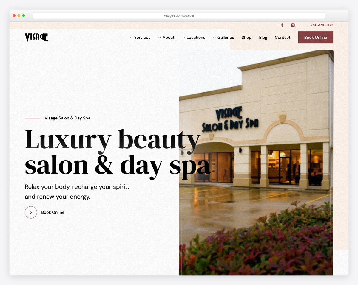
Luxury day spa offering facials, microdermabrasion, Swedish and hot stone massage, deep tissue and prenatal massage, waxing, nails, and full bridal services..
Elegant, custom Webflow design with sophisticated interactions, unique button animations, CMS-driven content, and a serene color palette reflecting the spa’s premium positioning.
What stands out: Dedicated wedding galleries and planning tools help couples envision their perfect day.
18. Shevet Hammam & Spa
Luxury hammam and spa housed in a historic 400-year-old building in Jaffa offering traditional Turkish bath experiences, massage, and modern spa treatments..
Striking minimal design with dramatic dark tones, smooth scrolling, a vertical slider, multilingual support, and atmospheric photography that showcases the venue’s historic architecture.
What stands out: A strong visual gallery lets the work speak for itself — the most effective selling tool.
19. OASIS Aveda Day Spa
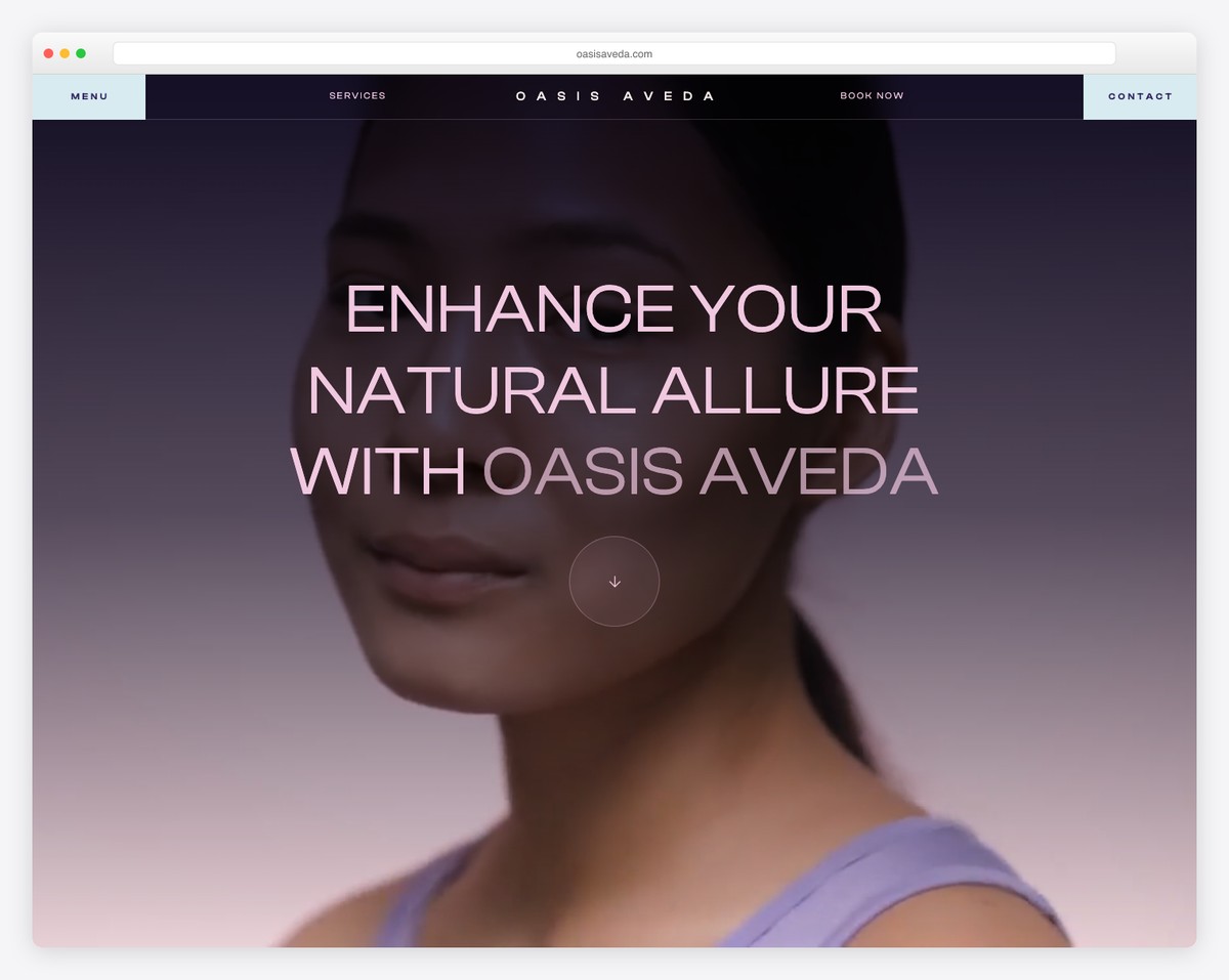
Holistic day spa offering Aveda hair care, skin rejuvenation facials, body care treatments, massage therapy, and makeup artistry using 100% vegan products..
Clean, nature-inspired Webflow design with warm greens and neutrals, integrated SalonBiz booking, product category showcases, and a strong eco-conscious brand message throughout.
What stands out: Seamless online booking removes friction and converts browsers into paying clients.
20. The Refuge Spa
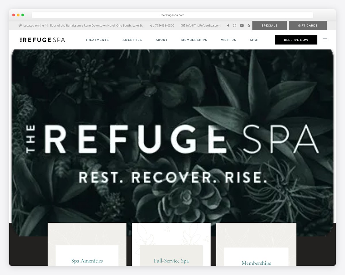
Modern day spa offering express treatments, full spa services, and spa party packages with a focus on holistic wellness and community connection..
Immersive WordPress design with Elementor page builder, atmospheric video hero section, creative hover effects, floating transparent header, and animated booking button.
What stands out: Seamless online booking removes friction and converts browsers into paying clients.
21. Green Leaf Spa Salon
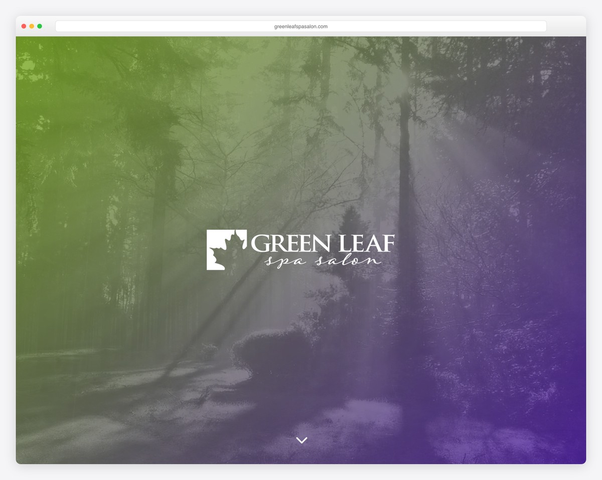
Luxury day spa located in the historic Uptown Theater Building offering massage therapy, customized skin care treatments, and spa packages..
Bold WordPress design using the Divi theme with a distinctive purple and green color scheme, detailed service pages, and a strong neighborhood connection to the Crossroads Art District.
What stands out: Highlighting sustainability and eco-conscious practices resonates with today’s values-driven consumers.
22. Castle Thai Spa
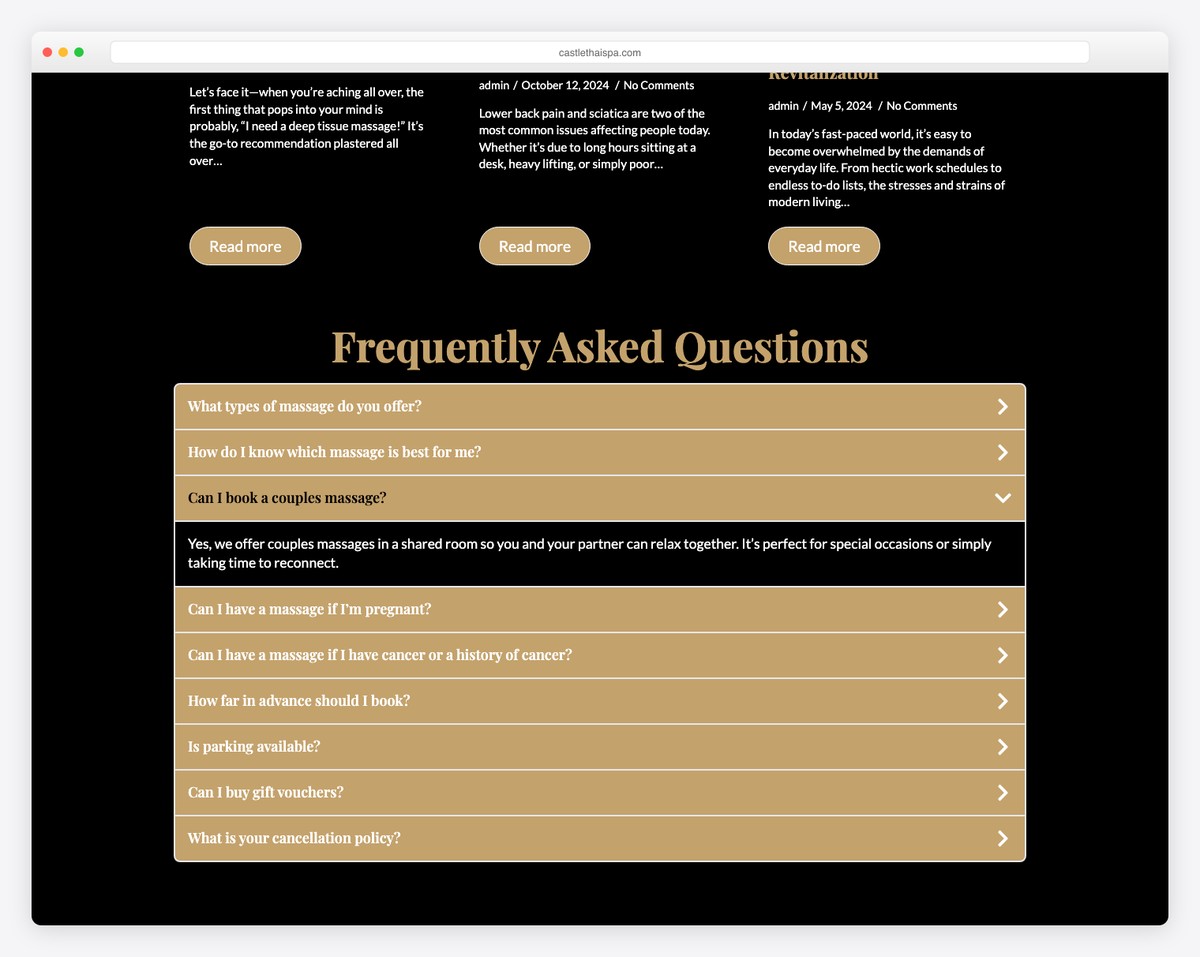
Authentic Thai day spa offering traditional Thai yoga massage, Thai oil massage, warm candle massage, couples massage, and neck and shoulder treatments..
Calming WordPress design with WooCommerce integration for gift card sales, a background video hero, elegant muted color palette, client testimonials, and online booking functionality.
What stands out: Seamless online booking removes friction and converts browsers into paying clients.
23. Grotta Giusti Spa
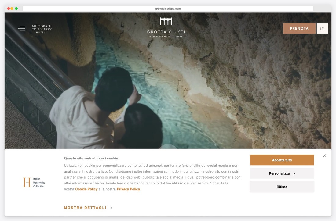
Historic thermal spa set in a Tuscan villa offering natural grotto steam baths, thermal pool experiences, massage, facials, and body treatments using thermal waters..
Sophisticated WordPress design combining classical typography with historic graphical elements and modern lifestyle photography, creating a rich sense of heritage and luxury.
What stands out: Detailed team profiles help clients connect with their stylist or artist before the first visit.
24. Shou Sugi Ban House
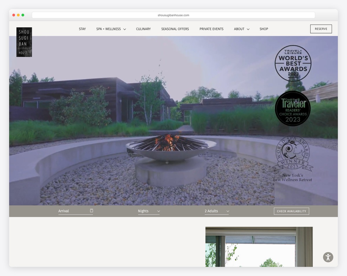
Japanese-inspired wellness retreat and day spa offering curated spa treatments, movement classes, and seasonal wellness programs rooted in Japanese philosophy..
Simple, minimal WordPress design honoring Japanese heritage with clean lines, restrained typography, natural textures, and immersive photography of the retreat’s tranquil grounds.
What stands out: The calming, spa-like design experience starts the relaxation journey before clients even arrive.
25. KOK Oslo
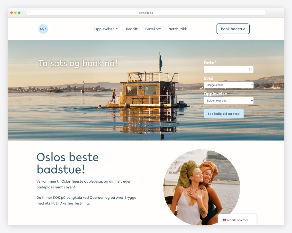
Outdoor urban bathouse offering communal sauna experiences, cold plunges, relaxation areas, massage, and social bathing events on the Oslo waterfront..
Creative WordPress design with Elementor featuring charming hand-drawn illustrations overlaying navigation elements, warm earthy tones, and a playful yet inviting visual identity.
What stands out: Event and catering capabilities open additional revenue streams and attract higher-value clients.
26. Elements Spa
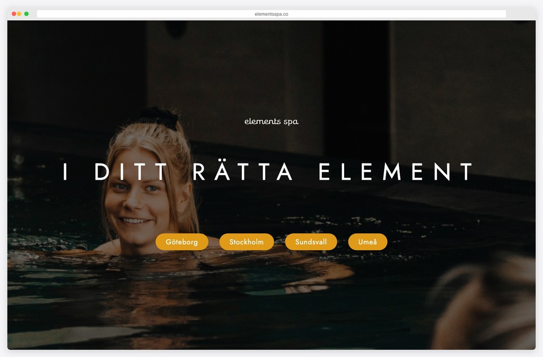
Nordic day spa close to nature offering massage, facials, body treatments, and thermal experiences inspired by Scandinavian wellness traditions..
Clean Nordic minimalist WordPress design with generous whitespace, cool natural tones, beautiful environmental photography, and a well-organized service layout emphasizing nature proximity.
What stands out: The calming, spa-like design experience starts the relaxation journey before clients even arrive.
27. La Mamounia Spa
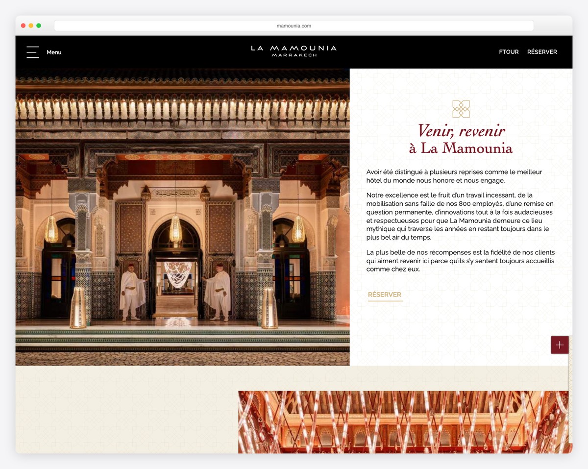
Iconic luxury day spa within the legendary La Mamounia palace offering hammam rituals, signature massage treatments, facial care, and bespoke wellness programs..
Gorgeous WordPress design with Synxis booking integration, rich jewel-toned color palette, stunning architectural photography, and an editorial layout that evokes Moroccan opulence.
What stands out: Seamless online booking removes friction and converts browsers into paying clients.
28. Scandinave Spa
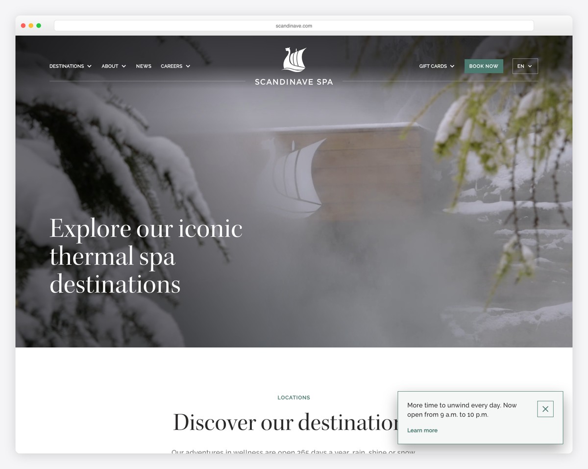
Premium Scandinavian bath experience with four Canadian locations offering thermal journeys, hot and cold pools, steam baths, Swedish massage, and deep tissue treatments..
Sophisticated headless WordPress with Next.js frontend delivering fast performance, location-specific video backgrounds, immersive nature photography, Zenoti booking integration, and a digital detox-focused brand message.
What stands out: Seamless online booking removes friction and converts browsers into paying clients.
29. Body Beautiful Spa
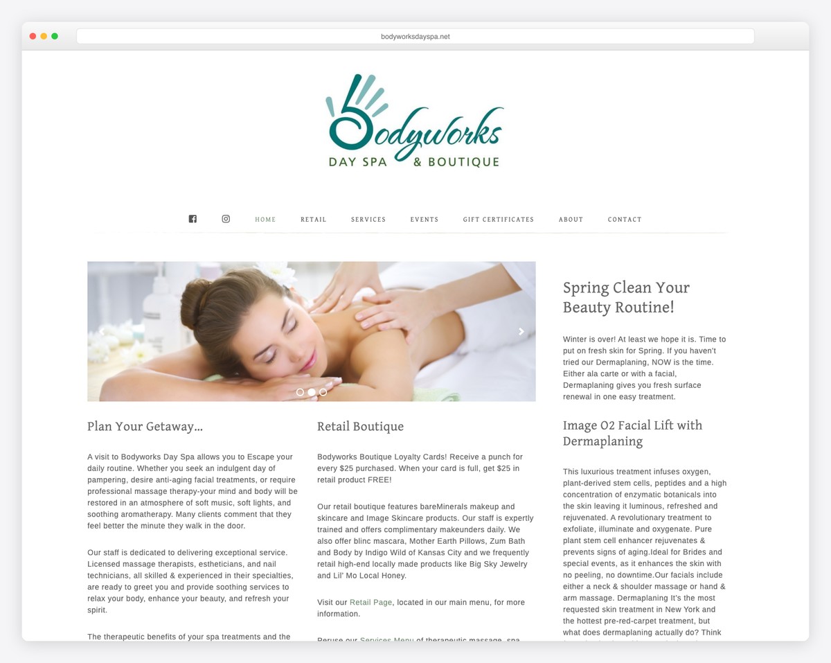
Full-service day spa and boutique offering therapeutic massage, spa body treatments, facials, nail services, and retail products including bareMinerals and Image Skincare..
Classic WordPress design using the Genesis framework with WooCommerce retail integration, a loyalty punch card program, military discount promotion, and a warm community-focused aesthetic.
That wraps up our collection of 29 inspiring website examples. Whether you’re just starting out or looking to redesign, these sites show what’s possible with today’s website builders.
For more design inspiration, browse our curated collections of clean website designs and best website examples.
What stands out: A strong visual gallery lets the work speak for itself — the most effective selling tool.
Wrapping Up
That wraps up our collection of 29 inspiring website examples. Whether you’re just starting out or looking to redesign, these sites show what’s possible with today’s website builders.
Most of the websites above were built with platforms like Squarespace, Shopify, and Wix — no coding required. Pick the one that fits your needs and start building today.
For more design inspiration, browse our curated collections of best website examples and simple website designs.
Related Posts


Comments (0)