20 Best Student Portfolio Examples 2026
Your portfolio is your most powerful asset as a student — it shows employers and grad schools what you can actually do, not just what your transcript says. A strong online portfolio can land internships, freelance gigs, and full-time offers before you graduate.
We’ve collected 20 student portfolio websites across design, development, writing, and creative fields. Each one demonstrates a different approach to presenting work — from minimalist single-pagers to interactive showcases.
Platform breakdown: Squarespace (9), Wix (2), Shopify (1).
What should yours include? A strong hero with your name and focus, 3-5 of your best projects with context, and a clear way to get in touch. Check out these developer portfolios and art portfolio websites for more ideas.
Best Student Portfolio Website Examples
1. Kayla Padilla
Built with: Squarespace
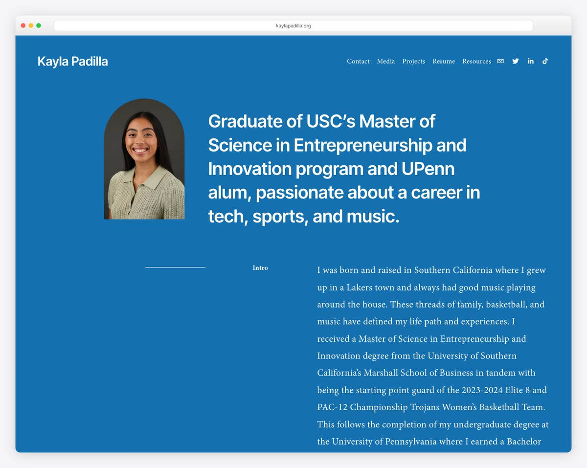
Former college basketball player showcasing finance, tech, sports, and music projects alongside academic journey.
Clean minimalist design with generous whitespace, professional headshots, inspirational quotes.
What stands out: Hands-on, project-based learning creates memorable experiences that keep students coming back.
2. Kabel Mishka Ligot
Built with: Squarespace
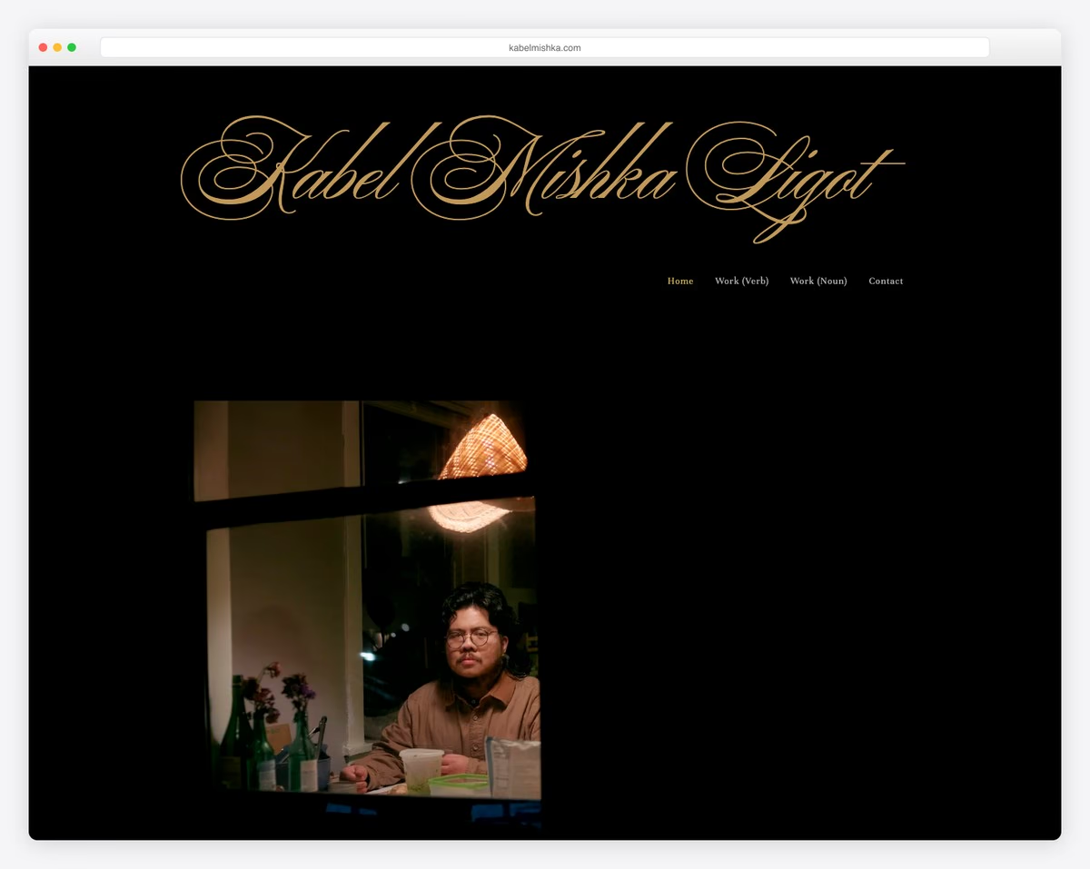
Student writer with work forthcoming in The Iowa Review and Shenandoah showcasing poetry and literary accomplishments.
Minimal text-focused aesthetic with transparent header that disappears on scroll, sections labeled “Work (Verb)” and “Work (Noun)”.
What stands out: Strong community messaging creates trust and a sense of belonging for prospective families.
3. Devansh Gandhi
Built with: Squarespace
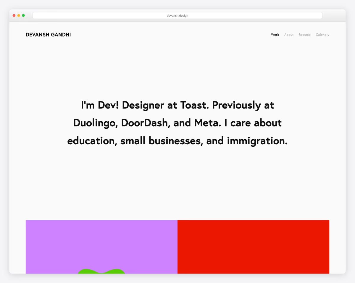
Interaction design student showcasing product design projects and internship work at Duolingo and DoorDash.
Solid-color hero with clean two-page layout and project case studies.
What stands out: Hands-on, project-based learning creates memorable experiences that keep students coming back.
4. Mingxi (Sissi) Wu
Built with: Squarespace
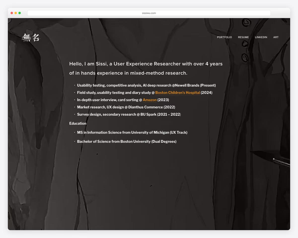
Information Science student on UX track showcasing UX research projects and branding from Amazon and Boston Children’s Hospital internships.
Minimalist white layout with strong content hierarchy and scrollable sections emphasizing readability.
What stands out: Hands-on, project-based learning creates memorable experiences that keep students coming back.
5. Cristina Clerici
Built with: Squarespace
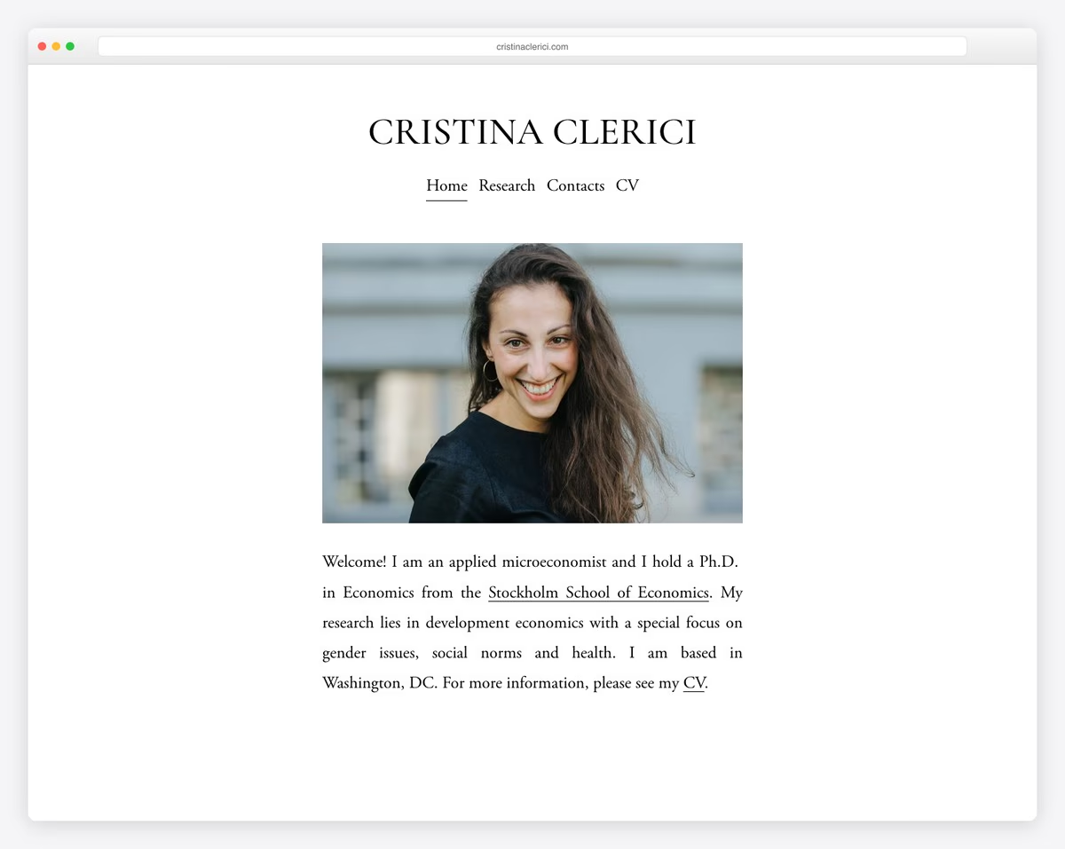
Economics PhD student presenting research papers on development economics, gender issues, and health.
Ultra-minimal three-page site with professional headshot, clean navigation, no footer, letting academic work speak.
What stands out: The clean, minimalist layout lets the work speak for itself — no distractions, just great design.
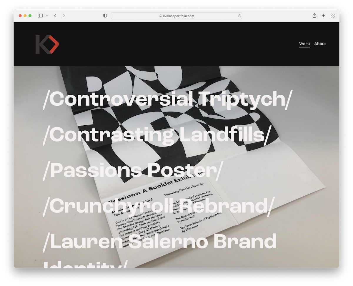
6. Kayla Valane
Built with: Squarespace
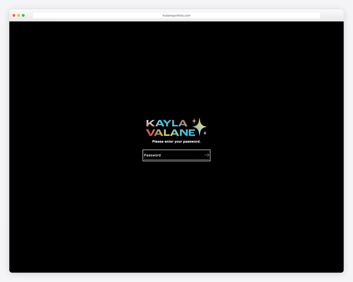
Graphic design student showcasing commissioned design work and creative projects.
Portfolio template with grid-based project display and professional typographic hierarchy.
What stands out: Showcasing student work and outcomes is the most powerful proof of educational quality.
Looking for more website inspiration? Check out our collections of small business websites, service websites, and clean website designs.
7. Kantwon Rogers
Built with: Squarespace
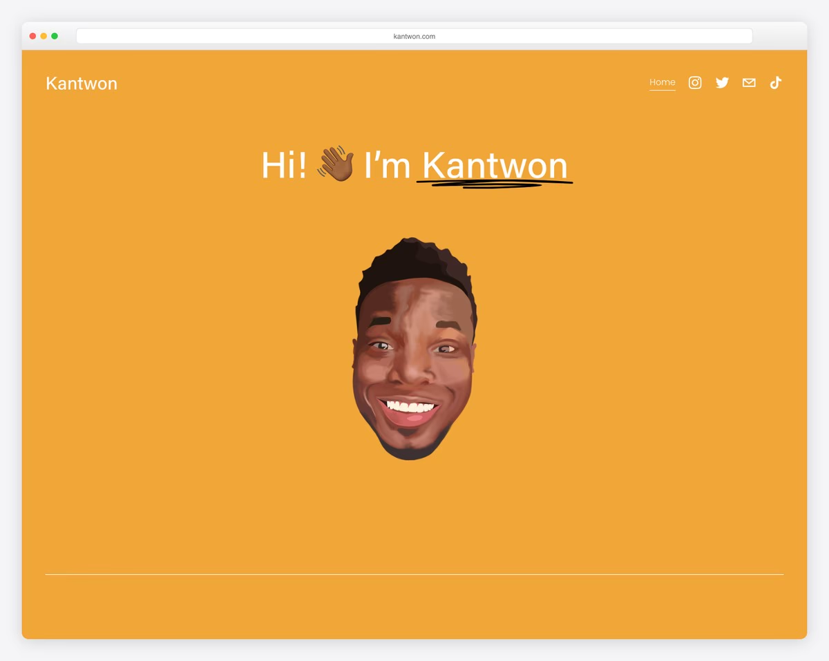
Computer science doctoral student showcasing academic research, internships, and technical work.
One-page layout with emoji accents adding personality to clean professional structure.
What stands out: The clean, minimalist layout lets the work speak for itself — no distractions, just great design.
8. Jon Rodz
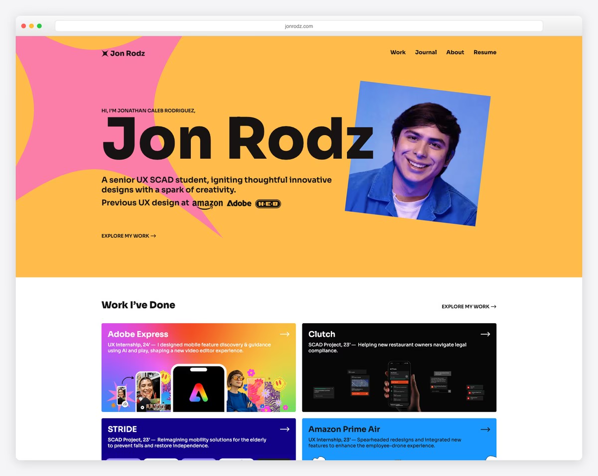
Senior UX/product design student with Amazon and Adobe internships, Red Dot and Core77 award wins.
Story-driven layout with visual case studies, testimonials, award badges, and personal design journey narrative.
What stands out: Detailed case studies and success stories build credibility by showing real results, not just promises.
9. Colin Moy
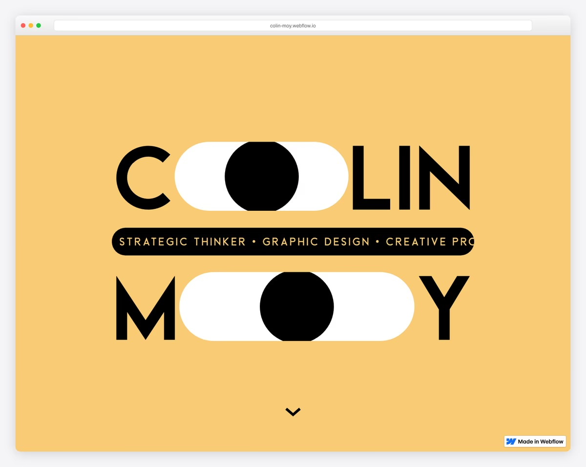
Graphic designer with 7+ years publicity and marketing experience showcasing art direction and strategic visual communication.
Eye-catching animations turning name letters into interactive eyes, large typography, minimal navigation.
What stands out: Hands-on, project-based learning creates memorable experiences that keep students coming back.
10. Cydney Vicentina
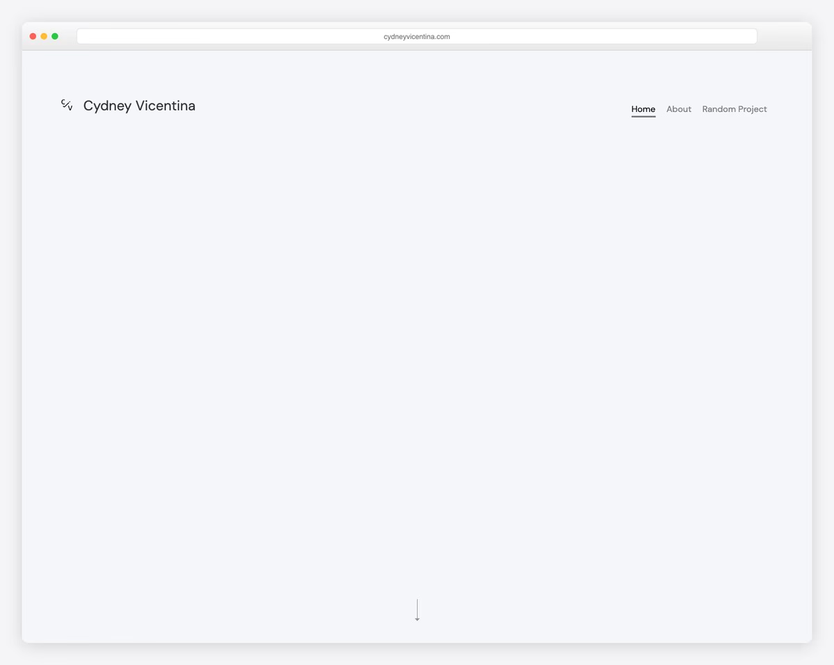
Product designer specializing in healthcare, sleep technology, and financial services with gaming and fine art passion projects.
Large typography with full-width sections, typed text animation, project cards with dual imagery.
What stands out: Hands-on, project-based learning creates memorable experiences that keep students coming back.
11. Isabel Ngan
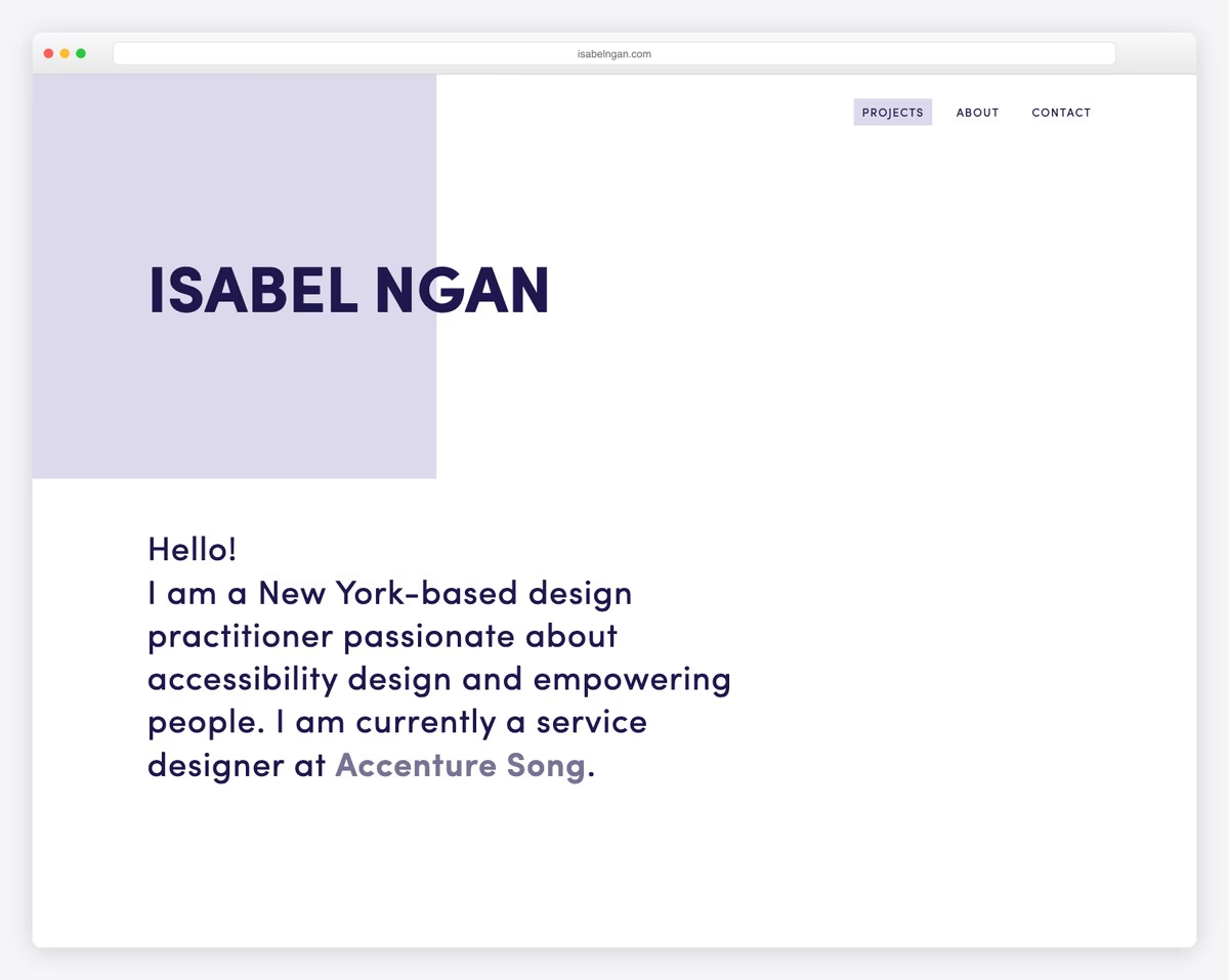
Service designer at Accenture Song with UX/UI projects including NASA deep-space communication and Home Depot kitchen measurements.
Responsive design with content loading animations, professional navigation, project-focused layout.
What stands out: Hands-on, project-based learning creates memorable experiences that keep students coming back.
12. Tim DP
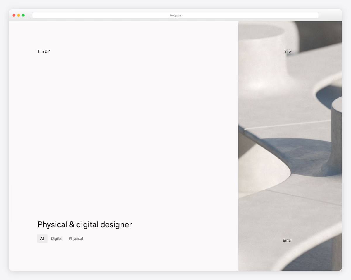
Industrial designer showcasing physical and digital projects including furniture, electronics, and web design.
Filterable project grid (All/Digital/Physical toggle), smooth scrolling, responsive layout emphasizing sustainable design.
What stands out: Hands-on, project-based learning creates memorable experiences that keep students coming back.
13. Ashley Cortez
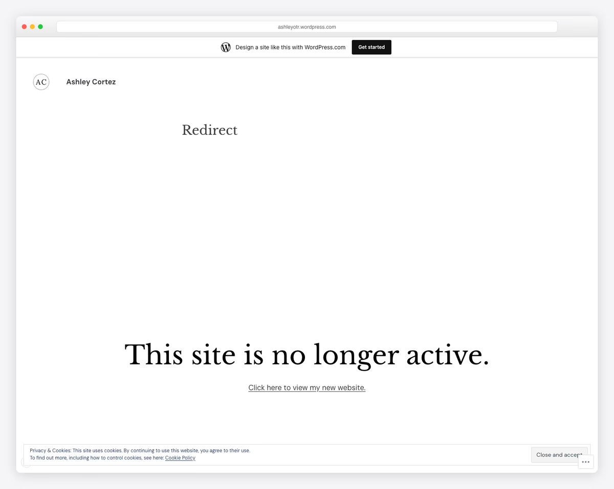
Journalism student showcasing content writing, editing samples, and campus journalism work.
Minimalist WordPress.com theme with Libre Baskerville headings and DM Sans body text.
What stands out: Showcasing the learning environment helps parents and students feel confident about the experience before visiting.
14. Cassie Myers
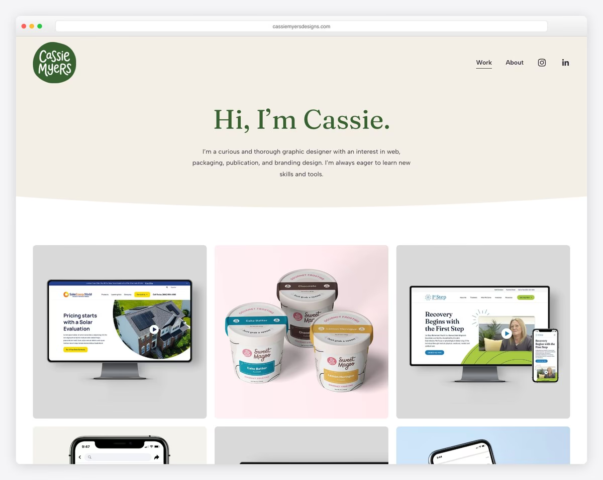
Graphic design graduate presenting web design, packaging, video, and publication projects for real clients.
Clean portfolio with grid project cards, professional work samples, “curious and thorough” designer tagline.
What stands out: Showcasing student work and outcomes is the most powerful proof of educational quality.
15. Jillian Hess
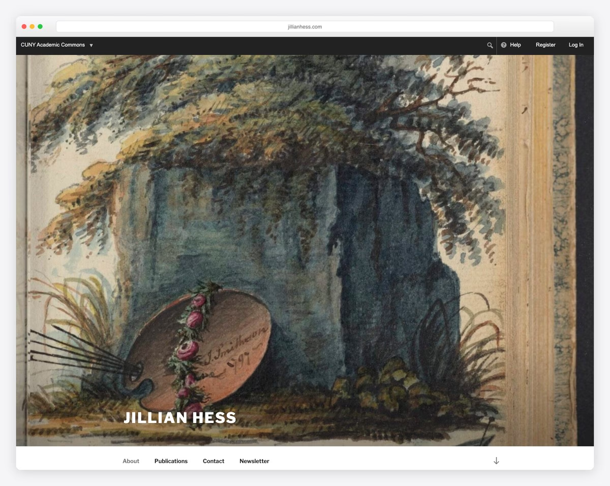
Literature and visual arts PhD student with academic writing, creative work, and teaching portfolio.
Artistic design on CUNY Academic Commons with watercolor hero image and scholarly aesthetic.
What stands out: Showcasing student work and outcomes is the most powerful proof of educational quality.
16. Vivek Patel
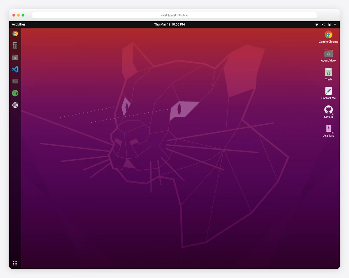
CS student who built portfolio as interactive Ubuntu desktop simulator showcasing projects through gamified OS interface.
What stands out: Showcasing student work and outcomes is the most powerful proof of educational quality.
17. Befikir Shimelis
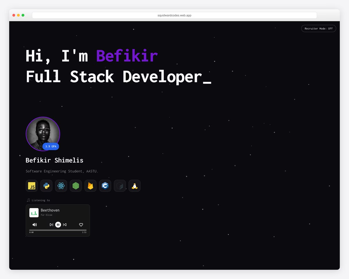
Software engineering student with 3.9 GPA showcasing full-stack projects including community library and campus social platform.
Terminal-inspired dark theme with command-line aesthetic, canvas 3D particle animations, simulated terminal with React and Firebase.
What stands out: Showcasing the learning environment helps parents and students feel confident about the experience before visiting.
18. Anav Chand
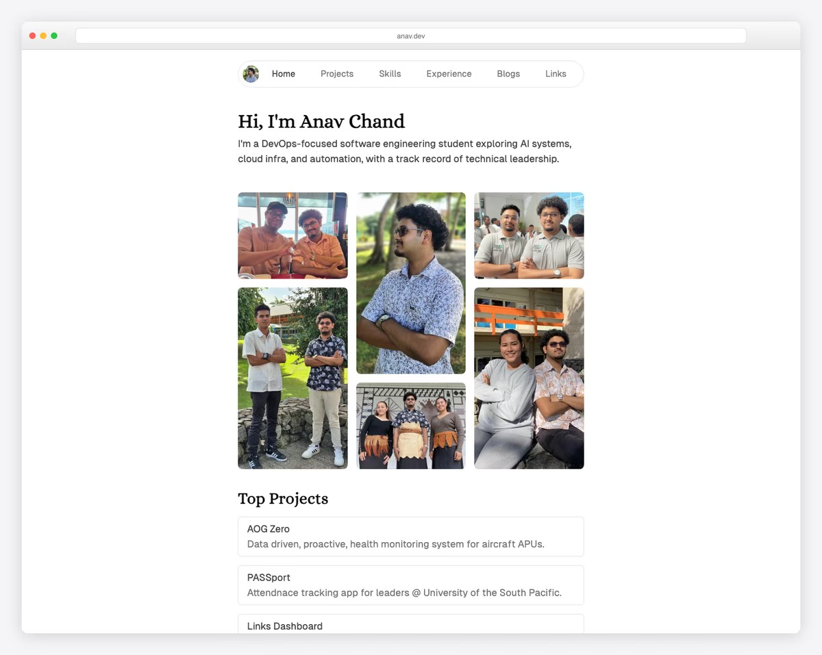
DevOps-focused student with projects in aircraft health monitoring, attendance tracking, and URL management plus tech blog.
What stands out: Hands-on, project-based learning creates memorable experiences that keep students coming back.
19. Asmaa Abdul-Amin
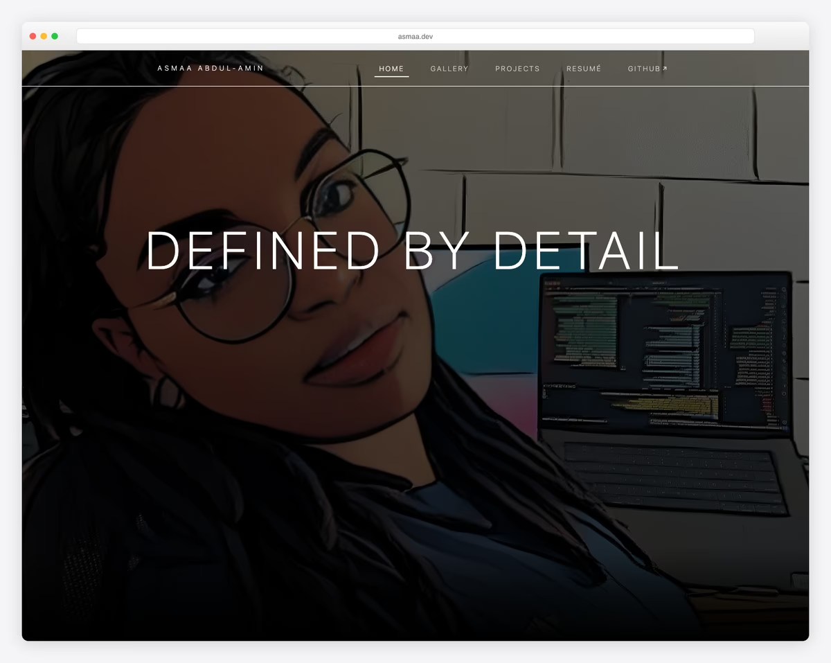
Data science student (graduating 2026) with NASA site redesigns and COVID-19 policy analysis projects.
Dark-themed with purple accents, sticky navigation, animated scroll reveals, modal lightbox galleries with Bootstrap.
What stands out: Hands-on, project-based learning creates memorable experiences that keep students coming back.
20. Aarav Gupta
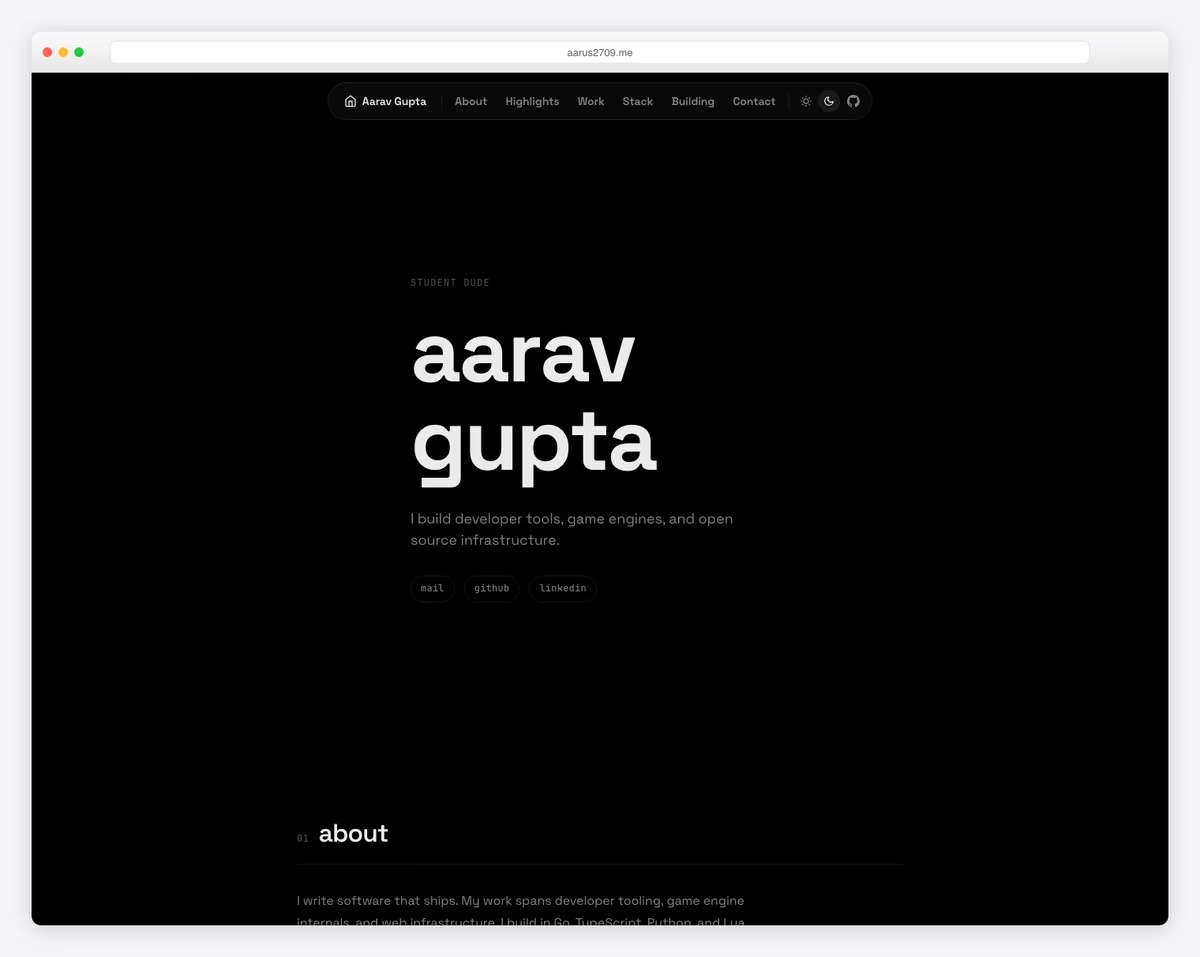
Student developer with developer tools, game engines, and infrastructure projects with 50K+ downloads and hackathon placements.
That wraps up our collection of 22 inspiring website examples. Whether you’re just starting out or looking to redesign, these sites show what’s possible with today’s website builders.
For more design inspiration, browse our curated collections of best website examples and best website examples.
What stands out: Hands-on, project-based learning creates memorable experiences that keep students coming back.
Wrapping Up
That wraps up our collection of 20 inspiring website examples. Whether you’re just starting out or looking to redesign, these sites show what’s possible with today’s website builders.
Most of the websites above were built with platforms like Squarespace, Shopify, and Wix — no coding required. Pick the one that fits your needs and start building today.
For more design inspiration, browse our curated collections of best website examples and simple website designs.
Related Posts


Comments (0)