20 Best Art Portfolio Websites (Examples) 2026
These stunning art portfolio websites will inspire you and give you ideas for building a great one yourself.
You’ll discover the best ways to present your works and projects, how to create a top-notch about page and the ideal approach to showcasing your services.
Every website has unique elements and details, some with a more minimalist approach and others more creative.
The versatility of this collection gives everyone something to indulge in regardless of what you dig more.
Best Art Portfolio Websites To Inspire You
1. Alex Fisher
Built with: Webflow
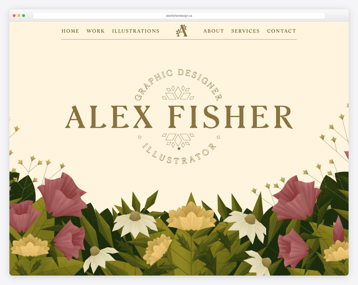
Alex Fisher’s Webflow site hits you with the artistic feel immediately. (You may also want to check these ultimate artist portfolio websites.)
The home page has a single-page website style with scrolling animations and a contact form at the bottom.
However, the menu links direct you to other internal pages to find works, details about services, and more. The header floats, so you always have navigation at your fingertips.
What stands out: Use a contact form on the home page so everyone interested can instantly get in touch.
2. Ray Hart
Built with: Webflow
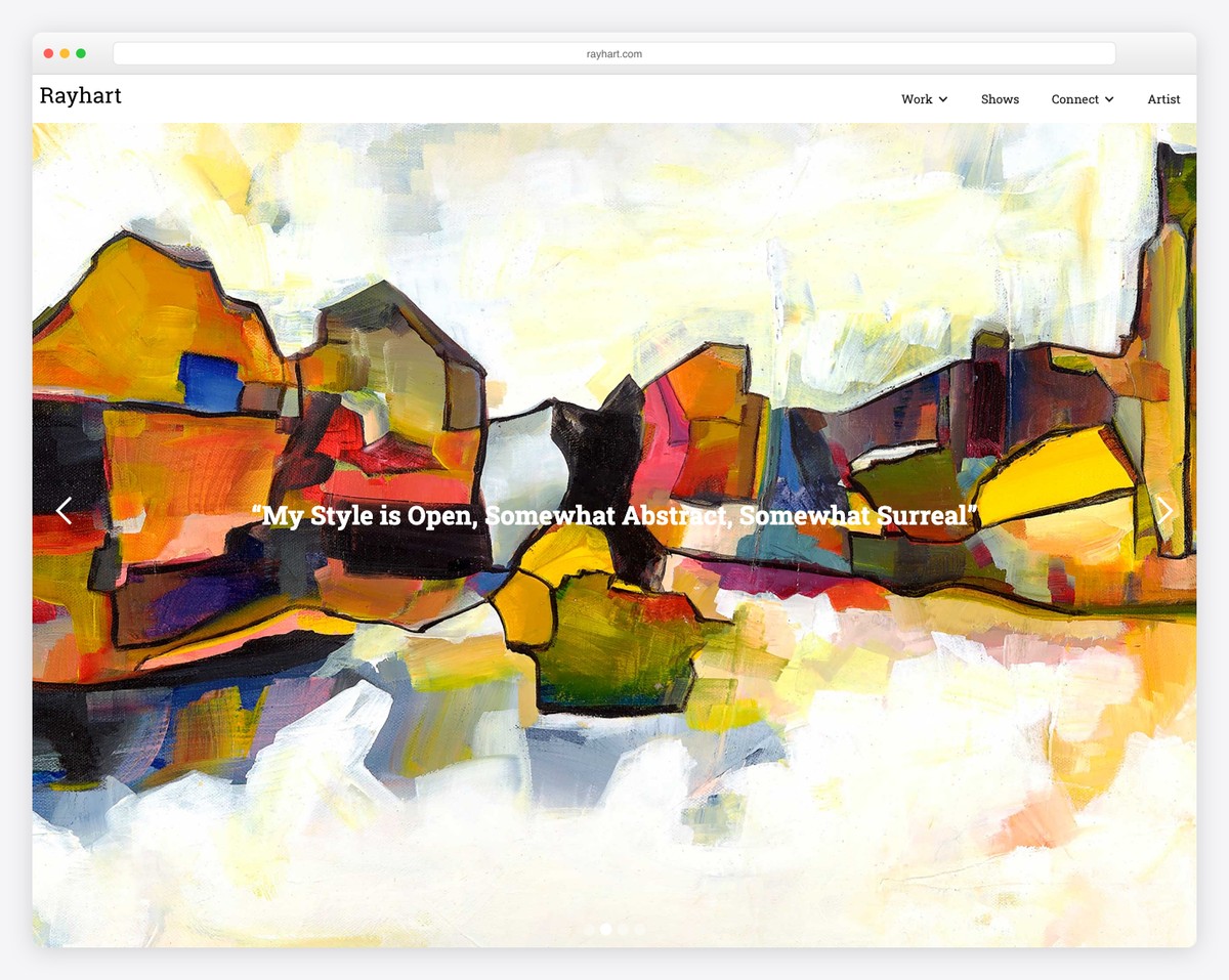
Ray Hart’s art portfolio features a full-screen slideshow on the home page, which allows visitors to experience his works firsthand. Each slider also has additional information to provide further insights.
Moreover, the header floats on top of the screen, and a drop-down menu lets you find the right information much more quickly.
What stands out: Use a large slider with simple text so that everyone can enjoy the images more.
3. Lisa Maltby
Built with: Squarespace
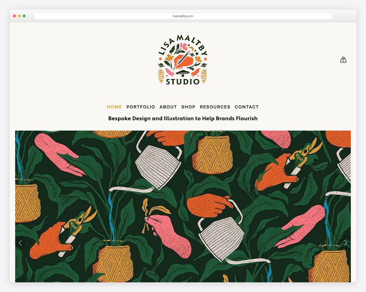
Lisa Maltby knows how to mix simplicity with creativity to ensure more engagement that contributes to better UX.
The header has the same background color as the website’s base, making it look more flawless.
Moreover, the home page portfolio grid has a mixture of animated and static elements to ensure the focus is on the content and not elsewhere.
What stands out: Create a home page portfolio and let your work do the talking.
Don’t miss our best Squarespace website examples for more creative ideas.
4. Gina Kirlew
Built with: Squarespace
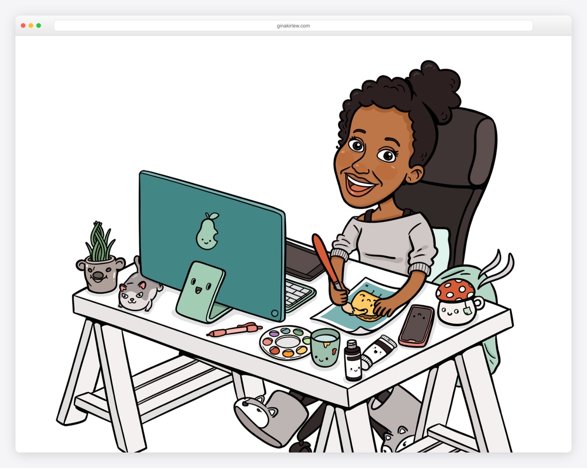
While Gina Kirlew’s is very minimalist, the illustrations make it bubbly and joyful. The home page doesn’t contain much, featuring a clean header and footer, a graphic of herself and a short introduction/bio.
All the other internal pages maintain a simple layout, making artwork and all the other information pop more.
What stands out: Create a distraction-free art portfolio website, so everyone can focus on what’s important: your work!
5. Adam Halls
Built with: Pixpa
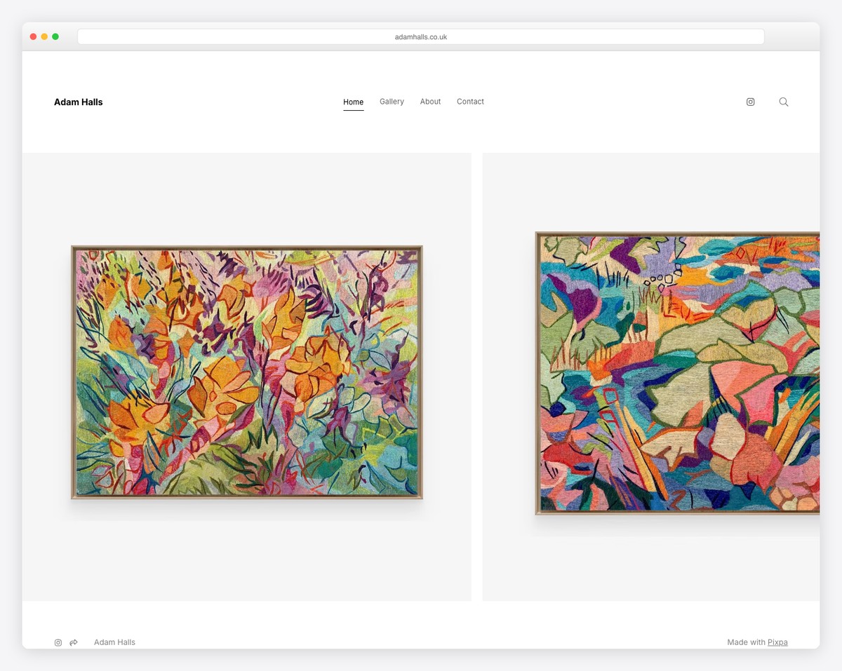
Adam Halls’ page interestingly starts with a lot of white space, a title and text before you get hit with a beautiful grid of various projects. The portfolio features a lightbox, so the visitors don’t have to leave the current page to view the content.
Moreover, the floating header ensures visiting other pages without the need to scroll back to the top.
What stands out: A floating header/menu can increase your page’s user experience.
6. Darren Cranmer
Built with: Pixpa
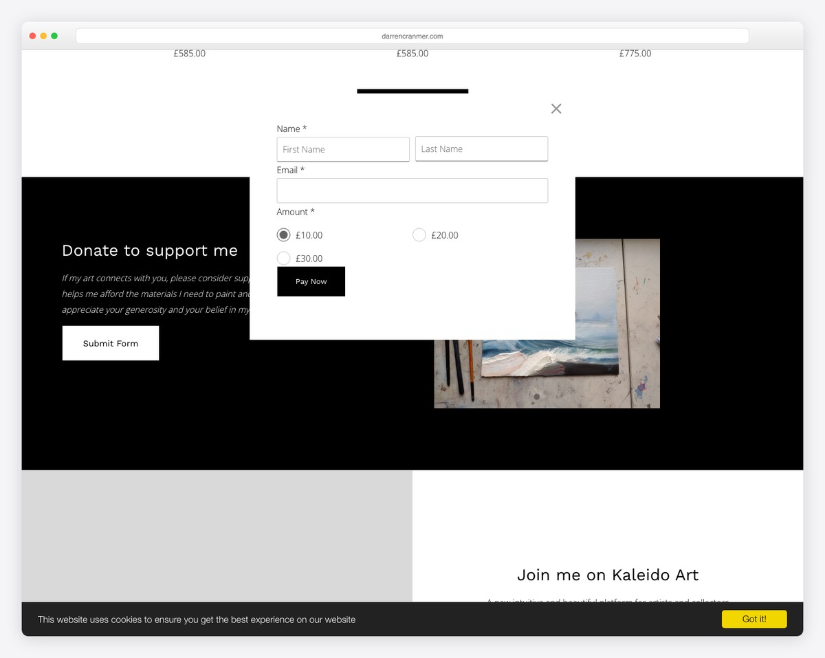
Darren Cranmer runs a fluff-free art portfolio website with a clean header with menu links and social media icons. The portfolio has plenty of spacing between elements, making concentrating on each segment much easier.
Meanwhile, the footer sticks to cleanness with the same background as the base and the header.
What stands out: It is much easier to achieve a more minimalist look with the same background, including the header and footer.
7. Susann Hoffmann
Built with: Adobe Portfolio
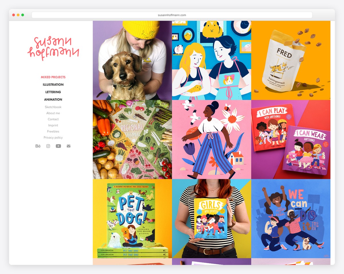
What differentiates Susann Hoffmann’s website from the rest is the left sidebar header/menu. And on the right is a large portfolio grid with a hover effect that reveals the project name. Each portfolio item is clickable, revealing more details about the project.
Moreover, the footer has only social media buttons and a back-to-top button to avoid scrolling.
What stands out: Another UX booster is the back-to-top button.
8. Essi Kimpimaki
Built with: Cargo
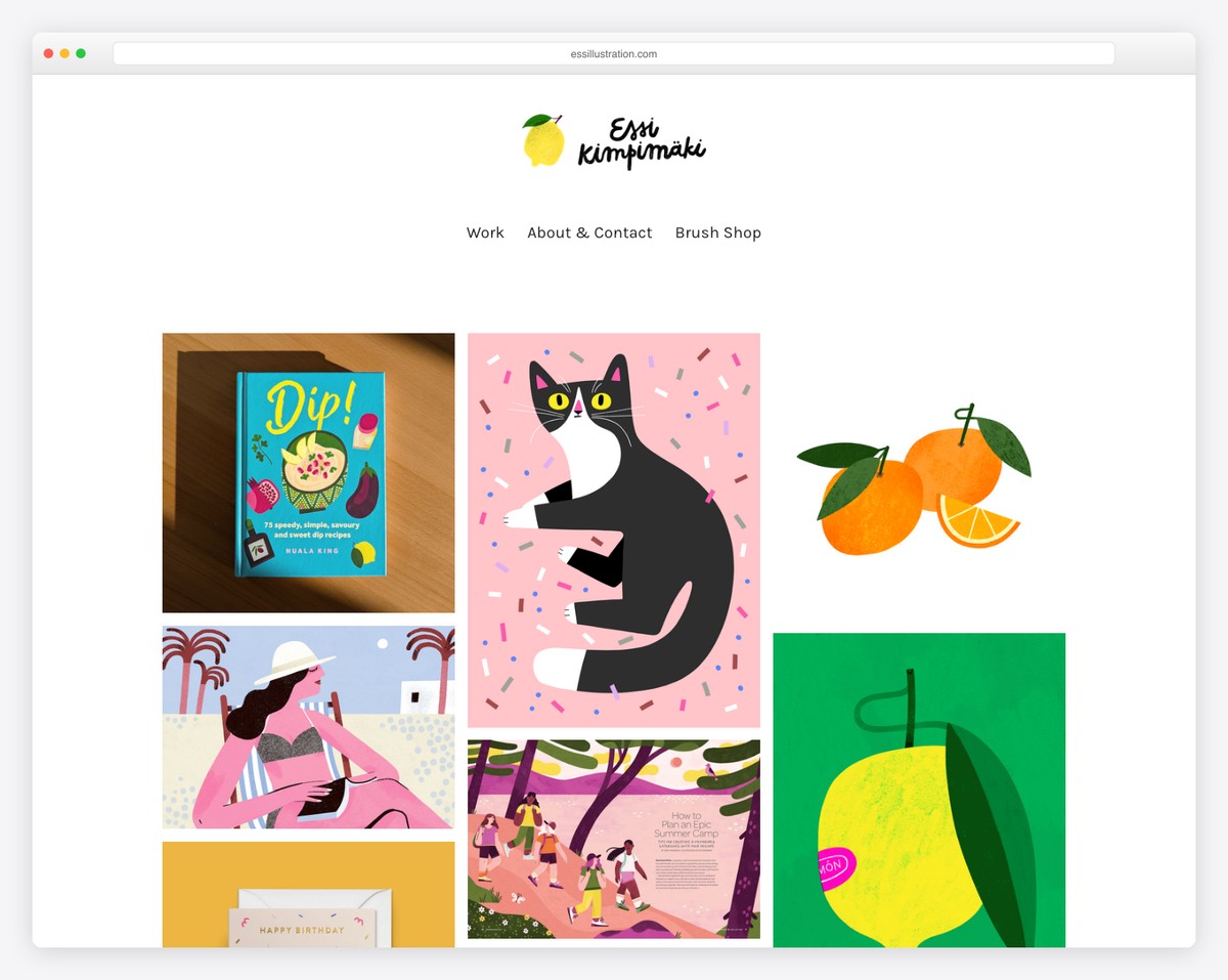
Essi Kimpimaki’s minimalist factor is very high, ensuring all those cool artworks receive the necessary shine.
The header and the footer stick to simplicity, and the choice of larger typography ensures more enjoyable reading.
What stands out: When in doubt about how to approach web design, follow one simple rule: keep it simple.
9. Nona Inescu
Built with: Invisible Folio
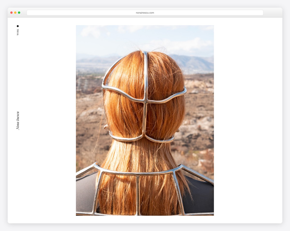
Nona Inescu has a full-screen look with a minimalist slider that features large images. You can navigate the slideshow with the keyboard, by clicking the arrows or swiping.
What’s unique about this art portfolio website is the navigation through works that reveals a thumbnail on hover because the titles might not reveal too much. Also, this page doesn’t have a footer, but even the header is very lightweight.
What stands out: You don’t need to use a footer if you don’t feel like adding it.
10. Artbox
Built with: Craft CMS
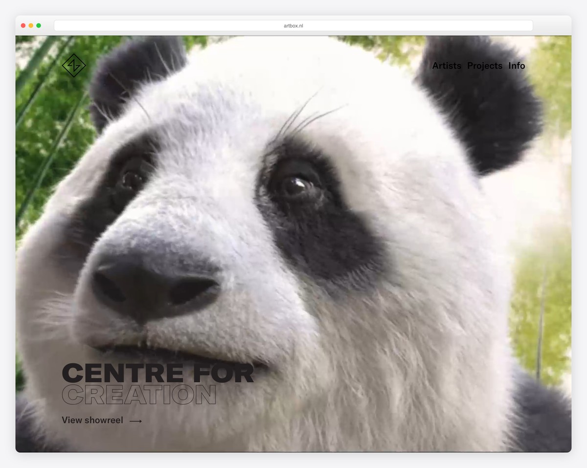
Artbox has an excellent full-screen video background that’ll capture your attention immediately. They moved the text and link to the bottom left corner while keeping the navbar as simple as possible so that the visitor can focus on the video/showreel without distraction.
The rest of this portfolio website sticks to minimalism with on-scroll content loading that works really well for the very long home page.
What stands out: Use a full-screen video above-the-fold to spark interest right away.
11. Musée Art & Histoire
Built with: Drupal
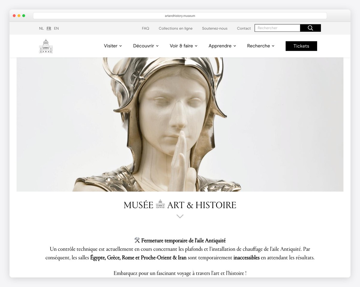
Musée Art & Histoire features a two-part header section; a top bar with a language switcher, links and a search bar, and a header with a drop-down menu and a call-to-action button to sell tickets.
The home page includes social media icons, a newsletter subscription form, a simple footer, and other useful links.
What stands out: If you feel the header lacks space for your categories and links, use a top bar.
12. Artstar
Built with: Shopify
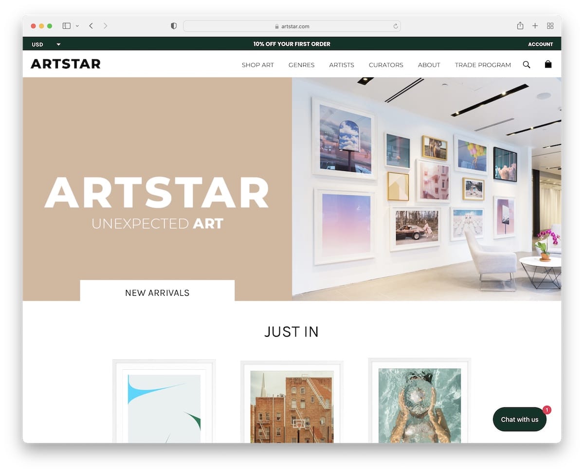
Artstar has a catchy split-screen hero image, with an animated left and static right part to spice things up.
The top bar notification also has a currency switcher and a link to the account page. Moreover, Artstar has a sales notification, a minimalist mega menu and a live chat widget.
A large section also displays client reviews and ratings, which build trust.
Furthermore, the four-column footer has multiple additional links, social media buttons and a newsletter subscription form.
What stands out: Use testimonials and reviews on your art portfolio website for social proof.
13. Citizen Atelier
Built with: Shopify
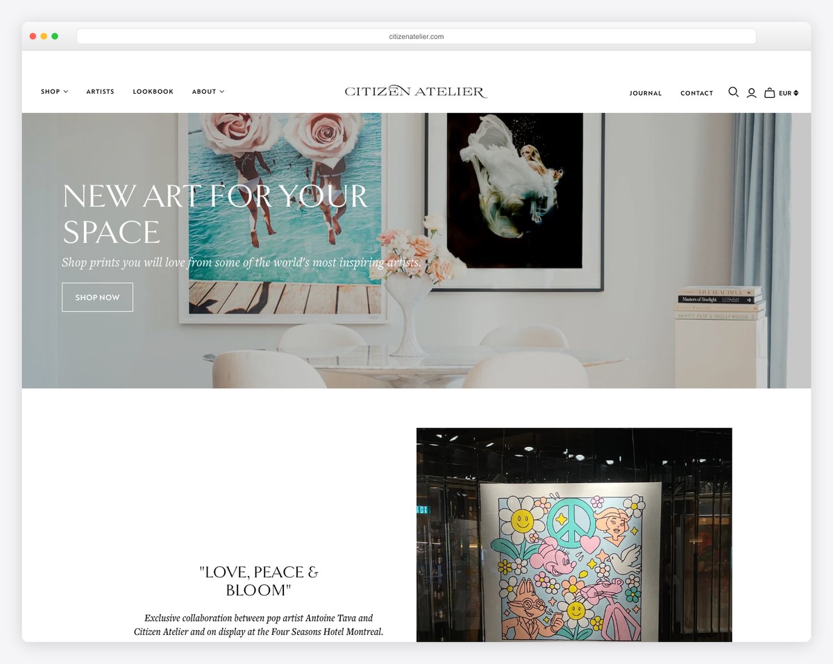
Citizen Atelier has a narrower banner with text above the fold and a CTA button that takes you directly to the online shop.
Moreover, this website uses a popup window that promotes a discount in exchange for an email. Citizen Atelier has a floating header with a mega menu and a clickable top bar notification with a black background to make it stand out more.
Additionally, Citizen Atelier integrated a full-width Instagram feed and created an entire section for “recent features” with links to published content.
What stands out: Do you want to add more content to your website? Add an IG feed.
14. Benjamin Hardman
Built with: Squarespace
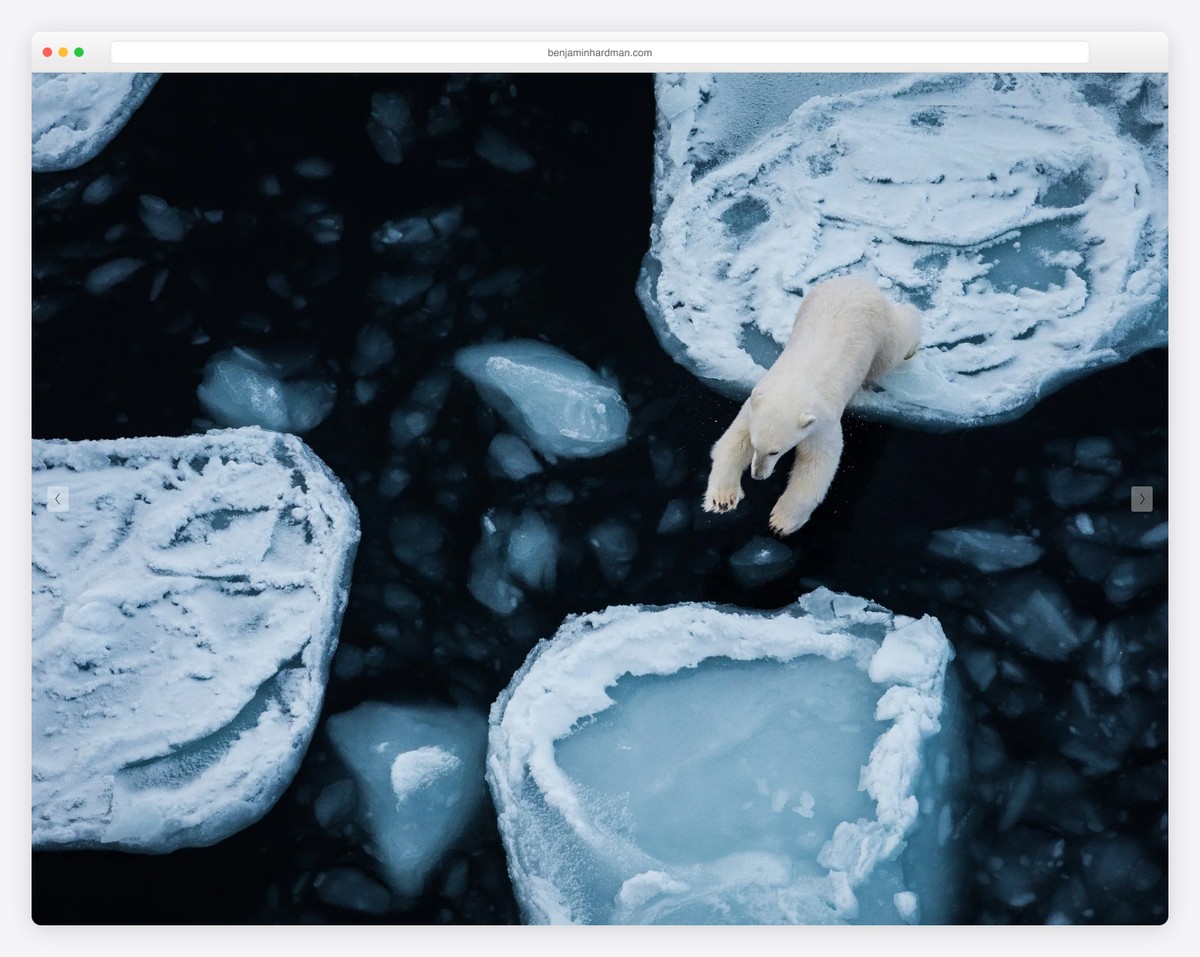
Benjamin Hardman wants you to enjoy his art portfolio website’s large slideshow without text or CTAs that might distract you.
Even the header is extremely minimalist! And this website doesn’t have a footer to keep the simplicity at an all-time high.
What stands out: Let your work do the talking by integrating a beautiful slider (without texts, links or CTAs).
You can easily create a simple website using Squarespace portfolio templates.
15. Shantell Martin
Built with: Django
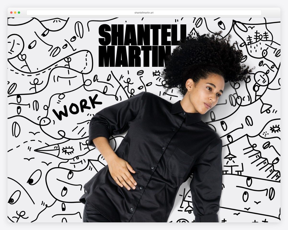
Shantell Martin’s hero section will immediately grab your attention, especially because of the cool hover effect that turns the background graphic into an animation. So. Cool.
What’s unique about this art portfolio website is that a hamburger menu only appears when you hover over the name. Still, there’s another navigation bar with social media links in the footer.
We also really like the one-of-a-kind work/portfolio page that makes viewing projects an enjoyable experience.
What stands out: Combine the hover effect with animation to make your page more engaging.
16. Jessica Chou
Built with: Squarespace
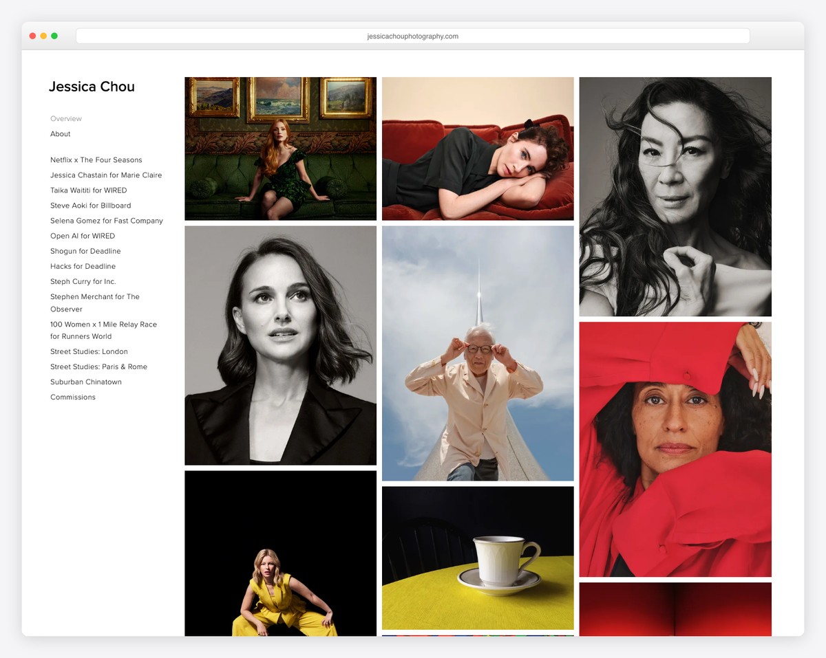
We could scroll through Jessica Chou’s art portfolio website forever because of how pleasurable the experience is.
Even though this site is EXTREMELY long, the single-column content loading on the scroll ensures a great atmosphere, emphasizing each image more.
Furthermore, the header is very plain, with three links, and there’s no footer, which makes the website even cleaner.
What stands out: Create a single-column portfolio grid to put more shine on each image.
Looking for more inspiration? Here are the best Squarespace artist websites created by first-time website builder users.
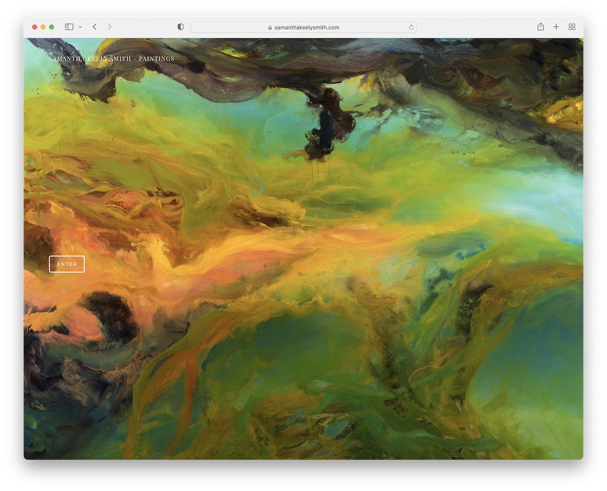
17. Samantha Keely Smith
Built with: Squarespace
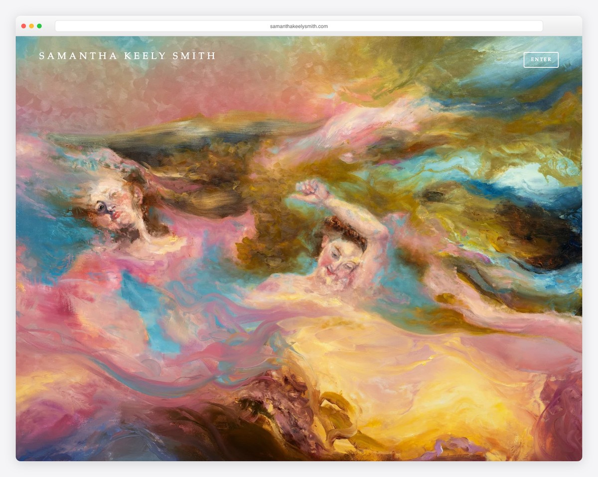
Samantha Keely Smith’s home page is a full-screen image slider with an “enter” button. It’s an art portfolio website with a sticky sidebar header/menu without a footer.
Although the text is small, it works well with the minimalist design and large images.
One handy feature is that you can switch from the slider view to the grid view by pressing the “show thumbnails” button in the bottom left corner.
What stands out: Give the visitor a chance to pick how they want to view your content.
18. Sophie Kahn
Built with: Squarespace
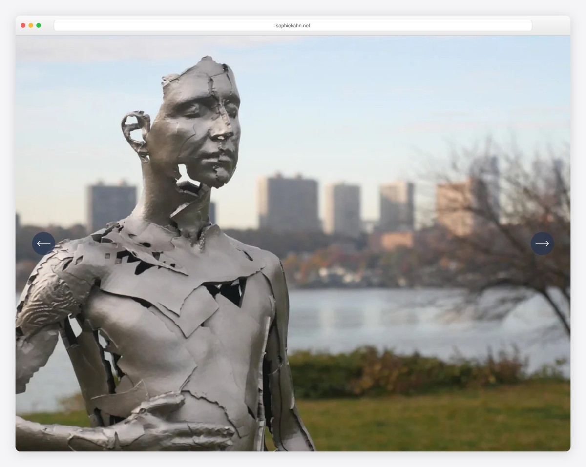
Sophie Kahn lets you enjoy her works right after her website loads with the massive slideshow. The slides don’t have any text or CTA overlays so you can pay more attention to the work itself.
This art portfolio website’s header has a drop-down menu, and you can navigate it using that menu and subscribe to the newsletter in the footer.
The overall look of this responsive web design is plain, meaning the content will pop more.
What stands out: Use a drop-down menu to add more useful internal website links.
19. Tyler Hobbs
Built with: Custom
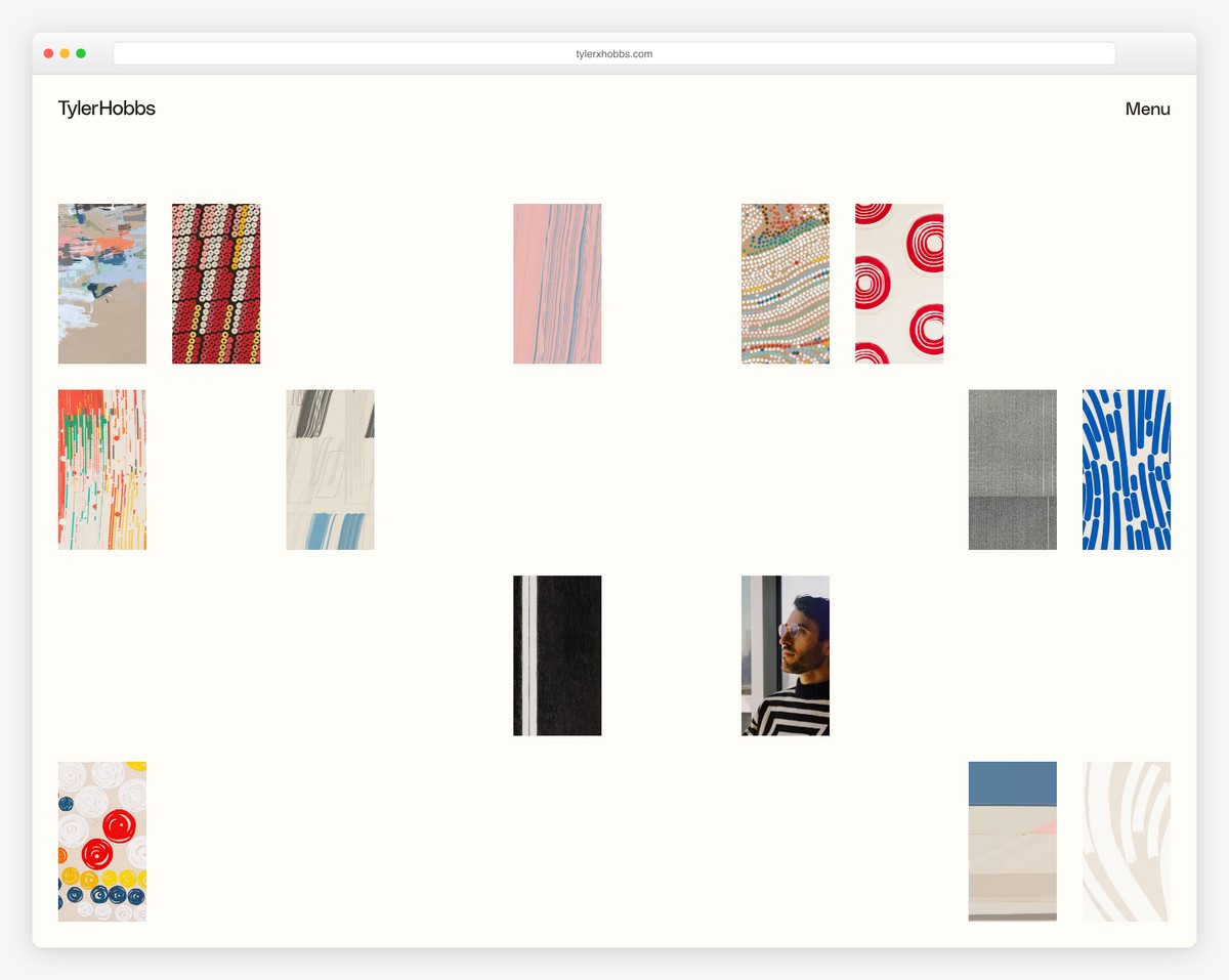
Tyler Hobbs’ generative art portfolio presents his algorithmic artwork in an organic, scattered grid layout against a warm cream background. Known for “Fidenza” — one of the most celebrated generative art collections — his site lets the colorful, abstract compositions create visual rhythm across the page.
The minimal navigation (just his name and a Menu link) puts the artwork front and center. Each piece showcases different techniques — from geometric patterns to fluid brushstrokes — all created through code, blending technology with traditional artistic sensibility.
What stands out: A scattered, asymmetric grid layout mirrors the organic nature of generative art — it feels curated rather than mechanical, which is exactly the right vibe for algorithmic artwork.
20. Saatchi Art
Built with: Custom
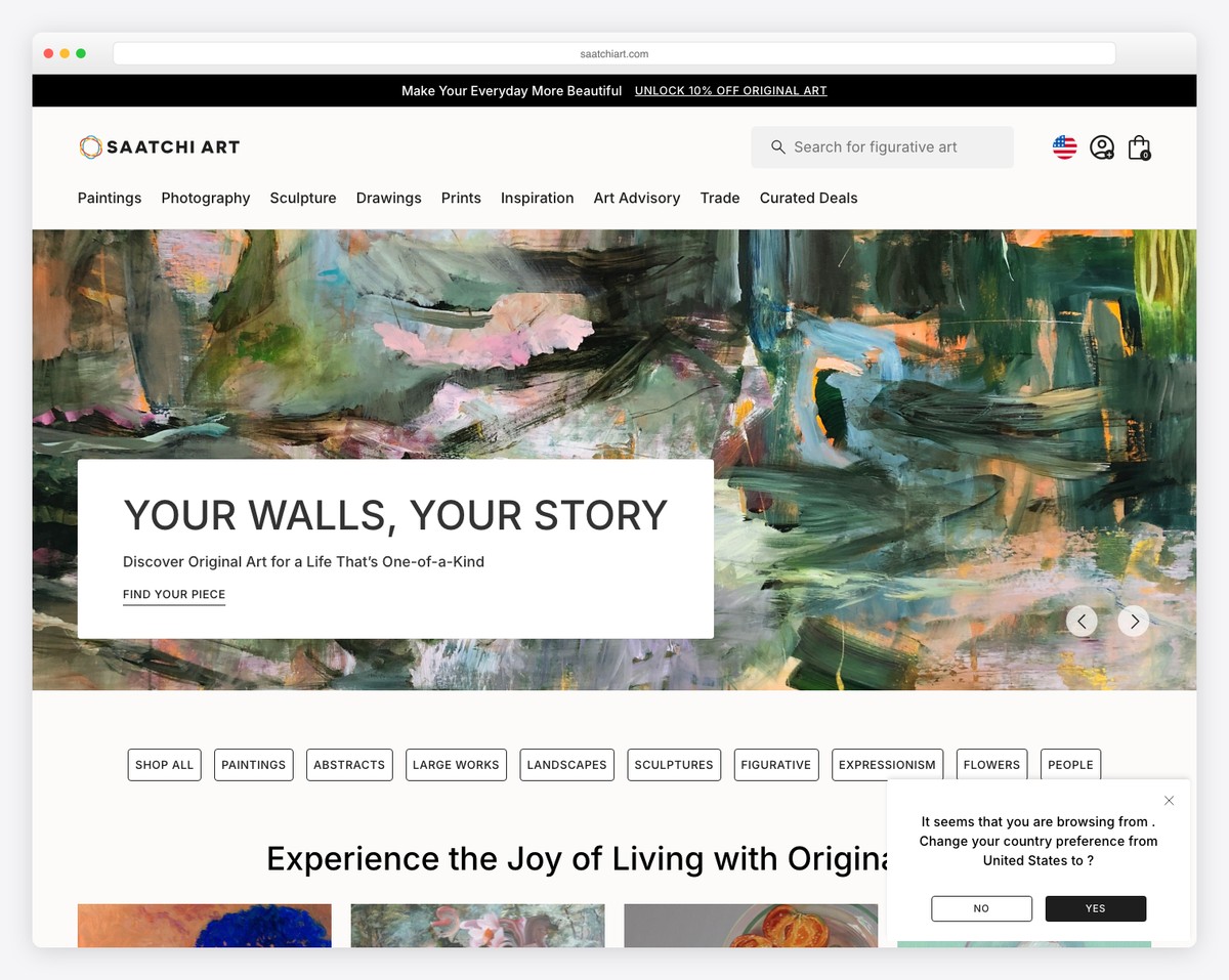
Saatchi Art’s online gallery leads with “Your Walls, Your Story” — a powerful tagline for the world’s largest online art gallery. The hero features a bold abstract painting that immediately communicates the quality and diversity of their collection spanning paintings, photography, drawings, and sculptures.
The navigation caters to every art buyer — from category browsing (Paintings, Photography, Sculpture) to curated experiences (Inspiration, Art Advisory, Curated Deals). Filter tags below the fold (Abstracts, Landscapes, Large Works) make discovery intuitive for both new and experienced collectors.
What stands out: For art marketplace platforms, combining editorial curation with e-commerce filters creates the perfect balance between gallery browsing and transactional shopping.
Related Posts


Comments (0)