18 Best Carrd Websites & Ideas In 2026
Are you looking for inspiration and want to check out the best Carrd websites?
That’s great!
We bring you our top selection after weeks of investigation.
While Carrd is an easy website builder, you can create quite advanced pages with it.
And it takes you little time to make your custom page happen, even if you have zero experience.
You are welcome to utilize the design ideas and creative touches found on the links below for your business site.
Instead of reinventing the wheel (and spending a ton of time and effort on it), improve on what’s already been done!
Best Carrd Websites To Gain New Ideas
1. Newsletter OS
Made with Carrd
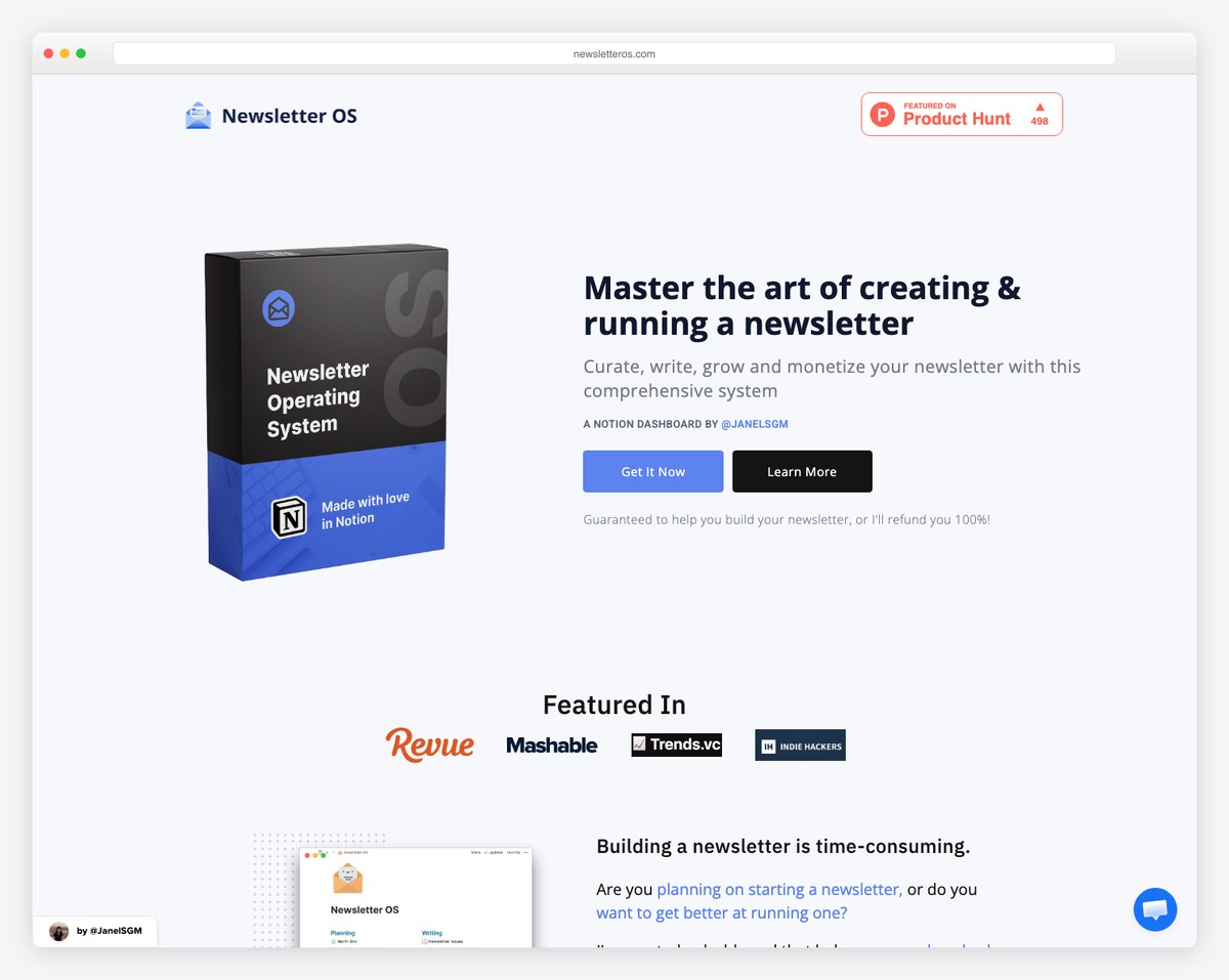
Create a strong landing page to promote your product, app, or software, using Newsletter OS’s awesome website as an example.
Thanks to the call-to-action (CTA) buttons above the fold, users can immediately act without scrolling.
However, this Carrd website also features all the other necessary information split into multiple sections, with a minimalist, distraction-free design.
What stands out: Ensure CTAs are above the fold if you push a product, but also don’t forget to create a solid presentation with pricing and a newsletter subscription form.
2. Transistor
Made with Carrd
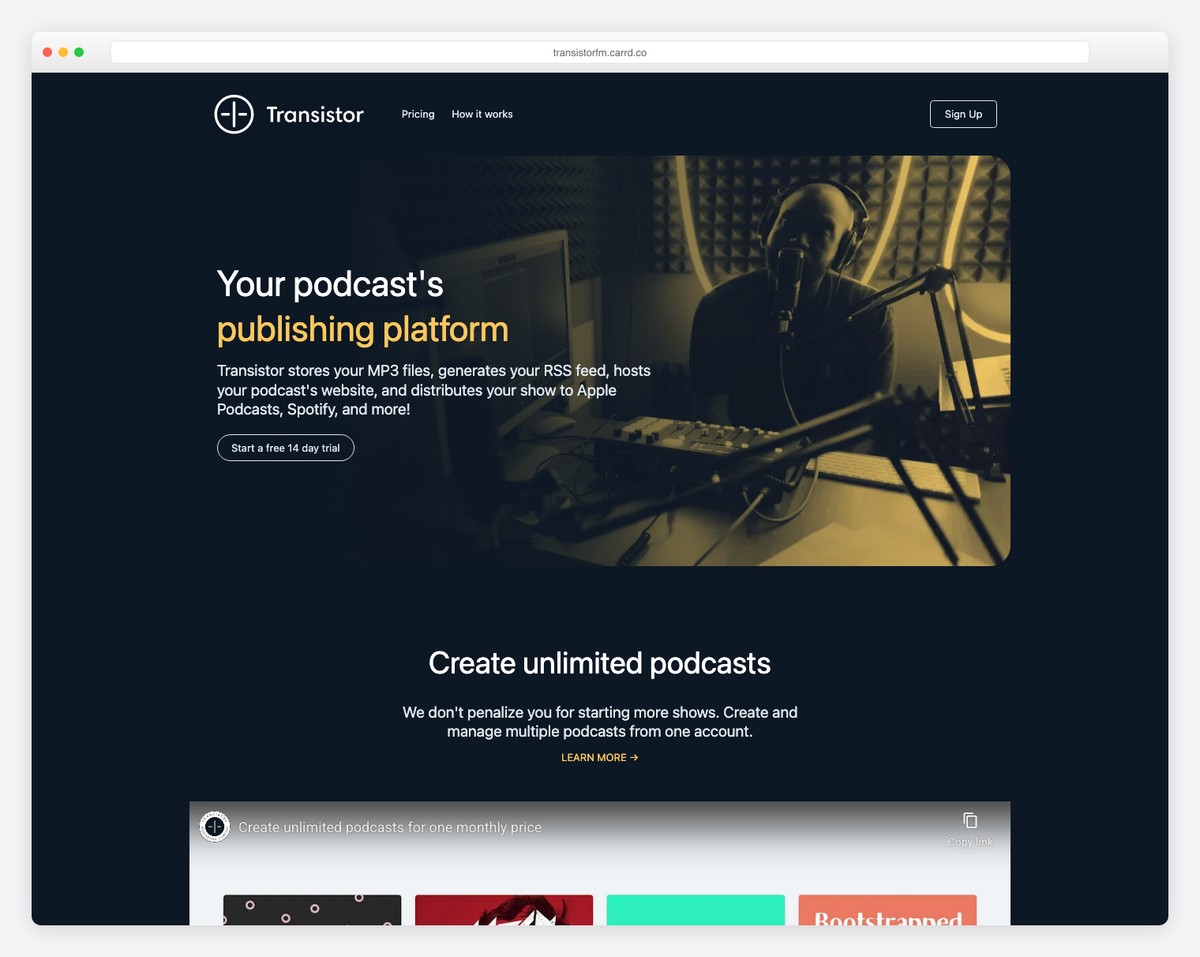
Transistor is an impactful landing page example with a dark design promoting a podcast publishing platform.
The minimalist hero section lets users start a free trial with a click. But they also embedded a promotional video, benefits and some of their customers to get the user excited to start.
What stands out: You can easily stand out with your lander by using dark mode.
3. Abstract
Made with Carrd
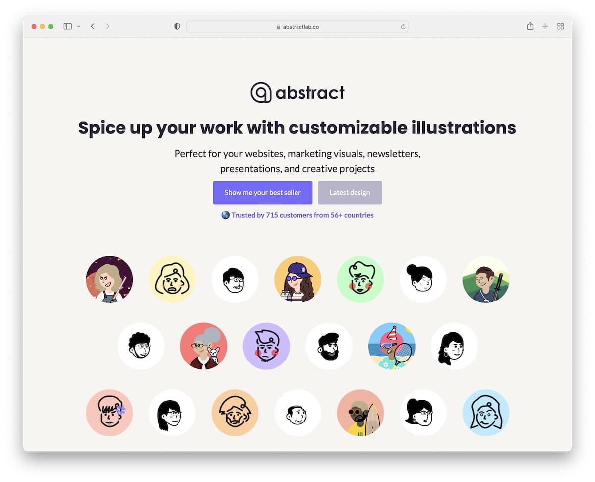
Abstract is an excellent landing page website that promotes custom illustrations very appealingly.
What’s really cool about the site is that it goes straight to the point. You can instantly check best sellers or the latest designs with just a click.
But they also strategically integrated real Twitter testimonials to build trust.
What stands out: If you offer something, do so without wasting visitors’ time!
4. Wild Horizon Design
Made with Carrd
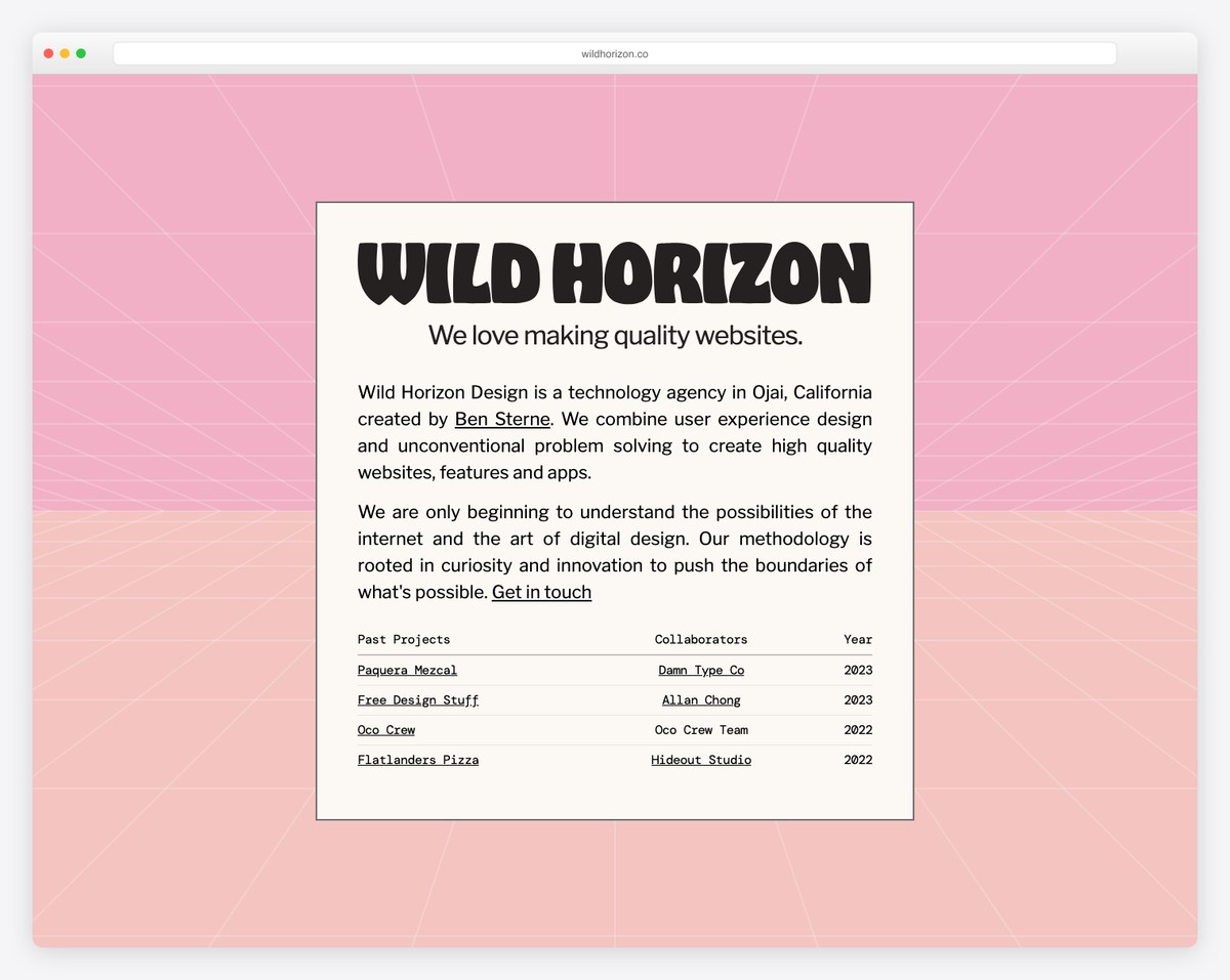
Catchy and creative design with a unique menu use makes Wild Horizon Design a stand-out Carrd website.
The hero section is one to stare at for as long as you don’t see all the graphics, sparking curiosity in everyone.
What stands out: Wild Horizon Design is a fantastic example of how minimalist design combined with fun elements works very well.
5. Zlides
Made with Carrd
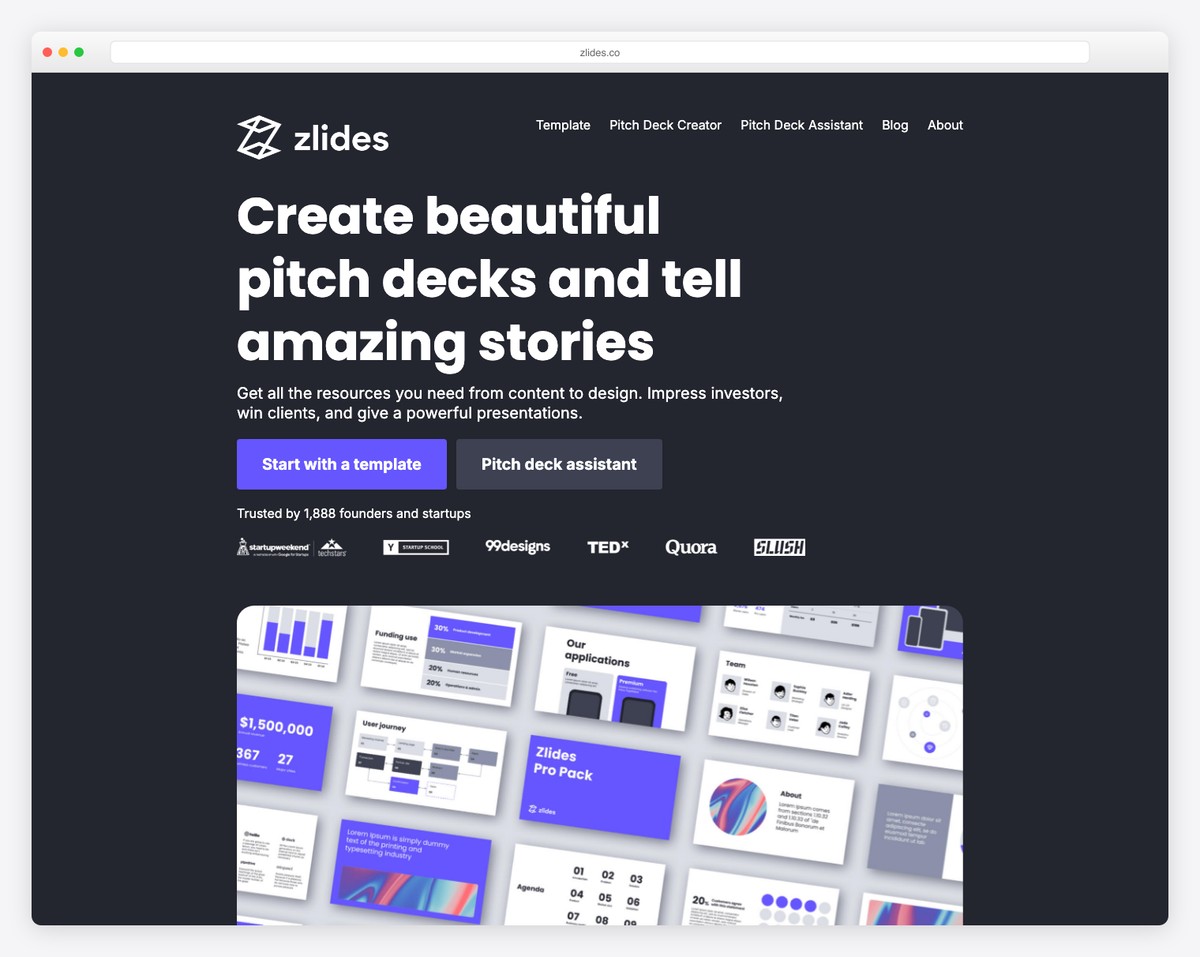
Zlides promotes its presentation kits with an epic landing page built with Carrd. You learn everything you need without even scrolling, and the CTA buttons take you either to the purchase page or to learn more about the kits.
The “Trusted by” section, which includes some big names, also has a high trust factor.
What stands out: If you worked with a large(r) brand, use them as a reference on your website.
6. SaaSHook
Made with Carrd
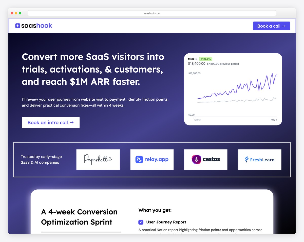
SaaSHook’s mobile-inspired design is very catchy and takes you on a pleasant browsing ride.
The landing page nicely features an email opt-in, examples, and an “about me” section. The blurry background makes the SaaSHook page really cool without being too traditional.
What stands out: Unlike the majority, you can always find ways to make things better, like applying SaaSHook’s background style.
7. Daily UI
Made with Carrd
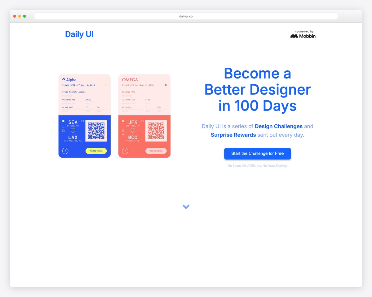
Daily UI uses a lot of white space (almost too much?), which, as you know, improves website readability.
The choice of font colors interacts with the rest of the content nicely, even the four-column footer.
Company logos and testimonials give an instant feeling that Daily UI is pro-level.
What stands out: Don’t neglect the footer area; use it strategically for additional information or navigation.
8. Handz
Made with Carrd
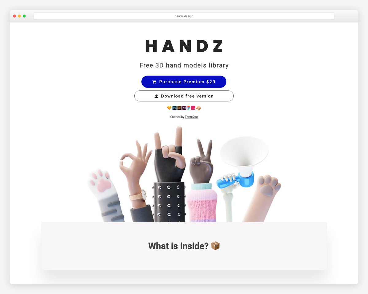
Handz sells 3D illustrations, which is almost the first things you see on their Carrd website. But they also use the page to show what you get in the package and a few examples.
While the landing page is quite long, using icons, text, images, and animations doesn’t make it feel that way.
What stands out: Don’t be afraid to promote your products, with the purchase button being the third thing on your site!
9. Haven Wellness Services
Made with Carrd
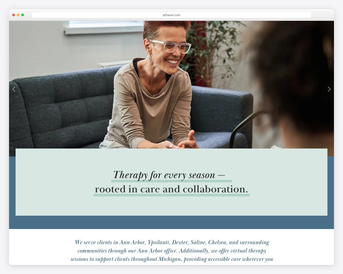
Your page can be as simple as Haven Wellness Services. It doesn’t need to include a lot of content on the home page, but it can have buttons that navigate users to different sections they’re interested in.
Or they may want to take immediate action and, in this case, schedule a consultation.
What stands out: Extreme simplicity needs a second thought, or you can just check Haven Wellness Services to learn how to do it.
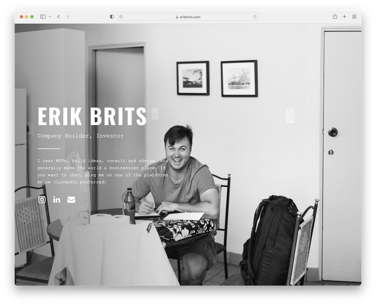
10. Erik Brits
Made with Carrd
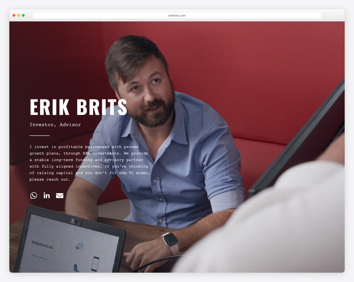
Erik Brits’ background image of himself is the shining star of his Carrd website.
But he also briefly explains what he does and features links to Instagram, LinkedIn and mail.
What stands out: Don’t have an idea for the background? Use an image of yourself! (For a personal website, of course.)
11. Roma
Made with Carrd
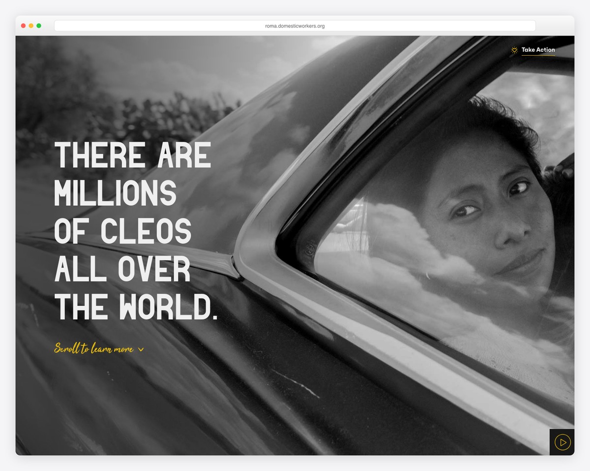
Roma welcomes you with a popup immediately after the site loads. This is a great way to notify visitors about something special.
Roma’s browsing experience is exceptional, with fantastic scrolling animations. But you need to see them to understand them.
What stands out: An animated browsing experience engages visitors more, keeping them from getting bored. And Roma is a fantastic Carrd website example that will inspire you.
12. Charles McDonald Music
Built with: Carrd
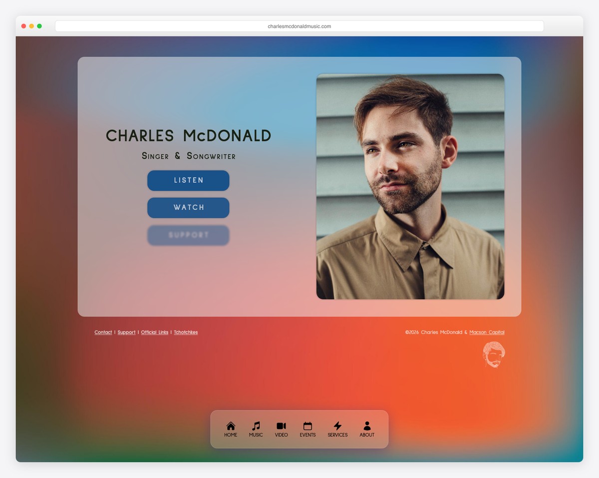
Charles McDonald’s musician portfolio uses Carrd to create a sleek, responsive one-page site with music releases, booking information, and streaming links. The minimal design keeps the focus on the music while providing all essential contact points.
What stands out: Musicians benefit from one-page sites that link directly to streaming platforms — fans want to listen, not browse through pages.
13. CashBar App
Built with: Carrd
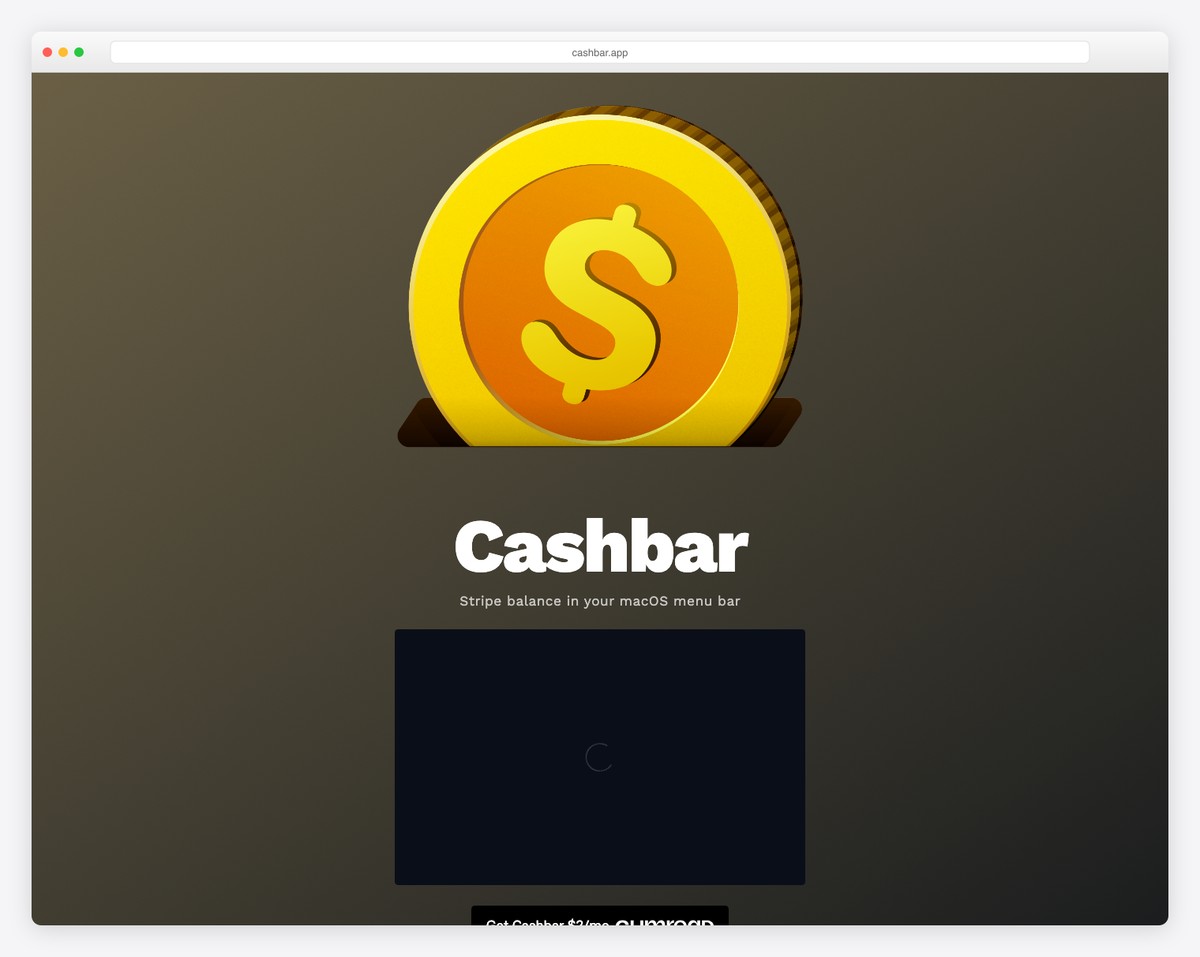
CashBar App uses Carrd to create a polished mobile app landing page with app store download links, feature highlights, and social proof. The clean gradient design and phone mockups demonstrate that Carrd can produce professional app marketing pages.
What stands out: App landing pages benefit from phone mockups and direct app store links above the fold — reduce the steps between curiosity and download.
14. Weekend Fund
Built with: Carrd
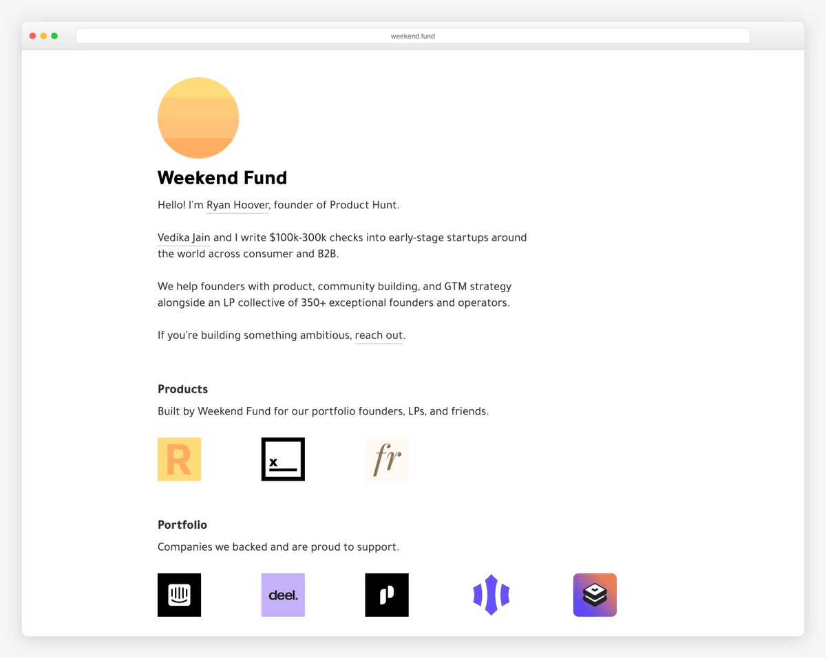
Weekend Fund is a startup investment fund using Carrd to present their portfolio companies and investment thesis in a minimalist one-page layout. The clean typography and strategic use of whitespace project the sophistication expected of a venture fund.
What stands out: Investment firms can use minimalist one-page sites effectively — simplicity communicates confidence and clarity of purpose.
15. OQuinn
Built with: Carrd
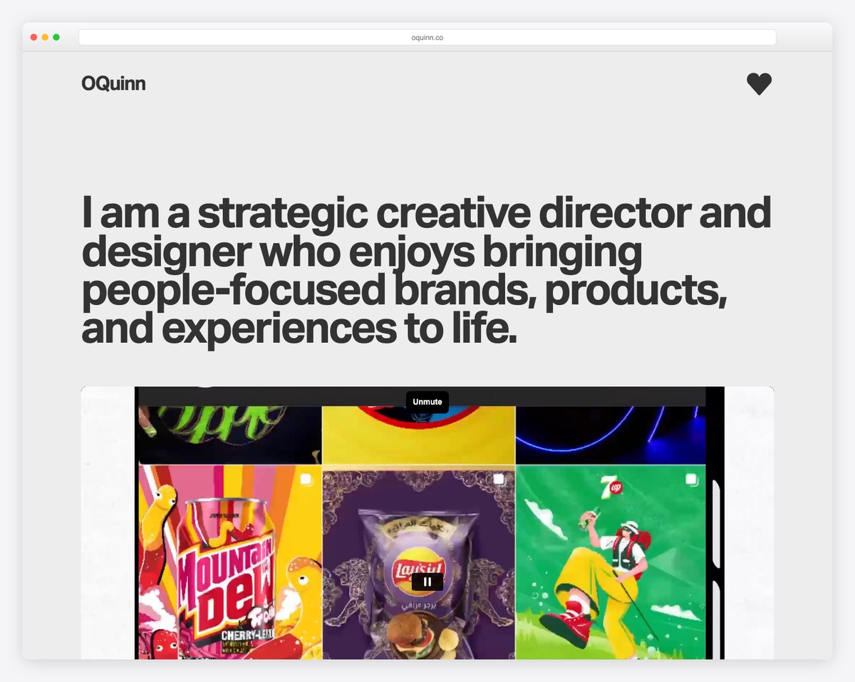
OQuinn is a branding and design direction portfolio showcasing work for startups and people-focused brands, built entirely on Carrd. The minimal one-page layout with bold typography and selective project highlights creates an impactful first impression.
What stands out: Design portfolios on Carrd prove that constraints breed creativity — a single page forces designers to curate ruthlessly, which often results in stronger presentations.
16. Daily Four
Built with: Carrd
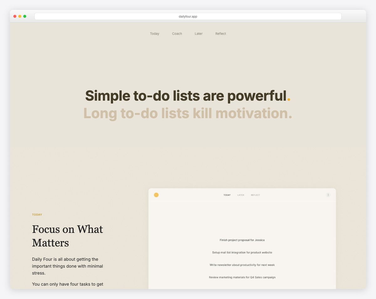
Daily Four is a productivity tool built around focusing on four important tasks each day. The Carrd landing page communicates the app concept clearly with minimalist design, app screenshots, and download links — selling the entire concept in seconds.
What stands out: The best app landing pages sell the concept, not the features — “focus on four tasks” is instantly understood and compelling.
17. Plaand
Built with: Carrd
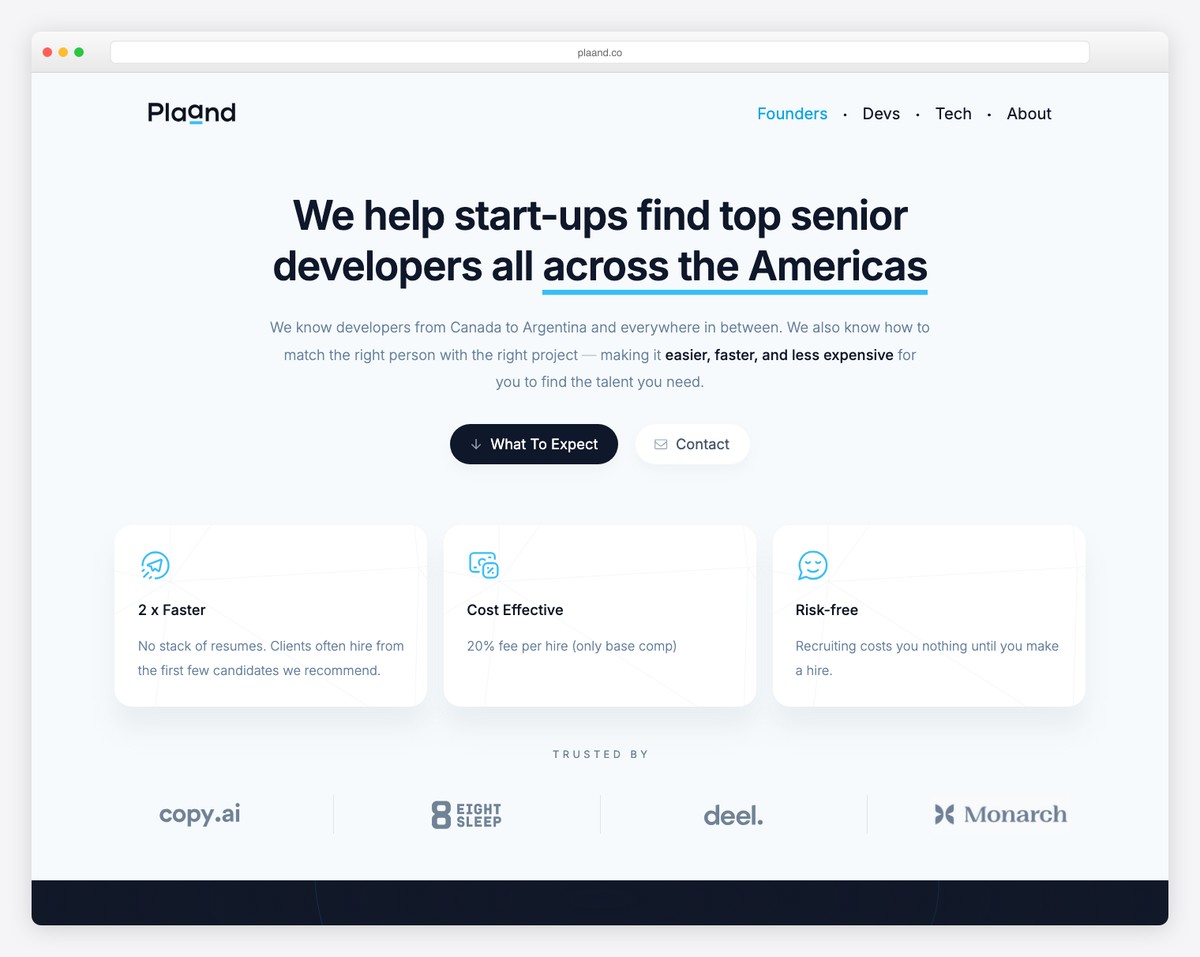
Plaand is a planning and productivity tool with a sleek Carrd-powered landing page that introduces the product through clear feature explanations and visual demonstrations. The modern color palette and structured sections walk visitors through the offering.
What stands out: SaaS products can launch with just a Carrd landing page and an email signup form — validate demand before investing in a full marketing site.
18. Launch FYI
Built with: Carrd
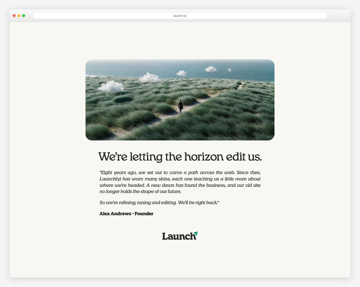
Launch FYI is a curated directory of places to launch and promote startups, products, and side projects. Built on Carrd, the site compiles launch platforms, communities, and directories into a single bookmark-worthy resource page for founders.
What stands out: Creatively uses Carrd as a resource directory rather than a typical landing page — proving the platform can handle content-rich layouts beyond simple portfolios.
Related Posts


Another cool library with great carrd websites and templates