
35 Best Publisher & Publishing Websites 2026
The best publisher websites work as a bookshop, a reading guide and a front door for authors at once: covers up front, easy ways to browse and buy, and a clear voice that tells readers what the press stands for. These 35 publisher and publishing website designs range from Penguin and HarperCollins to art book publishers, independent presses, literary magazines and self-publishing platforms. If you are building your own, our WordPress themes for writers and publishers are a good place to start.
We opened every site in a real browser and read the platform from the files it loads. The split is striking: ten of the 35 sell directly through Shopify, including HarperCollins, Phaidon and Verso, and ten run on WordPress, including Penguin Random House and Hachette.
Big Publishing House Websites
The largest trade publishers run sites that work as a bookshop, a reading guide and a front door for authors at the same time.
1. Penguin Random House
Built with: WordPress · headlines in Shift
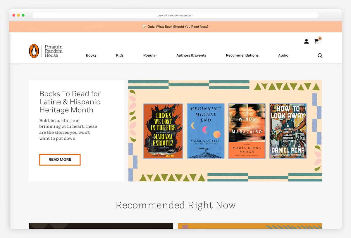
Penguin Random House runs its site like a well-edited bookshop. A slim coloured strip at the top promotes a reading quiz or campaign, and the main menu (Books, Kids, Popular, Authors & Events, Recommendations, Audio) opens into a large mega menu of genres and lists.
The first screen is a curated collection rather than a single bestseller: a text card on the left and a panel of covers on a patterned background on the right, followed by Recommended Right Now in Shift, a light serif. The site runs on WordPress.
What stands out: Recommendations first, like an editor at a bookshop counter.
2. Penguin Books UK
Built with: Next.js · headlines in Penguin Inclusive Sans
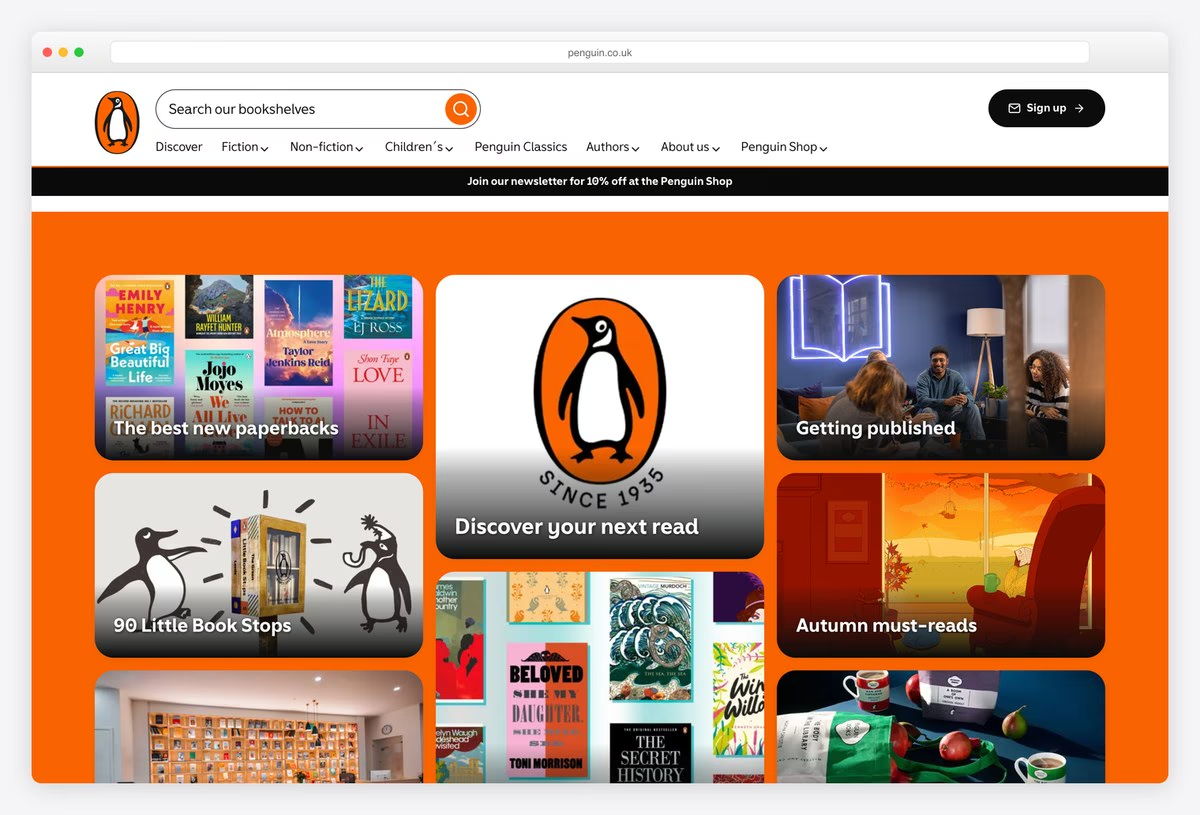
Penguin Books UK fills its first screen with a bento grid of tiles on a bright Penguin orange background, with the penguin logo in the centre tile and the others leading to new paperbacks, seasonal reading, reading campaigns and a Getting published guide for writers.
A large rounded search bar sits above the menu (Discover, Fiction, Non-fiction, Children’s, Penguin Classics, Authors, About us, Penguin Shop). The type is Penguin Inclusive Sans, the publisher’s own typeface, and the front end is built with Next.js.
What stands out: A bento grid in the brand’s own orange.
3. HarperCollins
Built with: Shopify
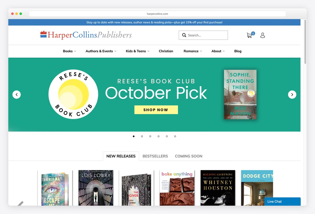
HarperCollins sets its wordmark in an elegant serif and italic, with a search box, cart and account icons beside it and a menu of Books, Authors & Events, Kids & Teens, Christian, Romance, About and Blog. A wide carousel features book club picks and campaigns.
Under the carousel, tabs switch between New Releases, Bestsellers and Coming Soon, and a Live Chat button sits in the corner. The whole site is a Shopify store, so readers can buy directly from the publisher instead of being sent to a retailer.
What stands out: A big-five publisher selling directly through Shopify.
4. Simon & Schuster
Built with: Custom code
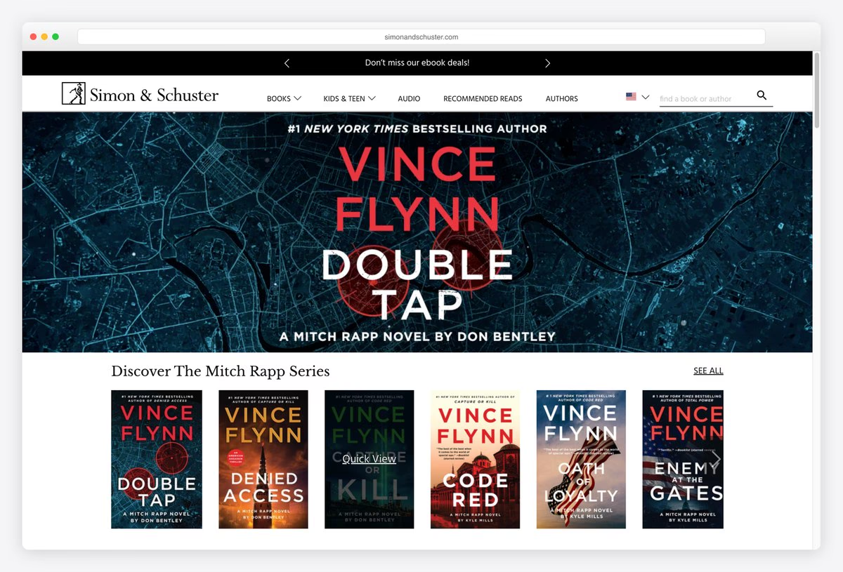
Simon & Schuster opens with a black promotional ticker and a short notice that warns authors to avoid publishing scams, a useful touch from a publisher whose name scammers often borrow. The menu covers Books, Kids & Teen, Audio, Recommended Reads and Authors.
A full-width banner for a featured author or series leads into rows of covers, each with a Quick View button that opens the book’s details without leaving the page. The site is custom-built rather than running on an off-the-shelf platform.
What stands out: Quick View on every cover and a warning about publishing scams.
5. Hachette Book Group
Built with: WordPress · headlines in Effra
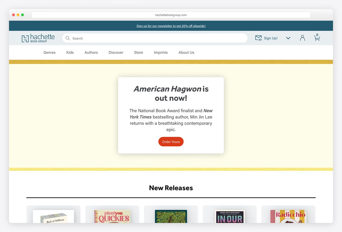
Hachette Book Group combines a newsletter strip, a wide search bar and a menu of Genres, Kids, Authors, Discover, Store, Imprints and About Us. Giving Imprints a top-level link makes sense for a group made of many publishing houses.
The first screen is calm: a single book announced in a centred white card on a pale yellow panel, with an Order button, then a New Releases row. Headlines are set in Effra, and the site runs on WordPress.
What stands out: Imprints in the main menu for a group of many houses.
6. Bloomsbury
Built with: Umbraco · headlines in Tiempos Headline
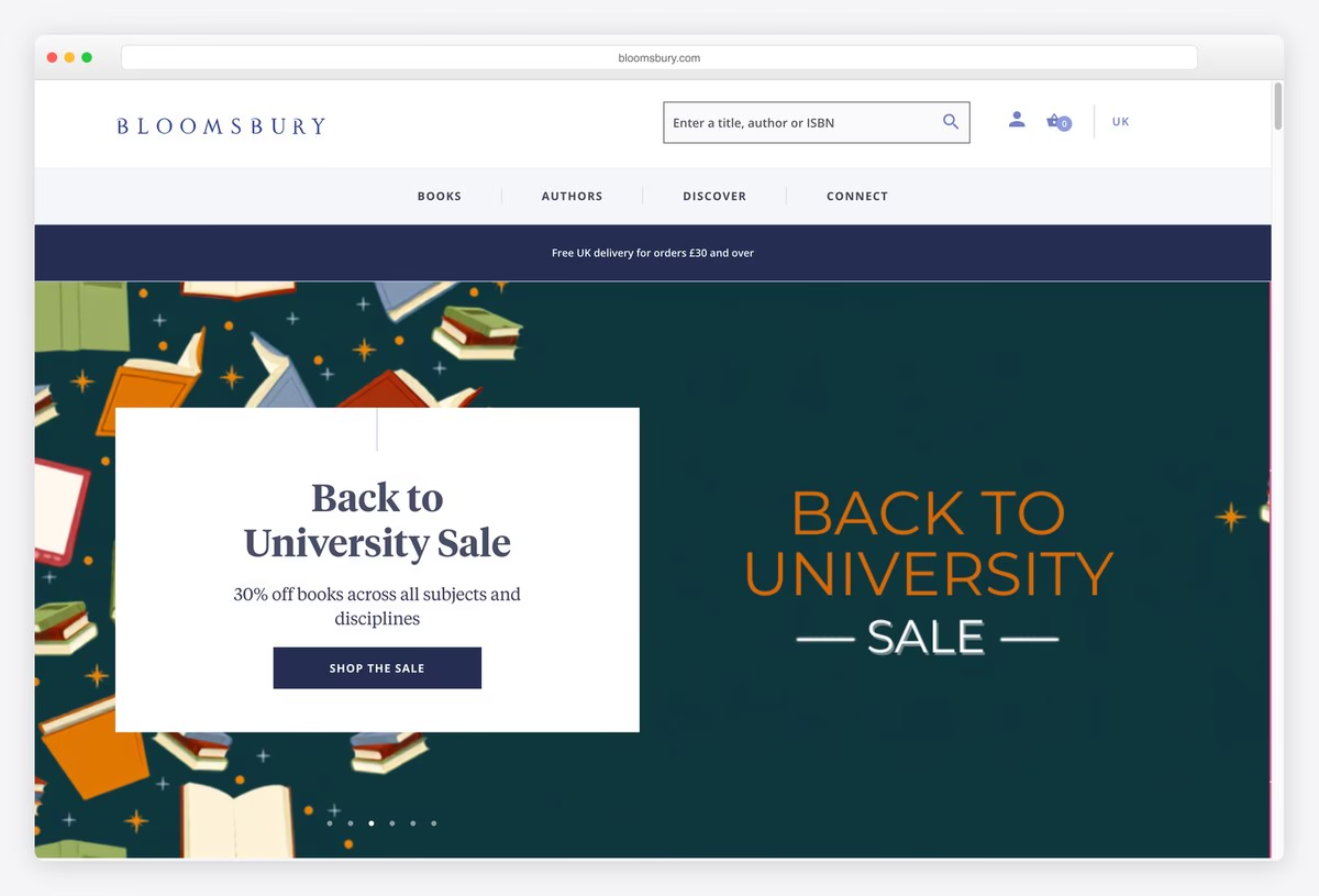
Bloomsbury sets its name in widely spaced capitals and gives the header a search box for a title, author or ISBN, plus a country switch for the UK, Canada, Australia, the US and India. The main menu is short: Books, Authors, Discover and Connect.
A delivery note and a full-width carousel of campaigns follow, with headlines in Tiempos Headline. The site runs on Umbraco. ISBN search and country stores show a site built for booksellers, librarians and academics as well as readers.
What stands out: ISBN search and country stores for trade and academic buyers.
Art, Design and Illustrated Book Publisher Websites
Publishers of art, photography, design and gift books, where the books are the visuals and the website has to show them off like objects.
7. TASCHEN
Built with: Next.js · headlines in Scala
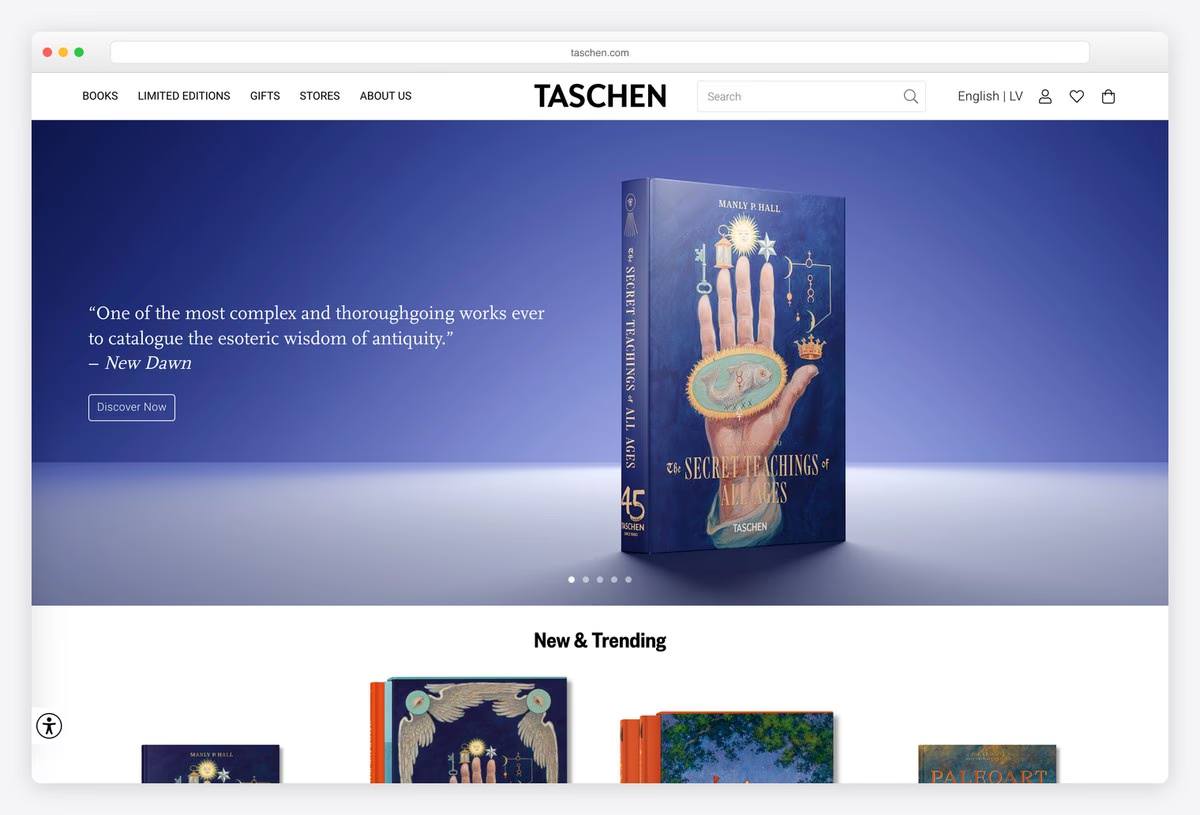
TASCHEN centres its wordmark in bold capitals and keeps the menu short: Books, Limited Editions, Gifts, Stores and About Us, with a language switch and the shop icons on the right. The hero carousel shows one book at a time, photographed like a luxury object on a coloured gradient.
Each slide pairs the book with a short press quote and a Discover Now button, and a New & Trending row follows. Headlines are set in Scala and the front end is built with Next.js. Treating every book as a product shot suits a publisher known for big, collectable editions.
What stands out: Books photographed like luxury objects.
8. Phaidon
Built with: Shopify · headlines in Akzidenz-Grotesk Next
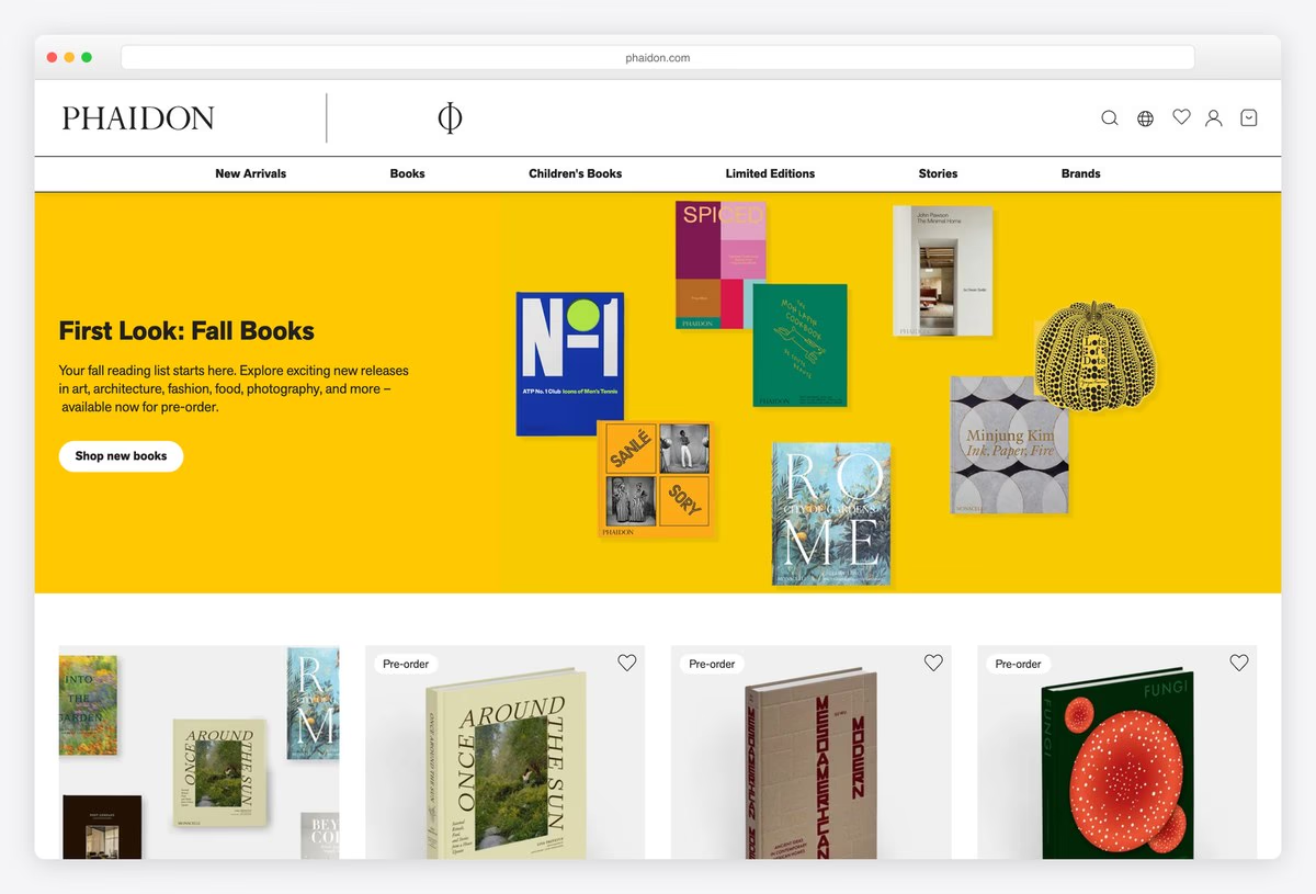
Phaidon pairs its serif wordmark with the Greek phi symbol and a menu of New Arrivals, Books, Children’s Books, Limited Editions, Stories and Brands. The hero is a bright yellow panel with covers scattered across it like a collage, next to a short seasonal headline.
Product cards follow with pre-order labels and wish-list hearts. Headlines use Akzidenz-Grotesk Next, a classic grotesque that suits an art and design list, and the store runs on Shopify.
What stands out: A collage of covers on a single bright colour.
9. Thames & Hudson
Built with: Shopify · headlines in Neue Haas Unica
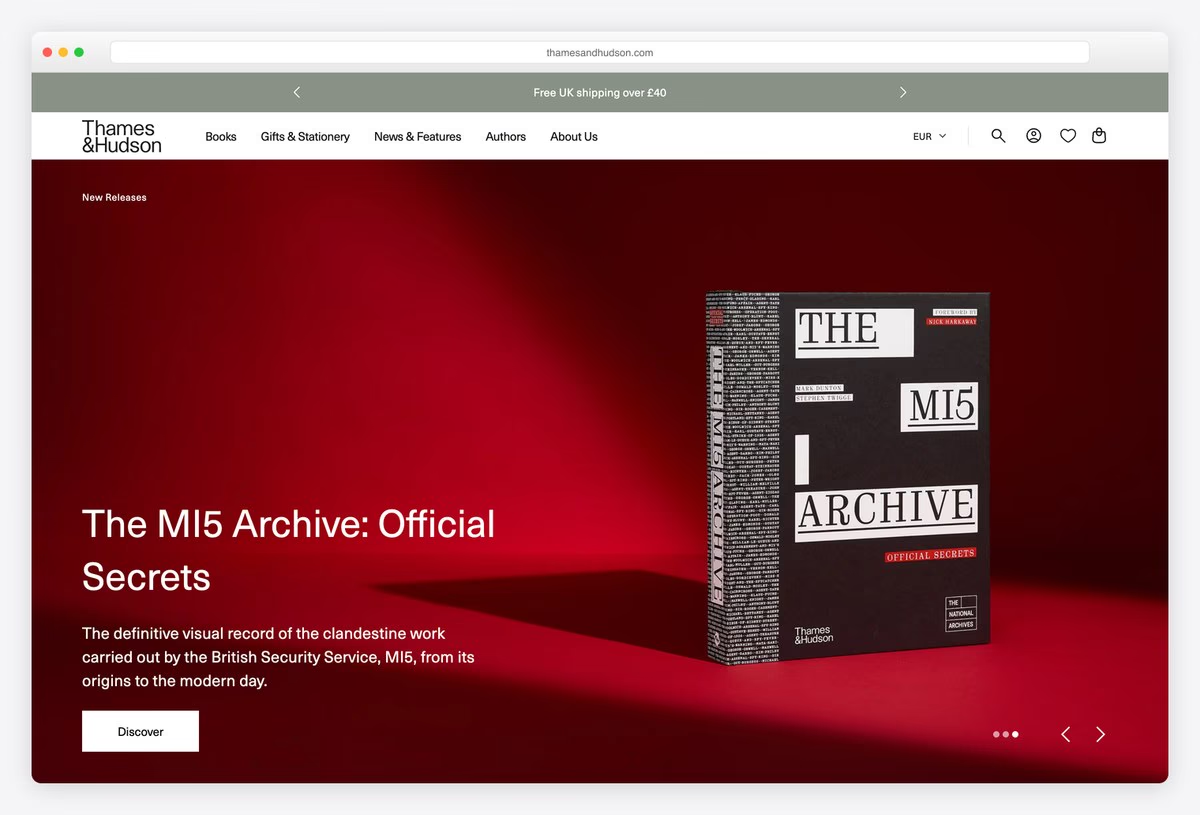
Thames & Hudson starts with a thin ticker of shipping offers for the UK, the EU and international orders, then a menu of Books, Gifts & Stationery, News & Features, Authors and About Us, with a currency switch beside the search and cart.
The hero is a full-bleed slideshow in which one book is photographed on a strong coloured set, with the title in large Neue Haas Unica and a Discover button. The store runs on Shopify, with prices and shipping set for each region.
What stands out: Region-aware shipping and currency for an international list.
10. Chronicle Books
Built with: Shopify
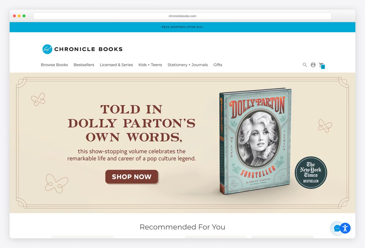
Chronicle Books is shop-first. A free shipping strip and a menu of Browse Books, Bestsellers, Licensed & Series, Kids + Teens, Stationery + Journals and Gifts lead to a hero banner styled like a vintage poster, with a single Shop Now button.
Rows of Recommended For You products follow, each with a price and a Quick Shop button. The page also offers a screen-reader mode from the very first link. The store runs on Shopify, and the menu shows how much of the business is stationery and gifts as well as books.
What stands out: Books, stationery and gifts sold side by side.
11. Laurence King
Built with: Shopify · headlines in Brown
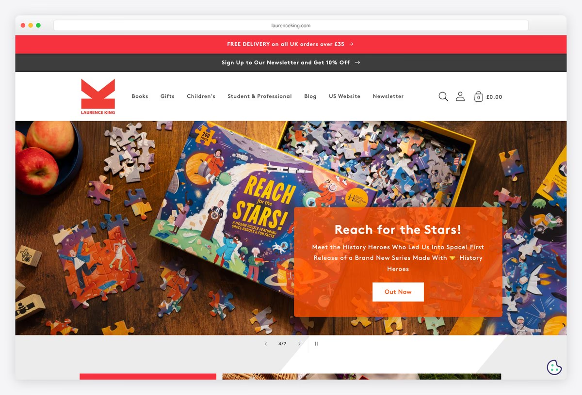
Laurence King uses a bold red K logo with two red strips above the header, one for free UK delivery and one for a newsletter discount. The menu covers Books, Gifts, Children’s, Student & Professional, Blog, a separate US Website and Newsletter.
A full-width photo slider shows books and games in use, with an orange caption box over each image. Headlines are set in Brown. The store runs on Shopify, and the dedicated US site link is a simple way to handle a transatlantic list.
What stands out: A separate US store linked from the main menu.
12. DK
Built with: Shopify · headlines in ABC Ginto
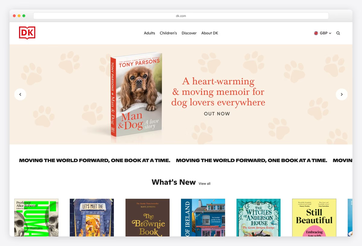
DK keeps its red logo and a tiny menu (Adults, Children’s, Discover, About DK) with a currency selector. A wide carousel of featured books is followed by a scrolling banner that repeats the line “Moving the world forward, one book at a time.”
What’s New comes next as a row of covers with short descriptions and prices. Headlines are set in ABC Ginto. The store runs on Shopify, which lets a famous reference publisher sell directly without building its own e-commerce system.
What stands out: A scrolling mission line between the hero and the shop.
13. ABRAMS
Built with: WordPress
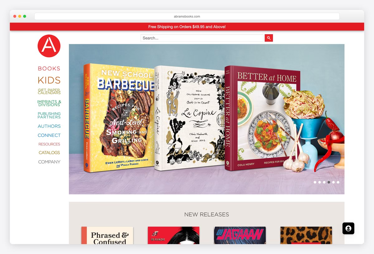
ABRAMS puts its navigation in a vertical column down the left side, under the red A logo, with each section (Books, Kids, Gift Paper Calendars, Imprints & Divisions, Publishing Partners, Authors, Connect, Resources, Catalogs, Company) in a different colour and size.
The rest of the screen is a large photo carousel of book covers styled with props, followed by New Releases. The site runs on WordPress. The playful left-hand menu reads more like a contents page than a navigation bar, which suits a publisher of art and illustrated books.
What stands out: A colourful vertical menu that reads like a contents page.
Independent and Literary Press Websites
Smaller presses with a strong editorial identity. Many sell directly, ask readers to subscribe or donate, and let their cover design carry the brand.
14. Verso Books
Built with: Shopify
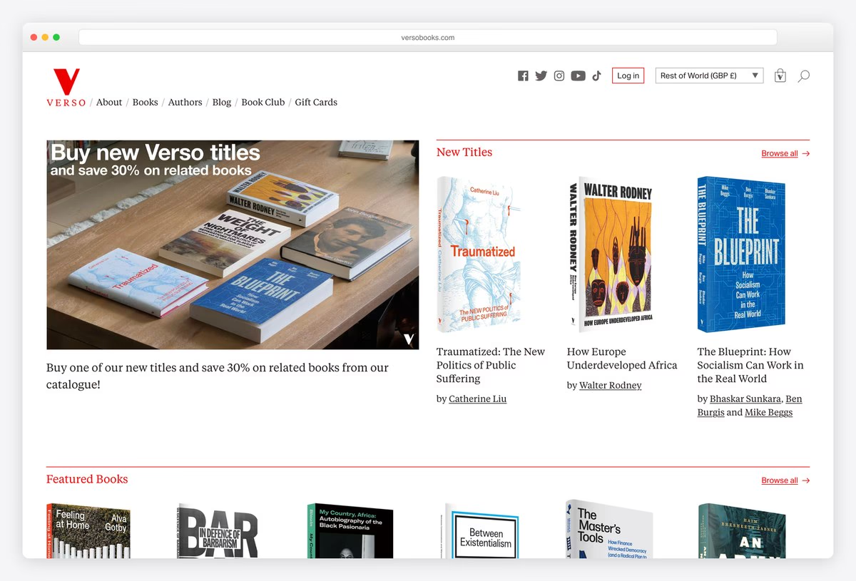
Verso Books uses its red V logo and a compact menu of About, Books, Authors, Blog, Book Club and Gift Cards, with social links, a currency switch and a cart in the top bar. Thin red rules divide the page into sections like a printed catalogue.
The first block pairs a photograph of books with an offer on related titles, beside a New Titles column of covers and authors. The store runs on Shopify. A Book Club subscription in the main menu turns loyal readers into regular buyers.
What stands out: A catalogue layout with a book club built in.
15. Fitzcarraldo Editions
Built with: WordPress
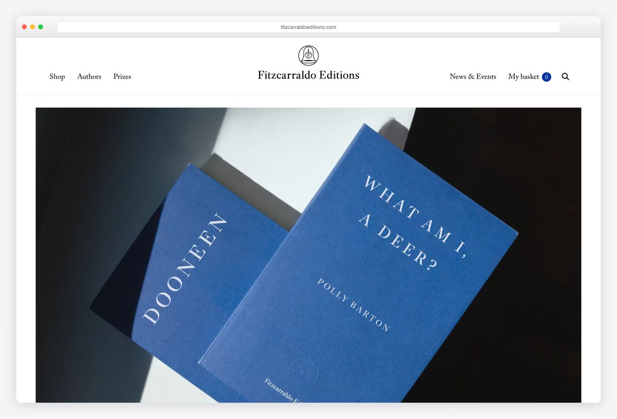
Fitzcarraldo Editions is known for its plain, typographic covers, and the homepage puts them centre stage: a full-width photograph of the books, a centred wordmark and small serif links for Shop, Authors, Prizes, News & Events and My basket.
Below the image, prize news runs above a list of books with prices and Pre-order or Add to basket buttons. The site runs on WordPress. When the cover design is the brand, a photograph of the books is all the hero a press needs.
What stands out: The covers are the brand, so the covers are the hero.
16. New Directions
Built with: Astro, Sanity · headlines in Archer
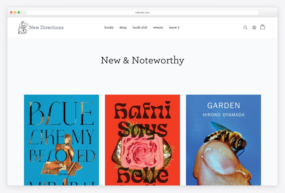
New Directions keeps its header tiny, a small logo and lower-case links for books, shop, book club and events, and gives the first screen to a single heading, New & Noteworthy, in Archer over a row of full-size covers.
Books carry prices and Pre-order or Add to Cart buttons, and a featured section follows. The site is built with Astro and its content is managed in Sanity, a modern headless setup that is still rare among literary publishers.
What stands out: Full-size covers and almost nothing else.
17. Graywolf Press
Built with: WordPress · headlines in Cervino
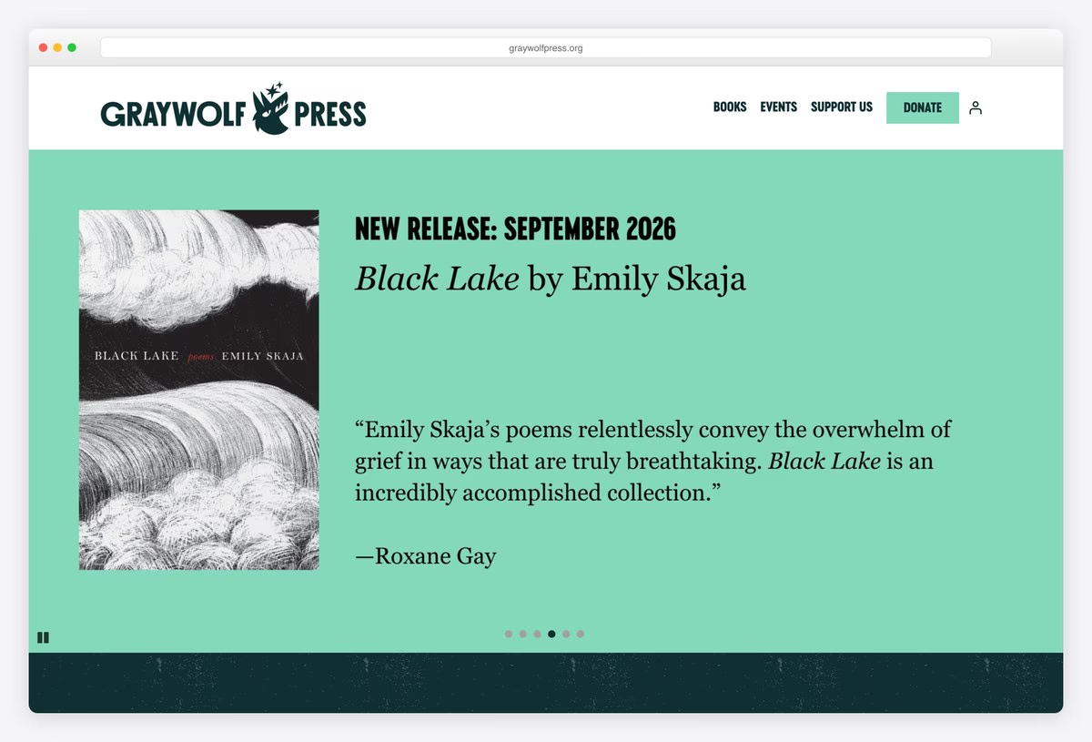
Graywolf Press puts its wordmark and wolf logo over a menu of Books, Events and Support Us, with a green Donate button. The slider pairs a cover with a review quote on a coloured background, and the next block explains the mission: “Graywolf Press is a nonprofit literary publisher of poetry, fiction, nonfiction, and work in translation.”
Headlines are set in Cervino, a heavy condensed face. The site runs on WordPress. For a nonprofit press, a donate button as prominent as the books is the right call.
What stands out: A nonprofit press that asks for donations as clearly as it sells books.
18. And Other Stories
Built with: WordPress, WooCommerce
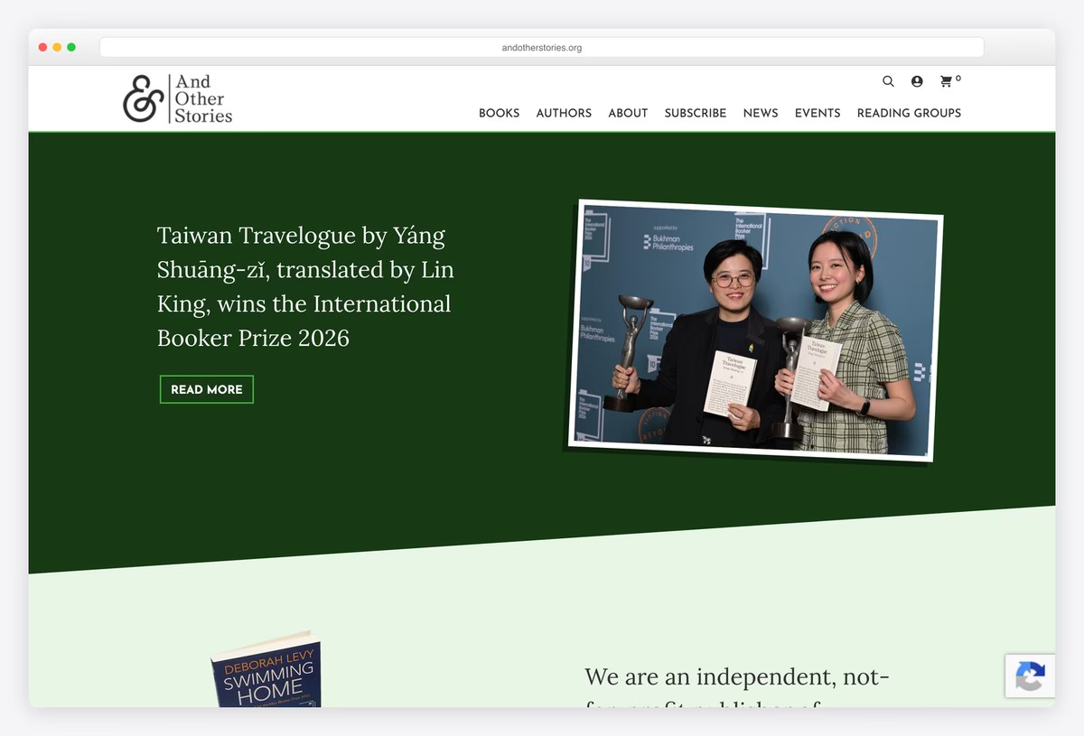
And Other Stories uses an ampersand logo and a menu of Books, Authors, About, Subscribe, News, Events and Reading Groups. A dark green banner leads with news from the press, followed by its mission: “We are an independent, not-for-profit publisher of innovative contemporary writing from around the world.”
Its subscription model is explained in one line: readers help make the books and receive them before anyone else. The site runs on WordPress with WooCommerce for the shop and subscriptions.
What stands out: Subscribers fund the books and get them first.
19. Pushkin Press
Built with: WordPress, WooCommerce · headlines in Futura PT
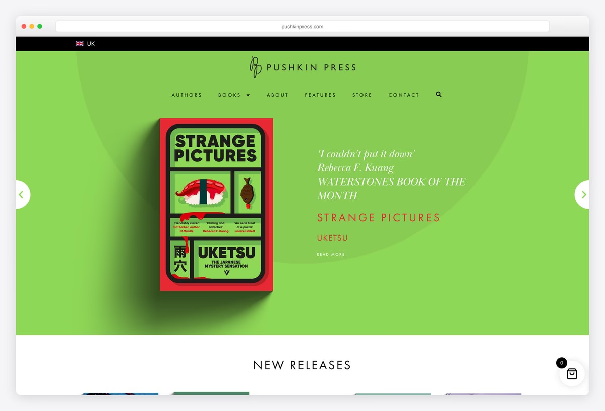
Pushkin Press gives each featured book a bright, full-width colour behind a single cover, with an italic review quote beside it. The menu (Authors, Books, About, Features, Store, Contact) opens into its imprints, from Pushkin Vertigo crime to children’s books, and a switch moves between the UK and US stores.
New releases and favourites follow in rows of covers. Headlines are set in Futura PT, and the site runs on WordPress with WooCommerce.
What stands out: One cover, one colour, one quote per slide.
20. New York Review Books
Built with: Shopify
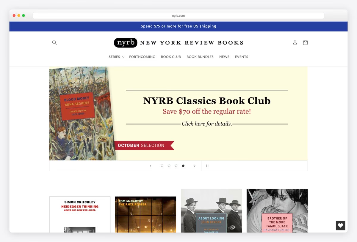
New York Review Books centres a rounded nyrb logo next to the full name in spaced capitals, with a menu of Series, Forthcoming, Book Club, Book Bundles, News and Events. A free shipping strip runs across the top.
The first banner promotes the NYRB Classics book club on a pale yellow panel, and rows of covers follow. Organising the menu by series (Classics, Poets, Comics, Kids and more) mirrors how its readers collect the books. The store runs on Shopify.
What stands out: A menu organised by series, the way readers collect them.
21. Canongate
Built with: WordPress · headlines in Ivyora
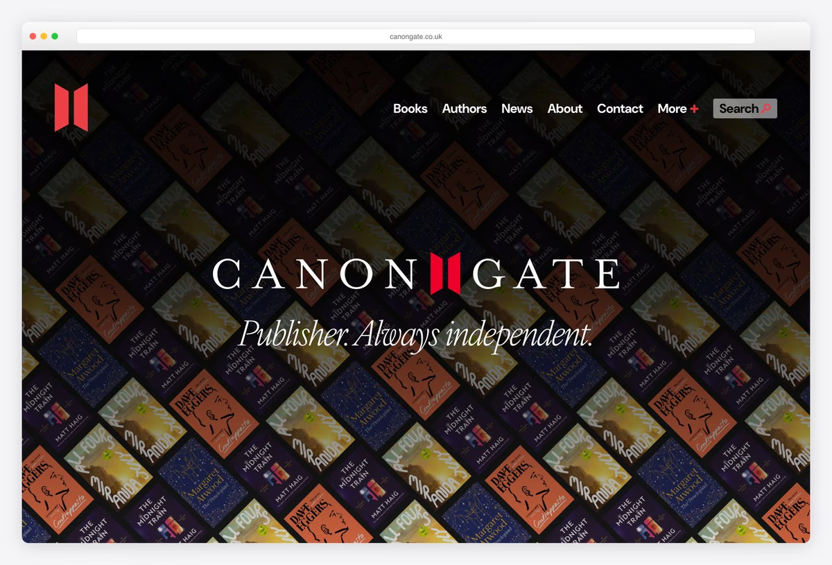
Canongate fills its first screen with a dark pattern of tilted book covers, with the wordmark and its red mark in the middle and the line “Publisher. Always independent.” in Ivyora, an italic serif.
The menu stays short (Books, Authors, News, About, Contact), and a News section collects dispatches and announcements with dates. The site runs on WordPress. Turning the backlist into a background pattern shows the size of the list without a single carousel.
What stands out: The backlist turned into a background pattern.
22. Salt Publishing
Built with: Shopify · headlines in Merriweather
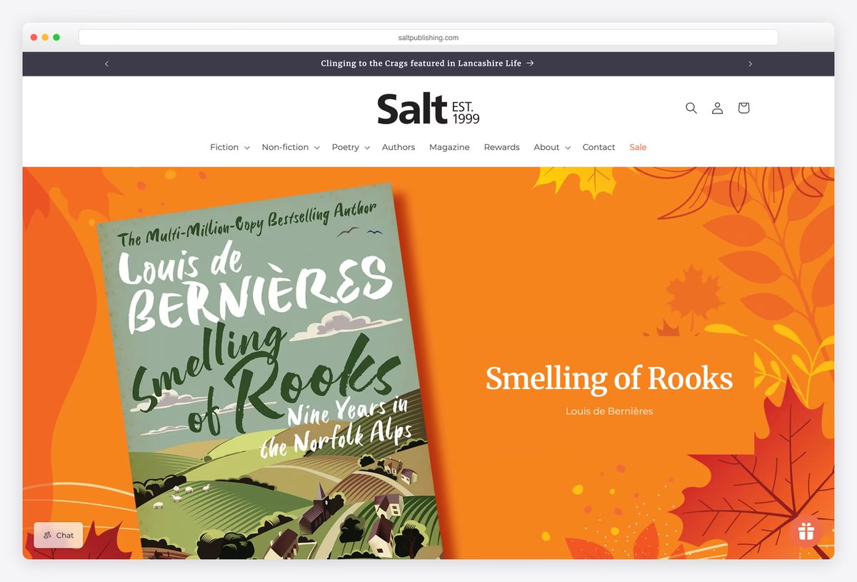
Salt Publishing runs a ticker of press coverage and reviews across the top of the page, then its wordmark over a menu of Fiction, Non-fiction, Poetry, Authors, Magazine, Rewards, About, Contact and Sale, with dropdowns for genres.
The hero extends a cover’s illustration into a full-width banner in the same colours, with the title set beside it in Merriweather. The store runs on Shopify. Showing reviews before anything else is a smart move for a small literary press.
What stands out: Reviews and press coverage run before anything else.
23. Mendo
Built with: Shopify · headlines in Futura PT
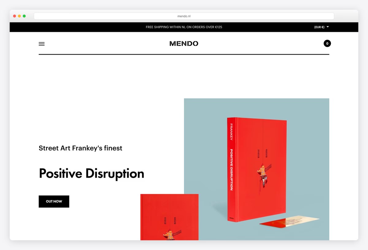
Mendo, the Amsterdam publisher and bookshop, keeps the header to a centred wordmark, a menu button and a cart. The hero photographs one book as an object on a soft coloured backdrop, with a short title and an Out Now button.
Its tagline sums up the approach: “Books as collectibles and lasting objects of beauty.” A journal and a B2B section sit in the menu beside the shop. The store runs on Shopify, and headlines are set in Futura PT.
What stands out: Books presented as collectible objects.
Literary and Digital Magazine Publisher Websites
Publishers whose main product is writing on the web: essays, criticism, design journalism and humour. For news publishers, see our newspaper and news website designs.
24. Smashing Magazine
Built with: Custom code · headlines in Mija
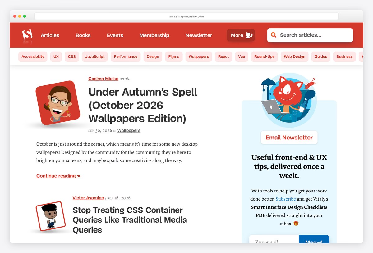
Smashing Magazine, a publisher of web design articles, books and events, uses a red header with its cat logo and a menu of Articles, Books, Events, Membership and Newsletter. A row of topic pills (Accessibility, UX, CSS, JavaScript, Performance and more) sits right under it.
Articles are listed with illustrated author avatars and headlines in Mija, next to a newsletter box with the mascot. Skip links jump straight to the article list or the topics. The site is custom-built.
What stands out: Topic pills under the header make a big archive easy to browse.
25. Aeon
Built with: Next.js
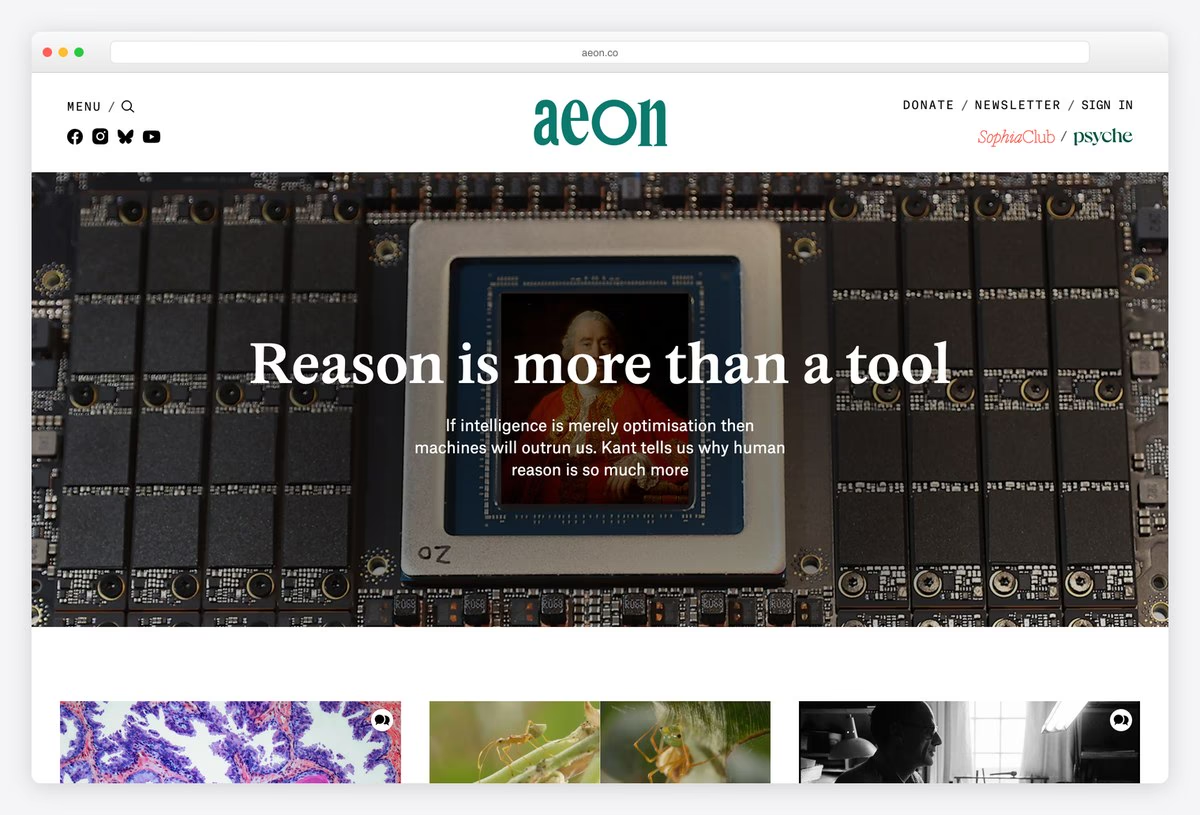
Aeon, a digital magazine of ideas, centres its green lowercase wordmark and keeps the top links tiny: Donate, Newsletter and Sign in, plus a link to its sister site Psyche. The first screen is one essay, with its title and standfirst set over a full-width image.
Sections for Philosophy, Science, Psychology, Society and Culture sit in the menu, and Popular this month follows below. The front end is built with Next.js. Leading with a single essay suits a publication built around long reads.
What stands out: One essay at a time, given the whole screen.
26. Literary Hub
Built with: WordPress · headlines in Adobe Caslon
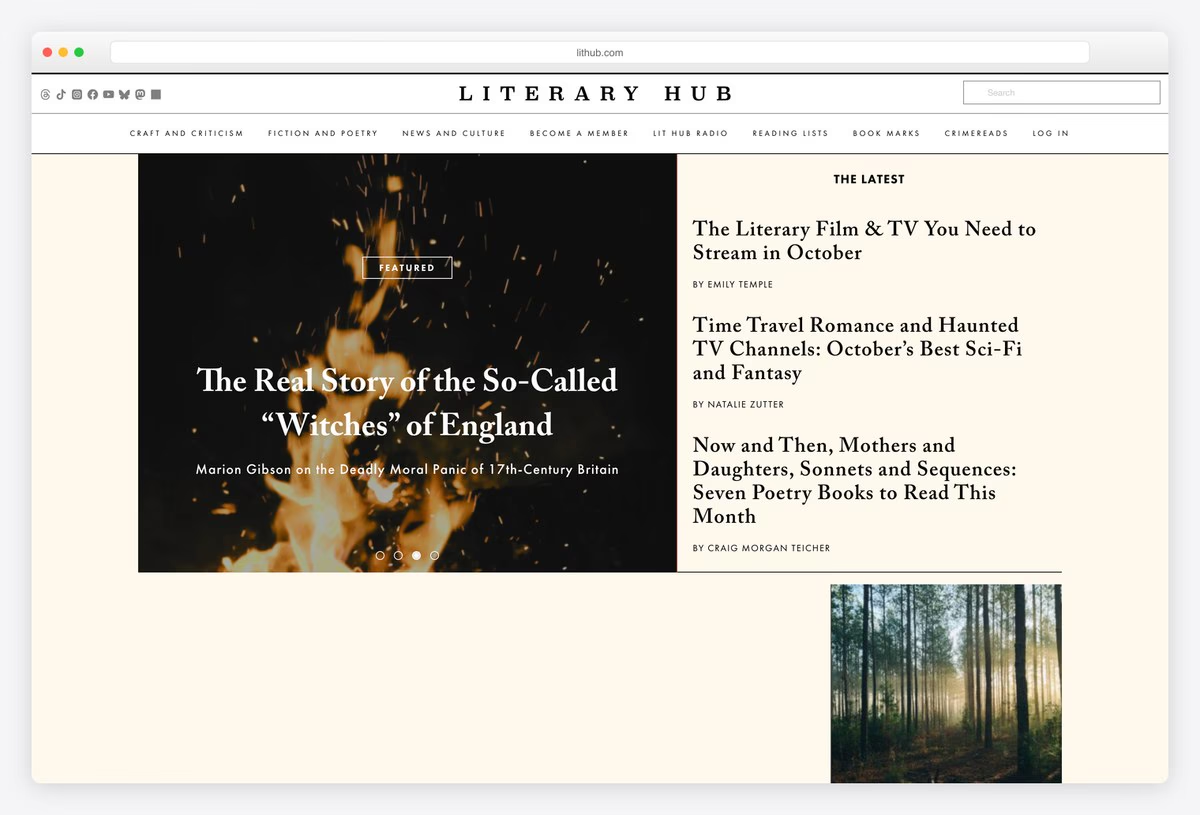
Literary Hub spaces its name in capitals across a cream page and lists its sections underneath: Craft and Criticism, Fiction and Poetry, News and Culture, Lit Hub Radio, Reading Lists, Book Marks and CrimeReads, plus a Become a Member link.
A featured slider sits beside The Latest, a column of headlines with bylines. Headlines are set in Adobe Caslon, and the site runs on WordPress. The newspaper-like front page shows how a books site can publish daily.
What stands out: A daily front page for books.
27. Kinfolk
Built with: WordPress · headlines in Kinfolk Serif
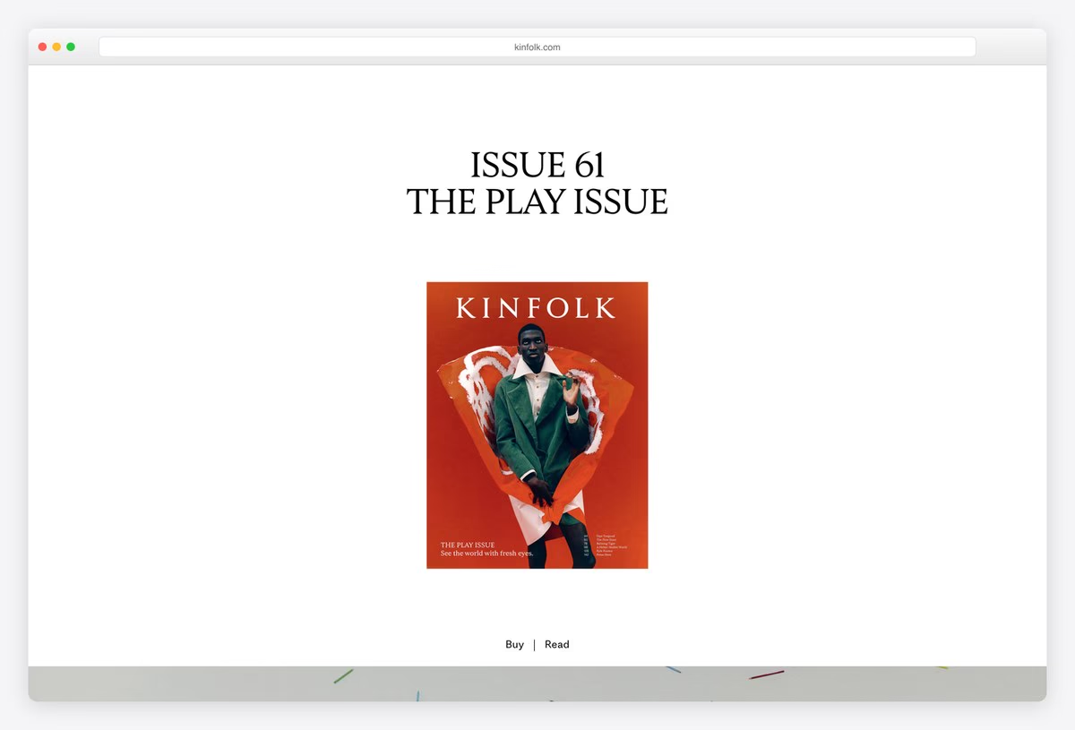
Kinfolk’s homepage is almost empty. The current issue’s number and theme are set in a centred serif, above a single cover image and two links: Buy and Read. Headlines use Kinfolk Serif, the magazine’s own face.
Stories from the issue follow as you scroll, with Shop, Subscribe and Current Issue in the menu. The site runs on WordPress. Making the latest print issue the whole first screen keeps the magazine at the centre of the brand.
What stands out: The current print issue is the whole homepage.
28. It’s Nice That
Built with: Custom code · headlines in Labil
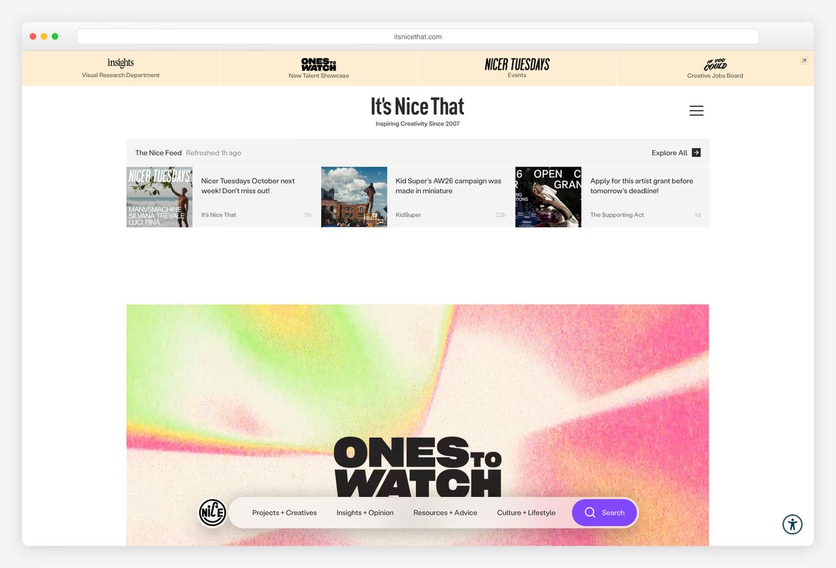
It’s Nice That, the creative publisher, opens with a row of its sub-brands (a research department, a new-talent showcase, events and a jobs board) and The Nice Feed, a strip of recent posts. A large gradient image with a bold title follows.
Navigation lives in a floating pill at the bottom of the screen with Projects + Creatives, Insights + Opinion, Resources + Advice, Culture + Lifestyle and Search. Headlines are set in Labil. The site is custom-built.
What stands out: A floating pill menu at the bottom of the screen.
29. McSweeney’s
Built with: Ruby on Rails
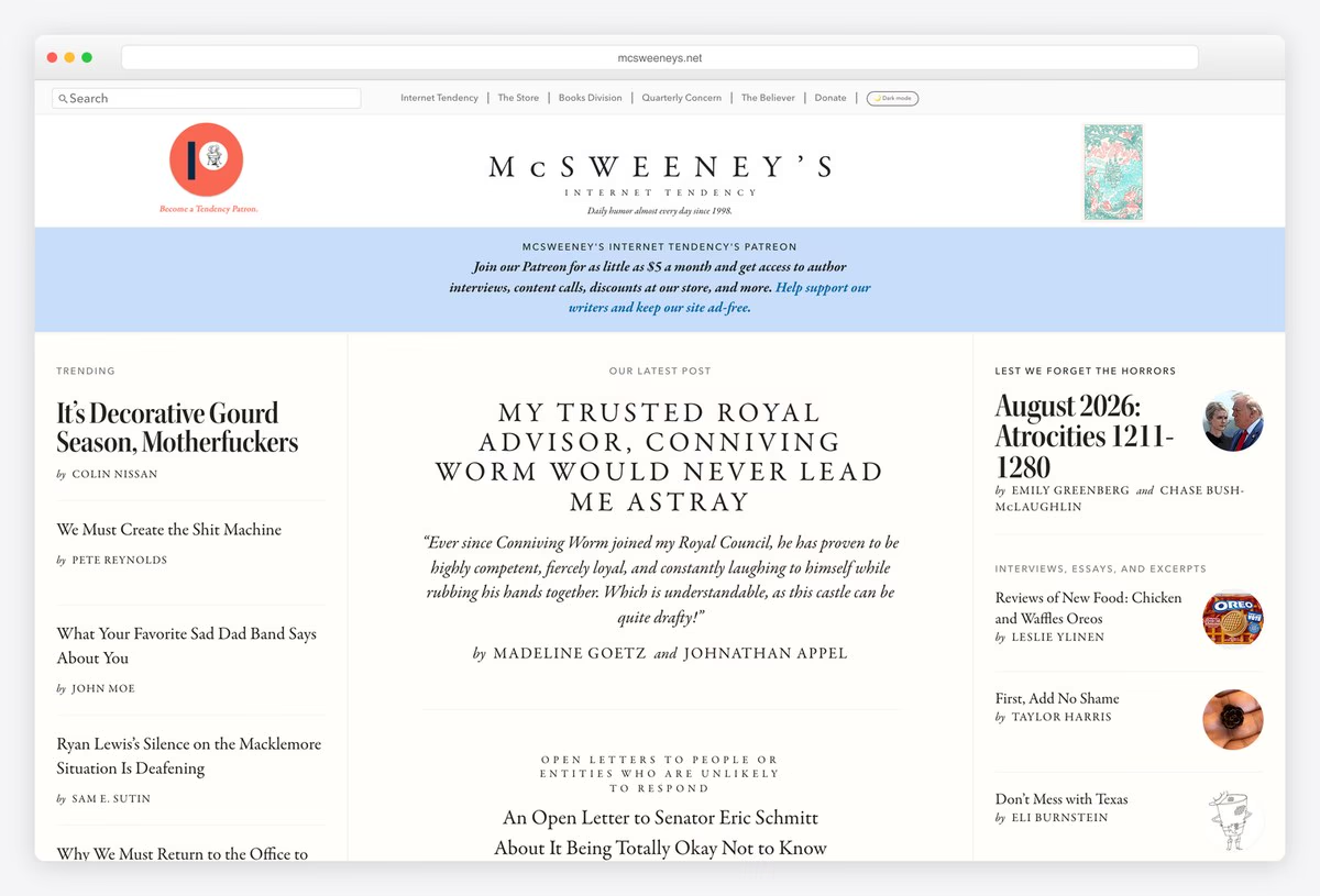
McSweeney’s Internet Tendency, the humour site of the San Francisco publisher, centres its name in spaced serif capitals and lays the page out in three newspaper columns: trending pieces, the latest post in capitals and more stories with small drawings.
A pale blue band asks readers to support the site on Patreon to keep it ad-free, links to the store, books division and The Believer sit at the top, and a Dark mode toggle is built in. The site runs on Ruby on Rails.
What stands out: Newspaper columns and a dark mode toggle for a humour site.
Self-Publishing and Publishing Platform Websites
Services that turn writers into publishers, from print-on-demand and distribution to editors for hire and newsletters.
30. Blurb
Built with: Astro · headlines in Futura PT
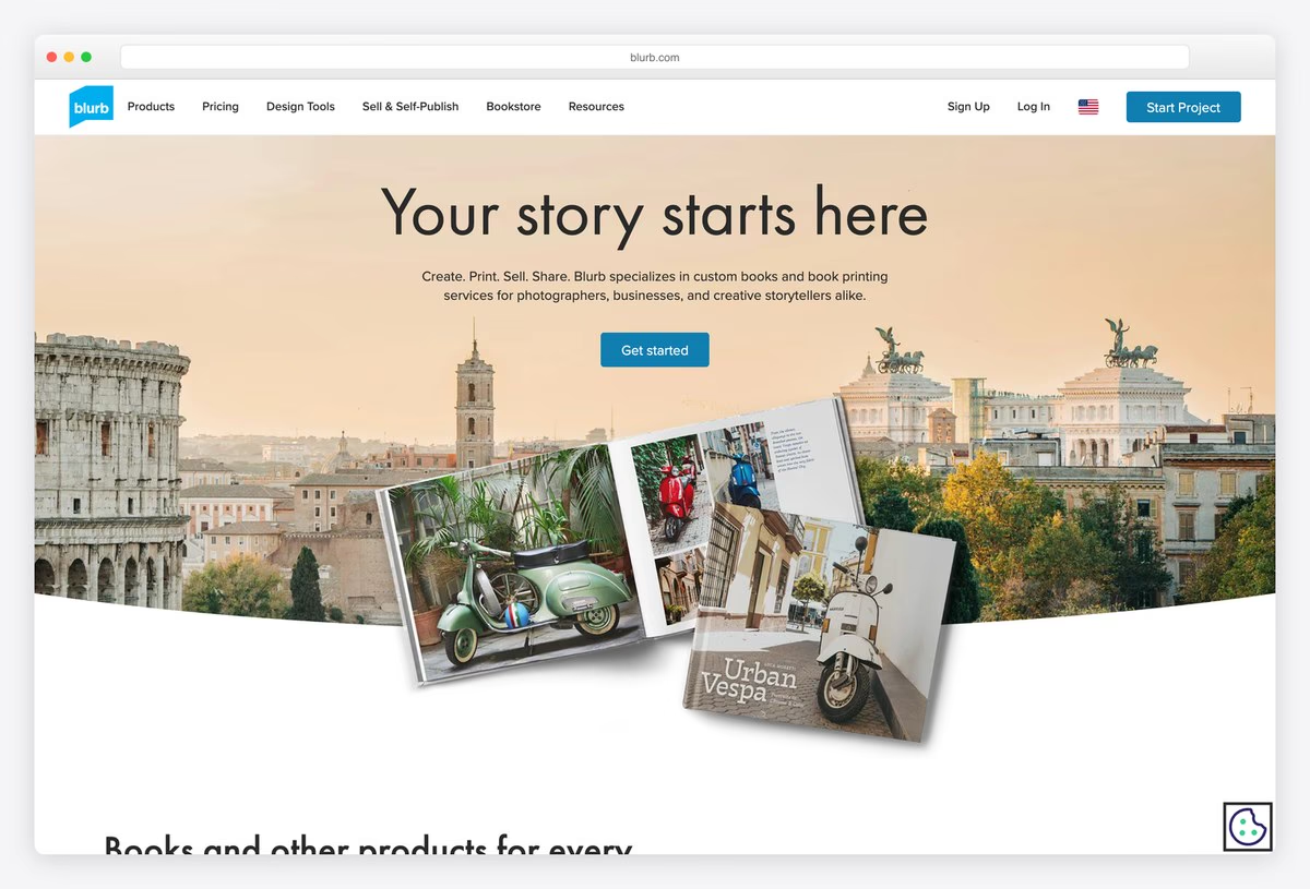
Blurb, a book printing and self-publishing service, puts “Your story starts here” at the top of the page in Futura PT, over a photograph of an open photo book in use. A short line explains the offer and a single Get started button follows.
The menu covers Products, Pricing, Design Tools, Sell & Self-Publish, Bookstore and Resources, with a blue Start Project button in the corner. The site is built with Astro. Showing a finished book rather than an interface makes the service easy to understand.
What stands out: A finished book, not the software, sells the service.
31. Reedsy
Built with: Custom code · headlines in Lora
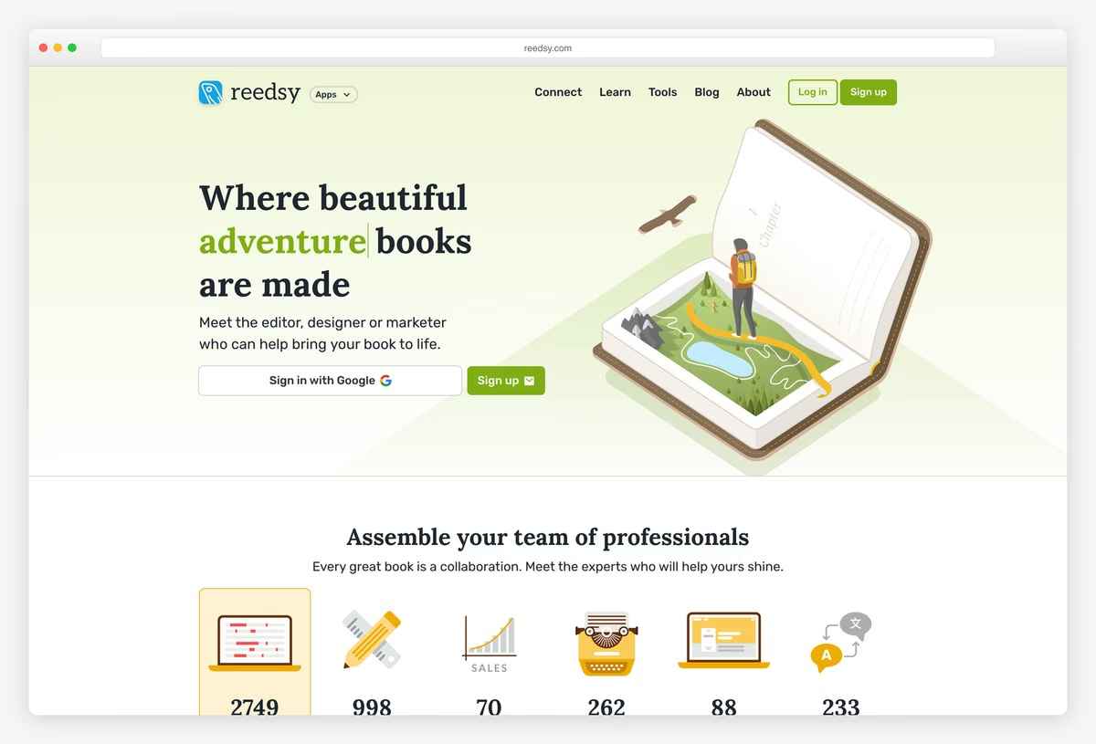
Reedsy, a marketplace of editors, designers and marketers for authors, uses a pale green hero with an illustration of an open book and a headline whose genre changes as you watch, set in Lora.
Below, a row of icons counts the professionals available in each field, from editors and designers to ghostwriters and translators. Sign in with Google sits right in the hero. The site is custom-built, and the live counts make the marketplace feel busy and trustworthy.
What stands out: Live counts of professionals make the marketplace tangible.
32. IngramSpark
Built with: HubSpot CMS · headlines in Fieldwork
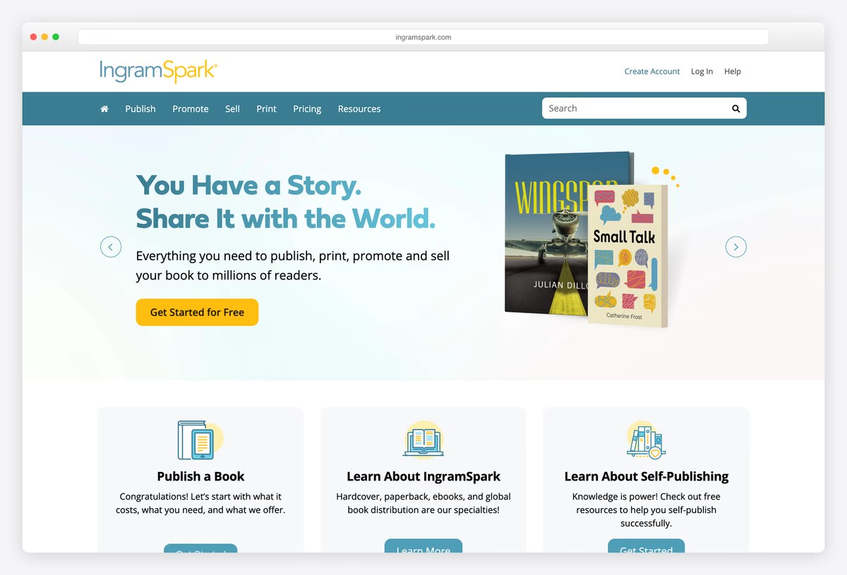
IngramSpark, the self-publishing arm of the Ingram book distributor, uses a teal menu bar with Publish, Promote, Sell, Print, Pricing and Resources, which follows the order an author goes through. The hero says “You Have a Story. Share It with the World.” in Fieldwork.
Three cards follow for publishing a book, learning about IngramSpark and learning about self-publishing in general. The site runs on HubSpot’s CMS.
What stands out: A menu that follows an author’s path from publish to print.
33. Draft2Digital
Built with: Custom code · headlines in Playfair Display
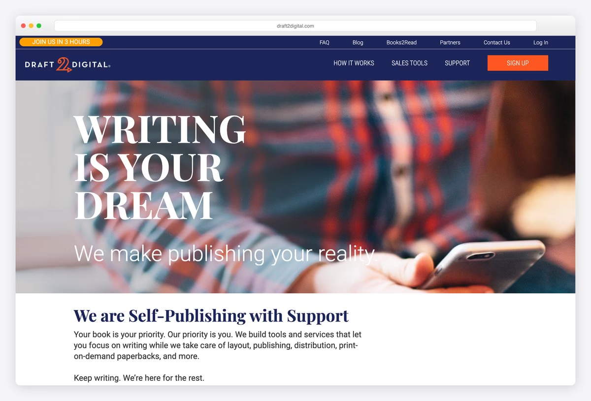
Draft2Digital sets a huge serif headline about the dream of writing in Playfair Display over a photograph, with the line “We make publishing your reality.” A navy header holds How It Works, Sales Tools, Support and an orange Sign Up button.
Below, a short promise is followed by the four steps of the service (Format, Publish, Print and Track Sales). The site is custom-built. Naming the steps up front tells a first-time author exactly what the service does.
What stands out: The whole service explained in four steps.
34. Issuu
Built with: Next.js · headlines in Inter
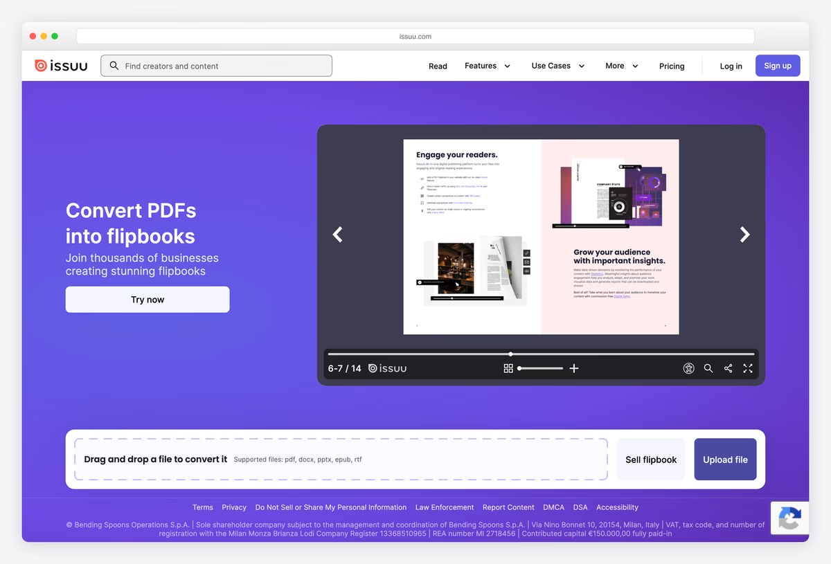
Issuu, a digital publishing platform, uses a purple hero with the headline Convert PDFs into flipbooks next to a working flipbook player that visitors can page through.
Under it, a drag-and-drop bar lets you upload a file and try the product straight away, with buttons to sell a flipbook or upload. Headlines are set in Inter, and the front end is built with Next.js. Letting visitors try the product in the hero beats any feature list.
What stands out: Try the product in the hero.
35. Substack
Built with: Custom code
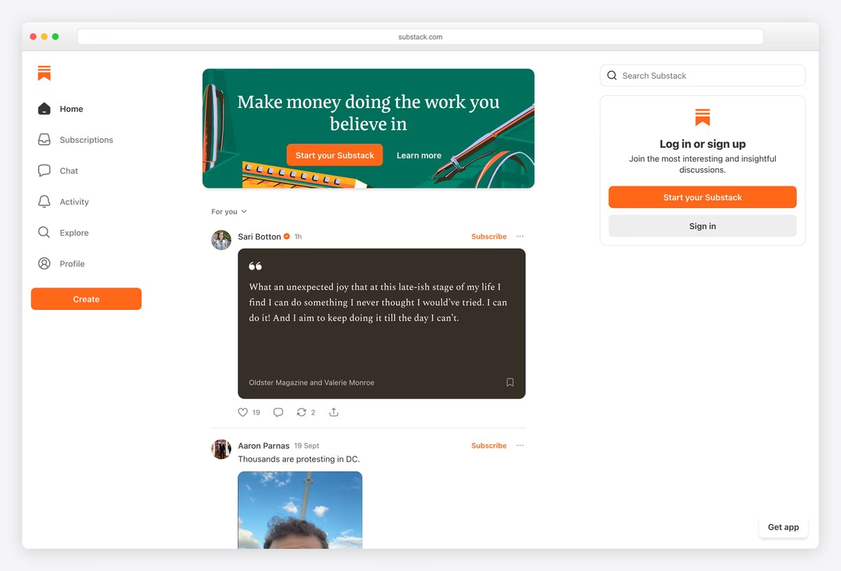
Substack’s homepage is the product itself: an app-style layout with a left sidebar (Home, Subscriptions, Chat, Activity, Explore, Profile and a Create button), a central feed of posts from writers and a sign-up panel on the right.
A banner at the top of the feed makes the pitch, “Make money doing the work you believe in”, with Start your Substack and Learn more buttons. The platform is custom-built. For a publishing platform, showing real writing is the most convincing demo.
What stands out: The homepage is the product, with real writing in the feed.
What Makes a Great Publisher Website?
Let the covers lead. New Directions shows little more than full-size covers, Fitzcarraldo photographs its famous plain jackets, and Canongate turns its backlist into a background pattern. Good cover design is a publisher’s best visual asset, so give it room.
Sell directly. Ten of the publishers here run their own Shopify store, from HarperCollins to small presses like Salt, and others use WooCommerce on WordPress. Selling direct builds a customer list and lets you offer bundles, signed copies and pre-order extras that retailers will not.
Make search work for books. Readers search by title and author, while booksellers and librarians search by ISBN, as Bloomsbury’s header search allows. Add filters for format, series and age group, and make sure out-of-print and forthcoming titles still have a page.
Organise by how readers collect. NYRB’s menu is built around its series, Hachette and Pushkin give their imprints their own entries, and Penguin highlights Penguin Classics. If readers follow a series or imprint, put it in the navigation.
Serve writers as well as readers. Penguin links to a Getting published guide from its first screen, and Simon & Schuster warns authors about publishing scams. A clear submissions page saves a press a lot of email.
Be clear about how you are funded. Graywolf puts a Donate button in its header, And Other Stories invites readers to subscribe, and McSweeney’s asks for Patreon support to stay ad-free. Readers are happy to support a press when the ask is visible and honest.
Plan for international readers. Bloomsbury and Thames & Hudson let visitors pick a country or currency, and Laurence King links to a separate US store. Shipping thresholds and prices that match the visitor’s region remove a common reason to abandon a cart.
Frequently Asked Questions
What makes a good publisher website?
A good publisher website puts its books first with large covers, makes it easy to browse by genre, series or imprint, and lets readers buy directly or find a retailer. It also has clear author pages, news and events, a submissions page for writers, and a consistent identity that shows what the press stands for.
What platform do publishers use for their websites?
On this list, Shopify and WordPress are the most common. HarperCollins, Phaidon, Thames & Hudson, Verso and many smaller presses sell through Shopify, while Penguin Random House, Hachette, Canongate and Graywolf use WordPress. Some use modern frameworks such as Next.js or Astro, and a few large publishers have custom-built sites.
Should a publisher use Shopify or WordPress?
Choose Shopify if selling books directly is the main goal, since it handles payments, shipping, taxes and pre-orders out of the box. Choose WordPress if editorial content, author pages and news matter most, and add WooCommerce for the shop. Both work well for small presses, and many publishers here run one or the other.
What pages should a publisher website have?
Most publisher websites need a homepage, a browsable catalogue with a page for every book, author pages, news and events, an about page, a submissions page for writers, contact details and rights or trade information for booksellers. A newsletter sign-up and a shop or links to retailers complete the set.
Can I build a publisher website with WordPress?
Yes. Penguin Random House, Hachette, Canongate, Graywolf and Literary Hub all run on WordPress. A theme built for writers or magazines gives you book and author layouts, and WooCommerce adds a shop. Plan your categories for genres, series and imprints early, because they shape the navigation.
How can a small press sell books directly from its website?
Use a store platform such as Shopify or WooCommerce, list every book with a cover, description, price and format, and offer something retailers cannot, like signed copies, bundles or subscriptions. And Other Stories and Verso show how subscriptions and book clubs turn regular readers into steady direct sales.
Wrapping Up
To build your own publishing website, browse our WordPress themes for writers, our magazine WordPress themes and these writer website templates. For author sites, see our best author websites.
Browse the other Publishing, blogs & media website examples (8 more collections), or see website examples for every industry.

Related Posts



Comments (0)