Top 5 WordPress Grid Plugins 2022
Here are the most popular and best WordPress plugins to create a grid-style website or portfolio.
For years, the secret has been out. It only takes three seconds to capture a reader’s attention. And in this day and age when there are tons of distractions, people’s attention span tends to dwindle even more. What does that mean for content creators? They’re in a sharp competition vying for their target audience’s attention. They need to make the most of those three seconds to show them their content is worth their time, curiosity and closer investigation – through WordPress Grid Plugins.
That being said, bloggers, these days play the jack-of-all-trades role. First and foremost, they need a knack at wordsmithing. But that’s not all. Because nobody loves a blog with just a plain wall of text unless that’s the last resort for that topic you’re reading. Being a blogger means having an exceptional eye for various visual elements such as photography and graphic and web design. You need to combine your text and visual elements to make your blog visually-arresting—enough to capture a reader’s attention within just three seconds.
The Role of Grids in Your Blog’s Overall Layout
Grids are the first lines that you draw on your rough draft. Since the inception of the print industry, the use of the grid has always been around. Layout artists use it as a framework that organizes graphic elements, including images, text sections, and other additional design elements. The grid system isn’t useful for the print industry alone. It is the building block of design, regardless of which industry it is applied.
Think of it as a storage that gives each element in your design a home and space that separates it from the rest. And yet, at the same time, it’s a string that ties your design elements together to create an aesthetically appealing output to the viewer.
The same principle applies in web design. Thus, a blogger needs to understand how to use grid in his blog layout so that his page would best represent his niche and the personality of his content. And as a result, it reels in first-time visitors, turning them into loyal readers who are always eager to take in new insights from your blog.
Use the Best WordPress Grid Plugin for Your Blog
Installing and using the best WordPress grid plugin for your blog would make designing your page a breeze. It’s like having a built-in designer that comes in handy when curating your design elements. No hardcore coding needed. Rather, you’re up to publish a brand-new blog post with just a few clicks.
But with tons of choices, both the top WordPress grid plugins and the new, unrated ones, it’s not easy to decide which would be ideal for your blog. Instead of wasting your time and resources doing trial-and-error, it is best to use it on careful planning to know exactly how to niche down your choices and pick the right one among the best WordPress grid plugins for blogs.
Whether you’re just about to build your blog, or you’re giving an existing one a major facelift, there are a few things you need to consider before installing a grid plugin.
The Type of Content You’d Display on Grids
WordPress grid plugins were designed for various kinds of content and purpose. For example, some grid plugins were made exclusively to arrange and display the images on your image gallery. A blogger’s first question to himself would be, “What type of content would I be using the grid plugin for?
Whereas you can utilize some for versatile functionalities—you can use it to display text, images, the latest posts on your blog, your best blog pages, and even some content from outside sources, like embedded videos from Vimeo or YouTube.
Look and Feel of the Layout
You’ve probably heard it a thousand times, so let me reiterate it. Know your target readers as if you’re their best friend. Knowing your readers well lets you know what topics they’d like to discuss. You know exactly what questions they have in mind, how they want you to answer them, and what style and tone of writing would keep them engaged.
Knowing your readers’ general personalities, preferences, motivations and ideals would also enable you to make a more thoughtful presentation of your content. Say, your reader is a 25-year-old mainstreamer who appreciates insights communicated through bright and cheerful, neat, and clean and clear images.
Now, you aim to consider that knowledge when brainstorming for the look and feel of your blog layout. You decide to use a grid plugin to help you develop a sleek, minimalist and clutter-free layout. Your readers will feel that you’re thoughtful enough to take that extra step to present information in a way that would feel very personal.
How the Layout Would Look Like Across Various Devices
Research reveals that in 2019, around 80% of internet users searched for information online using a mobile device. Also, 40% of online transactions were done using a smartphone. And by 2020, it is projected that the number of smartphone users will reach around 2.87 billion worldwide.
Bloggers must keep up with that trend by ensuring their blog layout is responsive and visually appealing across all screen sizes. Web designers keep that in mind, ensuring that their websites are mobile-friendly. You can do that as well by using a flexible grid plugin.
Steps to Choosing the Right WordPress Grid Plugin for Your Blog
To give you a recap, before choosing among grid plugins for blogs, there are useful steps you can take to make sure you’ll be picking the right one. First, define your blog niche and your target readers. Second, determine what kind of content you’ll use the grid for.
Third, visualize the look and feel of the page layout you wish to achieve, not just on a 14-inch laptop screen, but across various screen sizes. To do this, you can draw a rough sketch of your page designs for different devices.
And finally, niche down your choices among the best grid plugins for WordPress and choose the one that outstandingly fulfills all of the mentioned criteria. You can create a shortlist of your choices, detailed specs, and pros and cons.
Best WordPress Grid Plugins
Below, you’ll see examples of the best WordPress Grid Plugins you may pick for your blog. These top five on the list best illustrate the features we’re looking for: easy to customize, flexible, versatile, highly responsive, and mobile-friendly.
1. Post and Page Builder by BoldGrid – Visual Drag and Drop Editor
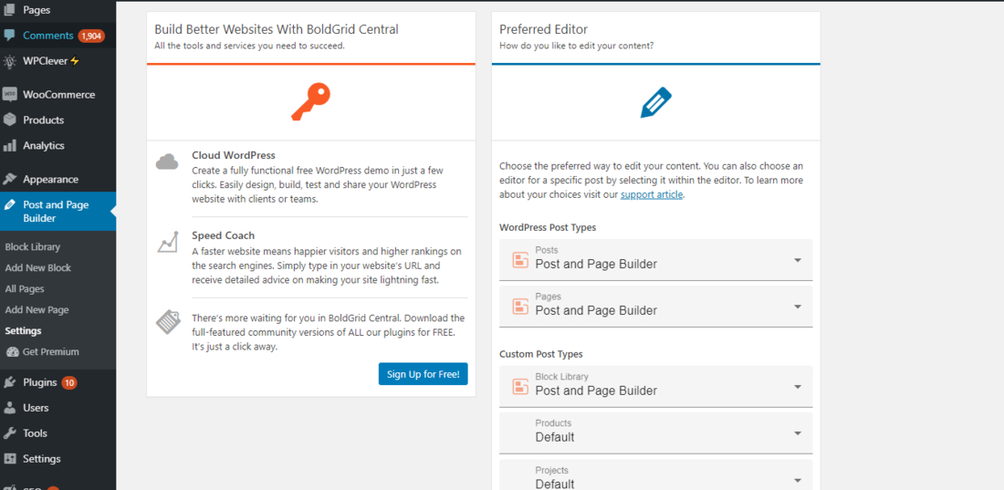
Whether you have some background on web design or have zero idea on what it’s all about, you can conveniently build stunning and responsive web pages in no time using this drag and drop plugin. It’s perfect, especially for anyone passionate about a particular niche and a talented content creator who can’t wait to share his ideas and insights to the world but doesn’t know where to start when building a blog.
The Post and Page Builder by BoldGrid eliminates the need to code, yet, it is highly customizable. It is designed to work with any layout theme on WordPress. So, whatever look and feel you’re visualizing for your blog and whoever you’re publishing your content for, it is doable with this drag and drop editor, making it a great choice among the top grid plugins for WordPress.
We mentioned the importance of designing your layout for various screen sizes a while ago. The user experience remains highly satisfactory whatever device your reader uses to access your content. And one of the features you’ll love about this plugin is that it enables you to make responsive layouts and controls for your blog pages on the mobile view.
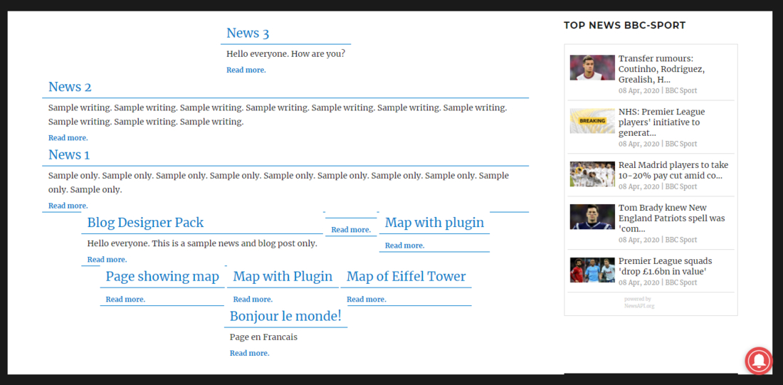
More info / Download2. Content Views – Post Grid & List for WordPress
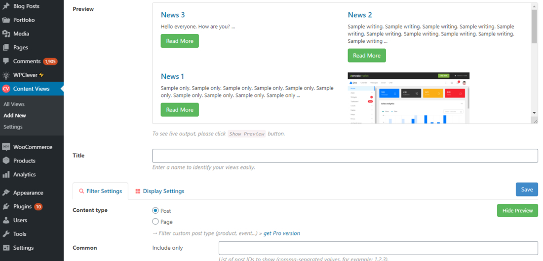
Filtering and organizing your content in a neat, well-curated grid or list is now easier with Content Views. Through this plugin, you can put posts by category, tag, ID, specific keywords, or if your blog is an online magazine-type with several authors, you can also display posts by the writer. It can also enable you to easily display your most recent posts. You can choose to show posts in grid, collapsible or scrollable list.
A lot of readers want a more visual kind of blog page. And so, this feature is utterly useful for that purpose. It’s pretty versatile, since a feature allows you to create a collage-like collection of your posts’ featured images and display them in a grid gallery.
Designed to be responsive and mobile-friendly, your readers will find your blog pages visually pleasing when reading your content on their desktop, tablet, or smartphone. Add the noticeable quick loading speeds as they navigate from one post to another. It can also boost your blog’s ranking on search engine results. And that’s all because Content Views have been optimized for speed.
Organizing the posts in your blog using this plugin can engage your readers more. For example, if they’re searching for information on a particular category, providing a well-curated collection of articles under that general topic will likely encourage them to check out other related articles. And if someone is a first-time site visitor, you might turn him into a loyal reader. This helps in boosting your blog’s readership rate.
More info / Download3. Post Grid
While very generic in its name, this plugin offers a variety of specific features that will keep your blog layout well-organized, responsive and aesthetically appealing to your target readers. It is also designed to make your posts well-optimized for mobile view.
Creating post grids is also unlimited with this plugin. It allows you to display multiple post types on a single grid. And if you have some basic background on CSS, you can easily tweak your layout elements and even make your grids more personalized as you apply your style.
You can unlock more of its useful features by opting for the premium version. Its premium version allows you to create grids for various media embedded in the blog, such as content from YouTube, Vimeo and Soundcloud.
More info / Download4. The Post Grid
The Post Grid was created by a different developer, not to be confused with the previous plugin on this list. But like the rest of the top plugins listed here, it offers topnotch features, too. Topping its list of best features is its capability to make your blog layout a hundred percent responsive and mobile-friendly.
While The Post Grid offers four different layout options in its free version, the developers have been pretty generous to offer 55 stunning layouts in its premium. Another well-loved feature in the premium version is the option to create custom image sizes. However, regardless of your version, the plugin allows you to generate unlimited grids. And what’s more, you can easily check your output before publishing it through the layout preview feature.
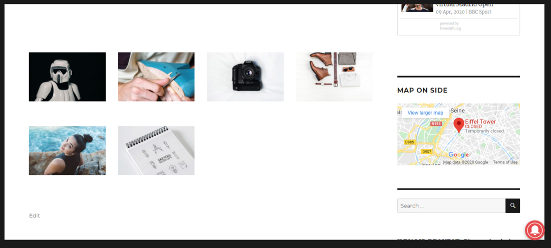
More info / Download5. Visual Portfolio
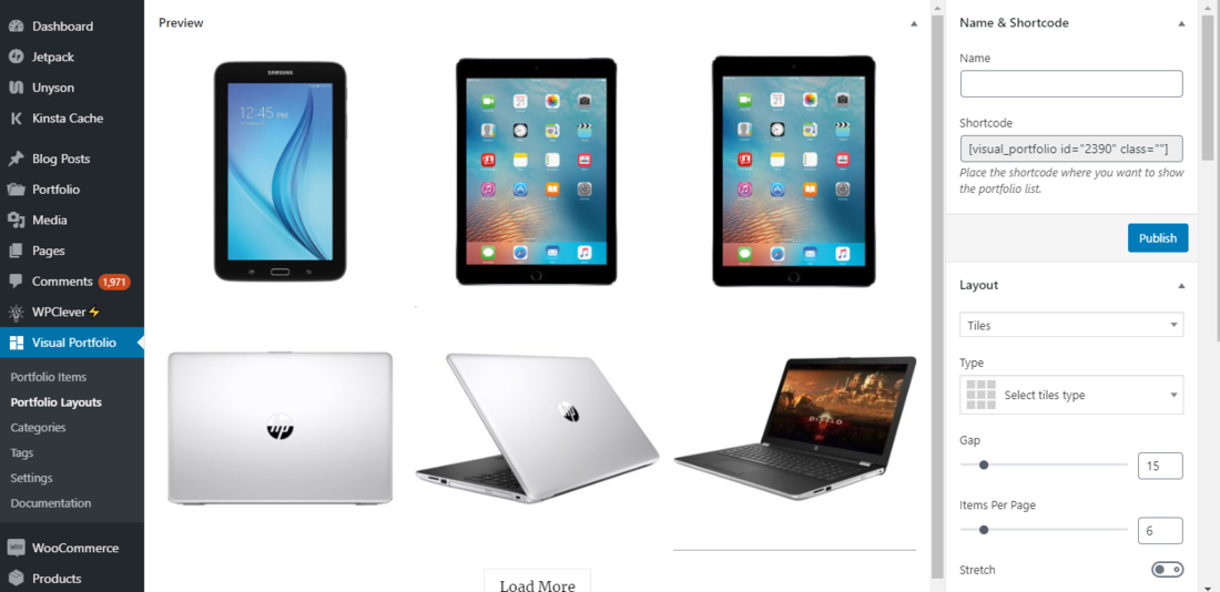
As the name implies, Visual Portfolio is the best option for creating attractive portfolio-like blog pages. It’s best used for photography-focused blogs, interior design niches, and fashion, travel and food blogs. These kinds of niches require a feast of visuals. And while some written content would nicely tell more detailed stories and captions, still, the visuals would do the talking in most parts.
With its ideal features, Visual Portfolio will enable you to develop stunning blog pages resembling that of Pinterest or Flickr.
More info / DownloadWhile content is king, how your blog presents it would starkly distinguish between reeling in a potential reader or unintentionally pushing him to look elsewhere. Wisely choose your WordPress grid plugin to jazz up your blog content layout. Make that three seconds count.
Related Posts


Comments (0)