
23 Best Elementor Websites (Examples) 2026
Do you want to check the ultimate Elementor websites because you want to build the best WordPress page?
We have prepared an extensive collection of excellent responsive web designs you can use as inspiration.
According to Colorlib’s estimates, Elementor is used by nearly 9 million websites worldwide.
The list encompasses multiple industries and niches to cater to a diverse audience.
But before you proceed with creating your online presence, we also have an in-depth Elementor review ready, demonstrating why it’s one of the best WordPress page builders.
When you’re ready to take action, you can choose the best Elementor WordPress theme to simplify your life while achieving a professional result quickly.
Best Examples Of Elementor Websites
1. Zensho Agency
Built with: Elementor
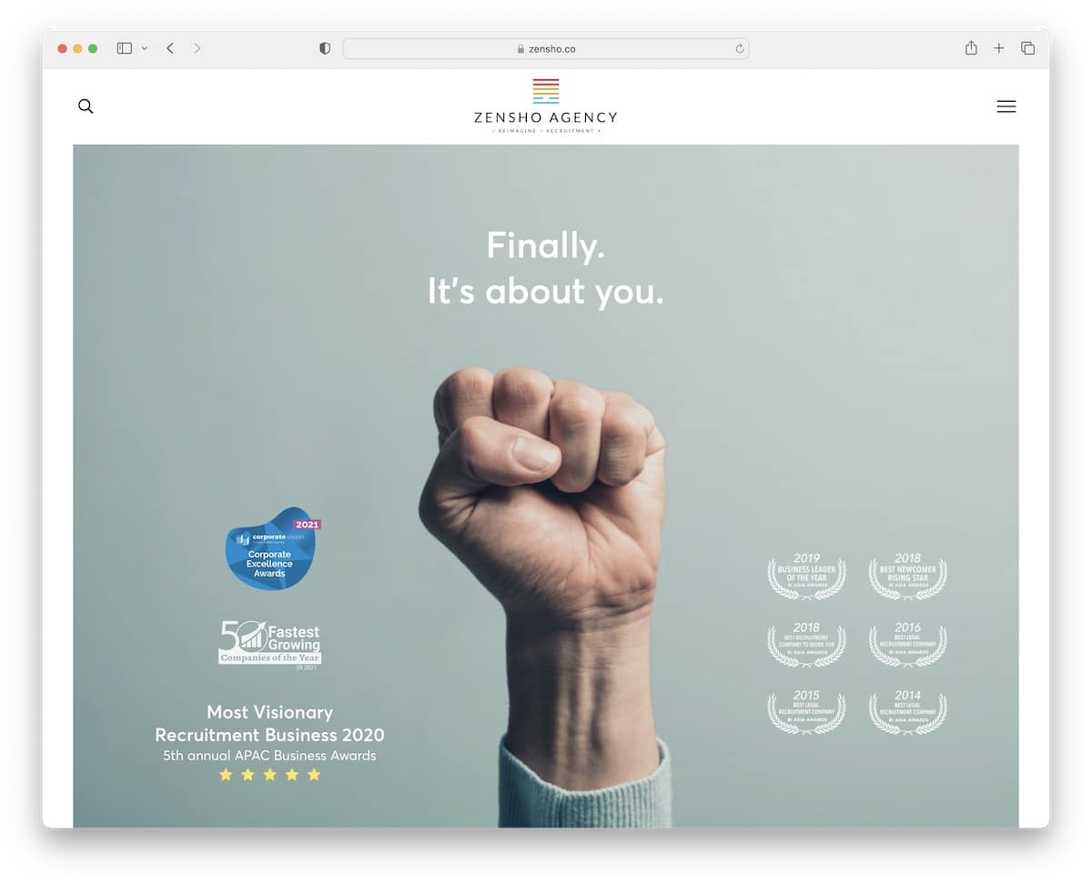
Zensho Agency is a clean website with ample white space and large images that create a strong visual impression.
The content loads as you scroll, while the header/menu remains available due to its stickiness. Additionally, navigation and the search bar both appear as full-screen overlays for a more pleasant search experience.
The site also features a “back to top” button to facilitate easy navigation.
Note: Use large images to create a WOW effect.
2. Mitchell Adam
Built with: Elementor
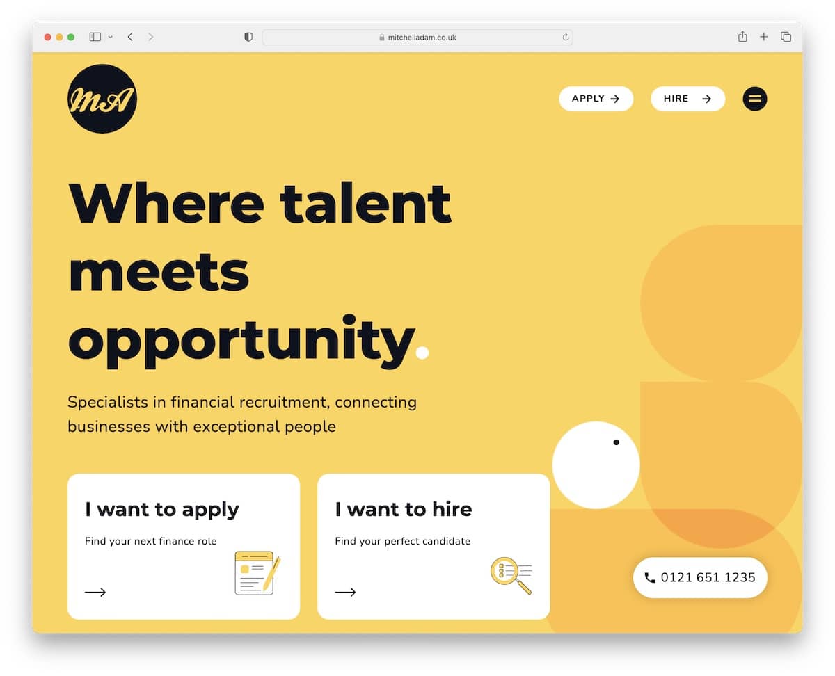
Mitchell Adam’s Elementor website example has a very mobile-ish look due to the rounded corners, large typography and cool background pattern(s).
It features a handy two-part testimonial slider that allows candidates and clients to build social proof.
If you would like to contact us, simply click the phone number button in the bottom right corner.
Note: Follow the mobile trend with rounded edges, cool color schemes and bolder typography.
3. DistantJob
Built with: Elementor
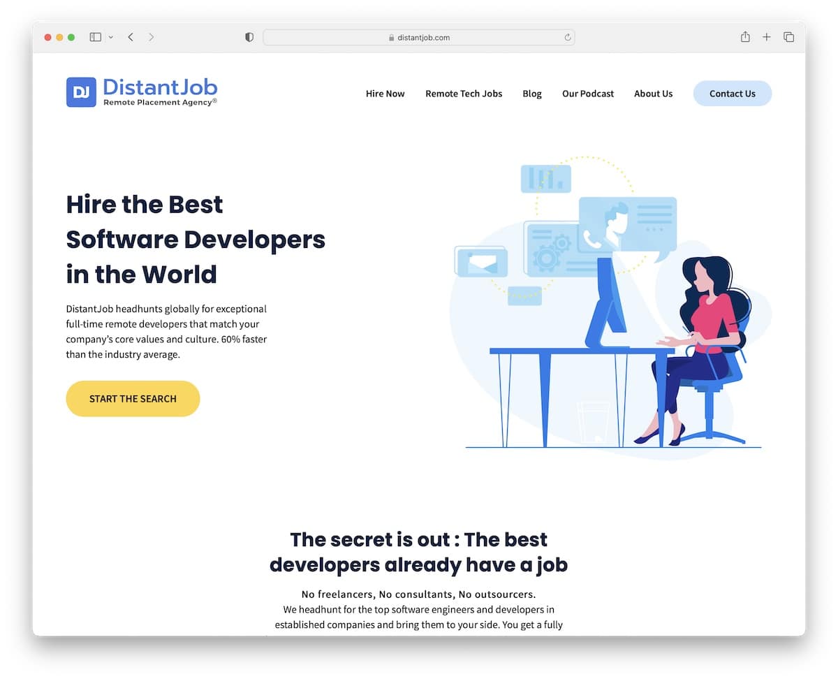
DistantJob is a modern, simple website with great attention to detail. Its floating navigation bar allows you to search other internal pages or access contacts without needing to scroll all the way back to the top first.
Moreover, the footer has multiple columns with quick links, social media icons and a newsletter subscription form.
Note: You can improve your recruitment website‘s user experience by creating a sticky header/menu.
4. ALL IN By Teddi
Built with: Elementor
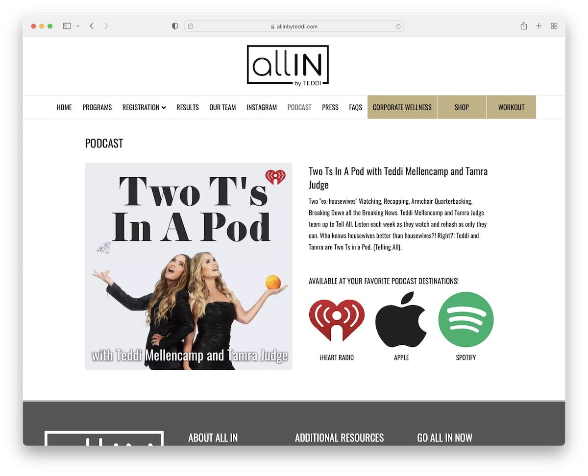
ALL IN By Teddi has a short but content-rich home page with a multi-level drop-down menu to find the necessary information quicker, which is handy because there’s no search bar.
There are multiple call-to-action (CTA) buttons for different podcast resources, a subscription form, and the “go all in” form (which is another way to get them more emails).
Note: Integrate a newsletter subscription form into your podcasting website and start growing your email list.
5. Laura Dawn
Built with: Elementor
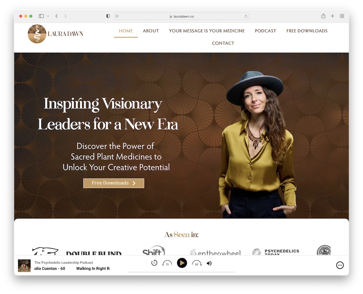
Laura Dawn is an animated website with a clean touch that grabs your attention with various effects – and a sticky audio player at the bottom of the screen.
We really like the “as seen in” section, which displays several authority logos (trust boosters!).
This Elementor website has an integrated Instagram feed, podcast playlist, iTunes reviews and testimonials.
Note: Integrate a playlist and an IG feed to your page if you want to add more content.
6. Brandon Li
Built with: Elementor
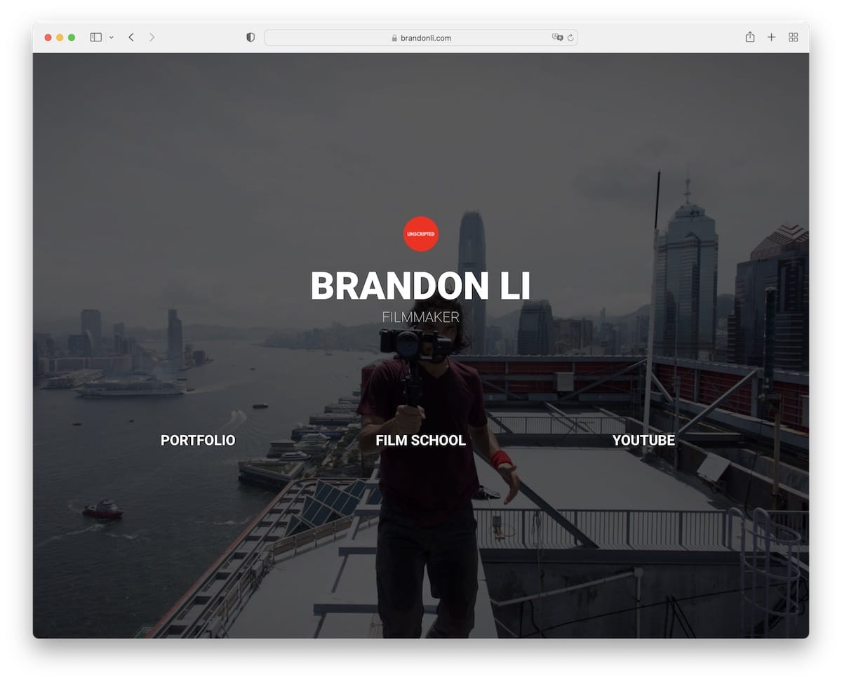
Brandon Li is a great example of how a simple, one-section home page website can work well if you want to create a hub with the necessary links.
The page uses a full-screen background image, links, and no header or footer. It is simplicity at its finest, yet it still delivers the professional aspect.
Note: Create a simple online presence as a professional content creator with links to your social media, portfolio, etc.
7. Safe Wise
Built with: Elementor
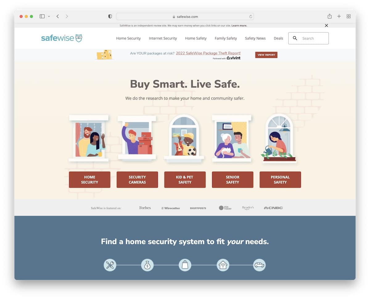
Safe Wise has a trendy design with lots of information on the home page. However, the use of catchy graphics, white space, and solid and non-solid backgrounds for sections creates a pleasant viewing experience.
The navigation is a mega menu with multiple columns, allowing users to find the necessary category with a click of a button. Moreover, there are additional quick links in the footer, a subscription form, and social buttons.
This Elementor website also has a back-to-top button, which is handy since it doesn’t have a floating header.
Note: Adding a back-to-top button can improve your affiliate site‘s UX if you don’t use a floating header/navigation bar.
8. Photofocus
Built with: Elementor
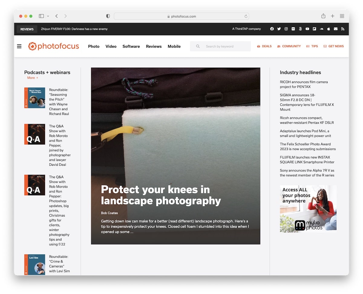
Photofocus has a beautiful, responsive web design with a magazine-like layout. Its navigation features quick links and an additional hamburger menu, complete with a search bar and social icons.
You will also find multiple sidebar widgets and a sticky one for the newsletter subscription form.
The header remains at the top of the screen, allowing you to easily access other pages and categories without needing to scroll back to the top.
Note: Add a sticky sidebar widget if you want to put an extra shine on something.
9. Mobile Notary Zone
Built with: Elementor

Mobile Notary Zone features an actionable hero section with a clickable phone number and a form for individuals who require their services.
Besides the transparent header, this Elementor website has a top bar with additional info and social icons.
Note: Improve your notary website with a top bar for notifications, contact details, and more.
10. Notarity
Built with: Elementor
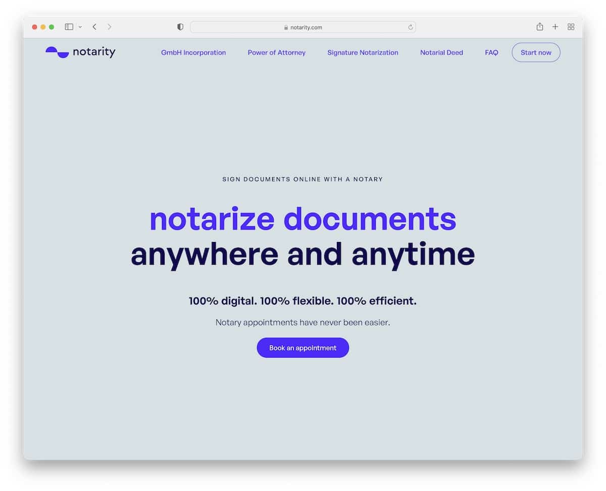
What we like about Notarity, in particular, is the text-heavy section above the fold. There are no images or visuals; instead, a solid background features a title, text, and a CTA button.
The basic navbar floats and features a CTA button alongside the navigation links, ensuring visitors always have access to it.
The FAQ accordions are also a great addition to providing extra information without sacrificing space.
Note: One way to make a CTA button easily accessible is by adding it to the sticky header.
11. River Oaks Dance
Built with: Elementor
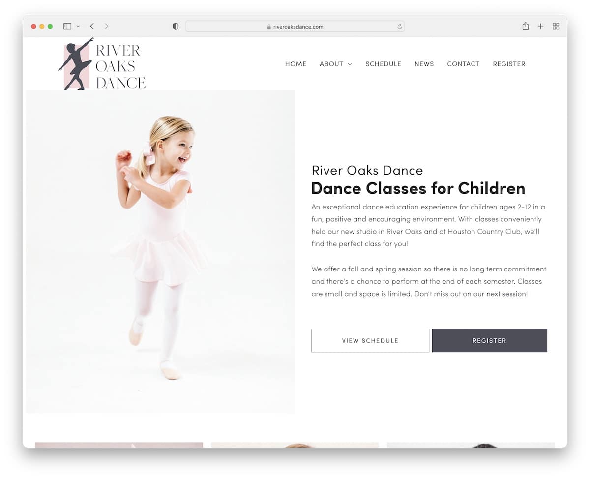
River Oaks Dance is a modern and minimalist website with a simple drop-down navigation and a plain footer with three columns.
The hero section has a stunning split-screen design, with an image on the left and text and two CTAs on the right. River Oaks Dance also has an embedded video, which is another element that keeps visitors on the page longer.
Note: Embed (promotional) videos to your website because watching is more fun than reading.
12. Scope Copenhagen
Built with: Elementor
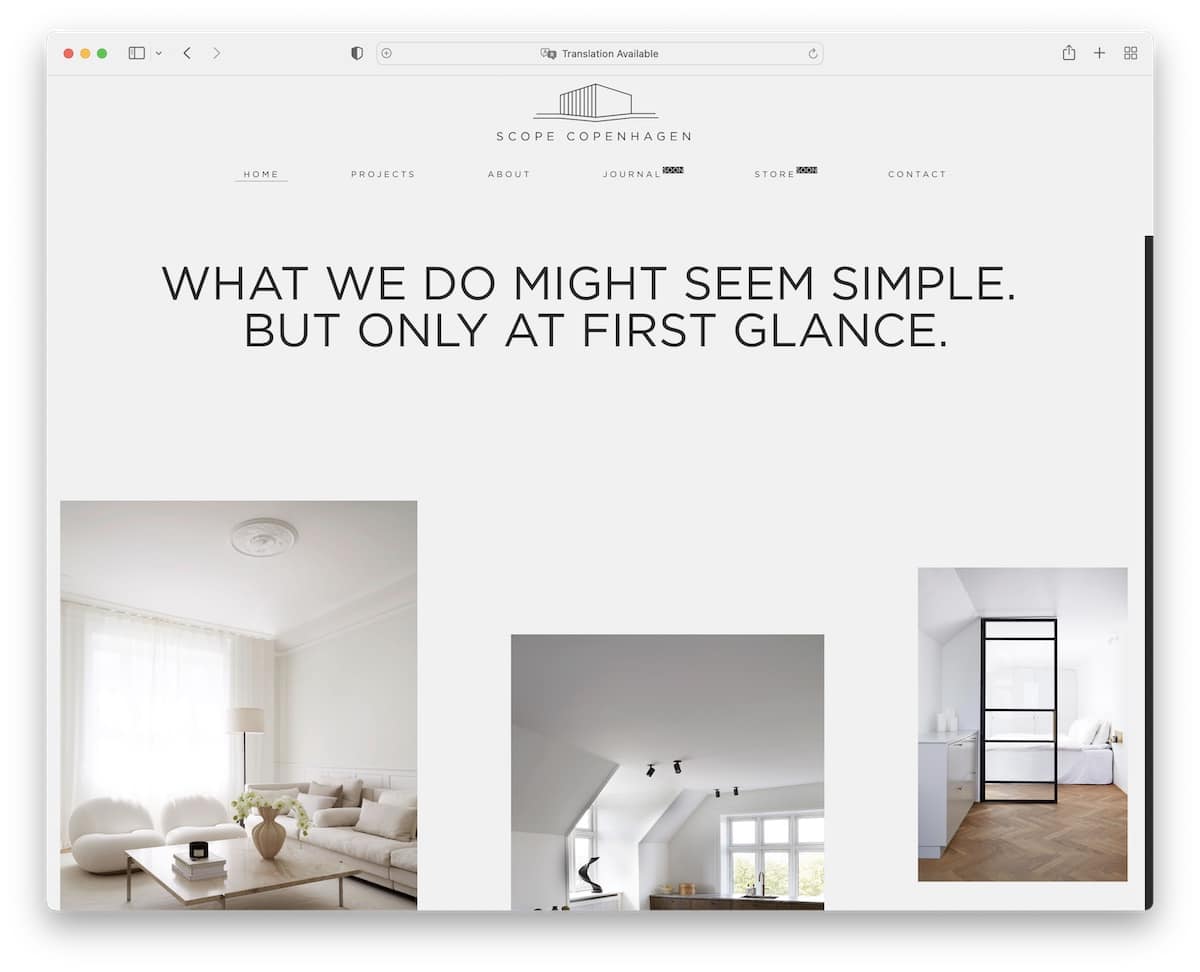
Scope Copenhagen is an Elementor website example with a minimalist Danish design. Large typography with white space and images make their home page enjoyable to scroll.
The header slightly minimizes when scrolled but remains at the top of the screen, ensuring the menu is always visible.
Another tip to achieve a neater look is to keep the same background color for all of the site’s sections (the header, the footer, and the base).
Note: Minimalist web design works GREAT. Try it!
13. Gaia Retreat
Built with: Elementor
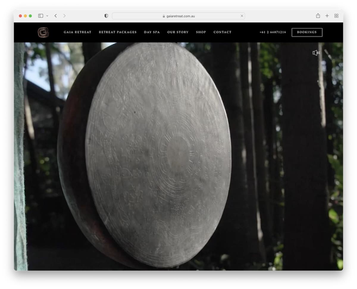
Gaia Retreat has an impactful full-screen hero video that welcomes every visitor to their beautiful retreat (you can also turn the sound on or off). They do it without text and CTAs to ensure a more enjoyable watching experience.
Another unique feature of this Elementor website is its navigation, which features a one-of-a-kind hover effect.
Besides the navigation bar are clickable telephone number and a bookings button so every potential customer can take action when they want (because the header floats).
Note: Let everyone enjoy your promotional video without overlayed text and buttons.
14. Dragone
Built with: Elementor
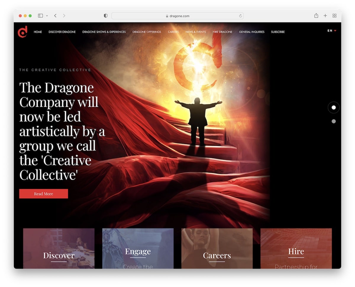
Dragone’s awesome dark design makes this Elementor site look much more premium. The header features an original drop-down function and a language switcher, providing a more personalized experience.
Furthermore, above the fold is a large slideshow with text and CTA buttons to promote the content, and below the fold are additional sections with links and an embedded video.
Note: Create a slider to push content, shows, products, services, or anything else you offer.
15. Practipago
Built with: Elementor
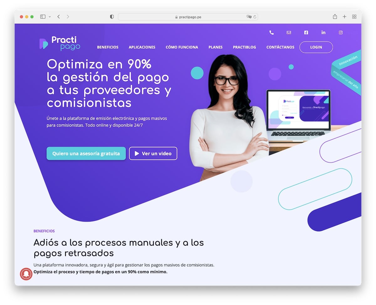
Practipago has various moving elements that make the website more engaging, especially its vibrant design.
We like their header/navigation, which disappears when you start scrolling but reappears instantly after you start to scroll back to the top (read better UX).
It’s also a one-page website, so all the information, benefits, and contact details are easily accessible.
Note: A single-page layout is becoming more popular amongst business websites.
16. YouEngage
Built with: Elementor
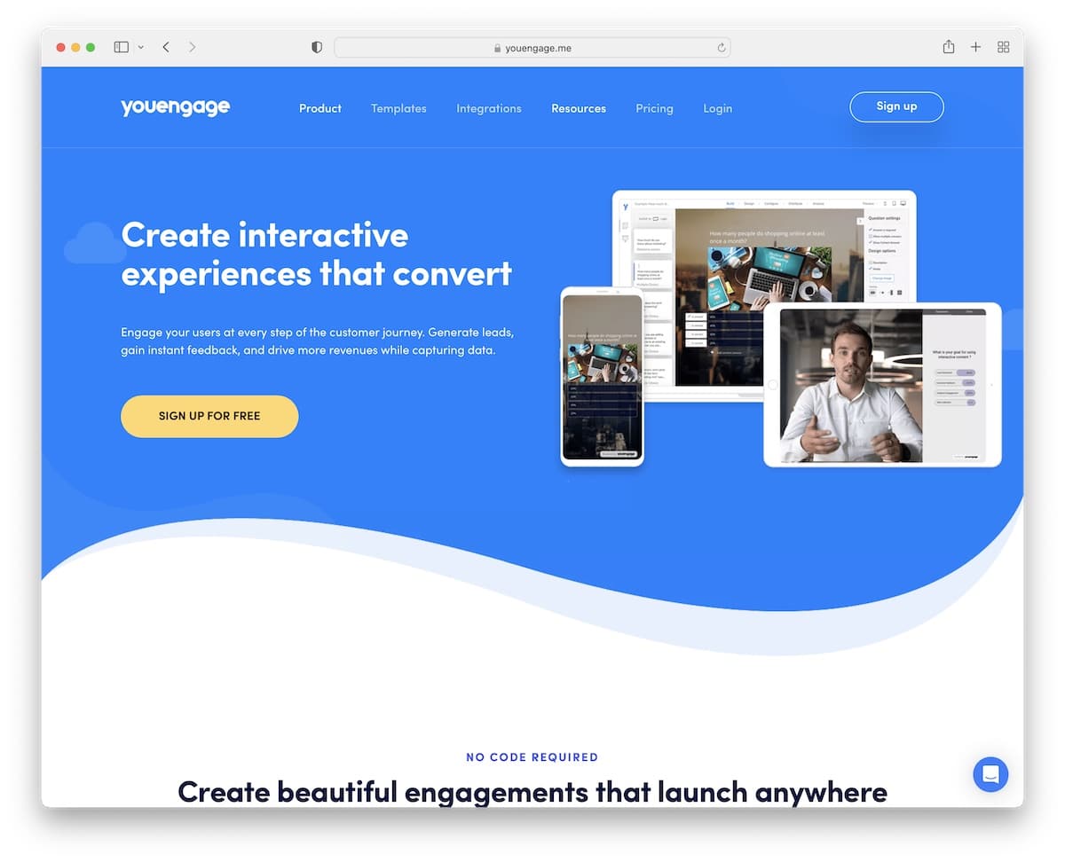
Everyone easily engages with YouEngage for its great design, hover effects, the content appearing on scroll and animated text. While it seems a lot, the page sticks to a more minimalist appearance with light and colorful backgrounds to make it (even more) dynamic.
YouEngage enhances customer service with a chat widget located in the bottom right corner, which also features helpful content.
Note: A live chat or a chatbot can improve your customer service by offering quick answers.
17. ebulletins
Built with: Elementor
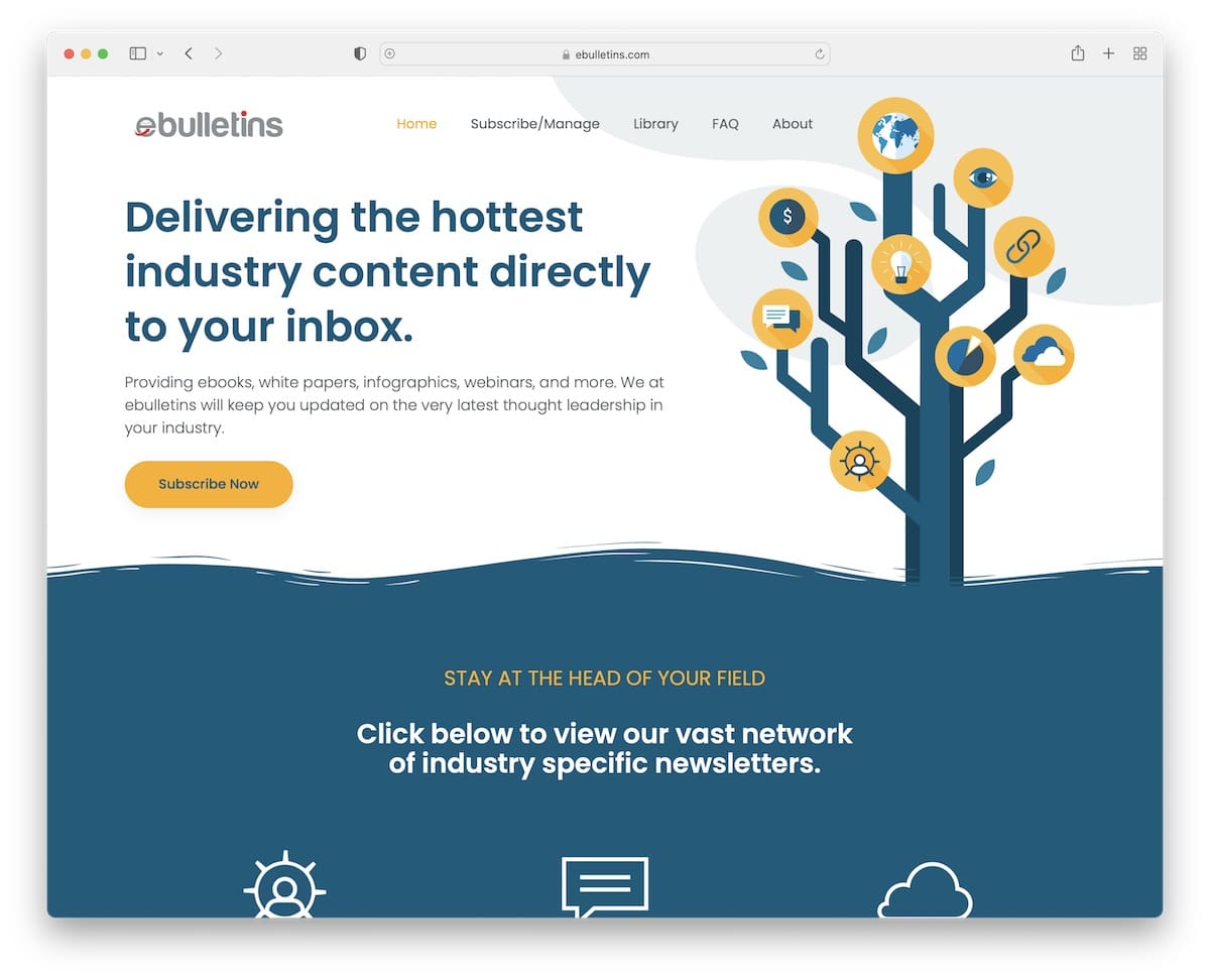
ebulletins features a clean header that stays fixed to the screen, with navigation transitioning to a hamburger icon that reveals a multi-level drop-down menu.
Other cool features are animated statistics, an integrated Twitter feed (with a load more tweets button), a back-to-top button and an advanced subscription form.
Note: Consider creating a subscription form with additional fields to capture more high-quality leads.
18. AchieveMore
Built with: Elementor
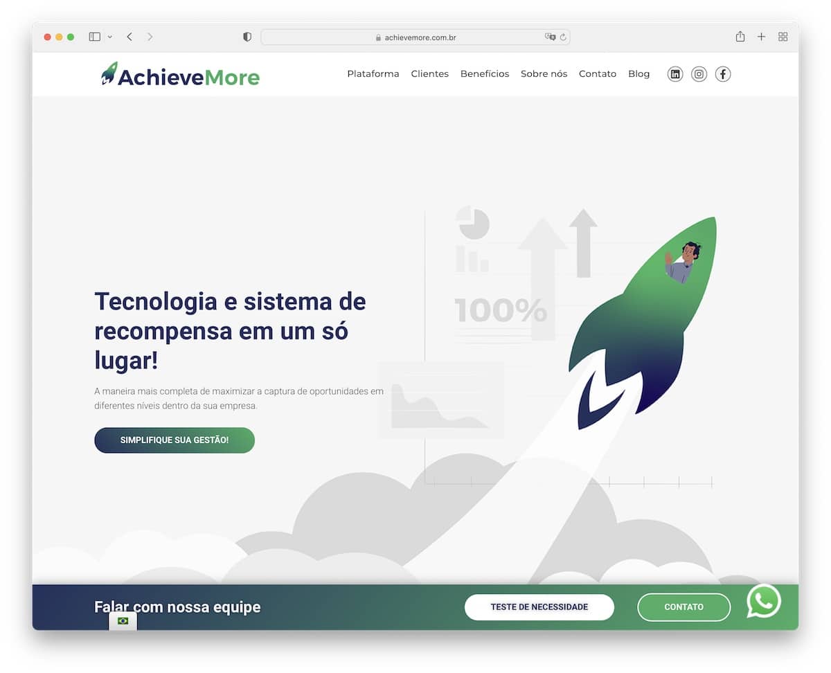
Besides the floating header, AchieveMore has additional sticky elements for the language switcher, WhatsApp, and an additional notification bar at the bottom of the screen (it appears when you start scrolling).
This Elementor website features a trendy design, complete with a client logo and testimonial sliders, scrolling animations, and a background that incorporates a particle effect.
The single-page layout (except for the blog) allows you to quickly skim through all the content, which is a significant advantage.
Note: Increase visibility of your offerings with a bottom-screen notification bar, like AchieveMore.
19. Ulah
Built with: Elementor

Ulah features a distinctive design with various animations for added engagement, beginning with the charming floating astronaut.
The choice of colors (especially orange) makes it pop nicely, so you’ll have a blast scrolling the home page (or any other internal page).
It’s a novel Elementor website that we highly recommend you check to gain new creative ideas.
Note: Adding a (more) vivid color for “detailing” can enliven your website significantly.
20. WODO
Built with: Elementor
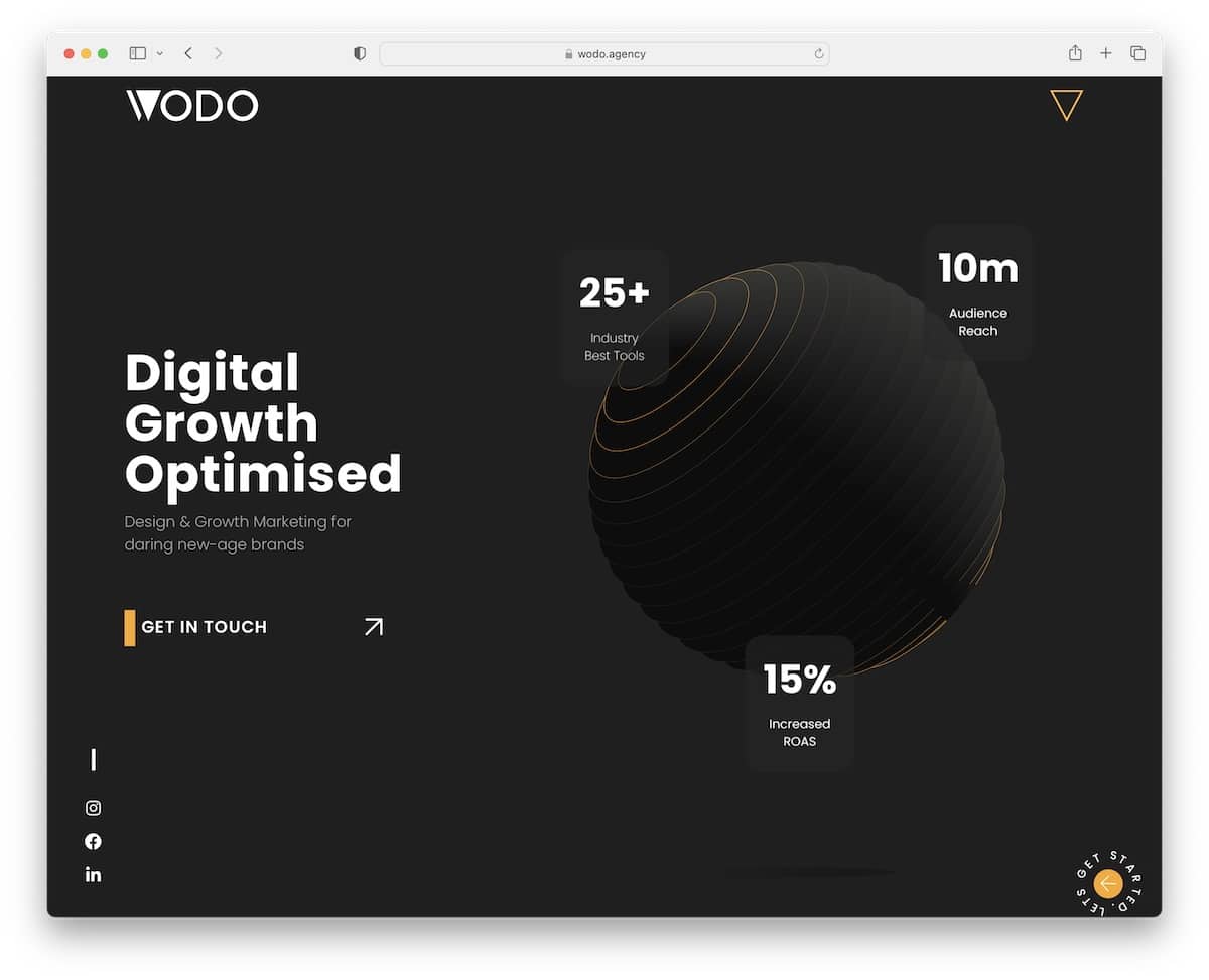
The WODO site has multiple original elements, like an animated hero section, a full-screen menu overlay, a circular button in the bottom right corner, and sliding text in the footer. But there’s more awesome stuff for you to enjoy.
Once you pass the above-the-fold section, the header disappears but reappears when you want to return to the top.
WODO figured out animations and effects, so you can comfortably adopt some.
Note: Special effects and animations can bring life to your Elementor website – just don’t overdo it.
21. Aiurri Montessori
Built with: Elementor
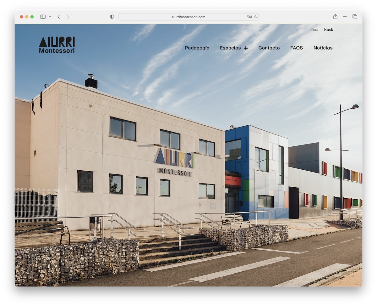
Aiurri Montessori features a full-screen background slider with no sales elements, only images. Also, the header is fully transparent for a better viewing experience but turns solid on hover (and sticks, too!).
The use of larger fonts, white space and a mixture of image-only and yellow-ish text-only sections make the page very dynamic. And then there’s a contrasting footer with a black background that places contact details front and center.
Note: Create a strong and lasting first impression with a full-screen image slider (no text, no CTAs).
22. Skateboarding Traunstein
Built with: Elementor
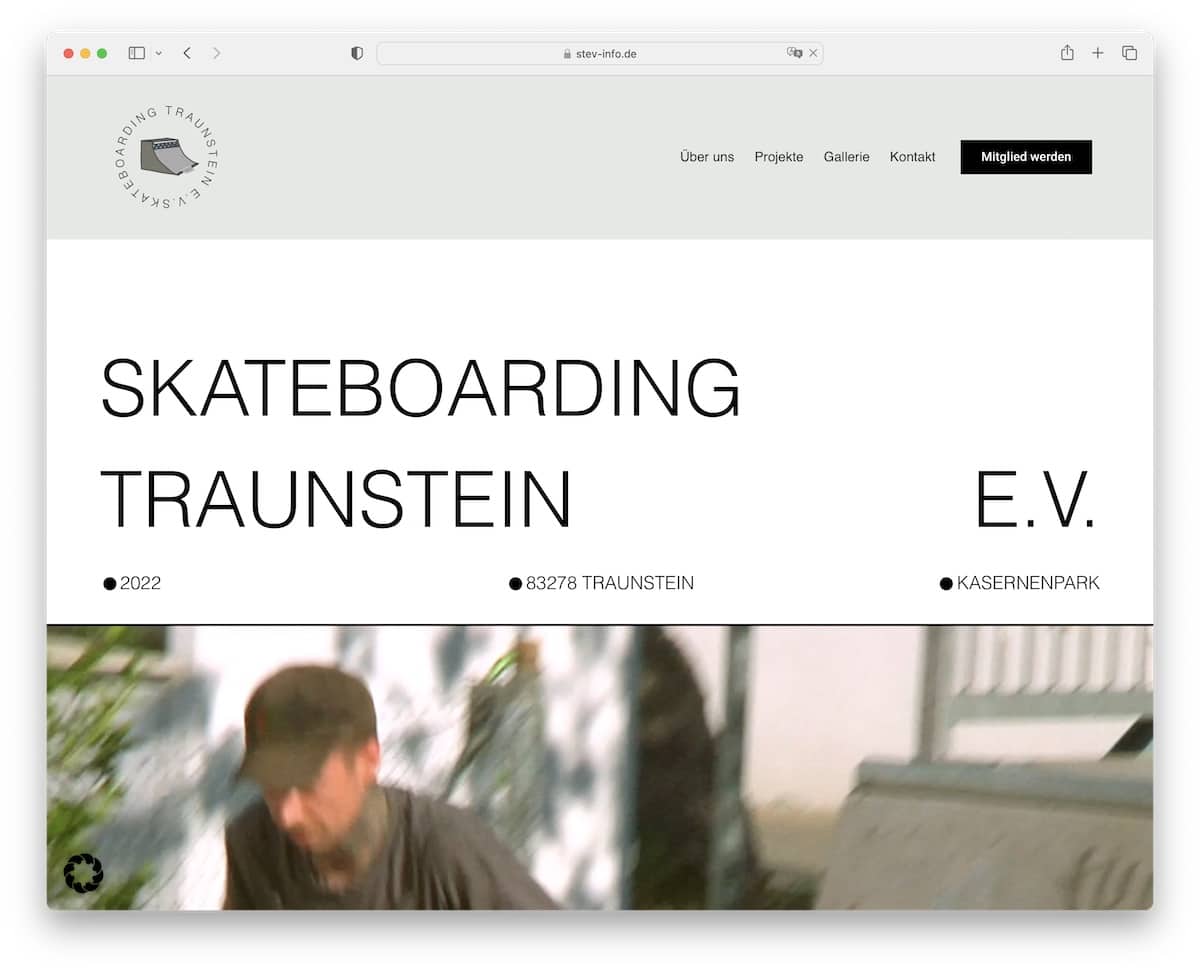
Skateboarding Traunstein ensures to grab your attention with large text on a white background, followed by a video.
It’s an Elementor website with a distinct design that leans toward simplicity, although it incorporates plenty of creative elements to add an extra oomph.
The header and the footer (is it too large?) are plain and simple, with quick links and additional business details.
Note: Embedding a video creates your “hero” section more gripping.
23. Halley Stevensons
Built with: Elementor
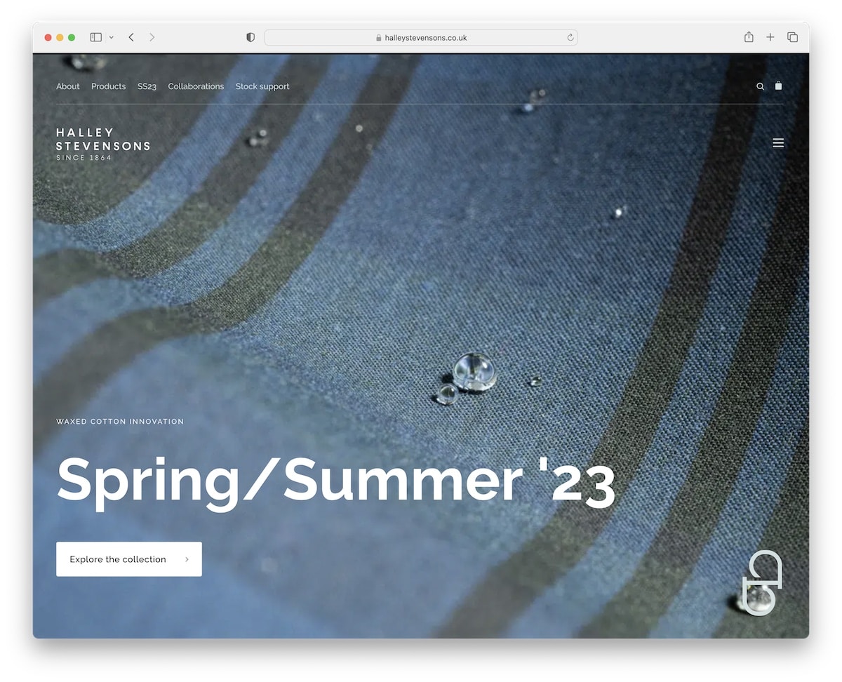
The first few seconds are crucial, so using a full-screen image with large text and a CTA button can be effective in capturing the potential customer’s interest. And Halley Stevensons is well aware of that!
They use a transparent top bar and header to give a better experience when checking the image. However, the header floats and becomes black when scrolling begins, displaying a hamburger menu icon. The footer is also black, so they complement each other nicely.
Note: A transparent header section creates a classier look when using a full-screen image (even a slider or video).
Related Posts

Comments (0)