
25 Best Animated Website Examples 2026 (With the Tech Behind Them)
The best animated websites use motion to explain something: a product that turns as you scroll, a cursor that reacts, a page that changes like a scene. These 25 come from studios, product and brand sites, personal portfolios and small businesses, and for each one we list the animation libraries we found in its code; for motion designers’ own portfolios, see our motion design portfolios.
We loaded 68 sites, including all twenty from the previous version of this list, and read the scripts each one downloads to identify its platform and animation stack (GSAP, three.js, Lottie, Rive and others). We also measured page weight and tested whether the motion stops when a visitor asks for reduced motion. Of the old entries, two no longer load, two are now different businesses and thirteen made the cut.
Best Animated Website Examples
1. Lusion
Built with: Astro, three.js, SplitType
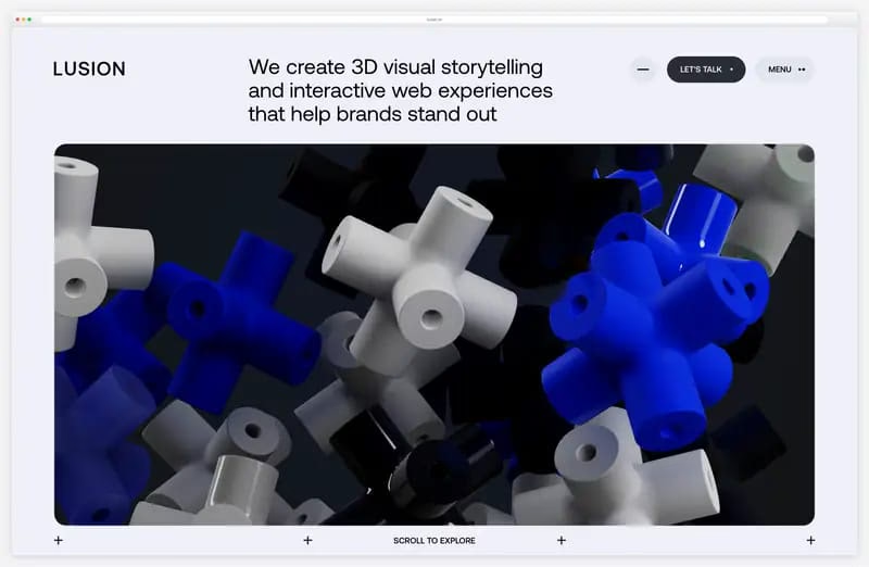
Lusion’s home page is a single 3D scene rather than a gallery: glossy blue, white and black connector pieces tumble slowly inside a rounded panel, under the line “We create 3D visual storytelling and interactive web experiences that help brands stand out”. The studio sells 3D work, so the first screen is 3D.
The scene runs on three.js inside an Astro site, and a short progress bar plays while it loads. Headings are split into individual letters with SplitType, so each letter can animate on its own.
What stands out: The first screen is the pitch: a live 3D scene instead of a showreel.
2. Apple AirPods Pro
Built with: Custom code (Apple), video, three.js

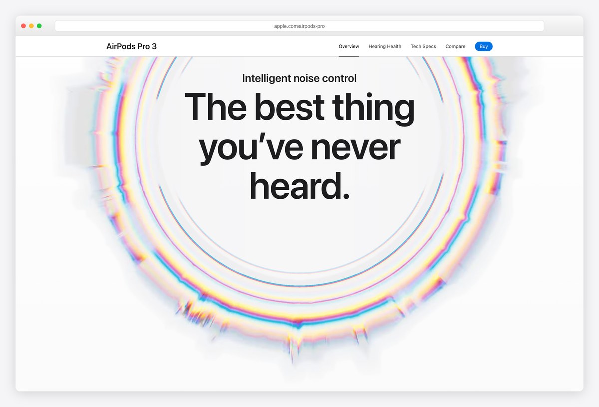
Apple’s AirPods Pro page is the reference for scroll-driven product storytelling. The hero film turns the earbuds in the light, “Get the highlights” plays a carousel of short films, and further down the close-up views and the noise-control rings move with your scroll position rather than on a timer.
Most of it is video, with 16 video elements on the page and three.js for one effect, rather than a heavy 3D engine. With reduced motion switched on, the hero shows a still image and the scroll sections simply appear.
What stands out: Scroll-linked storytelling that switches itself off for reduced motion.
3. Igloo Inc.
Built with: Custom (Vite), three.js, GSAP

Igloo Inc. opens on an igloo made of ice blocks on a snowy mountain, and the blocks lift away and settle back while you watch. Scrolling flies the camera into floating ice cubes, each holding one of the company’s portfolio businesses, starting with Pudgy Penguins.
The studio abeto signs the build in the browser console, and it runs on three.js with GSAP. The catch is that every word is drawn inside the canvas, so the page has no HTML text for search engines or screen readers, and it transferred 14.4 MB in our first eight seconds.
What stands out: A 3D scene that doubles as the navigation.
4. darkroom.engineering
Built with: Next.js, Lenis, GSAP, ScrollTrigger
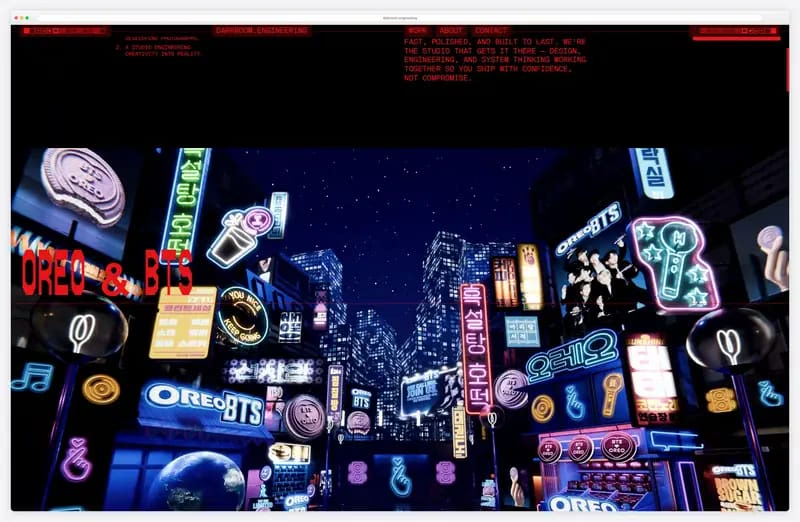
darkroom.engineering is the studio behind Lenis, the smooth-scroll library that four other sites on this list use, and its own site shows the style: red pixel type reading WHERE THINGS GET DEVELOPED over a dense neon scene, with projects scrolling past as full-bleed images.
It is also one of the lightest pages here, at 0.65 MB in our first eight seconds. The Work page opens with its tagline repeated down the screen, and with reduced motion on, the smooth scrolling switches off and the page moves instantly.
What stands out: The team that wrote Lenis, on a page that weighs under a megabyte.
5. Graza
Built with: Shopify, GSAP, ScrollTrigger, Lottie
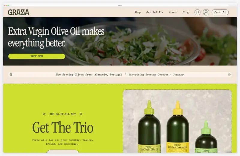
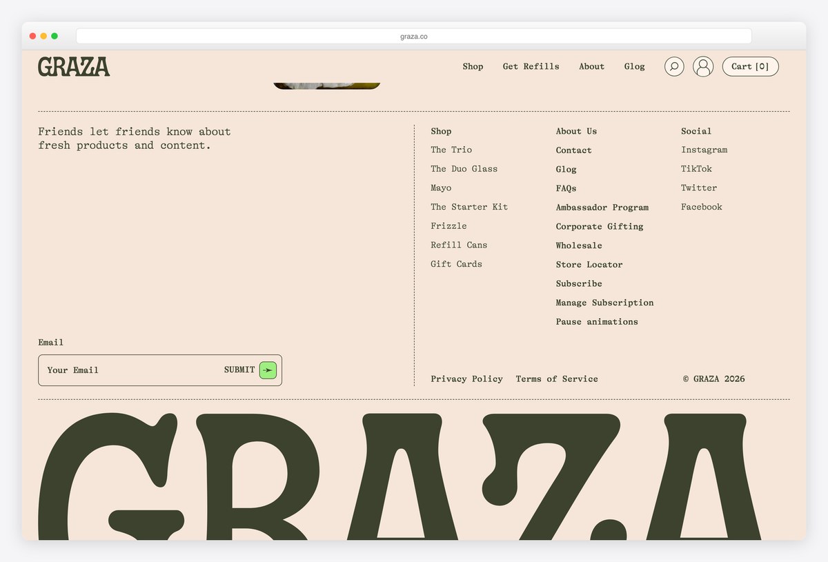
Graza, an olive oil brand, uses motion for personality: after the video hero, “Olive oil so fresh, you can taste it.” arrives over hand-drawn olives with faces, a drop falls, and short story panels stay pinned while you scroll past them.
A “Pause animations” control is the first thing a keyboard user reaches, and it is repeated in the footer. The site also honours the system reduced-motion setting, which stopped the hero film in our test. The cost is weight: the home page pulled 71.2 MB, mostly video, in eight seconds.
What stands out: A pause control for all the motion, reachable from the first keystroke.
6. Lando Norris
Built with: Webflow, GSAP, ScrollTrigger, SplitText, three.js, Rive, Lenis, Taxi.js

Lando Norris’s site, built by the studio OFF+BRAND, is scroll-driven from the first screen: shapes wipe across his portrait, the photo breaks into pixels, a neon signature is drawn over a scrolling headline, and highlight blocks sweep across the words of his mission statement.
It is a Webflow site with a large custom script on top: GSAP with ScrollTrigger and SplitText, three.js, the Rive runtime, Lenis smooth scrolling and Taxi.js for page changes. The Calendar page adds a track visualiser for the next race.
What stands out: Every scroll step changes what you see.
7. Stripe
Built with: Next.js, WebGL, three.js, Framer Motion

Stripe keeps the motion behind the message: ribbons of orange, pink and violet flow slowly on a WebGL canvas behind the headline, and a small counter above it, “Global GDP running on Stripe”, ticks up in its eighth decimal place while you read.
Lower down, a globe of light lines illustrates “The backbone of global commerce”. The page transferred 2.1 MB in our first eight seconds, and with reduced motion on, the gradient holds still and the CSS transitions switch off.
What stands out: Motion that sets the mood without competing with the copy.
8. 1Minus1
Built with: Nuxt, GSAP, ScrollTrigger, SplitText, Flip, three.js, Lenis
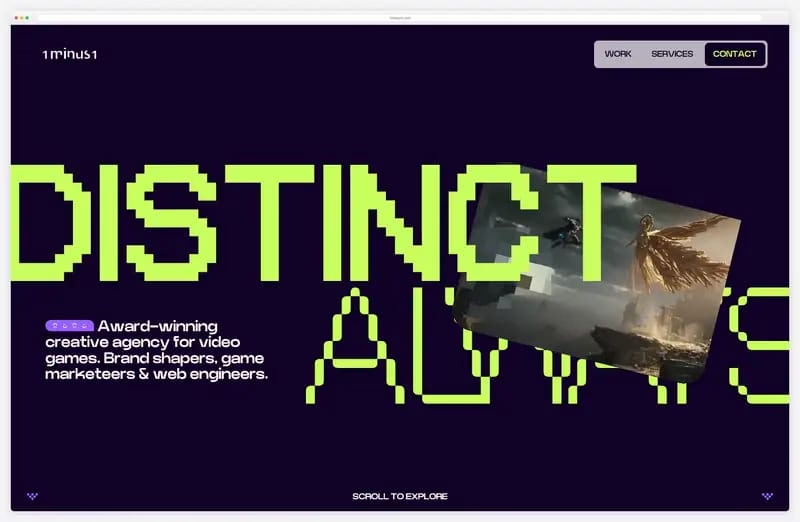
1Minus1, an agency for video game companies, opens like a game: a HOLD TIGHT, ALMOST READY counter runs to 100, then the pixel-font headline DISTINCT ALWAYS sits over a WebGL card that cycles through game key art.
The stack is GSAP with ScrollTrigger, SplitText and Flip, plus three.js and Lenis, on Nuxt. Like darkroom.engineering, it respects reduced motion: with the setting on, the hero effect stops, because its code skips the timeline when the reduce query matches.
What stands out: A loader and headline that feel like a game’s start screen.
9. Bruno Simon
Built with: Custom (Vite), three.js, GSAP
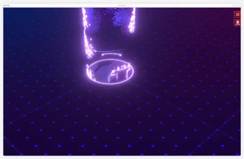
Bruno Simon’s portfolio is a game: after a glowing ring loads, a 3D island appears with a toy truck, trees and a “Click to start” prompt, and you drive around the world to find his projects and links. The site itself is the work.
It runs on three.js with GSAP in a Vite build, and the page switches between mouse-and-keyboard and gamepad modes. Expect a short wait while it loads: 5.5 MB arrived in our first eight seconds.
What stands out: A game you drive, not a page you read.
10. Hello Monday
Built with: Custom code, PixiJS, GSAP, MorphSVG

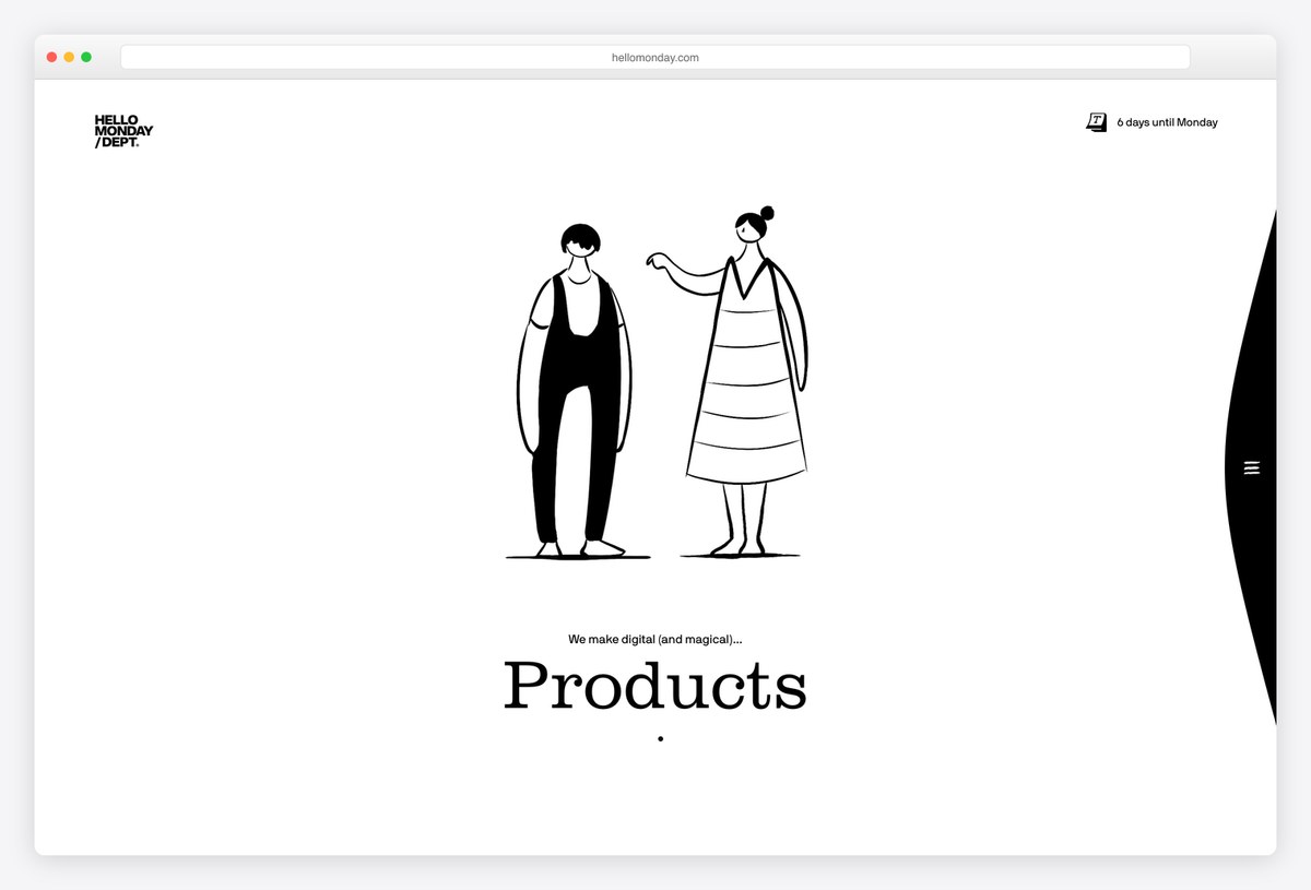
Hello Monday, a creative studio in New York, Copenhagen and Aarhus, opens with two line-drawn characters who change outfit and pose each time the word under them switches between Branding, Experiences and Products. It explains the three services without a paragraph of copy.
The drawings run on PixiJS with GSAP and its MorphSVG plugin, and a small counter in the corner tells you how many days remain until Monday. Case studies further down use video, which is most of the 12.6 MB the page loaded in eight seconds.
What stands out: Illustration that explains the three services at a glance.
11. Dogstudio
Built with: WordPress, three.js, GSAP, Highway.js
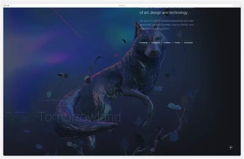
Dogstudio’s home page opens on a 3D dog lit in deep blue beside the studio’s tagline. Scroll, and the page becomes a list of projects, among them Tomorrowland, MSI Chicago and Royal Opera of Wallonia, and the dog changes colour and setting behind each title: gold for Tomorrowland, deep red for the opera.
The dog is a Draco-compressed glTF model rendered with three.js; GSAP handles the tweens and Highway.js swaps pages without a full reload, all on WordPress. Because each project restyles the same scene, the list feels like one continuous space.
What stands out: A project list where every title restyles the 3D scene.
12. Rive
Built with: Framer, Rive, Framer Motion
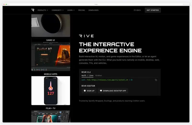
Rive makes an interactive animation tool, and its own site runs on it: the icons and buttons are Rive files playing live on the page (the Framer components are named “Framer site icons.riv” and button_simple.riv), next to a column of use-case tiles for automotive, game UI, mobile apps and film.
The layout is Framer, which also handles scroll and appear effects through its built-in motion library. It is a good model for any product whose output is animation: use the product on your own site.
What stands out: The product’s own animations run the site’s buttons and icons.
13. Castor & Pollux
Built with: SvelteKit, GSAP, Lottie, Lenis
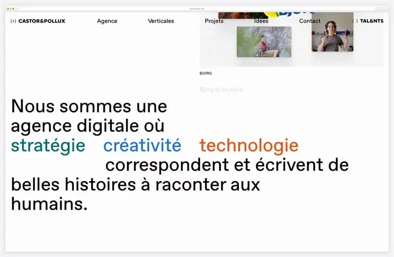
Castor & Pollux, a digital agency in Montreuil, replaces the cursor with a small eye whose pupil follows the pointer. It is a tiny detail, but it makes every hover feel alive and suits the agency’s playful copy.
Scrolling brings project images in as a collage and pushes the words stratégie, créativité and technologie apart. The SvelteKit site loads GSAP in a page-transition chunk, a Lottie animation and Lenis for smooth scrolling, and lists clients such as Deezer, WWF, La Poste and Engie.
What stands out: A cursor with a personality.
14. Home Abroad
Built with: Webflow, Webflow Interactions

Home Abroad, a Sofia agency that sells property in Cyprus, shows that animation does not need a studio budget. The three figures in the hero (340 sunny days a year, 0% buyer commission, up to 80% higher yield than in Bulgaria) pop in one after another.
Then villa and palm-tree photos rise out of a soft mist as each section scrolls in. It is all Webflow Interactions, with 29 animated elements on the home page and no extra library, and the motion stays slow enough that the offer remains the focus.
What stands out: Gentle motion on a small business site, built without code.
15. Active Theory
Built with: Custom code, custom WebGL, Theatre.js
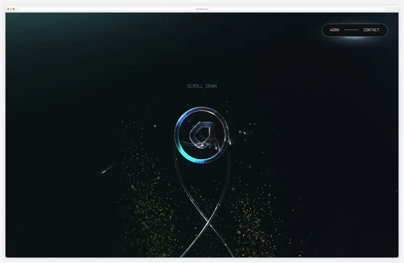
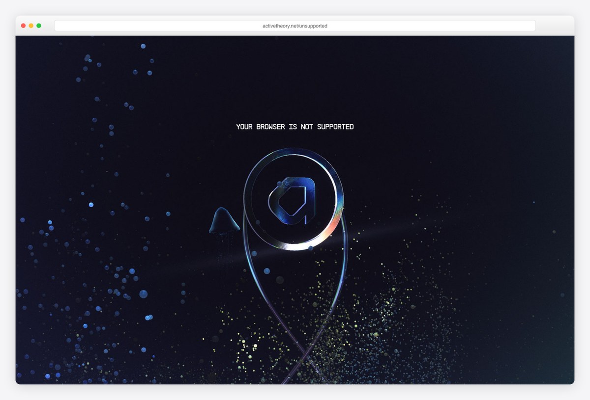
Active Theory builds games, installations and WebGL experiences, and its site behaves like one: a glowing ring logo floats over drifting particles, and the Work menu lists projects such as Secret Sky, Discover your Patronus and 20 Years of Xbox, filtered by games, multiplayer, XR / VR / AI, installations and websites.
Everything is rendered by the studio’s own WebGL code, with Theatre.js for sequencing. It also plans for weak browsers: our headless test browser was sent to a “Not Supported” page instead of a broken scene, while desktop Chrome ran the full site.
What stands out: A clear fallback page for browsers that cannot run it.
16. Eszter Bial
Built with: Custom HTML, GSAP, ScrollTrigger, Lenis
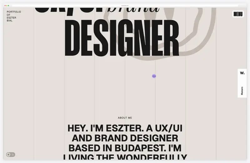
Eszter Bial, a UX/UI and brand designer in Budapest, builds her portfolio from kinetic type: “UX/UI brand DESIGNER” in huge condensed letters over an outlined smiley, copy that scrolls up in big blocks, and a running contact marquee near the end.
The cursor label changes by section, from view work to contact, and moving between pages shows a 0% to 100% counter. It is plain HTML with GSAP, ScrollTrigger and Lenis loaded from public CDNs, which shows how much motion a one-person site can carry without a framework.
What stands out: Big, confident type does most of the animating.
17. Duolingo
Built with: Custom code, Rive, Lottie
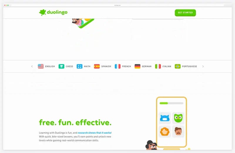
Duolingo’s home page uses its characters the way the app does: the cast crowds around Duo the owl in the hero and moves gently, and each section below (free. fun. effective., stay motivated, personalized learning) brings in its own illustration as it scrolls into view.
The app code ships Rive files for lesson animations and lottie-web for lighter ones. The characters are the brand, so the motion is short and friendly rather than cinematic, and with reduced motion switched on, the hero illustration stood still in our test.
What stands out: Mascot motion that stops when the visitor asks it to.
18. Les Animals
Built with: WordPress, GSAP, ScrollTrigger, ScrollSmoother, SplitText, MorphSVG, PixiJS, Matter.js
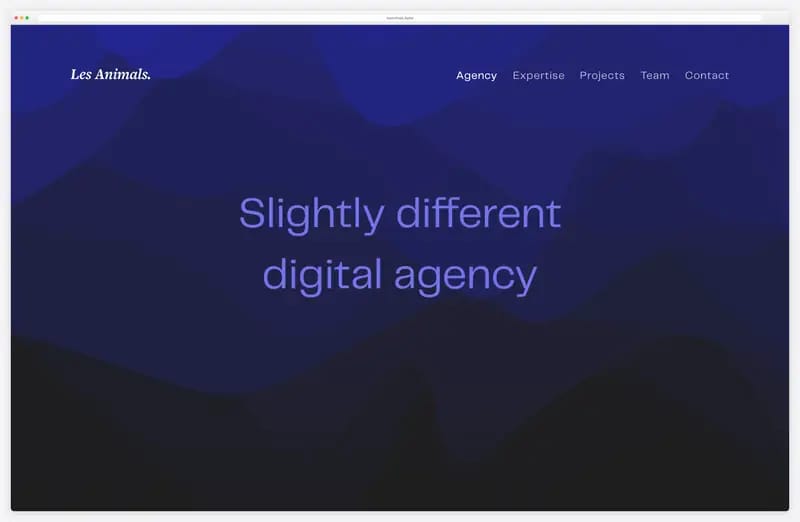
Les Animals, a digital agency in Lyon, keeps its hero almost still on purpose: “Slightly different digital agency” sits over slow, smoky blue waves drawn on a full-screen canvas, and the statement lines below reveal one at a time as you scroll.
Underneath is one of the richest stacks on this list, on WordPress: GSAP with ScrollTrigger, ScrollSmoother, SplitText and MorphSVG, plus PixiJS and the Matter.js physics engine. Even so, the home page transferred only 1.0 MB in eight seconds.
What stands out: A rich animation stack on WordPress that still loads light.
19. Verholy Relax Park
Built with: Nuxt, GSAP, ScrollTrigger
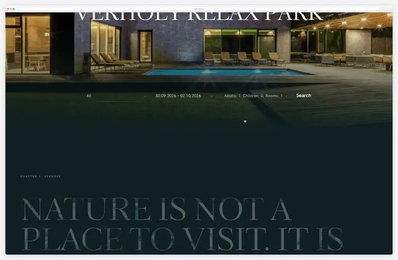
Verholy Relax Park, a forest spa hotel with English and Ukrainian versions, uses motion to slow you down: the letters of VERHOLY RELAX PARK drift apart over the photo as you scroll, then “Nature is not a place to visit. It is home.” fades in on dark green.
Rooms, food and activities follow in offset photo panels, with a custom cursor. It is a small business site built on Nuxt with GSAP and ScrollTrigger, and the animation stays in service of the photography.
What stands out: Scroll pacing that matches a slow weekend away.
20. Louis Ansa
Built with: Nuxt, three.js, Lottie, anime.js
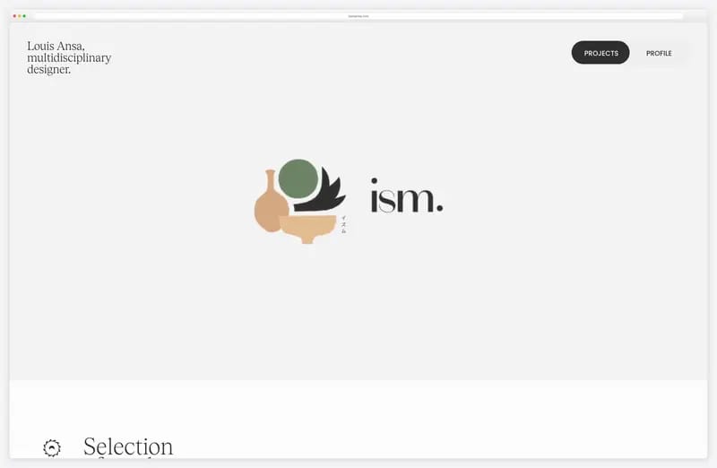
Louis Ansa, a freelance creative director and multidisciplinary designer with over 12 years of experience, lets his selection of work play itself: a grid of Mojo video templates, then the Ism logo drawing itself, then the next project, each numbered from SW.001 to SW.007.
His line “I tell stories through design, interactivity and animation” is backed by the stack, three.js, Lottie and anime.js on Nuxt, and by a custom cursor. The autoplaying previews are video, which is why the page reached 16.6 MB in eight seconds.
What stands out: The portfolio previews itself, one project after another.
21. OLIPOP
Built with: Shopify, GSAP, Barba.js
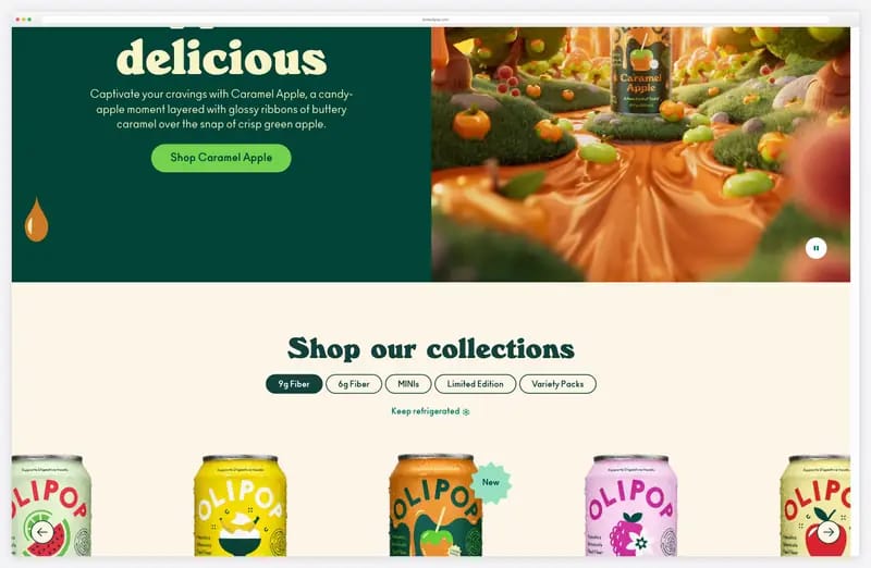
OLIPOP, the prebiotic soda brand, keeps its motion close to the product: caramel-drip shapes frame the Caramel Apple hero beside a short film of an apple coated in caramel, and scrolling slides the cans in on tabs by fibre content before the Why OLIPOP? panel.
The Shopify theme loads GSAP and imports Barba.js, a library for animated page changes. Expect a cookie bar and, after you accept it, a discount popup; the hero itself stays clean and readable.
What stands out: Product film and packaging-style graphics, with motion kept simple.
22. Waaark
Built with: WordPress, GSAP (TweenMax), SplitText, Lottie (Bodymovin)

Waaark, a French web studio of two, fits its home page on one screen: three panels for works, vision and studio, each with an isometric illustration. The motion is saved for page changes, where liquid pink and blue shapes sweep across the screen, a giant W builds behind the heading and the text reveals line by line.
The stack is older GSAP (TweenMax) with SplitText and the Bodymovin player, on WordPress, and the home page is the lightest here at 0.4 MB in eight seconds. Charm does not need WebGL.
What stands out: A page transition that makes one click feel like an event.
23. Brain Bakery
Built with: Webflow, Webflow Interactions, Lottie, Swiper
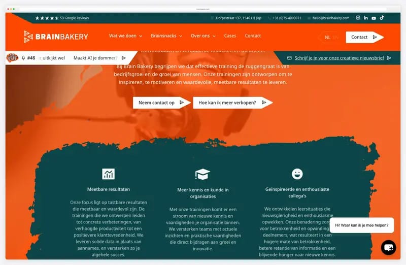
Brain Bakery, a training company in Jisp in the Netherlands, shows a small business can have a lively site. The headline’s outlined second line sits under a solid first one, and as you scroll, sections arrive on torn-paper brush shapes in dark green and cream that grow and slide into place.
All of it is Webflow Interactions (113 animated elements), two Lottie files and a Swiper carousel, with no custom code. The top bar keeps practical details, such as 53 Google Reviews and the address, in view.
What stands out: Playful, hand-made motion from a no-code builder.
24. Chartipedia
Built with: Vev, anime.js
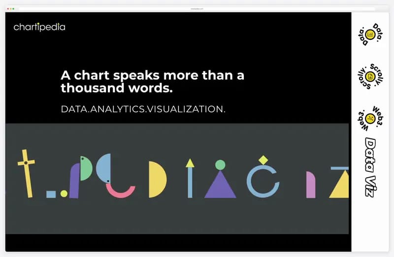
Chartipedia, a data visualisation studio, turns its own name into the animation: a marquee of geometric letterforms slides across the hero in bright colours under “A chart speaks more than a thousand words.”
Scrolling brings up cards that explain data storytelling, scrollytelling and data journalism, each over its own image. The site is built in Vev, a no-code builder whose runtime ships anime.js, and there is a Chinese version at /cn/.
What stands out: A logo that explains the business by moving.
25. Resn
Built with: Custom code, three.js, GSAP
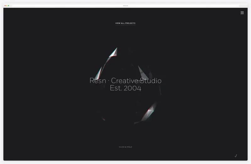
Resn keeps its home page to one object: a faceted glass shard turning slowly in the dark around the studio’s name. There is no grid of work and no headline to read, just the shard and a menu.
It is custom code with three.js and an older GSAP, and one of the heaviest pages here at 24.6 MB in eight seconds, 13.4 MB of it images. The restraint of the first screen is the point: one well-lit object says more than a wall of thumbnails.
What stands out: One object, lit well, instead of a busy grid.
What Makes a Great Animated Website?
Animate to explain, not to decorate. The strongest motion here carries information. Hello Monday’s characters change outfit to show its three services, Chartipedia’s logo turns its name into chart shapes, and Home Abroad brings in the three numbers that sell its offer one by one. If you cannot say what an animation tells the visitor, cut it.
Let scroll drive the story. Tie motion to scroll position so the reader sets the pace. Apple’s AirPods Pro page moves its close-ups and noise-control rings with the scroll, Lando Norris’s site changes something at every step, and Dogstudio restyles its 3D dog for each project in its list. Keep each step short so that people who skim still get the message.
Keep it fast. The animation libraries are rarely the heavy part: on 24 of these 25 sites all the JavaScript together stayed under three megabytes in our test; media is what pushed Graza and Resn past 20 MB. darkroom.engineering transferred 0.65 MB in our first eight seconds and Waaark 0.4 MB; Graza pulled 71.2 MB, mostly video. Compress video, lazy-load scenes below the fold and test on a phone connection.
Respect prefers-reduced-motion. Some visitors get dizzy or distracted by motion and switch it off in their system settings. We tested every site here with that setting on: Apple’s AirPods Pro page swaps its hero film for a still image, Stripe’s gradient holds still, darkroom.engineering and 1Minus1 drop their smooth scrolling and hero effects, and Duolingo’s illustration stops. Graza also offers a “Pause animations” control. Most of the other sites looked the same with the setting on.
Put micro-interactions where the hand is. Cursors and buttons are the cheapest place to add character. Castor & Pollux turns the cursor into an eye that follows you, Eszter Bial’s cursor label changes by section, and Rive’s icons and buttons are live animation files. Keep these small and quick, and keep the normal pointer on anything clickable.
Use page transitions to keep context. A transition that covers the swap makes a site feel like one continuous place. Waaark sweeps liquid shapes across the screen and builds a giant letter behind each heading, Dogstudio and Lando Norris change pages without a full reload, and Eszter Bial runs a short counter between pages. Keep transitions to a second or two; anything longer starts to feel like a loader.
Use 3D and WebGL only when it earns its weight. It pays off when the 3D is the product or the pitch: Lusion sells 3D work, Bruno Simon’s portfolio is a game, and Igloo Inc. uses its ice cubes as navigation. But Igloo’s copy lives only inside the canvas, so there is no HTML text to read or index, and every WebGL site needs a fallback like Active Theory’s “Not Supported” page.
Do not lock content behind a loader. A short progress bar is fair while a 3D scene downloads, as on Lusion, 1Minus1 and Igloo Inc., but the words should arrive with it. Several sites we looked at put everything behind a “Start” or “Enter” click, and none of them made this list. Put the headline in HTML first and let the scene load behind it.
Frequently Asked Questions
Which animation libraries do animated websites use?
GSAP is the most common: 15 of the 25 sites here load it, often with ScrollTrigger for scroll effects. three.js appears on ten, usually for WebGL scenes, Lottie on six and Rive on three. Smooth scrolling mostly comes from Lenis (five sites), and Webflow sites add Webflow Interactions. A few, like Waaark, still run older GSAP versions without trouble.
Should I use GSAP or CSS animation?
Use CSS for simple hover states, fades and transitions: it is built into the browser and costs nothing to load. Reach for GSAP when you need timelines, scroll-linked sequences or text split into lines, as Les Animals and 1Minus1 do. GSAP and its plugins are free to use, so the choice comes down to how complex the choreography is.
Do animations hurt SEO or page speed?
They can, but usually through heavy media rather than code. The JavaScript on most sites here stayed under three megabytes, while video and images pushed two pages past 20 MB. Keep headings and copy in HTML rather than only inside a canvas, lazy-load scenes and video, and check Core Web Vitals after adding motion.
What is prefers-reduced-motion?
It is an operating system setting that tells websites a visitor wants less motion, often because animation makes them dizzy. Sites read it with a CSS media query or in JavaScript and then tone down or skip their effects. In our test, Apple, Stripe, Duolingo, Graza, darkroom.engineering and 1Minus1 calmed their motion when it was on.
Can I build an animated website in Webflow or WordPress?
Yes. Webflow has built-in interactions, which Brain Bakery and Home Abroad use without custom code, and Lando Norris’s site adds GSAP and three.js on top of Webflow. On WordPress, Les Animals, Waaark and Dogstudio load GSAP, PixiJS or three.js from their themes. Both platforms let you add your own scripts when the built-in tools run out.
Should I use Lottie or video for website animation?
Use Lottie for flat illustration and icons: the files are small, vector and sharp at any size, which is why Waaark and Brain Bakery use it. Use video for filmed or rendered footage, like Apple’s product films. Rive is a newer option for vector animation that reacts to input, as on Rive’s own site and Duolingo.
Wrapping Up
For more motion on the web, see our SVG animation examples and Webflow website examples. For the people behind the motion, browse our motion design portfolios and best portfolio website examples. Ready to build your own? Start from one of our website templates.

Related Posts


Comments (0)