20 Powerful Personal Brand Websites That Convert (2026 Examples)
Are you searching for the best personal brands and examples of their websites to gain inspiration?
This is when our list of the greatest comes into play.
If you want to collect new ideas for your website or your personal brand, skim through these, learn from them and unlock new horizons of possibilities.
But it’s your uniqueness that will make you stand out. Always.
What things make up a personal brand?
When creating a personal brand, you must scatter your knowledge and expertise throughout your website.
It’s what people are following you for, and a page is a great medium for distributing excellent content.
You can also use the website for other valuable purposes, such as sharing your personal story, selling courses, or offering coaching.
Turn yourself into a product and market it online and offline like a champ.
Best Personal Brands & Branding Examples
1. Aaron Ward
Built with: Webflow
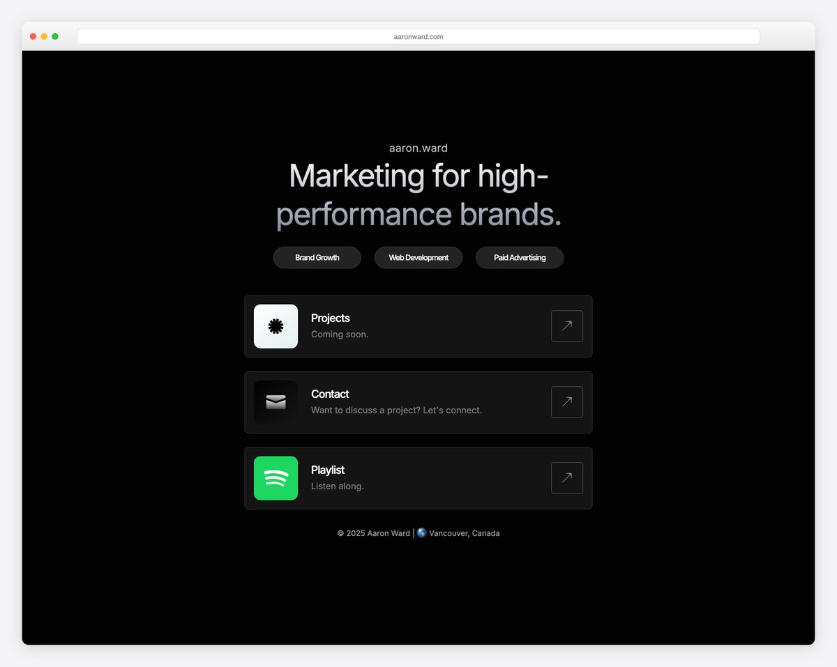
Aaron Ward opted for a minimalist responsive web design with light, dark and blue backgrounds. The hero section features a title, text, a call-to-action (CTA) button, and his image.
Moreover, the header and footer follow the clean website look for an overall distraction-free experience.
What stands out: Whenever in doubt, always aim for simplicity. Why? Because it always works!
Don’t forget to check our collection of the best Webflow websites.
2. Charlie Marie
Built with: Webflow
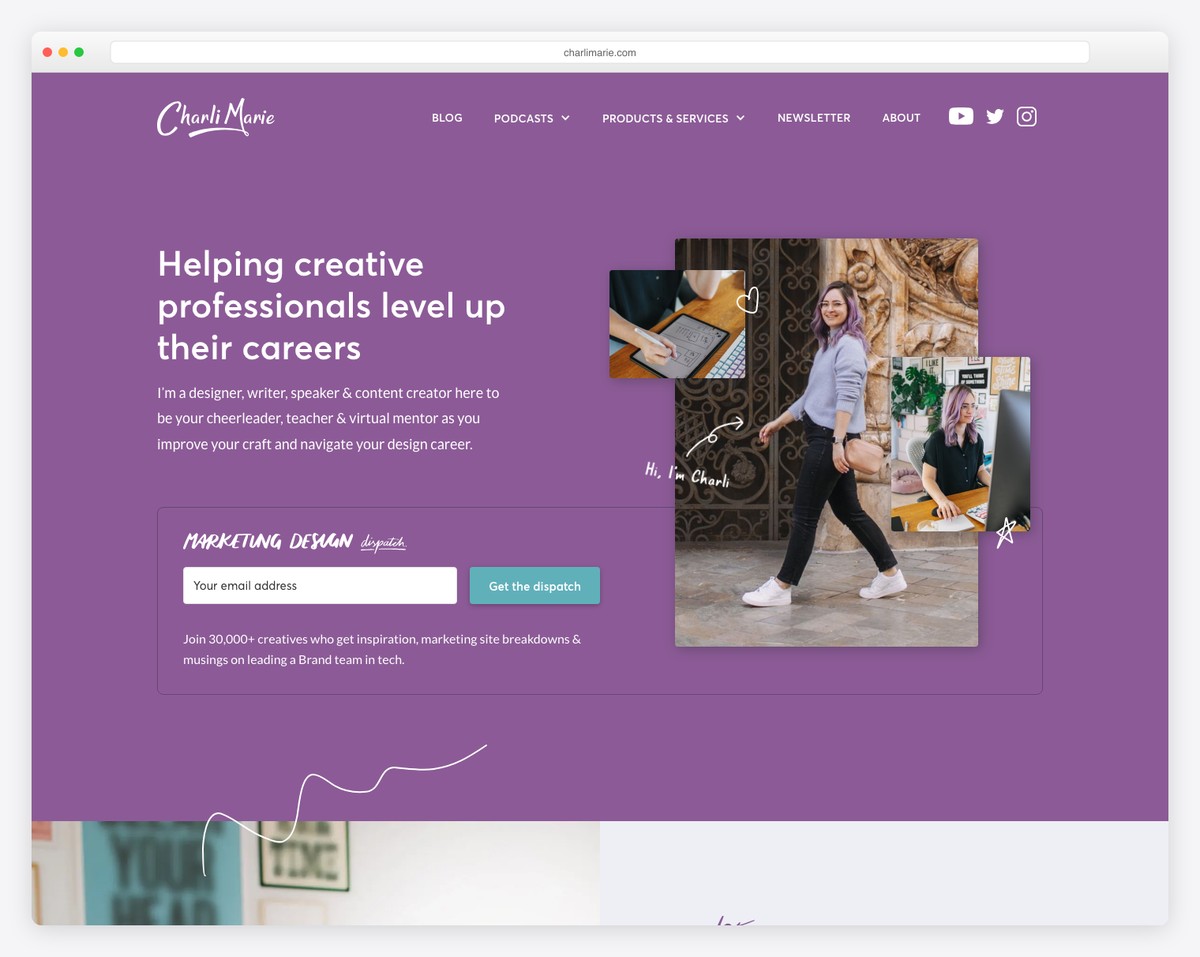
Charlie Marie’s personal brand website is much more creative than Aaron’s, with colorful and animated elements.
The transparent header features a mega menu and social media icons but no search bar.
Charlie also uses an email opt-in above the fold, a great strategy for growing an email list.
What stands out: If email marketing works well for you, try moving the newsletter subscription form to the hero section.
3. Mark Manson
Built with: WordPress using a custom WordPress Theme
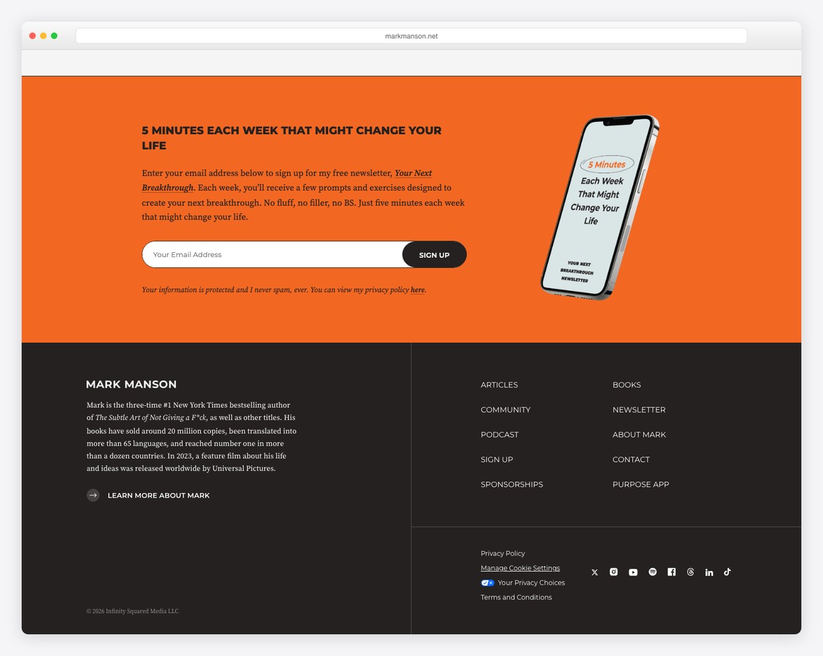
What we like about Mark Manson is that it’s text-heavy, with excellent readability, which promotes his books well. Writer, a lot of text, yeah, you get the gist of it.
Mark continues to build his personal brand by offering a free chapter in exchange for an email. It appears above the fold to increase the opt-in rate.
Also, it’s a simple website built with creativity in mind to ensure the best user experience.
What stands out: Push a free product above the fold and collect more emails.
4. Alice Thorpe
Built with: Squarespace
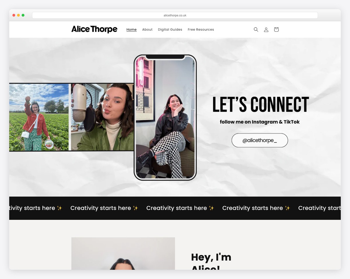
Alice Thorpe’s page is colorful and catchy, immediately triggering everyone’s curiosity. The first thing you’ll notice is a creative parallax background with a title and text. But she immediately promotes one of her videos, which opens YouTube in a new tab.
Alice separated the home page sections with different background colors to make them more dynamic. Just before the minimalist footer, you’ll also find an Instagram feed that opens posts in new tabs.
What stands out: You can use an IG feed to add more content to your website and to grow your profile.
You will also like checking through these Squarespace website examples.
5. Nesha Woolery
Built with: Squarespace
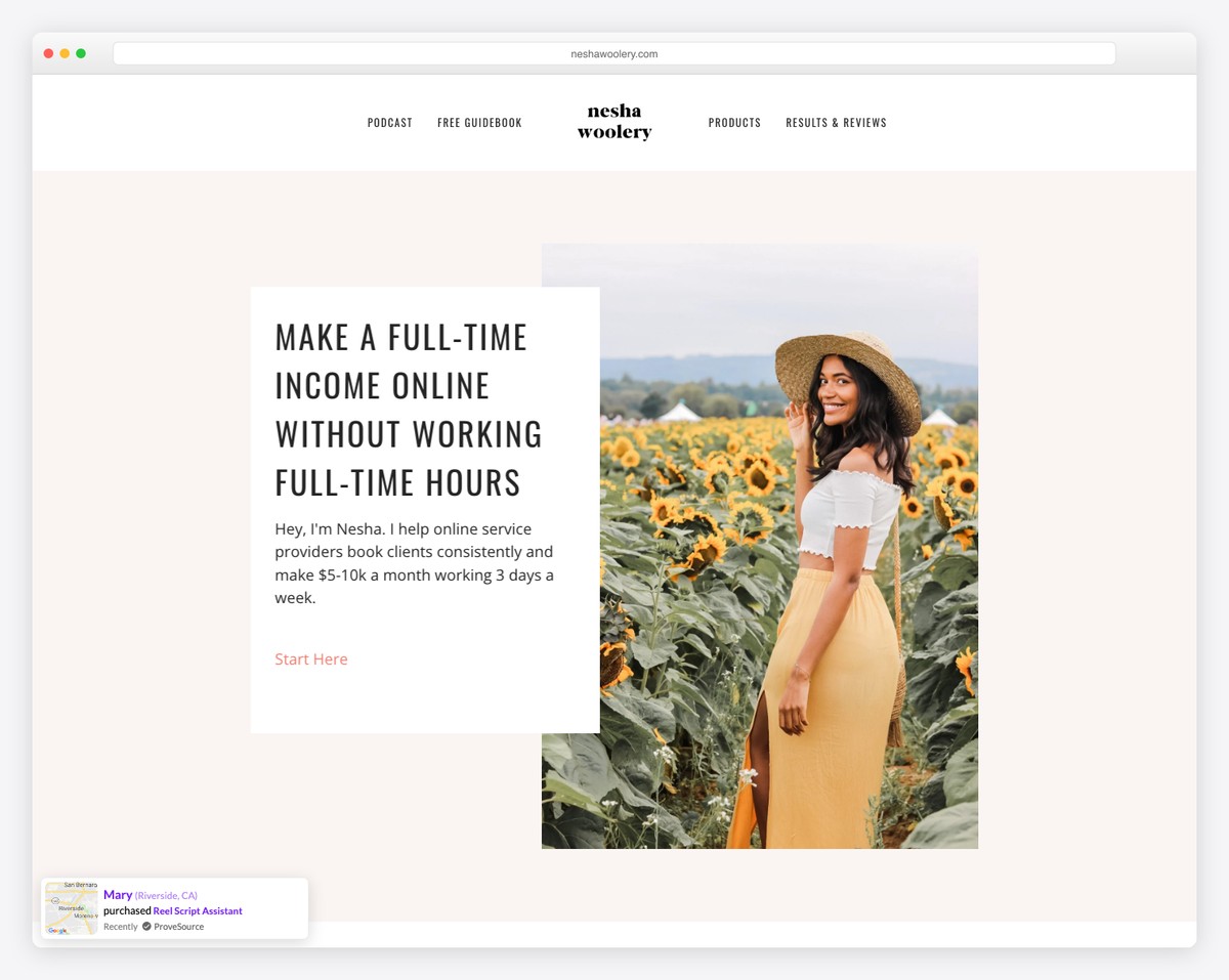
Nesha Woolery’s personal brand website first features a top bar notification, followed by a disappearing/reappearing header/menu.
She uses a CTA button in the hero area and then logos of multiple authorities who mentioned her.
The footer section is pretty extensive, with menu links, a newsletter subscription form, social icons and an Instagram feed slider.
What stands out: Showcase authority logos (and add links to content) to build trust.
6. Gary Vaynerchuk
Built with: WordPress using a custom WordPress Theme
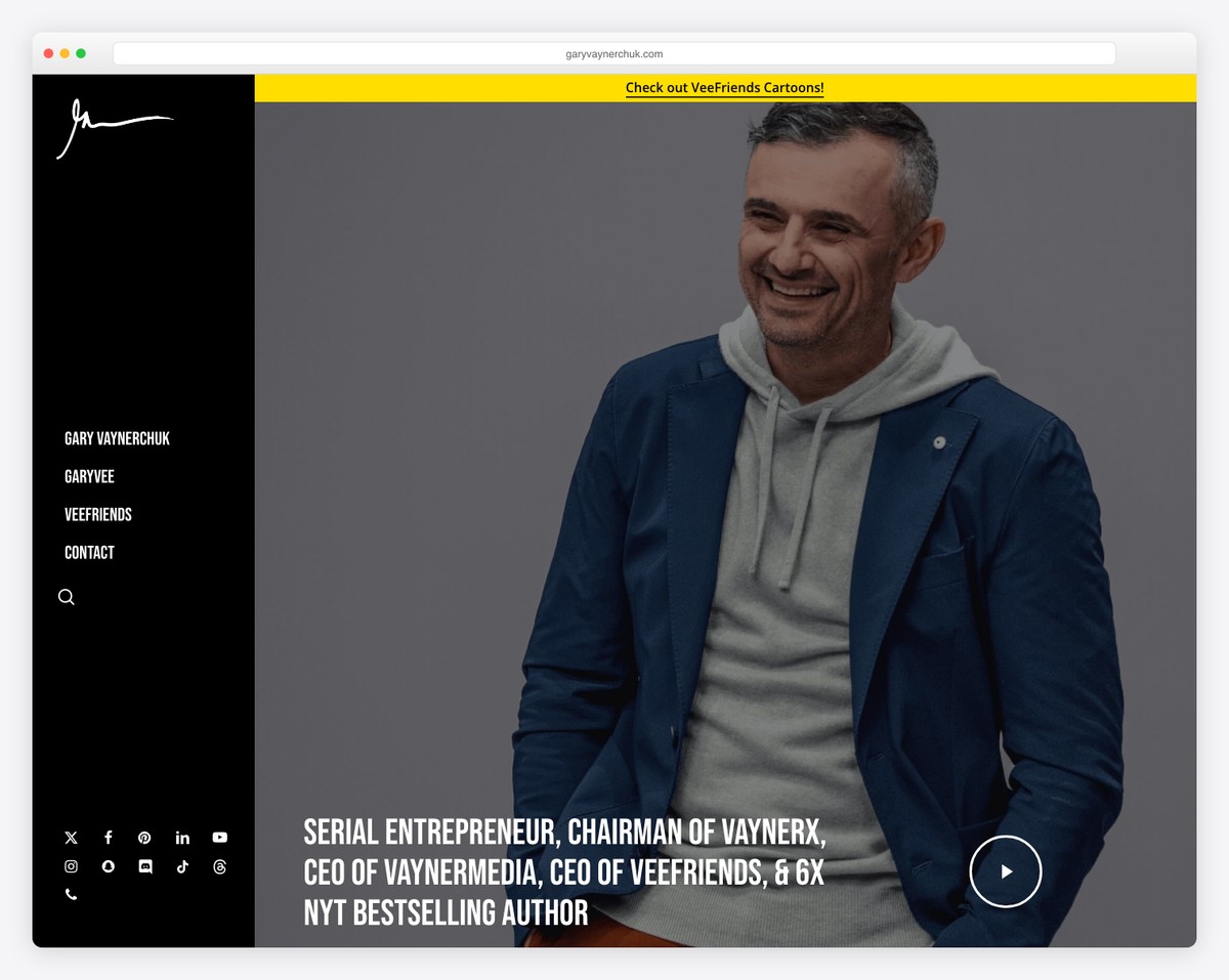
Gary Vaynerchuk’s website uses a slightly different design approach with its sticky left sidebar menu. The menu also features a cool hover effect with a drop-down, a search bar icon and multiple social media buttons.
The above-the-fold image background has a parallax effect with a text overlay and a play button that opens a video lightbox.
Last but not least, his personal brand site has a dark look, which makes it stand out more.
What stands out: Use a dark website design to give it a more premium look.
7. Bill Nye
Built with: Craft CMS
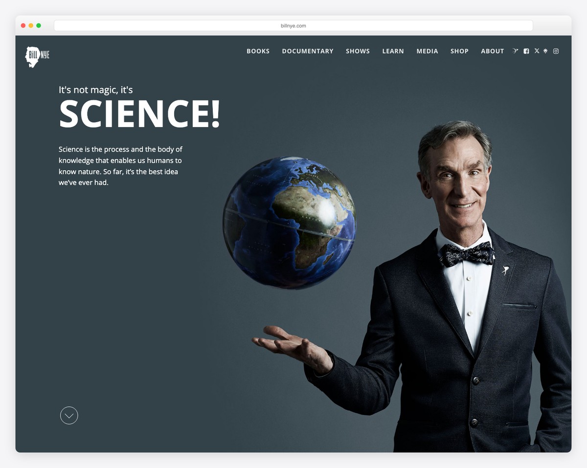
Bill Nye’s home page features a full-screen image with a transparent header that turns solid and sticky once you start scrolling.
Surprisingly, the hero image has no CTA button, but he promotes his book in the second section below the fold.
The footer is pretty cool, with a particle-effect background, but it has a clean overall look and social media icons.
What stands out: Create a strong and lasting first impression with a full-screen image above the fold.
8. Backlinko
Built with: Next.js
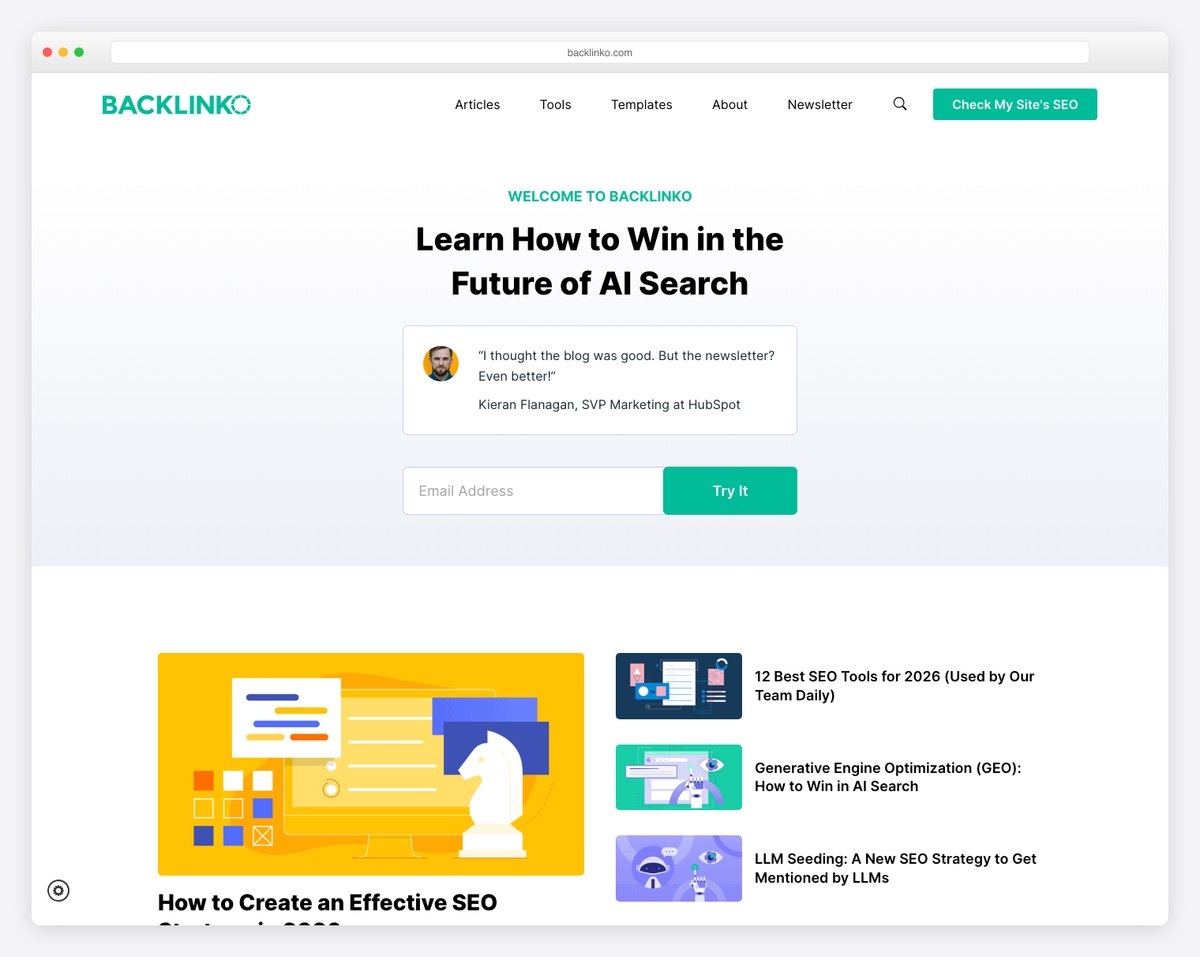
Backlinko’s front page is light and clean, with an email opt-in to sign up for exclusive tips, authority links, and client testimonials.
Furthermore, Brian uses another opt-in form for a free guide before the relatively simple footer with a dark background.
What stands out: If you don’t plan on adding a lot of content to your home page, let the one you do add stand out. Offering free products, tips, and guides via email also works great!
9. Tony Robbins
Built with: WordPress using a custom WordPress Theme
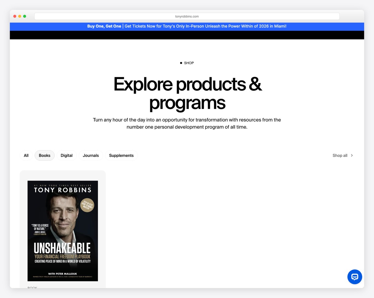
While Backlinko’s home page doesn’t have much going on, Tony Robbins’s is the complete opposite.
From a sticky top bar and header (with a drop-down) to scrolling animations, video lightboxes, success stories and a slider promoting upcoming events – you get it all and then some.
What’s also handy is the accessibility button in the bottom right corner that opens a menu to adjust the website experience.
What stands out: Let your visitors customize their website experience to their needs with the accessibility menu.
10. Melyssa Griffin
Built with: Showit
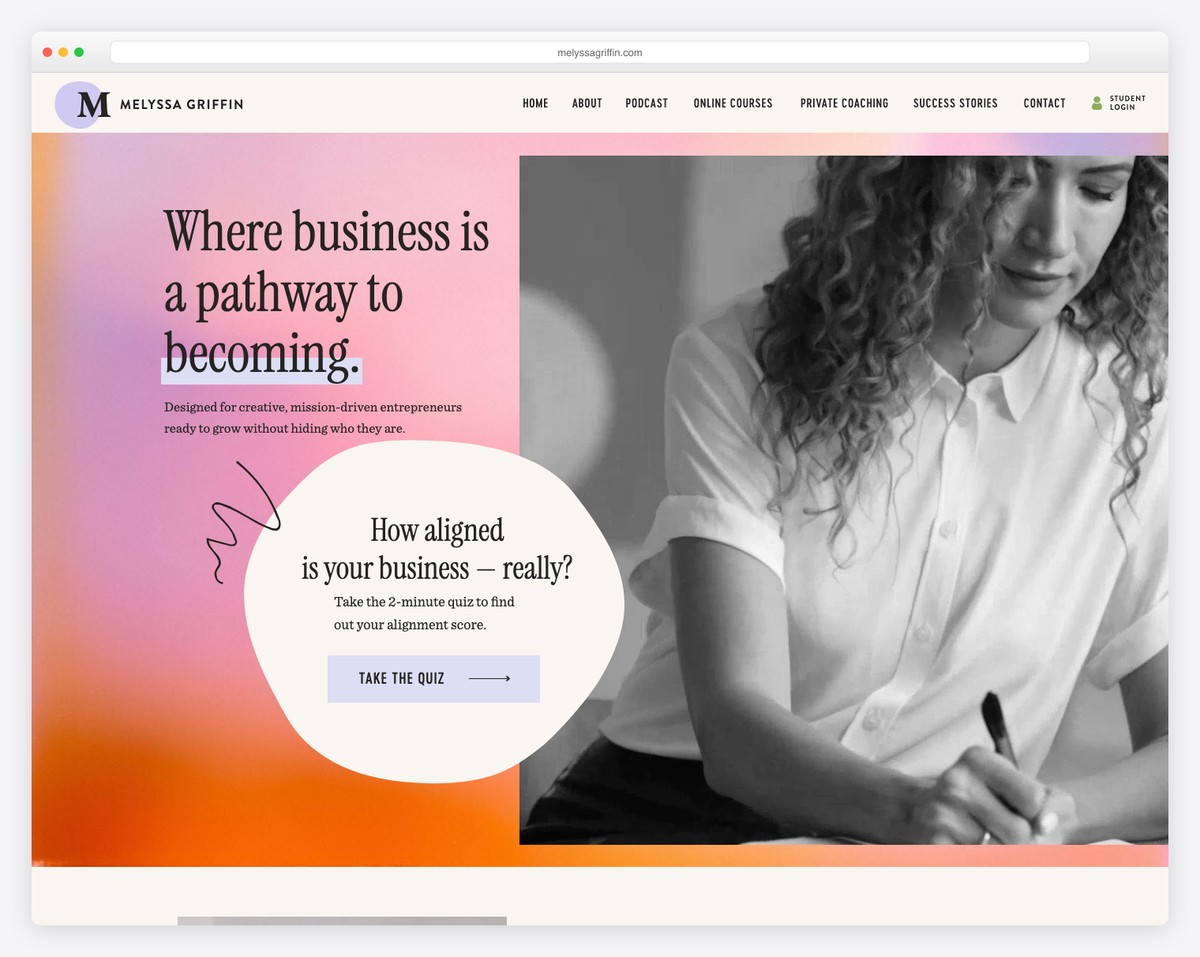
Melyssa Griffin knows how to capture the visitors’ attention with a background video/GIF. Her website is also very creative, with many details and animations that spice up the experience.
What’s unique about Melyssa Griffin’s page is her approach to collecting emails with a ten-question quiz popup. This allows her to get more quality leads than a single opt-in form.
What stands out: Add a multi-step opt-in form or a quiz to generate more quality leads.
11. Tim Ferriss
Built with: WordPress using a custom WordPress Theme
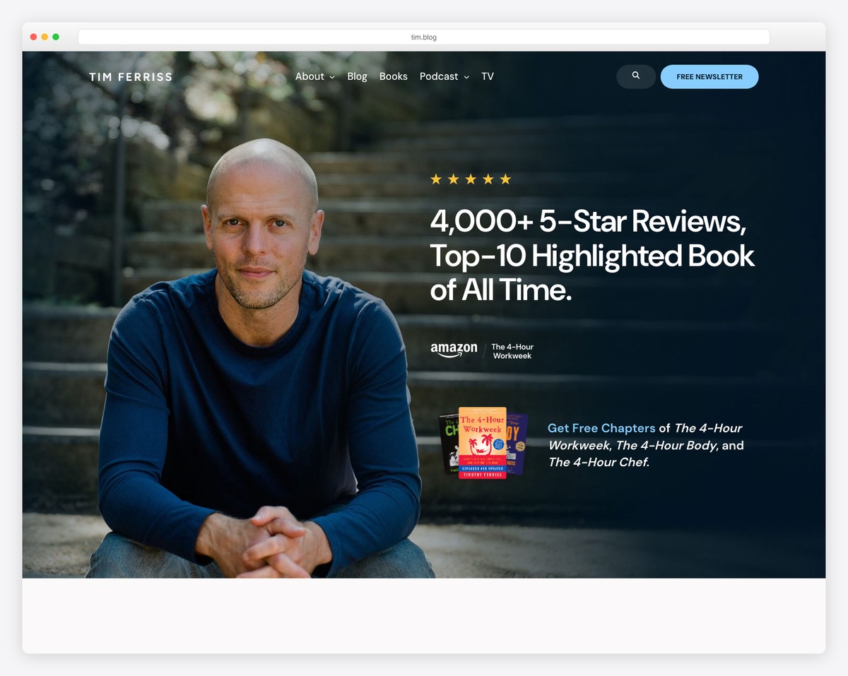
Tim Ferriss has a very interesting above-the-fold section with an image background, some facts and a podcast player first, followed by a header, menu and search bar.
Another great thing about Tim Ferriss’s page is that it’s a blog with a right sidebar and without a dedicated home page.
What stands out: Feel free to use a blog as your official website.
12. Roberto Blake
Built with: Divi Theme
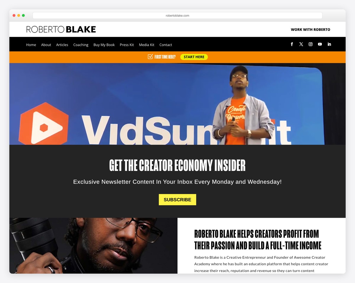
Roberto Blake’s page is content-dense but executed to achieve great viewability. The header consists of three parts, where he placed all the necessary links for first-time and returning visitors.
The narrow video banner/background plays automatically, which is great for keeping the visitor around for longer.
Also, the yellow-background quote sections make you stop scrolling and think about it.
What stands out: If you’re a video content creator, you may want to add a promotional video to your page’s hero section.
Plus, don’t miss our list of the best websites using the Divi theme.
13. Martha Stewart
Built with: Drupal
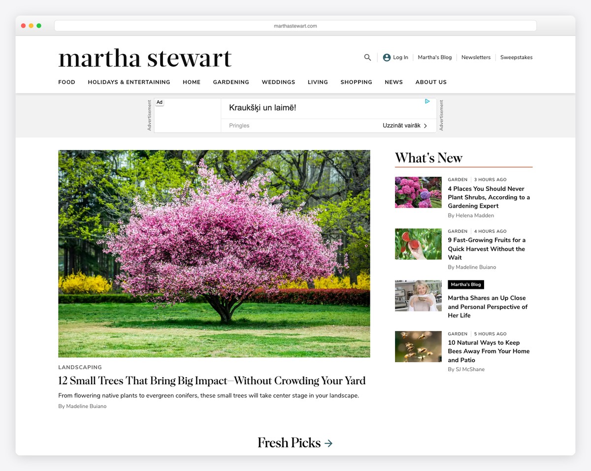
While Tim Ferriss uses a blog, Martha Stewart uses a magazine-style website. The home page loads A LOT of content but doesn’t really feel overwhelming, thanks to the white background, larger text and white space.
One of the Martha Stewart website’s more unique features is opening a “mega menu” in a popup that feels like a website within a website.
What stands out: Ensure white space and larger text (and images) when displaying a lot of content.
14. Neil Patel
Built with: WordPress using a custom WordPress Theme

Neil Patel has a similar approach to web design to Backlinko. He keeps it very clean and simple with an actionable above-the-fold section.
The header only features a website logo and a language switcher, while the footer features menu links, a CTA button and social media icons, to name a few.
Also, the white and orange branding is done with great care.
What stands out: Use your branding strategically across your website.
15. Marie Forleo
Built with: Webflow
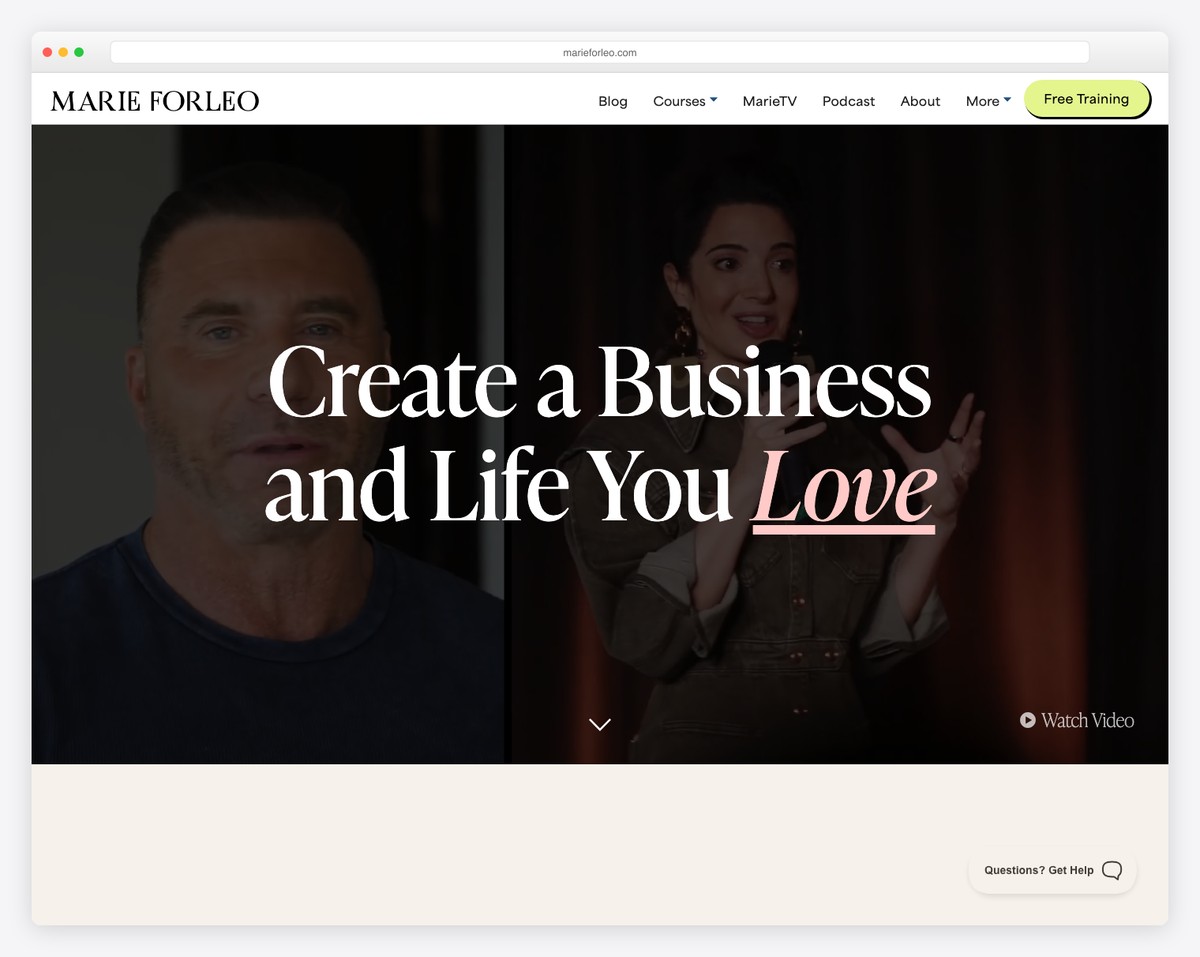
Marie Forleo’s site is vivid and engaging, starting with a video background and a lot of content you want to check.
She has a cool “You might have seen me on” section with big authorities’ logos, which shows that her personal brand is very popular.
The presentation of famous personalities she interviewed and other content in a portfolio-like style allows for a quick skim-through. Still, you can use the mega menu for anything more specific.
What stands out: Use a portfolio grid layout to distribute more content pleasantly.
16. Simon Sinek
Built with: Underscores & Elementor
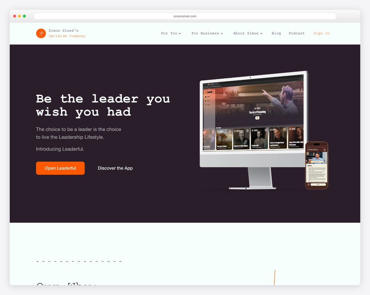
Simon Sinek’s personal brand site is simple but trendy. It features a top bar with sliding text, a drop-down menu, and a full-width slider with a split-screen design.
The page’s great color and font selection give it a distinct look that makes you want to check every little element.
Worth mentioning is the newsletter subscription form that has two boxes to tick for choosing what type of news you want to receive.
What stands out: If you plan to send many emails, it’s worth giving the subscriber a chance to pick what interests them so you don’t flood their inboxes (and make them unsubscribe).
17. Richard Branson
Built with: Contentful
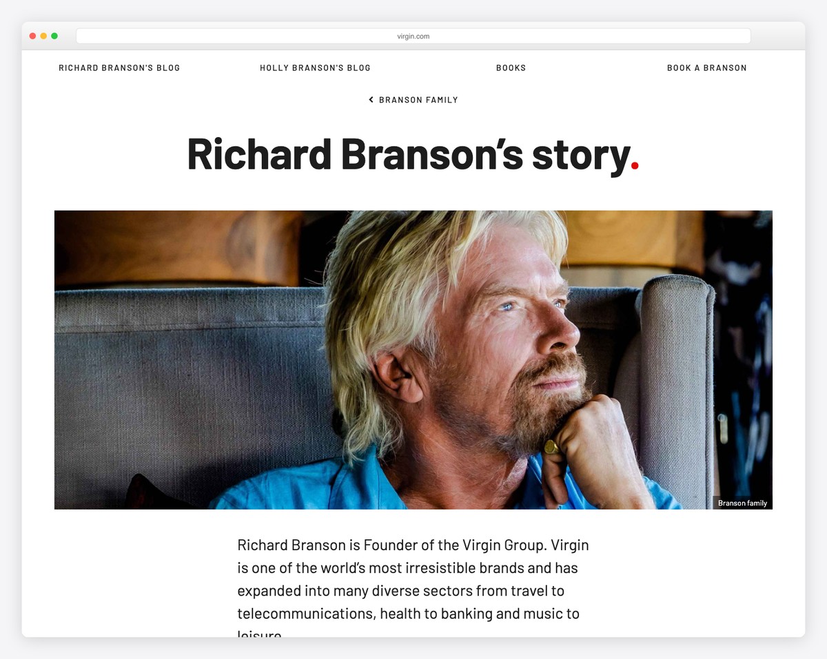
Richard Branson doesn’t have an official website but has a great personal page as part of Virgin’s official website.
The page layout has a somewhat timeline feel, showcasing Richard’s story with links to other family members’ profiles and his social media.
Lastly, the design is very minimalistic, with a great reading experience on both mobile and desktop.
What stands out: A simple, one-page layout can work great for a personal brand website.
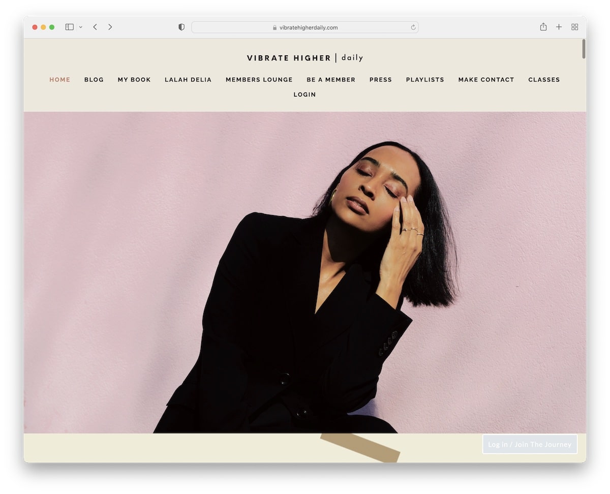
18. Lalah Delia
Built with: Squarespace
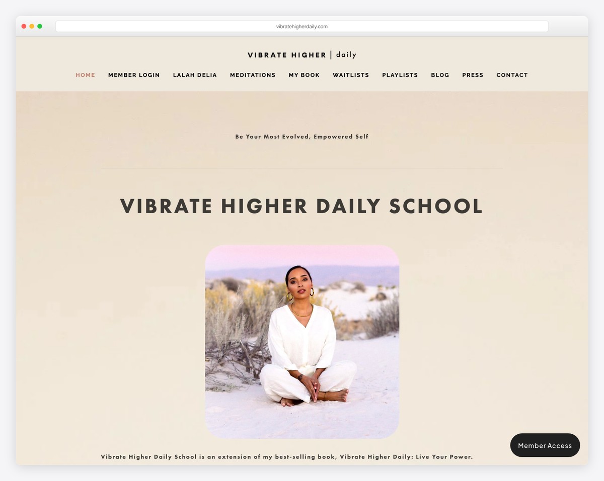
Lalah Delia’s website starts with a newsletter subscription popup that you can disregard. You can also disregard the top bar notification by pressing the “x.”
Because the home page is very long, a floating header allows the viewer to see other sections without needing to scroll back to the top.
Moreover, the floating button in the bottom right corner constantly reminds users to log in or join “the journey.”
What stands out: Use a popup to build an email list.
19. Seth Godin
Built with: Strikingly
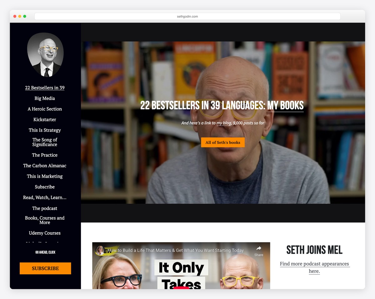
Seth Godin is the second personal brand website on this list with a sticky sidebar header/menu, but this one doesn’t have a footer. This also allows him to have the subscription CTA always visible.
What’s important to note is that Seth runs a single-page layout with the menu highlighting the section you’re viewing.
What stands out: Use a one-page website for a better user experience.
20. Ali Abdaal
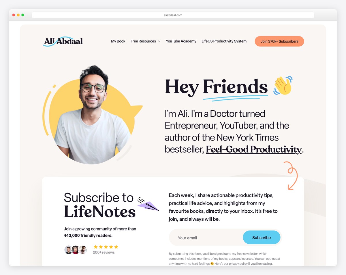
Ali Abdaal is a former doctor turned productivity YouTuber, podcaster, and bestselling author whose WordPress site serves as a comprehensive hub for his multi-platform personal brand. The sophisticated custom design features a blue, orange, and yellow color palette with fluid typography and interactive hover animations.
The site elegantly organizes Ali’s roles as writer, YouTuber, podcaster, and course creator without feeling cluttered. WooCommerce integration for courses, a well-organized content archive, and strong accessibility features (skip links, ARIA labels) show that a personal brand site can be both beautiful and functional.
What stands out: A multi-platform creator’s website that organizes diverse content types (videos, podcasts, courses, books) into a cohesive hub gives visitors a single destination — rather than scattered social profiles, everything lives under one roof.
Related Posts


Comments (0)