22 Best Coach Websites (Examples) 2026
These greatest coach websites will help you gain new creative ideas before building an online presence for your coaching services.
We have a website example for you, whether you prefer a minimalistic or more creative web design.
You can promote your services, build social proof through testimonials, start a blog (become authority!), and grow your social profiles – you can do it all with a well-thought-out page.
One of the fastest and easiest methods of building the right business site is with a coaching WordPress theme.
Without further ado, let’s enjoy these beautiful designs together.
Best Examples Of Coach Websites
1. Shanley Cox
Built with: Squarespace
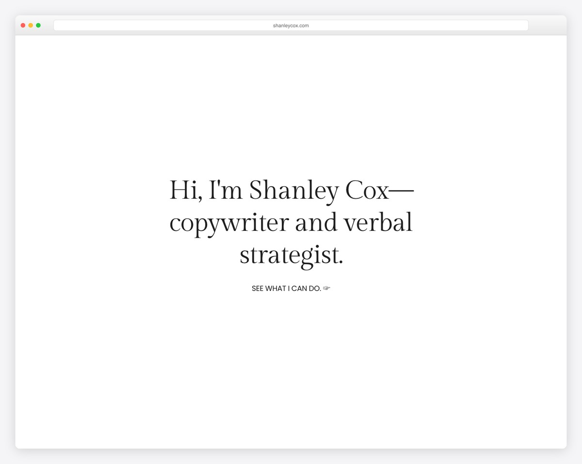
Shanley Cox is a minimalist and feminine website with awesome details that spice up the experience.
The header is clean and basic, with social media icons and a navbar, while the footer features multiple widgets for search, subscription, etc.
This coach’s website also integrates client testimonials (for social proof) and an Instagram feed (for more content and to grow the profile).
What stands out: Build trust in your coaching services with a client testimonials slider.
We’re certain you’ll also like checking other excellent Squarespace website examples.
2. Jessica Manning
Built with: Squarespace
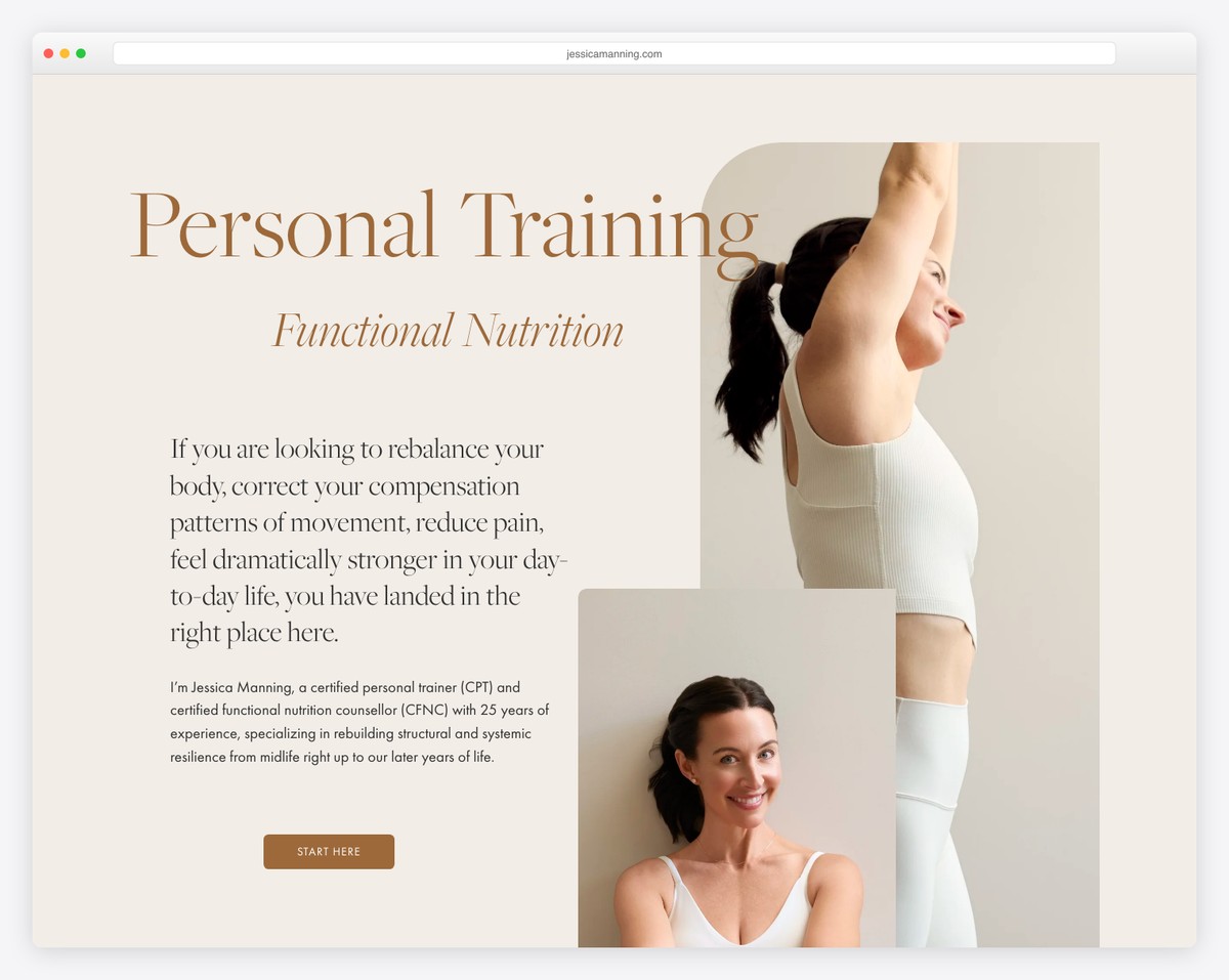
Jessica Manning’s hero section is a full-screen image background with a transparent header that creates a pleasant and welcoming first impression.
The content loads while you scroll, making the site more engaging. The IG feed and image slider also contribute to the page’s liveliness.
What stands out: Add more content to your website with an Instagram feed (that’ll also help you grow your profile).
3. Mike Ganino
Built with: Squarespace
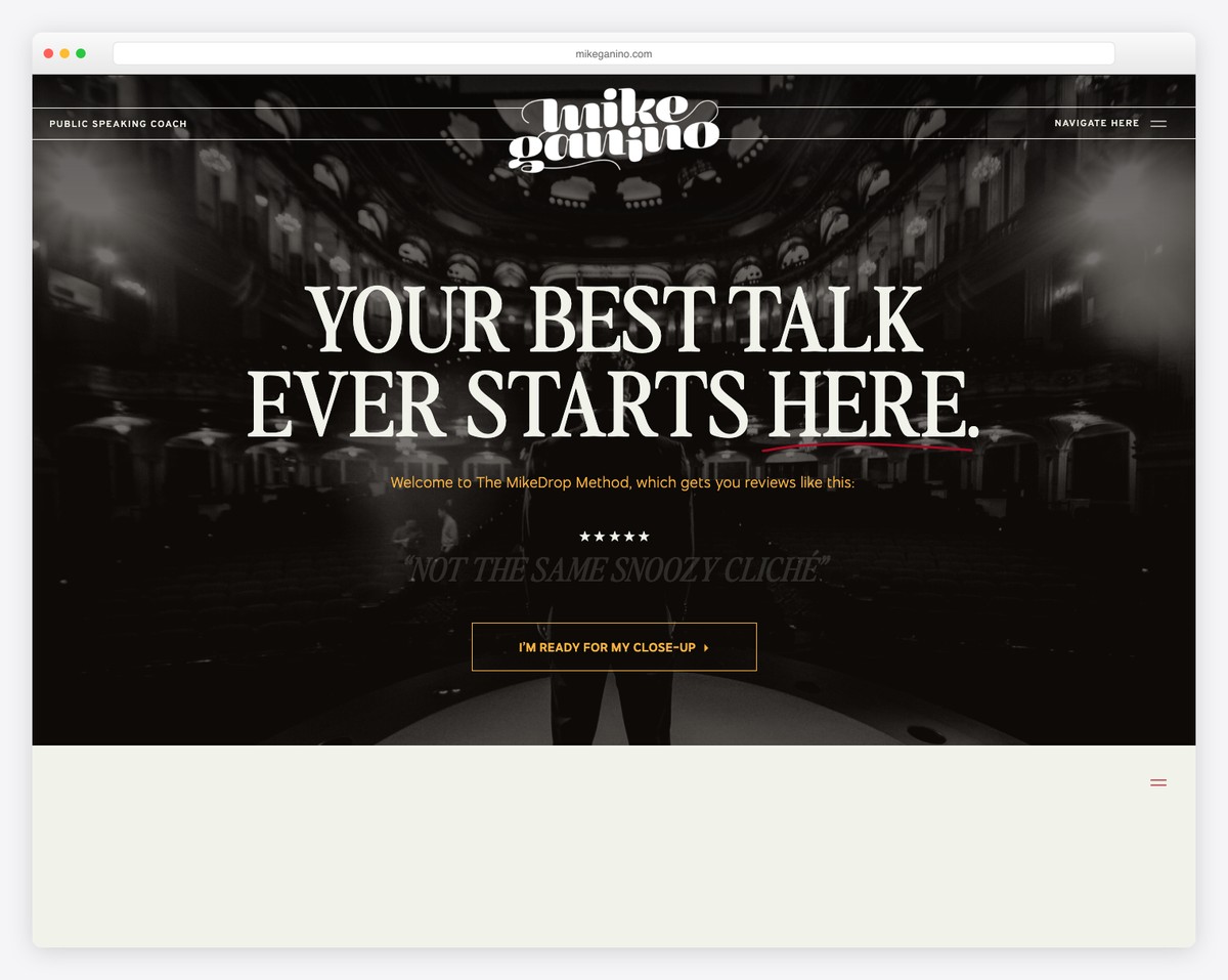
Mike Ganino is a coach website with a unique yet simple design and strong, attention-grabbing element. The graphics make the website and all its content pop more.
There’s also a popup window in the bottom left corner to promote the workshop, which you can close by pressing “x.”
We like the same background color across the entire website, the header, the base and the footer.
Note: Use popup windows to promote your services, a subscription form, etc.
What stands out: A hero slider showcases multiple offerings at a glance, giving visitors quick access to key content.
4. Scott McKain
Built with: Divi
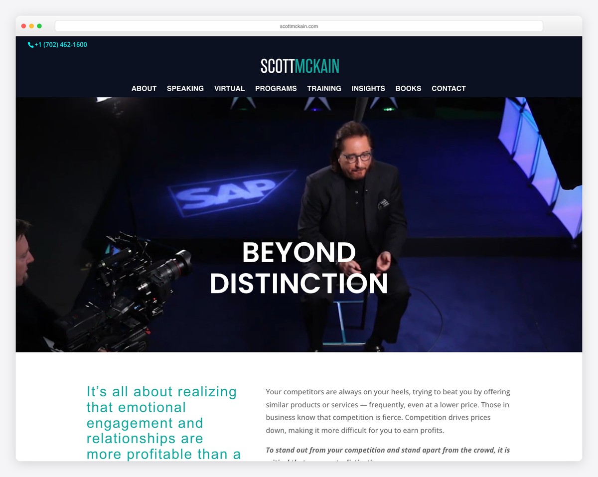
Scott McKain “created distinction” with a hero video that auto-plays as soon as you land on this coaching website.
The website also has a sticky top bar and header, so you don’t need to scroll back to the top to access menu links. But there’s also a back-to-top bar, just in case.
Besides testimonials, Scott added a giant collection of client logos he worked with for social proof.
Note: Use a sticky/floating header to improve your website’s user experience.
By the way, don’t miss checking these top-notch websites using the Divi theme.
What stands out: The background video creates an immersive first impression that immediately sets the mood.
5. Christine Hassler
Built with: Beaver Builder
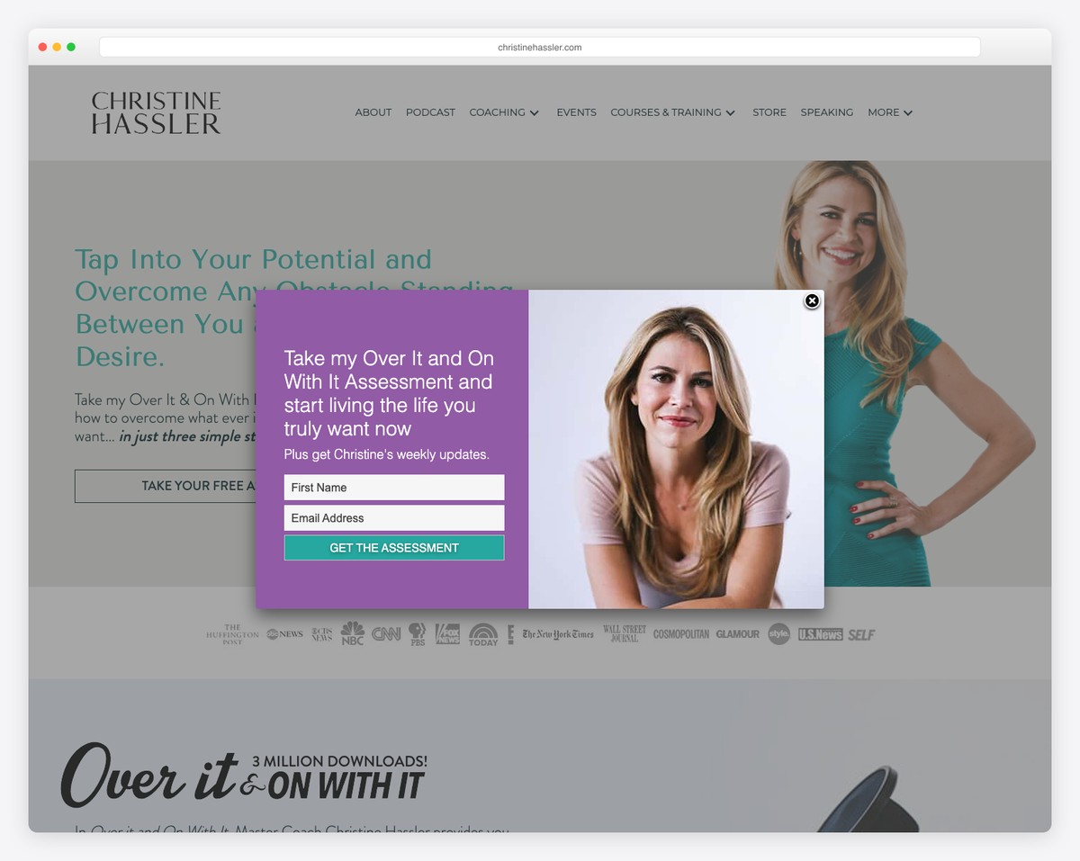
Christine Hassler is a great example of a coach’s website with an integrated audio player to listen to the podcast. (We also have a list of the best podcast websites.)
The navigation is done with the drop-down menu function, so all the necessary links are at your fingertips. This comes in extra handy if you don’t add a search bar.
Another cool feature is the popup for the free assessment, which is also an email list builder.
Note: If you want to grow your email list, offer a free product or service in exchange for an email.
What stands out: The dark color scheme gives the site a sleek, modern feel that makes imagery pop.
6. Katrina Cravy
Built with: Elementor
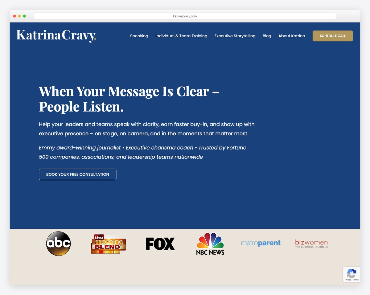
Katrina Cravy’s website is modern, with a testimonial slider showing clients’ avatars for an additional layer of proof.
The header floats and features a drop-down menu and a call-to-action (CTA) button for booking a call. The CTA takes you to an online calendar to secure the call directly via the site—no need for third-party platforms.
Note: Keep your business organized by integrating an online booking/appointment calendar.
Don’t forget to read our Elementor review to see why it’s SUCH a good WordPress page builder plugin.
What stands out: Full-screen video on the homepage draws visitors in before they even start scrolling.
7. Shola Richards
Built with: GeneratePress
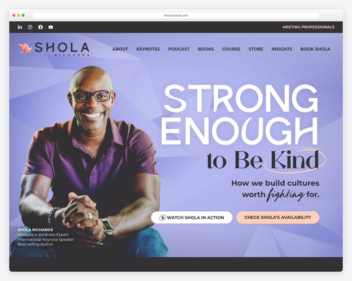
This great example of a coach website has a parallax background image above the fold, with text, a CTA button that opens a lightbox video and a link for business.
For your convenience, the top bar (with social icons) and navigation bar are both at the top of the screen.
The home page has an advanced contact form with extra fields and boxes, so the emails land in the right inbox, thanks to the “categorization.”
Note: You can add more depth and engagement to your website with a parallax effect.
What stands out: The image carousel keeps the above-the-fold area dynamic without requiring visitors to scroll.
8. Minaa B
Built with: Squarespace
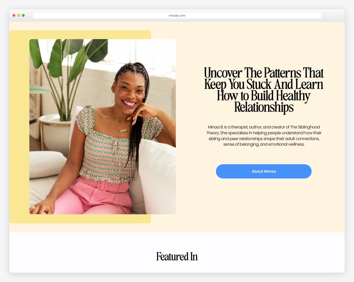
Minaa B runs a clean website with creative elements that make it more pleasurable to scroll. The text is larger, with plenty of white space to ensure excellent readability.
The header and the footer are pretty straightforward, with the essential links and social media icons. Speaking of social media, you’ll also discover a simple IG feed grid, where each post opens in a new tab.
What stands out: Use smooth tones, white space and larger fonts to ensure a top-notch UX.
9. JP Teaches Photo
Built with: Squarespace
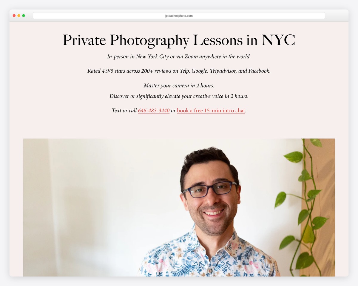
What’s awesome about this coaching website is that it starts with a title, text and a CTA button before transitioning to a personal image.
You can quickly get all the necessary information thanks to the large images and typography.
JP Teaches Photo knows how to make it more personal through storytelling. But he also created an entire page for reviews to build trust.
This minimalist website maintains the same background color throughout the site for a neater appearance, like Mike Ganino.
What stands out: Start your website with text and a CTA button instead of doing the visuals first.
10. From Dusk Till Dog
Built with: Wix
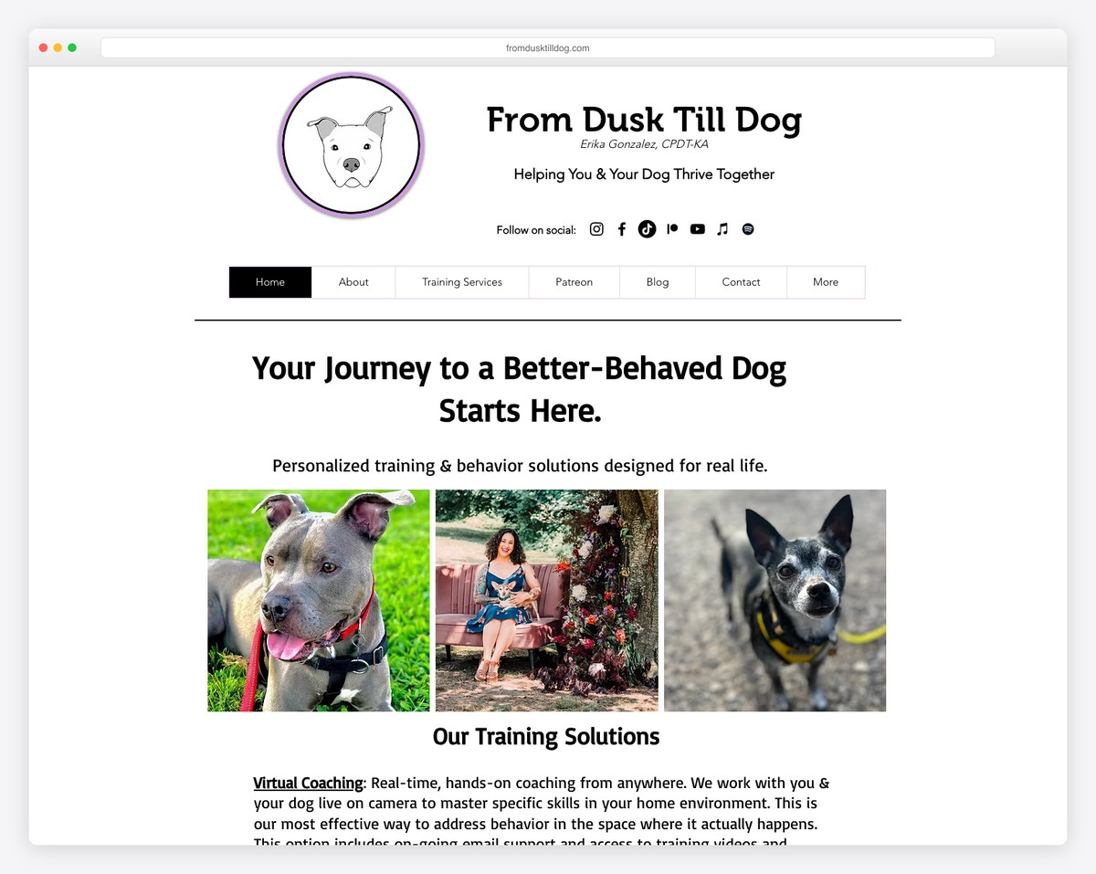
From Dusk Till Dog has a minimalist-looking yet advanced (does that make sense?) header with an avatar, title, text, social media and menu links.
The home page uses a grid layout to present services, short biography and links to internal pages. Instead of testimonials, From Dusk Till Dog creates a layer of trust by displaying various badges and certifications.
What stands out: Do you have certifications? Add logos to your website!
Expand your creative thinking with more websites built on the Wix platform.
11. Aaron Ward
Built with: Webflow
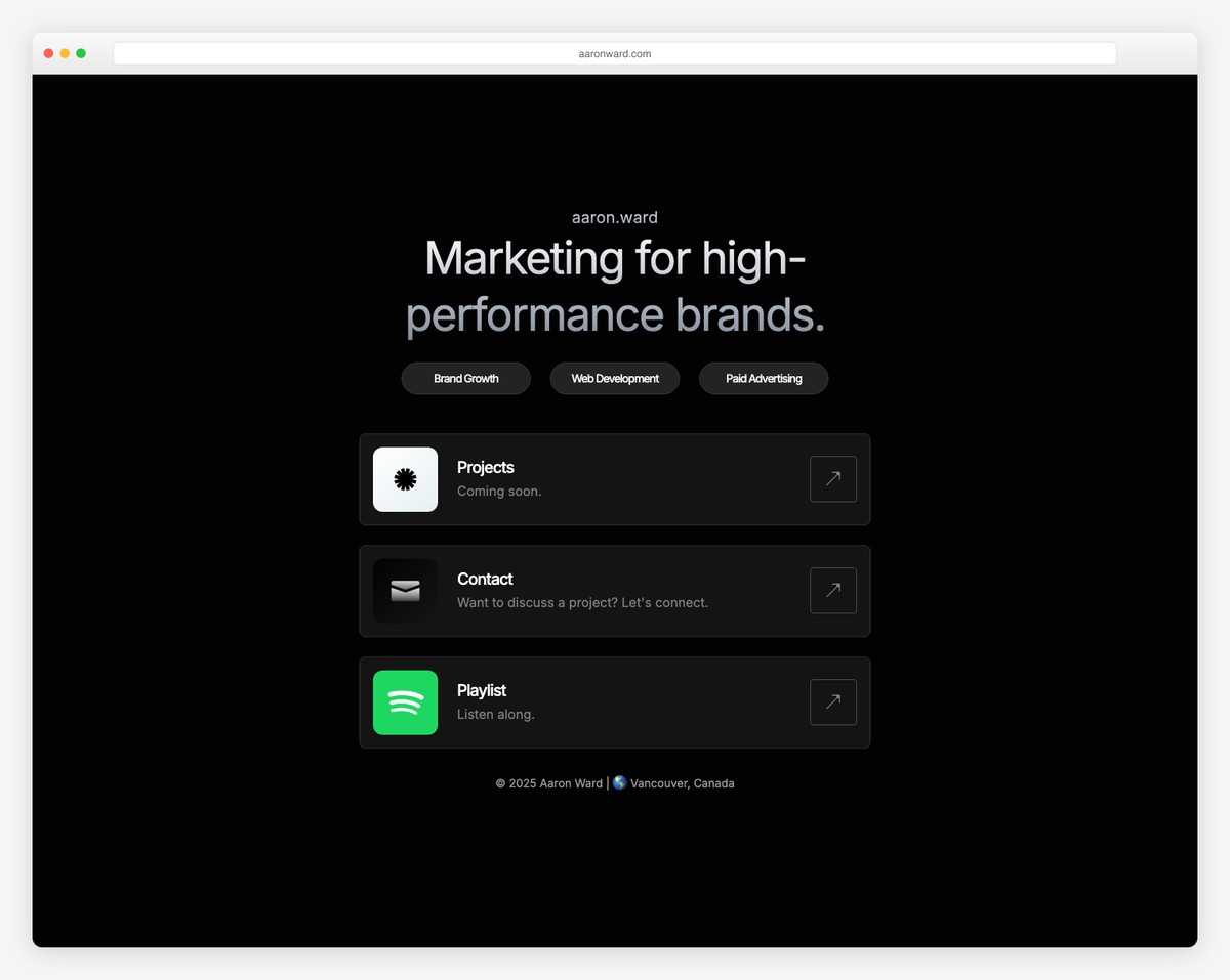
Aaron Ward’s coaching website is simple, with contrasting sections and CTA buttons to grab more eyeballs.
The header section is plain with a CTA button, but there’s another one in the hero area in case you miss it.
Moreover, the four-column footer equips you with multiple quick links, so everything is just a click away.
What stands out: Use contrasting colors for the backgrounds of CTA buttons to make them stand out (and more clickable).
You’ll also enjoy reviewing these superb Webflow websites and gaining even more creative ideas.
12. Tony Robbins
Built with: WordPress using a custom WordPress Theme
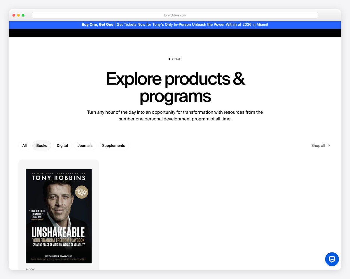
Tony Robbins’ website has multiple features you can copy and use on your coach’s website.
First, the language selection and a clickable phone number in the top bar. Second, the sticky accessibility menu icon in the bottom right corner lets visitors personalize the experience. Third, the “upcoming events” slider.
Furthermore, thanks to the floating navbar, you can continue your search even if you scroll to the bottom.
What stands out: Allow visitors to modify your website via the accessibility configurator.
13. Melyssa Griffin
Built with: Showit
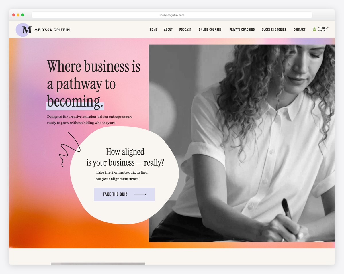
Melyssa Griffin’s hero section is catchy and engaging – all because of the cool GIF. The page has a modern and creative responsive web design with plenty of details to enhance the experience.
You will also find a section with a parallax image and another one with a video background.
Finally, various CTA buttons (in different colors) are scattered across the home page to make it more actionable.
What stands out: Make your website more exciting and joyful to scroll through with GIFs.
14. Marie Forleo
Built with: Webflow
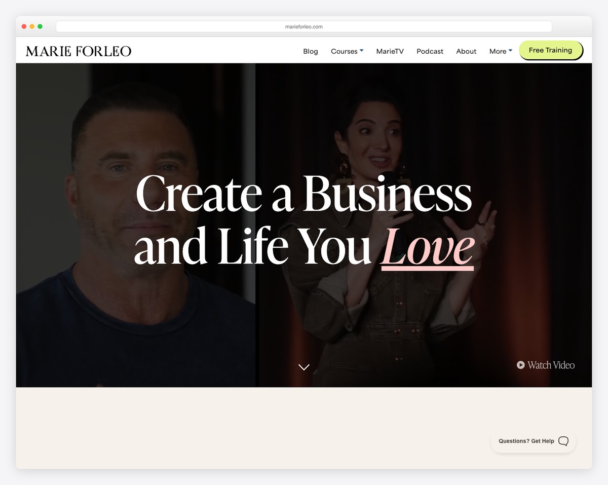
Marie Forleo is another excellent example of a coach website with a video background in the hero section that instantly sparks curiosity. Even better, you can click on “watch video,” and it’ll open in a lightbox, so you can enjoy it without leaving the current page.
Marie also tries to attract more attention to her free class by adding a notification bar below the header. Both float, but you can close the notification bar if you want.
What stands out: Promote your free classes, coaching services, products, etc., with an additional bar above or below the header.
15. Charlie Marie
Built with: Webflow
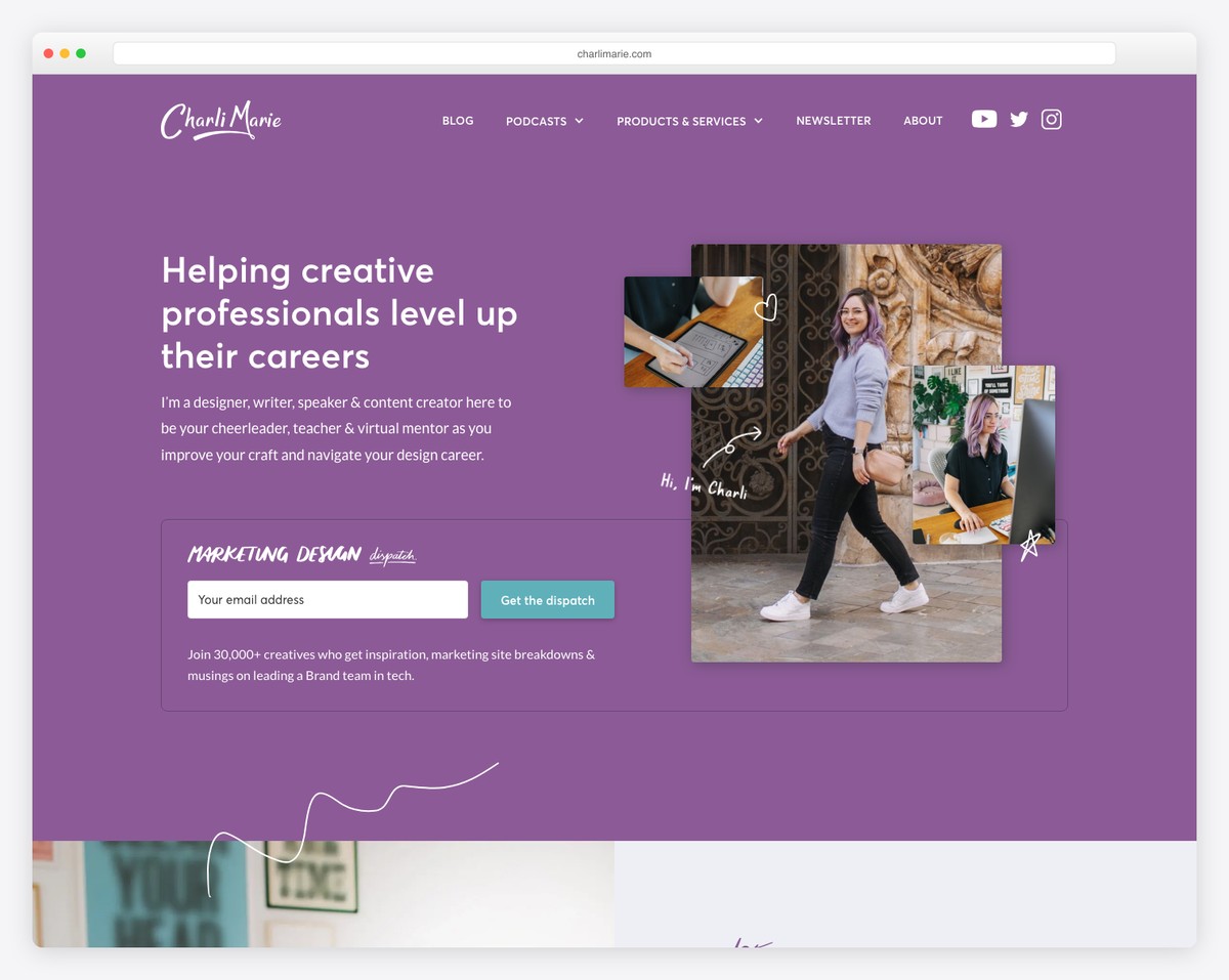
Charlie Marie’s website offers this personalized experience through its choice of colors and the small elements and details that enrich it.
Instead of the traditional navigation, this page uses a mega menu with links, images and CTA buttons.
Moreover, the above-the-fold section also features an opt-in form that helps Charlie collect emails and grow her fanbase.
What stands out: Improve your page’s navigation with a mega menu.
16. Jen Carrington
Built with: Squarespace
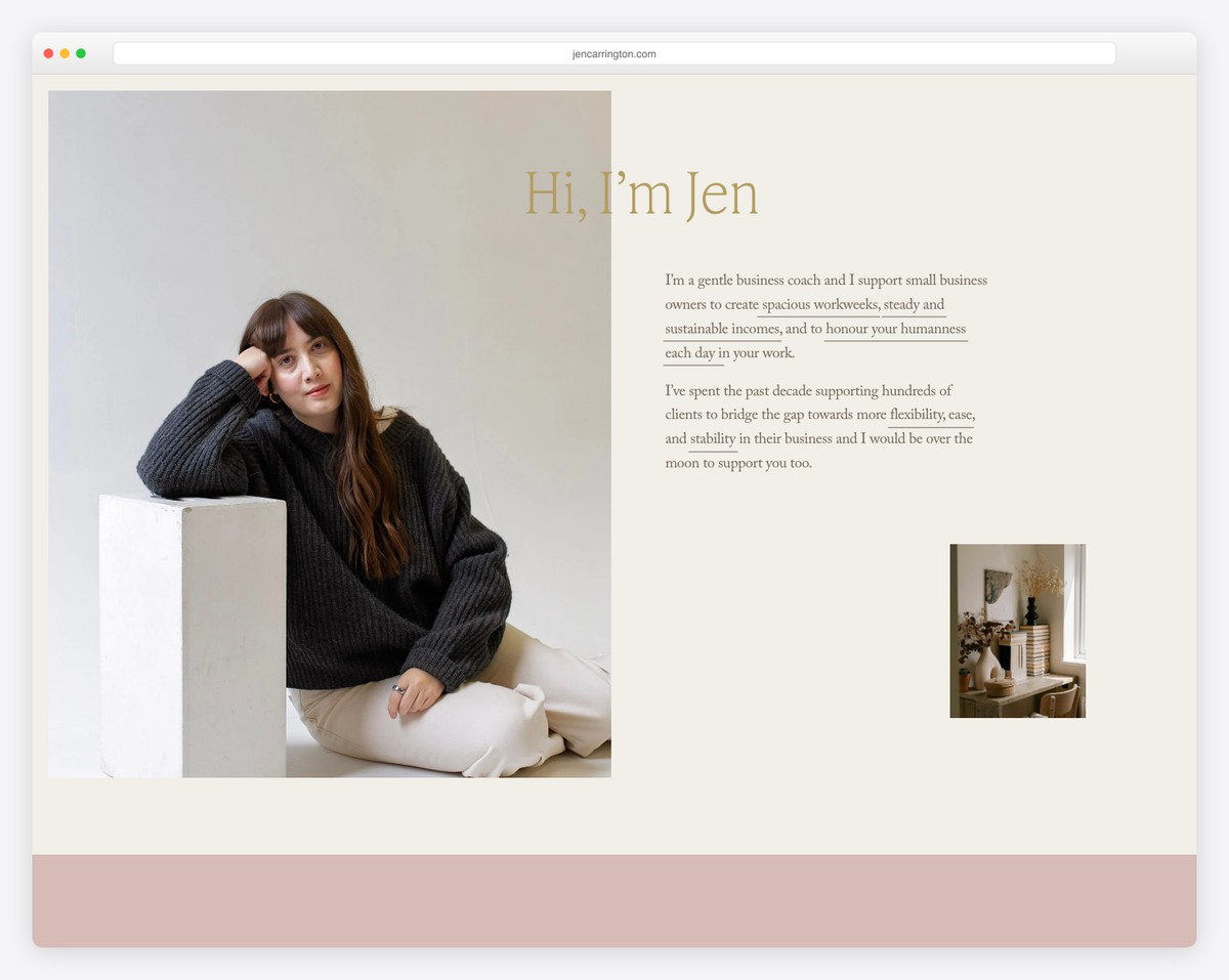
This coach website has a pretty cluttered hero section—but in a good way. The overlayed (question) text on a background is especially awesome because it triggers interest.
But one of the more unique features of Jen Carrington’s page is the quiz, which has an opt-in form at the end to access the free video and workbook.
What stands out: Entertain your visitors with a quiz.
17. Annie Woods
Built with: Squarespace
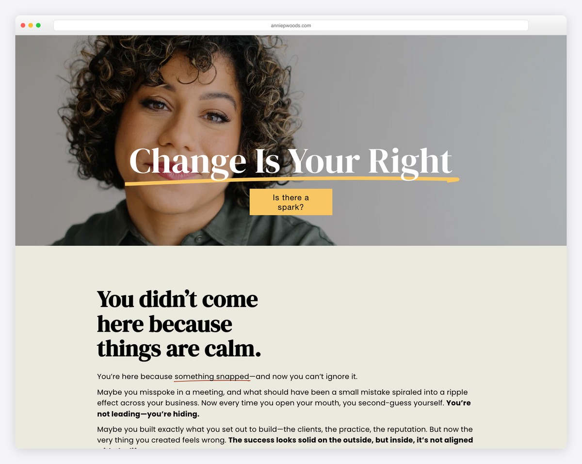
Annie Woods is a simple website with a transparent header that contains main menu links and a CTA button. The entire page, including the footer section, is simple.
What stands out: A minimalist website can put more shine on the necessary content.
18. A Branch Of Holly
Built with: Squarespace
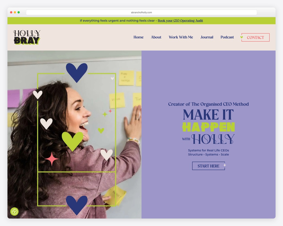
A Branch Of Holly combines cleanness with creativity to engage the visitor, ensuring a pleasant experience.
The banner above the fold has a split design with a parallax image on the left and text + a CTA button on the right.
What’s more, while some create a floating header, this coach’s website has sticky social media icons on the left side of the screen.
What stands out: Create a sticky element to promote your social media accounts.
19. Coaching By Carrie
Built with: Wix
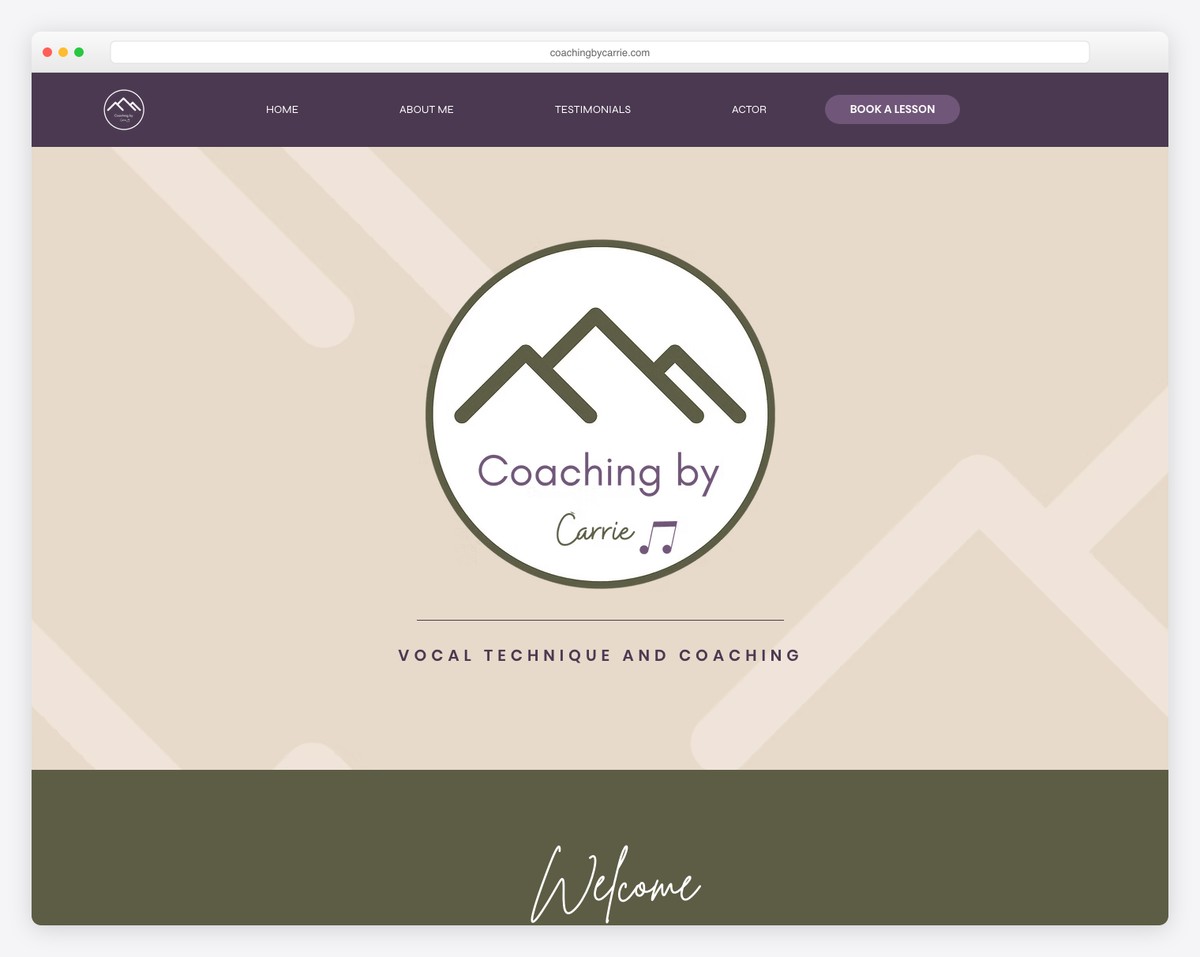
Instead of using an image, a slider or a video in the hero area, Coaching By Carrie uses a large logo. Below the fold is a welcoming text with CTA buttons to learn more about the studio and Carrie.
The page sections have different backgrounds to make scrolling more effective, helping you focus on each more easily.
What stands out: Use contrasting backgrounds for page sections to improve “scrollability.”
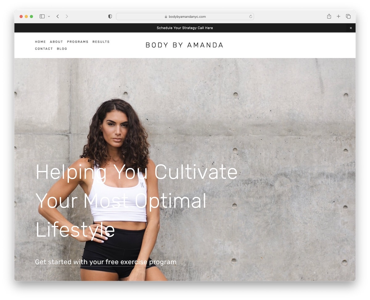
20. Body By Amanda
Built with: Squarespace
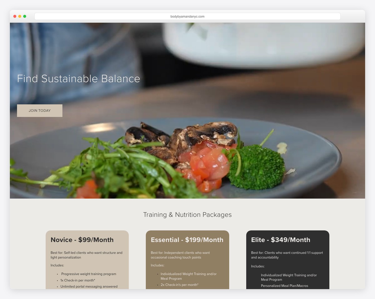
Body By Amanda has a clean, full-width website with parallax functionality for added oomph. The top bar is on a black background that stands out nicely in a light environment.
The navigation has a nice hover detail, highlighting the menu link you hover over and dimming the rest.
Finally, the “results” page provides plenty of before-and-after images of Amanda’s clients, better than written testimonials.
What stands out: If you can include before/after images – go for it!
21. Jessica Gregory
Built with: Webflow
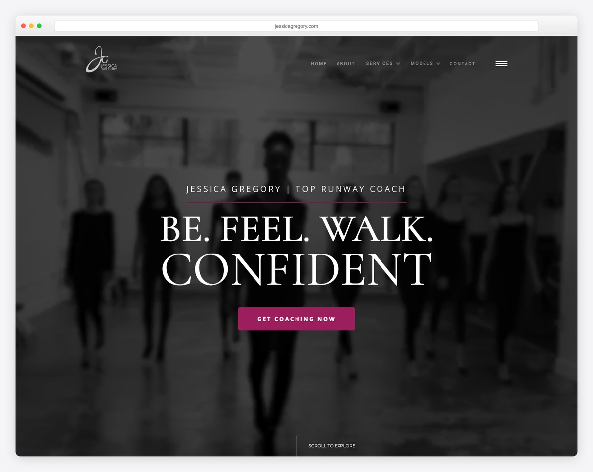
This coaching website example creates a strong impression with a full-screen video background above the fold.
After a few seconds, a popup window opens, promoting a newsletter subscription form with a gorgeous modal.
You’ll also see an overlayed hamburger menu (with social icons), stunning scrolling animations and a slider that promotes Jessica’s services.
What stands out: Attract your visitors and potential customers/clients with a full-screen hero video background.
22. Amy Porterfield
Built with: WordPress
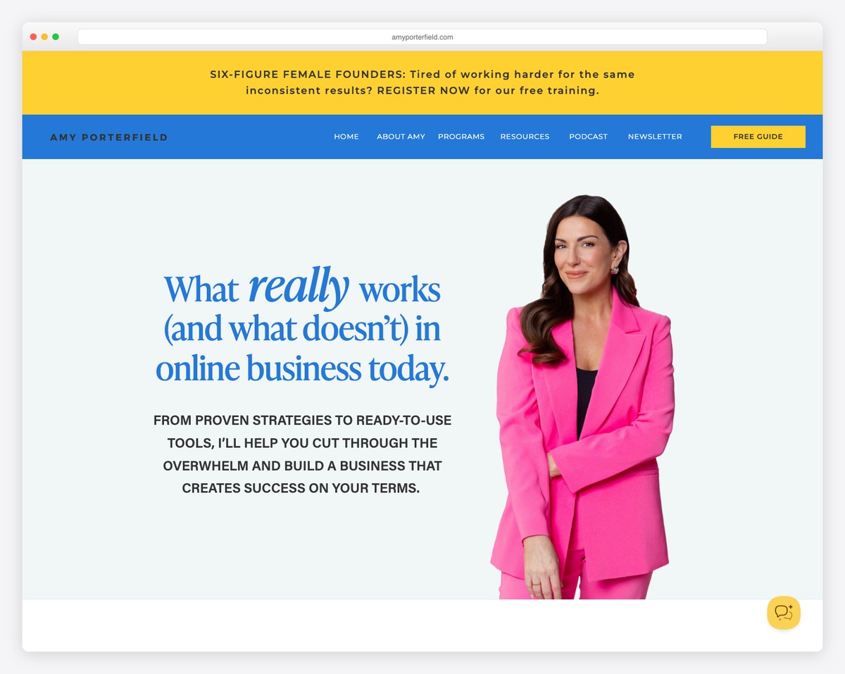
Amy Porterfield’s coaching website opens with a bold promise — “What really works (and what doesn’t) in online business today.” The split-layout hero pairs elegant blue script typography with a professional photo of Amy in a vibrant pink blazer, creating a warm yet authoritative first impression.
The yellow announcement bar promoting free training drives immediate engagement, while the navigation covers every facet of her business — Programs, Resources, Podcast, and Newsletter. The “Free Guide” CTA in the header ensures lead capture is always one click away.
What stands out: A top announcement bar promoting free training or lead magnets is a proven conversion technique for coaching websites — it captures attention before the visitor even scrolls.
Related Posts


Comments (0)