25 Best Website Footer Examples In 2026
A well-designed website footer is more than just a strip at the bottom of the page. It’s a navigation hub, a trust builder, and often the last thing visitors see before they leave or convert. The best footers balance clean design with practical utility — organizing contact info, social links, newsletter signups, and legal pages in a way that feels effortless.
We curated 25 real website footer examples from brands across industries — from SaaS companies and e-commerce stores to personal portfolios and wellness brands. For each footer, we break down what makes it effective and what you can borrow for your own site.
Best Website Footer Examples
1. Yoga Journal
Built with: WordPress
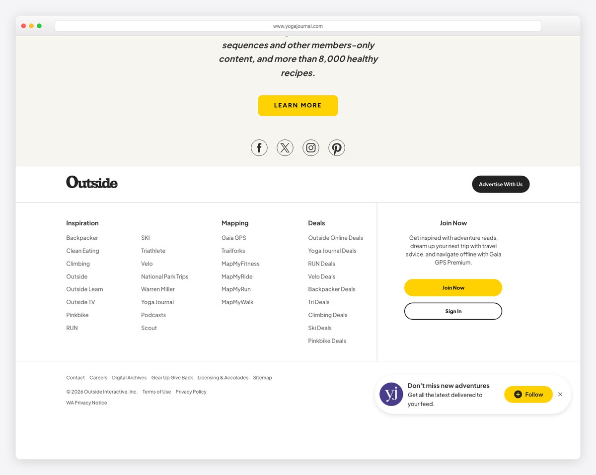
Yoga Journal features a well-designed, contrasting footer section that stands out effectively against the rest of the website.
The white and yellow text stands out against a black background, while the extra white space (or black space?) ensures better readability.
With a multi-column structure and main links at the top, Yoga Journal ensures an organized footer for an exceptional user experience.
What stands out: Using a contrasting background color is a great technique to swell the website footer.
What stands out: Yoga Journal combines simplicity and boldness into a cohesive footer example that can work for nearly any website.
2. Eating Bird Food
Built with: WordPress
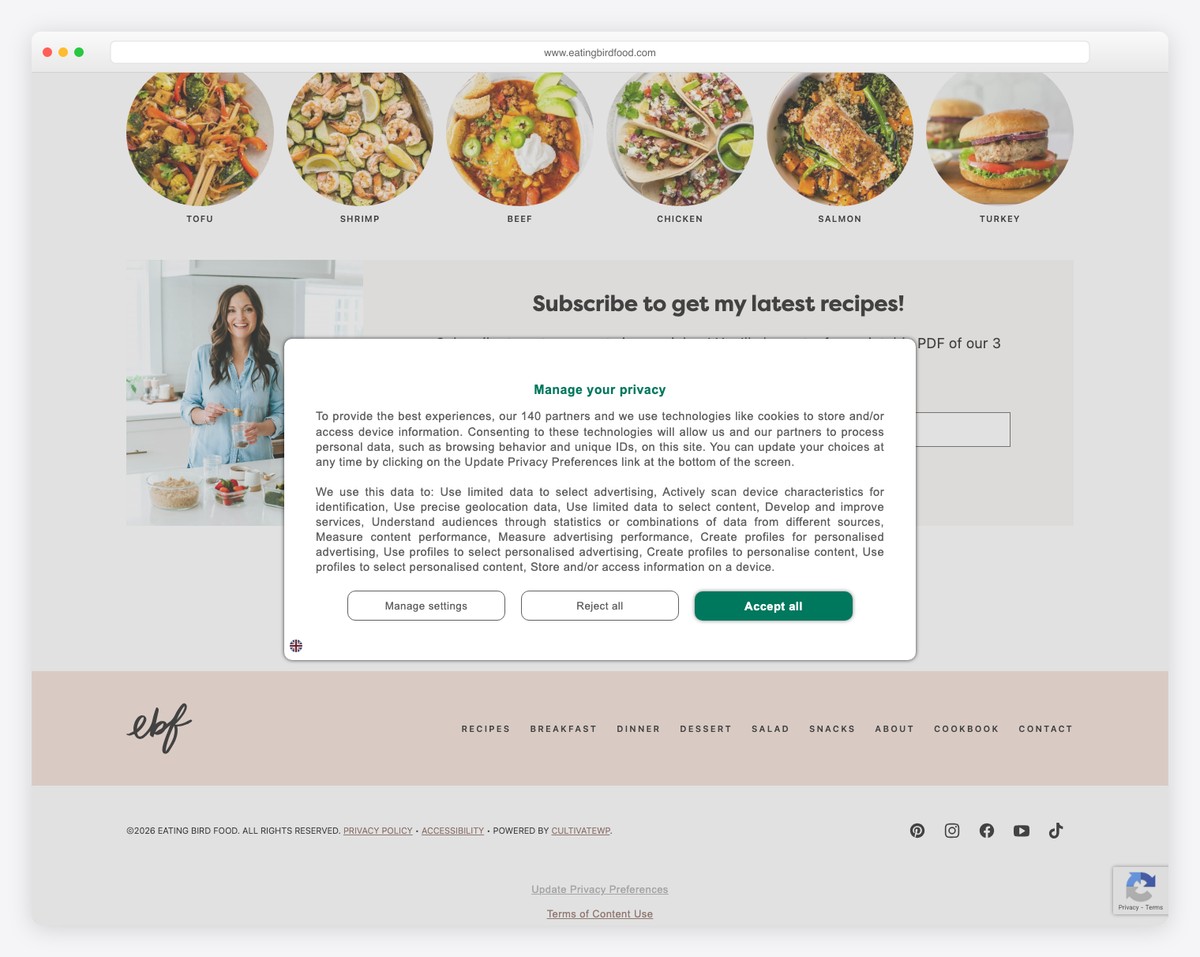
We could almost say that Eating Bird Food has a multi-sectioned foot area, starting with a prominent newsletter subscription form, followed by “As seen in” and then navigation links.
At the bottom are copyright text, essential links on the left, and social media icons on the right. The branding is also minimalistic to keep the same vibe as the rest of the website.
What stands out: If you’re unsure what to include and don’t want to leave the footer area empty, add menu links.
What stands out: Eating Bird Food’s footer remains simple yet practical with navigation links, social media and a large section for subscription above.
3. ISA
Built with: Squarespace
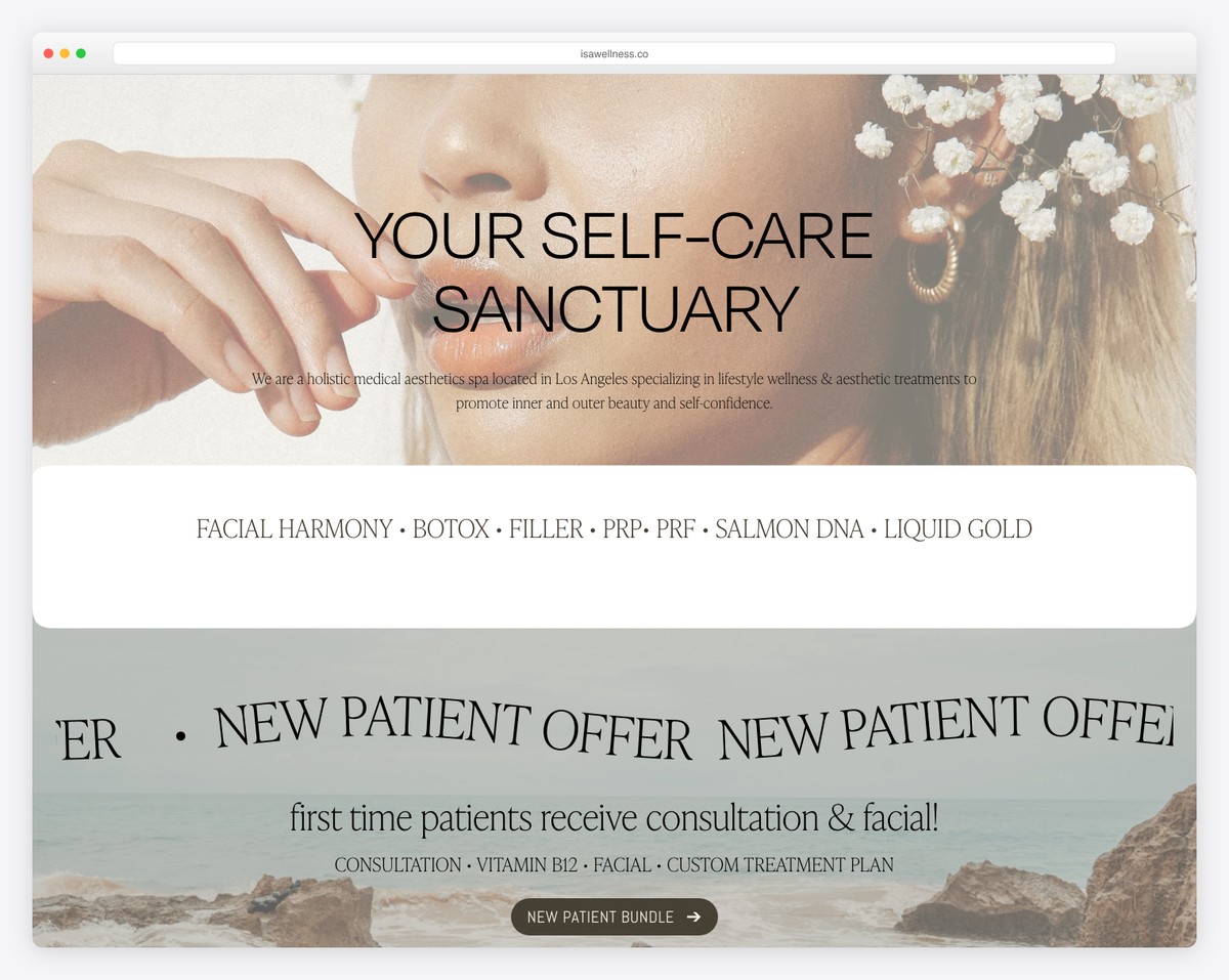
While ISA website appears very modern and creative, its footer is pretty basic, but that’s what makes it work.
It features ISA’s logo at the top, followed by menu links, business open hours, and contact details. Before copying the text, there’s also a section for a disclaimer.
What stands out: The website footer section is an excellent place to include your business’s hours.
What stands out: ISA utilizes a simple footer to display all essential links and business details, allowing potential clients to quickly access the necessary information.
Don’t forget to check some more fantastic Squarespace website examples and their footers.
4. Mitchell Adam
Built with: Elementor
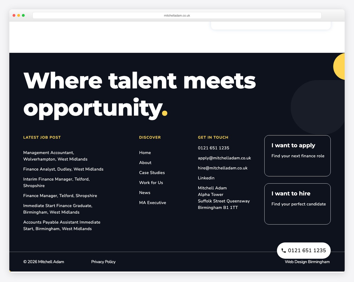
Like Yoga Journal, Mitchell Adam’s website has an extensive footer section with a dark, contrasting background. What’s cool is that it has some pattern for an additional oomph instead of a solid background color.
It features multiple sections, displaying the latest job posts, links, business and contact details, and call-to-actions for “I want to apply” and “I want to hire.”
What stands out: Include call-to-action (CTA) buttons in the website footer—you never know when your visitors will be ready to take action.
What stands out: Mitchell Adam dedicates a significant portion of their website to the footer, proving it works.
5. Neon Yang
Built with: Squarespace
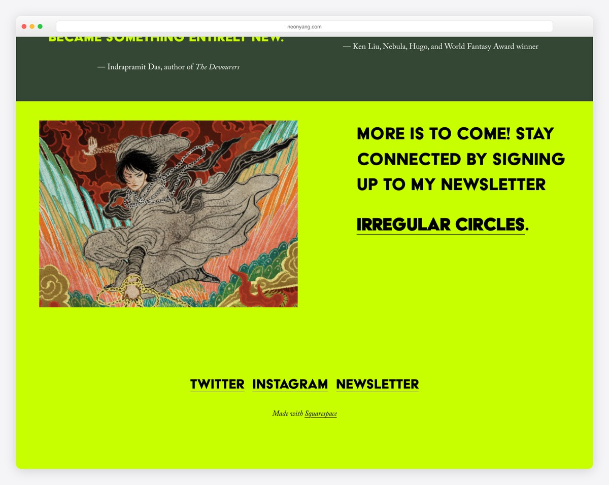
The Neon Yang website footer is a standout example of minimalist elegance meeting vibrant flair. Its eye-catching background color instantly grabs attention, setting a lively tone.
The design is sleek and uncluttered, emphasizing ease of navigation. A charming image adds a personal touch, while a newsletter link encourages ongoing engagement. Social media icons are neatly displayed for easy connectivity.
Lastly, the “Made with Squarespace” text adds a subtle nod to the platform, showcasing brand transparency and tech-savvy.
What stands out: The footer section is an excellent place to add social icons for those who missed them in your header.
What stands out: Neon Yang’s website footer exemplifies a blend of vibrant aesthetics, minimalist design, and user-friendly features.
6. Coddi
Built with: Shopify
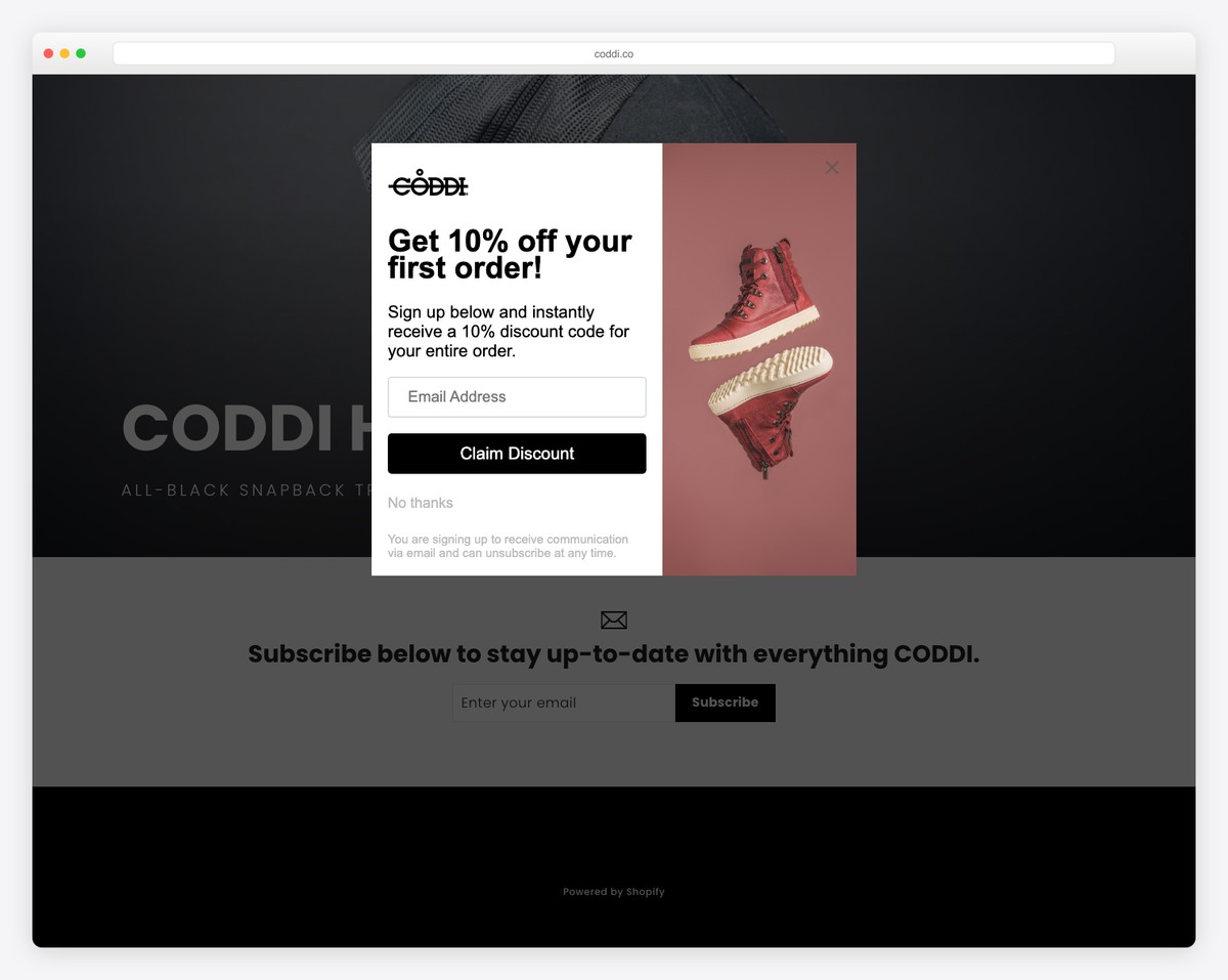
The Coddi website footer stands out with its stark simplicity and impactful design. It features a large, prominent section dedicated to newsletter subscription on a clean white background, encouraging user engagement.
Below, a contrasting black background highlights the “Powered by Shopify” text, boldly acknowledging the platform and creating a visually striking two-tone effect that captures the essence of modern, minimal web design.
What stands out: If you’re unsure how to design your website’s footer, aim for minimalism. Most of the footer examples in this list share this approach.
What stands out: Coddi’s website footer is a prime example of minimalist elegance.
Need more inspiration? Take a look at these Shopify websites and see how they effectively utilize their footers.
7. Shanley Cox
Built with: Squarespace
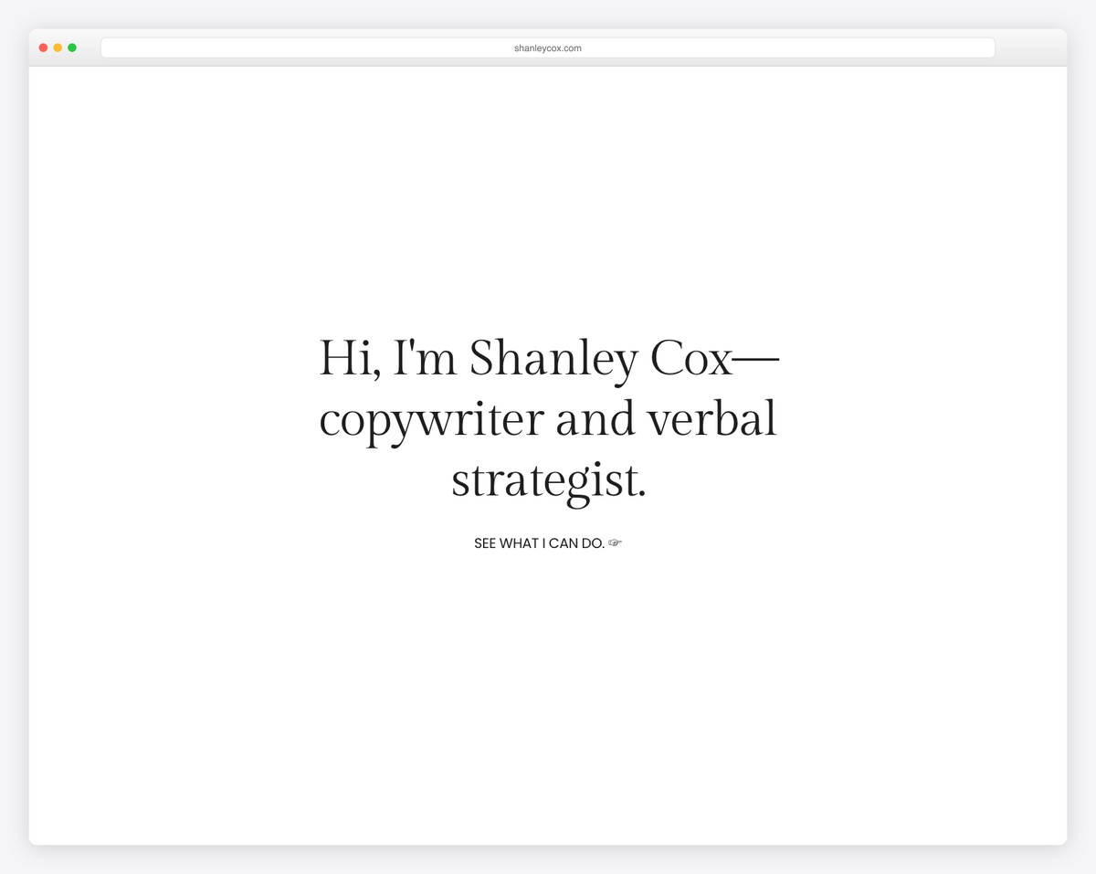
The Shanley Cox website footer is a beautifully crafted two-column design that harmonizes exceptionally with the website’s overall aesthetic.
One column efficiently houses menu links and a search bar, offering easy navigation. The second column is dedicated to a newsletter subscription form, featuring an inviting “Yes, please!” button that enhances user interaction.
Also, above the footer, a stunning Instagram feed grid seamlessly integrates social media presence, adding a visually captivating element.
What stands out: Alow visitors to perform a quick search even after they scroll all the way to the bottom of the page (so they don’t have to scroll all the way to the top first).
What stands out: The Shanley Cox website footer fuses functionality and design, elegantly combining navigation, search, and user engagement.
8. Oishii
Built with: Shopify
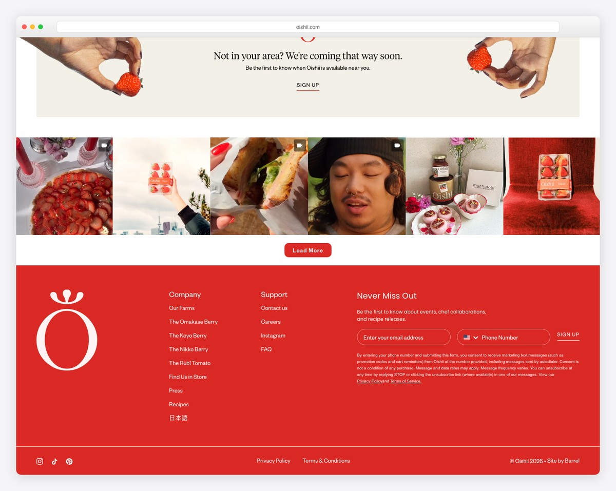
The Oishii website’s footer, with its striking red background, is a vibrant showcase of the brand’s identity. It features a full-width Instagram feed, adding a dynamic visual element.
It is organized into four columns and includes the brand logo, essential links, and a subscription form, ensuring functionality and easy navigation.
A bottom bar neatly houses social media icons, privacy and terms links, and copyright text, offering comprehensive information and connectivity options.
What stands out: Use multiple columns in the footer to ensure organization.
What stands out: Oishii’s website footer is a dynamic example of brand identity and functionality.
9. LivSo
Built with: Shopify
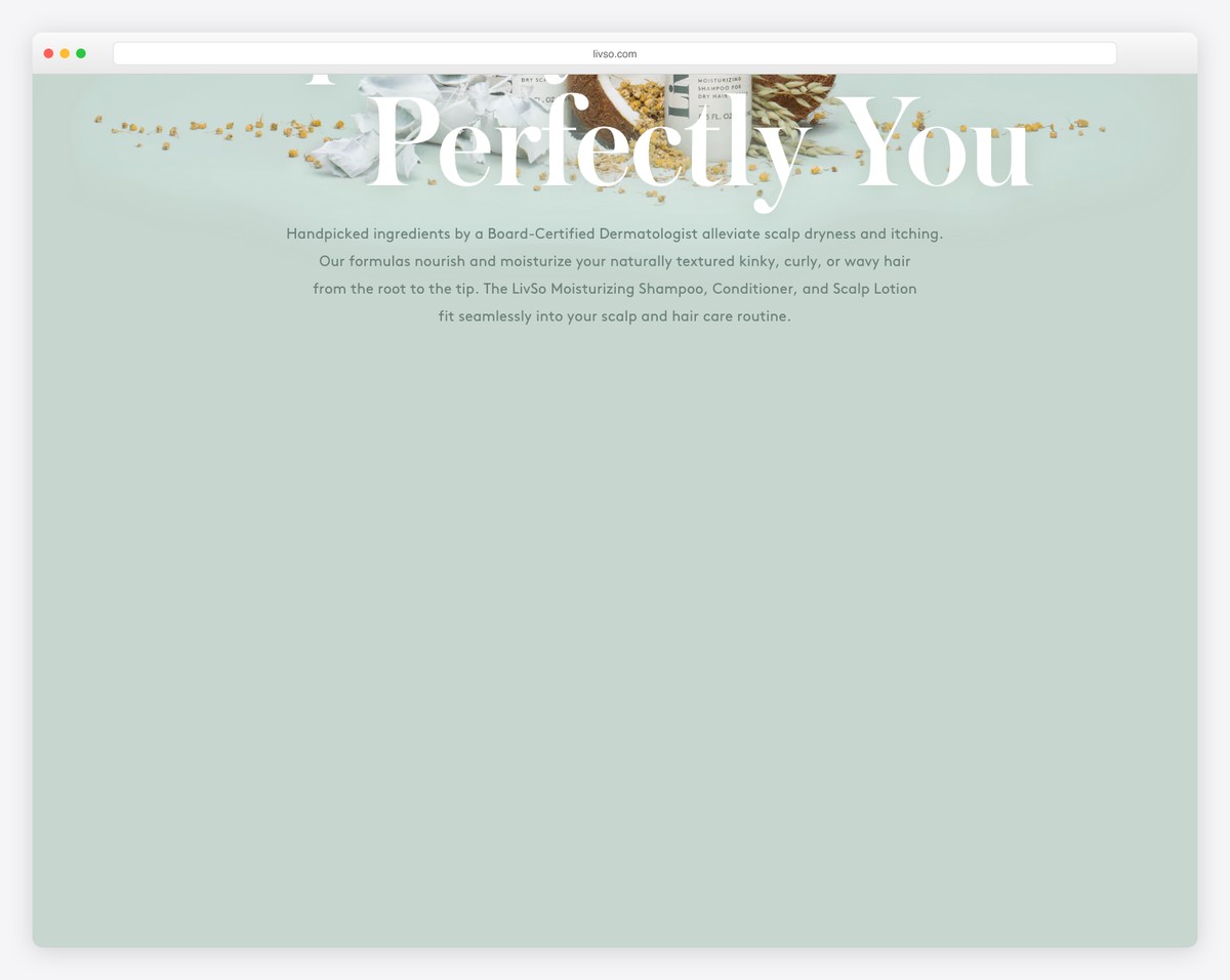
The LivSo website footer is a comprehensive masterpiece, starting with a prominent subscription area
It then features three interactive icons showcasing their products, adding an innovative touch. Social media icons follow, enhancing connectivity.
The footer thoughtfully includes links to FAQs and contact information, addressing user needs.
It also covers all bases, including essential legal links such as privacy policies, terms of use, and sales terms, making it a massively informative yet user-friendly section.
What stands out: There is no one-size-fits-all approach to website footer design —do what works best for you and your audience.
What stands out: LivSo’s website footer is a multifunctional space that combines subscription, product showcasing, social connectivity, and essential information.
10. Feastables
Built with: Shopify
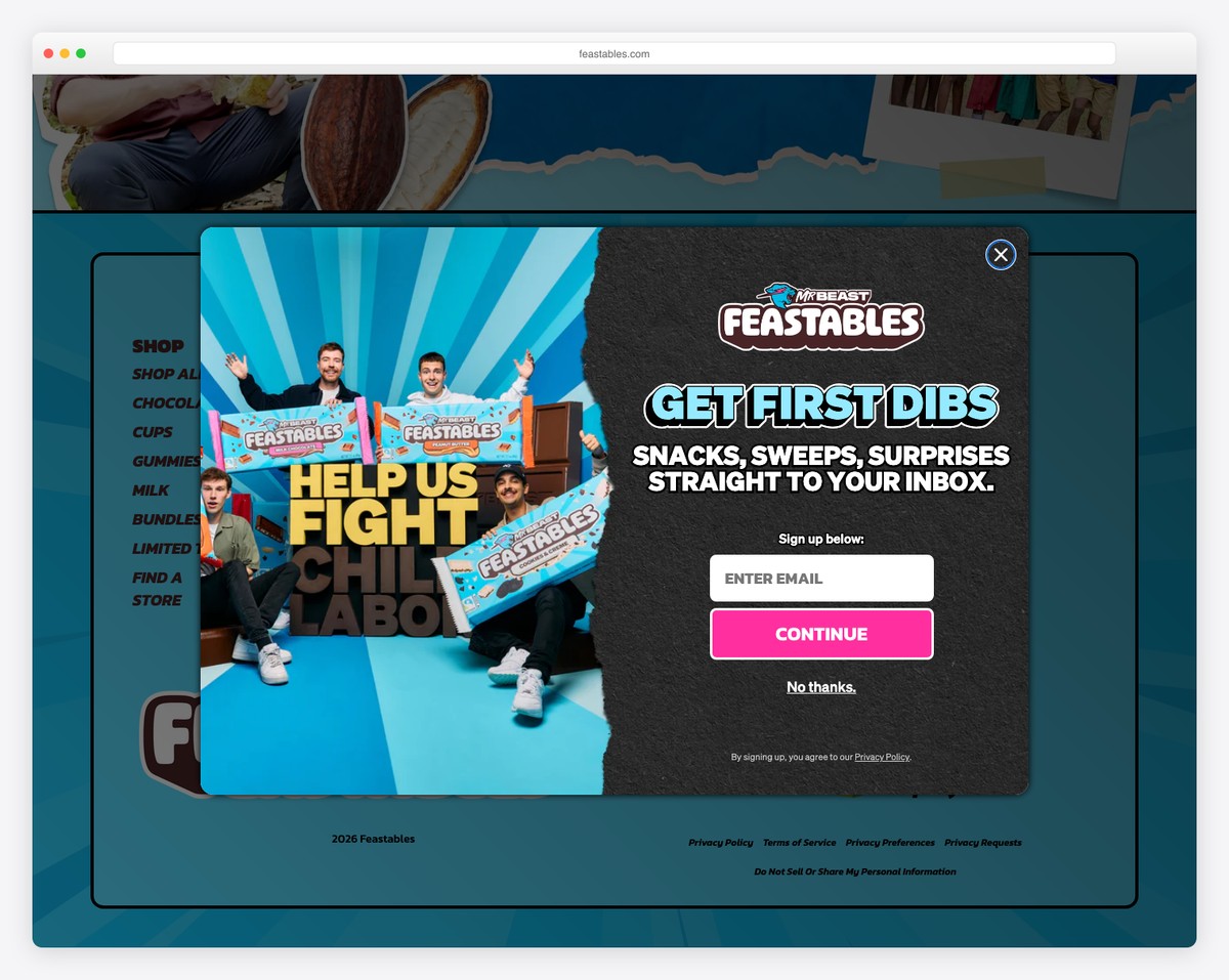
The Feastables website footer captivates with its sleek, modern design set against a black background, creating a striking visual contrast.
It prominently features the brand logo, reinforcing brand identity. The innovative use of a hamburger menu structure for links adds a unique, space-efficient twist.
Contact details are conveniently placed, along with a clickable number, for easy access. Moreover, social media icons are seamlessly integrated, encouraging digital connectivity.
The footer concludes with essential links and copyright information, creating a perfect blend of style, functionality, and user accessibility.
What stands out: If using a telephone number for contact in the footer, make it clickable for ease of use.
What stands out: Feastables’ website footer stands out for its modern, space-efficient design, which combines essential elements such as contact details, social media links, and a unique hamburger menu.
11. Kylie Cosmetics
Built with: Shopify
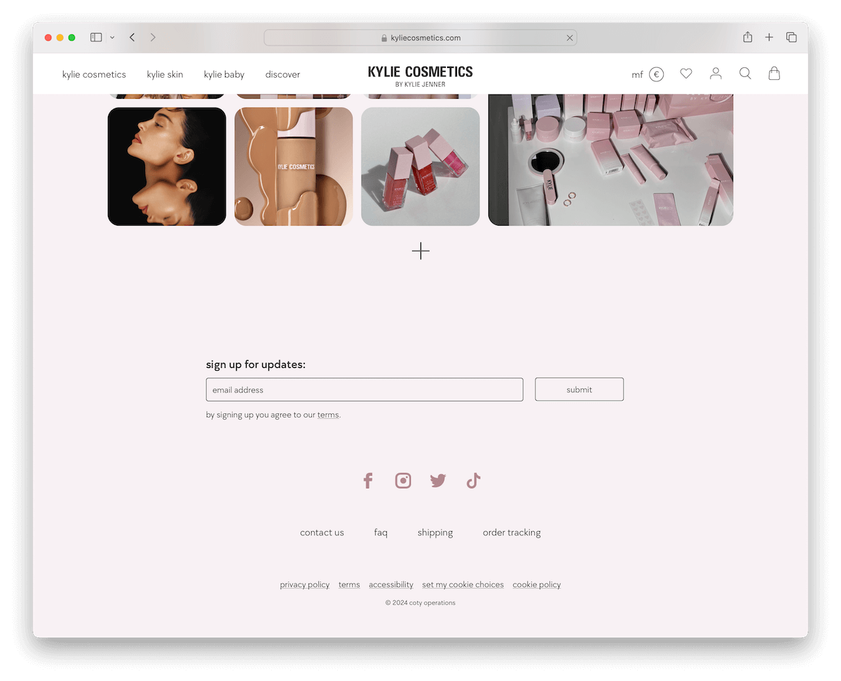
The Kylie Cosmetics website footer is a testament to minimalist elegance. It seamlessly transitions from the site’s base to the footer without the traditional border, using a cohesive background for a fluid visual experience.
The footer includes an unobtrusive subscription form, subtly encouraging user engagement.
Social media icons are neatly integrated, offering easy access to digital platforms. Essential links are provided, maintaining functionality while adhering to the clean design ethos, making it a chic and user-friendly component.
What stands out: Use the same background color as the previous section to achieve a clean and neat footer appearance. (You can even use the same background color for the header, the base, and the footer.)
What stands out: Kylie Cosmetics’ website footer exemplifies sleek minimalism and seamless integration.
12. Oatly
Built with: Shopify
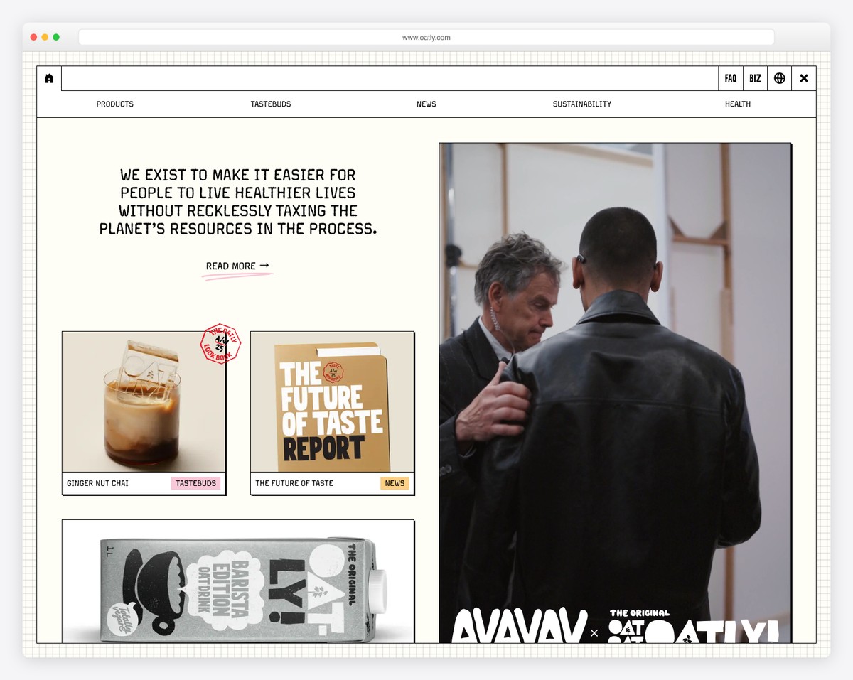
The Oatly website footer shines with its compact yet efficient structure.
Set against a contrasting black background, it contains multiple columns that organize content stylishly without overwhelming the space.
The brand’s logo is prominently displayed, reinforcing brand recognition. Handy links are provided, offering easy navigation and user convenience.
Furthermore, a simple newsletter subscription widget is included, subtly inviting users to join. Social media icons are also present, ensuring connectivity and facilitating community building.
It is worth mentioning that Oatly doesn’t have a footer on the home page because of the horizontal scrolling.
What stands out: A small and compact footer can also work fantastically well – emphasize the rest of the website instead.
What stands out: Oatly’s footer balances functionality, brand identity, and aesthetic appeal.
13. Gymshark
Built with: Shopify
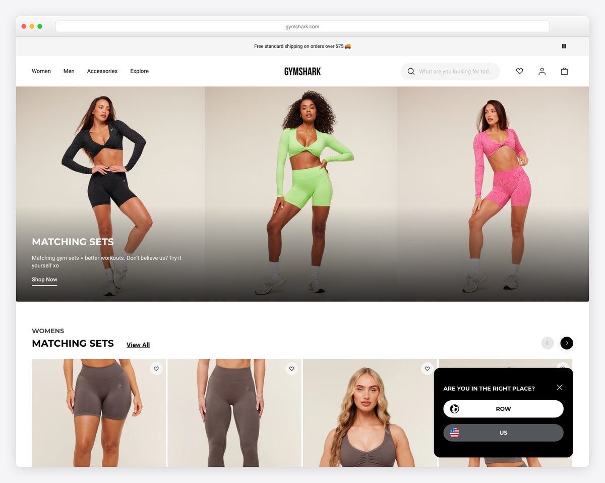
Gymshark website’s footer is a well-structured mix of practicality and design, marked by a thin line that separates it from the page’s base.
It organizes content into three columns, offering various helpful links for “Help,” “My Account,” and additional pages, facilitating easy navigation.
Clickable thumbnails for the Blog, Email Sign Up, and Training sections add interactive elements.
Payment method logos provide transactional assurance. What’s more, social icons and a bottom bar with essential links and a region selector further enhance its practicality.
What stands out: Many eCommerce websites have language and currency selectors in the footer – which might also work for you.
What stands out: Gymshark’s website footer offers a comprehensive range of features, from helpful links to interactive elements.
14. P&Co
Built with: Shopify
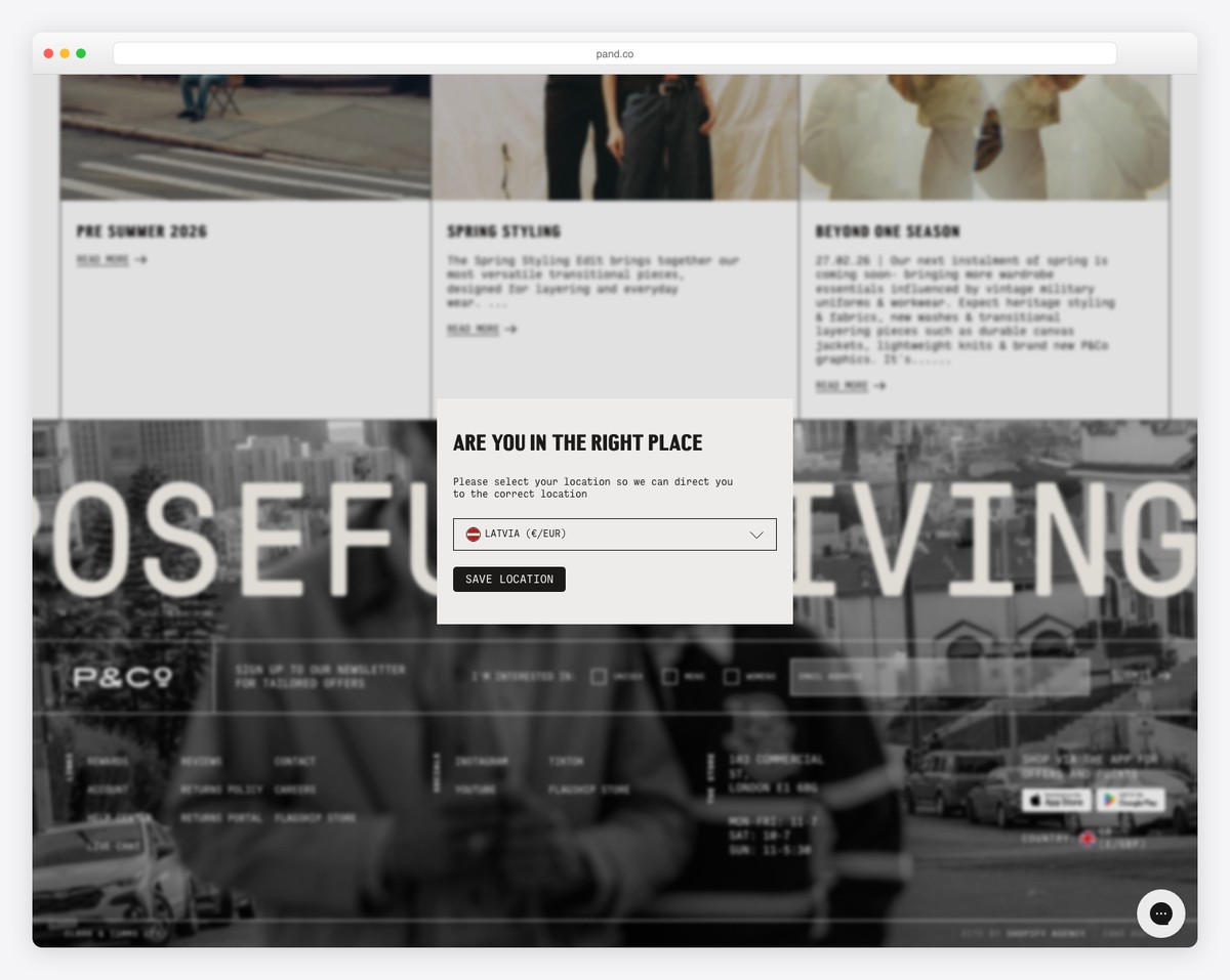
P&Co’s website footer features an innovative subscription form with a gender selector that caters to diverse audiences.
The footer also boasts prominent CTA buttons for their app, ensuring easy access while seamlessly integrated social and menu links streamline navigation.
Moreover, P&Co displays comprehensive business details for transparency. Notably, the footer showcases trusted payment logos, instilling confidence in users.
With its attention to detail and user-centric approach, P&Co exemplifies excellence in footer web design, offering an engaging online experience.
What stands out: Have an app? Add a CTA button to the App Store or Google Play in the footer.
What stands out: P&Co’s website footer comes forth due to its inclusive features, seamless navigation, and transparent business details.
15. HubSpot
Built with: HubSpot CMS
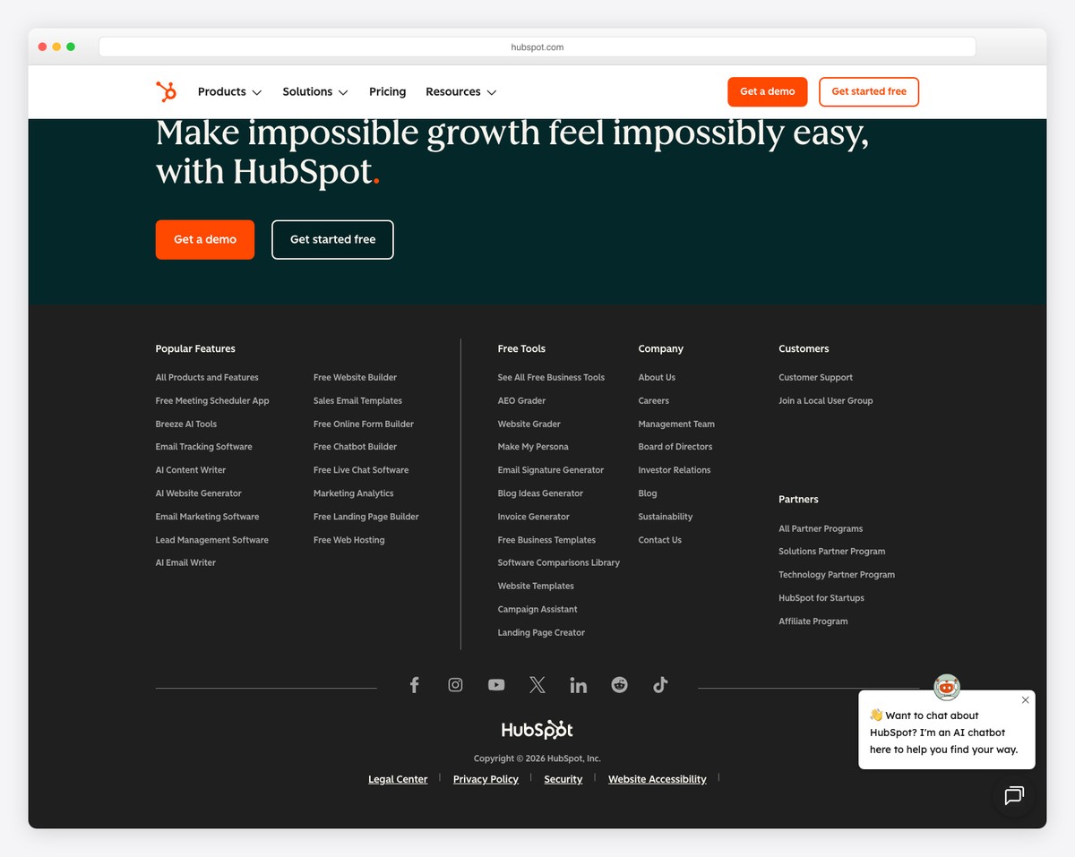
HubSpot’s website footer distinguishes itself with a well-organized layout comprising three distinct sections, offering effortless navigation through an array of valuable resources.
Additionally, centralized social icons facilitate connection.
The darkish background adds visual contrast and enhances the footer’s prominence, ensuring that vital information and links are readily accessible.
What stands out: Don’t be afraid to add multiple links in the footer.
What stands out: HubSpot’s website footer combines handy navigation, social integration, and visually striking design.
16. Devon Stank
Built with: Squarespace
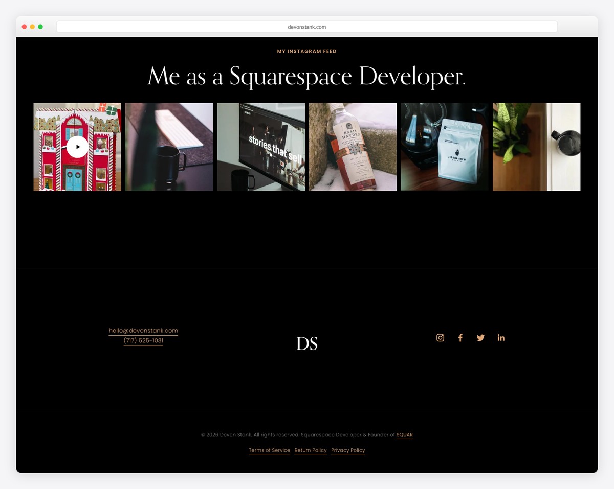
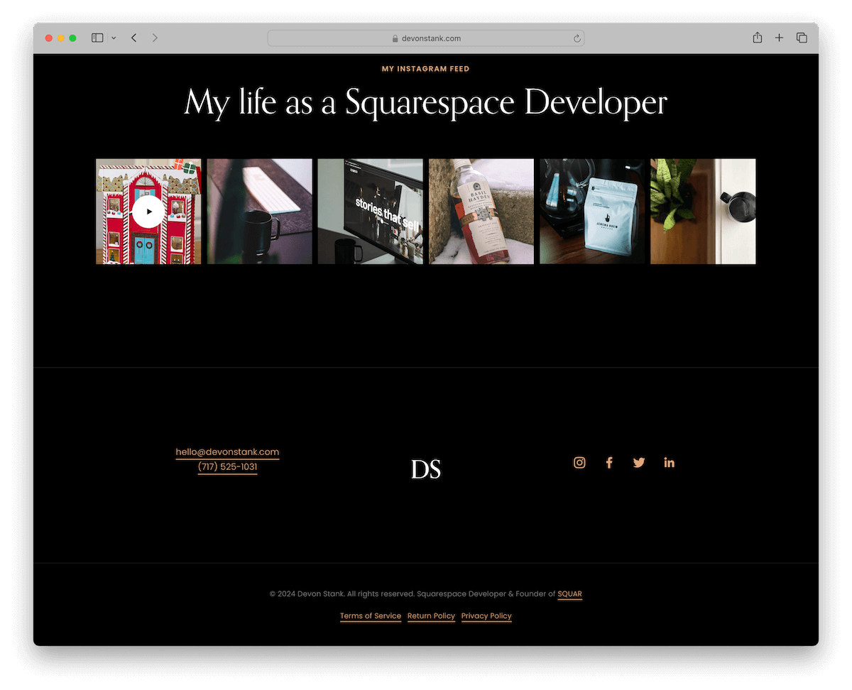
Devon Stank’s website footer embodies elegance and simplicity with its clean, minimalistic design.
Notably, it features a clickable email and telephone number on the left for instant contact. The centered logo lends a professional touch, while the right section offers easy access to social media profiles.
At the bottom, the footer includes copyright information and essential links, ensuring a seamless and uncluttered UX.
What stands out: Both the email and phone number in the footer can be clicked for an instant connection.
What stands out: Devon Stank’s website footer sets a benchmark for unobtrusive yet functional design in the digital landscape.
17. Ception
Built with: Wix
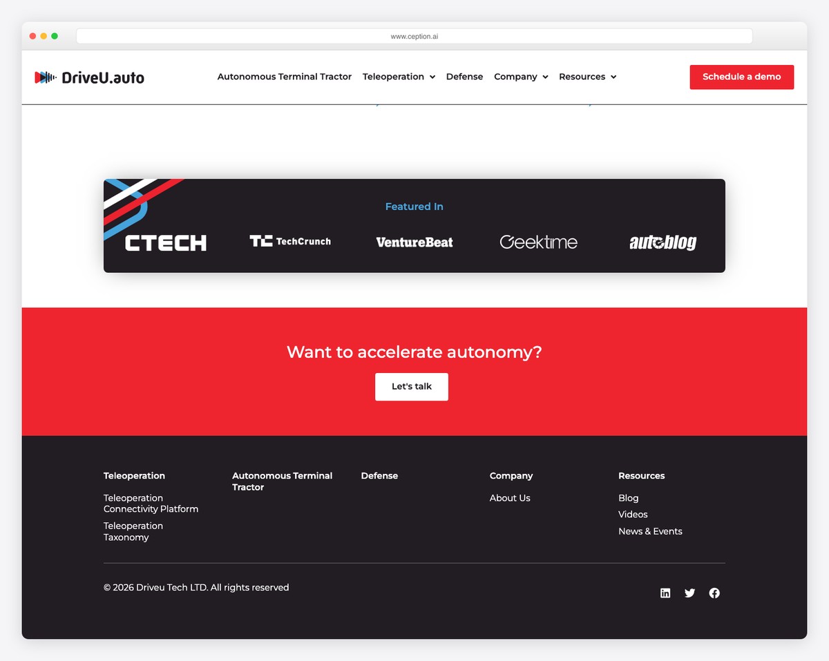
Ception’s website footer is professional and actionable, ensuring a comprehensive approach to user relationship.
Notably, it features a user-friendly contact form, allowing visitors to reach out effortlessly. Vital business details are prominently displayed for transparency, and an easily clickable email address provides quick communication options. (But the latter might not be necessary because of the form.)
The copyright text adds a professional touch, ensuring legal protection.
What stands out: Integrate a simple contact form in the footer so visitors can reach out quickly and easily.
What stands out: Ception’s footer exemplifies simplicity and functionality, creating a well-rounded user experience while emphasizing contact and information-sharing capabilities.
Considering Wix? That’s great, but check these websites built on the Wix platform first for some more great footer examples.
18. Altrock
Built with: Squarespace
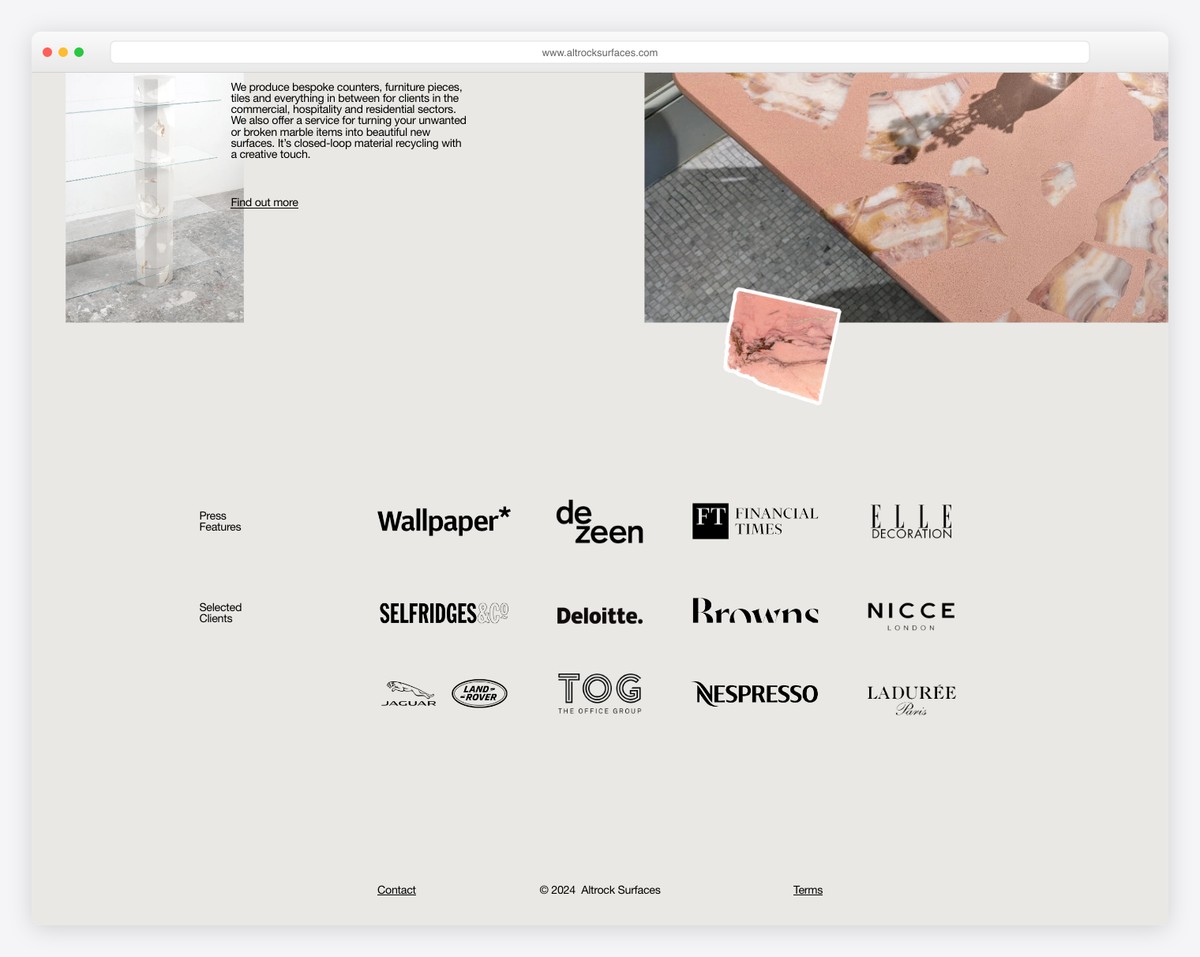
Altrock’s website footer epitomizes the beauty of simpleness, opting for an ultra-clean design that focuses on essential elements.
It achieves a sleek and uncluttered aesthetic with just a copyright text and two links—one for contacting them and another to their Instagram page.
This plainness enhances the user’s browsing experience, demonstrating how even the most basic footer can effectively convey important info.
What stands out: Keep the footer clean and straightforward, with only a few links or social icons.
What stands out: Altrock’s minimalist approach is a noteworthy example of refined web footer design.
19. Tattly
Built with: Shopify
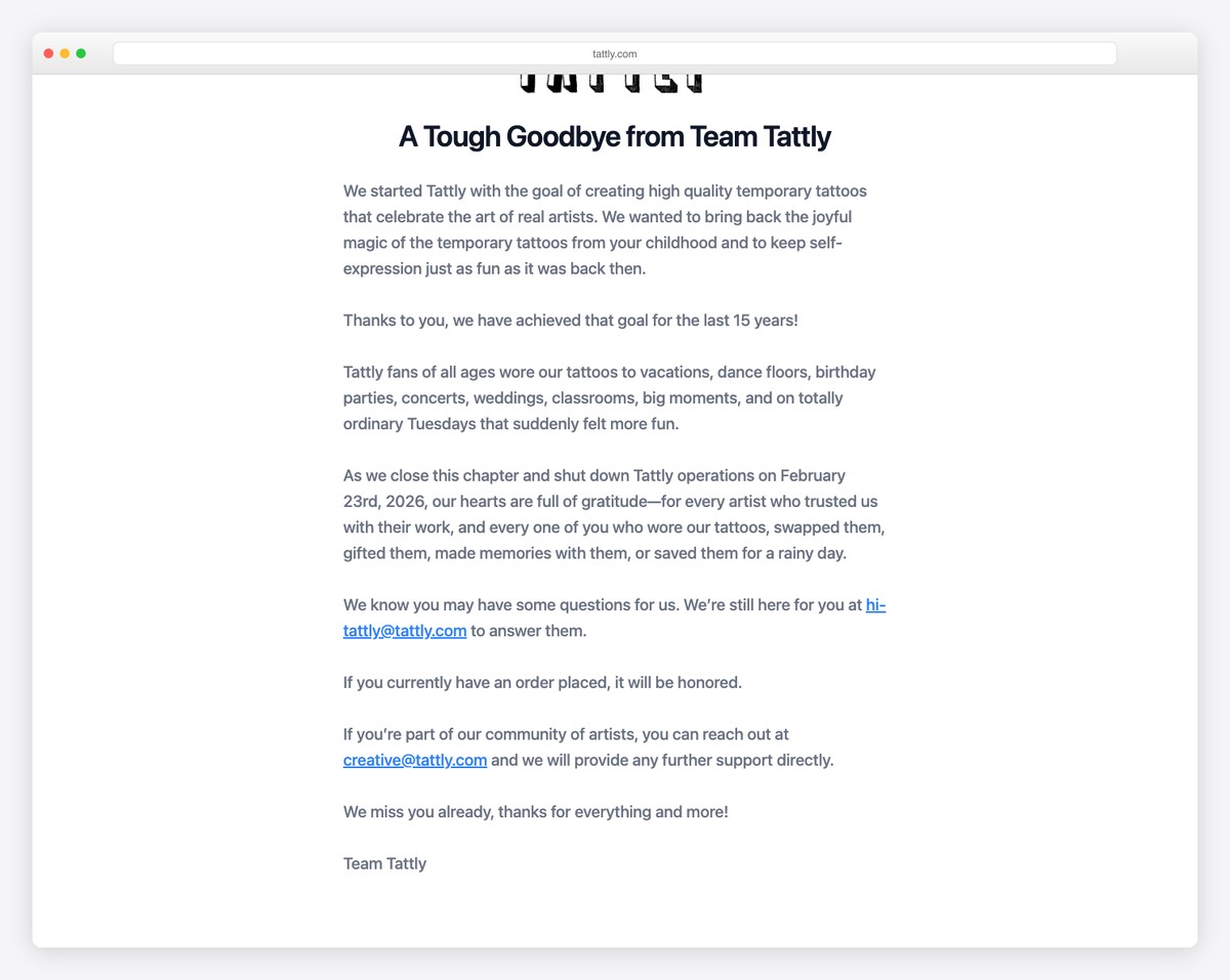
The Tattly website’s footer is a creative masterpiece. It features a cool, wavy design that elegantly separates it from the main content, adding a playful touch.
Set against a soothing grey background, it stores essential links for easy navigation and a subscription form for building an email list.
Social media icons are smartly included, fostering community connectivity. A unique addition is the “Gift of the Week!” link, adding an element of intrigue.
The footer is finalized with copyright text, ensuring both legal compliance and smooth operation.
What stands out: Have a special offer or a discount coupon? Add it to the footer!
What stands out: Tattly’s footer impresses with its artistic wavy design, blending essential navigation, social engagement, and unique features in a visually captivating layout.
20. Traackr
Built with: Webflow
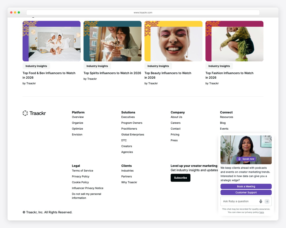
The Traackr website footer serves as a comprehensive information hub, featuring a large section rich in product links, company details, and other resources.
It goes beyond basic navigation by including additional links and helpful excerpts, enhancing user understanding.
The “Latest from the blog” column provides a snapshot of recent content, keeping users informed.
Social icons, prestigious award badges, and a practical language selector are thoughtfully included, elevating the experience to the next level.
What stands out: Do you run a blog? Add links to the latest or most-read articles in the footer.
What stands out: Traackr’s footer pops for its comprehensive blend of detailed links, blog insights, and brand highlights.
21. Mighty
Built with: Webflow
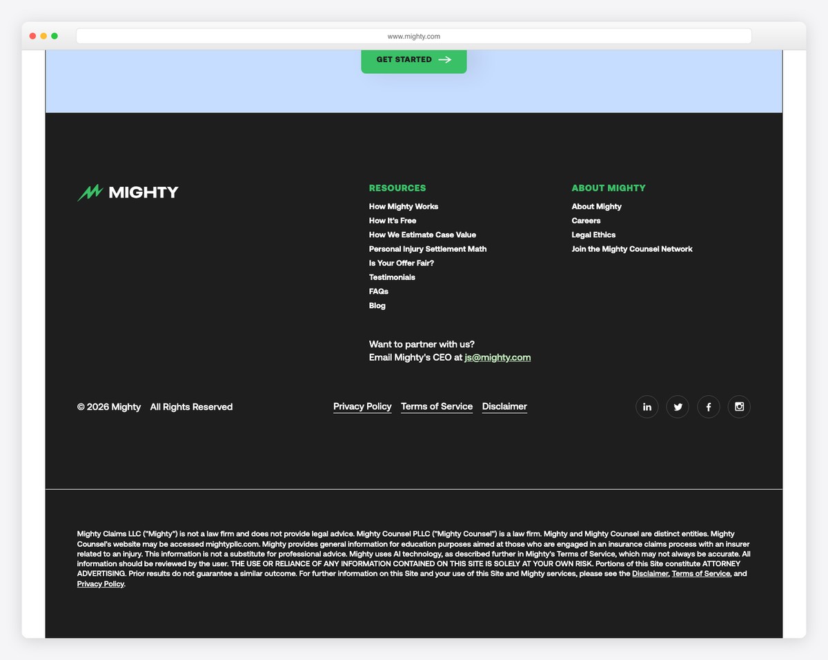
Mighty website footer is a striking example of simplicity and functionality against a contrasting black background.
It neatly organizes all the essential links, offering a comprehensive overview of the company, its solutions, and resources. This makes navigation effortless and user-friendly. There are also sign-in links, allowing users to quickly access their accounts.
A clickable email address enhances accessibility, inviting direct communication. Social media icons are strategically placed for easy connectivity.
What stands out: Do you have a members’ area on your website? Add sign-in links to the footer so users can access their accounts, even if at the bottom of the page.
What stands out: Mighty’s footer excels in elegant simplicity, seamlessly merging key links, direct contact information, and social media.
22. The Refuge Spa
Built with: Webflow
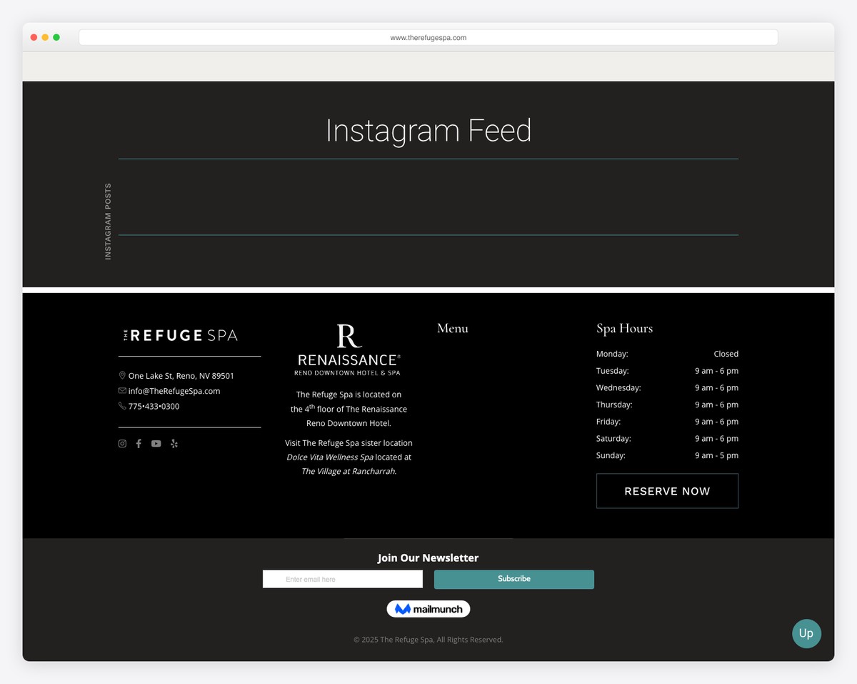
The Refuge Spa’s footer is a perfect example of organized functionality and accessibility.
It’s divided into four well-structured columns: the first column presents location and contact details alongside social icons for easy socialization; the second offers concise business details; the third column neatly displays menu links for effortless navigation; while the fourth lists spa hours, making scheduling visits convenient for users.
At the bottom, a newsletter subscription option invites ongoing interaction, ending this comprehensive and user-centric footer design.
What stands out: Add your business location details with a link to Google Maps in the footer for easy finding.
What stands out: The Refuge Spa’s footer is a model of organized efficiency, offering a blend of contact info, business details, navigation links, and engagement opportunities.
23. Blue Lagoon
Built with: Contentful
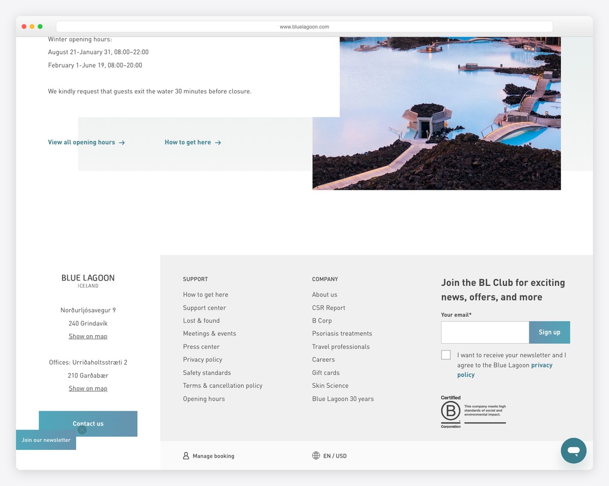
The Blue Lagoon website is impressive, featuring a multi-color background that matches the brand.
It lists business and office locations for easy reference and has a big “Contact Us” button for direct access.
The footer has support, company links, and a subscription form for ongoing engagement.
Unique features include currency and language switchers for a global audience, as well as a “Manage Booking” link for travelers’ convenience.
Note: Your footer is perfect for adding a clear Contact Us CTA button (a clickable email or even a contact form like Ception’s.)
Why we like it: Blue Lagoon’s footer is amazing in design and features, accessibility, global compatibility, and user convenience.
What stands out: The footer organizes essential links, social channels, and booking access without feeling cluttered.
24. Stripe
Built with: Next.js
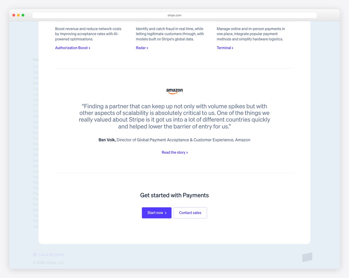
Stripe’s homepage sets the standard for modern SaaS design with its “Flexible solutions for every business model” hero and interactive product cards. The clean grid layout showcases payment acceptance, billing, commerce, and financial services — each with a miniature UI preview that gives visitors a taste of the product before clicking through.
The Next.js-powered site uses Stripe’s signature gradient accents (purple, blue, orange) sparingly against a clean white background. The footer organizes dozens of links into logical columns (Products, Developers, Resources, Company) with clear hierarchy, making it easy for both technical and business audiences to find what they need.
What stands out: Stripe’s footer is a masterclass in information architecture — organizing 50+ links into clear, scannable columns with consistent formatting ensures that even the most complex product lineup remains navigable.
25. Mailchimp
Built with: Custom
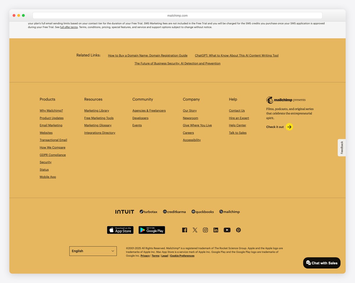
Mailchimp’s homepage radiates personality with its signature Cavendish Yellow branding and playful illustrations. The hero promotes their email marketing and automation platform with bold messaging and hand-drawn character illustrations that have become iconic in the SaaS world — proving that B2B does not have to mean boring.
The footer balances comprehensive navigation with Mailchimp’s characteristic warmth. Product links, resources, company info, and legal disclaimers are organized into clean columns, while the Freddie mascot and yellow accents maintain brand personality all the way to the bottom of the page.
What stands out: Mailchimp proves that a footer can reinforce brand personality — using your signature colors and playful tone even in the navigation section creates a cohesive experience from top to bottom.
What Makes A Great Website Footer
A website footer isn’t just about looks; it’s a powerful tool for enhancing UX, providing valuable information, and reinforcing brand identity.
Here are six key features to create a great website footer:
- Clear navigation links: A great footer should have clear and easily findable links to important website sections. This can include links to popular pages, site maps, privacy policies, terms of service, and other relevant information.
- Contact Information: Providing contact details, such as phone numbers, email addresses, and physical location (if applicable), is essential for accessibility and user trust. (You can even add Google Maps in the footer.)
- Social media icons: Including social media icons that link to the brand’s social profiles encourages users to engage with the brand on different platforms. (Some even add a social media feed in the footer.)
- Brand elements: Adding brand elements like logos, taglines, or a brief description of the company helps reinforce brand identity and makes the footer look more professional.
- Newsletter sign-up: A footer is a great place for a newsletter sign-up form where visitors can subscribe to updates, news or promotions easily.
- Responsive design: The footer should be responsive and look good on all devices. It should adjust seamlessly to different screen sizes, ensuring a consistent user experience across desktop, tablet, and mobile devices.
If you build it from scratch, check these Bootstrap footer templates and save time.
More tips and tricks for creating an amazing footer for your website
FAQs About Website Footer
What should I put in a website footer?
A website footer has navigation links, contact information, social media icons, brand elements, newsletter sign-up form and sometimes a brief about the company or additional resources.
Do I need to have a footer on every page?
Yes, having a footer on every page is generally a good practice. It provides a consistent structure and gives users information and navigation options at the end of their journey.
How can I make my website footer look nice?
To make your footer look nice, focus on clean design, use brand colors, add high-quality graphics or icons, and make the text concise and clear. Creatively arrange the content, add unique elements like mini-gallery or interactive features, or use a contrasting background color to make it pop.
Do I need to include legal info in the footer?
Yes, including legal information like terms of service, privacy policy, and copyright notices is important. It’s for transparency, compliance with legal requirements, and building user trust.
Can I use the footer for promotions?
The footer is a great place to promote special offers, highlight key products or services, or direct users to new and notable content. However, it is essential to strike a balance between promotional and informational content to maintain user-friendliness.
How often should I update my website footer?
Update regularly to keep contact information, links and copyright dates current. Also, refresh the design or content periodically to keep the footer in sync with the latest web design trends and business updates.
What stands out: The minimalist design keeps the focus on what matters most — the content itself.






Comments (0)