19 Best Consulting Websites (Examples) 2026
Do you want to gain inspiration and creative ideas by checking the best consulting websites?
You’re lucky because we just finished curating this collection after thoroughly examining over 70 consulting sites.
They come in all shapes and sizes.
We included one—and multi-page layouts, minimalist designs, and more creative designs to suit all tastes.
Tip: Enhancing your site’s user experience can be achieved by adding an online appointment/consultation form.
Remember, you can effortlessly create an impactful business site with these consulting WordPress themes.
Let’s go!
Best & Most Inspiring Consulting Websites
1. FourFold
Built with: Squarespace
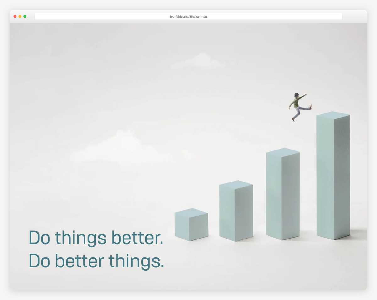
FourFold is a minimalist website that loads content on scroll to enhance the scrolling experience. It also has a header that disappears/reappears depending on the scrolling movement.
A handy feature is the accordions, which don’t take up too much website real estate and provide information only when needed.
FourFold is also a great one-page website example, with a contact form above the footer and a back-to-top button.
Note: A single-page layout can improve the users’ experience.
You’ll also enjoy reviewing all these Squarespace website examples.
What stands out: Parallax scrolling adds visual depth and encourages visitors to keep exploring.
2. The Bruin Group
Built with: Wix
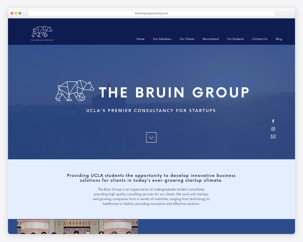
The Bruin Group is a beautiful consulting website example with a video background. On the right, you’ll find text, social, and email icons, and a convenient scroll-down button is located in the hero section.
The header and the live chat button in the bottom right corner are sticky, so you always have access to them. Lastly, the footer has a newsletter subscription form that helps grow their email list.
Note: Consider integrating a live chat function into your Wix website to enhance customer service.
What stands out: The background video creates an immersive first impression that immediately sets the mood.
3. CitrusAd
Built with: Elementor
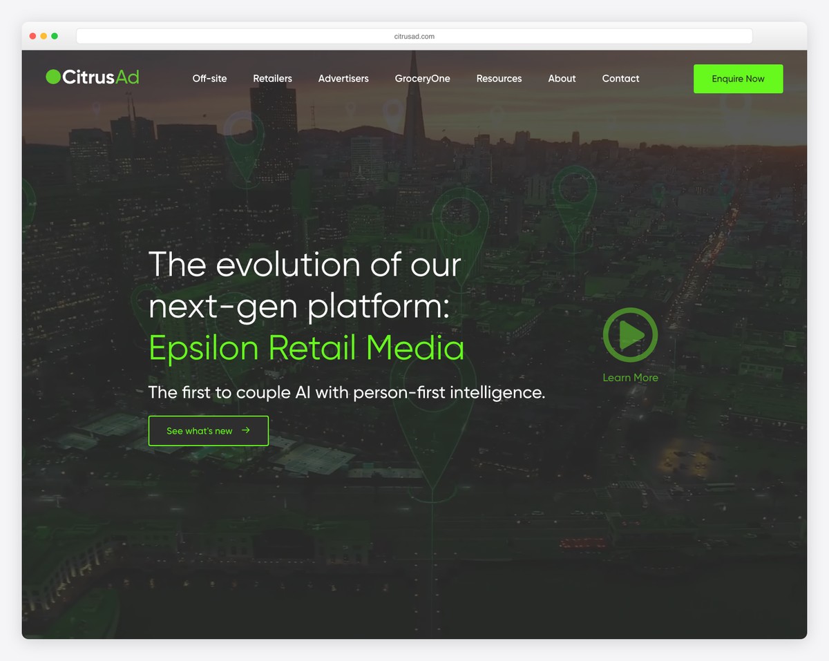
CitrusAd creates a strong first impression with a hero video, text and a play button that opens a promotional lightbox video.
They added multiple call-to-action (CTA) buttons across the home page, including one in the floating navigation bar.
CitrusAd is also very good at branding their website, incorporating many small details that remind you of the brand.
Note: Add a promotional video with lightbox functionality, allowing visitors to watch it without leaving the current page.
What stands out: Full-screen video on the homepage draws visitors in before they even start scrolling.
4. S Kaba Consulting
Built with: Wix
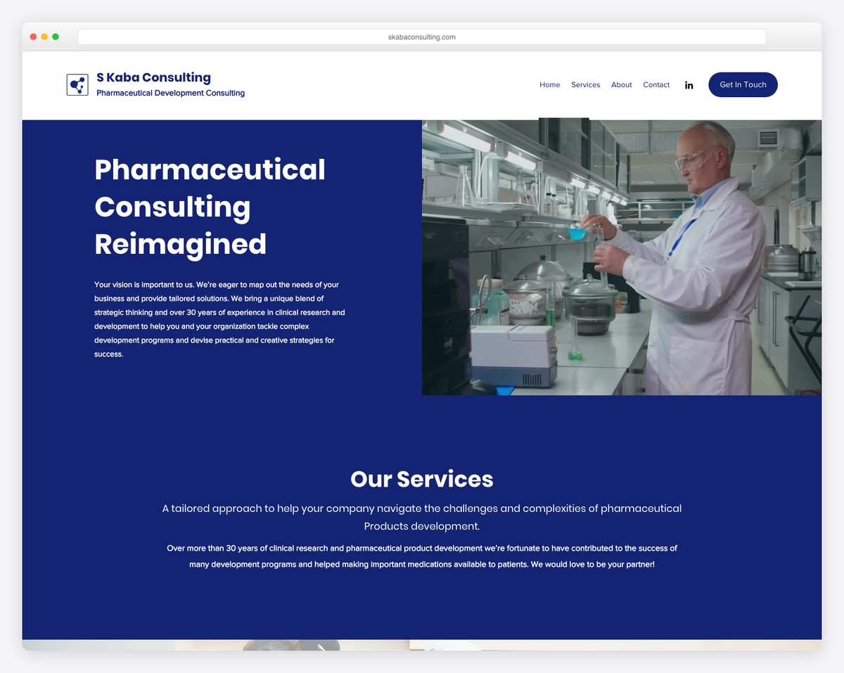
S Kaba Consulting is a professional business website with a split-screen hero design, where one part is the title and text and the other is a quick promotional video.
The home page has a full-width design, a basic header, and a contact form. It also features a section for services, accompanied by CTA buttons for those who wish to learn more.
Note: Add a contact form on the home page so everyone can easily reach out.
What stands out: Layered parallax effects create a sense of movement that makes scrolling feel dynamic.
5. Bridge Investment Group
Built with: Wix
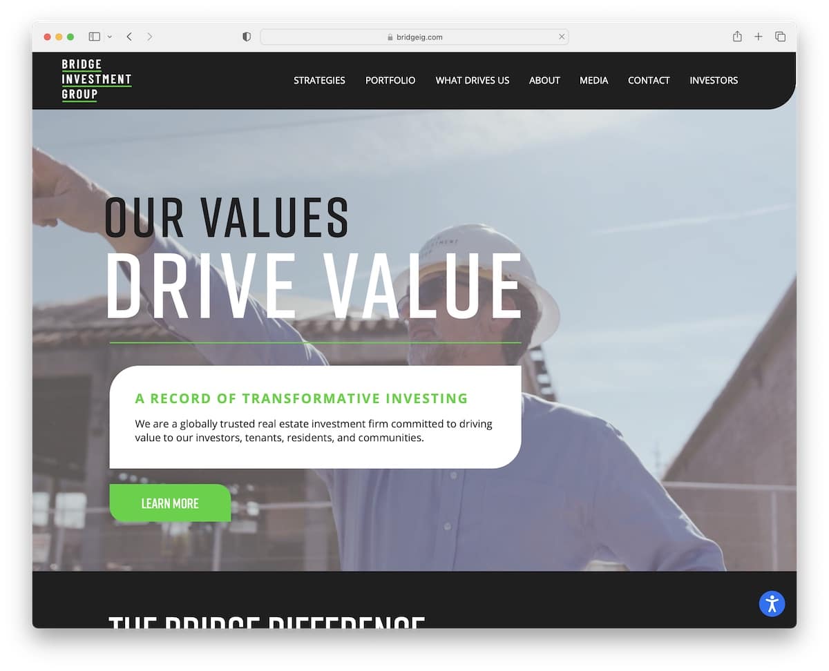
Honestly, during conducting collections of the best website examples, the consulting category has the most pages with videos on the home page.
And Bridge Investment Group is another excellent example, with awesome branding and a fantastic scrolling experience.
This consulting website also features a sticky accessibility adjustments button in the bottom right corner, allowing you to personalize the look.
Note: Allow everyone to modify your website’s appearance via the accessibility configurator.
What stands out: The dark color scheme gives the site a sleek, modern feel that makes imagery pop.
6. Kesslers London
Built with: Wix
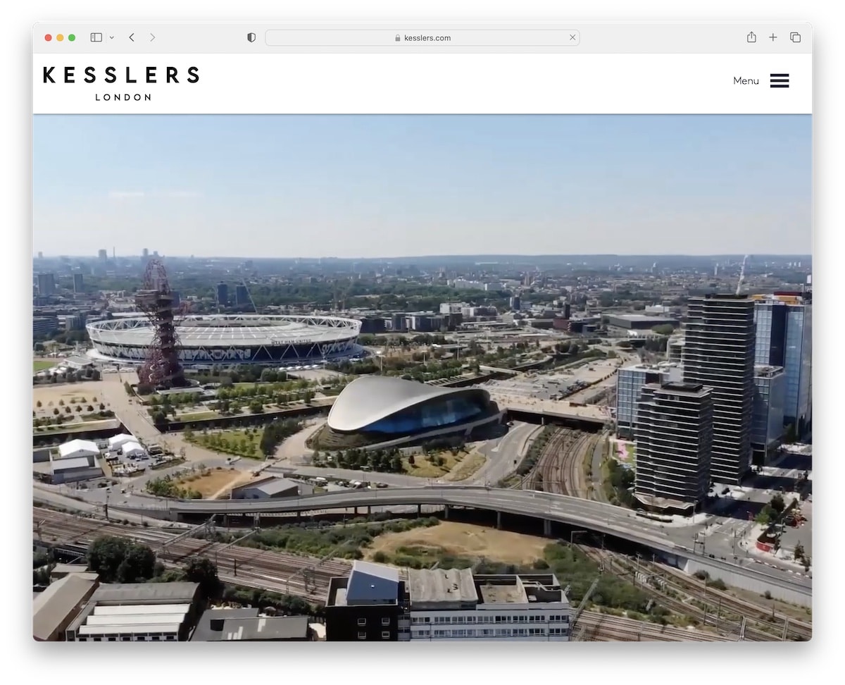
What we really like about Kesslers London is that they don’t try to sell you something in the above-the-fold section. Instead, they let you enjoy a video that gives you a glimpse of what they do.
However, you can click the hamburger menu icon to find what you’re looking for, or simply scroll through the likable homepage. Another smart move is portfolio integration, which allows you to review actual projects, read their strategies, and more.
Note: Create a portfolio of projects and cases so potential clients can learn more about your process, strategy, etc.
What stands out: A dark background paired with bold accent colors creates striking visual contrast.
7. Chris Boyer
Built with: Squarespace
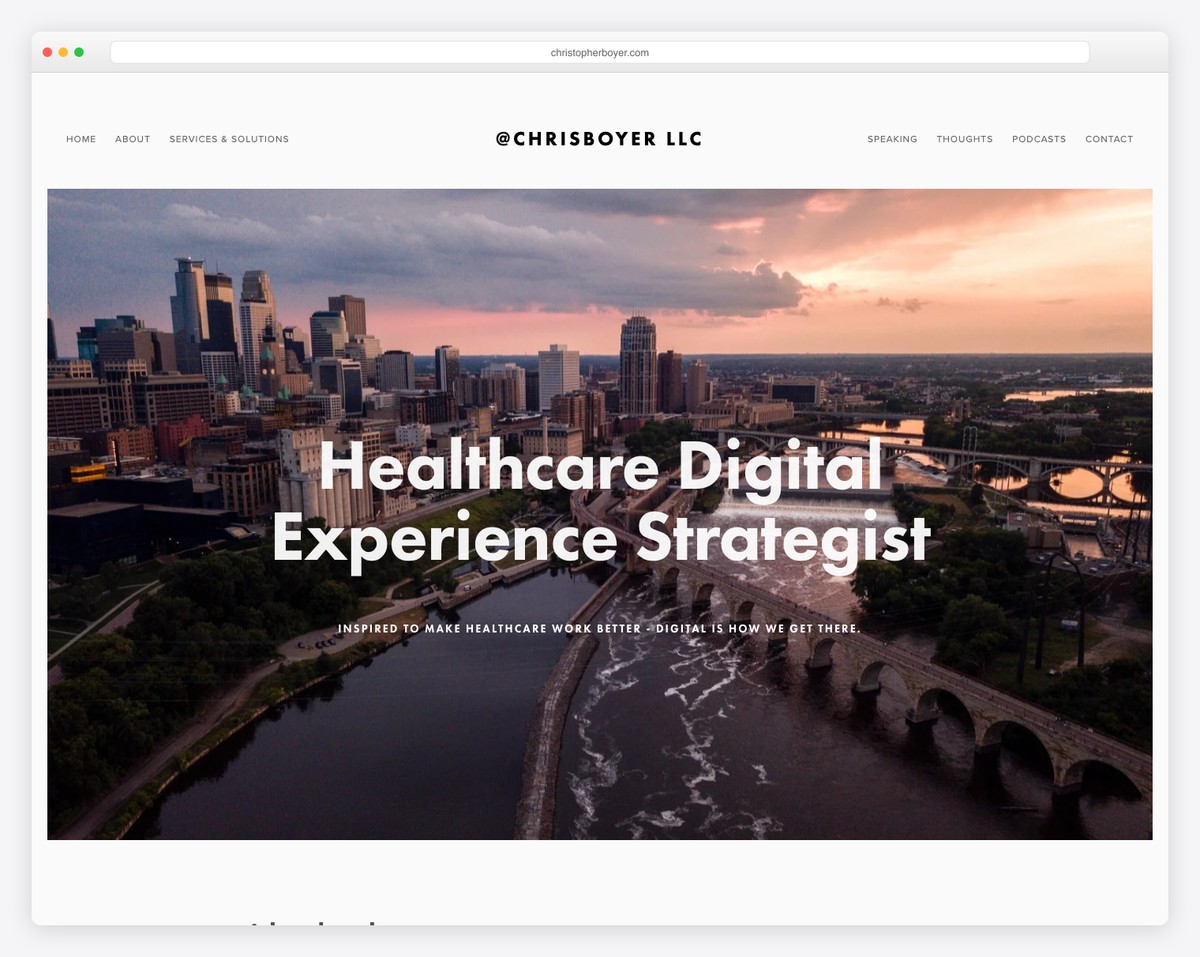
Chris Boyer is a clean website that makes things special with its parallax images, which decorate the homepage.
The header and footer are both minimalist, featuring all the essential menu links and social media icons.
Note: A minimalist web design and a touch of detail, like a parallax effect, go very well hand in hand.
You can build a similar website using Squarespace consulting templates. They feature an impressive design and an intuitive interface, making them easy to use even for first-time website creators.
What stands out: Seamless e-commerce integration lets visitors go from browsing to buying without leaving the site.
8. Jeremy Malcolm
Built with: Elementor
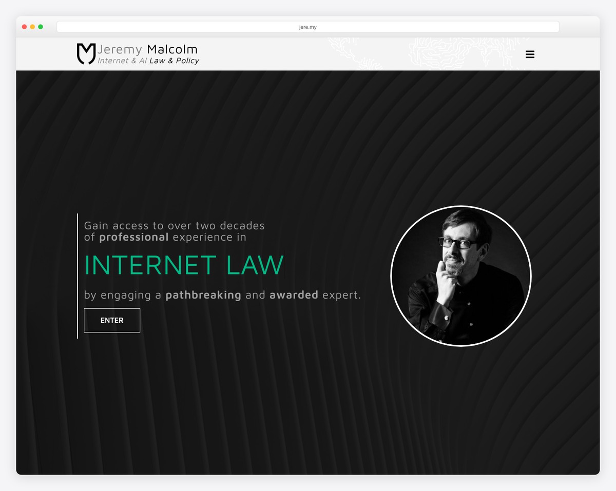
The number one thing that makes Jeremy Malcolm’s consulting website stand out from the rest is its framed layout. You don’t see it too often, but it’s so cool.
Furthermore, the typewriter effect above the fold is a catchy attention grabber, while the rest of the home page has a unique scrolling (collapsible section) experience.
Additionally, when you click on the hamburger icon, a full-screen menu appears with navigation links and social media icons.
Note: Awesome details, such as a framed layout, can make your website stand out even more.
What stands out: A hero slider showcases multiple offerings at a glance, giving visitors quick access to key content.
9. Kevin Sharon
Built with: Wix
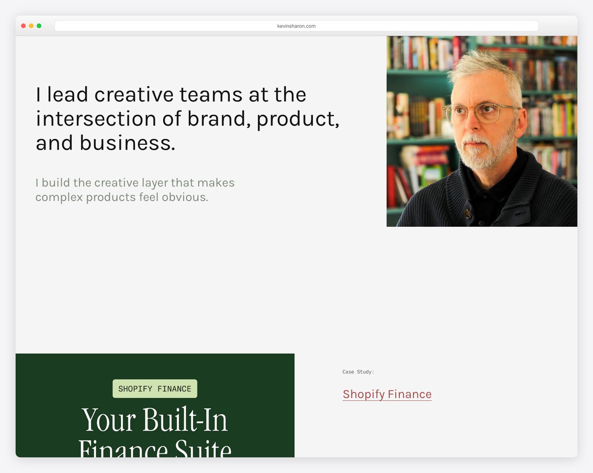
Kevin Sharon’s consulting website does things differently with a text-first hero section on a solid background and a 100% transparent header.
The next part of the home page is a grid of projects and case studies and then a clean footer to seal the deal.
This is also a great example of a simple website that highlights the important elements.
Note: Instead of images, videos and sliders above the fold, use text.
What stands out: A masonry grid layout organizes content attractively while maximizing screen real estate.
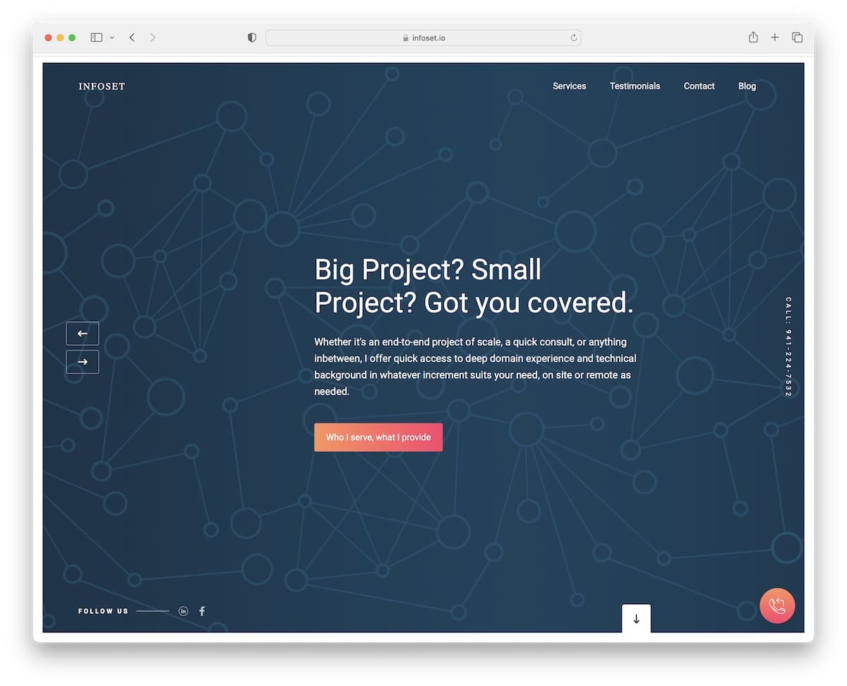
10. Infoset
Built with: Webflow
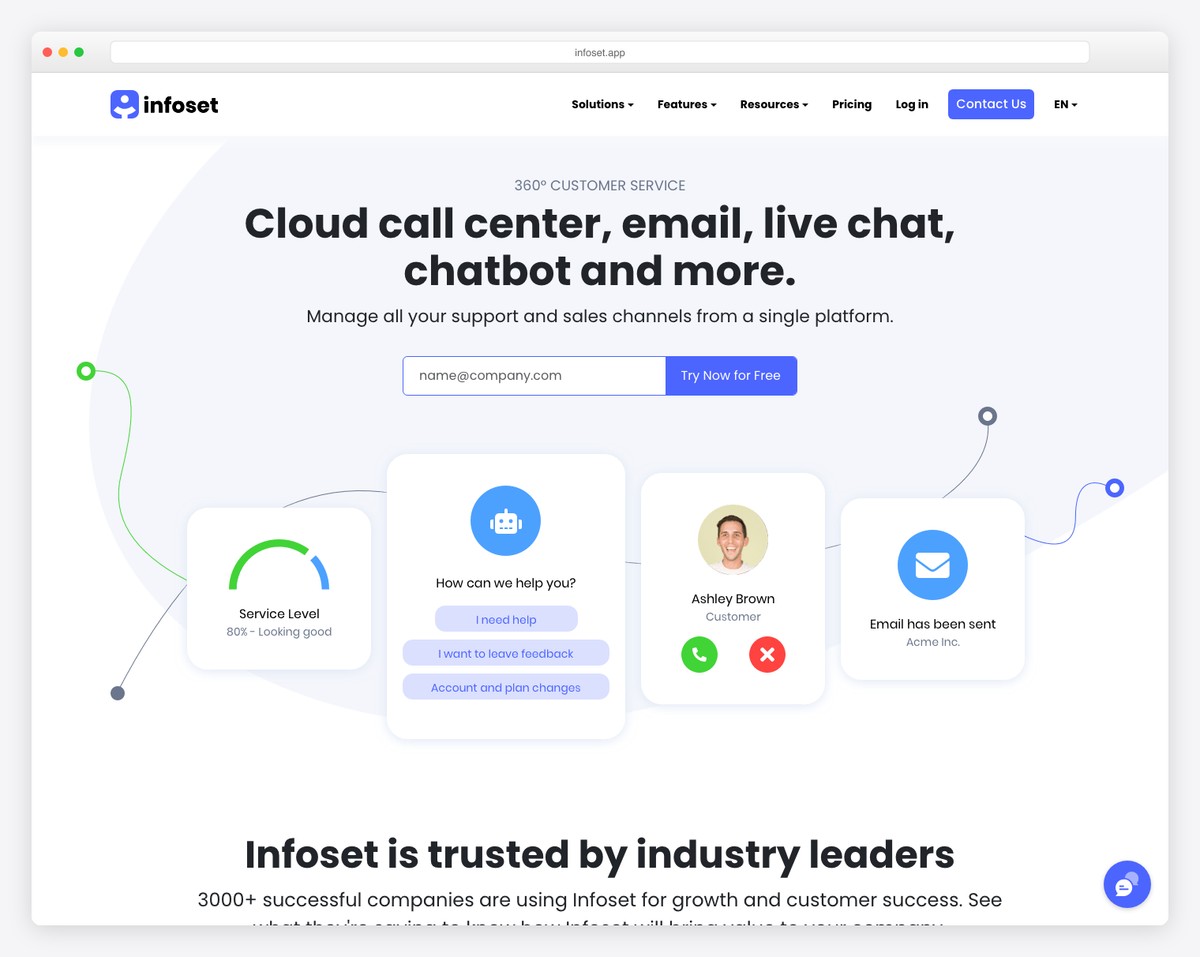
Infoset is another consulting website with a framed design; however, this one features a full-screen slider above the fold.
Each slide has a modern background with a title, text and a CTA button. The slider also features a floating telephone number and social media icons.
However, the elements that remain on the screen are the header and telephone number (located in the bottom right corner). And because it’s a single page, it also features a contact form, Google Maps, and a testimonial slider.
Note: Integrate a client testimonials slider into your page for social proof.
What stands out: The image carousel keeps the above-the-fold area dynamic without requiring visitors to scroll.
11. Denym Bird
Built with: Carrd
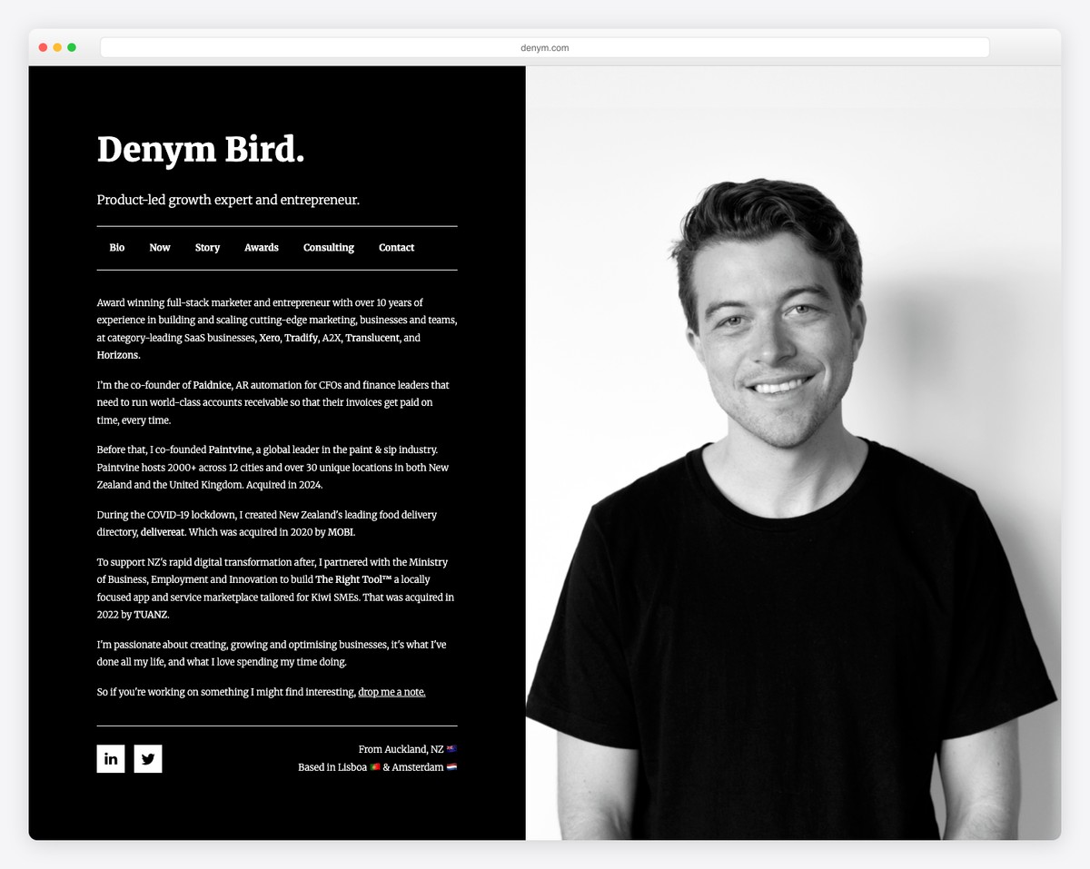
Denym Bird is a website featuring a split-screen design, where the right side displays a static image and the left side serves as the base for internal pages. Also, the dark background makes this consulting website look and feel more premium (especially in combination with the black and white image).
Note: You can easily create a similar Carrd website because it’s one of the easiest website builders.
What stands out: High-quality photography does the heavy lifting, making the content feel premium.
12. Josh Kremer Consulting
Built with: Squarespace
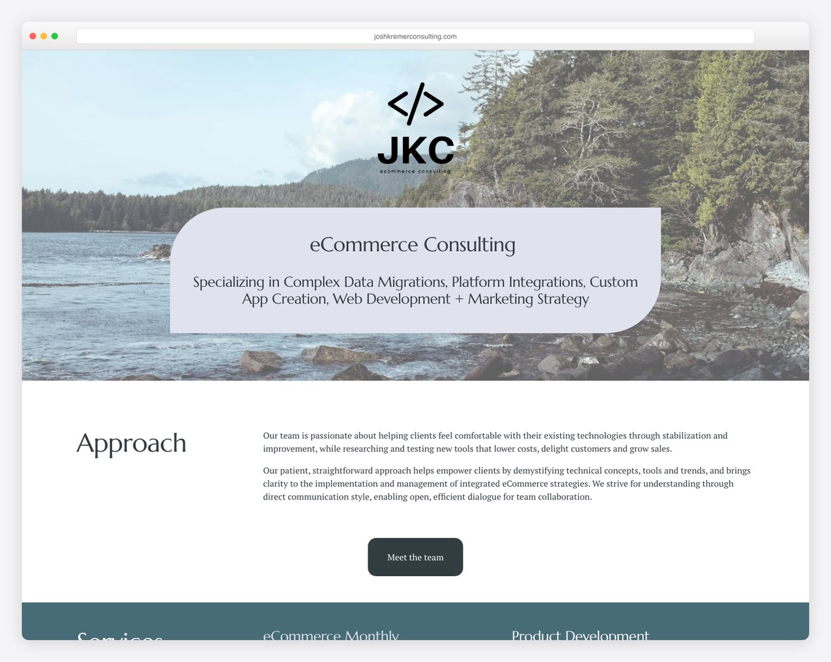
Josh Kremer Consulting is one of the most text-heavy consulting websites we stumbled across. Why are we adding it to the list? Because it stands out from the rest!
The minimalist structure and white space make this page easy to read and skim through, even if you’re in a hurry.
Josh ensures a pleasant scrolling experience with a disappearing header that only appears when you start scrolling back. This is an excellent detail that contributes to a better UX.
Note: Using a sticky header/menu can improve your website’s user experience.
What stands out: The grid-based gallery makes it easy to scan a large collection at a glance.
13. Jack Dalrymple
Built with: Webflow
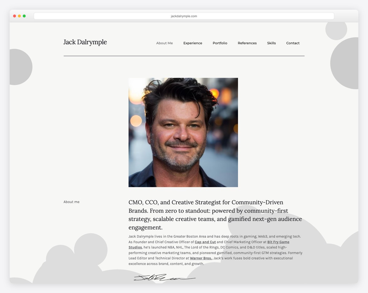
Jack Dalrymple’s personal website features a one-page layout, making everything easily accessible with just a few scrolls.
While the website is filled with text, it is organized in a timeline structure for a quick overview. Moreover, integrating testimonials and videos is a great way to add value.
While a floating header would be helpful, Jack Dalrymple’s page still features a back-to-top button, so you don’t need to scroll to reach the header.
Note: Use a back-to-top button, especially if you don’t have a sticky navigation bar.
What stands out: Client testimonials placed prominently on the homepage build trust before visitors even explore the services.
14. Navigate
Built with: Divi
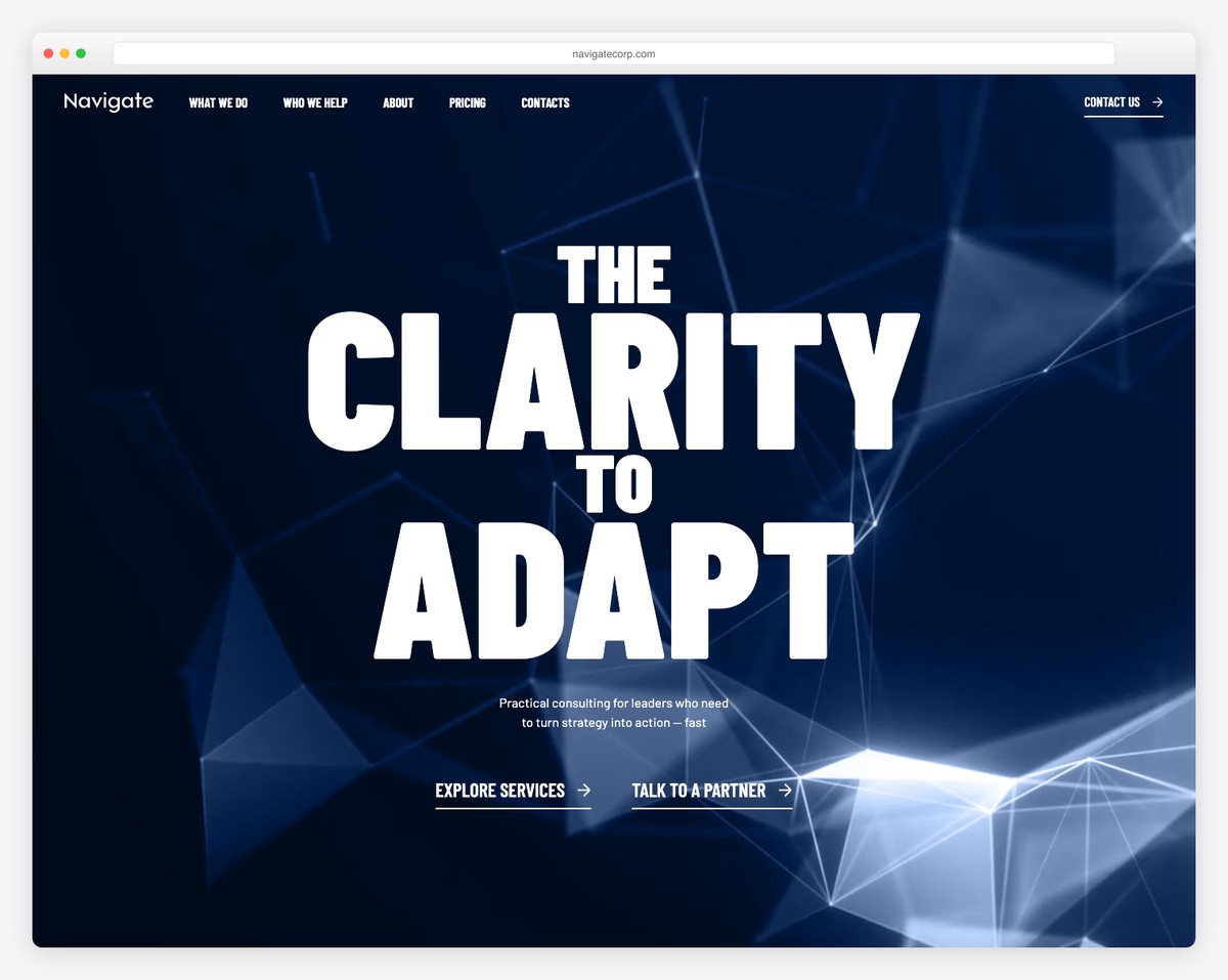
Navigate is an excellent mixture of minimalism and creativity with a light design, text and animated scrolling visuals.
It’s a consulting website that knows how to finesse details to create a better user experience.
Navigate’s header has a drop-down navigation, a search bar, and links to careers and LinkedIn. Moreover, the four-column footer features business details and a newsletter subscription form, in addition to the menu links.
Note: Let strategic detailing put life into your clean and minimal page.
But you can also benefit greatly by examining all these websites using the Divi theme for more ideas.
What stands out: The minimalist design keeps the focus on what matters most — the content itself.
15. Bain & Company
Built with: Gatsby
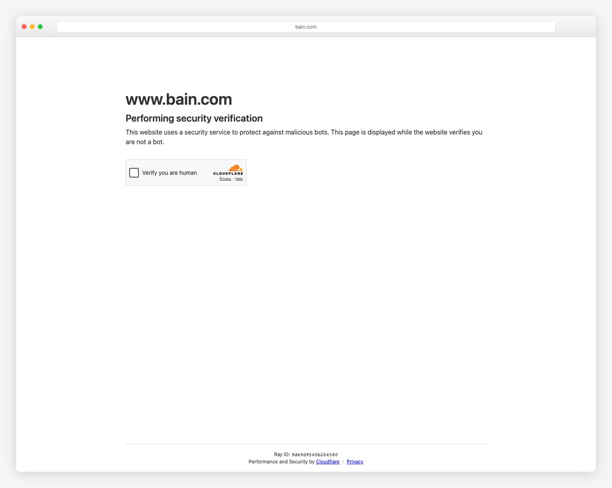
Bain & Company is a modern and impactful consulting website with a unique slider, embedded video, language switcher and a search bar with popular searches.
The header has a top bar (with a mega menu), a navigation bar, and a hamburger menu icon, so you can easily find everything you need. Additionally, the header adheres to the screen to enhance the user experience.
Everything about Bain & Company screams “professional,” which you can feel when you scroll the page.
Note: Use a top bar to include additional quick links, making visitors’ lives easier.
What stands out: Intuitive navigation makes the site easy to explore even for first-time visitors.
16. Beutler Ink
Built with: Squarespace
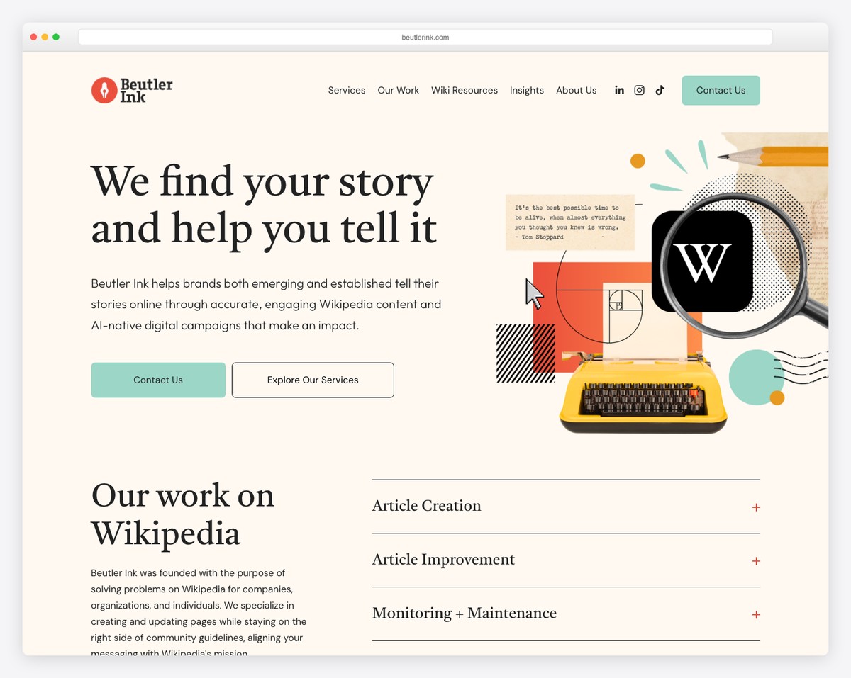
Beutler Ink’s consulting website leads with a compelling value proposition: “We find your story and help you tell it.” The retro-inspired collage illustration with a typewriter and Wikipedia logo adds visual personality to what could otherwise be a dry consulting pitch.
The site clearly outlines their services (Article Creation, Article Improvement, Monitoring + Maintenance) with expandable sections, and the dual CTAs (Contact Us / Explore Our Services) guide different visitor intents.
What stands out: A custom illustration style in the hero section helps consulting firms stand out from competitors using generic stock photography.
17. MLE Design
Built with: Squarespace
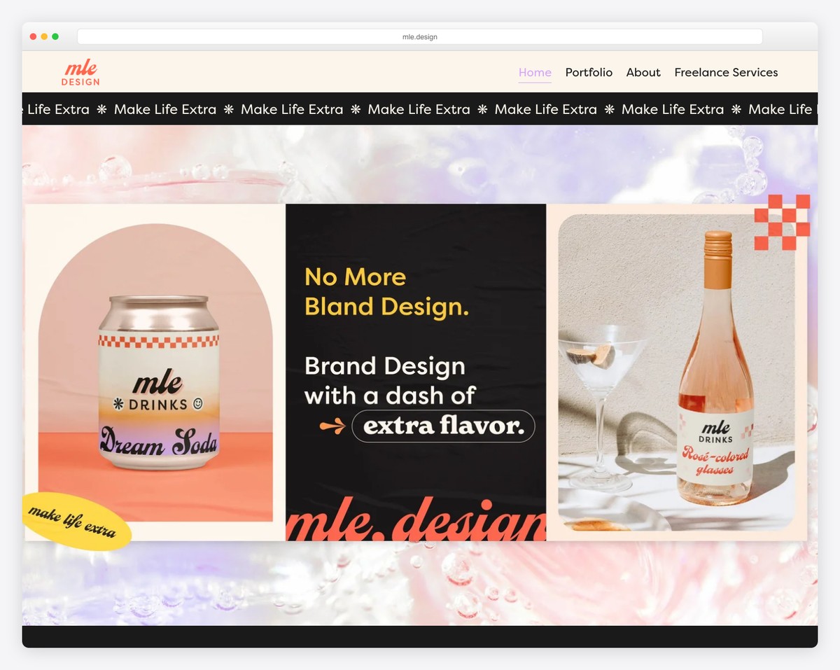
MLE Design’s website bursts with energy and personality. The “No More Bland Design” tagline on a scrolling “Make Life Extra” marquee immediately sets the tone — this is a brand design consultancy that practices what it preaches.
The pink-and-peach gradient background with playful product photography (branded soda cans, rosé bottles) demonstrates their packaging expertise. The navigation is simple: Home, Portfolio, About, and Freelance Services.
What stands out: Showcasing your own branding as the primary hero content is the ultimate proof of a design consultancy’s capabilities.
18. Slalom
Built with: Custom
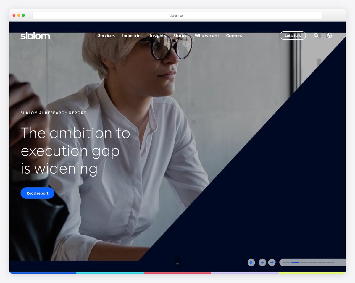
Slalom’s consulting website leads with thought leadership — their hero features an AI Research Report with the headline “The ambition to execution gap is widening.” The bold split-diagonal design with a professional portrait creates visual dynamism.
The navigation clearly organizes their offerings (Services, Industries, Insights, Stories, Who we are, Careers) with a prominent “Let’s talk” CTA. The modern navy color scheme and clean typography project both innovation and trustworthiness.
What stands out: Leading with thought leadership content rather than service descriptions positions a consulting firm as an industry authority.
19. Kearney
Built with: Custom
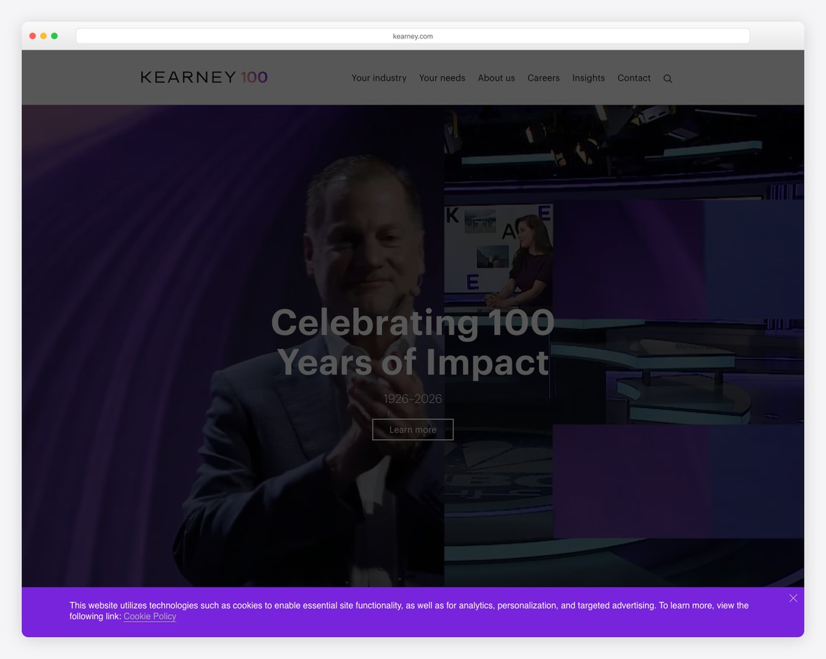
Kearney’s website celebrates their centennial (“Celebrating 100 Years of Impact, 1926–2026”) with a dramatic purple-toned hero that blends executive portraiture with broadcast-style imagery. The design conveys legacy and forward-thinking simultaneously.
The navigation is structured around client needs (Your industry, Your needs) rather than internal organization — a smart client-centric approach. The “About us,” “Insights,” and “Contact” sections complete the professional picture.
What stands out: Organizing navigation around client needs rather than company structure shows empathy and makes consulting sites more intuitive.
Related Posts


Comments (0)