
23 Best Business Websites (Examples) 2026
Are you ready to take a peek at the best business websites? You’d like to gain ideas before building your own.
We wanted to include something for everyone, from clean websites to creative ones.
Whether you’re building a simple small business website or an advanced online shop, these examples equip you with heaps of creative proposals that will expand the horizons of possibilities.
Remember, you can quickly build a similar website either using a business WordPress theme or a business website builder.
Best Business Websites For Inspiration
1. Notarize
Built with: Webflow

Notarize is a beautiful, modern website with an awesome responsive design. It uses a unique hero section with a title, text, and a call-to-action (CTA) button. What we really like is that they’re also pretty straightforward about the price.
Moreover, the transparent header has a drop-down menu that turns solid and floats on the scroll. There’s also a FAQ section with accordions, keeping the space cleaner.
What stands out: Use a CTA above the fold, so everyone interested can take action immediately.
We also have a complete collection of the best Webflow websites.
2. ETQ
Built with: Shopify

ETQ starts with a newsletter popup offering a discount, but you can easily close it if you are not interested.
The full-screen hero section features a 2/3 image background and a 1/3 text and link on a solid color.
The header disappears on the scroll but reappears as soon as you start scrolling back to top, making the page look smoother.
What stands out: Use a popup if you’d like to collect leads and grow your email list.
You might also want to examine other great shoe website design examples.
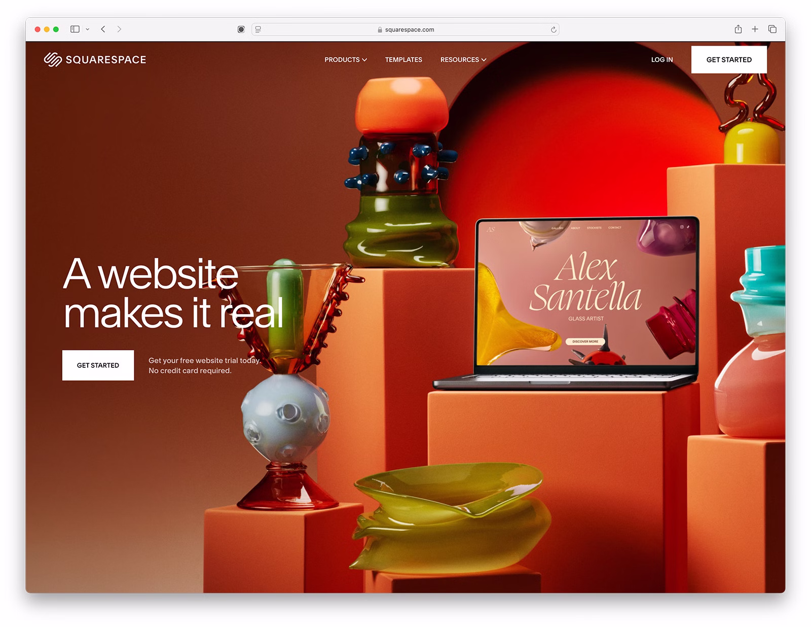
3. Casa Mami
Built with: Squarespace

Casa Mami is Beauty spelled with a capital. It’s a business website example with a massive slider that showcases the location without text or CTAs.
The design is minimalist, with a few bits of creativity sneaked in, including a parallax image.
What stands out: Use a slideshow purely for enjoyment instead of going straight to selling stuff.
Don’t forget to check all these stunning Squarespace website examples for more ideas.
4. Weddings By Lisa Nicole
Built with: Squarespace

Weddings By Lisa Nicole is a simplistic wedding website that creates a strong first impression with the two slim slideshows that don’t feel like slideshows until you click them.
The header is minimalistic, with a logo on the left and a menu on the right. On the other hand, Weddings By Lisa Nicole doesn’t use a footer, just “Powered by Squarespace” text.
What stands out: If you want to showcase a lot of content, use more than one slider. We recommend using narrower slideshows in this case.
5. Objective
Built with: Wix

One of Objective’s more unique elements is the floating “Objective” text in the middle of the screen, which acts as a back-to-top button. Surprisingly, it doesn’t feel distracting.
This business website uses lots of images, a lightbox gallery, a drop-down menu and a two-column footer featuring menu links and a newsletter subscription widget.
What stands out: Don’t be afraid to go against the grain by adding website elements that no one else adds.
We have some more example websites built on the Wix platform.
6. Altrock
Built with: Squarespace

Altrock’s home page is interestingly collage-like, with some images that are clickable and some that are not. It’s an awesome presentation of their works we aren’t used to seeing.
Plus, the overall page style is simple to ensure the ultimate browsing experience. This also applies to the header and the footer.
What stands out: Combining minimalism and creativity can work wonders.
This website was built using one of our Squarespace business website templates.
7. Traackr
Built with: Webflow

Traackr displays a lot of content and information on the home page but uses slightly larger text and enough white space to maintain pleasant readability.
You’ll also find some animated elements, a mega menu, CTAs in the navbar and a language switcher at the bottom. Furthermore, they also have a “popup” promoting their featured content that collapses into a sticky sidebar CTA once you scroll.
What stands out: Use a language switcher so that users can personalize their website experience.
8. MinRims
Built with: Webflow

MinRims welcomes you with a full-screen image background, text at the bottom, a CTA at the top, and an animated downward-pointing arrow that encourages you to start the one-of-a-kind scrolling experience.
The product’s immersive presentation reveals all the additional details and views that excite you to join the waitlist.
What stands out: Create a unique single-page product presentation, like MinRims.
9. Soilboy
Built with: Squarespace

Soilboy starts with a full-screen image background, text and a CTA button that takes the user directly to the shop.
There’s also a transparent header (that disappears when you scroll the page) to keep the appearance clean and a closable top bar notification.
What we like about Soilboy’s home page is that it maintains a minimalist website look throughout, with lots of white space, including the footer.
What stands out: Hide header on scroll and let it reappear only when needed.
10. Fred Perry
Built with: Adobe Commerce

Fred Perry wants you to have the best online shopping experience with a popup that offers you to select your region and language.
This business website features a disappearing/reappearing header, top bar notification, sticking bottom newsletter subscription, multi-column footer and product carousels, to name a few.
What stands out: Localize the experience with region and language switchers.
11. Vivobarefoot
Built with: Adobe Commerce

Vivobarefoot has a full-width slideshow to promote some of its products with two CTA buttons per slide.
The navigation is a mega menu with links and images that allow users to find the right product or information much faster.
Vivobarefoot also has country and currency selectors for more comfortable shopping.
What stands out: Use a slider to promote your best sellers, the latest drops, and more.
Check more ex. Magento now Adobe Commerce websites.
12. Nespresso
Built with: Adobe Commerce

Nespresso has a content-rich home page that doesn’t feel stuffed and overcrowded, still ensuring great content viewing.
They also have a cool “perfect coffee finder” with a three-part wizard that reveals the closest recommendations.
Last but not least, you’ll also find a shippable Instagram feed with lightbox functionality just before the footer.
What stands out: When done right, you can have a lot of content on your page, and it’ll still be a pleasure to view it.
13. Byredo
Built with: Adobe Commerce

Byredo has a grid-style home page design, with most grid elements static, except one being animated to spice things up.
The top bar notification features sliding text (that you can close), the header has a mega menu and the footer has four columns of useful links, information, a language switcher and a newsletter widget.
What stands out: Don’t feel like adding a lot of text on your home page? That is no problem. Create a grid to display your beautiful items.
Here are even more stunning eCommerce website examples to explore even more ideas for your upcoming website.
14. Skullcandy
Built with: BigCommerce

Skullcandy’s home page is bold but simple. It’s bold because of the images and simple because it’s short. The header is super clean, but the navigation opens a mega menu with all the necessary links.
The footer has multiple columns with a newsletter widget, social media icons and menu links.
What stands out: You don’t always need to add a lot of products, content, and other things to your home page—keep it simple.
We’re sure you’ll also enjoy analyzing these ultimate BigCommerce websites.
15. Bliss
Built with: BigCommerce

Bliss is a light and vibrant business website with an energetic vibe/branding from top to bottom. The top bar notification has a gradient background to make it stand out. The header has a mega menu and icons for search bar, log in, shopping cart, and more.
What’s really cool is the Instagram slider that features customers using Bliss products, so the whole website is not all about “me” but also about “you.”
The page also has a simple widget to enable accessibility, which happens automatically.
What stands out: Let everyone have the best website experience with accessibility mode.
16. American Leather
Built with: BigCommerce

American Leather has a sticky top bar and header/navigation, so all the links are always at your fingertips.
They have a live chat widget to find quick answers, but there’s also a clickable phone number in the footer.
The home page contains plenty of images to glimpse their products quickly.
What stands out: Offer your visitors quick answers with a live chat widget.
17. Minna
Built with: Squarespace

Minna also uses a full-screen parallax image background above the fold with a minimalist and transparent header, which allows them to achieve a refined look.
The home page is split into multiple sections, presenting one item per section with an accompanying background to make it more dynamic.
Minna also has a three-post IG feed and a footer with links, social icons and a subscription widget.
What stands out: Add depth to your website with a parallax effect.
18. Skin by Gabby
Built with: Squarespace

Skin by Gabby’s website makes a strong first impression with bold serif typography and an elegant green-and-cream color palette. The site clearly positions Gabby as a skin coaching expert in the Inland Empire, with a scrolling “Voted 2025 Best” banner reinforcing credibility.
The navigation includes dedicated sections for treatments, a skin coaching program, and an online shop, while the prominent “Book Appointment” CTA drives conversions from every page.
What stands out: Using a scrolling awards/credentials banner above the fold builds immediate trust with first-time visitors.
19. Toad Bakery
Built with: Squarespace

Toad Bakery’s website immediately draws you in with warm, inviting photography of their Camberwell bakehouse. The split-layout hero pairs a behind-the-counter shot with a clean introduction card that explains exactly what they’re about — fresh, scratch-made baked goods.
The playful yellow accent sections and clear navigation (Order for Pickup, In-Store Menu, FAQs, Gift Cards) make it easy for customers to take action. The site perfectly captures the warmth of a neighborhood bakery.
What stands out: Pairing warm food photography with a clear value proposition creates an inviting and action-oriented business website.
20. AAKS
Built with: Squarespace

AAKS’ website is a stunning showcase of their handcrafted African-inspired bags. The split-screen hero with bold, high-fashion photography immediately positions the brand as premium. The minimal navigation keeps focus on the products.
The site uses clean white space and full-bleed images to let the vibrant colors and textures of their woven bags speak for themselves. Social media links and a clean e-commerce integration complete the experience.
What stands out: Full-bleed fashion photography with minimal distractions lets a product-focused brand shine.
21. Driftaway Coffee
Built with: Shopify

Driftaway Coffee’s website bursts with color and personality, from the playful hand-lettered logo to the vibrant product photography featuring their signature coffee subscription boxes. The hero immediately communicates their mission — “Coffee from Small Holder Farmers Around the World.”
The dual CTAs (“Shop Subscription” and “Shop Coffees”) give visitors clear paths to purchase, while the award banner at the top (“2026 Roaster of the Year”) builds instant credibility. The overall design feels warm, approachable, and mission-driven.
What stands out: A mission-driven headline paired with vibrant product photography helps subscription businesses stand out in a crowded market.
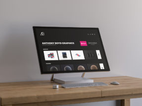
22. Grovemade
Built with: Shopify

Grovemade’s website is a masterclass in product-focused design. The dark, moody hero image showcases their premium desk accessories in a carefully styled workspace, immediately positioning the brand as high-end and design-forward.
The “Design Inspires” tagline and “Get Started” CTA below the hero guide visitors into their product customization experience. The minimal navigation (Shop, Explore, My Cart) keeps the focus on browsing and buying.
What stands out: Dark, atmospheric product photography in a styled setting elevates everyday products to feel premium and aspirational.
23. Ritual Coffee
Built with: WordPress

Ritual Coffee Roasters celebrates their 20th anniversary with a dreamy, illustrated hero featuring coffee plant leaves and a cloud motif. The artistic approach sets them apart from the typical coffee brand website with its blend of illustration and product photography.
The site balances online commerce (Shop, Subscribe) with their physical presence (Visit, Order Ahead), reflecting a business that bridges both worlds. The “Some of Our Other Superstars” section showcases their product line with playful confidence.
What stands out: Custom illustrations in the hero section create a distinctive brand identity that stock photography simply cannot match.
Related Posts


Comments (0)