23 Best Business Blog Examples In 2026
Don’t miss our collection of the best business blog examples; treat yourself to professional designs that’ll inspire you.
We are firm believers that every business should start a blog. Why? Because it can help you take things to the next level and enjoy more sales, conversions, etc.
A blog is an excellent tool for building a solid relationship between your company and your audience/customers.
Share educational content, announce new product drops and advertise your special mid-summer sale – this can all happen on your blog. Think long-term, apply a strategic SEO plan, and you can see your traffic grow.
Now let’s see how these businesses do it!
Best Business Blog Examples To Inspire You
We also have a general collection of the best blogs you shouldn’t miss.
1. Finisterre
Built with: Shopify
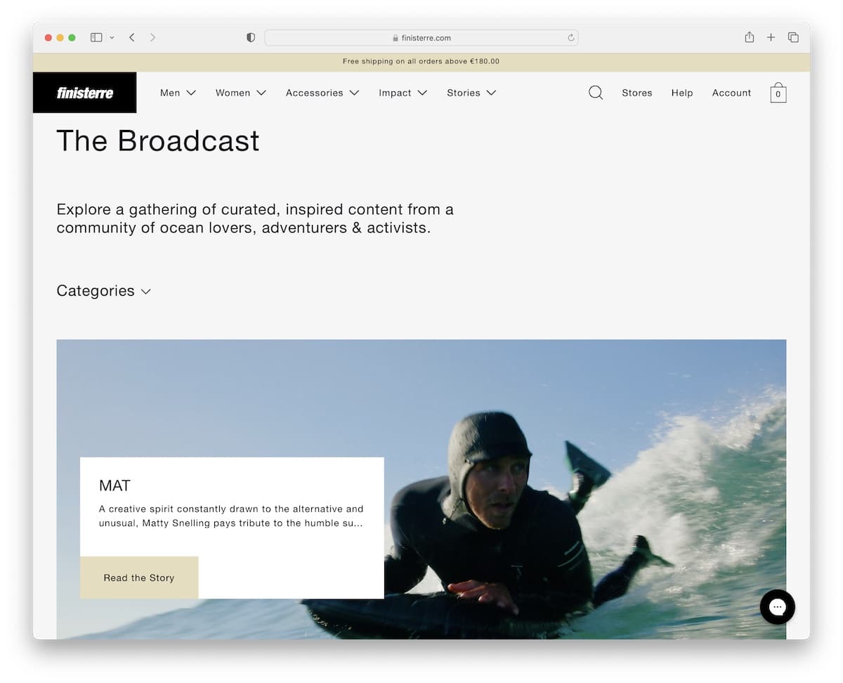
This superb business blog example has an elegant content distribution that’s easy to view on handheld and desktop devices.
Finisterre uses a handy category drop-down selector, which you can use to tick only the topics you’re interested in. However, the main navigation has a mega menu, which you can easily access without the need to scroll back to the top (it reappears right away).
Another thing worth mentioning is the chat widget with FAQs, but you can also leave a message – a great way to improve customer service.
Note: Ensure your readers can select categories to view only the content that interests them.
What stands out: A hero slider showcases multiple offerings at a glance, giving visitors quick access to key content.
2. Laird Superfood
Built with: Shopify
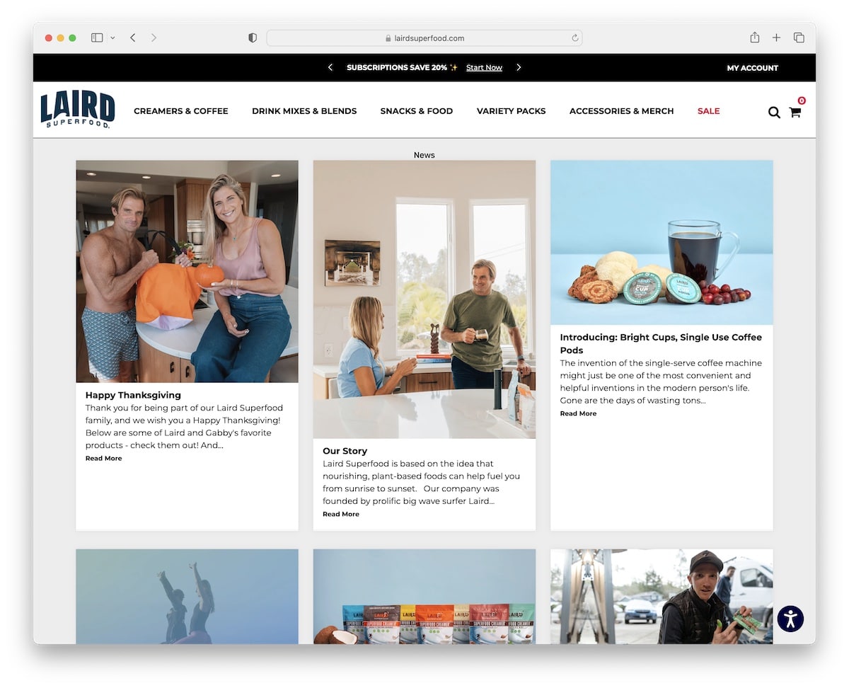
Laird Superfood is a business blog with a three-column grid layout. Each grid element has a thumbnail, a title, an excerpt and a “read more” button. Moreover, individual posts have a more classic view with a right sidebar.
The accessibility menu is handy because it allows everyone to modify the look of the website.
Note: Allow everyone to get the most out of your website by integrating accessibility adjustments.
What stands out: The image carousel keeps the above-the-fold area dynamic without requiring visitors to scroll.
3. Mani Life
Built with: Shopify
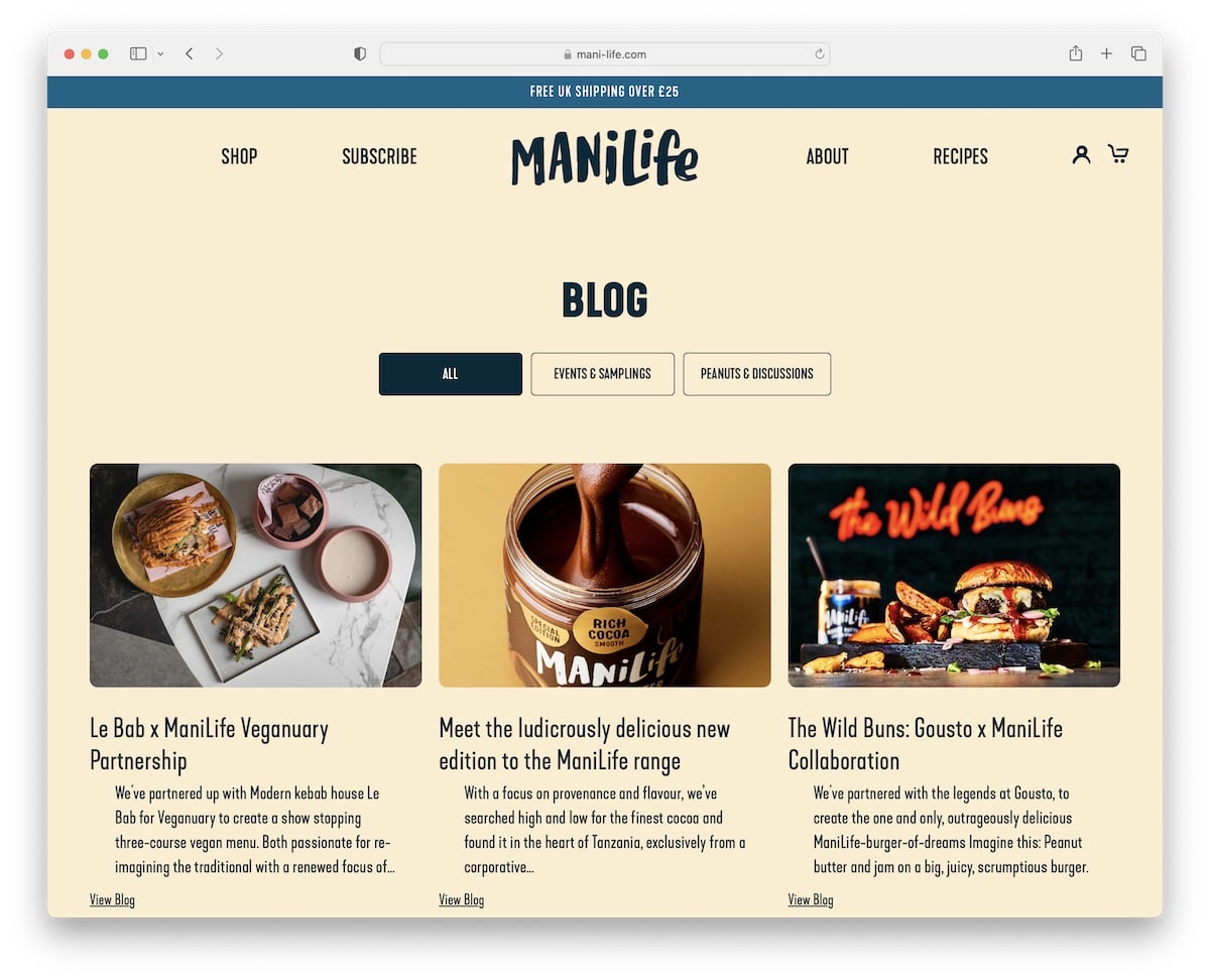
Mani Life’s header disappears when you start scrolling but comes back as soon as you stop scrolling. This creates a more pleasant, distraction-free experience that contributes to better UX.
What’s also handy is the “related products” section below each post, where everyone can continue shopping or return to the blog’s home page.
Note: A header that hides and shows depending on the scrolling movement can boost user experience.
What stands out: Scroll-triggered animations guide the eye through each section without overwhelming the visitor.
4. Bremont
Built with: Shopify
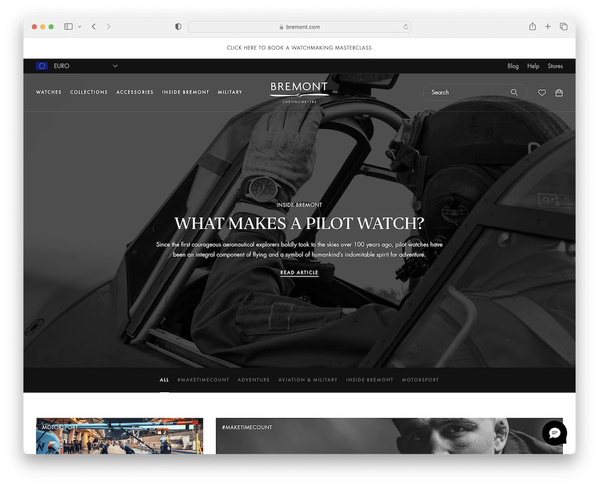
Bremont has an elegant black-and-white business blog design where the hero area promotes the latest article. And then there’s a black tab with links to categories that stick to the top of the screen so that you can jump from one to the other more comfortably.
Bremont’s blog also has the “show more articles” button, which loads them without opening a new page. (It also displays the total number of articles and how many are loaded.)
Note: Use the “load more” button to showcase more articles without pagination and keep your readers on your blog longer.
What stands out: The dark color scheme gives the site a sleek, modern feel that makes imagery pop.
5. Partake Foods
Built with: Shopify
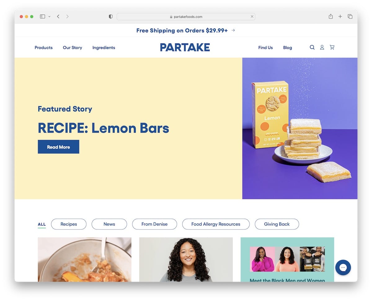
Partake Foods’ specialty is that the post-grid has some static and animated elements to create a more engaging vibe.
Above the fold is the “featured story” with a vibrant design and a button with a hover effect that promotes interactivity.
This blog’s home page is extremely long and doesn’t have a floating header or a back-to-top button, which we highly recommend incorporating.
Note: Remove scrolling back to the top with a sticky header/menu or a floating back-to-top button. (Hey, nobody enjoys scrolling!)
What stands out: A dark background paired with bold accent colors creates striking visual contrast.
6. Consider The Wldflwrs
Built with: Shopify
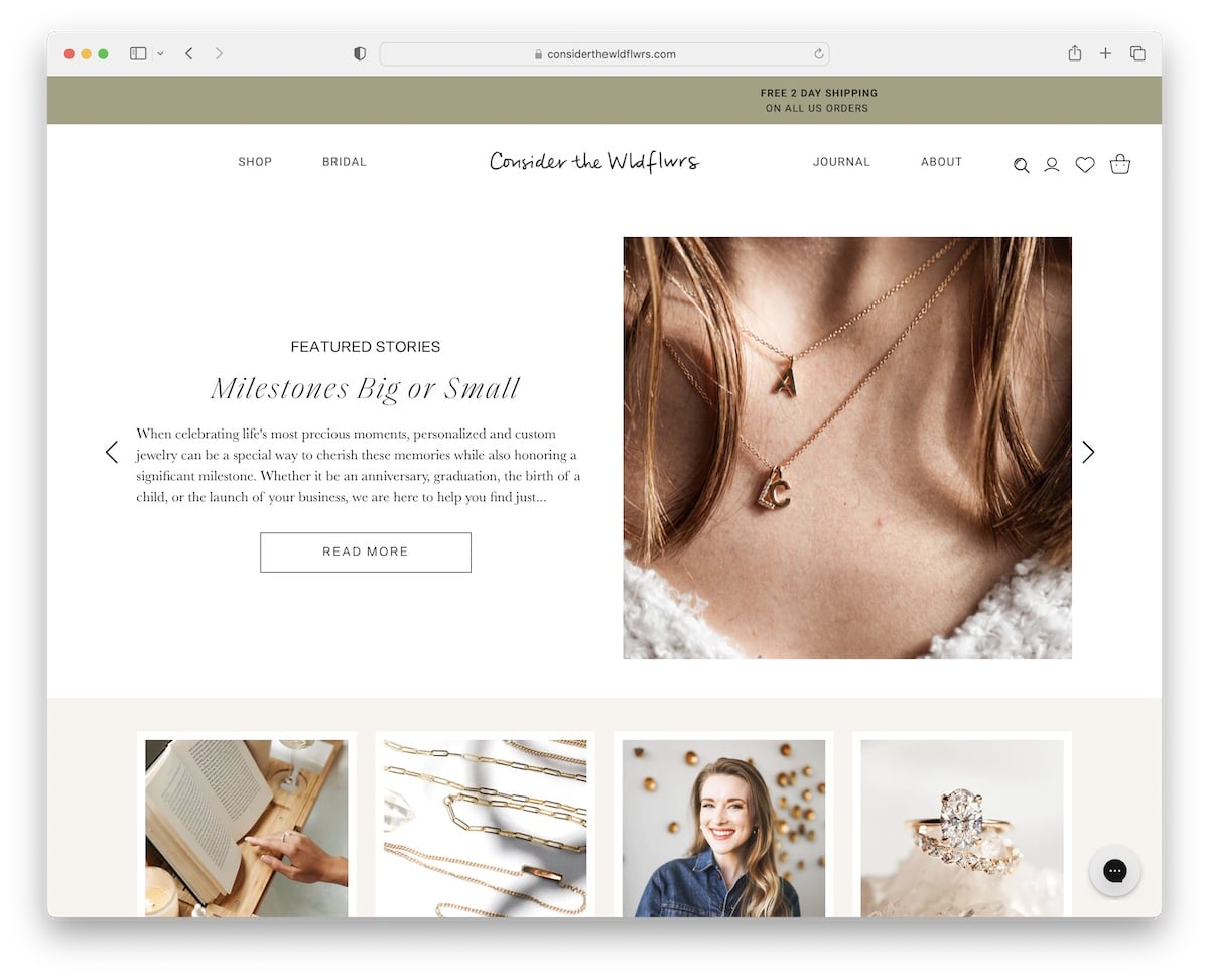
Consider The Wldflwrs has a clean and modern business blog with a slider that advertises featured stories above the fold.
Below the slider are categories with thumbnails to go directly to what you’re into or simply do some more scrolling to check all blog entries. Each blog post has a boxed layout without sidebar, so all the focus is on the content.
Note: Use a slider to show multiple articles without sacrificing the blog’s real estate.
What stands out: The background video creates an immersive first impression that immediately sets the mood.
7. Flourist Recipes
Built with: Shopify
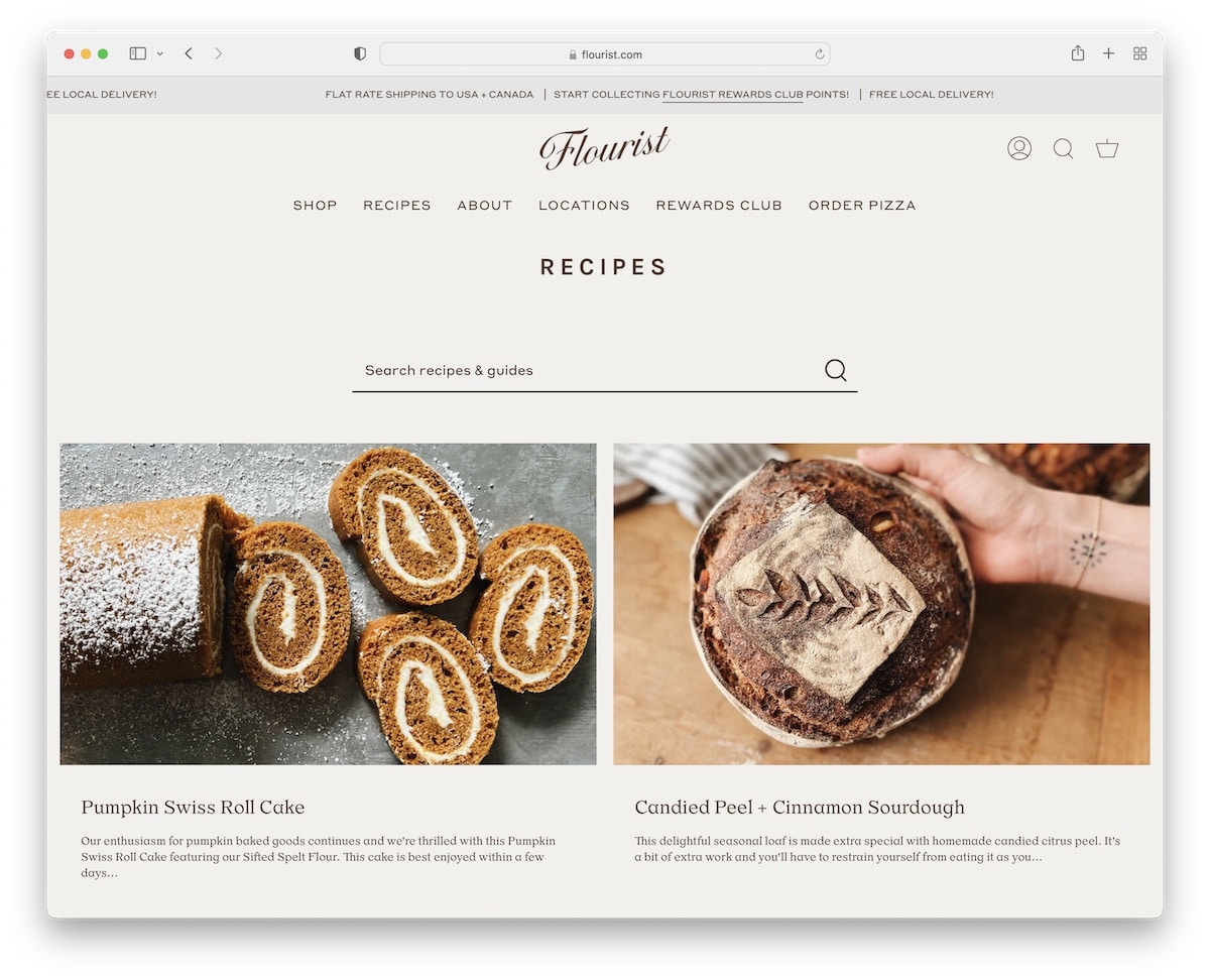
Flourist Recipes’ blog is minimalist, with a top bar notification (sliding text animation) and a header with a multi-column drop-down. Below the header is a search bar so everyone can search for a specific recipe or guide.
Blog posts have a sticky sidebar with widgets that showcase related products and recent articles.
What stands out: A sidebar with useful widgets can be extremely effective on a desktop (but not as much on mobile).
We also have a list of the best recipe blogs for everyone interested.
8. Urban Beardsman
Built with: Shopify
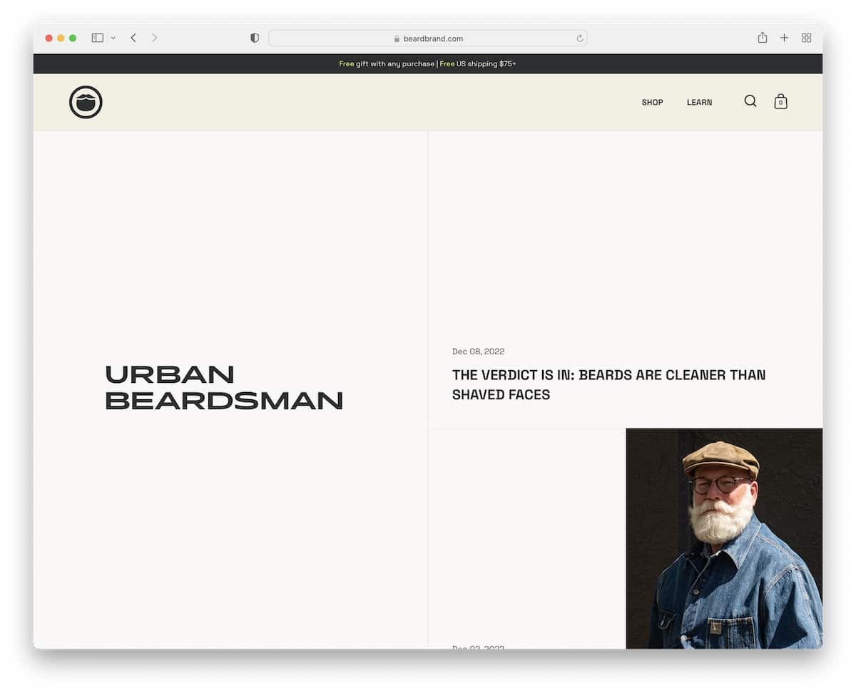
Urban Beardsman has a unique, split-screen blog layout with a static left side and a sliding right part. The right part also has a split design: the left displays the date and title, and the right features an image.
Before the multi-column (contrasting) footer is a newsletter subscription form with a transparent description informing you how many emails you’ll receive.
What stands out: Don’t just sneak in a subscription form; inform the subscriber what they can expect from your newsletters and how many.
Are you looking for more inspiration? Here are more beautiful Shopify blog examples.
9. HubSpot Blog
Built with: HubSpot CMS

The HubSpot Blog’s home page displays loads of content, broken down into sections, so everything is easy to reach and discover.
It starts with featured posts, the latest articles in different categories, and more. But you can also find the categories in the mega menu that sticks to the top of the screen.
What stands out: Use sections, dividers, and other practical elements to break down the content for more pleasing browsing (especially if you have a lot of it).
10. The Verge
Built with: Chorus
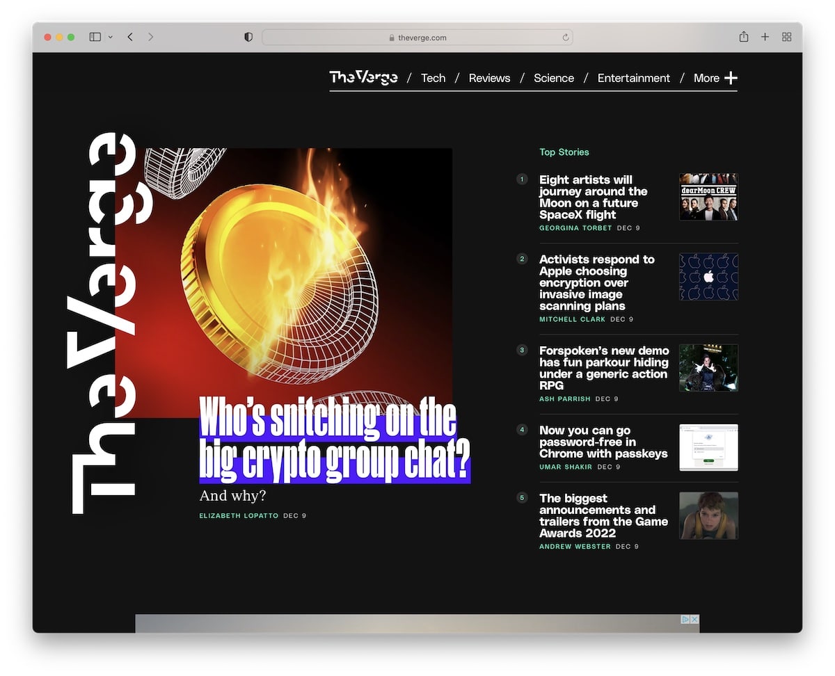
The Verge’s uniqueness is the dark design that makes it stand out from the masses. However, you’ll also find multiple elements with vivid backgrounds that create a more dynamic atmosphere.
Furthermore, besides the main menu links, The Verge has a hamburger menu with a drop-down that slides in from the right. Plus, various floating elements’ll trigger your interest.
What stands out: Instead of using the classic light blog design, go with a dark one and make a difference.
11. Help Scout
Built with: Gatsby
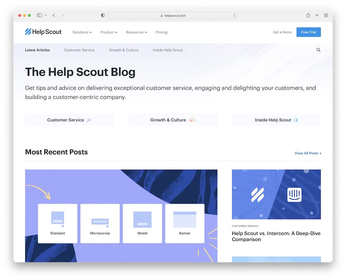
Help Scout does things slightly differently because it starts with a title and a short description of its content. Next are four quick button links if you need something specific or want to start enjoying the most recent posts instead.
Moreover, every category section also has a link to view more posts and find other valuable content. Lastly, individual posts have a progress bar to encourage readers to read to the end.
What stands out: Integrating a progress bar can contribute to longer time spent on your blog/website.
12. Pando
Built with: Webflow
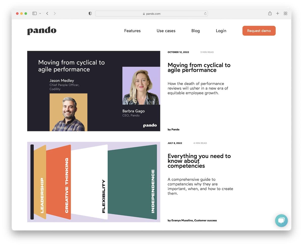
Pando’s business blog example has a clean, single-column layout with large thumbnails on the left and additional post information on the right.
After a few seconds, a small popup in the bottom left corner appears to subscribe to Pando’s blog, but you can also close it if you are uninterested.
What stands out: Add blog excerpts to persuade readers to click “read more” and enjoy the full post.
Don’t forget to peek at our list of superb Webflow websites that’ll excite you to start immediately.
13. Girlboss
Built with: Shopify
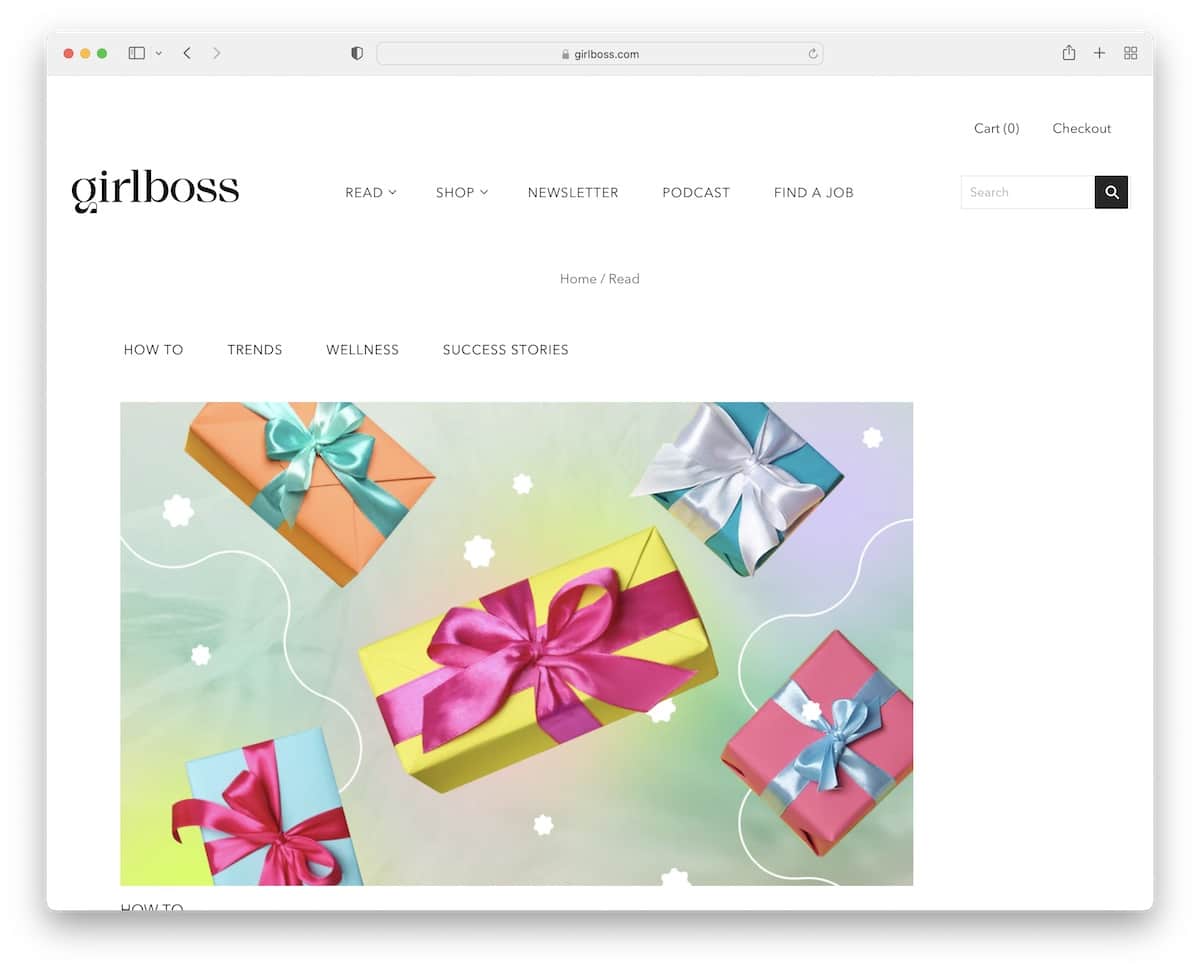
What we like about Girlboss is the mostly light design with a black footer background to create a likable contrasting effect.
Blog posts have a left sidebar instead of the more traditional right one, with popular posts and a banner advertisement. Each post also has social share buttons at the bottom, so readers can help spread the word.
What stands out: Gain more popularity by adding social sharing functionality to your blog.
14. Notarize
Built with: Webflow
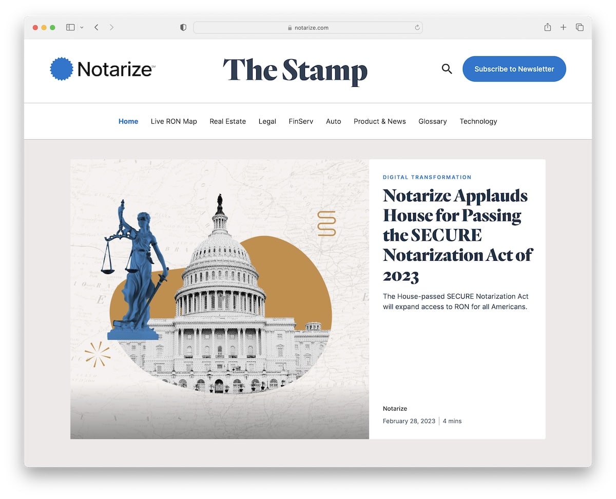
Notarize is a terrific business blog example with a boxed layout and a boxed slideshow above the fold. The design is sophisticated, with creativity in mind to make it livelier.
The entire header floats, so all the menu links, a search icon and a subscription button (if you click it, a popup opens) are always at your fingertips.
What stands out: Add a call-to-action (CTA) button to the header if you want more eyeballs on it.
15. Traackr
Built with: Webflow
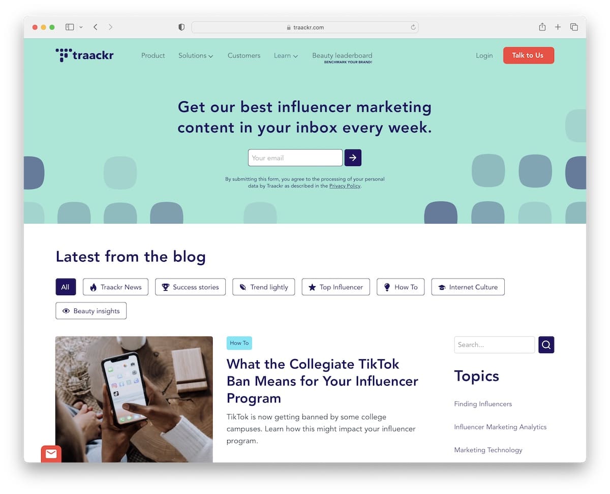
Traackr’s uniqueness is the newsletter subscription form in the hero area. But they also use a floating banner at the bottom of the screen to encourage you to subscribe.
This business blog example has a sidebar on the home page with quick topic links and a search bar, but you can also click on the category tabs above to find what’s hot faster.
What stands out: Email marketing works, so make your newsletter opt-in form clearly visible – why not add it as the first thing on your blog?
16. Fred Perry
Built with: Adobe Commerce
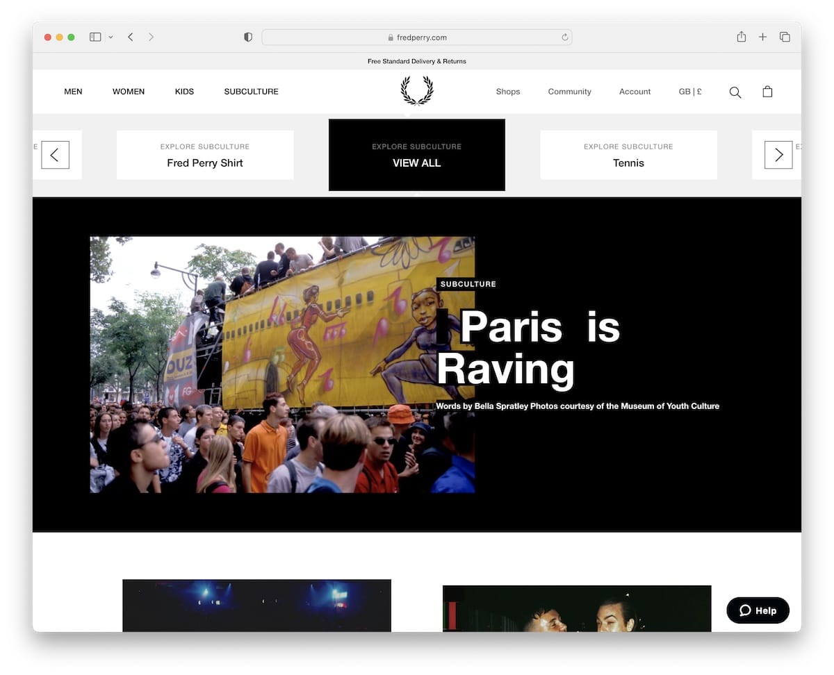
One of the things you’ll immediately notice when scrolling Fred Perry’s blog is the infinite scroll feature. Instead of pressing the “load more” button, the blog does it automatically for you.
Another cool thing about this blog is the slider below the header that helps you pick and explore the subculture you’re into.
What stands out: Expand the on-page time with an infinite scroll feature.
17. Vivobarefoot
Built with: Adobe Commerce
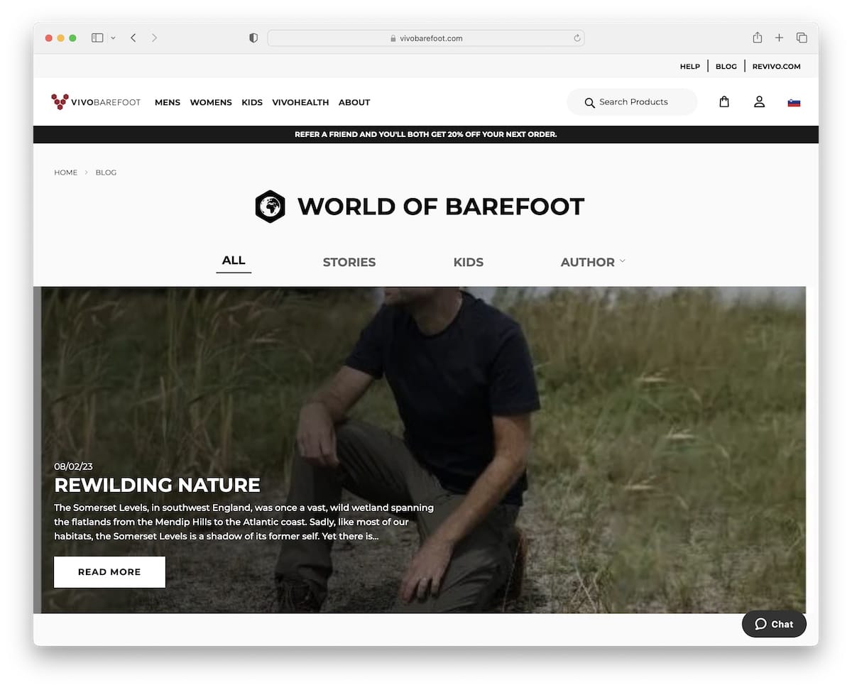
Along with the global header with a top bar, navigation bar and notification bar, Vivobarefoot also uses an additional menu to search the blog by different categories.
This business blog’s home page is a collection of the latest and not-so-latest articles with a “load more” button (you don’t need to press it, it loads the next batch of posts automatically) to keep you enjoying the content.
What stands out: While your main navigation may focus on navigating the entire website, ensure you also display blog categories, so your readers don’t endlessly search through all the posts.
18. Brew Tea Co
Built with: Squarespace
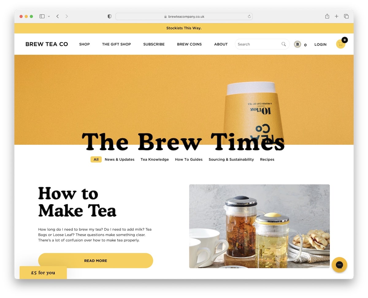
Brew Tea Co makes it easy to browse its blog content with quick links to different categories, like news, how-tos, recipes, and more.
Below the hero section is the must-read article, followed by a post grid to get tips, news, etc.
Furthermore, instead of immediately hitting you with a popup, Brew Tea Co has a floating button in the bottom left corner to remind you of the offer in exchange for an email.
What stands out: Instead of asking for emails, offer something in return, and you may grow your list faster.
19. Farm To People
Built with: Node.js
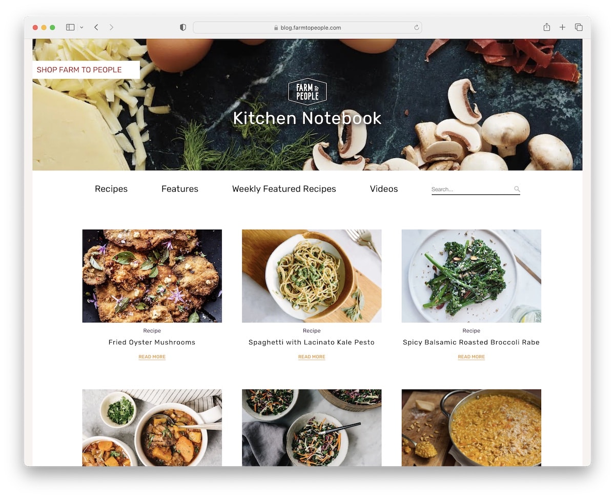
Farm To People’s business blog is simple, emphasizing visuals and text first and foremost. There are four main links and a search bar to make finding recipes quicker.
All recipe posts have a sidebar with tags, social sharing and a special section at the bottom with recipe recommendations.
What stands out: While some use “related products” at the bottom of each post, you can show “related posts.”
20. Wild
Built with: Node.js
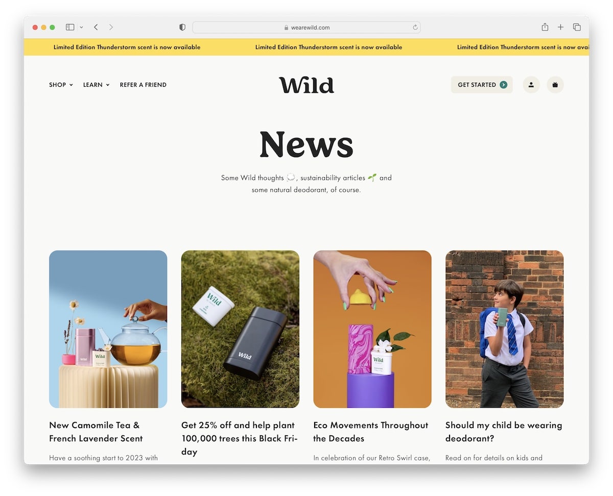
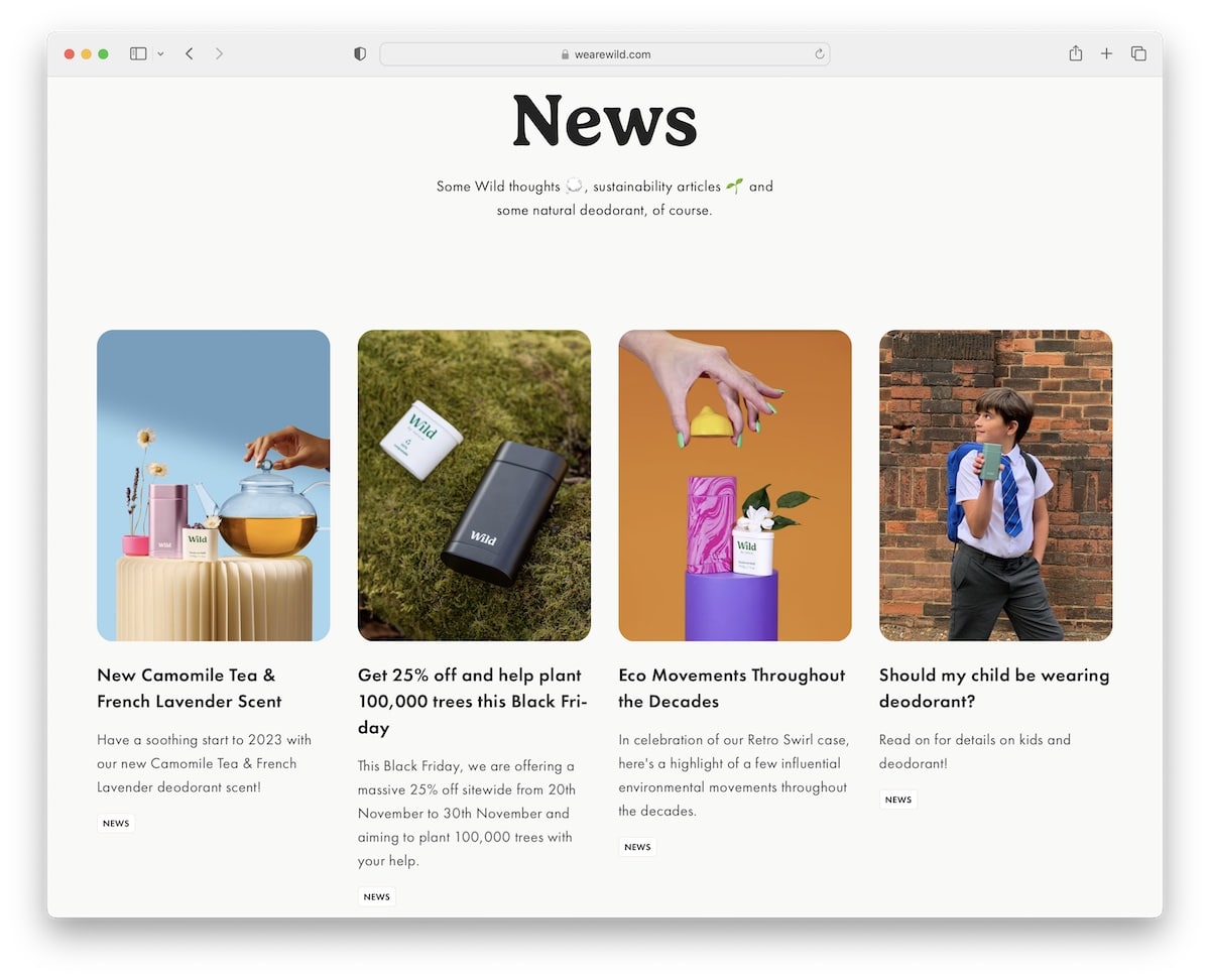
Wild’s blog immediately appears more mobile-like because of the rounded edges. The home page is relatively long, but the content loads while you scroll, so you don’t lose concentration.
And when you want to go back to the top, the header immediately appears so you can access the menu, account or shopping cart without scrolling back.
What stands out: Introduce the lazy loading technique to images, so they appear only when needed. (This can also mean your blog will load faster.)
Looking for more inspiration? Here are other websites built with Node.js.
21. PostHog
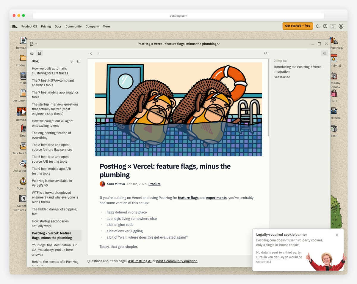
PostHog is a product analytics platform with a developer-focused blog that has become a content marketing standout. The minimalist design features dark mode support, clean typography, and code-friendly formatting that resonates with their technical audience.
The blog covers real-world case studies, practical product analytics advice, and company-building insights with a distinctive personality that stands out in the SaaS space. The high-contrast, accessibility-conscious design makes long-form technical content a pleasure to read.
What stands out: A developer-focused blog that uses developer-friendly design patterns (dark mode, monospace fonts, code blocks) signals that the company truly understands their audience — the medium matches the message.
22. Ramp
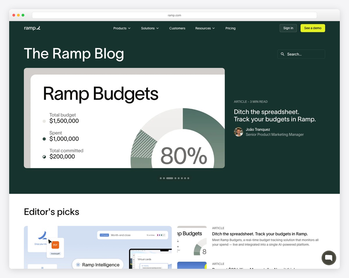
Ramp is a finance operations platform with an exceptionally well-organized resources section that serves as their content hub. The card-based layout with featured images and categorical organization makes it easy to find relevant content across business finance topics.
The clean navigation breaks content into digestible categories including Editor’s picks, Newsroom, and business credit card guides. The professional design matches Ramp’s fintech positioning, with clear headers, structured FAQs, and prominent CTAs woven naturally into the content.
What stands out: Organizing blog content into clear categories with a card-based layout turns a blog into a browsable resource library — visitors find what they need faster, which increases time on site and conversion.
23. Living Cozy
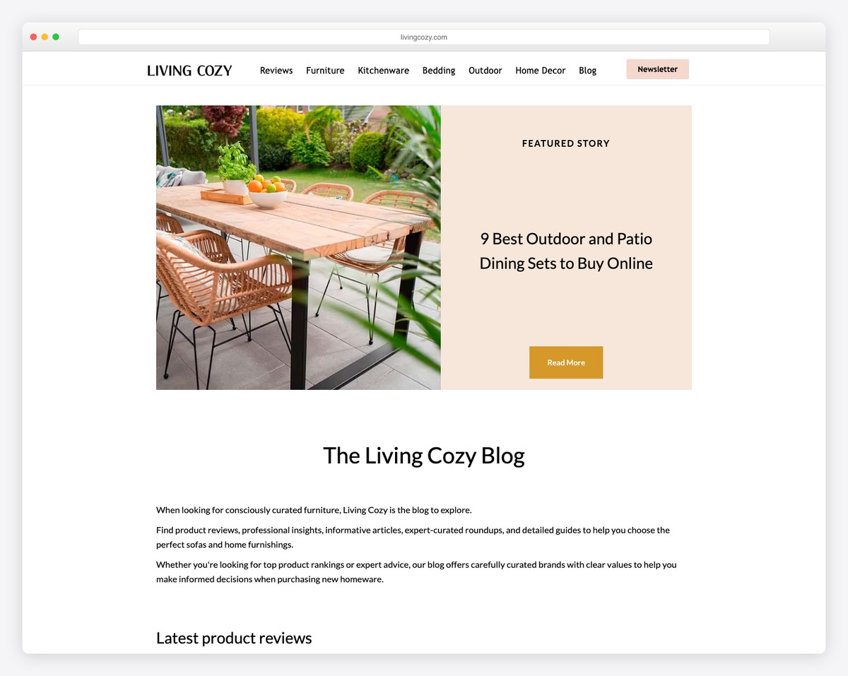
Living Cozy is a home furnishings and interior design publication with a clean, image-heavy blog that balances editorial content with commercial product recommendations. The grid-based article layout with clear categorical navigation covers reviews, furniture, bedding, and outdoor topics.
Multiple expert contributors with visual profiles add authority, while the newsletter integration throughout the site captures engaged readers. The minimalist aesthetic lets the beautiful interior photography take center stage, creating a browsing experience that’s both informative and visually inspiring.
What stands out: An image-heavy blog in the home design niche turns product recommendations into visual inspiration — readers are more likely to click through when they can see how products look in real spaces.


Comments (0)