
29 Best Bootstrap Column Layouts 2026
These 29 Bootstrap column layouts show how to split a page into two, three or four columns, card grids, masonry galleries and sidebar layouts, each with a live demo.
11 of them are free Colorlib snippets. The three footers and two contact forms at the top were rebuilt, and six newer 2026 layouts close the list: card grids, pricing columns, a split hero, a two-column job page and a cart with a summary sidebar. All 11 are plain HTML and CSS, with vanilla JavaScript only where needed, so they work on their own or inside Bootstrap 4, 5 and 6 projects.
The 18 CodePen layouts in between are CSS grid, flexbox and masonry examples from other developers, useful for seeing how a particular layout is built.
But what do we mean by column layout design?
To give you a better idea, here are a few examples:
- Split Screen
- Asymmetrical Layout
- Single Column
- Magazine
- A Grid of Cards
- Fixed Sidebar
- Boxes
- F-Shape Layout
Best Bootstrap Column Layouts
Bootstrap Footer V19
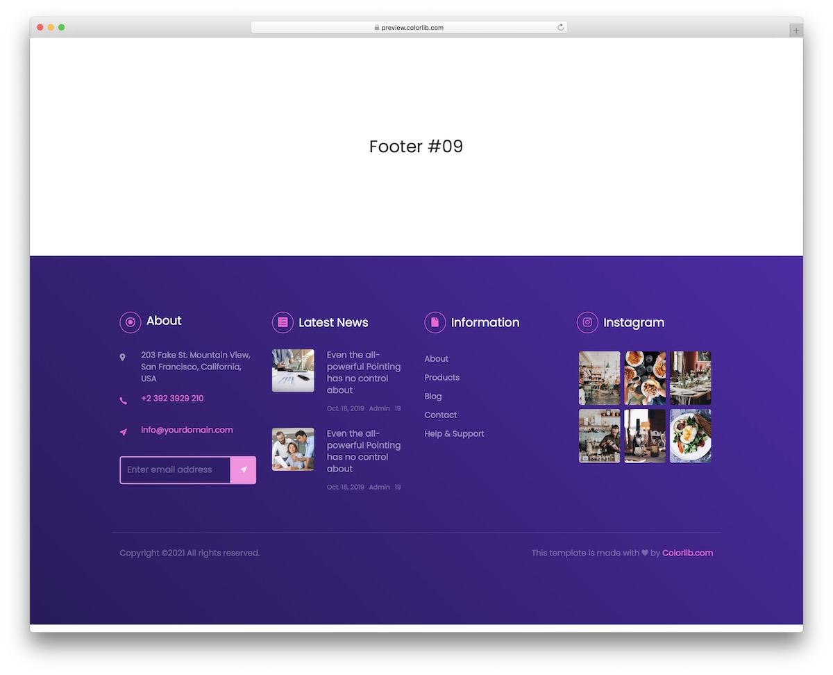
They can feature multiple columns for effective content distribution, even in footers. Here is a modern, vibrant solution with a purple background that will add a touch of style to your website.
There are four columns, which you can fine-tune and activate for your page’s top-notch user experience.
The design is also in tune with all popular devices, INSTANTLY acclimatizing to smartphones, tablets and desktops.
While you can modify the template to your heart’s desire, you should keep the copyright section intact.
Bootstrap Footer V18
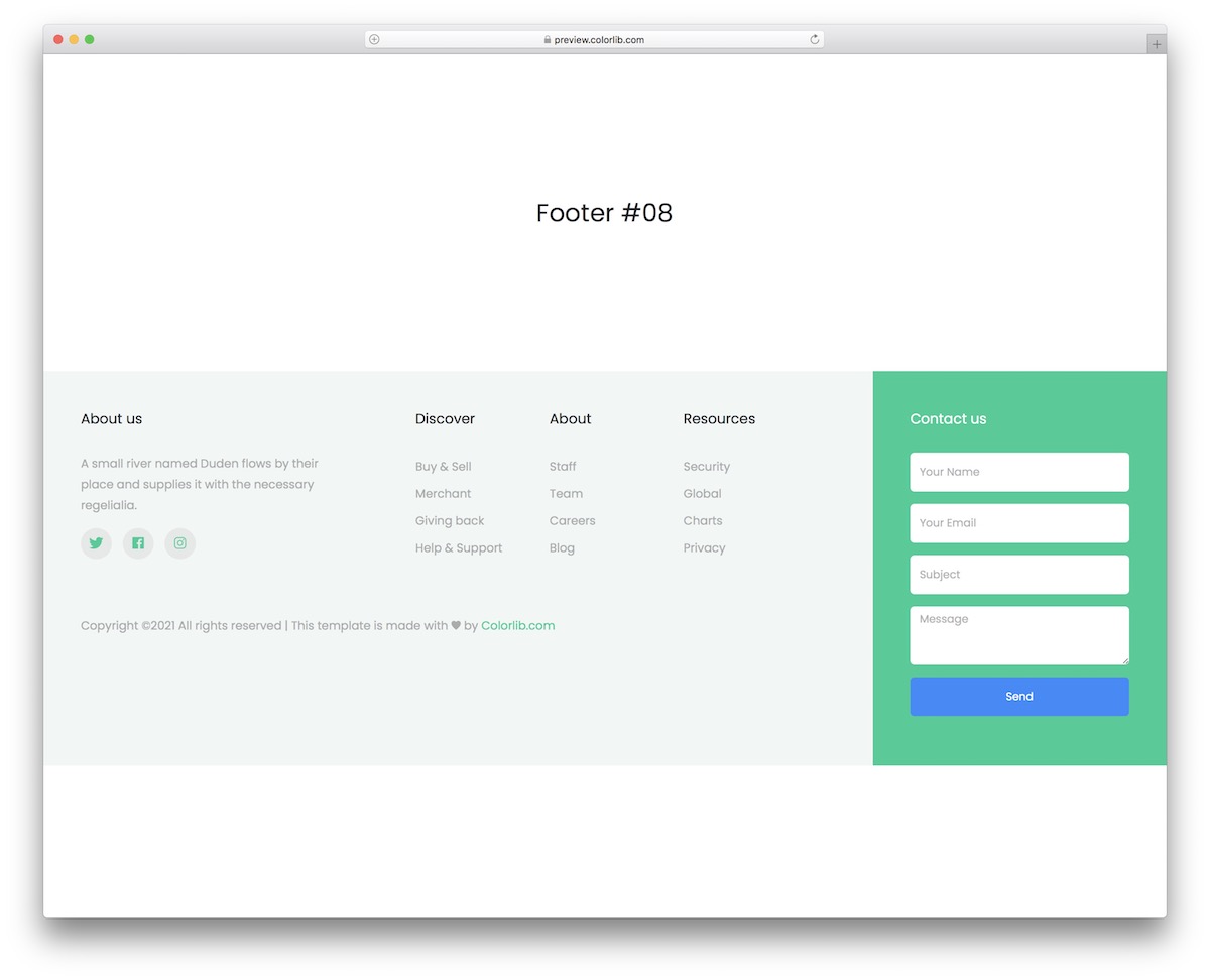
Bootstrap Footer V18 is a clean multi-column footer in plain HTML and CSS, allowing you to create a desirable footer area on your website.
Alongside the about section and social media icons, there are different links for pages and categories and a contact form.
You can employ this if you are building a one-page website, but FEEL FREE to integrate it into other site styles. There’s no need to limit yourself, shape, or form.
Bootstrap Footer V10
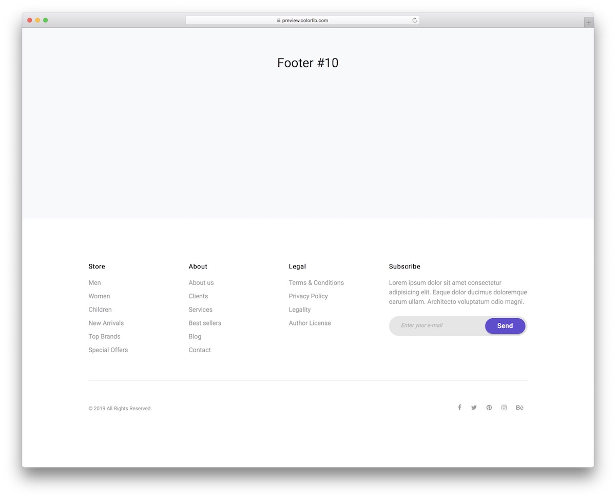
This footer is your best bet if you are looking for a clean and minimalist footer area with four columns. It’s not just that the design is pretty and responsive: the code is plain HTML and CSS with no JavaScript, so it is easy to work with and drops into any Bootstrap 4, 5 or 6 project.
You can start working on your powerful footer section, whether a beginner or an expert, from the get-go.
YOU CAN ADD any link you want, encourage your users to subscribe to your newsletter, and connect your website to your favorite social media platforms.
Contact Form V14
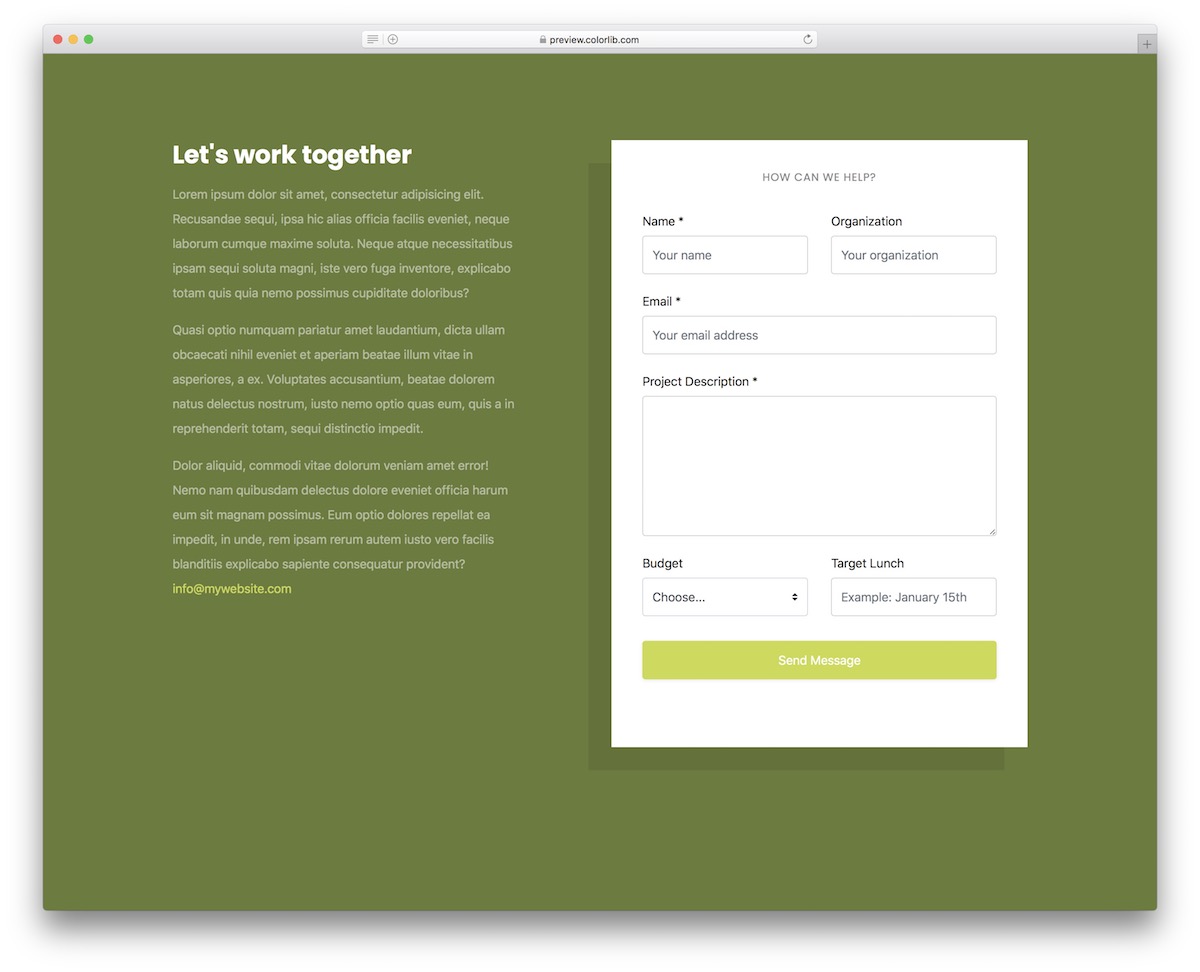
Contact Form V14 is a creative two-column layout for your website’s contact section or page, and it works with or without Bootstrap.
It is split into two sections; one is for the additional and encouraging words about your business, services and other whatnot, and the other displays a full-blown contact form.
The form has multiple fields, including a text area and a drop-down. Feel free to use the tool for any project you work on, as it is easy to customize and improve with your branding guidelines.
Contact Form V13

Don’t just go with the form when adding a contact page to your website or blog. You can always ramp things up with a neat design with several columns to display different details and information.
The layout is fluid, adapting seamlessly to different screen sizes, and it needs no Bootstrap files: just HTML, CSS and a few lines of vanilla JavaScript that style the browser’s own form checks. You can even pre-test things first before you fully commit.
As for the contact form, it’s pretty straightforward, featuring name, email and text area.
3 Column Responsive Layout
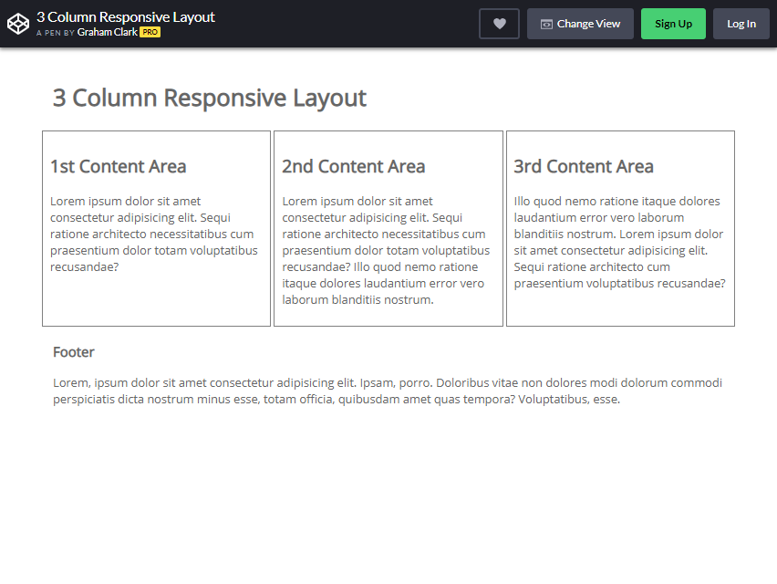
The three-column layout is an excellent design to give three variant options to the visitor. As you can see from the picture, three columns are displayed side by side.
The position of the column may vary on the size of your page. For example, if the width of the page is adjusted to a smaller scale, the third column will appear under the first and second columns.
On the other hand, readjusting the height of the page creates three columns, which will be consecutively stacked on top of each other.
This one can be PERFECT for a website providing the user with three different pieces of information. What you will like about this Bootstrap column is its flexibility with other website creators.
It is quite hard to find a reliable CSS-based column solution.
Pure CSS Pinterest Columnar Layout
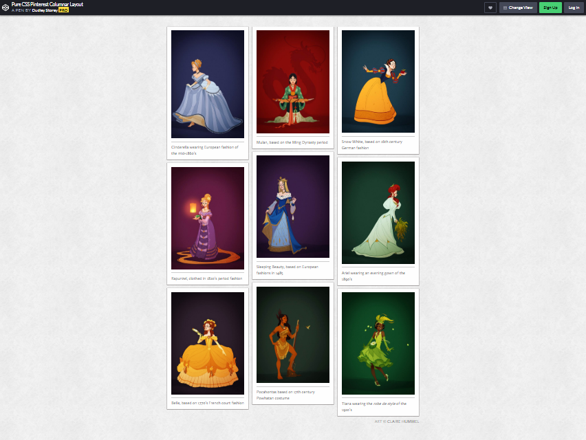
As you can see from the picture, this type of column is what you call ‘A Grid of Cards’ Layout. What is the purpose of this bootstrap column style? It is often used to websites that need to show a lot of information to a single page.
The card-shaped previews show a picture and a short description of what is inside. It helps the audience to find the item they like by simply clicking the card.
This type of layout is flexible, wherein you can manipulate it to change sizes, number of columns, spacing, and the style of cards.
You can mostly see this layout in YouTube and Pinterest (the same layout on this picture). Instead of using JavaScript, the standard application used for this Pinterest layout, Dudley Storey opted to use CSS instead.
According to him, he was in inspired by Kushagra Agarwal to create this.
Isometric eCommerce Layout using CSS Grid
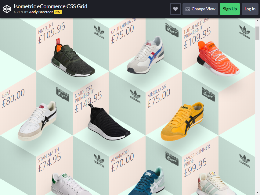
Are you an entrepreneur type to sell your products? You probably need to use this layout. As you can see from the picture, it is a fantastic way to showcase your item to your prospective buyers.
Andy Barefoot created this layout. The image shows many shoe items, but if you want to do the same to your eCommerce website, this is a to-go design for you.
Andy Barefoot created this grid layout by using CSS. It has an incredible floating effect as you hover your mouse button to the item. In each piece, the prices are visible to the visitor or buyer.
Parallax Effect

It is a unique style creating a Bootstrap column layout. As you scroll down the page, the column changes from one to another, as shown in the example above.
This is an IMPRESSIVE style for your page if you want to put different content on a single page. Adefful did not use JavaScript for this. He solely used and HTML and CSS to create this design.
If you want to add more impact to the website, you can add more into it as you desire.
Mostly Fluid by Brad Frost
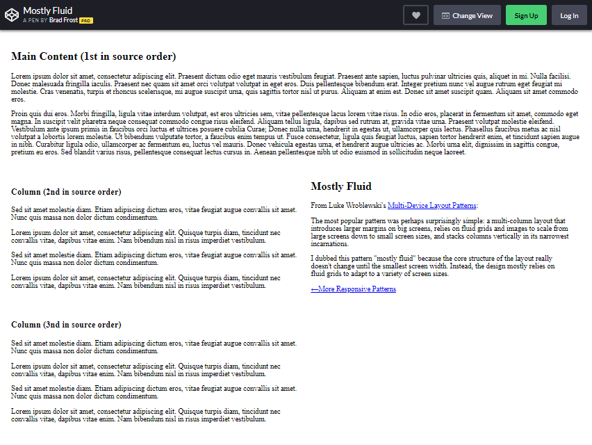
The pattern he used for bootstrap column layout is what you can see mostly on several websites. This layout is also called Magazine. What is the basis? Look again at the image example.
The columns are separated mainly by the modular grip. This multi-column website prioritized the main content by creating a bigger column size.
Have you been to the Yahoo page lately? It uses the same MULTI-COLUMN principle. The headline or major news is presented in the first column, and it is usually the largest.
It draws the reader’s attention by showing the most critical value or content. Brad Frost created this layout inspired by Luke Wroblewski’s pattern.
4-Up Grip Block
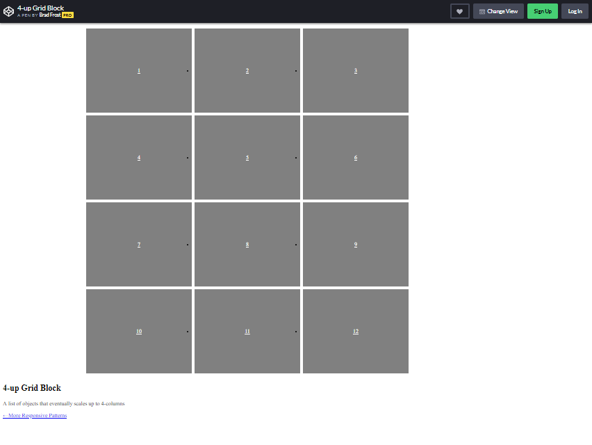
This layout is ideal for showcasing multiple types of content on a single page. So, how can it be used in a valuable way? This would be a great design for a portfolio.
There are 12 boxes to put up with your content from the example image. A grip block is an ideal way to display pictures in multiple boxes. When used in a mobile, you can view the tables vertically on one line.
Brad Frost created this layout design. He used HTML and CSS programs to finish it. If you are fond of displaying your photographs on your blog, this can be your ultimate savior!
3 Equal-Width Columns
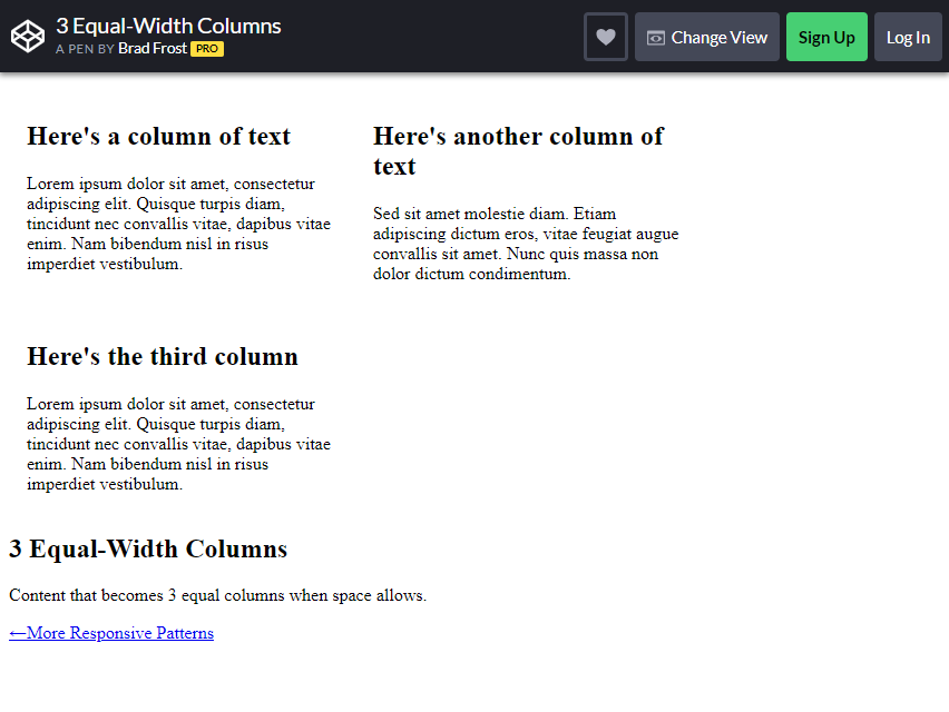
In this equal-width column, the content is separated using a fluid grid. Although simple, you can put a lot of information inside the columns.
This column style is also preferred for blogs and article purposes. You can use it freely as is due to its minimalist appearance.
Flexbox Grid

This layout may incorporate a typical Bootstrap column style, as seen on another website. It is undoubtedly a genius way to showcase your blog.
Once you hover over the boxes, they move with various animations. You can use this kind of column box on your website, too.
Admittedly, content is the ESSENTIAL thing in a website, but cute and enticing designs are also advantageous.
Even how good the contents inside your website, it would be a bother for visitors if there are a lot of lags or they can’t navigate through the right buttons.
Fortunately, you can create engaging content and unique visuals for your column simultaneously.
Infinite Responsive Grid (Masonry/Isotope) + Reveal Animation
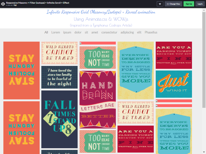
Goji (the creator’s username) created this layout design inspired by Tymphanus Codrops Article. You can put a lot of ideas through the columns.
There are an infinite number of grids you can include on your website. This is similar to what you can see from Google or Bing images. Most of the time, it is ideal for photo presentations.
As you scroll down more, you will find a lot more options. There is also a filter effect you may add to every grid.
Columns Flow

Colum Flow is one of the commonly used Bootstrap column layouts. An F-shape plan is specifically designed for users who want to scan content more easily and quickly.
So you might wonder, how does it call F-shape? Usually, when a reader reads a material, it starts from the top left corner and proceeds to the right, then moves to the next line.
Where can you use this kind of layout? Newspaper and online magazine websites primarily. Blogs, too.
From what you can see from the image designed by the maker, it is more organized, and the content has better visual impressions to the audience.
eCommerce Slider v2.1
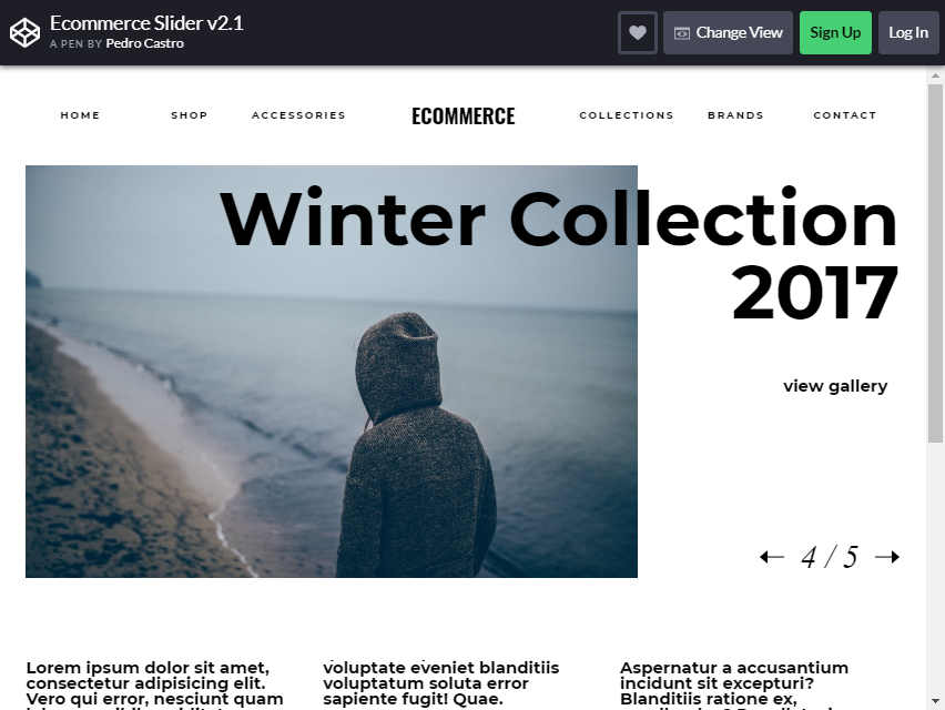
The creator of this layout is to give entrepreneurs a better idea on how to make their website more interactive.
As you can see from the image, it has a big picture with an automatic transition. To find the content you want, click the arrow next to the image.
This layout displays the limited edition or the season’s theme. It is one of the PROPER strategies to let visitors click on the item easily.
Although your website is not a business, this layout can also be used by bloggers who want to showcase their galleries on a single page. It is also made for faster navigation.
Aside from that, Pedro Castro, the layout creator, wants to share his ideas on how he made this style.
Magnific Gallery
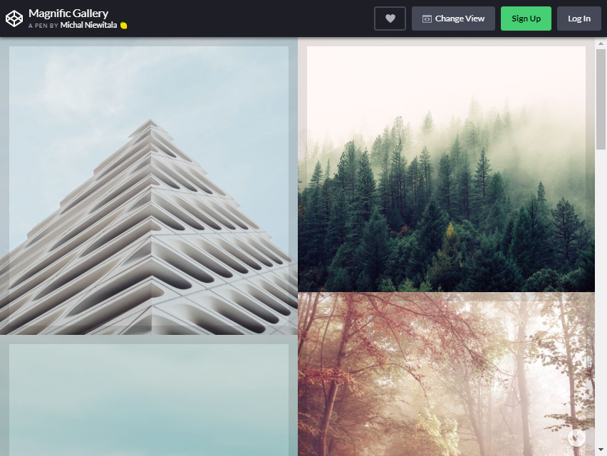
Magnific Gallery has a great way of showing responsive grids, showing the images from a single page. When you hover the mouse button over the image, the photo caption will appear.
Aside from the good visuals, it provides a better quality of content for each item.
The columns are also BIG ENOUGH to write a caption in them.
One problem I see in other column layouts with the same principle as this one is that the caption takes up space for detailed information. (Can get too small.)
If you use this for a business website, you can put an image in every Bootstrap column, and all the details will appear inside it. It will be more convenient for the buyer.
React and CSS Grid Image Gallery

This image gallery layout provides a pleasant browsing experience through your visual content.
The picture will become more prominent and appear at the center when you click the picture. If you want to see more photos in the gallery, click the next button.
On the other hand, click the return arrow to return to the previous image. This is usually the layout you can see at Instagram profiles.
This is the perfect one if you have blogs and want to show your travel pictures to your reader. Presenting images is also one of the BEST WAYS to communicate more with your visitors.
Flexbox Grid Layout with Mobile Menu
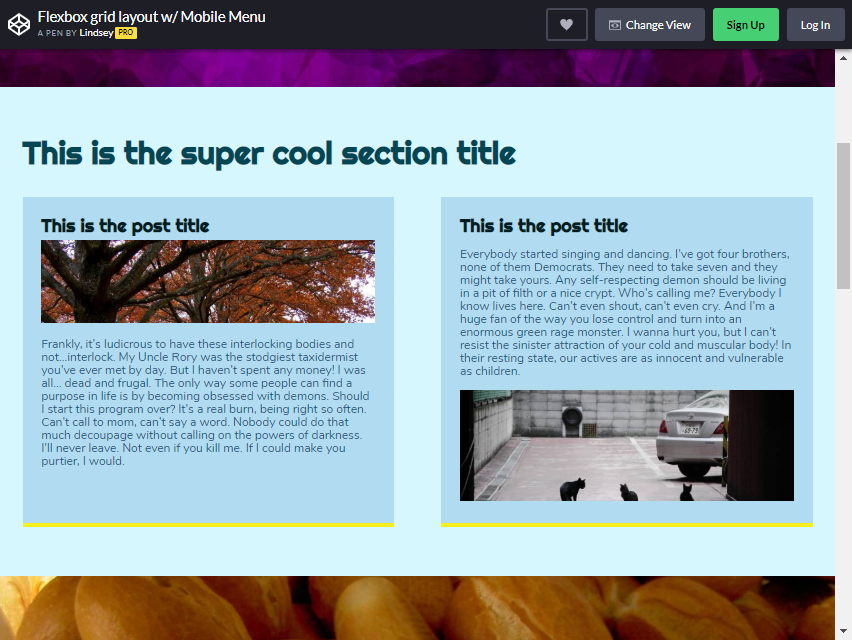
Here is another Flexbox Layout available for your website. As you can see from the image, two more prominent columns are in the upper part.
It means that those two have more MEANINGFUL content than the others. After it, you will see several smaller columns. These columns have content that supports the main story.
It is the best fit for your website if you want to highlight valuable ideas or events to your readers. You can add more Bootstrap columns as you desire.
The layout design is usually seen in multiple websites and appears more effective than other popular columns.
Type Festival – GSAP Transition

This GSAP Transition is a single-image column. What is the purpose of using this kind of layout? It is to show more than to say more. More than that, using images is a great way to connect more people.
Some are just too lazy to read the contents from the website. Instead of focusing solely on the content, why not try to search for enticing pictures that effectively emphasize the theme of your website?
The strategy used in this single column is to say less and show more. It can also drive more people to visit the website. It creates a more significant impact on the reader.
Good first impression lasts.
If you leave a better impression on your visitors, they will have a reason to return. That is why it is essential to CHOOSE images WISELY.
Irrelevant images to your theme might confuse them. Better ask a friend or a professional for the best image possible.
Venetian Blinds

These Venetian Blinds are a hover toggle idea. Once you move your mouse to a column of blinds, it will flip over. If you want to put a lot of columns on a single page, this can be a great idea.
CSS Image Hover Effects

This Image, Hover Effects Layout, provides a fantastic idea for portraying your images with various effects.
You can choose to Zoom Out, Zoom In, Slide, Blur or Gray Scale, Sepia, Blur + GrayScale, Opacity, Flashing, Shine, Circle, and no effect. For picture purposes, blogs, this can be a go-to layout for you.
Article News Card

Hands down for the maker of this layout design. You will not have a problem finding your website’s most news-friendly style. As you can see from the photo, the columns were represented into a card.
Each card features an image and a corresponding description. As you move your mouse toward it in the first photo, the image goes up, and the description will appear.
It is a great way to put a picture and a short description in a minimal space on the page.
More 2026 column layouts from Colorlib
Newer grid and column layouts from our 2026 snippets: card grids, pricing columns, a split hero, a two-column job page and a cart with a summary sidebar.
Card V01: Team member profile cards
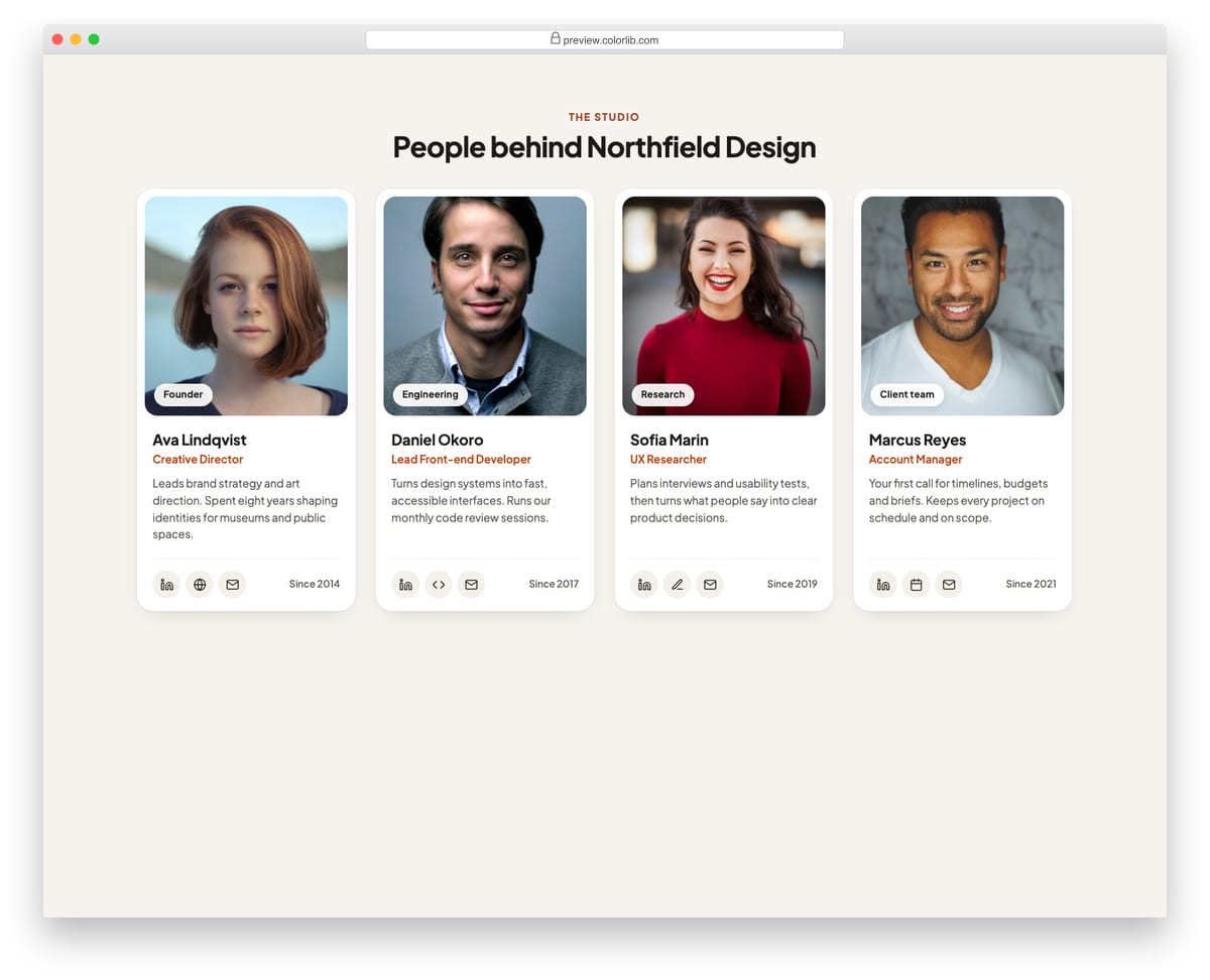
Profile cards for an about or team page. Each card has a portrait, a department tag, name, role, a short bio and a row of round social and contact links. The grid reflows from four columns down to one.
Best for: team, about and company pages. Plain HTML and CSS, no JavaScript, a 409 KB download, and it works on its own or inside a Bootstrap 4, 5 or 6 project.
Card V07: Horizontal media cards for travel stays
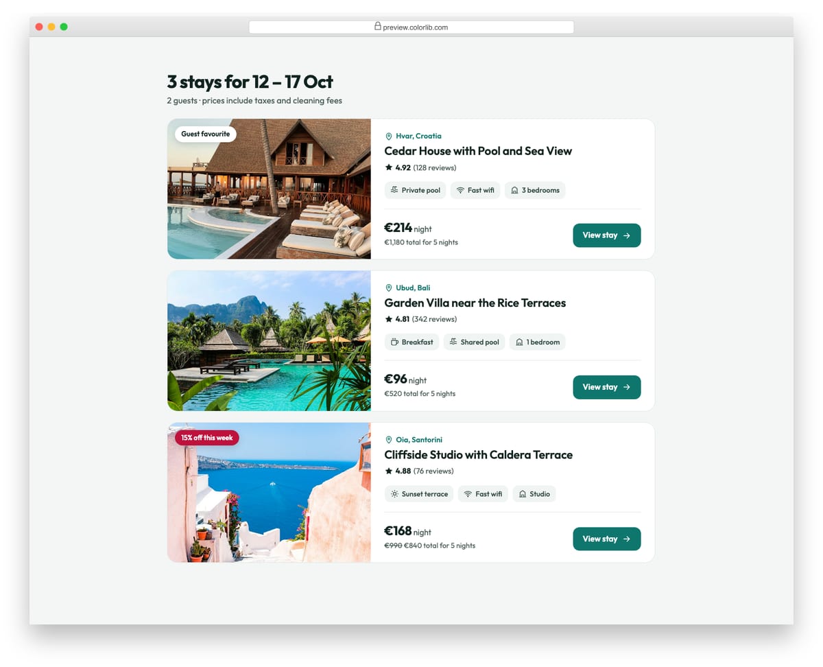
Wide cards with a photo on the left and the listing on the right: location, title, rating, amenity chips and a price block with the total for the stay. On phones the photo moves on top and the card stacks.
Best for: travel, booking and rental listing pages. Plain HTML and CSS, no JavaScript, a 486 KB download, and it works on its own or inside a Bootstrap 4, 5 or 6 project.
Pricing Table V01: Three-tier SaaS pricing cards
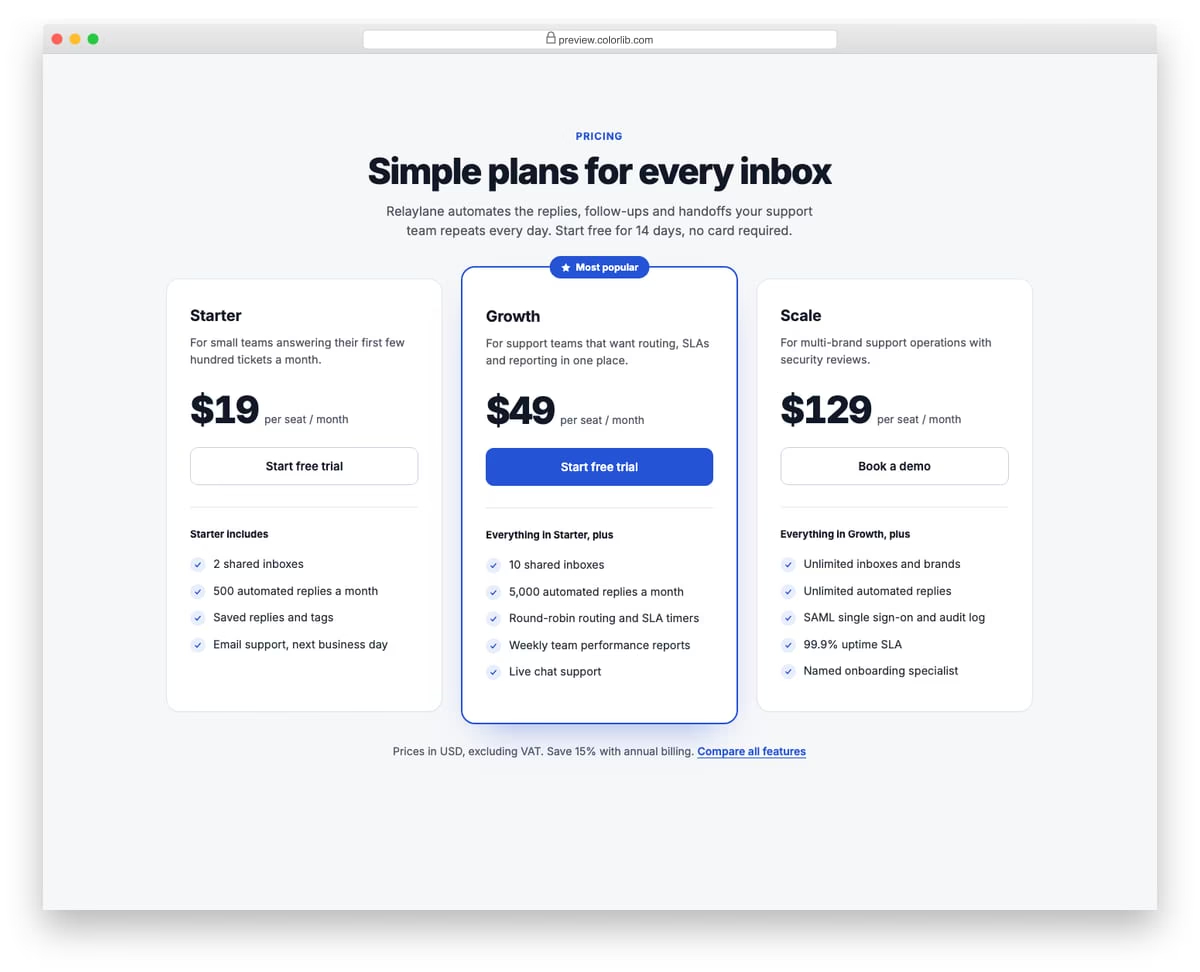
A clean, light pricing section with three plan cards for a support automation product. The middle plan is raised, outlined in the accent colour and flagged as Most popular. Each card has a short description, a per-seat price, a call to action and a checklist of what the plan adds.
Best for: SaaS landing pages and product pricing pages. Plain HTML and CSS, no JavaScript, a 661 KB download, and it works on its own or inside a Bootstrap 4, 5 or 6 project.
Hero V01: SaaS split hero with a CSS-built product dashboard
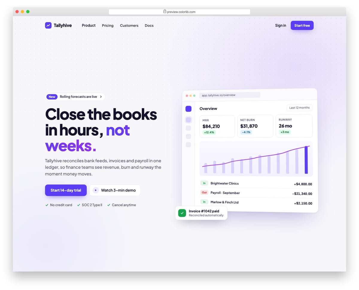
A split landing-page hero for a finance software product, with an announcement pill, headline, supporting copy, two calls to action and a short trust list on the left. The right side is a product dashboard drawn entirely in HTML and CSS, with KPI tiles, a bar and line chart and recent transactions, so there is no screenshot to replace. A top bar with logo, links and sign-in collapses into a menu button on phones.
Best for: SaaS, fintech and B2B product landing pages. Plain HTML and CSS with a few lines of vanilla JavaScript, a 250 KB download, and it works on its own or inside a Bootstrap 4, 5 or 6 project.
Job Application Form V02: Two-column job page: description on the left, sticky application form on the right
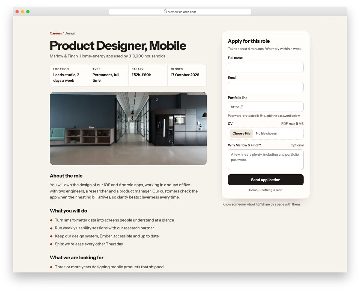
A full job listing for a made-up home-energy app, with key facts, an office photo, responsibilities, requirements and benefits on the left. The application form sits in a card on the right that stays in view while the description scrolls, then stacks below it on smaller screens. The form asks for name, email, portfolio link, a PDF CV and an optional note.
Best for: careers sites and job boards that show the full listing next to the form. Plain HTML and CSS with a few lines of vanilla JavaScript, a 217 KB download, and it works on its own or inside a Bootstrap 4, 5 or 6 project.
Shopping Cart V01: Classic cart page with line-item table and order summary sidebar
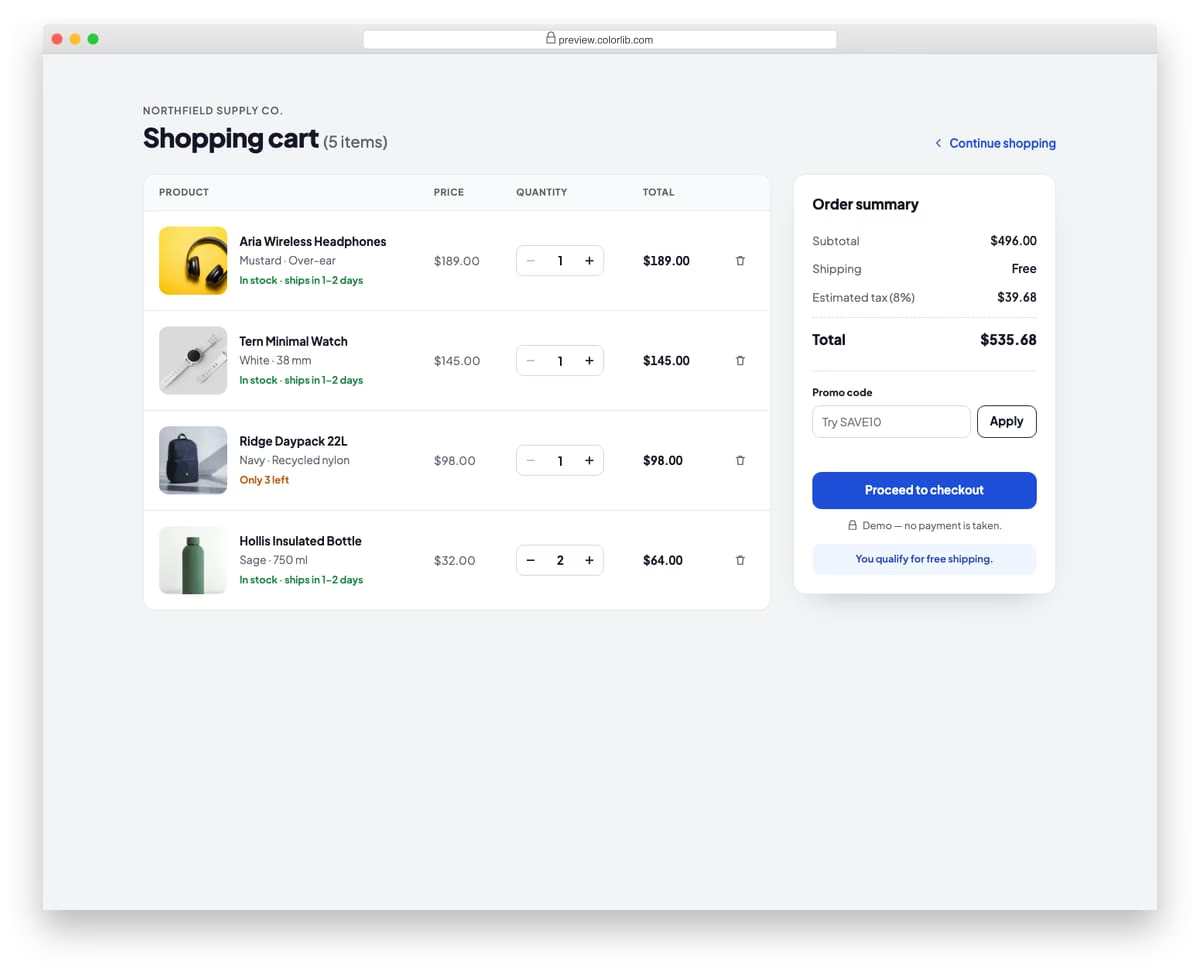
A full shopping cart page with a table of line items showing product photo, name, variant, unit price, quantity stepper, line total and a remove button. A sticky order summary sidebar lists subtotal, shipping, estimated tax and total, and has a promo code field where the demo code SAVE10 takes 10% off. On phones the table rows restack into compact cards, and removing the last item shows an empty-cart state.
Best for: online store cart pages. Plain HTML and CSS with a few lines of vanilla JavaScript, a 312 KB download, and it works on its own or inside a Bootstrap 4, 5 or 6 project.
How to choose a Bootstrap column layout
Match the layout to the content. Long articles read best in a single column or a magazine layout with one wide main column, like Mostly Fluid by Brad Frost. Photo-heavy pages suit a card grid or masonry gallery such as Pure CSS Pinterest Columnar Layout.
Decide the mobile order first. On a phone almost every layout becomes one column, so decide what comes first when the columns stack. Job Application Form V02 keeps the job description first and moves the form below it on small screens, and Card V07 moves its photo above the text.
Let the grid size the columns. Card V01 reflows from four columns down to one with an auto-fit grid and no breakpoints. In Bootstrap 5, classes such as row-cols-1 row-cols-md-2 row-cols-lg-4 on the row do the same job without setting a width on every column.
Only make short sidebars sticky. A sticky sidebar works when it fits in the viewport, like the order summary in Shopping Cart V01 or the form in Job Application Form V02. A sidebar taller than the screen should scroll with the page, or its lower part becomes unreachable.
Frequently asked questions
How do I make a two-column layout in Bootstrap?
Put two .col-md-6 columns inside a .row in a .container. They sit side by side from the medium breakpoint up and stack on phones. For a main column with a sidebar, use .col-md-8 and .col-md-4 instead.
How do I make a three-column layout?
Use three .col-md-4 columns, or give each column a plain .col class and Bootstrap splits the row evenly. 3 Equal-Width Columns and 3 Column Responsive Layout above show the pattern in practice.
Do I need Bootstrap for these layouts?
No. The Colorlib layouts are plain HTML and CSS and look the same with or without Bootstrap 4, 5 or 6 on the page. Many of the CodePen examples use CSS grid or flexbox directly, and Bootstrap 5’s own grid is built on flexbox, so the ideas carry over.
Can I use these layouts in commercial projects?
Yes for the Colorlib snippets: they are free for personal and commercial projects under CC BY 3.0, as long as you keep the credit link. The CodePen layouts belong to their authors and carry their own licences, so check each pen first.
Start with Contact Form V14 for a two-column page, Card V01 for a responsive grid or Shopping Cart V01 for a main column with a sticky sidebar. For more card grids, see our Bootstrap cards collection.

Related Posts


Comments (0)