20 Free Bootstrap Breadcrumb Examples (2026)
By Aigars Silkalns · Last updated May 13, 2026 · 14-min read
Ecommerce category drill-downs, documentation hierarchies, admin dashboard navigation, multi-step checkout flows — Bootstrap’s breadcrumb component is the navigation primitive every hierarchical site needs. This collection gathers 20 free Bootstrap 5–compatible breadcrumb examples covering the patterns developers actually ship: the canonical chevron-divider treatment, contextual color themes, icon-augmented breadcrumbs, wizard process-step visualizations, deep hierarchy patterns, mobile-friendly truncation, and Bootstrap 5.3’s native dark-mode cascade. Crucially, this article also includes a complete BreadcrumbList JSON-LD schema implementation guide — the SEO bonus most breadcrumb listicles miss entirely. Every visible breadcrumb on your site should be paired with the schema so Google can render the rich breadcrumb path directly in search results. If you’re picking a breadcrumb design, customizing the separator, or implementing schema for SEO, start here.
What is a Bootstrap breadcrumb?
A Bootstrap breadcrumb is a horizontal navigation aid that shows the user’s current location within a site’s hierarchy and lets them jump back to any parent level. The pattern derives its name from the Hansel-and-Gretel trail — each segment is a “crumb” pointing back to where the user came from. Bootstrap 5 ships breadcrumbs as a minimal, accessible component with a CSS-customizable separator.
When to use breadcrumbs:
- Ecommerce category navigation (“Home › Electronics › Laptops › Gaming”)
- Blog hierarchies (“Home › Category › Subcategory › Article”)
- Documentation drill-downs (“Docs › API › Auth › OAuth”)
- File-system or admin UIs (“Projects › Acme › Reports › Q4”)
- Settings panels with nested levels
- Multi-step wizards and checkout flows
Bootstrap 5 vs Bootstrap 4 breadcrumbs: The markup is nearly identical between versions. Bootstrap 5 introduced CSS custom properties for the separator (--bs-breadcrumb-divider), making per-breadcrumb separator customization trivial — set the property on the parent element to override the default slash. Bootstrap 4 required SCSS variable overrides for the same effect. Bootstrap 5.3 added data-bs-theme for native dark-mode support.
SEO and breadcrumbs: Breadcrumbs aren’t just navigation — they’re a signal to search engines about your site’s information architecture. Implementing BreadcrumbList schema (separate from the visible breadcrumb) makes them eligible for Google’s rich breadcrumb display in SERPs, replacing the URL with a readable path. Every visible breadcrumb on your site should be paired with the schema markup. See the “Adding BreadcrumbList schema” pattern below for the complete implementation.
Browser support: Universal — breadcrumbs are pure HTML/CSS and work everywhere Bootstrap 5 is supported.
How to use Bootstrap breadcrumbs (basic markup)
<!-- Basic breadcrumb (default slash separator) -->
<nav aria-label="breadcrumb">
  <ol class="breadcrumb">
    <li class="breadcrumb-item"><a href="/">Home</a></li>
    <li class="breadcrumb-item"><a href="/library/">Library</a></li>
    <li class="breadcrumb-item active" aria-current="page">Data</li>
  </ol>
</nav>

<!-- Custom separator (arrow) -->
<nav style="--bs-breadcrumb-divider: '>'" aria-label="breadcrumb">
  <ol class="breadcrumb">
    <li class="breadcrumb-item"><a href="/">Home</a></li>
    <li class="breadcrumb-item active" aria-current="page">Library</li>
  </ol>
</nav>

<!-- SVG separator (chevron) -->
<nav style='--bs-breadcrumb-divider: url("data:image/svg+xml,%3Csvg xmlns=%22http://www.w3.org/2000/svg%22 width=%228%22 height=%228%22%3E%3Cpath d=%22M2.5 0L1 1.5 3.5 4 1 6.5 2.5 8l4-4-4-4z%22 fill=%22%236c757d%22/%3E%3C/svg%3E");' aria-label="breadcrumb">
  <ol class="breadcrumb">
    <li class="breadcrumb-item"><a href="/">Home</a></li>
    <li class="breadcrumb-item active" aria-current="page">Products</li>
  </ol>
</nav>
Required JS: None — breadcrumbs are pure CSS.
Common gotcha: The aria-current="page" attribute on the final crumb is what screen readers use to identify the current location. Don’t omit it. Also, the final crumb should not be a link — it’s the current page, so there’s nowhere to go.
Best free Bootstrap breadcrumb examples
We grouped the 20 picks by use case rather than ranking them — every example below is a viable production starting point. Each screenshot shows our Bootstrap 5.3 implementation of the pattern, inspired by the original designer credited beneath. The “Original demo” link goes to the source pen, snippet, or repository for those who want to fork, compare implementations, or see the author’s specific code style.
Showcase — visually distinctive breadcrumb designs
1. Divider Variable Swap Demo
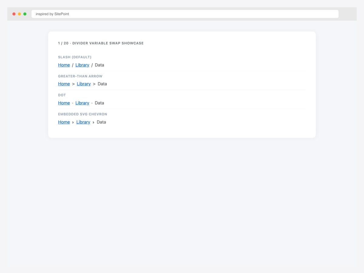
Four breadcrumb variations on a single page — slash, greater-than arrow, dot, and embedded SVG chevron — each driven by the --bs-breadcrumb-divider custom property. Best fit as a reference card: copy-paste the divider style you want into your project, change one inline-style attribute, ship it. Pure Bootstrap 5.3 — no JavaScript, no extra CSS. The SVG variant uses a data-URI so there’s no icon-font dependency. For documentation sites that explain breadcrumb customization to users, this side-by-side layout is the cleanest reference pattern.
Inspired by: SitePoint · License: CodePen default (attribution required)
Source & details Original demo
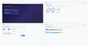
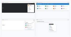
2. Multi-Size Navbar Breadcrumb
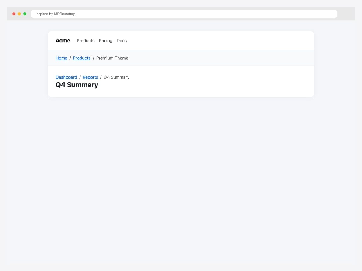
Breadcrumb embedded inside a top navbar plus a dashboard page-header pattern showing the breadcrumb directly above the page title. Best fit for SaaS apps and admin dashboards where the breadcrumb serves both as navigation aid and contextual reference for the current page. Pure Bootstrap 5.3 — the navbar uses standard .navbar markup, the dashboard header pairs the breadcrumb with an <h2> for a tight visual association. Use small font size (.small) for the breadcrumb so it stays subordinate to the page title.
Inspired by: MDBootstrap · License: MDB-free
Source & details Original demo
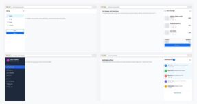
3. Gallery Variant Browser
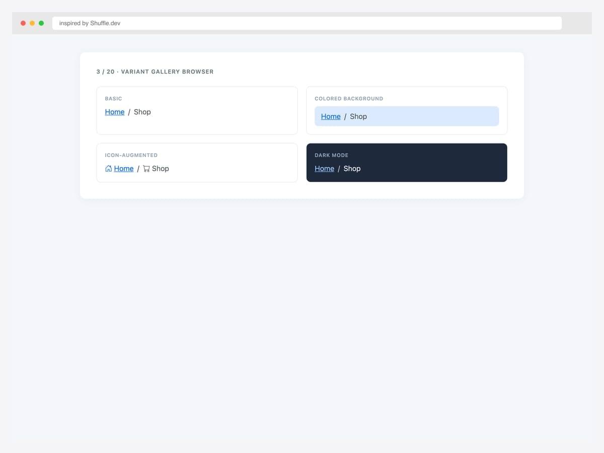
Four-variant gallery (basic, colored background, icon-augmented, dark mode) shown as a 2×2 tile grid for inspiration browsing. Best fit as a kitchen-sink reference: lets you see how different visual treatments look against each other before committing to one. Pure Bootstrap 5.3 with custom tile wrappers. Each tile demonstrates a different design decision: chrome (basic vs colored), iconography, and dark-mode treatment. The colored tile uses #dbeafe background (Bootstrap’s blue-100) for low-emphasis attention without competing with primary actions.
Inspired by: Shuffle.dev · License: Free (Shuffle gallery)
Source & details Original demo
Separator variations — slash, arrow, chevron, dot, SVG
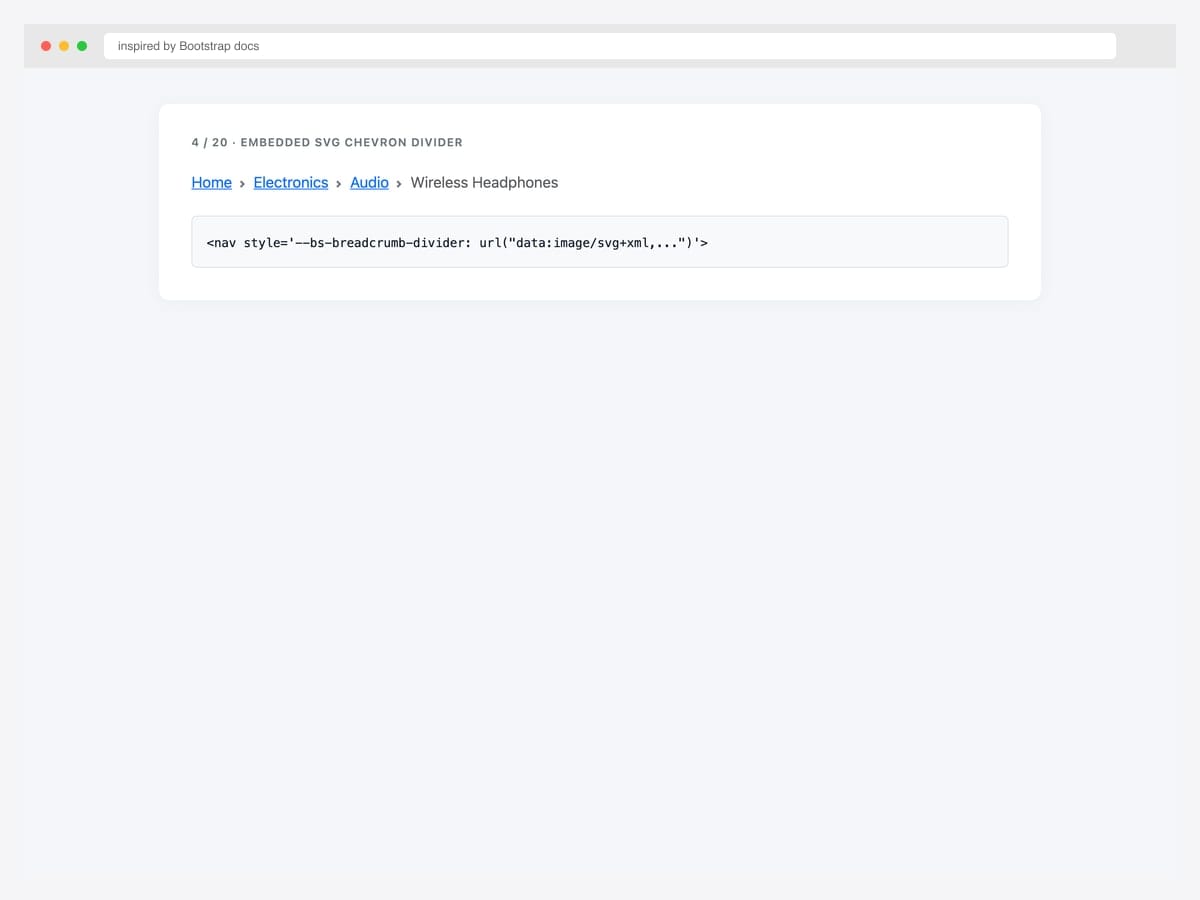
4. Embedded SVG Chevron
The canonical Bootstrap 5 chevron breadcrumb — embedded SVG via data-URI on the --bs-breadcrumb-divider custom property. Best fit as the modern default for SaaS, dashboards, and product UIs (this is the pattern Stripe, Linear, Vercel use). Pure Bootstrap 5.3 with zero icon-font dependency. The data-URI keeps the SVG inline so there’s nothing extra to load. To recolor the chevron, change the fill="%236c757d" URL-encoded hex inside the data-URI. The four-level breadcrumb in this example mirrors the canonical ecommerce drill-down (Home › Electronics › Audio › Wireless Headphones).
Inspired by: Bootstrap (twbs) · License: MIT
Source & details Original demo
5. Double-Arrow Divider
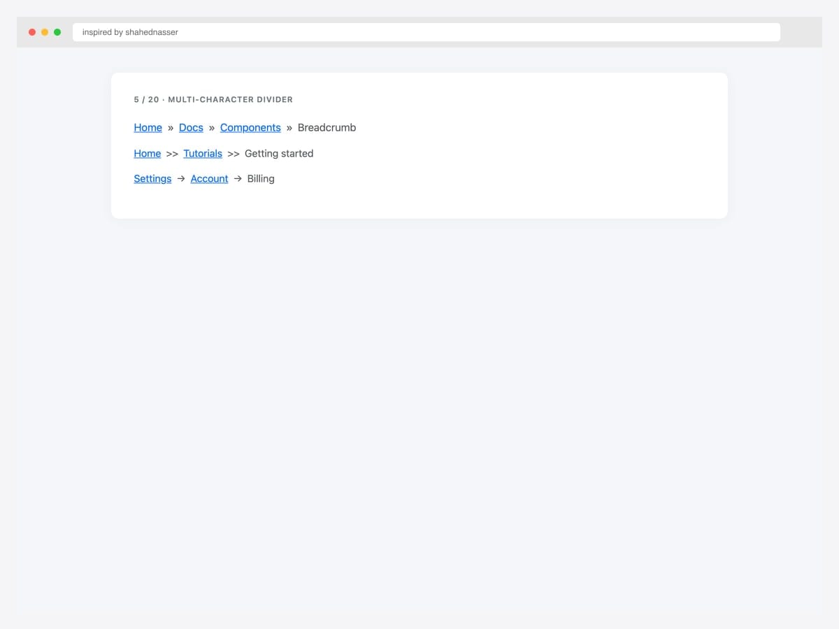
Three multi-character divider variants — » (right-pointing double angle quotation), >> (literal double greater-than), and → (arrow). Best fit for distinctive designs that want a more emphatic separator than the Bootstrap default. Pure Bootstrap 5 — set --bs-breadcrumb-divider to any single character or short string. Avoid characters longer than 2 chars; they look cramped between crumbs. Test in your live typography — some characters (like →) inherit weight from the parent font and may need color: #6c757d to match the default muted treatment.
Inspired by: shahednasser · License: CodePen default (attribution required)
Source & details Original demo
6. Dots Arrows Bullets
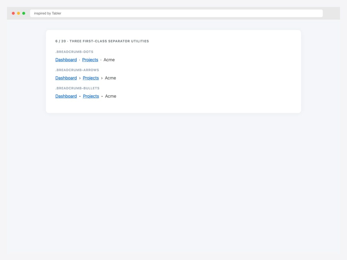
Three first-class separator utility classes — .breadcrumb-dots (·), .breadcrumb-arrows (›), and .breadcrumb-bullets (•). Best fit for design systems where breadcrumb separators should be a controlled set rather than per-page custom values. Bootstrap-compatible CSS that extends the base .breadcrumb with utility-class overrides for the --bs-breadcrumb-divider property. Define them once in your global stylesheet, then choose by adding the class. The Tabler implementation also ships .breadcrumb-muted for low-emphasis treatment.
Inspired by: Tabler · License: MIT
Source & details Original demo
7. No-Divider Plus Defaults
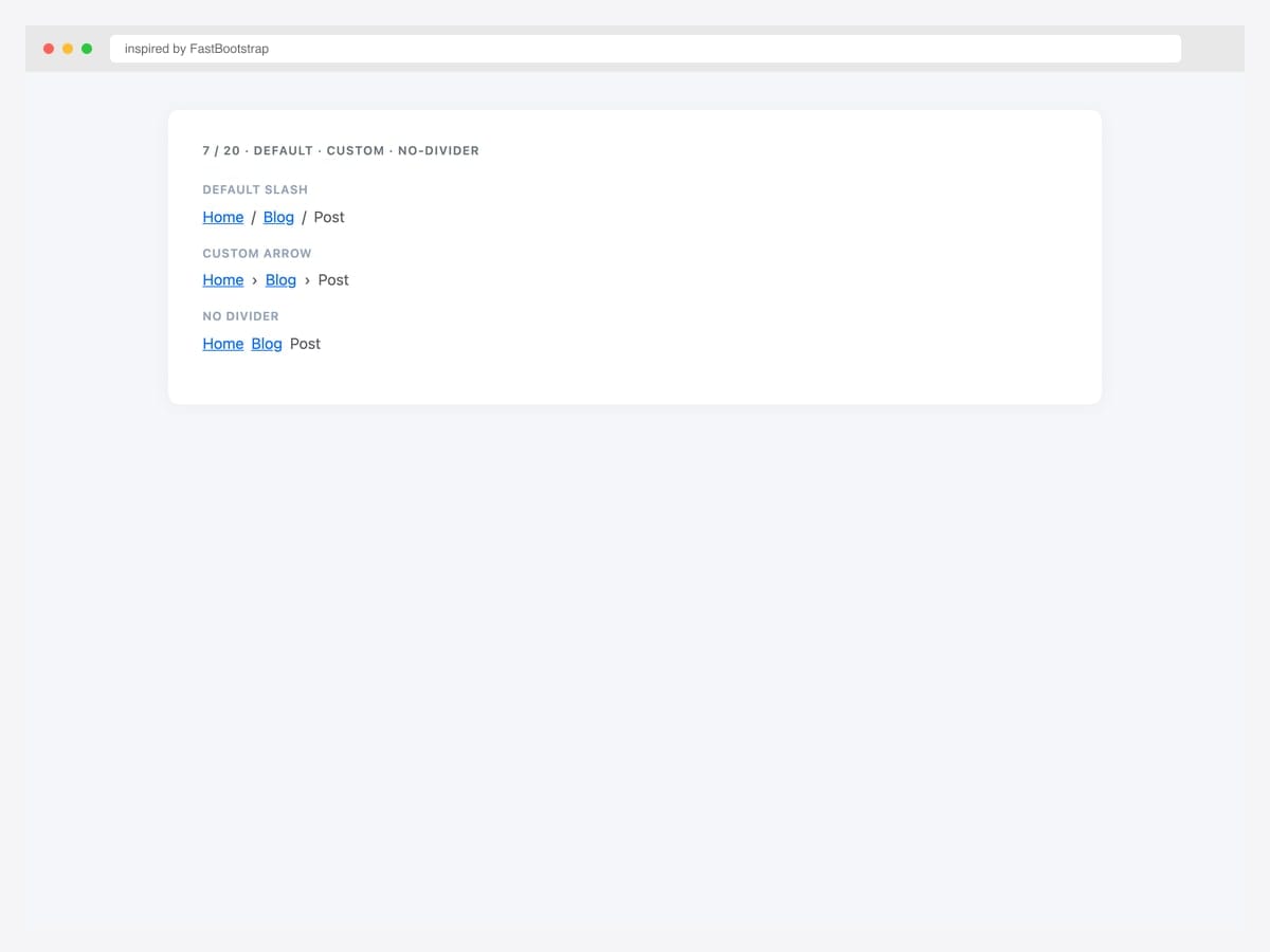
Three breadcrumb variants on one page — default slash divider, custom arrow divider, and no-divider (just spacing). Best fit as a quick-reference for the most common Bootstrap 5 breadcrumb decisions. Pure Bootstrap 5.3 — the no-divider variant uses --bs-breadcrumb-divider: none, which removes the separator entirely (some designs prefer pure spacing for a minimalist look). The custom arrow uses '›' (Unicode U+203A), a lighter weight than the standard > that pairs better with serif typography.
Inspired by: FastBootstrap · License: MIT
Source & details Original demo
Icon-augmented breadcrumbs
8. Font Awesome Per Label
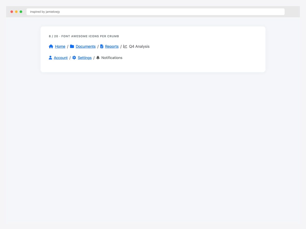
Font Awesome icons paired with each label — home, folder, file, chart icons inline with text on every crumb. Best fit for admin dashboards, file-system UIs, and any product where each hierarchy level has a recognizable icon identity. Pure Bootstrap 5 with Font Awesome 6. Use me-2 for consistent spacing between icon and label. Keep icons consistent in metaphor — don’t mix solid and outline styles within one breadcrumb. For dense breadcrumbs (4+ levels), drop icons on parent crumbs and keep them only on the current page to reduce visual weight.
Inspired by: jamielowjy · License: CodePen default (attribution required)
Source & details Original demo
9. Angle-Right Glyph Divider
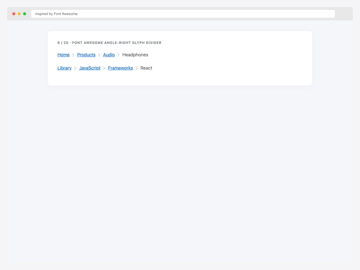
Font Awesome \f105 (angle-right) glyph as the divider via the ::before pseudo-element on .breadcrumb-item. Best fit when you already have Font Awesome loaded and want a consistent icon family across your UI. Pure CSS override — point --bs-breadcrumb-divider at a Unicode escape, then set font-family on .breadcrumb-item+.breadcrumb-item::before to the Font Awesome family. Color and size inherit from the parent .breadcrumb. This pattern lets you swap to any Font Awesome icon (chevron, caret, etc.) by changing one CSS escape.
Inspired by: Font Awesome · License: CodePen default (attribution required)
Source & details Original demo
10. Section Icons Plus Muted
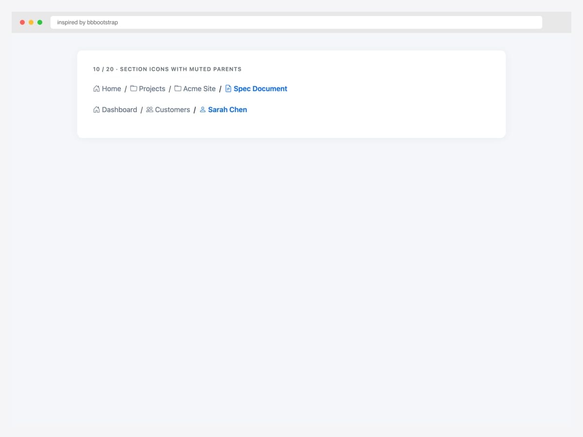
Section-prefix icons (home, folder, file-text) with text-muted parent crumbs and primary-color active item. Best fit for documentation sites, file managers, and admin tools where the hierarchy itself carries semantic meaning. Bootstrap 5 with Bootstrap Icons. Combines two design patterns: per-label icons (for instant section recognition) and color-based current-page emphasis (muted parents + bold blue current). The combination reduces visual noise while maintaining strong wayfinding signals.
Inspired by: bbbootstrap · License: Free (BBBootstrap)
Source & details Original demo
Color & theme variants — including BS5.3 dark mode
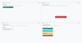
11. Six Contextual Themes
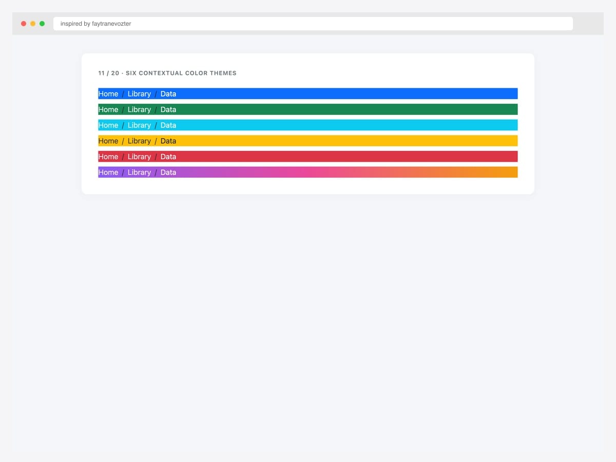
Six contextual color themes stacked vertically — primary, success, info, warning, danger, plus a gradient variant — applied to .breadcrumb backgrounds. Best fit for status-aware breadcrumbs (e.g., danger color for the audit-log page, success for the all-checks-passed dashboard). Pure Bootstrap 5 with custom color-class overrides on .breadcrumb. White text inherits from the parent class for contrast on dark colors; warning uses dark text on yellow for WCAG AA compliance. Use sparingly — colored breadcrumbs draw attention away from page content.
Inspired by: faytranevozter · License: MIT (Bootsnipp default)
Source & details Original demo
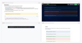
12. Wizard Three-State Color
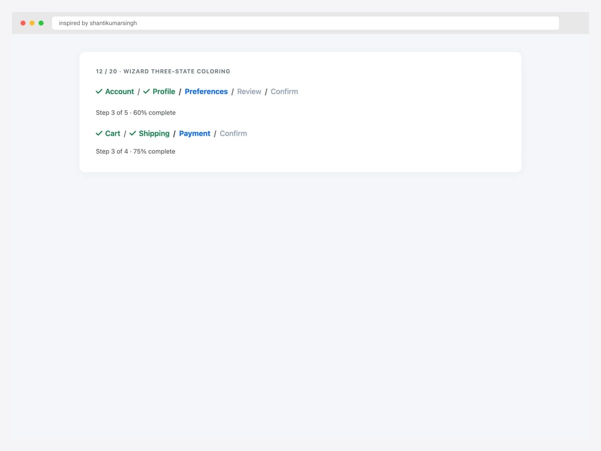
Wizard breadcrumb with three-state coloring — completed (green check), active (primary blue), pending (muted grey) — for multi-step flows. Best fit for checkout pages, multi-step onboarding, and any process where users need to see “what’s done, what’s now, what’s next.” Pure Bootstrap 5 with custom CSS classes (.done, .current, .pending) on each .breadcrumb-item. The check glyph on completed steps uses Font Awesome’s \f00c. Wire the state classes to your form step controller so completed steps automatically get the green treatment.
Inspired by: shantikumarsingh · License: MIT (Bootsnipp default)
Source & details Original demo
13. Dark Mode Breadcrumb
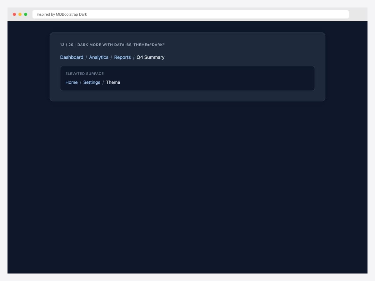
Bootstrap 5.3’s native dark mode applied to the breadcrumb via data-bs-theme="dark" — sky-blue links on a dark navy background. Best fit for any product that ships a dark-mode toggle. Pure Bootstrap 5.3 — the theme attribute cascades to recolor links, dividers, and text automatically. The example also shows the breadcrumb on an elevated surface (a darker tile within the dark page) to demonstrate the visual hierarchy that dark mode tends to flatten. Pair with the prefers-color-scheme: dark media query for system-preference autodetection.
Inspired by: MDBootstrap (Dark Mode) · License: MIT
Source & details Original demo
14. Minimal No-Background
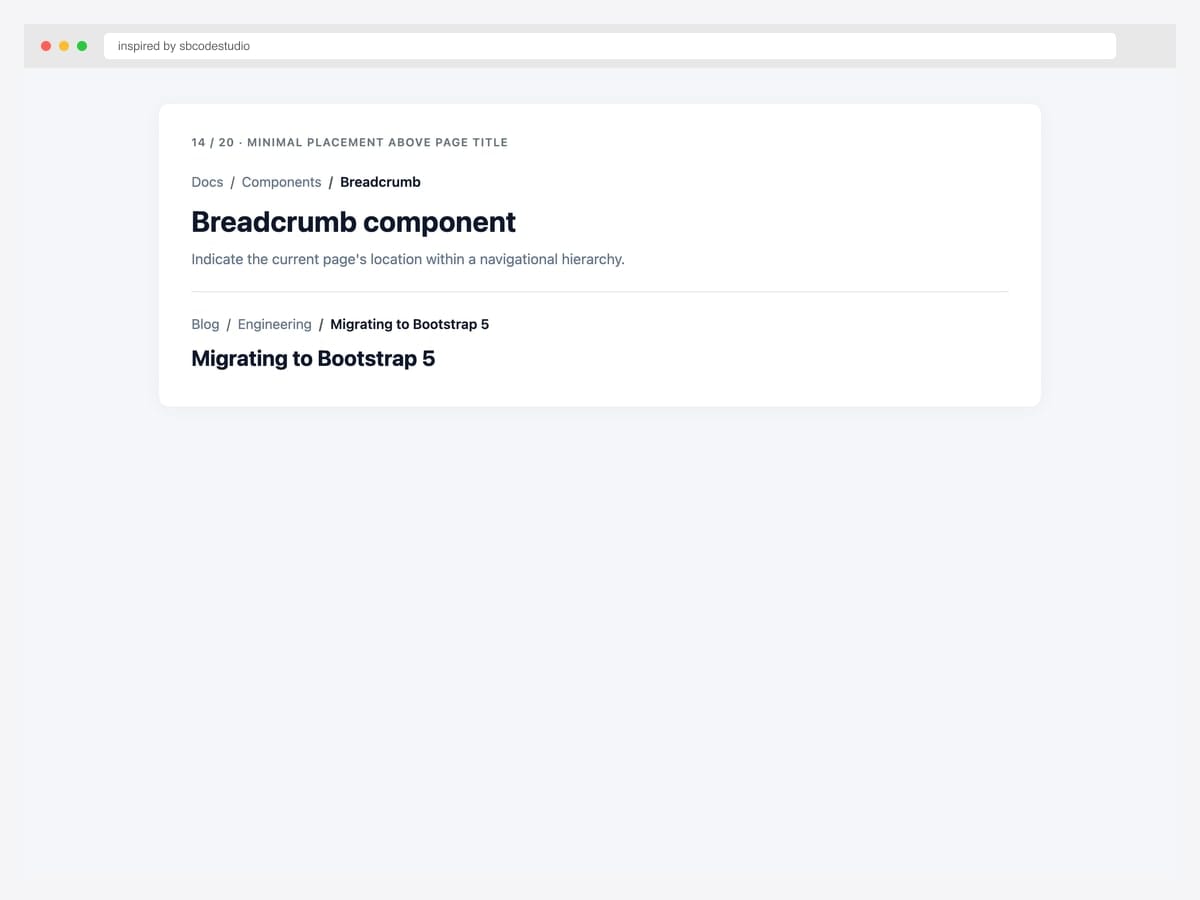
Stripped, minimal breadcrumb placed directly above an H1 page title — no background fill, tight padding, small font size. Best fit for editorial content sites (blogs, documentation, marketing pages) where the breadcrumb should hint at hierarchy without competing with the page title. Pure Bootstrap 5 with two CSS overrides: background: transparent and padding: 0 on .breadcrumb. The breadcrumb sits 8px above the H1, signaling “you got here from somewhere” without disrupting the reading flow. The most common pattern in production content sites.
Inspired by: sbcodestudio · License: CodePen default (attribution required)
Source & details Original demo
Specialty layouts — wizard, deep hierarchy, justified
15. Wizard Arrow Chevrons
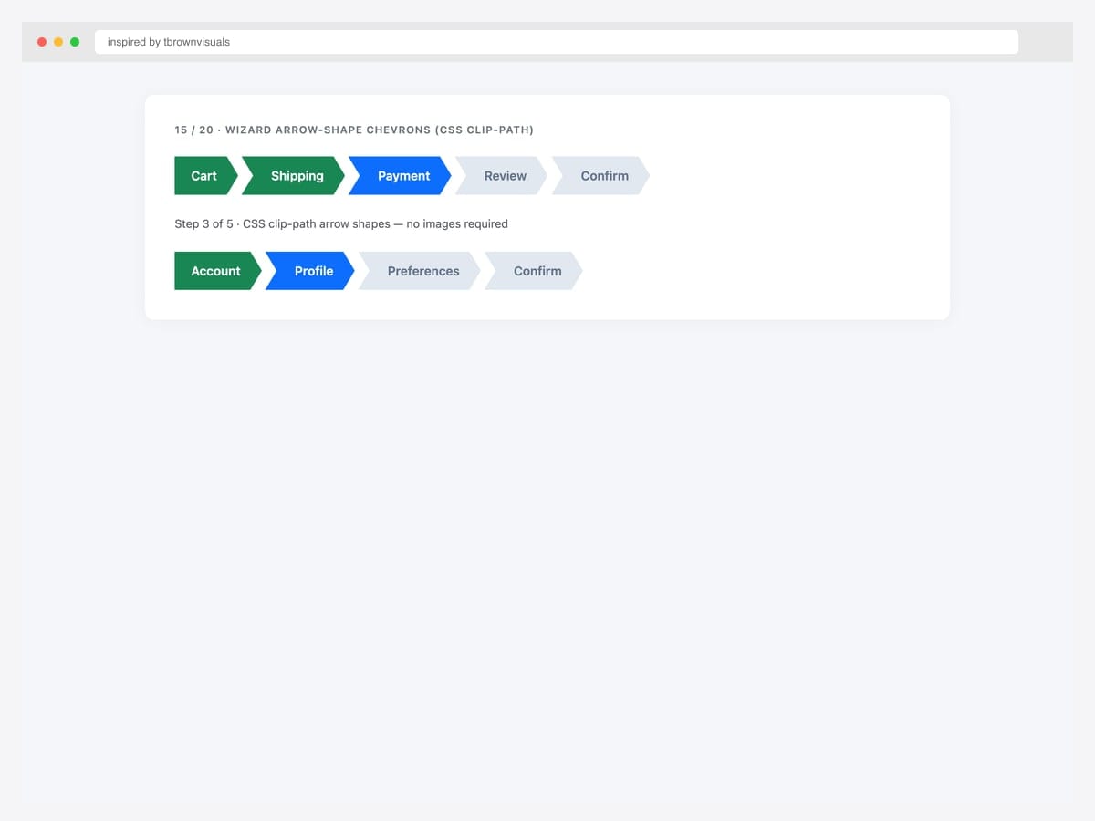
Wizard arrow-shape breadcrumb using CSS clip-path — each crumb becomes an arrow chevron with done/current/pending color states. Best fit for retail checkout, project-management apps, and any process visualization where the arrow shape reinforces forward motion. Pure CSS — the arrow shape uses clip-path: polygon(...) with no images. The first crumb has a flat left edge (no incoming arrow notch). Browser support is universal for clip-path in modern browsers (Chrome, Safari, Firefox, Edge since 2020). Provide a fallback border-radius for older browsers.
Inspired by: tbrownvisuals · License: CodePen default (attribution required)
Source & details Original demo
16. Deep Seven-Level Hierarchy
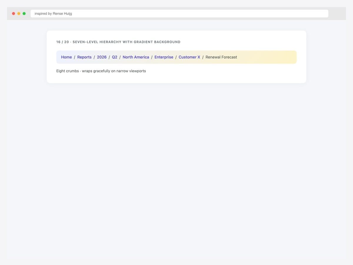
Deep seven-level breadcrumb hierarchy on a soft gradient background showing scalability — Home › Reports › 2026 › Q2 › North America › Enterprise › Customer X › Renewal Forecast. Best fit for enterprise SaaS, business-intelligence dashboards, and any product with naturally deep navigation hierarchies (think reporting tools, finance, legal). Pure Bootstrap 5 with flex-wrap: wrap on the .breadcrumb so it wraps gracefully on narrow viewports rather than horizontally scrolling. The gradient background is a soft indigo-to-amber for visual interest without distraction. For 8+ levels, consider truncation (#19) instead.
Inspired by: Rense Huijg · License: CodePen default (attribution required)
Source & details Original demo
17. Justified Process Steps
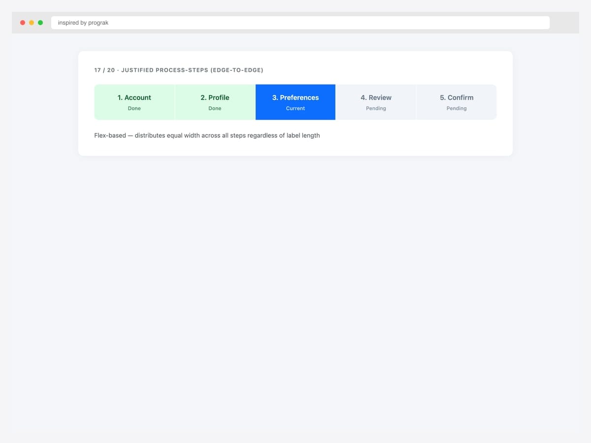
Justified process-steps breadcrumb using display: flex with flex: 1 on each item — distributes equal width across all steps regardless of label length. Best fit for any progress visualization where equal step width is meaningful (assessments, onboarding, tutorials). Pure CSS — no Bootstrap classes needed beyond layout utilities. Each step shows a number, label, and status sublabel. Color coding (green done, blue current, grey pending) matches the wizard pattern but with edge-to-edge layout instead of inline. For 3-5 steps, this is the most scannable breadcrumb variant.
Inspired by: prograk · License: MIT (Bootsnipp default)
Source & details Original demo
Mobile patterns — truncation & ellipsis collapse
18. Per-Item Ellipsis Truncate
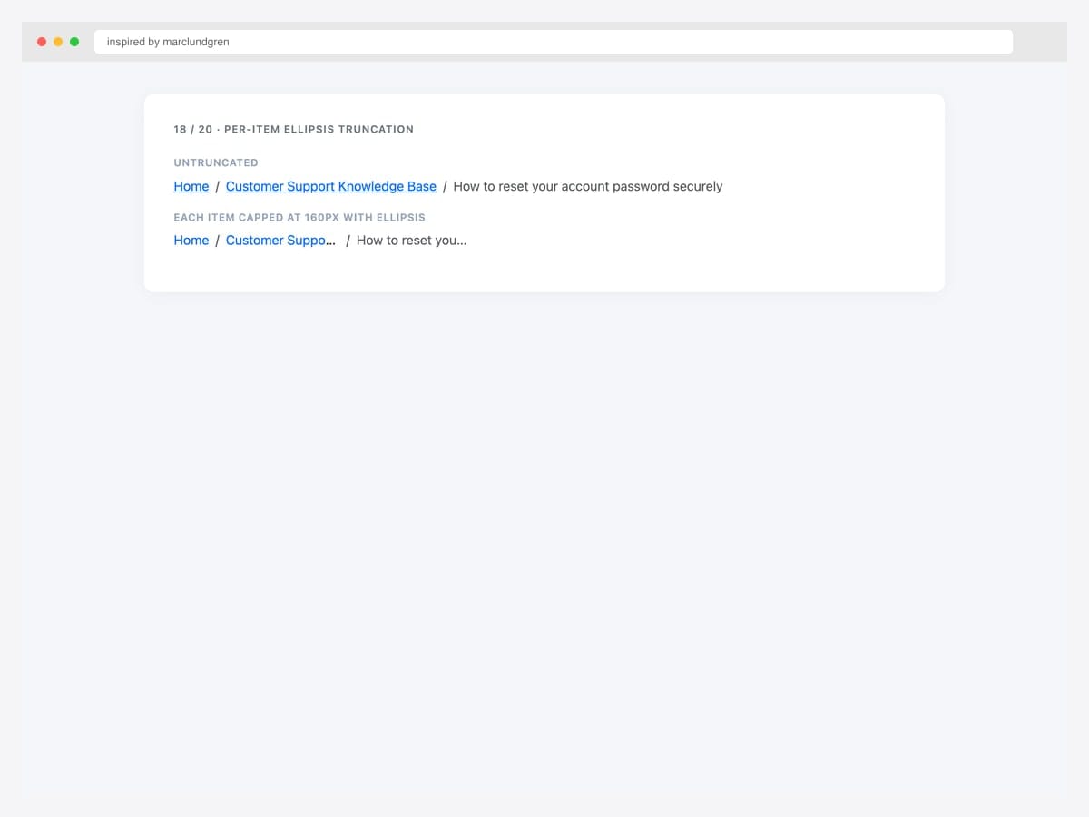
Per-item ellipsis truncation — each .breadcrumb-item capped at 160px with text-overflow: ellipsis. Best fit for breadcrumbs whose individual segments can be unpredictably long (user-generated category names, document titles, customer names). Pure CSS — max-width, overflow: hidden, text-overflow: ellipsis, and white-space: nowrap on each item. The user can still hover to see the full label via the link’s title attribute. Set the max-width to whatever fits two typical labels side-by-side — 160px works for most English typography at 14-16px font sizes.
Inspired by: marclundgren · License: CodePen default (attribution required)
Source & details Original demo
19. Smart Flexbox Ellipsis
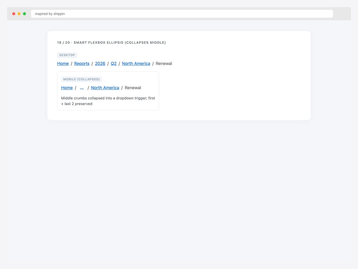
Smart flexbox ellipsis — desktop shows all crumbs, mobile collapses middle crumbs into an ellipsis dropdown trigger that preserves the first crumb plus the last 2. Best fit for ecommerce and enterprise SaaS that need full breadcrumb context on desktop but minimal chrome on mobile. Pure Bootstrap 5 with custom responsive logic; the ellipsis can wrap a Bootstrap dropdown so users can still navigate to collapsed levels. Always preserve Home (first) and current page (last) — those are the two most-used jump targets. Drop deeper internal levels first.
Inspired by: shippin · License: CodePen default (attribution required)
Source & details Original demo
BreadcrumbList JSON-LD schema demo
20. BreadcrumbList JSON-LD Reference
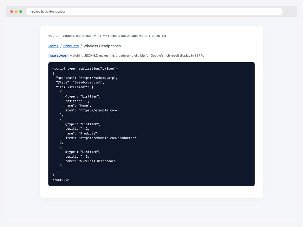
Visible Bootstrap breadcrumb paired with a matching BreadcrumbList JSON-LD schema block — the SEO bonus that lets Google display the breadcrumb hierarchy directly in search results. Best fit (genuinely) for every public-facing page with a breadcrumb. Pure HTML — drop the <script type="application/ld+json"> block anywhere in the page (head or body, both valid). The schema must match the visible breadcrumb exactly (same names, same order, same URLs) — mismatched schemas trigger Google Search Console quality warnings. Omit the item URL on the final/current crumb. See Pattern 1 in the advanced patterns below for the full template.
Inspired by: JayHoltslander · License: MIT
Source & details Original demo
Advanced Bootstrap breadcrumb patterns
Three patterns the listicle items above hint at but rarely demo as full working code. The first is the SEO differentiator most breadcrumb listicles skip entirely.
Pattern 1 — Adding BreadcrumbList schema (the SEO bonus). Place a BreadcrumbList JSON-LD block in the page that mirrors the visible breadcrumb exactly. Google uses this for the rich breadcrumb display in SERPs, replacing the raw URL with a readable path:
<nav aria-label="breadcrumb">
  <ol class="breadcrumb">
    <li class="breadcrumb-item"><a href="https://example.com/">Home</a></li>
    <li class="breadcrumb-item"><a href="https://example.com/products/">Products</a></li>
    <li class="breadcrumb-item active" aria-current="page">Wireless Headphones</li>
  </ol>
</nav>

<script type="application/ld+json">
{
  "@context": "https://schema.org",
  "@type": "BreadcrumbList",
  "itemListElement": [
    {
      "@type": "ListItem",
      "position": 1,
      "name": "Home",
      "item": "https://example.com/"
    },
    {
      "@type": "ListItem",
      "position": 2,
      "name": "Products",
      "item": "https://example.com/products/"
    },
    {
      "@type": "ListItem",
      "position": 3,
      "name": "Wireless Headphones"
    }
  ]
}
</script>
Critical: The schema must match the visible breadcrumb exactly (same names, same order, same URLs). Mismatched schemas trigger Google Search Console quality flags. The final/current crumb omits the item URL — schema validates “current page has no link” by absence rather than by a value. Verify your implementation via Google’s Rich Results Test before deploying.
Pattern 2 — Truncated breadcrumbs for deep hierarchies. Breadcrumbs can grow too long (“Home › Reports › 2026 › Q2 › North America › Enterprise › Customer X”). On mobile especially, this wraps badly. Truncate the middle with an ellipsis dropdown:
<nav aria-label="breadcrumb">
  <ol class="breadcrumb">
    <li class="breadcrumb-item"><a href="/">Home</a></li>
    <li class="breadcrumb-item">
      <div class="dropdown">
        <a href="#" class="dropdown-toggle" data-bs-toggle="dropdown">…</a>
        <ul class="dropdown-menu">
          <li><a class="dropdown-item" href="/reports/">Reports</a></li>
          <li><a class="dropdown-item" href="/reports/2026/">2026</a></li>
          <li><a class="dropdown-item" href="/reports/2026/q2/">Q2</a></li>
          <li><a class="dropdown-item" href="/reports/2026/q2/na/">North America</a></li>
        </ul>
      </div>
    </li>
    <li class="breadcrumb-item"><a href="/reports/2026/q2/na/enterprise/">Enterprise</a></li>
    <li class="breadcrumb-item active" aria-current="page">Customer X</li>
  </ol>
</nav>
Always preserve the first crumb (Home) and the last 1–2 crumbs (current context). Collapse the middle. See our Bootstrap dropdowns collection for the dropdown trigger styling.
Pattern 3 — Breadcrumbs with icons. Adding small icons to breadcrumb segments improves scannability — particularly for breadcrumbs in admin/dashboard contexts where each level has a recognizable section icon:
<nav aria-label="breadcrumb">
  <ol class="breadcrumb">
    <li class="breadcrumb-item">
      <a href="/"><i class="bi bi-house-door me-1"></i>Home</a>
    </li>
    <li class="breadcrumb-item">
      <a href="/users/"><i class="bi bi-people me-1"></i>Users</a>
    </li>
    <li class="breadcrumb-item active" aria-current="page">
      <i class="bi bi-person me-1"></i>Profile
    </li>
  </ol>
</nav>
Keep icons consistent in size (16px) and aligned via me-1 (margin-end). Don’t mix icon styles within one breadcrumb (e.g., solid icons on parents and outline on the current page).
Breadcrumb vs navigation menu — when to use which
| Breadcrumb | Navigation menu | |
|---|---|---|
| Shows | User’s current path within hierarchy | Site-wide navigation options |
| Position | Below header, above content | In header or sidebar |
| Direction | Linear, left-to-right | Vertical or horizontal grouped |
| Implies | Hierarchy depth | Site sections |
| User action | Jump back to a parent level | Navigate to any section |
| Required on every page | No (only on hierarchical pages) | Usually yes (consistent navigation) |
| Mobile behavior | Often hides middle crumbs | Often collapses to hamburger |
| Best for | Deep sites (ecommerce, docs, admin) | All sites |
Breadcrumbs complement navigation menus — they don’t replace them. A site can (and should) have both. Pair breadcrumbs with our Bootstrap navbar examples for the top-level navigation, and reach for Bootstrap pagination templates when the content is a paginated list rather than a hierarchical tree.
Frequently asked questions
How do I add breadcrumbs in Bootstrap?
Use the <nav> element with aria-label="breadcrumb" wrapping an <ol class="breadcrumb">. Each segment is a <li class="breadcrumb-item"> containing a link, except the current page which uses <li class="breadcrumb-item active" aria-current="page"> and contains text (not a link). The slash separator appears automatically via CSS — no JavaScript required.
How do I change the Bootstrap breadcrumb separator?
Set the --bs-breadcrumb-divider CSS custom property on the parent element: <nav style="--bs-breadcrumb-divider: '>';"> for an arrow separator, or use a URL with an inline SVG for chevron, dot, or any custom shape. Bootstrap 5 introduced this property — Bootstrap 4 required SCSS variable overrides. See items #4–#7 in this collection for working examples of each separator style.
How do I add BreadcrumbList schema for SEO?
Add a <script type="application/ld+json"> block to the page with a BreadcrumbList JSON-LD structure mirroring the visible breadcrumb. Each segment is a ListItem with position, name, and item (the URL — omit on the final/current page). The schema must exactly match the visible content. See the “Adding BreadcrumbList schema” pattern above for the complete code template.
Are breadcrumbs good for SEO?
Yes — when paired with BreadcrumbList schema markup, breadcrumbs help Google display rich breadcrumb paths in search results (replacing the raw URL with a readable hierarchy). They also reinforce your site’s information architecture for crawlers. Google has used breadcrumb schema for SERP display since 2014 and treats it as a positive site-quality signal. Always validate your implementation via Google’s Rich Results Test.
Should breadcrumbs be visible on every page?
No — breadcrumbs make sense only on pages within a clear hierarchy (category pages, sub-pages, deep navigation). On top-level pages (homepage, “Contact us”), breadcrumbs add visual noise without information value. Apply breadcrumbs to product pages, blog posts, documentation, and any page where users would want to jump back up the tree.
How should breadcrumbs behave on mobile?
Long breadcrumbs wrap awkwardly on narrow screens. Two common patterns: (1) truncate the middle with an ellipsis dropdown that opens to show collapsed segments; (2) keep only the immediate parent and current page, dropping deeper levels. Bootstrap 5’s flex utilities make either pattern straightforward. Avoid horizontal scrolling — it’s discoverability-poor and accessibility-poor. See items #18 and #19 in this collection.
Are these Bootstrap breadcrumb examples free for commercial use?
Yes — every example in this collection uses an MIT, Apache 2.0, MDB-free, or CodePen-default license, which permits commercial use including in client projects and SaaS products. Our Bootstrap 5.3 implementations are released under MIT; the original inspirations are linked for those who want to verify each source page’s specific license terms.
Final thoughts
Bootstrap’s breadcrumb component is one of the smallest primitives in the framework but one of the highest-leverage when paired with schema. The picks worth committing to memory: the embedded SVG chevron (#4) as your modern default, the wizard three-state breadcrumb (#12) for multi-step flows, Bootstrap 5.3’s dark-mode cascade (#13) for any theme-switching product, the minimal-above-title placement (#14) for editorial content sites, and the schema-paired implementation (#20) for every public-facing breadcrumb. The schema is the easy SEO win — most sites have the visible breadcrumb but forget the JSON-LD that makes Google render it in search results.
If you’re building a hierarchical site, pair these breadcrumbs with our Bootstrap navbar examples for top-level navigation and our Bootstrap sidebar templates for admin/dashboard contexts. For paginated content (blog index, search results), see our Bootstrap pagination templates instead — breadcrumbs are for hierarchy, pagination is for linear traversal.
Related collections: Bootstrap navbar examples · Bootstrap pagination templates · Bootstrap sidebar templates · Bootstrap header templates · Bootstrap dropdown menus · Bootstrap tables · Bootstrap cards · CSS3 table templates · Free website menu templates · Bootstrap snippet library
Related Posts
Comments (0)