
35 Beautiful HTML & CSS Table Templates & Examples 2026
These 35 HTML and CSS table templates cover the tables most sites need: data grids, user lists, price lists, schedules, order lists and a shopping cart table, each with a live demo.
The first 25 Colorlib tables were rebuilt in plain HTML and CSS, with a few lines of vanilla JavaScript only where a table needs behaviour, such as select-all checkboxes or expandable rows. None loads jQuery or Bootstrap files, yet each works on its own or as a Bootstrap table template inside a Bootstrap 4, 5 or 6 project, and all are free downloads.
The rest are our uiCookies set of ten tables, the Bootstrap table documentation, three CodePen examples and five newer 2026 Colorlib components with tables inside them, such as a feature comparison table and a paginated orders table.
Best CSS3 and Bootstrap Table Templates
Top picks at a glance
 Fixed Column Table by ColorlibSticky first column for wide data
 Fixed Header Table by ColorlibHeader stays visible on scroll
 Responsive Table V1 by ColorlibMobile-first responsive pattern
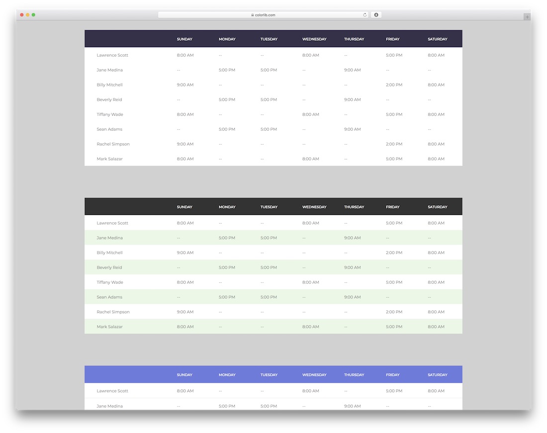 Table With Vertical & Horizontal Highlight by ColorlibRow + column hover highlight
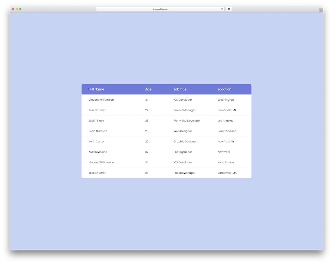 Responsive Table V2 by ColorlibCard-style mobile collapse
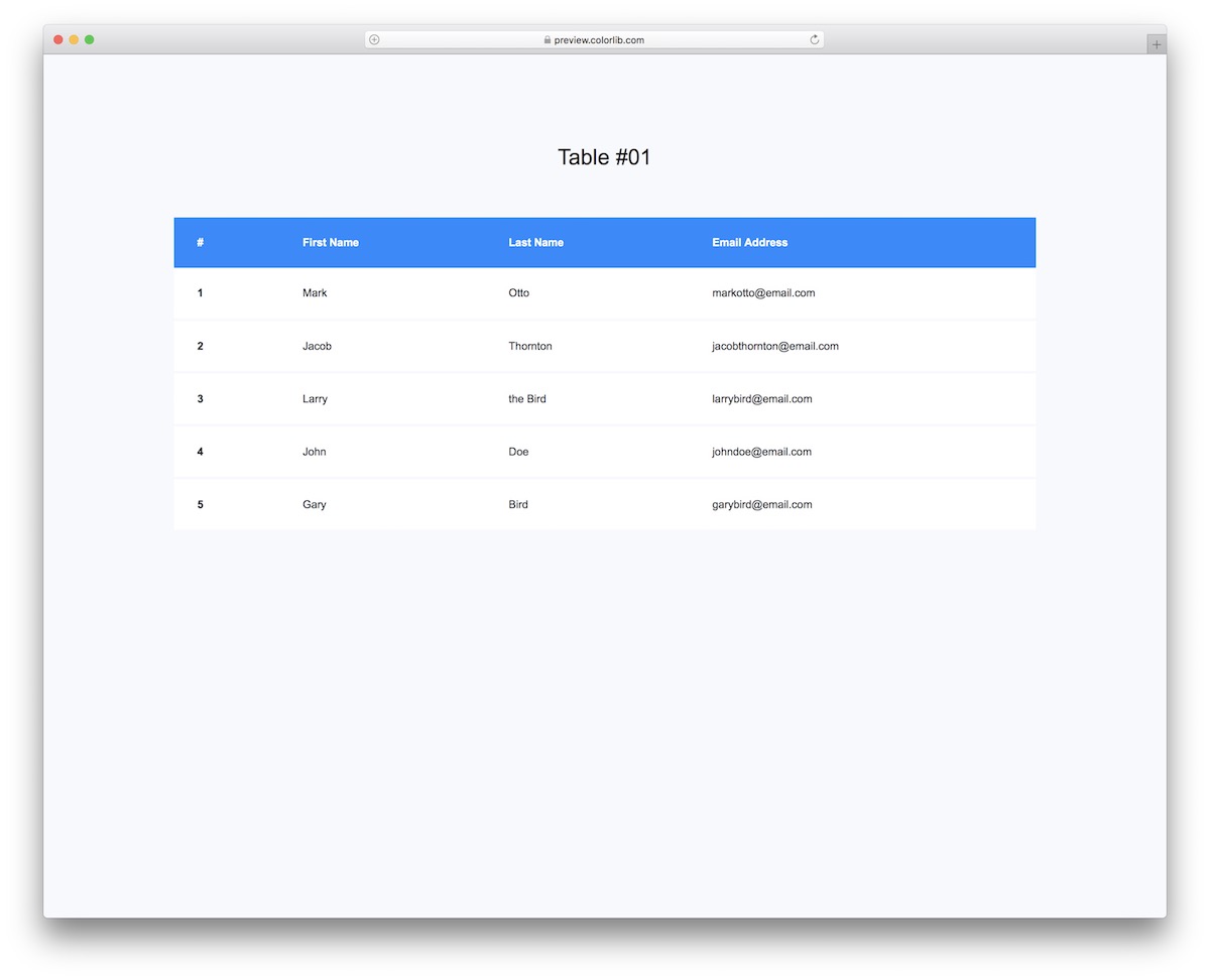 Table V01Minimal clean base to build on
Table of contents — all 30 table templates
- uiCookies Table Templates (10 templates)
- Fixed Column Table by Colorlib
- Fixed Header Table by Colorlib
- Table With Vertical & Horizontal Highlight by Colorlib
- Responsive Table V1 by Colorlib
- Responsive Table V2 by Colorlib
- Table V01
- Table V02
- Table V03
- Table V04
- Table V05
- Shopping Cart Table V06
- Table V07
- Table V08
- Table V09
- Table V10
- Table V11
- Table V12
- Table V13
- Table V14
- Table V15
- Table V16
- Table V17
- Table V18
- Table V19
- Table V20
- Bootstrap CSS
- Adaptive Pricing Table
- CSS3 Pricing Table
- Nutrition Facts Table in HTML & CSS
uiCookies Table Templates (10 templates)
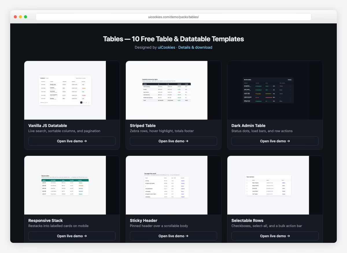
Ten table designs aimed at the cases a real project runs into rather than the showcase ones: a sortable datatable, a sticky-header table for long lists, a layout that stacks into cards on mobile, selectable and expandable rows, plus comparison and invoice tables.
The sortable table runs on a short piece of vanilla JavaScript instead of jQuery and DataTables.js, which keeps the page weight down considerably. Free download from our uiCookies library, with every design in its own self-contained file.
1. Fixed Column Table by Colorlib
FreeBootstrap-ready · Best for: Wide records that scroll sideways
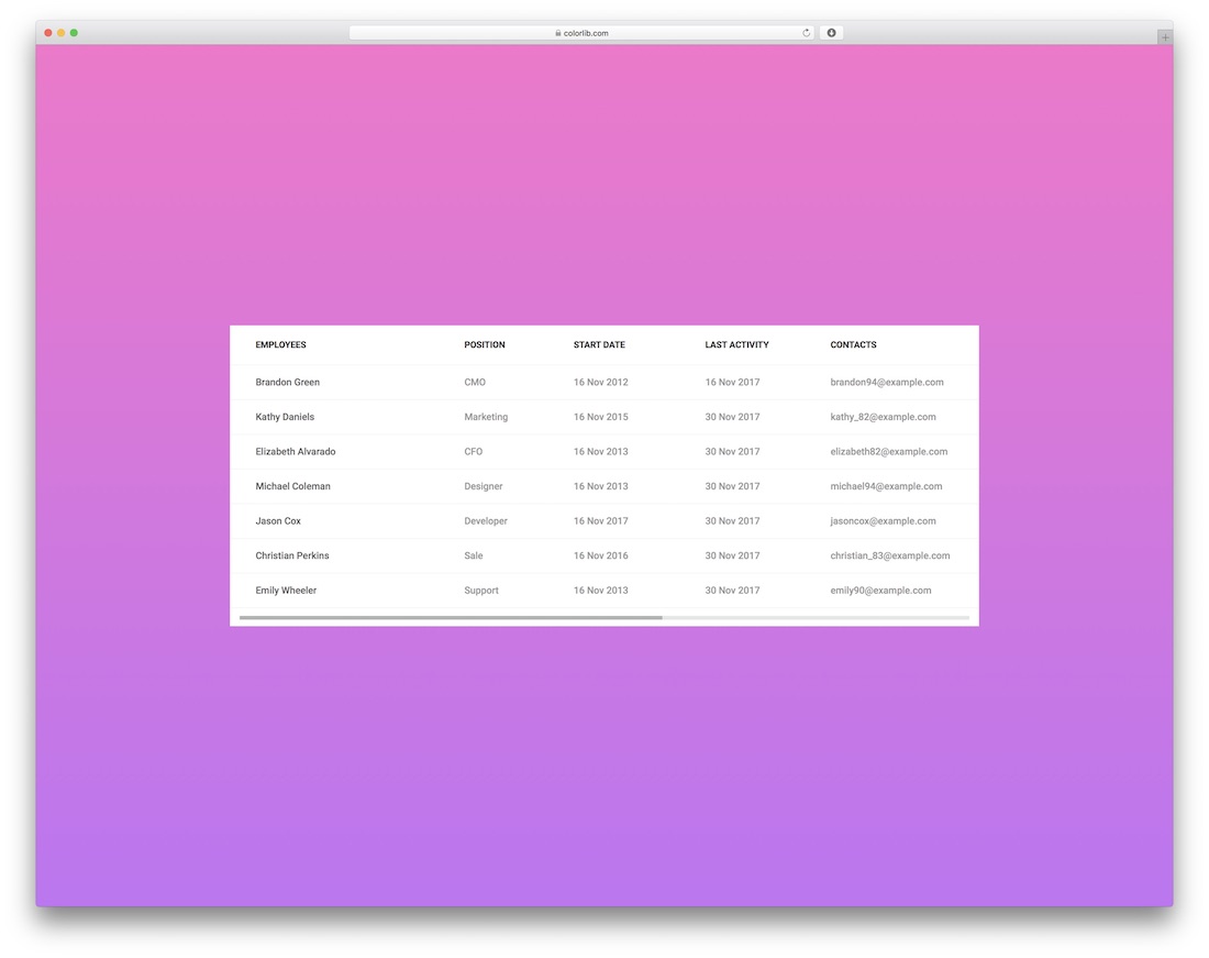
The first column stays pinned while the rest scroll horizontally, so a row never loses the label that identifies it. The demo is an eight-column employee record — position, start date, last activity, contacts, address, card number — the shape of data that normally forces you to hide columns on narrow screens. The rebuilt version needs no JavaScript at all, and the download dropped from 5.8 MB to 136 KB.
2. Fixed Header Table by Colorlib
FreeBootstrap-ready · Best for: Long data sets that scroll past a screenful
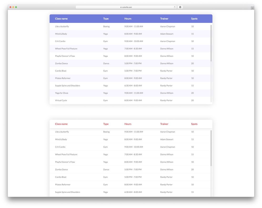
The header row stays fixed while the body scrolls, so column names are still readable a hundred rows down. The demo fills it with a class timetable — class name, type, hours, trainer, spots remaining — but the markup takes any long list without changes. No script drives the fixed header any more; the whole download is 72 KB of HTML and CSS.
3. Table With Vertical & Horizontal Highlight by Colorlib
FreeBootstrap-ready · Best for: Cross-referencing a cell in a grid
Hovering lights up the row and the column at the same time, which is what you want when a value only means something at an intersection. Six variations ship together — solid and gradient fills, sharp and rounded corners — all laid out over a seven-day grid. The crosshair highlight runs on a few lines of vanilla JavaScript, with no jQuery.
4. Responsive Table V1 by Colorlib
FreeBootstrap-ready · Best for: Order and invoice lists on mobile
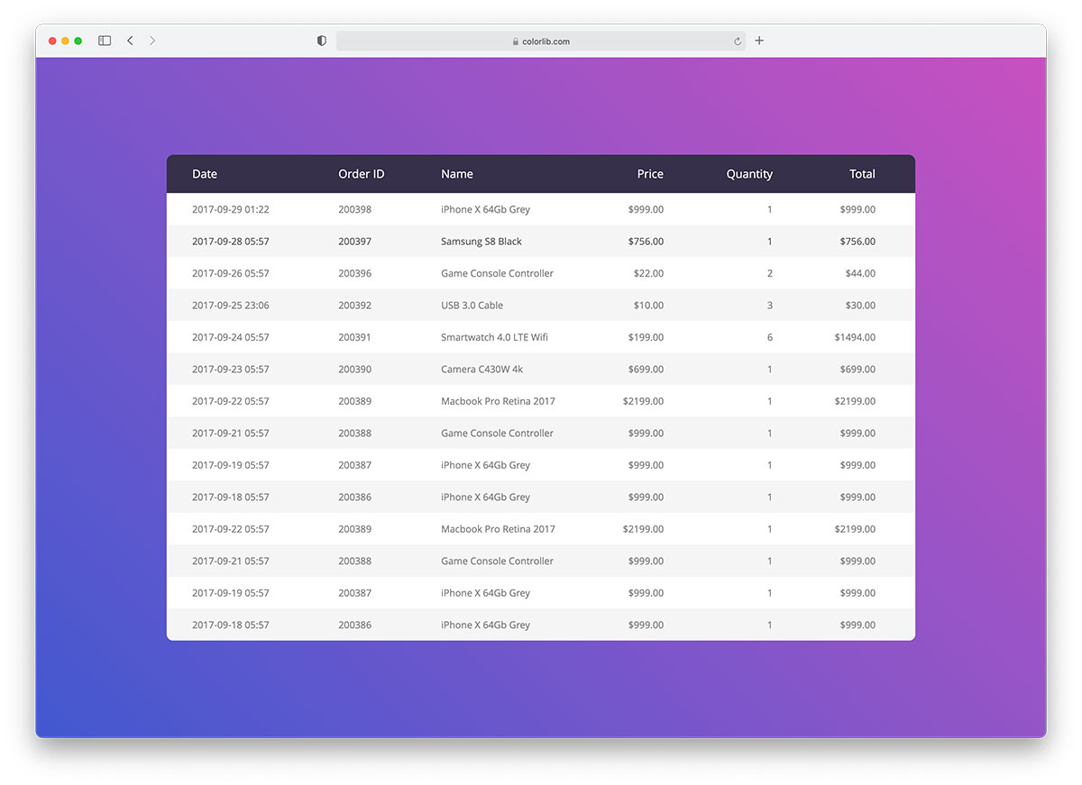
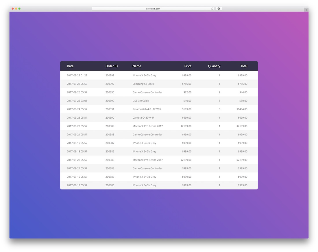
Six commerce columns — date, order ID, name, price, quantity, total — that stay readable as the viewport narrows. A plain starting point for order histories and billing screens, with the responsive behavior handled in the stylesheet rather than bolted on later.
5. Responsive Table V2 by Colorlib
FreeBootstrap-ready · Best for: Mobile-first data lists
Built from div rows and cells rather than table elements, which is why it collapses so cleanly on small screens. Row hover is included, and because the structure is not table layout, changing how rows stack is a stylesheet edit rather than a markup rewrite.
6. Table V01
FreeBootstrap-ready · Best for: A plain user list to build on
The most basic entry here: number, first name, last name, email, and a colored header band. Four columns and nothing else, which makes it the natural base to paste your own columns into rather than a finished screen. It is plain HTML and CSS with no JavaScript, so there is nothing to wire up.
7. Table V02
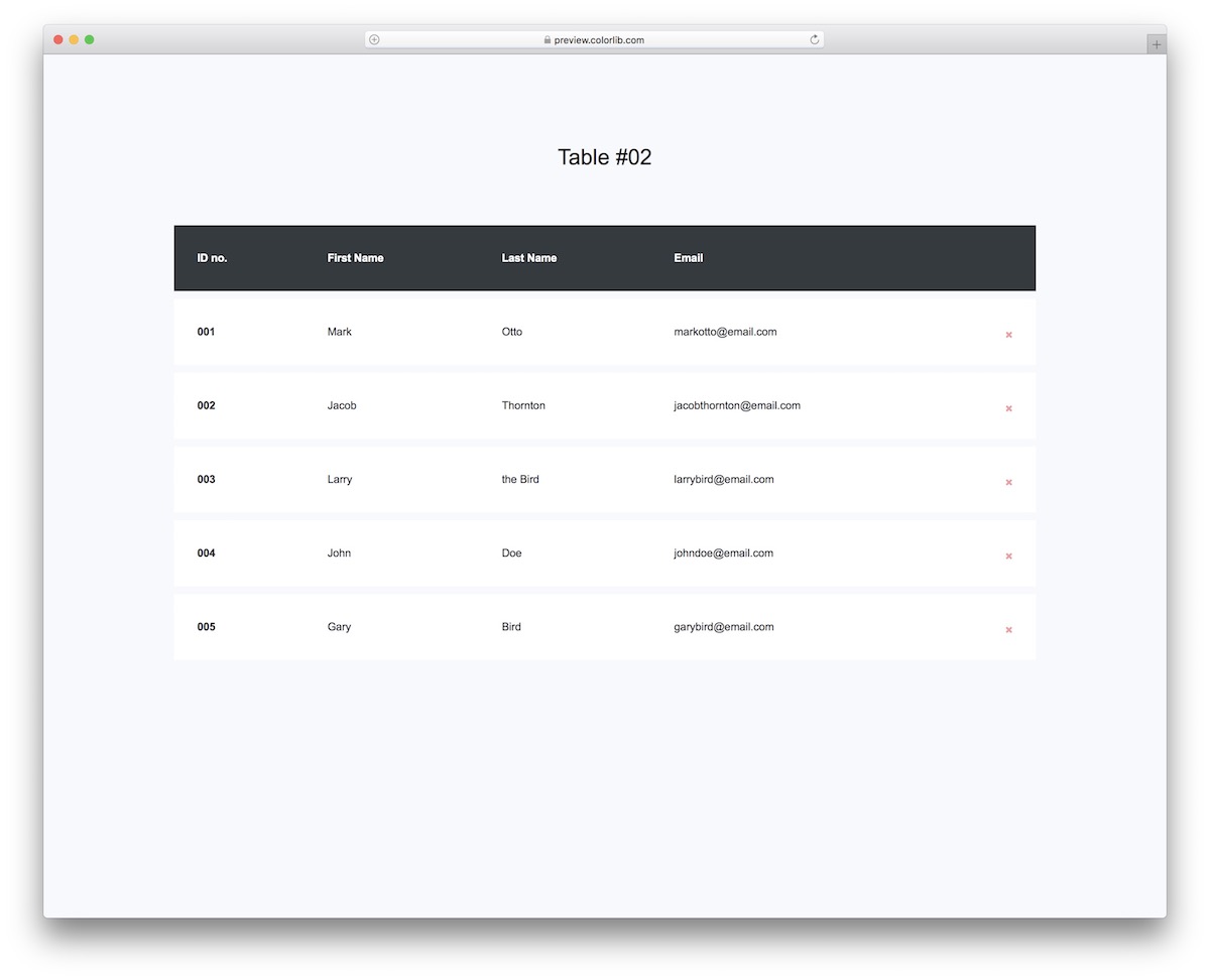
FreeBootstrap-ready · Best for: Lists with a per-row delete control
The same four-column list as V01 with a delete control on every row — and nothing behind it to undo the action. On narrow screens it scrolls sideways instead of restructuring, so column alignment survives the trip to mobile.
8. Table V03
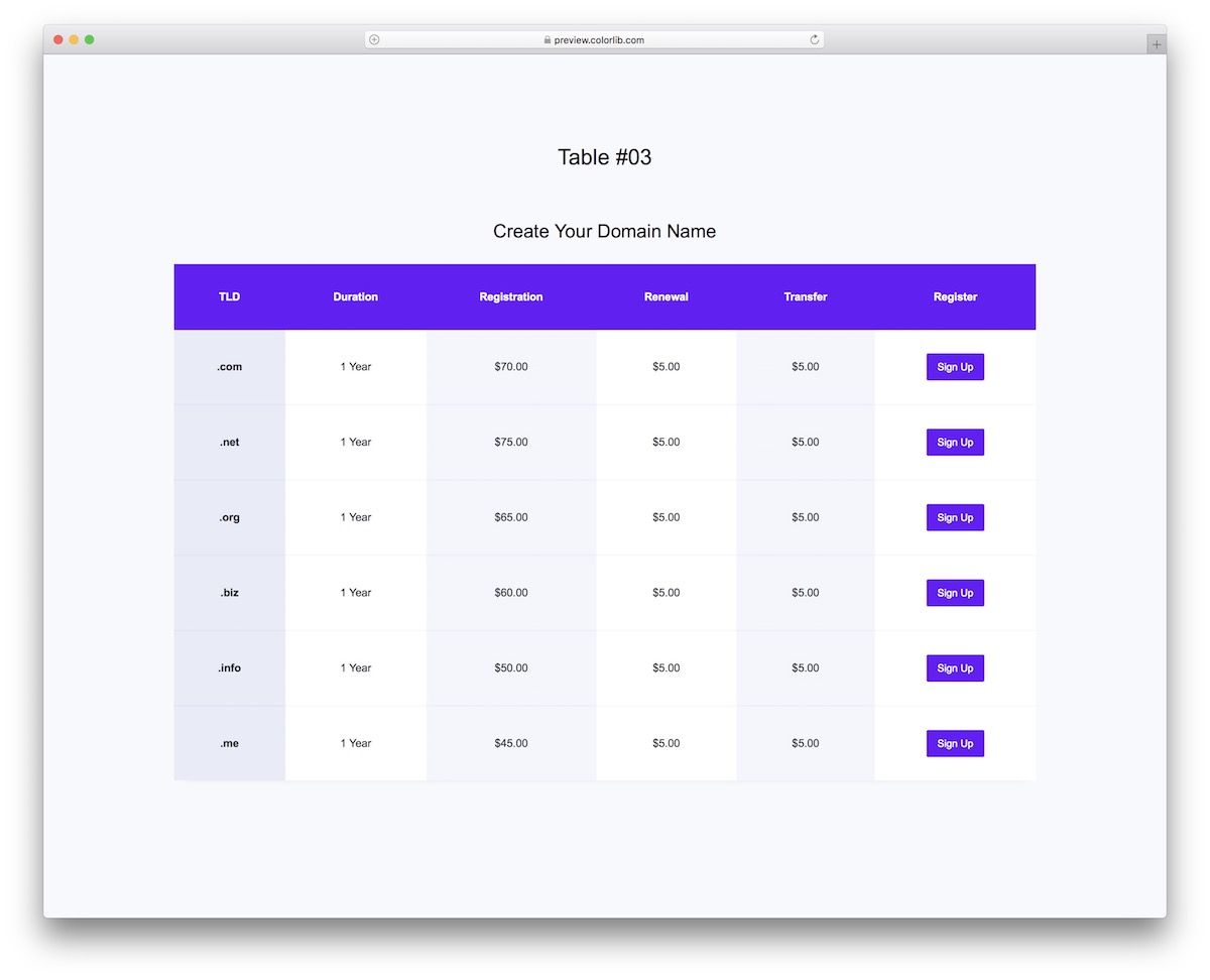
FreeBootstrap-ready · Best for: Domain and hosting price lists
A registrar price grid: TLD, duration, registration, renewal and transfer columns, with a sign-up button on every row. Rows for .com, .net, .org, .biz, .info and .me are already filled in, so it is a text edit away from a working price list.
9. Table V04
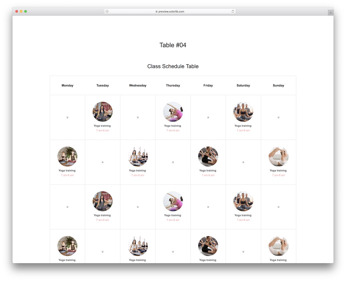
FreeBootstrap-ready · Best for: Weekly class and studio timetables
A Monday-to-Sunday schedule grid with images and times in each slot, rather than a row-per-record list. Previous and next month controls are drawn but not wired up, so the date logic is yours to supply.
10. Table V05
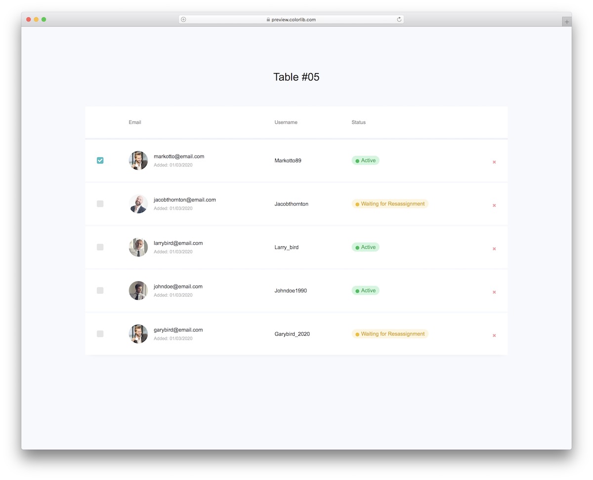
FreeBootstrap-ready · Best for: User administration screens
A user list with the admin controls already in place: select checkbox, avatar, email, username, status, and a delete action. The status column is the piece most user tables need and most free snippets leave out.
11. Shopping Cart Table V06
FreeBootstrap-ready · Best for: Shopping cart pages
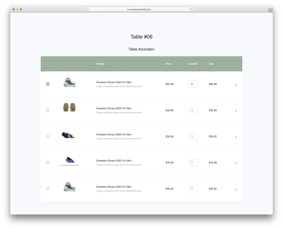
A free shopping cart HTML template rather than a data table — product thumbnail, name, price, a quantity control, line total, and a remove button. Row checkboxes let a shopper act on several items at once, which is usually the part left as an exercise. For complete carts with working totals, coupons and checkout, see our free HTML shopping cart templates.
The cart page is plain HTML and CSS with no JavaScript, so it drops into any eCommerce theme, with Bootstrap or without it. Hook the quantity and remove controls up to your own store logic.
12. Table V07
FreeBootstrap-ready · Best for: Dark interfaces
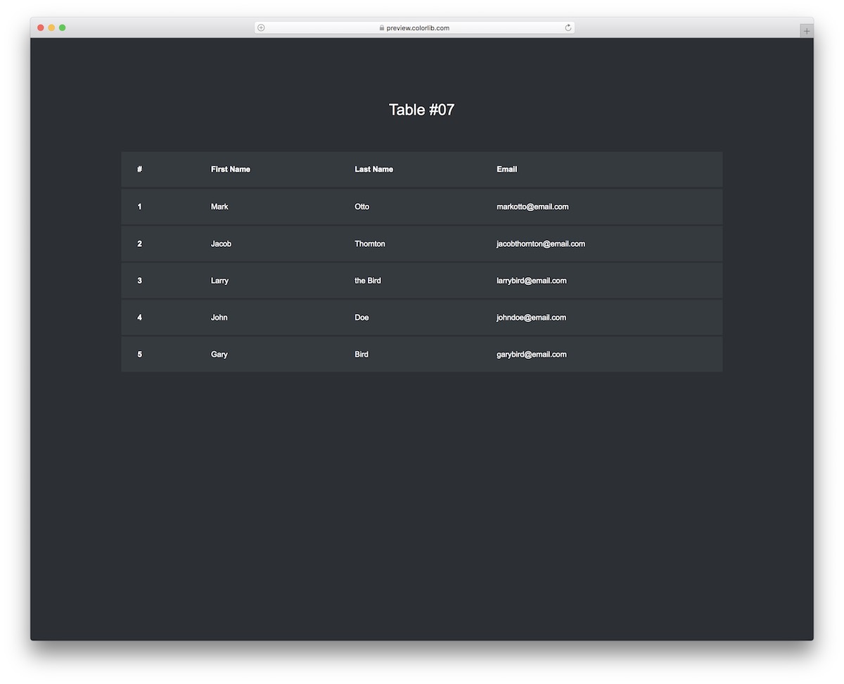
The dark counterpart to V01 — same four columns, inverted palette, row hover. Nothing is layered on top of that, which makes it the cleanest dark starting point on this page.
13. Table V08
FreeBootstrap-ready · Best for: Detail on demand without a modal
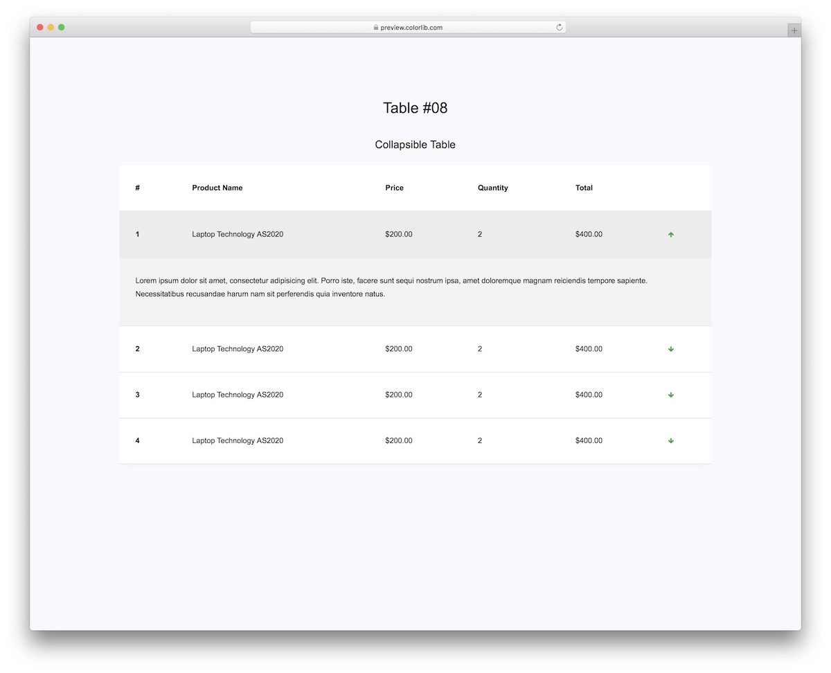
Rows expand in place: click the arrow and an accordion panel opens underneath with the extra product detail. The visible columns stay at five — product, price, quantity, total — so the table reads cleanly until someone asks for more. The rows open and close with a few lines of vanilla JavaScript instead of Bootstrap’s.
14. Table V09
FreeBootstrap-ready · Best for: Order and invoice status tracking
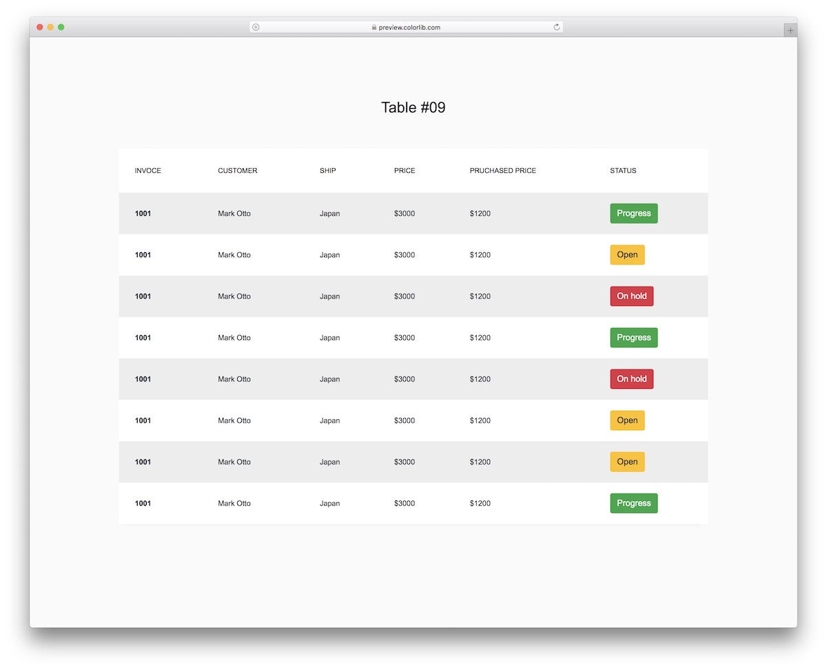
Status is the point here: color-coded pills for in progress, open, and on hold sit in the final column. Invoice number, customer, shipping and two price columns fill out the rest, matching how a back-office order list is usually read.
15. Table V10
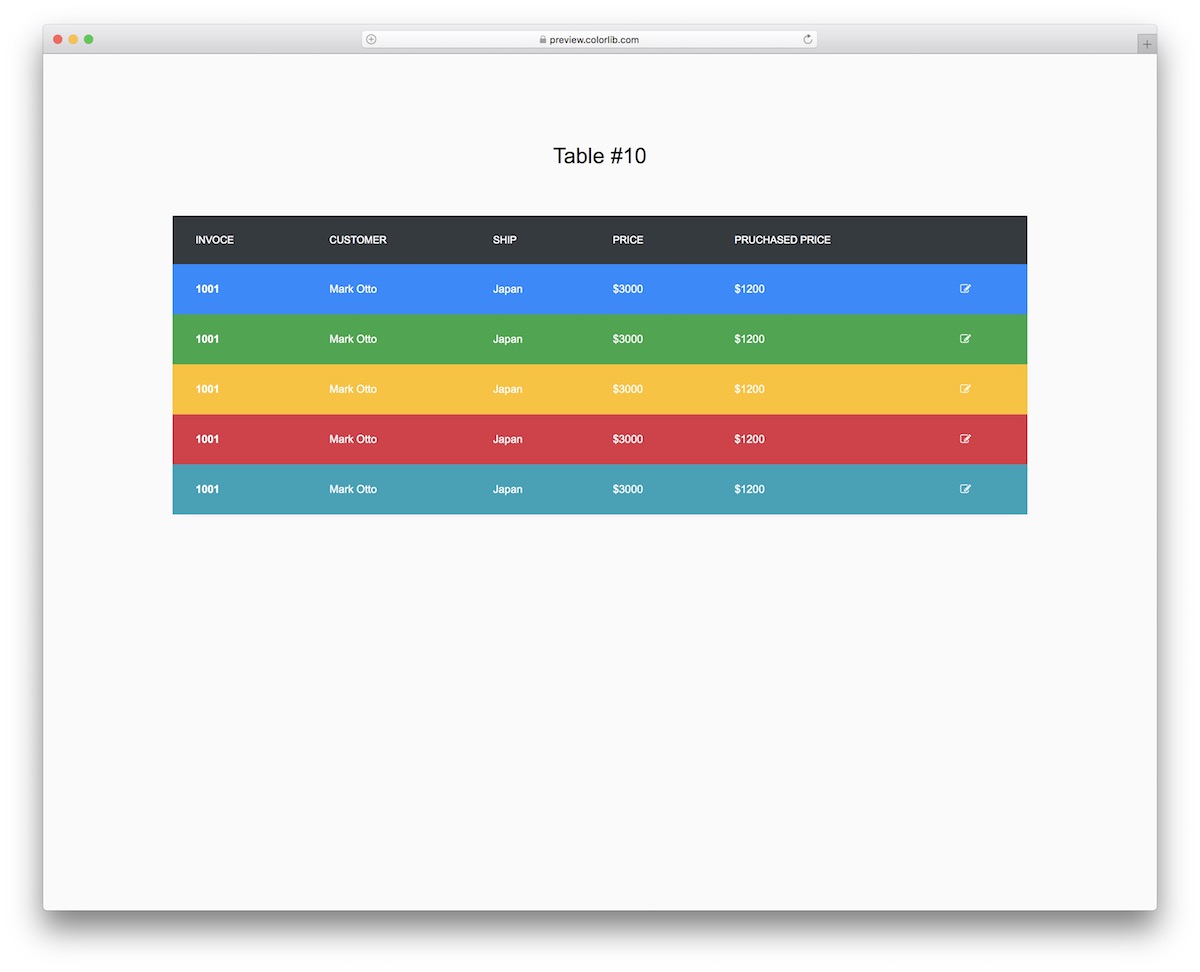
FreeBootstrap-ready · Best for: Colour-coded record lists
Every row carries its own color, so category is legible before you read a word of it. Five rows across six colors with an edit icon at the end — deliberately loud, and the least neutral design in the set.
16. Table V11
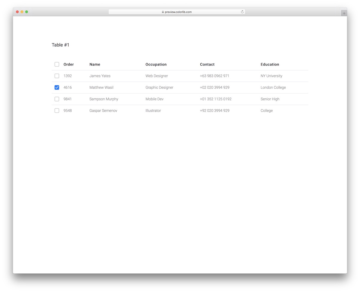
FreeBootstrap-ready · Best for: Minimal lists with bulk selection
Stripped to five columns — order, name, occupation, contact, education — with a select-all checkbox in the header. There is no hover or status treatment to unpick, which makes it the easiest one here to restyle into an existing design. The select-all box works without jQuery, and the download fell from 2.3 MB to 128 KB.
17. Table V12
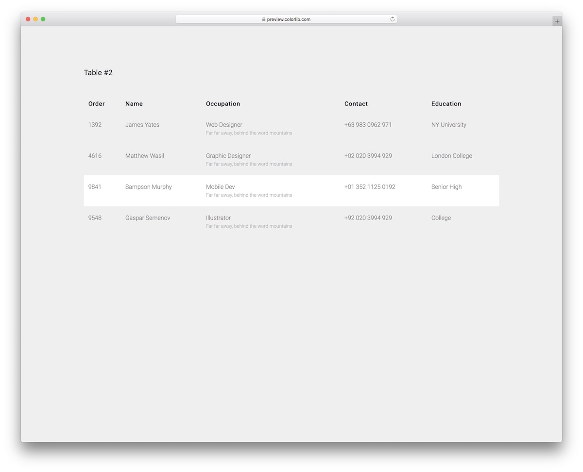
FreeBootstrap-ready · Best for: Read-only directories and reports
The same five columns as V11 with the checkboxes dropped and a full-row hover highlight in their place. Nothing is selectable, so it suits screens where rows are read rather than acted on. It needs no JavaScript at all.
18. Table V13
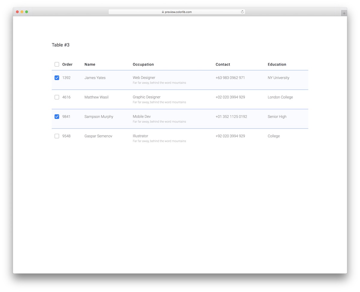
FreeBootstrap-ready · Best for: Multi-select workflows
Checked rows keep their highlight after the cursor moves away, so the current selection stays visible while you scroll. Select-all sits in the header, and the columns match V11 and V12 if you want consistent markup across several screens.
19. Table V14
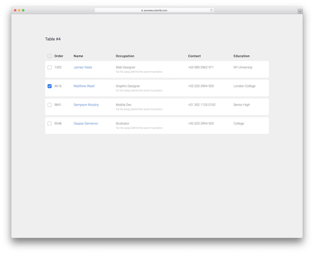
FreeBootstrap-ready · Best for: Contact and student directories
Rounded corners and spacing between rows make it read as a stack of cards rather than a grid. Names are clickable, every row has a checkbox, and the occupation, contact and education columns suit member or student records.
20. Table V15
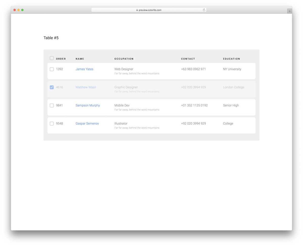
FreeBootstrap-ready · Best for: Working through a queue of records
Ticking a row dims it, so handled records recede and what is left to do stands out. The design is otherwise identical to V14 — same spacing, same rounded rows — with a background panel added behind the table.
21. Table V16
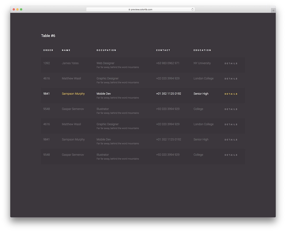
FreeBootstrap-ready · Best for: Dark dashboards with drill-down
Dark by default, with a hover state that switches row text to white and yellow so the active row is unmistakable. A details link closes each row, ready to point at a record page.
22. Table V17
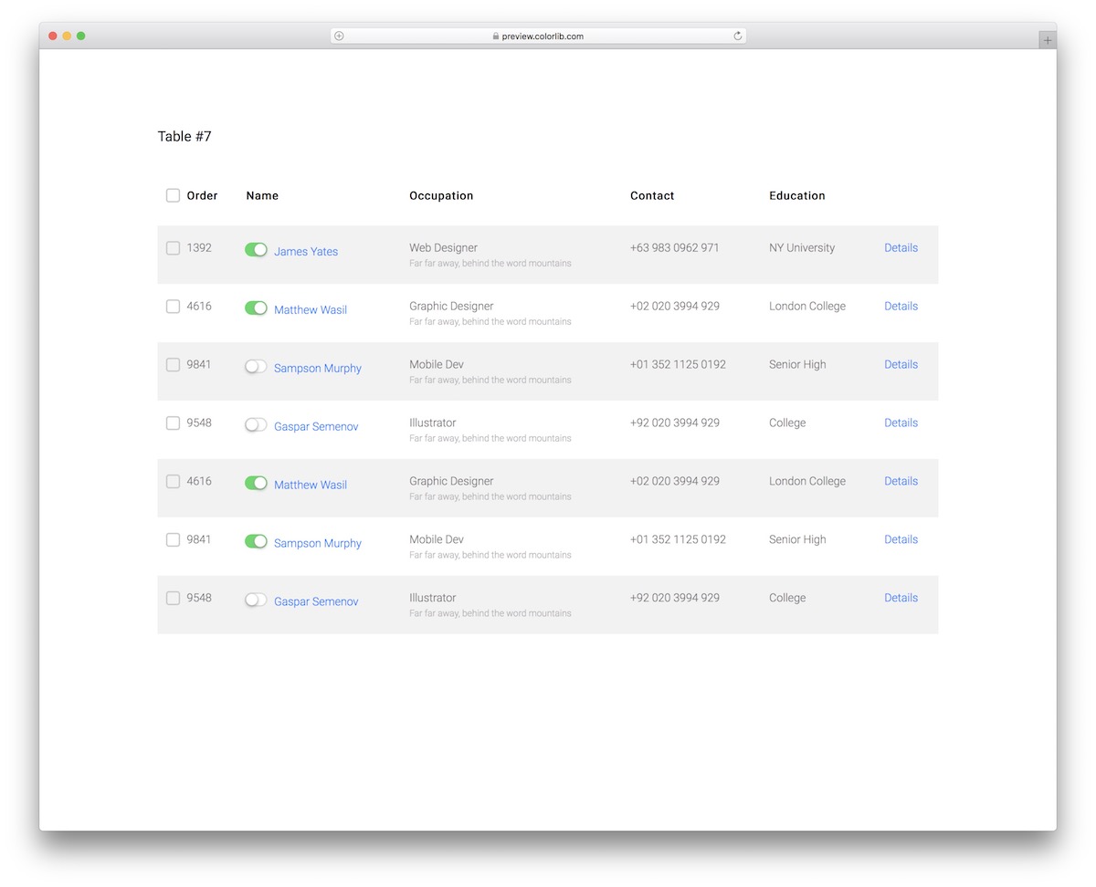
FreeBootstrap-ready · Best for: Permission and settings tables
Toggle switches, not just checkboxes: each row carries an animated on/off control alongside its selection box. That makes it the right shape for permission grids and feature settings, where every row has a state to flip.
23. Table V18
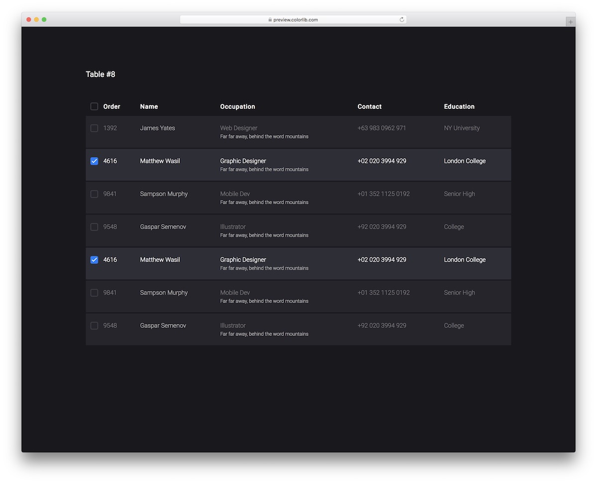
FreeBootstrap-ready · Best for: Dark interfaces with multi-select
The dark treatment with selection built in — ticking a row keeps it highlighted, and hover previews the same effect. Fourteen rows come populated, enough to see how the highlight behaves in a list long enough to scroll. Select and deselect-all is a few lines of vanilla JavaScript.
24. Table V19
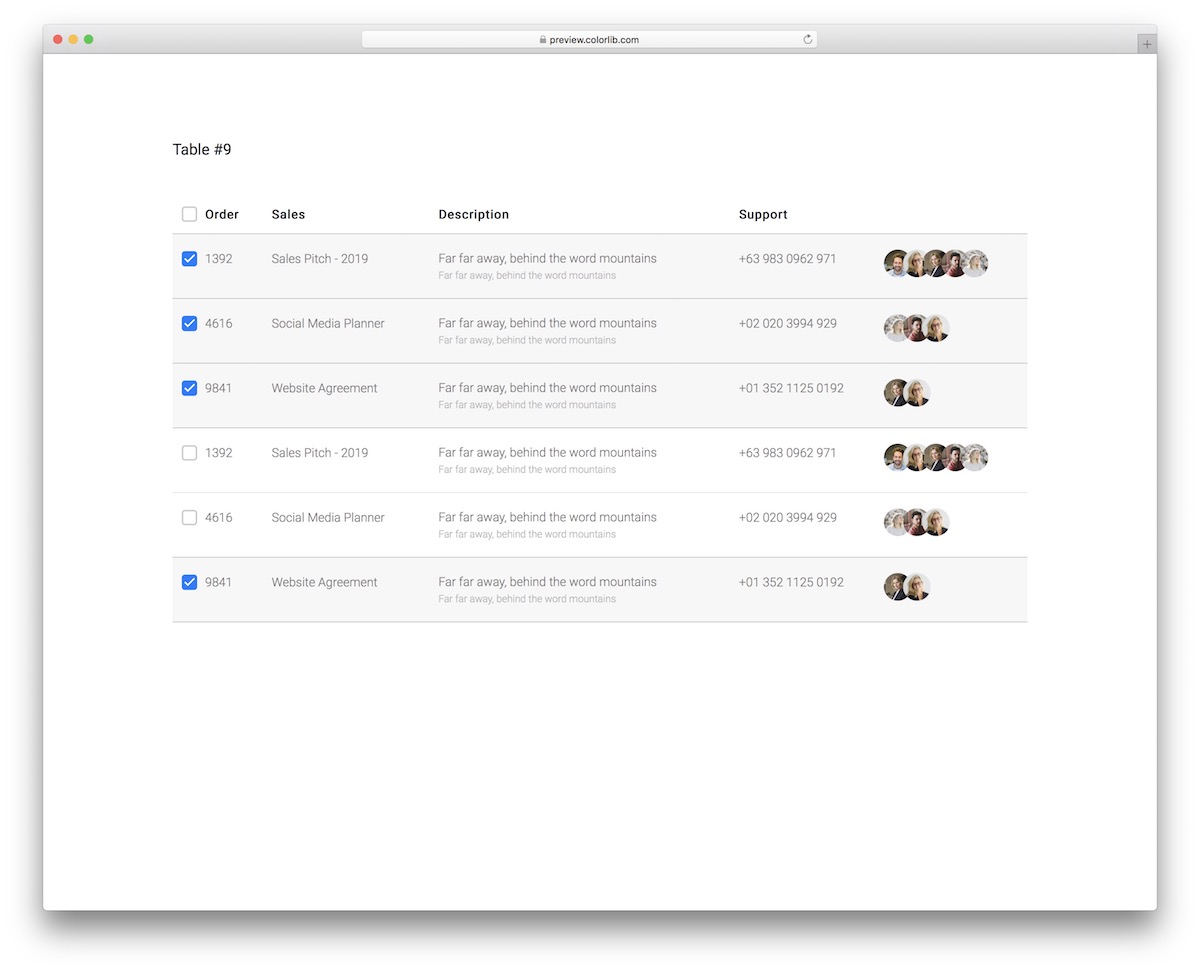
FreeBootstrap-ready · Best for: Sales and support team rosters
Built around people rather than records: avatars lead each row, with order, sales, description and support columns after them. On mobile it scrolls horizontally rather than collapsing, so a full row stays intact if you swipe across it.
25. Table V20
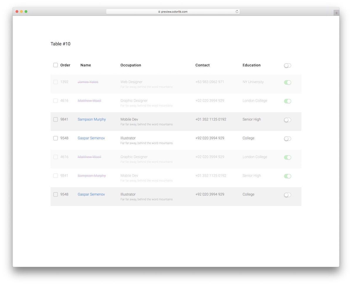
FreeBootstrap-ready · Best for: Enable and disable status lists
Every row has an active or inactive toggle, and one control in the header flips them all at once. Alternating gray and white row backgrounds keep long lists readable while you work down them.
Bonus CSS3 Tables
26. Bootstrap CSS
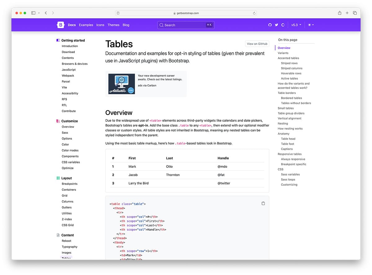
FreeBootstrap · Best for: Projects already running Bootstrap
Not a template but the framework documentation itself — striped, bordered, hoverable, compact and responsive table variants are all plain class names. Because the styling comes from a front-end framework the project already loads, these examples add no extra CSS and inherit whatever theme you have applied.
27. Adaptive Pricing Table
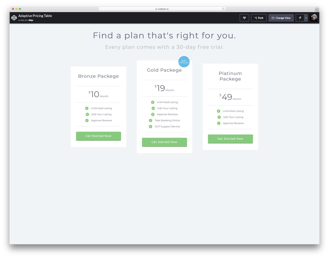
HTML · Best for: Comparing service or hosting plans
A pricing comparison rather than a data table, with plans across the top and features down the side. It lives on CodePen, so the HTML and CSS sit side by side and copy straight out; for WordPress sites, pricing table plugins cover the same ground without code.
More info / Download28. CSS3 Pricing Table
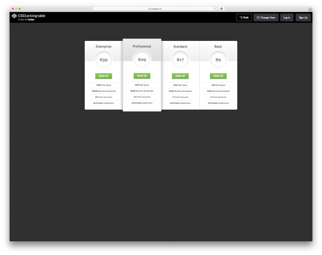
HTML · Best for: Highlighting a recommended plan
A pricing layout with an outline treatment that marks one tier as the recommended choice. Also a CodePen demo, so the markup and styles are there to copy and adapt; confirm the author license before commercial use.
29. Nutrition Facts Table in HTML & CSS
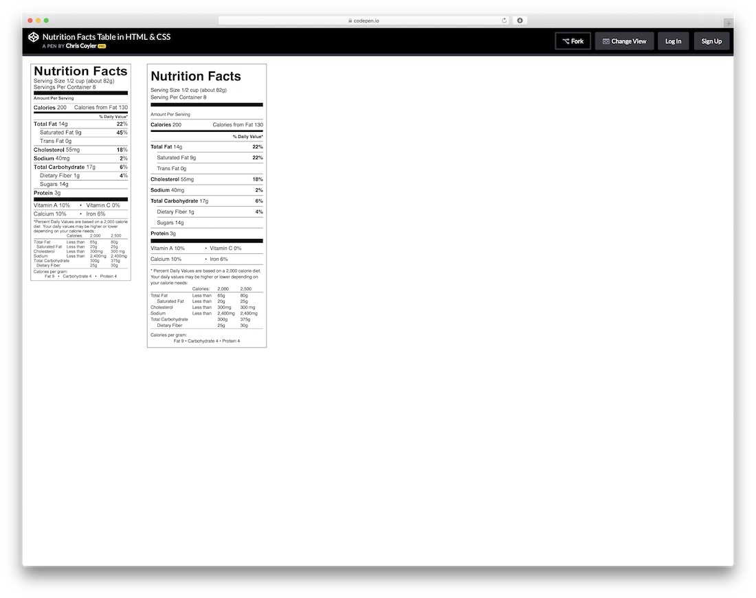
HTML · Best for: Food, recipe and product data
A faithful reproduction of the regulated nutrition label — rules, indentation and all — in plain HTML and CSS. It solves a layout most sites fake with an image, which makes it worth pointing your product or recipe output at; check the pen for its license first.
More 2026 table snippets from Colorlib
Tables inside real components from our 2026 snippets: a feature comparison table, a paginated orders table, a cart line-item table, an availability grid and a rating matrix. All use real table markup with headers.
Pricing Table V03: Full feature comparison table
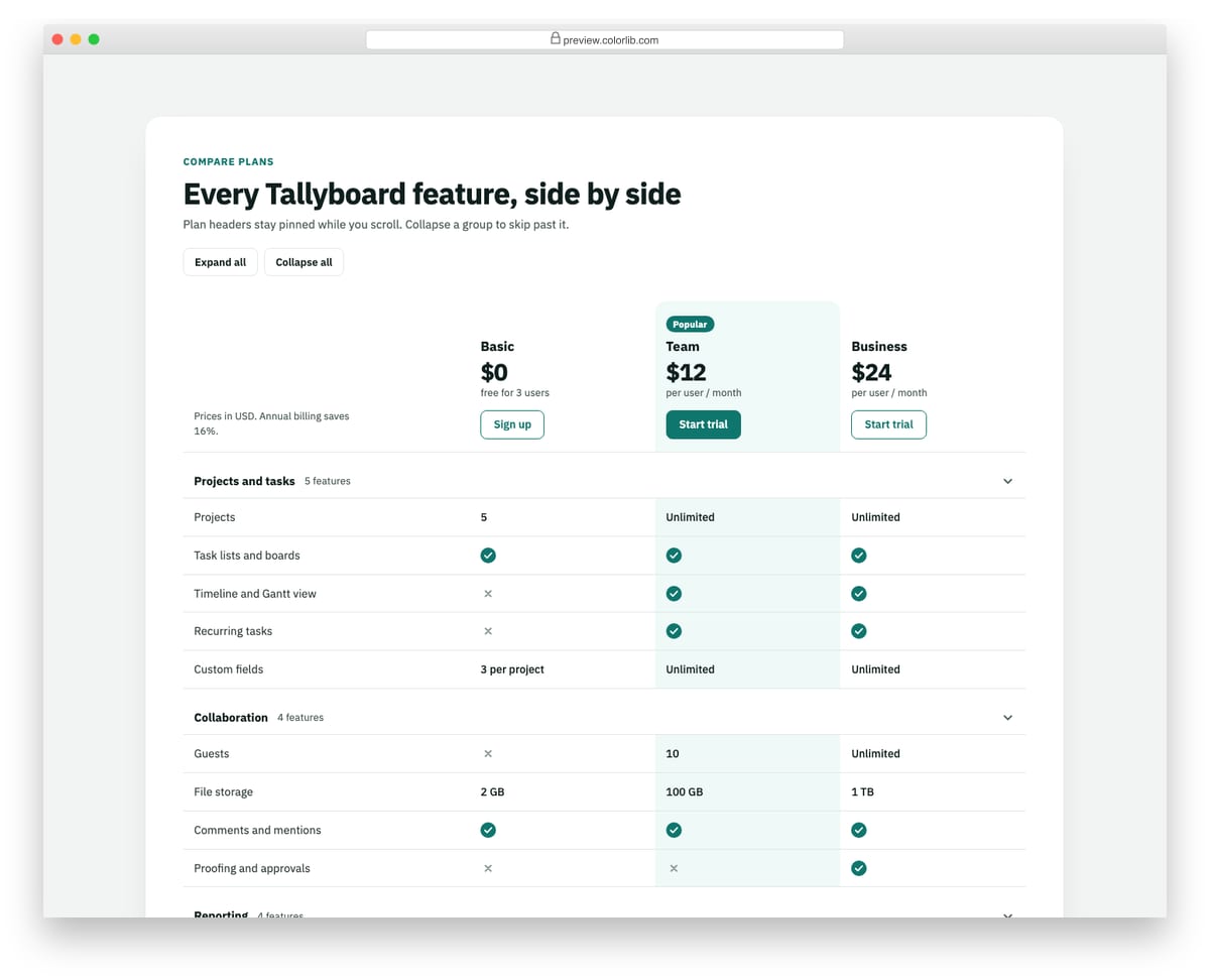
A plan comparison built as a real table with a caption, column and row headers, and headers attributes on every cell. The plan header row stays pinned while the page scrolls, and features are grouped into sections that collapse with disclosure buttons. Check and cross icons carry visually hidden text so screen readers hear Included or Not included.
Best for: pricing pages that need a detailed plan comparison below the plan cards. Plain HTML and CSS with a few lines of vanilla JavaScript, a 267 KB download, and it works on its own or inside a Bootstrap 4, 5 or 6 project.
Pagination V06: Data table pagination with rows per page, range text and first/last buttons
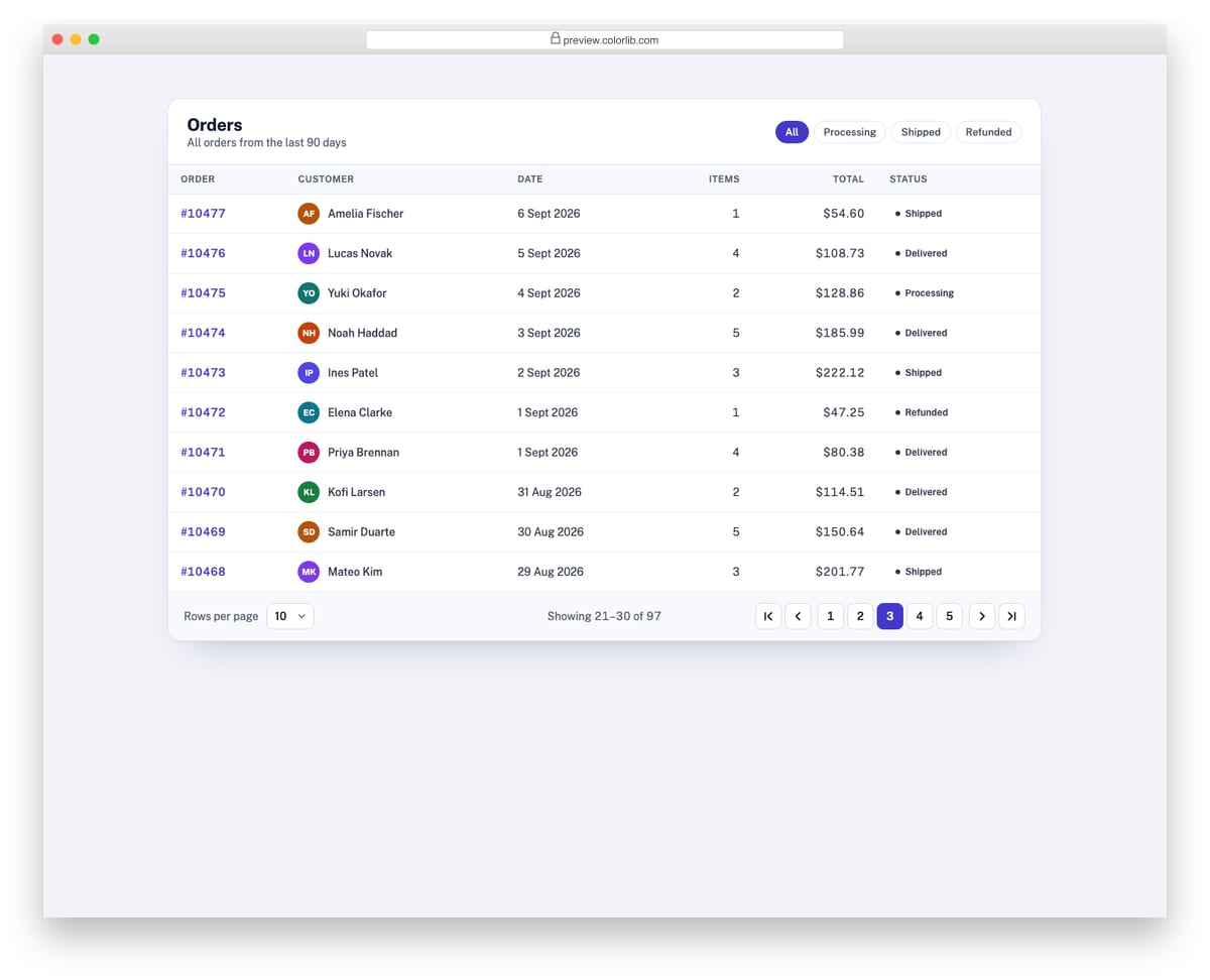
A table footer for an orders list of 97 rows, with a rows-per-page select, a "Showing 21–30 of 97" range and first, previous, numbered, next and last buttons. Changing the page size keeps the first visible row on screen, and the range line is a live region. The table body is rendered from a data array, so every control really changes what is shown.
Best for: admin dashboards, CRM and e-commerce back offices, reporting tables. Plain HTML and CSS with a few lines of vanilla JavaScript, a 185 KB download, and it works on its own or inside a Bootstrap 4, 5 or 6 project.
Shopping Cart V01: Classic cart page with line-item table and order summary sidebar
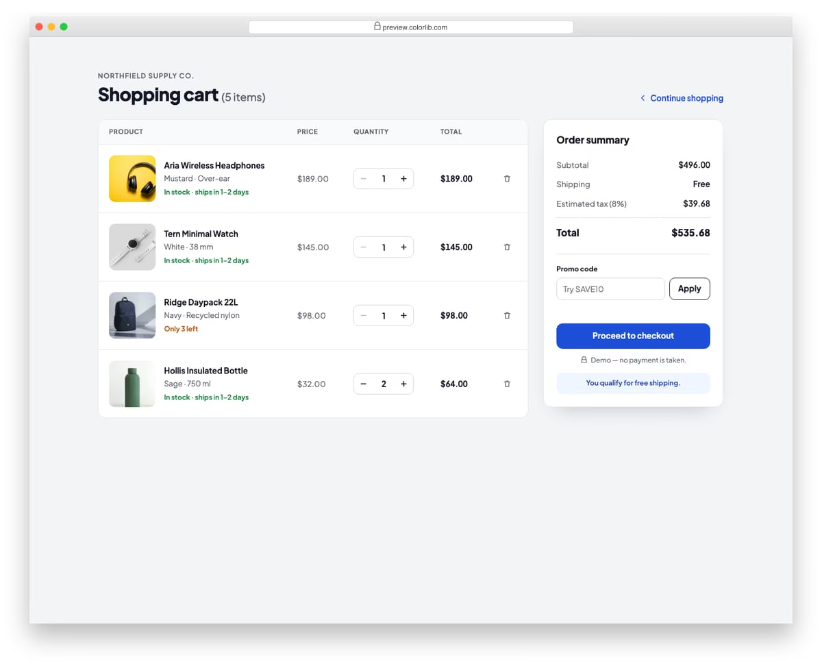
A full shopping cart page with a table of line items showing product photo, name, variant, unit price, quantity stepper, line total and a remove button. A sticky order summary sidebar lists subtotal, shipping, estimated tax and total, and has a promo code field where the demo code SAVE10 takes 10% off. On phones the table rows restack into compact cards, and removing the last item shows an empty-cart state.
Best for: online store cart pages. Plain HTML and CSS with a few lines of vanilla JavaScript, a 312 KB download, and it works on its own or inside a Bootstrap 4, 5 or 6 project.
Job Application Form V08: Volunteer application with a days by morning/afternoon availability grid
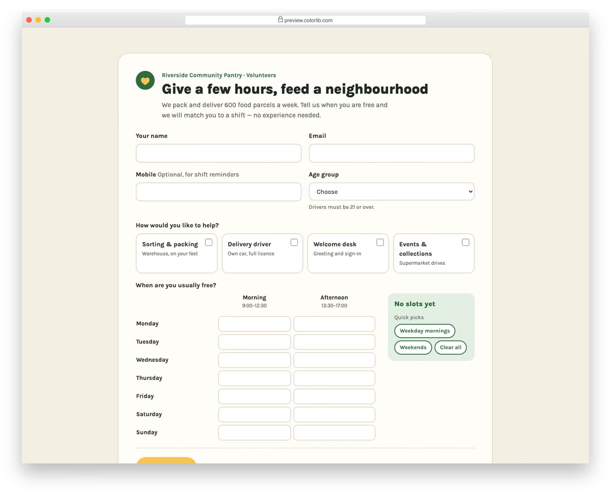
A warm volunteer sign-up form for a made-up community food pantry. After contact details and an age group, volunteers pick the roles they would like as checkbox cards and tick free slots in a weekly grid of days by morning and afternoon. Quick-pick buttons fill weekday mornings or weekends, and a tally shows the number of slots and hours offered.
Best for: charities, community groups, events and shift-based volunteer programmes. Plain HTML and CSS with a few lines of vanilla JavaScript, a 188 KB download, and it works on its own or inside a Bootstrap 4, 5 or 6 project.
Survey Form V05: Event feedback form with a matrix of sessions by rating columns
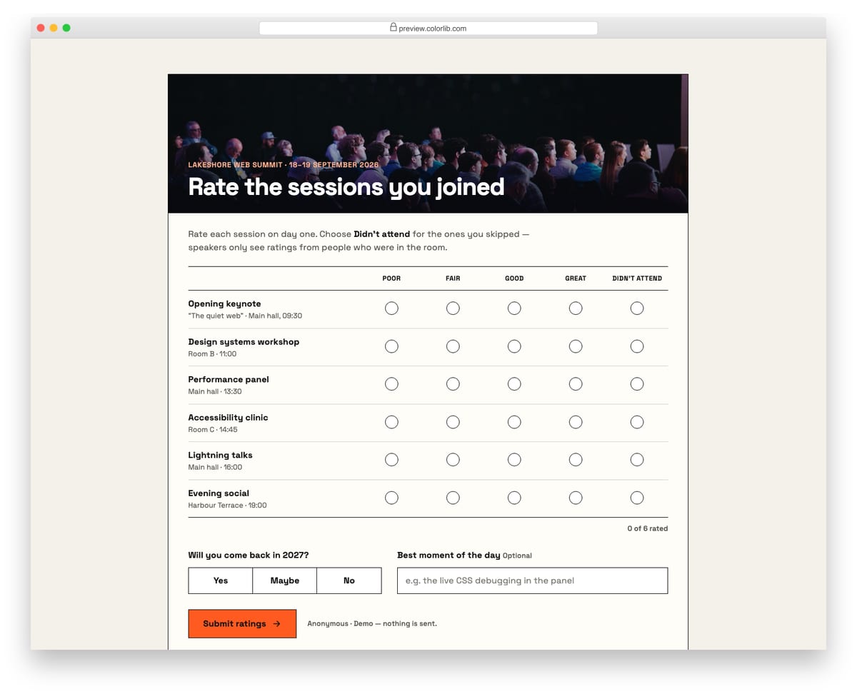
A conference feedback form with a photo header and a rating matrix: each session is a row and the columns run from Poor to Great plus Didn't attend. On desktop it reads as a grid with column headings; on phones every row turns into a card of labelled buttons. A return-next-year question and an optional best-moment field sit below.
Best for: conference, workshop and course feedback where many items share one scale. Plain HTML and CSS with a few lines of vanilla JavaScript, a 230 KB download, and it works on its own or inside a Bootstrap 4, 5 or 6 project.
How to choose an HTML table template
Plan for narrow screens. A wide table has two good options on a phone: scroll sideways and keep rows intact, as Table V02 and Table V19 do, or restack each row into a card, as Shopping Cart V01 does. Scrolling suits data people compare across rows; cards suit rows people act on one at a time.
Keep context while scrolling. In long or wide tables, a fixed header or first column stops people losing track of what a value means. Fixed Header Table and Fixed Column Table do this without any JavaScript.
Use real table markup. Screen readers announce row and column headers only when the table uses th elements. Pricing Table V03 is a good model, with a caption, row and column headers and hidden text on its check and cross icons. Responsive Table V2 is built from div rows, so add ARIA table roles if it has to be read as a table.
Don’t rely on colour alone. Table V09 pairs each status colour with a text label such as open or on hold. Keep that pairing when you restyle a table, so the meaning survives for colour-blind readers and in print.
Frequently Asked Questions
How do I make an HTML table responsive?
Wrap the table in a container with overflow-x: auto so it scrolls horizontally on small screens, or restructure rows into stacked cards with CSS grid or flexbox at a mobile breakpoint. Several templates above (Responsive Table V1 and V2) ship with this behavior built in.
Can I use these table templates without JavaScript?
Yes. Since the September 2026 rebuild, most of the Colorlib tables here, including the fixed-header and fixed-column examples, need no JavaScript at all. The few that do (select-all checkboxes, expandable rows, the row-and-column highlight) use a few lines of vanilla JavaScript with no jQuery. For a frozen header or first column in your own markup, position: sticky on the th or first cell does the job in a few lines of CSS.
How do I add sorting to an HTML table?
Lightweight options include the sorttable script or List.js; for data-heavy admin interfaces, DataTables remains the standard. All of them work on top of any template on this page, because the markup stays plain table elements.
Are these table templates free for commercial use?
The Colorlib-built tables are free for personal and commercial projects under CC BY 3.0, as long as you keep the credit link. CodePen-sourced examples follow their authors’ licenses — most are MIT, but check the individual pen before shipping.
Start with Table V01 for a plain data list, Fixed Header Table for long lists or Table V05 for a user admin screen. For complete cart pages, see our shopping cart templates, and for plan comparisons, our Bootstrap pricing tables.

Related Posts



Beautiful tables, especially the one with gradient background
I love these tables, simple yet elegant~!
thank you very much. i use one of them in my website. it’s superb
Can someone explain to me how the third table getting blured?
Which one did you mean by third?
The Fade and Blur on Hover Data Table one
You apply 2 different hover effects as text-shadow. First one applies to the entire table once you hover on it that blurs the all text except the line on which you are hovering your mouse. That part comes from the second line of code. It simply applies text-shadow that doesn’t look blurry. Also color plays some role in this. Here is the entire code for that:
tbody:hover td { color: transparent; text-shadow: 0 0 3px #aaa; } tbody:hover tr:hover td { color: #444; text-shadow: 0 1px 0 #fff; }use bootstrap css for table design
Yeah… If you want your table to look the same as any other Bootstrapped website. NOT!!!
Thanks a lot. However I may need a bit more help. I used one of the tables via wordpress. I pasted the html codes into the page text-editor. Also I pasted the css codes to the style.css file. But the table does not seem to have style effects. Only a raw table. What did I do wrong?
I’ll appreciate any help.
Ok, after some time it was fixed, now it works proplerly, thanks again.
Hello,
Very nice Tables… We find this one “Fade and Blur on Hover Data Table” is very perfect for public Stampdata.
Thanxx from Berlin
Thanks a lot, I was looked for these temples, really helpful for me.these templets save my time.
regards
Very nice and basic example which can be easily incorporated into existing code. Many Thanks!!
Simple tables yet gives a catch for the eyes of the visitors. Your examples are great. Thanks for bringing this into your article..
“Fixed Header Table by Colorlib” is not responsive.
It wasn’t supposed to be responsive. Combining responsiveness while having a fixed header layout is a very difficult challenge. Since our templates are open source we would very much appreciate if you could create and share a responsive version of it.
Very nice CSS table list! You solve my problem thank you so much!
Hi – I used this as my table – but I would like to have tab above the table that indicate the years. I don’t want to list all results in one table but broken into several years – I was not able to find an example how to do that.
Which of the templates do you mean?