18 Best Recruitment Websites (Examples) 2026
Welcome to our comprehensive list of the best recruitment websites, which deliver a significant dose of creativity.
You want to create a site with numerous actionable elements so that visitors can take action and find what they’re looking for as quickly as possible.
Pro tip: Call-to-action buttons and search forms (preferably above the fold) work excellently for recruiting and staffing sites.
However, you can see how established brands do it by checking the list below. Take notes and build a comfortable, epic business website for your recruitment agency.
A job board WordPress theme is one way to build a great website.
Best Recruitment & Staffing Websites
1. Tattersall Recruiting
Built with: Divi
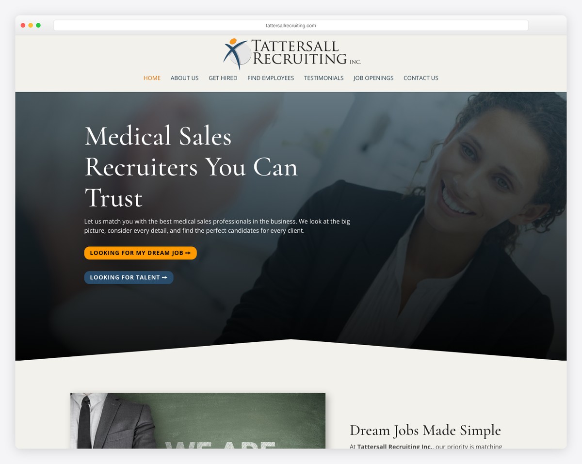
Tattersall Recruiting is an elegant and professional recruitment website example with a minimalist touch. It features CTA buttons in the hero area, allowing potential professionals to take immediate action.
Moreover, the footer has a contact form with additional contact details and links. Additionally, while the home page features only one client testimonial, it dedicates an entire page to showcasing more for social proof.
What stands out: Build trust by integrating testimonials (even include logos of clients you work(ed) with) into your page.
2. Zensho Agency
Built with: Elementor
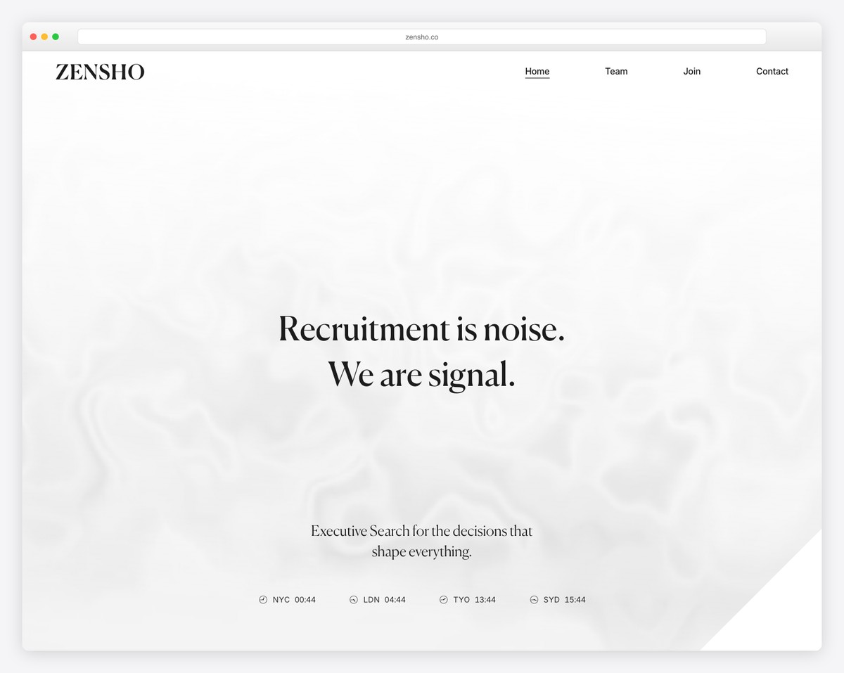
Zensho Agency features a clean header with a search icon, logo, and hamburger menu icon. The search bar and menu open in a full-screen overlay for the convenience of visitors.
The web design is simple, with plenty of white space to ensure excellent readability. Furthermore, the footer features four columns, including phone numbers, a menu, and social media links.
What stands out: Use a hamburger menu icon to keep the header simpler.
If you build your page with WordPress, you may be interested in reading our extensive Elementor review.
3. JDM Talent
Built with: Divi
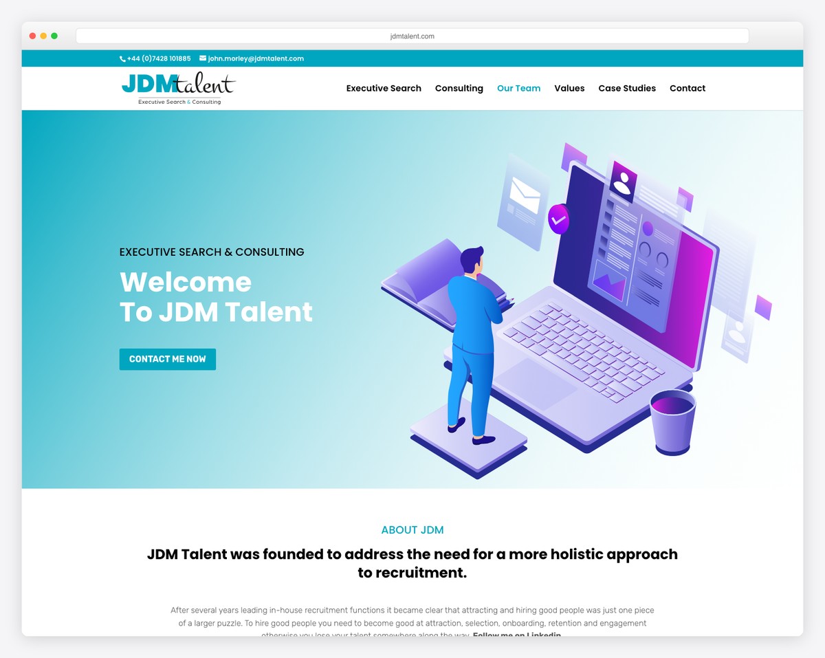
JDM Talent creates a captivating experience with scrolling animations that keep their professional look catchier.
This is a one-page website with a floating header and top bar, so you can navigate through the page much easier.
What stands out: A single-page website layout can improve your overall user experience and contribute to your business success.
4. Janou
Built with: Squarespace
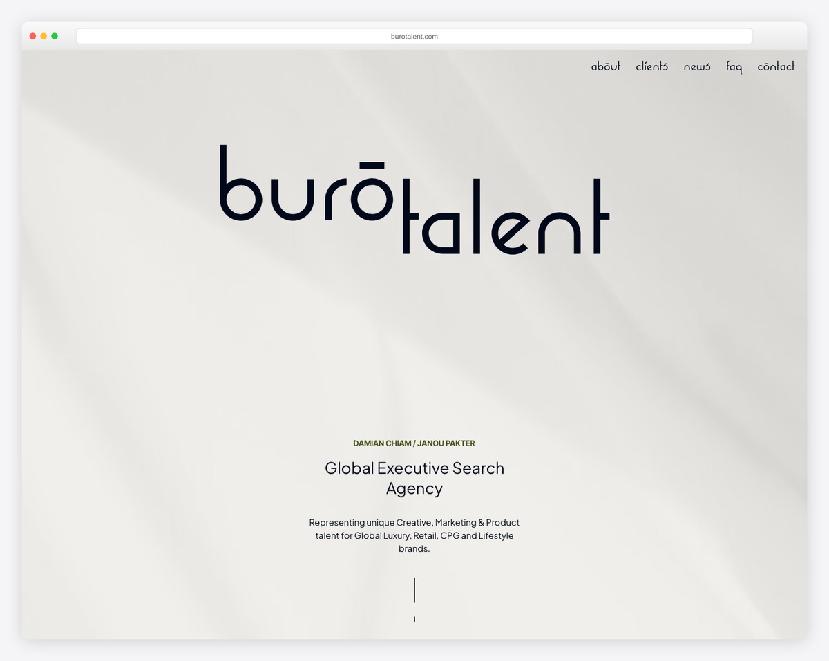
Janou is a minimalist website that makes the content pop nicely. The header and the site’s base have a white background, while the footer, with a dark one, makes it more dynamic.
The navigation features a drop-down menu, and the footer includes business details, social media icons, and a search bar. Janou’s recruitment website features a client testimonial slider and a link to read more reviews on a dedicated review page.
What stands out: Impress your visitors with a minimalistic and clean site.
Don’t forget to view our list of the ultimate Squarespace website examples.
5. Marble Recruitment
Built with: Liquid Theme
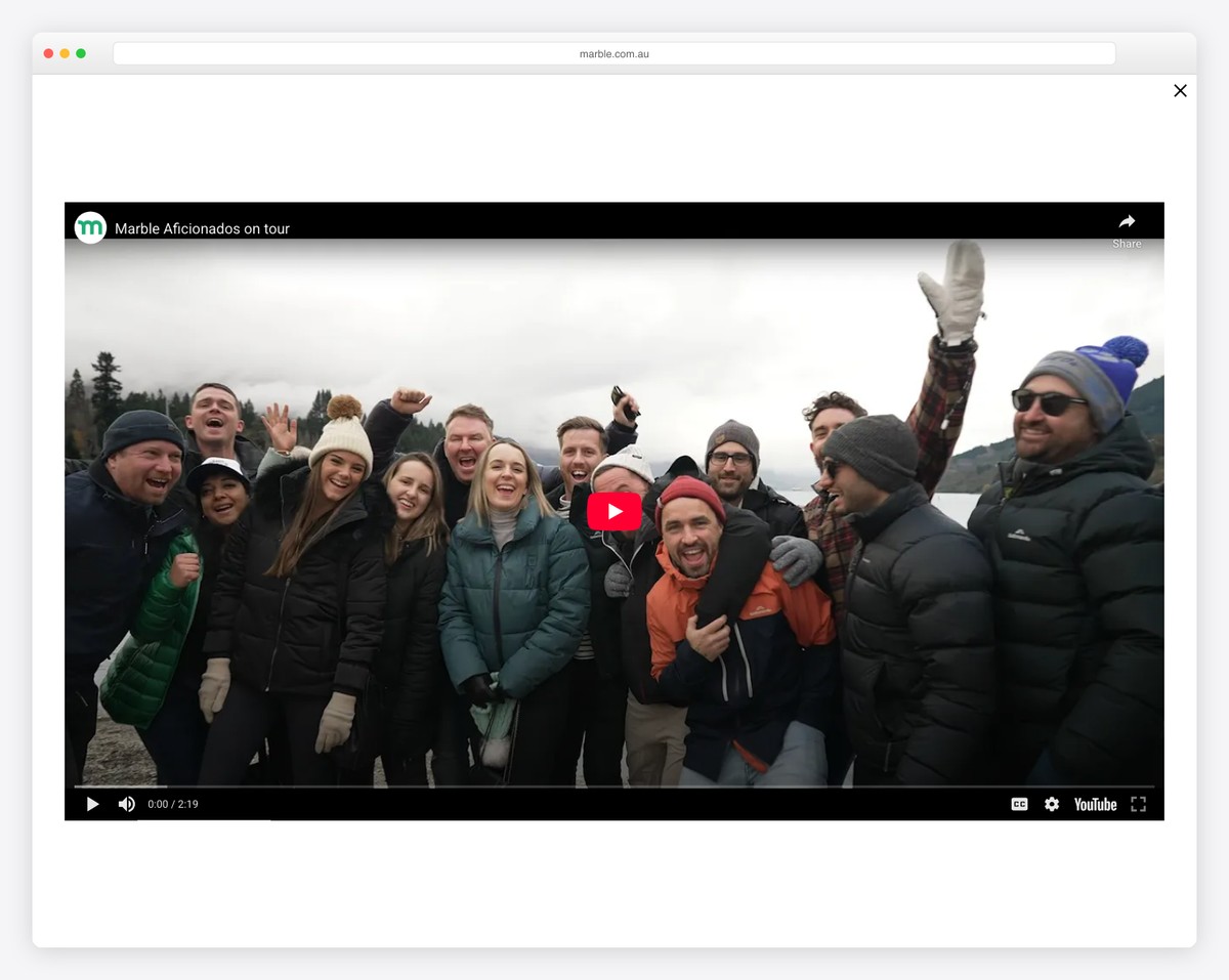
The number one thing that makes Marble Recruitment stand out is the massive video background above the fold. The hero section also features a job search form, allowing everyone to search for a vacancy immediately.
The interesting part is the header that sticks. It removes the navigation but retains only the two CTAs, social, and email icons.
What stands out: Add CTA buttons in the floating header so they’re always accessible. A video background can also make your recruitment website more engaging.
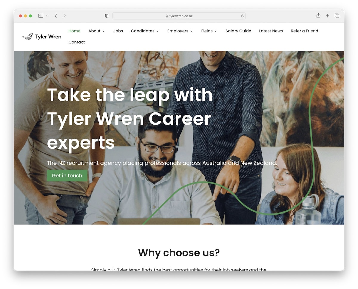
6. Kiwi Careers
Built with: Divi
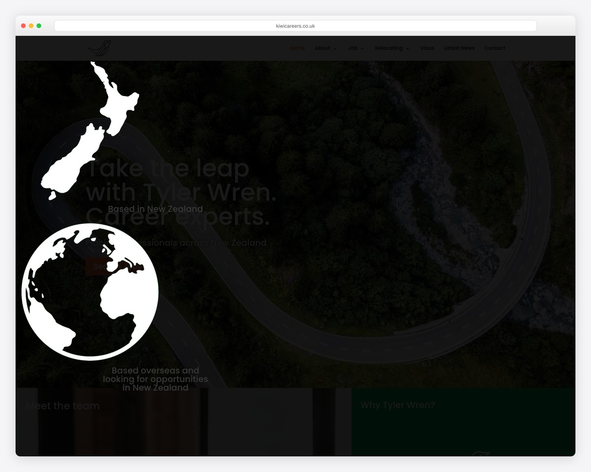
While Kiwi Careers doesn’t have a search form like Prios Experts, they still added a CTA button that directs you straight to the contact form.
However, they also have an individual “job search” page with different tags for more relevant results. What’s unique about Prios Experts is that every internal page has a large featured image which adds a nice touch.
What stands out: Include the most important CTA button above the fold.
7. Clarity Recruiting
Built with: Underscores
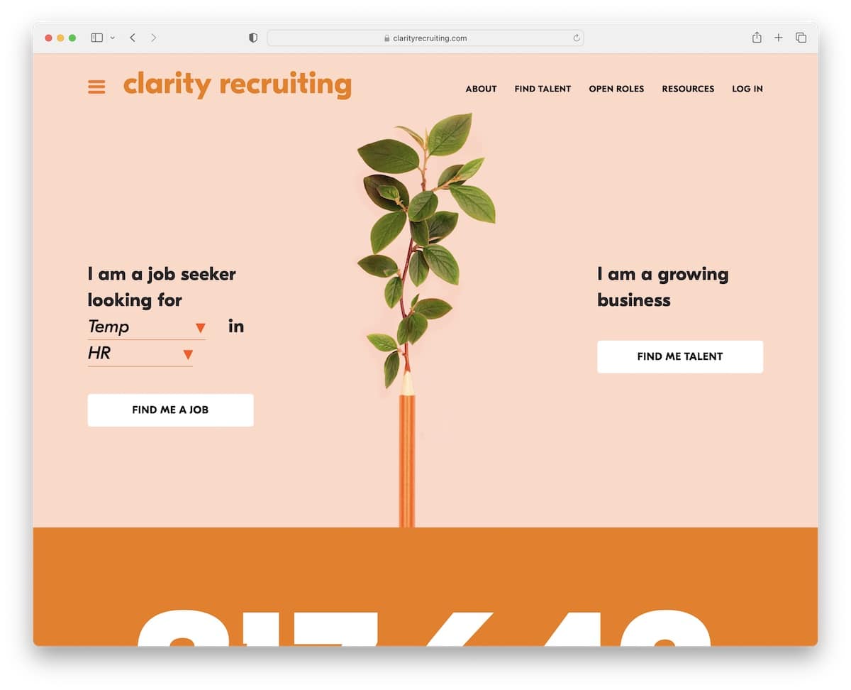
Clarity Recruiting launches a newsletter subscription popup soon after it loads, which helps grow their email list.
This recruitment website has a minimal yet creative design with a large animated stat number promoting how many jobs were landed through their service.
They also have a cool two-part hero section for job seekers and growing businesses.
What stands out: Do you want to grow your email list? Integrate a popup form to capture visitors’ attention.
8. Freshminds
Built with: Ruby On Rails
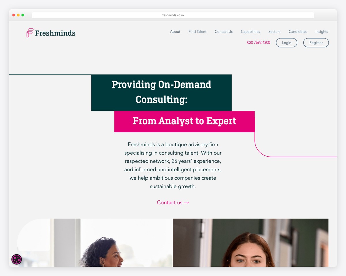
The simple line that flows through Freshminds’ layout is a smart element that makes the page more scrollable (it makes you “want” to follow the line).
This recruitment website’s header is straightforward, featuring login and registration buttons, while the footer comprises multiple columns with numerous additional links.
What stands out: Use unique elements and details to make your professional website more engaging to scroll through.
9. Stopgap
Built with: Ruby On Rails
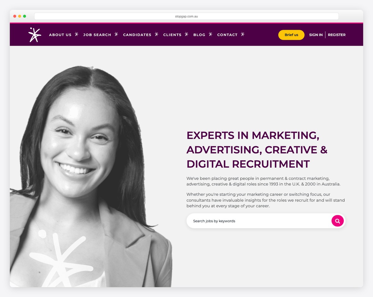
Stopgap has a large hero section with a title, text, and a job search bar. The sticky header features a drop-down menu, social media icons, and links for profile sign-in and registration.
Moreover, they have two CTAs for uploading CVs and submitting vacancies. There’s also a brands slider, a latest job carousel and testimonials, so you get a quick overview of everything.
What stands out: Use a slider or carousel to showcase the latest jobs without occupying excessive website space.
10. Pivotal Talent Search
Built with: Unbound Theme
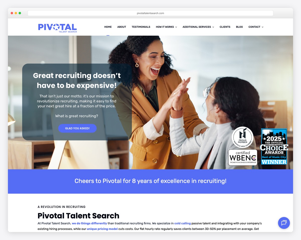
Pivotal Talent Search is a recruitment website example with a professional and clean appearance.
The header is basic with drop-down functionality, and the footer has three columns, including contact details and a newsletter subscription widget.
Pivotal Talent Search also has a live chat widget in the bottom right corner for quick answers.
What stands out: Boost your customer service with a built-in live chat.
11. iET SA
Built with: Craft CMS
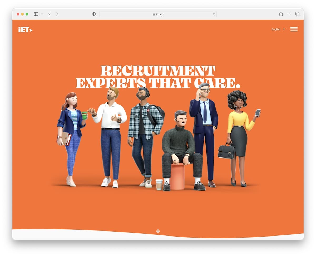
iET SA has a fun element that enhances the overall look and feel of this recruitment website. Why be so serious?
The site’s header area features a language switcher and a hamburger menu icon, maintaining a minimalist design. The footer, on the other hand, features multiple columns with address, link, and contact details for quick access.
What stands out: A recruitment page doesn’t have to be so professional and serious, have some fun with it.
12. Mitchell Adam
Built with: Elementor
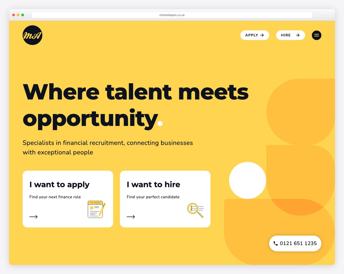
Mitchell Adam has a modern, mobile-like feel that makes this responsive web design enjoyable on desktop and handheld devices.
The website features bold sections with larger fonts and ample white space, making it easier to check content and information.
Once you click on the hamburger menu icon, a full-screen navigation overlay opens, featuring two CTA buttons for applications and hiring.
What stands out: Follow the modern mobile-alike web trend with large fonts, rounded edges and catchy color schemes.
13. Mercury Constant
Built with: Contentful
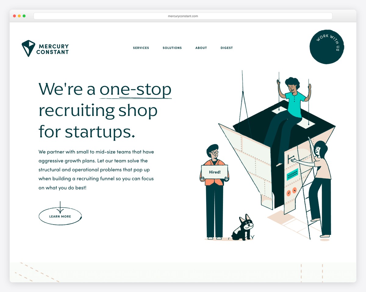
Mercury Constant takes a smart approach to blending minimalism with creativity. This recruiter website features various moving/animated elements, making it more lively and enhancing the user experience.
The animated floating CTA button at the top right corner is a cool element. This button opens a popup form if you want to work with them.
Moreover, the footer is a significant part of the website, with a large newsletter subscription form, contact details, and other useful info.
What stands out: Adding animations and special effects can positively impact your website’s user experience.
14. Opal Digital
Built with: Gatsby
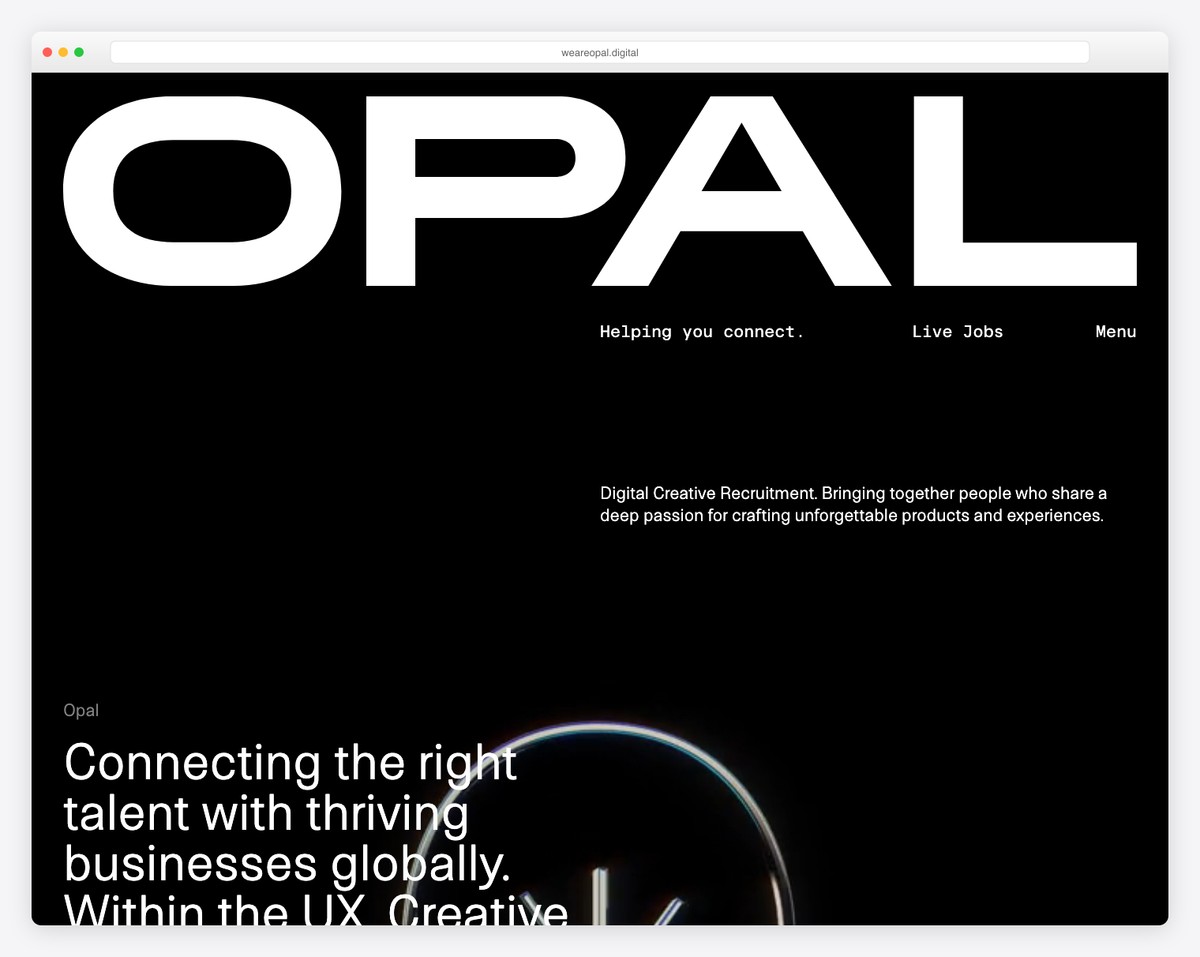
Opal Digital is one of the more unique recruitment websites we stumbled across. It may inspire you with creative ideas.
The dark hero area with text is a strong attention-grabber, while the rest of the page’s on-scrolling effects create a memorable experience.
Opal Digital also utilizes a custom cursor, a nice touch for an already distinctive page.
What stands out: Introduce scrolling effects to make your site more engaging.
15. Hiregy
Built with: Divi
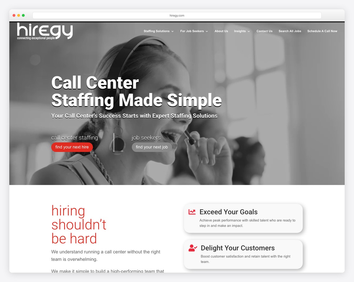
Interestingly, we couldn’t find that many high-end recruitment websites with a hero slider, but Hiregy is an excellent example of what we did.
The page also features a job search function with location and category selectors, as well as a live chatbot widget. Are chatbots worth it? Here are chatbot statistics to understand the hype.
Additionally, they integrated Google Reviews for social proof with star ratings.
What stands out: Promote your offerings with a slideshow.
16. DistantJob
Built with: Elementor
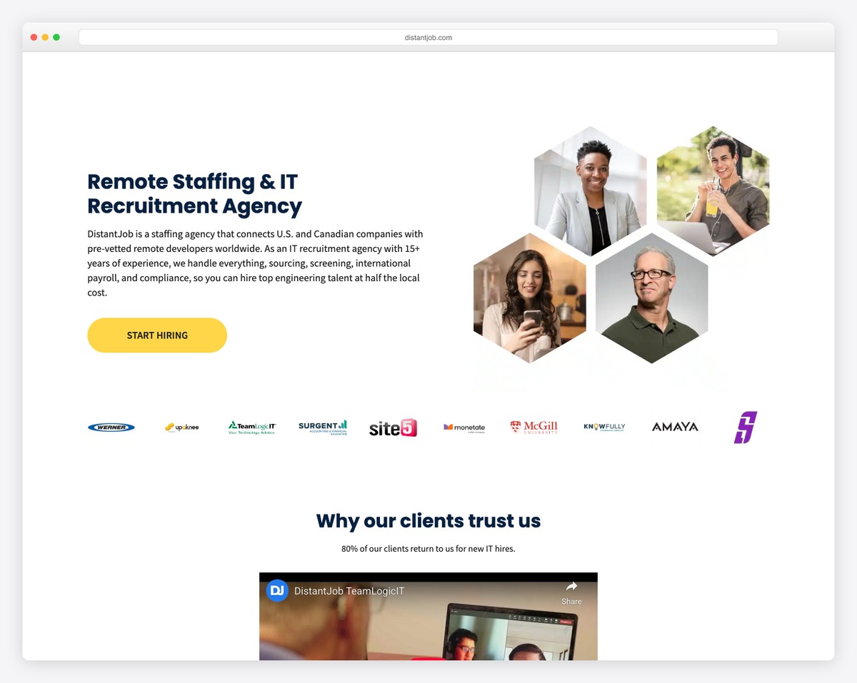
DistantJob is a niche recruitment website with a clean design and cool graphics. The hero section’s CTA button takes you directly to the search form, so you don’t have to scroll.
Moreover, the floating navigation bar allows you to jump from page to page without needing to scroll back to the top. The footer is feature-rich, with social icons, links and a subscription form.
What stands out: Ensure the search and submit forms are easily reachable.
17. Hunt Club
Built with: Custom
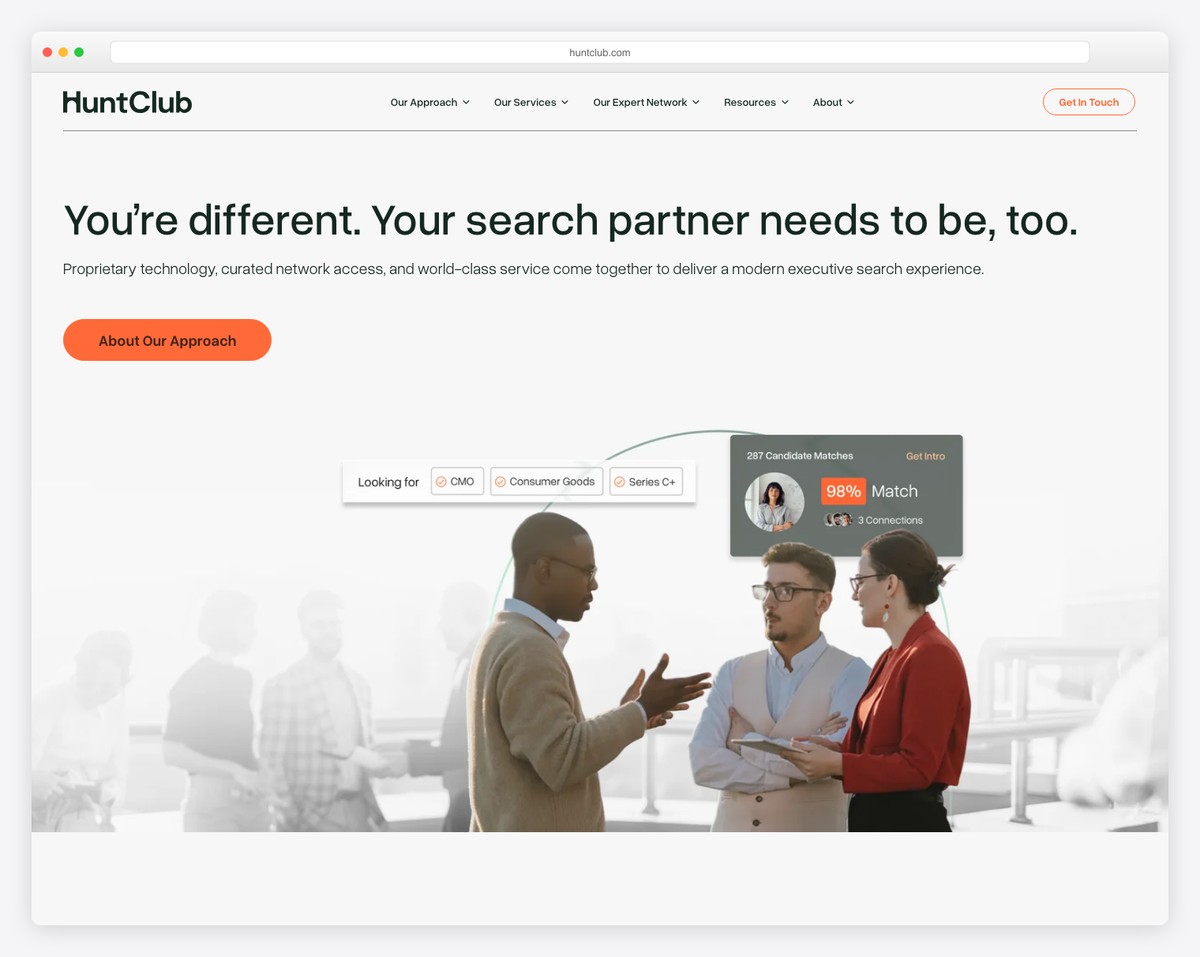
Hunt Club takes a tech-forward approach to executive recruiting with a clean, modern homepage that leads with “The fastest way to find exceptional talent.” The dark navy hero with crisp white typography and a green accent CTA creates instant authority in the staffing space.
The site highlights their proprietary Expert Network of 20,000+ business leaders who refer candidates, differentiating them from traditional headhunters. Clear service categories — Executive Recruiting, Retained Search, and Fractional Talent — make it easy for companies to find the right engagement model.
What stands out: Leading with a clear value proposition and quantifiable network size (20,000+ experts) builds immediate credibility for a recruiting firm.
18. Heidrick & Struggles
Built with: Custom
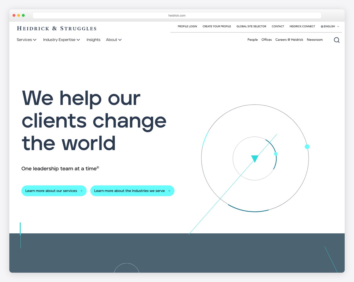
Heidrick & Struggles, one of the world’s top executive search firms, presents a polished corporate website that leads with “We help our clients change the world — One leadership team at a time.” The bold serif headline against a clean white background with geometric cyan accents projects confidence and sophistication.
The dual navigation structure separates corporate functions (Services, Industry Expertise, Insights, About) from utility links (Profile Login, Create Your Profile, Global Site Selector), catering to both potential clients and executive candidates simultaneously.
What stands out: A premium executive search firm benefits from understated elegance — geometric abstractions and ample white space communicate gravitas better than flashy visuals.
Related Posts


Comments (0)