
20 Best Personal Websites (Examples) 2026
Do you want to gain inspiration from the best personal websites?
That’s when this collection comes into play.
From simple and minimalist layouts to creative and colorful ones, we included something for everyone.
We also added the platform that the website was built on, so you can use the same one for yours.
However, you can also choose any other personal website builder alternative or even choose a personal WordPress theme.
With all the options available and ready to go, check these beautiful responsive web designs first and take action in building your site second.
Best Personal Websites & Design Ideas
1. Peter McKinnon
Built with: Squarespace

Like Lin-Manuel, Peter McKinnon also uses an image of himself above the fold but keeps things even more minimalist.
His entire home page is a beautiful collage of images with a parallax effect that enhances the viewing experience.
Finally, the clean footer only features social icons, adhering to the minimalist formatting.
What stands out: If you’re a content creator, consider showcasing some of your work on your website.
2. Jen Carrington
Built with: Squarespace

Jen Carrington’s page is modern, with a feminine touch and great storytelling. The header is basic, and the footer only includes a few links, maintaining a minimalist design.
Jen expresses herself well through her clean website, giving you the feeling you know her. Another unique feature is the quiz, which increases the likelihood of scoring more high-quality leads.
What stands out: Instead of using a simple subscription form, make it more engaging with a quiz.
3. Kantwon
Built with: Squarespace

There’s one main thing about Kantwon that makes it different from any other personal website on this list: it’s fun!
From the headshot above the fold to the use of emojis, cool images, and vibrant colors, Kantwon’s page has a lot of life in it.
While the page is very long, it doesn’t feel boring when you scroll it. Moreover, the header and footer only have social media icons, no links, no menu, and no search bar.
What stands out: Make a one-page website that’s fun, exciting and scrollable.
You can also use these best one-page website builders to create your online presence.
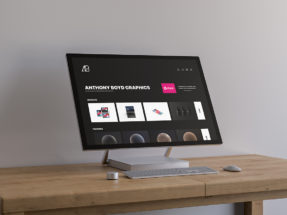
4. Anthony Wiktor
Built with: Gatsby

Anthony Wiktor’s minimalist design creates a strong and lasting first impression. It starts light but turns dark once you start scrolling.
His resume site features only two pages, home and about, with a smooth transition between them.
What’s also unique is the client profile grid, which changes the layout’s color and highlights the grid item when hovered.
What stands out: A dark and simple design creates a more premium feel.
5. Sean Halpin
Built with: GitHub Pages

Sean Halpin’s page is cool and creative, featuring a clean composition and creative elements that add visual interest.
It has a minimalist sticky header with a drop-down menu but doesn’t use a footer. There’s also a live chat widget that, although it’s a bot, still provides helpful answers.
What stands out: Use a “live chat” function so potential clients can quickly find additional information about you.
6. Devon Stank
Built with: Squarespace

Devon Stank gives a strong first impression with the video background hero section. The header is transparent, and the simple yet impactful title text conveys everything you need to know about Devon.
The call-to-action (CTA) buttons direct you to either hiring or watching a presentation video first.
We also like the dark design because it looks more premium.
What stands out: Use a video background and add a layer of engagement to your resume website.
7. Lin-Manuel Miranda
Built with: Avada Theme

Lin-Manuel Miranda’s site features a significant amount of image content, including a full-screen hero image of himself.
This resume page uses a slider, hover effects, animations and a back-to-top button to ensure a great user experience.
What stands out: Save visitors’ time with a back-to-top button, so they don’t need to scroll.
You will also enjoy these Avada theme examples to understand the power of this theme.
8. Arlen McCluskey
Built with: Webflow

Arlen McCluskey’s unique Webflow website layout is clean and creative. The page is divided into eight “sections,” showcasing work examples with and without mobile screen animation.
Like the header, the footer is also very basic, with only essential links.
What stands out: Arlen McCluskey’s resume website is a great example to gain inspiration for doing things differently.
9. Michael Mannucci
Built with: Webflow

Michael Mannucci has a landing page-style resume website with a navigation that directs you to the desired section without requiring scrolling.
The content loads smoothly when you scroll, making viewing much more pleasant. The Trustpilot reviews are also an excellent addition for social proof.
What stands out: Build trust and raise your potential with testimonials/reviews.
10. Scott Lacy
Built with: Squarespace

Scott Lacy runs a top-notch personal website with a blog. He shows love to his sponsors and updates fans on what’s going on in his life and training.
The header is transparent and disappears on a scroll, but reappears (with a black background) on a back scroll.
On the other hand, the footer is empty, except for “Made with Squarespace.” (There is Room for improvement.)
What stands out: If you have an active lifestyle, consider adding a blog to your page.
11. RyuCreative
Built with: Squarespace

While some use full images, a slider, or a video background in the hero section, RyuCreative uses a collage of images/thumbnails with a lot of white space.
The header is simple, featuring a logo on the left and three menu links, along with an Instagram icon on the right. The site’s last element is an Instagram feed that opens posts on a new page.
What stands out: Instead of just linking to your Instagram profile, consider integrating a feed to increase visibility.
12. Kelsey O’Halloran
Built with: Squarespace

Kelsey O’Halloran’s page features a great layout and an enjoyable color scheme, complemented by small details that make browsing it a fun experience.
She strategically included client testimonials with her services and a short bio of her identity.
Moreover, Kelsey’s page has a two-part footer section with links, CTAs and an IG feed.
What stands out: Choose images and site colors wisely so that they work together, not against each other.
13. Mindy Nguyen
Built with: Squarespace

If you think Samantha’s text-heavy above-the-fold section is boring, enhance it with catchy GIFs and images, like Mindy Nguyen.
After the text part, Mindy’s website showcases some works with links to live projects.
The only other page is the About page, which shares more about Mindy, services, experience, etc.
What stands out: Add links to your portfolio projects so potential clients can review your works first-hand.
14. Olga Miljko
Built with: Squarespace

Olga Miljko’s home page is a long portfolio of stunning images that load on scroll but aren’t clickable. The header disappears when you start scrolling the page but reappears when you wish to go back to the top.
Olga uses the header for menu links, IG, and a CTA button to contact her for a quote.
What’s pretty interesting is that she also uses Google Maps with her exact location.
What stands out: Use Google Maps to showcase your location, so clients can find you easier.
15. Mike Kelley
Built with: Squarespace

Mike Kelley uses a sticky left header/navigation and a portfolio slider on the left. This resume website’s look is minimalistic to emphasize the content more.
Furthermore, the menu features a drop-down functionality for certain elements, allowing users to find specific works and information more quickly.
What’s cool about Mike’s site is the business and the fun “about me” version. However, we’d need to add the latter to the list of bad websites. (Go check it yourself.)
What stands out: Does everyone use a top header? Try adding it to the left sidebar.
16. Erica Lauren
Built with: Squarespace

Erica Lauren’s page starts with a full-screen image background slider, text and a CTA button to enter the site.
The page has a simple scheme and uses a newsletter popup, which isn’t common among resume websites.
The header and footer are unfussy, with links and social media icons.
What stands out: If you write a blog or regularly update your website some other way, build an email list with a popup to keep your fans and clients “in the know.”
17. Lisa Maltby
Built with: Squarespace

Lisa Maltby’s portfolio grid consists of static and animated elements that make viewing and reviewing her works much more exciting (too bad they aren’t clickable).
The header features an animated logo on the left (so cool!) and a drop-down menu with a cart on the right. The footer provides additional contact details and links to her works’ categories.
What stands out: Use animated elements to add life to a grid-style portfolio.
18. Jamar Diggs
Built with: Squarespace

Jamar Diggs’ personal website makes a strong first impression with a bold dark hero section and a striking black-and-white portrait. The messaging is clear and direct — he helps business owners leverage YouTube for lead generation without becoming full-time content creators.
The navigation is minimal and well-organized, with clear CTAs for both joining his community and booking speaking engagements. The overall design feels premium and authoritative.
What stands out: A dark color scheme paired with a high-contrast portrait creates a memorable and authoritative first impression.
19. Johnny Harris
Built with: Squarespace

Johnny Harris’ website has a unique scrapbook-inspired aesthetic with textured backgrounds and taped-on photo collages. The design perfectly reflects his creative, hands-on approach to journalism and documentary filmmaking.
The site sells LUT and preset packs while linking to his YouTube channel and other ventures. The warm color palette and hand-drawn elements give it a personal, approachable feel.
What stands out: A scrapbook-style layout with textured elements can make a personal website feel authentic and memorable.
20. Hom Sweet Hom
Built with: Squarespace

Lauren Hom’s personal website bursts with color and personality, perfectly showcasing her lettering and mural artistry. The vibrant hero image immediately communicates her creative style, while the client logo bar (Google, Target, Adobe, TIME) builds instant credibility.
The site is well-organized with sections for work, classes, a store, and a blog, all tied together by a playful yet professional design that mirrors her brand.
What stands out: Showcasing recognizable client logos above the fold is a powerful way to build trust and credibility with new visitors.
Related Posts


Comments (0)