20 Best Weebly Websites (For Inspiration) 2026
Are you searching for the best Weebly websites to gain inspiration before creating your website?
Welcome to our carefully curated list of beautiful, professional websites in multiple niches.
While these websites are great examples of what can be achieved with this fantastic website builder, you can create a unique version with your own creative twist.
Weebly is a powerful website builder software to make your online presence for businesses, portfolios, eCommerce or even blogs – without coding!
You also won’t need to worry about responsive web design. Weebly takes care of all the tech.
We carefully reviewed These twenty favorite Weebly websites to ensure each has something original that’ll inspire you.
They sure did us!
Best Weebly Website Examples
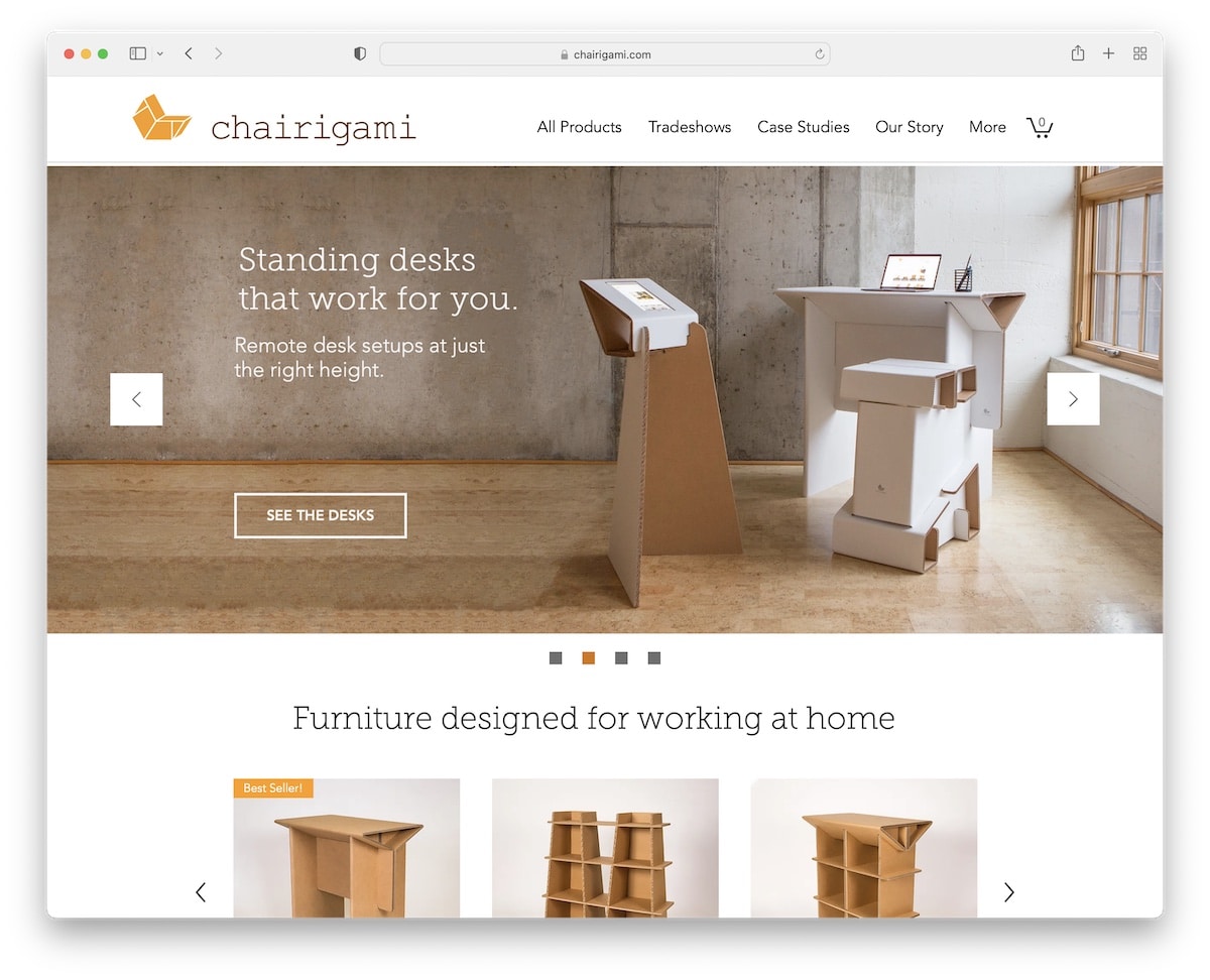
1. Chairigami
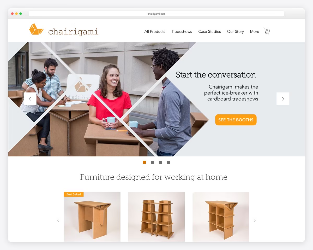
Chairigami is a clean online store website with a full-width slider above the fold and call-to-actions. It also features a practical product carousel for quick action. (User’s time matters!)
We also like how well they incorporated case studies, creating an individual page for each, which every business can benefit from.
Also, the newsletter form with cool animation is present on every page because they don’t want to miss the opportunity to collect new leads.
What stands out: Don’t be too salesy; make it more personal, like Chairigami.
2. Ashleigh Green
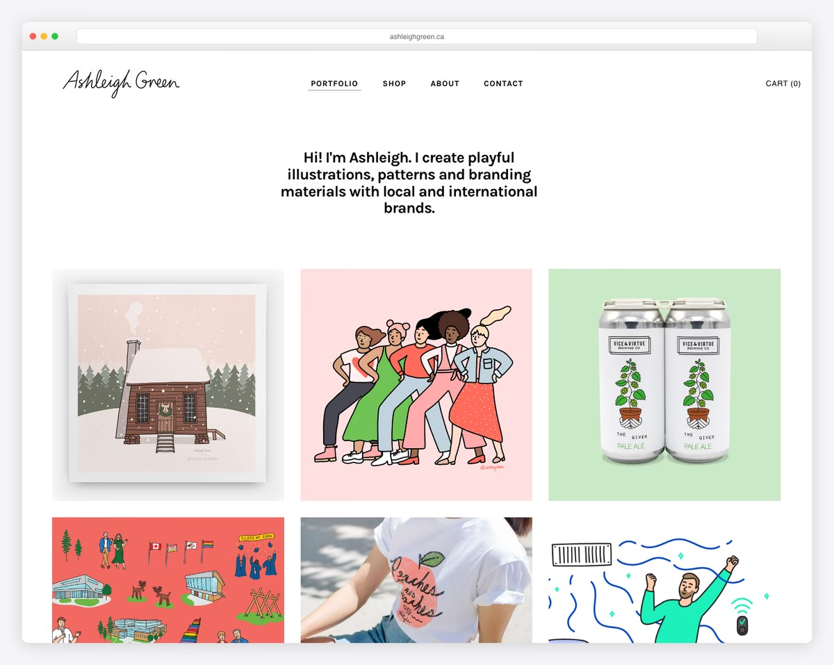
Any illustrator and designer can create a catchy website with Weebly, and Ashleigh Green’s version is a fantastic example.
The grid home page presents some of her projects, which is an excellent strategy if a potential client wants to learn more about your work quickly.
And what’s best, all grids are clickable, revealing more details about the illustration, project or campaign.
Need more inspiration? Check our list of the best portfolio websites.
What stands out: Ashleigh Green is a great storyteller, which shows through her website. Something you should consider implementing, too.
3. Yaak River Base Camp
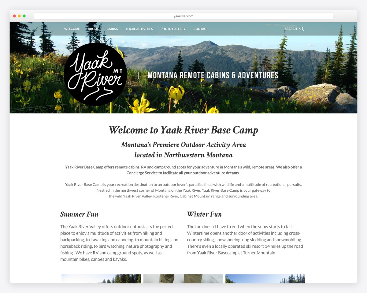
Front page business presentation is something Yaak River Base Camp does very well through text and images. But the strategic usage of CTA buttons also plays a big role here.
Sticky navigation allows users to visit different website sections anytime without scrolling back to the top. Plus, the footer area is enriched with Google Maps, contact details and a subscription form.
What stands out: Yaak River Base Camp is a great example of creating a fantastic presentation of activities that any outdoor business can apply.
4. Debra Lanning
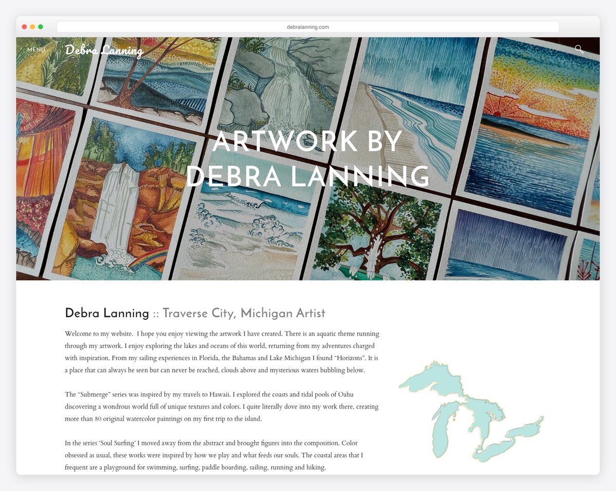
Using your website as a storytelling hub for your art is easily achievable with Weebly. Debra Lanning is an impressive yet simple online portfolio with detailed stories behind each project.
The floating header with a search bar and minimalist menu works in the visitor’s favor but doesn’t distract the viewing experience and reading of the content.
What stands out: If you don’t want site navigation to ruin your artwork, you can easily hide it as Debra Lanning does on her website.
5. Red River InterVarsity
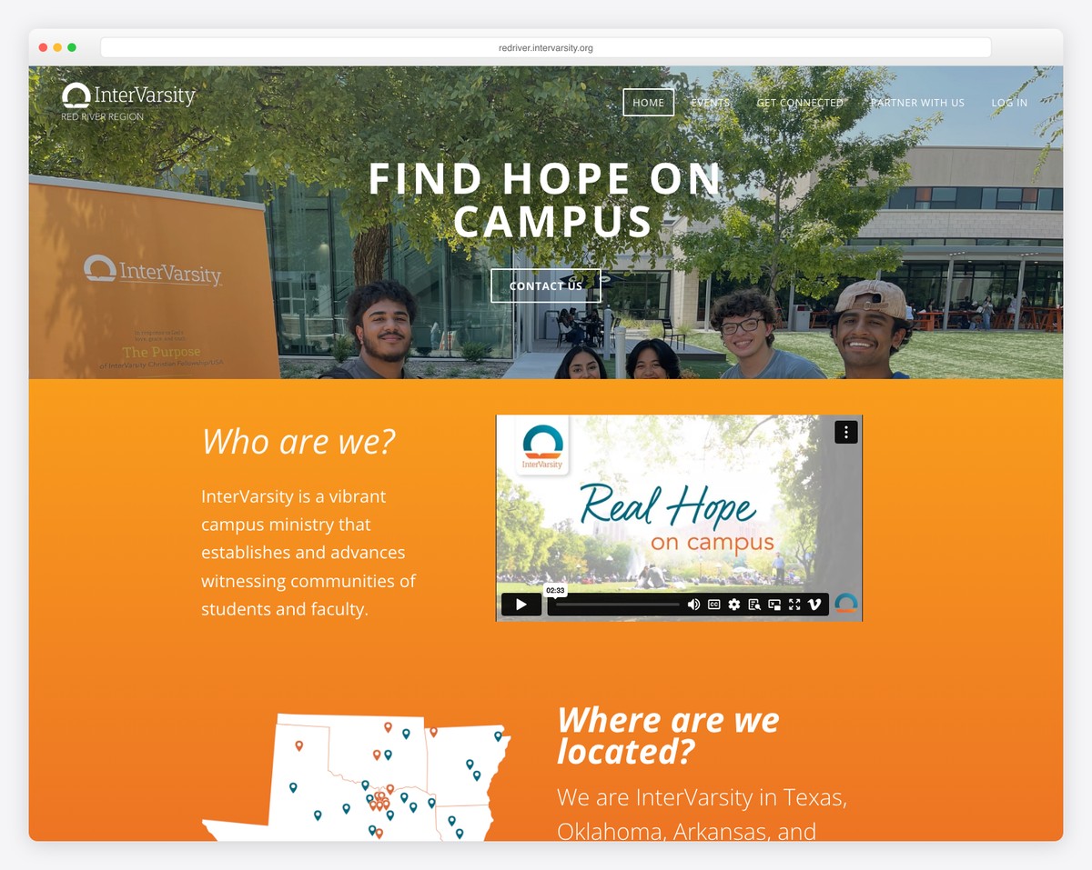
Great homepage overview with an excellent explanation of what you do is oh so necessary for every professional website, including campus or university.
Red River InterVarsity’s online presence creates pleasant scrolling with two individual sliders (that you can pause) side-by-side and a clickable video presentation.
What stands out: A campus website doesn’t need to be boring! Red River InterVarsity is proof of an intriguing page that’ll bring more students on board.
6. Colorado Market & Bakery
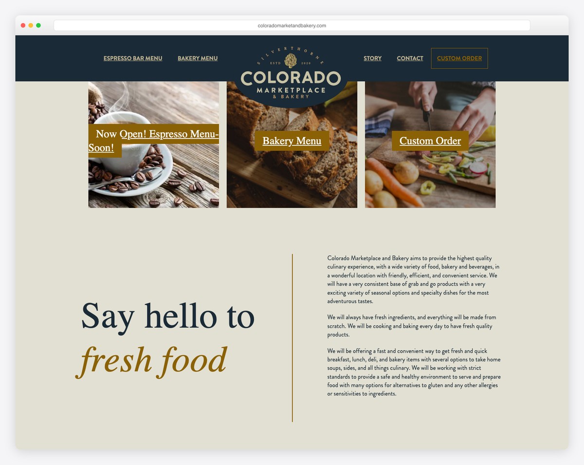
Delicious images, a food menu and a story are key factors that make Colorado Market & Bakery’s website so much better than many other bakery sites.
We like that the home page is pretty simple, strategically promoting daily and bakery menus and custom orders. (The only thing we’re missing are prices.)
We also have an extensive collection of bakery website design inspirations.
What stands out: If you run a bakery or any other food business, take high-quality images that’ll water your visitors’ mouths.
7. Stanley Hotel
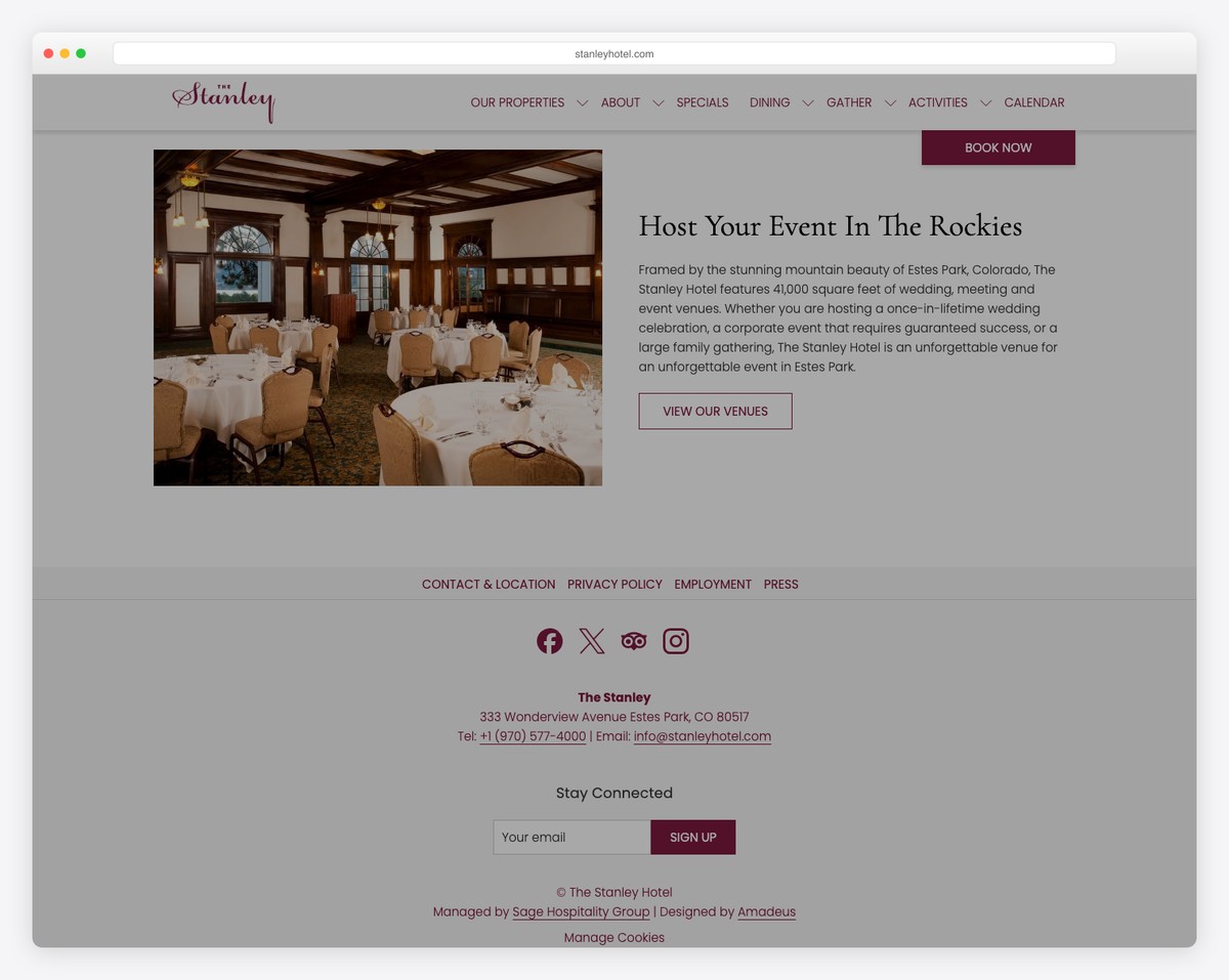
Stanley Hotel is one fine Weebly website with an excellent presentation of the stay, dining, events, activities and more.
The home page has a beautiful promotional video, call-to-action buttons and all the specialties that make you want to stay at the hotel.
Lastly, the full-screen menu can take you anywhere with just a click.
What stands out: Using a background video is a great engagement booster that can benefit any accommodation business.
8. Pointblank
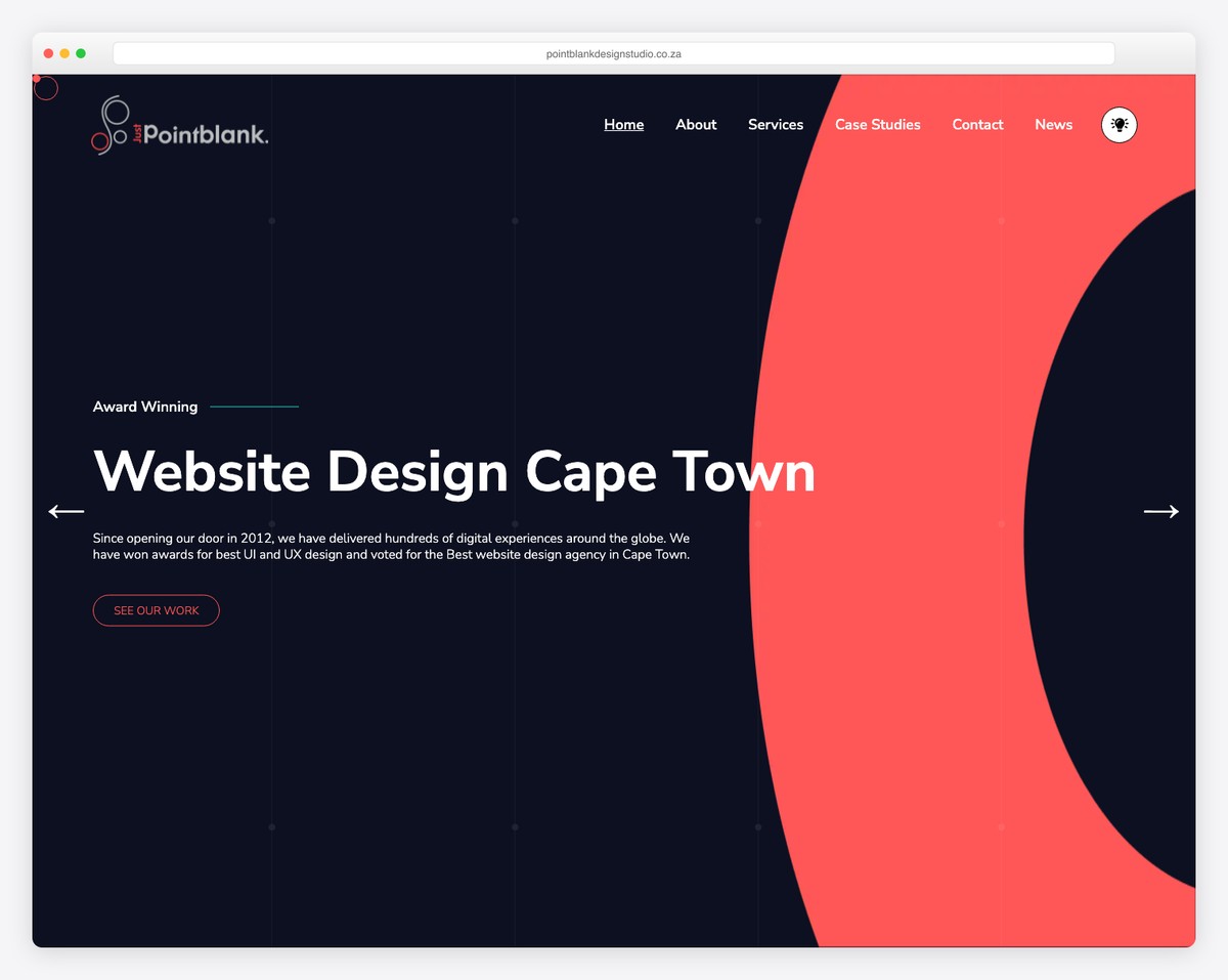
Keeping things minimal and modern is what Pointblank does so well.
This Weebly website gives an immediate impression of a professional digital agency, which increases the likelihood of gaining more business deals.
Unique slideshow, scroll down and up buttons, animated statistics, etc.; Pointblank’s site is truly special.
What stands out: Adding catchy scrolling animations will increase your website’s user experience, especially if you operate a modern agency. (Or check more animation websites for alternative ideas.)
9. Sail Alameda
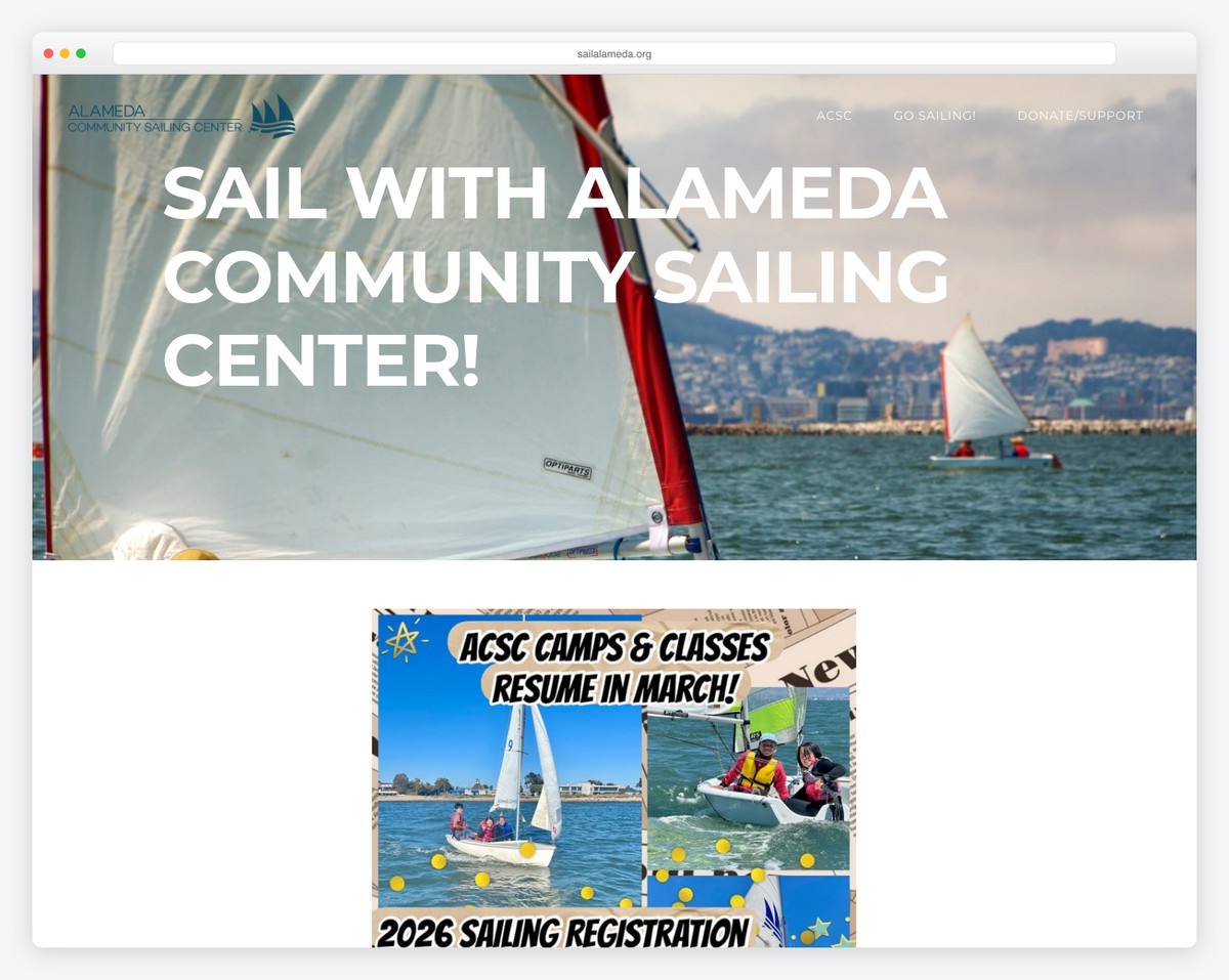
Sail Alameda doesn’t complicate with the design, keeping it basic, but with the great addition of the parallax effect.
It also features Google Maps for location and a subscription form to sign up for events and more.
What stands out: If you rely on donations, Sail Alameda has a Donation button in the navigation bar that’s always present, even on scroll (read sticky menu).
10. Schonell
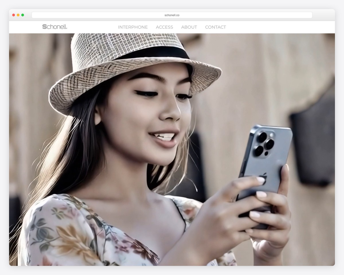
Large images work well in promoting software, services, or apps, and Schonell is a website example that does a great job of this.
The scrolling experience is also enriched with animations and a back-to-top button. However, the latter is almost unnecessary because of the practical (transparent) floating navbar.
What stands out: Schonell’s extensive product pages are also a nice example of a fantastic and persuasive presentation.
11. Kiko Rodriguez
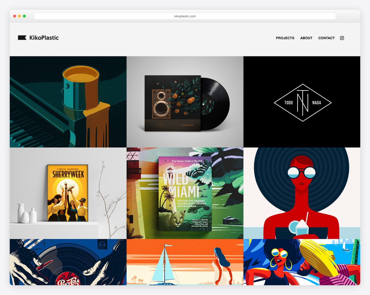
Kiko Rodriguez’s website hits you right in the eyes with its awesome collection of (colorful) designs. The hero section is also bold and with a notification of what’s coming next.
What stands out: A grid-style online portfolio with clickable elements (directing you to individual projects) is a smart way of sharing your work with the world.
12. Whiskey Ball
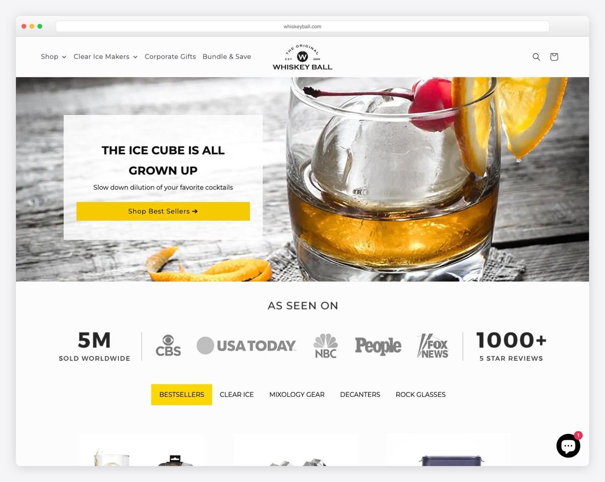
Whiskey Ball website is a fantastic example of simplicity that works well in eCommerce.
Also, the “Shop Best Sellers” button in the hero section improves your visitors’ user experience.
We also like the categorized product selection (time-saving!) that doesn’t require jumping from page to page.
What stands out: If you don’t have too many products, the filterable “portfolio” selection works excellently, like in the Whiskey Ball case.
13. Arrowhead
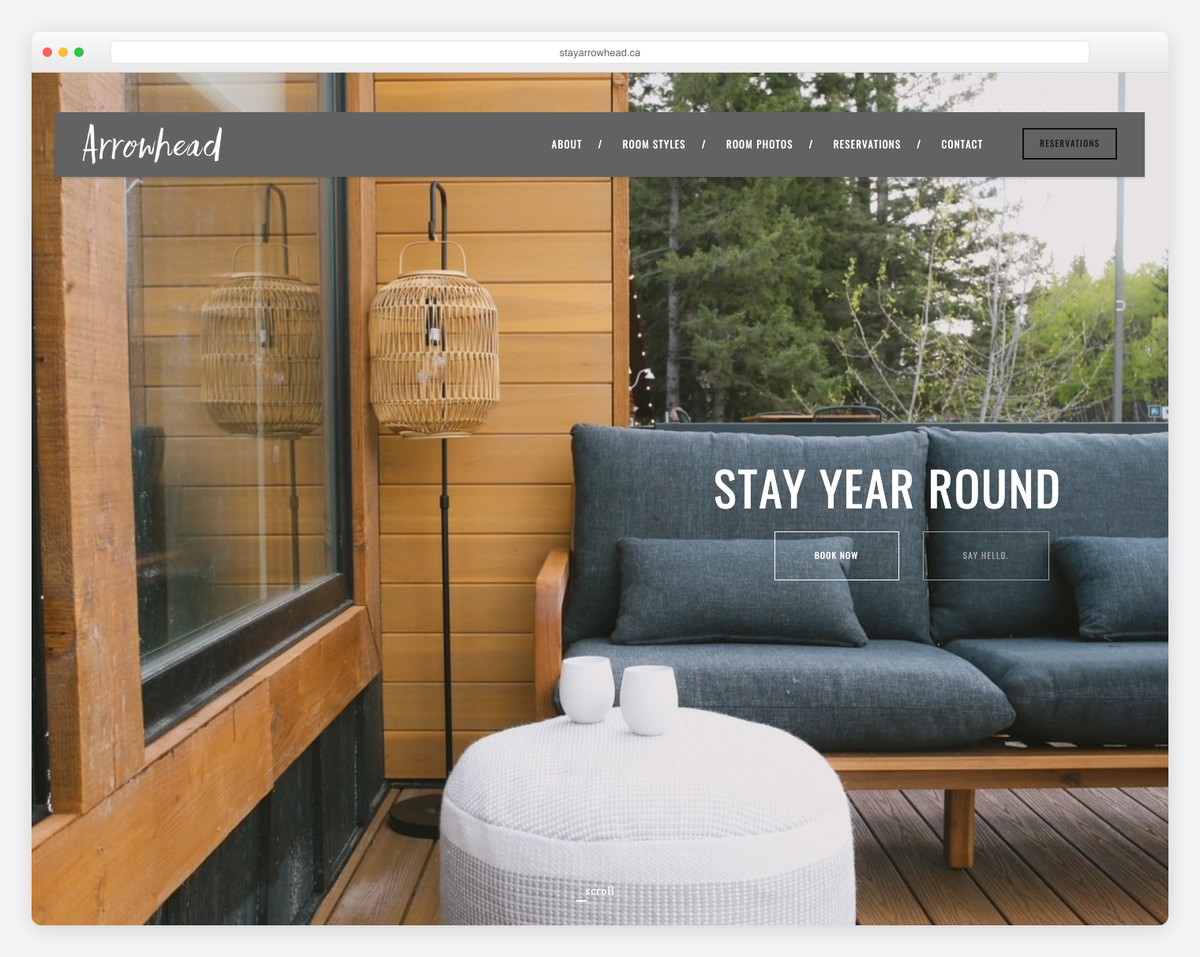
Arrowhead is another accommodation business with a welcoming website that calls for superb promotion.
The home page is all about their rooms, apartments and suites, with reservation buttons (with animations) for quick bookings.
But the floating menu is always available if you want to research further.
What stands out: Arrowhead lightbox gallery is a nice presentation of different units that everyone can check without leaving the current page.
14. Hanny Allston
Once you start scrolling Hanny Allston’s website, you quickly learn a lot about her. Which is precisely what a personal website should aim for.
As a runner, writer, podcaster and event organizer, you can learn a lot from Hanny and her simple but impactful page that starts with a quick, full-width hero image.
What stands out: If you’re an athlete in the process of building a website, let Hanny Allston influence you.
15. Merchant Method
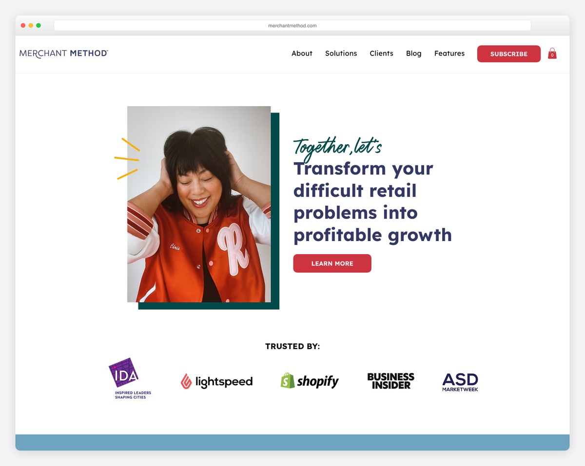
Merchant Method is another terrific example that goes straight to the point with its message and a call-to-action for a quiz above the fold.
The home page lets you learn more about Chirs, the Merchant Method founder, testimonials, different services, and more.
What stands out: Solo business owners offering services (even freelancers) can copy Merchant Method’s large testimonials section from happy clients.
16. Farm Lighting
Built with: Weebly
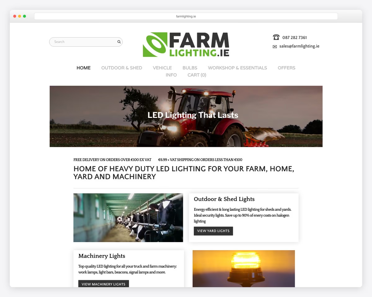
Farm Lighting is an Irish ecommerce store selling heavy-duty LED lighting for tractors, farms, workshops, and homes. The clean product grid layout with well-organized categories and a free delivery threshold prominently displayed shows how Weebly’s commerce features can power a focused niche store.
The straightforward product organization by use case (tractor lights, workshop lights, home lighting) makes it easy for farmers and tradespeople to find exactly what they need. Clear pricing, product specifications, and a functional shopping cart demonstrate Weebly’s ecommerce capabilities at their best.
What stands out: Organizing products by use case rather than just by type helps niche customers find what they need faster — a farmer looking for tractor lights doesn’t want to browse through home lighting options.
17. Petamorphosis
Built with: Weebly
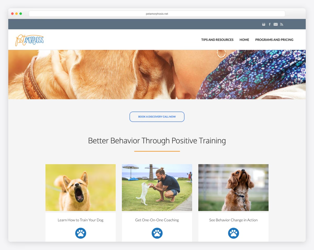
Petamorphosis is a dog training service offering positive reinforcement-based programs across Hawaii and South Puget Sound. The professional Weebly layout features Calendly booking integration, clear service tiers for group classes, one-on-one coaching, and consulting sessions.
Social media links and well-organized service descriptions make it easy for dog owners to understand what’s offered and book a session. The site demonstrates how a service business can achieve a polished, professional look on Weebly without custom development.
What stands out: Integrating Calendly directly into a Weebly service site eliminates the back-and-forth of scheduling — clients book at their convenience, reducing the friction between discovery and first appointment.
18. Fusedale Design
Built with: Weebly
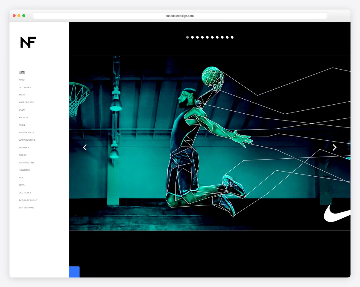
Fusedale Design is a creative director portfolio showcasing work for major brands including Nike, Old Navy, Abercrombie & Fitch, and Hollister. The minimalist black-and-white aesthetic with an image carousel on the homepage lets the work speak for itself.
The simple navigation and clean grid layout prove that a Weebly site can serve as a high-end creative portfolio when the design is intentionally restrained. Each project gets room to breathe, with large images that showcase the quality of the design work.
What stands out: A minimalist portfolio that lets major brand work (Nike, Old Navy) speak for itself is more impressive than a flashy design — the restraint signals confidence in the quality of the work.
19. Tour With Xuan
Built with: Weebly
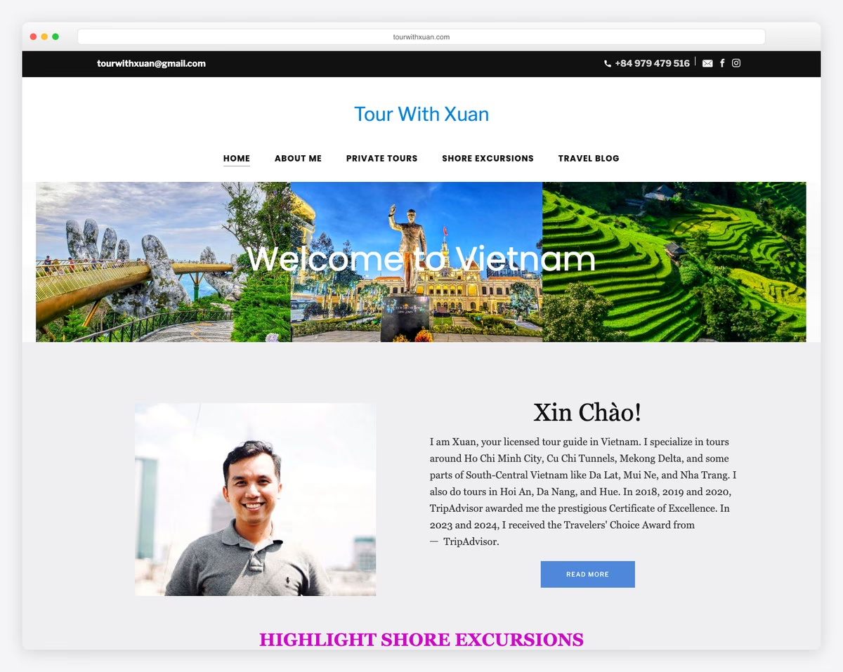
Tour With Xuan is a licensed tour guide offering private tours across Vietnam, from Ho Chi Minh City and the Cu Chi Tunnels to the Mekong Delta, Da Lat, Hoi An, Da Nang, and Hue. The Weebly site features TripAdvisor Travelers’ Choice awards from 2023-2024 prominently displayed.
Well-structured destination pages with clear booking flows make it easy for travelers to plan their Vietnam experience. The strong trust signals — TripAdvisor badges, detailed tour descriptions, and personal photos — are essential for a solo-operator tourism business competing against larger agencies.
What stands out: Displaying TripAdvisor awards prominently on a solo tour guide’s website converts social proof into bookings — travelers trust peer reviews more than any amount of self-promotion.
20. Baker Meech Lawyers
Built with: Weebly
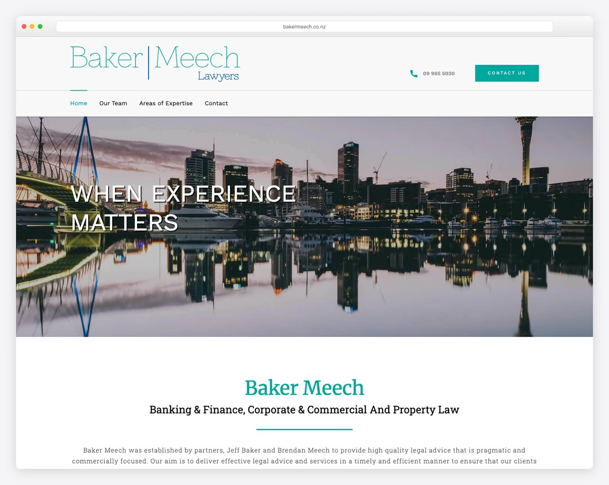
Baker Meech is an Auckland-based law firm specializing in banking and finance, corporate and commercial law, and property and estate planning. The clean, professional Weebly design with clear practice area navigation demonstrates that professional services firms can build credible websites on the platform.
The tagline “Large law firm quality services without the large firm cost” immediately communicates the firm’s value proposition. Well-organized practice area pages and lawyer profiles build credibility while keeping the site simple enough for potential clients to find the information they need quickly.
What stands out: A law firm tagline that directly addresses the client’s biggest concern (cost vs. quality) is more effective than generic “experienced attorneys” messaging — it answers the question every potential client is already asking.
Related Posts


Great article. Been looking at getting into Weebly for a while now. These templates definitely help.
Thank you 🙂
Kyle