
25 Best Free Bootstrap 6 Website Templates 2026
The first free Bootstrap 6 website templates have arrived — 25 downloads built on the new framework’s native dialogs, first-party date pickers and comboboxes, and OKLCH color system, all with live demos. This collection spans business, portfolio, restaurant, hotel, real estate, church, wedding, education and more, and every template on the list is free.
One thing to know up front: Bootstrap 6 is still pre-release and not yet on npm, so each template vendors the exact framework build it was built and tested against inside the download. There is no build step and no dependency to install — unzip and open. That also means these templates keep working regardless of what changes upstream before the stable release.
Building an application backend instead? See our free admin dashboard templates, or AdminLTE.io’s companion roundup of Bootstrap 6 admin dashboard templates and UI kits — 15 more Bootstrap 6 downloads covering dashboards, auth pages, forms, tables and dialogs.
Quick Picks
- Best for a product launch: Threshold — shared email state across hero, sticky bar and closer
- Best for a company site: Keystone — a mega menu that survives real information architecture
- Best portfolio: Silver Halide — full-bleed dark gallery with a native-dialog lightbox
- Best for hospitality: Lantern — a booking bar that docks as you scroll
- Best local-business pattern: Fixwell — working postcode checker and in-hero quote card
- Most complete niche build: Syllabus — curriculum progress that persists between visits
Table of contents — all 25 free bootstrap 6 website templates
- Threshold
- Keystone
- Ledgerline
- Northmark
- Atelier
- Silver Halide
- Longhand
- Drafthouse
- Tavola
- Lantern
- Haven Homes
- Forecourt
- Caseworth
- Bedrock
- Fixwell
- Ironworks
- Northgate
- Syllabus
- Stonebridge
- Openhands
- Summit
- Marigold
- Soundstage
- Pressroom
- Liftoff
Also on this page: What s new in Bootstrap 6 — and why it shows in these templates · Business, SaaS landing page templates · Portfolio creative templates · Hospitality, property automotive templates · Professional services trades templates · Education, faith nonprofit templates · Events, media coming soon templates · How to choose a Bootstrap 6 template · Frequently Asked Questions · Wrapping up
What’s new in Bootstrap 6 — and why it shows in these templates
These templates look and behave differently from every Bootstrap 5 collection because the framework underneath changed substantially:
- Native dialogs and drawers. Modals and offcanvas panels are now real
<dialog>elements — the browser supplies the backdrop, focus trapping and Escape handling. That is why lightboxes and booking dialogs here need almost no JavaScript. - First-party form components. Date pickers, searchable and multi-select comboboxes, steppers, OTP inputs, password strength meters, chip inputs and range sliders with live value bubbles — every booking form, property search and quote card in this list uses them, with zero third-party plugins.
- An OKLCH color system. The palette is generated with
color-mix(), so most of these templates retheme by changing a single brand token instead of recompiling Sass. - ESM-only vanilla JavaScript. No jQuery, no bundler — scripts load as ES modules and the templates run from a folder.
- Rebuilt navigation and tables. Mobile menus are native dialog drawers, ScrollSpy runs on IntersectionObserver, and the new stacked-table variant reflows tables into labelled blocks on phones.
Business, SaaS & landing page templates
1. Threshold
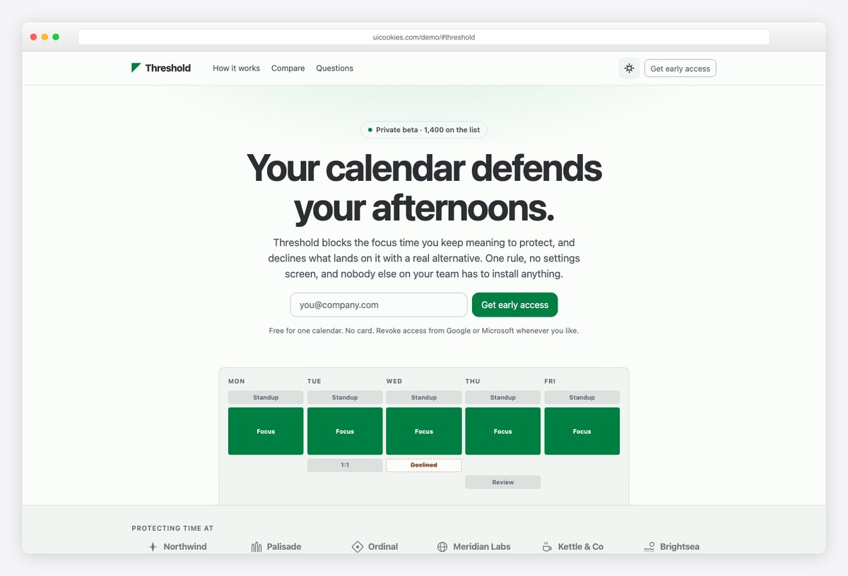
Why we like it: The three email inputs on the page — hero, sticky bar, closer — share one value, so a half-typed address follows the visitor down the page instead of greeting them with an empty box.
Threshold is a conversion-focused landing page that sweats the details most templates skip. The hero, features, how-it-works, social proof and closing call to action are all on one long page, followed by a thank-you page with a queue position and a referral link for the post-signup moment.
The sticky conversion bar is driven by IntersectionObserver rather than scroll handlers, and it knows to hide itself when the closing section is visible so you never show two calls to action at once. The FAQ runs on native details elements, the comparison table stacks properly on mobile, and there is no build step — unzip and open.
More info / Download Demo2. Keystone
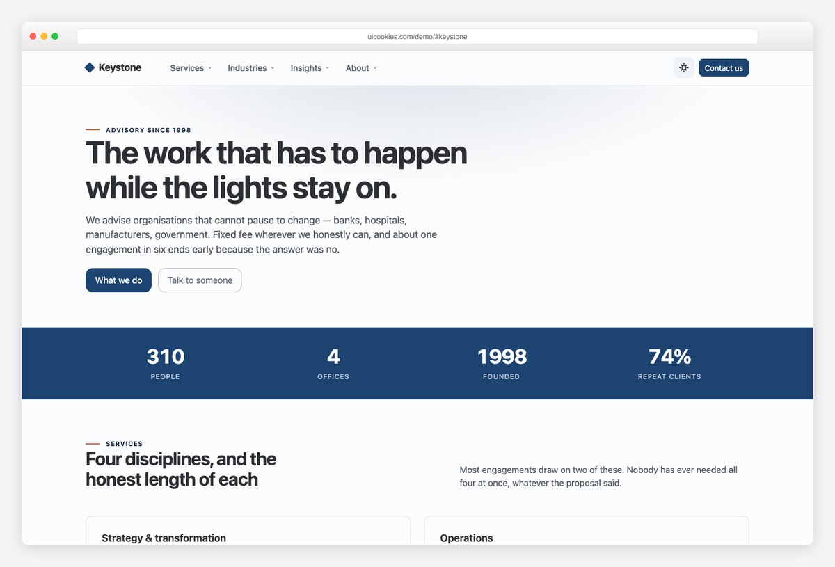
Why we like it: The mega menu is declared once and rendered twice — full-width panels on desktop, nested collapsible sections in the mobile drawer — so the two navigations can never drift out of sync.
Keystone is built for organisations with more than five things to say: three pages (homepage, services, contact) hung off a navigation designed for forty destinations, not a flat five-item navbar that collapses under real information architecture.
The menu is deliberately not hover-only. Click or Enter opens a panel, Escape closes it and returns focus to the trigger, Tab out closes it — so it works by keyboard and on touch, and never opens by accident as the pointer crosses it. It is the kind of navigation corporate sites need and almost never get from a free template.
More info / Download Demo3. Ledgerline
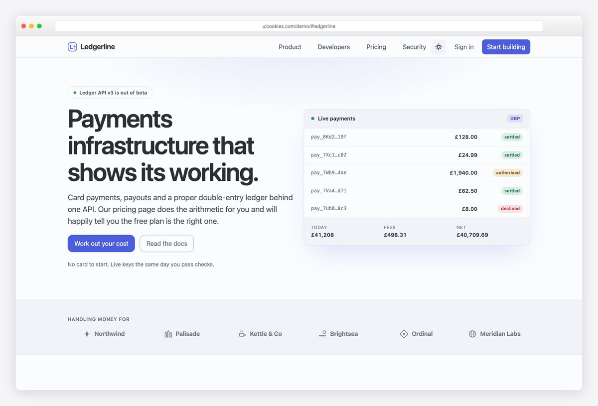
Why we like it: The pricing calculator tells visitors which plan actually costs them least. Two sliders — payments per month and average payment size — and the recommended tier updates with the arithmetic done for them.
Ledgerline pairs a payments-infrastructure homepage — product pillars, a code sample, security detail and honest figures — with a pricing page built around that calculator. Each plan is modelled as a monthly base plus a per-payment fee, so the recommendation is genuinely derived rather than decorative.
It is a small piece of product thinking that most real SaaS pricing pages still avoid, and having it working in a free template makes Ledgerline a strong starting point for any usage-priced product, not just payments.
More info / Download Demo4. Northmark
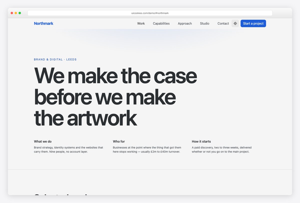
Why we like it: The work index is full-width rows rather than a card grid — a row puts the client name at display size, where a card shrinks it to a caption.
Northmark is a brand and digital agency template that leads with the thing agencies are actually judged on. Full-width work rows reveal project detail on hover, a capabilities matrix replaces the usual vague service blurbs, and the studio and approach sections carry real personality.
The second page is a project case study with results figures built in — the format clients actually ask for — so the template covers the pitch as well as the portfolio.
More info / Download DemoPortfolio & creative templates
5. Atelier
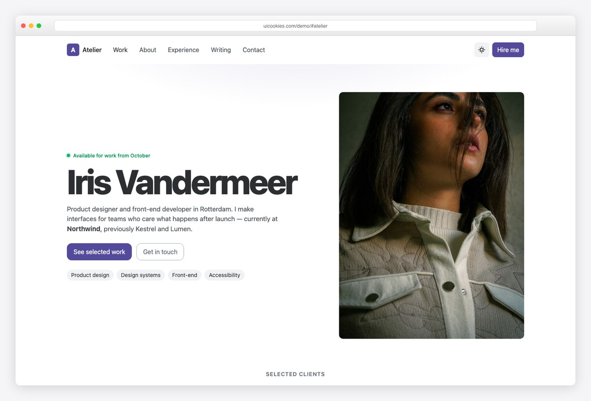
Why we like it: The contact form is more capable than portfolios usually get: a searchable project-type picker, a date picker for ideal start date, and a budget slider with a live value bubble — all first-party Bootstrap 6 components.
Atelier pairs a personal landing page — selected work, about, skills, an experience timeline and writing — with a complete case study page, so you can show the work rather than just list it.
Those form components matter beyond novelty: qualifying project type, timing and budget before the first email is exactly what a freelancer’s contact form should do, and in Bootstrap 5 each of those controls meant a third-party plugin.
More info / Download Demo6. Silver Halide
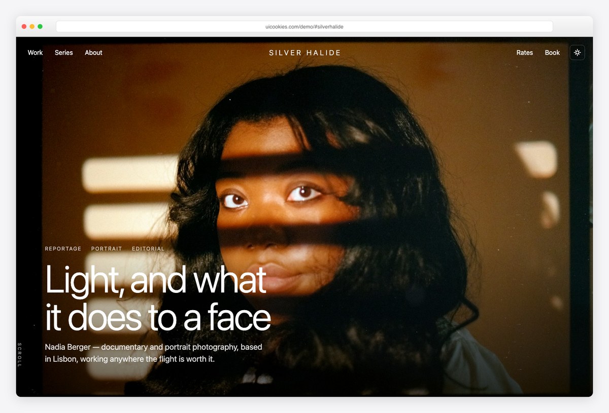
Why we like it: The lightbox is the browser’s native dialog element rather than a plugin — backdrop, focus trap and Escape handling come free, so the whole feature costs about fifteen lines of JavaScript.
Silver Halide is deliberately dark and chrome-free: a full-viewport hero with a centred wordmark floating over it, and a full-bleed mosaic gallery with asymmetric spans that never sits inside a container. A horizontal scroll-snap strip handles photo series, and rates and about sections use the new prose typography scope.
Rethemeing is a single brand token, light mode is included and remembered across visits, and the booking enquiry form uses the new combobox, date picker and chip input. For a portfolio this visual, the restraint of the engineering is the point.
More info / Download DemoLooking for something more app-shaped? Our free admin dashboard templates roundup covers the back-office side, and AdminLTE.io’s Bootstrap 6 admin dashboard templates and UI kits adds 15 more Bootstrap 6 downloads — dashboards, auth pages, forms, tables and dialog packs that pair with any template on this page.
7. Longhand
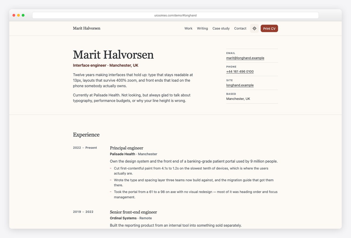
Why we like it: A real print stylesheet: the same markup that renders the web page prints as a clean one-page CV — no navigation bar, no dark backgrounds eating toner, no job title split from its bullets by a page break.
Longhand is a warm, editorial personal site — identity, experience, skills, side projects, writing and contact — with a worked case-study page alongside, in full light and dark modes.
The print detail sounds small until you need it. Most résumé templates are built to be looked at, so printing one produces a screenshot of a web page; Longhand treats print as a first-class output, which is exactly what a CV template should do.
More info / Download Demo8. Drafthouse
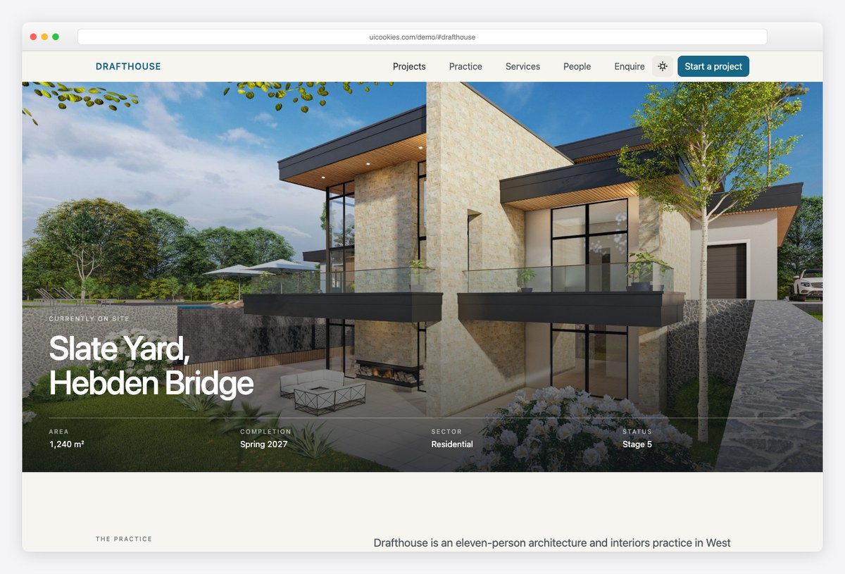
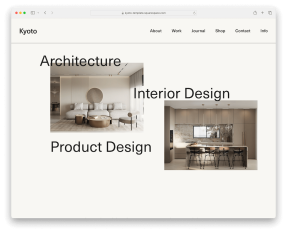
Why we like it: The whole template is set like a drawing sheet — warm paper ground, hairline rules, nothing rounded, nothing shadowed, metadata in small-caps labels above tabular values.
Drafthouse covers a practice homepage — projects, principles, staged services, awards, people, enquiries — and a project page carrying a complete data sheet: location, brief, area, stages, consultants.
That data-sheet discipline is what makes it read like a practice that produces drawings for a living rather than a generic portfolio with architecture photos dropped in. If your work is judged by people who read title blocks, this is the aesthetic that earns trust.
More info / Download DemoHospitality, property & automotive templates
9. Tavola
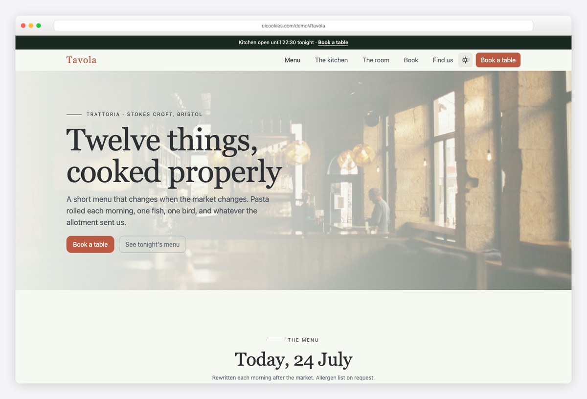
Why we like it: The menu is the centre of the page, tabbed by service — lunch, dinner and Sunday are genuinely different menus, not one list with asterisks — and every dish row is set with printed-menu leader dots.
Tavola treats the menu as the product. The homepage carries the tabbed menu, the kitchen, the room, booking, hours and an FAQ; a second page holds the full menu and wine list for the people who read those like literature.
Table booking uses Bootstrap 6’s new date picker and combobox — the reservation form works like the booking widgets restaurants normally pay a service for, at least at the front-end level.
More info / Download Demo10. Lantern
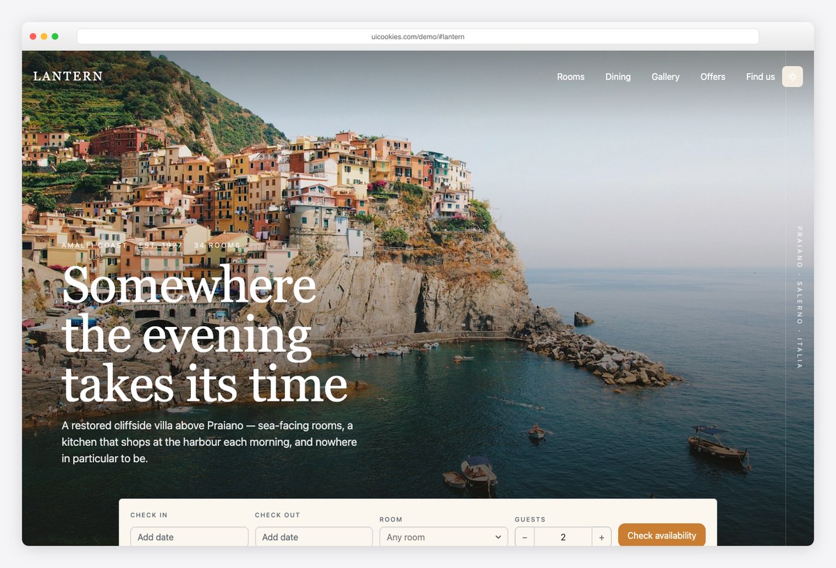
Why we like it: The booking bar under the hero — two date pickers and a searchable room-type combobox — docks itself to the top of the window as a compact bar once you scroll past it, so availability is always one click away.
Lantern pairs a full property homepage — rooms, dining, gallery, offers, reviews and a getting-here panel — with a room detail page built around a sticky booking rail.
The design leans photographic, with a full-bleed stay hero and a gallery lightbox, but the conversion machinery is what separates it from pretty hotel templates: everything funnels to check-in and check-out dates without a plugin in sight.
More info / Download Demo11. Haven Homes
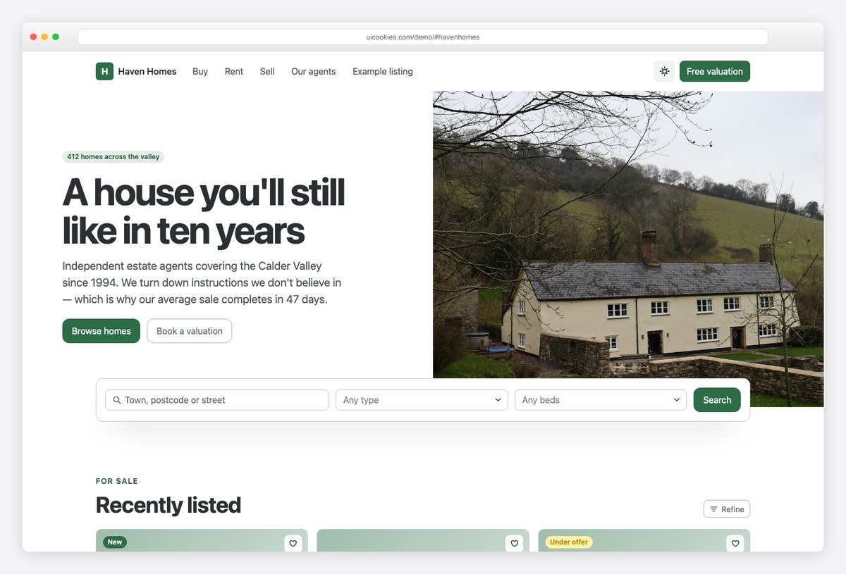
Why we like it: The search panel straddles the seam between the split hero and the page, so property search — multi-select type combobox, bedrooms, price range sliders with live bubbles — is the first thing in reach.
Haven Homes is an estate agency template with a property grid carrying real specs, a valuation form for the lead-generation side, and a complete listing page for individual properties.
Property search is the use case Bootstrap 6’s form components were practically designed for, and this template shows why: filters that took a plugin stack in Bootstrap 5 are first-party controls here, styled consistently with everything else on the page.
More info / Download Demo12. Forecourt
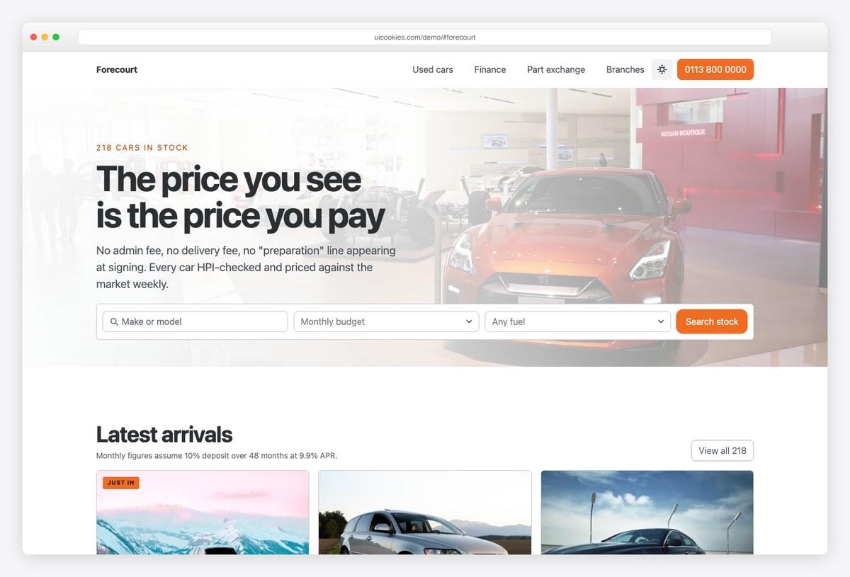
Why we like it: The monthly payment is the largest figure on every vehicle card — the number people actually shop on — and the finance calculator is live: move deposit, term or mileage and every payment on the page updates.
Forecourt pairs a dealership homepage — stock search, vehicle grid, finance calculator, part exchange, branches — with a vehicle listing page carrying a complete specification and a sticky finance rail.
Most automotive templates print “£299/mo” as static text and hope. Deriving the payments from actual inputs is the difference between a template that demos well and one whose logic you can genuinely wire to inventory.
More info / Download DemoProfessional services & trades templates
13. Caseworth
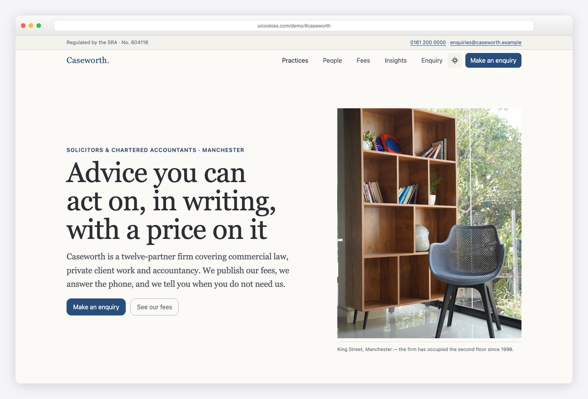
Why we like it: A filterable published-fees table, built on the new table variants — publishing prices is the single strongest trust signal a professional-services site can send, and this template makes it the centrepiece.
Caseworth is set in a serif on paper-white with hairline rules instead of cards — credibility through typography rather than stock photography of handshakes. A numbered practice index, people with credentials, and insights round out the firm homepage, with a practice-area detail page alongside.
The fee table reflows to labelled blocks on mobile using the new stacked-table variant, so the pricing stays readable exactly where prospective clients actually check it.
More info / Download Demo14. Bedrock
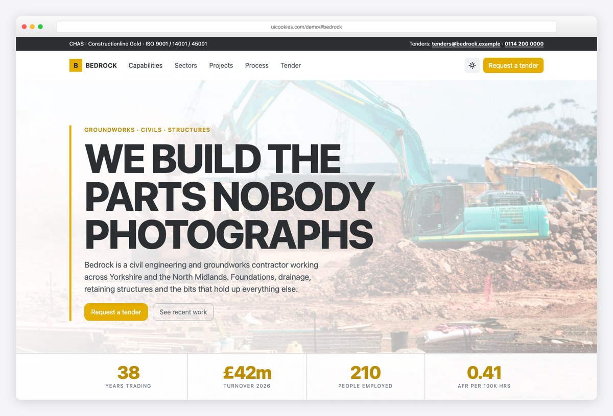
Why we like it: Deliberately hard-edged — no rounded corners anywhere, a safety-yellow accent on dark slate, and a full-width statistics strip — because contractors get judged on whether the site looks like people who deliver.
Bedrock covers capabilities, sectors, a project grid, accreditations and a tender enquiry form, with a project case study page for the delivered work.
The process section runs on Bootstrap 6’s new stepper component, which fits the subject matter unusually well: staged delivery is literally what the industry sells, and the component renders it without a plugin.
More info / Download Demo15. Fixwell
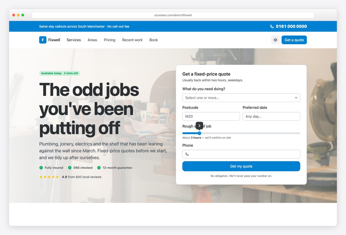
Why we like it: A working postcode coverage checker in about twenty lines of vanilla JavaScript — type a postcode, get a real in-area or out-of-area answer — plus a phone-forward call bar with the number set large.
Fixwell is built the way home-services sites actually convert: the fixed-price quote card sits inside the hero rather than behind a button that scrolls away, using a multi-select trades picker, date picker and job-size slider with a live value bubble.
Service cards carry from-prices, the work grid shows before-and-after pairs, and the trust row (insured, background-checked, guarantee) sits where visitors look for it. Retheme the whole site by changing a single brand token.
More info / Download Demo16. Ironworks
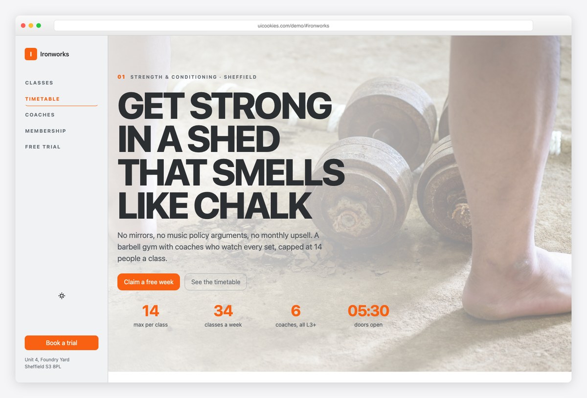
Why we like it: Navigation runs down a fixed vertical rail on the left edge, leaving the full page width for the thing members actually come for: a genuinely accessible weekly timetable with live remaining-space counts.
Ironworks sets its class timetable as a real table with row and column scopes and captions, filtered by a combobox — not a picture of a timetable, which is what gym sites usually ship.
Coach profiles, three membership tiers with a highlighted recommendation, and a free-trial form (date picker, class picker, goal chips) complete the funnel. Dark by default with heavy display type; scroll position drives the rail navigation via the rebuilt ScrollSpy.
More info / Download DemoEducation, faith & nonprofit templates
17. Northgate
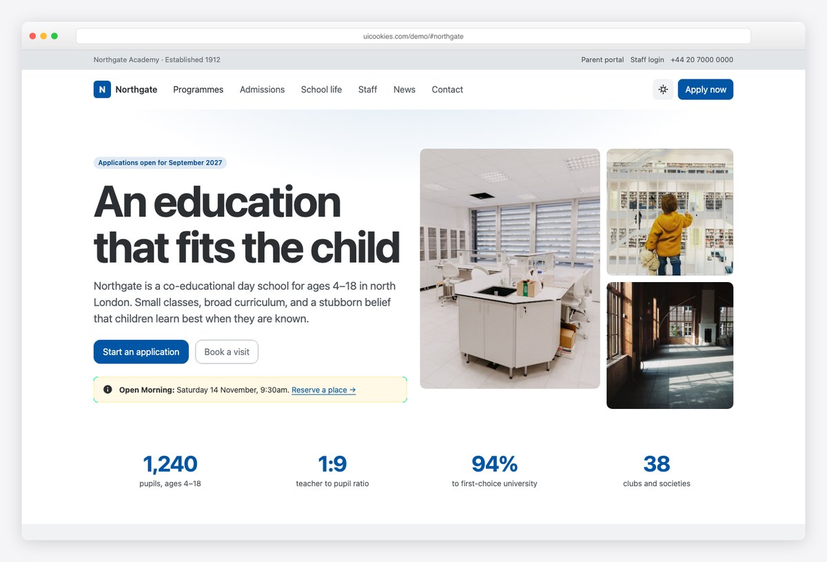
Why we like it: The admissions journey runs on Bootstrap 6’s new stepper, and the visit-request form combines an entry-point picker, date picker and interest chips — the exact flow prospective parents follow.
Northgate covers programmes, admissions, school life, staff, news and contact on the homepage, with a programme detail page alongside — the pages a parent actually reads before booking a visit.
Key dates, an honest statistics band and staff credentials give the content spine; the new form components give the admissions flow a quality that used to require a school-sector CMS.
More info / Download Demo18. Syllabus
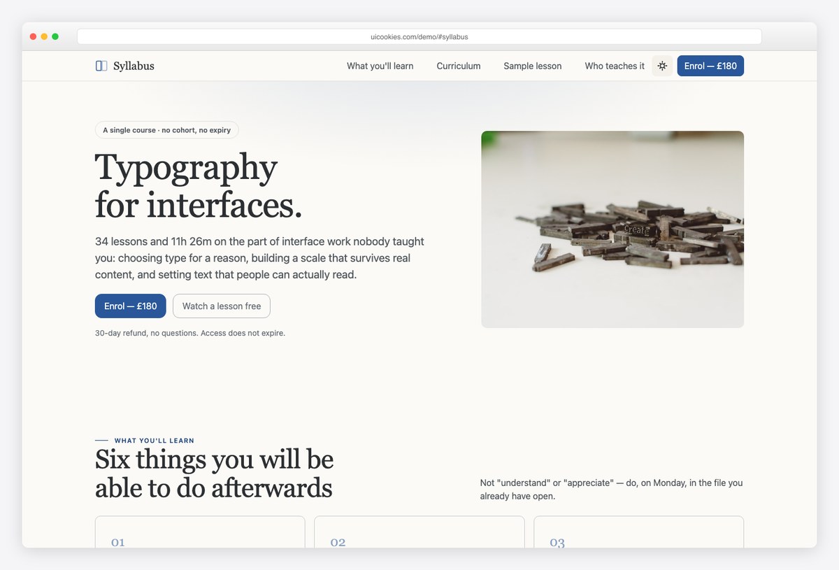
Why we like it: Every lesson carries its own duration and ticks off, the ticks persist in the browser between visits, and the remaining-time estimate recomputes — answering the two questions course pages always dodge: how much is left, and when would I finish.
Syllabus pairs a course landing page — outcomes, a 34-lesson curriculum, instructor, reviews, enrolment, FAQ — with a full sample lesson page carrying notes, resources and the course outline in a sidebar.
The persistent progress state is plain browser storage, no account system required, which makes the demo behave like a real course platform while remaining a static template you can host anywhere.
More info / Download Demo19. Stonebridge
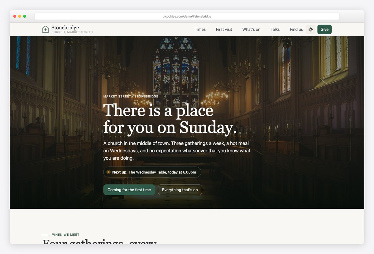
Why we like it: Each gathering declares a recurring rule and the template computes its own next occurrence — so somebody checking their phone on a Wednesday evening sees whether anything is on tonight, not just “Sundays, 10.30am”.
Stonebridge pairs a church homepage — service times, first-visit answers, midweek groups, a talk archive and honest giving figures — with a what’s-on page grouping the whole week by day, plus dated events and room hire.
The self-updating service times are the standout, but the first-visit section is the quiet win: it answers the questions newcomers actually have (what to wear, where to park, what happens with kids) instead of assuming familiarity.
More info / Download Demo20. Openhands
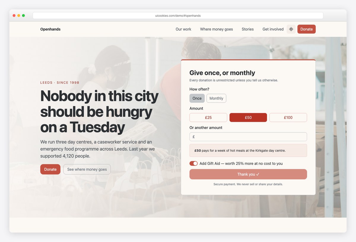
Why we like it: Choosing a donation amount immediately says what that amount buys — because “£50” means nothing on its own, while “£50 pays for a week of hot meals” is a reason to give.
Openhands pairs a charity homepage — donate widget, impact figures, transparent fund allocation, programmes, a story and a volunteer enquiry — with an appeal page carrying target progress and a sticky donate rail.
The fund-allocation section shows where money goes as plain, legible figures. Combined with the contextual donation amounts, the whole template is built around the one metric that matters for a nonprofit site: whether a stranger trusts it enough to give.
More info / Download DemoEvents, media & coming soon templates
21. Summit
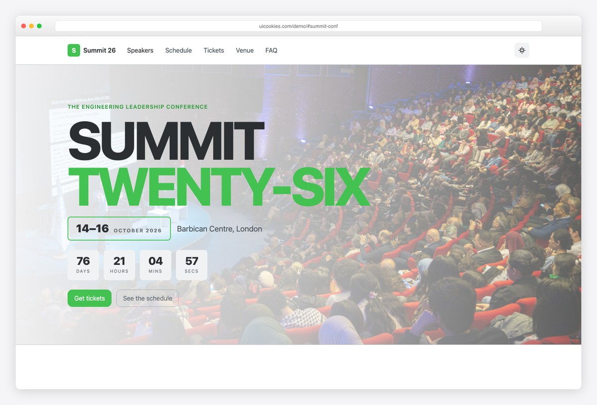
Why we like it: The primary call to action is a ticket bar fixed to the bottom of the viewport with a live remaining count — not a header button that scrolls away — and the schedule is a real accessible table tabbed by day.
Summit leads with an oversized marquee headline, a bordered date block and a live countdown, then moves straight to speakers and schedule — the two things attendees actually came to check.
The checkout dialog uses a combobox for ticket and workshop selection and chip input for dietary requirements, and the whole page runs dark by default with a light mode remembered across visits.
More info / Download Demo22. Marigold
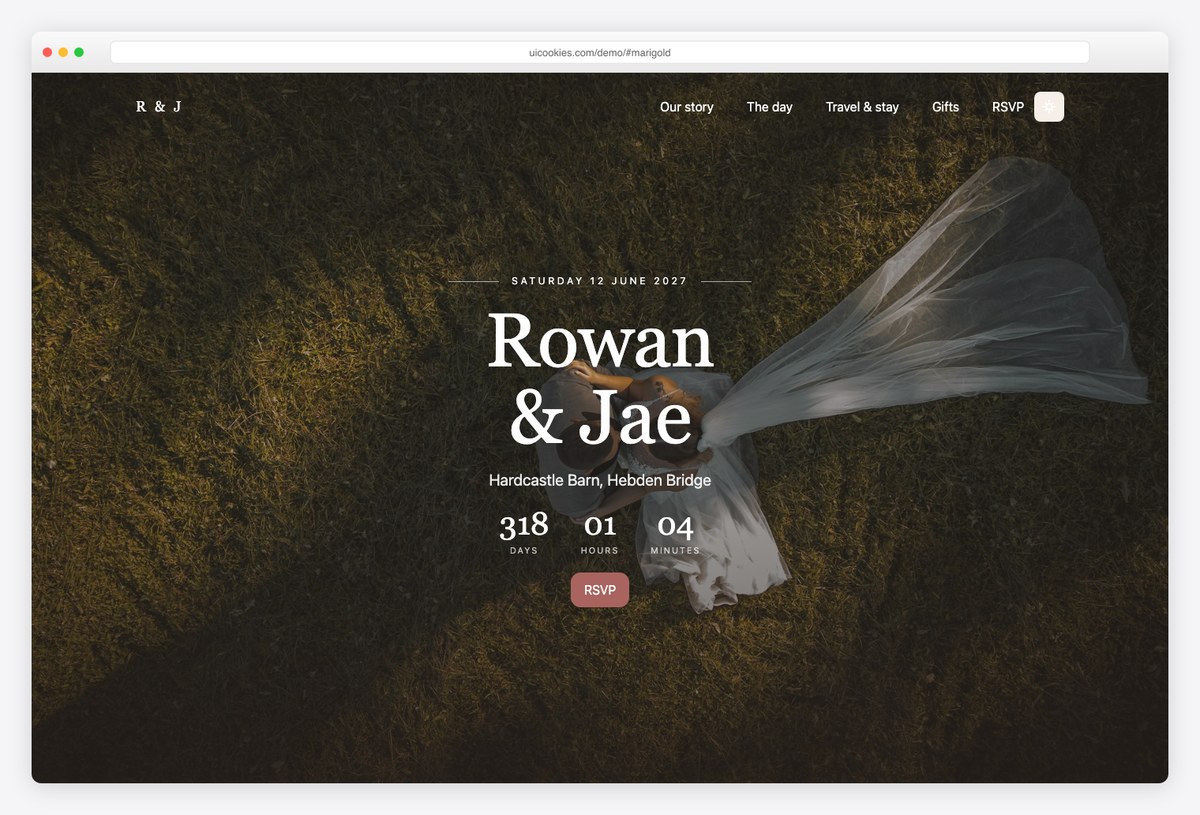
Why we like it: The RSVP takes a party, not a person: each named guest gets their own attendance and meal choice, so a family of four submits once — and nobody reconciles a spreadsheet afterwards.
Marigold covers the countdown, the couple’s story, the day’s schedule, a gallery, the gift list and RSVP on the homepage, with a travel-and-accommodation page carrying directions, taxi numbers, places to stay and an FAQ.
That second page is the underrated part — it is the page guests actually need the week of the wedding, and most wedding templates never ship it.
More info / Download Demo23. Soundstage
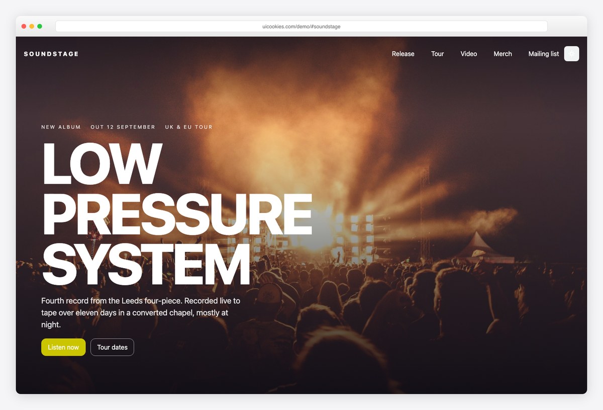
Why we like it: Sold-out shows stay on the tour list, struck through rather than deleted — a sold-out show is evidence, not an absence — and the tracklist carries a working play state.
Soundstage pairs a full artist homepage — release, tracklist, tour dates, videos, merch and a mailing list — with an album page carrying the complete tracklist, credits and a sticky pre-order rail.
The design is full-bleed and stage-lit, but the two editorial decisions above are what give it character: they encode how touring actually works into the markup.
More info / Download Demo24. Pressroom
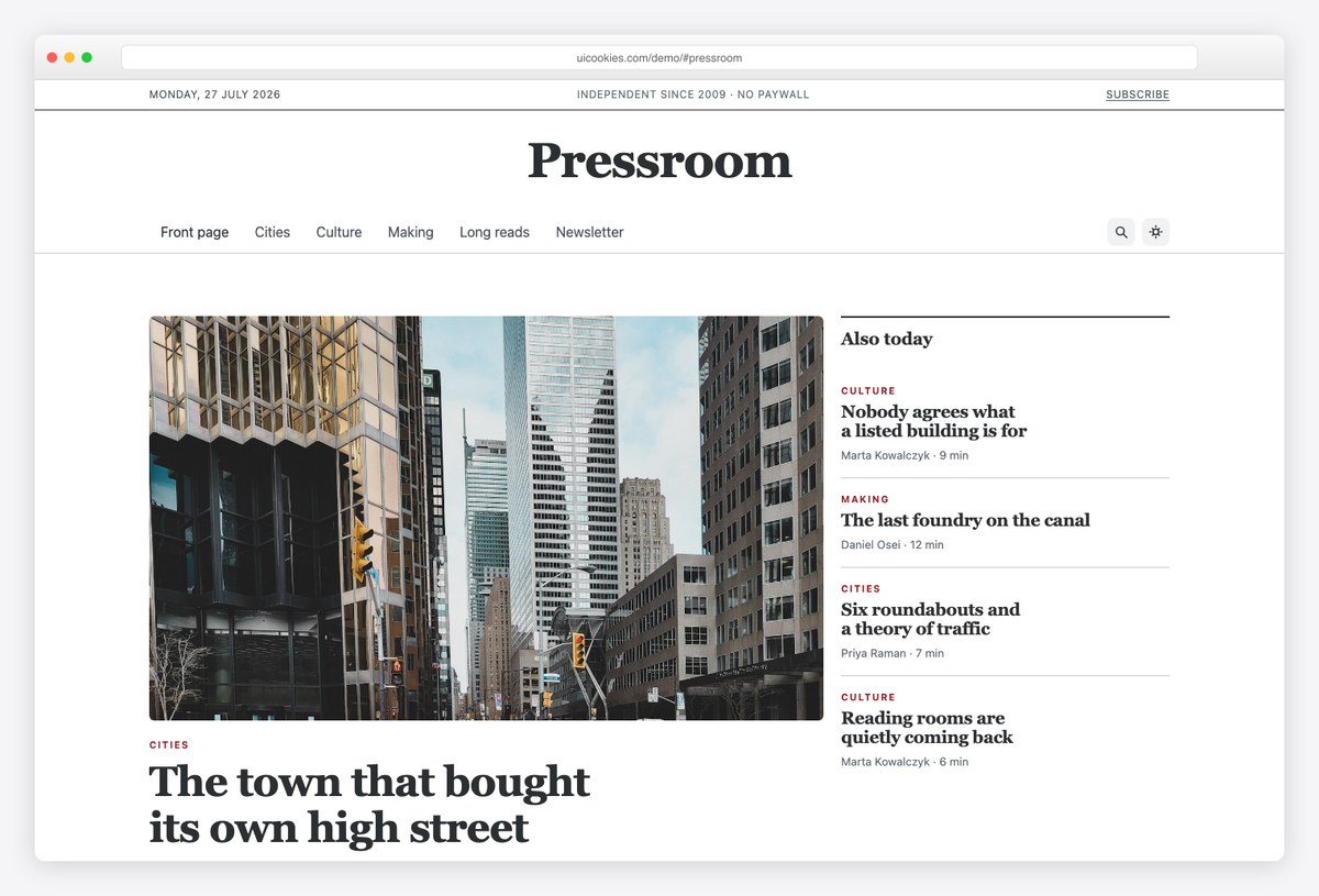
Why we like it: The homepage is built like a real front page — a lead story, a secondary rail, section blocks and a most-read list — rather than an endless grid of identical cards.
Pressroom’s article page uses Bootstrap 6’s new prose typography scope for rich text without touching the rest of the page, with a sticky table of contents driven by the rebuilt IntersectionObserver ScrollSpy.
Author pages give every byline a home, and category filtering runs on the new combobox and chip input. If you are moving a publication off a heavyweight CMS theme, this is the static starting point that respects editorial hierarchy.
More info / Download Demo25. Liftoff
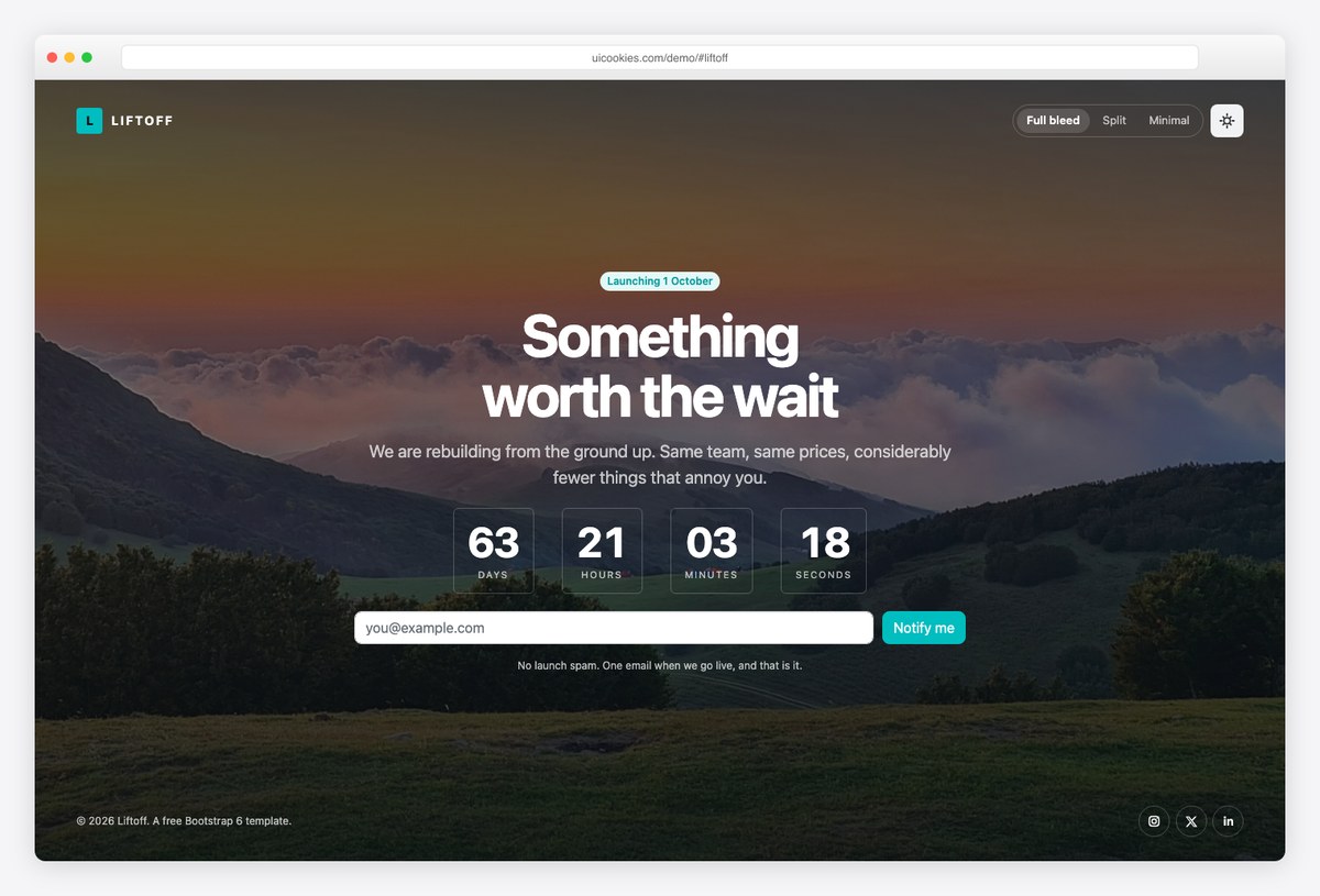
Why we like it: Three complete layouts in one download — full-bleed photographic countdown, split screen, and stripped-back minimal — with a switcher in the header so you compare them live before choosing.
Coming-soon is a niche where people choose by layout rather than feature list, so shipping one layout is shipping a third of a product. Every Liftoff variant fits the viewport exactly with no scroll, and all three share the countdown and signup form.
It is the lightest template in this collection and the fastest to deploy: pick a layout, change the date and logo, upload.
More info / Download DemoHow to choose a Bootstrap 6 template
- Launching a product? Threshold for the landing page, Ledgerline if pricing is usage-based, Liftoff while you build.
- Showing work? Silver Halide for photography, Atelier for design and development, Northmark for a whole studio, Drafthouse for architecture.
- Taking bookings? Lantern (rooms), Tavola (tables), Ironworks (classes), Northgate (school visits) — all on the new date picker and combobox.
- Running a local service? Fixwell’s call bar, quote card and postcode checker are the conversion pattern; Forecourt applies the same thinking to vehicle sales.
- Community or cause? Stonebridge for churches, Openhands for charities, Marigold for weddings.
- Publishing? Pressroom for editorial, Soundstage for music, Syllabus for courses.
Frequently Asked Questions
What is Bootstrap 6?
Bootstrap 6 is the next major version of the world’s most-used CSS framework. It replaces plugin-dependent patterns with platform features: modals and drawers become native <dialog> elements, the color system moves to OKLCH with color-mix(), JavaScript ships as ES modules only, and the framework gains first-party date pickers, comboboxes, steppers, OTP inputs and chip inputs.
Is Bootstrap 6 released? Can I install it with npm?
Not yet — Bootstrap 6 is still pre-release, and npm install bootstrap@6 does not work. The templates in this list solve that by vendoring a pinned Bootstrap 6 build inside each download, so they run today, with no package manager and no build step.
Will these templates break when Bootstrap 6 stable is released?
No. Because each template ships the exact framework build it was tested against, upstream changes cannot break your site. Upgrading to a newer Bootstrap 6 build later is your choice, made on your schedule.
Do I need a build step or any tooling to use these templates?
No. Every template is static HTML, CSS and ES-module JavaScript — unzip the download, open index.html, and edit with any editor. There is no Sass compilation, no bundler, and no Node.js requirement.
Which browsers do Bootstrap 6 templates support?
These templates rely on modern platform features — native dialogs, color-mix(), container-era CSS — so they target current evergreen browsers rather than legacy ones. If you must support very old browsers, a Bootstrap 5 template remains the safer choice; see our other free template roundups for those.
Wrapping up
These 25 templates are the fastest way to see what Bootstrap 6 changes in practice — native dialogs, real date pickers and comboboxes, and layouts that lean on the platform instead of plugin stacks. The collection keeps growing as new templates ship: the full set lives in the Bootstrap 6 category on uiCookies. And if you need the application side — dashboards, auth screens, data tables — start with AdminLTE.io’s Bootstrap 6 admin dashboard templates or our wider free admin dashboard templates roundup.

Related Posts
Comments (0)