19 Best Videographer Websites (Examples) 2026
Are you searching for the best videographer websites because you’d like to gain some additional creative ideas?
We may not always know exactly what we want, so checking other high-quality stuff is always rewarding.
Hey, we need to start somewhere, right?
And that’s when these examples come into play.
Make a website that will shine extra light on your works and projects, create a compelling about page and go one step further by starting a blog.
You can easily and quickly build your dream website with these excellent videographer WordPress themes.
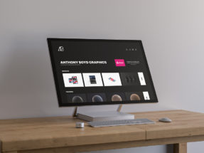
Best Videographer Websites And Examples

1. Astray
Built with: Squarespace
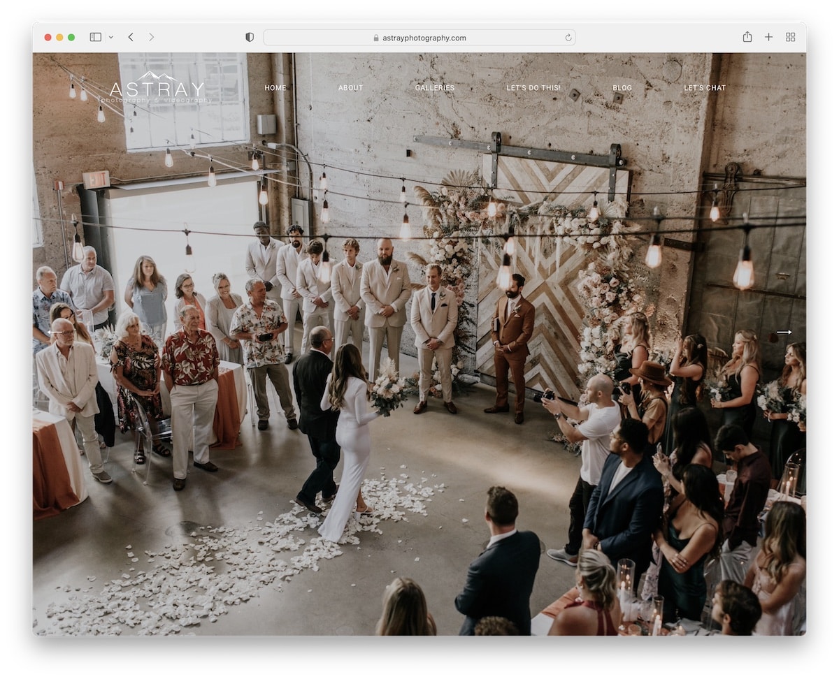
Astray can impress visitors the right way—with a full-screen image slider. To keep the experience distraction-free, the Astray page uses a transparent header.
Moreover, the wedding site sticks to a simpler layout with creative elements to spice things up. The large, full-width Instagram feed slider is an excellent addition to the already epic experience.
What stands out: Use a full-screen slider to welcome visitors to your world of beautiful content.
You can also check our list of the best Squarespace website examples.
2. Jensen Films
Built with: Squarespace
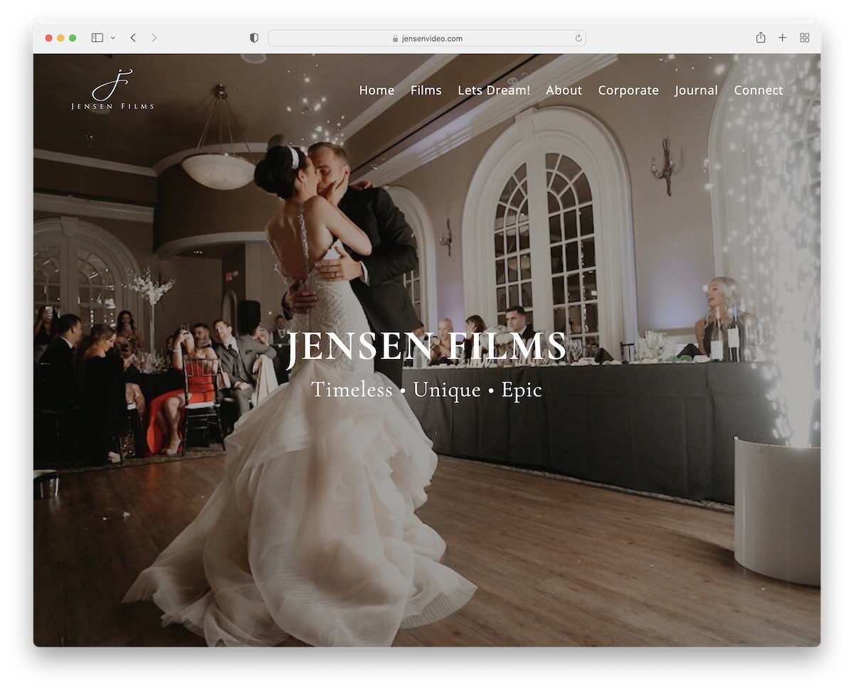
Jensen Films videographer website uses a full-screen image background with a clean header featuring a drop-down menu.
The home page has only a few sections, so it’s easy to skim through it, which is always a plus.
Moreover, adding client testimonials ensures social proof, while IG posts in the footer add some more exciting content.
What stands out: Use an Instagram feed if you’d like to add more content to your website while growing your profile.

3. Paradise
Built with: Squarespace
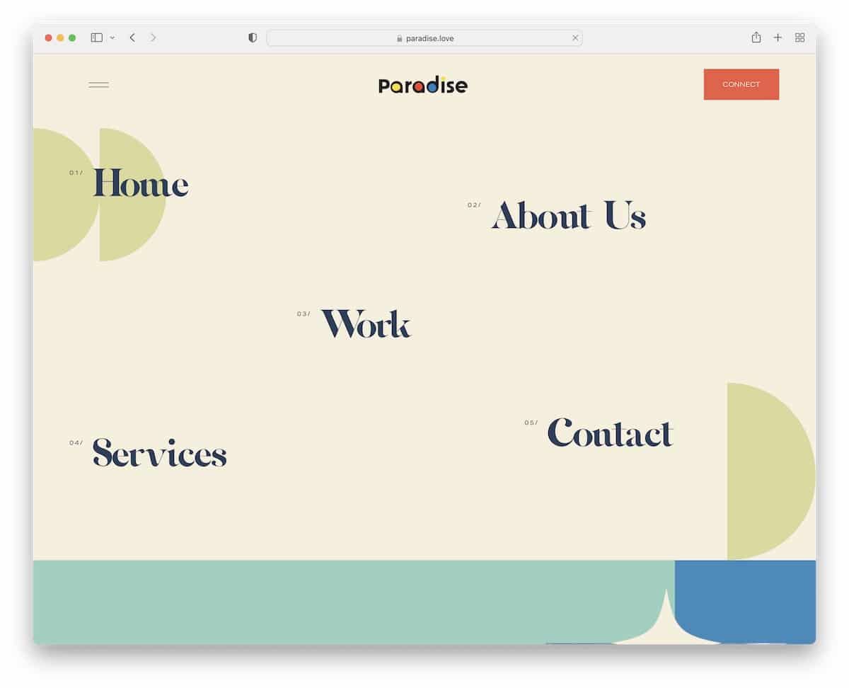
Paradise has a very interesting hero section, which is basically a menu with hover effects. However, the hamburger icon in the top left corner reveals a full-screen menu overlay.
Moreover, they use a call-to-action (CTA) in the header, so those interested in contacting them can do so immediately.
We also really like the unique yet somewhat minimalist design that keeps you engaged from header to footer.
What stands out: Try using a CTA button in the header/navigation bar.
4. The Orpens
Built with: Squarespace
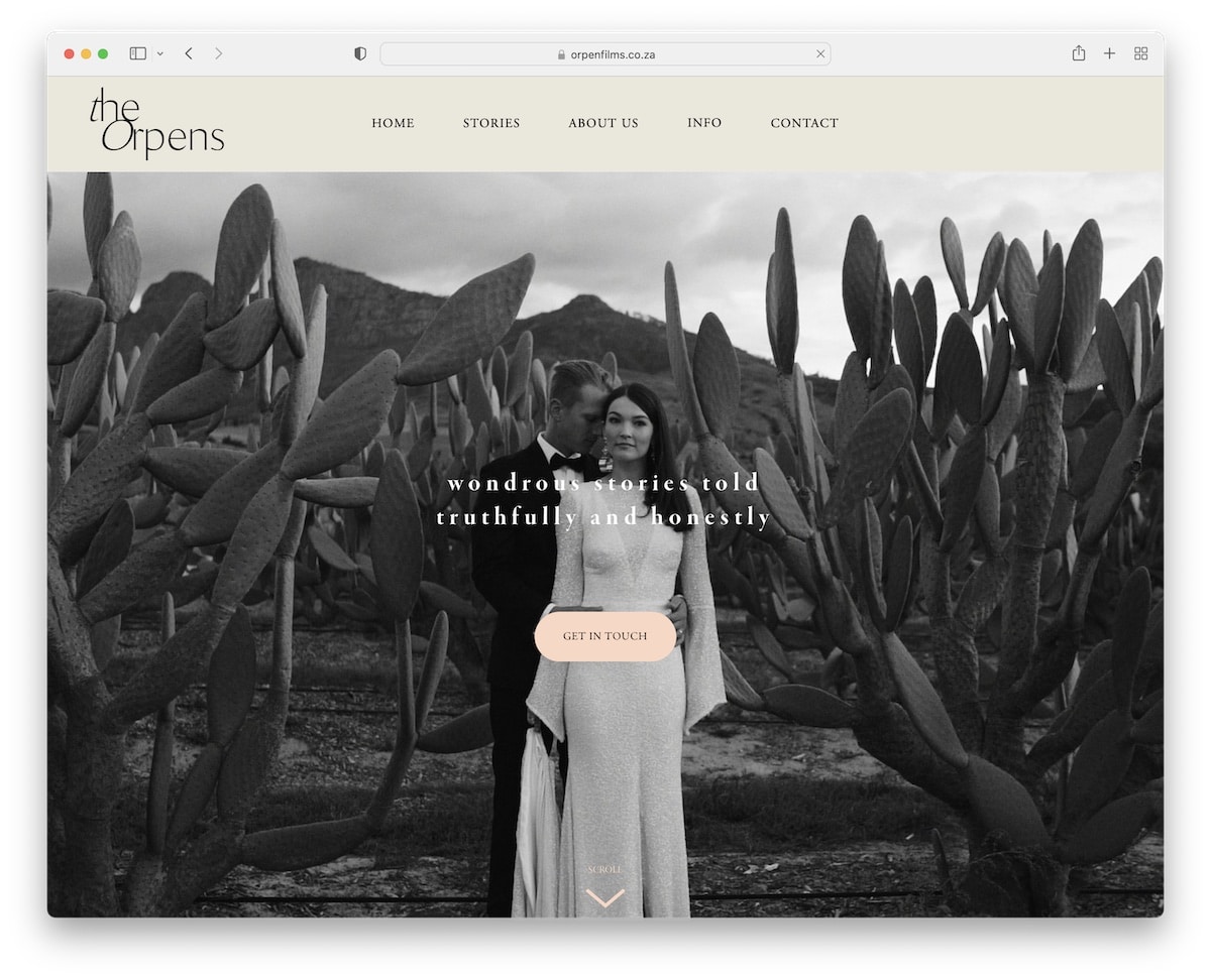
The Orpens features a clean header, a large image banner with text, and a CTA button above the fold to get the excitement going.
Further down is a two-column grid of animated and static thumbnails that take you to individual projects where you can watch beautiful videos.
The overall website look is clean, including the footer with the unchanged background color.
What stands out: Create a grid portfolio to ensure everyone can quickly check your work.
5. Odicci
Built with: Squarespace
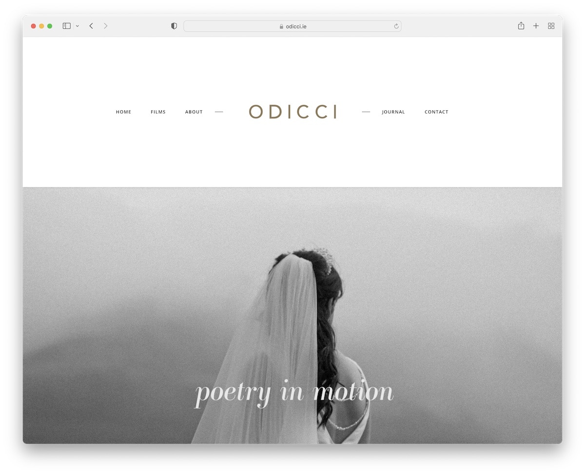
What’s interesting about Odicci is the large header with tiny menu links and a centered logo. However, it goes very well with their minimalist website look that continues with a large image with text but no CTA or link.
This videographer’s website also contains embedded videos, an about section and an Instagram feed grid. The footer also contains other social media links to easily connect with Stephen.
What stands out: Let all your website elements resemble minimalism, including the header and footer.
6. Ethan Hill Media
Built with: Squarespace
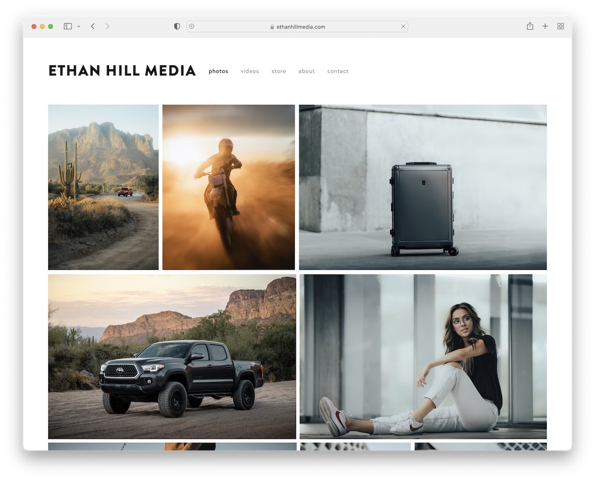
Ethan Hill Media’s page rocks a large grid portfolio on the home page with a lightbox effect, so visitors don’t have to leave the current page to view the content.
The header and footer have the same background color as the website’s base, giving the page a more pristine appearance.
What stands out: Use a portfolio or a gallery with the lightbox feature to boost user experience.
7. Courtney Holmes
Built with: Squarespace
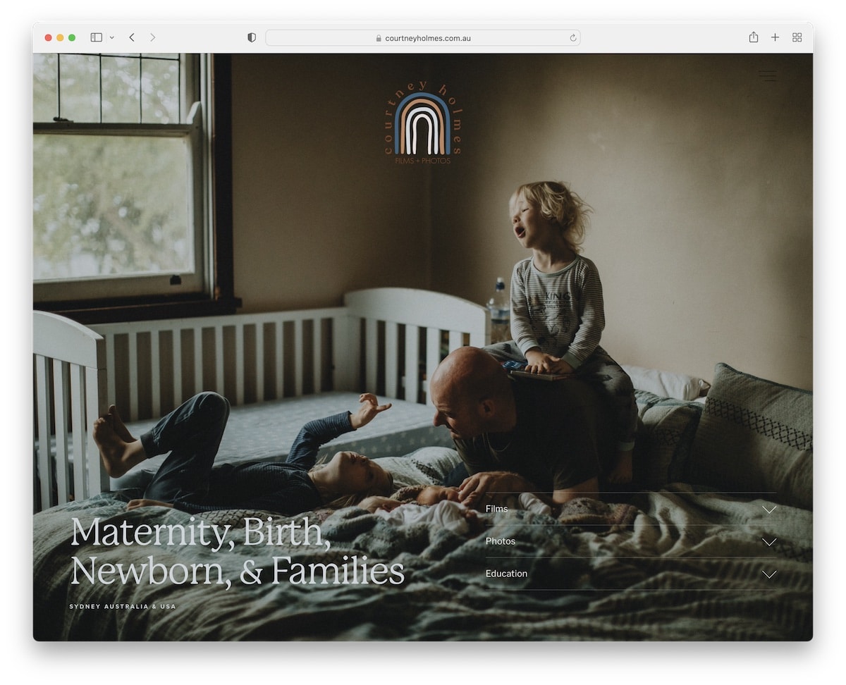
Courtney Holmes’ above-the-fold section has two unique features: first, the header only features a logo, which is the home button, and second, transparent accordions with further details.
The choice of colors makes this videographer’s website special, and the unique testimonials slider is a must-see.
And while there’s no navigation in the header, Courtney added it as part of the footer.
What stands out: Remove navigation from the header to keep the look cleaner.
8. FilmingLife
Built with: Squarespace
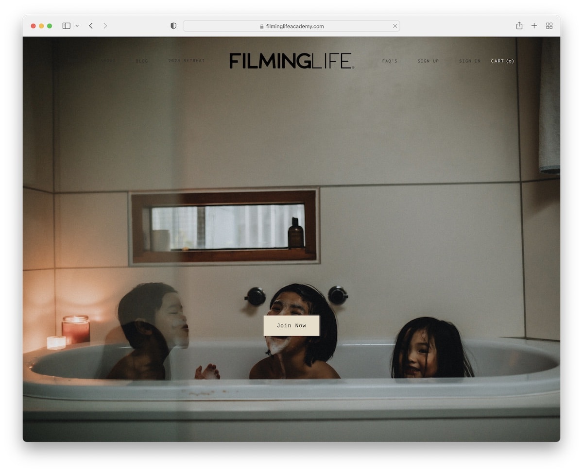
FilmingLife creates a strong first impression with an image background, a transparent header and a simple “join now” CTA button.
This website’s vibe is similar to Courtney Holmes’, ensuring the ultimate user experience when browsing its content.
The video lightbox is also handy because the viewer doesn’t need to leave the page to watch it.
What stands out: Use a CTA button above the fold to enjoy more leads, conversions, etc.
9. Snack Media
Built with: Webflow
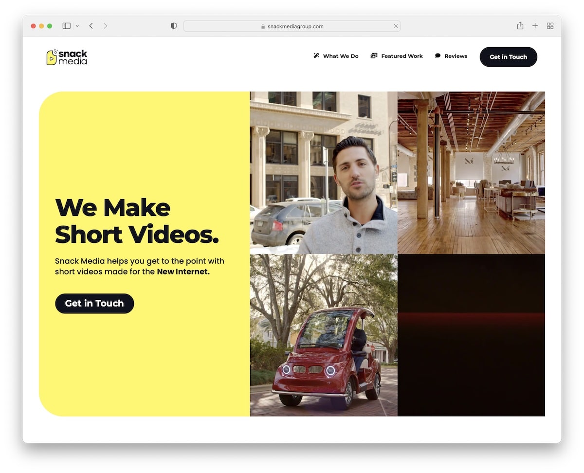
Snack Media has a vibrant and engaging hero section with a bright yellow background, text, a CTA and four-grid video-playing thumbnails. This is how you grab visitors’ attention!
With rounded edges, Snack Media achieves a mobile-like experience that we’re all used to.
Also, the filterable portfolio of videos allows everyone to find the right content much easier.
What stands out: Use video thumbnails instead of images to make it more engaging.
Do you plan to use Webflow? Then you should also check these great Webflow websites.
10. Kirth Noel
Built with: Squarespace
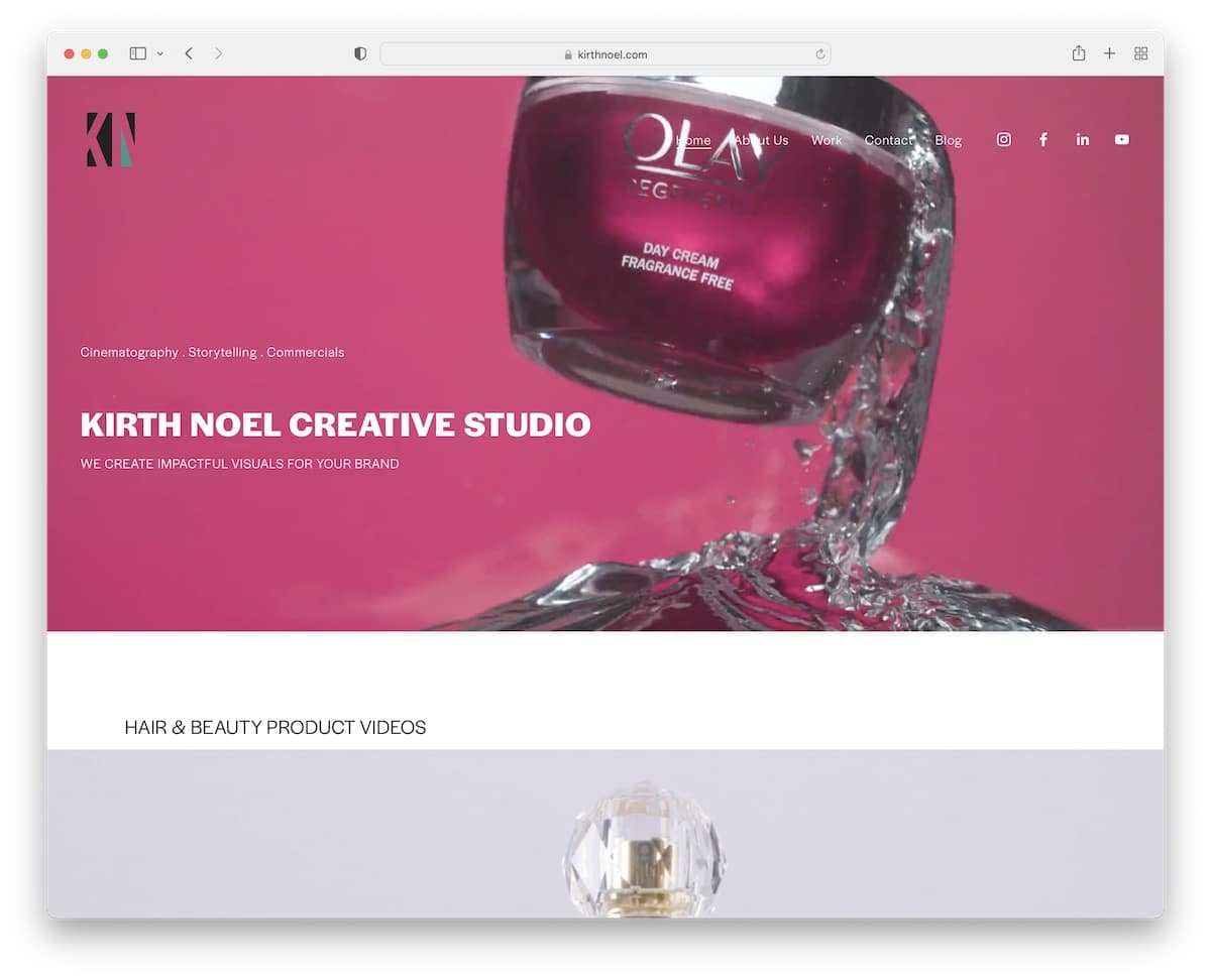
Kirth Noel’s videographer website has a video background above the fold with a title, text, and a transparent header. In addition to the menu, the header features social media icons for easy connection.
Furthermore, Kirth Noel has various massive image sliders where each slider opens a video on a new page.
What stands out: Use a video in the hero section to spark immediate curiosity.
11. The Chris Hau
Built with: Shopify
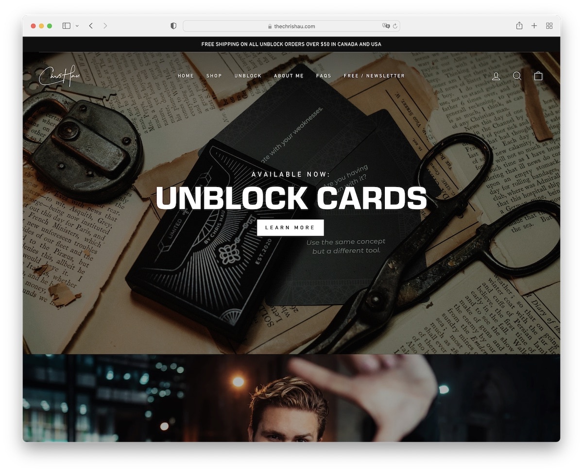
Chris Hau’s site is divided into multiple full-width sections, with text, CTA buttons, and a floating header, so users can always access other internal pages without scrolling back to the top.
One of the sections has a before-and-after effect, which promotes his Lightroom presets, so you can better visualize the result.
Additionally, some images have a parallax effect, with one section with a video background.
What stands out: Use a sticky header/menu to increase user experience.
12. Nainoa Langer
Built with: Squarespace
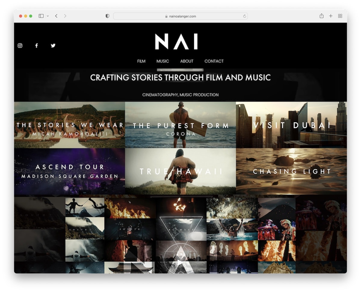
Nainoa Langer is a videographer website with a disappearing header that reappears as soon as you start scrolling back to the top.
The home page features a thin video background with a title, a grid promoting some of the works, and an embedded video. There’s also a full section with client logos.
What stands out: Have you worked with many notable brands? Mention them on your website to raise your potential.
13. Shortstache
Built with: Squarespace
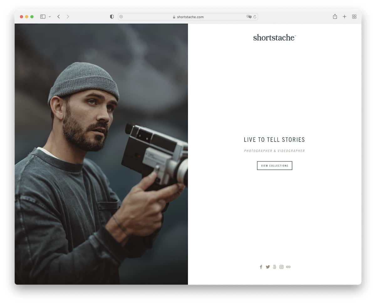
Shortstache’s home page features a split-screen design with an image on the left and text and a CTA on a solid background on the right. For a more minimalist look, the front page also doesn’t have a header or footer.
However, the header appears on internal pages to find different content and about and contact pages easier.
What stands out: Your home page doesn’t have to be a whole bunch of content and information; keep it simple, like Shortstache.
14. Creator Classes
Built with: Shopify
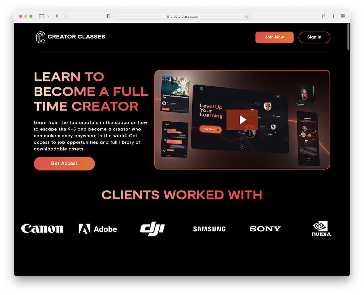
Creator Classes is another website with a beautiful dark design that works more as a landing page. The header features two CTA buttons to join and sign up, while the footer contains additional links, social media buttons and a newsletter subscription form.
The above-the-fold is very actionable, with a title, text, a CTA, a video, and client logos that prove the quality of the work.
What stands out: Do you want to promote your services and products via email? Add a subscription form to your business website to grow your list.
15. Brandon Li
Built with: Elementor
We wanted to add Brandon Li’s website to this collection to show that you don’t need a fancy online presence to make it work.
While he operates on other platforms, Brandon uses his videographer website as a hub to link it to his three main channels. But he did use a full-screen image background of himself in action to make it not too dull.
What stands out: Even if you’re successful on different platforms, create a website where fans can find links to your works.
If you plan to build your online presence with WordPress, read our Elementor review (one of the best page builders!)
16. Red Creative
Built with: Wix
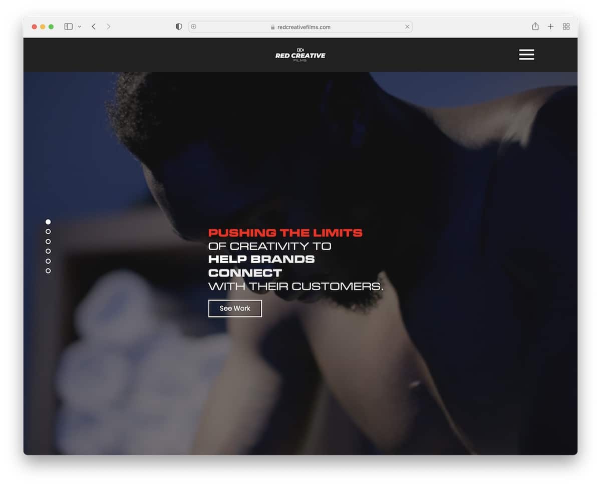
Red Creative’s website almost feels like a vertical slider, which you can scroll through or use pagination on the left to jump from section to section.
From video and parallax backgrounds to video thumbnails and full-screen menu overlay, Red Creative ensures you get everything you need in a pleasant atmosphere.
Also, while the header with the hamburger icon disappears as soon as you start scrolling, it reappears when scrolling back to the top.
What stands out: To keep your visitors’ attention, use special effects, like video backgrounds and parallax images, to keep them on your site for longer.
17. Matti Haapoja
Built with: Shopify
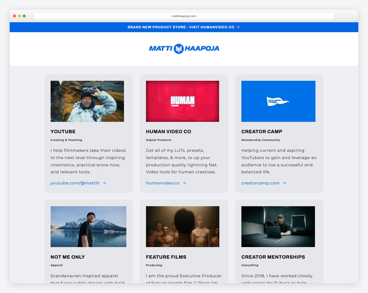
Matti Haapoja’s website showcases the YouTube filmmaker’s brand with a bold hero image and clean navigation. Known for his cinematic travel and documentary work, his site serves as a hub connecting his various creative ventures — from filmmaking courses to gear recommendations.
The design takes a commerce-forward approach using Shopify, with prominent links to his shop alongside his portfolio and YouTube content. The dark aesthetic and high-contrast imagery reflect the cinematic quality his 3M+ subscribers expect.
What stands out: Using Shopify for a videographer site is smart when merchandise and courses are significant revenue streams alongside client work.
18. Peter McKinnon
Built with: Squarespace
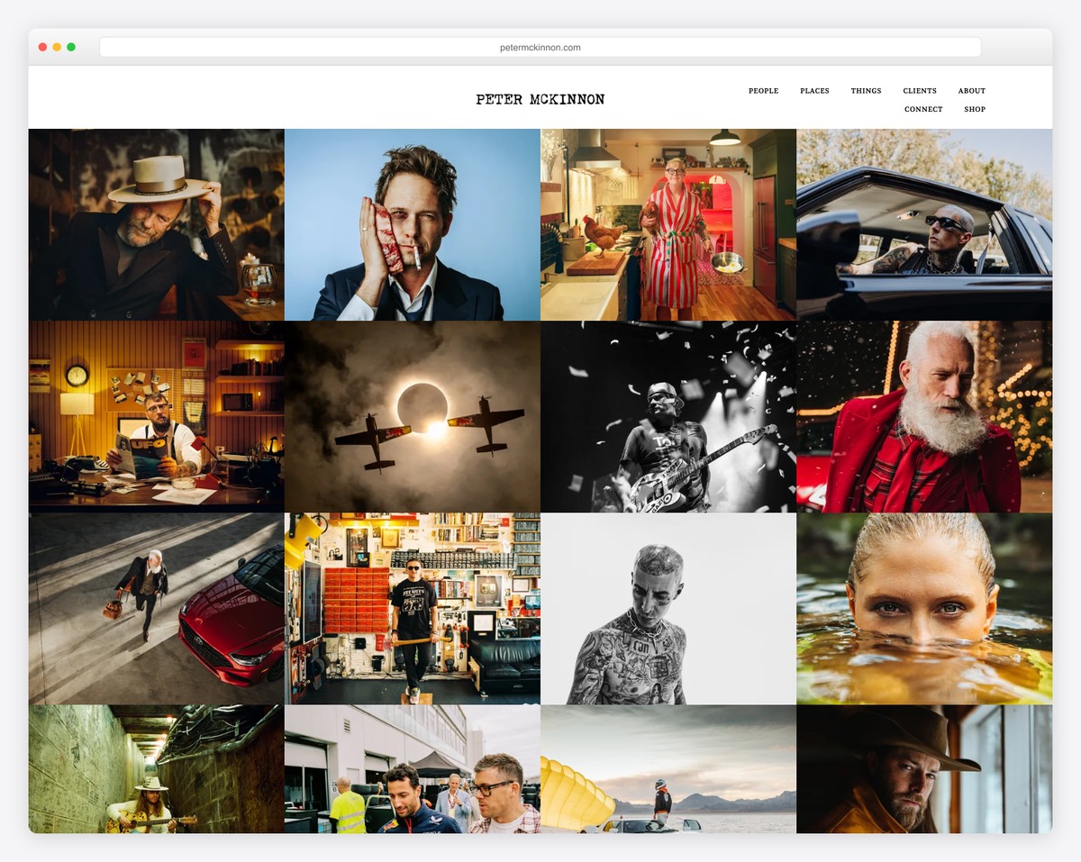
Peter McKinnon’s portfolio is a visual feast — a full-screen mosaic grid of his best photography and cinematography work greets visitors immediately. With 6M+ YouTube subscribers, his website wisely lets the imagery do the talking, with minimal text and a clean top navigation.
The grid layout organizes work into People, Places, Things, and Clients categories, making it easy for potential collaborators to find relevant samples. The name prominently displayed in bold serif type establishes brand recognition immediately.
What stands out: A full-bleed photo grid homepage is the gold standard for photographer-videographers — it proves your skill before visitors read a single word.
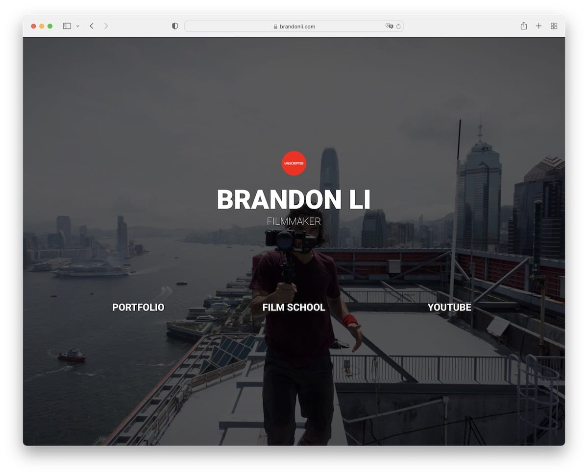
19. Brandon Li
Built with: WordPress
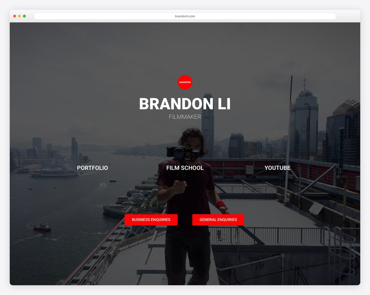
Brandon Li’s filmmaker portfolio opens with a cinematic full-screen hero — the “Unscripted” brand badge and Hong Kong skyline backdrop immediately establish his documentary filmmaking identity. The bold white typography against the moody cityscape creates instant atmosphere.
Three clear pathways — Portfolio, Film School, and YouTube — cater to different visitor intents. The red CTAs for Business and General Enquiries stand out against the dark palette, while the overall design mirrors the high-production-value aesthetic of his award-winning travel films.
What stands out: Segmenting your site into portfolio, education, and contact sections lets a filmmaker serve both clients and aspiring creators from a single homepage.
Related Posts


Comments (0)