19 Best Squarespace eCommerce Examples In 2026
Are you searching for the best Squarespace eCommerce examples to see what’s possible?
Whether you want to build a minimalist or a more advanced, feature-rich online store, you can make it happen with this great eCommerce website builder.
It’s all possible, from creating a compelling home page and insightful product pages to quick checkout processes and excellent site navigation.
However, you can gain a wealth of new creative and functional ideas by exploring these exceptional web designs.
Squarespace eCommerce Examples
1. Brew Tea Co
Built with: Squarespace
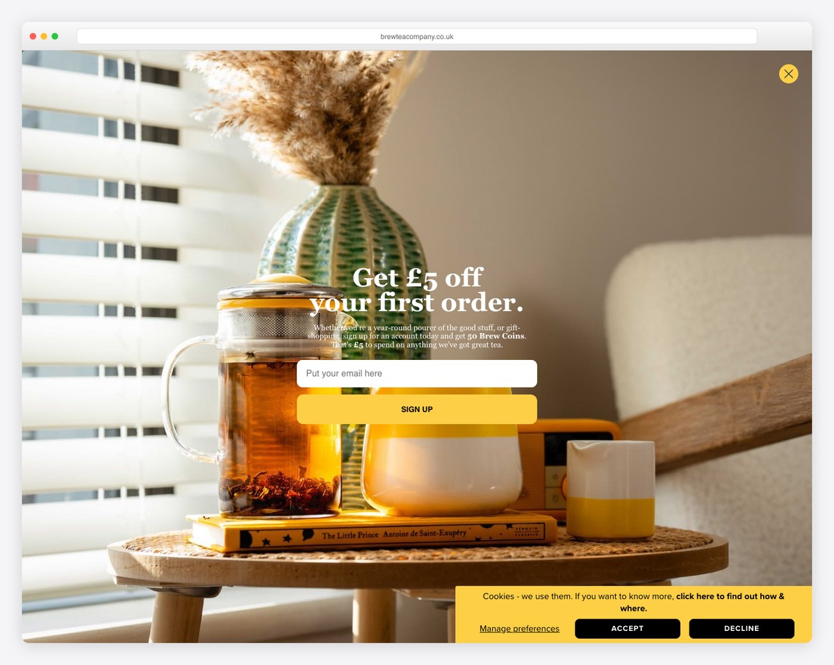
While Brew Tea Co’s leans more toward simplicity, its branding makes it vivid and attention-grabbing (thanks, yellow!).
This eCommerce website has plenty of practical features to create a pleasant online shopping experience.
From top bar text-sliding notifications and mega menu to a chat widget and a bestsellers carousel, these guys know how to do it right (and bright).
What stands out: Strategically incorporate your branding into the web design for a more pleasant and memorable experience.
Don’t forget to check our collection of the best website colors if you need inspiration with picking the right palette.
2. Ocelot Chocolate
Built with: Squarespace
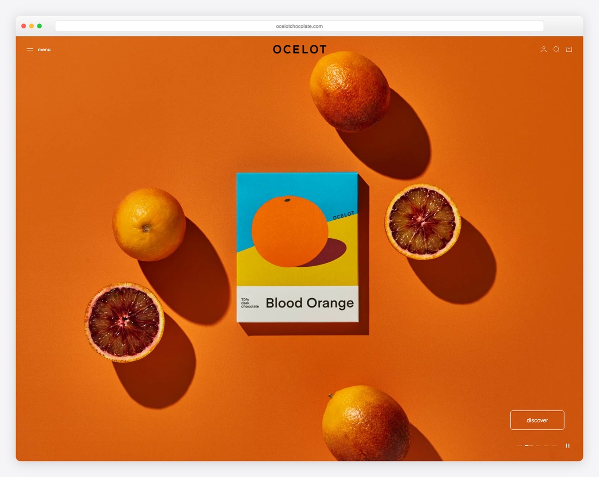
Ocelot Chocolate has a superb grid layout, linking to different shops and internal pages. The header and the footer are simple, using the same background color as the base.
Interestingly, the website doesn’t use a search bar, but it works because of the drop-down menu; plus, there aren’t many items, so everything is easily accessible.
What stands out: Use the same background color consistently throughout the website, including the header and footer, to create a more cohesive online presence.
3. Supernatural
Built with: Squarespace
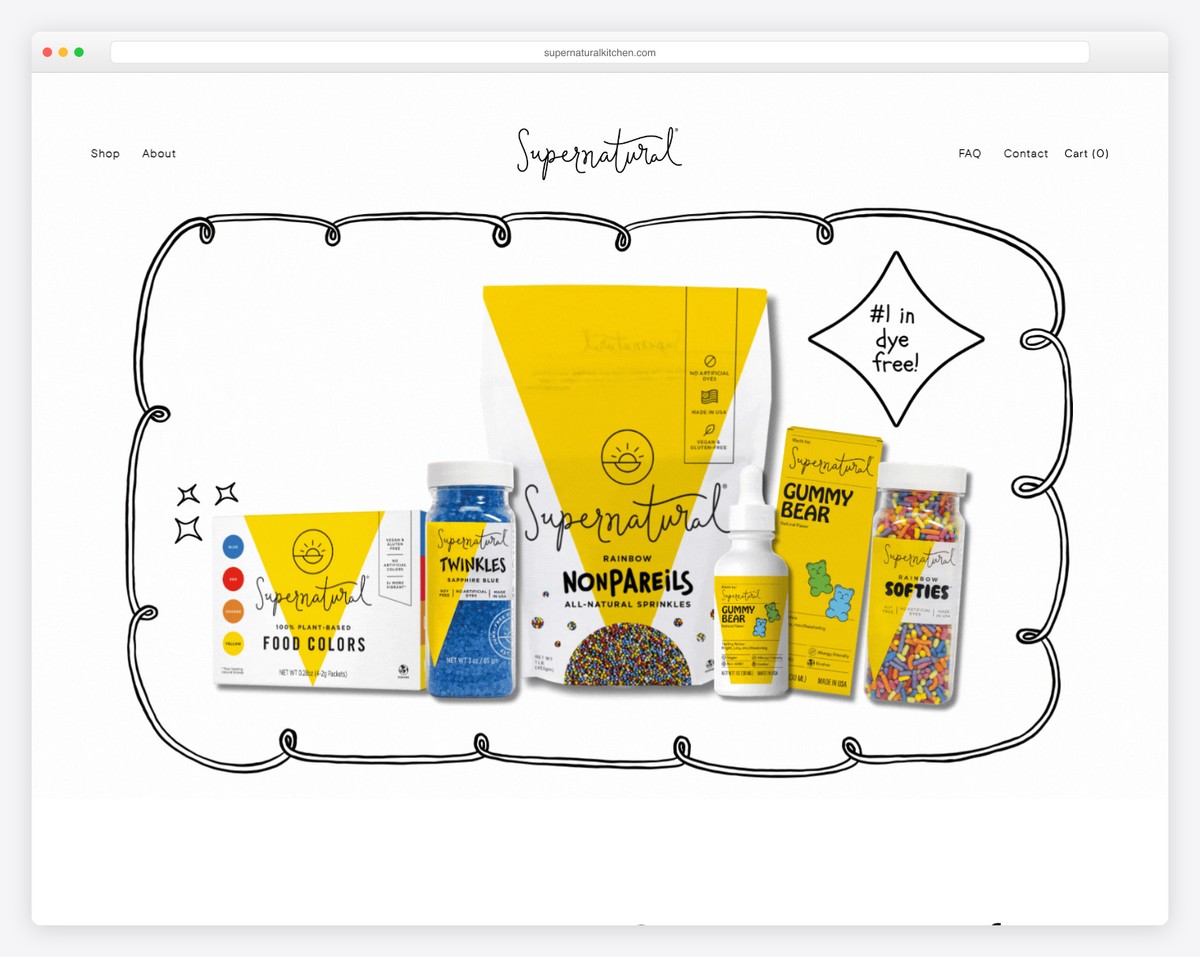
Supernatural has a large hero image with a parallax effect, creating a bold first impression. The header is 100% transparent, so the image pops more.
Moreover, you’ll find an integrated Instagram feed, which opens image posts in a new tab and video posts in a new window.
They also use a newsletter popup, promoting a discount in exchange for an email.
What stands out: Add more content and showcase your social skills with an IG feed.
4. Jones Bar-B-Q
Built with: Squarespace
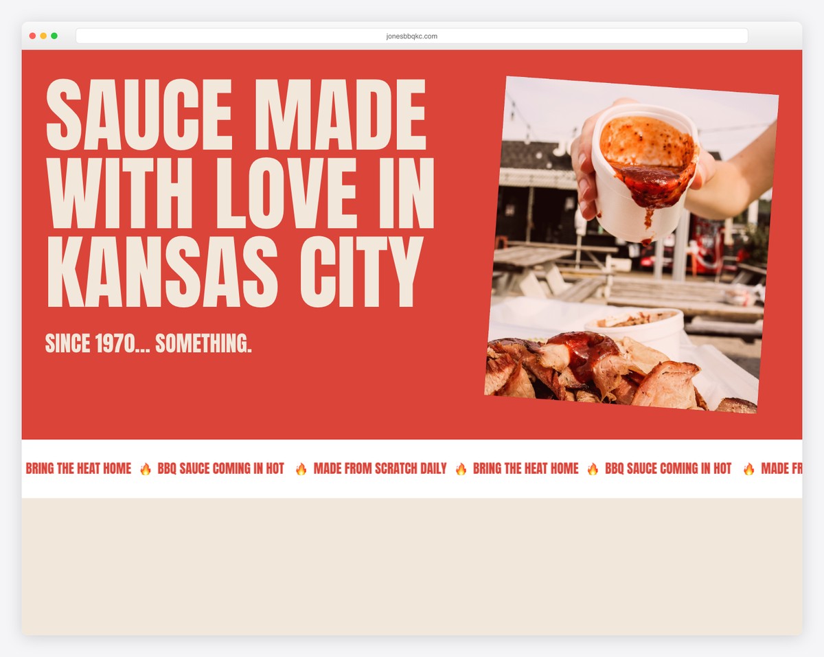
One of the handy features of Jones Bar-B-Q is the header, which disappears when you start scrolling and reappears when you return to the top. The navigation bar also has a shopping cart icon and a call-to-action (CTA) button.
Besides loading content on scroll to increase engagement, they also use a sliding text effect twice to keep you focused. Lastly, they use a subscription form positioned before the multi-column footer to collect leads for email marketing.
What stands out: Create a disappearing/reappearing header to make scrolling more distraction-free, while maintaining the practicality of a floating menu.
5. Minna
Built with: Squarespace
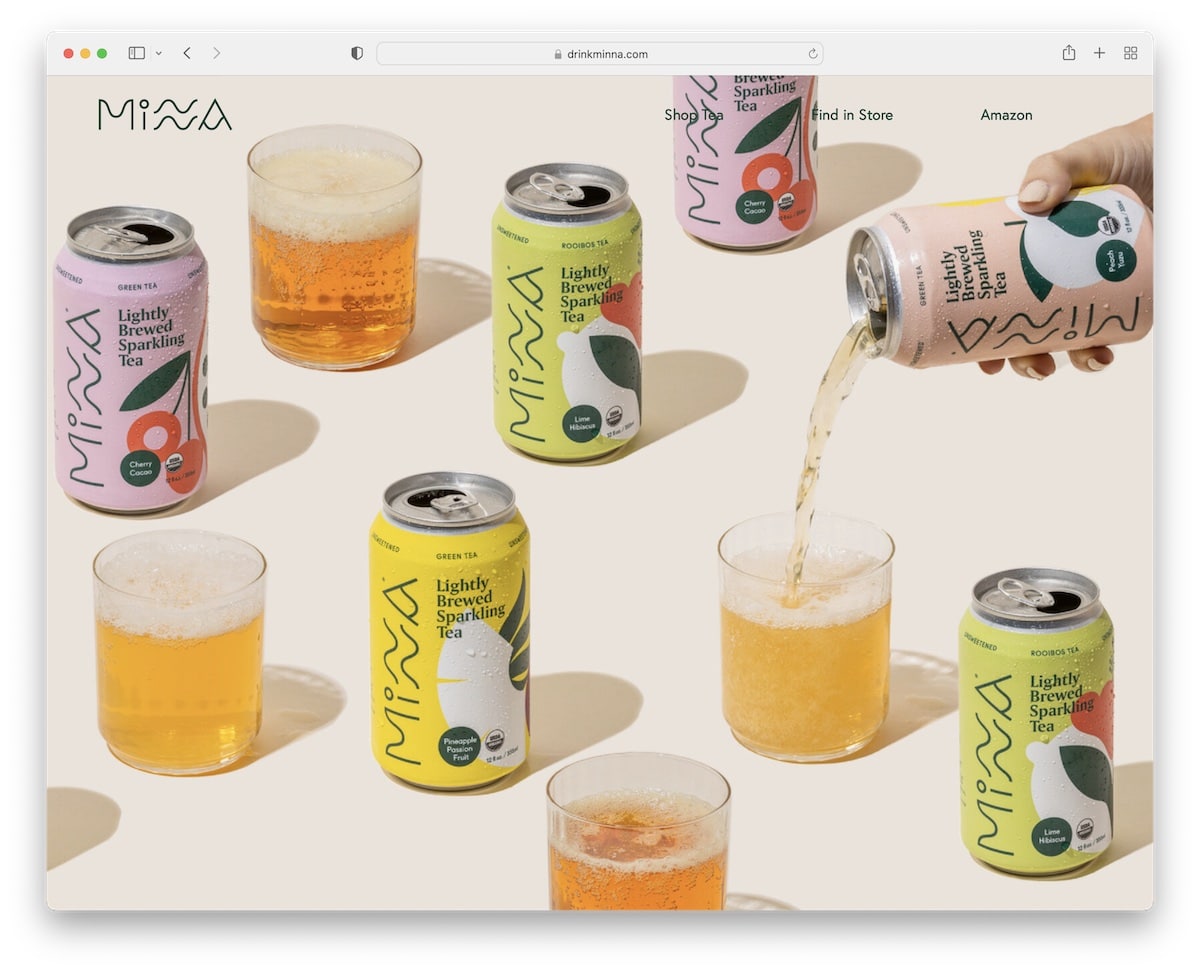
Like Supernatural, Minna also utilizes a massive parallax image above the fold, which undoubtedly sparks interest.
They then use multiple colorful sections to present their products, with CTA buttons for online ordering. The header is very plain, while the footer displays four quick links, social icons, and a subscription form.
What stands out: Your hero section doesn’t have to be salesy – let an image (with a parallax effect) do the talking.
6. Soilboy
Built with: Squarespace
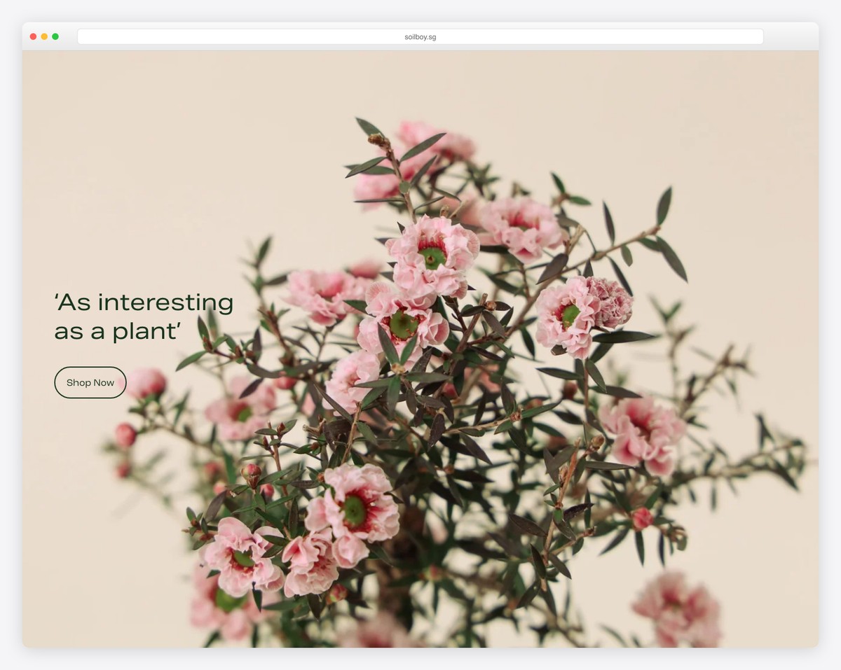
While Minna keeps the above-the-fold section minimalist, Soilboy goes one step further by adding simple text and an outlined CTA button. All their call-to-action buttons have a hover effect, making them more interactive (read clickable).
This Squarespace eCommerce example emphasizes large images, minimal text, and generous white space. This is an excellent approach for an eye-friendly online store.
What stands out: Use white space to reduce eye strain and make the website more skimmable.
You might be surprised, but this website was built using one of our Squarespace eCommerce templates, which you can use too.
7. Peter McKinnon
Built with: Squarespace

Peter McKinnon is a terrific example of a photography website with an online shop. The home page has multiple image sections with a parallax effect that unknowingly immerses you in the content.
The store page displays multiple banners with links to categories, but you can also access them via the drop-down menu in the header.
What stands out: Create a drop-down navigation for a refiner search (best if you have multiple categories and no search bar).
8. Lisa Maltby
Built with: Squarespace
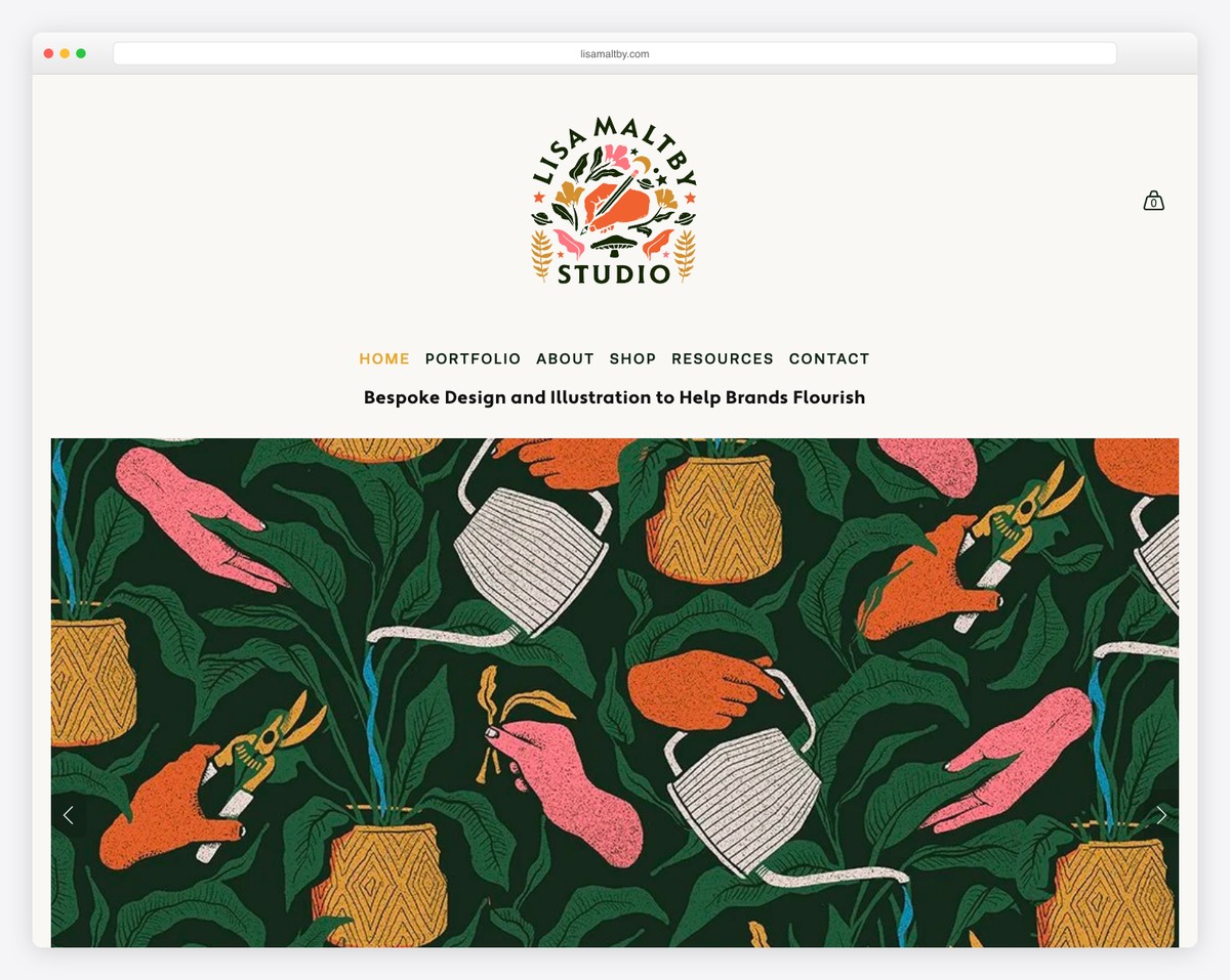
Lisa Maltby is a minimalist artist’s website with an online portfolio and store.
The eCommerce page has a simple grid with large thumbnails and quick-view functionality. You can view the details and add the product to your shopping cart without leaving the current page. You can also stay in the quick-view view to view other items.
What stands out: Quick view is an excellent feature that can enhance your eCommerce website’s overall user experience.
9. AAKS
Built with: Squarespace
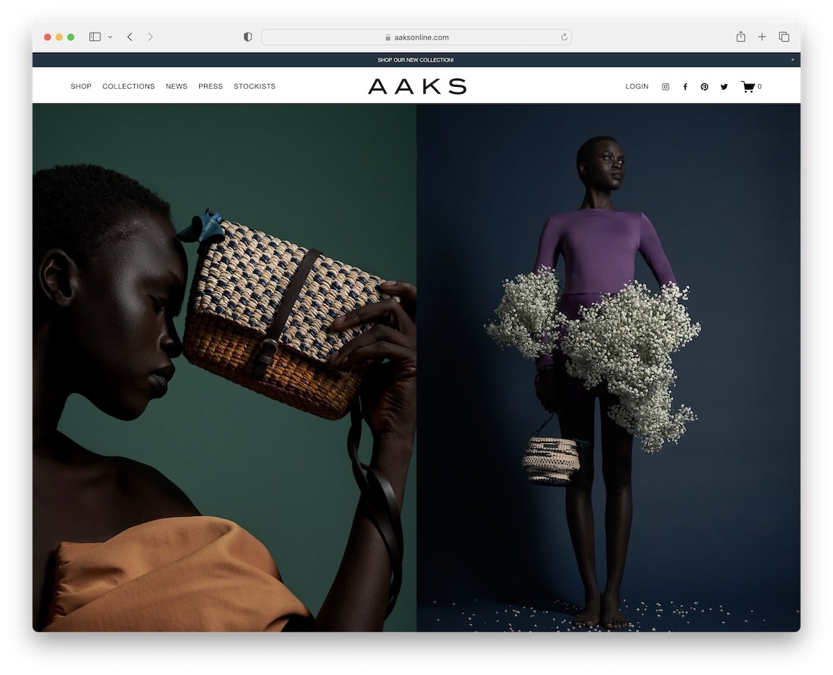
AAKS is a modern and elegant Squarespace eCommerce example that loads content on scroll, featuring ample white space for improved viewability and readability.
It’s another representation of a disappearing/reappearing header (just that AAKS also has a top bar, which you can close by pressing “x”).
While all the website sections have lighter tones, the footer stands out more with a black background.
What stands out: Don’t be afraid to use black sections, even if lighter tones dominate.
10. Shhhowercap
Built with: Squarespace
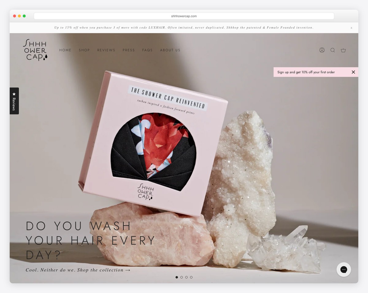
Shhhowercap uses a full-screen slider that combines an image and a video slide to make it more engaging.
Moreover, while some Squarespace eCommerce examples have 0 sticky elements, Shhhowercap has 4: header, back-to-top button, chat widget, and a subscription button.
They also added a customer testimonials slider for social proof and integrated an IG feed with a “follow” button.
What stands out: Build trust and validation by integrating testimonials and reviews into your online store.
11. The Fancy Friend Shop
Built with: Squarespace
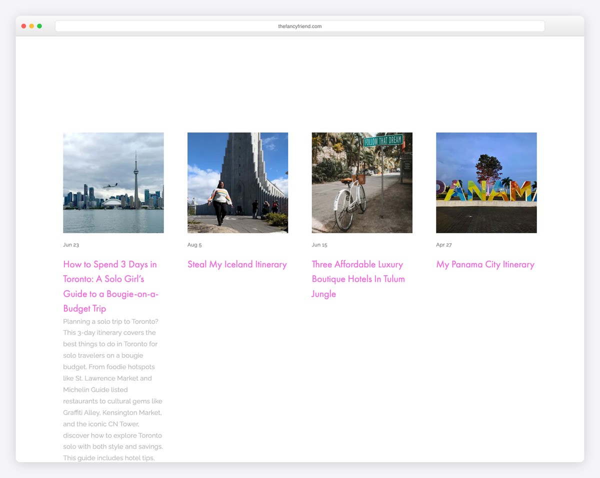
The Fancy Friend Shop’s home page features a shop page with category links below the header, allowing you to search for something more specific.
However, you can also click on the hamburger menu icon, which slides the navigation and social media buttons from the left.
Another feature worth trying (if you receive a lot of spam) is adding reCAPTCHA to your subscription form.
What stands out: Make your header cleaner with a hamburger menu icon that reveals navigation on click.
12. Projekt Glitter
Built with: Squarespace
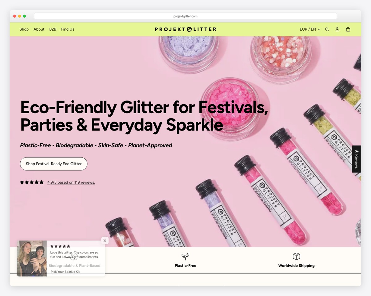
Projekt Glitter has a vibrant design that goes well with the name and the products. Talking about great branding!
While some Squarespace eCommerce websites use client testimonials, Projekt Glitter utilizes the “As seen in” section, featuring logos of various prominent authorities.
And they use a (live) chat widget (with instant answers) in the bottom right corner of the screen to ensure the ultimate customer service.
What stands out: Incorporate a chatting widget into your website to ensure quick customer answers. (You can also use a clever chatbot.)
13. Hungry Harvest
Built with: Squarespace
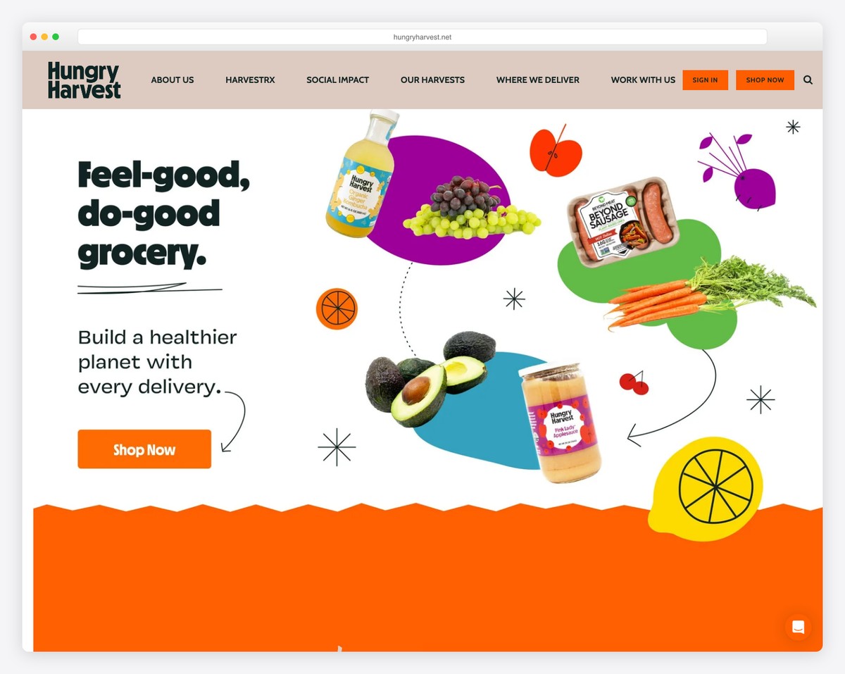
Hungry Harvest’s website is vibrant with custom graphics and icons that enliven the browsing and shopping experience.
The page features an exciting, earthy color scheme that makes exploring it even more engaging.
Moreover, because Hungry Harvest delivers fresh food, they first ask you to enter your address to check if they deliver to your area (only when you visit their shop page). This saves both parties time.
What stands out: Use custom graphics and icons specific to your brand for a personal touch.
In case you are building a similar website, here are some more food website examples.
14. Battle Axe
Built with: Squarespace

Because we focused this list of the best Squarespace eCommerce examples on physical products, Battle Axe offers digital and physical items.
The layout is tidy, but with a combination of dark and light backgrounds, as well as numerous animations and moving elements that make it more captivating.
One of the most convenient features is the pop-up checkout window that appears after you click the “Buy Now” button. A quick checkout, if you will.
What stands out: Create a simple checkout process to avoid discouraging potential buyers.
15. Blink
Built with: Squarespace
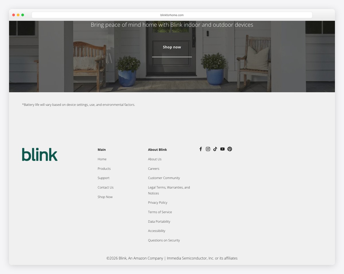
Blink is a semi-e-commerce website because it lets Amazon sell items. However, the website still boasts an excellent presentation, a light design, and multiple CTA buttons to facilitate shopping for items and learning more.
Additionally, the navigation links also serve as social icons and a CTA button, allowing users to go directly to the shops (their Amazon store opens in a new tab).
What stands out: Add a call-to-action button to the header to increase click-throughs to your online store.
16. Conscious Clothing
Built with: Squarespace

The stylish Conscious Clothing website starts with a free shipping notification bar, a transparent header, a large hero image with text, and a cursor-sensitive CTA.
Conscious Clothing uses larger images, easy-to-read text and a minimalist footer with lots of quick links, social icons and a subscription form.
All product pages feature a fantastic gallery, reviews, ratings, and a detailed description that simplify the decision-making process.
What stands out: Create a practical footer with links, social media, forms, etc.
17. Rust & May
Built with: Squarespace
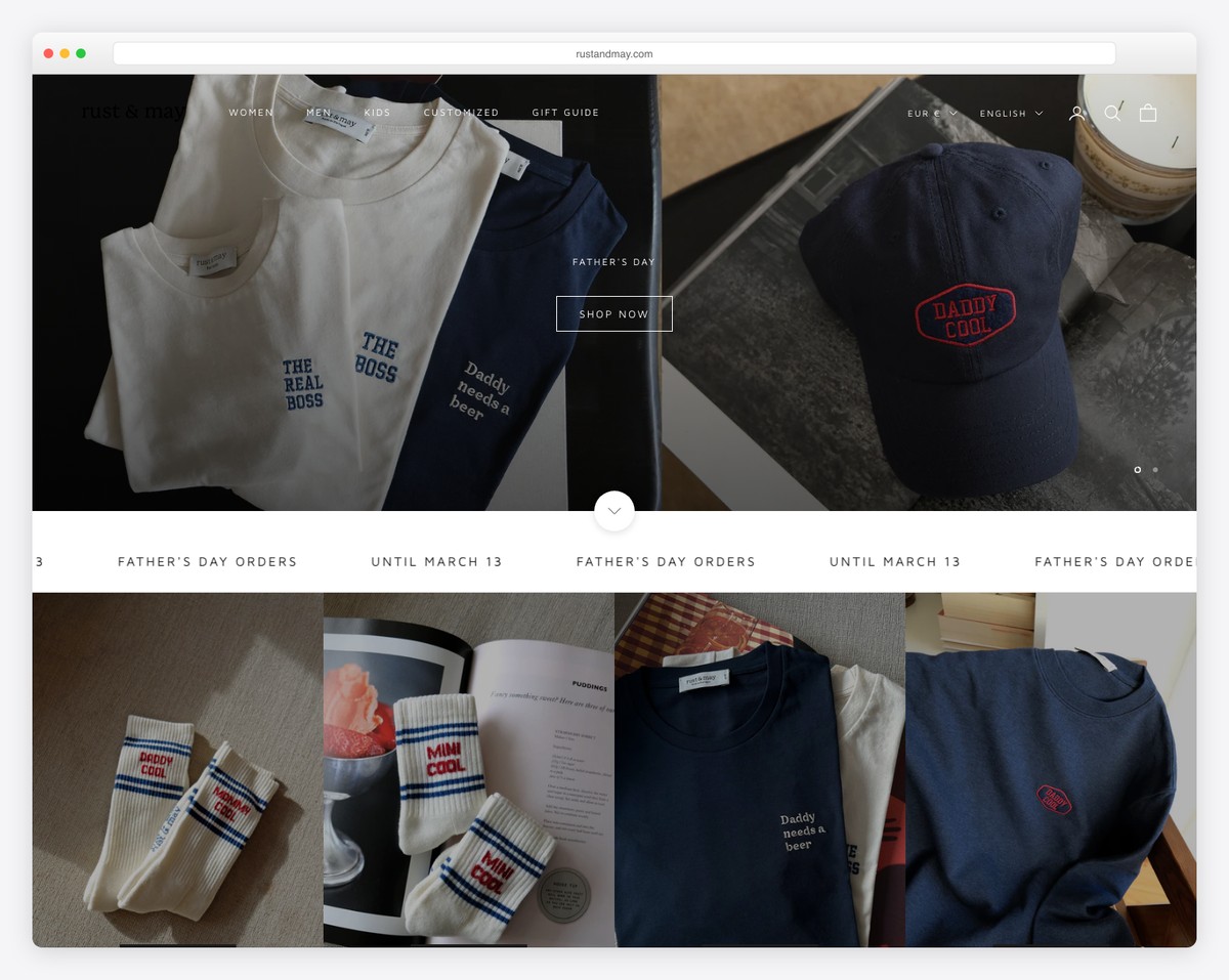
Rust & May’s white background, including the header and the footer, makes all the products shine more.
Speaking of headers and footers, the former has fewer links than the latter, but both adhere to a minimalist design.
Furthermore, all product pages feature additional images, both with and without a model, which is a recommended feature for any online store. Additionally, they feature a “You Might Also Like” section, displaying a few recommended items for further shopping.
What stands out: When unsure about web design, a minimalist site look has been tested and proven to work regardless of your branding and product type.
18. Deeper Japan
Built with: Squarespace
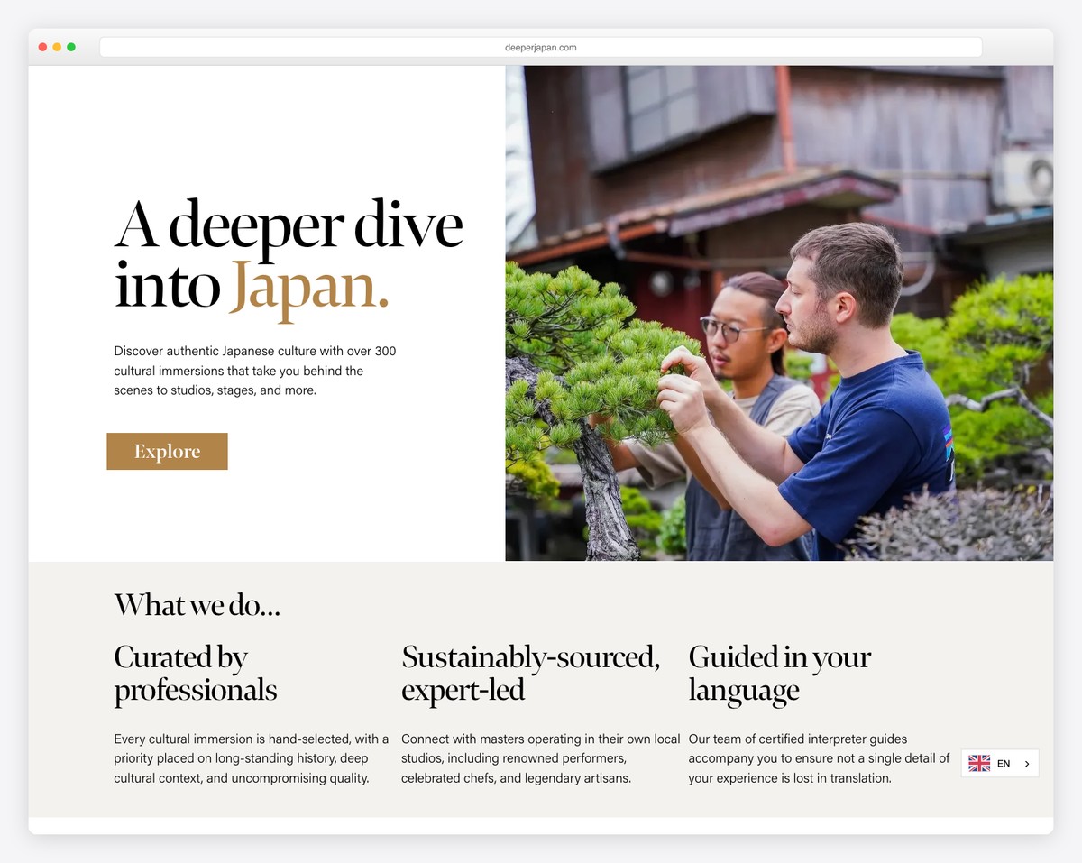
Deeper Japan boasts a soothing online presence that emphasizes simplicity. Its online store section features a grid layout with links to categories at the top, but you can also browse through all of them.
Each product image thumbnail has a hover effect. It displays a secondary image and a “quick view” button.
However, the standout feature of this store is its product pages, thanks to their personalized presentation, which includes the artist behind the work.
What stands out: Create transparent, in-depth product presentations with a personal touch to enhance sales.
19. Grain & Knot
Built with: Squarespace
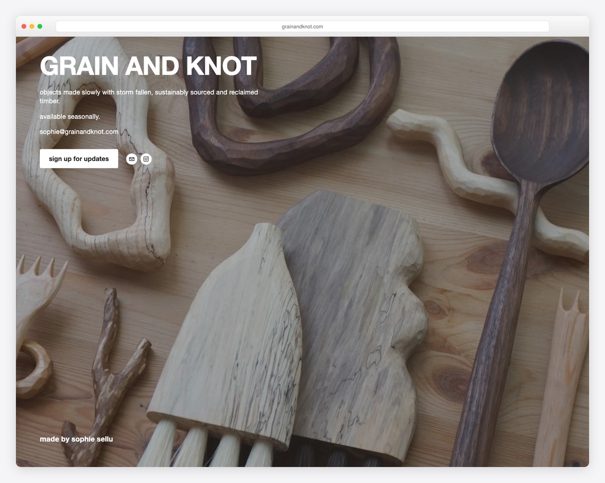
Grain & Knot is a handcrafted wooden homeware shop selling soulful, playful objects for the home — boards, utensils, sculptures, and more. The Squarespace store opens with warm, earthy photography that perfectly captures the natural, handmade quality of every piece.
The product pages feature multiple angles and lifestyle shots that show the pieces in real home settings, making it easy to imagine how they’d fit into your own space. The warm color palette and natural textures throughout the site create a cohesive brand experience that matches the handcrafted products.
What stands out: Lifestyle photography showing handmade products in real home settings creates emotional connection that studio-only product shots can’t match — visitors can visualize the pieces in their own lives.
Related Posts


Comments (0)