
32 Best University & College Website Designs 2026
The best university websites make the first decision easy: find a course, plan a visit or apply, with research and campus life one click away. These 32 university and college website designs range from MIT and Oxford to art schools and small liberal arts colleges, and for each one we list the platform it runs on and, where it has one, the typeface behind its headlines. If you are building a site for a school, our education WordPress themes are a good place to start.
We opened every site in a real browser and read the platform from the files it loads and the typefaces from the page itself. Thirteen of the 32 run on Drupal and six on WordPress, and many set their headlines in a typeface drawn for them, such as Yale, UChicago Serif and RISD Serif.
Research University Websites
Large universities with dozens of schools, millions of visitors and every possible audience. The best of them still make the first decision obvious: study here, read the research, or find a service.
1. MIT
Built with: Drupal
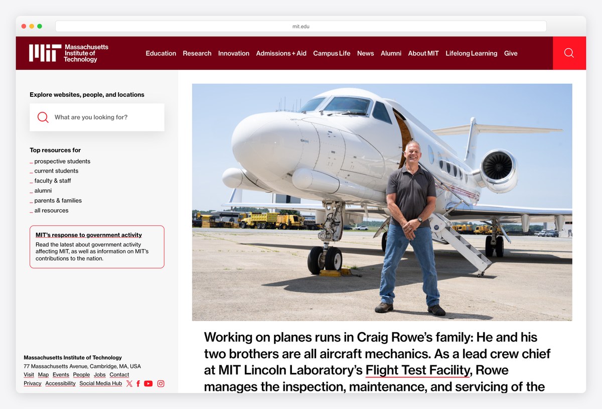
MIT skips the hero slider entirely. A narrow left column holds a search box for websites, people and locations, a list of top resources for prospective students, current students, faculty, alumni and families, and a boxed notice for important updates. The right side carries one large story with a photograph.
The red and black wordmark and the Neue Haas Grotesk type keep it plain, almost like a directory, and that is the point: most visitors to a university homepage are looking for something specific, and MIT puts search and audience links before any marketing.
What stands out: Search and audience links come before any marketing.
2. Stanford University
Built with: Next.js, Storyblok
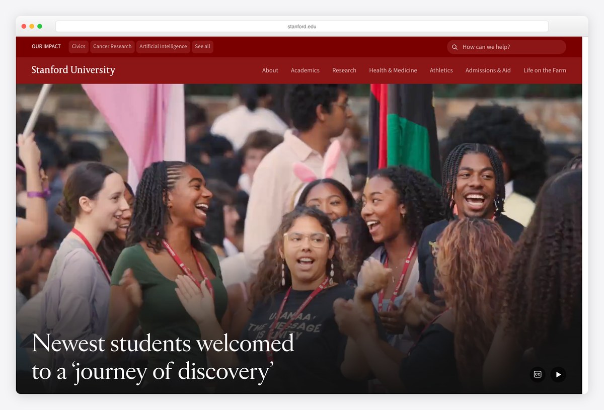
Stanford’s cardinal red header carries a slim Our Impact strip above the main navigation, linking to topics such as Civics, Cancer Research and Artificial Intelligence. Below it, a full-width video plays behind a serif headline, with a pause control in the corner.
The main menu reads About, Academics, Research, Health & Medicine, Athletics, Admissions & Aid and Life on the Farm, a nod to the campus nickname. The front end is built with Next.js and the content comes from Storyblok, a headless CMS, which is still unusual among large universities.
What stands out: Research topics get their own strip above the navigation.
3. Harvard University
Built with: WordPress · headlines in Canela Deck
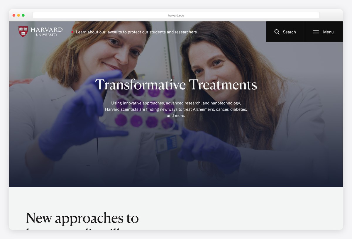
Harvard keeps the header almost empty: the shield and wordmark on the left, Search and Menu on the right, and nothing else. The rest of the first screen is one full-bleed photograph with a centred headline in Canela Deck, a sharp contemporary serif, and a two-line summary of the research behind it.
Further down, stories are set in large serif headlines over generous white space, with GT America for the text. The site runs on WordPress, a useful reminder that the platform scales to one of the most visited university websites in the world.
What stands out: The world’s best-known university, run on WordPress.
4. University of Oxford
Built with: Drupal · headlines in Tiempos Headline
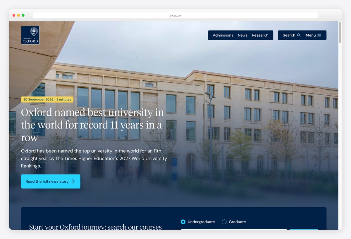
Oxford pins its dark blue crest to the top-left corner and keeps the header to a compact group of Admissions, News and Research links beside Search and Menu. The lead story sits over a full-bleed photograph with its headline in Tiempos Headline, a serif with a newspaper feel.
Directly under the hero is a course search with an Undergraduate or Graduate toggle, so a prospective student can start looking for a degree without opening a single menu. The site runs on Drupal, like many of the largest universities on this list.
What stands out: Course search sits directly under the hero.
5. University of Cambridge
Built with: Drupal
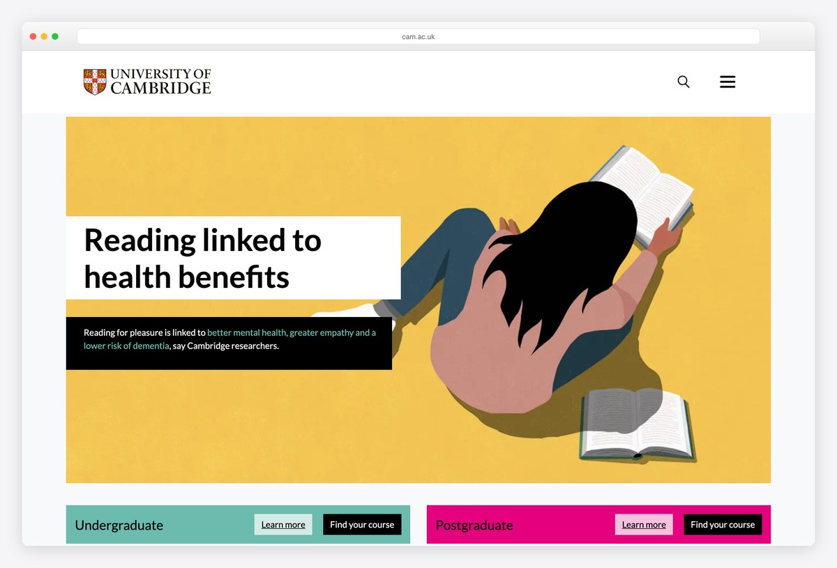
Cambridge gives its lead story a wide image panel with the headline in a white box laid over it, often using illustration rather than photography. The header holds only the crest, the wordmark, a search icon and a menu button.
Below the story, two colour-coded panels split the audience in two, teal for Undergraduate and magenta for Postgraduate, each with Learn more and Find your course buttons. It runs on Drupal, and the colour coding makes the most important choice on the page impossible to miss.
What stands out: Two coloured study panels make the first choice obvious.
6. Princeton University
Built with: Drupal · headlines in Franklin Gothic Extra Compressed
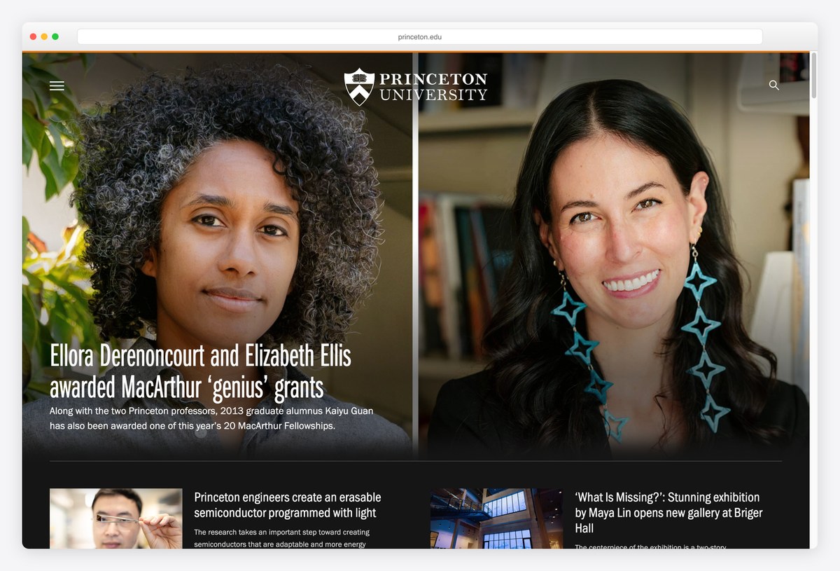
Princeton’s homepage behaves like a newsroom. A black header with the shield, a menu button and search gives way to large photography of researchers and their work, with headlines in Franklin Gothic Extra Compressed, a narrow sans that fits long headlines over images.
A row of smaller stories with thumbnails follows the lead, so the first screen shows several pieces of news at once. It runs on Drupal. For a research university whose reputation rests on its people, that focus is a deliberate editorial choice.
What stands out: Researchers and their work lead the page.
7. Yale University
Built with: Drupal · headlines in Yale
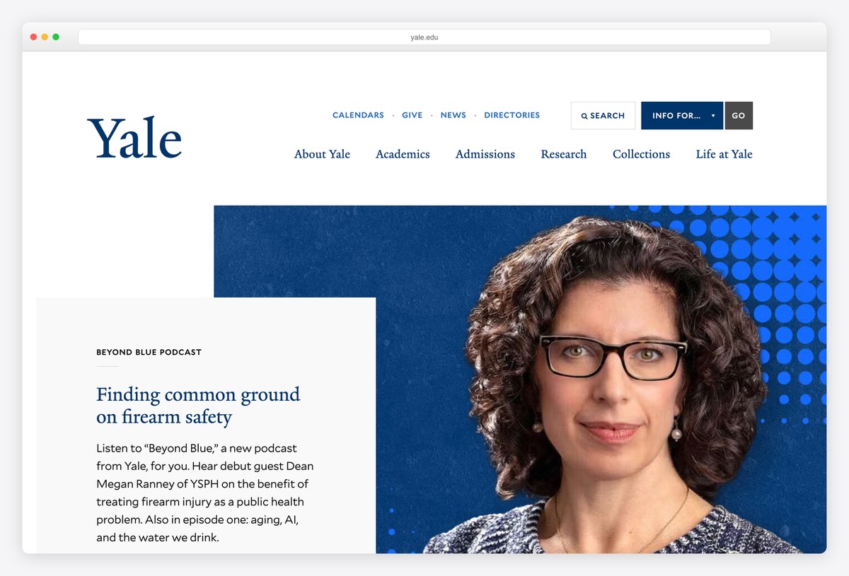
Yale’s wordmark is set in Yale, the typeface Matthew Carter drew for the university, and the same face runs through the navigation. A row of small-caps utility links (Calendars, Give, News, Directories, Search) and an Info for menu sit above the main menu: About Yale, Academics, Admissions, Research, Collections and Life at Yale.
The lead block is an offset layout, with a white text card overlapping a deep blue image panel. Collections in the main menu is a nice touch, since Yale’s museums and libraries are a reason to visit the site in their own right. It runs on Drupal.
What stands out: A custom typeface and museum collections in the main menu.
8. The University of Chicago
Built with: Sitecore · headlines in UChicago Serif
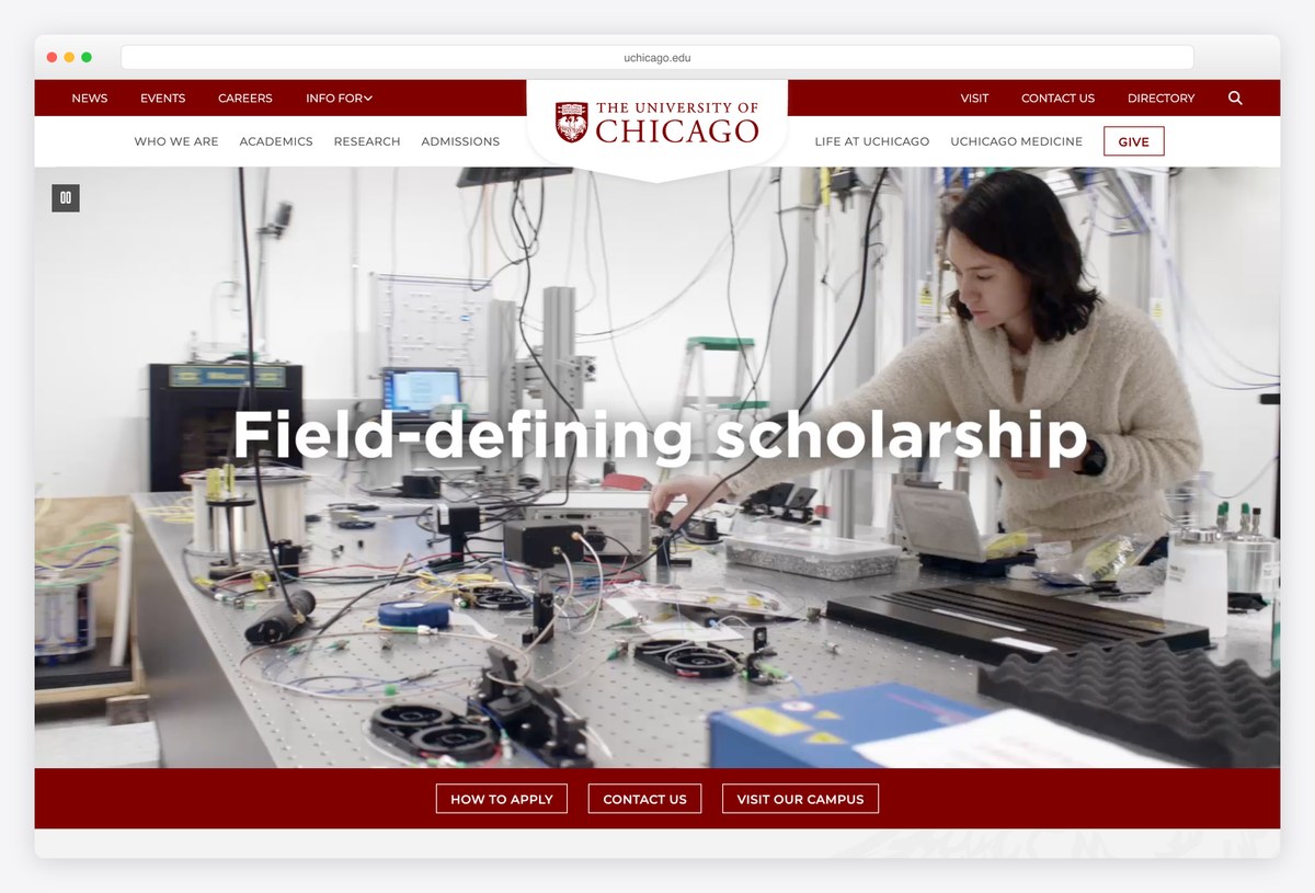
The University of Chicago centres its crest and wordmark in the header, between a maroon utility bar and a row of section links. The hero is a full-width video with a large white headline in UChicago Serif, the university’s own typeface.
A maroon band along the bottom of the video holds three outlined buttons: How to apply, Contact us and Visit our campus. Those are the three things a prospective student wants, and they stay in view while the video plays. The site runs on Sitecore.
What stands out: Apply, contact and visit buttons fixed to the hero.
9. ETH Zurich
Built with: Adobe Experience Manager · headlines in DIN Pro
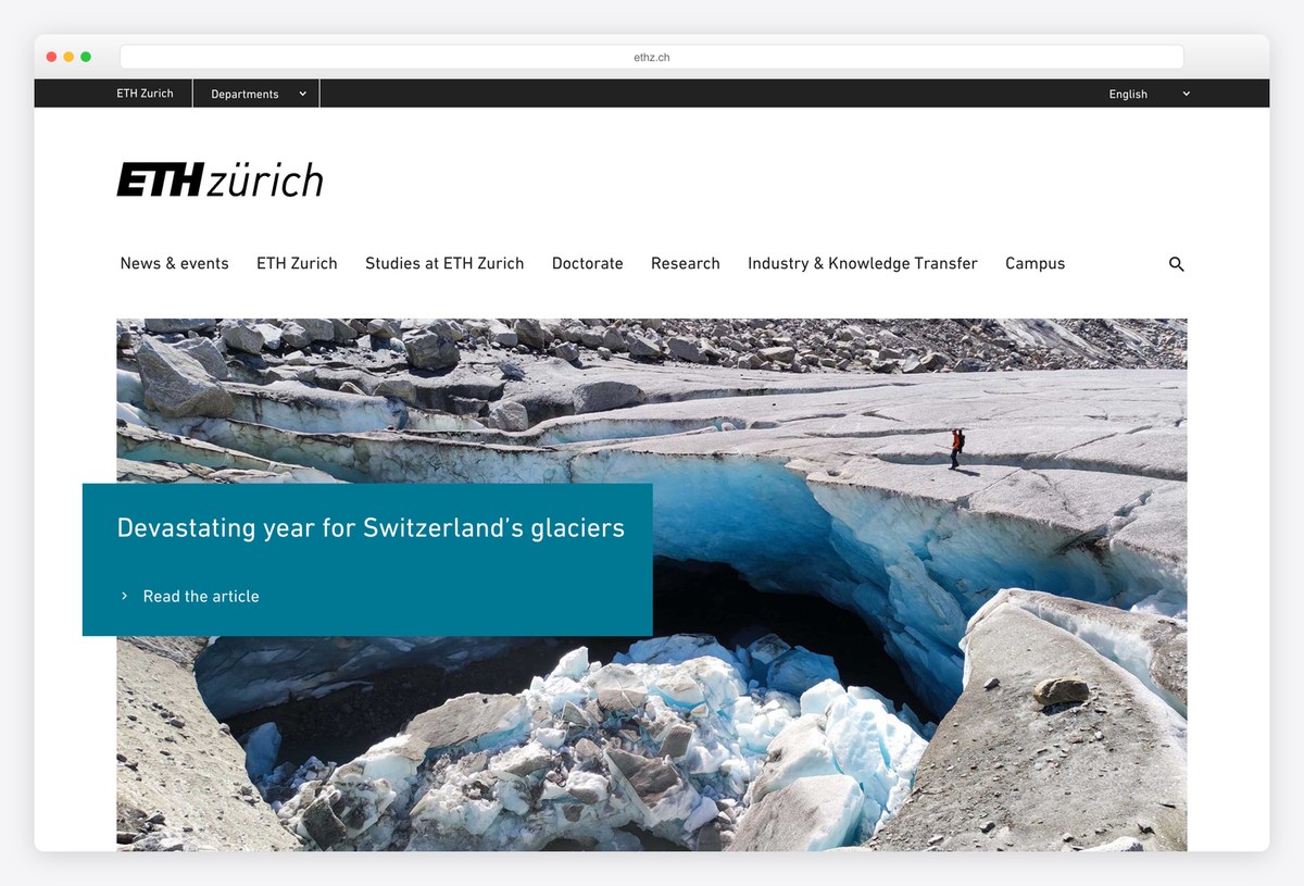
ETH Zurich keeps its wordmark, ETH zürich, in black on white with a simple text menu: News & events, Studies at ETH Zurich, Doctorate, Research, Industry & Knowledge Transfer and Campus. A thin black bar at the very top adds a Departments selector and a language switch.
The lead story uses a wide landscape photograph with a teal caption box overlapping its lower edge, and everything is set in DIN Pro. It runs on Adobe Experience Manager. The department switcher in the header is a smart answer to a common problem: many visitors want one department, not the university.
What stands out: A department switcher built into the header.
10. Imperial College London
Built with: TerminalFour · headlines in Imperial Text
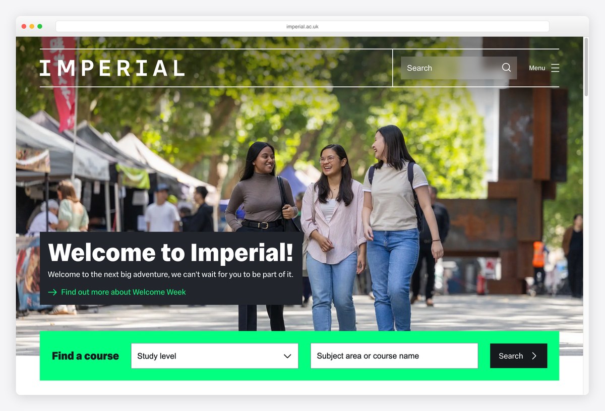
Imperial College London sets its name in wide, letter-spaced capitals over a full-bleed photograph of students on campus, with search and a menu button to the right. The headline and text use Imperial Text, the college’s own typeface.
The standout feature is a bright green Find a course bar inside the hero, with a study level dropdown and a subject search, so the most common task on the site can be finished from the first screen. The site runs on TerminalFour, a CMS used by many British universities.
What stands out: A course finder inside the hero.
11. University of Toronto
Built with: Drupal
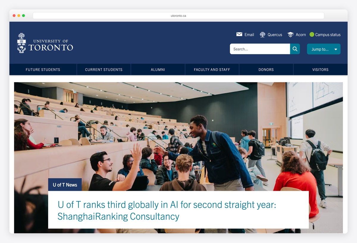
The University of Toronto’s navy header puts the tools students use every day first: links to Email, Quercus and Acorn (the learning and enrolment systems) and a campus status indicator with a green light. Below that, an audience bar splits visitors into Future Students, Current Students, Alumni, Faculty and Staff, Donors and Visitors.
Only then comes the news, a large photograph with a white headline card. It runs on Drupal and uses Trade Gothic Next throughout. For a university with three campuses, the status light in the header is a genuinely useful detail.
What stands out: A campus status light and student tools in the header.
12. The University of Texas at Austin
Built with: Drupal · headlines in Benton Sans
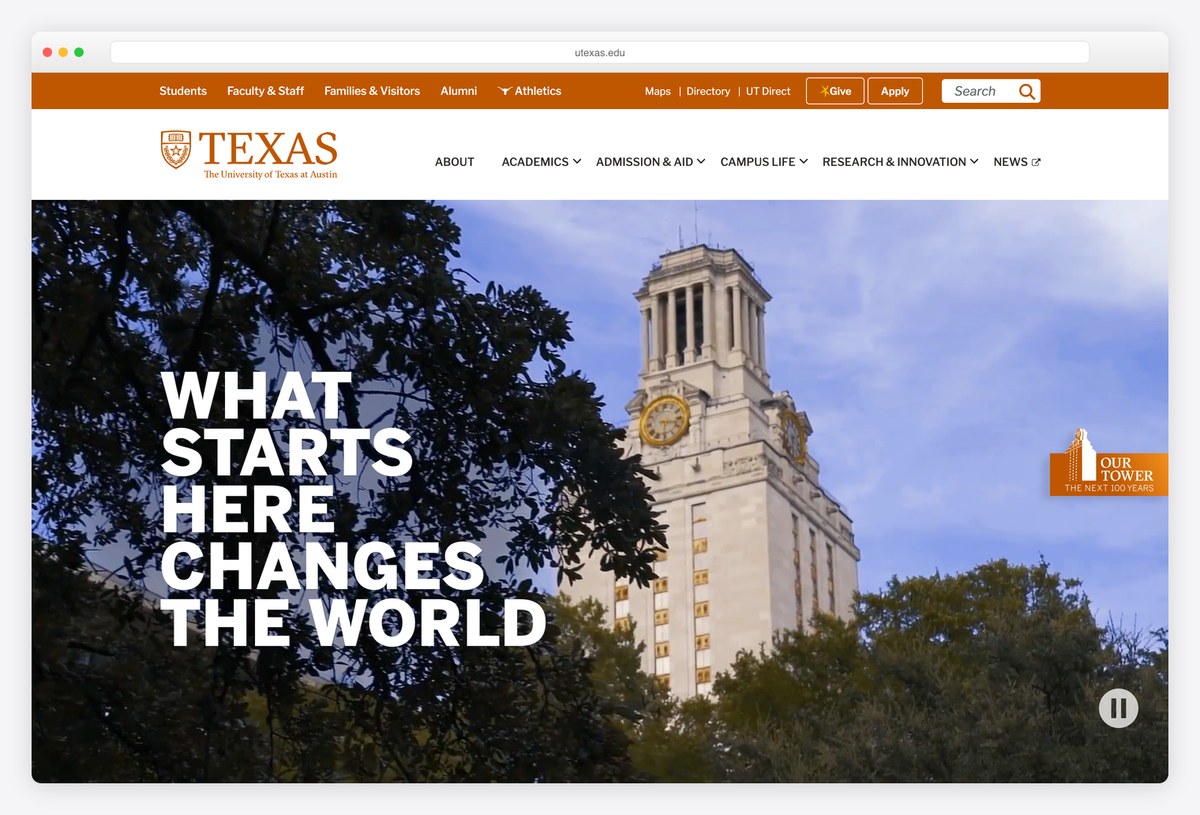
UT Austin opens with a burnt orange utility bar, the TEXAS wordmark and a full-bleed video of the UT Tower. Over it, the university’s slogan, “What starts here changes the world”, is stacked in heavy Benton Sans capitals that fill almost half the screen.
A pause button sits in the corner of the video, and the main menu (About, Academics, Admission & Aid, Campus Life, Research & Innovation) uses dropdowns to keep the header short. It runs on Drupal. Few universities are confident enough to make the slogan the whole hero, and it works.
What stands out: A slogan big enough to be the hero.
Art, Design and Music School Websites
Creative schools have to prove their taste on the homepage itself, and they take more risks with type, colour and student work than any other kind of university.
13. Rhode Island School of Design
Built with: Drupal · headlines in RISD Serif
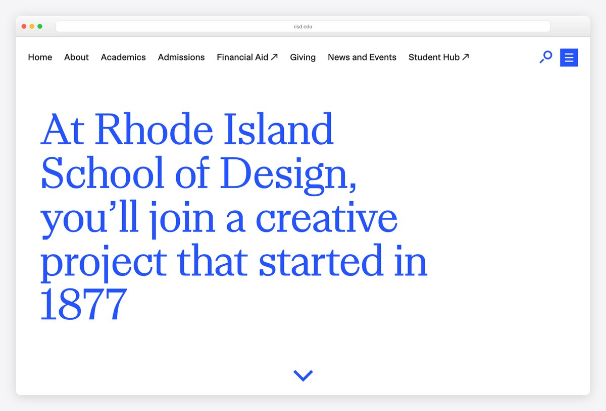
Rhode Island School of Design opens with no image at all. The first screen is a single sentence about joining the school’s creative project, set very large in blue RISD Serif, the school’s own typeface, with a small arrow inviting you to scroll.
The navigation is a plain row of text links (About, Academics, Admissions, Financial Aid, Giving, News and Events, Student Hub) and the site runs on Drupal. For a design school, a type-only opener is a confident statement: it trusts the typography to do what most universities ask of a campus photo.
What stands out: A type-only opener with no photograph.
14. Parsons School of Design
Built with: Next.js
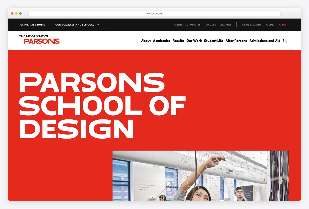
Parsons School of Design fills its first screen with a solid red block and the school’s name in huge white capitals, with student photographs cropped into the bottom of the block. A black bar above links back to The New School and its other colleges.
The main menu (About, Academics, Faculty, Our Work, Student Life, After Parsons, Admissions and Aid) gives student work and careers their own sections. The front end is built with Next.js. Using the brand colour as the hero, rather than a photo, makes the page recognisable at a glance.
What stands out: Brand red used as the hero itself.
15. Pratt Institute
Built with: WordPress
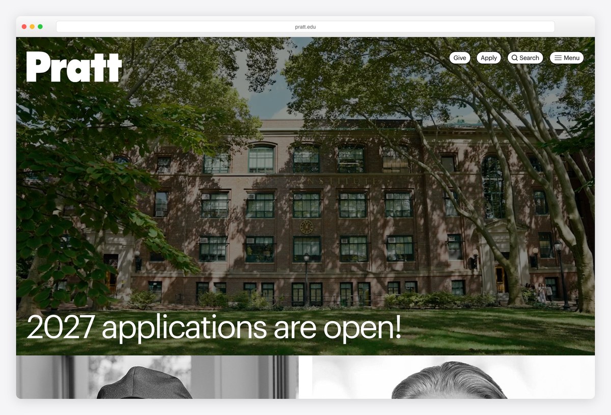
Pratt Institute sets its bold white wordmark over a full-bleed video of its Brooklyn campus and reduces the header to four small pills: Give, Apply, Search and Menu. The headline is set in Graphik, a clean grotesque used across the whole site.
Below the hero, news cards with black-and-white portraits lead into stories about alumni and the school’s magazine. The site runs on WordPress. The compressed navigation leaves the video almost untouched, which suits an art school that wants its campus and people to speak first.
What stands out: Navigation compressed into four small pills.
16. School of Visual Arts
Built with: Nuxt · headlines in Ringside Extra Wide
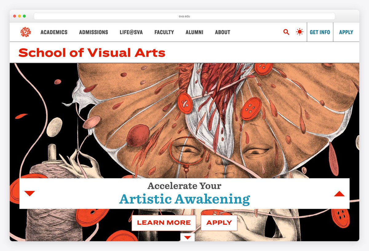
The School of Visual Arts sets its name in red Ringside Extra Wide across the top of the page, then fills the hero with a slideshow of artwork, including the school’s famous subway posters, each credited to the artist in a caption.
A white card over the art carries the line “Accelerate Your Artistic Awakening” with Learn More and Apply buttons, and the menu covers Academics, Admissions, Life@SVA, Faculty, Alumni and About. The front end is built with Nuxt. Leading with credited work by faculty and alumni shows the school’s standards rather than describing them.
What stands out: Credited artwork instead of stock campus photos.
17. The Glasgow School of Art
Built with: Webflow · headlines in Agrandir
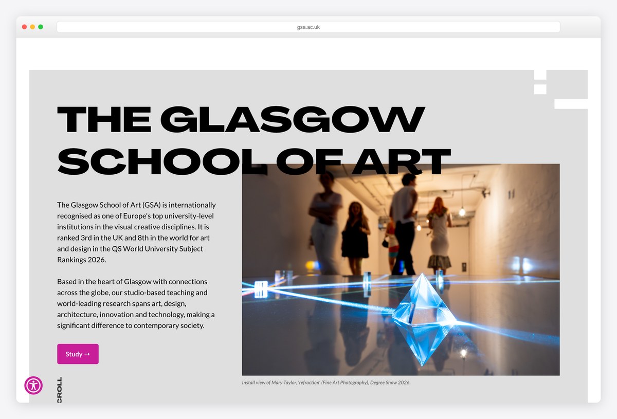
The Glasgow School of Art sets its name in huge black Agrandir capitals that overlap an installation photograph, so the type and image read like a poster. A short paragraph introduces the school and a pink Study button leads to admissions.
The site runs on Webflow, which is rare for a university and shows in the layout: big type, overlapping elements and lots of grey space. An accessibility toolbar is available from the corner of every page, and skip links cover the content, navigation and footer.
What stands out: Overlapping type and image, like a gallery poster.
18. MICA
Built with: Custom code · headlines in Theinhardt
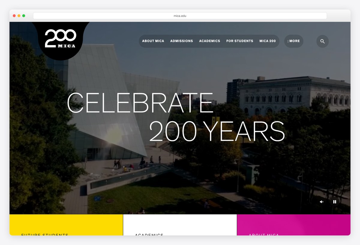
The Maryland Institute College of Art places a round black badge with its name in the top-left corner and sets the hero headline in very thin Theinhardt over a full-screen campus video, with the menu in a slim bar across the top.
Below the video, three solid colour blocks in yellow, white and magenta link to Future Students, Academics and About MICA, turning the main navigation into part of the design. The site is custom-built rather than running on an off-the-shelf CMS.
What stands out: Bold colour blocks double as navigation.
19. Berklee College of Music
Built with: Drupal
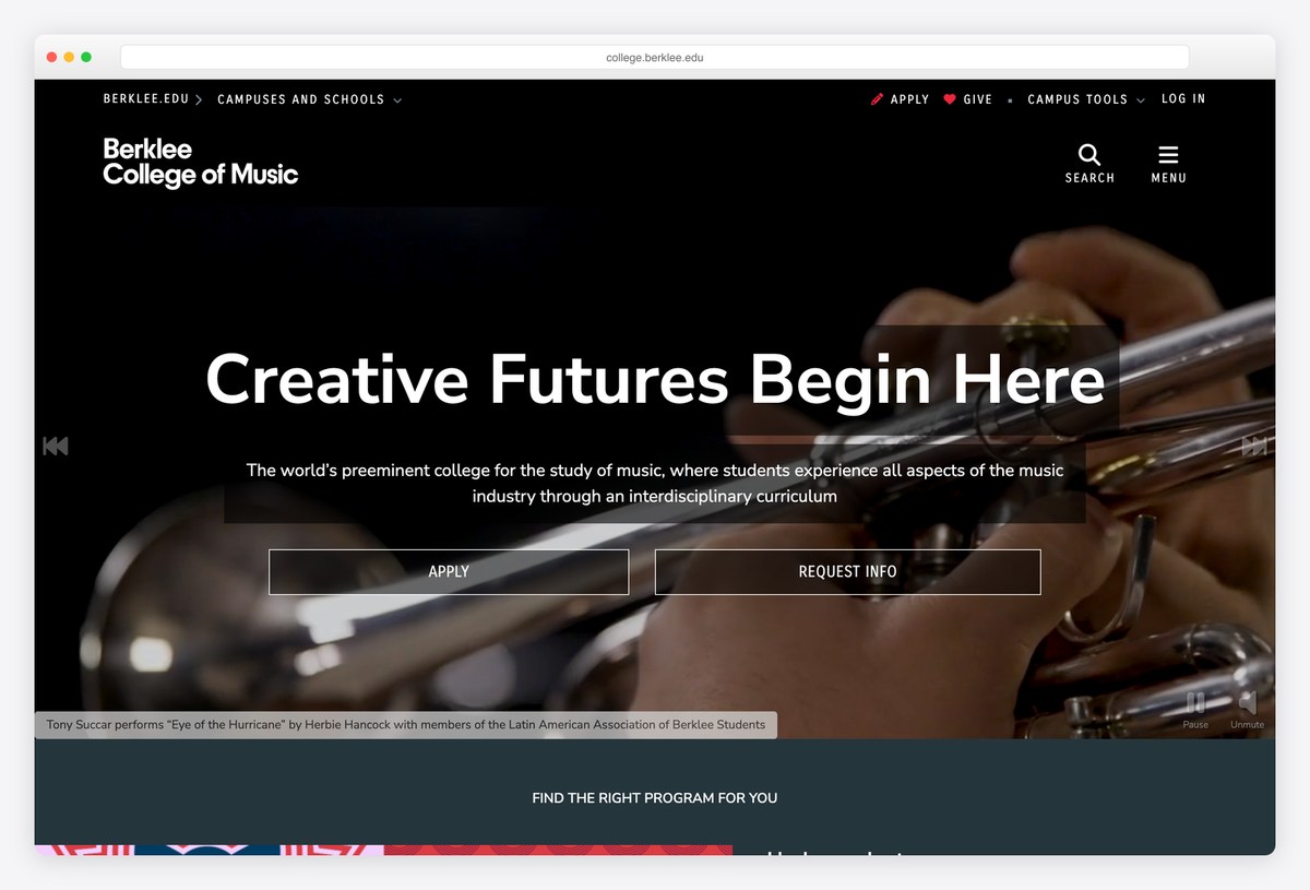
Berklee College of Music uses a dark page and a full-width video of students performing, with the headline “Creative Futures Begin Here” and outlined Apply and Request Info buttons over it. A caption names the performer and the piece, and the video has Unmute and Pause controls.
A bar at the very top switches between Berklee’s campuses and schools, including Valencia, New York and Berklee Online. The site runs on Drupal. For a music school, real performance footage with credits is far more convincing than a slogan.
What stands out: Real performance footage, credited and controllable.
20. University of the Arts London
Built with: Squiz Matrix · headlines in Helvetica Neue
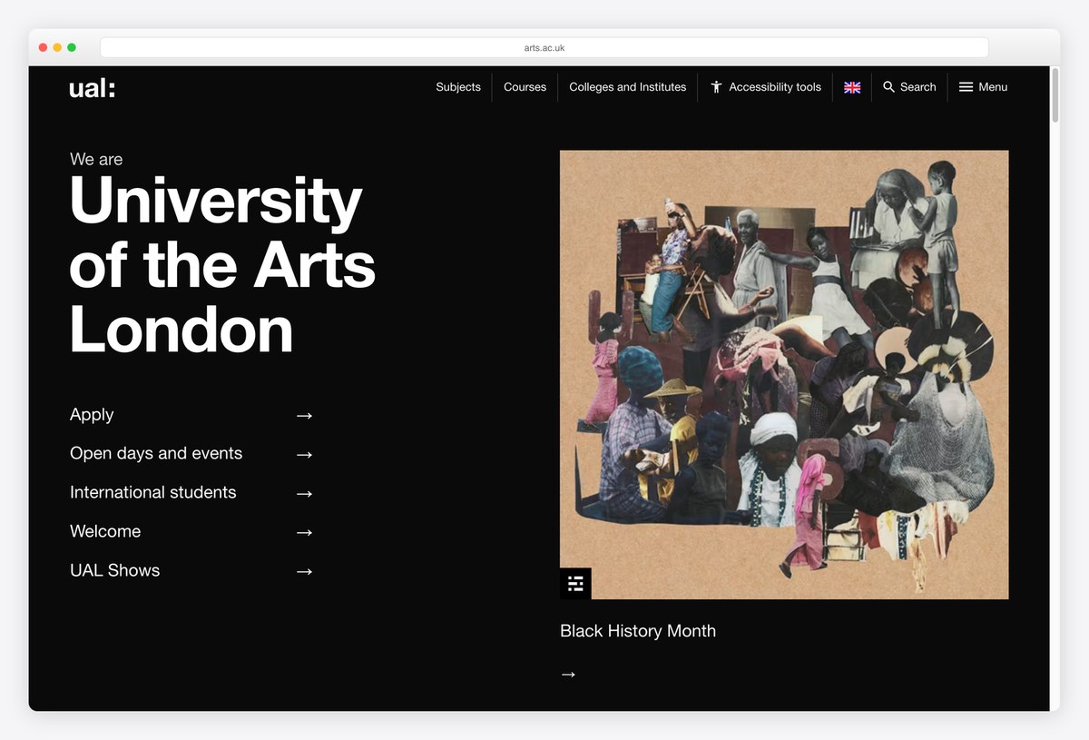
University of the Arts London sets “We are University of the Arts London” in bold Helvetica Neue on a black background, with a short list of arrow links underneath: Apply, Open days and events, International students, Welcome and UAL Shows.
The right half of the screen shows a single artwork with a short caption, and the menu covers Subjects, Courses, and Colleges and Institutes, since UAL is a group of six colleges. It runs on Squiz Matrix. Treating the homepage as a short list of tasks keeps a complex institution easy to enter.
What stands out: The homepage as a short list of tasks.
Liberal Arts College Websites
Small residential colleges sell a place and a community, so their homepages lean on campus photography, student voices and a short, confident line of copy.
21. Bates College
Built with: WordPress · headlines in Sabon Next
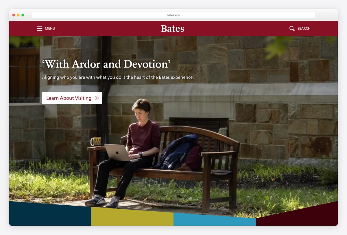
Bates College puts a centred serif wordmark in a deep crimson bar with only Menu and Search beside it. The hero is a full-bleed campus photograph with a short quoted headline in Sabon Next and a Learn About Visiting button.
A band of colour blocks (navy, mustard, blue and maroon) runs along the bottom of the hero and leads into sections for future students, academics and key dates. It runs on WordPress. The restrained header keeps the focus on the photograph and the invitation to visit.
What stands out: A restrained header and an invitation to visit.
22. Reed College
Built with: Custom code · headlines in GT Sectra Fine
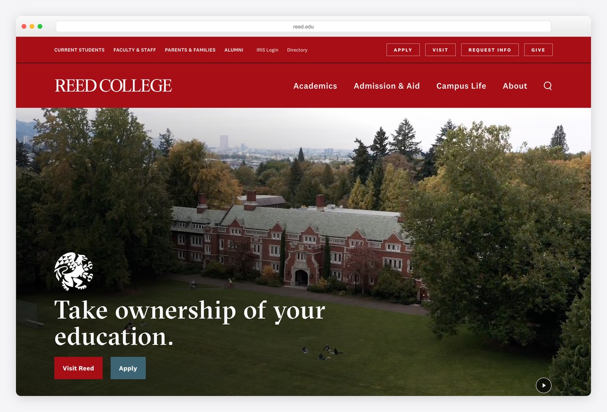
Reed College uses a red header with the name in serif capitals and small outlined Apply, Visit, Request Info and Give buttons. A silent campus video fills the hero, with “Take ownership of your education.” set in GT Sectra Fine.
The accessibility detail is worth copying: the page includes a written description of every scene in the background video for screen reader users, plus a control to stop it and a skip link to privacy settings. The site is custom-built rather than running on an off-the-shelf CMS.
What stands out: A written description of the hero video for screen readers.
23. Williams College
Built with: WordPress · headlines in Eph Slab
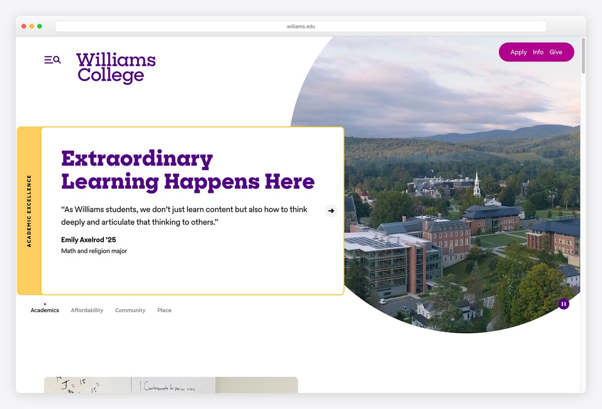
Williams College sets its purple wordmark on a white page and crops the hero photograph of its campus into a large circle. Overlapping the image, a card carries a quote from a student, with the student’s name and major, under a headline in Eph Slab.
Tabs under the card (Academics, Affordability, Community and Place) step through the college’s case one theme at a time, each with its own student quote. It runs on WordPress. Real student voices with names attached are more persuasive than any slogan.
What stands out: Student quotes with names and majors instead of slogans.
24. Pomona College
Built with: Drupal · headlines in Freight Text
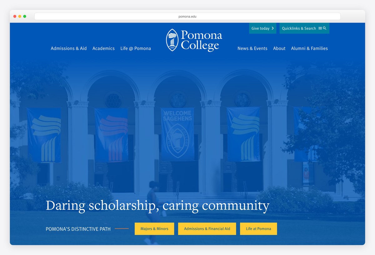
Pomona College tints its whole hero in a saturated Pomona blue, with the wordmark centred above the photograph and the headline “Daring scholarship, caring community” set in Freight Text, a warm book serif.
Under the headline, a row labelled Pomona’s Distinctive Path holds three yellow buttons for Majors & Minors, Admissions & Financial Aid and Life at Pomona. It runs on Drupal. The colour wash ties every photo to the brand and keeps white text readable on any image.
What stands out: A colour-washed hero that keeps text readable.
25. Kenyon College
Built with: Custom code · headlines in Gothia
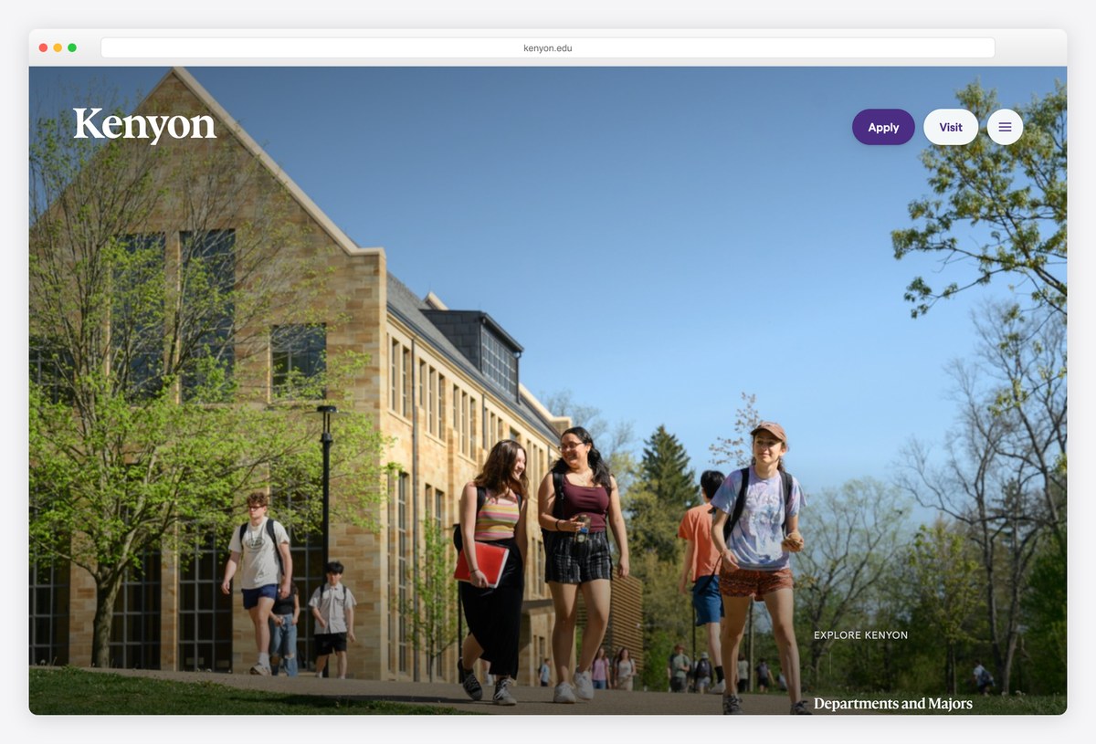
Kenyon College lets its campus do the selling: a full-bleed photograph of students walking past stone buildings, the Kenyon wordmark in white, and only Apply, Visit and a menu button in the corner. Headlines are set in Gothia.
The first text block quotes an alumnus: “Chances are that when you picture a college, you see a place like Kenyon.” Sections on departments, residential life and athletics follow. The site is custom-built rather than running on an off-the-shelf CMS. For a college known for its setting, minimal chrome is the right call.
What stands out: Minimal chrome so the campus can sell itself.
26. Colby College
Built with: WordPress
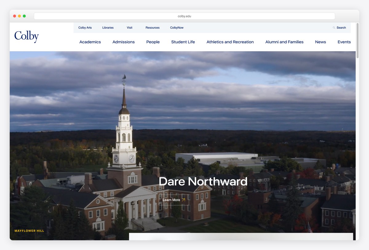
Colby College uses a clean white header with a two-level menu (Academics, Admissions, People, Student Life, Athletics and Recreation, Alumni and Families, News, Events) and a full-bleed aerial photograph of its campus at dusk.
The only text on the photograph is the tagline Dare Northward and a small Learn More link, which keeps the image clean. The site runs on WordPress. Tying a short tagline to the college’s northern location gives the brand a sense of place that generic slogans lack.
What stands out: A tagline tied to the college’s place.
Bold and Unconventional University Websites
Universities that broke the usual template with an unexpected colour, poster-sized type or a homepage that is mostly one statement.
27. University of Hull
Built with: Contensis · headlines in Signifier
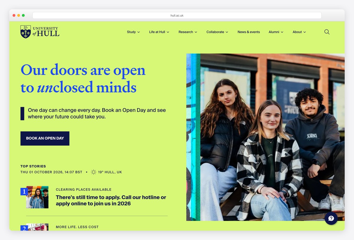
The University of Hull uses a colour no other university here dares to: an acid lime green background, with the headline “Our doors are open to unclosed minds” in Signifier, a crisp serif, with one word in italics. A dark blue Book an Open Day button sits underneath.
A Top Stories list shows the local date, time and weather in Hull above numbered stories, which makes the page feel live. The site runs on Contensis. It is proof that a university can be bold and playful without losing clarity.
What stands out: A colour and a voice no other university uses.
28. Aalto University
Built with: Drupal · headlines in Inter
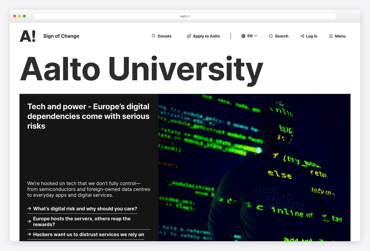
Aalto University in Finland sets its own name in huge Inter, larger than almost any headline on this list, under a small A! logo. A black featured block below introduces one theme with a short paragraph and three question-style links.
The header holds Donate, Apply to Aalto, a language switch (English, Finnish and Swedish), Search, Log in and Menu. It runs on Drupal. Poster-sized type and a single theme at a time make a big university feel like a design studio, which suits a school born from art, business and technology.
What stands out: Poster-sized type and one theme at a time.
29. Minerva University
Built with: Webflow · headlines in Chronicle Display
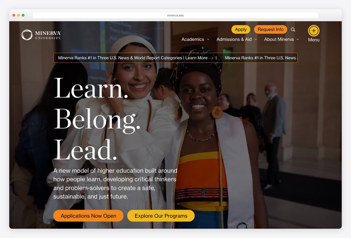
Minerva University sets “Learn. Belong. Lead.” in large Chronicle Display over a warm photograph of graduates, with orange pill buttons for applications and programmes and a ticker of rankings running above the hero.
The navigation is short (Academics, Admissions & Aid, About Minerva) with Apply and Request Info always in the corner. The site runs on Webflow. A young university with a new teaching model uses the homepage to explain that model in one sentence: a new model of higher education built around how people learn.
What stands out: A new kind of university explained in one sentence.
30. University of Technology Sydney
Built with: Drupal · headlines in NB International Pro
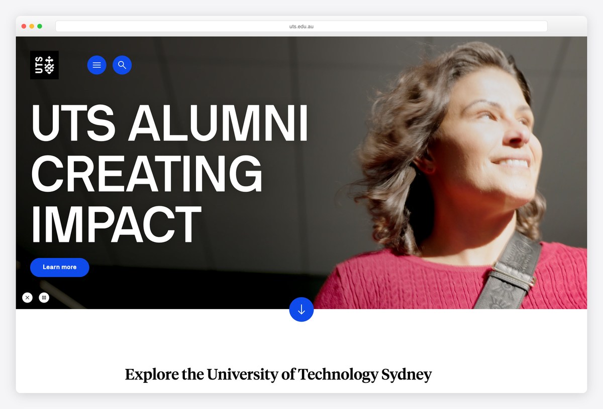
The University of Technology Sydney puts a boxed UTS logo and two round blue buttons, for the menu and search, in the corner, then lets a huge headline in NB International Pro capitals take over the left half of the screen next to a portrait photograph.
A round arrow button invites scrolling to a section titled Explore the University of Technology Sydney, with popular links for students, industry and research. It runs on Drupal. The oversized type and minimal header give it the feel of a magazine cover.
What stands out: Magazine-cover type with almost no header.
31. Cornell Tech
Built with: WordPress · headlines in DIN 2014
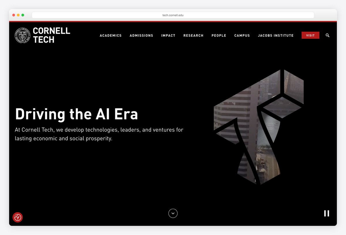
Cornell Tech, Cornell’s graduate campus on Roosevelt Island in New York, uses an all-black first screen with a short, confident headline in DIN 2014 and an animated geometric shape on the right.
The menu (Academics, Admissions, Impact, Research, People, Campus, Jacobs Institute) is set in small capitals, and a red Visit button stands out in the corner. It runs on WordPress. The dark, minimal look sets the campus apart from the main Cornell site and suits a technology school.
What stands out: A dark, minimal look for a technology campus.
32. Olin College of Engineering
Built with: Drupal
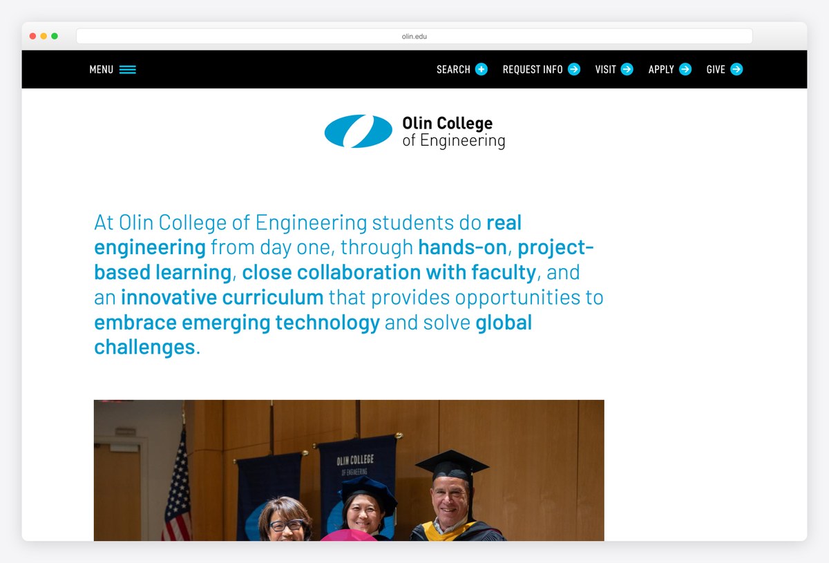
Olin College of Engineering has no hero image. The first screen is its mission, set in teal Barlow, with key phrases in bold: students do real engineering from day one, through hands-on, project-based learning, close collaboration with faculty and an innovative curriculum.
A black bar above holds Search, Request Info, Visit, Apply and Give, each with a small arrow icon. It runs on Drupal. Highlighting the important words in a paragraph lets visitors scan the pitch in seconds, a simple technique any small college can borrow.
What stands out: A mission statement with key phrases highlighted.
What Makes a Great University Website?
Put the main task in the first screen. Imperial and Oxford place a course search in or right under the hero, Cambridge splits undergraduate and postgraduate study into two coloured panels, and UChicago fixes Apply, Contact and Visit buttons to its video. Prospective students should never need the menu to start.
Route visitors by audience. A university serves applicants, students, staff, alumni, parents and donors at once. Toronto’s audience bar, Yale’s Info for menu and MIT’s list of top resources send each group to its own starting point without cluttering the main navigation.
Show real people and places. Williams quotes named students, Berklee credits the performers in its video, SVA credits the artists behind its posters, and Kenyon lets its campus photography carry the page. Specific, credited content is more convincing than stock photos and slogans.
Own your typography. Yale, UChicago, RISD and Imperial all use typefaces made for them, and smaller schools get a similar effect from one distinctive licensed face, like Hull’s Signifier or Reed’s GT Sectra. Type is the cheapest way to look like nobody else.
Make video optional. Background video is common on this list, and the best examples include a pause button (UT Austin, Berklee, Reed). Reed goes further and writes out what the video shows for screen reader users, which every university with a video hero should copy.
Build for accessibility from the start. Universities are expected to meet WCAG 2.1 AA at a minimum. Most of the sites here start with a skip-to-content link, and the Glasgow School of Art adds skip links to the navigation and footer as well.
Choose a platform your team can run. Drupal and WordPress dominate this list because many people in a university need to publish safely. Large institutions also use Sitecore, Adobe Experience Manager, TerminalFour or Squiz, while smaller schools such as Minerva and the Glasgow School of Art use Webflow.
Frequently Asked Questions
What makes a good university website design?
A good university website makes the most common tasks (finding a course, visiting and applying) easy from the homepage, routes each audience to its own starting point, and shows real students, staff and places. It also loads quickly on phones, meets accessibility standards and uses a consistent visual identity, ideally with a distinctive typeface.
What should a university homepage include?
Most strong university homepages include a clear way to find a course, links to visit and apply, an audience menu for students, staff, alumni and parents, a few research or campus stories, and search. Contact details, accessibility information and links to student tools such as email or the learning platform usually belong in the header or footer.
What CMS do universities use?
Drupal and WordPress are the most common platforms on this list: Oxford, Cambridge, MIT, Princeton and Yale use Drupal, and Harvard, Pratt and Williams use WordPress. Large institutions also use Sitecore, Adobe Experience Manager, TerminalFour, Squiz Matrix or Contensis, and some newer schools use Webflow or a headless setup with Next.js.
Can I build a university or college website with WordPress?
Yes. Harvard, Pratt, Williams, Bates, Colby and Cornell Tech all run on WordPress. For a smaller school, a good education theme gives you course pages, events, staff profiles and news out of the box, and you can add forms for enquiries and applications with plugins. Plan roles and editorial workflow early if many staff will publish.
How do you make a university website accessible?
Aim for WCAG 2.1 AA as a minimum: add a skip-to-content link, use real headings and sufficient colour contrast, give every image alt text, caption videos and let visitors pause any background video. Test with a keyboard and a screen reader, and publish an accessibility statement with a contact for problems.
Should a university website use background video?
It can, as long as it stays optional. Keep the video short and silent, add a visible pause button, respect the reduced-motion setting, and make sure the headline and buttons stay readable over every frame. Reed College also writes out what its video shows for screen reader users, which is good practice.
Wrapping Up
To build a site for your own school or college, browse our education WordPress themes, our school website templates and these school website designs. For student work, see our student portfolio examples.
Browse the other Education website examples (13 more collections), or see website examples for every industry.

Related Posts


I like your website, bro! It has a cool theme!